
Don't wanna be here? Send us removal request.
Statistics
We looked inside some of the posts by lukepearsonfmp2 and here's what we found interesting.
Average Info
Notes Per Post
0
Likes Per Post
0
Reblog Per Post
0
Reply Per Post
0
Time Between Posts
9 minutes
Number of Posts By Type
Text
17
Last Seen Tumblr Blogs


Fun Fact
US Tumblr user growth rate is estimated to slow down to 4.1%.
Text
Comic Cover outcome
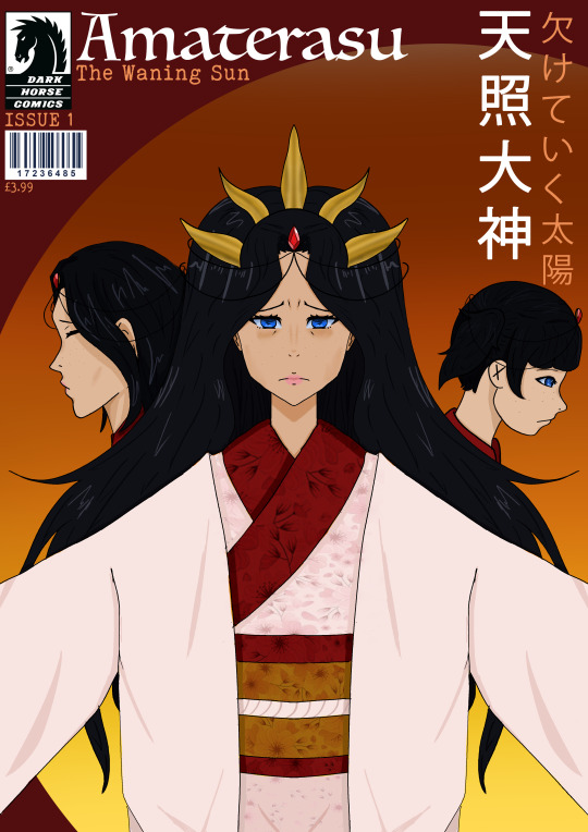
I am really happy with how my front cover turned out, i honestly didnt think it would work as well as it did, as i was drawing it i never really felt confident in how it looks, i thought it looked a bit boring and plain. However, seeing the finished product makes me feel really good about it, and like i was dreading over nothing. I personally really like all the little extra details, it really makes it feel like a comic! it really pulled it all together, i was worried it wouldnt look like a comic cover but i think it really does! I think i couldve spent more time to consider my font choices but i think the ones i chose actually work quite well and im honestly surprised that they do! - it shows how the image holds the viewer whilst the type just sits to turn it into an illustration.
0 notes
Text
Comic Cover Processes 2:


Making the background for my cover was quite simple, as i wanted it to look simple yet still make her stand out.
i used the colours of a setting sun to make her stand out as it relates to her character, the goddess of the rising sun, and the story as the world gets dimmer and dimmer. The sun is super important to japan so this just is a little hint to that to
0 notes
Text
Comic Cover Processes 1


To start off my front cover, i decided to try and sketch out the way i wanted it to be, however, when actually doing the line art i didn't like how the Childrens faces were obscured by her hair so i moved them up higher! I used the symmetry tool for the version of her looking forward to show her as perfect.
The way i colour is pretty basic, i don't think its anything special. The only time i ever really blur or smudge is on the shading on the face, especially on her eye bags as they're more soft, not a sharp shadow On her kimono, i thought the plain colour wasnt enough, she looked too plain. i looked for different sakura patterns and i quite liked the one below, so i copied and pasted it in on a multiply layer on 30% opacity

0 notes
Text
Comic page processes 3:
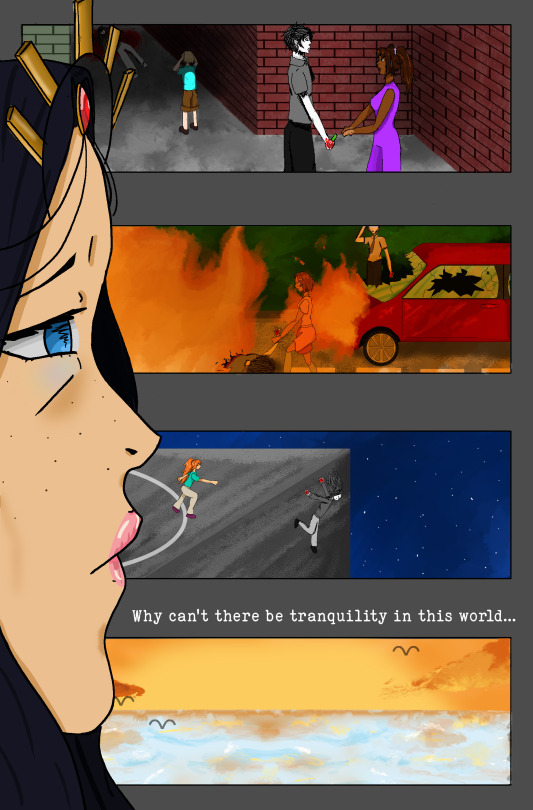
I really love how this turned out, It looks so much better then i imagined. I think its quite a simple lay out, which maybe it could look a bit better in that aspect. However i do like how she's just observing whats going on in these panels. My personal favourite would be the car crash scene. I have never drawn a car before in my life, so i'm really impressed with how its turned out. I really wanted to challenge myself to draw a couple things i haven't before and i'm really impressed with how its turned out
I wanted to show a range of bad events through these. I wanted the reader to see through her eyes, she can see the difference between the people doing all the bad stuff and good people
0 notes
Text
Comic page processes 2:
As I started drawing the car, I realised it look a lot better then I thought it would, I did use fire to cover the front of the car as it made it easier for me. As I did the fire, I used a blur tool to mix the colours into one another and I think it worked really well! I'm really proud of this panel over all. As I drew more and more, I felt really proud of myself I decided to do the 4th panel before the 3rd as I realised I had already drawn a beach in my poster... I copied and pasted it and added some little birds! I also removed the orange filter from it The 3rd panel was drawn quite quickly... i was really running out of time and i think its my least favourite panel. its really plain and just not how i wanted it to look at all. I'm really unhappy with how it turned out


0 notes
Text
Comic page processes 1:
The start of my comic page, I didn't really feel too hopeful. I really didn't leave myself a lot of time, I do think I did a good job on her face though! As I coloured her, I gained a bit more hope in how this would look, I think she looks really good! I really dont think my first panel looks all too good, and the whole time I was drawing it, I really wasn't liking how it looked. I wanted more detail, different buildings but I just didn't have time to redo it. So I just did what I could and moved on I stared the second panel here, I didn't feel confident going into it. I haven't ever drawn a car before, so I didn't know how it would end up. I started with the people though, I do think I did a decent job on them, I'm not good at drawing on such a small scale, yet I think it ended up okay!


0 notes
Text
Comic book fonts-
I've noticed how almost every comic seems to have a similar or the same font, why is this? I've just been researching this- it looks like this:

Apparently it's called WhizBang, and it is the original computer font for comics lettering! For over thirty years comics creators and enthusiasts have enjoyed this simulation of hand lettering in the style of comic books and comic strips of the sixties and seventies.
I think the font is really iconic to the style of comics marvel and DC release. However my comic doesn't really fit that kind of style so I think for the text, I would use something else

0 notes
Text
Comic Book Titles, logos and fonts:

Comic titles will be the first impression of someone's look at a comic, so it needs to stand out and be interesting enough to make people want to pick it up and read it. If the title has a boring font or name, it makes the rest of it fall apart!

The title works really well for this game! It's a kids game, the name itself is simple, and its designed to look like felt/patchwork, suiting the world and thee of the entire game.

This title really shows off the game, Its known for being difficult and they show it in the title with the character dying. The use of the two fonts works quite well here I think, I think it highlights the word super!


the font for COD, it works for the type of game it is- but it's still dull, and a million other plain fonts could replace it, with little difference.
0 notes
Text
Artist Research - Yoji Shinkawa
Yoji is a Japanese artist with an incredibly iconic art style, very unique with it's strong line work and distinct use of colour

I really like Yojis style of work, the lines seem sketchy yet with reason. I really love the way the line work is, the use of black sometimes to create depth, yet in other work they use colour for that. I really love the way they use colour too, The shading works really well and its not overly complex!


0 notes
Text
Lyndon Willoughby Posters
Discuss these in detail, very unique and clever ways of creating posters from numerous different properties. Lots of inventive fonts, layouts and colours- discuss/compare.

I really like how they've used a Gameboy in this poster, and mixed it in with a game. I really dont know what game it could be as I've never seen anything in that picture before but I really like how everything looks. I like how it looks drawn with chalk. I also like how the font looks hand drawn

I've never played a Zelda game so i presume this is an important place in it. I like how certain parts are more clean with no texture or shading yet other parts looks done with chalk. I like how they even used the font from zelda yet it still slightly looks hand written

This one has less of that chalky look, yet it still looks like their style and works with the film. You can really get a feel for this film with this poster, I really like how smooth the blood dripping is compared to the rest of the drawing
0 notes
Text
More Poster Discussion.
I think a lot of these posters become really famous for their use of a bold colour. These two in particular. They both have some bold colours on there that really make the poster shout. I like in the Kill Bill poster the contrast between the really bright yellow and the pitch black on there!


I think this poster is famous purely for how weird and unique it is. The distortion of the face would really make some peoples heads turn! No one naturally looks like that, so it would make people question as to why the poster is presented in such a way

I think the Jaws poster is so famous because of how simple it is, yet it pretty much sums up the film. And then you have big bold text. It really is an iconic poster. Having a big shark on a poster is bound to make people look at it regardless of why its on there.

JAWS- It's all about the shark - replicated by everything ever.


0 notes
Text
Poster Research:

In this poster, the character has its back turned from the viewer as he's viewing all the destruction around him. It looks almost like he's reflecting on what's going on around him, why all this is happening. This reason is basically the same as why I chose to have my character facing away from the viewer. To show reflection on all the worlds horror

I think they've faced the joker away to just show us that hes planning something evil. We can see that the street get livelier the further away from him it is. And seeing the knife in his hand, we can see he isn't up to any good

I think they've faced him away from the viewer in this poster purely to show off the mech that this character is wearing. It is really cool and it highlights that it must be important to the plot line some how!
0 notes
Text
Using Comic Panels to tell a Story

I think this panel is quite comedic. Its showing that she is a lot smaller without the heels she is wearing as in the last panel she isn't fully in it. I quite like that, I also think it helps them as they didn't have to draw a whole new panel, they just moved her down and added text

In these panels, you can see the main points of focus tend to be facing the way the comic flows, it helps our eyes to understand what is going on and leads us. I think these two comic pages do it quite well, especially Spiderman, his face is always looking to the way the comic flows, even if its just slightly.

I really love the way they've done this one, as you can see, it makes our eyes go on its journey with it. I think this page is actually quite fun to look at and I really do like what they've done, as our eyes focus on the drawing more then the words, it just is so fun to read!

I dont think the flow in this page really matters. each panel is its own story, showing different things happening in one place. The page is a bit too static to determine flow, yet it still works in my opinion!
0 notes
Text
Artist Research - Leslie Hung

i love the mixture of sketchy lines and watercolour. Their a combination that i think ALWAYS works, and this is no difference. I love seeing how even digitally, this is achieved. Her work looks amazing. I love that water colour look to the colouring, i really wish i could do something similar, i want to learn how to achieve that

0 notes
Text
Comic Cover Research:
I want you to talk about each of these comic book covers, what does it tell us? Anything about the characters and story? Talk about how you could implement things such as an issue number and barcode into your own cover, in order to make it feel more authentic.

In this front cover, it looks like they've managed to fit a lot of the information, including the blurb, inside the things "mouth"? You can see a price for the comic on the cover too, I think I could use that on my cover to maybe make it look more authentic

There's a lot going on in this front cover, to me it feels like there is too much going on. I really dont know where to look or where I'm supposed to focus. However, it does have a publisher in the corner which I think I could use in my cover to try make it seem more comic like!

i really like this cover, I like how she is over the top of the red band at the top. I dont feel like theres too much going on as the background is super simplistic. The red really makes everything stand out too, the red banding cates your attention!
0 notes
Text
Artist Research: Noelle Stevenson

Noelle has some really unique dimensions when it comes to creating characters.. they all have their own feel to it, some are weirdly long, whilst other have very stubby limbs. Her cartoon work is quite versatile! A she does some work with some refined line work, where as she sometimes keeps other work as coloured sketches! even the sketches look really good and i think would work really well as a comic style

0 notes
Text
Font used for Final Poster
I decided to use this font because it felt old, yet had a charm to it. I wanted it to fit her character, but i really dont like the way all the cursive fonts looked and how ineligible they are. I wanted something that people could read whilst also still having that feel to it. I think it really fits
0 notes