
Don't wanna be here? Send us removal request.
Statistics
We looked inside some of the posts by minoryr2visualinfo and here's what we found interesting.
Average Info
Notes Per Post
0
Likes Per Post
0
Reblog Per Post
0
Reply Per Post
0
Time Between Posts
8 days
Number of Posts By Type
Text
13
Photo
4
Last Seen Tumblr Blogs


Fun Fact
Tumblr has 411 employees.
Text
Material lists
The list of materials and their properties have been laid out with supporting images to help understand the viewers:
Acrylic Panel Blue
This material is primarily going to be used for highlighting installations which are mostly made out wood. Acrylic panel is excellent for outdoor use as it is weather and waterproof. The material is relatively durable as it can absorb damage because of its flexibility. Since it is made out of plastic, it does not decay easily.
Cost: NZ$8 each, bulk price (1m high)

Concrete
The primary use of this material is for weighting down installations so they will not tip over or fall. It is a durable material and can be manipulated in shapes when it’s in liquid form. This is an ideal outdoor material especially in Silo Park as this material can be seen often in the park.
Cost: NZ$10 (20kg)

Red Wood
Redwood is a Californian wood species which is planted in New Zealand. It is light and durable, ideal for both interior and exterior use. This material is chosen because it was relatively easy to find and durable. It is also quite resistant to warping and weather. This is a primary material for most of the installations for this project.
Cost NZ$45 per timber (bulk price possibly cheaper)

Decking Oil
Decking Oil is a wood protector that is going to help protect timer resist to rotting, and decaying from weather and bugs. Decking oil has to be applied multiple times however once fully applied, it lasts a long time.
Cost NZ$60 (10L, bulk no retail, industry product possibly cheaper)

Laser cutting Fee
I have used AUT 3D Lab workshop for printing and engraving texts on the mock-up. The price varies, however, AUT provides pricing for operating the machine.
Cost: NZ$5 for 9mins (Price scales up as the operating time increases)

0 notes
Text
Final Mock up


These are the final mockups/ miniature versions of how signs are going to look like in real life. Due to a shortage of time in acquiring materials, we were forced to use alternative materials and methods to produce these mockups. Blue acrylic sheet for the top has been painted blue on wood, while the bottom slap has been painted grey to resemble concrete. Since no real concrete was used, the slap had to be broader than what it is shown in the final mock-up sheet. Please understand due to how the laser machine works, the engraving has moved slightly towards the left. Initially, we planned to use oiled painted Redwood or White oak for the main structure of the body however at the time Kauri and Totara were the only available wood stocks we could use for cutting. In this particular set up, the woods were painted in varnish, which has a similar effect to oil painting. Engraving for photos was kept empty because the images we were using were too high quality that the laser could not engrave it effectively. The technician at the workshop told us using simplified line art image can be embedded on wood, which solves the problem of putting pictures and photos on the sign. Overall the mock-up came out fine, we were not able to test and experiment it outside with weather, but from what I've researched, actual materials going on the real installations are mostly somewhat weather/bug resistant. It would've been better if we had the time to experiment tho.
0 notes

Text
Scale Mock up of Final products


These are final products in scale mock-up sheets. All images are realistically scaled, and reference images have been included to help audiences understand how the material and crafting will take place. As for the main signage, we had to modify the shape of the wave decoration as it proved difficult to accurately cute acrylic sheet in large scale. Regarding how pictures are going be printed, Initially, we came up with printing on wood using special wood printing inject machine however later we found out that it is not only difficult to find this machine, but also the cost and possibility of printing it on a 2.75m scale wood sign. Karl and I will continually search for an alternative for now.
0 notes
Photo

Updated with a Parental guidance sign in black, yellow and white. Karl suggested we need a ‘safe to use for children’ sign which is equivalent to ‘General’ sign in a rating system. Initially, a Vectorised icon of a child was indistinguishable with a grown-up male figure. Thus modification of head size and gesture of a child were applied.
0 notes

Text
Initial Draft

This was a quick mockup of how the main sign would look in textured form. We need some sort of visual reference to how the sign and materials are going to visual work. This texture mockup briefly showcases wood-based body, concrete holder (bottom) and blue acrylic sheet for the wave decoration. Texts used in this mockup are placeholder texts. Actual descriptions and history will be added to the final proposal.
0 notes
Text
Conceptualising and Planning
These were a series of concepts and planning development when I tried various draft designs to see how they would work with Silo Park in Auckland. Karl and I both agreed to choose signage for the park as we felt the need for explaining what Silo Park is and how this historical site became one of the cultural parks in Auckland. The image below shows I initially tackled the signage-it did not have any information regarding to Silo Park instead it was filled with instructions and safety guidelines for parents and children to use the playground properly. This was when we as a team developed an idea of using simplified pictograms and icons to represent each individual play equipment and rides. The use of colour was also considered as we planned out the safety signs and colour code each sign according to context. Karl has done excellent research on colour theory, and he and I both spent a lot of time researching various signs internationally to get a grasp on how public signs need to be designed and presented.

A rough indication of where the wayfinding installations are going to be on the site. Initially, we thought it would be suitable to have the sign right in front of the playground then later we found out that they would cover the playground and can be distracting to other people. Hence we have moved them to the side (towards the toilet).
A new face design idea came up during the conceptualising. We felt the need to install some form of protect to stop balls from bouncing off to a footpath and the carpark which we considered it to be hazardous.
A failed concept that I had to throw away was the sticker infographic/ safety instruction. Initially, it'd be applied to a pole of any rides at the playground. However, Karl and I decided to abandon this concept as we did not find it as valid. Some consideration and suggestion of what kind of typeface to be used were discussed during the planning.

The initial concept of how the safety fence is going be like. Since Silo Park is located by the wharf, we have replaced shapes with sea creatures and shells to work around the surrounding environment and design more harmoniously.

This concept is more refined and developed version of the initial sign I have designed previously. Some dimensions and measurements on the plan provide a rough idea of how the sign going to be scaled in real life. Here I have included some wave shapes to reinforce the idea that the Park is by the sea. Information on the sign shifted from safety instruction to introduction of Silo Park. Brief description and history of the area were provided on the sign.

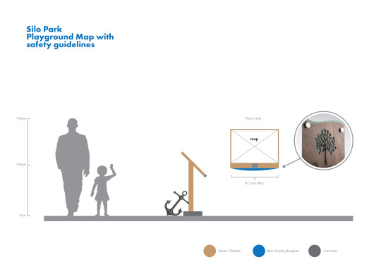
This is a map that indicates safety hazards, locations of facilities and transports as well as health and safety guidelines for parents and children at the playground. This was when we decided to conceptualise different safety signs for the map to use. Karl worked on the digital map based on this draft while I concentrated on making the main sign and safety icons/pictograms for the map.

This was another abandoned concept which was a stylised signpost that direct people. After the site visit to Silo Park in Week 1, we thought pre-existing signposts at the Park lacked in characteristics. This concept, however, did not get developed future as the map showed most of the essential locations conclusively.

0 notes
Text
Typeface choices
Choosing the right typeface is necessary before diving into planning and conceptually wayfinding options and sign designs. We have agreed that Serif types are inefficient in clearly delivering messages across the people. Whereas San-serif typefaces can be found easily in places like the airport, public transportation and signs for legibility and orientation of overall layouts, such as the space-saving design of San-serif as oppose to traditional Serif types. Here are some of the examples I have found in wayfinding. ‘


These signs are of two international airports in the world. Notice how type used for the texts are San-serif which makes them look cleaner and easier to understand. It also utilises more space where more information can be filled subsequently. It is interesting how both airports use a dark background panel with lit up signs with bright yellow LED lights. This is to enhance contrast and recognisability. Note how text comes after pictures-most western cultures read from left to right and pictograms are deliberately placed on the left before texts because we understand them faster than words.
Here are the typefaces we took into consideration.


I chose typefaces with the uniform body and weight, clean and geometric form, legible and well organised and aesthetically balanced. Our team has decided to use Futura (bold) primarily for headings and titles and Gill Sans for body texts and subheadings. We think the well balanced heavyweight stroke of Futura Bold give strong hierarchy in the orientation of texts and overall layout, while still providing with a very modernistic aesthetic and clear legibility.
Gill San has been chosen for our body text type because of its lightweight stroke with a lot of breathing space in between letters we thought it would be a great contrast to bold futura type.
0 notes
Text
Research and analysis on Signs and Colour.
From group discussion, it was evident that research on road signs and warning signs was necessary. The primary focus of this project is to address the importance of safety guidelines in a playground. We aim to help parents and kids to use the area safely and adequately, as well as introducing clear wayfinding systems to navigate visitors in Silo Park.
First We looked at various examples of signs, such as the rating system in entertainment (Video games, Films) and the road signs around the world. The initial purpose was to find out the cognitive relationship of how these signs utilise shapes and colour to convey meanings convey meanings.


As for warning/ caution signs, colours of yellow, orange and red depicted the most in the road and regulatory signs. Traditionally, the black and yellow combination in areas such as construction sites and safety hazard areas, due to its vivid contrast that instantly draws our attention. Red is also frequently used for warning and caution signs because of our instinct of recognising red in association with blood, hence potential danger.
The shape of these signs often shown in configurations with edges or rigid form. A broad border around the sign is instantly recognisable in an external environment. Icons (isotypes) and graphics often portrayed in heavy weighted strokes or fonts.

As for rating system for Video games, in this case, the PEGI rating distinguishes suitable gaming rating signs with the appropriate colours. Note how it forms a unity and consistency in the aesthetic of overall design sequences by having a uniform shape of each sign, distinguishing them only by colour and number. Orange and red were used to represent higher age groups for games with violence and sexuality and so on, while for children friendly games, the minimum requirement of age 3 to 7 has the green colour, the colour that we often associated with 'safe' and 'natural'. It is not hard to see the colour green used in positive ways as opposed to the colour red shown substantially in negative ways, for example, the traffic light. Our preconception on shapes and colours, forms and symbolism are very much the consequence of socially constructed ideas based on human cognition and psychological behaviours which we must consider thoroughly when planning our own wayfinding and sign system for Silo Park.
0 notes
Text
Silo Park research

Chosen Site: the playground area and the basketball court.
Presenting the playground and the basketball court as a way to educate child safety and parental supervision for parents and children so they could properly use the site safely. Karl and I chose this direction as we noticed the lack of vital safety signs, parental supervision guideline or an operating guide in which to instruct kids to use things safely and appropriately in the playground. Karl suggests that the basketball court could use a fence to stop basketballs from bouncing off to pedestrians and cars in the carpark. Karl has listed some potential hazard plays in Silo Park.

Important note for place making (Spatial design)- Signs and posters for physical space in Silo Park. Not actually manufacturing the physical signs and posters, however, some form of hypothetical suggestion, such as Photoshop mock-ups or sample miniature of the actual design that indicates its design ideas and usage (as well as materials for the mock-up).
For digital wayfinding system we planned to build an interactive, website based, map that works primarily as a navigation/ information guideline for locals and tourists.
0 notes
Text
Silo Park site visit
Demographics- Families, tourists, Local residence.
Location- Wynyard quarter, waterfront.
Accessibility- Citylink bus stop and the central access at Brigham Street.

Karl and I visited Silo Park and conducted initial research and observation of the area. The area was occupied by families, mostly kids and parents supervising them. First, visitors entering from Brigham Street are encountered by a metal structure on a pond, and then a basketball court, a playground and a bridge (sight-seeing) structure. A general observation from the initial response was that the park lacks in colour and vibrancy. While the playground and decorative structures have some tone, the overall colour palette of the area is grey and little dull because of silos in the background.

Wynard quarter has a close relationship with European settlements. Initially, the area was populated by timber trading which then moved on storing bulk petrochemicals in 1930′s, which enabled the region to grow substantially and became to be a hub of the trading system in Auckland.

Silo Park has six clustered silos in the park and the tallest silo, Silo 7, which is about 35 meters high, initially used to store cement. It is now frequently used for movie night events where movies are projected on the silo. Silo 6 is currently occupied as an art exhibition space where people enter and enjoy the artwork inside the silo. Based on Karl’s second visit at Silo Park, the movie night populated the area with locals and tourists. The audio was a little hard to hear, and the sun distracted the viewing, overall, the people seem to enjoy the atmosphere of the area. He also observed that people were laid back, enjoying their afternoon with families and friends, which indicates how people utilise the park.
0 notes
Text
Information Environment and Research
This project consists of developing awareness of how to shape information to suit varying physical (Spatial) and virtual (digital) spaces to create tailor-made experiences for the user strategically. It introduces core wayfinding, placemaking, and experiential design principles.
Here are some of the things I observed while watching clips introducing wayfinding;
1. Wayfinding is about putting yourself in the travellers (user) shoes. The critical point to wayfinding is about the user experience and in creating a successful wayfinding strategy, putting yourself in the end user's shoes is a vital process.
2. Make use of Gestalt theory and colour coding for organising signs. Wayfinding is deeply related to psychology and arranging information is a key to successful wayfinding.
3. Simple, precise information and visualisation for instant delivery.
4. Consider all age group, especially in public wayfinding.
Base on these observations, I have researched some excellent examples of wayfinding strategy used in real life. A group of design students at the Massey University has come up with fantastic wayfinding project for Wellington's Makara Peak mountain bike park. The students went and rode the park and conducted multiple site visits to research the area. Ultimately, they came up with a wayfinding system that navigates the user even without any prior knowledge of the park.


It’s clear to see how the students use colour, hierarchy and visuals to create this fantastic wayfinding system. It utilises colour coding for grading (difficulty of tracks), a clear indication of track navigation and instantly recognisable icons to show other vital information.

Solid and vivid colours were chosen to enhance the wayfinding in an outdoor environment effectively.

0 notes

Photo


Presenting data into a visualised form. Exploring concepts and layout, integrating bar graph with rest of the design.
0 notes
Photo


Exploring different forms of data visualisation with some annotations.
0 notes
Text
Self Reflection
I found collecting data sample little challenging as it needs to be accurate and precise. However, thanks you Youtube’s history feature I was able to track down all the videos I’ve watched during the data sampling period. Getting used to Excel and finding the right method of data visualization was particularly challenging, watching step by step Youtube video tutorials helped me a lot.
Lack of Participation and attendance in class were critical in terms of learning and gaining feedback from peers. This is No.1 thing to change. Did not attend the compulsory presentation hence no marking for participation and presentation which I’m well aware of. Need to be fixed.
Personally, I wish I was able to explore more creative ways to present data as I think my final data visualization lacks significantly in experimentation and ideas. I did try to make it look easy to read and clear to understand the complex data.
In terms of colour, I chose blue and orange, two very contrasty colour and also complementary. Used mainly for draw people’s attention. Typeface I’m using is Avant Garde, specifically, Demi and Bold, to give strong solid look, while maintaining beautiful typography of geometric San serif typeface.
I’ve found lots of things to improve on from critically reflecting on myself. I wish to do better and not repeat the same mistake again in next semester.
Phillip Kim
0 notes