#((who..needs backgrounds that would just detract from the main subjects..right..))
Explore tagged Tumblr posts
Visit Tumblr Blog
Explore Tumblr blogs with no restrictions, modern design and the best experience.
Last Seen Tumblr Blogs


Fun Fact
Tumblr is available in 18 languages.
Note
It's sad that they're trying to make Lea and Isa's duo into a trio by adding Skuld because Skuld is so underdeveloped that she barely counts as a character. All she does is hang out with Ephemer and neglect her friendship with Player. Maybe if she actually did things I'd be able to muster up some excitement over the idea of her becoming friends with my two favorite characters, but with the current situation she could be replaced with a cardboard cutout and no one would notice any difference.
Yes, thank you! This is a huge reason KH3 was such a letdown for me. I’ve heard people say that fans just got themselves too hyped up and their expectations were unrealistic. Nope, that’s not the case with me nor do I think that was the reason for most of the disappointment within the fandom. I wasn’t even overly hyped. KH3 just didn’t accomplish what it was supposed to. But more than anything, the characters were NOT treated with respect. That was my biggest disappointment.
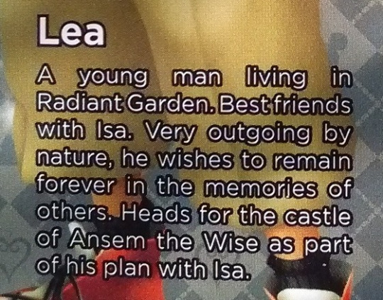
Before KH3 came out, I was actually excited about KH4 and beyond because of the fact that we now have a pretty large group of main characters and they have so much potential. We wouldn’t have to focus on just Sora, Donald, and Goofy anymore. There are so many characters to develop and they all have solid personalities. We have the Destiny Island trio, the Wayfinder trio, the Disney Castle crew, and Lea and Isa.
I have an attachment to all of them based on all the previous games and all the years they’ve been developed. I wanted to see them interact with each other once Xehanort was defeated and everyone was rescued. Not get dumped in favor of new characters. Of all the characters Lea and Isa could form a relationship with, Skuld is the WORST choice. There are sooo many more interesting characters to focus on. Lea and Isa could grow close to Sora, Riku, Kairi, Terra, Aqua, Ventus, Donald, Goofy, or Mickey! Yet, they’re getting shoved aside for Union X characters that you need to play a mobile game to be familiar with. Skuld wasn’t even included in the Back Cover movie. Even if you played all the KH remasters, you still won’t know who she is!

I’ve actually seen all the cutscenes for Union X and I agree with you wholeheartedly. The characters were inoffensive, but they all had the personality of a wet paper bag. Nomura said Kingdom Hearts X, as it was originally called, was not supposed to have a heavy focus on story. Nothing I saw gave me the impression that characters like Skuld or Ephemer were meant to be anything more than mobile game characters. They were there for the player’s avatar to interact with, to give him/her a voice, since he/she is silent. But they are ancient history and should have perished during the Keyblade War.
Ehpemer comes from the world ephemeral, meaning “lasting a very short time”. The three Norns are the Goddesses of fate in Norse mythology and are described as deciding the fates of people. Their names are Urd “What Once Was” (Old Norse “Urðr”), Verdandi “What Is Coming into Being” (Old Norse “Verðandi”) and Skuld “What Shall Be” (Old Norse “Skuld”).
My point is that these characters seem more suited as background characters. They are part of the mythology and history of the Keyblade War. They are not on par with the established characters and are not suitable to be the new protagonists. Now they are being teased as the main focus for the upcoming plot arc. I think this was a big mistake on Nomura’s part. Hardly anyone is going to be excited for them. I’m certainly not. I feel like there is very little to look forward to anymore.
You’re right. Skuld has no personality. And to add insult to injury, since she’s Subject X now, Lea and Isa had everything stripped from them in order to prop her up. Skuld isn’t interesting enough to be introduced on her own, so she has to ride on the coattails of Lea and Isa and the human experimentation subplot. This is such bullshit. New characters should NOT come at the expense of old ones. Lea needed a sad backstory as a test subject, and he needed his friendship with Isa to be properly developed so his fight at the Keyblade Graveyard felt emotionally engaging (which it didn’t).
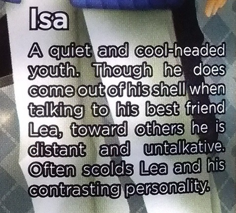
Isa needed to be Subject X to redeem him. Saïx didn’t have much of a “personality”. This was the whole point. He was never likable the way Axel was. He was rude, condescending, cold, and vicious. According to Axel, he showed no human emotion besides sneers and snide remarks. But he was Norted, for crying out loud! Saïx was not meant to be one of the protagonists. Isa was!! They threw away two amazing characters for this flat underdeveloped Union X one. Very foolish and shortsighted. it’s definitely gonna bite them in the ass.

Lea and Isa were always meant to be a duo. For some fans, it seems like only trios are valid, but that’s not true. SRK are Sky, Land, Sea. TAV are Earth, Water, Wind. Well, Lea and Isa are Sun and Moon—complementary opposites. I’ve heard people say that Skuld would be “Stars”. Well, I think Terra, Aqua, and Ven were meant to be the stars. Skuld is redundant and not needed to “complete” Lea and Isa.
Even in canon, she is a stranger to them. They spoke to her a few times in the shadows and couldn’t even see her face. She had amnesia. They literally knew nothing about her and weren’t sure if she even existed after a while, yet now their whole backstory revolves around her. She doesn’t complement them at all or make them more interesting. She detracts from them.
On the other hand, Isa definitely complemented Lea and made him a more interesting character. That’s why I liked him. He provided Lea with someone to humanize him and to give him a poignant backstory. He gave Lea a goal while becoming a Keyblade wielder. And Isa’s chemistry with Lea was adorable. Isa was sarcastic and brought out a different side of Lea than Roxas and Xion did. They also had an actual history together. They went to school together, ate ice cream, and also played with a dog. Probably played fetch with the frisbee (aww).
Lea was closer to Isa than anyone else—period. I was much, MUCH more excited to see Lea and Isa’s past and their friendship get developed than the potential relationship they have with Skuld get teased. No, I’m not excited for them to be a trio and I’m not excited for Skuld to get in the way of Lea and Isa’s friendship and make it all about her. She seemed like she fit in better with Ephemer anyways. Also, I think Lea and Isa have waaaaay more personality than Skuld. They are both colorful characters with a lot of charm. She can’t hold a candle to them.
Leo Traits
Leo is the fifth sign of the zodiac and has the Sun as its ruling celestial body. Bold, intelligent, warm, and courageous, Leo star sign is a natural leader of the Zodiac. Leo is an adventurer, seeking to balance an intense life of social obligations and travel with plenty of downtime to relax and luxuriate.
A Leo is a typical outgoing and jovial kind of person. He has a big friend circle and likes to boss around. Appreciation and admiration are the two important things for getting close to a lion’s heart. He likes to be flattered and pampered.
Skuld just doesn’t fit in with Lea and Isa’s theme. They are Sun/Moon opposites. She’s a third wheel. In KH2, Axel didn’t have a lot of development. He was clever and cocky, but we didn’t know a lot about him, especially as a human. When they decided to flesh him out, they definitely decided to make him a typical Sun personality. I thought Lea was surprisingly cheery and positive.
Caring
At their best, the courageous Leo is strong, and has an amazing, protective attitude towards their friends. They care very deeply for those close to them.
He cares very much for his friends.
Optimistic
Leo is an optimist who is able to see the silver lining to life. They are optimists who are always able to find the positive side of any situation, and they prefer to revel in the good than dwell over the bad.
Even though Axel could be quite pessimistic, Lea was a natural optimist.
Kind
They are always willing to help out a loved one in need, and they will go to great lengths to make sure that those they care about most are happy. Leos have a compassionate heart, and they tend to be extremely kind and generous creatures.
He was always willing to help stray puppies.
Loyal
If there’s one thing that you can say about Leo with certainty, it’s that they are some of the most loyal people that you will ever meet. Leo is the bravest sign in the Zodiac, often doing whatever they are required to do despite being scared or in danger.
He is amazingly loyal. He always wanted to bring his friends back, no matter what. Even when he thought Isa tried to kill him.
Straightforwardness
Mincing words is not in the nature of a Leo. They speak their mind and like to express their thoughts clearly. Frankness is therefore, one of the biggest strengths of Leos. It is because of their straightforwardness that they are able to confront opinions and thoughts, they do not approve of, directly. This is also one of the reasons why they get things done fast.
He is very straightforward. He lied a lot to Roxas and kept secrets, but that wasn’t who he really was.
Faithful Partners and Good Friends
Leos are romantic and passionate lovers. They are faithful partners and exhibit extreme sensitivity while in a relationship. This is also the reason why they are vulnerable to getting hurt. Thus, Leos need to find someone whom they can trust before they shower their love and kindness on that person.
One of the special traits found in Leos is helping friends in need. Lending emotional support to friends in difficult times is a rare quality found in these people. It enables them to make lifelong friends. Behind all the aggression, ego and other domineering personality traits of a Leo lies a sensitive heart which cares for the dear ones. Leos take pride in protecting their close ones and would do so with all the energy and wit they possess. It is observed that the bossy exterior of Leos often eclipses their sensitive nature.
He is a wonderful friend, but has a deeper side, more sensitive side. All very accurate.

Arrogance
At times, their dominance and confidence can be seen more like arrogance and conceit. Leo individuals ooze with confidence. They think that if they are the first to arrive at some conclusion, then they are right.
Lea was arrogant in a playful way. Like when he challenged Ventus to a fight. Axel was like that, too.
Inflexibility
They’re inflexible for other people, but they’re also inflexible for themselves. When they’ve made a commitment to something, they’re going to stick with it, regardless of how much they hate it.
Basically, Lea did whatever he wanted. Even Saïx said this about him.
Laziness
Though full of ambition and enthusiasm, Leo has to admit to a lazy streak and, given the opportunity, will take the easy way out, especially when a situation offers little fun or glory.
He likes to have fun.
Pride
This sign is represented by a lion, and as such, Leos are born with all of the pride and glory of the maned creature.
Oh yes, he is very proud.
Domineering
Leos have a hard time learning when to stop ruling and start listening. For this reason, Leos are extremely domineering and tend to overpower those around them.
Lea was the accelerator and Isa was the brake. Lea never listened to Isa, though.
Impatience
Impatience is one of the negative traits exhibited by a Leo. This trait of Leos get reflected in their habit to get things done fast. Impatience may lead to development of anxiety and restlessness in these individuals.
Axel never liked waiting around.
Jealousy
Leos may exhibit a possessive nature. This trait is closely related to the jealousy they exhibit. In fact, they are jealous because of their possessive nature.
Saïx was very jealous. But Lea probably had a side like that as well. He would not like it if Isa alienated him.
Cancer Traits
Cancer, the fourth sun sign of the Zodiac, has water as its element, is feminine, and is ruled by the Moon. This sign is represented by crabs, and similar to their nature, these people can be the sweetest and most sympathetic people at one moment, and turn into the most cranky and irritable ones the next.
Even though Isa was an NPC, he was not just “Lea’s friend”. He was certainly far more deserving of character development than ANY Union X character, that’s for sure. Isa seemed like he was more of a feminine archetype. Therefore, he is unlike any other male character in the series. I thought he was very refreshing and unique. He brought something new to the table. Also, based on the way Saïx acted, Isa was not just a cardboard cutout, either. He had interesting flaws to provide him with depth. Evidence suggests he was a typical Moon personality.
Moody
Cancer individuals are also known to have a moody attitude, especially whenever they are jealous. Normally protective and courageous, Cancer signed people could become very brooding and moody if they feel that their emotional needs are not being met. Cancer is all about needing emotional security and trust in a relationship, like all of us of course. But they take it to another level.
If a Cancer feels as though he can’t trust you or if he’s just an insecure guy in general, then his possessive and jealous side is going to come out in a major way. He’ll make snide comments about what you’re wearing and ask you questions about what you’re doing and who you’re with that can rival the time of being a teenager under your parents’ roof.
Man, dos this sound like Saïx or what? He was insanely jealous. While I think Saïx was a totally different personality from Isa, I still think he reflected much of Isa’s personality in him, due to having his memories and captured heart. In the novel, when Roxas was upset he pushed the wrong button, Axel said he knew what it felt like to have something be wrong and not know the reason. Based on the way Saïx acted, Isa sounded very emotionally needy towards Lea. I definitely think he’d be jealous if Lea didn’t spend enough time with him. He might be passive aggressive about it, too.
Unpredictable
Cancer, being a water sign, is very emotional and sensitive. They are very touchy, and can get hurt at the slightest provocation. It is this sensitivity, which makes them hide in their own shell, away from the world, to protect themselves from getting hurt. When they retreat into this shell, and refuse to talk to anybody, people may find them to be moody and unpredictable.
It doesn’t take much for them to go from friendly and outgoing, to totally introverted as a way of protecting themselves. And it can prove quite confusing and unpredictable to the people in their lives. Cancer needs a strong partner who can deal with his various sides and complexity. You never know what will trigger his moods and his evasiveness and his habit of being indirect makes you question if you ever really knew him.
Saïx could also be surprisingly moody and oversensitive once he began to awaken a heart. Axel had no idea why he suddenly started berating Xion and calling her a failure all the time. He wouls walk on eggshells to avoid upsetting him. It was probably easy to push the wrong buttons with Isa and he might not tell Lea what was bothering him right away. In the novel, Axel tried to get Saïx to open up to him by putting his hand on his shoulder, but Saïx brushed it away. This upset Axel and made him think how different things were between them. This said a lot about their relationship as humans. Lea had to put effort to get Isa to open up, but Isa was receptive to it.
Negative
Cancer people are ruled by the Moon, which is ever-changing, and thus they can have moods that can grow dark and darker. It’s common for people with this zodiac sign to struggle with low self-esteem and hold a lifelong grudge against someone. They are someone who sees the glass as half empty rather than half full.
Another trait being their lack of trust in people, they tend to have a negative outlook of life. They become prone to depression, and are unable to enjoy life. They can get hurt at the drop of a hat, and rarely express their resentment and anger.
I think this was why Isa felt like a burden on Lea and was down on himself a lot. Isa needed Lea to be the upbeat optimist for him. Isa was probably snarky and nitpicky with Lea, but in a more playful way. He was the brake, while Lea was the accelerator. This is also a dynamic unique to Lea and Isa. Axel had to be the mature and responsible mentor figure with Roxas and Xion. But with Isa, he was more playful and mischievous. Isa would scold Lea, but Lea never would listen.
Clingy
Cancer is a sign of fertile imagination and deep emotional needs. Cancer individuals are sometimes over-imaginative, which can get them in trouble. They will obsess over the situation until they have all of their answers.
Cancerians are very possessive about their relationships. They can be very clingy, and try to hold on to relationships, even after they have ended it. In relationships, they give much more and expect very little in return. Being emotional and sensitive, they are very easily influenced by their loved ones.
Yep. This is exactly how I think Isa was with Lea. Isa was very attached and gave his whole heart to Lea.
Suspicious
The empathetic crab is inclined to protect themselves. They only trust when they feel safe within relationships, often resorting to their inner world when they do not feel trustful or safe. He needs his moods and anxieties to be understood and if they’re not then he will retreat to his shell and come back out when he feels safe.
Definitely sounds like Isa. He was shy and couldn’t open up to just anybody.

Cancer Traits
Cancer star sign, the fourth sign of the zodiac is all about home. They are a nurturing and maternal sign. These people love their home and family more than anything else in this world. Cancerians are blessed with strong intuitive and psychic powers that help them judge people well. These people tend to be hard on the outside and soft inside. But they also have a tougher side to their personality.
So, Saïx exhibited all of the typical Cancer flaws. So, it stands to reason that Isa would also exhibit Cancer’s positive attributes, too.
Intuitive
Cancerians are known to be psychic, and can almost guess things before they actually happen. This comes from their highly developed observational powers. They can truly understand human behavior, and rarely forget things. All these make them highly intuitive and psychic.
This is a side of Isa we definitely never saw in Saïx. His scar is on his third eye chakra, which is the center of psychic awareness. It’s why he couldn’t see Xion or understand why Axel acted the way he did. It’s sad actually. A big part of his personality was shut down.
Kind
Emotional strength and intuition will always define Cancer’s top strengths and traits. This is emotional, but kind-hearted and compassionate personality type that makes for an outstanding friend.
I’m sure Isa was very kind and a wonderful friend, which is why Axel was so desperate to have a “best friend” to fill the void.
Emotive
Cancers are known for their traits like loyalty, their emotional depth, and their parenting instincts. Cancer individuals are emotional and intense; they are also extremely intuitive and compassionate. People belonging to this zodiac sign are highly emotional. Just like the crab that represents them, they are hard from outside, but very soft and mushy from within.
Isa scolded Lea a lot, but only because he cared. He was compassionate and selfless, like the Moon Rabbit. If there’s anything KH3 got right about Isa, it’s that he’d try to comfort an imprisoned girl and want to help her.
Faithful
Cancer is the most concerned with a secure and faithful relationship. Cancer individual loves home and family and is not happy unless they have deep emotional ties. Cancer is usually very nurturing and tends to take good care of everyone they care about.
Isa was serious when he said he’d never forget Lea. I definitely think Isa was the one who first gave Lea the WINNER stick, too.
Loving
Cancer individuals are very loving and caring. As the most sensitive sign of the zodiac, a Cancer does everything with love in mind and in the heart. Because of this, they are the most tender lovers.
Yes, I do think Lea and Isa were envisioned as a couple. Isa loved Lea. His Bunnymoon weapon has a rocket being launched by a heart. Lea also loved Isa, and this is why Axel was so depressed whenever he thought about how different Saïx was compared to Isa. Axel desperately missed feeling loved by someone. They had an extraordinarily interesting relationship. I don’t think Skuld adds anything except getting in the way and watering down their bond.
18 notes
·
View notes
Text
1.
Two weeks ago, my sister decided to cut her shoulder length hair to a number 2 buzzcut. As a woman in her early 20’s with few formal responsibilities, this haircut was simply a way for her to take authority over her appearance and celebrate her youth. Whilst she knew that people’s responses would be polarised, she wasn’t expecting how attached other people had become to her old hair. Comments such as “oh, but she had such lovely hair” and “why did she go so drastic” have been frequent from family friends and neighbours and have left me wondering what hair really does mean on a person. Whilst it’s clear some of these viewpoints come from more conservative understandings of femininity and others merely come from the shock of a big change, I have become astonished by the significance people attach to the hairstyle choices of other people.
My sister’s decision to shave her head stemmed from her dislike for the inconvenience of having longer locks. Personally this is a feeling I cannot relate to. For as long as I can remember I have desired Rapunzel-esque flowing lengths of hair. As a child I was jealous of anybody and everybody with a few extra inches than me. I longed for the day that my hair would be comparable to the waist-length manes of the dolls I played with and women I watched on screen, and as embarrassing as it is to admit, I still to this day sometimes find myself comparing the length of my own hair to those around me. Whilst this desire for long hair may have initially been a result of social conditioning and the feminine ideals I have been brought up to emulate, the attachment I now have to my long hair is for the strength I feel it gives me. As I have grown, so has my hair; its structure withholds information from each year that it has been attached to me. Whilst it has an attachment to the past, I see my hair as a reminder for how much has changed and how much will continue to change and that i will also grow and evolve alongside it. Where I gain confidence from having a long mass of hair, my sister has found a new confidence with having very little. Describing what these past few weeks have been like, she told me that there is a particular vulnerability without having the security blanket of hair to hide behind. Often our hair detracts some of the focus from our face, thus can feel like an extra layer of protection. With that added layer gone she has found herself to become more comfortable in her natural state and thus has gained a new confidence in not needing that added barrier. For much of human history, long hair had been adopted by people in positions of power as it provided a visual representation of their wealth and higher status. In many cases authoritative figures have forced those beneath them to cut their hair in order to reinforce the sense of power and ownership they hold over them. In other cases, most noticeable within the skinhead subculture emerging in London in the 1960s, people chose to shave their heads in an expression of their rejection of austerity and conservatism. Hair length can provide such a strong sense of empowerment depending on the context it is in; I find it intriguing that these two opposites (long and short) can in essence provide the same feeling for the wearer. Each of these examples of strength are dependent on the wearer having autonomy over how they chose to style their hair; I think there is an interesting concept within what people intend their chosen hair length to represent and how it is really seen by others. There is also the exploitative side to the history of hair length. Within this there could be a valuable study on how important hair is for the expression of self identity and the consequences of this being denied or taken away from an individual.
We cannot view hair now without applying a political connotation to it. Even if it is unintentional, the way we present our hair has been politicised to such an extent that it is now an inescapable inevitability. Hair has been such an integral way in which people depict their race or ethnic background, religion, their sexuality, their political leanings, their age, gender, the music they listen to and so on. As a gay woman, an assumption she recieved in response to the cut was that she had done it to “look more gay”. Whilst hair can be and often is used to illustrate a part of someone’s personality, these damaging stereotypes reiterate the misogynistic beliefs that remain in the way society views women’s appearance. Unfortunately these assumptions between hair length and sexuality have not changed much over the past sixty years. In an interview Simon Mayo did with Bruce Springsteen for BBC Radio 2’s ‘Drivetime’, Springsteen describes the attitudes of America when the Beatles brought the long hair trend across the pond in 1964: “they thought, you know, are you gay?... That's what my father asked me, you know, when I grew my hair like an inch, and he wasn’t kidding”. Whilst western society has strict customs for the lengths acceptable for each gender and sexuality, they haven’t always been the same, thus making each one entirely arbitrary. It would be interesting to compare these regulations from across history to find where each of our supposedly inflexible rules for hair have come from. On top of this, I would be interested to know how hairstyles may have been used as a form of secret messaging. Much like earrings being worn on the right ear of homosexual men were utilised to share a message only with others who knew about the code, I wonder if, and how, hair has been used through history on the subject of showing sexuality through code. Another form of identity shown through hair can be race. Braids have been an important part of many African cultures. Thought to have started with the Himba people of Namibia, different tribes have since continued to create different styles of braids. Through different traditional styles, braids could indicate a person’s tribe, religion, wealth, marital status and age. When the slave trade was initiated by Europeans in the early 16th century, one of the first acts of exploitation was shaving off their prisoners’ hair. This removed all indications of cultural identity as depicted through hair and reduced slaves to just one character. Racism towards people of colour did not end with slavery and hair, whether worn in a natural afro style or in braids, has frequently been used as a reason for descrimination. Due to this troubling history, the appropriation of these styles has been especially problematic and is an important aspect to look into on the subject of politicised hair.
Other assumptions we make of people's personalities through their hair comes from its colour and texture. Literature has long used the metonymic description of hair to help inform the details of a character’s whole personality and behaviour. As Susan J Vincent notes in Hair, An illustrated History, ‘Jane Eyre’s brown tresses are neat and unassuming, their wayward potential smoothed and disciplined; Blanche Ingram’s are a showy raven-black, glossily curled and becoming; and the insane, bestial Bertha Rochester gibbers in her attic under ’a quantity of dark, grizzled hair, wild as a mane’. From these simple physical descriptions we are encouraged to assume that these women are three wildly different characters. Indeed we do make uneducated judgements about people’s personalities solely from the appearance of their hair. Medical practice from the middle ages included the study of the ‘four humours’: blood, phlegm, yellow bile and black bile; with this style of medicine, it was believed that physical features showed what was happening with these four elements inside the body. Along this school of thought it was also believed that specific bodily features related to different psychological traits and hair was used as one of the main indicators. With this practice, many stereotypes were formed about the characters relating to different hair, and many of these remain today. In 1796 a ladies’ almanac created a guideline for the moral qualities relating to some hair types. The examples it gave were that “black smooth hair in both men and women denotes mildness, constancy, and affection, whereas black curly hair indicates inebriety, a quarrelsome temper and a nature inclined to amorousness. In men, long red hair ‘denotes cunning, artifice, and deceit’, and in women, a glib tongue, vain nature and ‘an impatient and fiery temper’”. Whilst we may not exactly follow these associations today, we still allow stereotypes to colour our judgement of people’s appearances. With depictions of Venus, the goddess of beauty, love and fertility, emerging from the water with cascading fair hair, the connotations of purity with blondes has been well rooted in our society. Following the theory that ‘blondes have more fun’ a research paper in 1997 by psychologist Dr Tony Fallone writes of the blonde psychology, stating that “blondes equal innocent, fragile, youthful, cool, chaste and ultimately sexy, kittenish and irresistable- not a colour, then, but a state of mind.” Red hair has received similar regard in terms of the character it represents, however rather than any connections to godliness, it has long received the most prejudice. The first hair dyes created were advertised for people with grey or ginger hair. In 1254 St Louis King of France ordained that all prostitutes must dye their hair reed, automatically connecting the colour with sexual behaviour, however in the middle ages, redheaded women were considered to be witches and were executed. By the end of the 1800s red hair had been praised so highly through literature that it became a symbol of rare and natural beauty. These examples prove the importance people have held throughout history on hair reflecting internal attributes, a focus that still remains to a certain degree in our judgements of hair today. This too could be a rich topic of research to consider.
2 notes
·
View notes
Text
Why Bojack Horseman season 5 was disappointing
So it ends with a car slowly disappearing into a tunnel. The driver is probably just as confused about her motives as I am in that moment. The music plays, the camera zooms out, the credits roll, the curtain falls. And here I am, feeling more conflicted than I’ve ever felt before about a piece of media.
By now it’s well known what kind of heights the Netflix show Bojack Horseman can sore to when it’s in its element. This show is truly something special. I’ve never seen anything that can touch me, delight me and, at the same time, depress me the way this show can. Catch me at the right time and you might even hear me confess to this being my favourite show of all time. So rest assured that everything I’m about to say I say out of love, and because of the incredibly high standards the show has set for itself. That being said, I do think my complaints are legitimate, and there were enough serious shortcomings to make me feel very disappointed in season 5.
According to many, Bojack Horseman had kind of a rocky start. Looking back at the first few episodes I think they are decent enough, but they’re certainly not representative of what the show would become known for eventually. But we didn’t have to wait very long to see a drastic increase in quality, which kept on going until the season 3 finale brought it to a preliminary climax. I still think season 3 is the strongest one overall, though the highest highs probably occurred in season 4. And then there’s season 5, which is the first time I feel the quality has dropped significantly. Worse, it detracts from previous seasons by putting certain moments in a new, quite unflattering light. But we’ll get there.
Themes of Ruin
The first thing I have to talk about, and I just have to get this out of the way so please bear with me, is feminism and my intense dislike for it. A lot of people when they hear this still think that I feel this way because I have a problem with women’s rights. Nothing could be further from the truth though. If feminism was just a women’s rights movement I’d have no problem with it. But it is way, way more than that. Feminism is an ideology, that brings its own ideological lens to the table. When viewed through that lens the world turns into one where society is dominated by an all encompassing power structure called the patriarchy. Men and women are related and locked together by a massive class struggle, although some more modern strands of feminism hold that men are just as much puppets of the patriarchy. The patriarchy, then, is the source of all the world’s social ills, and puts upon us a moral obligation to overthrow it in some kind of world revolution. Worse still, feminism in recent decades has become more and more anti-science in an attempt to discredit scientific explanations for social ills that they attribute to the patriarchy. It’s gotten to a point where the whole concept of the scientific method is under attack from academics who bought into this world view. I’ve written about this before, if anyone’s interested. All of this makes it impossible for me to view feminism as anything but a nutty conspiracy theory, akin to the kinds of things the alt-right movement would say about Zionism.
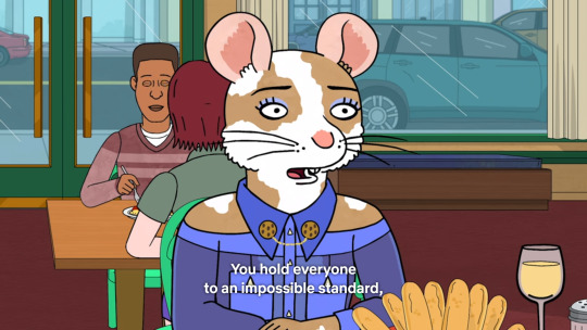
So to make the character of Diane Nguyen a feminist was always going to result in an uphill battle to make me lik her. Again, if this confuses you: imagine if she’d been a white supremacist instead, or some other kind of ideologue which would be completely disgusting to you. Imagine if instead of going on about the patriarchy, she went on about the conspiracy to commit genocide against white people, organised by a shadowy group of Zionists. That’s what it feels like for me. No matter how sympathetic the rest of her character is, her spouting that bigoted nonsense from time to time was always going to be a mark against her. And yet, amazingly, for four seasons the writers did make me like her, quite a bit actually. She was shown to be a caring, principled person who held herself to very high standards. While she had her flaws, she also seemed acutely aware of them. So much so that her season 2 arc revolved entirely around her hiding away from one of her failures out of shame. This season however her dark side just can’t be ignored anymore, because it’s intrinsically woven into the entire theme of the season. And the Diane that it brings out is one that the show is trying to frame as an improved version of herself, but honestly she just seems like kind of a bitch to me. But I’ll get back to Diane’s character this season in a moment. First I want to start with some of the more minor annoyances.
The Road to Nowhere
Throughout season 5 of Bojack Horseman I continually felt like I was waiting for something to happen, like the show was promising me something but dragging its heels to get there. I think the main reason for that is that nothing this season really got resolved, and some promising plot lines were barely explored. I know a lack of resolution is kind of Bojack Horseman’s thing. Life doesn’t suddenly end with a credit roll; it just keeps going even after what you think is a happy ending. The creator of the show, Raphael Bob-Waksberg, has stated that he doesn’t believe in endings. A bit of a worrying statement, since Bojack does have to end one day, but it has worked so far. Here’s the thing though: Bojack Horseman is not real life; it is a tv show. As such it needs to keep to a certain structure to tell an effective story. If you want to show something resembling real life that’s fine, but do cut out the dull bits please. We get an entire arc of Princess Carolyn looking for an adoptive child which seemingly gets resolved at the end by.... her adopting a child. Maybe it’s just me, but that feels way more like the beginning of a story than any kind of resolution. We get some interesting backstory about PC during her search, but the whole things ends up feeling like padding. Certainly nothing that compares to her arc in season 4, where we see her go from heaven to hell in the span of several episodes.
Bojack himself this season doesn’t seem to go through any kind of character growth either. There are no moments of revelation that give him and us more insight into his tortured soul. Everything we see of him we knew already, and all the problems he faces are ones that get introduced right at the beginning of the season, to be seemingly resolved at the end. Again, I will get to the ludicrous season climax in a moment, but as for the main character of the show: it seemed like the writers were either disinterested in him or really had no clue where to go with him next. Bojack kind of disappears into the background altogether during much of the season, since most of the other characters get way more development than he does. We do get some interesting interactions between him and Hollyhock, but that doesn’t really go anywhere either.
Mister Peanutbutter’s arc is actually kind of interesting and I have no major complaints about that. Todd on the other hand is probably one of the biggest missed opportunities in the show so far. His asexuality, and the problems coming with that, are barely explored. When Todd first came out as asexual I was a little disappointed I have to admit. I saw Todd as someone who was just really shy about sex, even though he had a healthy social life in most other respects. I saw a lot of myself and my own complicated relationship with my sexuality in Todd because of that, more so because there just aren’t any characters in fiction which represent that side of me. So when that turned out to be wishful thinking on my part, for a moment it was quite a letdown. But hey, the show doesn’t have any obligation to cater to me specifically, and it’s true that I’ve never seen an asexual character either so this could be quite interesting after all! Or so I thought.
In reality the issues surrounding asexuality barely get a mention. I don’t know any asexual people, so I can only go on what I’ve heard. My understanding is that most asexual people are indeed interested in romance, but finding someone who will be there for them, with which to form an emotional bond and a life partnership, but who at the same time is okay with never having sex with them, is quite hard. In fact, it’s something that a lot of asexual people really struggle with. I was a little disappointed that none of that really came into play in season 4, but it seemed season 5 was going to remedy this. As it turned out we get only a few brief moments where its mentioned that asexuals shouldn’t date each other just on the basis of both being asexuals and that’s it.
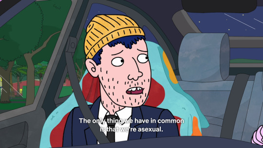
The rest of the time Todd doesn’t appear to be struggling with it. In fact, he doesn’t really seem to need any kind of genuine human connection at all. That’s fine for a comic relief character, which is how Todd spends most of his time, but if you’re going to tackle a serious subject like this then don’t half-ass it. Hell, Emily seems to struggle with it a lot more than Todd, even though we have seen that Todd does have feelings for Emily. All of the above is mentioned at one point or another, but we never see the consequences play out the way we usually do on this show. More time is spend on the social stigma surrounding asexuality than it is on actually living with it. Maybe season 6 will finally go deeper into the nitty gritty, but if so it remains just another thing that this season sets up only to do nothing with.
Diane
As the final episode of season 5 ends we focus on Diane driving a car. It’s a departure from previous seasons where we would focus on Bojack in the final moments, but it’s a fitting one since season 5 was much more Diane’s story than it was Bojack’s. It’s also a departure in another way, namely that I have no fucking clue what I’m supposed to feel while watching this, nor what’s supposed to be going through the head of the person I’m watching. Diane is probably the most prominent victim of this season’s smothering theme. Normally a theme should strengthen the material by binding everything together in a package that’s greater than the sum of its parts. But as previously mentioned this season has a strong feminist bend, and one of the stated goals of feminism is to make the personal political. As such, everything having to do with it is swallowed by the political message it’s trying to get across. At least, that’s what it seems like. With Diane we start out observing a woman who is trying to cope with her recent divorce. This was the obvious angle to take of course after season 4, and certainly one with a lot of potential. I really felt for Diane as she had to struggle with her newfound poverty, both in her love life as well as her, well, actual life. In episode 4, titled BoJack the Feminist, it all comes to a head for the first time however, beginning with the following stupid line:
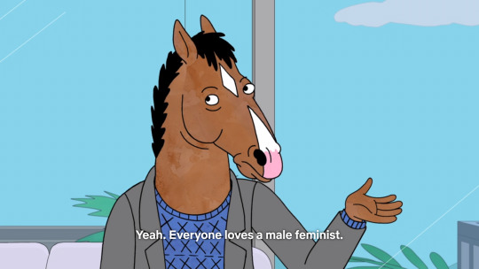
Who? Who loves male feminists? As far as I can tell they’re one of the most despised groups of people populating the political landscape. Obviously anti-feminists loathe them, often even more so than their female counterparts. But judging by the portrayal of every man claiming to be a feminist in this show I doubt even the person who wrote that line holds them in very high regard. I would think that someone trying to write political satire would at least have to be grounded enough to know something like this. During this scene we are also subjected to the following tired cliche:

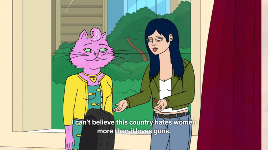
One would think that by now everyone knows this simply isn’t the case. It’s not like feminists have never tried to broaden their appeal by finding a man to speak for them. As it turns out this never works. Because the world in which a man’s word is taken so much more seriously that it’s the only way to get a message into the public consciousness, that world exists only in the heads of the most devout feminists. The only way to still be clinging to this notion is by completely ignoring reality. As it happens that’s exactly how it goes, and time and again I have to sit through another incarnation of a feminists “brilliant” “new” idea of: “hey, what if we let a man say it?!” I’m sure every time this happens the person in question thinks they’re the first to come up with it and thinks themselves very smart indeed. I don’t know how they respond when it fails yet again, but I doubt we’ll see any introspection on it from the writing staff in season 6.
In any case, this episode was probably the most annoyingly feminist one out there. We get the conformation that Diane also buys into the behavioural psychology side of the ideology, with her whole “media normalising the wrong things” shtick. It’s quite a worrying thing to me that the writers themselves seem to buy into this as well. There is a fine line between weaving a message in your art and making soulless political propaganda. If you care more about the message your art gets across than the quality of the art itself, as Diane appears to do, then it becomes damn near impossible to stay on the right side of that line. Last season there were some signs of this already, when we got the amazingly ridiculous Thoughts and Prayers. It made some interesting points about women and gun ownership (an argument straight from the NRA as it turns out) but ends in a spectacularly ridiculous fashion.
This after the Californian state legislature just passed a ban on all guns after a woman committing a mass shooting, described by PC as “sensible gun legislation” after a whole episode of arguing why gun ownership might be a positive thing for society in some cases. I can’t believe the Bojack writers are that cynical about the motives of gun ownership advocates. I really don’t know what they hope to achieve by knocking down such a clumsily constructed strawman either. In any case, besides the obvious bullshit conclusion the episode itself wasn’t that offensive to me, unlike BoJack the Feminist which wears its biases on its sleef.
The next big development in Diane the soapbox straddler’s journey comes in episode 7 called INT. SUB, where we get this bit from ms. Nguyen:
Admittedly Bojack spends most of this episode being a huge dick, so a verbal slap down was probably the appropriate response here. One might be tempted to brush off this comment as Diane just being angry, and rightfully so. But the way it’s framed it comes across like Diane is supposed to be speaking some hard hitting truth. She’s not though. We’ve been with Bojack for 44 episodes by this point and the changes have been so gradual they’re sometimes hardly noticeable, but they’ve been there. Bojack went from someone who did nothing but keep Todd down to being genuinely supportive of him when he admitted to being asexual. Yes, there was this one episode where he almost helped Todd launch a music career, but I always interpreted that as him trying to impress Diane. He went from someone who would turn down everything he got offered for the flimsiest of reasons to doing a show he knew nothing about as a favour to PC.

He went from someone who cared about no one but himself and his own misery to someone who genuinely cares about the well being of Gina, his costar. He went from someone who pushed everyone away to someone longing for the company of his sister, who he clearly cares about very much. Can you imagine the arsehole of early season 1 doing any of that? So Diane’s comment appears very misplaced and mean-spirited. With some different framing this whole situation could be about unfairly judging someone’s past. Of course we know the show is definitely not going to go there; it railed against forgiving public figures, that is men, for past transgressions just three episodes ago. Anyway, the point is that I can understand Diane saying it in the heat of the moment, but why does it seem like the writers are agreeing with her?
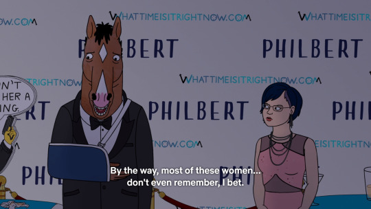
Here we come back to the crux of Diane’s arc in this season. The reason she inflicts her feminist side on us so much is not because it’s in service of any kind of character development. Her arc should've been about her standing on her own two feet again after the divorce, like it seemed to be at the beginning. Instead somewhere along the line the writers decided to make her the mouthpiece of the message this season is trying to send, thus making her character subordinate to political considerations, just as I feared. This is expressed most clearly in episode number 10, Head in the Clouds. Bojack and company are at the premier of their television show Philbert when Bojack is asked to say some words to the waiting public before the screening. Since he has nothing prepared and his head is at a totally different place at the moment he mutters some lines which barely make any sense.

They are enough to set off Diane’s righteous fury however and after the screening she first confronts Flip, saying that she “screwed up”.

The idea is that she thinks because people will identify with Philbert they will rationalise their own awful behaviour. So what we learn here is that Ms. Nguyen, despite her lecturing about media and how it influences people, doesn’t actually understand the first thing about how art interacts with the human mind. The big problem with most human beings is that they tend to overestimate their own goodness. This is not my observation, in fact it’s widely known among folks who study this sort of thing. The best way art can shape us into better people is not by being purely didactic, that is, trying to teach us what’s good and what’s bad. People above the age of nine are not going to absorb that message. Instead, what a piece of media should aim to do is try and help the observer become aware of the darkness in their own soul. The best way to do this is to make them identify with a character like Philbert, make them feel what he feels and then show them the shitty things he does because of it. And everyone feels vulnerable at some points. Everyone, even the biggest arseholes. So when you show someone like Philbert doing something nasty, and the viewer is seriously questioning whether or not they’d be doing the same thing in that circumstance, then you’ve written something successful. Then you’ve written something that can truly affect people for the better.
Of course all of this is completely lost on Diane who, after getting nowhere with Flip, goes to Bojack and confronts him with his earlier statement. She tells him that the point of Philbert was never to make him or anyone else feel okay about what they’ve done. She says she doesn’t want anyone to justify their shitty behaviour because of the show. Naturally Bojack asks her what the hell her problem is, so after some back and forth she confronts him with the tape describing what happened between him and Penny in New Mexico. The situation escalates until Diane starts berating him about what happened with Sarah Lynn. The fight ends with the apparent end of their friendship.
I hate everything about this whole scene. It fact it might be the whole reason I decided to write this. It’s downright uncomfortable to watch at some points. That probably was the intention to some degree, but it’s uncomfortable for all the wrong reasons. I don’t feel “confronted” by anything. Rather I weep for what the writers have done to Diane. This scene feel’s like a bully kicking their victim while they’re down. I’ll talk about the whole Penny and Sarah Lynn thing in the next part, so let me just say here that I don’t understand what Diane is hoping to accomplish with this. She asks Bojack if he feels bad about all the things he’s done, and he admits he does. He does try to excuse it.
But after receiving no sympathy he goes on to claim that he is the real victim, because he has to live with this shit. Whether or not he really means it or is just trying to upset Diane is unclear. What is clear that Diane’s approach is entirely unproductive. Bojack becomes more and more defensive as she becomes more aggressive and unsympathetic. I would also like to know who all these women are that Bojack has wronged. It’s implied that Bojack doesn’t care about their feelings as long as he feels sorry for himself. Diane’s scrutiny isn’t exactly not making him feel sorry for himself, in fact it has kind of the opposite effect, but it’s also hard to sympathise when I don’t give a shit either. Who are all these women? What has Bojack done to them that was so horrible? Again, we’ll get to Penny and Sarah Lynn in a second, but I almost get the feeling that the show is trying to shame Bojack for having lots of casual sex. You can say that’s not exactly a good thing, but it’s not something that he does to other people. Sex, believe it or not, is still something that two people do together under most circumstances. I’m not going to feel sorry for all those vapid starfuckers for getting exactly what they were after. Even in the case of, say, Emily I don’t think he owes her any apologies. He certainly did to Todd for sleeping with the girl he was infatuated with, but then I don’t remember Todd being particularly upset at any of those firemen either. Emily could’ve just said no and that would’ve been the end of it. Instead she decided to approach Bojack and sleep with him.
The fight culminates in Bojack confirming her earlier accusation.

Which we already know isn’t true. After all, what is the point of this whole damn tv series if we didn’t see Bojack change at any point. But the writers put these words into his mouth not because it is in line with the character development we’ve seen so far, but because is serves the message. This season is about confronting powerful men with their awful behaviour, so Diane has to become belligerent to Bojack to confront him, and Bojack needs to tell us she’s right for doing so because he’s learned nothing. Screw you if you’ve become invested in his growth as a character. You’re no different from those who get invested in Philbert and cheer for him, even though he’s awful. That’s what I mean when I say Diane’s just become a mouthpiece for the writers. This scene is to show that Bojack is one of those awful powerful men that needs to be confronted, and the fact that it’s Diane doing it, the same person responsible for making Philbert “too likeable” says something about what the writers think about their main character. One gets the distinct impression that the earlier quote from Diane about Philbert is exactly how they think about Bojack. Given that, who do you think the people who excuse their behaviour because of Philbert are supposed to represent? Why do you think this season is so concerned with teaching us about how media normalises things? What we are watching is the writers confessing to realising how many people like Bojack, and them being afraid their audience is too stupid not to idolise and emulate him. So it has to be more obvious that Bojack is the bad guy, and believe me: they will make it very obvious in the next episode.
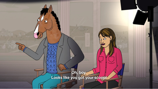
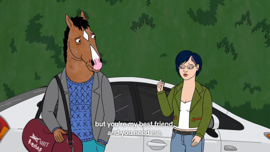
But first to wrap up Diane’s... I guess we should call it her “arc”. After angrily leaving the premier with her ex-husband she tops off the night by sleeping with him, despite his new girlfriend. Two episodes later it happens again. During the whole process she explodes several times about how bad it makes her feel, which prompts Mister Peanutbutter to ask:

Which she shoots right back at him. His answer is clear: because he loves her. But we never get an answer from her, and frankly: I would like one. It completely baffles me why she would do this. If her arc would’ve been more about her divorce perhaps this could’ve been explained. But as is it’s a shocking piece of hypocrisy that never gets addressed.
She does mention being a hypocrite and not knowing what she’s doing later on, but naturally there’s someone on hand to excuse her, since she isn’t a man.

Here Diane shows some much needed introspection, but she doesn’t really go into any specifics. What’s more, the final conversation between Bojack and Diane doesn’t even reference any of this. In fact there is no reason given for why she’s helping him beyond a simple “eh, we’re still friends”

What she should’ve said of course is that she realised she can never expect to truly forgive herself if she can’t also forgive him. All the pieces were in place, and it would at least have given all the previous scenes I talked about some kind of point. The execution would still have been awful, but at least I wouldn’t have to use quotation marks around the word arc. But no, we can’t have the author insertion character come off her moral high horse, no pun intended. She just has to do it because she is such an awesome friend.
So yeah, bit of a mess this character. I can almost discern the contours of a logical character progression, probably as it was originally intended. All the ideas were there: her being confused about where she stands with Mister Peanutbutter, being confronted with her own insecurities at the same time, and Bojack trying to get her to play ball with his shitty schemes and her finally putting her foot down. But Bob-Waksberg has admitted that changes were made to the story after they decided to play into the #metoo controversy going on at the time. I wonder if those changes involved sacrificing some parts of Diane’s arc, to give us the mangled corpse of a character arc that we see here.
The Whole Penny and Sarah Lynn Thing
The two main things thrown at the feet of Bojack in the fight with Diane are his involvement in the death of Sarah Lynn and his almost having sex with the daughter of his old friend. Let’s start with the more justified one. What happened between him and Penny was that Bojack, a way older man who should’ve known better, gave in for a moment to the avances of a seventeen year old girl and might have done something with her if her mother hadn’t walked in. Now, I can fully understand why Charlotte would be very angry about this, and why Bojack feels guilty about it. After all, he found something out about himself which wasn’t pretty. But what I never understood was Penny’s reaction to all of this. Specifically the moment in what is probably one of the most profound episodes of the whole series, That’s Too Much, Man!, in which they go to her college and Bojack almost literally stumbles into her. Her reaction to this is... quite bizar. She acts like a traumatised child stumbling into her abuser.
Keep in mind that this happened just last season. So how old is Penny now? Eighteen, maybe nineteen years old? No one says this about themselves just one year later. Never mind the fact that seventeen does not equal little child, I don’t buy that Penny had such a sudden leap in maturity. Maybe if it was ten years later and she had a lot more sexual experience, enough to know that sex can be a completely unromantic act to satisfy some urges sometimes. When she looks around and sees some seventeen year olds, and suddenly realises how young she was at the time, and then she realises she was taken advantage of and feels disgusted? Yeah, I’d buy that. But this is just nonsense. I thought so at the time as well, but I supposed it wouldn’t fit into the story line if we’d had to wait ten years for the revelation. What compounds it is this simple observation by Bojack himself.

And he’s right about that. Nothing actually happened. Sure, there were probably some exceptionally uncomfortable conversations between Penny and her parents afterwards, but I get the impression they worked it out between them. So at most I would expect Penny to look upon Bojack as a rather disgusting old man who she once, in a fit of youthful naïveté, felt attracted to. But this whole trauma angle stretches credulity. I was willing to put up with it as long as it was just another thing to weigh on Bojack’s conscience. The way he saw the incident up to this point was way more important than how it actually happened. After all, only he knows if he really would’ve gone through with it, or at least he thinks he knows. But now, because of the meta-commentary at work here, we as the audience are being scolded for not caring enough about Penny’s feelings by still rooting for Bojack. I’m sorry, but that’s where I draw te line. The reason I don’t care is because what you’re telling me makes no sense, and that’s not my fault.
On a side note: I do find it a bit rich that Diane essentially chastises Bojack for presumably intending to have sex with Penny, when in season one she was singing a rather different tune.
Whether you agree with that or not (I happen to think there’s a bit more to it than that) you have to acknowledge that it works both ways. Maybe Bojack is convinced deep down that he is capable of something like that, but until he actually does we’ll never know, and all we can judge him on are his actions. His actions don’t include sleeping with a seventeen year old girl. I wonder where the writers of season 5 stand on this, and if they realised this character inconsistency. Then again, I think we already established they didn’t really give a toss about Diane’s character this season.
Sarah Lynn then, the drug addict who overdosed on Bojack, thanks to Bojack. Or so we are led to believe. The truth of the matter is a lot more complicated I think. The only thing that Bojack bares the full responsibility for is him calling her up and asking if she’s up for going on a bender. Yes, that’s certainly not the most responsible thing to do, but she’d already revealed to Bojack she was fully intending on going back to doing drugs anyway. So let’s unpack the accusations regarding Sarah Lynn one by one.

So how was that his fault exactly? We see in one episode that her mother was right there on set with Sarah Lynn all the time. Sarah Lynn isn’t and never was his responsibility. The guilt he feels over that was more because of his inaction, which is understandable. Maybe he could’ve helped her, maybe not, but he probably should’ve tried. But when the only father figure in her life is an actor she works with then something has already gone terribly wrong, and not because of Bojack. The real reason it eats him up is probably because he cared about her and because he likes himself much more as a jovial dad than the grumpy washed-up celebrity he became, not because his actions led her to growing up the way she did.

When did that happen? Sarah Lynn never came to him for help. They accidentally ran into each other and after a little incident he immediately checked her into rehab. She refused to stay there though and came to Bojack to ask him if she could crash at his place. That’s the story, morning glory.

You could say it like that. Or you could say that she had sex with him. What’s the difference exactly? That Sarah Lynn was a washed up star, and addict who had a really rough childhood? All of that also applies to Bojack. Sarah Lynn wasn’t some wide eyed, innocent, naive, young thing. She was a grown woman in her thirties. Yeah, her and Bojack probably weren’t good for each other, but she came to him, remember? I can’t for the life of me think of a way of looking at this where Bojack was the one doing wrong to Sarah Lynn and not the other way around. Surely we aren’t supposed to think it’s because Bojack’s a man and Sarah Lynn a woman, right?

She seemed awfully eager to abandon her sober streak though. She lived in a house made of drugs with bottles stacked behind her calendar. Besides, as I said before, according to her she was planning on doing drugs again eventually.
But I get your point Diane. Maybe without Bojack this wouldn’t have happened. Maybe without Bojack she would still be alive. In any case it was pretty reckless of him to do that without any regards for her safety. So, where were her regards for his safety? Remember, he was an emotional wreck when he called her, and she didn’t give a damn. Under similar circumstances Bojack insisted she go to rehab, but she immediately agreed to take him on a bender and didn’t suggest to stop even when he started having severe blackouts. What if Bojack had died instead? Would Diane be giving this speech to Sarah Lynn now? Again, clearly these two weren’t good for each other, but I don’t see how Bojack was so much more responsible for this outcome than Sarah Lynn herself. How are “his actions” solely to blame for this? They were two damaged people doing stupid things together. Should he now feel guilty over having better luck than her?
Well yeah, Diane. What are you, some kind of psychopath? Of course it was rough for him. He was there and could’ve stopped it, but he failed her and so his friend died. That would be very rough on anyone, and especially on someone who is already emotionally crippled. This is what I mean when I say Diane really comes across as a spiteful bitch in this scene. Can you imagine rubbing someone’s face in their friend’s death, even when you’re angry with them? I sure can’t.
In the end I think it’s a good thing for the show that Bojack isn’t actually as horrible as he believes himself to be, or as this scene is trying to imply for that matter. Bojack is an arsehole, sure. He does stupid things sometimes, he does things that hurt other people. But generally those people choose to associate with him, and we see the sometimes twisted, but relatable rationale behind his actions. It’s a good thing that Bojack retains a certain degree of likeability that keeps us rooting for him. If not I probably wouldn’t have watched the entire show up until now. These two incidents were the most shocking ones that happened before this scene, and although we’ve been told before that Bojack is not the good guy of the story, the writers clearly haven’t dared making him the bad guy either. In the end they know what they’ve got with him. Even the climax of this season, although probably even more shocking than anything that came before, they didn’t pull of without leaving lot’s of wiggle room to excuse Bojack. Here, let me show you.
Bojack’s Big Break
Bojack’s arc this season is almost none-existent as far as I can see. We find out literally nothing new about him, and I don’t know how he’s supposed to have changed by the end of it. Maybe it’s because I don’t follow the logic behind anything that happens between him and Diane at the end, but I never had that problem in previous seasons. There are two main developments. The first is Bojack starting to conflict the fictional world of the character he plays on Philbert with the real world and his own life in it. The second is his related drug addiction which begins around the start of the season and drives most of the plot surrounding him.
For starters I would like to say how strange it is to see Bojack develop a debilitating drug addiction. Not because he would never touch the stuff, but because he would, and has, many times before. In fact, he’s been an addict for years by now, and it never seemed to affect him the way these pills do. What’s so special about them? I don’t know. Granted, I’ve never taken them, but are they really that potent that Bojack would rather drown himself in those things than just drinking his pain away, as usual? I know a lot of people don’t realise this because of its pervasiveness, but alcohol is just another drug, same as cocaine, meth and xtc.
So that’s the first problem. The second problem is an out of universe one: it doesn’t tie into any previous character development. It resolves nothing, nor does it really further anything, except Bojack going to rehab at the end of the season. Maybe there we can see some character development, but it would then just be another thing that season 5 sets up only to do nothing with. Given that it doesn’t really affect anything until episode 11, the whole thing feels like an artificial substitute for a character arc. More like a contrivance for the sake of the big climax than something that flows naturally from the themes and character. Well, maybe that’s a bit unfair of me. It only really feels like a contrivance at the climax itself, and only in light of everything else I’ve discussed. In all honesty this plot line is actually woven pretty well throughout the events of season 5, and it does come into play a few times. We see it slowly escalate from the point where almost no one seems to notice to a the complete breakdown of Bojack’s sanity at the end. The problem, once again, is that it doesn’t develop Bojack as a character in any way. This becomes very clear in the big whammer episode when it culminates into a violent outburst on set between him and Gina.
So, the strangling incident then. There are two contradictory motivations at work here on the part of the writers. first, Bojack needs the be firmly reestablished as the bad guy in the story. It needs to be shown that he will just keep doing more and more horrendous things as long as he’s allowed to have a career despite of it and never learn his lesson. The point is hammered home when he strangles his costar on set in a fit of rage. To be sure, it’s the most shocking thing we’ve seen him do so far. Naturally it destroys his relationship with her and when they see each other again she is understandably wounded and furious do to his actions. But something doesn’t add up here and the writers hint at it without even knowing it.

Would he though? Admittedly I’m no lawyer, but I’m pretty sure there are some mitigating circumstances in this scenario. Leaving the legal technicalities aside for a moment, what does our intuitive sense of justice say?
It’s clear from the weird, trippy blurring of fiction and reality in episode 11, the fact that Bojack doesn’t remember anything of it afterwards and the clear implication that he isn’t being himself in the heat of it, that he’s having some kind of drug induced psychotic episode. Considering that he himself brought it on by taking way too many of those pills he’s certainly not blameless. But there was no way to predict this woud happen. Bojack’s never been violent before, as far as we’ve seen. He’s also done a lot of drugs, but it’s never triggered any kind of psychotic break. Not to mention that he got hooked on the pills due to a doctor’s prescription, not because he tried to get high. So at the very least there’s a bit of a moral grey area. In fact, I would say it completely undermines the moral picture this episode tries to paint. Bojack didn’t do this because he’s a bad guy. He did it because his mind wasn’t functioning properly due to outside influence. So the message falls flat. Of course it does: it conflicts with the writer’s other motivation, the reason a scenario where Bojack wasn’t himself for a moment had to be concocted in the first place. If they hadn’t it would’ve completely alienated the entire audience from the main character of their show. As we’ve established that was a bridge too far, so this weird compromise has been put on the screen where we are both supposed hate Bojack but excuse him at the same time. It doesn’t work because those are two contradictory aims.
Let me take a moment to point out how weird this whole conversation is. Gina implies that there’s been no justice for her. Yeah, but the reason there was no justice is because you haven’t pressed any charges, despite overwhelming evidence in your favour. You didn’t, because you cared more about your career than about justice. Now don’t get me wrong, I think the indictment of celebrity culture and the whole Hollywood publicity machine in this scene is actually very well done. But of all the things to get angry about, why bring this up? The one thing you yourself are responsible for. I mean, for crying out loud!
While we’re on the subject, am I the only one that finds it weird how she describes the incident?

He did a little more than that, didn’t he? Just physically overpowering someone is what you do when you want to restrain someone from getting away, or doing something you don’t want them to. In some cases it might be for their own good even. What Bojack did was lay on top of her and strangle her with both hands. If that happened to me I would never describe it in those terms. I don’t know what exactly the intent was with choosing these words. Maybe it’s supposed to show how reluctant she is to talk about it. But it comes across as either an attempt to trivialise the whole incident, or to place any instance of a man overpowering a woman on the same level as what Bojack did.
There is, admittedly, a more charitable reading of the climax, namely as an indictment against Diane’s behaviour in the previous episode. While the theme of the season is evil men and their evil deeds, it also shows there are no easy solutions. Directly after Diane’s confrontation at the premier Bojack is shown to take a large dose of pills to cope. It’s implied that his drug problem only really gets out of hand after that. So while Diane’s outburst might be justified, her moral grandstanding is not the solution to the problem. In fact it only made things worse. The final conversation might make slightly more sense in that light as well. Though only slightly, and it doesn’t exactly fix any of the other problems I’ve mentioned so far. Still, I suppose I should take what I can get. Which reminds me...
You’re Adopted!
Of all the many things that irked me about this season by far the most egregious one, the one that really made me angry, came right at the end. It was the rather underwhelming conclusion to PC’s arc. Her adopting a child and becoming a single mother in the process. What irked me wasn’t the underwhelming part, or that it didn’t fit into her character development, because it did. No, it was the huge blow to my respect for her, and the way in which it was framed. It’s made to look like this happy ending for both mother and child, but it’s quite possibly the most selfish thing I’ve seen anyone do in this show, which is saying quite a lot. Not because of the adoption itself, but because of her choice of doing it as a single mother when a suitable father is available right there.
Now, I realise that this is what PC’s journey as a character has been building up to for quite a while. She’s had difficulties excepting help from other people. She’s also consistently pushed people away who didn’t need her as much as she needed them. In fact, the problem has been escalating as the series went on. First there was Rutabaga Rabitowitz, who was kind of a dick to her so it was probably a good thing to rid herself of his antics. Then there was Judah, who was nearly perfect in every way. She fired him for just one screw up. After that came Ralph, who did absolutely nothing wrong before she decided she needed to break up with him out of nowhere. Contrast that with the infinite number of chances she’s given Bojack over the years. Bojack can, at some points, barely function without her. That’s what PC needs in a relationship, any kind of relationship. Strong, independent people scare her, and she is completely incapable of accepting she might need help from anyone.
Now, all of those are interesting character flaws and serve to make her more sympathetic rather than less. That is, as long as she herself is the victim of them. But when an innocent child is dragged into it I can no longer sympathise. No matter what the personal demons you’re struggling with, when you take on the responsibility of raising a child you should do your best to put them aside. That’s the time to think about what’s best for the child, not about what you want out of it. To just brush of Ralph because “she’s made her plans” and he’s “not in them” is such a shallow reason to rob the child of the chance to have a father in its life. What, she’s going to take care of it when a lot of the time she’s already too busy to pay any attention to her personal life? Or is she waiting for someone better than Ralph to come along?
I probably wouldn’t make such a fuss out of this if the framing wasn’t so horrible. I hoped I wasn’t imagining it at first. That’s when I saw a certain popular youtuber claim that it was clear she was going to handle single motherhood just fine. That’s just such a baffling thing to say, I don’t know where to start. Okay, I have huge respect for women who are thrust into single motherhood and rise to the occasion, making the best of a difficult situation. To willingly foist that upon your little family when there’s an easy alternative is not a sign of “self-sufficiency” however, but of sheer stupidity, ignorance, narcissism, or all of the above. Furthermore, PC’s problem has never been a lack of self-sufficiency. Quite the opposite in fact. Self-sufficiency is her drug. It’s what she uses to plaster over her other problems. So is taking care of others. Which brings us to the last point: I really doubt PC is doing this for the right reasons. With her compulsion chances are she’s taken on this responsibility to solve her own problems. That’s not how this works though. Couple that with the fact that she’s got plenty to do already, and I can’t see this turn into anything but a huge disaster.
I don’t know if the showrunners are smart or honest enough to see the problems that should arise from this. I think they are, they’ve planted hints to that effect throughout season 5, but I’m not sure. Abandoning their female empowerment trip of late will certainly displease a few people. Showing the worst case scenario will be ugly and uncomfortable. Let’s hope the writing staff shows the same kind of bravery with that as they’ve done with showing Bojack’s debacles.
Conclusion
Well, if I think about it for a while I can undoubtedly find a lot more things to bitch about, but I think this will do. All in all I certainly can’t say I hate season 5, or that it was a bad season, but it was a huge step down. The main problems are that the characters just don’t progress naturally, or that their arcs are thin to the point of being almost non-existent. Not that everything that is there is bad, but it just doesn’t feel like enough to fill a whole season. It started out promising, but somewhere along the way the decision was taken to focus more on sending a political message than on where the character’s current journeys would take them and that was really to its detriment. All of the issues I mentioned in this piece could be fixed in season 6, in which case season 5 would become just a slightly too long buildup in hindsight. I do think the team behind Bojack has proven they have more than enough talent to bring this around. However, if Game of Thrones taught us anything it’s that no matter how good a show is in its first few seasons, it can always turn to shit later. Let’s hope Bojack Horseman is spared that fate.
7 notes
·
View notes
Text
Red Hot Chili Peppers - By the Way

Background
I’ve been a lifelong fan of the Red Hot Chili Peppers. I wanted to go back and actually review one of their most lauded albums and one of my favorites of all time. This is their eighth album overall, their second album after John Frusciante rejoined the band, and one of their most successful.
Track by Track Thoughts
Even from the introduction to the introduction to the album, “By the Way” is great. I love how Flea’s bass and John Frusciante’s guitar go from working together to almost playing against each other. The lyrics, of course, make no sense. It’s a Red Hot Chili Peppers record, right? Anthony Kiedis is back rapping, but putting them at the beginning of the album might lead you to believe that they’re more prominent than they actually are throughout. That’s not a knock on the song itself but it’s an interesting choice for a lead single, title track, and album opener. There’s a nice buildup into the “heavy” sections of the song, and for a rock band the guitar plays so much less of a role than any listener would come to expect from the genre or the band. You’ll hear this a lot in this review but John comes through with amazing backing vocals, with tracks both in a high register and matching Kiedis’. The way they build with every iteration of the hook is really cool, and the timbre between the two singers is really nice on the ears. My only gripes are that the “bow wow wow” and vocal effects on the verses aren’t too great isolated, but even still they add to the feeling of the song. I also still wanna know what the hell he’s saying on the bridge even if it’s just gibberish. (Side note: A while back I made my own remix of this song. You can listen to it here. You might not like it but I do, it’s sure different at least.)
“Universally Speaking” is relatively subdued, but since it follows the soft ending of “By the Way,” it feels a little bit more powerful. There’s almost a tension in the instrumentation which is really interesting to listen for. This is one of the tracks where you realize the interesting niche genius of Anthony’s vocals. It’s not technically proficient or amazing on its own but it all always just works so well with the music he’s over. The guitar tone on this song is really really good, I love it. One thing I don’t like though is the effect on the guitars in the pre-chorus; it’s mixed so badly as is the final hook on this track. Rick Rubin is trash. The backing vocals, on the other hand, are so perfect. On the subject of Frusciante, this is a typical solo of his: It’s simple and it follows the bones of what’s there, nestling in so nicely the actual technicality is irrelevant. The song as a whole doesn’t exactly go anywhere musically, but it’s still nice.
“This Is the Place” is the first bass-led song of the album, with a really nice riff that unfortunately disappears in the mix after the intro. Rick Rubin is trash. I’m not the biggest fan of the held notes in the vocals, it’s never been Anthony’s strong suit. A positive thing I can say about the production is that the chorus is mixed so well. The high end, low end, and mids are all represented really nicely and come through clearly. The backing vocals are great, naturally (seeing the pattern?). There’s a terrible transition between vocal takes around 1:22 in, it’s so distracting and takes you out of it if you’re listening intently. Rick Rubin is trash. The synthesizer “woo oo ooo” is pleasant, but it sounds so similar to John’s voice that I wonder if it would have been better as a bit that he sang. The guitar tone on the chorus is so nice. I like how it bursts into the bridge without needing to be heavy. The vocal melody is so good they reused it for B-side “Rivers of Avalon.” The backing vocals are amazing. Sublime. The lyrics are powerful throughout this track and are a great microcosm how personal Anthony’s writing has gotten on this album. It doesn’t have a big ending or anything but it doesn’t need one.
The four part guitar section on “Dosed” absolutely beautiful. Flea actually contributed to some of the playing. It’s so hard to accomplish without the magic of a studio or a bunch of players that they didn’t actually play this song live for fifteen years; it took a new guitarist and a lot of loop pedaling to get it done. There’s delightful vocals on this thing from John and, more surprisingly, Anthony too. When that hook hits and John’s voice comes through so clearly it’s just awesome. The way they trade lines, the emotion, Anthony’s counterpoint harmony that’s low but audible in the mix, it’s just a perfect chorus. The little switch-ups on the last repetition and the transition into the bridge are really great too. The solo is, again, nothing special on paper, but with the beauty of the song as a whole and in particular the guitar work, any sort of flashiness would almost certainly detract from it all. One thing that’s often overlooked are Chad’s drums on the Chili Peppers’ studio recordings. They’re flawless every time. The tone, the way he creates and sits in the groove, the way he complements all three members of the band while laying down tracks that are so nice to focus on all on their own. It stuck out to me more than usual here. This is a perfect track as-is and that’s not easy, usually even less so when you break the five minute mark.
“Don’t Forget Me” is the second song where Flea’s bass leads the charge. I’ve always been a sucker for pretty bass chords and that’s this whole song. I’m not a fan of the echo on the vocals though, especially after the solo. The guitar is simple and nice. It manages to be organized and frenetic at the same time somehow, peaceful and chaotic at once. There’s a big explosion into the hook, with nice backing vocals from both Anthony and John that are infinitely more interesting than the main ones, but I suspect they wouldn’t be nearly as cool if they were the focal point. It’s a well written piece. It’s fascinating how many errant vowel sounds Kiedis can cram into the word “alone.” This one has another simple solo, with some vocals mimicking it that build up behind the guitar and sound so cool. The bass builds too, getting louder and sounding cool as usual. The ending almost feels improvised, like one of their live jams. While I’m almost certainly sure it isn’t, it gives the song a cool resolution and a different feeling than others on here.
I love the electronic drum beat that plays throughout “The Zephyr Song,” just below the live drums. The riff is so cool, I swear I could listen to it on repeat all day. The backing vocals on the verses are just profoundly gorgeous. The bass adds to the low end without distracting or taking away from anything. It’s just filling the sound out and I’d bet that’s a Frusciante decision. The hi-hat work is excellent. I feel like the chorus could be improved but I’m not really sure how...maybe more interesting vocals? Maybe more guitar? I dunno. You tell me. The transition back into verses is awesome, and John just keeps coming with the vocals until we’re right back in the chorus. The ooh la las are so great. You could count the notes in the solo on your fingers but it’s a nice little eight bar change-up. There’s more great vocals on the bridge too. There’s a really, really annoying AutoTune hiccup three minutes in. Rick Rubin is trash. The dreamy ending is the cherry on top of this song, I especially like how Anthony’s “forever” fades into John’s vocals until he’s the only one that’s left singing.
Next is “Can’t Stop.” (Side note: I'm using the Frusciante single/video mix because it's the one I have and I respect myself too much to listen to Rubin's mix. Rick Rubin is trash.) This song has such a fun riff and buildup to start it off. Anthony brings back the raps. The bass is so good, especially when it kicks in; it makes the song. Then you get the backing vocals, which are awesome and turn amazing in the second verse and perfect in the third. I kinda wish the chorus would evolve in the same sort of way that the verses do, but it’s still a good one. All the elements hit you at once and come together. You can pick out any one to focus on and you’ll feel how good it is. The hand claps in the rhythm section add to the general fun feeling of the song. The reggae-influenced breakdown is cool, I wish the drums would have let up here but it still works the way it is. The solo is, in my eyes, really just an excuse to let the bass get over, it’s just so many held notes you can relegate it to the back of your ears if that makes sense. You get to really appreciate what Flea’s doing. I wish Anthony’s energy would come down with the rest of the song, but as long as we don’t get a repeat of this, I guess I’ll take it.
“I Could Die for You” is a slower, chiller number. I find myself coming back to it less for some reason even though I enjoy it. There’s a little issue with the vocals again at thirty seconds, maybe another problem mixing different tracks. Rick Rubin is trash. This overall just feels like a quick little mini-ballad. The vocals on the chorus, all the voices and notes complement so well. The best part of the entire song is John singing “how we are.” The swirly atmospheric effects could have been left out for sure. There’s really cool guitar ideas just sprinkled in, mostly at the end.
“Midnight” has some of my favorite strings in any song ever. They add so much all throughout. It’s a hard track not to sing along to, especially as John joins in on the pre-chorus. They’re easy notes to reach, too, but they sound good. And who doesn’t wanna be a lotus kid? It doesn’t really venture anywhere musically, but it builds so well and sounds so good that it’s another one you can’t tinker with. On Anthony’s end there’s some great multisyllabic rhymes, at least great on the ear. I can’t really speak to the quality of the lyrics themselves.
Right away on “Throw Away Your Television” you hear this cool bassline, and then the drums kick in, bringing this cool primal energy to the track. The guitar starts off just playing these little stabs and scratches for the most part; it’s another exercise in buildup. This is a very digital track for this stage in their career, lots of effects and glitchy sounds and effects. I can’t tell if there’s an effect on the vocals at some points or if it’s bad editing, but I’m not a fan either way. The solo here is so cool. On the surface it’s just this series of random notes, no connection to each other, all thrown at you so quickly with no breather, but it works together to create the resolution to all this craziness. It’s like the whole song is a vehicle for it and it works really well.
“Cabron.” What a cute, pretty song. All acoustic which is rare for the Chilis. It’s got this Spanish feel to it which makes perfect sense when you hear the lyrics and understand it’s from the perspective of a gang member trying to end this warfare between his gang and another. It’s so upbeat and happy but still trying to get that feeling across and it does it well. And using “cabrón” as the title and hook is a genius move. It’s something you’d call your best friend and your worst enemy. No matter how the subject’s message and efforts are received, it fits as his response to theirs. This is one of my favorites.
“Tear” is too long if not unnecessary. It could easily be cut down to three, three and a half minutes if it even had to make the album. There’s no reason for it to though when there’s so many great B-sides like “Fortune Faded,” “Havana Affair,” and even the instrumental “Slowly Deeply.” The keyboard is nice but this is one that can’t afford to not go anywhere. It should evolve somehow. The song’s best feature, as is par for the course on this project, is the backing vocals on the chorus. The bass is kinda nice and the trumpet is better, so John and Flea’s contributions are the only reasons to really play this one.
“On Mercury” is an amazing song and it picks up the pace after “Tear.” That sound is really nice, from the...horn? Maybe something else. It’s definitely some sort of wind instrument and it’s reminiscent of a car horn, but not in a bad way. It’s such a fun song with the bass, the guitar, the drums (especially the hi-hats), and the great vocals from Anthony and John (but we all know who the MVP is at this point). The way they expand on the pre-chorus the second go-round is cool. The second chorus repetition having the dueling backing vocals is even cooler, but the third, wow. You get absolutely steamrolled by this sexy, lush wall of sound. Synths and some dreamy guitar and John’s voice, all playing together and separately and making something better than the sum of its parts. Beautiful.
You gotta love that bass sound on “Minor Thing.” This is another fun one, but less than the one that precedes it. There’s a pretty cool percussive vocal pattern and almost a Hendrix-like solo sound, although not as obvious as what we’ll see later in their discography on “Dani California.” The strings are nice here but they’re not so necessary. They don’t add enough to be warranted in my opinion.
The penultimate song, “Warm Tape,” is more chill than the previous two by far. I’m not a fan at all of the big room effect on Anthony’s verses. The acoustic guitar is used so well on the chorus, and gives you almost a Western feel when combined with the electric guitar’s notes in the background and the voices of Anthony and John. It’s a really cool song. The synthesizer is a nice touch. The “settle for love” vocals just don’t sound good though. It’s got its charm, but it feels like a cool down before the main event.
“Venice Queen” has a really beautiful riff to start with. Nice and understated, too. The atmosphere is built so well. It reminds me a lot of the album Shadows Collide with People, which just shows me it’s a Frusciante production. Both singers do great here, the melody, the harmony, everything. The piano and acoustic guitar that’s peppered in sound so good.
Then you get to 2:40 and you get an entirely different song. It’s chiller and more exciting all at once. The acoustic guitar goes from afterthought to forefront, while the electric slides to the background just giving the track texture. We get another great new vocal melody and, at the “G-L-O-R-I-A” bit, a really cool new riff, ascending and descending all at once. John’s backing vocals take the forefront at times here to great effect. The emotions are palpable again on this song, but interestingly more so through John than Anthony, even though these lyrics are presumably only personal to Anthony. Maybe John’s drawing from something in his own past, or maybe he’s just that good. My educated guess is that it’s both. This is the longest song on the album and for good reason. It’s essentially a twofer and both are amazing.
Final Thoughts
There were hints on Californication, but the funk rock, the punkiness, the youth-gone-wild je ne sais quoi of old is all but gone with this incarnation of the Red Hot Chili Peppers. There’s not much rap on this release, there’s not much of that old funky energy. Maybe you get hints on songs like “Can’t Stop” or “On Mercury.” But don’t mistake that for a bad thing. You trade that off but you get a grown man energy on tracks like “Throw Away Your Television.” You get better songwriting like on “Venice Queen.” You get a wider range of emotion. It’s definitely an evolution for the better.
This is as close to a John Frusciante passion project as the Chili Peppers could ever put out and it shows in the energies, textures, and guitar work that they never truly replicated before or since. If you’re new to this new group and looking for a follow-up, I’d recommend their latest album The Getaway from 2016, or Frusciante’s aforementioned solo album Shadows Collide with People.
There’s definitely things that could have been executed better or tinkered with here, but overall you can’t hate on this. There’s so many perfect songs and parts of songs all throughout. To me this is an easy 9.5/10, but since I don’t do decimals on here for whatever reason, my final score is a 9/10.
3 notes
·
View notes
Text
In Conversation: Destiny Birdsong
We are beyond excited and honoured to start 2018 talking to acclaimed American poet, essayist and editor; Destiny Birdsong. Destiny has won the Academy of American Poets Prize, Naugatuck River Review’s 2016 Poetry Contest, and Meridian’s 2017 “Borders” Contest in Poetry. She’s had fellowships from Cave Canem and Callaloo among others.
She openly speaks to us about her experience with albinism, her family, writing out her fears and her hopes for young people with albinism

Photo: Hunter Armistead. Makeup: LaRisa Jones
We work in African communities and mostly have an African audience - Your background is different from that of our readers, tell us a bit about your community and how you grew up.
I grew up in the American South—Shreveport, Louisiana, to be exact. It’s not a big city, but it’s also not a small town. I haven’t lived there in many years, but it’s a place I love deeply. There’s something about the miles and miles of flat land, the pine trees, and all the waterways that will forever be a part of my concept of home, even though there are other places that share that moniker for me. Shreveport is an interesting place; it’s not in the part of the state most heavily populated by French-speaking Acadians or French Creoles (whose cultures Louisiana is most famous for), but it is definitely influenced by them in terms of food and other forms of celebration (like Mardi Gras), as well as in how the people around me thought about race and color. I grew up in an African American family where people were a range of colors, and my albinism never made me feel out of place in that regard. There is no general phenotype for us; I was just one color of many. So many of my family members’ nicknames are based on appearance, and particularly color. I have an uncle called “Fat Ear,” another called “Black Boy,” and yet another called “Red Boy.” When I was a baby, my uncles nicknamed me “Honey,” which they thought matched the color of my hair. I spend most of my life away from my family, and something in me starts to heal from the world when I walk into a room and my Uncle Carlos yells: “Honey Bunny!” I love my family for taking one look at me and naming me after something carefully made and harvested, something precious and sweet.
Of course, people outside the safe space of my family still said and did mean things during my childhood, but I was rarely—if ever—made to feel “less black” than others. And, while I was certainly made fun of, I felt physically safe in most of my environments. I do have one distinct memory of being bullied, however, and it was in pre-school. I’ve worn glasses since I was three years old, and this girl who had been hassling me on the playground one day smacked them off. Apparently, that was the last straw: somehow, I got a hold of her finger and bit down to the bone. She was rushed to the emergency room, and I was sent home. I love that story, especially since it’s the one time I got in trouble in school, but didn’t get in trouble at home. My mother knew the girl had been picking on me, and she understood why I retaliated. My mother never condoned violence, but she did give me space to stand up for myself, and she and the rest of my family made me feel like I had the right to do so. I also use this story to remind myself of something that I apparently knew then, but sometimes forget now: I matter, and no one has the right to treat me poorly simply because they feel like they can.
Do you remember when you initially became aware of your hyper-visibility?
There are two distinct moments that come to mind. The first happened when I was perhaps three or four years old, and I overheard my mother tell her best friend that, when she was at the grocery store, shew saw two children who looked like me. I wasn’t there with her, but I remember understanding that, when she said that, she also meant that we didn’t look like everyone else. The other time was a bit later—five or so—when I drew a picture of an imaginary friend named “Samantha.” Samantha had yellow hair and wore glasses, and my mother was touched, but also a little tickled; she showed that picture to everyone she knew. Although she understood better than I did at the time, we both knew who Samantha looked like, and why: I needed to see someone else who looked like me.
How have you navigated your albinism in your writing, what are some issues/aspects related to having the condition, feature most in your work?
This is a tough one, because, like everyone else (I imagine), this condition is one part of my identity, but doesn’t encapsulate the totality of my experience. I write about a number of things: love, sexual trauma, mental and physical health/illness, my family, my belief systems—so, whenever any of those things comes to the page, I let it come. I’m not sure if I ever developed a strategy for navigation. I do think, however, that in recent years, I’ve been more forthcoming about my fears and insecurities in my work, and albinism is certainly a part of that conversation, so I write about it more freely now. But, as I was recently telling a friend, I don’t come to the page with intentions so much as I come with questions, and if I am interrogating something about my experience with albinism and I feel like writing it out, then I write it out.
Oh! Ok, so I do have a caveat. I recently started writing fiction, and I deliberately made my main character a woman living with albinism. My decision was based on a few things. First, my best friend writes urban fiction, and we once had a conversation about how some writers in the genre create heroines who are cookie-cutter tropes: fair-skinned, long-haired, thin—very traditionally beautiful by some cultural standards. As such, these characters easily attract the interest of lovers and they are the darlings of whatever space they inhabit. I can’t speak to the motives of those writers, because I don’t know them or live inside their heads, but my first thoughts were: if these writers create such characters because they believe that a specific kind of beauty is more palatable for readers, and more believable, then that’s unfortunate for us as the audience, but also for the writers themselves (especially if they too don’t fit into that paradigm). There is a certain kind of trauma in never seeing yourself depicted as beautiful anywhere, not even in your own work. So, when I started writing fiction, I made a decision that my narrator would have albinism, and she would be desirable. She’s also really regular-degular (shout-out to Cardi B): she has no superpowers aside from code-switching and humor. I wanted her to be unique, but also just a person—someone you could imagine being friends with and commiserating with and understanding. I rarely see people with albinism depicted as such anywhere. And, of course, since I’m a hopeless romantic, her love interest falls in love with her. Well, eventually—I haven’t written that part yet.
There’s often a struggle between being vulnerable in talking about one’s experience with having albinism, and protecting yourself; how have you balanced being open and willing to educate others, and not feeling too exposed?
I practice one rule in this regard: people can ask me anything, but I reserve the right to refuse to answer. That’s my general rule about most things, and I try to offer that to others whenever I ask them questions about any subject I perceive as sensitive. I think that, as relational beings, we have all, at some point or another, fallen into the trap of assuming that, because we know a person who is privy to a particular experience, then they are conveniently available to provide the narrative of that experience for us. I’m certainly guilty of having done it in the past. However, I’ve learned that I don’t have the right to anyone’s body of knowledge, and they don’t have any right to mine if I don’t want to make it available to them. There are other ways to learn a thing, and to be informed.
There are some people who feel PWA should always self-advocate, what’s your view on this? Should we always carry the responsibility to help educate others?
Absolutely not. For instance, in public spaces, I often get the question: “Are you related to [insert the name of some other person they know who has albinism]?” Sometimes, I want to say “No, because not all of us are related. This is a complex genetic condition that spans ethnicities, countries, and cultures.” However, that is emotional labor, and I reserve the right not to perform it if I don’t want to. Sometimes, I just want to be doing whatever it is I was doing before I was interrupted: shopping for groceries, dining with friends, or taking a walk in a park. To be called to step out of the normalcy of my life to explain something to a person who perceives my body as abnormal, and thus demands that I explain this to them, is intrusive, and I don’t owe them anything. It can also take a toll on my emotional equanimity—especially if they prolong the conversation with follow-up questions, which they often do, and which are almost always deeply personal. I reserve the right to choose when to subject myself to that.
Do you have anyone in your family/community/role models of people with the condition, how did you find this experience?
No, I didn’t, and I was about to say “unfortunately,” but that’s a difficult thing to gauge in hindsight. I also don’t want to detract from the legacy of the people who were there. I was raised in a family of talented, innovative, and fiercely loving black women who have taught me a great deal about how to be a woman; and yet, whenever I hear the following words from Lucille Clifton’s “won’t you celebrate with me,” I always think of coming into womanhood as a person with albinism: “i had no model…/what did i see to be except myself?” In Clifton’s words, I made a lot of it up. I just did my research and/or figured it out and/or kept trying until I got what I needed. In so many ways, I am still doing that.
What words would you like to share with parents of children with the condition?
I don’t have any children, so it’s hard for me to tell any parent how to raise theirs, but I can say that it was—and still is—important for the people I love to give me space to feel what I can’t always articulate, and what people without the condition cannot always understand. There is something about my being hypervisible for every moment of my life outside my house that is both exhausting and exhilarating. I have a few other conditions—anxiety, depression, etc.—that sometimes make leaving the house an act of defiance. That is difficult, but I’m quite proud of that, and proud of the person I’ve become in spite of it. It’s important for the people around me to acknowledge that struggle, even when it looks effortless. I have a lovely family and wonderful friends who ask “Why are you so hard on yourself? You’re beautiful!” That’s important for me to hear, but it’s equally important for them to understand that everyone doesn’t see what they see; and, sometimes, I’ll be sad or frustrated by reactions that aren’t as complimentary, or as kind. If you are raising someone with albinism, give all of their feelings space, even as you remind them that one person’s opinion shouldn’t determine how you feel about yourself.
To young people with albinism, what are you hoping they take away, not only from your story, but their own experiences?
This one may take a bit of time to unravel, but trust me, I’m going somewhere! So, I spent most of the early part of this summer outdoors, which is rare for me: I’m a bookworm and not much of an athlete, and, of course, I burn easily (not to mention the fact that I often forget to wear sunscreen). But this summer, I spent four days at an outdoor music festival, and then travelled with my sister to the Bahamas. All around me were tan, thin, beautiful people, and I felt so self-conscious about my skin. This is unkind, but I literally felt apologetic that people had to look at it and spend time around it. Anyway, a few months later, I developed a skin condition that is temporary, but also incredibly uncomfortable, and it drastically changed the appearance of my skin. Fortunately, it’s finally resolving itself, but in the meantime, I’m realizing that I haven’t been loving my skin the way it deserves to be loved. It doesn’t do what everyone else’s skin does, but it is healthy, for which I am fortunate, and it’s beautiful, period. No caveats. I wish I had understood this earlier. I wish I hadn’t internalized so much of everyone else’s opinions about it. I wish I had known that one person’s recoil doesn’t mean I am unsightly or damaged or worthless. I feel like it’s never too late to change anything and enrich the quality of one’s life, but I wish I hadn’t wasted so much time thinking otherwise.
From their own experiences, I’d say: live your whole life. Albinism is an anomaly that you can’t change, and that may sometimes bring you grief, but don’t try to normalize the rest of your life as consolation for those around you. If you are quirky, if you have interests that differ from people around you, if you think differently from them, hold on to those things. Cherish them. In childhood, they might make you the butt of someone’s joke, or the object of ridicule, but hang on to them. Those opinions change over time, and in adulthood, those traits could make you an artist, a millionaire, an inventor, a world-changer—we won’t know if those parts of you don’t survive. Also, celebrate your albinism. As part of my faith practice, I believe God specifically made me to be myself. He determined my tastes and my cravings, my talents and challenges, my complex desires, and who and what I would come to love. Albinism was part of that plan. It too has its purpose, even though I’m still figuring out what that is. How wonderful it is to think that, years before I would learn to smile or wash my face, God set the bones in it to look like my mother’s and her mother’s, then covered them with a different skin. Then, He set my eye color to match my father’s, though they move differently. I’m no admixture of anything. I am a body curated from my ancestors, but also completely different from them. I can’t say I’m always happy about it, but I can say that, fragile as it often is, my body has survived. So has yours. Every cell in our bodies is narrative and counternarrative, plot and plot twist. We are also vulnerable, but we are also brave enough to be so. That is something worth celebrating.

Photo: Noelle Théard
3 notes
·
View notes
Text
RAGHUBIR SINGH PHOTOGRAPHS: A Critique
PHOTOGRAPHY: CRITIQUE A PHOTO EXHIBIT The exhibit that I chose to critique was Modernism on the Ganges: Raghubir Singh Photographs at the Met Bruer, from the recommendation of a friend. The Museum itself is a very imposing structure. You don’t notice it from coming down the block to enter it, but once you cross the street to take in the magnitude of the building you do. It’s not a smooth edifice but instead rocky feel similar to boulders. Huge geometric “boulders” also protrude from the rest of the building make the structure look very imposing; not necessarily uninviting but very imposing. When you walk in, there’s a build-up to the actual entrance because it’s inset instead of being right at the sidewalk. The reception area was very bright but was very structured. Usually when I get into museums, there’s artwork in the foyer or advertisements for the exhibits but this one was very straight to the point. There were desks for the guests to get their tickets, an area to sit, but that was it apart from the elevators. The people in reception were very helpful and nice, they even told me I didn’t have to pay even though I was a grad student; I felt bad and gave 5 dollars anyway. The actual exhibit is located on the second floor and when you arrive, you’re met with a very big wall with the words of the name of the exhibit super imposed in capital letters onto it in teal and orange colors; MODERNISM ON THE GANGES: RAGHUBIR SINGH PHOTOGRAPHS. The receptionist for this exhibit wasn’t really receptive, but I think that’s just because she was a guard. The environment is very clean and you notice that, at least from the entrance, that the frames for the artwork are all the same. The ceiling has these, what seemed to be concrete dropped squares; I wondered whether they were there for enhancing sound for the area or purely aesthetic. I believe in the end that it was for aesthetic purposes because the repetitive squares of the frames made your eyes connect to the ceiling somehow. If you follow the path that I did when entering the exhibit, you can follow the track of Singh’s life through his artwork. I started on my right because there was an excerpt of the artist describing where he came from and his various influences. The excerpt called him “a pioneer of color street photography” who “photographed nearly every corner of the subcontinent (India) from remote Himalayan villages to the bustling streets of Calcutta and Bombay (now Kolkata and Mumbai)” To the right of the elevators and left of the blurb, there was a room that seemed to be dedicated to Singh’s early work and his immediate influence of Henri Luc-Bresson. From here it was clear to see what the rest of this exhibit would look and feel like. In the middle of the room was a table with a glass cover that showed multiple examples of Singh’s published editorial works; these included Life, NYT Magazine and National Geographic. His nascent works were very telling and consistent but you could see as you went through the exhibit, how he built up his skills. One piece of work that I particularly enjoyed was the “After Crossing The Luni River, Barmer, Rajasthan 1975, Chromogenic print., 1988”. This print appeals to me because I think everything about it works. The background shows the remnants of monsoon season while the foreground shows the inhabitants continuing on with their daily life. The image also works because of the bareness of the background that is interrupted by the two trees on one side which makes your eye flow to the foreground which is filled with the people on the diagonal side; creating a sort of X dynamic with the composition. The photograph also works because Singh caught the essence of the life of the people. This image made be me feel like I was actually there, water and mud on the ground, wind billowing, baby crying, and life going on all around. From the first room, I went on to the middle section of the exhibit with the big wall and began in the left hand side. I immediately encountered what Singh considered to be his first successful photograph; “Monsoon Rains, Monghr, Bihar 1967 Chromogenic Print 1989.” The image depicts four women together on the banks of the Ganges in the Monsoon season. I believe this image is so successful because of how the women look in the image with the combination of the colors they wear. The one woman that’s standing up with the garment in her hand seems like a moving statue. She’s caught in a regular point in her life and environment but what we take from it is so much more because it isn’t our own. In this photograph, Singh managed to communicate multiple aspects of the Indian culture; the monsoon season, women congregating, their culture by being in the rain and more things that probably appear to Singh as opposed to his audience. If it weren’t for the heads of the women and different colors they were wearing, the image from a distance looks like and it’s one piece because their dynamic flows so well. You don’t capture too much of the vector in the image but you know the direction that it’d be going in which makes it appear much deeper than it appears. From the “Monsoon” I moved across the wall down to the back and around to the right side of the room. The next photo that caught my eye was “A Tribesman, Gujarat - Madhya Pradesh Border, 1980 Chromogenic Print.” The wheel in the image is enormous and takes up a little less than about half of the composition which is why it’s so eye-catching. The position of the man in the image continues the circuitous nature of the wheel which is why the image works so well. The subjects of the image, the man and the wheel, take up about the same amount of space, leaving a small amount of empty space which makes the entire scene more balanced. If something else was there, it would detract from the feeling of continuity that the main figures give you. The way the figures are in space makes your eyes roll across from left to right. As I move through the exhibit I go to the left of the middle area which opens up into another room that’s divided into two different spaces by a wall. This section of room has a blurb that lets you know that the the photographs that were taken focus on Singh’s time in Bombay during the 1990’s. The photo that really appealed to me was “Pavement Mirror Shop Howrah, West Bengal, 1991. The way that the image works is pure chaos, but that’s what I love about it. Bombay at that time was so lively and vivacious, and Singh was able to capture all of that with one photograph. The color, though it’s minimal, makes the image pop even more. The people pull in the culture of the area while the mirrors bring in different perspectives. The reflections are really the parts that are interesting because each one tells a different story which makes the image not just one scenario but a compilation of them all in one. The blurb mentions that the the image captures “the kaleidoscopic overload of Indian streets” and I believe that word fits perfectly to how I handled looking at the photograph. My eye couldn’t stop going from one angle to the other, from one mirror to the other; going back and forth. But perhaps the coolest thing about the photograph was that Singh himself was in it; in the top center of the frame. The blurb mentions that its deliberate but I debate whether or not it was. The mirror has so many vantage points that it could easily have been missed by Singh that he was in his photo at all. The final room that is in the exhibition leads from the end of the main room. The end room signifies the end of Singh’s career, which was done purposefully I imagine. The piece of work in this room that caught my attention was “Andhra Pradesh, 1996 Posthumous Chromogenic Print.” The photograph has two people in the image in the rain underneath a type of cloth or tarp. What makes this photograph interesting is that it was taken from the aspect of being in a car. The entire section in the exhibition of the end of his career was based on Singh’s “Ambassador Car” series. From the blurb on the wall, I learned that “Singh’s last major body of work was a series devoted to the ambassador car…for Singh, it was a potent visual metaphor for postcolonial India.” The image is constructed in such a way that we the viewer feel like we’re looking into a new world. The lush green of the content pulls back to color that so affects India’s culture. Behind the images of the end of the exhibit, there is a quote from Singh that says “ The Indian photographer stands on the Ganges side of modernism, rather than the Seine or the East River side of it. This leads me to believe that Indian photography needs to develop its own kins of adaptations to the modernist canon. - Raghubir Singh 1998 I think they included this quote specifically because of how much he affected the interpretation of India’s photography. He was able to look at all of his mentors, friends, and influences work and take that back to his own culture to exhibit the best sides of it.
1 note
·
View note
Text
Using Disney’s 12 Principles of Animation in Your Next Web Design Project
At the exact moment I’m typing this, my office has 17 Disney something-or-others on the walls and shelves. Seventeen. Even I’m surprised. As much as I love all-things-Disney, the magic created through the 12 principles of animation escapes even me as I watch one of their movies.
And that’s the point. The 12 principles of animation are subtle. They make impressions on viewers without the viewers realizing it. They make us laugh, cry, sympathize and dream, sometimes within the same scene. And they create characters and objects that look and move so realistically you want to reach out and touch them. (Have you ever seen Coco? I rest my case.)
Those 12 principles of animation now provide the basis for all motion work, Disney and otherwise. They’re also relevant to fields outside of animation, such as web design.
A Brief History of the 12 Principles of Animation
The 12 principles of animation were introduced by Ollie Johnston and Frank Thomas, two of Disney’s Nine Old Men, the core group of animators who joined in the 1920s and 30s. Johnston and Thomas wrote The Illusion of Life: Disney Animation in 1981, and it’s remained the “bible” of animation. The book takes a close look at the approaches of Disney’s top animators to extract the 12 principles. While these principles were originally intended for hand-drawn animation, they’ve survived through technological changes and are now used by computer animators (like Pixar) and web designers.
The 12 Principles of Animation and How They Inform Web Design
There’s a reason why these principles have stood the test of time. Sometimes the basics are still the best.
1. Squash and Stretch
Source: Chris Gannon via Giphy
“Squash and Stretch” is the most important of the animation principles. It gives animations flexibility, gravity, weight and mass. When an object is in motion, it doesn’t remain the same shape.
The volume has to stay consistent, though. Stretching requires making the object thinner and longer; squishing makes it shorter and wider. If you just made it thinner or shorter, it wouldn’t retain the same volume.
In web design, “Squash and Stretch” is used when objects need to be eye-catching. If there’s an object that needs to look like it has physical mass, this principle can do the trick.
2. Anticipation
Source: CentoLodigiani via Giphy
Anticipation preps the viewer for what’s about to take place, and it can make the resulting action more realistic. You wouldn’t sit down without first bending your knees, or catch something without sticking your arm out, right? Anticipation puts the character or object through one or two realistic motions to cue the viewer as to what’s about to happen.
In web design, anticipation is used in transitions. For example, if a visitor is filling out an information box and leaves out required information, the box could bounce a bit to get their attention and communicate, “Hey, something’s wrong.” Another way to use anticipation is to shrink items slightly and then make them get bigger on hover.
3. Staging
Staging leads the viewer’s eye so that they’ll look where you want them to look (“leading lines” in photography). Downplay the rest of the scene so the viewer focuses on just what you want them to. Another component of staging is that every action a character makes has an intention behind it. If you isolated each frame of the animation, you would be able to tell the intention behind the pose.
Staging is one of the easier principles to apply to web design and visuals used on websites. This is what happens when a pop-up comes up on a web page – the motion of the pop-up makes you focus on it, and the rest of the page is blurred, dimmed or covered. You’re figuratively lighting the most important part of the “stage” and keeping everything else in the background. Light and shadow can be used for this, too, or web designers can apply this principle simply by getting rid of unnecessary detail.
4. Straight Ahead and Pose to Pose
“Straight ahead” and “pose to pose” are two different ways to create animations. With “straight ahead,” frames are created in order from beginning to end. This gives the animation dynamic, fluid motion. With “pose to pose,” the first and last frames are created, then the necessary in-between poses are added.
Source: Vincenzo Lodigiani, Motion Artist
Today, computer animation uses “pose to pose” because the computer can fill in the missing frames automatically. Check out the animations on Chekhov – you can tell they’re not realistically fluid (and they’re not supposed to be). If you want to create a “straight ahead” animation on your website, you can use the steps( ) timing function, which lets you define multiple frames and display them in a sequence.
5. Follow Through and Overlapping Action
The “follow through and overlapping action” principle says that when a character or object is in motion and then stops, parts of the subject will move and stop at different rates. This mimics real-life laws of physics.
Overlapping Action: Different parts of the subject move at different rates.
Follow Through: Loosely-connected parts of the object continue moving for a few seconds after the main object has stopped moving. Those parts will move beyond the stopping point and then pull back toward the object.
In the example below, Rapunzel’s arms and legs move at a different rate from her head – that’s overlapping action. When she stops twirling, her hair continues to swing for a second – that’s follow through.
“Drag” is a related technique where the opposite happens – parts of the object move and then the rest catches up. All of these techniques show realistic movement or can exaggerate movement for comical effect.
“Moving hold” is related to this, too. Characters who are remaining still have slight movement so that the animation doesn’t become stagnant.
In mobile and web design, “follow through” and “overlapping action” show the viewer that an action is purposely stopping. Otherwise, you may think that it’s simply stopped working. For example, look how the Wunderlist app on my iPhone shows that I’m moving a list item. The item becomes a different color and gets larger as I move it, then goes back to the original color and size once I’m done. This is how I know the action is complete.
You can also see this principle in action on your iPhone. As you transition between views or move icons around on the home screen, the elements move at slightly different rates. This is how your iPhone communicates, “Things are changing.”
6. Slow In and Slow Out
The “slow in and slow out” principle states that an object starts moving slowly, gains momentum and speeds up, then slows down again as it comes to a stop. Basically, movements have to accelerate and slow down in order to be natural. To achieve this effect, there are additional frames at the start and end of an action to emphasize the gradual increase and decrease of motion.
Source: The Illusion of Life on Tumblr
For web design, CSS has two timing functions related to this principle: ease-in and ease-out. You can see an example if it on the Your Plan, Your Planet website (click “Let’s get started” first).
7. Arc
Like many of the other 12 principles of animation, “arc” is based on physics. Objects usually follow some type of arc as they move because of gravity. If they were to remain straight, the movement would be mechanical, not realistic.
This applies to all types of movement, too, not just low-to-high-to-low arcs:
In web design, the “arc” principle can be used by creating animations that arc, of course, but also by having an element rotate, like during loading times.
8. Secondary Action
A secondary action emphasizes the main action without distracting from it. It also gives characters and objects more dimension and breathes life into a scene. The principle of staging plays a role because the main action still has to be the focus.
A secondary action doesn’t have to fall outside of the main object. It can be a character whistling as they walk or expressing emotion by raising their eyebrows.
In mobile and web design, the “secondary action” principle is seen when elements move out of the way to make room for a new element, like when you rearrange apps on your iPhone. This may go hand-in-hand with “follow through and overlapping action,” which emphasizes those actions.
9. Timing
Timing is pretty straightforward, and it’s related to “slow in and slow out.” The principle says that elements should consistently move in a natural way, as they would in the real world. For emphasis, they can be purposely sped up or slowed down. The number of frames used will establish timing – more frames create a slower action, fewer frames create a faster one.
In this example, Daffy Duck’s first actions have natural timing, and then the last action, when he comes in close to the viewer, is purposely fast for emphasis.
Timing also helps the viewer understand the weight of the objects in relation to one another. In this example, the character lifts the weights slowly and drops them quickly, showing they’re heavy for him:
Source: @scottthigpen on Giphy
In web design, timing is used to make elements either stick around a bit longer or go away quickly, particularly when responding to user interaction. For example, if a user wants to dismiss a menu, you can set the timing so it sticks around for 300ms. If they tap an element in the navigation bar, you’ll want the action to happen quickly (100 ms).
10. Exaggeration
Even though many of the 12 principles of animation are reality-focused, the beauty of animation is that it’s not real. The “exaggeration” principle says that too much realism can detract from what animation’s best at: entertaining. Exaggeration is used to make characters and objects more interesting. It takes reality and turns it up a notch, just enough so the scene is still believable. Exaggeration requires restraint so the scene doesn’t become abstract or surreal.
In web design, objects are scaled up or down to draw or detract attention. When a user is active on a certain part of the website, like a form, it can grow while other elements shrink. This is similar to the “staging” principle, especially when you think of pop-up forms.
11. Solid Drawing
Source: The Illusion of Life on Tumblr
Even though animation is technically 2D, it has to present realistically in 3D. The “solid drawing” principle could also be called “perspective” because it’s about having the ability to draw and understanding basics like:
Anatomy
Balance
Consistency
Light and shadow
Volume
Weight
For web designers, adding depth to an element shows users that they can interact with it. You can see this in action on our website. Watch how the “Join to Download” button turns pink as I scroll down:
12. Appeal
Possibly the trickiest of the 12 principles of animation to master, “appeal” says that your characters, objects and their world have to appeal to the audience. They should be attractive and charming in some way, physically or otherwise. There’s no recipe for getting this right, but solid character development and storytelling are key ingredients.
In animation, every single character isn’t going to be appealing – the villain is a cornerstone of Disney movies. However, the way they’re presented should still have charisma and interest the audience.
In web design, “appeal” means that the website as a whole is engaging, enjoyable and easy to use.
Wrapping Up
Disney’s 12 principles can help with straightforward animations, like if you’re creating an interactive game on your website, but they can also help with design for all sorts of web pages. Most consumers are like me when it comes to Disney movies: I know that I like something and my brain processes the cues, but I can’t put my finger on why I have those reactions. The web designer’s job is to anticipate what a visitor will think and do, and then subtly guide them to take the right actions.
Looking for even more ways to connect with your audience? Read our blog post about using color emotion.
The post Using Disney’s 12 Principles of Animation in Your Next Web Design Project appeared first on Elegant Themes Blog.
😉SiliconWebX | 🌐ElegantThemes
0 notes
Text
It is my great pleasure to introduce readers to British artist Michele Clamp, scientist turned watercolourist.
The Interview
Who are you and what do you do?
My name is Michele Clamp and I am a watercolour artist.
Why do you do what you do?
I am tempted to reply ‘Because I can’. If you had the opportunity to create beautiful things that reflect who you are as a person and how you see the world why wouldn’t anyone? But maybe that’s too glib an answer. On a day to day basis painting simply makes life worth living. Even when the work goes badly (as it often does) it is still worthwhile. Painting is difficult, frustrating, unpredictable, and often not taken seriously by many. And objectively I am unlikely to go down in art history and sometimes it seems unlikely I’ll make a living at it. But none of that detracts from the satisfaction of setting your brushes down at the end of the day with something new on the easel. If, as I am lucky to have happen, other people want to take your work into their homes and it gives them pleasure in their lives so much the better.
Hare Today. Michele Clamp. Watercolour 14”x11”
Rose-breasted grosbeak. Michele Clamp. Watercolour 14”x11”
How do you work?
Regularly. That’s the main thing. I have a routine – go upstairs to the studio, put the lights on, put the radio on. Open the palette, top up any colors that are running low. Arrange the brushes and get the water pot filled with fresh water. Tape a fresh piece of paper to the empty board resting on the easel. It’s almost a ritual and it’s necessary. I am then in the right frame of mind to prod around in my subconscious to find out what I am itching to do.
As I am a watercolour painter and paint quickly I almost always complete a painting in a single session. This creates a lot of forward momentum as the weeks go by and I can move from subject to subject quickly. Other times I’ll work in series over a month or so. It could be birds one month, cityscapes another.
Even if a brush isn’t put to paper on any given day ideas are bubbling through my mind. These could be ideas for subject matter, design or style. A big portion involves reflecting on past works that may or may not have succeeded. What do I like, want don’t I like. Did I capture the light or the mood? Did it capture something about the moment that I didn’t expect and can I build on that.
Cockwomble. Michele Clamp. Watercolour 11”x14”
Puffins. Michele Clamp. Watercolour 11”x14”
What is your background?
Like many artists my interest was sparked in childhood. My father was a talented amateur artist when he was young but only had a limited amount of time to spend on it when I was a child. Even so I remember sitting beside him as he sketched outside. I had my own small sketchbook and tried to learn from him as he drew landscapes in the Essex countryside, marking in color and lighting notes as he went. These were intended to be preparatory sketches for larger oil paintings but sadly these almost never came to pass. However, I had almost no detectable talent at that point. My mother is still incredulous that I’ve ended up painting as she often remarks how bad I was in those years. It turned out that the art bug didn’t bite me hard until I was about 13. Somehow something clicked in a school art lesson. Mrs Amner our art teacher had put a group of us in front of a huge old mechanical typewriter and we were instructed to draw it. Not an easy subject for us but the longer I looked the more the complex mechanical shapes made sense and my pencil followed suit. I’d discovered the pleasure of truly seeing something and representing it on paper.
I loved painting and drawing throughout the rest of my school years and did them both in parallel with science and maths. When it came to deciding on college I plumped for science and went on to do a degree in physics at Oxford followed by a PhD. Art was on the back burner for many years. I had a wonderful career in science and worked in many interesting areas including the Human Genome Project. My science career took me from Oxford to Cambridge to MIT and Harvard and I was extremely lucky to be part of the genomics revolution over the past couple of decades.
I always knew I’d come back to art at some point although I didn’t know when. It’s little appreciated that science is a hugely creative endeavor. Like art it’s also all-consuming – you can’t dabble and expect to do it well. So after emerging 5 years ago from immersion in the research world I needed a creative outlet again. And watercolour was there waiting.
From 2012 to the end of last year I balanced painting with working. This year, however, we bit the bullet, quit our jobs and I get to paint full time. It’s bliss.
Sunflowers. Michele Clamp. Watercolour 11”x14”
Brass callipers. Michele Clamp. Watercolour 14”x11”
What is integral to the work of an artist?
Ah. There’s a quote about science by the famous physicist Richard Feynman that pops into my mind here. ‘The first principle is that you must not fool yourself and you are the easiest person to fool.’ So honesty, humility, and at least an attempt to keep the ego on a short leash.
What role does an artist have in society?
Wow. That’s a biggie.
What has been a seminal experience?
These are all hard questions but this one stumped me for a long while. I have to admit that I am not one of those artists that hate everything they do. Not that I’m uncritical (not at all) but I’m usually pretty positive about the work I produce. Very rarely does something emerge that is totally worthless in my eyes. I am self-aware enough to realise that I am hugely biased and lucky enough that I don’t need huge amounts of external validation. A year after I had returned to painting, however, something happened that made me think this wasn’t just an activity to please me. I used to go to a lot of classes at the local adult education centre in Cambridge, Mass. and they’d regularly run shows with students work. When I’d been painting for about a year I managed to get 8 pieces into their summer show. I’d put prices on them but really had no expectations in that area. When I arrived at the opening I was astounded that 3 had already sold. As the evening went on 3 more sold and I was emailed by someone later to buy another one. One painting was so popular the organisers emailed me to ask if I had anything similar as they’d had so many requests. It gave me huge confidence that this wasn’t just a solo journey.
Trinity College, Oxford. Michele Clamp. Watercolour 14”x11
Baptist Church, Marlborough, MA. Michele Clamp. Watercolour 14”x11”
How has your practice changed over time?
The big thing was understanding how important just showing up is.
What art do you identify most with?
We live in a very noisy world. So shouty art is not my thing. Art that screams at you and grabs you by the lapels is not for me. I like art that slowly gets under your skin. Art that creeps up on you over a period of time. Art that you come back to after years away and go ‘Ah yes now I get it’. Subtlety, nuance, layers, longevity. I’m British – what do you expect?
What work do you most enjoy doing?
Oh that’s easy – good work. Definitely good work. Seriously though it’s easier to answer that by thinking about the work I don’t enjoy doing. And that is work that I do when I start taking myself too seriously. Stuff that I plan when things are going well and I think I’m really getting to the next level. I get really ambitious and start large complicated paintings and work really hard and all the fun goes out of it. I start fooling myself in other words. I learned early on that your really good work comes from painting what you want to paint. However you don’t consciously choose what you want to paint – it comes from somewhere below the surface and it takes practice to let that side of yourself free.
Sunlit. Michele Clamp. 11”x14”
Liberty Boat. Michele Clamp. Watercolour 11”x14”
What is your favourite artwork?
That is far too difficult a question to answer. If I absolutely had to pick one it would be John Sell Cotman’s Chirk aqueduct. It’s a watercolour (of course) and I first came across it as a kid in one of my parent’s art books. It has everything I love – subtle colors, strong design and I enjoy it a little more every time I come across it. The composition is slightly off kilter – it looks as though it doesn’t quite fit on the page. It’s a little disconcerting the first few times you come across it but it’s that little bit of quirkiness that offsets the restrained colors and apparent lack of action.
Is the artistic life lonely? What do you do to counteract it?
Hmm. Is it any lonelier than all the corporate nonsense I’ve had to deal with elsewhere? Performance reviews, 360 assessments, endless pointless meetings, snotty emails, deadlines and justifications? Nope, not really. Just don’t look at the bank balance.
Hethersett Church, Norfolk UK. Michele Clamp. Watercolour 8”x10”
What is the best piece of advice you have been given?
A few months after I’d started painting again regularly I was showing someone photos of what I’d been doing on my phone. I was still feeling my way but some were good, some not so good, but there was definitely something worthwhile there. On one photo they stopped – it was a quick watercolour still life sketch. I’d managed to do something with lush colour and broad brushstrokes and it had confidence and ease and energy. ‘Oh Michele’ they said, ‘If only you could live your life the way you paint’. That comment has always stayed with me.
What wouldn’t you do without?
My husband James Cuff. Constantly supportive and encouraging even when things aren’t going well. And makes a mean gin and tonic.
Thank you for the insightful interview Michele. To see more of Michele’s work please contact her on the details below.
Website : micheleclamp.com
For Sale: micheleclamp.com/paintings-for-sale
Instagram: @micheleclamp
Email: [email protected]
Facebook: MicheleClampArt
Beauty, one brushstroke at a time.
Artist Interview: Michele Clamp It is my great pleasure to introduce readers to British artist Michele Clamp, scientist turned watercolourist.
0 notes
Text
Have you figured out how to begin when you are looking at digital photography? Try out diverse aspects and illumination strategies to observe how the atmosphere of your image is affected. Even skilled professional photographers can benefit from the recommendation published in this article.
With the ease of digital cameras right now, it is extremely easier for a beginner person to consider some very nice photos without the need of plenty of expertise. Possessing a top quality digital camera is the first task. Ensure that your camera, lenses and gear are all from the reliable organization who helps make quality photographic devices. Make sure you support the digicam effectively. Keeping the camera effectively cuts down on the possibility that the inopportune activity remains your picture. Support the video camera along with your hands near to your whole body along with the palm of your hands beneath the digital camera to avoid the camera from sliding or shaking. Don't stay on the inside once the weather is bad. Despite the fact that it's normal to believe a warm working day is the greatest time for you to pick up the digital camera, overcast and stormy days and nights provide an opportunity to get photos that could be hard to get at some other time. These climate conditions can provide photos that might appear natural or cheery on the sunny working day a dark and foreboding strengthen. Be creative when composing your pictures. Taking photos is focused on the visible outcome of your own pictures. If it's a mundane piece in the cluttered background, chances are great that nobody will proper care to think about your photo. Learn how to produce a very good picture, and after that acquire all those expertise and utilize them to your very own ideas. One method to make your subjects of your own picture put out is to get a track record that is much less properly identified. When the background is completely focused, the viewer may have issues deciding just what the main focus of the image was said to be. This is most quickly achieved by shifting your topic additional outside the back drop. One of many essential strategies to take great photos would be to get lots and a lot of them, so purchase a sizeable memory card that can maintain them all. With increased storage on a memory card, experiencing place for pictures does not have to become a worry. Having a greater storage device does mean you can acquire pictures in Uncooked format, boosting your possibilities in the modifying process. Hold your camera correctly. You must maintain it on a single area and employ your contrary to aid the lenses. Spot your hands within the zoom lens rather than around it. If you location both your hands this way, you will be assisting your camera as an alternative to using pressure, that may make your pictures blurry. When composing photographs, set your bright white stability by hand, as an alternative to relying upon the automatic configurations. Establishing your bright white balance physically will give you additional control over the distinction and mood of your respective picture. You can make pictures appear more stark or more normal, and it's all your decision. Don't enable the personal computer software decide how your pictures will be. Several moms and dads are unable to withstand the urge to put a bow inside the hair of the younger young lady when she actually is being photographed. If at all possible, discourage this practice. It makes an unnatural experiencing for an impression, when almost always contrasting using the great texture of human head of hair. Bows control the picture and detract in the younger girl's natural features. When you are traveling, have a snapshot of your knick-knacks and souvenirs you get. Good Night Photo Download on the shelf inside the store, or have a chance of this with the product sales clerk. This helps you make an interesting picture essay throughout the souvenirs you chosen that can boost your enjoyment of your pictures once you return home. Easy settings are the most effective for basic digital photography. Tend not to complicate your picture getting options by continually fiddling along with your camera. Several camcorders have wonderful general adjustments which will work good generally in most standard circumstances. Changing adjustments too frequently can muddle things, and cause you to get unforeseen poor outcomes. Try diverse rates for your camera's shutter. Will not forget of damaging your products. Speed it up and sluggish it lower. Find out how the pace results the very last snapshot. Take a lot of exercise photos, and obtain informed about how your digital camera will behave at diverse shutter rates. Consider managing bright white levels by hand when you capture photos. It has quite an impact in the picture's disposition, and yes it allows you to control what your picture may be like. You'll need to understand what configurations appearance great for distinct conditions, but once you do, you'll acquire more freedom for ingenuity. Furthermore, digital photography is a kind of pastime for many people. They normally use picture taking to express their ingenuity by recording moments on video with cameras. Professional photographers get light-weight while focusing into mind when designing images, which makes it more concerned than straightforward image using. Use the digital photography info in the following paragraphs to your benefit when rehearsing photography.
0 notes
Text
30°15′n 120°10′e
What To Do To Better Your Photography Skills
Photography can be quite a hard thing to grasp. A lot of people don't know where they must go to get the photography suggest that they seek. This is the fact. Read on to buy some insider tricks for taking photographs, some of which you will possibly not have even suspected were possible.
If you wish to develop into a serious photographer, you require a dSLR. A DSLR camera is the greatest one to use for taking shots as you can consider them once you snap the photo. Those designed with a full frame will inevitably give a more comprehensive image and finer details.
If you can't utilize a tripod while taking photos for reasons unknown, you should always brace your torso on the solid surface. Hold your breath provided you can while utilizing the shot. This may minimize shake in the exposure, causing clearer pictures. A tripod is always best, however.
A fantastic photography tip is to buy a tripod. Possessing a tripod is extremely important as it will allow you to take a clear and focused picture. Don't assume that one could require a clear picture simply by using your hands. Avoid blurry pictures by permitting a tripod.
Utilize a good lens to obtain a better image quality. You can create artistic pictures with any type of equipment if you work tirelessly and adapt your thing to the equipment. But getting a good lens definitely reveals more possibilities. As an illustration, it is possible to capture more details and have a better focus.
Learn about composition rules. Practice and experiment with these rules to create unique pictures. For instance, organizing a photograph around diagonal lines gives an impact of depth. You can even fiddle with colors and gradual nuances to provide an effect of movement into a picture. Tend not to keep to the rules blindly, but learn when to use them.
A great photograph tip would be to not be frightened of making mistakes. Mistakes are all portion of the learning process. You're missing a learning opportunity should you refrain from going for a picture because you're fearful of setting up a mistake. You have to remember that making mistakes is essential to learning.
That can be done a lot to change the caliber of your pictures by adjusting the main focus of the shot. What is your primary subject? This doesn't always must be in the middle of the photo. Obtaining your subject in the lower right hand or left hand corner, for example, can increase dramatic elements of your picture.
Reverting to using a film camera can allow you to take photos which provide a retro impression. If this is what you want, you could find an effective film camera in a garage sale or thrift store. Using white and black film (200 speed), can also create that old-time look. You could have your photography printed on various kinds paper to find out which makes the most dramatic impact.
Pay careful focus on backgrounds when composing your photographs. Jumbled, messy rooms can ruin a picture which will help prevent your subject from standing out. Also, even the smallest item within array of the snapshot might be a distraction, taking away from the central focus. Always make a quick scan of your room or landscape, then remove things that will detract from an otherwise perfect shot.
One great tip for photography is to try using the flash as soon as the sun is out. Sometimes direct sunlight creates nasty shadows and makes the main topic of the photograph not look just like they might. A number of the shadows will be completed along with the subject will be better, by making use of flash.
A great photography tip you should attempt is usually to to add an item for your photograph that may show the scale of some other object. Possessing a tiny person standing right beside it can make the tree look humongous, though a major tree might not look that impressive by itself.
A fantastic photography tip is to buy to find out someone before you get an attempt of them. This can sound silly but simply talking to a person will give you much more insight concerning how to capture them. It will make the visible difference between possessing a genuine or generic photograph.
While you are about to flaunt every one of the shots that you may have come to others, ensure that you are just showing and sharing your greatest shots. Not everybody will likely be so kind should they see a practice shot, no matter if it can be in the middle of good ones. Show your best to individuals.
When you are wanting to get tack sharp shots using a tripod, you ought to get a remote so that you can eradicate camera shake. Also, you should use the timer about the camera. Even if you don't possess a tripod, this may work great, but you'll require a stable surface to set it the camera on.
Incorporate such things as streams, shorelines and roads railway lines, and even railings, into your images. These are referred to as lead lines and are a great way to capture the way in which a viewer will almost certainly review your photo. They will lead your viewer's eyes throughout the scenes of the photos.
Spend some time to hear what others think about your pictures. Taking the two positive and also the negative criticism will make a better photographer. You may find that items that you probably did not like are merely what others are seeking in a photo which they love.
To capture great landscape shots, make use of a tripod for stability. Possessing a sturdy tripod for your camera to sit down on is imperative for taking any sort of picture, especially those that cope with landscapes, since you'll have the ability to alter the settings without your camera shaking.
Shoot and aim quickly. When you are having a picture of an object that is certainly moving, or could move suddenly (for instance a perched bird) consider the first photo as quickly as possible. Should it be not perfect, this means you have a minumum of one photo of your respective subject, even. As soon as you grab the first shot, in case the subject provides for it, you are able to require a second, more carefully aimed picture. It is better to have several images to select from rather than spend precious seconds framing the 1st shot only to have your subject disappear.
It bears repeating: Photography is, sadly, unknown to many. However, whenever they read more about photography, they learn that it may be a quite pleasant activity. So with all the information you merely read, grab the digital camera and make preparations for taking some fantastic pictures.The original source Tips For Lowering Costs On A Trip Well
Traveling doesn't usually have to mean an extended journey throughout the world. Many pleasurable places to check out are practically within your garden or simply a day's drive away. This article can help you to plan trips that happen to be both fun and affordable. Traveling is approximately meeting new people and anywhere you go, you will always find new faces.
If you need to locate a travel destination, you need to watch some documentaries about foreign countries and perhaps take a look at some travel guides. This should provide you with a better idea of what kind of landscapes and monuments you can see in different parts of the planet. Choose what interests you the most.
When traveling, you are able to avoid hassle and reduce travel dangers by blending in. Don't wear expensive jewelry or location-specific designer brands that mark you like a tourist. Instead, try and dress such as the locals do, and don't highlight yourself. Locally-owned businesses and lodging are less apt to be a target for terrorists and pickpockets alike.
Know about the opportunity get travel credit and continue to watch the price of your flight despite you will make your reservation. If the price tag on your flight drops after you have purchased your ticket, many major airlines will give you a credit for future travel. You could save cash on a future vacation by being conscious of the cost fluctuations.
When going on a trip, be sure to split up your bank cards, credit cards, cash and checks. Stick them all into different hidden pockets of the travel and purses bags. Following this simple tip will assure that should you do get robbed, you will not be stranded without having money.
In the winter, in particular, it really is smart to keep a few blankets, some boots, some matches along with a large candle, in the trunk of your own vehicle. This can are available in very handy in the event you skid off of the road and locate yourself lodged inside a snow bank without any potential for immediate rescue.
For safety, while you are packing to go on a vacation it is recommended to incorporate a first aid kit. You must also put some tweezers within your suitcase in case of any splinters that will get gathered as you go along. You usually desire to be prepared for any emergency.
Be sure you examine your bank card statement when you remain at a hotel. Even though your bill is correct if you pay at look at, extra fees could find their way into your payment. Sometimes rooms get charges twice by mistake or some other guest's expenses will get wear your money. Call the hotel's billing department right away if this happens.
Register your journey with all the US State Department. Doing this will provide them a means to contact you and your family in the case of an urgent situation. The State Department provides this service totally free to American citizens who happen to be visiting foreign soil, so that it doesn't sound right not to take advantage of it.
Have you been traveling overnight with an airplane? Try taking a little sleeping pills along. A lot of people battle to sleep on planes, due to the unfamiliar surroundings, uncomfortable aircraft and seats noise. Use a sleeping pill can assist enable you to get some rest on a long flight if you have trouble going to sleep otherwise. Always hold off until you happen to be safely inside the air prior to taking your sleeping pill because delays can take place or planes may be grounded.
Bring your own comfort items about the plane. With airlines attempting to recoup costs wherever they can while keeping ticket prices low, many have resorted to charging for most of the comfort items that used to be free. A travel pillow, headphones, blanket and music can help you save precious money that may be better used on your holiday.
Traveling great distance in a car with children can be difficult. Take along a number of activities for your kids to perform by using these as coloring books, crayons and toys etc. It is also fun to perform games using the kids including looking for license plates from all the states. Alternatively, playing I Spy.
Always leave a copy of your travel itinerary with someone back at hom,e so they can record you. If necessary, make sure to include phone numbers and addresses so they should be able to contact you. Who knows what type of emergency might come up when you are away.
Use a broomstick to lock your sliding door. Sliding doors are difficult to safely secure. Their locks aren't always the best nevertheless, you can fortify them by placing a cut-off broomstick in the channel behind the sliding panel. Cut the broomstick so that it is for long enough to reach through the inside side of the sliding door on the opposite door frame. It's simple, and it's cheap. Just explain it to any or all the individuals your family - you do not would like it to become a fire hazard either.
Inquire about their loyalty or rewards program and join it in case you are being at a popular hotel. Several of these programs cost nothing to provide and join excellent benefits from the very beginning for example discounts, room upgrades, free amenities and free meals. These programs may also be very user friendly.
An excellent travel tip is always to always bring printed directions together with you when you continue on a road trip. They may sometimes go haywire, despite the fact that gPS items are great. They might lead you along the wrong road or let you know to accept wrong turn. You are able to avoid this by consulting your printed directions.
Before leaving home, do your homework around the sightseeing locations you plan on visiting. Make note of attraction hours, days they may be closed, and whether you have to get a ticket beforehand. As an example, it is extremely frustrating to access a much-anticipated art museum, only to find they are closed every Tuesday.
These suggestions needs to have helped you locate the information you need to organize your following trip in a way that will help you to get the most fun you possibly can! Understand that this variety of tips cover the basic principles of traveling: read more about your destination and apply these suggestions for your particular vacation.
0 notes
Text
8 Tips to Help Find the Subject for Your Composition
8 Tips to Help Find the Subject for Your Composition
Do you find it difficult to take photos which hold people’s attention? In our digital societies where image sharing is prolific, it is challenging to have people really take time to look at your prized photos. Image composition is key here.
So I want to give you eight tips on how to create pictures that will grab hold your viewer’s attention. People will want to stop and look rather than keep scrolling past your images.
A good composition should have a clear main subject. It might be as plain as a landscape or a person’s face, or it might be something very small in the frame. If the composition is good the main subject will stand out like a sore thumb.
We all have a unique view of the world. Each of us takes in the world around us in different ways. If you have ever been on a group photo walk and taken part in a shared image review afterward, you will know this. Each photographer will have walked the same street, and the number of photographers that participated, there will be that same variety of pictures.
1. Choose a subject you can relate to
What catches your eye? Why does it appeal to you? You should be asking yourself these things when you are taking pictures. If you choose subjects that you feel a connection with you will create more interesting photos. This is simply because you are interested in the subject yourself.
So your initial choice of subject should be something that you can connect with. My subject of the portrait below is a woman my wife and I chat with at the local market. We connect with her. I wrote about her and her late husband in a recent article.
Because I have this lovely friendship with her it is easier for me to make lovely pictures of her. I know she will happily pose for me. I also know I will get a more interesting photo of her when she is that bit more relaxed and not looking directly at me. In this photo, she was chatting with my wife who was standing beside me.
2. Isolate the subject
About the most obvious way to have your main subject stand out in your photos is to isolate it.
My favorite two ways to isolate my subject is to use a narrow depth of field or a dark background. By using either of these techniques your main subject will be unmistakable.
Choosing a wide enough aperture and having your subject far enough from the background will allow you to have your background blurred and your subject sharp. If you are using a camera with a small sensor or a smartphone with only one lens, this may not be possible.
When you have a dark background your subject will stand out, especially when there is more light on the subject than the background. To achieve this look find a spot where the background is in the shade and your subject has more light on it/them.
3. Choose your lens carefully
Your choice of lens can affect how you compose the image and how your main subject will be seen. Sometimes a wide-angle lens is better than a telephoto. Other times you will need a longer lens.
Getting close to your subject with a wide lens has a different effect than if you use a long lens and position yourself further away. If you are not sure about how this works the best way to learn is to experiment.
Try taking a series of photos of the same subject with various lenses or zoom settings and see in which photos your main subject looks the best.
4. Frame your subject
Set up your subject how you want to see them. Move around your subject and study them from different angles. Watch closely how the background changes in relation to what’s behind them. Find an angle where your subject looks best.
Limit what you include in your frame. Fill your frame only with what is relevant to the photo you are making. If you can see anything in the frame which does not balance with or enhance your subject keep making changes until you can no longer see those things.
5. Exploit the foreground
Make use of something in the foreground of your composition to draw the viewer’s eye to your subject. This technique will add depth to your composition.
Use an object which is in front of your main subject, either in focus or out of focus. This can help bring the viewer’s eye to concentrate more on your subject.
6. Use leading lines and diagonals
Composing your photo so there are strong lines leading to your main subject will enhance it. The viewer’s eye will be lead along the lines to rest on your chosen subject. This is a very simple, very effective technique.
Diagonal lines used well in a composition can also be used to draw the viewer’s eye to the main subject.
7. Time it well
Choosing the right time to take your photo can help to bring attention to your main subject. When you are photographing in a busy location good timing is imperative. Having someone walk in front or behind your main subject just as you take your photo would detract from your main subject.
Watch carefully. When I am in a busy place I usually have both eyes open, rather than closing one. This way I can see more of what is happening around me and my subject and it helps me time my photos better.
8. Crop imaginatively
Don’t always stick to the rules of composition. Stepping outside the box can help highlight your main subject in unusual ways.
In this photo of the gold elephant statue against the gold wall of the chedi, everything tended to blend together. The harsh light was not helpful. Cropping tight to the elephant and only including half of it draws your attention there. The negative space balances the composition.
Conclusion
Try these tips sometimes. Be mindful of your main subject and whatever else is in your frame. If there are distractions, use one or more of these techniques to draw attention to your main subject and have it tell the story you want.
Having your primary subject stand out will make your photo easy for people to look at and relate to. But more than just having your subject stand out, you need to frame it so that it lets viewers see the subject and scene how you see it.
The post 8 Tips to Help Find the Subject for Your Composition appeared first on Digital Photography School.
Posted by: Jen
Filed under: Photography School
0 notes
Text
Creating B2B Websites: Tips and showcase of B2B website design
So, what are B2B websites? B2B websites are business-to-business websites. They are designed to sell a company’s products and services to business customers instead of retail customers. They are actually quite common, though naturally your average customer sees very little of them.
A typical site is focused on selling products and services to customers like you and me, while a B2B website is focused on selling products and services to businesses. B2B websites typically have medium-to-long selling cycles. The best B2B websites have a sales team that engages with the site’s customers in order to facilitate sales.
Here is a quick guide to making some great B2B website designs.
Important Elements of B2B Website Design
Most consumers engage with a B2B website by finding the B2B website using a search engine. Good search engine optimization are key for smart B2B website design. You’ll need to develop a keyword strategy and work on some on-page search engine optimization techniques.
The best B2B websites are built on a content management system. Drupal and WordPress are two of the most common. A content management system helps to tie all the elements of the B2B website together.
B2b websites are often optimized to have full e-commerce capabilities or to capture sales leads. Those optimized to capture leads frequently use landing pages that integrate with CRM as well as marketing automation systems.
Those B2B websites with full e-commerce capability give customers the opportunity to purchase products and services online without involving sales. These also tend to integrate with order fulfillment, backend inventory, and accounting systems.
It’s important to remember that 94% of buyers on B2B buyers conduct online research before they make any purchases. It is vital for your B2B website to make a good first impression. This is the best way to make sure the site can generate leads and sales. The best way to hook site visitors and keep them in tested is through clean B2B website design and intuitive functionality.
Think about some of the following stats:
48% of people identify a website’s design as the biggest factor in deciding a company’s credibility.
If given 15 minutes to view the content, two-thirds of people would rather read a site that is beautiful and well-made instead of a plain website.
38% of people stop looking at a site if the content and/or layout are unattractive.
In light of this information and the key elements of B2B website design, here are some tips and tricks to help you make an effect B2B website.
Tips and Tricks for Good B2B Website Design
Keep a Professional Tone and Appearance
Many business websites, whether they’re trying to appeal to consumers or other businesses, are becoming more creative and casual. This offers a lot of flexibility and design freedom, but you shouldn’t take it too far.
You need to make sure your B2B website includes a high and consistent level of professional, including site organization, language, image quality, and just about every element of the website design.
Keep Navigation Simple
Every website has a very specific user goal. Users typically expect to solve a problem, learn some new info, or make purchases. Make it easy for site visitors to find what they are looking for to accomplish their goal. 76% of website users say the most important part of website design is how easy it is for them to find what they want.
Your navigation design should highlight your products or services, your contact info, and a clear call to action.
You should get rid of unnecessary links that distract visitors from the B2B website’s main goal, which could be lead generation, sales, or brand awareness. Every other piece of relevant info should be organized within a clear hierarchy that makes the most sense for your company.
Use High-Quality Product Images
Most companies use their website to either sell a product or service or use it to generate interest in their brand. This means that you should showcase what you have to offer on the B2B website with high-quality images.
If users can’t see clearly what you’re offering, they will not trust either the company or your products, meaning that you will lose potential customers. Take the time, effort, and resources to make sure every image of your product is high-quality and professional.
Use Clear Language
Avoid using marketing talk. B2B website buyers want you to get your point out quickly. They understand and expect technical and industry terms. Your target audience are subject matter experts. They won’t fall for gimmicks.
Make sure no element of your design detracts from your proposition. Visitors need to know what you do within the span of a few seconds. Otherwise, they’ll leave to find a B2B website that does communicate clearly and quickly.
Use Parallax Scroll
Parallax is a visual tool that creates a 3D effect on a website. The foreground moves at a faster pace than the background. It is more engaging than normal scrolling and no other design tools have offered the same level of engagement to date.
While some people believe that using parallax design causes issues with search engine optimization, the actual cause of those issues is overuse and misuse of the design. Also, parallax design is compatible with mobile in spite of rumors to the contrary. Just make sure you have a good developer who can set up the parallax design properly.
Create Quality Gated Top-of-the-Content
A good way to provide lead-nurturing details is to only allow visitors access to premium content after they fill out a form. You need to make high-quality gated content for these prospects early on in their exploration of the B2B website.
This content needs to be consistent and authoritative. It should aim to educate your target audience. This kind of content can help your B2B website get quality inbound links and organic traffic. This will boost the website search engine ranking, increasing brand exposure.
Showcase of B2B websites
Grammarly
Grammarly is great site for a lot of reasons, some of which I’ve already discussed (long scrolling, functional minimalism, and animation). But the biggest reason is the use of flat design. Not just flat design, but design that fills up the entire screen. The laptop on their site uses flat design, which helps with load time and responsiveness for mobile devices.
Yapstone
Why we love it: Captivating photography. Site is due to its screen-sized, beautiful photography. But it’s not just the content, it is how the photo was composed. It truly is incredible what quality photography can do for visits and conversions.
Dstillery
Why we love it: Long scrolling (to the next level) .It is a complete and total myth that users don’t scroll, and with mobile usage surpassing desktop, long-scrolling pages are one of the most popular design trends today. Long scrolling helps to increase the user experience on both desktop and mobile while giving the company a chance to tell a story, their story.
Pulse 220
Why we love it: Card layout. Popularized by the mobile movement, card layouts are a great way to concisely present content in an organized and user-friendly way. Pulse 220 uses the card layout a couple different ways: to present case studies and their team.
Quid
Why we love it: Functional minimalis. In 2015, we saw trend toward minimalism–in other words, using only the essential elements on-page. Minimalist design is particularly helpful in decreasing load time and increasing readability–in Quid’s case, it also helps you scan through the site and still leave with an understanding of their product.
Zendesk
Why we love it: Advanced animation. Motion attracts attention and Zendesk has done a phenomenal job adding in subtle, yet advanced, animations across their site.
Aiia
Aiia offers branded promotional products for corporations. This website is excellent in showing that gadgets don’t have to be ordinary. The catalog is showcased right on the front page, each product accompanied by a short description prompted by a mouseover. When you click on a product, a full screen promo clip is triggered. It’s intuitive and informative!
Future Water City
If you’ve ever played SimCity this website design will look familiar. FWC provides water infrastructure solutions. The site is basically an interactive map of a city block which explains how water circulation works. By following the stages of water flow, you are brought to individual landing pages that explain in a game like manner, each step of the process and how FWC solutions factor in.
Dropbox Business User Guide
Dropbox is a well established brand. Their business user guide is set up as a separate B2B website. The website is a great example of a material design approach. It reads like an interactive book with screen turning animations and sections that are easily accessible from the table of contents. It’s incredibly interactive and user friendly. This is an excellent FAQ solution for a business service!
MUV Interactive
This website is designed to sell a product that’s used to control visuals during group presentations on various types of displays. When you first enter the site you encounter an animation that changes it’s view angle depending on your cursor.
Danish Shipowners Association
DSA is an eco-friendly certification service for sea going vessels. This website offers a great use of illustration and animation telling visitors a story while revealing eco-data on ships that travel popular marine routes around the world. This site uses excellent design elements to bring users through 6 distinct “chapters.” It’s design is intriguing, yet tells their story well.
Asana
Asana’s site is excellent because it directs visitors exactly where they want them to go. It’s clean, simple to navigate and offers no distractions. Prominently displayed on their homepage is a giant call-to-action waiting to convert visitors into consumers of their products.
Reputation Squad
Reputation Squad is an online business monitoring solution for medium and large-scale companies. They use several mouse sensitive animations and while decorative, offer visitors a sense of control, which is exactly what you’d expect from a monitoring service.
Interamark
It’s critical to show your user all the services you have as quickly and efficiently as you can, so users don’t have to scroll down the page searching for it. Interamark managed to do this by laying out icons and small headers with all their services above the fold so users know exactly what to expect as they scroll down to read more.
Cart2Cart
Before going into the variety of services they offer, Cart2Cart put a section which visually shows you what their software has the ability to do – migrate your store from one platform to another. This initial CTA gives users an exact idea of what they can expect and whether or not the store options they’re looking for are available.
WaveOC
Unlike the previous two examples, WaveOC took a much more visual approach to their services page by adding in graphics for each service option to add context to each option, before you even start reading.
Salesforce Marketing Cloud
Salesforce Marketing Cloud services overview page does a clean job of showing their service categories without overwhelming the user with too much information.
iVision
Sometimes you’ll find yourself overwhelmed with the amount of services you offer and you may struggle to know how to outline them for your users to understand. iVision knew exactly what to do when they were assembling their services.
Domo
For some, your services page could be a great place to segment the visitors by their role, industry, platform, job title, etc. Domo did just that on its solutions page (which I still consider being a variation of a services page).
Hootsuite
Many of us talk about how our services can impact the present without acknowledging how they will continuously ensure your customer’s success in the future. Hootsuite made sure this strategy did not go missing on their services page.
Ending thoughts on a b2b websites company
B2B websites are well worth the effort to design well if your target audience is other businesses. The expectation re different than they are for other consumers, but these companies are very serious about finding the best use of their money.
If you enjoyed reading this article about b2b websites, you should read these as well:
Awesome Websites: 31 Top Notch Designs To Check Out
Top 30 Most Captivating Preloaders for Your Website
A Guide To Usable Portfolio Websites For Digital Designers & Creatives
The post Creating B2B Websites: Tips and showcase of B2B website design appeared first on Design your way.
from Web Development & Designing http://www.designyourway.net/blog/web-design/b2b-websites/
0 notes
Text
The Power Of Photography Explained To You
There are many contrary opinions out there with regards to taking quality photos. Read on to clear up some of the confusion. This article is full of tips designed to help you take artistic photographs that you can be proud of.
To improve the quality of your picture, decrease the distance between your camera and your subject. If you get closer to your subject you can frame it, and focus on it. If you are shooting a person, getting closer also allows to capture their facial expressions with greater clarity. Smaller details are usually overlooked when the picture is taken from far away.
Avoid capturing an overcast sky in your photos. Your photo will look washed out if you have too much gray sky in it. A black and white photo might work best if you have to shoot an overcast sky. Include a blue and beautiful sky if you want to. but make adjustments for available light.
Blur the background of shots with people in them just a little bit. Having your background in full focus is bad; it will take away the focus from your subject. Blur your background to keep it from detracting from your central subject.
You should enjoy photography! Photos should be taken of things you want to remember later on and show others, whether it be an event, a location or even just a space of time. Have fun when actually taking the pictures and will will soon fall in love with photography.
Don’t be afraid to try new techniques, even if it means taking a risk. The best photos you take are the ones that reinforce your personal style and reflect the world as you see it. Try your best to not take stereotypical pictures; you want to be as unique as you can. Try looking for angles that are unique, and be creative.
More often than not, taking a shot of a person will provide the best and most lively pictures. Do not take photographs of people without their consent. These photos will bring back memories from when you travel, even though the subjects of the photographs weren’t people who would normally stand out in a crowd. Seek out spontaneous actions and everyday attire.
Move in closer to whatever subject you’re taking a picture of. There is nothing worse than the subject being so far away in a photo that it makes it hard to see colors and details. Make it easy for your viewers and you to see the subject vividly and clearly.
Field depth is a critical feature when shooting landscapes. Give an idea of the scale by including a subject somewhere in the foreground. If you set a small aperture, one that is not greater than f/8 (for many digital cameras that are made for consumers), or f/16 (on a full-frame SLR) you will notice that your foreground and background look sharp.
Centering your camera on your subject will bring it into focus, but try moving the camera to change the shot’s framing after focus is established. Centering photos is expected and not very unique. Try to off-center your shots so that they are more enticing to the viewers.
There is no special formula that automatically produces a skilled photographer. Keep shooting and get more experience. If you have a digital camera, you’ll probably end up deleting some of your pictures: you don’t have to develop them all if you don’t like them. You will get better and better as time goes on, taking shots of everything and judging them later on to evaluate how you might have gotten a better photo.
Many people believe sunny days to be ideal for shooting photos, but the truth is that shooting pictures in bright sunshine is the best way to ruin every shot taken. The sunlight often creates shadows and glare; also, the bright light causes many people immediately squint as they are photographed. If you want to take photographs outdoors, it’s far better to do so just before sunrise or near sunset so that the sun’s light won’t interfere with your photograph.
Ordinary Object
Challenge your preconceived notions regarding expressions, perspective and even scale. Even an ordinary object can be transformed into a work of art if its setting makes it appear dramatically magnified or diminished in size or placed in a situation that is humorous or unique. Make compositions that make an ordinary object appear unique.
Make sure that your arms remain next to your body when you hold a camera, and make sure that the sides and the bottom of the camera are supported. Holding the camera in this way, you will reduce camera shake and make shots that are in clear focus. Putting your hands beneath the lens and camera, instead of having them on top, prevents you from dropping your camera accidentally.
Take pictures of small gestures during a wedding. For example, a close up of the brides flower arrangement or some make up sitting on the vanity. This could be the occasion to take some great pictures.
Despite popular thought, white is not a good color choice for clothing when having your photograph taken. If you are using the auto focus feature on your camera, it will record many varying colors and shading that it picks up through the lens. Because of this, white items of clothing are too pale and don’t photograph well.
This next piece of advice is helpful! Familiarize yourself with shutter speeds. These are labeled S, A, M an P on your camera. Program mode is indicated by the “P”. This setting is fully automated and will set both the shutter speed and aperture for you. For general use, the “P” setting is the right one to choose.
Have you ever wanted to photograph subjects that were wet or left in the rain? Try to create the effect of rain on your own by carrying a rain bottle with you.
Read the manual that comes with your camera until you truly feel that you have a mastery for all the settings it has. Manuals are usually thick and heavy. They are usually thrown away or stored somewhere and forgotten. If the manual is going to get tossed or buried, it should at least be read first. The manual can teach you how to take higher-quality pictures and avoid simple mistakes.
Don’t miss the little things when taking photos on vacation. While the pictures might not seem particularly important to you at the time, they will stir up wonderful memories of your trip when you look through them later. Consider snapping pictures of things like a street sign, an interesting landmark or a ticket to a movie or the theater.
Find the type of equipment that works best for you if you want to make photography your lifetime hobby. While some people only select name brands, there is no harm in testing out all the manufacturers that are available.
Any subject can make an interesting photograph, however, for some subjects, in order to make a good photograph, you may need to adjust your camera’s setting, alter the angle which you capture the image from or change the surrounding lighting. Practice these techniques before you shoot your photos so you know what results you’ll get from each.
Move in close to your subject. Your picture will not be very interesting if your main subject cannot be seen clearly. The result of a close shot will be a vivid picture that you will enjoy more.
Remember that images do not always have to be taken with your camera in a horizontal position. Sometimes, the most striking photographs come when you turn the camera to capture a vertical shot. If you want to fill the entire frame with your subject, zoom in close to it, or if your subject is a person and you want a full head and body shot, try zooming out to your desired perspective.
The information above provides you with important things to remember when you are trying to capture the perfect shot. Now that you have read this information, you should be better prepared to begin snapping photos of your own, improving your quality as you go along.
ISO, shutter speed and aperture are important settings, and you may have to try different settings for the best results. Together, these features interact to determine the photograph’s exposure levels. Unless you are shooting for an artsy, atmospheric result, try to avoid under- or over-exposed photos. Try experimenting with these features, and see how they interact together and what combinations you like.
Chris Fisher Photography http://CFisherphotography.com
The post The Power Of Photography Explained To You appeared first on C Fisher Photography.
from C Fisher Photography http://cfisherphotography.com/the-power-of-photography-explained-to-you-3/ from C Fisher Photography https://cfisherphotography.tumblr.com/post/171656578879
0 notes
Text
The Power Of Photography Explained To You
There are many contrary opinions out there with regards to taking quality photos. Read on to clear up some of the confusion. This article is full of tips designed to help you take artistic photographs that you can be proud of.
To improve the quality of your picture, decrease the distance between your camera and your subject. If you get closer to your subject you can frame it, and focus on it. If you are shooting a person, getting closer also allows to capture their facial expressions with greater clarity. Smaller details are usually overlooked when the picture is taken from far away.
Avoid capturing an overcast sky in your photos. Your photo will look washed out if you have too much gray sky in it. A black and white photo might work best if you have to shoot an overcast sky. Include a blue and beautiful sky if you want to. but make adjustments for available light.
Blur the background of shots with people in them just a little bit. Having your background in full focus is bad; it will take away the focus from your subject. Blur your background to keep it from detracting from your central subject.
You should enjoy photography! Photos should be taken of things you want to remember later on and show others, whether it be an event, a location or even just a space of time. Have fun when actually taking the pictures and will will soon fall in love with photography.
Don’t be afraid to try new techniques, even if it means taking a risk. The best photos you take are the ones that reinforce your personal style and reflect the world as you see it. Try your best to not take stereotypical pictures; you want to be as unique as you can. Try looking for angles that are unique, and be creative.
More often than not, taking a shot of a person will provide the best and most lively pictures. Do not take photographs of people without their consent. These photos will bring back memories from when you travel, even though the subjects of the photographs weren’t people who would normally stand out in a crowd. Seek out spontaneous actions and everyday attire.
Move in closer to whatever subject you’re taking a picture of. There is nothing worse than the subject being so far away in a photo that it makes it hard to see colors and details. Make it easy for your viewers and you to see the subject vividly and clearly.
Field depth is a critical feature when shooting landscapes. Give an idea of the scale by including a subject somewhere in the foreground. If you set a small aperture, one that is not greater than f/8 (for many digital cameras that are made for consumers), or f/16 (on a full-frame SLR) you will notice that your foreground and background look sharp.
Centering your camera on your subject will bring it into focus, but try moving the camera to change the shot’s framing after focus is established. Centering photos is expected and not very unique. Try to off-center your shots so that they are more enticing to the viewers.
There is no special formula that automatically produces a skilled photographer. Keep shooting and get more experience. If you have a digital camera, you’ll probably end up deleting some of your pictures: you don’t have to develop them all if you don’t like them. You will get better and better as time goes on, taking shots of everything and judging them later on to evaluate how you might have gotten a better photo.
Many people believe sunny days to be ideal for shooting photos, but the truth is that shooting pictures in bright sunshine is the best way to ruin every shot taken. The sunlight often creates shadows and glare; also, the bright light causes many people immediately squint as they are photographed. If you want to take photographs outdoors, it’s far better to do so just before sunrise or near sunset so that the sun’s light won’t interfere with your photograph.
Ordinary Object
Challenge your preconceived notions regarding expressions, perspective and even scale. Even an ordinary object can be transformed into a work of art if its setting makes it appear dramatically magnified or diminished in size or placed in a situation that is humorous or unique. Make compositions that make an ordinary object appear unique.
Make sure that your arms remain next to your body when you hold a camera, and make sure that the sides and the bottom of the camera are supported. Holding the camera in this way, you will reduce camera shake and make shots that are in clear focus. Putting your hands beneath the lens and camera, instead of having them on top, prevents you from dropping your camera accidentally.
Take pictures of small gestures during a wedding. For example, a close up of the brides flower arrangement or some make up sitting on the vanity. This could be the occasion to take some great pictures.
Despite popular thought, white is not a good color choice for clothing when having your photograph taken. If you are using the auto focus feature on your camera, it will record many varying colors and shading that it picks up through the lens. Because of this, white items of clothing are too pale and don’t photograph well.
This next piece of advice is helpful! Familiarize yourself with shutter speeds. These are labeled S, A, M an P on your camera. Program mode is indicated by the “P”. This setting is fully automated and will set both the shutter speed and aperture for you. For general use, the “P” setting is the right one to choose.
Have you ever wanted to photograph subjects that were wet or left in the rain? Try to create the effect of rain on your own by carrying a rain bottle with you.
Read the manual that comes with your camera until you truly feel that you have a mastery for all the settings it has. Manuals are usually thick and heavy. They are usually thrown away or stored somewhere and forgotten. If the manual is going to get tossed or buried, it should at least be read first. The manual can teach you how to take higher-quality pictures and avoid simple mistakes.
Don’t miss the little things when taking photos on vacation. While the pictures might not seem particularly important to you at the time, they will stir up wonderful memories of your trip when you look through them later. Consider snapping pictures of things like a street sign, an interesting landmark or a ticket to a movie or the theater.
Find the type of equipment that works best for you if you want to make photography your lifetime hobby. While some people only select name brands, there is no harm in testing out all the manufacturers that are available.
Any subject can make an interesting photograph, however, for some subjects, in order to make a good photograph, you may need to adjust your camera’s setting, alter the angle which you capture the image from or change the surrounding lighting. Practice these techniques before you shoot your photos so you know what results you’ll get from each.
Move in close to your subject. Your picture will not be very interesting if your main subject cannot be seen clearly. The result of a close shot will be a vivid picture that you will enjoy more.
Remember that images do not always have to be taken with your camera in a horizontal position. Sometimes, the most striking photographs come when you turn the camera to capture a vertical shot. If you want to fill the entire frame with your subject, zoom in close to it, or if your subject is a person and you want a full head and body shot, try zooming out to your desired perspective.
The information above provides you with important things to remember when you are trying to capture the perfect shot. Now that you have read this information, you should be better prepared to begin snapping photos of your own, improving your quality as you go along.
ISO, shutter speed and aperture are important settings, and you may have to try different settings for the best results. Together, these features interact to determine the photograph’s exposure levels. Unless you are shooting for an artsy, atmospheric result, try to avoid under- or over-exposed photos. Try experimenting with these features, and see how they interact together and what combinations you like.
Chris Fisher Photography http://CFisherphotography.com
The post The Power Of Photography Explained To You appeared first on C Fisher Photography.
from http://cfisherphotography.com/the-power-of-photography-explained-to-you-3/
from C Fisher Photography - Blog http://cfisherphotography1.weebly.com/blog/the-power-of-photography-explained-to-you
0 notes
Text
It is my great pleasure to introduce readers to British artist Michele Clamp, scientist turned watercolourist.
The Interview
Who are you and what do you do?
My name is Michele Clamp and I am a watercolour artist.
Why do you do what you do?
I am tempted to reply ‘Because I can’. If you had the opportunity to create beautiful things that reflect who you are as a person and how you see the world why wouldn’t anyone? But maybe that’s too glib an answer. On a day to day basis painting simply makes life worth living. Even when the work goes badly (as it often does) it is still worthwhile. Painting is difficult, frustrating, unpredictable, and often not taken seriously by many. And objectively I am unlikely to go down in art history and sometimes it seems unlikely I’ll make a living at it. But none of that detracts from the satisfaction of setting your brushes down at the end of the day with something new on the easel. If, as I am lucky to have happen, other people want to take your work into their homes and it gives them pleasure in their lives so much the better.
Hare Today. Michele Clamp. Watercolour 14”x11”
Rose-breasted grosbeak. Michele Clamp. Watercolour 14”x11”
How do you work?
Regularly. That’s the main thing. I have a routine – go upstairs to the studio, put the lights on, put the radio on. Open the palette, top up any colors that are running low. Arrange the brushes and get the water pot filled with fresh water. Tape a fresh piece of paper to the empty board resting on the easel. It’s almost a ritual and it’s necessary. I am then in the right frame of mind to prod around in my subconscious to find out what I am itching to do.
As I am a watercolour painter and paint quickly I almost always complete a painting in a single session. This creates a lot of forward momentum as the weeks go by and I can move from subject to subject quickly. Other times I’ll work in series over a month or so. It could be birds one month, cityscapes another.
Even if a brush isn’t put to paper on any given day ideas are bubbling through my mind. These could be ideas for subject matter, design or style. A big portion involves reflecting on past works that may or may not have succeeded. What do I like, want don’t I like. Did I capture the light or the mood? Did it capture something about the moment that I didn’t expect and can I build on that.
Cockwomble. Michele Clamp. Watercolour 11”x14”
Puffins. Michele Clamp. Watercolour 11”x14”
What is your background?
Like many artists my interest was sparked in childhood. My father was a talented amateur artist when he was young but only had a limited amount of time to spend on it when I was a child. Even so I remember sitting beside him as he sketched outside. I had my own small sketchbook and tried to learn from him as he drew landscapes in the Essex countryside, marking in color and lighting notes as he went. These were intended to be preparatory sketches for larger oil paintings but sadly these almost never came to pass. However, I had almost no detectable talent at that point. My mother is still incredulous that I’ve ended up painting as she often remarks how bad I was in those years. It turned out that the art bug didn’t bite me hard until I was about 13. Somehow something clicked in a school art lesson. Mrs Amner our art teacher had put a group of us in front of a huge old mechanical typewriter and we were instructed to draw it. Not an easy subject for us but the longer I looked the more the complex mechanical shapes made sense and my pencil followed suit. I’d discovered the pleasure of truly seeing something and representing it on paper.
I loved painting and drawing throughout the rest of my school years and did them both in parallel with science and maths. When it came to deciding on college I plumped for science and went on to do a degree in physics at Oxford followed by a PhD. Art was on the back burner for many years. I had a wonderful career in science and worked in many interesting areas including the Human Genome Project. My science career took me from Oxford to Cambridge to MIT and Harvard and I was extremely lucky to be part of the genomics revolution over the past couple of decades.
I always knew I’d come back to art at some point although I didn’t know when. It’s little appreciated that science is a hugely creative endeavor. Like art it’s also all-consuming – you can’t dabble and expect to do it well. So after emerging 5 years ago from immersion in the research world I needed a creative outlet again. And watercolour was there waiting.
From 2012 to the end of last year I balanced painting with working. This year, however, we bit the bullet, quit our jobs and I get to paint full time. It’s bliss.
Sunflowers. Michele Clamp. Watercolour 11”x14”
Brass callipers. Michele Clamp. Watercolour 14”x11”
What is integral to the work of an artist?
Ah. There’s a quote about science by the famous physicist Richard Feynman that pops into my mind here. ‘The first principle is that you must not fool yourself and you are the easiest person to fool.’ So honesty, humility, and at least an attempt to keep the ego on a short leash.
What role does an artist have in society?
Wow. That’s a biggie.
What has been a seminal experience?
These are all hard questions but this one stumped me for a long while. I have to admit that I am not one of those artists that hate everything they do. Not that I’m uncritical (not at all) but I’m usually pretty positive about the work I produce. Very rarely does something emerge that is totally worthless in my eyes. I am self-aware enough to realise that I am hugely biased and lucky enough that I don’t need huge amounts of external validation. A year after I had returned to painting, however, something happened that made me think this wasn’t just an activity to please me. I used to go to a lot of classes at the local adult education centre in Cambridge, Mass. and they’d regularly run shows with students work. When I’d been painting for about a year I managed to get 8 pieces into their summer show. I’d put prices on them but really had no expectations in that area. When I arrived at the opening I was astounded that 3 had already sold. As the evening went on 3 more sold and I was emailed by someone later to buy another one. One painting was so popular the organisers emailed me to ask if I had anything similar as they’d had so many requests. It gave me huge confidence that this wasn’t just a solo journey.
Trinity College, Oxford. Michele Clamp. Watercolour 14”x11
Baptist Church, Marlborough, MA. Michele Clamp. Watercolour 14”x11”
How has your practice changed over time?
The big thing was understanding how important just showing up is.
What art do you identify most with?
We live in a very noisy world. So shouty art is not my thing. Art that screams at you and grabs you by the lapels is not for me. I like art that slowly gets under your skin. Art that creeps up on you over a period of time. Art that you come back to after years away and go ‘Ah yes now I get it’. Subtlety, nuance, layers, longevity. I’m British – what do you expect?
What work do you most enjoy doing?
Oh that’s easy – good work. Definitely good work. Seriously though it’s easier to answer that by thinking about the work I don’t enjoy doing. And that is work that I do when I start taking myself too seriously. Stuff that I plan when things are going well and I think I’m really getting to the next level. I get really ambitious and start large complicated paintings and work really hard and all the fun goes out of it. I start fooling myself in other words. I learned early on that your really good work comes from painting what you want to paint. However you don’t consciously choose what you want to paint – it comes from somewhere below the surface and it takes practice to let that side of yourself free.
Sunlit. Michele Clamp. 11”x14”
Liberty Boat. Michele Clamp. Watercolour 11”x14”
What is your favourite artwork?
That is far too difficult a question to answer. If I absolutely had to pick one it would be John Sell Cotman’s Chirk aqueduct. It’s a watercolour (of course) and I first came across it as a kid in one of my parent’s art books. It has everything I love – subtle colors, strong design and I enjoy it a little more every time I come across it. The composition is slightly off kilter – it looks as though it doesn’t quite fit on the page. It’s a little disconcerting the first few times you come across it but it’s that little bit of quirkiness that offsets the restrained colors and apparent lack of action.
Is the artistic life lonely? What do you do to counteract it?
Hmm. Is it any lonelier than all the corporate nonsense I’ve had to deal with elsewhere? Performance reviews, 360 assessments, endless pointless meetings, snotty emails, deadlines and justifications? Nope, not really. Just don’t look at the bank balance.
Hethersett Church, Norfolk UK. Michele Clamp. Watercolour 8”x10”
What is the best piece of advice you have been given?
A few months after I’d started painting again regularly I was showing someone photos of what I’d been doing on my phone. I was still feeling my way but some were good, some not so good, but there was definitely something worthwhile there. On one photo they stopped – it was a quick watercolour still life sketch. I’d managed to do something with lush colour and broad brushstrokes and it had confidence and ease and energy. ‘Oh Michele’ they said, ‘If only you could live your life the way you paint’. That comment has always stayed with me.
What wouldn’t you do without?
My husband James Cuff. Constantly supportive and encouraging even when things aren’t going well. And makes a mean gin and tonic.
Thank you for the insightful interview Michele. To see more of Michele’s work please contact her on the details below.
Website : micheleclamp.com
For Sale: micheleclamp.com/paintings-for-sale
Instagram: @micheleclamp
Email: [email protected]
Facebook: MicheleClampArt
Beauty, one brushstroke at a time.
Artist Interview: Michele Clamp It is my great pleasure to introduce readers to British artist Michele Clamp, scientist turned watercolourist.
0 notes