#But I think it is coherent and that it would enhance this narrative motif or subject in Dan Hen.g's characterisation and arc
Explore tagged Tumblr posts
Visit Tumblr Blog
Explore Tumblr blogs with no restrictions, modern design and the best experience.
Last Seen Tumblr Blogs


Fun Fact
In February 2021, Tumblr had 518.6 million blog accounts.
Note
having unadulterated brainrot on fmf rn so please pardon these ramblings of a design-obsessed madman 🫣🫣
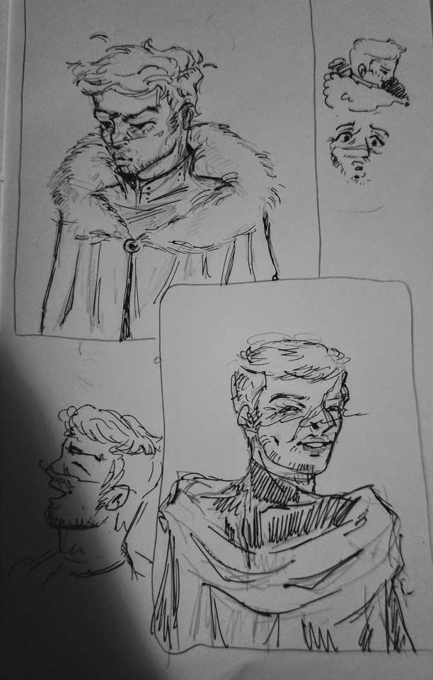
so many mentions of cloaks..... they're such good character design traits because they're very plot relevant and great motifs for the characters snsjsk they define the respective nations and personalities of our two mains sooozz

(ignore my attempt at kingdomifying the mv logo for house of verstappen purposes)
House of verhoeven, warmer of the two right so linen and thin cotton is the way to go for them for most of the year. single drape cloaks because air flow and they can afford it, i wanted to make their cloak designs particularly well draped to showcase how they have or at least for a while have had more relaxed circumstances compared to the north side while also have it be a single long drape of cloak to show that they're on edge. nothing they can afford to fuss over, but they have time. from a worldbuilding pov, their winters r still warmer compared to the north side, it's still a cotton and linen blend but a fuller coverage drape. + thicker undershirt !

House of verstappen, far far colder. i thought they'd prbly have the tradition of layering rather than draping. a motif for how they r far more focused on practicality and diligence than whimsy, they don't have time. verhoeven had clasps that twisted and turned the fabric, verstappen has clasps that click together as fast as possible, practical. a sense of paranoia, it's enhanced by the cold cold cold. fur-lined over cloaks, they end at the waist unlike the knee/ankle length of verhoeven, due to the main fight style of the northern people being reliant on speed. a cloak at the bottom of their feet would be a hindrance. the under-cloak serves as a way to cut the cold on the bottom half of the body cus the thicker cloak can't, it's still early to move around in so cotton.
the verhoeven colours go from a summery blue to a muted one in the winter, due to there being more resources during the summer and people can work more without risk of disease. the verstappen colours stay the same year round. dark under cloak bc darker = warmer and orange cloak for patriotism. flow vs stagnancy.
i also thought it'd be interesting to point out how the verstappen under-cloaks have raised collars, and then a final guard with the thick fur that obscures the figure in terms of silhouettes. the verhoeven ones are relaxed around the neck and loosely hangs off the figure.
these were done wayyy too late at night so not ideal looking but the point is to showcase how the sharper angular face of a young max is guarded by the fur and high collars. the verhoeven cloak hangs off his back. relaxed.
anyway yeahh it's like 3 am and i have an exam tmrw and im sososo happy for max kells and their baby lily !! but i needed to Yao about character designnn mwah hopefully this makes some sort of coherent sense and I'm srry if i overstepped any boundaries xx
HI WOW YES!! first off— never apologize for art!!! never apologize for creating and for sharing because I LOVE when you guys do that <3 when you decide that my silly little words are worth your actual time and effort to go and create things!! art, pottery, music playlists— all of that is so incredible and it absolutely blows my mind every single time. always share it with me because I love seeing it and all of you are so talented 😭🫶
secondly— yap begets yap, so. buckle in. cloak realness!! you get it!!! they're so... I use them narratively a lot, because A) they are cool, and B) they're good for storytelling. I adore the way you designed them, and your little notes and explanations are so so cool. do you have a design background???
the collar on the house verhoeven cloak is mwah. the buttons on the side, the flowey drapiness of it all— absolutely encapsulates the lighter, warmer climate and attitudes. these are people who aren't as focused on raw survival. they can afford to think about the design and the colors!
I especially like the idea of the shorter cloaks and layering further north. not only is it warmer, but it also offers more protection in a fight! it would be easier for a weapon to get caught in the house verhoeven cloak, and then tangle and pull, compared to house verstappen where it's more likely to just slice through.
they're always alert further north. it's cold year round, and they don't have the time or the want to spend the effort to dye their things— and it would make them stand out more than they'd like. your consideration about the faster fighting style up north was really really impressive. I don't think I state anywhere that they're faster than everyone else, just that they're fast— but they have a style that relies on footwork and reaction speed. they're always moving, and their fighting style lends itself to that, a constant flow of movement so they're not wasting any energy. (because when it's that cold and your resources are scarce, energy is a currency.)
tiny max hiding in the hood under the fur I am so endeared. the skrunkly of all time, honestly. rico having his moment off to the side— real.
anyways that's more yap than you probably wanted but I am genuinely STUNNED about this, so never ever apologize for it ever again thank you mwah. I would actually be v interested in seeing your thoughts on the leathers as well, if you ever felt so inclined.
art is inspiring <3 I just write stuff for the hell of it, but every time someone reads it and feels inspired to create is just amazing. the casual talent so many of you have is a little bit ridiculous and I love you all 🤍
#fmf verse#art!!#fmf art#getting this kind of thing is so inspiring for me as an author#like oh my god you liked my brainworms#you liked them so much they become your brainworms too#this is amazing and ily
42 notes
·
View notes
Note
Did you ever talked about what role narratively the moonlight child is fulfilling? I recently got to the moment where it’s revealed who that is and I noticed some people loving it and others hating it and personally idk what to think? Did you ever elaborated on that matter before?
So, I don't talk that much about the moonkid because I go back and forth with it a lot, myself.
I think... regardless of all the stuff I'm about to say the best bet is that the kiddo's function in the story is to create and/or exacerbate the emotional weaknesses that will probably eventually determine Griffith's ultimate fate.
I also think it makes a lot of sense for the baby to serve as an enhancer of Griffith's humanity/emotions - a lot more sense than it would make to think of him as the sole source of those feelings.
Because if you think about the way Griffith and Guts work in relation to one another, you tend to have one doing something that the other then echoes either by repeating or by contrasting - that's the whole "repeating beats" theory, but it's also things like the Beast of Darkness being a thing.
BoD is, I believe, meant to represent that dark part of Guts that is the equivalent of the part of Griffith that became Femto. Notice they have similar designs, are similarly destructive, and the way Femto's actions are enabled by Griffith's transformation into a demon/loss of humanity, the BoD is mostly able to run wild when Guts' humanity is suppressed, whether by contact with spirits or arguably (depending on what happens next) through a despair that seems poised to drop him through a metaphorical dark sea - a visual that is distinctly reminiscent of the visuals of Griffith's soul falling away from the physical world just before changing into Femto.
Here's my point, which I'm hoping I can coherently express but no promises:
Ultimately the human being that was Griffith loses to his inner dark hawk - he becomes Femto, and his body becomes black armor that reflects his animal motif and his emotions are chained up, frozen, stilled, whatever you want to call it.
Then sometime later Griffith is returned to the world in a human form by inhabiting the body of that infant, which causes those chained/frozen/stilled emotions to become activated again, on a low level at all times and then more powerfully at other times, when he literally transforms into a humanlike child.
Meanwhile, around the same time, Guts gets the Berserker armor, and thus begins to inhabit black armor that reflects his animal motif. This feeds his inner monster, especially at specific times when he literally transforms into a humanoid version of the BoD and goes completely wild. and notably, the implication is that if he keeps it up, he'll essentially melt into the armor like Skull Knight and become the monster he lets loose.
So again, parallel and contrast - Griffith, a monster, dons human skin which affects him by feeding his suppressed human side and occasionally it takes over his body and he becomes a benevolent child. Guts, a human, dons bestial/demonic skin which affects him by feeding his suppressed monstrous side and occasionally it takes over his body and he becomes a destructive monster.
Of course the primary objection to this would be that the child is not a part of Griffith but is rather an independent entity, but...
Well, two things. First, it's a metaphor/parallel so it doesn't need to be exact, the point is just that as narrative foils Guts and Griffith will often do or encounter things that work to contrast each other's actions and experiences.
But the other thing is that if the function is fairly clear, the mechanism through which the function is expressed is another question and that's where I start talking for like a thousand thousand words.
So if you're sane you can stop here but if you want to go down the rabbit hole, click on.
The most common interpretation in the english-speaking fandom is that he's Guts and Casca's child (well that part is obvious) and he's kind of co-residing in Griffith's body (or Griffith is using his) and he is the source of all of Griffith's post-eclipse emotions. So Griffith has no emotions, it's all just the child being squishy about his parents. The theory goes from there that he's going to become the weakness that takes Griffith down because he'll help the parents from inside Griffith or whatever. Some people think he'll sacrifice himself to destroy Griffith, some people think Griffith will die and the baby will be restored to his human "purified" form or whatever, and then go live the domestic bliss life with Guts and Casca.
And I mean I think this is a fairly obvious interpretation although I do think there are some issues there. Just of the top of my head:
Femto already exhibited emotional responses to Guts before he was incarnated into the body he shares with the child so attributing his feelings entirely to the baby is a little questionable.
It also kind of contradicts Miura's stated goals if it boils down to something as simple as "good child helps good family destroy the bad man"
Guts, Casca and the kid ending up as a nuclear family would be deemed a happy ending by most standards, and while a lot of people say Miura had stated that the ending would be happy, Mori denies that was ever Miura's claim. And anyway, what Miura actually said was that he was just trying to keep it from being a total tragedy and wanted to end with at least some sense of hope.
But I think the BIGGEST issue with the theory is that it shifts the narrative centerpiece away from the dynamic between Guts and Griffith and towards a Good Family vs. the Bad Man thing. It also transforms it into a story about romantic and familial love conquering all or whatever. And while a lot of people who believe in this theory don't see that as a problem - mostly because they already perceive the story as being about Guts and Casca's love overcoming the bad man, that narrative is ultimately at odds with everything the creator had said he was intending to do.
Now, it could obviously still be right or even just mostly right, like it doesn't have to hit every bulletpoint, and as long as they can avoid the fourth point it's still feasible/workable without breaking it.
I also think for most of the west, this is really the only explanation that makes sense - even I just assumed this was basically the situation (sans the emotion thing, which I was and am still mixed on), but that may be a question of perspective because...
We get another theory if we look to the Japanese fandom where as far as I can tell the main thing I keep seeing is that people just literally refer to the Moon Kid as a thing Griffith is doing once a month for some reason - like he's less a separate entity that takes over and more an aspect of Griffith or a persona he wears sometimes.
When asked about it Miura apparently said that he knew but wouldn't explain it because he wanted people to decide for themselves. Which would imply there is indeed something more complicated happening than just the child being the Gutsca baby and taking over the badman to do good things.
So this theory is that while biologically the child created by Guts, Casca and uh Femto, Moonkid is ultimately (either literally or metaphorically) an expression of Griffith's lost humanity. Either Griffith is allowing the Moonkid to take control because he wants to experience his emotions again, or he literally is Griffith in some form. This one is kind of interesting for a few reasons...
There's actually a trope that comes up a lot in doujinshi but also was part of the resolution of the Devilman sequel Devilman Lady where a character is either reborn as the child of their friend, love interest, or enemy or reduced to infancy and raised by said friend, love interest or enemy.
The child delivers Griffith's words to Guts in the Revelations arc long before it actually merges with Griffith. You can say the baby was trying to get Guts to save Casca/his mother, which he was, but it's interesting because if Guts didn't go after Casca, the Conviction Arc wouldn't have happened and the dead souls that helped to enable Griffith's return wouldn't have been summoned by the two brands, so even as it pursues the goal of getting Guts to save Casca, it also serves Griffith's goals. Which means that we have some chapters that consist entirely of Griffith sending visions to people in order to get them to do what he needs them to do, followed by the child sending a vision about Casca to Guts - a message that repeats Griffith's lines to Zodd precisely, and that ultimately makes Guts do what Griffith needed him to do. Which reminds me...
The Moonkid can't TALK? The only times he ever speaks are when he repeats Griffith's prophecy and when he centers Guts' mind during the Sea God arc, but like when he did that he literally looked like a child form of Griffith's astral body (as seen in the first post-Miura chapter).
Way back just after the Eclipse, Skull Knight told Guts to kill the infant because it would end up causing them grief. You can say Skull Knight doesn't know the future, but he does kind of seem attuned to causality - he pins Guts as the survivor of the Eclipse a year in advance, tells him how the faux eclipse is going to work and predicts the fight vs. save scenario, and when Elfhelm collapses, his internal narration is like well this was destined to happen but I guess we need to fight it anyway.
In Casca's dreamscape (when her mind is pieced back together), the infant is in the incubation egg instead of Griffith.
Griffth's self-image - the way he imagines himself - has consistently been a child.
The biggest argument against this is that the kid obviously doesn't look like Griffith and is specifically made to echo some of Casca's behaviors (e.g. trying to chew on Puck) That said, I don't think this theory would necessarily need to be complete - it could always be that the moonkid carries some portions of Griffith's soul but is otherwise what he appears to be, or that he's a literal reincarnation and thus has a different appearance and different personality but the same soul.
The other thing is, like i said before, the Beast of Darkness/Berserker form of Guts is I think clearly meant to physically echo the demonic side of Griffith - Femto. So it would make sense as a narrative device if the newly reborn "human" side of Griffith resembled Guts's human self - which is to say Guts himself.
(The theory also really does remind me of Devilman Lady, not just because of Akira being reborn as Satan's kid but because the main plot in itself was driven by Satan splitting into various aspects which only became his original self when all the pieces were reunited. In the meantime they looked different, had different personalities, and seemingly acted independently.)
Which brings me to some weird trivia in this area.
There's an essay (in a japanese book of Berserk essays) that was namedropped/semi-explained by kojion@twitter that questioned the reason behind Griffith's trips as the Moonkid and suggested that the meaning is comparable to the dynamic between Amuro Ray, Lalah Sune and Char Aznable.
Now I don't know much about Gundam so when I read that I went and did a bit of research about those characters and basically its an imaginary love triangle where the protagonist (Amuro Ray) thought he was competing with the antagonist (Char Aznable) for the girl (Lalah Sune), but in reality the antagonist thought of the girl as family and then the creator of the series, Yoshiyuki Tomino, was like, "anyway, so Amuro and Char are maybe kind of gay:"

Anyway I didn't buy the book and read the whole essay or anything so I can't really tell you what the writer's whole theory re: parallels between Berserk and Gundam was, but it's an interesting insight into different ways to look at this situation.
...also this has nothing to do with anything necessarily but it is kind of funny to think about: as we know, Griffith and Guts and their dynamic were based on Miura, Mori and their relationship. Well, in the memorial manga done by Mori's wife, she implies that Miura would want to be reincarnated as Mori and her child.
So okay, those are the two main threads I see a lot, and which I see depends on which fandom I'm looking at.
As for where I, personally, am with it...
I feel like this post makes it seem like I'm arguing in favor of option two but it's really more that I'm explaining it in greater detail because it's the theory most of the english-speaking fandom doesn't know about, is dismissive of, and generally never seems to consider.
For me, well, I have no doubt that the child is physically Guts and Casca's son, it's just a question what's going on under the hood. As I've said before I tend to take my cues from the Japanese fandom when it comes to major interpretational differences so I do think there's a pretty good chance that the Moonkid is literally a part of, or contains a part of, Griffith beyond just his being the vessel. If I were going to put some cash down on something, it would be this be one, though I don't know where I would stand on "it's literally just Griffith reincarnated through Guts and Casca's child" vs. "it's Guts and Casca's child but he has some parts of Griffith floating around inside him as well."
Aside from being more consistent with the narrative approach Miura had expressed, such a connection would also help explain why the Moonkid's emotions are able to bleed into NeoGriffith's, and why the Moonkid is able to take command of Griffith's body which seems sort of ridiculous otherwise. It also echoes back to Miura's comment about how Guts' attitude will remain what it is only as long as Griffith remains the way he is, and the relationship remains dynamic and will keep evolving. How much can a man with no heart really change. after all?
That said, it also wouldn't surprise me if he really is just Guts and Casca's son and only connected to Griffith via the shared body thing. I do think it would be a little more difficult to explain why he's there without skewing the narrative focus if that's the case. It could also make things like the Femto-not-killing-Guts incident a little incongruous if we're meant to think all of Griffith's emotional reactions stem from the baby.
But it can work, and it doesn't actually break the Guts-Berserker/Femto-Childform parallel, because it's not really necessary for everything to be exactly the same as long as they serve the right function.
So, long story already long, I think regardless of what the kid actually is, in the end his narrative purpose is to be the turn-Griffith-human equivalent of the Berserker armor's Turn-Guts-Monstrous effect. It just depends on how literal and exact you want to go with it. Because if it's just Gutsca's kid then it's a metaphorical equivalence, whereas if it's a part of Griffith reincarnated or embodied or whatever, then it's a literal point-for-point parallel with both cases being a part of themselves that they try to keep controlled that, at some points, controls them instead.
27 notes
·
View notes
Text
5.4.1 Week 4 Mastery Reflection - Task 3: Reflection
During my four weeks of Design Research I was tasked with digging deeper into my research to explore and evaluate design options, investigate methods for text handling and layout, utilize critical thinking skills, and to translate the concepts into effective visual communications.
Reflection:
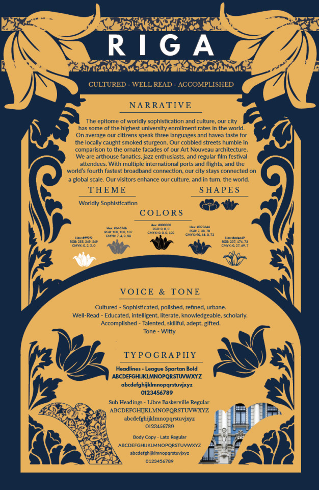
In week one I began by reading Basics Advertising 03: Ideation by Mahon and explored Riga, Latvia and the many facets of the city from culture to architecture. As I worked to develop the narrative as well as establish the voice and tone for Riga, I initially struggled to focus my narrative on what Riga’s personality as a brand needed to be as opposed to writing jumbled copy for a tourist brochure. Mahon 2011, suggests “However, some of the most creative ideas are generated by exploring different routes and directions that can't merely be logically explained” (Mahon 2011, p. 24). The more research I conducted on Riga the more the city’s personality became clear to me.
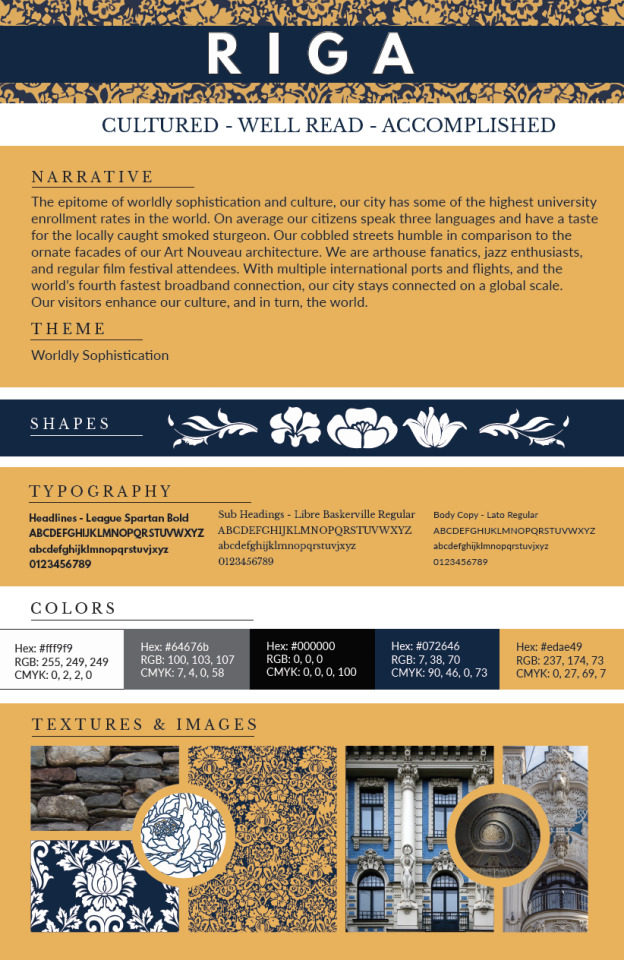
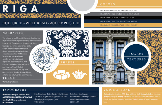
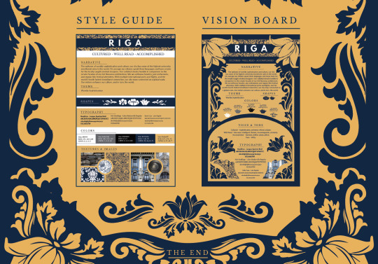
In week two it was time to delve into creating a style sheet that featured the necessary design elements for Riga’s burgeoning brand. With a polished and refined narrative, the three words that described Riga’s brand: Cultured, Well-Read, and Accomplished, as well as a color palette, textures/patterns, images, and a typography sampling I was laying the ground work for week three’s Vision Boards. Felton 2006 offers “Find the human story in your brand, tell it, and watch people gather around the fire” (Felton 2006, p. 80).
Style Sheet:
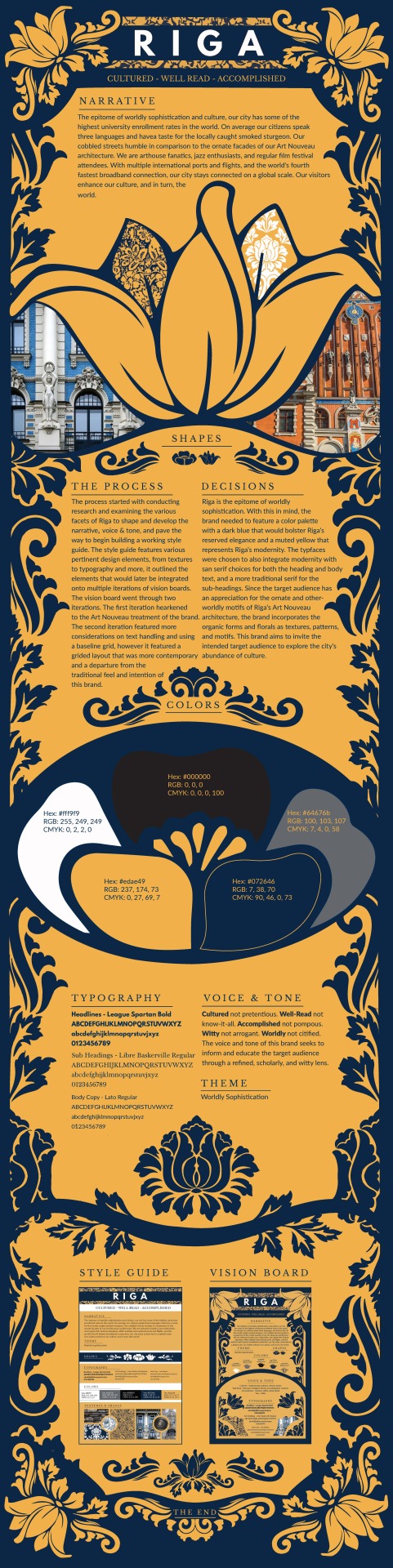
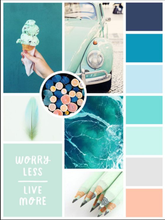
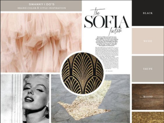
In week three it was time to dig even deeper into my research. As I explored layout and text handling in Basics Design 02: Layout (second edition) and The Fundamentals of Typography (second edition) by Ambrose & Harris as well as Best Practices for Graphic Designers, Grids and Page Layouts: An Essential Guide for Understanding and Applying Page Design Principles by Gavin & Jura, it was time to apply these concepts in two iterations of Vision Boards. The initial vision board showcases the Art Nouveau treatment and styling of the brand while my attempt at a revised vision board showcases applied concepts of text handling such as alignment and utilizing a baseline grid, but is styled in a more structured grid that is too contemporary and was sadly a departure from the visual tone of the brand. Ambrose & Haris 2011, suggests “Type and image are treated and arranged as separate elements, but the consistent approach unifies these elements into a coherent whole” (Ambrose & Harris 2011, p. 90). After receiving feedback and critique from Professor Argo, I knew that I needed to step up my game in week for, re-frame my thinking, and meld the best aspects of both iterations of my vision boards into my infographic.
The Initial Vision Board:
The “Revised” Vision Board:

In week four it was time to implement all the concepts I had learned and all the research I conducted to create an infographic on the brand identity I developed for Riga. Ambrose & Harris 2011 argues, “There are a number of axioms in design, for example that range left is easier to read than range right, or that range left is more `modern' than centered type” (Ambrose & Harris 2011, p. 110). With this brand I had a fine line to walk in balancing contemporary elements such as white text, flush left text alignment, and sans-serif typefaces, with more traditional elements such using a serif typeface for the sub-headings, ornate floral patterns and motifs, and dark blue that would bolster Riga’s reserved timeless elegance. After all, this brand aims to invite the intended target audience to explore the city’s abundance of culture, Art Nouveau architecture and to experience the epitome of worldly sophistication.
Infographic:
Degree Learning Outcomes:
Synthesizing:
Hierarchical Grid - The infographic needed to maintain flow lines yet adhere to the organic presentation that enhanced the visual hierarchy of my initial vision board. “These grids create specific alignments within the material as a method of developing a hierarchy of information. Because they rely on an intuitive placement based on specific content, an in-depth review of the materials and requirements at the outset of the project is crucial” (Graver & Jura 2012, p. 40). After critically reviewing both of my vision boards, and my style sheet it was time to plug in various elements.
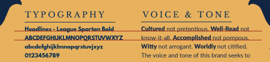
Baseline Grid - For the infographic, the copy cross-aligns to accommodate for the varying sizes of the header, sub-heads, and body texts. “The use of cross alignment enables a designer to use different type sizes while maintaining a consistent baseline” (Ambrose & Harris 2011, p. 51). Since there is a plethora of information to be read, maintaining a consistent baseline is essential to making it easier for the target audience to read.
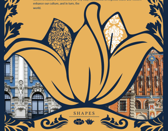
Problem Solving: Maintaining a Consistent Approach - Throughout the last four weeks I struggled to maintain consistency in my approach to this brand from the get-go. For example, my initial attempt at a theme was “Worldly citified”. I was suggesting “urbane”, but not only did the theme not make any sense, “citified” denotes and undercuts the worldly culture and sophistication of the brand as a whole. From there, my next struggle with consistency came in week three with my vision boards. I had reviewed too many contemporary pieces in my research and thus delivered a final vision board that was a complete departure from my brand. Felton 2006 suggests, “There’s a continual struggle between being on-strategy and being clever. Each wants to pull you away from the other. Your job as a thinker and problem solver is to keep both in mind, to spin the strategy without losing hold of it” (Felton 2006, p. 86). While Felton is referring specifically to writing headlines, this quote reminded me to keep a firm grasp on the concepts I had developed thus far and to return to the Art Nouveau style for my brand’s infographic.
Before:
After:

Innovative Thinking: Avoid “Templates”: Breaking away from the mistakes made in my revised vision board meant making a return to the original and diverse perspectives my Art Nouveau stylings had to offer. By moving away from a geometric grid so often seen in contemporary mood boards on Pinterest, I allowed myself to think outside the circles and force myself to dig deeper in reviewing Art Nouveau designs for architecture (and windows), posters, and vintage ads. By breaking away from the geometric grid, my brand moved away from the “template” trap and was bolstered by embracing the ornate and otherworldly motifs that makes this brand so unique. Graver & Jura 2012 advises “When attempting to unify content elements through the organizing principle implied by the grid itself, it is important to make sure there is visual balance between the items. Frequently, this is successfully achieved when the content areas seem to communicate with one another” (Graver & Jura 2012, p. 137). Rather than allow the grid itself to rule the page, I had to utilize the organizing principles of a hierarchical grid while allowing the brand’s elements to communicate effectively.
Common Practice: What to Avoid
Acquiring Competencies:
1. Baseline Grid - With a plethora of information it is important to keep the reader in mind and how maintaining a consistent baseline will enable the target audience to read with ease and thereby better understand the content on the page. Ambrose & Harris 2011 write ”The baseline grid provides a guide for positioning elements on the page with accuracy, which is difficult to achieve by eye alone” (Ambrose & Harris 2011, p. 54).
2. The Size & Shape of the Page - You can’t fit a square peg into a round hole just like you can’t squeeze design elements and throw them where they don’t belong. “Prose or materials focusing on the writing itself may be better served by a slightly wider format that encourages slow, deliberate reading. Similarly, content that is primarily defined by horizontal images should not be forced into a narrow vertical format” (Graver & Jura 2012, p. 94). Admittedly, I still need to work on this. The fine balance of negative space and placing the content in a manner that bolsters the viewers understanding of the content and maintains a consistent brand approach.
3. “Templates” Beware - In reviewing too many contemporary pieces that utilized more geometric forms and shapes, somewhere along the way I lost sight of the concepts I had worked to develop for this brand and the resulting “revised” vision board showed that. One of my biggest takeaways from this course is that I cannot loose sight of my originality and perspectives to crank out something similar to what hundreds of other people are doing. The challenge for myself is remember the DLO’s I have learned so far and to always dig deeper into research when I am stuck. Felton 2006 states, “As a creative person, you are dedicating yourself to transcending clichés” (Felton 2006, p. 263).
References:
Ambrose G. & Harris, P. (2011). Basics Design 02: Layout (second edition). Retrieved from: https://ce.safaribooksonline.com/book/graphic-design/9782940447169
Ambrose G. & Harris, P. (2011). The Fundamentals of Typography (second edition). Retrieved from: https://ce.safaribooksonline.com/book/graphic-design/9782940447244
Felton, G. (2006). Advertising Concept and Copy, Third Edition. New York, NY: W. W. Norton & Company, (Originally Published by Pearson Education, Inc.).
Graver, A. & Jura, B. (2012). Best Practices for Graphic Designers, Grids and Page Layouts: An Essential Guide for Understanding and Applying Page Design Principles. Retrieved from: https://ce.safaribooksonline.com/book/graphic-design/9781592537853
Lonely Planet. (n.d.). Welcome to Rīga. Retrieved from: https://www.lonelyplanet.com/latvia/riga
LIAALatvia. (2014, February 2). About Riga, Capital of Latvia [Video file]. Retrieved from: http://www.liaa.gov.lv/en/invest-latvia
Mahon, N. (2010). Basics Advertising 02: Art Direction Retrieved from: https://ce.safaribooksonline.com/book/graphic-design/9782940439447
Mahon, N. (2011). Basics Advertising 03: Ideation. Retrieved from: https://ce.safaribooksonline.com/book/sales-and-marketing/9782940411504
0 notes