#MAjor Project
Explore tagged Tumblr posts
Visit Tumblr Blog
Explore Tumblr blogs with no restrictions, modern design and the best experience.
Last Seen Tumblr Blogs


Fun Fact
There are dozens of funny blogs to kill time on Tumblr.
Text


Once I had enough high-resolution climate data to work with, the final part of the Climate phase was the creation of maps with discrete climate zones, which I produced in both the Trewartha classification scheme, left, and the Köppen classification scheme, right.

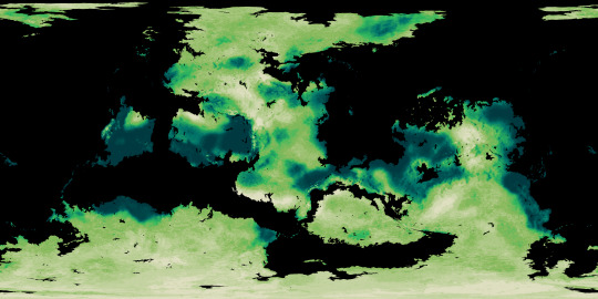

The final phase of the Ayrum mapmaking project was to create realistic satellite style maps, which began with mapping out soil colors and the ground cover of vegetation generally and tree-analogues specifically.
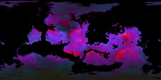
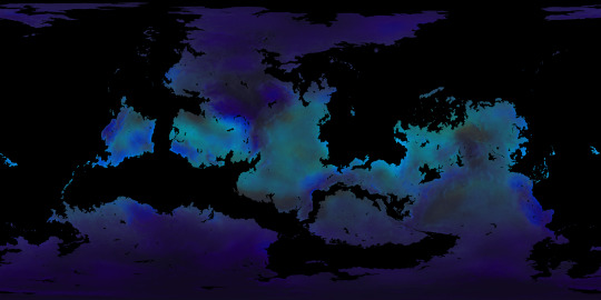
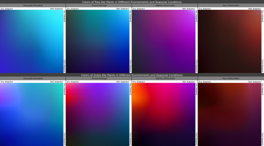
Once I knew where the plants belonged, I then determined what colors they'd be in the conditions they're adapted for, as seen in the maps, and under seasonal variation, with the chart showing how plants with certain adaptations react to seasonal changes in those conditions.

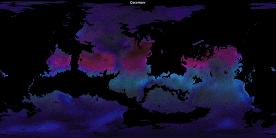
In these gifs we see the ground plants and tree canopies changing colors as the Solstices and Equinoxes expose them to greater or lesser rainfall and harsher or milder temperatures than what they're adapted for. Neither of these gifs provide a true image of what the surface looks like from space, but rather of the in-person appearance of whatever plants may be present.

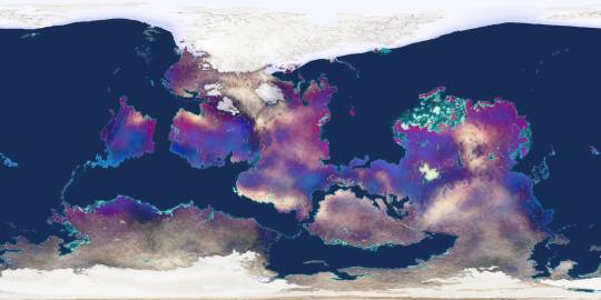
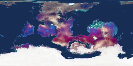
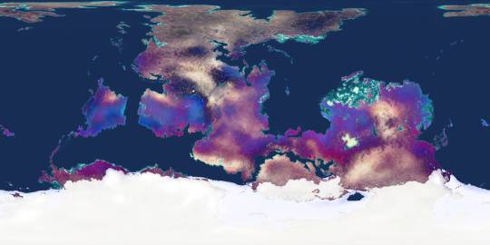
Finally, using the vegetation density maps as raster masks for the seasonal plant color maps, and layering those with the snow-and-ice maps over the soil color map, we now have a much truer image of Ayrum's surface as of its (Northern) Winter, Spring, Summer, and Autumn months.
#Ayrum#mapmaking#digital painting#imaginary maps#imaginary climate zone maps#Trewartha climate scheme#Koppen climage scheme#worldbuilding#commission#major project#seasonal data sequence#imaginary soil color maps#imaginary vegetation maps#vegetation extent#vegetation color#satellite-style maps#Photopea#Christopher Maida Artwork
55 notes
·
View notes
Text
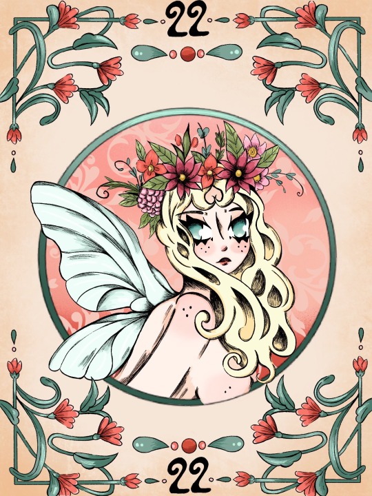
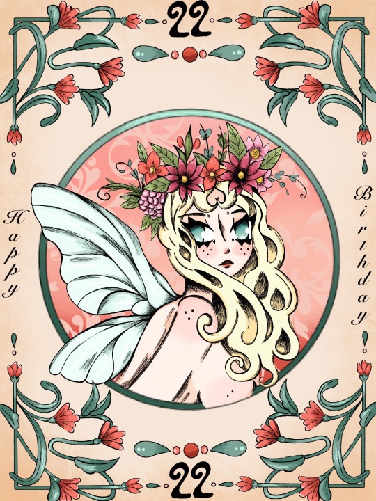
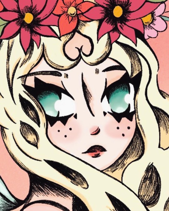
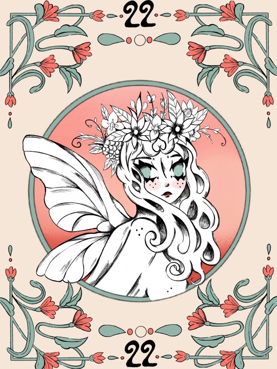
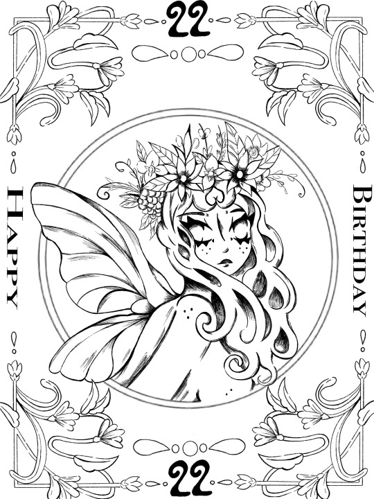
For my Cert 3 in design I choose to produce a design for a 22nd Birthday in the Art Nouveau style. Really proud of the work I put into this piece and loved the style of Art Nouveau. I definitely wanna try more designs with this art style in future :3
#art#artists on tumblr#artwork#digital art#lineart#art nouveau#oc art#original art#fairy aesthetic#fairycore#design#art promo#major project#designer
36 notes
·
View notes
Text
Major Project - Why bands are disappearing (Research)
“Starting a band is hugely expensive,” says Joff Oddie, guitarist with Wolf Alice. “You need an immense amount of equipment and a lot of space. I spent most of my student loan on rehearsal space. Travelling is expensive. Anything that can be done to make being in a band tenable for young artists is good, because the fear is that we’ll lose that tradition. I think it would be a disaster if it’s only open to middle-class kids.”
“We’re fanatical about bands and being in a band,” says Wolf Alice’s Joff Oddie. “A good band creates a community. They have an ecosystem that, as a fan, you feel like you want to be part of. Despite all that’s been said about individualism, there is still a hunger for that collective feeling.�� Perhaps you just have to squeeze it all into a phone screen.
One theory is that major labels avoid bands because solo artists are cheaper and easier to handle. Not so, says Jamie Oborne, whose Dirty Hit label has found success with bands (the 1975, Wolf Alice) and solo artists (Beabadoobee, Rina Sawayama). “We’re actively trying to sign bands,” he says. “I’m desperate to find a really young band that I can help develop.”
The problem is, he says, there aren’t that many around. “It’s more likely now that a kid will make music in isolation because of technology. When I first met the 1975, they were all friends meeting in a room to make noise. So much is done in bedrooms these days, so you’re more likely to be by yourself.”
Ben Mortimer, co-president of Polydor Records, says that cost is more of an issue for artists than for labels. “If you’re young and inspired to become a musician, you face a choice. If you go the band route, you need to find bandmates with a similar vision, you need expensive instruments and equipment, and you need to get out on the road to hone your craft. On the other hand, you could download Ableton [production software], shut your bedroom door and get creating straight away. Culture is shaped by technology.”
Very interesting article which includes two of my favourite bands - The 1975 and Wolf Alice. Labels are still wanting new bands to develop but it is very expensive for young people of working class to afford equipment and rehersal space. It is also difficult to find people who have a similar vision, especially when you can make songs in your own bedroom using software.
8 notes
·
View notes
Text
It's bittersweet to say that I finally have finished DIVE. It's taken me actually around 20 years to get the story to where it is today, frankly I never thought I'd actually finish it but I did. I've gone through countless drafts but this one seemed to be the one that actually stuck.
DIVE started out as funny enough a Dragon Ball Z fanfiction staring me and my friends as super sayians. There was a lot that influenced me to make the story but what got me started writing in the first place was wanting to take the adventurous daydreams I used to fall asleep to as a kid into a story since I'd pick up where I left off night after night. Sometimes I'd replay a scene in my head over and over again if I liked them enough, that's kind of how this was.
The more I grew up, the more the story matured and changed too. It's a far cry from the beginning and what I had initially imagined but I'm happy to say it's done. I hit a lot of writers block and I had two major drafts that were almost 400 pages a piece that I scrapped before I got to the version of the story I was happy with. I pulled a lot of late nights getting lost in the world I created, I revamped countless characters and story beats until I was satisfied with where it was.
There's something about accomplishing this one goal that really tickles a deep part of me, it's a lot of emotions all in one considering it was this hobby of mine that helped me get through some of the roughest patches of my life. It was that thing that was always there and is still my escape from reality when I need it.
I got the bulk of the story done during the pandemic. The only arc I didn't finish during that time was actually the first one, which was about a year before.
I've got some small revisions to do and to edit a couple of details but overall the story is fine the way it is. I'm sure I'll be rereading the 5th arc sometime soon and I know I want to go back and fix the the climax of the 4th arc - add a little more grandeur. Other than that it'll be getting the story transformed into a comic which will be done in full colour. It's a big project but it's the next step I want to take with this.
I know with the comic version it'll be longer than the written considering some of the flash backs will be elaborated on. Instead of just hearing about some of the events - you'll get to see them. I think it'll be fun for the reader that way. Other than that I've got some side stories I'd like to write up, perhaps some NSFW one shot stories too.
Either way I've got a lot to do.
Cheers!
#personal#fall 2023# ̄★DIVE★ ̄#DIVE#story#fantasy#high fantasy#writing#hobby#personal project#major project#inner thoughts#goal complete#original work#novel#pandemic
2 notes
·
View notes
Text
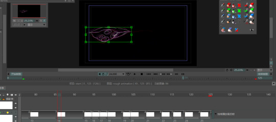
Major Project # Post 11| Experiment and Decision
youtube
I recently dedicated all my time this week to developing rough animations. While brainstorming ways to improve my animation production, I found an informative video on YouTube. While brainstorming ways to improve my animation production, I found an informative video on YouTube. The video presented some intriguing ideas. For instance, First of all, a high frame rate doesn't necessarily mean that the animation is better, in fact, some low frame rates can be more readable. In fact, some low frame rates can be more readable. Therefore, the number of frames per image should only be comfortable for the eye. This viewpoint gave me a whole new perspective on animation, and I was so interested that I decided to try applying this new thinking in my projects. This will bring more exciting results to my work, and at the same time allow me to move further along the path of animation creation.


This is the beginning part of my animation. When I set out to draw the draft, I gave due consideration to the effect I wanted to show of a fish belly being cut open by a knife. To achieve a more realistic effect, I decided to make speed changes. In the faster part, I occupied each drawing with two frames so that I could show rapid movement and tension. However, I also realised that there were certain episodes where the pace of the action needed to be slowed down to better show detail and emotion. In these moments, I would have each image take up about five frames, which would slow down the pace of the animation and allow the viewer to better experience the process of the fish's belly being sliced open by the knife, as well as increase the emotional resonance for the viewer.
2 notes
·
View notes
Text
Here is a commercial project I did in school for my English final major project
@0deltakhan0 is mentioned in this because I love their art and love interacting with them and this is my first time making something like this so yeah 😅😅😅😅
1 note
·
View note
Text
FMP Major Project Mobile portfolio
Along with the destop version I did a mobile one too. This was because it's linked to my Instagram portfolio to make it as accessible as possible to all audiences. I am really happy with using a slideshow feature to make imagery easy to see. Again this does need small tweeks in sizing but I'm proud of the development from previous web creations.
0 notes
Text
Portfolio
Visual Identity


0 notes
Text
Major Project
I also made a poster for this film.
I wanted it to look like a polaroid, looking into my life, you're getting a little snapshot.

0 notes
Text
Developing Stamp graphics
Using my research, I decided to place the e inside a circle border to make it resemble a rubber stamp. To create the e, I used my hand drawn calligraphy to create a base shape. Then refined the design so the lines were smoother and less jagged.


Had trouble creating an e that resembled blackletter but had curved edges to make it suit the designed logo. Decided to test different borders. I liked the circular border the most because it drew attention to the e, instead of making the stamp look too busy.
I did not like these designs because I found the es were not recognisable and did not fit in the border comfortably.
Although Dot recommended I use a lowercase e as this may fit into a border better, I decided to experiment with my original design as the newer designs did not look at polished or fit with the brand identity.

I found this took up too much room and the sharp rectangular border constrasted with the curves edges of the e. However, when I tried a circle, I found that it did not sit comfortably.
Following this I decided to try combining sections of the new letterform with one of my previous designs, as I found my newer designs looked too unrefined and uneven.

I found I liked this design because it loosely resembled a blackletter but had soft flourishes which fit with the rest of the brand identity.
0 notes
Text


I have found this design for cider bottle labels which represent the handcrafted love and care that has gone into creating the drink.
The first thing that caught my attention to being different to other labels i have looked at is that it is heavily typographic which relates to the blues music posters i have looked at and something i want to strongly consider when i start designing to make sure i get the balance between illustration and typography right.
the minimalistic use of colour allows for the solid black type and illustrations to stand out bold against the clear bottles, each of which have a colour to represent the flavour.
the simplicity in colour and design allows the design to feel retro especially when it is photographed in a similar style and allows the colour and typography to do all of the expression.
Behance. “Ciderbil Branding & Packaging.” Behance, 1 June 2023, www.behance.net/gallery/172096021/Ciderbil-Branding-Packaging?tracking_source=search_projects. [Accessed 22 Apr. 2024.]
0 notes
Text
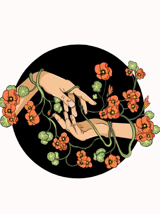
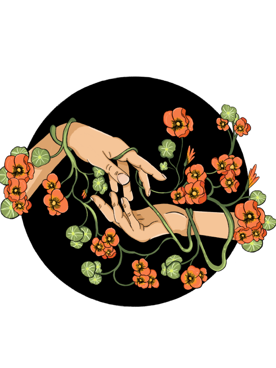
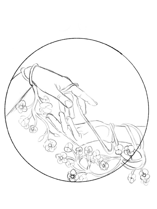
Nasturtium of Love
A project piece embodying entanglement and connection.
6 notes
·
View notes
Text
Trav Cats
From my friend from work Graham's band
So, we were all friends and family who used the same pub (the Travellers Rest) We used to just pick up instruments and have impromptu sing a longs. One of the regulars then asked us if we would kick off a charity event he was organising. So we got together and practiced a few songs. It went down so well that we thought hey! Let’s give it a go. We then rehearsed lots got asked to do a private party then we were asked to do a festival. We built in confidence and approached pubs to get gigs. 15 years later we have such a following that pubs and festivals now contact us to play. Our line up, all bar one member has been the same throughout. Take a look on Facebook for pages such as “Musicians wanted & available Hampshire UK” Also Southampton Musician & promoters forum.
As for expenses Musicians normally supply their own instruments But replacement strings / drum skins etc would come out of band funds An average Speaker and PA set up required for gigs would be around £1500 upwards.
2 notes
·
View notes
Text
Since I’m almost finished the 5th arc and DIVE in its entirety here’s a playlist of songs that really inspired me to write this portion of the story. I’m sure some of these tunes will appear on my Spotify Wrapped this year (we’ll see in roughly a month).
It’s bittersweet saying I’m almost done the main story. Over 700 pages and countless hours I’ve spent over the past 8.5 years writing what I’ve let myself get lost in. It’s been fun, but at least this gives me the opportunity to make the wonderful world I have in my head a comic now that I’ve got it on paper…
# ̄★DIVE★ ̄#DIVE#personal#writing#fall 2023#playlist#Spotify#Spotify Wrapped#inspiration#story#fantasy#high fantasy#demon#Demyra#5th arc#almost finished#major project#comic#Hank#Hank Vranas#long haul
2 notes
·
View notes
Text
MP - Research into Interactive games
0 notes