#Nom: Visual Effects
Explore tagged Tumblr posts
Visit Tumblr Blog
Explore Tumblr blogs with no restrictions, modern design and the best experience.
Last Seen Tumblr Blogs


Fun Fact
Tumblr has been banned in Indonesia for providing people with access to pornographic content.
Text
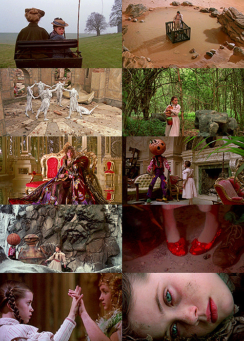
Return to Oz (1985). Dorothy, saved from a psychiatric experiment by a mysterious girl, is somehow called back to Oz when a vain witch and the Nome King destroy everything that makes the magical land beautiful.
HOW has this film escaped the legacy of children's horror masterpieces like The Dark Crystal and The Witches? I had pretty low expectations going in, but it really leans into the horror of its setting and lets Dorothy grow and regress in equal measure. Plus the stop motion and puppetry and practical effects are pretty awesome. Yeah, it's flawed, but man, I think I would've been obsessed with this if I'd watched it when I was 9. 7.5/10.
#return to oz#19885#Oscars 58#Nom: Visual Effects#walter murch#L. Frank Baum#gill dennis#Fairuza Balk#Nicol Williamson#piper laurie#jean marsh#america#american#horror#childrens#fantasy#1800s#7.5/10
188 notes
·
View notes
Text
#full transparency I haven’t seen iron claw or maestro#I’ve just seen people upset at it’s lack of nomination so I added it#and obviously maestro being nominated for makeup is fucked#for me personally I’m upset about the Barbie stuff the most#and Godzilla minus one. like it deserves that visual effects nom but there was SO MUCH MORE in that movie that deserves recognition#oscars#oscars 2024
46 notes
·
View notes
Note
One way I've imagined my redeemed Durge using the tadpole was as something akin to a panic button. For example, when she meets Isobel and the urge starts to take hold, she starts practically screaming 'HELP' through the telepathic link
Oh, that's fun. I'm going back and forth on whether or not Kyvir should use the tadpoles, honestly. On the one hand the vibes are exquisite, but on the other hand I don't know if he'd trust We Have Gortash At Home Dream Visitor and also his head is already very messed up... Hm...
#bg3#other people's ocs#kyvir#asks#anon#hey at what point does nomming tadpoles have a noticeable visual effect. i don't want to mess up my boy's pretty face with illithid shit#not significantly anyway
46 notes
·
View notes
Text
That's the Oscar nomination list?...
I expected nothing and was still disappointed...
#dumb stuff#oscars 2024#oscar nominations#only categories that I'll actually care about is animated movie (which actually has a decent selection for once)#and visual effects (same but rooting for goji ❤️)#and no nom for margot or greta i hate you all#i did finally watch oppenheimer and yeah... it's fucking great...#if it doesn't win sound design then wtf is going on
2 notes
·
View notes
Text
I've looped around from finding the belief that The Wizard of Oz was "the first color film" or "first technicolor film" understandable if wrong to finding it deeply annoying
Like. I get how it feels true - how the transition from sepia to technicolor in the film feels epochal, and how it's a springboard to people imagining how AMAZING and how AWESTRUCK audiences must've been at the time, but it just isn't the case, and no one in 1939 would've thought it was the first color film.
I mean, you've probably seen Snow White (1937) and Adventures of Robin Hood (1938). At the time color features were becoming more common, and they had been common in cartoons and shorts for years.
On a base level, if The Wizard of Oz was such a monumental moment in film history, giving people something they've never seen before, why did it only break even at the box office? By all accounts while not a flop it did decently but not great, and it only became a Cherished Classic thanks to TV airings later on. I mean, 1939 saw what is still, if adjusted for inflation, the highest grossing film ever made, and it wasn't The Wizard of Oz
Here is the actual history of color: most silent films were tinted, most commonly with different scenes being all tinted different colors, but more rarely hand-coloring. But back then people started experimenting with many different "true" color film systems, most of which failed for one reason or another, and there were a couple silent features made in two-strip technicolor, which had a more limited palette. At the start of the sound era, some black & white scenes would have color segments; this stage has been largely forgotten bc in many cases, the color segments don't survive & we only have them in black and white. Then three-strip technicolor began and became the dominant form of color until the late 1950s, with the first full-length three-strip technicolor film being 1935's classic...Becky Sharp. Which did decently, and got one Oscar nom for Best Actress, but didn't really become a classic. And then color films became more common until they became the norm in the 1960s
But it has to be a classic, right? It can't just be some random movie that ushered in technicolor. It has to be a famous movie everyone's heard of. It can't have been a gradual process touched by many individual artists, it has to be something one Great Man ushered in overnight, and the crowds were amazed, bc they had just been waiting for someone to Do Color Film so they could ditch black & white forever. It couldn't have been the case that they rejected many previous attempts at color film bc they sucked. Nothing can ever be the result of many people making many choices in many works of art, it has to be the work of one Great Work of Art that Changed Everything Instantly, and all the little people and failed experiments and less-enduring ones just have to be erased to make way
But it isn't. The transition from sepia to color in The Wizard of Oz did dazzle audiences, and still does, but that's because it's a incredibly well-done visual effect and a creative choice within the story to show the change from Kansas to Oz. We don't have to say it was important bc it was the first to do something technologically; it can be important for just being a really good movie
1K notes
·
View notes
Note
How did you find your artstyle and how do you consistently draw it, if I may ask?? I’m having a hard time being consistent with my artstyle 🥲
Also, I hope you don’t mind- but I’m just gonna…*noms your art* Delicious <33
To be totally honest, I'm still finding my art style!! It's not really something I've 100% decided on yet, and that's partially because I have so many! I'm gonna use my story that I've been developing for a while as an example, along with other drawings for things I've done :]
Also idk if this counts as a tutorial, but I do yap a lot about loosely put-together steps, so here we go!
I love experimenting with things like brushes, color palettes, blending modes and effects to see which things serve the purposes I most need them to. All of the brushes I currently use I found for free, mostly on Gumroad!
Experimenting would probably my first step, regardless of what I want the style to be. I usually have at least a vague idea of what kind of vibe I'm going for, but sometimes I get more inspired just from experimenting with various brushes and coloring styles.
Something ill do when trying out new brushes (usually line art brushes) is to go over the same sketch with them. This is a very old example LOL but it was when I was trying to develop a style for a comic/light novel of an extensive fantasy world I've been working on for a long time.
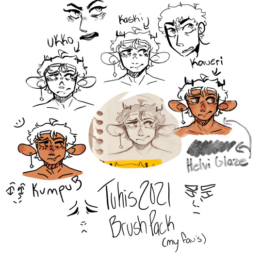
I labeled all the different brushes so I could easily remember which was which, and from there I ended up liking the Kumpu brush the best.

Then I made a bunch of drawings with that brush of some of the main characters, to get a feel of what I liked and what I didn't. I knew I wanted the style of this comic to feel a little bit like a pixel-art game (think undertale and stardew) but also have a clear color palette. I liked the drawing in general, but overall wasn't ecstatic with how they came out, because it wasn't as close as I wanted it to be. So, a while later, I searched the internet for more inso, and brushes.
This was feeling a lot closer to what I had envisioned in my head, but it still wasn't quite there. It wasn't until I took a creative writing class that I actually gave myself time to work on this world and style more. I ended up making these portraits to go along with my paper, and I started to really like the palette that I had coming together.


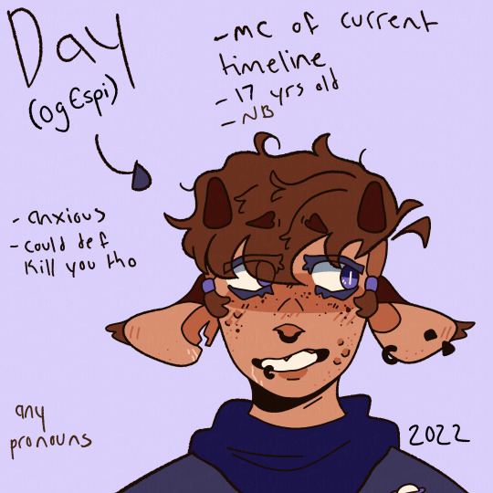
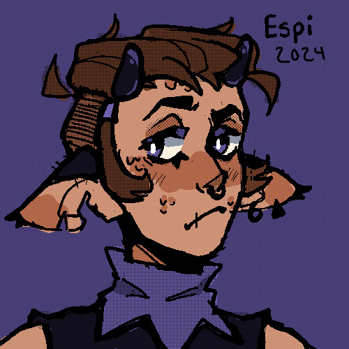
I knew I wanted this world's primary color to be purple, with the accent being mainly yellow/orange, so I made sure to keep those at least as undertones in my drawings. For example, Lenni is a grey tabby cat, so I chose a grey with a purple undertone, so that he didn't look out of place in this world that (design-wise) he clearly belongs in. I also chose to give a purple undertone to Espi's skin color, along with her brown hair. Sometimes undertones are more subtle, but from the very beginning I knew that I wanted the purple undertones in this style to be very noticeable.
That's something that I highly recommend thinking about when wanting to develop a style!! That would probably be my second step. What purpose do you want it to serve? I knew that I needed a style that was 1) simple enough for me to draw over and over 2) interesting enough to carry the story artistically like I wanted it to and 3) be visually different in an eye-catching way. My different iterations of this style I think achieved these goals in varying levels, and I tried to keep track of what things were working towards my goals, and what wasn't.
I also had to make a cover and back cover for my paper, so I used that as an opportunity to explore this style even more, with the introduction of how I wanted to use shading!

I knew I wanted the cover to have striking lighting, but I wasn't super sure how I wanted to go about it. Eventually, I kind of just tried to give up on my perfectionist mindset of "it has to look exactly how I want it to!!" and instead focus on actually drawing something. I've had to keep revisiting this world after long breaks because I was never satisfied with how my drawings were turning out, and in turn, I'd give up for a while. Which is NOT a good work flow LMAO. I do like how this cover looks as a drawing, even though it's just not QUITE what I want. But I'm trying to work on that mentality shift, and it's helped me make a lot more progress in my styles so far.
This is the mock back cover! I was much more satisfied with the shading in this one, and I felt like I was finally finding my footing with that. Now that I've become more comfortable with my line art, color, and shading for this style, I feel like I can finally start experimenting with the fun parts of the style I know I want to include, like sprinkled in pixel textures, etc. I haven't gotten to that part yet though, so we'll see how it goes!!
Besides my story-style, I would say I have two main other styles, being my "normal" style (even that could have different iterations), and my rendered style.
I'm gonna use my most recent drawing as an example for my normal style. In this style, I knew going into it that I had a vague want to explore color more, so that became the thing I decided to experiment most with.


Something I started noticing in my experiments was that I would be generally satisfied with the base colors, only to slap some shading on and not like it anymore.
When this kept happening time and time again, I decided that since I had a concrete goal of improving my colors, I would take a break from shading all together.

This is when I started taking more requests to really work on my understanding and application of color. I wanted to give myself a fun excuse to make lots of drawings of characters, and working until I was happy with how my colors looked. When I was doing this, I was referencing artists where I specifically admired their colors, and using information I gathered from my painting and color analysis classes! I love color and could yap about it for a while so lmk if you want more on my process for that.
After I felt like I had a good grasp on color, I started to tackle shading again. And....I'm still tackling it!!
I love the idea of textured shading and using masks, so I combined those two things for this piece. I think the use of masks worked well, but I'm not satisfied with the rake brush textures I used. I want them to be more noticeable and intentional, so that's the next thing I'm choosing to work on! I'm not abandoning the non-shaded style of my art, especially because I like it so much!!, but I for sure want to continue my process of experimentation and figuring out what purposes I want to achieve.
The other major style I use is my rendered style!
This style obviously is a lotttttt more time consuming, so I don't do it all the time, but it is something that I really enjoy! I use this style mainly for poster-type drawing that I want to make into prints to sell someday! This style is also en exploration of my skills and application of the things I learn in my studio classes! We do a lot of time-intensive realistically rendered drawings in my classes, and I wanted to use that knowledge that I've gained and apply it to my personal art! I can't share a lot of the work I do from class since I draw models and they're nude (they didn't consent to the internet seeing those drawing lol!!) but I can share some self portraits I did!!


These classes really honed my shading skills that I want to work on applying to my personal digital pieces, along with the hatching that I used in these graphite drawings (something that I really grew to love about them!!)
So to wrap things up, I'm still finding my style(s)!! As any good artist is. I focus on experimenting with things that intrigue and inspire me, with artists I look up to as references, and then figure out what I want the style to be and what purposes I want it to serve. I hope this was helpful!! If you have anymore questions please feel free to ask!
#digital art#digital artist#small artist#artists on tumblr#digital illustration#tutorial#style#art style#inkcapjester#inkcapjester tutorial#how to find your style
11 notes
·
View notes
Text

Part 2 of my notes on the TPF data pages! (Part 1 is here.) This page is from Issue 6, and my main thought about it is, "Where is all this information even coming from, and how much should we trust whoever is saying it?"
(Note: this post draws heavily from conversations in The Power Cut Discord! We had a long talk, lots of people said lots of smart things, and a lot of the ideas in this post are just me summarizing and organizing other people's thoughts. Crediting each individual idea to its originator is beyond the limits of my time and energy (sorry…) but if you were part of these conversations, I appreciate you and you're welcome to shout yourself out in the comments/reblogs!)
So, one theory for who's writing these data pages is that they're official Pyramid documents, perhaps for internal use or communication with the US government. I'm not 100% sold on that, but I'm open to the possibility. (It would explain why Magus is at the center, right?) But whether or not this page is compiled by Pyramid members, whether it's an in-universe document at all, it does contain a lot of "facts" that I'm guessing originate from different sources. Every Superpower is presented with:
An illustration of their face. If I recall correctly: out-of-universe, these portraits were drawn by Rian Hughes (TPF's designer) rather than Caspar Wijngaard (TPF's usual artist), and then color-shifted for this data page. I think the idea is that Wijngaard's art is how the world of TPF "really looks" (it's not, because comics are complicated, but let's just go with it) and Hughes's illustrations here are drawn by some unknown illustrator in-universe. Magus at the center does point towards it being a Pyramid document.
A visual flourish accompanying the illustration that demonstrates their powers. I said they all had these things, but the possible exception is Magus- four of the Superpowers have lighting effects around their faces that symbolize their abilities, Heavy has the floating joint that shows off his gravity powers, but Magus is different. You could either say "he doesn't have a power effect because his power is knowledge-based rather than inherent" or you could say "his power effect is his mask because it's got magic in it". Or you could say those two statements are two sides of the same coin? Point is, the diagram illustrates the differences between the characters' powers.
The lighting effects on Valentina, Etienne, Masumi, and Eliza are interesting, because (if this really is an in-universe document) that implies that these characters' ablilities are literally visible to the people around them. It's never been entirely clear whether Etienne's little ECG-style line is visible to people around him, or just a stylized comics device for the benefit of the readers. The events of the plot make it seem like his powers are invisible (nobody noticed him altering the art critic's mind.) However… it's not impossible that Magus has seen these things, and described them to the illustrator who put them on the sheet? (Who knows why, but it could be.)
A tagline/sobriquet describing them. This is where I really start getting into "where is this information coming from?" All these taglines are implied (but not stated) to be pithy representations of the Superpowers' public reputations, but I think the different tones of the descriptions is really interesting- Heavy's is jokey and braggy, Masumi's is menacing and dehumanizing, Valentina/Etienne/Eliza's are all clinical jargon, and Magus's I'd say is the most straightforward and the least judgemental. (Pyramid propaganda? The more I write about this, the more I'm honestly sold on the theory.) Different people, from different places in society, coined each of these terms. Heavy might have started his own reputation, especially based on "nom de guerre", and a Pyramid document would take its cues directly from how Magus presents himself- but I doubt the other four had a say in any of those descriptions. (Maybe Etienne?)
It's an interesting contrast between the way this data page presents the Superpowers and how they'd rather be seen. Heavy as a younger man might have been that kind of braggart, but in the context of everyone else's serious descriptors he looks kind of the buffoon. Masumi might believe, on some level, that she's more monster than artist, but I doubt it's the version of herself she wants to lead with. Valentina in particular would probably resist being described in this technicalized formal language, as if she's an interesting phenomenon rather than a person. (Not sure about Etienne and Eliza.) And Magus… "The Peak of the Pyramid", as in a serious person in a position of power, does seem to work well with his public image, but on a personal level he still characterizes himself as "The Total Arsehole".
Their "Estimated Potential Kills Per Hour", listed in millions and then in "megadeaths". This is the thought that originally sparked this post, because I really want to know whose estimates these are and what actual evidence (if any) those estimates are based on! I've seen a couple different people talking about how power-scaling in TPF is kind of futile and behind the point… but these statistics (plus a lot of Magus's dialogue about Etienne getting stronger and similar) feel a lot like invitations to power-scale. ("Power-scaling" meaning comparing and ranking characters' abilities- maybe everyone else knows this word, but I just learned it since discovering TPF, so I'm defining it.) I'm also curious why the numbers are in millions and in "megadeaths"- is a megadeath a frequently-used unit of measure in the TPF-verse, and if so why?
One footnote elaborating on either their tagline or estimated kills. Every Superpower's footnote is a bit different! Heavy's footnote, like his sobriquet, is a bit of a joke. Valentina's and Eliza's are explicitly about official Pyramid attitudes towards their existences as extradimensional. Masumi's and Magus's actually refer to how those estimates of their deadly powers were calculated (although we still don't get any real details about that estimation process!) And Etienne's just defines the word "omnipath".
…okay, and now that I've done all this in-depth analysis let's talk about how it might all be garbage. For one thing, this is all just recaps of information that's been TPF marketing material elsewhere- the images are straight from Rian Hughes's alternate covers, and the text is all from the TPF Primer, an introduction to the story for potential new readers. Also, there's this recent interaction from the comments on my other data page post:


…and my speculation there might be right? Or maybe, because the data stuff shares a page with the out-of-universe credits and recap, that's a sign that it's not an in-universe document at all.
But, I think it's fun to at least consider that the Pyramid (or someone else in-universe) wrote this, because it would tell us interesting things about various people's perceptions of the Superpowers in their universe. Guess we'll just have towait and see!
12 notes
·
View notes
Text
‼️‼️OSCARS RANTT‼️‼️
I. emilia perez did not deserve 13 noms wth is going on, zoe saldana deserves recognition but NOT for this film, yall can't snub her for avatar and try to correct ur mistakes with this train wreck of a film
2. if adrien brody wins best actor im throwing a tantrum, i dont want someone with an ai-modified hungarian accent winning over others.
3. if wicked wins for best visual effects i will also be throwing a tantrum, this is completely a personal preference tbf, but i wasn't the biggest of the constant blurry ass glare in the film.
4. the film federation of india, i hope sending laapata ladies was worth not sending All we imagine as light (cannes grand prix winner jfc) for an oscar consideration; the first film we could've had in the best international feature in a WHILE and this is what they do, my god
5. WHERE IS CHALLENGERS?????
WHERE IS QUEER??
Luca Guadagnino they want to silence u
18 notes
·
View notes
Note
I listen to sum film podcasters n Dune 2/Challengers/Inside Out 2 has been a favorite amongst a lot of them, i wuldnt b shocked if they got noms, even if its more technical things like score, visual effects, cinematography. It really is Zs yr tho!

8 notes
·
View notes
Text
I just saw The Nickle Boys (movie), and oh boy do I have feelings. Some thoughts;
To start off I haven’t read the book. I knew what it was about and that it was super heavy. I wanted to see the movie first. Movies can be impactful (and this was) but reading something and having it your head is just…heavier
I immediately bought the book when I got out of the movie though.
Sidenote/idea for theaters: if there is a movie coming out based on a book they should sell them in the lobby.
Anyway the movie was phenomenal. It was a limited release so I missed it originally but because it was nominated for some Oscars my theater is playing it again (for $5!)
I was really worried about the POV aspect; especially worried they would do some kind of shakey cam (which gives me vertigo and makes me nauseous)
But the shots and cinematography was beautiful and it added so much to the movie
I feel like it did kinda effect the cast in that they didn’t get any Oscar noms; which is criminal cause they were AMAZING and did so much with the screen time they had
Especially Ethan Herrisse as Elwood. He broke my heart.
One thing I thought was really cool was when you’re in the first person POV; the characters voice is deepened; because your voice is deeper in your own head.
At one point I got really into researching those kind of “reform” schools. And one thing a visual medium has over reading is actually seeing some of the really young kids. They’re just these tiny little babies going through that. Ugh it makes me sick to my stomach.
I’m really glad we didn’t see too much physical violence onscreen. We didn’t see a lot like scarring or bruising either. And the cast was so good; you didn’t need to see those things to feel the pain or abuse.
Overall A+. Please go see this movie in theaters if you can. Like watch it anywhere honestly it will probably be just as impactful at home, but it’s incredible on the big screen.
#the nickle boys#ethan herisse#brandon wilson#colson whitehead#I am still scared to read the book#but I think I can now#movie review#bullet review#sorry I’m bad at reviews
2 notes
·
View notes
Text

Terminator 2: Judgement Day (1991). A cyborg, identical to the one who failed to kill Sarah Connor, must now protect her ten year old son John from an even more advanced and powerful cyborg.
It really does have to be straight up one of the best action movies of all time, and one of the best sequels. Taut, thrilling, action packed, and genuinely pretty emotional - it's one of the few action movie classics that really lives up to the hype. 8/10.
#terminator 2 judgment day#1991#Oscars 64#Nom: Sound#Won: Sound#Nom: Sound Editing#Won: Sound Editing#Nom: Makeup#Won: Makeup#Nom: Cinematography#Nom: Editing#Nom: Visual Effects#Won: Visual Effects#james cameron#william wisher#arnold schwarzenegger#linda hamilton#edward furlong#joe morton#america#american#science fiction#sci fi#action#thriller#8/10
7 notes
·
View notes
Text


Fall Out Boy on Instagram, 08/08/2023.
tfw when we get TWO @vmas noms for Hold Me Like A Grudge for best alternative vid and Love From The Other Side for best visual effects 🤯🤯 a special s/o to @breadandwalter & @opentheportal for their work on the videos 💥 votes are double today, ya know what to do
42 notes
·
View notes
Text
Mission Impossible: Dead Reckoning Part One nabbing Oscar noms for Sound and Visual Effects, we love to see it. Especially now that I can refer to the film as “Oscar-nominated.”
#will i ever stop being obnoxious about these films? not likely#if this actually gets cruise to the ceremony i will laugh#tho lbr idk if i’d go if i have to put up with Jimmy Kimmel being unfunny for three hours#oscar nominations
3 notes
·
View notes
Text
kinda became a tradition on accident for me to go see the oscar nominated animated short films at a movie theater (they play them all as a group, it's nice)
tl:dr--they were not good this year and Our Uniform should win but it's going to go to War is Over
last year the worst one by far was the winner, The Boy the badger the fox and the horse, or something like that. It had an incredible cast of A-listers and every line of dialogue was like the moral in a children's picture book. "what do you want to be when you grow up?" the badger asks the boy, he replies "kind" ugh excuse me while i puke so hard my eyes pop out of my head so I don't ever have to watch it again jfc.
this year's disgustingly saccharine and obviously very expensive equivalent is "War Is Over! Inspired by the Music of John and Yoko" which about a pair of soldiers on the opposite side of a trench warfare who are playing chess via carrier pigeon. The two trenches charge each other, the two soldiers figure out that the other person is their friend and they see the pigeon get hit by a bomb and die. They read its final message and stop all their fellow soldiers from fighting. Not the worst and the juxtaposition of chess against an actual war is so cliche that no one does it, which makes it novel again. But then john fucking lennon starts wailing as it's revealed to the audience that the message said "war is over" and you only have a beat to take that in before the fucking children's choir joins in. Not to be a flanderized Liz Lemon but *eyeroll* oh brother
anyway they'll probably all go online in a couple weeks, rn they're hard to find w/ a 2-minute google search. The special commendation Wild Summon was good too, gross but effective
oh yeah also the issue with this year's noms is that they. uh. IDK how to phrase it but there's a type of vignette-y meandering plotless story that I'm ok with in short stories but i have a higher bar for visual mediums so like Totoro is nice for nostalgia reasons but multiple stories in a row animated by different teams where I Do Not Know What The Plot Is Or Why I Care About These Characters is. not my thing. So Pachyderme, Letter to a Pig, and 95 Senses were just an absolute drag to watch in sequence. Our Uniform was also vignettes but at least I knew for a fact waht the fuck was happening at any given moment. Kinda wish we just got the four losers from last year again this year so they could get the recognition they deserve
2 notes
·
View notes
Note
Harry only got one nomination for the VMAs for best visual effects and harries aren't happy and some are calling out update accounts for not celebrating the nom 🤭
when your videos have no cultural impact at all
5 notes
·
View notes
Text


2025 Horror Challenge: [2/?]
↳“You are my affliction.” Nosferatu (2024) dir. Robert Eggers
Plot: A gothic tale of obsession between a haunted young woman and the terrifying vampire infatuated with her, causing untold horror in its wake.
Starring: Bill Skarsgård, Nicholas Hoult, Lily-Rose Depp, Aaron Taylor-Johnson, Emma Corrin, Ralph Ineson & Willem Dafoe
Well, here is the actual first horror movie I watched this year (at least I think so lol) and it only took me how many months to type up a review for it. Oh well XD Anyway, I think I'll start off by saying I can safely bet that if I had been able to watch it in time for last year's challenge, it would have easily found a place in my Favorites category. It wouldn't have knocked down The Substance or anything but I did enjoy it. That cast was amazing. The visuals were *chef's kiss* The Oscar noms it got were so deserving. As a big fan of the original silent film and considers it still to be so effective to this day, this was a worthy remake imo. That ending shot will stay with you. At least it did with me. I think Bill did a fine job as Orlok but it's really Nicholas & Lily that hold this whole thing for me. I've been a fan of Nicholas since Mad Max: Fury Road so any time he has a movie that gets my attention, I'm there. He was so good as always. Now, Lily was definitely the unexpected MVP. I think a lot of us doubted her (I'll admit it, I did) knowing that she was the replacement for Anya Taylor-Joy but I think it actually worked out the way it was meant to because she really impressed me with just how game she was for all the outlandish stuff that she had to do. I completely believed her being under Orlok's control. Some really striking moments in there. It's not gonna be for everyone but it worked for me. I'm just grateful Harry Styles was not cast in this because I already know this review would not have been so positive if that had been the case. LOL Anyway, yeah, liked this one a lot.
0 notes