#Pantone Matching System
Explore tagged Tumblr posts
Visit Tumblr Blog
Explore Tumblr blogs with no restrictions, modern design and the best experience.
Last Seen Tumblr Blogs


Fun Fact
Tumblr Inc. is using 66 technologies for its website.
Text
"Matching and Mixing Ink"
youtube
Pantone "spot colors" for printing are physical products made by mixing specific proportions of colored inks.
The Pantone Matching System was invented in 1963.
You can see Pantone colors in real life.
But not all of them can be accurately reproduced by the red, green, and blue dots of a screen on your phone or computer.
0 notes
Text
Easily Convert Hex to Pantone Colors With This Methods
Are you a designer looking to ensure your colors look perfect across both digital and print media? Converting color codes accurately is essential for maintaining brand consistency and achieving professional results. Whether you’re working on a website or preparing materials for printing, understanding how to match colors precisely can save you time and effort. Hexadecimal codes are widely used…
#Color Conversion#Color Matching Techniques#Color Palette#Design Resources#Digital Color Space#Graphic design tools#Hex to Pantone#Hexadecimal Codes#Pantone Matching System
0 notes
Text
Choosing Between Spot Color and Process Color: What's the Big Deal?
So, as you venture into the world of print, you’ll encounter two major approaches to bringing color to life on paper. On one hand, there���s spot color—also known as solid color—and on the other, process color, commonly referred to as CMYK. If you’ve ever sent a design off to the printer, chances are these terms have crossed your path. But do you truly understand the subtle distinctions that…

View On WordPress
0 notes
Text
pink boys best 8th anniversary get shaker colors
(in my humble opinion)
1. Hinata

2. Tori

3. Kohaku

4. Shu

see how the only one who chooses to be pink has the best pink? hinata having the brightest one makes sense, and tori’s sweet pink matches with his cute image… kohaku’s is supposed to resemble cherry blossoms, and i see shu’s as a more elegant subdued pink.
if you don’t see the differences between them then i don’t know what to tell you… iykyk 💕
#i’m not sure what color coding system their image colors use so idk if they match#since physical merch is more likely to use pantone but idk#ensemble stars#enstars#hinata aoi#enstars hinata#tori himemiya#enstars tori#kohaku oukawa#enstars kohaku#shu itsuki#enstars shu#enstars merchandise#enstars merch#color theory
13 notes
·
View notes
Text
0 notes
Text


the pattern repository has been brought up to date!
and, uh, I gotta not wait so long between updates next time-- this was a LOT of patterns to make, even with WinStitch doing the heavy lifting. 😅 One of the eventual goals is for Samplerbot to be able to make its own PDFs, but that's still a long ways out from here.
I also added two more borders, and did some research into color matching that may someday pay off-- Samplerbot is using a DMC-to-hex-color table that's widely available online (threadcolors.com has one version of it, though none of the instances I've found have any kind of attribution listed), but if I ever have the opportunity I'd prefer to make my own.
I'm considering getting a Pantone color book via interlibrary loan, then putting both it and the threads in direct sunlight and matching that way-- so converting DMC -> Pantone color -> hex color. Not a perfect system, but I think it could work well enough.
Requests/messages will be answered over the weekend! Thanks as always for chilling with the bot. :)
38 notes
·
View notes
Text

Describe the Visual Identity: Making Your Brand Visually Memorable
The visual identity of your brand is the thing most people will notice first. Now, let’s go into detail about each element and explore what should be included in brand guidelines:
Brand Guidelines Logo
Your logo is the face of your brand. Outline when and how to deploy it. Include variations in format, such as horizontal or stacked. Mention minimum size and spacing requirements.
Example: Apple’s logo is iconic because it’s simple yet versatile.
It works equally well on product packaging, digital ads, and storefronts. A good mark helps people recognize your brand right away.
Color Palette
Choose primary and secondary colors that reflect your brand personality. Use tools like Pantone or HEX codes to ensure accuracy.
Example: Coca-Cola’s red evokes excitement and energy, while Tiffany & Co.’s Robin’s egg blue conveys elegance and exclusivity.
Colors evoke emotions and associations. Choosing the right palette strengthens your brand’s emotional impact.
Typography
Specify the selection of font types that match your brand’s personality. Include rules on headings, subheadings, body text, and other typographic elements.
Example: Google utilizes clean, sans-serif fonts to convey simplicity and approachability.
Typography informs both readability and perception. The wrong font undermines credibility.
Photography
Establish rules for imagery styles. Include candid shots and staged shots. Also specify filters or image treatment to utilize.
Example: Airbnb photography is about homes and actual experiences, therefore reinforcing their community-driven ethos.
Imagers tell stories, and continuing photography styles reinforce the brand narrative.
Iconography
If applicable, provide examples of approved icons and explain their role within your brand ecosystem.
Example: Microsoft’s Fluent Design System includes standardized icons that enhance the device user experience.
Icons simplify communication and improve usability, especially in digital interfaces.
By detailing these elements, you create a framework ensuring every piece of content aligns seamlessly with your overall aesthetic.
GraphyPix LLC offers multiple brand guidelines for your design. Investing in strong brand guideline templates is not just about looks. It’s about giving your audience a smooth experience. When done well, these documents are valuable tools. They empower teams, please customers, and boost growth.
11 notes
·
View notes
Text
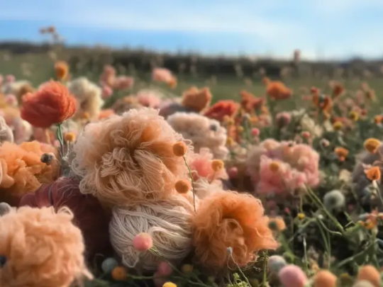
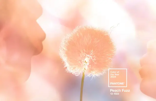
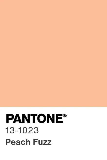
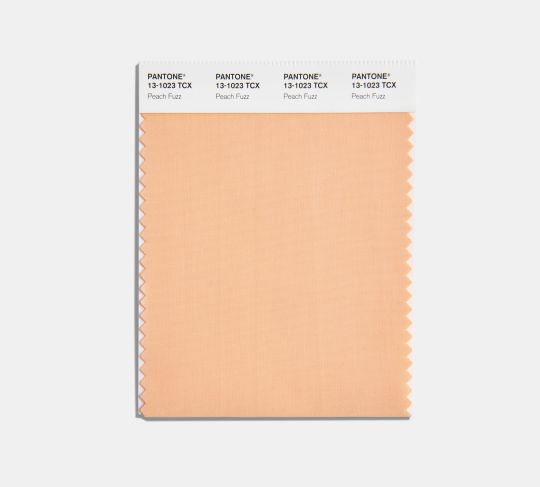
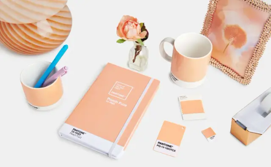
Pantone’s Color of the Year for 2024 'Peach Fuzz'
The gentle, pinkish-orange hue was chosen to reflect a collective desire for respite
A soft, pinkish-orange hue called “Peach Fuzz” is Pantone’s pick for the 2024 color of the year, the company announced last week.
Officially called “Pantone 13-1023 Peach Fuzz,” the color is “velvety,” “gentle” and “subtly sensual,” according to the design and color authority.
Pantone is best known for its color-matching system, created in the 1960s, that numbers and organizes hues with a distinct chip format. The company also runs the Pantone Color Institute, which selects the color of the year and conducts color trend forecasting research.
This year’s choice “echoes our innate yearning for closeness and connection,” says Leatrice Eiseman, executive director of the Pantone Color Institute, in a statement.
“We chose a color radiant with warmth and modern elegance,” she adds. “A shade that resonates with compassion, offers a tactile embrace and effortlessly bridges the youthful with the timeless.”
Peach Fuzz is Pantone’s 25th color of the year. The annual announcements began in 1999 to “engage the design community and color enthusiasts around the world in a conversation around color,” per a statement from Laurie Pressman, the Pantone Color Institute’s vice president.
Every year, a team of color experts examines movies, art, fashion, design, travel destinations, technologies and more to figure out which colors are influencing the world in the current moment. They also use forecasting tools, color psychology research and other sources to predict upcoming trends. From all that research, they narrow down the options to just one color that they feel sets the tone for the year ahead.
Peach Fuzz is less bold than last year’s choice, a bright, pink-red shade called “Viva Magenta.” But the world felt different in 2023, when Pantone “celebrated coming out of the malaise of the last year,” as Eiseman tells CNN’s Leah Dolan. Viva Magenta was intended to evoke verve, power and grace as the world emerged from the pandemic and continued to grapple with social unrest, as NPR’s Rachel Treisman wrote last year.

Heading into 2024, however, Peach Fuzz “arrives at a dark time amid a tumultuous war and a tense election year,” as Angelica Villa writes for ARTnews. The more muted hue is meant to reflect the “need for some quiet, some peace, some respite,” Eiseman tells CNN.
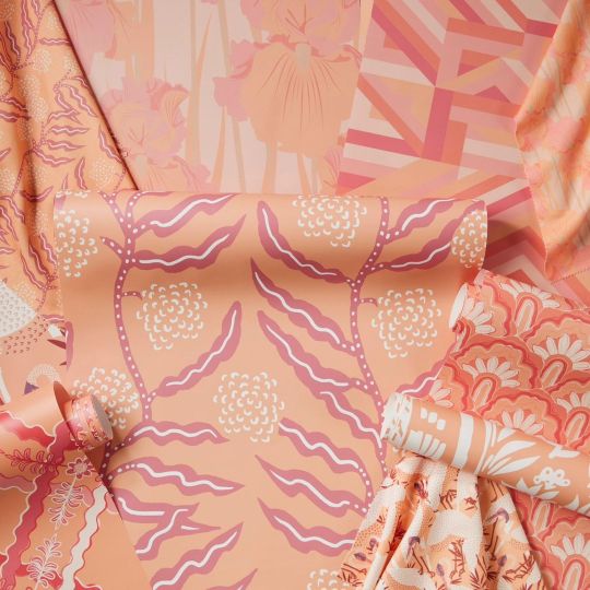
Where will Peach Fuzz show up in 2024? Rugs, wallpaper, fabric, makeup, tea and more—which are all examples of products released in conjunction with Pantone’s announcement. The color is already showing up in fashion, with celebrities like Taylor Swift and the Rock wearing Peach Fuzz to various events, notes USA Today’s Emily DeLetter.
“It feels like another rediscovered neutral that’s meant to seep its way into every surface of our lives,” said Jeremy Allen, the art director for the New York Times Styles Desk, in a conversation with colleagues.
By Sarah Kuta.
#Peach Fuzz#Pantone 13-1023 Peach Fuzz#Pantone’s Color of the Year for 2024 'Peach Fuzz'#Pantone’s 25th color of the year#Pantone Color Institute#color#colorful#style#design#art#artist#art work#art world#art news#pink#pretty in pink
34 notes
·
View notes
Text
Motorola Edge 60 Pro Specifications And Availability
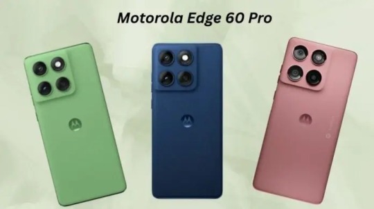
Customers may explore their inner and outer worlds more than ever with the Motorola Edge 60 series. Motorola Edge 60 Pro and Edge 60 can handle any profession or passion with their unique design and expressive skills. Motorola's first quad-curved design in this market segment with vibrant colours and textures, the most advanced edge device camera system ever with four pro-grade cameras, industry-leading durability standards, and new Moto Artificial Intelligence features that make daily life smarter, more effective, and more natural make both gadgets exciting.
Comfortable quad-curved design
The Edge 60 series' ultra-thin, continuous quad-curved design is pleasant to grip for long durations. New textured backings and gentle, curved edges give it a patterned look. The Motorola Edge 60 Pro sparkles with Pantone Shadow, Dazzling Blue, and Sparkling Grape. It has leather- and nylon-inspired finishes. From modest to vibrant shades, these trendy picks are conversation makers and suit a range of personalities.
Motorola Edge 60 is worth another look with its canvas- and leather-inspired PANTONE Gibraltar Sea and Shamrock finishes.
Like electronics, these innovative materials are attractive and durable. Both gadgets have top durability standards. MIL-STD-810H certification protects against extreme temperatures, 95% humidity, high altitudes, and 1.5-meter falls, whether rock climbing on vacation or dropping a phone on the way to work. The smartphones also include IP68/IP69 certifications and Corning Gorilla Glass 7i5, giving the finest protection against sand, dust, dirt, high-pressure water, and 1.5 meters of fresh water for 30 minutes.
Pro-grade photography for visual storytelling
Motorola Edge 60 Pro and 60 use technology and software to take great images. Day or night, four professional-grade cameras ensure every close-up or distant view matches consumers' expectations. Because advanced software eliminates guessing, customers can point and shoot for high-quality photographs. The Sony LYTIA 700C sensor in the 50MP main camera system offers brighter photographs in any lighting. Short blur-free intervals are due to OIS and 32x more focussing pixels in omni-directional all-pixel focus. The 50MP ultrawide angle lens lets users capture a huge group of friends, a city skyline, or snow-covered mountains, while the 10MP telephoto lens takes clear, detailed distant shots. Users may view the scene clearly from three times away with the Motorola Edge 60 Pro optical zoom, and fifty times closer with Super Zoom. The telephoto lens assist creates realistic photos that highlight a subject's features and more. Users may use the phone's 50MP front camera to capture impromptu selfies. Moto AI and Photo Enhancement Engine work together to improve quality, reduce noise, and refine details beyond hardware. This displays every image as it appears in real life. These candy bar phones are the only ones to achieve this certification, and their cameras meet Pantone Validated colour and SkinTone Validated requirements. With Ultra-HDR, material may be more bright and colourful. The Motorola Edge 60 Pro's AI-powered features let photographers finish their shots faster while playing with contrasts, themes, and angles: Group Shot automatically blends multiple frames in one second. This ensures everyone wants nice photos. Video quality enhancements include audio, colour, exposure, and clarity.
Moto AI enabled magical interactions
Moto AI is becoming a proactive, observant partner and improves camera experiences and daily duties. The Edge 60 series will include advanced moto AI prompts. Pay closely and remember that consumer input modified these. This information also affected how users used the Moto AI Edge 60 Pro, creating some of the most intriguing experiences. Next Move is a real-time suggestion system that recognises an itinerary or recipe on a user's screen and suggests next steps. They may use Playlist Studio to make a playlist based on the recipe they're seeing, store important information, or use Image Studio to create an image, avatar, wallpaper, or sticker inspired by their next trip. Smart Connect with AI lets users start a multitasking hub, broadcast to a TV, or mirror to a PC or tablet with a voice or text command like “show me this on my TV.”
Films with long battery life
Larger, sharper screens allow people to fully immerse themselves in their passion projects. To enhance content and details, the Edge 60 series has a 6.7" pOLED quad-curved display, Motorola's brightest and most dazzling. The on-screen activity highlights the user's current hobby, whether it's a new TV show or a topic they're researching. Pantone SkinTone Validated display and colours authenticate this information and people with varied skin tones. Users may utilise Dolby Atmos for immersive sound with these visuals. Customers changing activities or places don't worry about finding a power outlet. DXOMARK awarded the Motorola Edge 60 Pro the Gold Label and the highest smartphone battery score for its excellent battery life and charging. With 90W TurboPower charging and a 6000mAh battery, the Motorola Edge 60 Pro charges in six minutes. Additionally, 15W wireless charging provides maximum power and independence (wireless charger supplied separately). In addition, the efficient MediaTek Dimensity 8350 Extreme CPU powers on-device AI, fluid gaming, high-resolution videos, and more. Motorola Edge 60 has no power problems.
Its massive 5200mAh battery and 68W TurboPower rapid charging, which powers the day in eight minutes, enable recording, producing, sharing, binge-watching, and socialising.
Ecologically friendly fashion accessories
Moto Things may be linked to Motorola Edge 60 Pro and Moto Edge 60 to stay informed and complete a wardrobe. Moto buds loop, Motorola's latest earbuds featuring Swarovski crystals and Bose Sound. This set is ideal for those who desire superb sound without sacrificing style or comfort. With fitness assistance, the Moto Watch Fit works with most Android devices. These enhancements allow users to enjoy great music while monitoring their health and daily routines. Motorola Edge 60 Pro Release Worldwide release of the Motorola Edge 60 Pro occurred on April 24, 2025. World-wide availability Along with Europe, Asia, and Oceania, the phone is now available in the UK. It won't be available in the US. India availability India will soon get the Motorola Edge 60 Pro. Motorola India lists it on its website. Flipkart teases an online release. Before April 2025, India's debut date and selling details are expected.
#MotorolaEdge60Pro#MotorolaEdge#motoai#ArtificialIntelligence#MediaTekDimensity8350#MotorolaEdge60#News#Technews#Technology#Technologynews#Technologytrends#govindhtech
2 notes
·
View notes
Text
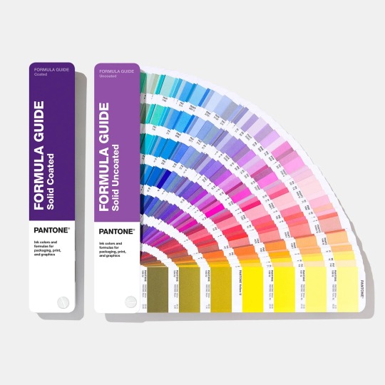
TPG/TPX Pantone Book (FHIP110C) BD
The TPG/TPX Pantone Book (FHIP110C) is a highly regarded tool for professionals in industries like fashion, interior design, and product development. This Pantone TPG color book is designed to help users select, communicate, and apply accurate colors for a wide variety of applications. Whether you’re working with textiles, plastics, or paints, this book simplifies the process of color matching.
What is the TPG Pantone Book?
The TPG Pantone book is part of the Fashion, Home + Interiors (FHI) system. TPG stands for Textile Paper Green, which reflects the eco-friendly reformulation of the TPX (Textile Paper Extended) series. This color Pantone book is ideal for non-fabric products such as home furnishings, ceramics, and cosmetics.
The TPG/TPX Pantone Book (FHIP110C) is an excellent choice. It combines sustainability, a vast range of colors, and user-friendly features to meet the needs of professionals across various creative fields.
Specifications
Model : FHIP110C Brand : Pantone Origin : USA Color Number : 2800 Fashion Color Pack : two-volume set Type : TPG/TPX collection : 175 new hues in the Dualities
2 notes
·
View notes
Text
"How To Mix Custom Pantone Colors For Printing On T-Shirts"
youtube
Pantone "spot colors" are physical products made by mixing specific proportions of colored inks.
The Pantone Matching System was invented in 1963.
You can see Pantone colors in real life. But not all of them can be accurately reproduced by the red, green, and blue dots on your phone or computer.
0 notes
Text
I am a doll collector with BJD and buying parts or making hybrids can be a pain to color match. Just like playline dolls there’s not much consistency between brands. Some resins age differently, too.
The most reliable color matching source would probably be something like Pantone color cards, but those are FREAKING EXPENSIVE and it’s not reasonable to expect everyone to have them.
BJD collecting is an expensive luxury hobby and there are some of us that do need to keep our spending as minimal as possible.
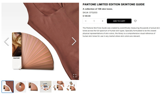
This skintone chips set (https://www.pantone.com/products/fashion-home-interiors/skintone-guide-limited-edition) has an excellent range of skin tones, but seems to be lacking the pasty pale practically white colors a lot of Asian BJD come in and costs as much as a lower-priced BJD.
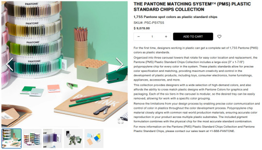
This set (https://www.pantone.com/products/plastics/the-pantone-matching-system-plastic-standard-chips-collection) seems ideal for color matching plastics, which resin is, at first but it’s polypropylene chips which will degrade in a few years, and not all colors of urethane or epoxy resins can be replicated in polypropylene. It’s also NINE THOUSAND FREAKING DOLLARS.
We all know I’m always looking for something functional and accessible and $9k that’s going to discolor and maybe even crumble in a decade is not my idea of accessible.
-
@maleficentmrsofallevil suggested a digital resource (https://redketchup.io/color-picker) which is free and accessible to most collectors that have an internet connection and using HEX codes is consistent across devices, however there are a few problems that we might run into.
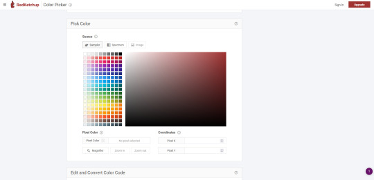
Everyone’s monitors/phone screens and cameras would have to be calibrated exactly the same, and everyone’s lighting when making comparisons would have to be identical for this to be a viable resource. The hex chart being backlit could also skew the way it looks compared to a tangible resin sample.
That’s frustrating. Free and easy for most people to get a hold of is the ideal.
The main benefit of a physical vs digital resource for color matching is that the color sample and the doll are both subjected to the same lighting conditions, monitor settings, and camera settings so even if those factors vary between users, the comparison will still be relatively accurate.
-
A bunch of us sat around discussing different options. International hobby paint brands like Vallejo or Mr. Color, international makeup foundation color cards, etc. etc.
I’ve decided to give DMC embroidery floss color cards a try.
There are two versions.
One has samples of the actual floss in the book and costs about $40.
https://amzn.to/3Oq8G2f
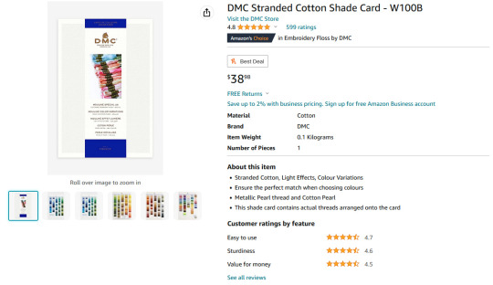
The other has printed color blocks that presumably match the floss colors and costs about $10.
https://amzn.to/3Q2H8Bb
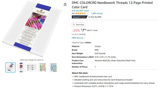
DMC are sticklers for their colors being the same across dye lots. Sometimes they change the numbers on colors and sometimes they discontinue colors all together, so we do still run into the issue of whether everyone’s looking at the same color cards or different versions.
At $10, needing to replace or update the color card every few years isn’t nearly as daunting as a $9k plastic samples set falling apart in your hands once a decade.
(Can you tell I hate polypropylene when used in conjunction with dolls?)
Other variables that will affect the efficacy of using DMC color cards are the conditions under which the color cards are kept like sun exposure, temperature, humidity etc. affecting either the color of the thread samples or the quality of the printed samples.
Another factor is consistency between printed samples.
I have not received these, yet, but my plan is to first compare them to each other to see how well the printed samples match the swatched samples, and then proceed from there.
21 notes
·
View notes
Text
Gonna be a little mean maybe but I still think it was pretty funny when Adobe decided to paywall Photoshop's integration with the Pantone Color Matching System and Stuart Semple decided to piggyback off of his reputation as some sort of liberator of the art world by releasing a screen-picked color palette that solved absolutely none of the problems created by Adobe's decision but that managed to look like a legit enough solution as long as you didn't know what the Pantone System actually does and your understanding of the problem was "Photoshop is copyrighting a bunch of fancy colors" and a lot of artists on this website who didn't know what the Pantone system is for (because you'll literally never need to use it or know what it's for if you're a purely digital artist) were singing his praises while everyone who actually needs to use Pantone colors was like "this does literally nothing".
16 notes
·
View notes
Text
LSAD Seminar 01: Colour Theory with Sylvia Shortall
What is Colour Theory?
In it's most basic form, colour theory is the study of how colours relate to one another and how this, in turn, affects our perception of them. The feeling or emotion evoked by a colour or combination thereof is of particular interest this field of study.
Above: An old RTE test card from 1978 recorded by Andrew Walmsley on Youtube.
The Medium Affects the Message
An important consideration when discussing clour and colour theory is through what medium the colour is being perceived. For instance I have two desktop monitors; A pen display for digital art and an old Dell monitor from a million years ago. Due to differences in technical specifications and calibration they display colour slightly differently. The pen display is marketed toward artists for its colour accuracy, whereas the Dell monitor was basically made to for looking at spreadsheets. If I slide a picture across from one monitor to the other, I can observe the colours change in real time. In this sense, the accuracy of colours is something we can take for granted.
youtube
Above: A video which explains digital colour and how images are projected onto monitors.
Enter PANTONE
So if we can't even trust a colour to look the same between two different monitors, how on earth can brands like Coca-Cola or Starbucks slap their logo on every conceivable product under the sun with one recognisable colour?
Well for better or worse the answer is Pantone LLC and their proprietary Pantone Matching System (PMS). Basically Pantone have a specific formula to render any given colour in any given format. For instance an average computer monitor recreates colour through backlighting hundreds of tiny pixels varying shades of red, green and blue. This is known as the RGB colour model, which is considered "additive" as the colours "add" together to create their intended effect. Print media on the other hand, uses the CMYK colour model. The is a "subtractive" colour model, where the cyan, magenta, yellow, and black (K) mask one another out gradually until the desired tone is created. Pantone somehow they were able to copyright this process and have people pay them for it. If it's not obvious, I hate Pantone and here's a video that should explain why:
youtube
Above: A good video about a bad company.
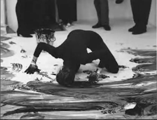
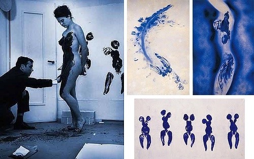
Janine Antoni - Loving Care, 1993
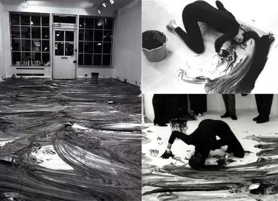
Sylvia actually recommended I research Janine Antoni for my project, so I was happy too see her work show up in this seminar. Personally I feel colour is one of the less important aspects of this particular piece, but all the same, it's roll can't be diminished either.
The use of commercial hair dye, Antoni's long hair and the act of mopping play into stereotypes of women and their gender defined "roles" in life. The gallery floor becoming covered in dye and the audience being gradually forced back out the door they came in can be seen as an act of reclamation. In this sense Antoni is challenging gender roles by using the traditionally feminine to accomplish the traditionally masculine. For me, it brings to mind the contrast between how men and women sit in public spaces, the phenomenon of "Man-spreading". Something that is seen as a faux pas for women but normalised for men. Antoni makes the viewer confront this kind of everyday sexism.
I think she choose a monochrome colour palette here for the contrast. The deep black on the brilliant white. The Yin and Yang of those shades is often said to represent men and women. I'm gonna move on now cause I'm really just rambling about a piece of art I enjoy.
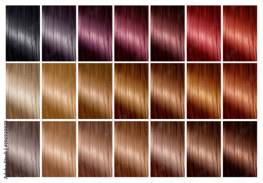
Above: Hair dye charts bear a striking resemblance to Pantone swatch booklets.
Colour for Legibility
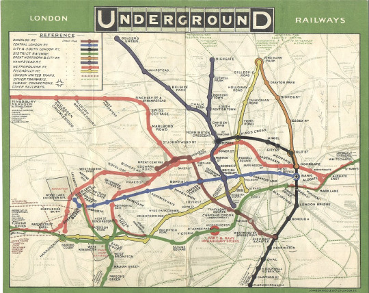
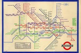
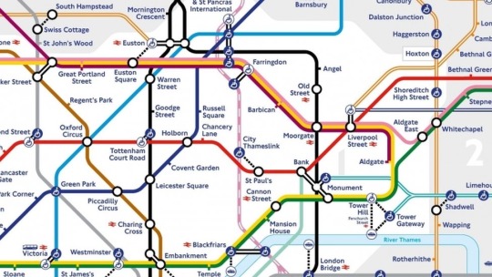
Many maps, such as the famous London Underground map designed by Harry Beck, use abstracted visuals and colour to distinguish between and make clear what might otherwise appear as confusing and arbitrary.
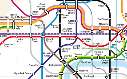
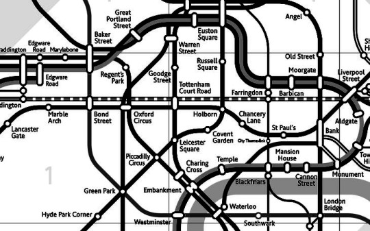
Above: You can tell me which one of these two maps is more legible...
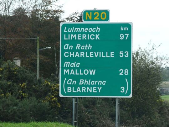
Similarly road signs are specifically engineered in such a way as to be legible under any given time of day or weather condition, regardless of colour.
The Politics of Colour
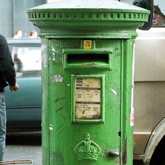
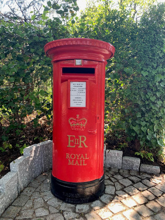
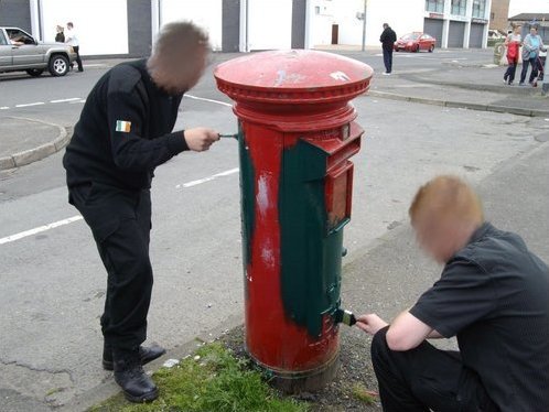
Colour can mean a lot more than simple aesthetics. As Sylvia points out in the lecture, there can be strong political associations with specific colours. A powerful example of this is how our public post boxes in Ireland were mandated to be painted green after the country achieved independence from British colonial rule. In fact the shade of green was entirely arbitrary, one could argue the act was more about the removal of the distinctly British-associated shade of red, which itself speaks volumes of the power of colour.
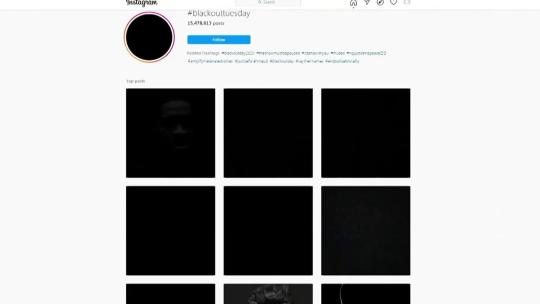
A similar example of the political power of colour was the #Blackout campaign to protest against racism and police brutality following the killing of George Floyd.
Copyright and Colour
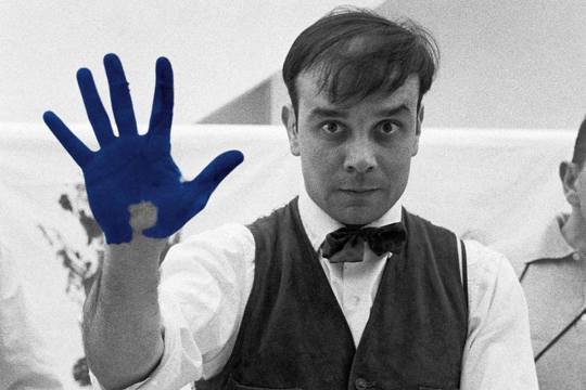

Left: Yves Klein, Center: Anish Kapoor, Right: Stuart Semple
A bit similar to Pantone and their patented method of matching colour, a number of artist have gained infamy for their roles in legal ownership and exclusive use of colour.
Yves Klein, an influential french artist and pioneer of performance art. Klein, in collaboration with Edouard Adam, created a vibrant blue, reminiscent of the lapis lazuli used in medieval paintings of the Virgin Mary. This shade was dubbed International Klein Blue or IKB. Klein registered this process with the French patent institute in 1960 but never formally patented it.
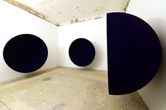
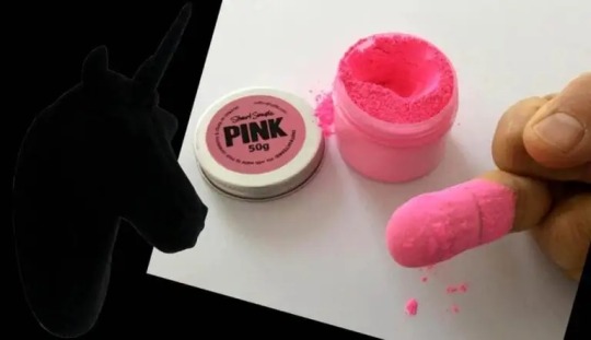
Renowned British-Indian artist Anish Kapoor, known for sculptures such as "The Bean" and Sky Mirror, was granted exclusive artistic use of the super-black coating Vantablack by it's creator Surrey NanoSystems in 2014. This provoked widespread criticism across the art world.
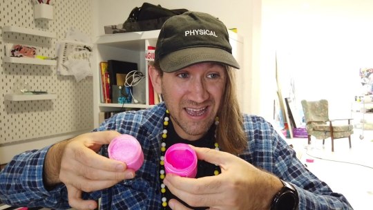
Kapoor drew particular criticism from Biritsh artist Stuart Semple. Semple, in retaliation to Kapoor's exclusive licensing of Vantablack released a shade of pink paint called "PINK – the world's pinkest pink paint" with the specific legal caveat that it could not be purchased by or for Anish Kapoor. This spurred him on toward a movement of democratising colour, creating affordable alternatives to patented shades such as the aforementioned Vantablack but also to Yves Klein's IKB and even an alternative to Pantone's matching system.
If it's not obvious I think artists have legal exclusivity to materials of any kind is an affront to art itself, and I'm happy to see people like Semple challenging the practice.

Above: Anish Kapoor's now iconic reply to Stuart Semple after getting his hands on PINK.
Stanley Whitney and Colour
youtube
Stanley Whitney is an American painter known for his use of colour and politically motivated art. I included a video above where he talks both about important political causes like contraceptive rights and also his feelings on colour.
What I admire specifically about Whitney's work is his persistent use of a loose grid as a composition. It highlights just how much emphasis he places on colour. What speaks to the viewer in a Stanley Whitney painting are the colours and their relationships between one another.
7 notes
·
View notes
Text
Colour Theory Seminar {Part 1}
Hey Tumblr,
Today I went back and watched the colour theory seminar, I had watched it before but decided to re-watch it to take notes on and post about it.
Colours can be perceived differently depending on what you're looking at it from, for example it will look different on a laptop or phone from a piece of paper. There are different factors such as the calibers of equipment, if your printer is running out of ink or even the lighting your looking at it from.
Test cards are physical cards which are held in front of cameras used for calibrating alignment. They're made up of patterns to adjust the receiver in televisions and to make sure it's displaying the colours correctly.

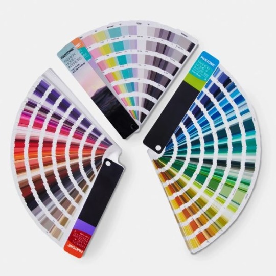
The Pantone Colour Matching System (PMS) is used to communicate through colour and to keep consistency throughout various materials and finishes. People and manufacturers use it to refer to to make sure they're colours match one another. It uses the CMYK process which is standard for most printer worldwide.
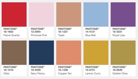
Each year Pantone pick a colour of the year, which in 2020 was Classic Blue 19-4052 which is seen as "a restful colour" and "brings a sense of peace and tranquility".
In 2021 they picked Illuminating 13-0647 and Ultimate Gray 17-5104. They grey is a flat colour in the middle of the spectrum, where as the yellow is an artificial florescent colour. By putting the yellow next to the grey it enhances the viewers perception of the yellow, giving it a metallic taint,

Fine artist Janine Antoni made a performance piece called 'Loving Care' in 1993. She mopped the floor of the gallery with her hair soaked in loving care hair dye colour natural black. This act was linked to mopping but also to abstract expressionist painting.
The London Underground map, made in 1908, uses lines of different colours to show different train lines. The map shows how the lines actually look throughout London so it doesn't show the Metropolitan line fully. In 1933 Harry Beck redesigned the map. He used vertical, horizontal and diagonal lines to simplify it. It shows individual stations and connecting stations. Although easy to read it looks like nothing the city of London.
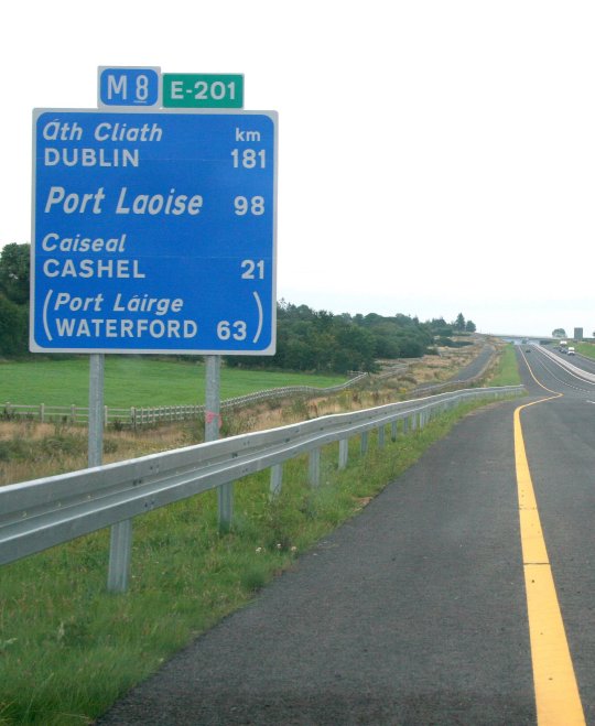
Another example of colours being used is in road signage. Signs today look different to how they did back in the 30's and even the 80's, with todays being simplified. Brown indicating area of historical interest, white signifying placenames and yellow showing roads. Between 1957-1976 two british graphic designers created signage for the UK motorways by asking themselves, 'what would I like to see when I'm driving?'. At night the signs are slightly illuminated and are made so the letters are still visible. The colours help indicate what's ahead even if the driver didn't read what the sign said.
Colour is also an indicator of identity. In Ireland post boxes used to be painted red to show British rule over Ireland. In 1922 the Irish government ordered all post boxes be painted green.

This is all from part one of the seminar, I'll make a separate post about part two as I feel it would be too long of a post if I did them both together :)
6 notes
·
View notes
Text
Notes on Colour Theory Seminars
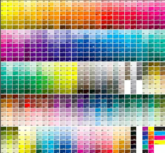
Pantone
Pantone standard colour matching system, used by over 10 million designers, ensures standardisation
Pantone uses the CMYK process
As of 2023 there are 2390 colours in the Pantone system
By pairing grey as an accent with other colours it increases the viewers perception that the other colour has a metallic taint
My favourite Pantone colours of the year
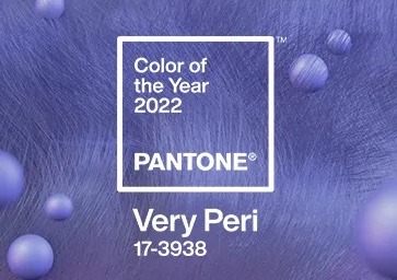
2022, Very Peri, 17-3938
2019, Living Coral, 16-1546
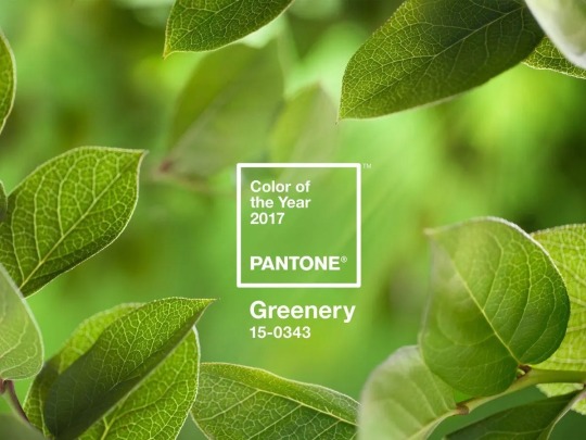
2017, Greenery, 15-0343
2014 Radiant Orchid, 18-3224
2012, Tangerine Tango, 17-1463
Use of Colour in the Real World
London Underground uses coloured lines that are all horizontal, vertical or diagonal at 45 degrees to create a simplified map of all the stations and stops that’s easier for the user to navigate
Road Signage
Brown indicates areas of historical interest, white for place names, yellow for roads
In the late 1950s, Jock Kinneir and Margaret Calvert, two British graphic designers, created the signage from the UK motorways and created new fonts for them. This signage was later adopted by Ireland too.
Contested Spaces
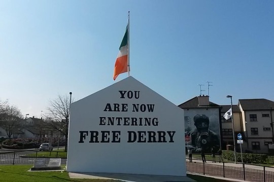
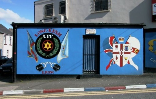
Derry is a prime example of a contested space in Ireland. On the Bogside (mainly catholic area) of Derry, the tricolour is widely used as a symbol of Irish nationalism
While on the Waterside, the Loyalist (Protestant) area, the use of Union Jack colours and orange dominate the area.
Our postboxes were originally red under British rule, 1922 when we gained our independence, painted green
Use In Fine Art
International Klein Blue
Developed by Yves Klein
Heavy reliance on ultramarine
Copyrighted the colour in 1958
Used Klein Blue as a central component in his works
Vantablack
absorbs 99.96% of light
When lights hits the pigment it becomes trapped inside it
Developed for military purposes by the company NanoSystems
Anish Kapoor bought the colour from NanoSystems
The Worlds Pinkest Pink
In 2016 Stuart Semple created the world’s “Pinkest Pink” in retaliation to Kapoor buying the rights to Vantablack
Semples pink is available to everybody except Kapoor, who is banned from buying it
Must sign a contract when you’re buying it that you’ve no affiliation with Kapoor
2 notes
·
View notes