#color tutorial
Explore tagged Tumblr posts
Note
Hullo! I’ve been watching a bunch of your Timelapses and I was wondering how do you always come up with the colours for your pieces? They’re always so cohesive and pleasing to look at (I almost exclusively work in greyscale so if I’m using colour it’s always a lucky guess and it never looks quite right)
Hey there!
I have to be honest that most of the time I don't actually know what I'm doing and that I have no idea how most of my pieces are gonna turn out. My work process is usually based on "Fuck around and find out", haha. I'm happy to know that it apparently doesn't come across that way, though.
A lot of it comes very naturally to me simply because I've been drawing non-stop for so long, but I can give you some small tips that really help me:
1. Have as many references as possible!
Here's what my reference sheet looked like for the Jayvik piece:

It helped me a lot to understand the overall color scheme I wanted to convey. Lots of very cold tones, pinks and very light blues and greens. These colours sorround Jayce and Viktor throughout all of season 2 and I wanted to keep them, especially since in my piece they are lying in the glowing hexcore.
Don't shy away from using references, get as many as you possibly can! Look at other poeple's art too and try to understand how they work with colours.
2. Work with complementary colours!
Since I paint a lot of romantic illustrations I want them to look pleasing and comforting, which I can accomplish by using complementary colours! You see this a lot with couples that are blue and red coded, for example. And I wanted to do the same thing in the Jayvik piece! For that I used the highlights in their hair!


Viktor's highlights are a soft pink hue.


While Jayce's are a soft blue hue.
The colour wheel works perfect for figuring out if two colors compliment each other because they are literally right across from one another!
3. It doesn't have to be true to life.
Pretty self-explanatory, but I thought I'd add it in here anyways. It's important to understand how colour and light works, but you don't always have to follow the rules. Does the rim light look cool but it makes zero sense? Who cares! Keep the cool rim light! Just have fun and fuck around.
4. A little trick to make your life easier!
I'm not excatly the best at colour theory, I still struggle with it quite a bit, but here's a little trick I like to use from time to time:
If you want all your colours to look coherent, take one specific color as your flat colour. Choose a hue that you would like your piece to have. Like this:

Now you choose whatever colours your characters have and paint them in. For example, here are the skin colours I chose for Jayce and Viktor:

Looks off, right? These colours don't fit the overall piece at all. So what do we do?
Turn down the opacity! It's that easy, wahoo!

I went from 100 Opacity to 72 for this specific illustration. And look at that!

It's so much nicer already! Now you know what colours to use as your actual flats! Just repeat this with every other part of your illustration and you'll have a great starting point. :)
I really hope this was helpful! I'm not an actual teacher and I don't have a proper illustration degree, so some things might not be completely accurate, but I thought I'd try my hand at this anyways!
#teacher han is at it again#if I talked bullshit forgive me#I just hope I was able to help at least a little bit haha#I'm always happy to give some tips!#art process#art tutorial#color tutorial#colouring#illustration#tips#my art#arcane#jayvik#tutorial#anon#ask
792 notes
·
View notes
Text

made a rendering tutorial a bit ago since i had a few people asking about it. hope this helps!
since tumblr might butcher image quality, you can download the high quality file here and you can download my brushsets here. im always happy to help with art resources so if anyone else had any ideas in mind for future tutorials please feel free to shoot them my way
#murder drones#uzi doorman#murder drones fanart#glitch productions#md fanart#tutorial#drawing tutorial#color tutorial#art#art resources#my stuff
680 notes
·
View notes
Note
Do you have any recommended tutorials on lighting? You have such a way of making your skies glow with sunlight and i admire it a lot.
honestly doing studies helped me a lot more than anything else!! i rly recommend that everyone does studies and continues to do studies bc it helps u improve !
youtube
476 notes
·
View notes
Text
How to Make your Premade Pixel Palettes Pop! | Pixel Tip
sorry for the messiness of the video, first time actually speaking English verbally/Editing an actual video 😭
I hope you like it!
(Also, if you really like this, support the YouTube release here)
#pixel art#art#tips#tip#art tutorials#tutorial#anubi arts#anubi tutorials#thats right we have a tutorial tag now#pixel tip#palettes#color palettes#palette tutorial#color tutorial
97 notes
·
View notes
Text

This lovely lady helped me make a coloring technique tutorial! The full tutorial is under the cut, or you can download the PDF for free or check out the timelapse over on my Ko-fi Kofi | Inprnt | Cara | Twitter
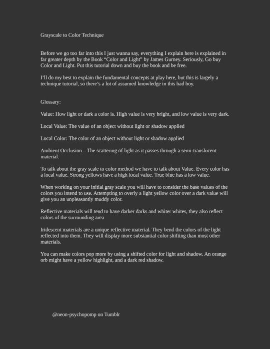
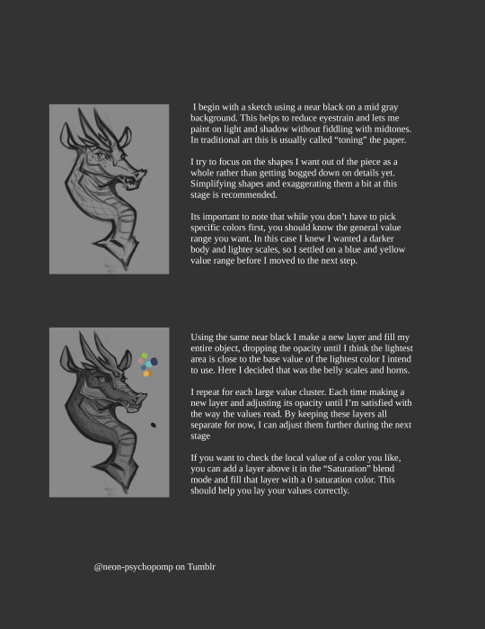
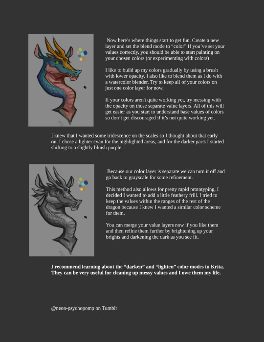
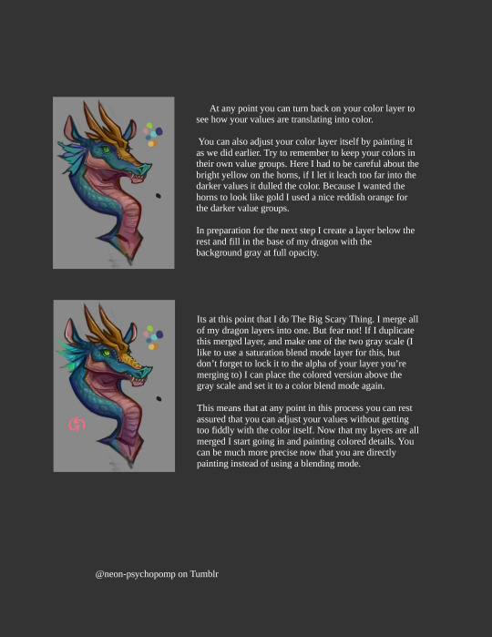

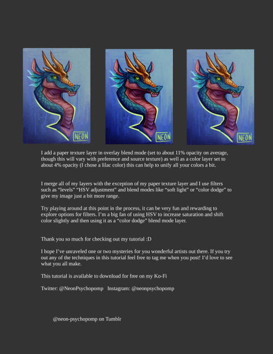
A special thank you to @eatember for showing interest in a coloring tutorial :D I hope this helps a bit ^^ If this helps anyone out, consider donating over on my ko-fi to help me fund future tutorials :D Have questions or want to request a tutorial? Feel free to drop a comment and I'll do my best to oblige.
#krita#digital art#artists on tumblr#art#digital painting#fantasy#creature design#tutorial#color tutorial#krita art#art tutorial#dragon
74 notes
·
View notes
Note
How do you pick colours to use for your characters? Also do you have any advice for character designs with meaningful colours? A lot of information I find online is either contridictory or feels too reachy
Colors and Character Design
Oooo good question! And perfect timing too-I’ve been updating the Key Art for my OCs and just finished the first two characters, who coincidentally are perfect for this as examples! I would use Anthea and COTL for this, but for color symbolism especially, using OCs rather than game characters with pre-set colors (aka Red for the Lamb’s cloak, White for Baal, Black for Aym, ect.) would be a lot better since while I can interpret the game designer's reasons they're not exact.
Picking Colors
Now, how do I pick colors? Typically I prefer jewel-tones for my palettes, so vibrant but not oversaturated, and somewhat dark but not muddy. I just like how they look for the most part.
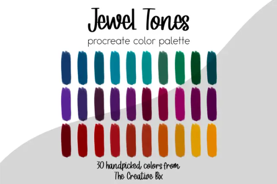
Typically when working with a character, I usually set two things down first in their lineart-their skin tone and their hair color. The reason for that is its a LOT easier to pick colors when you know WHAT they’re going against because color is relative (meaning whatever colors are next to each other will slightly influence how they’re perceived as a whole), or at least in this case its easier. I typically know what skin tone my characters are going to have since I’ve had most of my main OCs for a decade now, though even if it's not a set in stone color I still at least place one down first then adjust down the line, like with Anthea and Narinder’s cameo in my Christmas piece I originally had their skin set as this olive-undertone one before warming their colors up after messing around for a bit with their clothes.


Skintone is kinda really important to have the colors match (Or match with multiple skintones if its say, a uniform everyone wears for example) to avoid issues. It both helps the character look nice in their outfit, and avoids a Nasica and the Valley of the Wind situation where your character's pants are a bit too close to their skin color and make some poses awkward.
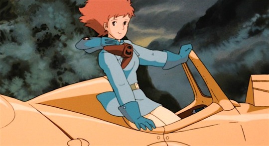
(See how Nasica’s pants are a light cream color but her skin is a very light peach? Depending on the quality of the film scan/shot they can appear identical and make it look like she's wearing a short dress and nothing underneath)
Anyway, with Chrysa and Leo, who you'll see shortly, their characters have been with me for a decade, so whenever I redesign/update their looks I kind of already have a set skin/hair for them. Chrysa’s meant to be very pale with red hair, while Leo has a warm tan and brown hair. I also never use pure white for eyes whites/teeth, and instead lower the opacity down to like 70-80 to let the skin tint it a little, this is just to help keep it from being too sharp. After skintone and hair are down, it’s onto Theme Color.
Theme Colors

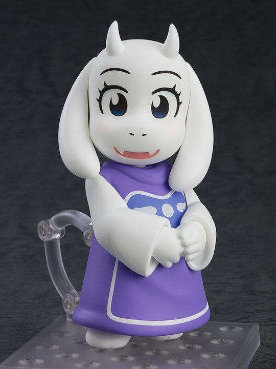
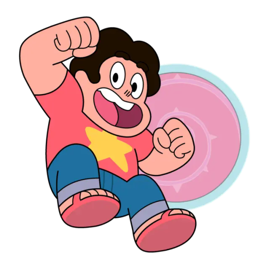
It’s very common in media for certain characters to have a ‘theme’ color, so a color they’re always wearing/associated with. Sonic the Hedgehog is blue, Toriel is purple, and Steven Universe is pink. Now this isn’t always the case, the girls from the 90s version of Sailor Moon for example wear a bunch of colors like most people do for every-day looks, but in character design if your character primarily has one outfit it’s good to pick a main color, and especially one that matches them.
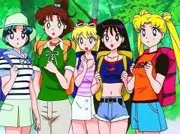
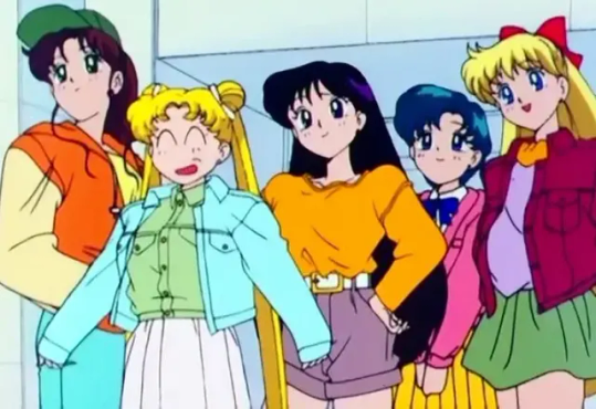
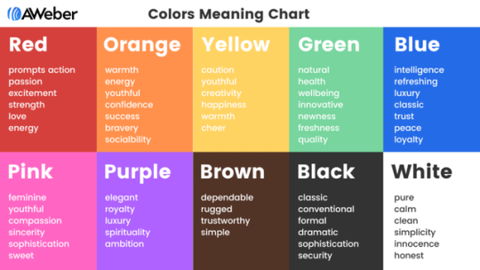
Colors have meanings both positive and negative beyond just the chart above (and there are a lot of different takes that can even vary from culture to culture), like how Red is passion/anger in the west, but in China represents joy and prosperity. Your character doesn’t have to match every one of those meanings for them to use that color though. For Chrysa and Leo here:

Chrysa: Purple meaning Royalty, Mystery, and Compassion Chyrsa’s a princess who’s been exiled and disgraced since she was born, she has a whole lot of mystery surrounding her purpose in life and just what she is (as she has magic and abilities most mortals typically don’t-which spoiler alert she is only alive as the the result of some godly intervention via a pact between the Goddess of Death and a dishonest queen), and her greatest strength is her kindness and compassion towards others regardless of who they are. She also has a sub-theme color in pink (so her secondary color) because of its association with youth, since Chrysa's isolation left her rather not so much naive but unaware of the outside world, which gives a lot of her morals and beliefs this youthful optimism. Leo: Green meaning Nature, Growth, and Selfishness Leo’s the healer of the party who is more knowledgeable of the world around them both in regards to the kingdom they’re in (as he was raised by his mother a nomadic healer and traveled alongside her), and in regards to being more aware of the fae most mortals overlook. He’s got this unassuming look where his clothes don’t fit him right and a boyish face that makes it clear he’s got some growing up left to do when combined with his attitude, and especially at first Leo is rather selfish with others, often keeping his travel experience to himself when the party struggles in hopes they’ll give up their quest. (mainly due to having little faith left in their situations improving, kid's a huge pessimist)
Those are Chrysa and Leo’s basics, but that’s not all I was thinking about with their colors. While you can just leave it at that, I do have more reasons why I picked the shades/placements I did. Connecting the colors to where they’re placed on the design and why something is the way it is can be super important too. Heck, even where the outfit came from in-lore can be important too sometimes. So congrats, you’re getting a mini character design lecture too I guess? Really this is me just taking the excuse to talk about the little things I did with my OCs’ designs here lol, but its somewhat relevant so trust me. Also as usual you can see more of OC stuff here @illustratemuse
Also I was gonna go into Leo too, but to not go on for long we'll just look at Chrysa's today.
Symbolism and Connections to Design


For Chrysa her entire character centers around being ‘inbetween’ life and death. As a girl raised in isolation not really wanted by anyone after her mother died in childbirth, she never had the chance to ‘live’ when all she wondered was why she hadn’t ‘died’. Chrysa basically has no opinion on if she lives or dies, and just wants someone to straight up tell her what to do since she doesn't know what either fully mean. (Just what does life have to hold? Just what peace does death offer?) Thus her colors I specifically chose based off twilight, that time between day (life) and night (death).
She’s also meant to resemble both a nun (as the story follows her becoming a Priestess of Death and the nun appearance is a quick shorthand glance for ‘oh she’s the priestess of this adventure party’ to the audience) and a bride crossed with a mourner-that bride part because another element of her character is how a lot of people place her mother's image over her, down to even misremembering her mother’s slightly sharper and at times angrier face to instead being as soft and gentle as Chrysa’s. And what is often viewed as pure in regards to woman? Being a bride-whose dress can easily be recolored into a mourner's if you change the fabric from white to black. Her mother’s death haunts her despite her having little emotional connection to the woman, and thus that’s how she’s dressed, a pure white bridal gown beneath a mourner's garb for a mother she never knew.
Now Chrysa isn’t a bride and is not getting married, but that imagery is still there since for a lot of the story it’s other people giving Chrysa her outfits, so it's like they're trying to recreate either that image of Chrysa's mother on her wedding day or her funeral, though I used the darker purples mostly since again the twilight nod as well as simply to make her look more vibrant, especially with her hair. Were Chrysa's outfit actually black she'd stick out too much when placed alongside her party.
Chrysa’s colors are very dark clothing-wise, so we're naturally drawn to her pale face and bright, vibrant red hair. Red like her mother’s blood. Red and curled like the threads of life she cuts as a priestess. So bright and alive unlike the rest of her appearance, yet covered by the only actual black garment on her, the veil. (which note that it’s not pure black but instead a very dark purple-I recommend using a dark version of a color that appears black since it helps match nicer). For the veil, Chrysa’s outfit was from her maternal aunt who becomes her mentor as the only other Priestess of Death, a woman who tries to pretend that she sees only Chrysa and not the sister she lost. And yet what does she give her niece upon first meeting? A veil. And what was Chrysa’s mother’s hair? Long, black, and straight. Chrysa’s key defining trait, the one thing people cannot place her mother’s image over, the trait they cannot soften/alter in memories, was her hair, yet here it is covered in a way that still gives Chrysa her mother’s silhouette/hides that red.
Extra

Another little note is that if two or more characters are meant to go together check their colors side by side and adjust as needed! I usually line everyone up like this at the end to check them all over. Also at least for me, I have certain color types for certain materials that are the same for ALL characters in a cast. In my OC cast, metals like gold, silver, and iron are the same, as well as anything that’s white cotton or linen, since it helps unify the group. You can do leather too, but since leather can be dyed or colored you can honestly mess with its appearance to, that’s what I do where I tint the leather to match the theme color.
Conclusion
Honestly with color, study the characters you like and the types of colors they use, and don’t be afraid to color pick from a color palette from image site or from even a character you like. Make it your own, have fun, and just play around and see what happens!
#I like getting questions about character design they make me happy :D#I will yap about my OCs and symbolism and XYZ if you give me the chance don't think I won't lol#grimm rambles#grimm art tutorial#art tutorial#color theory#storytelling#character design#character design tutorial#color tutorial#my art#illustration#oc
46 notes
·
View notes
Text
alright, here it is: ZENO'S COLOR GUIDE 3.0 !
here, i'll have three "chapters" regarding color:
CH1: how i color in illustrations
CH2: color and character design (in zeno's case)
CH3: how zeno makes his colors cooler
CH1: HOW I COLOR IN ILLUSTRATIONS
it must be noted that, as of lately, i heavily use halftones in my art and the way i use them for gradients effects my color choices. of course you don't need to use halftones if you don't want to, as it's just my personal choice, but anything regarding halftones here could (probably) also apply to regular gradients!
when choosing colors in an illustration, i usually have three things in mind: mood, character, and contrast. we'll be using "gloomy bunny naptime" as an example here.
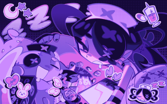
MOOD: what's the vibe of the piece? for example, here in "gloomy bunny naptime", wanted a mellow, sleepy vibe, so purples and pinks seemed like the best choice. these colors also have a dreamy effect due to being common in real-life early mornings/summer nights - basically, i tend to use associative colors in illustrations.
i usually only use a pallete of 3-7 colors, though of course more characters calls for more colors. for multi-character pieces, i would actually make a "rainbow" of colors based on the mood of the piece - essentially, a bank of colors to use for your colorful casts based on the actual rainbow. you can alter this based on the saturation levels you want! hope that makes sense. i'm not the best at this though, so i would heavily recommend looking for guides from artists who are more skilled in that department.
CHARACTER: velvet is the focus of the piece, and as a character her palette is made up of many purples and pinks. of course, it's easier because she and ribbon both have similar designs, but i would still recommend using colors based on/complementary to the focus character's pallete, though this is a rule that can and should be broken if needed. gradients can be used to provide a smooth transition from color-to-color and add depth to the piece, as well as showcase velvet's pallete. when making any gradient, you probably want to have a vibrant middle color. this is difficult to achieve in most art programs, so i'd do it like this:
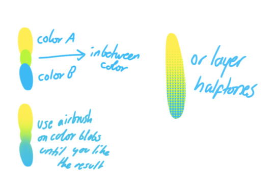
you can use gradients in lots of cool ways to make stuff pop! (i think this collage shows i use too much purple and pink though.)

CONTRAST: the context of the piece also aids the color through contrast. (that's a lot of Cs!)- we see that velvet is just waking up, and the light from her switch is glowing brightly. i wanted to convey something like her switch suddenly turning on in the middle of the night, waking her up - so the console emits "light" in the form of illuminating the contrasting color of pink against the purples. it might seem specific to this piece, but what i'm trying to say is that contrasting colors can lead the eye to the focal point of the piece, that being velvet herself. because a great deal of the rest of the piece is dark, we look at the contrasting switch screen - the brightest thing in frame - and our eyes move around and up to take in the focal point character. at least that's how i wanted it to be ;w; i guess you could convey it as something like this?
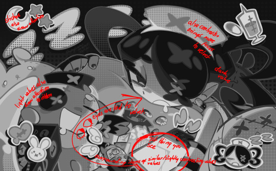
CH2: COLOR AND CHARACTER DESIGN (IN ZENO'S CASE)
this is where i start to get annoying, so stand back! when deciding on colors for a cast of characters, there are many factors: time period, variety, personality, and more that i can't think of.
TIME PERIOD: this one is simple. for example, a futuristic time period (such as that in x-calibur) calls for colder colors, such as greens and blues. for characters involved in futuristic professions such as space exploration, this works incredibly well. for modern time periods, less focus can be on colors and more on the shapes of the clothes, but this is not a shapes tutorial! i don't have any ancient times oc stories, but i'd probably use earthy and warm tones.
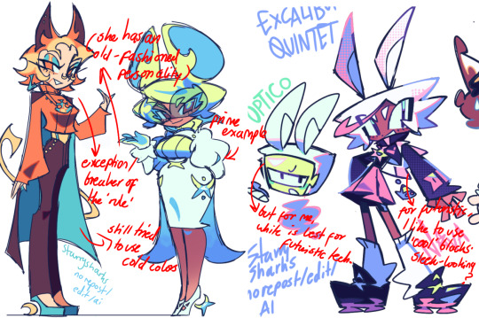
VARIETY: this is also rather simple. i try to be aware of the palletes that i used, and the similarities they might have with other characters. i try to use similar colors for characters who belong to certain organisations or have a uniform, but of course, it's not like catholic school students adhere their entire look to their uniform, so this is a rule that can be broken yet again. art is all about learning things and breaking them, remember that!!!
color can also be used for symbolism. my absolute fav example for this is vivica and octavia - the amount of red in their designs is supposed to represent the amount of freedom/passion/anger/confidence they have or are allowed to express under their different circumstances. as vivica belongs to a strict organisation, she has far less red in her design, showing her emotions are stifled - meanwhile octavia has it as her main complementary color because of her freedom to express her emotions, though those emotions may be destructive because of her circumstances.
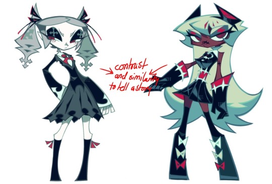
PERSONALITY: what colors are associated with your character's personality? i actually usually refer to magical girl groups to see what's commonly associated with different colors. here's the main trend:
red: hot-headed, passionate, firey
orange/yellow: bright, happy-go-lucky, sunshine personality
green: wise, mellow, kind
blue: serene, graceful, elegant
purple: magical, regal, fancy
pink: usually the main character (though this because magical girl anime tends to be marketed towards young girls), sweet, relatable, determined
of course these are only stereotypes from one genre of anime, and different colors have tons of different meanings. color theory is the best way to learn this! these colors can also express different moods, which ties into ch1. i myself constantly ignore these rules - v-con, a bombastic hyper DJ, is purple (though he does have yellow accents) for example. basically, i just take them as a general rule and try to have them in mind while drawing.
CH3: HOW ZENO MAKES HIS COLORS COOLER
this might be the most important part of this guide. once again, there are a few things to consider here: filters, hue, overlays, and more!
FILTERS: for ibispaint, you can use an adjustment layer on your whole piece to use a filter. i usually only use brightness/contrast here - upping the brightness (or darkening it based on the mood of the piece) and upping the contrast. this helps to better express values and intensify the colors if that's what you want. i often use it in all my pieces to some extent.
hue/saturation/lightness is also helpful in moderation. you can alter the hue - though it usually only helps if you bring it back or forward by just a few points, or the entire pallete will change. saturation is what it sounds like, and slightly over/desaturating the piece can help with atmosphere. lightness is what it sounds like - lightens the colors in the piece. i don't use it at all.
posterize and sharpen mask are some that i've used recently. posterize can add some crazy effects to your art, but i'd probably need to edit it slightly after using it because it can mess with certain colors.
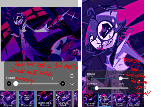
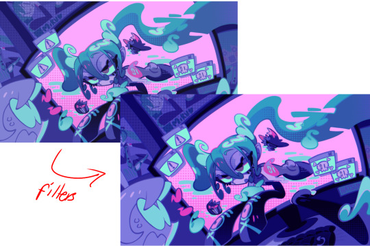
HUE: it's a layer type that can change the overall hue of the piece. i usually use it at a low percentage for atmosphere. kind of like a gradient map but nothing like it? idk
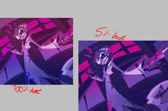
and OVERLAYS: i just use a very saturated blue/purple color over the entire piece at a very low percentage, around 5-10%. it can wash out the piece at too high a percentage.
and that's basically it! sorry it kind of derailed at the end i spent like 2 hours on this and got super tired. goodnight i'm going to sleep please also look at other artists etc etc. bye.
#zeno's art#long post#color tutorial#liar by korn is actually a really catchy song yea the lyrics are weird but its so good tbh#peak drums and bass and guitar and vocals and then the lyrics are hot booty. this is what nu metal's all about people#ask questions if you want#about nu metal or art i dont care
378 notes
·
View notes
Text
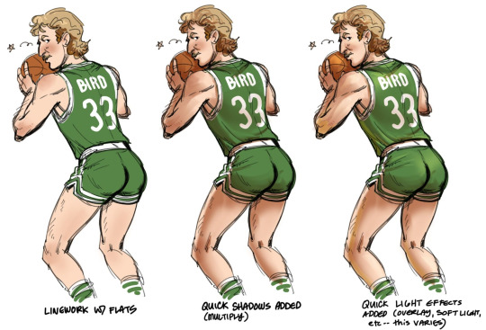
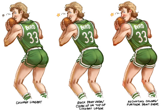
Also, was demonstrating to someone how simple my coloring approach is. I use these steps for the majority of my stuff, even when they end up a little more rendered/clean than this (not that I do much clean art anymore these days)
The above Larry drawing, and the two pieces below all have the same 'process,' they all just have different amounts of clean up/render time put into them.
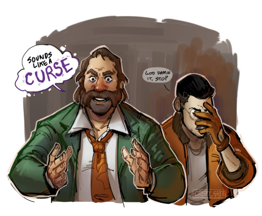
In the end I'm not a color person, I'm a drawing person, so I just looked for an easy to digest way for me to add color to those drawings.
78 notes
·
View notes
Note
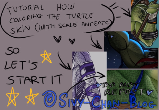
I got a quick question. How do u do the skin on the turtles, with their scales and all. Do you do them all hand? Or use a already existing pattern and apply it to the drawing?
Good question for how am I did the skin for the turtle and then I was decided to do a little tutorial for how am I doing this stuff.

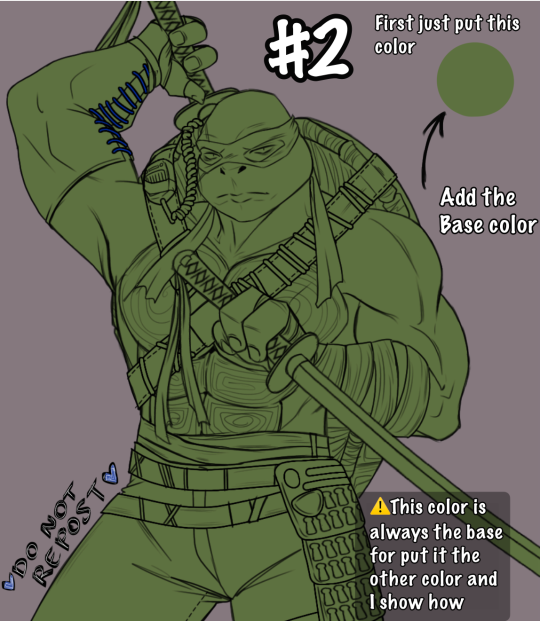
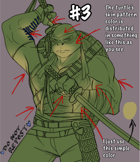
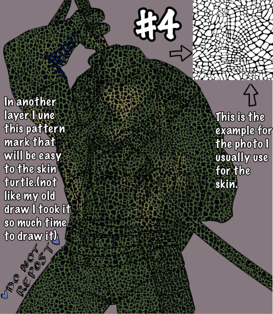
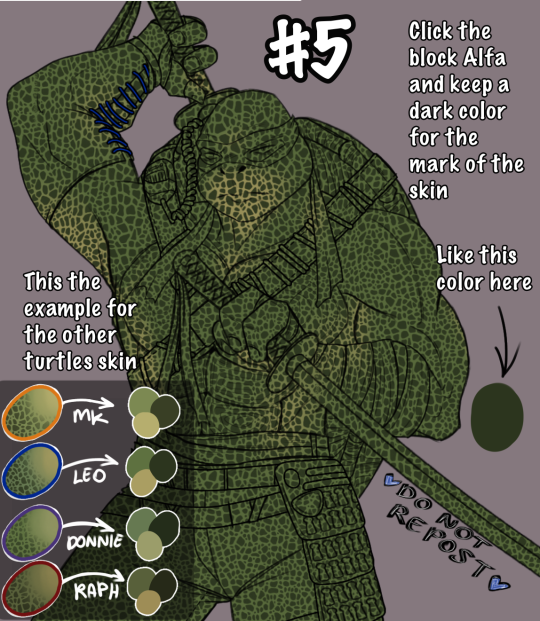
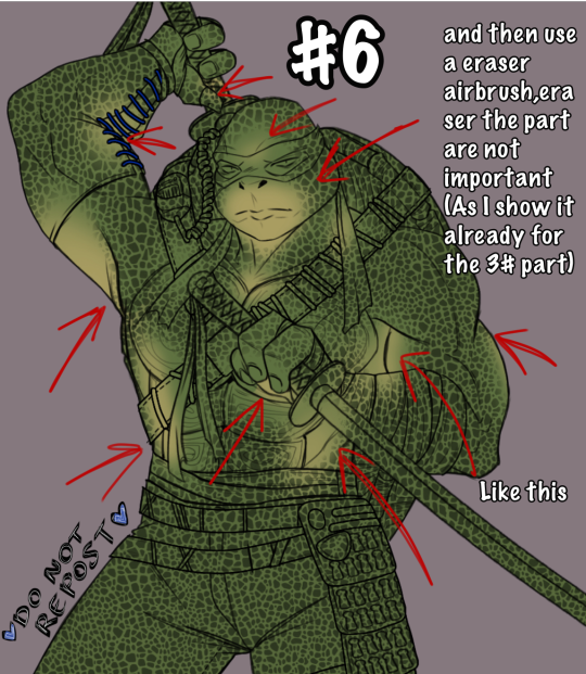
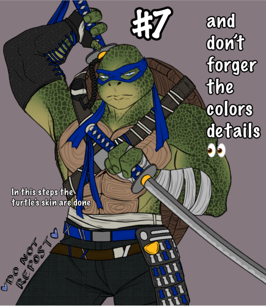
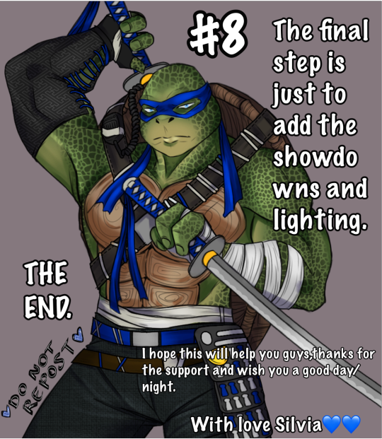
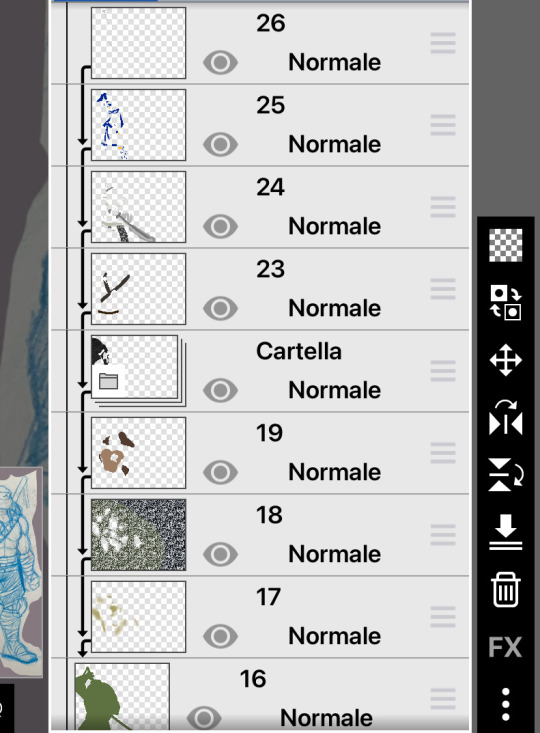
For the step number #2 this how i color without coloring out of the drawing and don’t do the mess
Art by me @sivy-chan-blog
#tmnt#tmnt bayverse#tmnt 2014#tmnt 2016#tmnt movie#tmnt fanart#tmnt art#tmnt leonardo#tmnt leo#color tutorial#art tutorial#my art#sivy-chan-art#sivy-chan-blog
260 notes
·
View notes
Text


I made a coloring guide……
#this took far longer than I was expecting#art#color#color theory#cool#oc#cute art#cute#oc art#design#character design#color tutorial#color guide
37 notes
·
View notes
Note
Yo I love the way u color so much
Tutorial?
Thank you! When coloring I like to use tons of layer modes until I get the colors I like. I use brightness and overlay modes a lot to set the colors. Other than that, I use the row method as explained below.
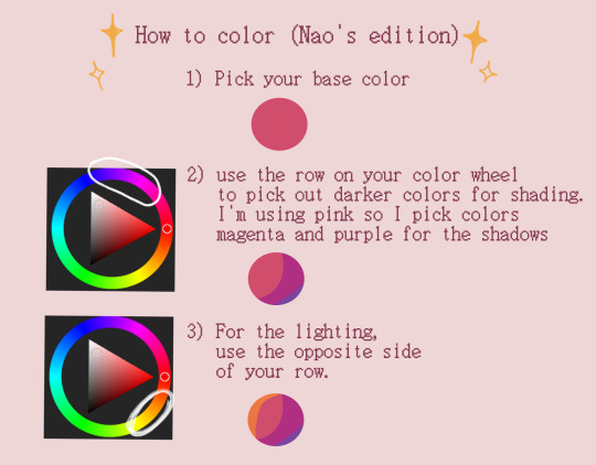
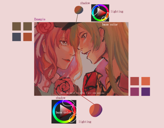
feel free to ask questions!
8 notes
·
View notes
Note
Hey !! I just wanted to say your art is CRAZY good and I was wondering if you had any tips on picking color palettes?
Sorry for taking forever to respond, but hi!!! Thank you so much!!! wahh always wild when I am percieved, makes me v happy :)) As for color, your ask got me really excited since it my favorite part of the artistic process!
The long and short of it is that I like to use color theory (complimentary, analogous, triadic colors, etc) to minimize the amount of color in my work while using a variety of saturation and value to create the variation! Complimentary being colors across eachother on the color wheel, analogous are the colors next to eachother, and triadic are colors equidistant from each other,,, triangularly.
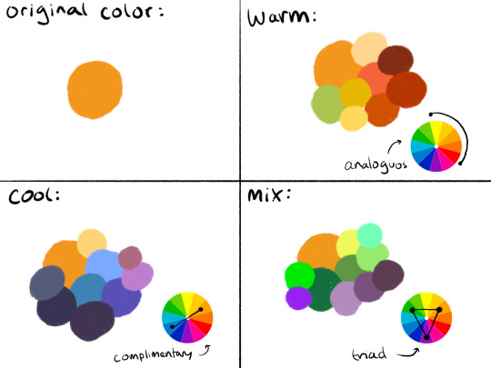
I typically don’t like starting out with a rigid number of colors of specific shades when I do my work cause it feels really limiting, and I enjoy adding color when it feels right. However, when I do color pick, I like to get a main big overall color scheme in mind then start placing various shades and saturations within that minimized pallete. The important part for me is not to stray too far from my pallete without some intent.
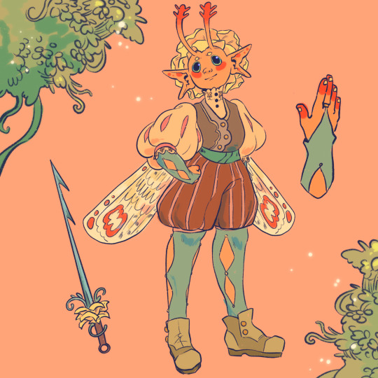
For example, when creating my character Peter, my goal was to make her a very warm colored character. To do that, I used an analogous color scheme of oranges and yellows with green sparingly. By minimizing the amount of different colors used, it helped the piece feel far more cohesive, but the amount of saturated and desaturated forms of the color created a lot more energy. And even though the colors I used were all next to eachother on the color wheel, the green provided a cooling contrast that I used in the eyes and portion of her costume to connect the two and emphasize. I also tried to use saturation and value to separate her from her outfit. Her skintone, hair petals, and markings are all very bright, while the outfit is desaturated tones. This made the seperation of the two more apparent to the viewer that this is body and this is clothes. I also like throwing in multiple color schemes to create even more visual interest. For example, for the lineart I used a deep saturated blue since blue is the complimentary to orange, her main color. This caused the lineart to stand out against her even more so than black lineart would.

To the upper right I also sketched out a different costume for her while maintaining the motif of orange and green (though some of the colors I’m not necessarily happy with).
Here are examples of some of my other stuff to show the “main colors” of the work. And as a secret, if a color isn’t matching my scheme, I like putting a color from my color scheme over it with a lower opacity and color pick from there ;) helps with melding it into it.

Of course these rules are not set in stone and I break them when I gotta, but this is generally how I like to find my colors. Anyways,, I hope this made some sense!! I really enjoy color :)
69 notes
·
View notes
Note
how do you choose color schemes for your art cos they're always so good, also i looove your horror magical girls <3
<3 receiving this ask made me SO excited i love talking about processes and techniques. anon i hope you enjoy the essay
note: for anyone wondering how i get the different color strokes in my art, that's color jitter! I can answer a different question on that, but it's just a brush setting that changes the color for each stroke. This answers how I choose the base colors :)
GENERAL RULES
I think the first thing to know about my process is that I'm weirdly strict with the colors I use? I see people who color pick and wiggle the color around a bit each time and it's really cool! But my brain doesn't like me doing that, so it makes most of my color palettes a pretty closed ecosystem.
As a overview, I have 3-4 "types" of colors with their own color gradients. Be aware of tone! Don't make the types of colors the same tone. Additional colors are made from combining the types. I use 25-75% opacity for new colors instead of blending them.
This is a good example of the closed ecosystem concept:

My 3 types of color are brown, green, and pink. The circles of colors are the ones I manually picked from the color wheel. The rectangular blocks of color are the new, in-between colors.

Something to note is that my new colors aren't 25% opacity, then 50% opacity, then 75% opacity. I draw a rectangular strip of the base color and draw over it with a 25% opacity brush. Then, I draw over half of that again with the 25% opacity brush. I keep doing this until I'm satisfied with my colors.
This character is a dryad and I wanted to add more interest to the bark skin, so I used the pink for some highlights. The brown and pink are both warm colors and it made the most sense to use them together. This is how it looks without the pink accent:

It ties the brown and pink together pretty nicely, right? I usually do this because I don't really like having two types of colors that are very similar in hue. If I have a pink-red color, then all pink-reds in the piece should be a color from its gradient (or a new color made from it). This makes sure all colors in the piece have a distinct relationship to each other.

(If I'm drawing something that's predominantly one or two hues, the threshold for merging colors is higher)
If that's not the case, then I prefer to manually include a gradient relationship. This particular instance was a little weird, where the brown seems more red than it is. It's actually an orange, but because I never used a medium or light toned variant of the color it just seems red. Changing its hue to pink would be pretty noticeable, so I chose to use the gradient method here.

Here's some other examples with the types explicitly added


and some with just the swatches


As a rule of thumb, there are usually at least 3 types of colors: skin, hair, and clothing base colors. Skin and hair are generally unique, but not always.
CHOOSING GRADIENT/SHADING COLORS
This might change in the future (i want to experiment), but most of the time* when choosing my shading colors I move counterclockwise from lightest to darkest.

I originally started doing this because I use the same color for skin shading as the blush, which was tinted red. In general, this works pretty well because when moving counterclockwise from yellow the average tone of the color decreases. Purple has the darkest tone, so red/blue/purple are often my darkest colors.
*There are exceptions to this, particularly when I'm using green or blue-green. If that's the case, then I do the same thing but clockwise. Purple is still my darkest value.
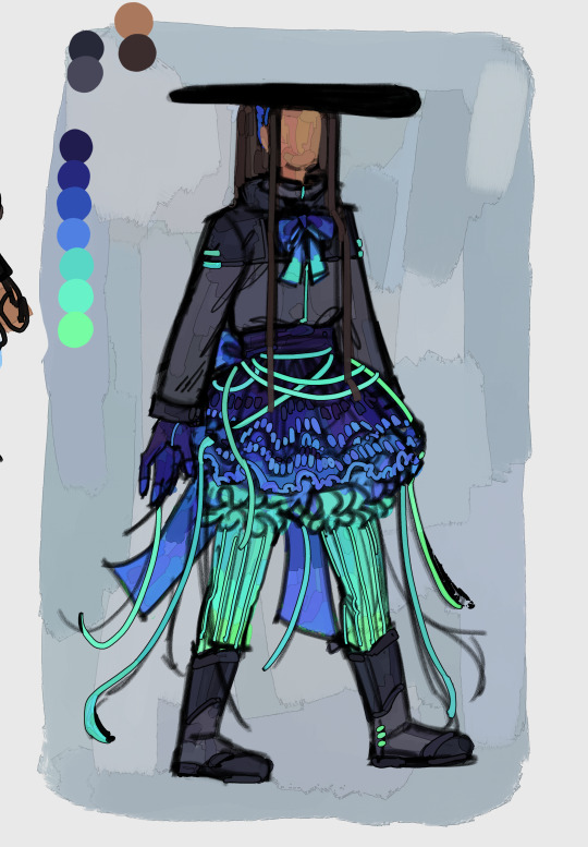
It's a personal preference, but I very rarely use a yellow as the light color in a shading gradient moving towards green. You'll usually see me use yellow and then move towards orange/red OR use a yellowish green and move towards blue/purple. I'm not the biggest fan of yellow-green and use it extremely sparingly. Consequentially, this does pretty distinctly separate my warm and cool colors. It's not intentional lol
HUE RELATIONSHIPS
To be honest, I usually have two types of color schemes: Boldly different colors or similar colors with a bold accent.
If anyone has seem my art then they know i LOVE a good contrasting color scheme. I know there's actual contrasting colors-- yellow-purple, orange-blue, red-green-- but in this context I'll be using "contrasting color" to refer to the actual contrasting color and it's immediate neighbors. For example, red and blue would be contrasting in this context. Red and purple would not.
The reason I want to make this definition is because I think that you can get the same visual impact of actual contrasting colors as long as a color is the opposite mood (warm/cool) AND not next to the base color. Using the same example, red would be a warm color with green as its actual contrasting color. Yellow is also warm, so we can't use that despite it being green's neighbor. Blue works. Purple is red's neighbor, so we can't use that despite it being a cool color.
Here's some examples of color schemes with really prominent contrasting colors:
For purple/orange

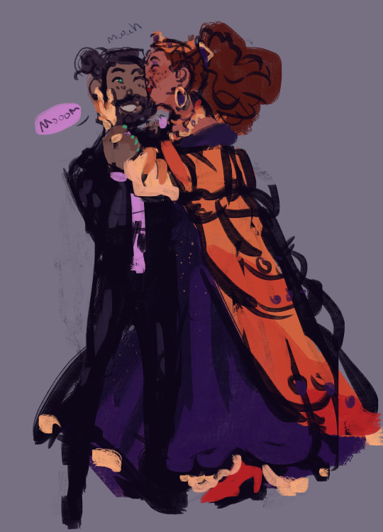
For red/blue

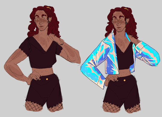

For pink/green
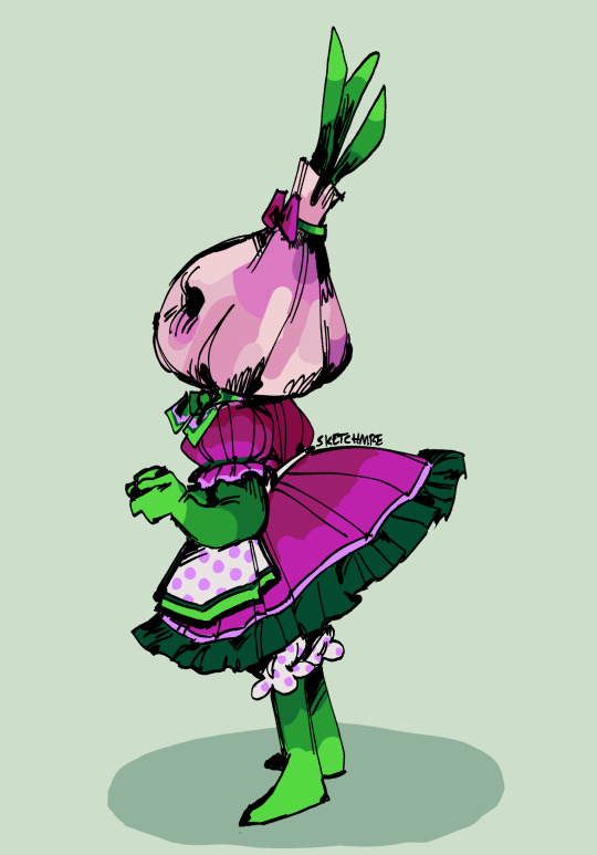

As for the other type of color scheme, it's 2 or 3 neighboring colors and a contrasting color (which is usually very saturated)


In some cases, the "contrasting color" is just a very light grey/white


In both cases, you just need a color that pops from the rest! Because my color palette is so limited, this accent color ends up being used for jewelry, trimmings, embroidery, etc. It helps tie everything together.
FINAL NOTES
I can (and will!) break the rules established here. I experiment, I make the objectively bad decision, I want to try other things. That's art. If you find something here that's interesting, try it out! Make it your own! (maybe tag or dm me, id love to see it)
If anyone has any questions, please let me know! I love answering these and it's really cool knowing someone might take inspiration from this :)
#sketchmre tutorial#sketchmre answers#tutorial#art tutorial#color tutorial#idk how else to tag this lmao
6 notes
·
View notes
Note
You might have already been asked something like this before, and if so if you could point me in the direction of that post I would !!! very much enjoy that but !!
How do you get your color palettes/pick out all the colors you're gonna use for a piece? At first glance it looks so 'simplistic'/like you can pick out each individual color but the longer I look at your art the more I see a billion tiny details and i'm just curious as to how you keep all of that looking so tidy!!! :0
YOUR ART IS GORGEOUS BY THE WAY AS SOON AS I CAN I'M DEFINITELY GETTING PRINTS
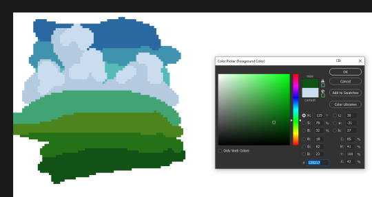
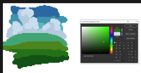
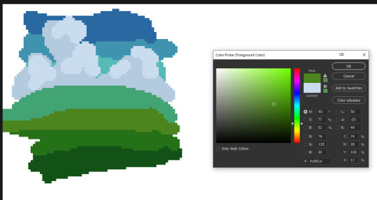
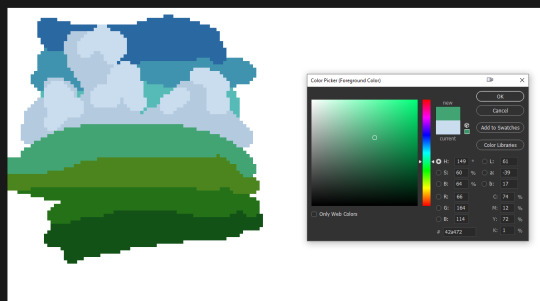
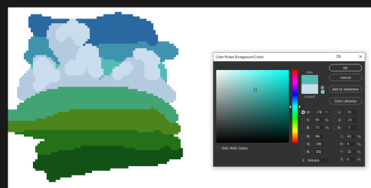
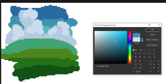
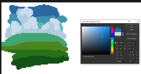
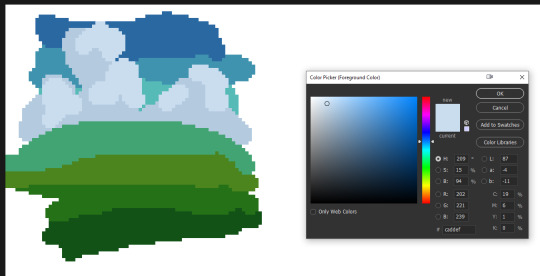
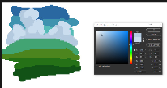
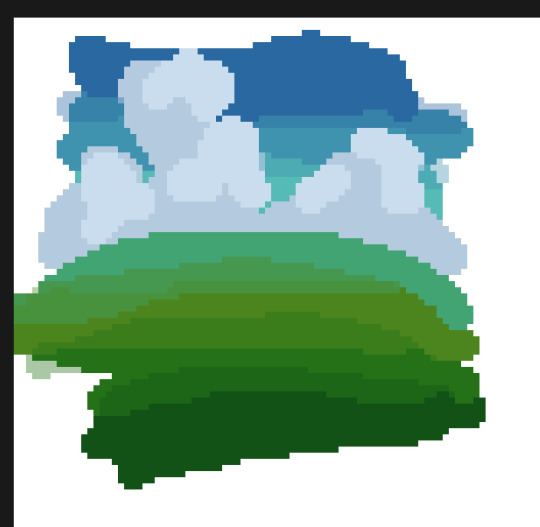
this is a v sloppy how to i just did (it looks like a froog loool) but basically i just make gradients then blend the colors, based on the mood i want. starting out i used a looooot of references for inspiration/colors and did a ton of studies and that helped me learn! then usually i add 'striking' complimentary colors for oomph! i also usually saturate/color correct at the end as well. hope this helps and thank you so much~~
#pixel art#artist on tumblr#artist tutorial#color tutorial#pixel art tutorial#pixelart#8bit#8bitart#how to color#color palette#color palette meme
311 notes
·
View notes
Text
PRETENTIOUS TURQUOISES AND NARANJA BUTANOS
Part I
So.
Studying/Drawing Crowe's career gave me flashbacks. Not just remembering his good/bad movies, but how colour was used through the 90's-00-10's AND still today.
When I was like 8 or so, before the internet, my dad would come from work, describing what he did today, and so so.
He worked(s) as a storyboard artist.
One of our favourite anecdotes was his boss and his orange obsession. Every time there was an argument choosing the correct colour for a new AD, he would say "Bah! Throw a naranja butano".
Naranja= Orange
Butano (Boo-tah-gnaw)= Butane, gas tank (I have NEVER heard an english speaker say butane, but that is what Godgle Translate says)
Before gas was replaced mostly by electricity, Spain had very special "butanos".
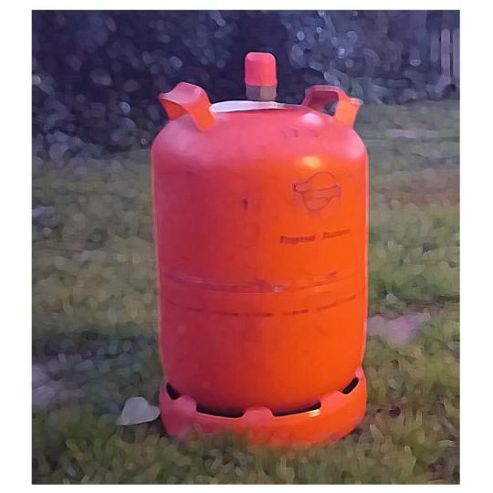
Every time we walked by the streets of Barcelona, you'd see a truck carrying loads of these. It was IMPOSSIBLE not to get that orange colour drilled into your corneas.
Hence this desperation of my dad's boss using orange for many, many ADs.
My dad and I would laugh, but my mum would cringe and roll her eyes- as a pastel painter + caricaturist, this was almost personal to her.
"WHHYYYYYYYYYYYYYY"
Orange is -metaphorically speaking- dangerous to use on your paintings, on anything. You have to know how to use it.

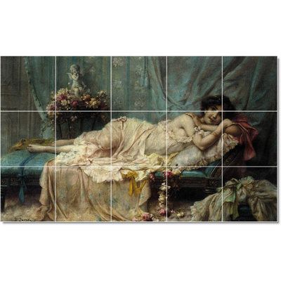
And for a long while (since the 90's or maybe even BEFORE that) we have been recurring heavily to naranja butano or turquoise filters- or pretentious turquoises, as I like to call them.
Sometimes people knew how to handle naranjas/blues...


and sometimes...
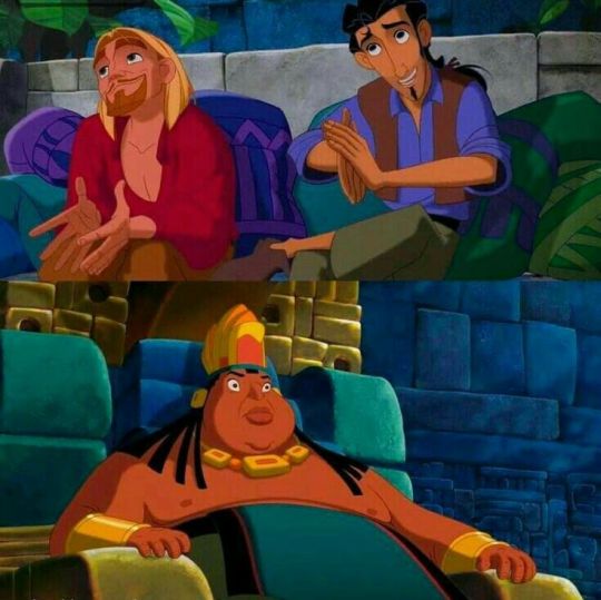
SOMETIMES...
Well.
Sometimes you had a really good concept in mind-

and then someone came in and told you:

"NOPE NEEDS MORE BUTANO, YOU'RE FIRED"

Almost death by butano. ALMOST.
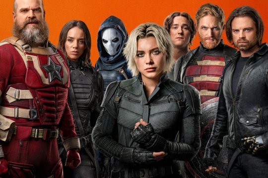
UGH.
Not you, Luke.
WHY.

WHYYYYYYYYYYY
"Bruh, in the comics I have my own yellow shirt"
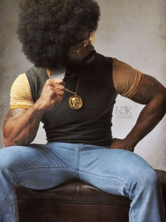
"WHY TF DO I NEED AN ORANGE BACKGROUND, EXACTLY??"
As much as I like Prince of Egypt's animation...
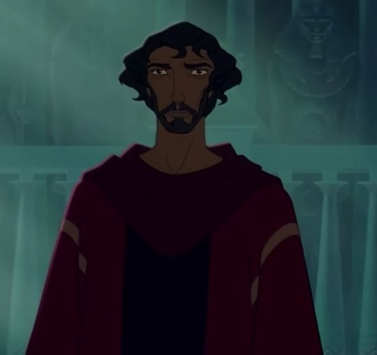

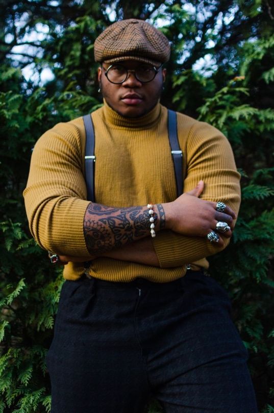
...in terms of colour, don't you feel these images belong to the same movie?
These are not even from a movie, they're from a music video. (Note: again- I like Florence and the Machine. But I'm talking about colour themes + palettes.) This is from 2011...


...And THESE were released in the same year- 2017.


Two COMPLETELY different movies.
First I want to make sure, and want to be clear. I won't talk about how colour makes you "feel". That is a very personal subject and everyone sees a director from a different point of view. The problem is when the director has none and has nothing personal to say.
Orange and blue don't make each other stand out. I can't understand why certain people insist with this, but they are COMPLEMENTARIES, therefore they NEUTRALIZE each other. In the same way yellow and purple or black and white "stand out".

I'll be using Russell Crowe's filmography to keep on subject, because as shown, there are ING FINITE movies with pretentious turquoises and naranja butanos. Not just Hollywood, everywhere in this beautiful world.
But for some reason, when Photoshop and all kinds of editing programs kicked in, everyone had this desperate choice to apply turquoise filters on their images.
"Oh dear, there's too much orange in my image. How can I save this??"
Photoshop: "Don't worry---"

(to be continued in Part II)
2 notes
·
View notes
Text

How to color belly 🤰 simply with brush, blend & blur!
15 notes
·
View notes