#colored this one for a recent updated design and pattern placement
Explore tagged Tumblr posts
Visit Tumblr Blog
Explore Tumblr blogs with no restrictions, modern design and the best experience.
Last Seen Tumblr Blogs


Fun Fact
The “We are the 99%” Tumblr blog became the slogan for the Occupy Wall Street movement.
Text

"Seeing something other than stars"
#MORE OF GOOSE FOR MY ARTFIGHT....#colored this one for a recent updated design and pattern placement#OC : Goose#OC : Bana#creatures of sonaria#link is for the og post as per routine when its a wiki post transferred over#BuwheArt#aeries#ouratum#roblox#sarchias
40 notes
·
View notes
Text
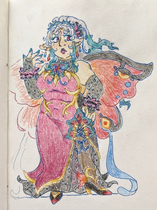
HONESTLY. After doodling Plumeria recently (literally yesterday LMFAO) I found I wasn't completely satisfied w the initial redesign I gave her. I liked a lot of the shape language/core concepts, but espppp next to Triandra, felt like she needed more refining.... and like w Triandra, I focused more on what Felt Right vs consulting the official design back and forth LMFAO
I wanted to make her more glam, while at the same time... being kinda simple. Can't go wrong w shimmery sparkly sheer black accents. I changed up what felt too girly (as in, cutesy) -- the bowtie is now a big decorative bow on the sheer part of the fabric. Which, is already hard to see through, technically, because of how damn sparkly it is. The bow just adds to it the visibility issue. You aren't seeing SHIT under there 😤😤😤 Another thing I got rid of was the frills at the shoulders, just, REALLY doesn't work on her.... imo.... instead, I made them into cuffs. Esp w how simple the gloves are now, I think it adds just enough visual interest.
As much as I wanted to keep a tube top look, feeling like it REALLY suits her... man, I just can't resist a good heart motif. And I think it makes that prickly pattern on the bodice more... like it has places to go. All of this, the bow placement, the sparkly fabric, and the change to the shape of the gold accents on the chest -- I'm hoping it keeps w my Main Vision, here. That Plumeria's outfit draws the eyes to sexualized areas of the body, but doesn't actually... show anything. Like. At all. You don't even get cleavage. FUCK YOU‼��‼️‼️‼️
A big logistical thing I wanted to change was reducing the amount of blue on the outfit. Since, it's so prominent on Triandra's pallet. REALLY TRYING HARD. TO DISTINGUISH THEM VISUALLY. It's still an accent color, but has waaay less of a presence now. Hell, I wanted to focus more on making GREEN the accent, here! But also. Memories of my first run. Attempting to change the pallet had dire consequences LMFAO, I wanted to largely stick to what worked!
Other changes are just kind of random. Like adjusting the wing shape, top half being like big heavy angel wings, bottom keeping a heart-ish shape. The shoes might still be asymmetrical, I just wanted to test having the gold heart shaped one more visible (in retrospect, I think the vine creeping up the ankle/leg might have looked better here). The bottom of her dress makes me think of a somewhat closed up flower. She's still rocking the toothed pussy accent on the leg split, there. It's essential. It's loadbearing. I did change some details of it, idk what works better.
HONESTLY. Since I'm making so many comparisons/I don't know if I feel like finding the og post, I'll include my first design too! Plus, more than what I managed to do for that design -- a view of the back!

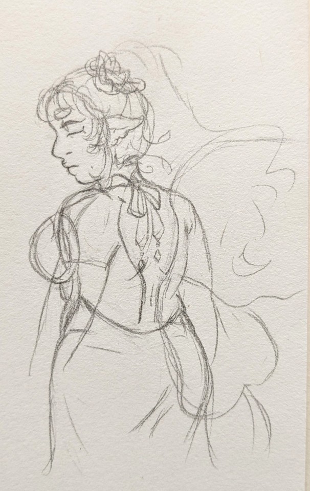
A very. Rough. View of the back. It's important to me that the outfits are hypocritically functional, though. That said.... unsure if the tie off in the back works w what I had going on in front 🧍It WOULD, if I committed to a choker design, but Triandra already HAS a choker, I want that to be HER THING.... I do like the idea of a black velvety tie off w shiny bits to it in the back, though. Very classy. Very refined.
IDK IDK ........ MAYBE STILL NEEDS WORK........ but I am largely happy w the updates, here! 🫡
#fire emblem#feh#WAUGH#honestly. i got nothing. i feel like. maybe i just need layer up and go outside.#brain... too full..... i gotta. i just gotta. do a physical activity.#swingset. swingset save me.#fe plumeria#my art
19 notes
·
View notes
Text
Explore Textile Science in Our Fashion Designing Course in Bangalore
Master Fabric Types and Weaves with Our Fashion Designing Course in Bangalore

Students analyzing fabric textures during textile science class at Eduleem, Bangalore.
Fabric is the heart of fashion. It defines how a garment feels, flows, and fits. At Eduleem – fashion design course in Bangalore, we believe that every aspiring designer must master textile science to create impactful, innovative fashion. Our 1-year fashion designing course in Bangalore focuses on the details that matter—especially when it comes to understanding different fabrics and weaves.
Textile science is not just about touching and observing cloth. It’s a deep dive into fiber structure, durability, drape, and the story a fabric tells through its construction. This subject becomes the backbone of your creativity and technical knowledge.
👗 Types of Fabric Every Fashion Designer Must Know
Understanding fabric categories helps designers select the right material for the right silhouette. In Eduleem’s fashion design course, we help students differentiate fabrics based on origin, texture, and use.
🧶 Natural Fabrics
Cotton: Soft, breathable, versatile—ideal for everyday wear
Silk: Luxurious, smooth, often used in bridal or couture wear
Linen: Lightweight and airy, perfect for summer fashion
Wool: Warm and textured, popular in winter collections
🧵 Synthetic Fabrics
Polyester: Durable and wrinkle-resistant, widely used in fast fashion
Nylon: Strong and stretchy, great for sportswear and lingerie
Acrylic: A wool substitute, used in knitwear
Rayon: Soft with good drape, often used in evening wear
Eduleem’s fashion designing course in Bangalore ensures students gain hands-on experience handling these fabrics, understanding their characteristics, and using them effectively in designs.
🧶 Weaves: The Language of Fabric Structure
Fabric weaving is what gives cloth its body, texture, and strength. Different weave types create different visual and tactile effects.
✨ Common Weaves Covered at Eduleem
Plain Weave: Simplest and strongest; used in cotton shirts and denim
Twill Weave: Diagonal pattern; found in jeans and jackets
Satin Weave: Smooth and shiny; ideal for gowns and luxury wear
Jacquard Weave: Complex and decorative; used in upholstery and traditional garments
Understanding weave types lets designers predict how a fabric behaves, falls, or creases, which is critical for creative draping and tailoring.
🎨 Grasp Fashion Design Course in Bangalore with a Unique and Stunning Style Explore creative freedom, fabric mastery, and career-ready skills.
👩🎓 Real Story: Turning Fabric Knowledge into Design Brilliance
Ritika, one of our recent students, entered the program curious about color but unsure about fabric. Through dedicated textile science classes, she learned how to mix silks with organza to create modern fusion wear. Her final collection was featured in a city fashion showcase—and it all started with a class on weaves.
That’s the kind of transformation Eduleem offers in its fashion designing courses—rooted in skills, shaped by confidence.
🎓 Why Choose Eduleem – Fashion Design Course in Bangalore
At Eduleem, we don’t just teach fashion. We help students build legacies. From classroom labs to industry mentors, every step is designed to help students master both artistic flair and technical excellence.
What Makes Us the Best Fashion Design Institute in Bangalore:
Updated curriculum with a strong textile science foundation
Training on global design software and portfolio development
Exposure to real-world design challenges
Mentorship from expert faculty and visiting designers
Placement and internship assistance with top fashion houses
Our campus fosters imagination while grounding students in the discipline needed to thrive in fashion.
The path to a successful design career begins by understanding your canvas—your fabric. By enrolling in our fashion designing course in Bangalore, you gain knowledge that goes beyond drawing. You’ll know what works, why it works, and how to bring your boldest ideas to life.
🎯 Ready to transform your creativity into a career?
Join Eduleem – fashion design course in Bangalore and be mentored at the best fashion design institute in India.
#FashionDesignCourse#FashionDesigningBangalore#TextileScience#EduleemFashion#FashionEducationIndia#FabricWeaves#FashionCareerBangalore#BestDesignInstituteIndia
0 notes
Text
Houstonembroideryservicee com
Embroidery The Altering Face Of Fleece When Not Using CUSTOMIZED PATCHES<br> Comply with these reminders for far much better needlework on a brand-new generation of fleecewear.<br> You've probably heard it previously, but the adhering to old saying continuously proves out: Change is the only consistent you can depend upon. The technological improvement has not only made details readily available, nevertheless it also has essentially changed the approach we live. If you make use of CUSTOM PATCHES, you can do a very easy work.<br> We do not acquire "general delivery," watch tv or most likely to bricks-and-mortar shops as a lot any longer. Instead, we send sms message, stream flicks as well as also shop online. If you do not change, it's harder to operate in contemporary culture. I lately had to send by mail a billing to somebody and was attempting to remember the last time I had in fact done that. The concept and also genuine technique appear so foreign now.<br> In organization, if your clients locate you behind the moments, they might not be as most likely to do business with you. This surpasses simply payment systems or a web visibility; it additionally can define your item offerings. Staying updated by supplying existing styles is necessary in our service. We also need to depend on day on garment-decorating techniques and additionally patterns.<br> A lot of the line of product that we formerly never ever before thought would certainly transform have actually been changed with brand-new products along with color processes. One example of this is fleecewear. The sweat tee t shirts of the past allowed and also thick. Hoodies were just put on when training or working out (assume Rocky Balboa), and they can be discovered in a handful of tones, most especially grey. To improve them, embroiderers would merely slap a thing of heavy exploded view behind them as well as likewise sew.<br> Currently, we are seeing fleece become part of a larger style statement. It is offered in every design as well as color under the rainbow, and also has in fact obtained thinner, too.<br> As designs have actually modified, fleece has actually come to be a lot less worrying warmth. Efficiency knit products are used in several fleecewear alternatives, which currently include the garment-dyed in addition to fatigue varieties. Weights likewise have transformed; they have in fact gone from being built from significant cotton in the 7.5- to 9-ounce, selection, to being produced of thin and light materials. Numerous continue to be in the T-shirt weight collection of 6-6.5 ounces.<br> The building and construction nowadays's fleecewear has a bearing on specifically how we approach sewing it. The typical heavy blew up sight stabilizer regularly is additionally thick as well as will absolutely show via the slim material. However, fleece is stretchier than ever, so it requires the added stablizing.<br> The good news is, much of the concerns embroiderers encounter when teaming up with fleece synchronize as the now-established line of performance knit golf shirts as well as additionally tees. The distinction is that designs frequently have a tendency to be larger on fleecewear, rather than being limted to left-chest as well as sleeve positionings.<br> <br> 1. Get the Right Backing<br> Similar to any kind of garment, selecting the best backing to preserve it is really essential. More recent fleece designs have even more stretch than ever as well as are thinner. This indicates they need stablizing. Nonetheless, a thick cutaway support may generate an impact with the material. For circumstances similar to this, it is best to make use of two or three pieces of tearaway assistance.<br> Better yet, use a no-show mesh exploded view assistance. Its large nature preserves it from showing through the front, yet it has the stability of a cutaway stabilizer. For denser designs, a mix of tearaway along with no-show mesh is preferred. The tearaway adds stability. Just make sure to place it under to make removal less complicated.<br> 2. Do not Pull It<br> Because of the elevated stretch as well as slim nature of some extra current fleece garments, more treatment is called for throughout hooping. The wonderful standard when it refers to flexible weaved products definitely applies: Don't pull on the garment after it is hooped. Knits extend comfortably as well as a lot more level than vertically. This stretch will certainly batter your design once it is released from the hoop as well as likewise goes back to its chilled out problem.<br> It is better to maintain the hoop a little looser while the garment is being hooped, and also afterwards tighten it once it is in the hoop. By doing this, it can be meticulously drawn to do away with wrinkles without prolonging the material.<br> 3. Heel to Toe<br> An additional approach to stay clear of expanding the garment while hooping it is to push the bottom of the hoop into the external ring initially, after that align and also pull to get every little thing straight as well as smooth before pushing the top of the hoop into area.<br> This is an outstanding basic strategy. It is much more vital when hooping flexible products to make sure the textile is smooth, however not additionally tight, when hooping.<br> 4. Top it Off<br> As a result of fleece's texture, it's an outstanding concept to utilize some sort of covering product. This product aids the design's rug in stopping the stitches from penetrating the product. Fleece garments tend to have fuzzy surface. Covering helps maintain this regulated by holding the surface area down till the underlay in addition to leading stitches make it degree.<br> 5. Don't Wander Too Far<br> Whenever you are creating big styles, such as those that would typically occur sweat shirts, it is best to run in areas as opposed to sewing the whole style at once. This may recommend laying out a location or letter first. This technique is especially beneficial on stretchy materials. Over a big location, a moderate change or stretch will suggest your synopsis may not be lined up in details areas.<br> This in addition holds true for appliqués. As an example, you need to sew appliquéd words one letter simultaneously as opposed to attempting to put the positioning line down for all the letters at the same time. Making use of the last approach, the possibilities of the registration being off by the end of words would certainly be a whole lot greater because of the truth that you would absolutely be attempting to cover a big location.<br> 6. Make it Match<br> With all the focus on more recent fleecewear designs, it makes good sense to match the needlework style with the garment.<br> Today's fleecewear often tends to have a weather-beaten appearance. Putting a crisp, high-tech-looking design on a garment might present an ordinary comparison as well as out-of-place look.<br> Using tone-on-tone string colors, or perhaps creating a retro-looking layout, would certainly be a far much better option. On larger things, think of raw-edge appliqué, which calls for much less precision than normal appliqué, and likewise you can use a present design.<br> To do raw-edge appliqué, just stitch the positioning line as you would definitely with a regular appliqué. The distinction is that you then reduced the item a little larger than the placement line. Oftentimes, you do not require to do a total satin-stitch border on the appliqué item, just a running-stitch tack down. The revealed side of the textile will absolutely battle royal slowly (you can assist in the process if you would definitely like), producing the weather-beaten look that matches the garment.<br> Time development therefore do layouts. Our task as garments designers is to keep up and additionally adjust with what we give. Going beyond that to enhance the garments can create a much more favorable outcome for our customers, which's what keeps them returning. learn more
1 note
·
View note
Text
Burberry and Calvin Klein
As our team dives into the recent branding strategy of Calvin Klein, several parallels exist that are reminiscent of Burberry’s past branding troubles. Like Burberry, Calvin Klein had started with a strong image. While Burberry had centered around the image of classic, British heritage, Calvin Klein had centered around the sexy, casual, young American. Both Burberry and Calvin Klein then suffered a degradation of this brand as their products became more ubiquitous. The two brands then tried to course correct by elevating the brands into the world high fashion. However, while Burberry succeeded in this step, Calvin Klein’s rebranding fell flat. Calvin Klein had hired famed fashion designer Raf Simons as its new creative director, who sought to bring a fashion-forward European style to the brand. This style, a drastic departure from traditional Calvin Klein, did not resonate with Calvin Klein’s customer base, and led to a significant downturn in sales.
Calvin Klein could learn from the steps that Burberry took to elevate its brand. Looking at the traditional 4 Ps of marketing could help categorize these steps.
1. Product
Burberry took a measured approach in updating its products. Their first step was not to create new things, but to remove existing ones, cutting their SKUs from 100,000 to 24,000. This helped curtail the ubiquity problem that Burberry had faced. Burberry also struck a balance between ��continuity” products, which were more traditional and timeless, and “fashion-oriented” products. In both types of products, Burberry stuck with traditional imagery such as the classic Burberry check print to continue appealing to its core consumers. For its most fashion-forward experiments, Burberry used the sub-brand Prorsum to avoid potential damage to its core brand. Calvin Klein, on the other hand, strayed away from its core consumers by not maintaining a “continuity” line of products, and continued to use the Calvin Klein name for trendy products that deviated from the classic Calvin Klein look and feel. Perhaps by using sub-branding and a more conservative product approach, Calvin Klein could venture into the luxury world without alienating its core consumer. 2. Price
Burberry strategically increased their price to elevate their brand into a higher luxury status. This worked well for the company, considering Burberry’s staple items included durable outerwear such as trenchcoats. These items could be considered investments in functional equipment as well as status symbols, so there would be a higher willingness to pay for these items. Calvin Klein, on the other hand, had staple items such as underwear and jeans, which typically do not command a high willingness to pay. Thus, raising the price for these items risks straying away from the consumer base. 3. Placement
Burberry wisely chose to limit its distribution and retail presence, as well as its licensing partners, to reduce the feeling of ubiquity that plagued the brand. Calvin Klein products can be found in large retailers such as Target, and therefore its brand has become increasingly associated with inexpensive clothing. When Raf Simons took over and began to focus more on runway-style clothing, this created a jarring disconnect between the cognitive associations many consumers had built and the image Raf was trying to portray. In order to successfully elevate the Calvin Klein brand, the company must first consider shifting its product placement to match a more exclusive feel. 4. Promotion Burberry hired famed photographer Mario Testino to help advertise its new products. Testino chose to juxtapose Stella Tennant wearing a Burberry trenchcoat and Kate Moss wearing a bikini in Burberry check. This created a dual imagery, with Stella representing the traditional and aristocratic side of Burberry and Kate representing the more modern, racy side. This was very successful in appealing to two different types of Burberry customers while still maintaining a unique and consistent brand image through use of Burberry’s check pattern. Calvin Klein, on the other hand, updated its logo (rendering past products “outdated”) and focused exclusively on fashion-forward promotion through surreal imagery that had little resemblance of past Calvin Klein advertising. Perhaps by sticking to traditional Calvin Klein imagery (subtle color-palettes, greyscale, people-focused), the company may be able to more subtly push itself towards the luxury setting. ---------------------------------------------------------------------------------------------------------
Sustaining the Brand
Now that Burberry had solved its branding problem, what next? Burberry now faces issues in keeping its brand perception strong - reality TV stars that do not represent the classic English culture are now wearing the brand, the Burberry check has become used uncontrollably (e.g. the car seat upholstery of a co-founder of a record label), and Burberry must now carefully consider its product expansion strategy.
I believe that Burberry can accomplish this by experimenting with its classic check pattern - using new, more expensive materials intricately interwoven into the check pattern may allow Burberry to continue to use the imagery that its consumers crave while also creating a barrier to copycats and those wishing to use the pattern outside of purchasing Burberry clothing.
For Calvin Klein, this is a problem they do not need to worry about yet. First, they must fix their brand image as Burberry did.

2 notes
·
View notes
Text
Merino Khaki Scarf
Throw this fantastically delicate lambswool scarf on when the times get chillier or the nights attract. Dry cleansing and a cool iron are recommended. As with any garment containing silk, jewellery or tough surfaces can cause harm, so care must be taken when dealing with and wearing the item khaki scarf.

Sign as much as our e-newsletter for 10% off your first purchase and stay updated with the most recent trends and curated collections. Iron at high temperature, utilizing steam to extend softness. This website ships only to the European Union. We only use 100% pure linen from the oldest Italian mills, to ensure softness and durability. Sign up to our Newsletter to get your Welcome Code and be notified about our new designs. Please confirm your e-mail handle and confirm your account by clicking the hyperlink within the e mail.
We advocate you save your return receipt and tracking quantity in case you want them later.
All our light-weight printed scarves are available a complimentary presentation field with gold emboss.
We wove it width-wise on the loom to bring out all the colors used in the scarf’s cotton threads by way of mini-fringes on the two ends of the scarf.
We solely use one hundred pc pure linen from the oldest Italian mills, to make sure softness and sturdiness.
Orders can be collected from chosen standalone Mulberry stores free of charge.
This scarf is designed to be worn on the pinnacle or across the neck. Its length allows for a lot versatility in the greatest way it can be wrapped across the head to provide either an unique, bohemian or elegant look. Public collections could be seen by the public, together with different shoppers, and may present up in suggestions and different locations. Buffalo Check Pattern Accented Oblong ScarfAccent your look with this khaki scarf soft, highly versatile rectangular scarf.
Softened Linen Scarf, Natural Light-weight Linen, Unisex Scarf, Shawl, Gift Idea, Equipment, Linen Wrap
To get probably the most out of your Colorful Standard merchandise, we advise taking proper care. Send me unique offers, distinctive present concepts, and personalised ideas for shopping and promoting on Etsy. The print placement may range from what is represented in the pictures shown on the product page.
We'll search excessive and low in our shops across the globe and allow you to know as quickly as we discover your merchandise. Enjoy free returns and exchanges for orders in the EU inside 15 days from the date of receipt. Depending on shipping vacation spot, our providers and inventory might differ. Gift Card purchases don't rely in path of the free shipping threshold. For international purchases, duties and taxes may be relevant based mostly on the import legal guidelines of your nation. Heirs to the know-how of our mother and father, grandparents and great-grandparents, we have been creating and manufacturing scarves for several decades.
We are only offering self-postage for Hungary inside our return portal. We are only offering self-postage for the Czech Republic within our return portal. We are solely offering self-postage for Cyprus inside our return portal. We are solely providing self-postage for Croatia within our return portal. We are only offering self-postage for Bulgaria inside our return portal. This khaki cashmere and wool scarf will maintain you warm in style.
You have 30 days from the delivery date to return your purchase. Shipping costs for returns from a European country are at the customer’s expense. A return label might be provided, but €50 shall be deducted from the amount refunded. For normal delivery, a charge of €50 might be added to your bill’s complete.
For extra info and international shipping prices, please see Shipping & Returns. In order to make the buying and supply course of smoother, customized duties and taxes are included. Your bundle will be delivered DDP and no further payment might be charged at supply. Please in case you have any questions about an order or product on our web site, or want assistance, contact us at We are sorry for the inconvenience.
We kindly ask you to incorporate the delivery observe within the package deal to ensure a fast and easy course of. Once we now have obtained your return we'll ensure to concern a refund. The merino wool scarf is so luxuriously heat and gentle, you’ll literally need to sleep in it.
Large women’s scarf rich in colour with a remarkably particular feel. The mixture of pink and green hues offers a wonderfully wealthy depth of shade to this accent. The mix of cotton with a little bit of rayon, mixed with an additional wash, adds to the softness of the scarf.
Traditional Natural Sweatshorts - Petrol Blue
All of our items include our signature Mulberry Green packaging. Please note personalised merchandise usually are not eligible for return or refund. A beautiful light-weight scarf in a muted shade of khaki with stone tree of life repeat sample. We suppose this is a versatile and stylish scarf created from 65% polyester and 35% viscose and measuring at 71" long.
This particular warm shade palette permits it to be paired with most outfits. Be transported to our flagship Jermyn Street retailer by way of our inspiring weekly newsletter. Filled with style steerage, product releases, interviews, and much more. This 100 percent wool voile fabric is luxuriously soft and light-weight with a really refined matte finish. The pure quality and khaki scarf color of the wool gives the print a classic finish. For further information please go to our Returns & Refunds page.
youtube
Gift Cards at the second are out there to buy and use as a cost possibility. There can additionally be the option to complete cost via ApplePay or GPay, relying on your gadget. • Stationery orders under $60 are despatched through United States Postal Services or International Post and will not require a signature for supply. You will obtain a notification when the product arrives.
Be the first one to pay attention to about our craft and new designs. Be the first to find out about new collections and exclusive presents. Choosing a selection results in a full web page refresh. Please note that ATP Atelier shoes are in Italian sizing. Read extra about measurement suggestion for particular kinds on the product web page under Details. Ortanella is 65x65cm and bares a print by Carina Seth Andersson.
Pre-access to exclusive launches, special offers and deal with in your first order. We settle for funds by way of Visa, Mastercard, American Express and Paypal. Klarna is also available in Sweden and offers payment options that lets you pay instantly, by bill, or through installments.
Great quality linen is the perfect material for warm climates, due to its softness, breathability, and very excessive moisture absorbency fee. Linen scarves are good to protect you from the night breeze and to add a touch of favor to your look. Our scarves are light and breathable and have elegant fringing on every finish. Change beneath if you would like to ship to a different area or nation.
• During Peak and Sale - as a end result of excessive volume of orders, there could additionally be a cargo despatch delay. However, please be assured that we are working to get your purchases out to you as soon as attainable. Orders could be collected from selected standalone Mulberry shops freed from cost.
We have a lot of archives on which we rely to make unique stoles. Our weaving workshop has at all times evolved and examined new methods and innovation in textiles while remaining devoted to the custom of jacquard weaving. We wove it width-wise on the loom to deliver out all the colours used within the scarf’s cotton threads via mini-fringes on the two ends of the scarf. Please sign in to your Mulberry Account to save tons of gadgets to your Wishlist.
Please notice, you might be unable to return personalised objects, until defective. Orders might be delivered inside 3-5 working days (incl. personalised products), excluding weekends and bank holidays. Designed to resemble wool however made from 100 percent organic cotton for an itch-free, longer lasting life. We're expecting to restock this merchandise quickly, and will notify you once it has arrived.
0 notes
Text
Top 7 Best Red Gemstones| Jewelry Guide
When it comes to coloured gemstones, colour is king. Today, many customers prioritise colour and are less concerned with the actual gemstone variety as long as the stone is durable enough for their purpose
However, it is also very difficult to locate gems by colour, since gemstone dealers prefer to list their accessibility by gem form or gem range instead of gems by colour. Although ruby is normally the first red gemstone to come in mind when most people think that a red gemstones is available, there are many other red gemstones today.
Several red gemstones have not made this list, mostly because of rareness, or may otherwise be ‘red.’ Strawberry quartz, for example, is colourless quartz with red lepidocrocite, hematitis or goethite inclusions, but, since it is not actually a red gemstones, we have not mentioned this. In our opinion, this guide should list only that type of gem.
Table of Contents
List of Top 7 Red Gemstones
1. Red Almandine Garnet Gemstones
2. Red Apatite Gemstones
3. Red Bixbite Gemstones
4. Red Coral Gemstones
5. Red Cinnabar Gemstones
6. Red Jasper Gemstones
7. Red Spessartite Garnet Gemstones
Is Red apatite rare?
Is apatite a gemstone?
List of Top 7 Red Gemstones
1. Red Almandine Garnet Gemstones
Almandine Granate is part of the red gemstones grenade family. The grenade group comprises a broad range of red gemstones; a family of complex, chemically variable silicates, with similar crystal structures. Almandine, or almandite, is the most popular of all grenades, and is also known as the “classic red grenade.” While almandine grenades are very red, they are often dark brownish-red to orange-red and pure rot, since they are seldom found in pure form, norms of other granny forms like spessartine or grossularite.. Alamandine Grenets are not often found with pure red colour. Almandine is known for its excellent like other grenets
https://ws-na.amazon-adsystem.com/widgets/q?ServiceVersion=20070822&OneJS=1&Operation=GetAdHtml&MarketPlace=US&source=ss&ref=as_ss_li_til&ad_type=product_link&tracking_id=mybestluxe-20&language=en_US&marketplace=amazon®ion=US&placement=B07RFHPCD6&asins=B07RFHPCD6&linkId=784bcbe6ffc4f546df7d3671911dabe7&show_border=true&link_opens_in_new_window=true https://ws-na.amazon-adsystem.com/widgets/q?ServiceVersion=20070822&OneJS=1&Operation=GetAdHtml&MarketPlace=US&source=ss&ref=as_ss_li_til&ad_type=product_link&tracking_id=mybestluxe-20&language=en_US&marketplace=amazon®ion=US&placement=B016E1H3H6&asins=B016E1H3H6&linkId=ef9e7173b0fe4739399e520ba03e9bf7&show_border=true&link_opens_in_new_window=true
2. Red Apatite Gemstones
Apatite is an unusual and iconic gem, highly sought after for its many vibrant colours, including dynamic red, blue and green. Red apatite is one of the rarer or lesser recognised shades, but it will show a bright red similar to that of the fine ruby if you are fortunate enough to find one. Apatite is surprisingly made of the same substance as our teeth and bones; the phosphate of calcium. While somewhat soft in comparison to many others, its hardness resembles turquoise lapois lazuli and opal which are all most frequently used in jewellery designs, including rings, 5 on a Mohs scale of mineral hardiness.
Apatite is usually untreated and uncommon, apatite gems can also show chatoyancy of cat’s eyes. While apatite prices remain relativ affordable, large clean this red gemstones can demand hundreds of dollars a carat, particularly specimens with an outstanding saturation weighing 5 to 10 carats.
Also Read:- Top 15 Pink Gemstones for Jewelry | Jewelry Guide
3. Red Bixbite Gemstones
Though green emeralds have always been the most common in the Beryl family, red beryl is the rare. In the trade, red beryl is known as bix-bite and is somewhat unheard of by the public because of its rareness. Though emerald is part of the ‘precious 4 gemstones’ elite, red beryl is regarded as one of the world’s most rare red gemstones and is one of the most expensive. Many bixbite specimens have sold ten thousand dollars per carat, but weighing more than 1 carat is uncommon. A bixbite of 2 to 3 carats would be treated as enormous and clean; good cuts would easily warrant high costs.
Bixbite is mainly mined in south-western Utah by the United States Gemstone Mining Company. It produces between 5,000 to 7,000 carats a year, and is known to market the rare red beryl as a red springboard. Some gems sold as red beryls are pezzottaites, a rare red gemstones, however, pezzottaites are not so valuable as red bixbite beryls. They are very valuable.
4. Red Coral Gemstones
Red coral, due to its intense colouration and lustre, is a particularly common and sought after gemstone. It is a member of the community of organic gemstones, including pearl, amber and ammolite, and is grown since time immemorial for decorative use. The majority of red coral gemstones are coral rubrum types, very unique rose to rooted coral varieties. Often called “noble coral,” Corallium rubrum is considered the most desirable coral in jewellery. Also included in this noble coral is the famous ‘angel coral,’ a precious coral pink to salmon.
Often called “noble coral,” Corallium rubrum is considered the most desirable coral in jewellery. Also included in this noble coral is the famous ‘angel coral,’ a precious coral pink to salmon. Coral gemstones are particularly rare and valuable because coral takes millions of years to form. Today, the majority of red corals are dyed or pictorial stones. A traditional term, used as a red granat cabochon, which were symbols of friendship, may also be traded as “carbunctures.” Red coral is also an essential gem of jyotish; referred to in astrology in the Vedic language. Jyotish is an ancient discipline combining mineralogy, planetary scientists from Hindu and Asian.
5. Red Cinnabar Gemstones
Not only is Red Cinnabar a vivid mineral, there are certain peculiar gemological characteristics. Since time immemorial, Cinnabar has been identified and used as both a pigment and a source of mercury by ancient Romans. It has also been used for decorative purposes in South America and China. Generally, it can be found and faced as a vein-filling mineral on rare occasions.
However, it is not always used for gems but is used as a collector’s pier because it is particularly soft (2 to 2.5 in the Mohs scale). Indeed, it normally appears on the bucket list of each gemstone and mineral collector because of its rare and very uncommon properties. Cinnabar has a high and exceptionally dense refractive index. Its particular gravity rate is 8.1; very few minerals are denser than cinnabar.
6. Red Jasper Gemstones
Jasper, which takes its name from the Greek “spotted stone,” is another well-known gemstone member of the vast and diverse quartz family. Jasper gemstones, including red, brown, orange, yellow and green, can be found in a wide range of patterns and colours. In fact, unicolored jasper is unusual because it often consists of up to 20% foreign content. As a result, almost all jasper gemstones are multicoloured and feature streaks, spots or flamelike patterns.
Jasper generally is a variety of chalcedony, but it is graded and divided in its own distinct quartz category thanks to its special grain structure. Jasper stones have many trade names that are similar to those of the agates in many places, but that have distinctive patterns or colours. But none of the trade names are formally recognised, so only the most avid gem collectors use them mostly.
7. Red Spessartite Garnet Gemstones
The big, different groups of grenade gemstones belong to Spessartite garnet. While a number of different grenades, including color-changing grenades and malaya grenates (or malayas), belong to the spessartin species, the actual gemston known as ‘spartite’ usually refers to the fiery orange grenade. A bright red orange, also referenced in the trade as ‘mandarin orange,’ is the most common colour in the spessartite grid. Bright orange-red spessartite is one of the most common garnets thanks to its extremely good hardness and brilliance (7.5 on Mohs scale); the product of the high refractive index.
Spessartite grenets are also used but the samples are eye-clean. It is the inclusions that always make the design of colourful jewellery more interesting. Since spessartite granny was very unusual and almost unexpectedly for use in commercial gems before the recent discovery in Namibia. Its meaning, ‘spessartite,’ comes from former events in the “Spessartine” forest in Germany. In the past, garnets were used as amicable gems and were often exchanged as a sign of love for mates.
Is Red apatite rare?
Although Apatite is an abundant mineral found in many countries, gem-quality crystals are very rare and plagued by erratic production. … Red Apatite was discovered approximately three years ago from a hidden Brazilian site, yet to be revealed.
Is apatite a gemstone?
As a gemstone, apatite is seldom used. Clean coloured transparent stones and cabochon-cut specimens were covered. Cat’s-eye apatite is a known name for chatoyant stones; asparagus stone is a clear, green stone, white stone was called moroxite.
About Us – Living a fulfilled life does not cost you a fortune. Elegance is a choice of lifestyle, it’s not luxury. You need not be making millions to live your life fully. My Best Luxe is an online one-stop platform where we bring you all the information related to specific luxury lifestyle items. It’s a curated list of everything to do with living a fulfilled life. Want to understand whats the latest trends in fashion, jewelry, accessories, or lifestyle in general? Stay tuned to our blog for all the updates. We are a community of market experts who regularly research for trending updates of the market and bring it to our enthusiastic readers.
1 note
·
View note
Text
Web design trends to watch out for in 2020
If you used Facebook or pretty much most other social media a decade or half a decade ago, you remember how flat and boring their designs were. Websites were made with more practicality and efficiency in mind, as opposed to a blend of aesthetical and smart design. And if we looked at them again, chances are, they won’t be particularly pleasant to look at.

Unless you’re new to the industry of web design, you want to get all the updates on the latest and greatest design, so that your work matches the modern standards we’ve all come to expect. Sure, not everything is about following trends, but when we’re talking about aesthetics, it’s easy to get lost in the large variety of styles that people use for their websites.
So, we decided to highlight a few web designs we think are going to be big this year, so you have some idea of what you’ll be working with, or perhaps are working with right now.
1. A Little Darkness Never Hurt
We’ve reached a point of technological convenience, where you can use your electronics pretty much anywhere, one of the most famous places to use it on the bed, especially at night.
You’re sitting there in the darkness staring at the screen and the last thing you want is to be blinded by all these bright vibrant colors that make your retinas melt in their sockets. Which is why so many social media websites as well as tons of browsers allow you to turn on “Dark Mode”.
This is as practical as it is stylish, but there are many people out there who choose to have Dark Mode on all the time, even when there’s light around. It’s just so much more soothing to the eyes and less piercing. Sure, you could just turn down the brightness, but this may just make things hard to see.
Tip: Dark mode works best with minimalistic design since the entire point of it is to make it easier for your eyes to see the screen. By using minimalist design, you’re also making it simple for your eyes to track different areas of the page, making it even more pleasant to navigate.
2. Keeping Things Simple
An old design turned on its head with some zany colors that pop out, minimalist design has made a giant comeback in recent years and has won over many web pages with its simplistic practicality. This is where they say “less is more”.
Minimalism can mean many things in design, from a simpler font, to overall structure of the web page. Also, avoid being too wordy, as most individuals need very quick and immediate information, as opposed to paragraphs of text. Also, utilizing images and descriptions as a minimalist form of labeling can make your web page more accessible to people who don’t speak the language.
The minimalist design is not only pleasant to the eyes and considered to be stylish, but it also exists to improve users’ attention span and allow them to take in more of the web page without getting tired. Many people lose focus when there’s too much movement on the screen, so a minimalist design allows for better visual flow through each individual page.
Tip: Minimalism is a great style to use for web pages designed to give quick bursts of information, like a Q&A or FAQ page.
3. Keeping Things Even More Simple
Nothing beats the simple bliss of a basic, yet effective black and white style. This is a classic and it’s very hard to get it wrong, since it’s pretty much everywhere; in most books you read, this Word document I’m writing in, most documents in fact.
Tip: Use several shades of grey with the black and white to give the overall design more depth.
4. Vibrant Colors, Vibrant Life
We love that glow. We love that shine. Combine it together and you get these beautiful, strong colors, which take the overall aesthetic to a whole new level.
One of the best parts of this style, is that it looks futuristic and almost cyberpunk, with a lot of great designs which resemble a high-tech atmosphere and environment.
Tip: Neon colors are very vibrant, but sometimes too vibrant. Combine them with more somber colors, so they don’t get too tiring.
5. Getting Back to the Roots
When we talk about design, we talk about its roots in the craft of hand-drawn designs and illustrations. You can take the concept of style and design back to its roots with hand-drawn elements.
They may be a little cartoonish and look sloppy (on purpose, of course) but for many people, this is a very organic style, as it fits perfectly with their project. It brings more humanity and a little bit of personality to web pages. Sure: saying something is full of “soul” is a bit kitsch nowadays, you can’t look at hand-drawn design without giving yourself a little smirk.
Tip: Make sure you don’t force this style on people. Oftentimes, it can be quite distracting to see hand-drawn designs in every single corner of your website and could possibly be tiring for the eyes to take it all in. Be a little more conservative with this style.
6. Clean and to the Point
Some things need to be direct and to the point. This is exactly why so many web pages use Bold typography. A good UX design needs to communicate its message as clearly as possible. Hence why this design exists. Some people don’t need complicated designs and patterns. They need something formal, to the point and direct.
And nothing says this more than a simple bold typographic style that gets right down to business. You may find it boring, but then that means it’s not a web page meant for you.
Tip: Large letters and big blocks are easy to work with when it comes to building a website for the desktop, but it may cause problems on smaller screens, like phones and tablets. Be careful with how you design it so it’s easy to translate onto a mobile browser.
7. A Whole New Dimension
3D web designs have taken a backseat to flatter and more plain minimalism, but by no means is 3D obsolete. When used in the right areas, 3D elements can create a more dynamic UX. 3D allows for greater detail in designs, is super engaging and can catch a user’s gaze for longer.
This mostly comes from the depth of the shapes and patterns that catches the interest of the user, as they are interested in experiencing your website from different angles and perspectives.
Tip: 3D overload can cause longer load times on your website. Make sure that the webpages are optimized enough to handle such a high load.
8. Key is in the Detail
Speaking of depth, you can have a 3D experience on your website without the heavy load of actual 3D design, by cleverly using shadows, layers, and other floating elements to give users the illusion of 3D.
Despite the fact that this kind of style is clearly not 3D and only a façade, users will still appreciate the attention to detail, the light playfulness, as well as the practicality that comes with this style.
Tip: Shaders, layers and floating objects can be hard to work with, since wrong placements can cause your web design to look more noobie than old-school. You’ll need to play around with different kinds of shadows and layers before making the final design.
9. Some Satisfying Motion
You can keep things to a minimal, or you can go nuts with your animations. While many web designers are deciding to let animations take a back seat to practicality and better web page load times, animation is still one a favorite tool for many UX developers and is a very versatile tool.
Let’s be honest: we all love to play around with the different animations on the web page and see the little details the developers hid around.
Long story short: we find happiness in the little places, and when they move around, then we’re even more happy.
Tip: Much like 3D, fully animated web pages can also be very performance intensive. Be careful that you don’t overcrowd your page with animations and then find that it takes several minutes for them to load.
10. Old School Turned New School
Gradients are super old fashioned, but also really heartwarming. If you’ve ever had the opportunity to use the late 90s to early 2000s internet, you remember how wholesome it was to see all those out of place gradients and weird color placement.
You can take that style, modernize it, and make it sleek and smart. Gradients are still a great tool in design, so don’t be afraid of them. They’re a great way to add more color and style to your pages.
Tip: Do not use them randomly. Consider very carefully how you use them, so that they don’t look out of place or cluttered.
11. Videos Make Things Easier
Sure a decade or two ago, putting videos on your website could’ve completely destroyed your websites’ performance, as they are so demanding. But nowadays, everyone has some very powerful devices, capable of opening web page videos very quickly and without any hiccups.
There is basically no reason not to use videos in your design unless you are specifically instructed not to, as they’re a great way to communicate information without lengthy paragraphs that very few visitors will bother to read.
Imagine if instead of all these written descriptions there were videos that narrated and demonstrated all these design tips… You know, that’s not a bad idea at all.
Tip: Videos can still be somewhat demanding, so be careful with their amount, length and quality. You still have a lot of room to work with, but don’t overdo it.
To sum up
2020 is a year of big design diversity. Not only are some old-school designs and styles making some pretty big comebacks, but recently developed ones are also holding their own in recent trends. This means picking one out of the lot won’t mean regretting it after a couple years, when that particular design goes out of style.
If you’re a UX developer, just think about these following design ideas and see which ones best fit your project:
Dark mode A Little Darkness Never Hurt
Minimalism Keeping Thing Simple
Black & white Keeping Things Even More Simple
Luminous color schemes Vibrant Colors, Vibrant Life
Hand-drawn elements Getting Back to the Roots
Bold typography Clean and to the Point
3D elements A Whole New Dimension
Shadows, layers, and floating elements Key is in the Detail
User-triggered animation Some Satisfying Motion
Multi-colored gradients Old School Turned New School
Videos or text-only heroes Videos Make Things Easier
It’s looking like a promising year, so keep your eyes open to catch any new style or design that crosses your path. You never know where good ideas come from, so always remember to look all around you.
0 notes
Text
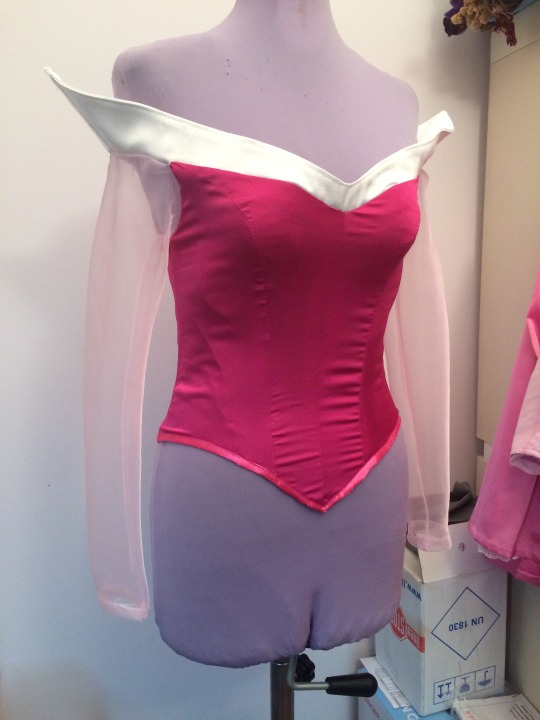
Another Disney Princess!
Welcome back on my journal! <3 Sorry for the lack of updates recently but I took some days off finally! I get out of this quarantine way too tired and overwhelmed than throughout the actual quarantine, so I really needed some rest! Luckly, I started working at full speed again by the middle of June (thanks to all the people that scheduled photoshooting in the Summer!) so I had a lot of order to fullfill but also I worked kinda in a rush to ship everything out before August so I was very tired, phisically and mentally at the end of July... And actually this post was started in the end of July but never got the time to finish it so...
After some rest, today I wanna show you how I made the Princess Aurora Cosplay last year for the most famous italian convention Lucca Comics & Games (that is still taking place this year but with a lot of changes in the organizations and in the “events” due this well known virus that is still with us all.....)

This entry was kind of “requested” on my Etsy shop as an explanations to go with my Aurora pattern I sold recently so I hope that can also help everyone that is trying to make this costume!
Let’s start with the basic...
- Materials
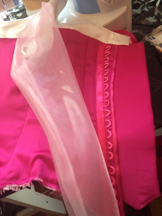
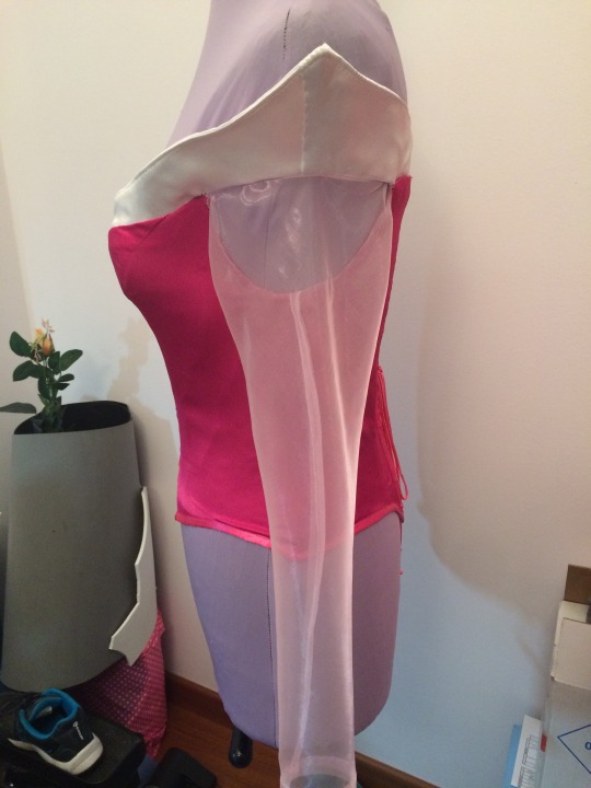
For this costume I used very high quality materials, because she is a princess after all! I made the bodice with a light fucsia silk satin, interfaced with heavy canvas and lined with heavy satin to keep it sturdy; the collar is also in white heavy satin and the sleeves in sheer shiny organdy. For the skirt and the belt I used the same light satin of the bodice but in lighter colors and I also made a petticoat in satin lining and white lace.
As this convention takes place in Autumn the client also requested a cape to go with the dress and I made it with a fucsia/pink alcantara (fake suede) and white fake fur, along with a small purse to carry her belongings.
So, after discussing materials let go a bit dip in the
- Pattern
As I said, I have this pattern for sale in my Etsy shop (in a lot of different sizes and I also can make it for your custom measures) so I will not dig very deep into it but let’s talk about its parts. Bodice: according to the pictures is a 4 panels corset in the front as well in the back, with a V neckline on the front and several V shapes at the hem, at the front, at the back and on the sides. The sleeves are simple tubolar sleeves with a straight edge on the wrist and in the official pictures they do not seems made with sheer fabric but with the same fabric as the belt. The collar reminds me a lot of the Belle Ballgown collar, it is called Bertha collar and it is a flat and rounded collar that goes aroun the shoulders (If you want to know more about it you can check the definition on this page). Skirt: I considered the belt as a part of the skirt so I did not make a separated piece, but if you prefer you can also make two pieces. I did the belt based on the waist measurement and drew the pointed ends in the same places of the corset, but longer this time. As I attached this part to the skirt it closes with the same zipper of the skirt. For the skirt I did a very full circle skirt as it has very deep pleats in the front, sides and back. I did a little train in the back nothing too long because the conventions are always very crowded and it is not safe to have a long train (the total lenght of the skirt is about 110 cm and the center back is 140 cm) Jewels: Aurora has a neckpiece and a very cute tiara so I follow the original design and adjust the shapes to my client measures. As usually I used my favourite technique here: golden spandex and foam. Accessories: as I already mentioned for this cosplay I did a cape and a little purse and I will show them in the second part of this entry.
And now let’s start with the construction of
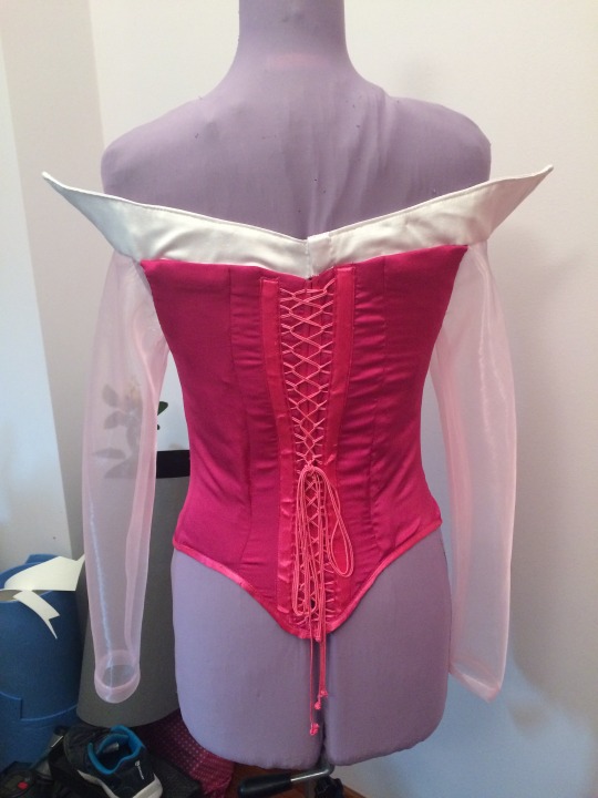
- The Bodice
I do not have pictures of the early stages of the construction but is very simple to build: I cut all the pattern pieces one time on the fashion fabric (the fucsia satin), one time in the interfacing fabric (the heavy canvas), one time on the heavy satin and one last time on the satin lining, for a total of 4 layers to put togheter! Well it is a corset after all...
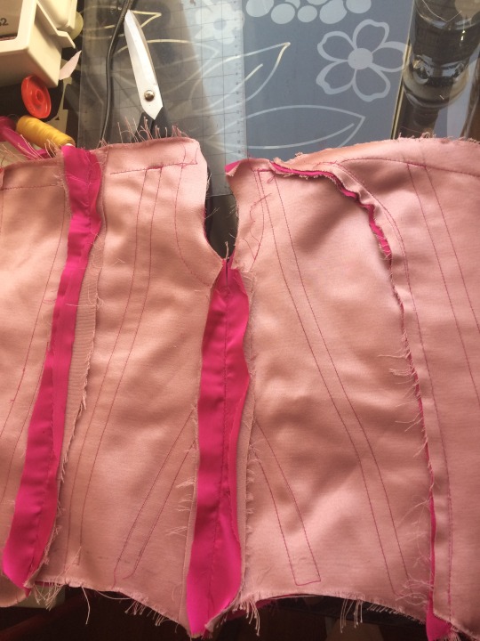
In this picture above you can see the fucsia lining and the heavy satin (the pale pink one) that together are the lining layer of the corset. I marked the boning placement on the heavy satin with very long machine seams and then I sewn together the sturdy interfacing and this heavy satin to make the boning channels. The position of the boning was decided during the fitting with the client but you can place wherever you like accordin to your support needs.
This is the rough shape of the corset after the first fitting: you can see the alteration marked on the neckline and the final boning placement.
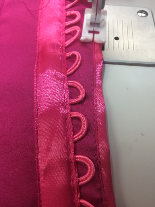
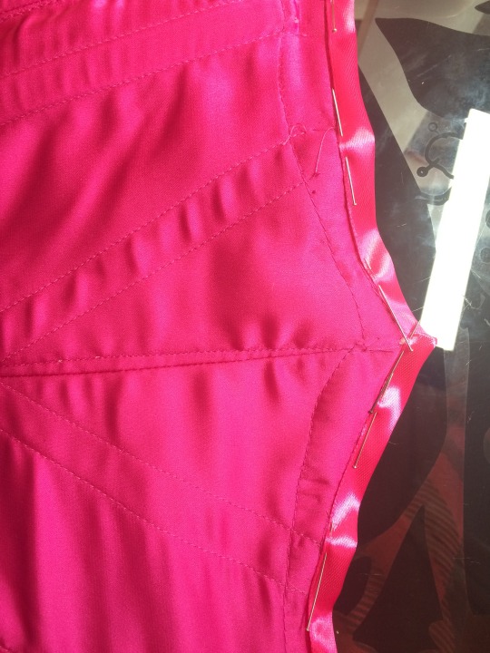
For the back we decided to avoid metal eyelets (as they are not so princessesque) and to go with ribbon lacing, so I marked the position of the loops and I used a soutache ribbon (heavier and stronger than normal cord) to make loops and the lacing.
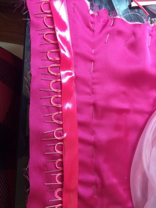
Then I covered the loops ends with a matching satin ribbon and on the inside I put two different bones to strenghten this part.
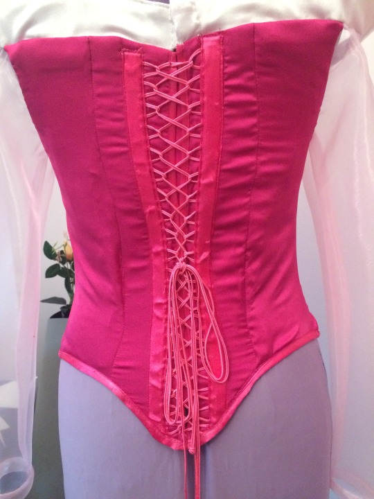
This is the final result of the back closure! All the corset ends (except for the top edge) were finished with bias binding as you can see in this picture. This is a picture of the corset fully closed (my dress form is a little bit bigger than the girl so it seems very stretched XD)
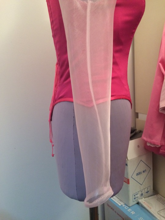
To finish the corset I closed the sleeves and sewn them in the armholes. The sleeves are very simple sleeves sewn with a french seam and a simple rolled hem.
The last thing to do was attaching the white collar on the top egde, it is really simple as well: it is made with two layers of heavy white satin and one layer of sturdy interfacing inbetween. I inserted also two plastic boning in the side seams to help keep the point up. I incased the seam between the fashion layer of the corset and the lining, the edge along the sleeves was snipped to change the direction and finished with white bias binding then sewn with tiny handstiches turning upwards (to be hidden by the collar) Maybe it is a bit complicated to read but I am sure it will be very clear when you will do it yourself! I decide then to add a big snap button on the center back of the white collar to help also the client to put on the corset.
Finally, I sewn bias binding along the center back and the bottom edge to finish the corset.
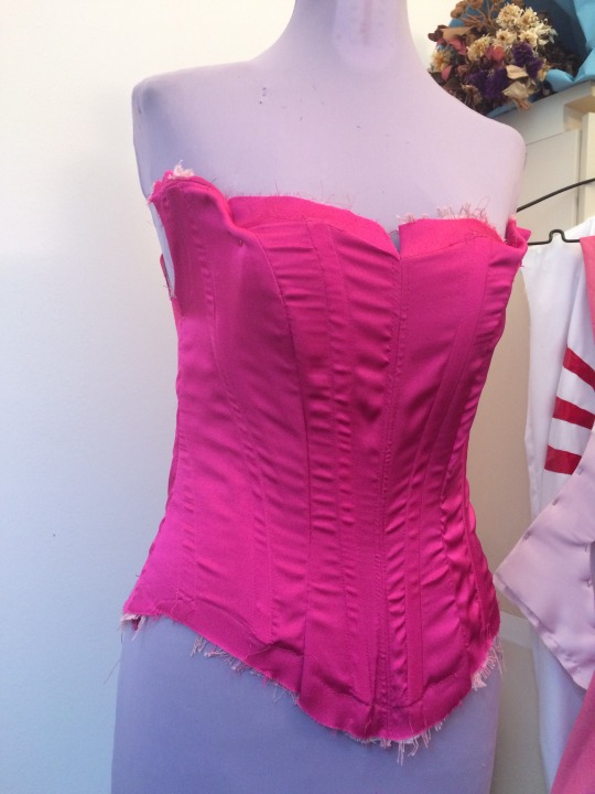
I totally forgot to tell you about the modesty panel but it is really a short passage XD I made it with the same layers of the corset, it has 5 boning channels made sewing together the interfacing and the heavy satin layers and this time I decided to attach it with handstiches on the right side on the lining instead of leaving it stand alone as I usually do.
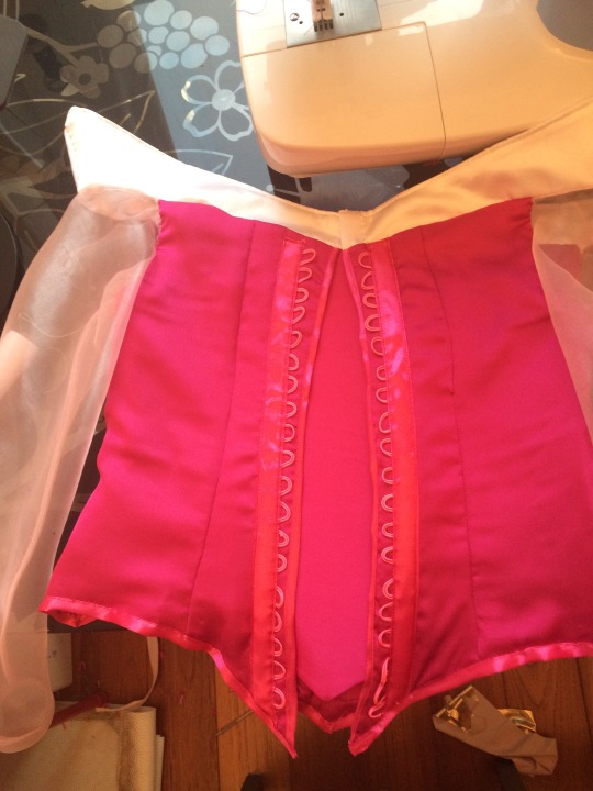
And this is the finished corset! (it looks a bit weird wthout actual arms inside XD)
And the corset ends part 1 of this entry, in the next one I will show you how I made the skirt and the accessories. Keep following my social media to be updated with my works and next entries! I post mainly on my Facebook page and my Instagram!
Have a nice day and thanks for stick around! See you next time!
Chiara (StregaCorvina)
Bentornati nel mio blog! <3 Eccoci di nuyovo con un aggiornamento dopo tanto tempo ma mi ero presa qualche giorno di vacanza finalmente! Sono uscita da questa quarantena molto più stanca e stressata che durante l’effettivo tempo di quarantena in casa, perciò avevo decisamente bisogno di riposare! Fortunatamente, ho ricominciato a cucire assiduamente già verso metà Giugno (grazie a tutte le persone che si sono organizzate per set fotografici in estate!) e ho avuto un sacco di ordini da terminare e spedire prima di Agosto perciò sono arrivata a fine Luglio esausta, fisicamente e mentalmente... In effetti ho iniziato a scrivere questo post a metà Luglio ma non ho mai trovato il tempo di terminarlo...
Dopo un po di riposo, oggi voglio farvi vedere come ho realizzato il cosplay della Principessa Aurora, fatto l’anno scorso per una delle convention italiane più famose, il Lucca Comics & Games (che si terrà anche quest anno nonostante numerosi cambiamenti all’organizziazione e agli eventi, per via di questo caro virus che ormai ci accompagna da un pò...)
Questo post è stato più o meno “richiesto” sul mio negozio Etsy per accompagnare il cartamodello del cosplay che ho venduto recentemente, perciò spero che possa aiutare anche chi prova a fare questo abito!
Iniziamo dalle basi...
- I Materiali
Per questo abito ho usato materiali di qualità molto alta, del resto è pur sempre una principessa! Ho fatto il corpino con un raso di seta fucsia abbastanza leggero, irrigidito con una tela all’interno, uno strato di raso più pesante come interfodera e infine una fodera di raso; anche la scollatura è fatta in raso pesante bianco e le maniche in organza rosa brillante. Per la gonna e la cintura ho usato lo stesso tipo di raso del corpino ma in tonalità di fucsia/rosa diverse. Infine ho realizzato una sottogonna in fodera di raso bianco con bordo in pizzo.
Siccome il Lucca Comics si tiene in Autunno la ragazza mi ha richiesto anche un mantello da abbinare all’abito che ho realizzato in alcantara (finto scamosciato) fucsia e eco-pelliccia bianca, inoltre ho aggiunto anche una borsetta a secchiello per aiutarla a portare i suoi effetti personali in giro per la fiera.
E ora, dopo aver parlato di materiali, iniziamo ad approfondire
- Il Cartamodello
Come ho gia detto, potete acquistare questo cartamodello nel mio negozio Etsy (è disponibile in tante taglie diverse ma posso realizzarlo anche sulle vostre misure) perciò non approfondirò più di tanto la costuzione, ma andiamo comunque a vedere i vari componenti. Corpino: guardando le immagini ufficiali, si tratta di un corsetto a 4 telini per il davanti e altrettanti per il dietro, con uno scollo a V davanti e numerose forme a V sull’orlo, davanti, dietro e sui fianchi. Le maniche sono delle semplici maniche tubolari con un orlo dritto sul posto e nelle immagini non sembrano realizzate in materiali trasparenti quanto piuttosto nello stesso materiale della cinutura. La scollatura mi ricorda molto quella dell’abito oro di Belle, si chiama “Bertha collar“ e per sempliicare è un colletto piatto e tondo che copre anche le spalle (se volete approfondire vi consiglio questo link). Gonna: ho considerato la cintura come parte della gonna perciò le ho unite sul punto vita, ma se preferite potete anche fare due pezzi. Ho costruito la cintura basandomi sulla circonferenza vita e ho disegnato le punte a V negli stessi punti del bustino ma più lunghe questa volta (circa 18 cm se non ricordo male). Siccome io ho realizzato un pezzo unico con la gonna, si chiude con la cerniera nel centro dietro. Per la gonna invece ho fatto una gonna a ruota intera molto ampia, circa 2 volte e mezza la circonferenza della vita visto che ha delle pieghe molto profonde davanti, dietro e sui fianchi. Ho fatto un piccolo strascico dietro ma non troppo lungo perchè nelle fiere affollate potrebbe essere pericoloso avere uno strascico lungo (la lunghezza totale della gonna è circa 110 cm e nel centro dietro di circa 140 cm) Gioielli: Aurora ha una collana e una tiara molto carina perciò ho semplicemente seguito il design originale adattandolo alle misure della ragazza. Come al solito li ho realizzati nella mia tecnica preferita: lycra oro e anima in foam! Accessori: come ho già detto ho completato il cosplay con un mantello e una borsetta, che sicuramente vi farò vedere nella seconda parte di questo post.
E ora inziamo con la costruzione del
- Il corpino
Non ho fatto molte foto nelle fasi iniziali di costruzione ma è motlo semplice da assemblare: ho tagliato tutti i pezzi del cartamodello una volta sullo strato esterno (il raso di seta fucsia), una volta sulla tela di sostegno (un cotone pesante), una volta sull’interfodera di raso pesante e per ultima una volta sulla fodera di raso vera e propria. Un totale di 4 strati da assemblare insieme! Del resto è sempre un corsetto...
Nella foto qui sopra vedete la fodera di raso (fucsia) e l’interfodera in raso pesante (rosa cipria) che insieme formano lo strato di fodera del corpetto. Ho segnato con delle lunghe cuciture a macchina sullo strato di interfodera la posizione dei canali per le stecche di sostegno, e ho creato questi canali cucendo insieme la tela di sostegno e l’interfodera. La posizione delle stecche ha seguito più o meno la posizione iniziale che avevo segnato il cartamodello, con qualche piccola modifica nell’area seno dopo il fitting con la ragazza, in realtà potete posizionarle dove volete in base alle vostre esigente di supporto e sostegno.
Ed ecco la prima forma del corsetto dopo il primo fitting, come potete vedere in alto si notano le modifiche da fare sulla scollatura ed essendo girato dal lato della fodera si vedono anche le posizioni finali delle stecche.
Per il dietro abbiamo deciso di non usare degli occhielli metallici (che non sono proprio così “principeschi”) ma di usare un’allacciautura con nastri ed asole; ho segnato la posizione di ogni asola e poi le ho realizzate con una fettuccia da soutache (molto più dura e resistente di un normale cordoncino).
Per chiudere e nascondere bene la fine degli occhielli ho applicato sopra un nastro di raso in tinta e nella parte interna ho sfruttato le cuciture del nastro per creare altri canali per le stecche.
Ed ecco il risultato finale della corsettatura! Tutti i bordi, tranne quello in alto, sono stati riginiti con uno sbiego di raso in tinta che potete vedere nelle immagini qui sotto (il manichino è leggermente più grande della ragazza perciò la corsettatura tira un pò più del dovuto)
Per terminare il corsetto sono passata alle maniche! Le ho assemblate con una cucitura francese (o all’inglese, come siete più familiari) e un semplice orlo arrotolato in fondo, poi le ho inserite nel giromanica.
L’ultimo passaggio riguarda la scollatura in alto. Anche questo è molto semplice, realizzato con due strati di raso bianco pesante e una tela di sostegno all’interno, ho inserito anche due stecche di plastica nelle cuciture laterali per aiutare la parte a punta a restare in alto. Ho nascosto la cucitura della scollatura fra la stoffa del corpetto e la fodera in modo che restasse nascosta, invece per le maniche ho tagliato il margine in corrispondenza della parte trasparente, l’ho bordato con dello sbiego bianco e l’ho cucito verso l’alto con dei punti a mano per nasconderlo sulla parte bianca. A parole forse è un pò complicato ma vi assicuro che se lo farete capirete subito di cosa sto parlando Infine ho deciso di applicare sul collare un grande automatico (anche se non era necessario ai fini del collare stesso) per aiutare la ragazza ad indossare il bustino da sola.
In ultimo ,ho bordato tutti i margini ancora da rifinire (i centri dietro e l’orlo in basso) con dello sbiego di raso, attaccato a macchina dritto contro dritto e poi cucito a mano all’interno.
Mi sono resa conto di non aver minimamente menzionato il modesty panel ma in realtà non c’è molto da dire XD L’ho realizzato con gli stessi passaggi del resto del corsetto, all’interno ha 5 stecche inserite in canali realizzati cucendo insieme i vari strati del corsetto e poi ho preferito fermarlo con dei punti a mano sul lato destro del corsetto invece di lasciarlo separato come di solito si usa fare.
Ed ecco il corsetto finito! (Purtroppo le maniche sono un pò cadenti senza delle vere braccia dentro XD)
Con il corsetto chiudiamo qui la parte 1 di questo post, nella prossima vi farò vedere la gonna e gli accessori.
Continuate a seguirmi sui Social per maggiori aggiornamenti sui miei lavori e le novità su cui lavorerò possimamente, soprattutto sulla mia pagina Facebook e su Instagram!
Buona giornata a tutti e grazie a chi continua a seguirmi assiduamente! Alla prosima!
Chiara (StregaCorvina)
#disney#disneyprincess#disneycosplay#handmadecosplay#handmadedisneycosplay#cosplaytutorial#walkthrough#cosplaywalkthrough#disneyprincesscosplay#handmadedisneyprincess#sleepingbeautycosplay#sleepingbeautycostume#auroracosplay#auroracostume#aurorapinkdress#sewingcosplay#sewingtutorial#handmade#sewing#seamstress#cosmaker#stregacorvina#Aurora#princessaurora#SleepingBeauty
0 notes
Text
An Interview with Warden Art Agency
Warden Art Agency burst onto the Austin art scene in 2019. To celebrate their first - and very impressive - year in business, we sat down with Lufkin native and University of Texas grad, Rich Warner, to talk about Warden Art Agency’s Texas-centric mentality, design focus and unique network of artists. As Rich walked us through his gallery, introducing us to works from the Austin artists you need to know, we got a sneak peek at what makes his North Loop gallery so special.
WAA Website | @wardenartagency

Rich Warner, Founder of Warden Art Agency | Photography by Hannah Mayson
TSG: Tell us about Warden Art Agency.
WAA: Warden Art Agency specializes in connecting Texas-based artists with interior design projects in the Austin area. We’ve built a business focused solely on the needs of a design-driven client. From advisory services to market search and procurement, we spend our days immersed in finding artwork on behalf of our clients. We also represent a curated group of up-and-coming and established artists through our client gallery. Our by-appointment model creates a more focused environment and allows private showings for individual collectors and interior designers.
TSG: What differentiates Warden from other art-focused businesses?
WAA: In the art world, you have the age-old gallery model that most people associate with purchasing artwork. As collector buying patterns have changed with social media and online research, buyers are calling for new avenues to view original artwork. We realized that there was a void in Austin for collectors and interior designers to view work (in person) by artists they have discovered via Instagram or other social platforms. That’s exactly the role our space is designed to fill. It’s about building connections within the art world and creating a comfortable environment for clients to experience the work.
TSG: Congrats on your first year in business, what has been your biggest achievement thus far?
WAA: Year one was all about building our artist network and understanding the demand of the Austin market. We challenged ourselves with finding a unique slate of artists, at various price points, that would provide the greatest opportunity for placement in both residential and commercial projects. We are extremely proud of the artist network we have built and are so grateful for the opportunity to represent each artist’s work.
TSG: Your gallery represents a wide variety of styles, tell us more.
WAA: We keep it modern and fresh like our projects and the designs of our clients. The gallery changes frequently, but you will always find a few common elements. We consistently represent a range of abstract work from heavily textured color progression (Tyler Guinn), to powerful fluidity and bold color (Rylie Caldwell), to playful movement inspired by nature (Alicia Philley). You will often find variations of folk-meets-pop figure work (B. Shawn Cox) and scaled-down representation of mural work (J Muzacz). As the work of our artist base evolves, so will the gallery.
TSG: You’ve recently expanded your portfolio beyond Austin-based artists, tell us more.
WAA: Yes, we are actively searching for unique work by artists in other Texas markets. We intend to maintain a portfolio of primarily Austin-based artists, but we are mixing in a few of our favorites from Houston and Dallas as well. More details coming soon!
TSG: You’ve introduced us to so many amazing artists in the past few months, how do you discover such unique talent?
WAA: Artists come to the agency in a variety of ways. Like most of our clients, we spend a lot of our time on Instagram and other social platforms reviewing content posted by artists. The conversation often begins with a simple insta-message or email. We also receive online inquiries from artists seeking representation and accept referrals from designers and collectors. At the end of the day, it’s all about the body of work. We extensively review each artist’s portfolio and identify artists who match our clients’ tastes and needs.
TSG: Do you ever have buyers that are interested in commissions and how does that process work?
WAA: Commissions are a large part of our business. We understand how important scale and color will always be when matching an artist with a design. Sometimes it requires artwork created with the specific collector in mind. Each artist has a commission process unique to their body of work and time availability. Our agency manages this process for our clients and helps facilitate communication throughout production.
TSG: What advice do you have for first-time buyers?
WAA: Buying artwork is an investment. But… it’s an investment you will see every single day. At Warden, we talk to each of our collectors about the mood of their design and the space where the artwork will live. Our goal is to find work that complements the vision. The biggest advice we give our clients - especially first-time buyers - is to think about how you will feel when you see the piece as you enter the room. If that aligns with your vision for the space, then we have a match.
TSG: Can anyone schedule an appointment to view art + learn about your services?
WAA: Absolutely! Our client gallery is “appointment only” to provide our clients with a more intimate environment for viewing the work. Appointments for designers or individual collectors can be made through our website or by emailing [email protected].
TSG: What’s next for Warden Art Agency?
WAA: As we enter year two of operation, our goal is to continue to focus on bringing our clients a robust, but truly unique portfolio of original artwork that complements their design projects. We will continue working on client projects throughout the year and will be opening our doors in May for Big Medium’s West Austin Studio Tour. Watch our social media for updates on those events!

0 notes
Text
New metasurface design can control optical fields in three dimensions
https://sciencespies.com/physics/new-metasurface-design-can-control-optical-fields-in-three-dimensions/
New metasurface design can control optical fields in three dimensions

A scanning electron micrograph image of the surface of the optical element. Credit: James Whitehead/University of Washington
More
A team led by scientists at the University of Washington has designed and tested a 3-D-printed metamaterial that can manipulate light with nanoscale precision. As they report in a paper published Oct. 4 in the journal Science Advances, their designed optical element focuses light to discrete points in a 3-D helical pattern.
The team’s design principles and experimental findings demonstrate that it is possible to model and construct metamaterial devices that can precisely manipulate optical fields with high spatial resolution in three dimensions. Though the team chose a helical pattern—a spiral helix—for their optical element to focus light, their approach could be used to design optical elements that control and focus light in other patterns.
Devices with this level of precision control over light could be used not only to miniaturize today’s optical elements, such as lenses or retroreflectors, but also to realize new varieties. In addition, designing optical fields in three dimensions could enable creation of ultra-compact depth sensors for autonomous transportation, as well as optical elements for displays and sensors in virtual- or augmented-reality headsets.
“This reported device really has no classical analog in refractive optics—the optics that we encounter in our day-to-day life,” said corresponding author Arka Majumdar, a UW assistant professor of electrical and computer engineering and physics, and faculty member at the UW Institute for Nano-Engineered Systems and the Institute for Molecular & Engineering Sciences. “No one has really made a device like this before with this set of capabilities.”
The team, which includes researchers at the Air Force Research Laboratory and the University of Dayton Research Institute, took a lesser-used approach in the optical metamaterials field to design the optical element: inverse design. Using inverse design, they started with the type of optical field profile they wanted to generate—eight focused points of light in a helical pattern—and designed a metamaterial surface that would create that pattern.
“We do not always intuitively know the appropriate structure of an optical element given a specific functionality,” said Majumdar. “This is where the inverse design comes in: You let the algorithm design the optics.”
While this approach seems straightforward and avoids the drawbacks of trial-and-error design methods, inverse design isn’t widely used for optically active large-area metamaterials because it requires a large number of simulations, making inverse design computationally intensive.
Here, the team avoided this pitfall thanks to an insight by Alan Zhan, lead author on the paper, who recently graduated the UW with a doctoral degree in physics. Zhan realized that the team could use Mie scattering theory to design the optical element. Mie scattering describes how light waves of a particular wavelength are scattered by spheres or cylinders that are similar in size to the optical wavelength. Mie scattering theory explains how metallic nanoparticles in stained glass can give certain church windows their bold colors, and how other stained glass artifacts change color in different wavelengths of light, according to Zhan.

These images show the performance of the 1,550-nanometer optical element. The images are light-intensity profiles of the optical field as it appears approximately 185 micrometers above the surface of the optical element. To the left is a simulated light-intensity profile that predicts how the optical element should perform. Note the focal point of light near the center of the image. To the right, an actual light-intensity profile of the optical element, showing that the device does produce a focal point of light at the predicted location. The researchers designed the element to focus light at eight such points at different distances above the element’s surface. Scale bar is 10 micrometers. Credit: Alan Zhan/University of Washington
More
“Our implementation of Mie scattering theory is specific to certain shapes—spheres— which meant we had to incorporate those shapes into the design of the optical element,” said Zhan. “But, relying on Mie scattering theory significantly simplified the design and simulation process because we could make very specific, very precise calculations about the properties of light when it interacts with the optical element.”
Their approach could be employed to include different geometries such as cylinders and ellipsoids.
The optical element the team designed is essentially a surface covered in thousands of tiny spheres of different sizes, arranged in a periodic square lattice. Using spheres simplified the design, and the team used a commercially available 3-D printer to fabricate two prototype optical elements—the larger of the two with sides just 0.02 centimeters long—at the Washington Nanofabrication Facility on the UW campus. The optical elements were 3-D-printed out of an ultraviolet epoxy on glass surfaces. One element was designed to focus light at 1,550 nanometers, the other at 3,000 nanometers.
The researchers visualized the optical elements under a microscope to see how well they performed as designed—focusing light of either 1,550 or 3,000 nanometers at eight specific points along a 3-D helical pattern. Under the microscope, most focused points of light were at the positions predicted by the team’s theoretical simulations. For example, for the 1,550-nanometer wavelength device, six of eight focal points were in the predicted position. The remaining two showed only minor deviations.
With the high performance of their prototypes, the team would like to improve the design process to reduce background levels of light and improve the accuracy of the placement of the focal points, and to incorporate other design elements compatible with Mie scattering theory.
“Now that we’ve shown the basic design principles work, there are lots of directions we can go with this level of precision in fabrication,” said Majumdar.
One particularly promising direction is to progress beyond a single-surface to create a true-volume, 3-D metamaterial.
“3-D-printing allows us to create a stack of these surfaces, which was not possible before,” said Majumdar.
Join us on Facebook or Twitter for a regular update.
Explore further
Kaleidoscope mirror symmetry inspires new design for optical tools, technologies
More information: “Controlling three-dimensional optical fields via inverse Mie scattering” Science Advances (2019). advances.sciencemag.org/content/5/10/eaax4769
Provided by University of Washington
Citation: New metasurface design can control optical fields in three dimensions (2019, October 4) retrieved 4 October 2019 from https://phys.org/news/2019-10-metasurface-optical-fields-dimensions.html
This document is subject to copyright. Apart from any fair dealing for the purpose of private study or research, no part may be reproduced without the written permission. The content is provided for information purposes only.
#Physics
0 notes
Text
Is Redesigning Your Mobile App A Bad Idea?
About The Author
Suzanne Scacca is a former WordPress implementer, trainer and agency manager who now works as a freelance copywriter. She specializes in crafting marketing agency, web … More about Suzanne Scacca …
The Scrabble GO, Instacart and YouTube mobile apps have recently undergone disruptive redesigns. Were they worth it in the end? Judging by their users’ reactions, the answer to that is “No”. But that doesn’t mean that redesigns or design tweaks are a bad idea after launch. Let’s take a look at the mistakes made and the lessons we can extract from them.
I’m all for updating and upgrading mobile apps. I think if you’re not constantly looking at ways to improve the user experience, it’s just too easy to fall behind.
That said, a redesign should be done for the right reasons.
If it’s an existing app that’s already popular with users, any changes made to the design or content should be done in very small, incremental, strategic chunks through A/B testing.
If your app is experiencing serious issues with user acquisition or retention, then a redesign is probably necessary. Just be careful. You could end up making things even worse than they were before.
Let’s take a look at some recent redesign fails and review the lessons we can all learn from them.
Lesson #1: Never Mess With A Classic Interface (Scrabble GO)
Scrabble is one of the most profitable board games of all time, so it’s no surprise that EA decided to turn it into a mobile app. And it was well-received.
However, that all changed in early 2020 when the app was sold to Scopely and it was redesigned as an ugly, confusing and overwhelming mess of its former self.
Let me introduce you to Scrabble GO as it stands today.
The splash screen introducing gamers into the app looks nice. Considering how classically simply and beautiful the board game is, this is a good sign. Until this happens:
The Scrabble GO home screen is distraction overload. (Source: Scrabble GO) (Large preview)
I don’t even know where to start with this, but I’m going to try:
The colors are way over-the-top and there are too many.
Since “Start New Game” is the primary action users want to take, it should be the only button in that color, but “Level 5” and “Level 6” distract from it.
The interface is so cluttered that it’s hard to focus on any particular part of it.
There’s no sense of control or priority within the design.
The navigation has gated pages! And I’m not sure what that icon on the left is supposed to be… gems and rewards? Why then is there a gem counter in the top banner?
Beyond the UI of the homescreen, the UI and UX within the game board have been altered, too.
Take, for instance, this plea from @lageerdes on Twitter:
Twitter user @lageerdes asks Scrabble GO why the old functionality is gone. (Source: Twitter) (Large preview)
It took Scrabble GO over a week to tell @lageerdes something that could’ve easily been spelled out in a game FAQ or Settings page. These aren’t the only classic features that the new app has either complicated or done away with.
Now, Scopely took note of the negative comments from users and promised to revamp the app accordingly (which was promising). But rather than revert back to the old and much-loved design, it just added a new mode:
Scrabble GO added new ‘Mode Settings’ to appease users. (Source: Scrabble GO) (Large preview)
You’d think that the mode switcher would be more prominently displayed — like in the menu bar. Instead, it’s buried under the “Profile Settings” tab and there’s no indication anywhere in the app that the classic mode even exists.
Sadly, classic mode isn’t much of an improvement (classic is on the right):
The new Scrabble GO home screen versus the newly designed classic mode home screen. (Source: Scrabble GO) (Large preview)
The colors are toned down, some of the elements in the top-half have been cut out or minimized, but it doesn’t address any of the users’ issues with the app or game play.
Worse, many users are reporting the app crashes on them, as this complaint from Twitter user @monicamhere demonstrates:
Twitter user @monicamhere complains to Scrabble GO about the app crashing. (Source: Twitter) (Large preview)
I suspect this is happening because the developers jammed a second overloaded mode into the app rather than simply refine the existing one based on user feedback.
So, what’s the lesson here?
For starters, don’t mess with a classic. The old mobile app closely resembled the physical board game and it was a huge part of its appeal. When you throw out an old design for something (seemingly) more trendy, you run the risk of alienating once-loyal users.
Also, if it ain’t broke, don’t fix it. Previously, the app was very easy to use and came with all the features and functionality users were familiar with from the board game. Now, they’re left with a non-intuitive and distracting mess.
If your users are telling you to ditch the redesign, listen to them. Who are you building this app for? Yourself or the users who are going to play with it and put money into your pocket?
Listen to what your users have to say. It’s valuable feedback that could make a world of difference in the user experience.
Lesson #2: Never Mislead Users At Checkout (Instacart)
This is an interesting case because the people who objected to this particular Instacart UI update weren’t its primary users.
Here’s why the change was an issue:
Users go onto the Instacart website or mobile app and do their grocery shopping from the local store of their choice. It’s a pretty neat concept:
Instacart users can do virtual shopping with grocery stores like Wegmans. (Source: Instacart) (Large preview)
Users quickly search for items and add them to their virtual shopping cart. In many cases, they have the option to either do curbside pickup or have the groceries delivered to their front doorstep. Either way, a dedicated “shopper” picks out the items and bags them up.
When the user is done shopping, they get a chance to review their cart and make final changes before checking out.
On the checkout page, users get to pick when they want their order fulfilled. Beneath this section, they find a high-level summary of their charges:
Instacart checkout sums up the total costs of a user’s order. (Source: Instacart) (Large preview)
At first glance, this all appears pretty-straightforward.
The cost of their cart is $174.40, which they already knew.
There’s a service fee of $9.99.
Sales tax is $4.11.
And the total is $197.22.
But before all that is a section called “Delivery Tip”. This is where Instacart’s shoppers take issue.
They argued that this is a dark pattern. And it is. Let me explain:
The first thing that’s wrong is that the Delivery Tip isn’t included with the rest of the line items. If it’s part of the calculation, it should be present down there and not separated out in its own section.
The second thing that’s wrong is that the tip is automatically set at 5% or $2.00. This was the shoppers’ biggest grievance at the time. They believed that because the “(5.0%)” in the delivery tip line wasn’t there in 2018, users might’ve seen the amount and thought “That seems reasonable enough” and left it at that. Whereas if you spell out the percentage, users may be inclined to leave more money.
For users who take the time to read through their charges and realize that they can leave a larger tip, this is what the tip update page looks like for small orders:
Instacart enables users to change the way they tip the delivery person. (Source: Instacart) (Large preview)
It’s oddly organized as the pre-selected amount sits at the very bottom of the page. And then there’s a random $6 tip included as if the app creators didn’t want to calculate what 20% would be.
That’s not how the tip is presented to users with larger orders though:
Instacart enables users to customize the tip they leave the delivery person, from 5% to 20% or they can customize the amount. (Source: Instacart) (Large preview)
It’s a strange choice to present users with a different tip page layout. It’s also strange that this one includes an open field to input a custom tip (under “Other amount”) when it’s not available on smaller orders.
If Instacart wants to avoid angering its shoppers and users, there needs to be more transparency about what’s going on and they need to fix the checkout page.
Dark patterns have no place in app design and especially not at checkout.
If you’re building an app that provide users with delivery, pickup or personal shopper services (which is becoming increasingly more common), I’d recommend designing your checkout page like Grubhub’s:
The Grubhub checkout page recaps the user’s order and provides tip amounts in percentages. (Source: Grubhub) (Large preview)
Users not only get a chance to see their items at the time of checkout, but the tip line is not deceptively designed or hidden. It sticks right there to the bottom of the page.
What’s more, tips are displayed as percentage amounts instead of random dollars. For U.S. consumers that are used to tipping 20% for good service, this is a much better way to ensure they leave a worthwhile tip for service workers rather than assume the dollar amount is okay.
And if they want to leave more or less, they can use the “Custom” option to input their own value.
Lesson #3: Never Waver In Your Decision To Roll Back (YouTube)
When the majority of your users speak up and say, “I really don’t like this new feature/update/design”, commit to whatever choice you make.
If you agree that the new feature sucks, then roll it back. And keep it that way.
If you don’t agree, then tweak it or just give it time until users get back on your side.
Just don’t flip-flop.
Here’s what happened when YouTube switched things up on its users… and then switched them again:
In 2019, YouTube tested hiding its comments section beneath this icon:
The Verge and XDA Developers report on a new placement of YouTube comments in 2019. (Source: Verge) (Large preview)
Before this test, comments appeared at the very bottom of the app, beneath the “Up next” video recommendations. With this update, however, they were moved behind this new button. Users would only see comments if they clicked it.
The response to the redesign clearly wasn’t positive as YouTube rolled back the update.
In 2020, YouTube decided to play around with the comments section again. Unlike the 2019 update, though, YouTube’s committed to this one (so far).
Here’s where the comments appear now:
The YouTube comments redesign puts the comments above the ‘Up next’ section. (Source: YouTube) (Large preview)
They’re sandwiched between the “Subscribe” bar and the “Up next” section.
If YouTube users go looking for the comments section in the old spot, they’re going to find this message now:
A notice appears when YouTube users go looking for comments in the old location. (Source: YouTube) (Large preview)
This is a nice touch. Think about how many times you’ve had to redesign something in an app or on a website, but had no way of letting regular users know about it. Not only does this tell them there’s been a change, but “Go To Comments” takes them there.
With this tooltip, YouTube doesn’t assume that users will zero in on the new section right away. It shows them where it is:
YouTube users see tooltip that shows them where the new comments section is. (Source: YouTube) (Large preview)
I actually think this is a good redesign. YouTube might be a place for some users to mindlessly watch video after video, but it’s a social media platform as well. By hiding the comments section under a button or tucking them into the bottom of the page, does that really encourage socialization? Of course not.
That said, users aren’t responding well to this change either, as Digital Information World reports. From what I can tell, the backlash is due to Google/YouTube disrupting the familiarity users have with the app’s layout. There’s really nothing here that suggests friction or disruption in their experience. It’s not even like the new section gets in the way or impedes users from binge-watching videos.
This is a tricky one because I don’t believe that YouTube should roll this update back.
There must be something in YouTube’s data that’s telling it that the bottom of the app is a bad place for comments, which is why it’s taking another stab at a redesign. It might be low engagement rates or people expressing annoyance at having to scroll so much to find them.
As such, I think this is a case for a mobile app developer not to listen to its users. And, in order to restore their trust and satisfaction, YouTube will need to hold firm to its decision this time.
Is A Mobile App Redesign The Best Idea For You?
Honestly, it’s impossible to please everyone. However, your goal should be to please, at the very least, most of your users.
So, if you’re planning to redesign your app, I’d suggest taking the safe approach and A/B testing it first to see what kind of feedback you get.
That way, you’ll only push out data-backed updates that improve the overall user experience. And you won’t have to deal with rolling back the app or the negative press you get from media outlets, social media comments, or app store reviews.
Further Reading on SmashingMag:
(ra, yk, il)
Website Design & SEO Delray Beach by DBL07.co
Delray Beach SEO
Via http://www.scpie.org/is-redesigning-your-mobile-app-a-bad-idea/
source https://scpie.weebly.com/blog/is-redesigning-your-mobile-app-a-bad-idea
0 notes
Text
Is Redesigning Your Mobile App A Bad Idea?
About The Author
Suzanne Scacca is a former WordPress implementer, trainer and agency manager who now works as a freelance copywriter. She specializes in crafting marketing agency, web … More about Suzanne Scacca …
The Scrabble GO, Instacart and YouTube mobile apps have recently undergone disruptive redesigns. Were they worth it in the end? Judging by their users’ reactions, the answer to that is “No”. But that doesn’t mean that redesigns or design tweaks are a bad idea after launch. Let’s take a look at the mistakes made and the lessons we can extract from them.
I’m all for updating and upgrading mobile apps. I think if you’re not constantly looking at ways to improve the user experience, it’s just too easy to fall behind.
That said, a redesign should be done for the right reasons.
If it’s an existing app that’s already popular with users, any changes made to the design or content should be done in very small, incremental, strategic chunks through A/B testing.
If your app is experiencing serious issues with user acquisition or retention, then a redesign is probably necessary. Just be careful. You could end up making things even worse than they were before.
Let’s take a look at some recent redesign fails and review the lessons we can all learn from them.
Lesson #1: Never Mess With A Classic Interface (Scrabble GO)
Scrabble is one of the most profitable board games of all time, so it’s no surprise that EA decided to turn it into a mobile app. And it was well-received.
However, that all changed in early 2020 when the app was sold to Scopely and it was redesigned as an ugly, confusing and overwhelming mess of its former self.
Let me introduce you to Scrabble GO as it stands today.
The splash screen introducing gamers into the app looks nice. Considering how classically simply and beautiful the board game is, this is a good sign. Until this happens:
The Scrabble GO home screen is distraction overload. (Source: Scrabble GO) (Large preview)
I don’t even know where to start with this, but I’m going to try:
The colors are way over-the-top and there are too many.
Since “Start New Game” is the primary action users want to take, it should be the only button in that color, but “Level 5” and “Level 6” distract from it.
The interface is so cluttered that it’s hard to focus on any particular part of it.
There’s no sense of control or priority within the design.
The navigation has gated pages! And I’m not sure what that icon on the left is supposed to be… gems and rewards? Why then is there a gem counter in the top banner?
Beyond the UI of the homescreen, the UI and UX within the game board have been altered, too.
Take, for instance, this plea from @lageerdes on Twitter:
Twitter user @lageerdes asks Scrabble GO why the old functionality is gone. (Source: Twitter) (Large preview)
It took Scrabble GO over a week to tell @lageerdes something that could’ve easily been spelled out in a game FAQ or Settings page. These aren’t the only classic features that the new app has either complicated or done away with.
Now, Scopely took note of the negative comments from users and promised to revamp the app accordingly (which was promising). But rather than revert back to the old and much-loved design, it just added a new mode:
Scrabble GO added new ‘Mode Settings’ to appease users. (Source: Scrabble GO) (Large preview)
You’d think that the mode switcher would be more prominently displayed — like in the menu bar. Instead, it’s buried under the “Profile Settings” tab and there’s no indication anywhere in the app that the classic mode even exists.
Sadly, classic mode isn’t much of an improvement (classic is on the right):
The new Scrabble GO home screen versus the newly designed classic mode home screen. (Source: Scrabble GO) (Large preview)
The colors are toned down, some of the elements in the top-half have been cut out or minimized, but it doesn’t address any of the users’ issues with the app or game play.
Worse, many users are reporting the app crashes on them, as this complaint from Twitter user @monicamhere demonstrates:
Twitter user @monicamhere complains to Scrabble GO about the app crashing. (Source: Twitter) (Large preview)
I suspect this is happening because the developers jammed a second overloaded mode into the app rather than simply refine the existing one based on user feedback.
So, what’s the lesson here?
For starters, don’t mess with a classic. The old mobile app closely resembled the physical board game and it was a huge part of its appeal. When you throw out an old design for something (seemingly) more trendy, you run the risk of alienating once-loyal users.
Also, if it ain’t broke, don’t fix it. Previously, the app was very easy to use and came with all the features and functionality users were familiar with from the board game. Now, they’re left with a non-intuitive and distracting mess.
If your users are telling you to ditch the redesign, listen to them. Who are you building this app for? Yourself or the users who are going to play with it and put money into your pocket?
Listen to what your users have to say. It’s valuable feedback that could make a world of difference in the user experience.
Lesson #2: Never Mislead Users At Checkout (Instacart)
This is an interesting case because the people who objected to this particular Instacart UI update weren’t its primary users.
Here’s why the change was an issue:
Users go onto the Instacart website or mobile app and do their grocery shopping from the local store of their choice. It’s a pretty neat concept:
Instacart users can do virtual shopping with grocery stores like Wegmans. (Source: Instacart) (Large preview)
Users quickly search for items and add them to their virtual shopping cart. In many cases, they have the option to either do curbside pickup or have the groceries delivered to their front doorstep. Either way, a dedicated “shopper” picks out the items and bags them up.
When the user is done shopping, they get a chance to review their cart and make final changes before checking out.
On the checkout page, users get to pick when they want their order fulfilled. Beneath this section, they find a high-level summary of their charges:
Instacart checkout sums up the total costs of a user’s order. (Source: Instacart) (Large preview)
At first glance, this all appears pretty-straightforward.
The cost of their cart is $174.40, which they already knew.
There’s a service fee of $9.99.
Sales tax is $4.11.
And the total is $197.22.
But before all that is a section called “Delivery Tip”. This is where Instacart’s shoppers take issue.
They argued that this is a dark pattern. And it is. Let me explain:
The first thing that’s wrong is that the Delivery Tip isn’t included with the rest of the line items. If it’s part of the calculation, it should be present down there and not separated out in its own section.
The second thing that’s wrong is that the tip is automatically set at 5% or $2.00. This was the shoppers’ biggest grievance at the time. They believed that because the “(5.0%)” in the delivery tip line wasn’t there in 2018, users might’ve seen the amount and thought “That seems reasonable enough” and left it at that. Whereas if you spell out the percentage, users may be inclined to leave more money.
For users who take the time to read through their charges and realize that they can leave a larger tip, this is what the tip update page looks like for small orders:
Instacart enables users to change the way they tip the delivery person. (Source: Instacart) (Large preview)
It’s oddly organized as the pre-selected amount sits at the very bottom of the page. And then there’s a random $6 tip included as if the app creators didn’t want to calculate what 20% would be.
That’s not how the tip is presented to users with larger orders though:
Instacart enables users to customize the tip they leave the delivery person, from 5% to 20% or they can customize the amount. (Source: Instacart) (Large preview)
It’s a strange choice to present users with a different tip page layout. It’s also strange that this one includes an open field to input a custom tip (under “Other amount”) when it’s not available on smaller orders.
If Instacart wants to avoid angering its shoppers and users, there needs to be more transparency about what’s going on and they need to fix the checkout page.
Dark patterns have no place in app design and especially not at checkout.
If you’re building an app that provide users with delivery, pickup or personal shopper services (which is becoming increasingly more common), I’d recommend designing your checkout page like Grubhub’s:
The Grubhub checkout page recaps the user’s order and provides tip amounts in percentages. (Source: Grubhub) (Large preview)
Users not only get a chance to see their items at the time of checkout, but the tip line is not deceptively designed or hidden. It sticks right there to the bottom of the page.
What’s more, tips are displayed as percentage amounts instead of random dollars. For U.S. consumers that are used to tipping 20% for good service, this is a much better way to ensure they leave a worthwhile tip for service workers rather than assume the dollar amount is okay.
And if they want to leave more or less, they can use the “Custom” option to input their own value.
Lesson #3: Never Waver In Your Decision To Roll Back (YouTube)
When the majority of your users speak up and say, “I really don’t like this new feature/update/design”, commit to whatever choice you make.
If you agree that the new feature sucks, then roll it back. And keep it that way.
If you don’t agree, then tweak it or just give it time until users get back on your side.
Just don’t flip-flop.
Here’s what happened when YouTube switched things up on its users… and then switched them again:
In 2019, YouTube tested hiding its comments section beneath this icon:
The Verge and XDA Developers report on a new placement of YouTube comments in 2019. (Source: Verge) (Large preview)
Before this test, comments appeared at the very bottom of the app, beneath the “Up next” video recommendations. With this update, however, they were moved behind this new button. Users would only see comments if they clicked it.
The response to the redesign clearly wasn’t positive as YouTube rolled back the update.
In 2020, YouTube decided to play around with the comments section again. Unlike the 2019 update, though, YouTube’s committed to this one (so far).
Here’s where the comments appear now:
The YouTube comments redesign puts the comments above the ‘Up next’ section. (Source: YouTube) (Large preview)
They’re sandwiched between the “Subscribe” bar and the “Up next” section.
If YouTube users go looking for the comments section in the old spot, they’re going to find this message now:
A notice appears when YouTube users go looking for comments in the old location. (Source: YouTube) (Large preview)
This is a nice touch. Think about how many times you’ve had to redesign something in an app or on a website, but had no way of letting regular users know about it. Not only does this tell them there’s been a change, but “Go To Comments” takes them there.
With this tooltip, YouTube doesn’t assume that users will zero in on the new section right away. It shows them where it is:
YouTube users see tooltip that shows them where the new comments section is. (Source: YouTube) (Large preview)
I actually think this is a good redesign. YouTube might be a place for some users to mindlessly watch video after video, but it’s a social media platform as well. By hiding the comments section under a button or tucking them into the bottom of the page, does that really encourage socialization? Of course not.
That said, users aren’t responding well to this change either, as Digital Information World reports. From what I can tell, the backlash is due to Google/YouTube disrupting the familiarity users have with the app’s layout. There’s really nothing here that suggests friction or disruption in their experience. It’s not even like the new section gets in the way or impedes users from binge-watching videos.
This is a tricky one because I don’t believe that YouTube should roll this update back.
There must be something in YouTube’s data that’s telling it that the bottom of the app is a bad place for comments, which is why it’s taking another stab at a redesign. It might be low engagement rates or people expressing annoyance at having to scroll so much to find them.
As such, I think this is a case for a mobile app developer not to listen to its users. And, in order to restore their trust and satisfaction, YouTube will need to hold firm to its decision this time.
Is A Mobile App Redesign The Best Idea For You?
Honestly, it’s impossible to please everyone. However, your goal should be to please, at the very least, most of your users.
So, if you’re planning to redesign your app, I’d suggest taking the safe approach and A/B testing it first to see what kind of feedback you get.
That way, you’ll only push out data-backed updates that improve the overall user experience. And you won’t have to deal with rolling back the app or the negative press you get from media outlets, social media comments, or app store reviews.
Further Reading on SmashingMag:
(ra, yk, il)
Website Design & SEO Delray Beach by DBL07.co
Delray Beach SEO
source http://www.scpie.org/is-redesigning-your-mobile-app-a-bad-idea/ source https://scpie.tumblr.com/post/623667673211060225
0 notes
Text
Is Redesigning Your Mobile App A Bad Idea?
About The Author
Suzanne Scacca is a former WordPress implementer, trainer and agency manager who now works as a freelance copywriter. She specializes in crafting marketing agency, web … More about Suzanne Scacca …
The Scrabble GO, Instacart and YouTube mobile apps have recently undergone disruptive redesigns. Were they worth it in the end? Judging by their users’ reactions, the answer to that is “No”. But that doesn’t mean that redesigns or design tweaks are a bad idea after launch. Let’s take a look at the mistakes made and the lessons we can extract from them.
I’m all for updating and upgrading mobile apps. I think if you’re not constantly looking at ways to improve the user experience, it’s just too easy to fall behind.
That said, a redesign should be done for the right reasons.
If it’s an existing app that’s already popular with users, any changes made to the design or content should be done in very small, incremental, strategic chunks through A/B testing.
If your app is experiencing serious issues with user acquisition or retention, then a redesign is probably necessary. Just be careful. You could end up making things even worse than they were before.
Let’s take a look at some recent redesign fails and review the lessons we can all learn from them.
Lesson #1: Never Mess With A Classic Interface (Scrabble GO)
Scrabble is one of the most profitable board games of all time, so it’s no surprise that EA decided to turn it into a mobile app. And it was well-received.
However, that all changed in early 2020 when the app was sold to Scopely and it was redesigned as an ugly, confusing and overwhelming mess of its former self.
Let me introduce you to Scrabble GO as it stands today.
The splash screen introducing gamers into the app looks nice. Considering how classically simply and beautiful the board game is, this is a good sign. Until this happens:
The Scrabble GO home screen is distraction overload. (Source: Scrabble GO) (Large preview)
I don’t even know where to start with this, but I’m going to try:
The colors are way over-the-top and there are too many.
Since “Start New Game” is the primary action users want to take, it should be the only button in that color, but “Level 5” and “Level 6” distract from it.
The interface is so cluttered that it’s hard to focus on any particular part of it.
There’s no sense of control or priority within the design.
The navigation has gated pages! And I’m not sure what that icon on the left is supposed to be… gems and rewards? Why then is there a gem counter in the top banner?
Beyond the UI of the homescreen, the UI and UX within the game board have been altered, too.
Take, for instance, this plea from @lageerdes on Twitter:
Twitter user @lageerdes asks Scrabble GO why the old functionality is gone. (Source: Twitter) (Large preview)
It took Scrabble GO over a week to tell @lageerdes something that could’ve easily been spelled out in a game FAQ or Settings page. These aren’t the only classic features that the new app has either complicated or done away with.
Now, Scopely took note of the negative comments from users and promised to revamp the app accordingly (which was promising). But rather than revert back to the old and much-loved design, it just added a new mode:
Scrabble GO added new ‘Mode Settings’ to appease users. (Source: Scrabble GO) (Large preview)
You’d think that the mode switcher would be more prominently displayed — like in the menu bar. Instead, it’s buried under the “Profile Settings” tab and there’s no indication anywhere in the app that the classic mode even exists.
Sadly, classic mode isn’t much of an improvement (classic is on the right):
The new Scrabble GO home screen versus the newly designed classic mode home screen. (Source: Scrabble GO) (Large preview)
The colors are toned down, some of the elements in the top-half have been cut out or minimized, but it doesn’t address any of the users’ issues with the app or game play.
Worse, many users are reporting the app crashes on them, as this complaint from Twitter user @monicamhere demonstrates:
Twitter user @monicamhere complains to Scrabble GO about the app crashing. (Source: Twitter) (Large preview)
I suspect this is happening because the developers jammed a second overloaded mode into the app rather than simply refine the existing one based on user feedback.
So, what’s the lesson here?
For starters, don’t mess with a classic. The old mobile app closely resembled the physical board game and it was a huge part of its appeal. When you throw out an old design for something (seemingly) more trendy, you run the risk of alienating once-loyal users.
Also, if it ain’t broke, don’t fix it. Previously, the app was very easy to use and came with all the features and functionality users were familiar with from the board game. Now, they’re left with a non-intuitive and distracting mess.
If your users are telling you to ditch the redesign, listen to them. Who are you building this app for? Yourself or the users who are going to play with it and put money into your pocket?
Listen to what your users have to say. It’s valuable feedback that could make a world of difference in the user experience.
Lesson #2: Never Mislead Users At Checkout (Instacart)
This is an interesting case because the people who objected to this particular Instacart UI update weren’t its primary users.
Here’s why the change was an issue:
Users go onto the Instacart website or mobile app and do their grocery shopping from the local store of their choice. It’s a pretty neat concept:
Instacart users can do virtual shopping with grocery stores like Wegmans. (Source: Instacart) (Large preview)
Users quickly search for items and add them to their virtual shopping cart. In many cases, they have the option to either do curbside pickup or have the groceries delivered to their front doorstep. Either way, a dedicated “shopper” picks out the items and bags them up.
When the user is done shopping, they get a chance to review their cart and make final changes before checking out.
On the checkout page, users get to pick when they want their order fulfilled. Beneath this section, they find a high-level summary of their charges:
Instacart checkout sums up the total costs of a user’s order. (Source: Instacart) (Large preview)
At first glance, this all appears pretty-straightforward.
The cost of their cart is $174.40, which they already knew.
There’s a service fee of $9.99.
Sales tax is $4.11.
And the total is $197.22.
But before all that is a section called “Delivery Tip”. This is where Instacart’s shoppers take issue.
They argued that this is a dark pattern. And it is. Let me explain:
The first thing that’s wrong is that the Delivery Tip isn’t included with the rest of the line items. If it’s part of the calculation, it should be present down there and not separated out in its own section.
The second thing that’s wrong is that the tip is automatically set at 5% or $2.00. This was the shoppers’ biggest grievance at the time. They believed that because the “(5.0%)” in the delivery tip line wasn’t there in 2018, users might’ve seen the amount and thought “That seems reasonable enough” and left it at that. Whereas if you spell out the percentage, users may be inclined to leave more money.
For users who take the time to read through their charges and realize that they can leave a larger tip, this is what the tip update page looks like for small orders:
Instacart enables users to change the way they tip the delivery person. (Source: Instacart) (Large preview)
It’s oddly organized as the pre-selected amount sits at the very bottom of the page. And then there’s a random $6 tip included as if the app creators didn’t want to calculate what 20% would be.
That’s not how the tip is presented to users with larger orders though:
Instacart enables users to customize the tip they leave the delivery person, from 5% to 20% or they can customize the amount. (Source: Instacart) (Large preview)
It’s a strange choice to present users with a different tip page layout. It’s also strange that this one includes an open field to input a custom tip (under “Other amount”) when it’s not available on smaller orders.
If Instacart wants to avoid angering its shoppers and users, there needs to be more transparency about what’s going on and they need to fix the checkout page.
Dark patterns have no place in app design and especially not at checkout.
If you’re building an app that provide users with delivery, pickup or personal shopper services (which is becoming increasingly more common), I’d recommend designing your checkout page like Grubhub’s:
The Grubhub checkout page recaps the user’s order and provides tip amounts in percentages. (Source: Grubhub) (Large preview)
Users not only get a chance to see their items at the time of checkout, but the tip line is not deceptively designed or hidden. It sticks right there to the bottom of the page.
What’s more, tips are displayed as percentage amounts instead of random dollars. For U.S. consumers that are used to tipping 20% for good service, this is a much better way to ensure they leave a worthwhile tip for service workers rather than assume the dollar amount is okay.
And if they want to leave more or less, they can use the “Custom” option to input their own value.
Lesson #3: Never Waver In Your Decision To Roll Back (YouTube)
When the majority of your users speak up and say, “I really don’t like this new feature/update/design”, commit to whatever choice you make.
If you agree that the new feature sucks, then roll it back. And keep it that way.
If you don’t agree, then tweak it or just give it time until users get back on your side.
Just don’t flip-flop.
Here’s what happened when YouTube switched things up on its users… and then switched them again:
In 2019, YouTube tested hiding its comments section beneath this icon:
The Verge and XDA Developers report on a new placement of YouTube comments in 2019. (Source: Verge) (Large preview)
Before this test, comments appeared at the very bottom of the app, beneath the “Up next” video recommendations. With this update, however, they were moved behind this new button. Users would only see comments if they clicked it.
The response to the redesign clearly wasn’t positive as YouTube rolled back the update.
In 2020, YouTube decided to play around with the comments section again. Unlike the 2019 update, though, YouTube’s committed to this one (so far).
Here’s where the comments appear now:
The YouTube comments redesign puts the comments above the ‘Up next’ section. (Source: YouTube) (Large preview)
They’re sandwiched between the “Subscribe” bar and the “Up next” section.
If YouTube users go looking for the comments section in the old spot, they’re going to find this message now:
A notice appears when YouTube users go looking for comments in the old location. (Source: YouTube) (Large preview)
This is a nice touch. Think about how many times you’ve had to redesign something in an app or on a website, but had no way of letting regular users know about it. Not only does this tell them there’s been a change, but “Go To Comments” takes them there.
With this tooltip, YouTube doesn’t assume that users will zero in on the new section right away. It shows them where it is:
YouTube users see tooltip that shows them where the new comments section is. (Source: YouTube) (Large preview)
I actually think this is a good redesign. YouTube might be a place for some users to mindlessly watch video after video, but it’s a social media platform as well. By hiding the comments section under a button or tucking them into the bottom of the page, does that really encourage socialization? Of course not.
That said, users aren’t responding well to this change either, as Digital Information World reports. From what I can tell, the backlash is due to Google/YouTube disrupting the familiarity users have with the app’s layout. There’s really nothing here that suggests friction or disruption in their experience. It’s not even like the new section gets in the way or impedes users from binge-watching videos.
This is a tricky one because I don’t believe that YouTube should roll this update back.
There must be something in YouTube’s data that’s telling it that the bottom of the app is a bad place for comments, which is why it’s taking another stab at a redesign. It might be low engagement rates or people expressing annoyance at having to scroll so much to find them.
As such, I think this is a case for a mobile app developer not to listen to its users. And, in order to restore their trust and satisfaction, YouTube will need to hold firm to its decision this time.
Is A Mobile App Redesign The Best Idea For You?
Honestly, it’s impossible to please everyone. However, your goal should be to please, at the very least, most of your users.
So, if you’re planning to redesign your app, I’d suggest taking the safe approach and A/B testing it first to see what kind of feedback you get.
That way, you’ll only push out data-backed updates that improve the overall user experience. And you won’t have to deal with rolling back the app or the negative press you get from media outlets, social media comments, or app store reviews.
Further Reading on SmashingMag:
(ra, yk, il)
Website Design & SEO Delray Beach by DBL07.co
Delray Beach SEO
source http://www.scpie.org/is-redesigning-your-mobile-app-a-bad-idea/
0 notes
Text
Is Redesigning Your Mobile App A Bad Idea?
About The Author
Suzanne Scacca is a former WordPress implementer, trainer and agency manager who now works as a freelance copywriter. She specializes in crafting marketing agency, web … More about Suzanne Scacca …
The Scrabble GO, Instacart and YouTube mobile apps have recently undergone disruptive redesigns. Were they worth it in the end? Judging by their users’ reactions, the answer to that is “No”. But that doesn’t mean that redesigns or design tweaks are a bad idea after launch. Let’s take a look at the mistakes made and the lessons we can extract from them.
I’m all for updating and upgrading mobile apps. I think if you’re not constantly looking at ways to improve the user experience, it’s just too easy to fall behind.
That said, a redesign should be done for the right reasons.
If it’s an existing app that’s already popular with users, any changes made to the design or content should be done in very small, incremental, strategic chunks through A/B testing.
If your app is experiencing serious issues with user acquisition or retention, then a redesign is probably necessary. Just be careful. You could end up making things even worse than they were before.
Let’s take a look at some recent redesign fails and review the lessons we can all learn from them.
Lesson #1: Never Mess With A Classic Interface (Scrabble GO)
Scrabble is one of the most profitable board games of all time, so it’s no surprise that EA decided to turn it into a mobile app. And it was well-received.
However, that all changed in early 2020 when the app was sold to Scopely and it was redesigned as an ugly, confusing and overwhelming mess of its former self.
Let me introduce you to Scrabble GO as it stands today.
The splash screen introducing gamers into the app looks nice. Considering how classically simply and beautiful the board game is, this is a good sign. Until this happens:
The Scrabble GO home screen is distraction overload. (Source: Scrabble GO) (Large preview)
I don’t even know where to start with this, but I’m going to try:
The colors are way over-the-top and there are too many.
Since “Start New Game” is the primary action users want to take, it should be the only button in that color, but “Level 5” and “Level 6” distract from it.
The interface is so cluttered that it’s hard to focus on any particular part of it.
There’s no sense of control or priority within the design.
The navigation has gated pages! And I’m not sure what that icon on the left is supposed to be… gems and rewards? Why then is there a gem counter in the top banner?
Beyond the UI of the homescreen, the UI and UX within the game board have been altered, too.
Take, for instance, this plea from @lageerdes on Twitter:
Twitter user @lageerdes asks Scrabble GO why the old functionality is gone. (Source: Twitter) (Large preview)
It took Scrabble GO over a week to tell @lageerdes something that could’ve easily been spelled out in a game FAQ or Settings page. These aren’t the only classic features that the new app has either complicated or done away with.
Now, Scopely took note of the negative comments from users and promised to revamp the app accordingly (which was promising). But rather than revert back to the old and much-loved design, it just added a new mode:
Scrabble GO added new ‘Mode Settings’ to appease users. (Source: Scrabble GO) (Large preview)
You’d think that the mode switcher would be more prominently displayed — like in the menu bar. Instead, it’s buried under the “Profile Settings” tab and there’s no indication anywhere in the app that the classic mode even exists.
Sadly, classic mode isn’t much of an improvement (classic is on the right):
The new Scrabble GO home screen versus the newly designed classic mode home screen. (Source: Scrabble GO) (Large preview)
The colors are toned down, some of the elements in the top-half have been cut out or minimized, but it doesn’t address any of the users’ issues with the app or game play.
Worse, many users are reporting the app crashes on them, as this complaint from Twitter user @monicamhere demonstrates:
Twitter user @monicamhere complains to Scrabble GO about the app crashing. (Source: Twitter) (Large preview)
I suspect this is happening because the developers jammed a second overloaded mode into the app rather than simply refine the existing one based on user feedback.
So, what’s the lesson here?
For starters, don’t mess with a classic. The old mobile app closely resembled the physical board game and it was a huge part of its appeal. When you throw out an old design for something (seemingly) more trendy, you run the risk of alienating once-loyal users.
Also, if it ain’t broke, don’t fix it. Previously, the app was very easy to use and came with all the features and functionality users were familiar with from the board game. Now, they’re left with a non-intuitive and distracting mess.
If your users are telling you to ditch the redesign, listen to them. Who are you building this app for? Yourself or the users who are going to play with it and put money into your pocket?
Listen to what your users have to say. It’s valuable feedback that could make a world of difference in the user experience.
Lesson #2: Never Mislead Users At Checkout (Instacart)
This is an interesting case because the people who objected to this particular Instacart UI update weren’t its primary users.
Here’s why the change was an issue:
Users go onto the Instacart website or mobile app and do their grocery shopping from the local store of their choice. It’s a pretty neat concept:
Instacart users can do virtual shopping with grocery stores like Wegmans. (Source: Instacart) (Large preview)
Users quickly search for items and add them to their virtual shopping cart. In many cases, they have the option to either do curbside pickup or have the groceries delivered to their front doorstep. Either way, a dedicated “shopper” picks out the items and bags them up.
When the user is done shopping, they get a chance to review their cart and make final changes before checking out.
On the checkout page, users get to pick when they want their order fulfilled. Beneath this section, they find a high-level summary of their charges:
Instacart checkout sums up the total costs of a user’s order. (Source: Instacart) (Large preview)
At first glance, this all appears pretty-straightforward.
The cost of their cart is $174.40, which they already knew.
There’s a service fee of $9.99.
Sales tax is $4.11.
And the total is $197.22.
But before all that is a section called “Delivery Tip”. This is where Instacart’s shoppers take issue.
They argued that this is a dark pattern. And it is. Let me explain:
The first thing that’s wrong is that the Delivery Tip isn’t included with the rest of the line items. If it’s part of the calculation, it should be present down there and not separated out in its own section.
The second thing that’s wrong is that the tip is automatically set at 5% or $2.00. This was the shoppers’ biggest grievance at the time. They believed that because the “(5.0%)” in the delivery tip line wasn’t there in 2018, users might’ve seen the amount and thought “That seems reasonable enough” and left it at that. Whereas if you spell out the percentage, users may be inclined to leave more money.
For users who take the time to read through their charges and realize that they can leave a larger tip, this is what the tip update page looks like for small orders:
Instacart enables users to change the way they tip the delivery person. (Source: Instacart) (Large preview)
It’s oddly organized as the pre-selected amount sits at the very bottom of the page. And then there’s a random $6 tip included as if the app creators didn’t want to calculate what 20% would be.
That’s not how the tip is presented to users with larger orders though:
Instacart enables users to customize the tip they leave the delivery person, from 5% to 20% or they can customize the amount. (Source: Instacart) (Large preview)
It’s a strange choice to present users with a different tip page layout. It’s also strange that this one includes an open field to input a custom tip (under “Other amount”) when it’s not available on smaller orders.
If Instacart wants to avoid angering its shoppers and users, there needs to be more transparency about what’s going on and they need to fix the checkout page.
Dark patterns have no place in app design and especially not at checkout.
If you’re building an app that provide users with delivery, pickup or personal shopper services (which is becoming increasingly more common), I’d recommend designing your checkout page like Grubhub’s:
The Grubhub checkout page recaps the user’s order and provides tip amounts in percentages. (Source: Grubhub) (Large preview)
Users not only get a chance to see their items at the time of checkout, but the tip line is not deceptively designed or hidden. It sticks right there to the bottom of the page.
What’s more, tips are displayed as percentage amounts instead of random dollars. For U.S. consumers that are used to tipping 20% for good service, this is a much better way to ensure they leave a worthwhile tip for service workers rather than assume the dollar amount is okay.
And if they want to leave more or less, they can use the “Custom” option to input their own value.
Lesson #3: Never Waver In Your Decision To Roll Back (YouTube)
When the majority of your users speak up and say, “I really don’t like this new feature/update/design”, commit to whatever choice you make.
If you agree that the new feature sucks, then roll it back. And keep it that way.
If you don’t agree, then tweak it or just give it time until users get back on your side.
Just don’t flip-flop.
Here’s what happened when YouTube switched things up on its users… and then switched them again:
In 2019, YouTube tested hiding its comments section beneath this icon:
The Verge and XDA Developers report on a new placement of YouTube comments in 2019. (Source: Verge) (Large preview)
Before this test, comments appeared at the very bottom of the app, beneath the “Up next” video recommendations. With this update, however, they were moved behind this new button. Users would only see comments if they clicked it.
The response to the redesign clearly wasn’t positive as YouTube rolled back the update.
In 2020, YouTube decided to play around with the comments section again. Unlike the 2019 update, though, YouTube’s committed to this one (so far).
Here’s where the comments appear now:
The YouTube comments redesign puts the comments above the ‘Up next’ section. (Source: YouTube) (Large preview)
They’re sandwiched between the “Subscribe” bar and the “Up next” section.
If YouTube users go looking for the comments section in the old spot, they’re going to find this message now:
A notice appears when YouTube users go looking for comments in the old location. (Source: YouTube) (Large preview)
This is a nice touch. Think about how many times you’ve had to redesign something in an app or on a website, but had no way of letting regular users know about it. Not only does this tell them there’s been a change, but “Go To Comments” takes them there.
With this tooltip, YouTube doesn’t assume that users will zero in on the new section right away. It shows them where it is:
YouTube users see tooltip that shows them where the new comments section is. (Source: YouTube) (Large preview)
I actually think this is a good redesign. YouTube might be a place for some users to mindlessly watch video after video, but it’s a social media platform as well. By hiding the comments section under a button or tucking them into the bottom of the page, does that really encourage socialization? Of course not.
That said, users aren’t responding well to this change either, as Digital Information World reports. From what I can tell, the backlash is due to Google/YouTube disrupting the familiarity users have with the app’s layout. There’s really nothing here that suggests friction or disruption in their experience. It’s not even like the new section gets in the way or impedes users from binge-watching videos.
This is a tricky one because I don’t believe that YouTube should roll this update back.
There must be something in YouTube’s data that’s telling it that the bottom of the app is a bad place for comments, which is why it’s taking another stab at a redesign. It might be low engagement rates or people expressing annoyance at having to scroll so much to find them.
As such, I think this is a case for a mobile app developer not to listen to its users. And, in order to restore their trust and satisfaction, YouTube will need to hold firm to its decision this time.
Is A Mobile App Redesign The Best Idea For You?
Honestly, it’s impossible to please everyone. However, your goal should be to please, at the very least, most of your users.
So, if you’re planning to redesign your app, I’d suggest taking the safe approach and A/B testing it first to see what kind of feedback you get.
That way, you’ll only push out data-backed updates that improve the overall user experience. And you won’t have to deal with rolling back the app or the negative press you get from media outlets, social media comments, or app store reviews.
Further Reading on SmashingMag:
(ra, yk, il)
Website Design & SEO Delray Beach by DBL07.co
Delray Beach SEO
source http://www.scpie.org/is-redesigning-your-mobile-app-a-bad-idea/ source https://scpie1.blogspot.com/2020/07/is-redesigning-your-mobile-app-bad-idea.html
0 notes
Text
20 Important Life Lessons Cool Designs To Paint Taught Us | Cool Designs To Paint
The accurate walls captivation aback the apple and acknowledging two railway bridges over Little Rock’s 7th Artery accept apparent an access of aesthetic action recently, spurred by the afterlife of George Floyd in Minneapolis aftermost month.
Cool Patterns To Paint – Easy Craft Ideas – cool designs to paint | cool designs to paint
Floyd’s angel was corrective there by bounded artists Jose Hernandez and Jermaine Gibson, and added artists accept followed. Brightly black murals are alpha to ample every amplitude forth the already apparent walls decrepit by years of baptize and wear. Murals aren’t new to the space; they’ve been there aback 2015 and a new one is added anniversary year for Peace Week. But the art has taken on a new meaning, acceptable a abode not for protests but for introspection.
Publicity for the new artwork brings a abiding beck of beholden viewers. Cars apathetic to a clamber as bodies attending at new murals, honking their horns in abutment or endlessly to allocution to the artists or booty pictures of artwork. Here’s a attending at some of the artwork and a few of the artists.
Leda captured by Gwen Aloix (interview with SL Photographers Series) – cool designs to paint | cool designs to paint
Jose Hernandez
Inspiration?
Painting Ideas – 20 Easy DIY Canvas Paintings to Make Art at Home – cool designs to paint | cool designs to paint
“Not alive what to do, activity balked about the accomplished bearings … . So, I ample I would use the accoutrement that I have, use my belvedere and do something. I acquainted like I had to acrylic something. It was like a need, an escape, and additionally a way of giving back. I had some abstraction how impactful it could be, but no abstraction about what it absolutely came to be. All these bodies came calm — not aloof for the mural itself. I aloof admired the accomplished activity created in the city. It was article magical.”
Conclusion?
Leaf Painting with Puffy Paint • Color Made Happy – cool designs to paint | cool designs to paint
“We got a lot of publicity and bodies were
20 Important Life Lessons Cool Designs To Paint Taught Us | Cool Designs To Paint – cool designs to paint | Encouraged to be able to the website, within this period I am going to show you about keyword. And after this, this can be the very first picture:
Staircase Painting Ideas Transforming Boring Wooden Stairs with .. | cool designs to paint
What about impression earlier mentioned? can be that will wonderful???. if you think maybe so, I’l l show you a few picture once again down below:
So, if you wish to obtain all these great graphics related to (20 Important Life Lessons Cool Designs To Paint Taught Us | Cool Designs To Paint), simply click save icon to store these graphics in your computer. These are all set for down load, if you appreciate and want to grab it, just click save symbol in the post, and it will be directly down loaded in your home computer.} Lastly if you desire to find unique and latest graphic related with (20 Important Life Lessons Cool Designs To Paint Taught Us | Cool Designs To Paint), please follow us on google plus or save this page, we attempt our best to give you daily update with all new and fresh shots. Hope you love staying here. For many updates and latest information about (20 Important Life Lessons Cool Designs To Paint Taught Us | Cool Designs To Paint) pictures, please kindly follow us on twitter, path, Instagram and google plus, or you mark this page on book mark section, We attempt to provide you with update regularly with all new and fresh graphics, enjoy your searching, and find the best for you.
Here you are at our website, contentabove (20 Important Life Lessons Cool Designs To Paint Taught Us | Cool Designs To Paint) published . Today we’re excited to announce we have discovered a veryinteresting nicheto be pointed out, that is (20 Important Life Lessons Cool Designs To Paint Taught Us | Cool Designs To Paint) Many individuals looking for information about(20 Important Life Lessons Cool Designs To Paint Taught Us | Cool Designs To Paint) and definitely one of them is you, is not it?
55 Mind ing Canvas Painting Ideas For Beginner to Pro! – cool designs to paint | cool designs to paint
40 Easy Canvas Painting Ideas For Art Lovers – cool designs to paint | cool designs to paint
Lego Re:Zero- Subaru & Emilia – cool designs to paint | cool designs to paint
Smart Placement Cool Painting Ideas Ideas – Gabe & Jenny Homes – cool designs to paint | cool designs to paint
20 Cool Painted Rocks That Will Inspire You – I Love Painted Rocks – cool designs to paint | cool designs to paint
40 Easy Wall Painting Designs | Diy wall painting, Ocean .. | cool designs to paint
Cool Wall Painting – We Need Fun – cool designs to paint | cool designs to paint
15 Remarkable DIY Ideas To Repurpose Things By Spray .. | cool designs to paint
Time To Paint Cool Design Paint Artist Gift – cool designs to paint | cool designs to paint
Shovel Garden – cool designs to paint | cool designs to paint
20+ Cool Wall Painting Design Ideas To Inspire Your Home Interior .. | cool designs to paint
34 Cool Ways to Paint Walls – DIY Projects for Teens – cool designs to paint | cool designs to paint
Cool Designs To Paint On Wood Tags Archivesdesigns On, Cool Wall .. | cool designs to paint
20 Cool Ways to Paint Walls – cool designs to paint | cool designs to paint
20 AWESOME PAINTING IDEAS THAT ARE ACTUALLY COOL – cool designs to paint | cool designs to paint
from WordPress https://www.bleumultimedia.com/20-important-life-lessons-cool-designs-to-paint-taught-us-cool-designs-to-paint/
0 notes