#divider tutorial
Explore tagged Tumblr posts
Visit Tumblr Blog
Explore Tumblr blogs with no restrictions, modern design and the best experience.
Last Seen Tumblr Blogs


Fun Fact
Tumblr’s reach among the 26-to-35-year-olds in the US is 11%.
Text

— how to recolor gifs ( easy ) tutorial
website used :
https://ezgif.com/instagif

#૮ ´ ཀ `𓏼 ა#rentry#rentry resources#rentry stuff#rentry graphics#rentry decor#rentry inspo#rentry divider#rentry pixels#rentry dividers#rentry frame#rentry icons#rentry mask#rentry template#rentry tutorial#tutorial#nahida#genshin impact
918 notes
·
View notes
Text


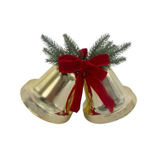
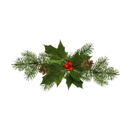
Free png ingredients you can use for this recipe :>... include a christmas tree hehe ૮꒰ ˶• ᵕ •˶꒱ა ♡
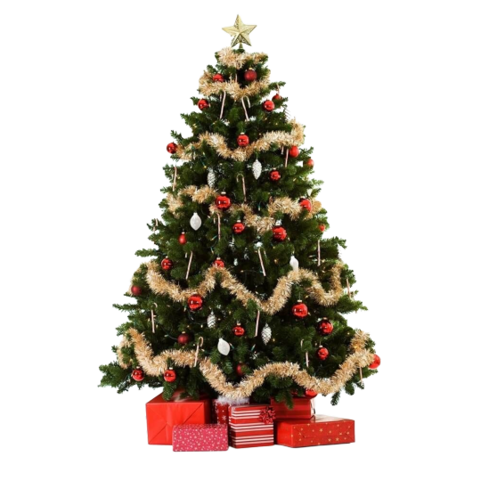
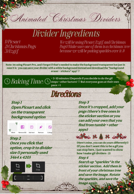
My Finished Result:
#dollywons bakery#divider by dollywons#dividers#divider tutorial#tutorial#christmas dividers#pngs#christmas pngs#transparent dividers#edits#editing#christmas aesthetic#i hope this makes sense jfjdkdks
357 notes
·
View notes
Text

𓆩♡𓆪 divider tutorial ˖˚
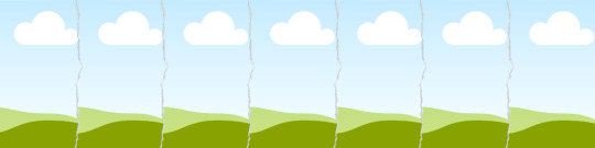
꒰ step one ꒱ ↳ first, find an image or two on a search engine or pinterest/something like it. it's best to use images with plain color (like white or black) backgrounds.
꒰ search terms to try ꒱ ↳ lace trim ↳ lace divider ↳ floral divider ↳ heart divider ↳ clouds divider ↳ bow/ribbon divider ↳ divider clip art
꒰ step two ꒱ ↳ either copy and paste the image or download and upload the image into remove.bg. use erase/restore as needed.
꒰ step three ꒱ ↳ you're done! pretty simple, right? good work \(^_^)/

#aesthetic dividers#tumblr dividers#post dividers#carrd dividers#divider packs#divider#page dividers#text dividers#cute dividers#tumblr layouts#divider tutorial#graphics tutorial#rentry tutorial#carrd tutorial
175 notes
·
View notes
Text
★ How to: Tumblr Dividers ★
personally i had a really hard time trying to make dividers so i'm making this to hopefully help others who may be having the same problems as me.

1. Programs
i like to use clip studio paint since that is what i have but there are other free options too like: Photopea (free, browser), Canva (free, browser),IBIS Paint (free, ios/android), ect...
2. Canvas Sizes
this is where i struggled the most since it can be hard to judge how something will look in a post vs how it looks when you're making it. i put together some "guideline" dividers so its easier to see how things will look:

^ small divider 2000 x 40px ( good for pixel art )

^ medium divider 2000 x 100px (good for small doodles)

^ large/ medium divider 2000 x 140px (small text and drawings)

^ large divider 3000 x 225px ( good for titles )
obviously you don't have to follow these exactly but they are a good reference for what looks good at different sizes
3. Saving
the way that you save your drawings will affect how they look if you want parts to be "clear/ see through" make sure to save in .png these files may be a little bit bigger but they will keep any transparent parts of your divider / drawing.
^ a good example of this is my star divider
if you're ok with having no transparent parts/ a solid colour, pattern divider you can save in .jpg these files are smaller than .png so are good if you don't have a lot of space on your device. All of the above "size example" dividers are .jpg so they don't have any transparent parts. [Side note: if you have transparent parts in your drawing but save it in .jpg they will become white]
i hope that this was a helpful little tutorial, i didn't go through everything but i tried to give some good starting points!
#tutorial by: kayo-ko#How to: Dividers#divider tutorial#dividers#dividers by kayo#how to#art tutorial#tutorials#digital art
437 notes
·
View notes
Note
Can you make a tutorial on how to make dividers I wanna become a writer on here and I want my work to look appealing.
here is a tutorial i made awhile back. my tutorial skills are not great so i apologize if it's a bit cheesy. if you have any questions at all, please don't hesitate 😊
57 notes
·
View notes
Text
⠀⠀谷 : TUTORIAL : link personalizado para twitter


⠀⠀
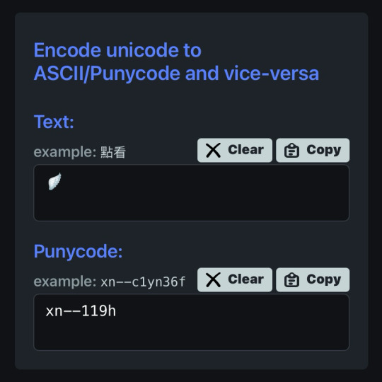
en notas, escribiremos POR SEPARADO la frase o emoji que deseamos convertir. ¿por qué por separado? si se hace junto nos saldrá como un link invalido y no podremos ponerlo en nuestro perfil, procuren hacerlo por separado (para las letras usen el espacio en blanco para la separación)

⠀⠀
ya con esto realizado, nos dirigimos a la pagina puny coder (https://www.punycoder.com) en donde pondremos nuestros textos respectivos que se codificaran, es muy fácil ya que la misma pagina te entrega la opción de copiar el nuevo formato, copias ambos y vuelves a notas
⠀⠀

⠀⠀
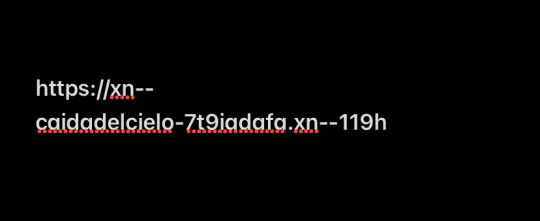
para lograr cualquiera de los formatos que elijamos, al inicio de nuestro link hay que usar el HTTPS:// y para separar la palabra del emoji hay que usar un PUNTO ejemplo:
⠀⠀

⠀⠀
con nuestro link listo, nos dirigimos a twitter, iremos a editar perfil y procedemos a ingresarlo en la categoría de sitio web, aceptar los cambios y quedará así:
⠀⠀
⠀⠀
esto servirá bastante para hacer tu perfil más atractivo o por el entretenimiento de decorarlo más, recuerden que pueden jugar con todo el formato pero solo está disponible para twitter, en otras apps puede que no se convierta el link pero al menos en twitter puedes cambiarlo infinitas veces. espero haberlas ayudado y haganme saber sus dudas o deseos sobre otros tutoriales ( ദ്ദി ˙ᗜ˙ )
⠀⠀
#᭪𒋲 ִ੭﹕evrthng⠀: post#tutorial#link#aesthetic#messy moodboard#random moodboard#cute moodboard#aesthetic layouts#messy layouts#random layouts#messy headers#random headers#dividers#kaomoji#cute symbols#random usernames#username ideas#twitter usernames#twitter#messy bios#messy locs#messy symbols#alternative users#cutecore#cute locs#goth moodboard#goth users#grunge moodboard#emo moodboard#edgy moodboard
2K notes
·
View notes
Text
A Simple Tutorial on How to Curve Dividers ( or anything ) on Photopea!
Since someone asked, I'll explain. It's very very simple and easy to do!
Make sure you have transform controls on! When you go to adjust the image, click warp.

2. Now simply select a warp style, clicking the 'none' space will open up a drop down menu, most people use arc warp style.

3. Adjust the percentage of the bend to your liking and then you're done! You can do this with anything, text, shapes, etc!
Here is a short and simple video showing every step in case it's preferred or needed:
#𐐪 tutorials and help.#𐐪 from praysia.#𐐪 by praysia.#rentry dividers#dividers#don't mind my music I forgot to turn it off eueu#song: Don't Forget from BEASTARS by Satoru Kōsaki
534 notes
·
View notes
Text
Editing tutorial (graphics, layouts, etc) IN DETAIL. From the absolute beginning
You’re completely new to graphic making and editing? Don’t know where to start? Well now I’m here.. heh I’m the alpha. /j /silly I have a year of experience and plenty of past accounts that you probably seen or seen my creations on rentries. This for the most part will be a fully accessible post for anyone starting (which includes people using screenreaders, any and all images and videos will include an alt text and for videos specifically I’ll make a post separately explaining what’s happening in the video.)
I think honestly the first part people worry about is how do they even begin and I think we should really start with the absolute basics. Which are usually the FAQ (frequently asked questions) I see within the editblr community.
What program do I use? If you’re a phone/tablet user the best program will be ibispaint x. It’s simple when you learn the basics. When you download the app there will be an in-app pop-up tutorial if you’ve NEVER used or seen ibispaint x. BUT for pc/laptop users with no access to a mobile device photopea will be your best bet, and for the most part.. I have no idea how to like fully use photopea. Photopea is a free online editing software website. There’s many tutorials on YouTube that will include all the basic components to the app and how to use it. But they also have a discord server which I assume you can find help on anything you’re struggling with over there! (Also some tutorials on here aswell that explain photopea in an easy to understand manner.)
Whats a psd (PEE-ES-DEE)? a psd stands for Photoshop Document and it’s most commonly used in the editblr community for colouring their edits with unique colour combinations.
How do I use a psd (PEE-ES-DEE)? well the easiest way is to import the psd straight from your files after downloading into the photopea website, importing your edit afterwards, and then clicking on the psd at the top and you’ll see on the side of the screen it will show you all the layers and most of the time you’ll see a folder and that includes all the colouring layers. And if you’re using mobile just hold down on the layer/folder and drag it onto the edit you imported. (This explanation won’t make sense if I don’t include a video so I’m gonna include a link to a YouTube tutorial)
where can I find resources? the most common places would be Pinterest, discord servers, tumblr and rentries. You can find resources on Pinterest by searching up “rentry resources” and filtering it by boards so you can find boards full of PNGs and etc, or by posts if you want to find rentries. You can also search up like “aesthetic pngs” or “aesthetic frames” etc depending on what you wanna find. Discord servers are pretty hard to find in my opinion but you can probably find some by looking on your favourite editors posts or asking any editors you like if they know any. And as far as tumblr goes; there’s a bunch of editing blogs on tumblr so I will tag some below at the end of this post!
How do I find my editing style? it’s pretty simple but also complicated, see what represents YOU, do you wanna be known for bright colours or dull colours? Elegant minimalist graphics? Or cute maximalist graphics? You can always take inspo aswell but never try and directly copy people’s graphics! But honestly your style will come as time goes on. You’ll find yourself editing in a certain way and reaching for certain pngs that are always consistent in your edits, etc. and the best way to ensure you have your editing style is to edit everything you make how YOU would want it to look if you were to use it. Your editing style should be authentic and original to YOU. Looking at a bunch of editors for hours will not help anything. We all start somewhere and if you keep worrying about not making progress or not being good enough, you’ll only fall into a bigger slump. Have confidence in your work and once you have that; that what makes you an editor and worthy of posting. Many people with talent will hide their edits thinking it’s not good enough, they’ll keep working on it until it’s too late and they deactivated. Play around with colours and take some inspo, look through all the styles and see what speaks to you, or make your own :)
NOW as far as my own tutorial and tips go, my editing style is comprised of three components and before I explain it, it’ll sound weird.
1. Music. I’m a very big music nerd, but something for me personally; whenever I listen to certain genres or music while making graphics, it’ll help me visualize and design my graphics better because when I listen to music I can associate it with colours, styles, shapes and different designs. So the biggest component of MY editing is music. I will always have lyrics attached to my posts that I associate the edit or my layout to.
2. Filters. The biggest thing in my editing journey was ibispaint x filters. Whether it be colours, the stroke filter, the glow filter, glitch filters, etc. they can elevate your edits and give it that extra boost you know? This component might become a separate tutorial because I can’t really spend 20 minutes dedicating a whole section to this part, this is mostly to give you an idea of how my process works.
3. Pngs. It’s a big aspect to everyone’s editing if I’m being honest, but you wanna make sure you’re choosing PNGs that actually fit what you’re making. Like don’t add a random cake png if your edit isn’t associated with cakes or bakery themed, you know? Your PNGs should fit the edit and the style aswell. That’s how beginner editors always are unhappy with their edits.
Figure out what components are a big part of your editing and try to improve them as best as possible. It’ll help while you figure out your main style :3
While I can’t really TEACH you how to become the greatest editor of all time in just a short span of your time, I CAN provide you with tips and tricks that can help improve your edits if you’re in a rut, or unmotivated. Aswell as giving beginner editors tips for starting their blogs, and becoming the best version of themselves.
1st tip: Always take care of yourself first. People on here will constantly over apologize for not fulfilling someone’s request, or put their blog and their followers before themselves. You do NOT have to always be active and putting out edits, you do NOT have to climb to the top of editblr before relaxing. Especially as a beginner, you will die out so much quicker. Drink water, eat an adequate amount of meals, fuel your body, get enough sleep, and your body will thank you and so will your BRAIN. Your brain will be the main component other than your hands thats being used during your edits. And also everyday life. We do not want smooth brains guys ����
2nd tip: never send anon hate… I don’t need to explain this.. beginner editors are probably the main culprit of anon hate besides other evil people that might reside inside of editblr but anon hate will do nothing good for you. If you see a bigger editor doing better than you, it’s not because you’re worthless and it’s not because they’re better.
3rd tip: try and make your blog and edits as accessible as possible. It’s fine if not all your posts are accessible for everyone, nobody is perfect, but if a majority of your edits are: too bright, too many flashing gifs, too dull with no contrast (I’ll get into this part later), your text can’t be read by a screen reader, you can’t edit darker skinned characters because your colouring makes them too white.. girl say goodbye to the blog.
4th tip: contrast. if you like the dull aesthetic (as I do), make sure there is contrast with your edits. Contrast is what helps people be able to differentiate different parts of the graphic. So you need the light and the dark colours in your graphic. An example where this works really well is: black and neon pink, black and neon green, etc. those combinations always look so good because it’s contrasting the other and will give you a pretty design.
5th tip: as a beginner it is gonna be really hard to master the maximalist style so I recommend starting with things you can handle. A frame, a character and messing around with colours, filters and programs. And when you think you’re ready: implement new things into your style and see where it goes.
Now if you have made it this far into my post, I would like to suggest that anyone starting out, and needs additional help to send me asks of what I should include in my next tutorials. Because this post was more about how to get started and my own personal tips, but I get there’s people who struggle with dividers, layouts, graphics, etc individually. And I want to keep this going so if please let me know what you’d like to see next! And I hope this helps someone.
Tag list: @psychodellism @friliette @terrortowne @menhara @kuguri-domeki @frillissist @cuisinekuga @sancryi @apostlenoir @hwizou + anyone else who would like to reblog !
#࣪ ִֶָ☾. kiss me with your eyes closed.#rentry#rentry dividers#rentry graphics#rentry inspo#rentry decor#rentryblr#rentry stuff#rentry layout#rentry tutorial#tutorial#tumblr tutorial#edit tutorial#editblr tutorial#rentryblr tutorial#graphic tutorial#tumblr edits#editblr
143 notes
·
View notes
Text
🥖 𝓨𝗈 𝗍𝖾𝗇í𝖺 𝗎𝗇𝖺 𝖾𝗌𝗉𝖾𝗋𝖺𝗇𝗓𝖺 ᭪ᬻ𓏸𓈒゚⃝
𝅄 ི۪۪۪ ֯ ּ ֗ ۫ 𝖤𝗇 𝖾𝗅 𝖿𝗈𝗇𝖽𝗈 𝖽𝖾 𝗆𝗂 𝖺𝗅𝗆𝖺 𝅘𝅥𝅮♪ ˟̫ː᜴ 🍰


#꒰ atsubie ꒱ ౨ৎ︵⠀⠀#gif by me#heres how the mb from my tutorial turned out ☆#ㅤㅤㅤㅤㅤㅤㅤㅤㅤㅤㅤㅤㅤㅤㅤㅤㅤㅤㅤㅤㅤㅤㅤㅤㅤㅤㅤㅤㅤㅤㅤㅤㅤㅤㅤㅤㅤㅤㅤㅤㅤㅤㅤㅤㅤㅤㅤㅤㅤㅤㅤㅤㅤㅤㅤㅤㅤㅤㅤㅤㅤㅤㅤㅤㅤㅤㅤㅤㅤㅤㅤㅤㅤㅤㅤㅤㅤㅤㅤㅤㅤㅤㅤ#stayc layouts#stayc moodboard#stayc j#kpop icons#kpop layouts#messy moodboard#kpop themes#kpop moodboard#kpop aesthetic#alternative moodboard#alt moodboard#colorful moodboard#yellow moodboard#pink moodboard#indie moodboard#y2k moodboard#fresh moodboard#nature moodboard#soft moodboard#simple moodboard#maximalist moodboard#retro moodboard#vintage moodboard#dark moodboard#edgy moodboard#divider by im4yeons
235 notes
·
View notes
Text


Lace divider stuff whatever
F2U with like & reblog , I edited pngs from Pinterest to make these. credit is greatly appreciated since this took me a solid 40 minutes
feel free to add to resource rentries, but it has to link back to this post or account.
tagging @smilepilled noticed you enjoy being tagged in things 🤍 unless i mistaked you for someone else
#꒰৯ ̇ ۪ dividers ۪ ྀི#lace dividers#rentry dividers#dividers#rentry icon#rentry tutorial#rentry template#rentry inspo#rentry resources#rentry stuff#rentry pixels#rentry gif#rentry decor#rentry graphics#rentry frame#rentry#carrd resources#f2u with credit#saeriji#template coming soon i promise i js want to post some resources.#postponing the template to be posted next week because i’m busy this week w church.#idk what else to tag#rentry carrd#carrd graphics#carrd inspo#carrd stuff#carrd#carrd decor#carrd dividers#carrd layouts
302 notes
·
View notes
Text

i get a lot of asks about how i make my dividers, so i just decided to make a video on how i would typically make one, but the thing is i’m super sick so i have no idea if any of this makes sense LMAO

775 notes
·
View notes
Text
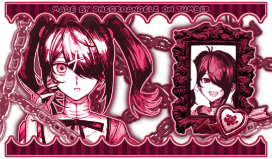
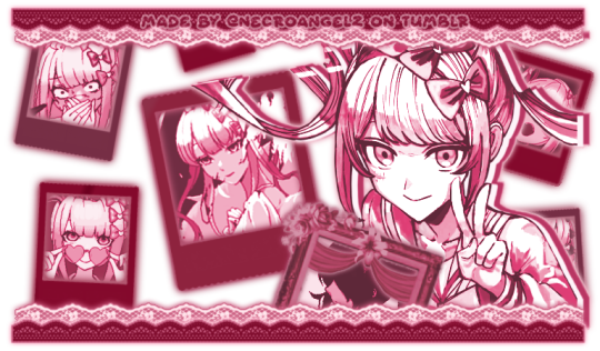
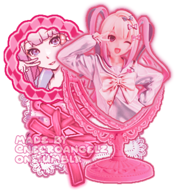
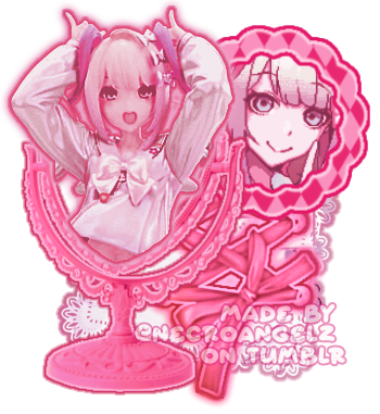
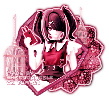
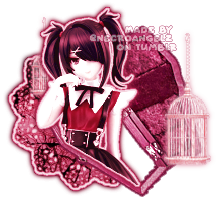
☆ ❛ STREAM ALERT !! ❜ NECROANGELZ is streaming ♡ ⁓⁓ Come watch ?
❛ i'm a mess in distress but we're still the best dressed. fearless, say yes, we don't dress to impress. ❜ —- EVE, PSYCHE & THE BLUEBEARD'S WIFE.
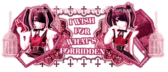
♡ NOW WATCHING : Needy Streamer Overload Graphics ☆ ⁓⁓ Enjoy the stream !!
—- semi-requested by @lavendergalactic
—- OH MY GOD. IF ANYONE WERE TO ASK ME WHAT GRAPHICS I HAD THE HARDEST TIME EDITING I WOULD SAY THESE GRAPHICS. THESE WERE IN THE MAKING SINCE A MONTH AGO AND I PROBABLY SPENT 10+ HOURS TOTAL ON THEM. THESE WERE SO HARD TO MAKE BUT THEY'RE NOT THAT BAD I THINK. ANYWAY I'M GOING TO CRY NOW.
—- alts under the cut.
—- "angel why is one of the graphics a different color-" we don't talk about that. (i had a hard time making it with the color palette i decided, ok. i toiled for four hours, ok. i had to change the colors or else i would die, ok.)
—- likes and reblogs are always appreciated. thank you for supporting the angelic streamer.
#🌠﹕ a wishing star 𝜗𝜚 ︵#👁️🗨️﹕ from the archives 𝜗𝜚 ︵#needy streamer overload#needy girl overdose#kangel#omgkawaiiangel#kangel nso#ame chan#ame nso#ame needy girl overdose#ame needy streamer overload#kangel needy girl overdose#kangel needy streamer overload#needy streamer overdose#needy girl overload#rentry graphics#editblr#rentry resources#rentry edit#rentry tutorial#rentry guide#rentry divider#tumblr layouts#nso icons#kangel icons#ame icons
721 notes
·
View notes
Text
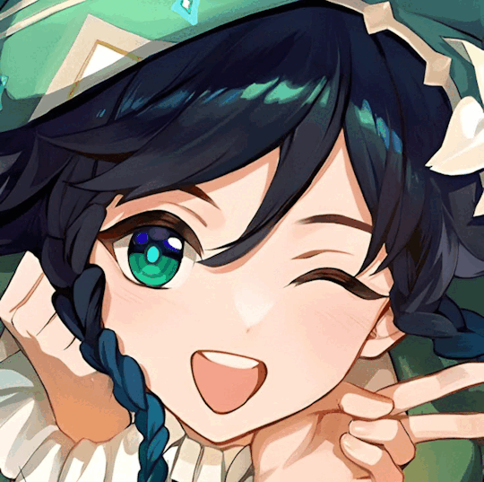
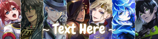
HOW TO MAKE A FADE TRANSITION GIF FOR YOUR GRAPHICS FT. VENTI!
first, go to https://ezgif.com/maker, and select your images! it needs to be a minimum of at least 2, but you can have as many as you want.
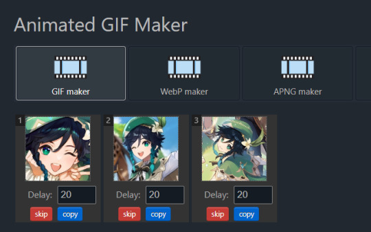
then you should go to "gif options" and change the delay time (this adjusts how long it stays on each image) to whatever you like! here, i picked 80. this applies it to all the images!

next, go to "effects" and check off "crossfade frames" before adjusting the fader delay (this slows down/speeds up the fade) and the frame count (this gives the fade more frames, making it smoother.)
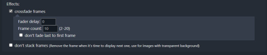
then press the blue "make a gif" button (or press enter) and ta da! you have a fading gif! here's the results (using my settings pictured in the images):

#rentry#rentry stuff#rentry tutorial#tutorial#rentry graphic#rentry graphic tutorial#my tutorials#rentry guide#gif tutorial#dividers nf2u
86 notes
·
View notes
Text
How I make my Covers and Dividers

Hi.👋 So, the idea to make these posts came about because @cat1705 asked me in private how I made my dividers and that made me wonder if other people would be interested in knowing how I made my covers and dividers. I made a poll and a lot of people were interested in knowing how I made them.
I make them in Canva, so anyone can make them, but I would like this to be more of a help for you to create your own and not for you to do exactly like me. Even though I'm always playing around with the font and the way I place the images, I have a guiding line, so to speak, and that's what I'm going to try to show you.

👉COVERS
Well, first things first, apparently I use the dimensions of an Etsy cover photo template. I just chose it because the dimensions looked good. Choose any one and delete all the elements in it until you have only the white background.
To make covers with several characters I use these frames that serve to drag the image inside and adjust it within the defined limits.
I always use only official images from the game so as not to steal anyone's fanart. I usually get the images from the wikis.
You can also upload the image by just dragging it.

To make sure the title won't cover the characters' faces, I put some temporary text on top to adjust the images.
After uploading the image, drag it to the correct frame and drop it.
To adjust the image, double-click, enlarge, rotate, reduce and move it as you wish. When you think it is ready, click outside the image or press the enter key.
When the image is ready, I remove the text and download the image with the characters.
To download, click the button in the top right corner that says "Share". Then click on "Download", the first button on the last line. It should already be in PNG format, so you won't need to change it.
Attention: If you have more than one page: in "Select pages" choose the option "Current page", click “Done” and only then click on "Download". Otherwise, you will download ALL the pages you have and not the specific one you want.
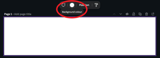
On another page I usually have a gradient background and a little frame. I make the gradient by clicking on "Background color" and in "add a new color" there is the option "Gradient". I don't remember where I got the frame I use, but you can look for some free ones in "Elements".
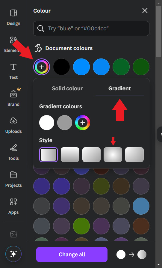
Use the colors that you think look best, I usually put the light color in the center and the dark color at the ends. For this example I will use white and a golden yellow.

Then, I upload the previous character image and make it 50% transparent. On top of the white frame too (It's just my thing, I don't have a reason to do it, I just think it looks good)
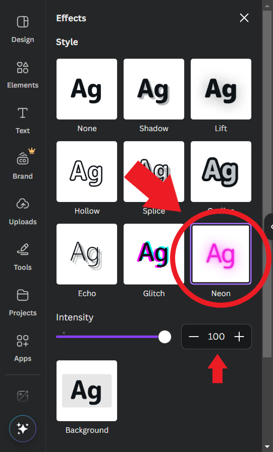
Then I'll put the title. I usually use the "Chewy" font. The font size depends on the size of the title I decided to give it, but it's usually around 80/90. And I add the Effect: "Neon"

To finish, I look for some images in "Elements" to decorate a little more. Searching for "line art" is usually a good tip.
When you're ready, download the image and you're done.
.
👉CHARACTER DIVIDERS
The dividers follow a similar pattern to the covers to match. Create a new page with the same background color gradient.
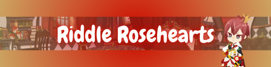
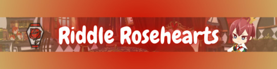
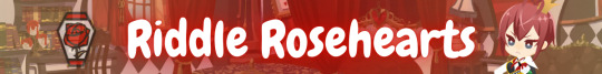
For the background, I use game backgrounds that match the theme of the fic. For this example, I'm going to make a generic Riddle divider with an image of his room with transparency at 50%.

Then I reduce the height of the image until it is half the height of the canva and place it in the center. Remembering that you can adjust the image by double clicking.

I keep the color of the ends the same, but I adjust the color of the center to the color of the dorm to which the character belongs. In this case, red from Heartslabyul. But I will leave an image with the colors I use for each room, taken from the colors of their personal icons.

For the character name, copy and paste the title, as the font and effect is the same, and adjust to the size of the divider.
And also change the color of the letters to the dorm color.

Then I upload the png image of the character's chibi that can be found on the wikis. In this case I'll use the chibi with Riddle's dorm uniform.
I crop the image to help me orient myself better, but you don't need to do that.
Then I upload the character's personal icon, also found on wikis, adjust the size and set the transparency to 60%.
To finish, I download the image and crop the top and bottom in Paint.
Yes... in Paint... it works ok, shut up!
.
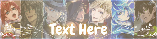
👉LINE DIVIDERS
Finally, for the line dividers, you can copy the Cover because the background colors are the same and erase everything except the image with 50% transparency.

Then I cut it in half, like in the character divider, and again in half to make it thinner, and I place it in the middle of the canvas. (These measures may not be exactly the same as the ones I use today, but the logic in the beginning was this.)

I replace the image with one that seems to fit the theme of the fic. You can do this by dragging it. I usually use game backgrounds, but when none of them seem to look good I look for images from Canva, in "Elements"
That's what I'm going to do to show you. In Elements, write what you want to search for, I'll simply write "background" and choose one of the images without the crown icon (this icon means it's a paid image).
I'll choose any one.


Then I upload the personal icons of the characters that are the focus of the fic. For this example it's the overblot students (because they're my favorite)
Drag them in, place them in a line and adjust the size to that of the line. You can do this one at a time or all at once by selecting them all.
When it's just one character I put one icon upright and the one on the side upside down.

To repeat the pattern, select all of them, copy, paste, and drag until the new set is next to the first. Repeat until the entire line is filled.

Then select all the icons again and set their transparency to 50%.

And finally, download the image and crop the top and bottom parts in Paint. Or wherever you want.
Aaand... I think that's it.
If there's anything you'd like me to explain better, you can ask in the comments. I hope you enjoyed it and that it can help you if you create your own covers and dividers.😘
85 notes
·
View notes
Text
BG3 Virtual Photography Masterpost
Mog's BG3 Virtual Photography Tutorial
Chapter 0: Overview
Chapter 1: Script Extender Debug Console
Chapter 2: Scene Manipulation
Chapter 2.5: More Scene Manipulation
Chapter 3: Otis_Inf Camera Tools
Supplement: Mods and Resources - Patch 8 Update
Supplement: Fun with the Dream Guardian

Asks
Transform and CopyCharacterEquipment Commands
Other Posts
2 Tips for BG3 Photo Mode
Mod Highlight: Lighty Lights
Lighty Lights praise - Moon over Baldur's Gate
Lighty Lights + Otis_Inf Camera Tools Tip
My Frequent ReShade Shaders
BlackJackKent's SE code to find Hireling UUIDs
Tags
My VP Tutorial Tag: Mog's BG Virtual Photography Tutorial
My BG3 Shots: my bg3 (edited by @susann-noir when credited)
65 notes
·
View notes
Text
IM TEACHING MYSELF HOW TO RECOLOR MANGA PANELS AND MAKE GRAPHICS IM SO EXCITEDDDD

#purple reo 😊#i’m sososososo excited for these upcoming series u guys omg#gonna try a new theme out for tbp since vgl is already done and i don’t wanna go back lol#actually i might recolor hiori IDK YET#i might post a tutorial if anyone wants to learn how recolor photos/make png dividers/change text color#blue lock#bllk#mikage reo
96 notes
·
View notes