#fieldset and legend tag in html
Explore tagged Tumblr posts
Visit Tumblr Blog
Explore Tumblr blogs with no restrictions, modern design and the best experience.
Last Seen Tumblr Blogs


Fun Fact
If you dial 1-866-584-6757, you can leave an audio post for your followers.
Note
Hello, wanted to say I read and loved the demo. Very well done. I just had a few questions, would love to know what Twine Template you use, especially at the beginning. Where you have the character creator, I love that the box around your selection changes to say/match what you chose. Such as depending on what skin color I choose it changes to signify that. Would love to know if you would share how you did that. I look forward to future updates! Best of luck.
Thank you! 🤍
I'm using the default template for SugarCube, if I remember correctly. Glad that you liked the box effect, it was my solution to reducing the number of passages whilst still allowing the validation of user input in character creation.
I did it through a combination of HTML tags and SugarCube native macros. Technical stuff under the cut:
Here is an example for eye color:
<fieldset class="charbox"><legend id="chareyes" class="chartxt">$p.appearance.eyes</legend> <div class="charoptions">Your eyes are: <<link "hazel">><<set $p.appearance.eyes to "hazel">><<replace "#chareyes">>$p.appearance.eyes<</replace>><</link>> <<link "brown">><<set $p.appearance.eyes to "brown">><<replace "#chareyes">>$p.appearance.eyes<</replace>><</link>> [rest of the options removed for brevity]</div> </fieldset>
The fieldset and the legend HTML tags together form a single box, a so-called legend, which I declare per attribute such as name, skin color, etc. You need a fieldset to make legend work iirc, but legend is where that text is displayed and it is positioned on the box frame by default. Important here is to give a unique ID to the legend tag ("chareyes" in this case), as we are interested in manipulating the text shown in it depending on our box.
In the sample above, the options I present for the eye color are listed within the Twine <<link>> tags. For these links there is no target passage to go to. Instead, you can see it is coded to do two things upon clicking the respective option. One, setting a game variable to the selected color.
<<set $p.appearance.eyes to "brown">>
Two, triggering a replace command to change the value shown in the legend to the description of the selected eye color according to the variable we have set in the same line. This is the bit you are asking about:
<<replace "#chareyes">>$p.appearance.eyes<</replace>>
Replace triggers without changing passages, so this way you can adjust multiple variables on a single "page". You'd obviously need to adjust the corresponding CSS classes to make it look the desired way, but the mechanics are serviced with just this idea above.
Hope this helps!
12 notes
·
View notes
Text
HTML fieldset Tag
The HTML <fieldset> tag is used to create a group of related elements in HTML form.Use the <legend> tag to define caption or title of the fieldset element.The <fieldset> tag create a box around the related elements. Syntax <fieldset>Content...</fieldset> Example <!DOCTYPE html> <html> <head> <title>HTML fieldset Tag</title> <style> fieldset{ padding:15px; background:…

View On WordPress
#add fieldset tag#fieldset#fieldset and legend tag in html#fieldset html#fieldset html tag#fieldset in html#fieldset tag#fieldset tag in html#how to add fieldset tag in html#how to use fieldset tag in html#html css fieldset tag#html fieldset#html fieldset and legend#html fieldset tag#html form fieldset#html5 fieldset#legend tag in html#tag fieldset#tag fieldset html#use of fieldset tag#what is fieldset tag
0 notes
Text
Website Design and Programming – Introduction to Web Forms
There is practically no website without at least a form in one of its pages. Forms are useful to collect data from the website visitors and users. Once the user submits the form to the server, a form processing script must get the form data, validate that the user input matches the expected format for each field (e.g: email address field must be a string of text with the format of a valid email address) and process this information as desired. The script may save it into a database, send it by email or just do some processing with it and display the result. Validating the user input is essential to prevent malicious users from damaging your site.
A form definition in html starts with the form tag and ends with the /form tag. This tag can have several attributes like method (GET or POST), and action (the url of the form processing script). If use the GET method, the form data is encoded in the action URL. This method is recommended when the form is a query form. With the POST method, the form data is to appear within a message body. This is the recommended method when the form will be used to update a database, or send email, or make any action other than just retrieve data.
The form fields are used to collect the data. Generally a label is placed by each field, so the user knows what data to input. There are different kind of fields, among them:
· Textboxes
· Textareas
· Drop-downs
· Multi select
· File
· Radio buttons
· Checkboxes
· Buttons
· Hidden
The hidden fields are used to send some data that the user does not need to see, along with the form. An example of this could be a form number, so the form processing script identifies which form has been submitted.
The File field allows users to upload a file. The form processing script will get the file together with the rest of the form data. For this field to work properly, you need to include this attribute in the form tag: enctype=”multipart/form-data”.
Buttons are used to submit or reset the form.
Refer to an HTML guide for full description on the attributes and syntax of each tag. You may find a guide at http://www.w3schools.com/tags/default.asp or at http://www.w3.org/MarkUp/ among many other sites.
When the form is complex, it is useful to group fields in areas using the fieldset tag. Just place the fieldset tag, then optionally a legend Section Name /legend tag, then all the pertinent form fields, and the /fieldset tag after them.
It is possible to use CSS (Cascading Style Sheets) or inline styles to change the look of the form controls.
You can bring your forms to a different level by combining them with the usage of scripting language like JavaScript. You can make the form react immediately to certain events, like the user clicking on a control, or a field changing its value. You can highlight the field that has the focus, for example. Or count how many characters have been entered in a text box or a textarea. You can make calculations and display the results automatically. The possibilities are endless.
Thanks and regards,
https://gurujisoftwares.com
1 note
·
View note
Text
HTML Forms: Building Interactive User Input

HTML forms play a vital role in web development, allowing users to input and submit data on websites. Whether it's a simple contact form or a complex registration form, understanding how to build interactive user input forms is essential for creating engaging and dynamic web experiences. In this blog post, we will explore the fundamentals of HTML forms and discuss best practices for building interactive user input.
<form> Tag:
The <form> tag is the foundation of HTML forms. It acts as a container for all form elements and defines the boundaries of the form. The "action" attribute specifies the URL where the form data will be submitted, and the "method" attribute determines the HTTP method to be used (GET or POST).
<input> Tag:
The <input> tag is the most commonly used form element. It allows users to input various types of data, such as text, numbers, email addresses, and more. The "type" attribute defines the input type, and additional attributes like "name" and "placeholder" provide further context and guidance for users.
<textarea> Tag:
The <textarea> tag is used to create a multiline text input field. It's ideal for capturing longer messages, comments, or descriptions from users. The "rows" and "cols" attributes can be used to define the size of the textarea.
<select> and <option> Tags:
The <select> tag creates a dropdown menu, while the <option> tag defines individual options within the dropdown. This combination allows users to select one or multiple choices from a list. Attributes such as "selected" and "disabled" provide additional functionality and user experience enhancements.
<label> Tag:
The <label> tag is used to associate a label with an input field, providing a clear description or prompt for the user. It improves accessibility and helps users understand the purpose of each input field. The "for" attribute should match the "id" attribute of the corresponding input field.
<button> Tag:
The <button> tag creates clickable buttons within the form. It can trigger form submission or perform other actions using JavaScript. The "type" attribute can be set to "submit" to submit the form, "reset" to reset form values, or "button" for custom actions.
<fieldset> and <legend> Tags:
The <fieldset> tag groups related form elements together, providing a visual and semantic grouping. The <legend> tag is used to provide a caption or title for the fieldset. This combination improves form structure and readability, especially for complex forms.
Form Validation:
HTML5 introduced built-in form validation, allowing developers to validate user input without relying solely on server-side validation. Attributes like "required," "min," "max," and "pattern" can be used to enforce specific rules on input fields. HTML5 also provides the "pattern" attribute, which accepts regular expressions for custom validations.
Handling Form Submissions:
When a user submits a form, the data is typically sent to a server for processing. Server-side scripts, such as PHP or JavaScript, are used to handle form submissions and process the data accordingly. The server-side script specified in the form's "action" attribute receives the form data, which can be accessed and processed further.
Styling and Enhancing Forms:
HTML forms can be customized and styled using CSS to match the website's design and branding. Additionally, JavaScript libraries and frameworks like jQuery and React can be used to enhance form interactivity, provide real-time validation, or create dynamic form elements.
Conclusion:
Building interactive user input forms is an essential skill for web developers. HTML provides a range of form elements and attributes to collect user input and create engaging web experiences.
To streamline the development process, leveraging online HTML compilers can be incredibly beneficial. online html compiler offer a convenient way to test and validate forms in real-time, allowing developers to see the immediate results of their code. These tools provide an interactive environment to experiment with different form elements, input validation, and styling, enabling faster iterations and bug detection.
Remember to combine HTML forms with server-side scripting, such as PHP or JavaScript, to handle form submissions and process the data effectively. Additionally, css compiler online can be utilized to style and customize form elements, ensuring a cohesive and visually appealing user interface.
By mastering the art of building interactive user input forms and utilizing html compiler online, developers can create seamless and user-friendly experiences that enhance engagement and facilitate data collection on websites. Embrace the power of HTML forms and leverage the convenience of online HTML compilers to elevate your web development skills.
0 notes
Text
Mini Project Retro: Building a Form with HTML & CSS
Given I recently implemented a form in React, I figured I’d go back to a smaller, unfinished assignment from the freeCodeCamp HTML & CSS track: to build a form. They’re usually pretty simple assignments: you get some user stories that will have tests against them, an example to inspire you, and off you go.
The end result is here.
I made a random post-event satisfaction form, and all in all it took about 8 hours (1 day), without adding any JavaScript to it:

Lessons
Placeholder text is bad UX, and not recommended by the Nielsen Norman group and other practitioners.
It’s in my CodePen because some of the stories require this or else the tests will fail, but seems like the industry has moved on since. It looks harmless but can be confusing for users, especially when it’s used as helper text that disappears as you type. There are plenty of alternatives to various use cases for placeholder text, which include tooltips and better labels above input fields.
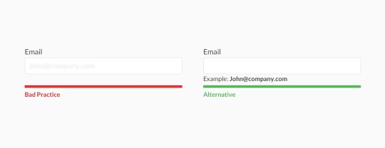
Use <fieldset> and <legend> to group options or questions for better accessibility.
I hadn’t seen them much before, but wanted to experiment with them. They work together to tell screen readers that a group of form fields relate to each other, and to provide a label for the group. Screen readers read the legend before introducing them to the options. On the GOV.uk Accessibility blog, the GDS recommends using them when you have a single multiple choice question, or when you have several questions relating to the same topic -- which is how I used them.
Use <label> to make form fields more accessible.
The label tag wraps the text for a specific form control item, usually the name or label for a choice. This ties meaning to the item and makes the form more readable for screen readers Bonus: this also means you can click on the text next to a radio button to select it, rather than inside the radio button itself.

Styling the form took a lot of time (and could’ve taken longer)
It took time to get fonts and colors right. I’m not a designer but I want to make things look decent (if not pretty) even if it’s not a requirement. I worked around this by scouring Pinterest and Dribbble for pleasant color schemes, and landed on just four colors (blue, dark and light grey, and white) and a few variations for the button hover state.
What I’d do differently
Try a different layout for the fields. There’s more to do to make it readable and accessible, align the dropdowns, and so on.
Different and custom styling; I could spend forever on things like custom checkboxes and radio buttons but decided not to for the purpose of this exercise.
Make the form responsive. This wasn’t a requirement, but I’d go back in and add it later.
0 notes
Text
HTML là gì? Phân loại thẻ HTML theo mục đích sử dụng
Bài viết này trình bày những điều cơ bản cần thiết nhất về HTML. Cho dù rằng bạn là người làm website chuyên nghiệp hay nghiệp dư cũng đều phải biết về nó. Hy vọng rằng bài viết này của LADIGI sẽ hữu ích đối với những ai đã và đang tìm hiểu về HTML.
1. HTML là gì?
HTML là từ viết tắt của cụm từ HyperText Markup Language hay tiếng Việt có thể dịch ra là Ngôn ngữ đánh dấu siêu văn bản. Nó được sử dụng để tạo trang web, đối với một website có thể chứa nhiều trang được gọi là một tài liệu HTML hay tập tin HTML. Người sáng lập ra HTML là ông Tim Berners- Lee hay cũng chính là người khai sinh ra tổ chức World Wide Web và chủ tịch của hộ World Wide Web Consortium – tổ chức thiết lập các tiêu chuẩn trên internet.
Một tập tài liệu HTML được hình thành bởi các phần tử HTML quy định bằng các các cặp thẻ hay còn gọi là tag. Cặp thẻ này thường được đặt trong dấu ngoặc nhọn <html> và thường được khai báo thành một cặp. Các văn bản muốn đánh dấu bằng HTML sẽ được khai báo bên trong cặp thẻ. Cũng có một số thẻ đặc biệt thì không có thẻ đóng và dữ liệu được nằm trong thuộc tính như <img>.
HTML được gọi là ngôn ngữ đánh dấu siêu văn bản
2. HTML được xử lý như thế nào?
Sau khi tập tin HTML đã được tạo lập nên thì việc xử lý tập tin này sẽ do trình duyệt đảm nhận. Trình duyệt sẽ đọc hiểu nội dung của HTML từ các thẻ và chuyển sang văn bản để đọc, nghe hoặc hiểu.
Để kiểm tra bạn có thể chuyển qua phần HTML và Result để xem kết quả của tập tin HTML đã được tạo và sau khi qua xử lý thì như thế nào.
Ví dụ minh họa cách mà HTML được xử lý
3. Cấu trúc đoạn HTML và dùng chương trình gì tạo tập tin HTML
3.1. Cấu trúc của đoạn HTML như thế nào?
Như chúng ta đã biết thì HTML được khai báo bằng các phần tử bởi những từ khóa. Nội dung nằm bên trong đó là nội dung mà bạn cần định dạng với HTMl. Chúng ta có thể tham khảo ví dụ minh họa dưới đây để có thể khai báo một đoạn văn bản.
<p> Đây là một đoạn văn bản HTML.</p>
Và một điều quan trọng không thể không nhắc đến là trong thẻ còn có các thuộc tính. Thuộc tính thường đặt ở bên trong thẻ mở đầu. Mỗi một thuộc tính sẽ có giá trị được đặt trong ngoặc kép và cách nhau bằng dấu bằng (=) cùng với tên thuộc tính. Mỗi thẻ có thể sử dụng được nhiều thuộc tính.
<form action=http://thoitrang.com> </form>
Ví dụ về một đoạn code HTML
3.2. Dùng chương trình gì để tạo tập tin HTML
HTML là dạng tập tin siêu văn bản nên có thể sử dụng chương trình soạn thảo không có chức năng định dạng để tạo tập tin dạng HTML. Với window bạn có thể dùng Notepad++, trên Mac có thể dùng Textedit. Điều quan trọng là sau cùng bạn phải lưu tập tin này dưới dạng .html và sử dụng trình duyệt web để đọc nó.
Notepad++ là phần mềm thường được dùng viết code HTML
4. Phân loại thẻ HTML theo mục đích sử dụng
4.1. Thẻ HTML cơ bản
<!DOCTYPE> : Thẻ định nghĩa dạng tài liệu HTML
<html> : Thẻ này định nghĩa rằng đây là tài liệu HTML
<title>: Thẻ giúp định nghĩa tiêu đề của tập tin HTML
<body>: Thẻ định nghĩa rằng từ đây là thân tập tin HTML
<h1> tới <h6>: Thẻ định nghĩa các mục chính trong tài liệu
<p>: Thẻ định nghĩa văn bản
<br>: Thẻ chèn xuống dòng
<hr> Thẻ định nghĩa thay đổi chủ đề trong nội dung
<!-…->: Thẻ định nghĩa một comment (thẻ này chỉ là ghi chú trong tập tin HTML, không hiện ra ngoài).
4.2. Thẻ HTML định dạng
<acronym>: Thẻ định nghĩa từ viết tắt, không được hỗ trợ trong HTML5.
<abbr>: Thẻ định nghĩa từ viết tắt.
<address>: Thẻ định nghĩa thông tin liên hệ cho tác giả.
<b>: Thẻ định nghĩa văn bản bôi đậm.
<bdi>: Thẻ này hữu ích khi nhúng nội dung người dùng tạo ra với một hướng chưa biết.
<bdo>: Thẻ định nghĩa hướng của văn bản.
<big>: Thẻ định nghĩa văn bản lớn hơn, không sử dụng trong HTML5, thường sử dụng CSS để thay thế.
<blockquote>: Thẻ định nghĩa nội dung được trích dẫn từ nguồn khác.
<center>: Định nghĩa một đoạn văn bản ở giữa, không được hỗ trợ HTML5.
<cite>: Thẻ định nghĩa tên sản phẩm.
<code>: Thẻ định nghĩa một đoạn code máy tính.
<del>: Thẻ định nghĩa rằng văn bản đã bị xóa từ một tài liệu.
<dfn>: Thẻ này thay thế định nghĩa cho thuật ngữ.
<em> Thẻ định nghĩa rằng văn bản phải được nhấn mạnh.
<font>: Định nghĩa phông, màu sắc và kích cỡ văn bản.
<i>: Tạo văn bản nghiêng trong HTML4.
<ins>: Thẻ định nghĩa văn bản được chèn vào tài liệu.
<kbd>: Thẻ định nghĩa thông tin người dùng nhập.
<mark>: Thẻ định nghĩa văn bản được đánh dấu.
<meter>: Thẻ đo lường dữ liệu trong một phạm vi.
<pre>: Thẻ định nghĩa dạng văn bản có sẵn.
<progress>: Thẻ mô tả tiến trình hoàn thành nhiệm vụ.
<q>: Thẻ định nghĩa nội dung trích dẫn từ nguồn khác.
<rp>: Thẻ định nghĩa sẽ hiển thị gì lên trên trình duyệt.
<rt>: Thẻ định nghĩa giải thích, phát âm ký tự.
<ruby>: Thẻ định nghĩa chú thích ruby dành cho kiểu chữ Đông Á,
<s>: Thẻ định nghĩa rằng văn bản không đúng nữa.
<samp>: Thẻ định nghĩa mẫu đầu ra từ chương trình máy tính.
<small>: Thẻ định nghĩa đoạn nhỏ hơn.
<strong>: Thẻ định nghĩa đoạn văn bản quan trọng.
<sub>: Thẻ định nghĩa chỉ số dưới.
<sup>: Thẻ định nghĩa chỉ số trên.
<time>: Thẻ định nghĩa ngày tháng và thời gian.
<u>: Thẻ định nghĩa văn bản có phong cách khác văn bản bình thường.
<var>: Thẻ định nghĩa một biến.
<wbr>: Thẻ định nghĩa một vị trí để xuống dòng.
4.3. Thẻ nhập liệu HTML, Form và Input
<form>: Thẻ định dạng form HTML để nhập liệu.
<input>: Thẻ định nghĩa một điều khiển nhập liệu.
<textarea>: Thẻ này giống input nhưng là cả một vùng nhập liệu, không phải là một dòng.
<button>: Thẻ định nghĩa nút bấm.
<select>: Thẻ định nghĩa cả một danh sách thả xuống.
<optgroup>: Thẻ định nghĩa một nhóm lựa chọn trong danh sách thả xuống.
<option>: Thẻ định nghĩa một lựa chọn ở trong danh sách thả xuống.
<label>: Thẻ định nghĩa một nhãn cho thẻ input.
<fieldset>: Thẻ định nghĩa nhóm phần từ liên quan trong một form.
<legend>: Thẻ định nghĩa mô tả cho thẻ.
<datalist>: Thẻ chỉ định danh sách tùy chọn định trước.
<keygen>: Thẻ chỉ định cặp khóa sử dụng cho form.
<output>: Thẻ định nghĩa kết quả của phép tính.
4.4. Các khung
<frame>: Định nghĩa khung cửa sổ trong frameset.
<frameset>: Thẻ định nghĩa một bộ khung.
<noframes>: Thẻ định nghĩa nội dung thay thế cho người dùng nếu trình duyệt không có hỗ trợ nào cho thẻ frames.
<iframe>: Thẻ định nghĩa frame nhúng.
Tổng kết
Bài viết đã chia sẻ những kiến thức cơ bản nhất về HTML. Có thể bạn nghĩ rằng thông tin này chỉ mang tính chất tham khảo nhưng thực tế nó cực kỳ quan trọng, là nền tảng giúp bạn có thể học HTML chuyên sâu hơn, để có thể thiết kế website.
Nguồn bài đăng: LADIGI Academy Company Link: https://ladigi.vn/html-la-gi
0 notes
Text
Folding X-Shape 3 in 1 Workout Exercise Bike 8-Level Magnetic Resistance Fitness
New Post has been published on https://fitnesstech.website/product/folding-x-shape-3-in-1-workout-exercise-bike-8-level-magnetic-resistance-fitness/
Folding X-Shape 3 in 1 Workout Exercise Bike 8-Level Magnetic Resistance Fitness
listing template .pcTemplate display:none; .mobileTemplatedisplay:block; <p>@media only screen and (min-width:960px) .pcTemplatedisplay:block; .mobileTemplatedisplay:none;
body,div,dl,dt,dd,ul,ol,li,h1,h2,h3,h4,h5,h6,pre,code,form,fieldset,legend,input,button,textarea,p,blockquote,th,td margin:0; padding:0; body background:#fff; color:#555; font-size:12px; font-family: Verdana, Arial, Helvetica, sans-serif; td,th,caption font-size:12px; h1, h2, h3, h4, h5, h6 font-weight:normal; font-size:100%; address, caption, cite, code, dfn, em, strong, th, var font-style:normal; font-weight:normal; a color:#555; text-decoration:none; a:hover text-decoration:underline; img border:none; ol,ul,li list-style:none; input, textarea, select, button font:14px Verdana,Helvetica,Arial,sans-serif; table border-collapse:collapse; html /* css common */ .clearfix:after content: "."; display: block; height:0; clear:both; visibility: hidden; .clearfix *zoom:1; <p>.flfloat:left; .frfloat:right; /*上面为css初始化*/ .containerwidth:1362px; <p>headerheight:85px;padding-top:50px;background-color:#fff; .logowidth:256px;height:83px;background:url(https://s3.amazonaws.com/EbayTemplate/etech/2018listing/logo.png) no-repeat; <p>.top_navpadding-top:15px; .top_nav lifloat:left; .top_nav li afloat:left;margin-right:10px;display:inline-block;background-color:#593713;color:#fff; width:175px;height:38px;line-height:38px;text-align:center;font-size:12px; <p>.icon_visitdisplay:inline-block;width:23px;height:22px;position:relative;background:url(https://s3.amazonaws.com/EbayTemplate/TEST/icon1.png) no-repeat;top: 5px;left: -10px; .icon_emaildisplay:inline-block;width:24px;height:15px;position:relative;background:url(https://s3.amazonaws.com/EbayTemplate/TEST/icon2.png) no-repeat;top: 3px;left: -8px; <p>/*banner*/ .bannerwidth:100%; .banner imgwidth:100%;height:320px;display:inline-block; <p>/*bigpic*/ .bigpicpadding:20px 0; .bigpic_descri pwidth:97%;color:#000;line-height:200%; .bigpic_descri spanline-height:150% !important; .bigpic_descri strongfont-weight: bold !important; <p>.bigpic_descriwidth:50%; .bigpic_descri h2color:#593713;font-size:25px;margin-bottom: 20px; .bigpic_descri h2 spanline-height:120%; .bigpic_descri .conmin-height:400px;padding:30px 10px;line-height: 26px;text-align: justify;overflow:hidden; .bigpic_descri .con imgwidth:100%; <p>#publishDescriptioncolor:#000; line-height:18px; #publishDescription img border: 0 none; height: auto; max-width: 100%; <p>/*轮播图*/ .slider width: 662px; position: relative; float:left; padding-top:672px; <p> <p>.slider>img position: absolute; left: 0; top: 0; /*transition: all 0.5s;*/ <p>.slider input[name='slide_switch'] display: none; <p>.slider label <p> float: left; cursor: pointer; /*transition: all 0.5s;*/ <p> /*Default style = low opacity*/ opacity: 1; <p>.slider label img display: block; width:158px;height:158px;margin-right:7px;margin-bottom:10px;border:1px solid #b5b5b5; <p> <p>.slider input[name='slide_switch']:checked+label <p> opacity: 1; <p>.slider input[name='slide_switch'] ~ img opacity: 0; /*transform: scale(1.1);*/ width:660px; height:660px; border:1px solid #b5b5b5; <p>.slider input[name='slide_switch']:checked+label+img opacity: 1; transform: scale(1); <p>/*item这块*/ .index_itemposition:relative; .index_more adisplay:inline-block;position:absolute;right:0;top:5px;color:#593713;font-size:20px; .index_item h2width:100%;height:40px;line-height:40px;color:#593713;font-size:20px; <p>.index_item_listpadding: 20px 0; .index_item_list li adisplay:inline-block;float:left;width:15%;margin-right:27px; .index_item_list li a:hovertext-decoration:none;background-color:#fcfcfc; .index_item_list li a:hover imgopacity:0.8; .index_item_list li:last-child amargin-right:0; .index_item_list li a imgdisplay: inline-block;width:200px;height:200px; .index_item_list pwidth:100%;padding:10px 0;line-height:20px;max-height:60px;overflow:hidden;text-align: left;font-size:12px;word-wrap:break-word;-webkit-word-wrap:break-word; .index_item_list span.index_pricedisplay:block;width:100%;text-align:left;font-size:18px;color:#593713;cursor:auto; /*选项卡*/ .edesc width:1000px; margin: 0 auto;padding-bottom:40px; .infobar position:relative;min-height:600px; .infobar li background:#2a2a2a;height:32px; line-height:32px; color:#fcfcfc; float:left; text-align:center; <p>.infobarbody color:#222222; position:absolute; width:1000px; left:0px; top:40px; display:none; line-height:120%; <p>.infobar li.first_con .infobarbody display:block; .infobar li.con2:hover .infobarbody display:block; .infobar li.con2:hover .con1display:none !important; .infobarbody p margin-bottom:8px; <p>.edesc width:100%; .infobarbody width:97%;padding:20px;height:600px;top:40px;font-size:14px;background-color:#fff;text-align:left; <p>.bottom-infolayout width: 100%; <p>.ehot-tags margin: 0 50px; .infobarwidth:100%; .infobar li width:20%;background-color:#d1c0a6;color:#fff;margin-right:0;height:40px;line-height:40px;font-size:14px; <p>.infobar li:hoverbackground-color:#593713; <p>/*footer*/ .footerposition:relative;width:100%;background-color:#593713;height:40px;margin-top:30px; .footer_mwidth:100%;padding-top:10px; .footer_m pwidth:100%;text-align: center;color:#fff;font-size:12px;line-height:20px; .footer_m p acolor:#fff;font-size:12px; <p>/*适配小屏幕*/ @media(max-width:1150px) .containerwidth:1100px; .bigpic_descriwidth:40%; .index_item_list li amargin-right:18px; .index_item_list li a imgwidth:180px;height:180px; /*bigpic*/ <p>.bigpic_descriwidth:33%; .bigpic_descri h2color:#d1c0a6;font-size:25px; .bigpic_descri .conmin-height:350px; .infobarbody width:96%; <p>
VISIT OUR STORE
SIGH UP FOR EMAIL
Folding X-Shape 3 in 1 Workout Exercise Bike 8-Level Magnetic Resistance Fitness
Features: 1. Premium 3-in-1 ways to switch upright/semi-recumbent/recumbent type 2. It has resistance bands both for arm and leg, You can have stretching exercises after cycling workout 3. Comfortable seat with high backerst 4. Hand pulse handle with pre-assembled exercise monitor 5. High-end curved crank arm with anti-slip pedal with soft shoe strap makes the pedaling training safe 6. 8 level magnetic resistance Specifications: 1. Material: Plastic & ABS & Steel 2. Color: Black/Pink/Red 3. Dimensionss: (30.7 x 5.5 x 45.7)” / (78 x 41 x 116)cm (L x W x H) 4. Weight: 45.2lbs / 20.5kg 5. Weight Capacity: 300lbs / 136kg 6. Magnetic Resistance Level: 8 7. Foldable: Yes 8. Hand Pulse: Yes 9. Model: CF-917FM 10. Suitable for: Home Use
Package Includes: 1 x Folding Exercise Bike
You might like this
more>>
Wireless 720P HD PTZ Security CCTV IP Camera
$20.49
Outdoor Amplified HD TV Antenna High Gain 36dB
$23.59
Handgunc Carrying Case Digit Password Lock Safe Tool Box
$21.49
Display Storage Containers Holder Organizer
$14.99
18oz A/C Air Conditioner System Flush Canister Gun Kit
$27.99
5 Holder Folding Organizer Rack Stage Bass Acoustic Electric
$19.99
Shipping Policy
1. Ship worldwide from New Jersey by reliable shipping companies — USPS, UPS, FEDEX, DHL, etc., and only to VERIFIED PAYPAL ADDRESS. Transport Delivery ETA. Package handling only takes 1 business day at our warehouse, so please make sure entering correct payment and shipping information before checking out. Once your payment is completed, we are not going to accept any more changes to your order.
2. International Buyers – Please Note:
a. Import duties, taxes and charges are not included in the item price or shipping charges. These charges are the buyer’s responsibility.
b. Please check with your country’s customs office to determine what these additional costs will be prior to bidding/buying.
3. Please check your shipping address carefully before checkout, it can’t be changed if order completed.
4. Orders placed on weekend will be shipped within 2 days.Notification of shipment with tracking number will be sent to buyers.
5. Standard shipping: 2-7 business days Expedited Shipping: 2-3 business days One-day Shipping: 1 business day International shipping: Varies
6.Ship within 1 business day once payment completed. Notification of shipment with tracking No. will be sent to buyer.
7.We offer discounts for combine shipping. Please contact us first if you need combine shipping, and an invoice with discount will be sent to you.
8.Please allow 5 business days for delivery to US destinations on any eBay orders and 14 business days for delivery to any International destinations. We highly recommend our buyer choose priority/expess mail for international delivery which is much more stable.
Return Policies
1. Refunds given only if item DOA and cannot be replaced via PAYPAL . If so, Please contact us with 5 days since you receive the item and and return to us within 30 days from the delivery date for exchange or refund.
2. If you need return, please contact our customer service representative, let us know the detailed problem and send us some pictures for confirmation.
Payment
Payment should be sent within 8(EIGHT) days of auction closing.
Feedback
If you are dissatisfied for any reason, please do not be quick to leave negative/neutral feedback. We work hard to make sure EVERY CUSTOMER 100% SATISFIED and resolve any problem for you.
Work Time
Work Time:Monday to Saturday
Copyright © 2019 Hi-etech. All rights reserved.
无标题文档 *margin:0;padding:0;font-family: arial,"microsoft yahei"; htmlfont-size:10px; lilist-style:none; <p>li list-style-type:none; <p>/**/ @media screen and (min-width: 320px) htmlfont-size:50px; @media screen and (min-width: 360px) htmlfont-size:56.25px; @media screen and (min-width: 375px) htmlfont-size:58.59375px; @media screen and (min-width: 400px) htmlfont-size:62.5px; @media screen and (min-width: 414px) htmlfont-size:64.6875px; @media screen and (min-width: 440px) htmlfont-size:68.75px; @media screen and (min-width: 480px) htmlfont-size:75px; @media screen and (min-width: 520px) htmlfont-size:81.25px; @media screen and (min-width: 560px) htmlfont-size:87.5px; @media screen and (min-width: 600px) htmlfont-size:93.75px; @media screen and (min-width: 640px) htmlfont-size:100px; @media screen and (min-width: 680px) htmlfont-size:106.25px; @media screen and (min-width: 720px) htmlfont-size:112.5px; @media screen and (min-width: 760px) htmlfont-size:118.75px; @media screen and (min-width: 800px) htmlfont-size:100px; @media screen and (min-width: 960px) htmlfont-size:100px; .clearfix:after visibility: hidden; display: block; font-size: 0; content: " "; clear: both; height: 0; .m_containermax-width:7rem;margin:0 auto; <p>#publishDescription1padding:20px; #publishDescription1 img border: 0 none; height: auto; max-width: 100%; .test width: 100%; height: auto; margin: 10px 0; overflow: hidden; .test input[type="radio"] display: none; .test label position: relative; width: 100%; height: 38px; line-height: 38px; font-size:16px; background: #666; color: #fff; float: left; border-top: 1px solid #fff; cursor: pointer; text-indent: 8px; .test input[type="radio"]+span display: none; width: 100%; line-height: 22px; color: #000; cursor: default; padding:15px 30px; border: 1px solid #bbb; box-sizing: border-box; text-decoration: none; font-size:14px; .test input[type="radio"]:checked+span display: inline-block; .m_bannerwidth:100%;height:100px;margin-bottom:15px;background:darkorange;cursor: pointer; .product_txtwidth:100%;line-height:0.4rem;background:#666666;color:#fff;font-size:0.26rem;text-align: center; <p>.m_slider width:100%; position: relative; margin-bottom:0.3rem; padding-top:7.5rem; <p> <p>#publishDescription1 p,#publishDescription1 spancolor:#000;line-height:130%; #publishDescription1 strongfont-weight: bold; .m_bigpic position: absolute; left: 0; top: 0; transition: all 0.5s; <p>.m_slider input[name='m_slide_switch'] display: none; <p>.m_slider label <p> width:17%; float: left; cursor: pointer; /*transition: all 0.5s;*/ margin: 0.1rem 0.08rem; /*Default style = low opacity*/ opacity:1; <p>.m_slider label img display: block; width:1.2rem;height:1.2rem;border:1px solid #d5d5d5;display:inline-block; <p> <p>.m_slider input[name='m_slide_switch']:checked+label border-color: #666; opacity: 1; <p>.m_bigpic opacity: 0; /*transform: scale(1.1);*/ width:100%; <p> .first-picopacity:1; .m_slider input[name='m_slide_switch']:checked+label+img opacity: 1; transform: scale(1);
Folding X-Shape 3 in 1 Workout Exercise Bike 8-Level Magnetic Resistance Fitness
Features: 1. Premium 3-in-1 ways to switch upright/semi-recumbent/recumbent type 2. It has resistance bands both for arm and leg, You can have stretching exercises after cycling workout 3. Comfortable seat with high backerst 4. Hand pulse handle with pre-assembled exercise monitor 5. High-end curved crank arm with anti-slip pedal with soft shoe strap makes the pedaling training safe 6. 8 level magnetic resistance Specifications: 1. Material: Plastic & ABS & Steel 2. Color: Black/Pink/Red 3. Dimensionss: (30.7 x 5.5 x 45.7)” / (78 x 41 x 116)cm (L x W x H) 4. Weight: 45.2lbs / 20.5kg 5. Weight Capacity: 300lbs / 136kg 6. Magnetic Resistance Level: 8 7. Foldable: Yes 8. Hand Pulse: Yes 9. Model: CF-917FM 10. Suitable for: Home Use
Package Includes: 1 x Folding Exercise Bike
Shipping + 1. Ship worldwide from New Jersey by reliable shipping companies — USPS, UPS, FEDEX, DHL, etc., and only to VERIFIED PAYPAL ADDRESS. Transport Delivery ETA. Package handling only takes 1 business day at our warehouse, so please make sure entering correct payment and shipping information before checking out. Once your payment is completed, we are not going to accept any more changes to your order. 2. International Buyers – Please Note: a. Import duties, taxes and charges are not included in the item price or shipping charges. These charges are the buyer’s responsibility. b. Please check with your country’s customs office to determine what these additional costs will be prior to bidding/buying. 3. Please check your shipping address carefully before checkout, it can’t be changed if order completed. 4. Orders placed on weekend will be shipped within 2 days.Notification of shipment with tracking number will be sent to buyers. 5. Standard shipping: 2-7 business days Expedited Shipping: 2-3 business days One-day Shipping: 1 business day International shipping: Varies 6.Ship within 1 business day once payment completed. Notification of shipment with tracking No. will be sent to buyer. 7.We offer discounts for combine shipping. Please contact us first if you need combine shipping, and an invoice with discount will be sent to you. 8.Please allow 5 business days for delivery to US destinations on any eBay orders and 14 business days for delivery to any International destinations. We highly recommend our buyer choose priority/expess mail for international delivery which is much more stable. Payment + Payment should be sent within 8(EIGHT) days of auction closing. Returns + 1. Refunds given only if item DOA and cannot be replaced via PAYPAL . If so, Please contact us with 5 days since you receive the item and and return to us within 30 days from the delivery date for exchange or refund. 2. If you need return, please contact our customer service representative, let us know the detailed problem and send us some pictures for confirmation. Feedback + If you are dissatisfied for any reason, please donot be quick to leave negative/neutral feedback. We work hard to make sure EVERY CUSTOMER 100% SATISFIED and resolve any problem for you and always leave positive feedback to all our customers. Contact us + Work Time:Monday to Saturday Reply + All replies will be sent to your email box, if you don’t get response within 24 hours (Sat. & Sun. excluded) please check your eBay My Messages in case that our emails will be filtered automatically by your settings.
Copyright © 2019 hi-etech. All rights reserved.
0 notes
Text
<!DOCTYPE html> <!--
Theme: Ashley v0.6 Author: Jxnblk [https://jxnblk.com] For: Tumblr [https://tumblr.com/] Terms: Protected under Creative Commons. [https://creativecommons.org/licenses/by-nc/3.0/]
--> <html lang="en"> <head> <meta charset="UTF-8"> <!-- Custom Variables --> <meta name="image:Logo" content=""/> <meta name="text:Colophon" content="Ashley theme by Jxnblk"/> <meta name="text:GoogleWebFont" content="Gentium Book Basic"/> <meta name="text:GoogleWebFontURL" content="Gentium+Book+Basic"/> <meta name="color:Background" content="#fff"/> <meta name="color:Text" content="#444"/> <meta name="color:Link" content="#09b"/> <title>{Title}{block:PostSummary} — {PostSummary}{/block:PostSummary}</title> {block:Description}<meta name="description" content="{MetaDescription}">{/block:Description} <link rel="shortcut icon" href="{Favicon}"> <link rel="apple-touch-icon" href="{PortraitURL-128}"> <link rel="alternate" type="application/rss+xml" href="{RSS}"> {block:IfGoogleWebFont} <link href='https://fonts.googleapis.com/css?family={text:GoogleWebFontURL}' rel='stylesheet' type='text/css'> {/block:IfGoogleWebFont} <meta name=viewport content='width=device-width, initial-scale=1'> <!--[if lt IE 9]> <script src="https://html5shim.googlecode.com/svn/trunk/html5.js"></script> <![endif]--> <style>
article,aside,details,figcaption,figure,footer,header,hgroup,main,nav,section,summary{display:block}audio,canvas,video{display:inline-block}audio:not([controls]){display:none;height:0}[hidden]{display:none}body,h1,h2,h3,h4,h5,h6,p,ul,ol,dl{margin:0;padding:0}a:focus{outline:thin dotted}a:active,a:hover{outline:0}b,strong{font-weight:bold}dfn{font-style:italic}hr{-moz-box-sizing:content-box;box-sizing:content-box;height:0}mark{background:#ff0;color:#000}code,kbd,pre,samp{font-family:monospace, serif;font-size:1em}q{quotes:"\201C" "\201D" "\2018" "\2019"}small{font-size:80%}sub,sup{font-size:75%;line-height:0;position:relative;vertical-align:baseline}sup{top:-0.5em}sub{bottom:-0.25em}img{border:0}svg:not(:root){overflow:hidden}figure{margin:0}fieldset{border:1px solid #c0c0c0;margin:0 2px;padding:0.35em 0.625em 0.75em}legend{border:0;padding:0}button,input,select,textarea{font-family:inherit;font-size:100%;margin:0}button,input{line-height:normal}button,select{text-transform:none}button,html input[type="button"],input[type="reset"],input[type="submit"]{-webkit-appearance:button;cursor:pointer}button[disabled],html input[disabled]{cursor:default}input[type="checkbox"],input[type="radio"]{box-sizing:border-box;padding:0}input[type="search"]{-webkit-appearance:textfield;-moz-box-sizing:content-box;-webkit-box-sizing:content-box;box-sizing:content-box}input[type="search"]::-webkit-search-cancel-button,input[type="search"]::-webkit-search-decoration{-webkit-appearance:none}button::-moz-focus-inner,input::-moz-focus-inner{border:0;padding:0}textarea{overflow:auto;vertical-align:top}table{border-collapse:collapse;border-spacing:0}
body { color: {color:Text}; background: {color:Background}; font-family: '{text:GoogleWebFont}', Georgia, serif; font-size: 100%; line-height: 1.5; font-weight: 400; }
h1, h2, .h1, .h2 { font-weight: 400; line-height: 1.25; margin-top: .5em; }
h1, .h1 { font-size: 32px; }
h2, .h2 { font-size: 24px; }
h3, .h3 { font-size: 20px; }
h1+h2 { margin-top: 0; }
p, .p, ul, ol { font-size: 18px; }
small, .small { font-size: 14px; }
strong, .strong { font-weight: 700; }
p, ul, ol { margin-top: 1em; }
@media screen and (min-width: 480px) { h1, .h1 { font-size: 48px; } h2, .h2 { font-size: 32px; } h3, .h3 { font-size: 24px; } p, .p, ul, ol { font-size: 20px;} small, .small { font-size: 16px;} }
@media screen and (min-width: 640px) { h1, .h1 { font-size: 64px; } h2, .h2 { font-size: 48px; } h3, .h3 { font-size: 32px; } }
.wrap { width: 90%; padding: 0 5%; max-width: 48em; margin: 0 auto; overflow: hidden; }
article { margin-top: 4em; }
a { color: {color:Link}; text-decoration: none; }
a:hover { text-decoration: underline; }
header { width: 90%; padding: 2em 5% 0; max-width: 48em; margin: 0 auto; overflow: hidden; }
.logo { float: left; margin-right: 1em; }
header h1, header p { margin: 0; }
header a, a.post-title { color: {color:Text}; }
a.post-title:hover { text-decoration: none; color: {color:Link}; }
header a:hover { text-decoration: none; }
.post img, .photoset, .photoset img, .photoset_row { max-width: 100%; }
.post iframe, .video object { width: 100%; max-width: 100%; }
.post blockquote { padding-left: 1em; border-left: 1px solid #ddd; }
.post ul, .post ol { margin-left: 2em; }
.post footer ul, .post footer ol { margin: 0; }
.quote blockquote { padding: 0; border: none; font-style: italic; }
.quote .source { text-align: right; }
.post footer { padding: 0; margin-top: 1em; color: #aaa; font-style: italic; }
.post footer a { color: #aaa; }
.post footer a:hover { color: #999; }
.post footer .source { float: right; margin-right: 0; }
.post footer ul li { display: inline-block; margin-right: 1em; }
.tags { margin-top: 1em; }
.pagination { margin-top: 4em; text-align: center; line-height: 3em; overflow: hidden; }
.pagination a { display: block; height: 3em; padding: 0 1em; border-radius: 0.25em; }
.pagination a:hover { background: #eee; text-decoration: none; }
.pagination .previous { float: left; }
.pagination .next { float: right; }
footer.wrap { padding-top: 2em; padding-bottom: 2em; }
ul.pages { list-style: none; }
ul.pages li { display: inline-block; margin-right: 1em; }
ul.pages li a { display: block; height: 3em; line-height: 3em; }
/* Permalink Notes */
aside.notes { margin-top: 4em; }
ol.notes { list-style: none; margin-top: 1em; border: 1px solid #ddd; border-radius: 0.25em; }
ol.notes, ol.notes a { color: #aaa; }
li.note { display: block; line-height: 2em; padding: 0.5em 1em; border-bottom: 1px solid #ddd; } li.note:last-child { border: none; }
ol.notes li.note img.avatar { display: block; float: left; width: 2em; height: 2em; margin-right: 1em; border-radius: 0.25em; }
.notes .action a { color: {color:Text}; }
.action { display: block; margin-left: 3em; }
.notes blockquote { line-height: 1.5; margin-left: 3em; } {CustomCSS} </style> </head> <body>
<header> {block:IfLogoImage}<a href="/"><img src="{image:Logo}" class="logo" /></a>{/block:IfLogoImage} <h1><a href="/">{Title}</a></h1> {block:Description} <p>{Description}</p> {/block:Description} </header>
<div class="content wrap"> <section class="posts"> {block:NoSearchResults} <h2>Sorry, nothing found for “{SearchQuery}”.</h2> {/block:NoSearchResults}
{block:TagPage} <h2 class="h1">#{Tag}</h2> {/block:TagPage}
{block:Posts} <article class="post {PostType}"> {block:Text} {block:Title} <a href="{Permalink}" class="post-title"><h2>{Title}</h2></a> {/block:Title} {Body} {block:More}<a href="{Permalink}" class="p">Read More »</a>{/block:More} {/block:Text}
{block:Photo} {LinkOpenTag} <img src="{PhotoURL-HighRes}" alt="{PhotoAlt}"> {LinkCloseTag}
{block:Caption} {Caption} {/block:Caption} {/block:Photo}
{block:Photoset} {Photoset}
{block:Caption} {Caption} {/block:Caption} {/block:Photoset}
{block:Quote} <blockquote> <p class="h3">“{Quote}”</p>
{block:Source} <p class="source">– {Source}</p> {/block:Source} </blockquote> {/block:Quote}
{block:Link} <h2><a href="{URL}"{Target}>{Name} »</a></h2>
{block:Description} {Description} {/block:Description} {/block:Link}
{block:Chat} {block:Title} <h2>{Title}</h2> {/block:Title}
<ul> {block:Lines} <li class="{Alt}"> {block:Label} <b>{Label}</b> {/block:Label}
{Line} </li> {/block:Lines} </ul> {/block:Chat}
{block:Audio} {AudioEmbed-640} {block:Caption} {Caption} {/block:Caption} {/block:Audio}
{block:Video} {Video-700}
{block:Caption} {Caption} {/block:Caption} {/block:Video}
{block:Answer} <h2>{Asker} asked: <q>{Question}</q></h2>
{Answer} {/block:Answer}
{block:Date} <footer> <ul class="small"> <center><li><a href="{Permalink}" title="{DayOfWeek}, {DayOfMonth} {Month} {Year}, {24Hour}:{Minutes}:{Seconds}">{TimeAgo}</a><br><img src="https://ui-ex.com/images/transparent-divider-page-tumblr.png"></li</center> {block:RebloggedFrom}<li class="source"> (reblogged from <a href="{ReblogParentURL}">{ReblogParentName}</a>)</li>{/block:RebloggedFrom} {block:ContentSource} <li class="source">via <a href="{SourceURL}">{SourceTitle}</a></li> {/block:ContentSource} </ul> {block:PermalinkPage} {block:HasTags} <ul class="tags"> {block:Tags} <li> <a href="{TagURL}">#{Tag}</a> </li> {/block:Tags} </ul> {/block:HasTags} {/block:PermalinkPage} </footer> {/block:Date} </article> <!-- /post --> {block:PostNotes} <aside class="notes"> {block:NoteCount}<p>{NoteCountWithLabel}</p>{/block:NoteCount} {PostNotes-64} </aside> {/block:PostNotes}
{/block:Posts} {block:Pagination} <div class="pagination p"> <span class="previous">{block:PreviousPage}<a href="{PreviousPage}" class="previous">{/block:PreviousPage}« Previous{block:PreviousPage}</a>{/block:PreviousPage}</span> <span class="page-numbers">{CurrentPage}/{TotalPages}</span> <span class="next">{block:NextPage}<a href="{NextPage}">{/block:NextPage}Next »{block:NextPage}</a>{/block:NextPage}</span> </div> {/block:Pagination} </section> <!-- /posts --> </div> <!-- /content --> <footer class="small wrap"> {block:HasPages} <ul class="pages"> {block:Pages} <li><a href="{URL}">{Label}</a></li> {/block:Pages} </ul> {/block:HasPages} {block:AskEnabled}<a href="/ask">{AskLabel}</a>{/block:AskEnabled} {block:IfColophon}<p class="small">{text:Colophon}</p>{block:IfColophon} </footer> </body> </html>
0 notes
Text
HTML Forms and Input
HTML Forms and Input
HTML Forms
HTML forms are used to pass data to a server.
An HTML form can contain input elements like text fields, checkboxes, radio-buttons, submit buttons and more. A form can also contain select lists, textarea, fieldset, legend, and label elements.
The <form> tag is used to create an HTML form:
<form> . input elements . </form> HTML Forms – The Input Element
The most important form element…
View On WordPress
0 notes
Text
All HTML Tags List in Hindi
सभी HTML Tags के नाम और सूची (HTML Tags List)
HTML में सैंकडों Elements है. प्रयेक HTML Elements का अपना विशेष कार्य होता है. इसलिए जैसे-जैसे Webpages में नये-नये Functions की जरूरत पडती गई वैसे-वैसे ही New HTML Tags का Development होता गया.
इस Lesson में हमने लगभग All HTML Tags के नाम और उनके उपयोग के बारे में बताया है. हमने All HTML Tags की Complete List बनाई है. HTML Tags List को हमने कई Categories में बांटा है. ताकि HTML Tags को समझने में आसानी रहे.
Complete HTML Tags List
Basic Tags
HTML Basic Tags वे Tags होते है, जो एक HTML Document की Foundation रखते है. इसलिये इन्हे Foundation Tags भी कहते है. नीचे HTML Basic Tags की List और उनके उपयोग के बारे में बताया जा रहा है.
<–…–> – यह Comment Tag है. Comment Element का उपयोग HTML Document में Comment Define करने के लिए किया जाता है.
<!DOCTYPE> – DOCTYPE Element का पूरा नाम Document Type Definition होता है. DOCTYPE Element का उपयोग Document Type को Define करने के लिए किया जाता है.
<HTML> – HTML Element एक HTML Document का Root Element होता है. इससे HTML Document को Define किया जाता है.
<Head> – Head Element द्वारा HTML Document के बारे में लिखा जाता है. यह एक Webpage का Header Section होता है. जिसमे अधिकतर Meta Information को लिखा जाता है.
<Title> – Title Element का उपयोग HTML Document का Title Define करने के लिए किया जाता है. Document Title हमें Browser Window में दिखाई देता है. Document Title को Head Element में लिखा जाता है.
<Body> – Body Element से HTML Document की Body को Define किया जाता है. Body Element में एक HTML Document का Visible Part लिखा जाता है, जो Users को दिखाई देता है.
<H1> to <H6> – ये Heading Elements है. Heading Element द्वारा HTML Document में Headings को Define किया जाता है. HTML में H1 से H6 Level तक Headings बना सकते है.
<P> – इसे Paragraph Element कहते है. इसका उपयोग HTML Document में Paragraph Define करने के लिए किया जाता है.
<Hr> – <hr> Element का पूरा नाम Horizontal Line है. Hr Element से HTML Document में Horizontal Line को Define किया जाता है.
<Br> – <br> Element का पूरा नाम Break है. Br Element का उपयोग Single Line Break देने के लिए किया जाता है. मतलब आप एक Line को अलग-अलग Line में तोडकर लिख सकते है.
Formatting Tags
Formatting HTML Tags वे Tags होते है, जिनसे Document Text की Formatting की जाती है. मतलब आप Text को किस प्रकार दिखाना चाहते है. नीचे कुछ मुख्य Formatting Tags के नाम और उनके उपयोग के बारे में बताया जा रहा है.
<abbr> – <abbr> Element का पूरा नाम Abbreviation होता है. Abbreviation Element से Abbreviation Define किया जाता है.
<b> – <b> Element का पूरा नाम Bold है. Bold Element से Text को Bold (गहरा) किया जाता है.
<big> – Big Element से Text को Normal Size से बडा करने के लिए किया जाता है.
<blockquote> – Blockquote Element का उपयोग Document में Text को Quote करने के लिए किया जाता है. इसका मुख्य उपयोग अन्य Source से प्राप्त Data को Quote करने के लिए होता है.
<center> – इसे Center Element कहते है. इससे किसी HTML Element की Center Position को Define किया जाता है.
<code> – Code Element से Computer Code को Define किया जाता है.
<del> – <del> Element का पूरा नाम Delete है. Delete Element से Document से Delete Text को Define किया जाता है.
<em> – <em> Element का पूरा नाम Emphasize होता है. इससे Text को Emphasized किया जाता है.
<font> – Font Element से Text का Font, Color और Size Define किया जाता है.
<i> – <i> Element का पूरा नाम Italic है. इससे Text को Italic यानि तिरछा किया जाता है.
<ins> – <ins> Element का पूरा नाम Insert है. Insert Element से Delete किए गए Text की जगह पर लिखे गए Text को Define किया जाता है.
<mark> – Mark Element से Text को Highlight किया जाता है.
<pre> – <pre> Element का पूरा नाम Preformat है. इस Element से Preformatted Text को Define किया जाता है.
<q> – <q> Element का पूरा नाम Quotation है. Quotation Element से छोटा Quotation Define किया जाता है. जैस; किसी शब्द या शब्दांश को Quote करने के लिए <q> Element का उपयोग किया जाता है.
<small> – Small Element से Text को Normal Size से छोटा दिखाने के लिए किया जाता है.
<strike> – <strike> Element का पूरा नाम Strikethrough है. Strikethrough Element से Strikethrough Text को Define किया जाता है. इससे Text के बीछ में एक Line आ जाती है.
<strong> – इससे Important Text को Define किया जाता है.
<sub> – <sub> Element का पूरा नाम Subscript होता है. <sub> Element से Text को Subscript किया जाता है.
<sup> – <sup< Element का पूरा नाम Suprescript है. इससे Text को Suprescript किया जाता है.
<u> – <u> Element का पूरा नाम Underline होता है. इस Element से Text को Underline किया जाता है. मतलब Text के नीचे एक Line आ जाती है.
Style Tags
Style Tags के द्वारा एक HTML Document की Style Information को Define किया जाता है. नीचे Style Tags के बारे में बताया जा रहा है.
<style> – <style> Element द्वारा HTML Document में Style Information को Define किया जाता है. इसके द्वारा Text Color, Text Size, Heading Color और Size, Paragraph Size और Color को अपनी पसदांनुसार Define किया जा सकता है.
Image Tags
Image Tags के द्वारा HTML Document में Image Insert करने के लिए किया जाता है. नीचे Image Tags के नाम और इनके उपयोग के बारे में बताया जा रहा है.
<img> – <img> Element का पूरा नाम Image होता है. इस Element द्वारा Document में Image को Define किया जाता है.
<map> – <map> Element से Image-Map को Define किया जाता है.
<area> – <area> Element से Image-Map में एक विशेष Area कोक Define किया जाता है.
Link Tags
Link Tags का उपयोग HTML Document में Hyperlinks बनाने और अन्य बाहरी Documents को जोडने के लिए किया जाता है. नीचे Link Tags का नाम और उनके उपयोग के बारे में बताया जा रहा है.
<a> – <a> Element का पूरा नाम Anchor है. Anchor Element का उपयोग Document में Hyperlink बनाने के लिए किया जाता है.
<link> Link Element का उपयोग External Document को HTML Document से जोडने के लिए किया जाता है.
Section Tags
Section Tags का उपयोग एक HTML Document को विभिन्न भागों में विभाजित करने के लिए किया जाता है. नीचे कुछ Section Tags के नाम और उनके उपयोग के बारे में बताया जा रहा है.
<span> – <span> Element के द्वारा एक HTML Document में inline Sections बनाए जाते है. इसके द्वारा एक शब्द, Paragraph, Paragraphs का एक Section बना सकते है.
<div> – <div> Element का पूरा नाम Division है. Division Element से HTML Document में अलग-अलग Sections को Define किया जाता है.
List Tags
List Tags के द्वारा HTML Document में Lists बनाई जाती है. आप Number Lists, Bullet Lists,Order Lists, Unorder Lists और Definition Lists Create कर सकते है. नीचे Lists Tags के नाम और उनके उपयोग के बारे में बताया जा रहा है.
<ul> – <ul> Element का पूरा नाम Unorder List होता है. Unorder List Element द्वारा Bullet Lists या Unorder Lists बनाई जाती है.
<ol> – <ol> Element का पूरा नाम Order List होता है. Order List Element द्वारा Number या Order Lists बनाई जाती है.
<li> – <li> Element का पूरा नाम List Item होता है. List Item Element द्वारा एक List में लिखे जाने वाले Data को Define किया जाता है.
<dl> – <dl> Element का पूरा नाम Definition List होता है. Definition List Element द्वारा Definition Lists को Define किया जाता है.
<dt> – <dt> Element का पूरा नाम Definition Term होता है. Definition Term Element द्वारा Definition Term को Define किया जाता है.
<dd> – <dd> Element का पूरा नाम Definition Description होता है. Definition Description Element द्वारा Definition Terms के Description को Define किया जाता है.
Table Tags
Table Tags के द्वारा HTML Document में Table Create करने के लिए किया जाता है. Table से Data को Tabular Format में Present किया जाता है. नीचे Table Tags के नाम और उनके उपयोग के बारे में बताया जा रहा है.
<table> – <table> Element से Table को Define किया जाता है.
<caption> – <caption> Element का उपयोग Table Caption यानि शीर्षक Define करने के लिए किया जाता है.
<th> – &th;th> Element का पूरा नाम Table Header होता है. Table Header Element द्वारा Table Header यानि Cells को Define किया जाता है.
<tr> – <tr> Element का पूरा नाम Table Row होता है. Table Row Element द्वारा Table Row को Define किया जाता है.
<td> – <td> Element का पूरा नाम Table Data होता है. Table Data Element द्वारा Table Data को Define किया जाता है. यानि जो Data हम Table में लिखना चाहता है.
<thead> – <thead> Element का पूरा नाम Table Header होता है. Table Header Element द्वारा Header Content का Group बनाया जाता है.
<tbody> – <tbody> Element का पूरा नाम Table Body होता है. Table Body Element द्वारा Table के Body Content को Group किया जाता है.
<tfoot> – <tfoot> Element का पूरा नाम Table Footer होता है. Table Footer द्वारा Footer Content को Group किया जाता है.
Forms & Input Tags
Form Tags का उपयोग एक HTML Document में अलग-अलग प्रकार के Forms बनाने के लिए किया जाता है. नीचे Form Tags के नाम और उनके उपयोग के बारे में बताया जा रहा है.
<form> – <form> Element का उपयोग HTML Document में Form Create करने के लिए किया जाता है.
<input> – <input> Element का उपयोग HTML Form में विभिन्न प्रकार के Input Controls Create करने के लिए किया जाता है.
<textarea – <textarea> Element द्वारा Form में Text Area बनाया जाता है.
<button> – <button> Element से Form में Buttons बनाए जाते है.
<option> – <option> Element के द्वारा Drop-Down List में Options बनाने के लिए किया जाता है.
<optgroup> – <optgroup> Element का पूरा नाम Option Group होता है. इस Element द्वारा Drop-Down List मे एक प्रकार एक Options का एक Group बनाया जाता है.
<label> – <label> Element द्वारा एक Input Element के लिए Label को Define किया जाता है.
<fieldset> – <em> Element द्वारा Form में एक प्रकार के Elements का एक Group बनाया जाता है.
<legend> – <em> Element द्वारा Fieldset Element के लिए Caption या शीर्षक बनाया जाता है.
Scripting or Programming Tags
Scripting Tags द्वारा एक HTML Document में कुछ Programming Codes को लिखा जाता है. नीचे Scripting Tags के नाम और उनके उपयोग के बारे में बताया जा रहा है.
<script> – <script> Element द्वारा HTML Document में Script को Define किया जाता है.
<noscript> – <noscript> Element द्वारा उन ब्राउजरों के लिए वैकल्पिक (Alternet) Content को लिखा जाता है, जो Script को Support नहीं करते है. या जिन ब्राउजरों में Script को Disable कर दिया जाता है.
Frame Tags
Frame Tags द्वारा एक HTML Document को कई Frames में बाँटा जा सकता है. मतलब एक Document को कई अलग-अलग Window बनाकर उनमे अलग-अलग Data Show करा सकते है. Frame का अब ज्यादा उपयोग नही किया जाता है. फिर भी जानकारी देने के लिए हमने Frame Tag के बारे में नीचे बताया है.
<frame> – <frame> Element के द्वारा HTML Document में Frames को Define किया जाता है.
<frameset> – <frameset> Element द्वारा एक Frameset को Define किया जाता है. Frameset को Frame Tag द्वारा अलग-अलग Rows और Columns में बाँटा जाता है.
<noframes> – <noframes> Element द्वारा उन ब्राउजरों एक लिए वैकल्पिक (Alternet) Content को लिखा जाता है, जो Frames को Support नही करते है.
<iframe> – <iframe> Element द्वारा HTML Document में Inline Frame को Define किया जाता है.
Meta Tags
Meta Tags द्वारा एक Webpage के बारे में Information को लिखा जाता है. इस Information का उपयोग Search Engines द्वारा HTML Document के बारे में जानकारी लेने के लिए किया जाता है. नीचे मुख्य Meta Tags के नाम और उनके उपयोग के बारे में बताया जा रहा है.
<head< – <head> Element का पूरा नाम Header होता है. Header Element द्वारा एक Document के बारे में Information को Define किया जाता है.
<meta> – <meta> Element द्वारा एक Document का Meta Data Define किया जाता है.
<base> – <base> Element का उपयोग एक Document में Related URLs के लिए एक Base URL Define करने के लिए किया जाता है.
from Blogger http://bkcomputercafe.blogspot.com/2018/09/all-html-tags-list-in-hindi.html via IFTTT
0 notes
Photo

The Benefits of Using CSS Grid for Web Form Layout
Form layout and design is a fundamental yet frustrating part of web design and development. Ask anyone who's ever tried to style a <select> box or align a label consistently in all browsers.
In 2016 I wrote “Make Forms Fun with Flexbox”, which identified how several form difficulties could be solved with Flexbox. A key benefit was HTML source order consistency, with the <label> always following its associated field tag in a container:
<div> <input id="name" name="name" type="text" /> <label for="name">name</label> </div> <div> <select id="experience" name="experience"><!-- options --></select> <label for="experience">experience</label> </div> <div> <input id="html" name="html" type="checkbox" /> <label for="html">HTML</label> </div>
Flexbox could then be used to:
reposition the label if necessary — that is, move it to the left of the field on text inputs, select boxes, and textareas
vertically align the label and field.
It also became possible to style labels based on the state of their field using adjacent sibling selectors — for example, applying bold to a label when its associated checkbox is checked:
input:checked + label { font-weight: bold; }
Flawed Flexboxed Forms
Unfortunately, there are a number of problems using Flexbox to lay out a form. Flexbox creates a one-dimensional layout where each item follows another and wraps to a new line when necessary. Field/label pairs must be placed in container elements with display: flex; applied to guarantee each appears on a new row.
It was also necessary to define a fixed label width, such as 10em. If a long label required more room, its text would either overflow or resize the element and push the field out of alignment with others.
Finally, forms are normally laid out in a grid. Shouldn't we be using CSS Grid now that it's fully supported in all mainstream browsers? Absolutely!
Development Approach
Most CSS Grid articles demonstrate the concepts and may provide graceful degradation fallbacks for older browsers. That approach is ideal when the layout is mostly decorative — for example, positioning page content, headers, footers and menus. It rarely matters when oldBrowserX shows linear blocks in an unusual order because the page content remains usable.
Form layout is more critical: a misaligned label could lead the user to enter information in the wrong box. For this reason, this tutorial takes a progressive enhancement approach:
An initial floated layout will work in all browsers including IE8+ (which doesn’t support Flexbox either). It will not be perfect, but floats never were!
Enhance the layout using CSS Grid in all modern browsers.
The examples below contain very few CSS classes, and styling is applied directly to HTML elements. That’s not the BEM way, but it is intentional to keep the code clean and understandable without distractions.
You could consider using similar code as the base for all forms on your site.
The HTML
A typical HTML form can be kept clean, since there’s no need for containing (<div>) elements around field/label pairs:
<form action="get"> <fieldset> <legend>Your web development skillset</legend> <div class="formgrid"> <input id="name" name="name" type="text" /> <label for="name">name</label> <select id="experience" name="experience"> <option value="1">1 year or less</option> <option value="2">2 years</option> <option value="3">3 - 4 years</option> <option value="5">5 years or more</option> </select> <label for="experience">experience</label> <input id="html" name="html" type="checkbox" /> <label for="html">HTML</label> <input id="css" name="css" type="checkbox" /> <label for="css">CSS</label> <input id="javascript" name="javascript" type="checkbox" /> <label for="javascript">JavaScript</label> <textarea id="skills" name="skills" rows="5" cols="20"></textarea> <label for="skills">other skills</label> <button type="submit">SUBMIT</button> </div> </fieldset> </form>
The only additional element is <div class="formgrid">. Browsers can’t apply display: grid or display: flex to fieldset elements. That may eventually be fixed, but an outer container is currently required.
The post The Benefits of Using CSS Grid for Web Form Layout appeared first on SitePoint.
by Craig Buckler via SitePoint https://ift.tt/2PAuiZi
0 notes
Link
Web Designing Course Syllabus
Best Web Designing Training institution is SkillXpert. Learn Web Designing Training with onf of the software industry expert, who have been dealing with Testing Applications since a decade.
Introduction to Web Technologies
How the Website Works? Types of Websites (Static, Dynamic and CMS Websites) Responsive Web Designing Client and Server Scripting Languages Domains and Hosting Web Standards and W3C recommendations Careers in Web Technologies and Job Roles
Adobe Photoshop
Introduction to Adobe Photoshop Interface Tour of Photoshop Document settings – Dimensions,Color Modes,Resolution and Presets Move Tool Marque Tool Lasso Tool Quick Selection, Magic Wand Crop, Slicing Tool Healing Brush, Patch Tool Brush Tool History Brush Eraser Tool Pattern Stamp, Clone Stamp Gradient Tool Blur and Exposure Tool Pen Tool, Shape Tool Text Tool Other Photoshop Tools Layers, Groups and Smart Object Blending Options Filter Effects Client requirement Analysis Realtime Website Layout Design Responsive Design with Grids Practical Task in Layout Design
HTML 4.01
Introduction to HTML Basic Structure of HTML Difference Between HTML and XHTML Head Section and its Elements Meta, CSS, Script, Title and Favicon HTML 4 tags Table tag and div tag Headings, Paragraph, Lists, Pre and Span Tags Anchor Links and Named Anchors Image Tag,Object Tag,Iframe Tag Form Tag and its attributes POST and GET Method Fieldset and Legend Text input, Text area Checkbox and Radio Button Dropdown, List and Optgroup File Upload and Hidden Fields Submit, Image, Normal, Reset Button
HTML 5
HTML 5 tags Header,Nav,Main,Section,Article tags Aside,Figure,Dialog,Details,Summary and Footer tags Mark,Figcaption,Code and Cite tags Audio and Video tags Input tag new attributes and values Buttons,Datalist,Required,Placeholder and Autofocus Using HTML tags in realtime websites HTML Validators
Adobe Dreamweaver CC
Introduction to Adobe Dreamweaver Dreamweaver Interface Basics Creating new documents Working with modes Definging a Site Creating root-site folder and its elements Working with previews Designing interface using Insert tools Properties Panel Template Design in DW Editable and Non-Editable Regions Defining the DWT for project. Working with errors, validating code
CSS 2
Introduction to Cascading Style Sheets Defining CSS CSS Selectors Universal Selector ID Selector Tag Selector Class Selector Sub Selector Child Selector Adjacent Sibling Selector Attribute Selector Group selector CSS 2 Properties Type Properties Background Properties Block Properties Box Properties List Properties Border Properties Positioning Propeties Realtime Implementation CSS Menu Design (Horizontal, Vertical and Drop-down menus) Form Designing
CSS 3 Advanced Selectors
nth-child() and nth-of-type first-of-type and last-of-type first-child and last-child first-line and first-letter before and after CSS 3 Properties Rounded corners Advanced Background Properties Shadow property New Font properties Opacity Gradients Transition and Transform properties Animation properties
Responsive Web Design + BootStrap
Introduction to Responsive Design Devices and their dimension ranges View-port tag Using css media queries Basic Custom Layout Introduction to Bootstrap Installation of Bootstrap Grid System Forms Buttons Tables and Images Image sliders Icons Integration Realtime page design using bootstrap
Java Script
Introduction to Client Side Scripting Introduction to Java Script Javascript Types Variables in JS Datatypes in JS Operators in JS Conditional Statements Java Script Loops JS Popup Boxes JS Events JS Arrays JS Objects JS Functions Using Java Script in Realtime Validation of Forms
jQuery and jQuery UI
Introduction to jQuery jQuery Features Installing jQuery jQuery Syntax jQuery Ready Function jQuery Selectors jQuery Actions jQuery plugins jQuery Validation plugin jQuery Slideshow jQuery Dropdown jQuery UI Working with jQueryUI jQuery Accordions jQuery Tabs jQuery Tooltips jQuery Autocomplete
Domain and Hosting
Web Hosting Basics Types of Hosting Packages Registering domains Defining Name Servers Using Control Panel Creating Emails in Cpanel Using FTP Client Maintaining a Website
Wordpress
Introduction to CMS Introduction to WordPress Installation of wordpress application Installing a theme Using Dashboard and its components Creating Pages Setting Menu Installing plugins Editing content Customizing Techniques
Angular Javascript
Introduction to AngularJS Installation of angularJS application Components in angularJS Directives Modules Expressions Controllers Built-in-directives Filters and Tabs Examples for applications
Website Design Project
Clients Requirement Analysis Planning the Website Creating the HTML/CSS Structure Creating project using Bootstrap Integration of Features using JS and jQuery Project Testing
Web Designing Resources and Material
Graphics (Icon, Buttons, Backgrounds) Photoshop (Brushes, Patterns, Textures, Styles, Gradients, Actions) PSD Templates Study Material in PDF Daily Notes in Class All class examples files on our FTP server space for easy access Professional CSS Templates Professional Flash Templates 100 Stock Photos for Website Work Java Scripts and Jquery Files (Date, Slideshow, Dropdowns, Modal and Ajax Scripts) 100% Job Assistance till you get placed Demo Project in course Email Support for any issues after the course
0 notes
Link
Envato Tuts+ Code http://j.mp/2kTDKJw
What You'll Be Creating
This is the second part of the series on Introduction to Forms in Angular 4. In the first part, we created a form using the template-driven approach. We used directives such as ngModel, ngModelGroup and ngForm to supercharge the form elements. In this tutorial, we will be taking a different approach to building forms—the reactive way.
Reactive Forms
Reactive forms take a different approach compared to that of the template-driven forms. Here, we create and initialize the form control objects in our component class. They are intermediate objects that hold the state of the form. We will then bind them to the form control elements in the template.
The form control object listens to any change in the input control values, and they are immediately reflected in the object's state. Since the component has direct access to the data model structure, all changes can be synchronized between the data model, the form control object, and the input control values.
Practically speaking, if we are building a form for updating the user profile, the data model is the user object retrieved from the server. By convention, this is often stored inside the component's user property (this.user). The form control object or the form model will be bound to the template's actual form control elements.
Both these models should have similar structures, even if they are not identical. However, the input values shouldn't flow into the data model directly. The image describes how the user input from the template makes its way to the form model.
Let's get started.
Prerequisites
You don’t need to have followed part one of this series, for part two to make sense. However, if you are new to forms in Angular, I would highly recommend going through the template-driven strategy. The code for this project is available on my GitHub repository. Make sure that you are on the right branch and then download the zip or, alternatively, clone the repo to see the form in action.
If you prefer to start from scratch instead, make sure that you have Angular CLI installed. Use the ng command to generate a new project.
$ ng new SignupFormProject
Next, generate a new component for the SignupForm or create one manually.
ng generate component SignupForm
Replace the contents of app.component.html with this:
<app-signup-form> </app-signup-form>
Here is the directory structure for the src/ directory. I've removed some non-essential files to keep things simple.
. ├── app │ ├── app.component.css │ ├── app.component.html │ ├── app.component.ts │ ├── app.module.ts │ ├── signup-form │ │ ├── signup-form.component.css │ │ ├── signup-form.component.html │ │ └── signup-form.component.ts │ └── User.ts ├── index.html ├── main.ts ├── polyfills.ts ├── styles.css ├── tsconfig.app.json └── typings.d.ts
As you can see, a directory for the SignupForm component has been created automatically. That's where most of our code will go. I've also created a new User.ts for storing our User model.
The HTML Template
Before we dive into the actual component template, we need to have an abstract idea of what we are building. So here is the form structure that I have in my mind. The signup form will have several input fields, a select element, and a checkbox element.
Here is the HTML template that we will be using for our registration page.
HTML Template
<div class="row custom-row"> <div class= "col-sm-5 custom-container jumbotron"> <form class="form-horizontal"> <fieldset> <legend>SignUp</legend> <!--- Email Block ---> <div class="form-group"> <label for="inputEmail">Email</label> <input type="text" id="inputEmail" placeholder="Email"> </div> <!--- Password Block ---> <div class="form-group"> <label for="inputPassword">Password</label> <input type="password" id="inputPassword" placeholder="Password"> </div> <div class="form-group"> <label for="confirmPassword" >Confirm Password</label> <input type="password" id="confirmPassword" placeholder="Password"> </div> <!--- Select gender Block ---> <div class="form-group"> <label for="select">Gender</label> <select id="select"> <option>Male</option> <option>Female</option> <option>Other</option> </select> </div> <!--- Terms and conditions Block ---> <div class="form-group checkbox"> <label> <input type="checkbox"> Confirm that you've read the Terms and Conditions </label> </div> <!--- Buttons Block ---> <div class="form-group"> <button type="reset" class="btn btn-default">Cancel</button> <button type="submit" class="btn btn-primary">Submit</button> </div> </fieldset> </form> </div> </div>
The CSS classes used in the HTML template are part of the Bootstrap library used for making things pretty. Since this is a not a design tutorial, I won't be talking much about the CSS aspects of the form unless necessary.
Basic Form Setup
To create a Reactive form, you need to import the ReactiveFormsModule from @angular/forms and add it to the imports array in app.module.ts.
app/app.module.ts
// Import ReactiveFormsModule import { ReactiveFormsModule } from '@angular/forms'; @NgModule({ . . //Add the module to the imports Array imports: [ BrowserModule, ReactiveFormsModule . . }) export class AppModule { }
Next, create a User model for the registration form. We can either use a class or an interface for creating the model. For this tutorial, I am going to export a class with the following properties.
app/User.ts
export class User { id: number; email: string; //Both the passwords are in a single object password: { pwd: string; confirmPwd: string; }; gender: string; terms: boolean; constructor(values: Object = {}) { //Constructor initialization Object.assign(this, values); } }
Now, create an instance of the User model in the SignupForm component.
app/signup-form/signup-form.component.ts
import { Component, OnInit } from '@angular/core'; // Import the User model import { User } from './../User'; @Component({ selector: 'app-signup-form', templateUrl: './signup-form.component.html', styleUrls: ['./signup-form.component.css'] }) export class SignupFormComponent implements OnInit { //Gender list for the select control element private genderList: string[]; //Property for the user private user:User; ngOnInit() { this.genderList = ['Male', 'Female', 'Others']; }
For the signup-form.component.html file, I am going to use the same HTML template discussed above, but with minor changes. The signup form has a select field with a list of options. Although that works, we will do it the Angular way by looping through the list using the ngFor directive.
app/signup-form/signup-form.component.html
<div class="row custom-row"> <div class= "col-sm-5 custom-container jumbotron"> <form class="form-horizontal"> <fieldset> <legend>SignUp</legend> . . <!--- Gender Block --> <div class="form-group"> <label for="select">Gender</label> <select id="select"> <option *ngFor = "let g of genderList" [value] = "g"> </option> </select> </div> . . </fieldset> </form> </div> </div>
Note: You might get an error that says No provider for ControlContainer. The error appears when a component has a <form> tag without a formGroup directive. The error will disappear once we add a FormGroup directive later in the tutorial.
We have a component, a model, and a form template at hand. What now? It's time to get our hands dirty and become acquainted with the APIs that you need to create reactive forms. This includes FormControl and FormGroup.
Tracking the State Using FormControl
While building forms with the reactive forms strategy, you won't come across the ngModel and ngForm directives. Instead, we use the underlying FormControl and FormGroup API.
A FormControl is a directive used to create a FormControl instance that you can use to keep track of a particular form element's state and its validation status. This is how FormControl works:
/* Import FormControl first */ import { FormControl } from '@angular/forms'; /* Example of creating a new FormControl instance */ export class SignupFormComponent { email = new FormControl(); }
email is now a FormControl instance, and you can bind it to an input control element in your template as follows:
<h2>Signup</h2> <label class="control-label">Email: <input class="form-control" [formControl]="email"> </label>
The template form element is now bound to the FormControl instance in the component. What that means is any change to the input control value gets reflected at the other end.
A FormControl constructor accepts three arguments—an initial value, an array of sync validators, and an array of async validators—and as you might have guessed, they are all optional. We will be covering the first two arguments here.
import { Validators } from '@angular/forms'; . . . /* FormControl with initial value and a validator */ email = new FormControl('[email protected]', Validators.required);
Angular has a limited set of built-in validators. The popular validator methods include Validators.required, Validators.minLength, Validators.maxlength, and Validators.pattern. However, to use them, you have to import the Validator API first.
For our signup form, we have multiple input control fields (for email and password), a selector field, and a checkbox field. Rather than creating individual FormControl objects, wouldn't it make more sense to group all these FormControls under a single entity? This is beneficial because we can now track the value and the validity of all the sub-FormControl objects in one place. That's what FormGroup is for. So we will register a parent FormGroup with multiple child FormControls.
Group Multiple FormControls With FormGroup
To add a FormGroup, import it first. Next, declare signupForm as a class property and initialize it as follows:
app/signup-form/signup-form.component.ts
//Import the API for building a form import { FormControl, FormGroup, Validators } from '@angular/forms'; export class SignupFormComponent implements OnInit { genderList: String[]; signupForm: FormGroup; . . ngOnInit() { this.genderList = ['Male', 'Female', 'Others']; this.signupForm = new FormGroup ({ email: new FormControl('',Validators.required), pwd: new FormControl(), confirmPwd: new FormControl(), gender: new FormControl(), terms: new FormControl() }) } }
Bind the FormGroup model to the DOM as follows:
app/signup-form/signup-form.component.html
<form class="form-horizontal" [formGroup]="signupForm" > <fieldset> <legend>SignUp</legend> <!--- Email Block --> <div class="form-group"> <label for="inputEmail">Email</label> <input type="text" formControlName = "email" id="inputEmail" placeholder="Email"> . . </fieldset> </form>
[formGroup] = "signupForm" tells Angular that you want to associate this form with the FormGroup declared in the component class. When Angular sees formControlName="email", it checks for an instance of FormControl with the key value email inside the parent FormGroup.
Similarly, update the other form elements by adding a formControlName="value" attribute as we just did here.
To see if everything is working as expected, add the following after the form tag:
app/signup-form/signup-form.component.html
<!--- Log the FormGroup values to see if the binding is working --> <p>Form value </p> <p> Form status </p>
Pipe the SignupForm property through the JsonPipe to render the model as JSON in the browser. This is helpful for debugging and logging. You should see a JSON output like this.
There are two things to note here:
The JSON doesn't exactly match the structure of the user model that we created earlier.
The signupForm.status displays that the status of the form is INVALID. This clearly shows that the Validators.required on the email control field is working as expected.
The structure of the form model and the data model should match.
// Form model { "email": "", "pwd": "", "confirmPwd": "", "gender": "", "terms": false } //User model { "email": "", "password": { "pwd": "", "confirmPwd": "", }, "gender": "", "terms": false }
To get the hierarchical structure of the data model, we should use a nested FormGroup. Additionally, it's always a good idea to have related form elements under a single FormGroup.
Nested FormGroup
Create a new FormGroup for the password.
app/signup-form/signup-form.component.ts
this.signupForm = new FormGroup ({ email: new FormControl('',Validators.required), password: new FormGroup({ pwd: new FormControl(), confirmPwd: new FormControl() }), gender: new FormControl(), terms: new FormControl() })
Now, to bind the new form model with the DOM, make the following changes:
app/signup-form/signup-form.component.html
<!--- Password Block --> <div formGroupName = "password"> <div class="form-group"> <label for="inputPassword">Password</label> <input type="password" formControlName = "pwd" id="inputPassword" placeholder="Password"> </div> <div class="form-group"> <label for="confirmPassword" >Confirm Password</label> <input type="password" formControlName = "confirmPwd" id="confirmPassword" placeholder="Password"> </div> </div>
formGroupName = "password" performs the binding for the nested FormGroup. Now, the structure of the form model matches our requirements.
Form value: { "email": "", " password": { "pwd": null, "confirmPwd": null }, "gender": null, "terms": null } Form status "INVALID"
Next up, we need to validate the form controls.
Validating the Form
We have a simple validation in place for the email input control. However, that's not sufficient. Here is the entire list of our requirements for the validation.
All form control elements are required.
Disable the submit button until the status of the form is VALID.
The email field should strictly contain an email id.
The password field should have a minimum length of 8.
The first one is easy. Add Validator.required to all the FormControls in the form model.
app/signup-form/signup-form.component.ts
this.signupForm = new FormGroup ({ email: new FormControl('',Validators.required), password: new FormGroup({ pwd: new FormControl('', Validators.required), confirmPwd: new FormControl('', Validators.required) }), gender: new FormControl('', Validators.required), //requiredTrue so that the terms field isvalid only if checked terms: new FormControl('', Validators.requiredTrue) })
Next, disable the button while the form is INVALID.
app/signup-form/signup-form.component.html
<!--- Buttons Block --> <div class="form-group"> <button type="reset" class="btn btn-default">Cancel</button> <button type="submit" [disabled] = "!signupForm.valid" class="btn btn-primary">Submit</button> </div>
To add a constraint on email, you can either use the default Validators.email or create a custom Validators.pattern() that specifies regular expressions like the one below:
email: new FormControl('', [Validators.required, Validators.pattern('[a-z0-9._%+-]+@[a-z0-9.-]+\.[a-z]{2,3}$')])
Use the minLength validator for the password fields.
password: new FormGroup({ pwd: new FormControl('', [Validators.required, Validators.minLength(8)]), confirmPwd: new FormControl('', [Validators.required, Validators.minLength(8)]) }),
That's it for the validation. However, the form model logic appears cluttered and repetitive. Let's clean that up first.
Refactoring the Code Using FormBuilder
Angular provides you with a syntax sugar for creating new instances of FormGroup and FormControl called FormBuilder. The FormBuilder API doesn't do anything special other than what we've covered here.
It simplifies our code and makes the process of building a form easy on the eyes. To create a FormBuilder, you have to import it into signup-form.component.ts and inject the FormBuilder into the constructor.
app/signup-form/signup-form.component.ts
import { FormBuilder, FormGroup, Validators } from '@angular/forms'; . . export class SignupFormComponent implements OnInit { signupForm: FormGroup; // Declare the signupForm //Inject the formbuilder into the constructor constructor(private fb:FormBuilder) {} ngOnInit() { ... } }
Instead of a creating a new FormGroup(), we are using this.fb.group to build a form. Except for the syntax, everything else remains the same.
app/signup-form/signup-form.component.ts
ngOnInit() { ... this.signupForm = this.fb.group({ email: ['',[Validators.required, Validators.pattern('[a-z0-9._%+-]+@[a-z0-9.-]+\.[a-z]{2,3}$')]], password: this.fb.group({ pwd: ['', [Validators.required, Validators.minLength(8)]], confirmPwd: ['', [Validators.required, Validators.minLength(8)]] }), gender: ['', Validators.required], terms: ['', Validators.requiredTrue] }) }
Displaying Validation Errors
For displaying the errors, I am going to use the conditional directive ngIf on a div element. Let's start with the input control field for email:
<!-- Email error block --> <div *ngIf="signupForm.controls.email.invalid && signupForm.controls.email.touched" Email is invalid </div>
There are a couple of issues here.
Where did invalid and pristine come from?
signupForm.controls.email.invalid is too long and deep.
The error doesn't explicitly say why it's invalid.
To answer the first question, each FormControl has certain properties like invalid, valid, pristine, dirty, touched, and untouched. We can use these to determine whether an error message or a warning should be displayed or not. The image below describes each of those properties in detail.
So the div element with the *ngIf will be rendered only if the email is invalid. However, the user will be greeted with errors about the input fields being blank even before they have a chance to edit the form.
To avoid this scenario, we've added the second condition. The error will be displayed only after the control has been visited.
To get rid of the long chain of method names (signupForm.controls.email.invalid), I am going to add a couple of shorthand getter methods. This keeps them more accessible and short.
app/signup-form/signup-form.component.ts
export class SignupFormComponent implements OnInit { ... get email() { return this.signupForm.get('email'); } get password() { return this.signupForm.get('password'); } get gender() { return this.signupForm.get('gender'); } get terms() { return this.signupForm.get('terms'); } }
To make the error more explicit, I've added nested ngIf conditions below:
app/signup-form/signup-form.component.html
<!-- Email error block --> <div *ngIf="email.invalid && email.touched" class="col-sm-3 text-danger"> <div *ngIf = "email.errors?.required"> Email field can't be blank </div> <div *ngIf = "email.errors?.pattern"> The email id doesn't seem right </div> </div>
We use email.errors to check all possible validation errors and then display them back to the user in the form of custom messages. Now, follow the same procedure for the other form elements. Here is how I've coded the validation for the passwords and the terms input control.
app/signup-form/signup-form.component.html
<!-- Password error block --> <div *ngIf="(password.invalid && password.touched)" class="col-sm-3 text-danger"> Password needs to be more than 8 characters </div> . . . <!--- Terms error block --> <div *ngIf="(terms.invalid && terms.touched)" class="col-sm-3 text-danger"> Please accept the Terms and conditions first. </div> </div>
Submit the Form Using ngSubmit
We are nearly done with the form. It lacks the submit functionality, which we are about to implement now.
<form class="form-horizontal" [formGroup]="signupForm" (ngSubmit)="onFormSubmit()" >
On form submit, the form model values should flow into the component's user property.
app/signup-form/signup-form.component.ts
public onFormSubmit() { if(this.signupForm.valid) { this.user = this.signupForm.value; console.log(this.user); /* Any API call logic via services goes here */ } }
Final Demo
Here is the final version of the application. I've added a few Bootstrap classes to make the form pretty.
Wrapping It Up
If you've been following this tutorial series from the start, we had a hands-on experience with two popular form building technologies in Angular. The template-driven and model-driven techniques are two ways of achieving the same thing. Personally, I prefer to use the reactive forms for the following reasons:
All the form validation logic will be located in a single place—inside your component class. This is way more productive than the template approach, where the ngModel directives are scattered across the template.
Unlike template-driven forms, Model-driven forms are easier to test. You don't have to resort to end-to-end testing libraries to test your form.
Validation logic will go inside the component class and not in the template.
For a form with a large number of form elements, this approach has something called FormBuilder to make the creation of FormControl objects easier.
We missed out on one thing, and that is writing a validator for the password mismatch. In the final part of the series, we will cover everything you need to know about creating custom validator functions in Angular. Stay tuned until then.
In the meantime, there are plenty of frameworks and libraries to keep you busy, with lots of items on Envato Market to read, study, and use.
http://j.mp/2kTDOJg via Envato Tuts+ Code URL : http://j.mp/2etecmc
0 notes
Text
Introduction to Forms in Angular 4: Reactive Forms
What You'll Be Creating
This is the second part of the series on Introduction to Forms in Angular 4. In the first part, we created a form using the template-driven approach. We used directives such as ngModel, ngModelGroup and ngForm to supercharge the form elements. In this tutorial, we will be taking a different approach to building forms—the reactive way.
Reactive Forms
Reactive forms take a different approach compared to that of the template-driven forms. Here, we create and initialize the form control objects in our component class. They are intermediate objects that hold the state of the form. We will then bind them to the form control elements in the template.
The form control object listens to any change in the input control values, and they are immediately reflected in the object's state. Since the component has direct access to the data model structure, all changes can be synchronized between the data model, the form control object, and the input control values.
Practically speaking, if we are building a form for updating the user profile, the data model is the user object retrieved from the server. By convention, this is often stored inside the component's user property (this.user). The form control object or the form model will be bound to the template's actual form control elements.
Both these models should have similar structures, even if they are not identical. However, the input values shouldn't flow into the data model directly. The image describes how the user input from the template makes its way to the form model.
Let's get started.
Prerequisites
You don’t need to have followed part one of this series, for part two to make sense. However, if you are new to forms in Angular, I would highly recommend going through the template-driven strategy. The code for this project is available on my GitHub repository. Make sure that you are on the right branch and then download the zip or, alternatively, clone the repo to see the form in action.
If you prefer to start from scratch instead, make sure that you have Angular CLI installed. Use the ng command to generate a new project.
$ ng new SignupFormProject
Next, generate a new component for the SignupForm or create one manually.
ng generate component SignupForm
Replace the contents of app.component.html with this:
<app-signup-form> </app-signup-form>
Here is the directory structure for the src/ directory. I've removed some non-essential files to keep things simple.
. ├── app │ ├── app.component.css │ ├── app.component.html │ ├── app.component.ts │ ├── app.module.ts │ ├── signup-form │ │ ├── signup-form.component.css │ │ ├── signup-form.component.html │ │ └── signup-form.component.ts │ └── User.ts ├── index.html ├── main.ts ├── polyfills.ts ├── styles.css ├── tsconfig.app.json └── typings.d.ts
As you can see, a directory for the SignupForm component has been created automatically. That's where most of our code will go. I've also created a new User.ts for storing our User model.
The HTML Template
Before we dive into the actual component template, we need to have an abstract idea of what we are building. So here is the form structure that I have in my mind. The signup form will have several input fields, a select element, and a checkbox element.
Here is the HTML template that we will be using for our registration page.
HTML Template
<div class="row custom-row"> <div class= "col-sm-5 custom-container jumbotron"> <form class="form-horizontal"> <fieldset> <legend>SignUp</legend> <!--- Email Block ---> <div class="form-group"> <label for="inputEmail">Email</label> <input type="text" id="inputEmail" placeholder="Email"> </div> <!--- Password Block ---> <div class="form-group"> <label for="inputPassword">Password</label> <input type="password" id="inputPassword" placeholder="Password"> </div> <div class="form-group"> <label for="confirmPassword" >Confirm Password</label> <input type="password" id="confirmPassword" placeholder="Password"> </div> <!--- Select gender Block ---> <div class="form-group"> <label for="select">Gender</label> <select id="select"> <option>Male</option> <option>Female</option> <option>Other</option> </select> </div> <!--- Terms and conditions Block ---> <div class="form-group checkbox"> <label> <input type="checkbox"> Confirm that you've read the Terms and Conditions </label> </div> <!--- Buttons Block ---> <div class="form-group"> <button type="reset" class="btn btn-default">Cancel</button> <button type="submit" class="btn btn-primary">Submit</button> </div> </fieldset> </form> </div> </div>
The CSS classes used in the HTML template are part of the Bootstrap library used for making things pretty. Since this is a not a design tutorial, I won't be talking much about the CSS aspects of the form unless necessary.
Basic Form Setup
To create a Reactive form, you need to import the ReactiveFormsModule from @angular/forms and add it to the imports array in app.module.ts.
app/app.module.ts
// Import ReactiveFormsModule import { ReactiveFormsModule } from '@angular/forms'; @NgModule({ . . //Add the module to the imports Array imports: [ BrowserModule, ReactiveFormsModule . . }) export class AppModule { }
Next, create a User model for the registration form. We can either use a class or an interface for creating the model. For this tutorial, I am going to export a class with the following properties.
app/User.ts
export class User { id: number; email: string; //Both the passwords are in a single object password: { pwd: string; confirmPwd: string; }; gender: string; terms: boolean; constructor(values: Object = {}) { //Constructor initialization Object.assign(this, values); } }
Now, create an instance of the User model in the SignupForm component.
app/signup-form/signup-form.component.ts
import { Component, OnInit } from '@angular/core'; // Import the User model import { User } from './../User'; @Component({ selector: 'app-signup-form', templateUrl: './signup-form.component.html', styleUrls: ['./signup-form.component.css'] }) export class SignupFormComponent implements OnInit { //Gender list for the select control element private genderList: string[]; //Property for the user private user:User; ngOnInit() { this.genderList = ['Male', 'Female', 'Others']; }
For the signup-form.component.html file, I am going to use the same HTML template discussed above, but with minor changes. The signup form has a select field with a list of options. Although that works, we will do it the Angular way by looping through the list using the ngFor directive.
app/signup-form/signup-form.component.html
<div class="row custom-row"> <div class= "col-sm-5 custom-container jumbotron"> <form class="form-horizontal"> <fieldset> <legend>SignUp</legend> . . <!--- Gender Block --> <div class="form-group"> <label for="select">Gender</label> <select id="select"> <option *ngFor = "let g of genderList" [value] = "g"> </option> </select> </div> . . </fieldset> </form> </div> </div>
Note: You might get an error that says No provider for ControlContainer. The error appears when a component has a <form> tag without a formGroup directive. The error will disappear once we add a FormGroup directive later in the tutorial.
We have a component, a model, and a form template at hand. What now? It's time to get our hands dirty and become acquainted with the APIs that you need to create reactive forms. This includes FormControl and FormGroup.
Tracking the State Using FormControl
While building forms with the reactive forms strategy, you won't come across the ngModel and ngForm directives. Instead, we use the underlying FormControl and FormGroup API.
A FormControl is a directive used to create a FormControl instance that you can use to keep track of a particular form element's state and its validation status. This is how FormControl works:
/* Import FormControl first */ import { FormControl } from '@angular/forms'; /* Example of creating a new FormControl instance */ export class SignupFormComponent { email = new FormControl(); }
email is now a FormControl instance, and you can bind it to an input control element in your template as follows:
<h2>Signup</h2> <label class="control-label">Email: <input class="form-control" [formControl]="email"> </label>
The template form element is now bound to the FormControl instance in the component. What that means is any change to the input control value gets reflected at the other end.
A FormControl constructor accepts three arguments—an initial value, an array of sync validators, and an array of async validators—and as you might have guessed, they are all optional. We will be covering the first two arguments here.
import { Validators } from '@angular/forms'; . . . /* FormControl with initial value and a validator */ email = new FormControl('[email protected]', Validators.required);
Angular has a limited set of built-in validators. The popular validator methods include Validators.required, Validators.minLength, Validators.maxlength, and Validators.pattern. However, to use them, you have to import the Validator API first.
For our signup form, we have multiple input control fields (for email and password), a selector field, and a checkbox field. Rather than creating individual FormControl objects, wouldn't it make more sense to group all these FormControls under a single entity? This is beneficial because we can now track the value and the validity of all the sub-FormControl objects in one place. That's what FormGroup is for. So we will register a parent FormGroup with multiple child FormControls.
Group Multiple FormControls With FormGroup
To add a FormGroup, import it first. Next, declare signupForm as a class property and initialize it as follows:
app/signup-form/signup-form.component.ts
//Import the API for building a form import { FormControl, FormGroup, Validators } from '@angular/forms'; export class SignupFormComponent implements OnInit { genderList: String[]; signupForm: FormGroup; . . ngOnInit() { this.genderList = ['Male', 'Female', 'Others']; this.signupForm = new FormGroup ({ email: new FormControl('',Validators.required), pwd: new FormControl(), confirmPwd: new FormControl(), gender: new FormControl(), terms: new FormControl() }) } }
Bind the FormGroup model to the DOM as follows:
app/signup-form/signup-form.component.html
<form class="form-horizontal" [formGroup]="signupForm" > <fieldset> <legend>SignUp</legend> <!--- Email Block --> <div class="form-group"> <label for="inputEmail">Email</label> <input type="text" formControlName = "email" id="inputEmail" placeholder="Email"> . . </fieldset> </form>
[formGroup] = "signupForm" tells Angular that you want to associate this form with the FormGroup declared in the component class. When Angular sees formControlName="email", it checks for an instance of FormControl with the key value email inside the parent FormGroup.
Similarly, update the other form elements by adding a formControlName="value" attribute as we just did here.
To see if everything is working as expected, add the following after the form tag:
app/signup-form/signup-form.component.html
<!--- Log the FormGroup values to see if the binding is working --> <p>Form value </p> <p> Form status </p>
Pipe the SignupForm property through the JsonPipe to render the model as JSON in the browser. This is helpful for debugging and logging. You should see a JSON output like this.
There are two things to note here:
The JSON doesn't exactly match the structure of the user model that we created earlier.
The signupForm.status displays that the status of the form is INVALID. This clearly shows that the Validators.required on the email control field is working as expected.
The structure of the form model and the data model should match.
// Form model { "email": "", "pwd": "", "confirmPwd": "", "gender": "", "terms": false } //User model { "email": "", "password": { "pwd": "", "confirmPwd": "", }, "gender": "", "terms": false }
To get the hierarchical structure of the data model, we should use a nested FormGroup. Additionally, it's always a good idea to have related form elements under a single FormGroup.
Nested FormGroup
Create a new FormGroup for the password.
app/signup-form/signup-form.component.ts
this.signupForm = new FormGroup ({ email: new FormControl('',Validators.required), password: new FormGroup({ pwd: new FormControl(), confirmPwd: new FormControl() }), gender: new FormControl(), terms: new FormControl() })
Now, to bind the new form model with the DOM, make the following changes:
app/signup-form/signup-form.component.html
<!--- Password Block --> <div formGroupName = "password"> <div class="form-group"> <label for="inputPassword">Password</label> <input type="password" formControlName = "pwd" id="inputPassword" placeholder="Password"> </div> <div class="form-group"> <label for="confirmPassword" >Confirm Password</label> <input type="password" formControlName = "confirmPwd" id="confirmPassword" placeholder="Password"> </div> </div>
formGroupName = "password" performs the binding for the nested FormGroup. Now, the structure of the form model matches our requirements.
Form value: { "email": "", " password": { "pwd": null, "confirmPwd": null }, "gender": null, "terms": null } Form status "INVALID"
Next up, we need to validate the form controls.
Validating the Form
We have a simple validation in place for the email input control. However, that's not sufficient. Here is the entire list of our requirements for the validation.
All form control elements are required.
Disable the submit button until the status of the form is VALID.
The email field should strictly contain an email id.
The password field should have a minimum length of 8.
The first one is easy. Add Validator.required to all the FormControls in the form model.
app/signup-form/signup-form.component.ts
this.signupForm = new FormGroup ({ email: new FormControl('',Validators.required), password: new FormGroup({ pwd: new FormControl('', Validators.required), confirmPwd: new FormControl('', Validators.required) }), gender: new FormControl('', Validators.required), //requiredTrue so that the terms field isvalid only if checked terms: new FormControl('', Validators.requiredTrue) })
Next, disable the button while the form is INVALID.
app/signup-form/signup-form.component.html
<!--- Buttons Block --> <div class="form-group"> <button type="reset" class="btn btn-default">Cancel</button> <button type="submit" [disabled] = "!signupForm.valid" class="btn btn-primary">Submit</button> </div>
To add a constraint on email, you can either use the default Validators.email or create a custom Validators.pattern() that specifies regular expressions like the one below:
email: new FormControl('', [Validators.required, Validators.pattern('[a-z0-9._%+-]+@[a-z0-9.-]+\.[a-z]{2,3}$')])
Use the minLength validator for the password fields.
password: new FormGroup({ pwd: new FormControl('', [Validators.required, Validators.minLength(8)]), confirmPwd: new FormControl('', [Validators.required, Validators.minLength(8)]) }),
That's it for the validation. However, the form model logic appears cluttered and repetitive. Let's clean that up first.
Refactoring the Code Using FormBuilder
Angular provides you with a syntax sugar for creating new instances of FormGroup and FormControl called FormBuilder. The FormBuilder API doesn't do anything special other than what we've covered here.
It simplifies our code and makes the process of building a form easy on the eyes. To create a FormBuilder, you have to import it into signup-form.component.ts and inject the FormBuilder into the constructor.
app/signup-form/signup-form.component.ts
import { FormBuilder, FormGroup, Validators } from '@angular/forms'; . . export class SignupFormComponent implements OnInit { signupForm: FormGroup; // Declare the signupForm //Inject the formbuilder into the constructor constructor(private fb:FormBuilder) {} ngOnInit() { ... } }
Instead of a creating a new FormGroup(), we are using this.fb.group to build a form. Except for the syntax, everything else remains the same.
app/signup-form/signup-form.component.ts
ngOnInit() { ... this.signupForm = this.fb.group({ email: ['',[Validators.required, Validators.pattern('[a-z0-9._%+-]+@[a-z0-9.-]+\.[a-z]{2,3}$')]], password: this.fb.group({ pwd: ['', [Validators.required, Validators.minLength(8)]], confirmPwd: ['', [Validators.required, Validators.minLength(8)]] }), gender: ['', Validators.required], terms: ['', Validators.requiredTrue] }) }
Displaying Validation Errors
For displaying the errors, I am going to use the conditional directive ngIf on a div element. Let's start with the input control field for email:
<!-- Email error block --> <div *ngIf="signupForm.controls.email.invalid && signupForm.controls.email.touched" Email is invalid </div>
There are a couple of issues here.
Where did invalid and pristine come from?
signupForm.controls.email.invalid is too long and deep.
The error doesn't explicitly say why it's invalid.
To answer the first question, each FormControl has certain properties like invalid, valid, pristine, dirty, touched, and untouched. We can use these to determine whether an error message or a warning should be displayed or not. The image below describes each of those properties in detail.
So the div element with the *ngIf will be rendered only if the email is invalid. However, the user will be greeted with errors about the input fields being blank even before they have a chance to edit the form.
To avoid this scenario, we've added the second condition. The error will be displayed only after the control has been visited.
To get rid of the long chain of method names (signupForm.controls.email.invalid), I am going to add a couple of shorthand getter methods. This keeps them more accessible and short.
app/signup-form/signup-form.component.ts
export class SignupFormComponent implements OnInit { ... get email() { return this.signupForm.get('email'); } get password() { return this.signupForm.get('password'); } get gender() { return this.signupForm.get('gender'); } get terms() { return this.signupForm.get('terms'); } }
To make the error more explicit, I've added nested ngIf conditions below:
app/signup-form/signup-form.component.html
<!-- Email error block --> <div *ngIf="email.invalid && email.touched" class="col-sm-3 text-danger"> <div *ngIf = "email.errors?.required"> Email field can't be blank </div> <div *ngIf = "email.errors?.pattern"> The email id doesn't seem right </div> </div>
We use email.errors to check all possible validation errors and then display them back to the user in the form of custom messages. Now, follow the same procedure for the other form elements. Here is how I've coded the validation for the passwords and the terms input control.
app/signup-form/signup-form.component.html
<!-- Password error block --> <div *ngIf="(password.invalid && password.touched)" class="col-sm-3 text-danger"> Password needs to be more than 8 characters </div> . . . <!--- Terms error block --> <div *ngIf="(terms.invalid && terms.touched)" class="col-sm-3 text-danger"> Please accept the Terms and conditions first. </div> </div>
Submit the Form Using ngSubmit
We are nearly done with the form. It lacks the submit functionality, which we are about to implement now.
<form class="form-horizontal" [formGroup]="signupForm" (ngSubmit)="onFormSubmit()" >
On form submit, the form model values should flow into the component's user property.
app/signup-form/signup-form.component.ts
public onFormSubmit() { if(this.signupForm.valid) { this.user = this.signupForm.value; console.log(this.user); /* Any API call logic via services goes here */ } }
Final Demo
Here is the final version of the application. I've added a few Bootstrap classes to make the form pretty.
Wrapping It Up
If you've been following this tutorial series from the start, we had a hands-on experience with two popular form building technologies in Angular. The template-driven and model-driven techniques are two ways of achieving the same thing. Personally, I prefer to use the reactive forms for the following reasons:
All the form validation logic will be located in a single place—inside your component class. This is way more productive than the template approach, where the ngModel directives are scattered across the template.
Unlike template-driven forms, Model-driven forms are easier to test. You don't have to resort to end-to-end testing libraries to test your form.
Validation logic will go inside the component class and not in the template.
For a form with a large number of form elements, this approach has something called FormBuilder to make the creation of FormControl objects easier.
We missed out on one thing, and that is writing a validator for the password mismatch. In the final part of the series, we will cover everything you need to know about creating custom validator functions in Angular. Stay tuned until then.
In the meantime, there are plenty of frameworks and libraries to keep you busy, with lots of items on Envato Market to read, study, and use.
via Envato Tuts+ Code http://ift.tt/2BL0pBu
0 notes
Text
ashley
<!DOCTYPE html> <!--
Theme: Ashley v0.6 Author: Jxnblk [http://jxnblk.com] For: Tumblr [http://tumblr.com/] Terms: Protected under Creative Commons. [http://creativecommons.org/licenses/by-nc/3.0/]
--> <html lang="en"> <head> <meta charset="UTF-8"> <!-- Custom Variables --> <meta name="image:Logo" content=""/> <meta name="text:Colophon" content="Ashley theme by Jxnblk"/> <meta name="text:GoogleWebFont" content="Gentium Book Basic"/> <meta name="text:GoogleWebFontURL" content="Gentium+Book+Basic"/> <meta name="color:Background" content="#fff"/> <meta name="color:Text" content="#444"/> <meta name="color:Link" content="#09b"/> <title>{Title}{block:PostSummary} — {PostSummary}{/block:PostSummary}</title> {block:Description}<meta name="description" content="{MetaDescription}">{/block:Description} <link rel="shortcut icon" href="{Favicon}"> <link rel="apple-touch-icon" href="{PortraitURL-128}"> <link rel="alternate" type="application/rss+xml" href="{RSS}"> {block:IfGoogleWebFont} <link href='http://fonts.googleapis.com/css?family={text:GoogleWebFontURL}' rel='stylesheet' type='text/css'> {/block:IfGoogleWebFont} <meta name=viewport content='width=device-width, initial-scale=1'> <!--[if lt IE 9]> <script src="http://html5shim.googlecode.com/svn/trunk/html5.js"></script> <![endif]--> <style>
article,aside,details,figcaption,figure,footer,header,hgroup,main,nav,section,summary{display:block}audio,canvas,video{display:inline-block}audio:not([controls]){display:none;height:0}[hidden]{display:none}body,h1,h2,h3,h4,h5,h6,p,ul,ol,dl{margin:0;padding:0}a:focus{outline:thin dotted}a:active,a:hover{outline:0}b,strong{font-weight:bold}dfn{font-style:italic}hr{-moz-box-sizing:content-box;box-sizing:content-box;height:0}mark{background:#ff0;color:#000}code,kbd,pre,samp{font-family:monospace, serif;font-size:1em}q{quotes:"\201C" "\201D" "\2018" "\2019"}small{font-size:80%}sub,sup{font-size:75%;line-height:0;position:relative;vertical-align:baseline}sup{top:-0.5em}sub{bottom:-0.25em}img{border:0}svg:not(:root){overflow:hidden}figure{margin:0}fieldset{border:1px solid #c0c0c0;margin:0 2px;padding:0.35em 0.625em 0.75em}legend{border:0;padding:0}button,input,select,textarea{font-family:inherit;font-size:100%;margin:0}button,input{line-height:normal}button,select{text-transform:none}button,html input[type="button"],input[type="reset"],input[type="submit"]{-webkit-appearance:button;cursor:pointer}button[disabled],html input[disabled]{cursor:default}input[type="checkbox"],input[type="radio"]{box-sizing:border-box;padding:0}input[type="search"]{-webkit-appearance:textfield;-moz-box-sizing:content-box;-webkit-box-sizing:content-box;box-sizing:content-box}input[type="search"]::-webkit-search-cancel-button,input[type="search"]::-webkit-search-decoration{-webkit-appearance:none}button::-moz-focus-inner,input::-moz-focus-inner{border:0;padding:0}textarea{overflow:auto;vertical-align:top}table{border-collapse:collapse;border-spacing:0}
body { color: {color:Text}; background: {color:Background}; font-family: '{text:GoogleWebFont}', Georgia, serif; font-size: 100%; line-height: 1.5; font-weight: 400; }
h1, h2, .h1, .h2 { font-weight: 400; line-height: 1.25; margin-top: .5em; }
h1, .h1 { font-size: 32px; }
h2, .h2 { font-size: 24px; }
h3, .h3 { font-size: 20px; }
h1+h2 { margin-top: 0; }
p, .p, ul, ol { font-size: 18px; }
small, .small { font-size: 14px; }
strong, .strong { font-weight: 700; }
p, ul, ol { margin-top: 1em; }
@media screen and (min-width: 480px) { h1, .h1 { font-size: 48px; } h2, .h2 { font-size: 32px; } h3, .h3 { font-size: 24px; } p, .p, ul, ol { font-size: 20px;} small, .small { font-size: 16px;} }
@media screen and (min-width: 640px) { h1, .h1 { font-size: 64px; } h2, .h2 { font-size: 48px; } h3, .h3 { font-size: 32px; } }
.wrap { width: 90%; padding: 0 5%; max-width: 48em; margin: 0 auto; overflow: hidden; }
article { margin-top: 4em; }
a { color: {color:Link}; text-decoration: none; }
a:hover { text-decoration: underline; }
header { width: 90%; padding: 2em 5% 0; max-width: 48em; margin: 0 auto; overflow: hidden; }
.logo { float: left; margin-right: 1em; }
header h1, header p { margin: 0; }
header a, a.post-title { color: {color:Text}; }
a.post-title:hover { text-decoration: none; color: {color:Link}; }
header a:hover { text-decoration: none; }
.post img, .photoset, .photoset img, .photoset_row { max-width: 100%; }
.post iframe, .video object { width: 100%; max-width: 100%; }
.post blockquote { padding-left: 1em; border-left: 1px solid #ddd; }
.post ul, .post ol { margin-left: 2em; }
.post footer ul, .post footer ol { margin: 0; }
.quote blockquote { padding: 0; border: none; font-style: italic; }
.quote .source { text-align: right; }
.post footer { padding: 0; margin-top: 1em; color: #aaa; font-style: italic; }
.post footer a { color: #aaa; }
.post footer a:hover { color: #999; }
.post footer .source { float: right; margin-right: 0; }
.post footer ul li { display: inline-block; margin-right: 1em; }
.tags { margin-top: 1em; }
.pagination { margin-top: 4em; text-align: center; line-height: 3em; overflow: hidden; }
.pagination a { display: block; height: 3em; padding: 0 1em; border-radius: 0.25em; }
.pagination a:hover { background: #eee; text-decoration: none; }
.pagination .previous { float: left; }
.pagination .next { float: right; }
footer.wrap { padding-top: 2em; padding-bottom: 2em; }
ul.pages { list-style: none; }
ul.pages li { display: inline-block; margin-right: 1em; }
ul.pages li a { display: block; height: 3em; line-height: 3em; }
/* Permalink Notes */
aside.notes { margin-top: 4em; }
ol.notes { list-style: none; margin-top: 1em; border: 1px solid #ddd; border-radius: 0.25em; }
ol.notes, ol.notes a { color: #aaa; }
li.note { display: block; line-height: 2em; padding: 0.5em 1em; border-bottom: 1px solid #ddd; } li.note:last-child { border: none; }
ol.notes li.note img.avatar { display: block; float: left; width: 2em; height: 2em; margin-right: 1em; border-radius: 0.25em; }
.notes .action a { color: {color:Text}; }
.action { display: block; margin-left: 3em; }
.notes blockquote { line-height: 1.5; margin-left: 3em; } {CustomCSS} </style> </head> <body>
<header> {block:IfLogoImage}<a href="/"><img src="{image:Logo}" class="logo" /></a>{/block:IfLogoImage} <h1><a href="/">{Title}</a></h1> {block:Description} <p>{Description}</p> {/block:Description} </header>
<div class="content wrap"> <section class="posts"> {block:NoSearchResults} <h2>Sorry, nothing found for “{SearchQuery}”.</h2> {/block:NoSearchResults}
{block:TagPage} <h2 class="h1">#{Tag}</h2> {/block:TagPage}
{block:Posts} <article class="post {PostType}"> {block:Text} {block:Title} <a href="{Permalink}" class="post-title"><h2>{Title}</h2></a> {/block:Title} {Body} {block:More}<a href="{Permalink}" class="p">Read More »</a>{/block:More} {/block:Text}
{block:Photo} {LinkOpenTag} <img src="{PhotoURL-HighRes}" alt="{PhotoAlt}"> {LinkCloseTag}
{block:Caption} {Caption} {/block:Caption} {/block:Photo}
{block:Photoset} {Photoset}
{block:Caption} {Caption} {/block:Caption} {/block:Photoset}
{block:Quote} <blockquote> <p class="h3">“{Quote}”</p>
{block:Source} <p class="source">– {Source}</p> {/block:Source} </blockquote> {/block:Quote}
{block:Link} <h2><a href="{URL}"{Target}>{Name} »</a></h2>
{block:Description} {Description} {/block:Description} {/block:Link}
{block:Chat} {block:Title} <h2>{Title}</h2> {/block:Title}
<ul> {block:Lines} <li class="{Alt}"> {block:Label} <b>{Label}</b> {/block:Label}
{Line} </li> {/block:Lines} </ul> {/block:Chat}
{block:Audio} {AudioEmbed-640} {block:Caption} {Caption} {/block:Caption} {/block:Audio}
{block:Video} {Video-700}
{block:Caption} {Caption} {/block:Caption} {/block:Video}
{block:Answer} <h2>{Asker} asked: <q>{Question}</q></h2>
{Answer} {/block:Answer}
{block:Date} <footer> <ul class="small"> <li><a href="{Permalink}" title="{DayOfWeek}, {DayOfMonth} {Month} {Year}, {24Hour}:{Minutes}:{Seconds}">{TimeAgo}</a></li> {block:RebloggedFrom}<li class="source"> (reblogged from <a href="{ReblogParentURL}">{ReblogParentName}</a>)</li>{/block:RebloggedFrom} {block:ContentSource} <li class="source">via <a href="{SourceURL}">{SourceTitle}</a></li> {/block:ContentSource} </ul> {block:PermalinkPage} {block:HasTags} <ul class="tags"> {block:Tags} <li> <a href="{TagURL}">#{Tag}</a> </li> {/block:Tags} </ul> {/block:HasTags} {/block:PermalinkPage} </footer> {/block:Date} </article> <!-- /post --> {block:PostNotes} <aside class="notes"> {block:NoteCount}<p>{NoteCountWithLabel}</p>{/block:NoteCount} {PostNotes-64} </aside> {/block:PostNotes}
{/block:Posts} {block:Pagination} <div class="pagination p"> <span class="previous">{block:PreviousPage}<a href="{PreviousPage}" class="previous">{/block:PreviousPage}« Previous{block:PreviousPage}</a>{/block:PreviousPage}</span> <span class="page-numbers">{CurrentPage}/{TotalPages}</span> <span class="next">{block:NextPage}<a href="{NextPage}">{/block:NextPage}Next »{block:NextPage}</a>{/block:NextPage}</span> </div> {/block:Pagination} </section> <!-- /posts --> </div> <!-- /content --> <footer class="small wrap"> {block:HasPages} <ul class="pages"> {block:Pages} <li><a href="{URL}">{Label}</a></li> {/block:Pages} </ul> {/block:HasPages} {block:AskEnabled}<a href="/ask">{AskLabel}</a>{/block:AskEnabled} {block:IfColophon}<p class="small">{text:Colophon}</p>{block:IfColophon} </footer> </body> </html>
0 notes
Text
Folding X-Shape 3 in 1 Workout Exercise Bike 8-Level Magnetic Resistance Fitness
New Post has been published on https://fitnesstech.website/product/folding-x-shape-3-in-1-workout-exercise-bike-8-level-magnetic-resistance-fitness/
Folding X-Shape 3 in 1 Workout Exercise Bike 8-Level Magnetic Resistance Fitness
listing template .pcTemplate display:none; .mobileTemplatedisplay:block; <p>@media only screen and (min-width:960px) .pcTemplatedisplay:block; .mobileTemplatedisplay:none;
body,div,dl,dt,dd,ul,ol,li,h1,h2,h3,h4,h5,h6,pre,code,form,fieldset,legend,input,button,textarea,p,blockquote,th,td margin:0; padding:0; body background:#fff; color:#555; font-size:12px; font-family: Verdana, Arial, Helvetica, sans-serif; td,th,caption font-size:12px; h1, h2, h3, h4, h5, h6 font-weight:normal; font-size:100%; address, caption, cite, code, dfn, em, strong, th, var font-style:normal; font-weight:normal; a color:#555; text-decoration:none; a:hover text-decoration:underline; img border:none; ol,ul,li list-style:none; input, textarea, select, button font:14px Verdana,Helvetica,Arial,sans-serif; table border-collapse:collapse; html /* css common */ .clearfix:after content: "."; display: block; height:0; clear:both; visibility: hidden; .clearfix *zoom:1; <p>.flfloat:left; .frfloat:right; /*上面为css初始化*/ .containerwidth:1362px; <p>headerheight:85px;padding-top:50px;background-color:#fff; .logowidth:256px;height:83px;background:url(https://s3.amazonaws.com/EbayTemplate/etech/2018listing/logo.png) no-repeat; <p>.top_navpadding-top:15px; .top_nav lifloat:left; .top_nav li afloat:left;margin-right:10px;display:inline-block;background-color:#593713;color:#fff; width:175px;height:38px;line-height:38px;text-align:center;font-size:12px; <p>.icon_visitdisplay:inline-block;width:23px;height:22px;position:relative;background:url(https://s3.amazonaws.com/EbayTemplate/TEST/icon1.png) no-repeat;top: 5px;left: -10px; .icon_emaildisplay:inline-block;width:24px;height:15px;position:relative;background:url(https://s3.amazonaws.com/EbayTemplate/TEST/icon2.png) no-repeat;top: 3px;left: -8px; <p>/*banner*/ .bannerwidth:100%; .banner imgwidth:100%;height:320px;display:inline-block; <p>/*bigpic*/ .bigpicpadding:20px 0; .bigpic_descri pwidth:97%;color:#000;line-height:200%; .bigpic_descri spanline-height:150% !important; .bigpic_descri strongfont-weight: bold !important; <p>.bigpic_descriwidth:50%; .bigpic_descri h2color:#593713;font-size:25px;margin-bottom: 20px; .bigpic_descri h2 spanline-height:120%; .bigpic_descri .conmin-height:400px;padding:30px 10px;line-height: 26px;text-align: justify;overflow:hidden; .bigpic_descri .con imgwidth:100%; <p>#publishDescriptioncolor:#000; line-height:18px; #publishDescription img border: 0 none; height: auto; max-width: 100%; <p>/*轮播图*/ .slider width: 662px; position: relative; float:left; padding-top:672px; <p> <p>.slider>img position: absolute; left: 0; top: 0; /*transition: all 0.5s;*/ <p>.slider input[name='slide_switch'] display: none; <p>.slider label <p> float: left; cursor: pointer; /*transition: all 0.5s;*/ <p> /*Default style = low opacity*/ opacity: 1; <p>.slider label img display: block; width:158px;height:158px;margin-right:7px;margin-bottom:10px;border:1px solid #b5b5b5; <p> <p>.slider input[name='slide_switch']:checked+label <p> opacity: 1; <p>.slider input[name='slide_switch'] ~ img opacity: 0; /*transform: scale(1.1);*/ width:660px; height:660px; border:1px solid #b5b5b5; <p>.slider input[name='slide_switch']:checked+label+img opacity: 1; transform: scale(1); <p>/*item这块*/ .index_itemposition:relative; .index_more adisplay:inline-block;position:absolute;right:0;top:5px;color:#593713;font-size:20px; .index_item h2width:100%;height:40px;line-height:40px;color:#593713;font-size:20px; <p>.index_item_listpadding: 20px 0; .index_item_list li adisplay:inline-block;float:left;width:15%;margin-right:27px; .index_item_list li a:hovertext-decoration:none;background-color:#fcfcfc; .index_item_list li a:hover imgopacity:0.8; .index_item_list li:last-child amargin-right:0; .index_item_list li a imgdisplay: inline-block;width:200px;height:200px; .index_item_list pwidth:100%;padding:10px 0;line-height:20px;max-height:60px;overflow:hidden;text-align: left;font-size:12px;word-wrap:break-word;-webkit-word-wrap:break-word; .index_item_list span.index_pricedisplay:block;width:100%;text-align:left;font-size:18px;color:#593713;cursor:auto; /*选项卡*/ .edesc width:1000px; margin: 0 auto;padding-bottom:40px; .infobar position:relative;min-height:600px; .infobar li background:#2a2a2a;height:32px; line-height:32px; color:#fcfcfc; float:left; text-align:center; <p>.infobarbody color:#222222; position:absolute; width:1000px; left:0px; top:40px; display:none; line-height:120%; <p>.infobar li.first_con .infobarbody display:block; .infobar li.con2:hover .infobarbody display:block; .infobar li.con2:hover .con1display:none !important; .infobarbody p margin-bottom:8px; <p>.edesc width:100%; .infobarbody width:97%;padding:20px;height:600px;top:40px;font-size:14px;background-color:#fff;text-align:left; <p>.bottom-infolayout width: 100%; <p>.ehot-tags margin: 0 50px; .infobarwidth:100%; .infobar li width:20%;background-color:#d1c0a6;color:#fff;margin-right:0;height:40px;line-height:40px;font-size:14px; <p>.infobar li:hoverbackground-color:#593713; <p>/*footer*/ .footerposition:relative;width:100%;background-color:#593713;height:40px;margin-top:30px; .footer_mwidth:100%;padding-top:10px; .footer_m pwidth:100%;text-align: center;color:#fff;font-size:12px;line-height:20px; .footer_m p acolor:#fff;font-size:12px; <p>/*适配小屏幕*/ @media(max-width:1150px) .containerwidth:1100px; .bigpic_descriwidth:40%; .index_item_list li amargin-right:18px; .index_item_list li a imgwidth:180px;height:180px; /*bigpic*/ <p>.bigpic_descriwidth:33%; .bigpic_descri h2color:#d1c0a6;font-size:25px; .bigpic_descri .conmin-height:350px; .infobarbody width:96%; <p>
VISIT OUR STORE
SIGH UP FOR EMAIL
Folding X-Shape 3 in 1 Workout Exercise Bike 8-Level Magnetic Resistance Fitness
Features: 1. Premium 3-in-1 ways to switch upright/semi-recumbent/recumbent type 2. It has resistance bands both for arm and leg, You can have stretching exercises after cycling workout 3. Comfortable seat with high backerst 4. Hand pulse handle with pre-assembled exercise monitor 5. High-end curved crank arm with anti-slip pedal with soft shoe strap makes the pedaling training safe 6. 8 level magnetic resistance Specifications: 1. Material: Plastic & ABS & Steel 2. Color: Black/Pink/Red 3. Dimensionss: (30.7 x 5.5 x 45.7)” / (78 x 41 x 116)cm (L x W x H) 4. Weight: 45.2lbs / 20.5kg 5. Weight Capacity: 300lbs / 136kg 6. Magnetic Resistance Level: 8 7. Foldable: Yes 8. Hand Pulse: Yes 9. Model: CF-917FM 10. Suitable for: Home Use
Package Includes: 1 x Folding Exercise Bike
You might like this
more>>
Wireless 720P HD PTZ Security CCTV IP Camera
$20.49
Outdoor Amplified HD TV Antenna High Gain 36dB
$23.59
Handgunc Carrying Case Digit Password Lock Safe Tool Box
$21.49
Display Storage Containers Holder Organizer
$14.99
18oz A/C Air Conditioner System Flush Canister Gun Kit
$27.99
5 Holder Folding Organizer Rack Stage Bass Acoustic Electric
$19.99
Shipping Policy
1. Ship worldwide from New Jersey by reliable shipping companies — USPS, UPS, FEDEX, DHL, etc., and only to VERIFIED PAYPAL ADDRESS. Transport Delivery ETA. Package handling only takes 1 business day at our warehouse, so please make sure entering correct payment and shipping information before checking out. Once your payment is completed, we are not going to accept any more changes to your order.
2. International Buyers – Please Note:
a. Import duties, taxes and charges are not included in the item price or shipping charges. These charges are the buyer’s responsibility.
b. Please check with your country’s customs office to determine what these additional costs will be prior to bidding/buying.
3. Please check your shipping address carefully before checkout, it can’t be changed if order completed.
4. Orders placed on weekend will be shipped within 2 days.Notification of shipment with tracking number will be sent to buyers.
5. Standard shipping: 2-7 business days Expedited Shipping: 2-3 business days One-day Shipping: 1 business day International shipping: Varies
6.Ship within 1 business day once payment completed. Notification of shipment with tracking No. will be sent to buyer.
7.We offer discounts for combine shipping. Please contact us first if you need combine shipping, and an invoice with discount will be sent to you.
8.Please allow 5 business days for delivery to US destinations on any eBay orders and 14 business days for delivery to any International destinations. We highly recommend our buyer choose priority/expess mail for international delivery which is much more stable.
Return Policies
1. Refunds given only if item DOA and cannot be replaced via PAYPAL . If so, Please contact us with 5 days since you receive the item and and return to us within 30 days from the delivery date for exchange or refund.
2. If you need return, please contact our customer service representative, let us know the detailed problem and send us some pictures for confirmation.
Payment
Payment should be sent within 8(EIGHT) days of auction closing.
Feedback
If you are dissatisfied for any reason, please do not be quick to leave negative/neutral feedback. We work hard to make sure EVERY CUSTOMER 100% SATISFIED and resolve any problem for you.
Work Time
Work Time:Monday to Saturday
Copyright © 2019 Hi-etech. All rights reserved.
无标题文档 *margin:0;padding:0;font-family: arial,"microsoft yahei"; htmlfont-size:10px; lilist-style:none; <p>li list-style-type:none; <p>/**/ @media screen and (min-width: 320px) htmlfont-size:50px; @media screen and (min-width: 360px) htmlfont-size:56.25px; @media screen and (min-width: 375px) htmlfont-size:58.59375px; @media screen and (min-width: 400px) htmlfont-size:62.5px; @media screen and (min-width: 414px) htmlfont-size:64.6875px; @media screen and (min-width: 440px) htmlfont-size:68.75px; @media screen and (min-width: 480px) htmlfont-size:75px; @media screen and (min-width: 520px) htmlfont-size:81.25px; @media screen and (min-width: 560px) htmlfont-size:87.5px; @media screen and (min-width: 600px) htmlfont-size:93.75px; @media screen and (min-width: 640px) htmlfont-size:100px; @media screen and (min-width: 680px) htmlfont-size:106.25px; @media screen and (min-width: 720px) htmlfont-size:112.5px; @media screen and (min-width: 760px) htmlfont-size:118.75px; @media screen and (min-width: 800px) htmlfont-size:100px; @media screen and (min-width: 960px) htmlfont-size:100px; .clearfix:after visibility: hidden; display: block; font-size: 0; content: " "; clear: both; height: 0; .m_containermax-width:7rem;margin:0 auto; <p>#publishDescription1padding:20px; #publishDescription1 img border: 0 none; height: auto; max-width: 100%; .test width: 100%; height: auto; margin: 10px 0; overflow: hidden; .test input[type="radio"] display: none; .test label position: relative; width: 100%; height: 38px; line-height: 38px; font-size:16px; background: #666; color: #fff; float: left; border-top: 1px solid #fff; cursor: pointer; text-indent: 8px; .test input[type="radio"]+span display: none; width: 100%; line-height: 22px; color: #000; cursor: default; padding:15px 30px; border: 1px solid #bbb; box-sizing: border-box; text-decoration: none; font-size:14px; .test input[type="radio"]:checked+span display: inline-block; .m_bannerwidth:100%;height:100px;margin-bottom:15px;background:darkorange;cursor: pointer; .product_txtwidth:100%;line-height:0.4rem;background:#666666;color:#fff;font-size:0.26rem;text-align: center; <p>.m_slider width:100%; position: relative; margin-bottom:0.3rem; padding-top:7.5rem; <p> <p>#publishDescription1 p,#publishDescription1 spancolor:#000;line-height:130%; #publishDescription1 strongfont-weight: bold; .m_bigpic position: absolute; left: 0; top: 0; transition: all 0.5s; <p>.m_slider input[name='m_slide_switch'] display: none; <p>.m_slider label <p> width:17%; float: left; cursor: pointer; /*transition: all 0.5s;*/ margin: 0.1rem 0.08rem; /*Default style = low opacity*/ opacity:1; <p>.m_slider label img display: block; width:1.2rem;height:1.2rem;border:1px solid #d5d5d5;display:inline-block; <p> <p>.m_slider input[name='m_slide_switch']:checked+label border-color: #666; opacity: 1; <p>.m_bigpic opacity: 0; /*transform: scale(1.1);*/ width:100%; <p> .first-picopacity:1; .m_slider input[name='m_slide_switch']:checked+label+img opacity: 1; transform: scale(1);
Folding X-Shape 3 in 1 Workout Exercise Bike 8-Level Magnetic Resistance Fitness
Features: 1. Premium 3-in-1 ways to switch upright/semi-recumbent/recumbent type 2. It has resistance bands both for arm and leg, You can have stretching exercises after cycling workout 3. Comfortable seat with high backerst 4. Hand pulse handle with pre-assembled exercise monitor 5. High-end curved crank arm with anti-slip pedal with soft shoe strap makes the pedaling training safe 6. 8 level magnetic resistance Specifications: 1. Material: Plastic & ABS & Steel 2. Color: Black/Pink/Red 3. Dimensionss: (30.7 x 5.5 x 45.7)” / (78 x 41 x 116)cm (L x W x H) 4. Weight: 45.2lbs / 20.5kg 5. Weight Capacity: 300lbs / 136kg 6. Magnetic Resistance Level: 8 7. Foldable: Yes 8. Hand Pulse: Yes 9. Model: CF-917FM 10. Suitable for: Home Use
Package Includes: 1 x Folding Exercise Bike
Shipping + 1. Ship worldwide from New Jersey by reliable shipping companies — USPS, UPS, FEDEX, DHL, etc., and only to VERIFIED PAYPAL ADDRESS. Transport Delivery ETA. Package handling only takes 1 business day at our warehouse, so please make sure entering correct payment and shipping information before checking out. Once your payment is completed, we are not going to accept any more changes to your order. 2. International Buyers – Please Note: a. Import duties, taxes and charges are not included in the item price or shipping charges. These charges are the buyer’s responsibility. b. Please check with your country’s customs office to determine what these additional costs will be prior to bidding/buying. 3. Please check your shipping address carefully before checkout, it can’t be changed if order completed. 4. Orders placed on weekend will be shipped within 2 days.Notification of shipment with tracking number will be sent to buyers. 5. Standard shipping: 2-7 business days Expedited Shipping: 2-3 business days One-day Shipping: 1 business day International shipping: Varies 6.Ship within 1 business day once payment completed. Notification of shipment with tracking No. will be sent to buyer. 7.We offer discounts for combine shipping. Please contact us first if you need combine shipping, and an invoice with discount will be sent to you. 8.Please allow 5 business days for delivery to US destinations on any eBay orders and 14 business days for delivery to any International destinations. We highly recommend our buyer choose priority/expess mail for international delivery which is much more stable. Payment + Payment should be sent within 8(EIGHT) days of auction closing. Returns + 1. Refunds given only if item DOA and cannot be replaced via PAYPAL . If so, Please contact us with 5 days since you receive the item and and return to us within 30 days from the delivery date for exchange or refund. 2. If you need return, please contact our customer service representative, let us know the detailed problem and send us some pictures for confirmation. Feedback + If you are dissatisfied for any reason, please donot be quick to leave negative/neutral feedback. We work hard to make sure EVERY CUSTOMER 100% SATISFIED and resolve any problem for you and always leave positive feedback to all our customers. Contact us + Work Time:Monday to Saturday Reply + All replies will be sent to your email box, if you don’t get response within 24 hours (Sat. & Sun. excluded) please check your eBay My Messages in case that our emails will be filtered automatically by your settings.
Copyright © 2019 hi-etech. All rights reserved.
0 notes