#figured I'd copy/paste the article here because so many old articles end up lost to time and this is genuinely fascinating stuff
Explore tagged Tumblr posts
Text
The Language of the Black Parade
By Nate Piekos

Soon after being contacted by Gerard Way to work on the 2025 Long Live the Black Parade tour, I thought it might be a good idea to start writing down notes in the event that I decided to compose an article on how the typeface came together. Not really knowing if I’d actually get it done—or have enough interesting info to even justify an article—I just scribbled thoughts and dates on sticky notes which were soon lost to the chaos of my studio. I tried my best to find them all (and I was semi-successful) when the time came to write this.
In August of 2024, I received an email from Gerard asking me if I was up to design a font for the following year’s My Chemical Romance tour. Gerard and I have worked together since the beginning of The Umbrella Academy comic books published at Dark Horse (Wikipedia tells me that was back in 2007). We’ve always gotten along really well. We’re approximately the same age, and we’re both really into comics and music. Of course I said I was interested, so we scheduled a Zoom call to hash out the details.
The afternoon of the Zoom call, Gerard filled me in on his concept of the tour, which would lean heavily on a fictional dictatorship rooted in an equally-fictional Eastern Bloc country. He wanted to create a language that was both made-up, and yet felt entirely real. In fact, he already had a name for this language...
KEPOSHKA
We started delving into 1930s and 40s posters from Russia, England, Italy, and other countries, compiling a morgue file of reference images. We would send pictures to each other and try to figure out what appealed to us. After poster art, we moved on to brutalist architecture and then period typefaces. It was about that time that I broke out the art supplies and started sketching. I used 11” x 17” graph paper, tech pencils, and Copic tech pens.
As I filled out the first sheet of ideas, I would email or text pics to Gerard and he enthusiastically approved pretty much everything—going so far as to hang print-outs in his studio as inspiration for the other facets of the tour’s design work. Quite an honor for me. Other members of My Chemical Romance were now getting their first look at what we had been cooking up. While I didn’t have any direct contact with Mikey, Frank, or Ray, I was told that they were excited at the samples they’d been shown.
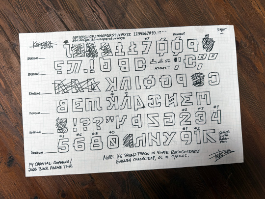
After three or four rounds of this piecemeal approval of ideas, it seemed we were moving in the right direction and Gerard gave me the go-ahead to work independently. While I was sketching, he emailed me one particular glyph that he’d created and was calling, “the hangman” symbol. It was inspired by the old pen and paper game called, Hangman, that kids used to play. Gerard thought the symbol looked like the gallows from the game. This eventually became our Keposhka version of the letter “R”, and you can see it in the translated version of the MCR logo at the beginning of this article.
A second sheet of 11” x 17” sketches followed over the next couple of weeks. When that was approved, I felt like it was time to progress to the next step: bringing these ideas into the digital realm. I began working on vector versions of the glyphs in Adobe Illustrator. Quite a few of the ideas from the sketches were used. When I ran out, I began creating new glyphs without reference. I was finally at a point where my familiarity with the style allowed me to just make up new symbols on the fly.
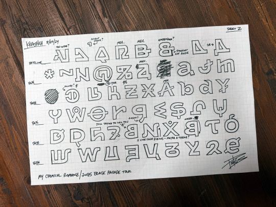
We also began thinking about numbers and punctuation. Many other non-English languages use standard numbers. Since these fonts might be used for merch, tour graphics, and other instances that might require understandable numbers, I created a clean, western set of numbers.
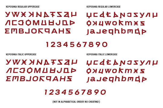
KEPOSHKA CONDENSED & EXTRA CONDENSED
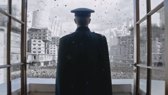
Originally, this whole project was just focused on a single pair of fonts; somewhat wide, very clean, sans-serif versions of Keposhka Regular and Italic—but I began to see that there might be a need for more. I finished up the initial set, I proposed a Condensed Regular and Condensed Italic. Gerard was all for it. Later on, this Condensed set was shown prominently in the initial live-action trailer for the tour. If you look closely, you can see many instances of Keposhka Regular in the final scene of the trailer as well.
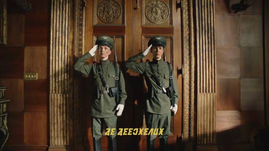
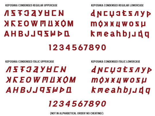
Since I was proposing the Condensed set, I figured an Extra Condensed Regular and Extra Condensed Italic might be useful for scenarios where space was at a premium. Gerard was eager for me to come up with anything I thought might be useful and gave me the thumbs up.
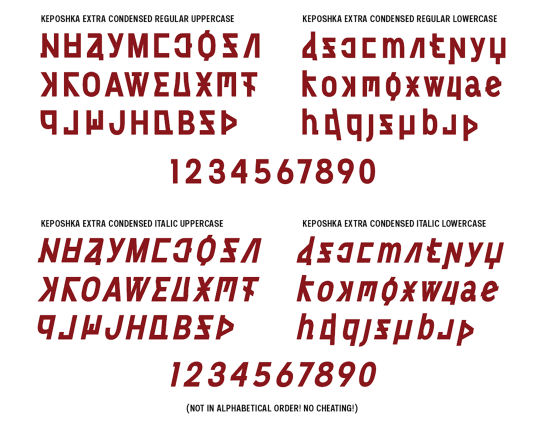
I took the vectors of Keposhka Regular, Italic, Condensed Regular, Condensed Italic, Extra Condensed Regular, and Extra Condensed Italic created in Illustrator, and ported them over to Fontlab. This is my software of choice for doing all the programming, kerning, etc. involved in making professional, finished typefaces. I think it took about a month and a half to wrap up all six fonts. A well-designed font family can take up to several months to finish, but our deadlines were tight—there were other designers waiting on these fonts so they could get started on other facets of the tour.
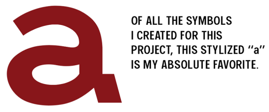
MCRIn late October/early November, with very few corrections from Gerard, the six fonts were approved and delivered, and as far as I knew, I was finished with the project. Little did I know that six fonts was soon to become fourteen!
KEPOSHKA ENGLISH
A few months later, I got an email from Gerard. He’d realized that he needed an English typeface…and it would need to work aesthetically with our fictional language. Off the shelf English fonts might not cut it. Gerard wanted something custom-made. Gerard was already very busy with tour prep, so he let me work almost completely on my own. I found myself re-hired on the project, and I got back to work. There would be no more analog sketching of ideas; I decided to work 100% in the digital realm, creating vectors in Illustrator. We decided on a simple sans-serif. Something traditional, slightly wide, and pleasing to the eye. This eventually led to Keposhka English Regular, Italic, Bold, and Bold Italic (bringing us up to ten fonts total).
I’ve been making fonts for over twenty years, almost all of which are in English and other Latin-based glyph sets, so Keposhka English went more quickly than the fictional language. I didn’t have to imagine how weird symbols would fit together, or how this imaginary culture used punctuation, etc. I was back in my comfort zone.
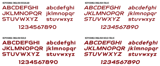
I finished and delivered Keposhka English Regular, Italic, Bold and Bold Italic in mid-April of 2025. I thought it meshed with the original Keposhka when displayed side-by-side, and so did Gerard. Once again, I thought I was done . . . but it was not to be! Gerard had one more idea up his sleeve.
[continued in reblog]
#figured I'd copy/paste the article here because so many old articles end up lost to time and this is genuinely fascinating stuff#but I am promoting this article!!! go read it on his site!!!!#My Chemical Romance
109 notes
·
View notes
Text
KEPOSHKA HYBRID
We started with a completely fictional language, followed by a stylized English version inspired by the original font . . . but now Gerard wanted something in-between the two. Now that was a challenge—an English typeface inspired by the unusual shapes of Keposhka! I proposed another four-font set and got to work on Keposhka Hybrid Regular, Italic, Bold, and Bold Italic. Once again, Gerard was very hands-off. We were on the same wavelength and he trusted me to produce something cool. You'll note in the samples below that the numerals have become stylized as well.


MCRI had a lot of fun on this one; almost as much fun as the original set. There was a lot of trial and error and revisions once I moved everything to Fontlab and began to view the glyphs as large blocks of text. It had to be readable. I didn’t want anyone to struggle to tease out the meaning when Hybrid was seen...but I didn’t want them to just think this was Keposhka English, either. Finally, I was happy with the design, and I previewed it to Gerard. He gave it the green light with no further notes, and I delivered final files in late April 2025. After fourteen fonts, I was (mostly) finished with my contributions to the tour.
I was hired back for a couple of small projects that you’ll see when you end up at the tour dates—I won’t spoil them for you! I’m really looking forward to your reactions to the immersive experience that Gerard and the band has planned for you. Maybe I'll see you at a show!
Thanks for reading.
-Nate
Keposhka™ and © Gerard Way. All Rights Reserved. Images used with permission. No part of this article may be reproduced without the express permission of Nate Piekos, with exception for review or promotion
The Language of the Black Parade
By Nate Piekos

Soon after being contacted by Gerard Way to work on the 2025 Long Live the Black Parade tour, I thought it might be a good idea to start writing down notes in the event that I decided to compose an article on how the typeface came together. Not really knowing if I’d actually get it done—or have enough interesting info to even justify an article—I just scribbled thoughts and dates on sticky notes which were soon lost to the chaos of my studio. I tried my best to find them all (and I was semi-successful) when the time came to write this.
In August of 2024, I received an email from Gerard asking me if I was up to design a font for the following year’s My Chemical Romance tour. Gerard and I have worked together since the beginning of The Umbrella Academy comic books published at Dark Horse (Wikipedia tells me that was back in 2007). We’ve always gotten along really well. We’re approximately the same age, and we’re both really into comics and music. Of course I said I was interested, so we scheduled a Zoom call to hash out the details.
The afternoon of the Zoom call, Gerard filled me in on his concept of the tour, which would lean heavily on a fictional dictatorship rooted in an equally-fictional Eastern Bloc country. He wanted to create a language that was both made-up, and yet felt entirely real. In fact, he already had a name for this language...
KEPOSHKA
We started delving into 1930s and 40s posters from Russia, England, Italy, and other countries, compiling a morgue file of reference images. We would send pictures to each other and try to figure out what appealed to us. After poster art, we moved on to brutalist architecture and then period typefaces. It was about that time that I broke out the art supplies and started sketching. I used 11” x 17” graph paper, tech pencils, and Copic tech pens.
As I filled out the first sheet of ideas, I would email or text pics to Gerard and he enthusiastically approved pretty much everything—going so far as to hang print-outs in his studio as inspiration for the other facets of the tour’s design work. Quite an honor for me. Other members of My Chemical Romance were now getting their first look at what we had been cooking up. While I didn’t have any direct contact with Mikey, Frank, or Ray, I was told that they were excited at the samples they’d been shown.

After three or four rounds of this piecemeal approval of ideas, it seemed we were moving in the right direction and Gerard gave me the go-ahead to work independently. While I was sketching, he emailed me one particular glyph that he’d created and was calling, “the hangman” symbol. It was inspired by the old pen and paper game called, Hangman, that kids used to play. Gerard thought the symbol looked like the gallows from the game. This eventually became our Keposhka version of the letter “R”, and you can see it in the translated version of the MCR logo at the beginning of this article.
A second sheet of 11” x 17” sketches followed over the next couple of weeks. When that was approved, I felt like it was time to progress to the next step: bringing these ideas into the digital realm. I began working on vector versions of the glyphs in Adobe Illustrator. Quite a few of the ideas from the sketches were used. When I ran out, I began creating new glyphs without reference. I was finally at a point where my familiarity with the style allowed me to just make up new symbols on the fly.

We also began thinking about numbers and punctuation. Many other non-English languages use standard numbers. Since these fonts might be used for merch, tour graphics, and other instances that might require understandable numbers, I created a clean, western set of numbers.

KEPOSHKA CONDENSED & EXTRA CONDENSED
Originally, this whole project was just focused on a single pair of fonts; somewhat wide, very clean, sans-serif versions of Keposhka Regular and Italic—but I began to see that there might be a need for more. I finished up the initial set, I proposed a Condensed Regular and Condensed Italic. Gerard was all for it. Later on, this Condensed set was shown prominently in the initial live-action trailer for the tour. If you look closely, you can see many instances of Keposhka Regular in the final scene of the trailer as well.


Since I was proposing the Condensed set, I figured an Extra Condensed Regular and Extra Condensed Italic might be useful for scenarios where space was at a premium. Gerard was eager for me to come up with anything I thought might be useful and gave me the thumbs up.

I took the vectors of Keposhka Regular, Italic, Condensed Regular, Condensed Italic, Extra Condensed Regular, and Extra Condensed Italic created in Illustrator, and ported them over to Fontlab. This is my software of choice for doing all the programming, kerning, etc. involved in making professional, finished typefaces. I think it took about a month and a half to wrap up all six fonts. A well-designed font family can take up to several months to finish, but our deadlines were tight—there were other designers waiting on these fonts so they could get started on other facets of the tour.

MCRIn late October/early November, with very few corrections from Gerard, the six fonts were approved and delivered, and as far as I knew, I was finished with the project. Little did I know that six fonts was soon to become fourteen!
KEPOSHKA ENGLISH
A few months later, I got an email from Gerard. He’d realized that he needed an English typeface…and it would need to work aesthetically with our fictional language. Off the shelf English fonts might not cut it. Gerard wanted something custom-made. Gerard was already very busy with tour prep, so he let me work almost completely on my own. I found myself re-hired on the project, and I got back to work. There would be no more analog sketching of ideas; I decided to work 100% in the digital realm, creating vectors in Illustrator. We decided on a simple sans-serif. Something traditional, slightly wide, and pleasing to the eye. This eventually led to Keposhka English Regular, Italic, Bold, and Bold Italic (bringing us up to ten fonts total).
I’ve been making fonts for over twenty years, almost all of which are in English and other Latin-based glyph sets, so Keposhka English went more quickly than the fictional language. I didn’t have to imagine how weird symbols would fit together, or how this imaginary culture used punctuation, etc. I was back in my comfort zone.

I finished and delivered Keposhka English Regular, Italic, Bold and Bold Italic in mid-April of 2025. I thought it meshed with the original Keposhka when displayed side-by-side, and so did Gerard. Once again, I thought I was done . . . but it was not to be! Gerard had one more idea up his sleeve.
#figured I'd copy/paste the article here because so many old articles end up lost to time and this is genuinely fascinating stuff#but I am promoting this article!!! go read it on his site!!!#My Chemical Romance
109 notes
·
View notes
Text
Okay so here's my review of the new information: we have a name! Keposhka, and we also get official confirmation of the eastern bloc and dictator themes we'd all figured out even if we didn't really need it confirming because it was pretty blatant. I'll be interested to see any information that is revealed about Keposhka as a language and how it links to Draag, at this point I feel like there could be a demonym linked to the language name, but I could be wrong!
I think knowing Gerard not only created one of the letters but named it "the hangman symbol" is significant, part of me wonders if it's the Houdini imagery from Bullets rearing it's head again? Given the tour has included blatant references to Danger Days it's not impossible that it was an intentional reference to another album. However this also makes me feel even more confident in my assertion that the carabiner visible at the back of Gerard's jacket during the Seattle show could be used to safely simulate an execution by hanging at a show (I theorize that Gerard will "die" in different ways over the course of the show, as well as at some point the Dictator getting decapitated because that is absolutely a decapitatable figure)
Learning the fonts were finalised literally in April is crazy, this was so many fonts completed at such an impressive pace and really speaks to Nate's clear skill at what he does! Truly this was a work of art and the way all of the fonts work so cohesively is fantastic work, I think the hybrid (my personal favourite) shows the level of cohesiveness. It also gives us an idea of how fast everyone working on the visual elements of the tour had to work in order to get all the merch, props and displays for the screens completed and I am so impressed.
I hope that we get a bunch of merch with the hybrid font because the image of My Chemical Romance written in it is really striking! I also think it'll be interesting to see people's handwritten Keposhka and see how different handwriting affects the characters, I wish I could write cursive in a way that would work for the language because I imagine much like handwritten cursive Russian it would look interesting (imagine a war letter sent from the battlefield in cursive Keposhka!)
This is such a cool insight, and I am so grateful that we got a glimpse into the design process as well as getting access to a full alphabet now so we can finally fill in the last couple of missing letters
The Language of the Black Parade
By Nate Piekos

Soon after being contacted by Gerard Way to work on the 2025 Long Live the Black Parade tour, I thought it might be a good idea to start writing down notes in the event that I decided to compose an article on how the typeface came together. Not really knowing if I’d actually get it done—or have enough interesting info to even justify an article—I just scribbled thoughts and dates on sticky notes which were soon lost to the chaos of my studio. I tried my best to find them all (and I was semi-successful) when the time came to write this.
In August of 2024, I received an email from Gerard asking me if I was up to design a font for the following year’s My Chemical Romance tour. Gerard and I have worked together since the beginning of The Umbrella Academy comic books published at Dark Horse (Wikipedia tells me that was back in 2007). We’ve always gotten along really well. We’re approximately the same age, and we’re both really into comics and music. Of course I said I was interested, so we scheduled a Zoom call to hash out the details.
The afternoon of the Zoom call, Gerard filled me in on his concept of the tour, which would lean heavily on a fictional dictatorship rooted in an equally-fictional Eastern Bloc country. He wanted to create a language that was both made-up, and yet felt entirely real. In fact, he already had a name for this language...
KEPOSHKA
We started delving into 1930s and 40s posters from Russia, England, Italy, and other countries, compiling a morgue file of reference images. We would send pictures to each other and try to figure out what appealed to us. After poster art, we moved on to brutalist architecture and then period typefaces. It was about that time that I broke out the art supplies and started sketching. I used 11” x 17” graph paper, tech pencils, and Copic tech pens.
As I filled out the first sheet of ideas, I would email or text pics to Gerard and he enthusiastically approved pretty much everything—going so far as to hang print-outs in his studio as inspiration for the other facets of the tour’s design work. Quite an honor for me. Other members of My Chemical Romance were now getting their first look at what we had been cooking up. While I didn’t have any direct contact with Mikey, Frank, or Ray, I was told that they were excited at the samples they’d been shown.

After three or four rounds of this piecemeal approval of ideas, it seemed we were moving in the right direction and Gerard gave me the go-ahead to work independently. While I was sketching, he emailed me one particular glyph that he’d created and was calling, “the hangman” symbol. It was inspired by the old pen and paper game called, Hangman, that kids used to play. Gerard thought the symbol looked like the gallows from the game. This eventually became our Keposhka version of the letter “R”, and you can see it in the translated version of the MCR logo at the beginning of this article.
A second sheet of 11” x 17” sketches followed over the next couple of weeks. When that was approved, I felt like it was time to progress to the next step: bringing these ideas into the digital realm. I began working on vector versions of the glyphs in Adobe Illustrator. Quite a few of the ideas from the sketches were used. When I ran out, I began creating new glyphs without reference. I was finally at a point where my familiarity with the style allowed me to just make up new symbols on the fly.

We also began thinking about numbers and punctuation. Many other non-English languages use standard numbers. Since these fonts might be used for merch, tour graphics, and other instances that might require understandable numbers, I created a clean, western set of numbers.

KEPOSHKA CONDENSED & EXTRA CONDENSED
Originally, this whole project was just focused on a single pair of fonts; somewhat wide, very clean, sans-serif versions of Keposhka Regular and Italic—but I began to see that there might be a need for more. I finished up the initial set, I proposed a Condensed Regular and Condensed Italic. Gerard was all for it. Later on, this Condensed set was shown prominently in the initial live-action trailer for the tour. If you look closely, you can see many instances of Keposhka Regular in the final scene of the trailer as well.


Since I was proposing the Condensed set, I figured an Extra Condensed Regular and Extra Condensed Italic might be useful for scenarios where space was at a premium. Gerard was eager for me to come up with anything I thought might be useful and gave me the thumbs up.

I took the vectors of Keposhka Regular, Italic, Condensed Regular, Condensed Italic, Extra Condensed Regular, and Extra Condensed Italic created in Illustrator, and ported them over to Fontlab. This is my software of choice for doing all the programming, kerning, etc. involved in making professional, finished typefaces. I think it took about a month and a half to wrap up all six fonts. A well-designed font family can take up to several months to finish, but our deadlines were tight—there were other designers waiting on these fonts so they could get started on other facets of the tour.

MCRIn late October/early November, with very few corrections from Gerard, the six fonts were approved and delivered, and as far as I knew, I was finished with the project. Little did I know that six fonts was soon to become fourteen!
KEPOSHKA ENGLISH
A few months later, I got an email from Gerard. He’d realized that he needed an English typeface…and it would need to work aesthetically with our fictional language. Off the shelf English fonts might not cut it. Gerard wanted something custom-made. Gerard was already very busy with tour prep, so he let me work almost completely on my own. I found myself re-hired on the project, and I got back to work. There would be no more analog sketching of ideas; I decided to work 100% in the digital realm, creating vectors in Illustrator. We decided on a simple sans-serif. Something traditional, slightly wide, and pleasing to the eye. This eventually led to Keposhka English Regular, Italic, Bold, and Bold Italic (bringing us up to ten fonts total).
I’ve been making fonts for over twenty years, almost all of which are in English and other Latin-based glyph sets, so Keposhka English went more quickly than the fictional language. I didn’t have to imagine how weird symbols would fit together, or how this imaginary culture used punctuation, etc. I was back in my comfort zone.

I finished and delivered Keposhka English Regular, Italic, Bold and Bold Italic in mid-April of 2025. I thought it meshed with the original Keposhka when displayed side-by-side, and so did Gerard. Once again, I thought I was done . . . but it was not to be! Gerard had one more idea up his sleeve.
#I put it here so I can write my thoughts about it and have it to reference#figured I'd copy/paste the article here because so many old articles end up lost to time and this is genuinely fascinating stuff#but I am promoting this article!!! go read it on his site!!!#My Chemical Romance
109 notes
·
View notes