#font tag attributes in html
Explore tagged Tumblr posts
Visit Tumblr Blog
Explore Tumblr blogs with no restrictions, modern design and the best experience.
Last Seen Tumblr Blogs


Fun Fact
Kazakhstan’s Minister of Communications and Informatics has blocked the Tumblr site because it contained 60 sites of terrorism, extremism, and pornography in 2015.
Text
This disability pride month, if there's nothing proventing you from doing so, add alt text to your images.
The option to add alt text on social media, including and especially tumblr, is fairly new! You can still join everyone else who uses those options.
For those who didn't know, you can also add it to your html website. The attribute you're looking for is "alt" and this text will also show up if your image fails to render.

Example source: Wikipedia
And for those who follow me for my Wiki stuff tag, you can also add alt text using MediaWiki. Forgive me for the bad screenshot, since I'm on mobile, but here is an example from my Wiki's homepage:
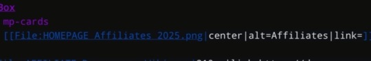
This image is of the text "Affiliates" (in a cool font), therefore the word "Affiliates" alone is a sufficient alt. It allows people who use screenreaders and who can't see the image for any reason to know that they're looking at the Wiki's affiliates.
If you don't have enough time or spoons (re: spoon theory) to write long descriptions, please remember that every little bit helps. Please consider adding the alt text when it's short enough for you to write, or when it can be copy pasted from the source, even if you don't usually do it.
4 notes
·
View notes
Note
Hello! I hope I don't bother you again. I have two questions for you (I think there are more). I'm writing a zosan fanfic and I came up with the idea of putting "titles" in what happens in the "chapters" separated by the divider, like the titles of anime episodes (very One Piece with spoilers about what happens in the episode), I would like to know what do you think of this idea? I have images of what these titles would look like if you want them for better visualization. 2- Is there a skin work on ao3 that imitates these "titles", as if they were chapter titles of a book (but without having to have several chapters as I want to make a oneshot)?
hello! yes, I think that sounds like a neat idea. you should go for it!!
I don't watch one piece so I hope I'm visualizing it right. if I got it wrong, feel free to send me a picture.
anyway. are you trying to do something like this?
if this is what you're going for, you can try this code out! I also created a pastebin for this one, so you can just copy paste to your own workskin.

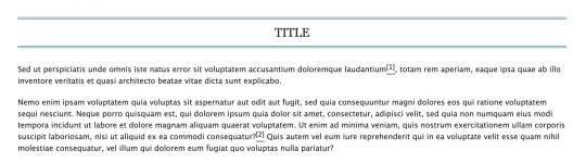
so here, we're creating the lined-title css class. you can just add it to your <p> tags in the html when you want to apply them. e.g.
<p class="lined-title">TITLE</p>
feel free to play around with border-style and the border-color (or any other attribute). you'll want border-style:solid if you just want one single line, for example.
you can also check AO3's FAQ on what colors and fonts you can use. fun fact: border-style:double is the same css they use to add those double lines in the FAQ!
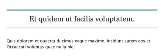
note that this will span the entire width of the page. so if you have a short title, it'll look like this on desktop:
if you don't want it to span the whole page, we could try this instead (also included in the pastebin link):

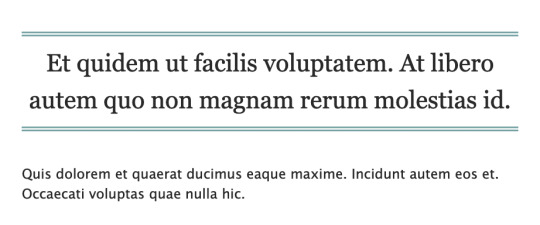
which will result in this:

however, we can't manipulate the spacing between the text and the lines in this one. on the other hand, it has text-decoration-style:wavy which the first option doesn't have!
for custom scene dividers, you can also check out these guides:
How to Make Customized Page Dividers by La_Temperanza
Dividers & how to style them by skinofthesoul
Rainbow Paragraph Divider by benwvatt
bonus: inspect element
also, are you familiar with inspect element yet? if you are, great! you can just skip this. otherwise, if you're still getting the hang of working with workskins and aren't used to editing css, you can try this:
right click on the text you want to change on AO3, then click "inspect" or "inspect element" (not sure what it's called in browsers these days; on firefox, it's just "inspect"). this will bring up a bunch of developer tools and it kinda looks like this:
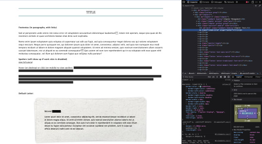
it might look different depending on the browser.
but here on the side, you can see the html on top and css at the bottom. as you can see in the screenshot, we are inspecting the title and we can see the different css rules for the title.
if you want to play around with the css, you can just change them from this panel and it will automatically reflect on the page. these changes are not permanent so it's a good way to test different styles without having to go through the cycle of updating the workskin and refreshing the fic page.
if this is your first time trying this out, it might look overwhelming, but it's very helpful if you get the hang of it. but of course, you don't need to learn how to do this to style your fics. :D
9 notes
·
View notes
Note
Hnnnghh I was informed by tatp that u know about about coding wdgvbb any tips or whatever I’m trying to make a neocitys website or smthg
Since it's neocities website all you need is: HTML, CSS and maybe some graphics. As I said before I'm shit at explaining stuff but I will try my best. So here's "I want to make my own website" the basics!
HTML - markup language, the base of your websiteCSS - style of your website, can change color of html elements, size, font etc. I linked w3schools website since it's pretty easy to understand.Do you need to learn all of this before coding? No. I think it's the best to just check things that you need for your website. If you need to change background color of your website just find a w3schools tutorial on it or simply search for "how to change background color in css". You just should know html tags and basic attributes: id and class and how to link your css in html file so your style actually works! Neocities has it's own tutorials on html and css so you could check them out too! Neocities also has it's own code editor. You can edit everything in browser. I personally like to code in Visual Studio Code then just paste the code into Neocities editor. VS Code has a lot of addons (some of them are there by default) that make coding way easier for example: autocorrection of syntax errors and giving you suggestions!
Example: If you type html in vs code html file you will get 3 suggestions:
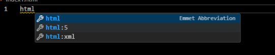
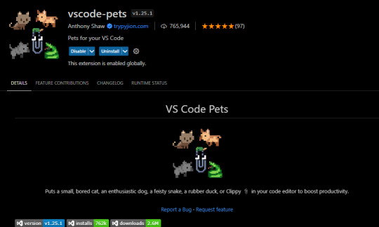
choose the html:5 one:
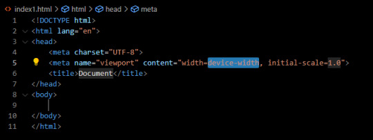
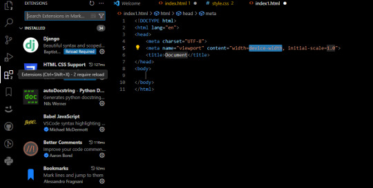
TAADAAAM!! VS Code just wrote the whole website structure for you! You can install more extensions here under extension section! There is this extension called vscode-pets it won't help you with coding but its really cute:
some yt tutorials: CINNIMANI (specifically for neocities), web coding playlist (this one is good for all websites in general); https://sadgrl.online if you were on neocities you probably saw her website. She has a lot of useful resources including image resources and also she made her own WEBSITE BUILDER or acutally layout builder! It's pretty simple website builder but still. If you are looking for premade layouts you can just search them on google or get sum from the website I linked ^__^ Uploading your website to neocities is really easy since all you need to do is to put all the files on there! I guess that's all for now. If you have any problems or questions just ask. I'm here to help ^^ websites with free to edit code: https://codepen.io, https://github.com
10 notes
·
View notes
Note
Is it possible to do gradient text on tumblr with Fraktur font? whenever I attempt it, the text colour always defaults to white in the preview
To my knowledge, unfortunately there's no way (yet) to directly cut and paste the word in your desired font and have it become a gradient text, since you're using 2 different editors int he process. I may be wrong, but you can try to use the "font face" attribute (where you can specify the font family; i.e in your case, Fraktur) of the font style tag in HTML (since that's the editor used for gradient text). Google has multiple resources detailing how to use this tag, so you can give it a try. I myself am not sure about whether this will work, but it's worth a shot at least.
8 notes
·
View notes
Text
How to Improve Accessibility on Your WordPress Site
Website accessibility is more than a legal requirement — it’s about ensuring that all users, including those with disabilities, can navigate and interact with your site. WordPress is a powerful platform for creating inclusive digital experiences, but achieving true accessibility takes thoughtful planning and expertise. That’s where custom WordPress development comes in. In this blog, we’ll explore practical ways to improve accessibility on your WordPress site and deliver a better experience for all visitors.
Why Accessibility Matters
Accessibility ensures your website can be used by people with visual, auditory, cognitive, or motor impairments. Not only does this broaden your audience and reflect positively on your brand, but it also helps with SEO and compliance with regulations such as the Americans with Disabilities Act (ADA) and the Web Content Accessibility Guidelines (WCAG).
Custom WordPress development gives you the flexibility to build features and design elements that meet or exceed accessibility standards without compromising on aesthetics or functionality.
Choose an Accessibility-Ready Theme
Your theme forms the foundation of your WordPress site’s design and functionality. When aiming for accessibility, it’s important to choose or build a theme that is labeled as accessibility-ready. These themes follow coding best practices that support screen readers, keyboard navigation, and proper heading structures.
Custom WordPress development allows you to modify or create themes that not only align with your brand’s visual identity but also adhere strictly to accessibility guidelines.
Use Semantic HTML and Proper Heading Structure
Screen readers rely on semantic HTML to interpret page content accurately. Ensure that your WordPress site uses proper tags for headings, lists, buttons, and forms. A logical heading structure (H1, H2, H3) helps users navigate content more easily.
With custom WordPress development, developers can fine-tune your site’s code to ensure it follows best practices and offers a seamless experience for users relying on assistive technologies.
Ensure Keyboard Navigation Works
Many users with disabilities rely on keyboard navigation to interact with websites. All interactive elements, including menus, forms, buttons, and modals, should be accessible via the keyboard. Tab order should follow a logical sequence, and focus indicators should be clearly visible.
Custom WordPress development focuses on creating interfaces that function smoothly without requiring a mouse, ensuring accessibility for all users.
Add Alt Text to Images
Images play a key role in digital content, but without descriptive alt text, they are inaccessible to screen reader users. Make sure every meaningful image on your WordPress site includes alt text that describes its purpose or content.
Custom WordPress development teams often provide tools and workflows that make it easier to manage and enforce consistent use of alt text across large sites.
Improve Color Contrast and Font Choices
Low contrast between text and background can make content difficult to read, especially for users with visual impairments. Select colors that provide sufficient contrast and avoid relying solely on color to convey meaning. Additionally, choose clear, readable fonts and ensure text can be resized without breaking the layout.
A custom WordPress development approach allows for precise control over design elements, ensuring your site meets color contrast standards and offers a comfortable reading experience.
Optimize Forms for Accessibility
Forms are often barriers for users with disabilities if not designed properly. Label all form fields clearly, provide instructions where necessary, and ensure error messages are easy to understand. Group related fields and use ARIA (Accessible Rich Internet Applications) attributes where appropriate.
Custom WordPress development ensures forms are built or enhanced with accessibility in mind, improving usability for everyone.
Test Accessibility Regularly
Accessibility is not a one-time task — it requires ongoing testing and refinement. Use tools like WAVE, AXE, or Lighthouse to check for issues, and consider manual testing with screen readers or keyboard navigation.
Custom WordPress development providers can integrate these tools into your development process and address issues proactively as your site evolves.
Final Thoughts
Improving accessibility on your WordPress site is both a technical and ethical priority. By investing in custom WordPress development, you ensure that your site not only complies with accessibility standards but also provides a positive experience for all users. Accessibility strengthens your brand, expands your audience, and supports your business goals while making the web a more inclusive space.
0 notes
Text
🖥️ Building a Website in 2025? Here’s What You Shouldn’t Ignore
At Vynzora, we’ve seen websites go from pixelated HTML pages to sleek, immersive digital experiences. In 2025, your website isn’t just a place people visit—it’s where they connect with your brand.
So, whether you’re a small business owner, a startup founder, or just vibing with the idea of launching your own space online, here are 5 things you NEED to keep in mind when building your website:
✅ 1. Make It Mobile-First, Always
More than 70% of your users are visiting from their phones. Your website should feel buttery smooth on mobile devices.
🛠 Pro Tip: Use fluid layouts, responsive images, and test on real devices (not just emulators).
⚡ 2. Speed = Trust
People click away in 3 seconds if your page doesn’t load. In 2025, speed isn’t a bonus—it’s survival.
Use lazy loading, compressed assets, and lightweight frameworks.
🎨 3. Your Design = Your Vibe
Fonts, colors, and whitespace matter. They speak before your words do.
Go for minimal, clean, and brand-aligned. Think Google, not GeoCities. 😅
🔍 4. SEO is Still Alive and Kicking
Search engines might feel old school, but Google’s still king. Set your site up with proper meta tags, alt attributes, and clean code.
Don’t forget local SEO if you run a physical business in Kerala!
🎥 5. Add Video for That Extra Magic
People stay longer on websites with videos. Whether it’s a “Meet the Team” clip or a 30-second explainer, video builds connection.
And guess what? At Vynzora, we do video production too. Just sayin’. 😎
👋 Final Thoughts
In 2025, your website is your digital handshake. Don’t make it limp. Make it confident, fast, and future-ready.
If you're building or revamping a site, we're here to help! Drop us a DM, or visit us at https://vynzora.com/
#digitalmarketing#webdesign#webdevelopment#smallbusiness#startups#vynzora#videoproduction#kerala#marketing2025#websitedesigncompanyinkerala#branding#socialmediamarketing
0 notes
Text
Difference Between HTML and CSS
In the realm of web development, two foundational technologies form the backbone of nearly every website: HTML (HyperText Markup Language) and CSS (Cascading Style Sheets). While they often work closely together to build and style web pages, they serve fundamentally different purposes. Understanding the differences between HTML and CSS is essential for anyone interested in web design or development.
Introduction to HTML
What is HTML?
HTML stands for HyperText Markup Language, and it is the standard language used to create the structure of web pages. Developed by Tim Berners-Lee in 1991, HTML has evolved into a robust language that helps define the layout and content of a website.
Purpose of HTML
HTML is primarily used to:
Define the structure of web documents
Insert and format text
Add images, videos, and other multimedia
Create hyperlinks
Form interactive elements such as buttons and forms
HTML Tags and Elements
HTML uses "tags" enclosed in angle brackets (< >). Each tag has a specific function. For example:
<h1>This is a heading</h1>
<p>This is a paragraph.</p>
<a href="https://www.example.com">Visit Example</a>
In this code:
defines a main heading
defines a paragraph
defines a hyperlink
HTML follows a nested structure. Tags are often paired with closing tags (</tag>) to wrap content.
Introduction to CSS
What is CSS?
CSS stands for Cascading Style Sheets, a language used for describing the presentation and design of HTML documents. Introduced in 1996 by the W3C (World Wide Web Consortium), CSS allows developers to apply styles like colors, fonts, spacing, and layouts to HTML elements.
Purpose of CSS
CSS is used to:
Style text (color, font, size)
Manage layout (grid, flexbox, margins, padding)
Control visibility and positioning
Apply responsive design
Animate HTML elements
CSS Syntax and Example
CSS rules are usually written in a separate file (e.g., style.css) or within a <style> tag. A CSS rule consists of a selector and declaration block:
p {
color: blue;
font-size: 16px;
}
This rule selects all <p> elements and applies a blue font color and a font size of 16 pixels.
Key Differences Between HTML and CSS
Feature
HTML
CSS
Purpose
Structure of a webpage
Styling of a webpage
Language Type
Markup language
Style sheet language
File Extension
.html or .htm
.css
Usage
Adds elements like text, images, forms
Adds color, layout, fonts, and visual effects
Integration
Must be present for any webpage
Optional, but improves user experience
Position in Web Development
Backbone/structure
Design layer/presentation
Role in Web Development
HTML’s Role
Without HTML, there would be no content to style. HTML:
Provides the blueprint for web pages
Organizes content in a logical structure
Serves as a framework for CSS and JavaScript to enhance
HTML is essential for SEO (Search Engine Optimization), accessibility, and content hierarchy.
CSS’s Role
CSS enhances the user experience by:
Making content visually appealing
Ensuring the layout adapts to different screen sizes (responsive design)
Keeping style rules separate from structure, promoting clean code and reusability
Working Together: HTML + CSS
HTML and CSS are complementary. HTML provides the "what," and CSS provides the "how it looks." Here's an example of them working together:
HTML File (index.html):
<!DOCTYPE html>
<html>
<head>
<link rel="stylesheet" href="styles.css">
</head>
<body>
<h1>Welcome to My Website</h1>
<p>This is a simple paragraph.</p>
</body>
</html>
CSS File (styles.css):
h1 {
color: darkgreen;
font-family: Arial, sans-serif;
}
p {
font-size: 18px;
color: gray;
}
In this example:
HTML sets the content: a heading and a paragraph
CSS styles the content: changing colors and fonts
Inline, Internal, and External CSS
CSS can be included in three ways:
Inline CSS: Defined within an HTML tag using the style attribute. <p style="color: red;">This is red text.</p>
Internal CSS: Written within a <style> tag in the <head> section of the HTML. <style>
p { color: blue; }
</style>
External CSS: Linked via a separate .css file. <link rel="stylesheet" href="style.css">
External CSS is the most scalable and recommended method for larger websites.
Advantages and Disadvantages
Advantages of HTML
Easy to learn and use
Supported by all browsers
Crucial for webpage structure
SEO-friendly
Disadvantages of HTML
Limited to content and structure
Requires CSS for styling
Not dynamic on its own (needs JavaScript for interaction)
Advantages of CSS
Separates design from content
Enables responsive design
Allows for consistent styling across pages
Reduces redundancy and improves maintainability
Disadvantages of CSS
Can become complex for large projects
Browser compatibility issues may arise
Changes in structure can require rework in styles
Best Practices for Using HTML and CSS
Use semantic HTML (e.g., , , ) to improve accessibility and SEO
Keep structure and style separate by using external CSS
Use classes and IDs effectively for targeted styling
Test your pages on multiple browsers and devices
Keep your code clean, readable, and well-commented
Real-World Analogy
Think of building a website like constructing a house:
HTML is the framework — the walls, roof, and foundation.
CSS is the interior design — the paint, furniture, and layout.
Without HTML, there’s no house. Without CSS, the house is plain and undecorated.
Conclusion
In summary, HTML and CSS are two essential technologies for creating and designing web pages. HTML defines the structure and content, while CSS is responsible for the visual style and layout. They operate in tandem to deliver functional, attractive, and user-friendly websites.
Understanding the differences between HTML and CSS is the first step toward mastering web development. While HTML answers "What is on the page?", CSS answers "How does it look?" Together, they empower developers to build rich, engaging digital experiences.
0 notes
Text
How to Reduce Render-Blocking Resources for Faster Pages

We’ve all faced slow websites. One common reason is render-blocking resources—files like CSS and JavaScript that delay how quickly your page loads. These resources prevent the browser from showing your content until they’re fully loaded. That delay can cost you visitors and affect your SEO. When someone visits your website, their browser starts loading the page by downloading HTML, CSS, JavaScript, fonts, and images.
Some files, especially CSS and JavaScript, are marked as critical and must be fully loaded before the page content can appear. These files are called render-blocking resources. Until they’re done loading, users may only see a blank screen. This can cause visitors to leave your site before it even loads.
Why Do Render-Blocking Resources Matter?
Speed matters. If your page takes too long to load, users may leave. A slow site increases bounce rates and lowers engagement. It also affects search engine rankings. Google includes page speed as one of the factors in its algorithm, especially for mobile devices. Reducing render-blocking files can lead to better SEO performance, happier users, and improved conversion rates.
Common Examples of Render-Blocking Resources
Most often, render-blocking comes from external CSS stylesheets and JavaScript files. Fonts can also delay rendering, especially if they are hosted externally or not optimized. These files must be fully processed before your page is displayed, even if the actual content is ready. That’s why solving this issue is one of the first steps in improving site performance.
How to Reduce Render-Blocking Resources
1. Minify CSS and JavaScript
Minifying your code means removing unnecessary spaces, line breaks, and comments that browsers don’t need. This makes the files smaller and faster to load. You can use tools like CSSNano, CleanCSS, UglifyJS, or Terser. Many website platforms and builders also offer plugins that handle minification automatically.
2. Use Async or Defer for JavaScript
By default, browsers pause content rendering when they encounter a JavaScript file. To avoid this, add async or defer attributes to your script tags. Async loads the script while the rest of the page loads. Defer waits until the page is fully loaded before running the script. Both help reduce delays caused by JavaScript.
3. Inline Critical CSS
Critical CSS is the minimal styling required to render the above-the-fold content of your page. Instead of linking to an external stylesheet, you can place this CSS directly in your HTML. This allows the page to appear more quickly, even if the full CSS file hasn’t finished loading yet. Tools like Critical or PurifyCSS can help generate this code.
4. Optimize Font Delivery
Web fonts are another common source of delays. You can reduce this impact by using font-display: swap in your CSS. This allows a fallback font to show immediately while the custom font loads in the background. It prevents invisible text and improves the user experience.
5. Combine CSS and JavaScript Files
Fewer requests usually mean faster load times. If your website uses multiple CSS or JS files, consider combining them where possible. This reduces the number of HTTP requests made when a page loads. But be careful—only combine files used across multiple pages to avoid unnecessary loading.
6. Use a Content Delivery Network (CDN)
A CDN stores your files on servers around the world. When someone accesses your site, files are delivered from the nearest location. This doesn’t eliminate render-blocking resources, but it does reduce how long they take to load. Faster delivery means quicker page rendering.
Why You Should Work with Experts
Fixing render-blocking issues requires technical knowledge. It’s easy to break a site if changes are made incorrectly. A trusted Website Development Company in India as Dzinepixel Webstudios can help you optimize your site without affecting its design or functionality. Whether you’re running a business site, eCommerce store, or blog, performance is key.
Final Thoughts
Reducing render-blocking resources is one of the most effective ways to boost your website’s speed. Whether it’s minimizing CSS, delaying JavaScript, or optimizing font loading, these steps can have a real impact. A faster website not only helps users stay longer but also ranks better on search engines. If you want to improve user experience and drive more engagement, these small changes can lead to big results.
#website development company in india#web design company india#website designing company in india#best web development agencies india#digital marketing agency india#online reputation management companies in india
0 notes
Text
Crafting Strong DX With Astro Components and TypeScript
New Post has been published on https://thedigitalinsider.com/crafting-strong-dx-with-astro-components-and-typescript/
Crafting Strong DX With Astro Components and TypeScript
I’m a big fan of Astro’s focus on developer experience (DX) and the onboarding of new developers. While the basic DX is strong, I can easily make a convoluted system that is hard to onboard my own developers to. I don’t want that to happen.
If I have multiple developers working on a project, I want them to know exactly what to expect from every component that they have at their disposal. This goes double for myself in the future when I’ve forgotten how to work with my own system!
To do that, a developer could go read each component and get a strong grasp of it before using one, but that feels like the onboarding would be incredibly slow. A better way would be to set up the interface so that as the developer is using the component, they have the right knowledge immediately available. Beyond that, it would bake in some defaults that don’t allow developers to make costly mistakes and alerts them to what those mistakes are before pushing code!
Enter, of course, TypeScript. Astro comes with TypeScript set up out of the box. You don’t have to use it, but since it’s there, let’s talk about how to use it to craft a stronger DX for our development teams.
Watch
I’ve also recorded a video version of this article that you can watch if that’s your jam. Check it out on YouTube for chapters and closed captioning.
Setup
In this demo, we’re going to use a basic Astro project. To get this started, run the following command in your terminal and choose the “Minimal” template.
npm create astro@latest
This will create a project with an index route and a very simple “Welcome” component. For clarity, I recommend removing the <Welcome /> component from the route to have a clean starting point for your project.
To add a bit of design, I’d recommend setting up Tailwind for Astro (though, you’re welcome to style your component however you would like including a style block in the component).
npx astro add tailwind
Once this is complete, you’re ready to write your first component.
Creating the basic Heading component
Let’s start by defining exactly what options we want to provide in our developer experience.
For this component, we want to let developers choose from any HTML heading level (H1-H6). We also want them to be able to choose a specific font size and font weight — it may seem obvious now, but we don’t want people choosing a specific heading level for the weight and font size, so we separate those concerns.
Finally, we want to make sure that any additional HTML attributes can be passed through to our component. There are few things worse than having a component and then not being able to do basic functionality later.
Using Dynamic tags to create the HTML element
Let’s start by creating a simple component that allows the user to dynamically choose the HTML element they want to use. Create a new component at ./src/components/Heading.astro.
--- // ./src/component/Heading.astro const as = Astro.props; const As = as; --- <As> <slot /> </As>
To use a prop as a dynamic element name, we need the variable to start with a capital letter. We can define this as part of our naming convention and make the developer always capitalize this prop in their use, but that feels inconsistent with how most naming works within props. Instead, let’s keep our focus on the DX, and take that burden on for ourselves.
In order to dynamically register an HTML element in our component, the variable must start with a capital letter. We can convert that in the frontmatter of our component. We then wrap all the children of our component in the <As> component by using Astro’s built-in <slot /> component.
Now, we can use this component in our index route and render any HTML element we want. Import the component at the top of the file, and then add <h1> and <h2> elements to the route.
--- // ./src/pages/index.astro import Layout from '../layouts/Layout.astro'; import Heading from '../components/Heading.astro'; --- <Layout> <Heading as="h1">Hello!</Heading> <Heading as="h2">Hello world</Heading> </Layout>
This will render them correctly on the page and is a great start.
Adding more custom props as a developer interface
Let’s clean up the element choosing by bringing it inline to our props destructuring, and then add in additional props for weight, size, and any additional HTML attributes.
To start, let’s bring the custom element selector into the destructuring of the Astro.props object. At the same time, let’s set a sensible default so that if a developer forgets to pass this prop, they still will get a heading.
--- // ./src/component/Heading.astro const as: As="h2" = Astro.props; --- <As> <slot /> </As>
Next, we’ll get weight and size. Here’s our next design choice for our component system: do we make our developers know the class names they need to use or do we provide a generic set of sizes and do the mapping ourselves? Since we’re building a system, I think it’s important to move away from class names and into a more declarative setup. This will also future-proof our system by allowing us to change out the underlying styling and class system without affecting the DX.
Not only do we future proof it, but we also are able to get around a limitation of Tailwind by doing this. Tailwind, as it turns out can’t handle dynamically-created class strings, so by mapping them, we solve an immediate issue as well.
In this case, our sizes will go from small (sm) to six times the size (6xl) and our weights will go from “light” to “bold”.
Let’s start by adjusting our frontmatter. We need to get these props off the Astro.props object and create a couple objects that we can use to map our interface to the proper class structure.
--- // ./src/component/Heading.astro const weights = "bold": "font-bold", "semibold": "font-semibold", "medium": "font-medium", "light": "font-light" const sizes= "6xl": "text-6xl", "5xl": "text-5xl", "4xl": "text-4xl", "3xl": "text-3xl", "2xl": "text-2xl", "xl": "text-xl", "lg": "text-lg", "md": "text-md", "sm": "text-sm" const as: As="h2", weight="medium", size="2xl" = Astro.props; ---
Depending on your use case, this amount of sizes and weights might be overkill. The great thing about crafting your own component system is that you get to choose and the only limitations are the ones you set for yourself.
From here, we can then set the classes on our component. While we could add them in a standard class attribute, I find using Astro’s built-in class:list directive to be the cleaner way to programmatically set classes in a component like this. The directive takes an array of classes that can be strings, arrays themselves, objects, or variables. In this case, we’ll select the correct size and weight from our map objects in the frontmatter.
--- // ./src/component/Heading.astro const weights = bold: "font-bold", semibold: "font-semibold", medium: "font-medium", light: "font-light", ; const sizes = "6xl": "text-6xl", "5xl": "text-5xl", "4xl": "text-4xl", "3xl": "text-3xl", "2xl": "text-2xl", xl: "text-xl", lg: "text-lg", md: "text-md", sm: "text-sm", ; const as: As = "h2", weight = "medium", size = "2xl" = Astro.props; --- <As class:list=[ sizes[size], weights[weight] ] > <slot /> </As>
Your front-end should automatically shift a little in this update. Now your font weight will be slightly thicker and the classes should be applied in your developer tools.
From here, add the props to your index route, and find the right configuration for your app.
--- // ./src/pages/index.astro import Layout from '../layouts/Layout.astro'; import Heading from '../components/Heading.astro'; --- <Layout> <Heading as="h1" size="6xl" weight="light">Hello!</Heading> <Heading as="h3" size="xl" weight="bold">Hello world</Heading> </Layout>
Our custom props are finished, but currently, we can’t use any default HTML attributes, so let’s fix that.
Adding HTML attributes to the component
We don’t know what sorts of attributes our developers will want to add, so let’s make sure they can add any additional ones they need.
To do that, we can spread any other prop being passed to our component, and then add them to the rendered component.
--- // ./src/component/Heading.astro const weights = // etc. ; const sizes = // etc. ; const as: As = "h2", weight = "medium", size = "md", ...attrs = Astro.props; --- <As class:list=[ sizes[size], weights[weight] ] ...attrs > <slot /> </As>
From here, we can add any arbitrary attributes to our element.
--- // ./src/pages/index.astro import Layout from '../layouts/Layout.astro'; import Heading from '../components/Heading.astro'; --- <Layout> <Heading id="my-id" as="h1" size="6xl" weight="light">Hello!</Heading> <Heading class="text-blue-500" as="h3" size="xl" weight="bold">Hello world</Heading> </Layout>
I’d like to take a moment to truly appreciate one aspect of this code. Our <h1>, we add an id attribute. No big deal. Our <h3>, though, we’re adding an additional class. My original assumption when creating this was that this would conflict with the class:list set in our component. Astro takes that worry away. When the class is passed and added to the component, Astro knows to merge the class prop with the class:list directive and automatically makes it work. One less line of code!
In many ways, I like to consider these additional attributes as “escape hatches” in our component library. Sure, we want our developers to use our tools exactly as intended, but sometimes, it’s important to add new attributes or push our design system’s boundaries. For this, we allow them to add their own attributes, and it can create a powerful mix.
It looks done, but are we?
At this point, if you’re following along, it might feel like we’re done, but we have two issues with our code right now: (1) our component has “red squiggles” in our code editor and (2) our developers can make a BIG mistake if they choose.
The red squiggles come from type errors in our component. Astro gives us TypeScript and linting by default, and sizes and weights can’t be of type: any. Not a big deal, but concerning depending on your deployment settings.
The other issue is that our developers don’t have to choose a heading element for their heading. I’m all for escape hatches, but only if they don’t break the accessibility and SEO of my site.
Imagine, if a developer used this with a div instead of an h1 on the page. What would happen?We don’t have to imagine, make the change and see.
It looks identical, but now there’s no <h1> element on the page. Our semantic structure is broken, and that’s bad news for many reasons. Let’s use typing to help our developers make the best decisions and know what options are available for each prop.
Adding types to the component
To set up our types, first we want to make sure we handle any HTML attributes that come through. Astro, again, has our backs and has the typing we need to make this work. We can import the right HTML attribute types from Astro’s typing package. Import the type and then we can extend that type for our own props. In our example, we’ll select the h1 types, since that should cover most anything we need for our headings.
Inside the Props interface, we’ll also add our first custom type. We’ll specify that the as prop must be one of a set of strings, instead of just a basic string type. In this case, we want it to be h1–h6 and nothing else.
--- // ./src/component/Heading.astro import type HTMLAttributes from 'astro/types'; interface Props extends HTMLAttributes<'h1'> "h4" //... The rest of the file ---
After adding this, you’ll note that in your index route, the <h1> component should now have a red underline for the as="div" property. When you hover over it, it will let you know that the as type does not allow for div and it will show you a list of acceptable strings.
If you delete the div, you should also now have the ability to see a list of what’s available as you try to add the string.
While it’s not a big deal for the element selection, knowing what’s available is a much bigger deal to the rest of the props, since those are much more custom.
Let’s extend the custom typing to show all the available options. We also denote these items as optional by using the ?:before defining the type.
While we could define each of these with the same type functionality as our as type, that doesn’t keep this future proofed. If we add a new size or weight, we’d have to make sure to update our type. To solve this, we can use a fun trick in TypeScript: keyof typeof.
There are two helper functions in TypeScript that will help us convert our weights and sizes object maps into string literal types:
typeof: This helper takes an object and converts it to a type. For instance typeof weights would return type bold: string, semibold: string, ...etc
keyof: This helper function takes a type and returns a list of string literals from that type’s keys. For instance keyof type bold: string, semibold: string, ...etc would return "bold" | "semibold" | ...etc which is exactly what we want for both weights and sizes.
--- // ./src/component/Heading.astro import type HTMLAttributes from 'astro/types'; interface Props extends HTMLAttributes<'h1'> "h3" // ... The rest of the file
Now, when we want to add a size or weight, we get a dropdown list in our code editor showing exactly what’s available on the type. If something is selected, outside the list, it will show an error in the code editor helping the developer know what they missed.
While none of this is necessary in the creation of Astro components, the fact that it’s built in and there’s no additional tooling to set up means that using it is very easy to opt into.
I’m by no means a TypeScript expert, but getting this set up for each component takes only a few additional minutes and can save a lot of time for developers down the line (not to mention, it makes onboarding developers to your system much easier).
#Accessibility#ADD#alerts#app#Arrays#Article#Articles#astro#attributes#Blue#box#Building#change#Children#classes#code#Code Editor#coding#command#Conflict#convention#course#craft#deal#delete#deployment#Design#Developer#developers#development
0 notes
Text
instagram
Have you ever left a website because it took too long to load? Slow page loading can frustrate users and increase bounce rates. Today, we’ll explore practical ways to reduce page loading times, by looking at optimising media assets.
Large images and videos are common culprits for slow load times. By optimizing these assets, you can significantly speed up your site. * Compress Images: Use tools to reduce image file sizes without compromising quality. * Use Modern Formats: Implement formats like WebP for images and AV1 for videos to achieve better compression rates. * Lazy Loading: Defer loading off-screen images and videos until they’re needed. In HTML, add the loading=“lazy” attribute to your media tags: <img src=“image.jpg” loading=“lazy” alt=“Description”>
If this doesn’t work, try Minimize HTTP Requests, Leverage Browser Caching, Minify and Compress Files or Optimize Web Fonts.
0 notes
Text
What's new about HTML6 and CSS5?
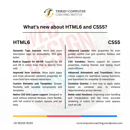
As technology continues to advance, so do the characteristics of how languages will shape a web in the future. HTML and CSS were also the constituent elements of web design. Although HTML5 and CSS3 have become standards in the industry, the web development community has anticipated HTML6 and CSS5 to come soon as they already breathe of new features and improvements that will revolutionize the way websites are constructed and experienced. Let's dive into what we can expect from these upcoming languages.
New Features of HTML6
Under development, HTML6 is expected to proffer any features exciting enough that it makes web development much more powerful and intuitive. Here is what is expected to come in:
Better Integration with JS Frameworks
HTML6 will come with a design that perfectly matches the working of modern JavaScript frameworks, for e.g., React, Angular, or Vue.js, enabling easy creation of dynamic and responsive web applications.
Reduced Complexity in Syntax
HTML6 should lessen complexity with new tags and attributes opening up ways to easier and simpler syntaxes. For example, semantic elements would be new to better content structuring, improving code readability.
Better Web Accessibility
Web accessibility is among the important developments of HTML6. New features would offer facilities to construct effective websites capable of usage by disabled people with improvements in screen reader usage and improved ARIA (Accessible Rich Internet Applications) integration.
Advanced Multimedia Support
HTML6 gives web developers greater control in the handling of multimedia elements, such as video and audio. Enhanced support of 3D content and interaction with more immersive user experience could be possible.
What Is Latest in CSS5?
Similar to the development of HTML6, CSS5 is being developed and is expected to give web designers an improved capability in designing. Here are some of the expected newer features of CSS5:
CSS Grid 2.0
CSS Grid has changed the face of layout design in CSS3, and CSS5 would go a step further by offering more positioning control of the elements to allow even more complex and fluid designs of grid layouts.
Advanced Typography Features
There will be improvements in typography with new properties that will allow for an even more impressive and lively text styling in CSS5. Better variable font support, animated text, and superior text alignment control can be expected.
Enhanced CSS Variables
CSS Variables are reusable styles incorporated in the development of a website that increase the ease with which developers could use styles. CSS5 will also reinvent custom properties, making them much easier to use in crafting flexible and scalable design systems.
New Pseudo-Classes and Pseudo-Elements
New pseudo-classes and pseudo-elements will be added to form CSS5. They will also provide new flexibility for selecting and styling elements on a page. Elements targeting dynamically, based on their state or position, will then be easier.
Flexible Improvements
Flexbox will be stable and strong as it is, and in addition to that, CSS5 is expected to give added powers. Here will come in new properties to enable better flexible-tenant layout construction, to make building responsive into it.
For What Purposes One Should Learn HTML6 and CSS5?
Well, whenever the new versions come into existence, it becomes important for web developers, designers, and students to keep pace with the changes. The TCCI Computer Coaching Institute makes up the best educational institutions for aspiring web developers to learn master HTML5, CSS3, and beyond.
Courses related to website designing and development will happen at TCCI, including practical learning sessions with HTML, CSS, JavaScript, and more. Whether a student is entering the doors of the web development world for the first time or wishes to learn new technologies to update their skill set, expert trainers are there for every step of the journey.
What HTML6 and CSS5 are going to do is a revolution in the way we build our websites. They are going to enhance the experience at the front end in terms of features, make the application more accessible, and increase compatibility with modern framework development. With these technologies, you are going to prepare yourself at the TCCI Computer Coaching Institute to be relevant in the changing tech world and develop the next generation of web experiences.
Call now on +91 9825618292
Get information from https://tccicomputercoaching.wordpress.com/
#Best Computer Training Institutes Bopal Ahmedabad#Computer Training Institutes near me in Ahmedabad India#TCCI - Tririd Computer Coaching Institute#Top Web Designing Institutes in Bopal Ahmedabad#web development courses in ahmedabad
0 notes
Text
Troubleshooting HTML Website Updates for Beginners
Updating an HTML website can seem straightforward, but the process often comes with unexpected hiccups for beginners. Broken links, missing images, or formatting errors can make a simple update time-consuming. However, these common problems can be addressed effectively with a few troubleshooting strategies. This guide will walk you through practical solutions to help you troubleshoot and resolve issues during updates, ensuring you understand how to update my HTML website easily and confidently.

Identifying Common Issues
When updating an HTML website, the first step to effective troubleshooting is identifying the root cause of the problem. Beginners often encounter these common issues:
Broken Links: Links that no longer work or direct to the wrong page can frustrate users and harm SEO. Incorrect URLs or file paths typically cause these errors.
Missing Images: If images fail to load, it's often due to a broken file path or an unsupported image format.
Text Formatting Issues: Incorrect HTML or conflicting CSS styles can cause problems like misaligned text or unexpected font changes.
Incomplete Updates: Changes that don't display as expected on the live site may result from incorrect saving or publishing updates.
Recognizing these problems early makes it easier to pinpoint and resolve them efficiently.
Checking HTML Syntax
Incorrect syntax is one of the most frequent culprits behind HTML website errors. HTML relies on proper structure and accurate tags, so even small mistakes can disrupt the website's appearance or functionality.
Unclosed Tags: Every opening tag (e.g., ) must have a corresponding closing tag (e.g., ). Forgetting to close tags can break the structure of the page.
Misplaced Punctuation: Ensure that attributes within tags are enclosed in quotation marks and that no extra characters are present.
Case Sensitivity: While HTML tags are not case-sensitive, file names and paths on web servers often are. Check capitalization when referencing images or other files.
An HTML validator tool can help you quickly catch syntax errors and ensure your code is clean and functional.
Using Developer Tools for Inspection
Browser developer tools are invaluable for troubleshooting issues in real-time. These tools allow you to inspect the website's code, identify problems, and test fixes before permanently applying them.
Inspect Elements: Right-click on any part of your website and select "Inspect" to view the HTML and CSS associated with that element. This helps you locate and fix issues with layout or content.
Console Errors: The browser console displays error messages related to JavaScript, file paths, or other problems. Use these messages to understand why an image isn't loading or a link isn't working.
CSS Debugging: Developer tools also allow you to test CSS changes live, making it easier to adjust styles and see immediate results.
Mastering these tools can significantly speed up the troubleshooting process and help you learn how to update my HTML website easily.
Testing Changes Before Publishing
Thoroughly testing updates is a critical step in avoiding errors on your live site. Different browsers and devices may interpret your code differently, so it's essential to ensure compatibility.
Multiple Browsers: Check your updates in Chrome, Firefox, Edge, and Safari to identify any browser-specific issues.
Responsive Design Testing: Use tools like Google's Mobile-Friendly Test or responsive design features in developer tools to ensure your updates look good on desktops, tablets, and smartphones.
Offline Preview: Save a copy of your updated HTML file and open it locally in a browser before uploading it to the server. This allows you to identify issues without affecting the live site.
By testing changes in various environments, you can catch and fix problems before they impact your users.
Reverting to Previous Versions
Even with careful updates, mistakes can happen. A backup plan ensures you can restore your website to its previous state if needed.
Backup Your Files: Always back up your HTML files, images, and other assets before making changes. Save copies on your computer or use a cloud storage service for easy access.
Version Control: Tools like Git or manual versioning (e.g., saving files as index_v1.html, index_v2.html) can help you track changes and revert to an earlier version if necessary.
Restoring from Backups: If an update goes wrong, replace the problematic file on the server with your backup to restore functionality quickly.
Backing up your files protects your work and gives you the confidence to experiment and learn from mistakes.
Tips for Ongoing Improvement
Troubleshooting HTML website updates is a skill that improves with practice. Here are a few tips to refine your process:
Document Changes: Keep a log of updates and fixes you've applied. This can help you identify patterns in common errors and streamline future updates.
Learn the Basics of CSS and JavaScript: While not always necessary, understanding these languages can help you address more complex issues.
Seek Help When Needed: Online forums, tutorials, and communities like Stack Overflow are excellent resources for troubleshooting guidance.
By embracing these habits, you'll find how to update my HTML website easily becomes second nature.
Building Confidence Through Practice
Updating an HTML website as a beginner can feel challenging, but with the right approach, it's an excellent opportunity to learn and grow. By identifying common issues, using developer tools, testing changes, and maintaining backups, you can troubleshoot problems effectively and keep your website running smoothly.
With each successful update, your confidence will grow, and you'll become more comfortable managing your website. Apply these troubleshooting tips regularly, and soon, you'll master the art of maintaining a professional and engaging online presence.
0 notes
Text
Creating Animated Icons: Techniques for Engaging User Interfaces
Icon Design: Key Queries Explained
1.How do I use ionic icons?
To use Ionic icons, first include the Ionic Icons library in your project via a CDN link or by installing it through npm. Then, add the desired icon in your HTML using the `<ion-icon>` tag, like this: `<ion-icon name="home"></ion-icon>`. You can customize the size and color through CSS or attributes.
2. How do I use animated icons?
To use animated icons, first select the icons you want from a library or create your own. Import them into your project, ensuring they are in a compatible format (like GIF, SVG, or APNG). Use CSS or JavaScript to control their animation if needed. Finally, place the icons in your layout, adjusting size and position as desired.
3. How to create GIF icons?
To create GIF icons, use graphic design software like Adobe Photoshop or free tools like GIMP. Start by designing your icon, then animate it by creating multiple frames. Export your project as a GIF file, ensuring to select settings for looping and frame delay. You can also use online GIF makers by uploading images and adjusting animation settings.
4. How to create SVG icons?
To create SVG icons, use a vector graphics editor like Adobe Illustrator or Inkscape. Design your icon, then export it as an SVG file. Alternatively, you can write SVG code manually using a text editor, defining shapes with elements like `<svg>`, `<circle>`, `<rect>`, and `<path>`. Keep the design simple for clarity and scalability.
5. How to create a CSS icon?
To create a CSS icon, use the `::before` or `::after` pseudo-elements with the `content` property to insert a symbol or character. Style it with `font-size`, `color`, and `background` properties. You can also use CSS shapes like circles or squares by manipulating `border-radius` and `width`/`height`. Alternatively, use a web font like Font Awesome for more complex icons.

Visit: VS Website See: VS Portfolio
0 notes
Text
Technical SEO Excellence for LATAM: A Granular Approach

Technical SEO forms the bedrock of your LATAM SEO strategy. A fast, secure, and mobile-friendly website is essential for providing a seamless user experience and pleasing search engines. Let's break down the key steps to achieve technical excellence in the LATAM context:1️⃣ Website Speed Optimization:- Page Load Time: Aim for a page load time of under 3 seconds, especially on mobile devices. Use tools like Google PageSpeed Insights and GTmetrix to identify bottlenecks and optimize accordingly. - Image Optimization: Compress images without compromising quality. Use appropriate formats (WebP, JPEG 2000) and consider lazy loading for images below the fold. - Caching: Implement browser and server-side caching to store frequently accessed data and reduce server requests. - Content Delivery Network (CDN): Distribute your website's static content across multiple servers globally to reduce latency and improve load times for users across LATAM. - Responsive Design: Ensure your website adapts seamlessly to different screen sizes and devices. - Mobile-Friendly Navigation: Simplify menus and navigation for touchscreens. - Font Size and Readability: Use fonts that are easy to read on smaller screens. - Mobile Page Speed: Prioritize mobile page speed optimization as mobile usage is prevalent in LATAM. - HTTPS Encryption: Secure your website with an SSL certificate to protect user data and boost search rankings. - Regular Security Audits: Conduct regular security audits to identify and address vulnerabilities. - Secure Content Management System (CMS): Choose a CMS with robust security features and keep it updated. - XML Sitemap: Create and submit an XML sitemap to help search engines discover and index your pages. - Robots.txt: Use robots.txt to control which pages search engines can crawl and index. - Internal Linking: Implement a logical internal linking structure to guide search engine crawlers and users through your website. - Schema.org: Implement schema markup to provide search engines with additional context about your content, potentially leading to rich snippets in search results. - Local Business Schema: If you have a physical presence in LATAM, use local business schema to provide accurate information about your business to search engines. - Hreflang Tags: If you have multiple versions of your website for different LATAM countries or languages, use hreflang tags to tell search engines which version to show to users in each location. - Language Declarations: Use the lang attribute in your HTML to specify the language of your content. - Currency and Units: Display prices and units of measurement in the local currency and system for each target market. - Regular Audits: Conduct regular technical SEO audits to identify and fix any issues that might be hindering your website's performance. - Use SEO Tools: Utilize tools like Screaming Frog, DeepCrawl, or SEMrush Site Audit to crawl your website and identify technical problems. - Internet Infrastructure: Be mindful of varying internet speeds and connectivity across the region. Optimize your website for slower connections. - Local Search: Optimize for local search by claiming and verifying your Google My Business listing and other local directories. - Voice Search: With the increasing popularity of voice assistants, optimize your content for voice search queries.Conclusion:Technical SEO excellence is crucial for achieving success in the competitive LATAM market. By prioritizing website speed, mobile optimization, security, crawlability, structured data, internationalization, and regular audits, you can create a technically sound website that delivers a superior user experience and ranks well in search engines. Remember, technical SEO is methodological process. Stay up-to-date with the latest best practices and technologies to ensure your website remains at the forefront of technical excellence. Read the full article
0 notes
Text
Learned the bare bones of html today
"< >" indicates a tag
said tags can have many attributes that determine things such as style and font
1 note
·
View note
Text

How To Create A Statistic Counter For Your Website Using HTML, CSS & JavaScript — Sohojware
Do you ever wonder how many visitors your website attracts? Or perhaps you’re curious about how many times a specific button is clicked? Website statistics counters provide valuable insights into user behavior, and statistic counters are a fantastic way to visualize this data. In this comprehensive guide by Sohojware, we’ll delve into creating a basic statistic counter using HTML, CSS, and JavaScript.
This guide is tailored for users in the United States who want to enhance their website with an engaging statistic counter. Whether you’re a seasoned developer or just starting out, this tutorial will equip you with the necessary steps to implement a statistic counter on your website.
Why Use a Statistic Counter?
Website statistic counters offer a multitude of benefits. Here’s a glimpse into why they’re so valuable:
Track Visitor Engagement: Statistic counters provide real-time data on how many visitors your website receives. This information is crucial for understanding your website’s traffic patterns and gauging its overall effectiveness.
Monitor User Interaction: By placing statistic counters strategically on your website (e.g., near buttons or downloads), you can track how often specific elements are interacted with. This allows you to identify areas that resonate with your audience and areas for improvement.
Boost User Confidence: Well-designed statistic counters can showcase the popularity of your website, fostering trust and credibility among visitors. Imagine a counter displaying a high number of visitors — it subconsciously assures users that they’ve landed on a valuable resource.
Motivate Action: Strategic placement of statistic counters can encourage visitors to take desired actions. For instance, a counter displaying the number of downloads for a particular resource can entice others to download it as well.
Setting Up the Project
Before we dive into the code, let’s gather the necessary tools:
Text Editor: Any basic text editor like Notepad (Windows) or TextEdit (Mac) will suffice. For a more feature-rich experience, consider code editors like Visual Studio Code or Sublime Text.
Web Browser: You’ll need a web browser (e.g., Chrome, Firefox, Safari) to view the final result.
Once you have these tools ready, let’s create the files for our project:
Create a folder named “statistic-counter”.
Within the folder, create three files:
Building the HTML Structure
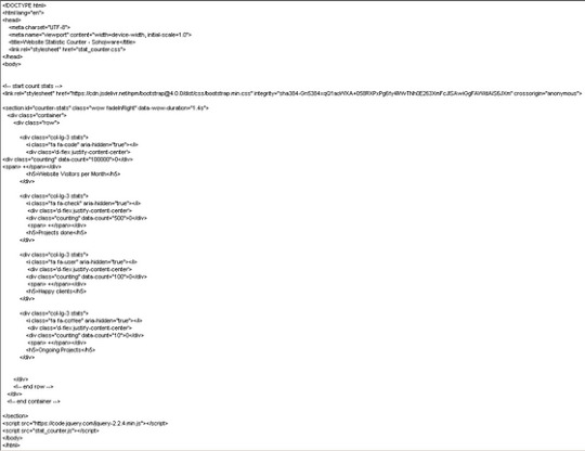
Let’s break down the code:
DOCTYPE declaration: Specifies the document type as HTML.
HTML tags: The and tags define the root element of the HTML document.
Lang attribute: Specifies the document language as English (en).
Meta tags: These tags provide metadata about the webpage, including character encoding (charset=UTF-8) and viewport configuration (viewport) for optimal display on various devices.
Title: Sets the title of the webpage displayed on the browser tab as “Website Statistic Counter — Sohojware”.
Link tag: Links the external CSS stylesheet (style.css) to the HTML document.
Body: The tag contains the content displayed on the webpage.
Heading: The tag creates a heading element with the text “Website Statistic Counter”.
Counter container: The element with the ID “counter-container” serves as a container for the counter itself.
Counter span: The element with the ID “counter” displays the numerical value of the statistic counter. The initial value is set to 0.
Script tag: The tag references the external JavaScript file (script.js), which will contain the logic for updating the counter
Styling the Counter
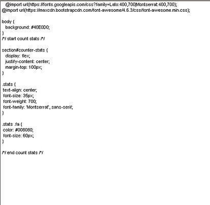
Let’s break down the CSS styles:
Body: Sets the font family for the entire body and centers the content.
Heading: Adds a bottom margin to the heading for better spacing.
Counter container: Styles the container with a border, padding, width, and centers it horizontally.
Counter: Sets the font size and font weight for the counter element, making it prominent.
Implementing the JavaScript Logic

Let’s break down the JavaScript code:
Variable declaration: Declares variables counter and count. counter references the HTML element with the ID “counter”, and count stores the current counter value.
updateCounter function: Defines a function named updateCounter that increments the count variable and updates the text content of the counter element.
setInterval: Calls the updateCounter function every 1000 milliseconds (1 second), creating a continuous update effect.
Running the Counter
Save all the files and open the index.html file in your web browser. You should see a webpage with the heading “Website Statistic Counter” and a counter that increments every second.
Customization and Enhancements
This is a basic example of a statistic counter. You can customize it further by:
Changing the counter speed: Modify the setInterval interval to adjust how frequently the counter updates.
Adding a start/stop button: Implement a button to start and stop the counter.
Displaying different units: Instead of a raw number, display the counter in units like “views” or “downloads”.
Integrating with analytics tools: Connect the counter to analytics tools like Google Analytics to track more detailed statistics.
Styling the counter: Experiment with different CSS styles to customize the appearance of the counter.
FAQs
1. Can I use a statistic counter to track specific events on my website?
Yes, you can. By placing statistic counters near buttons or links, you can track how often those elements are clicked or interacted with.
2. How often should I update the counter?
The update frequency depends on your specific use case. For a real-time counter, updating every second might be suitable. For less frequent updates, you can increase the interval.
3. Can I customize the appearance of the counter?
Absolutely! You can modify the CSS styles to change the font, color, size, and overall appearance of the counter.
4. Is it possible to integrate a statistic counter with other website elements?
Yes, you can integrate statistic counters with other elements using JavaScript. For example, you could display the counter value within a specific section or trigger other actions based on the counter’s value.
5. How can I ensure the accuracy of the statistic counter?
While JavaScript can provide a reliable way to track statistics, it’s essential to consider potential limitations. Factors like browser caching, ad blockers, and user scripts can influence the accuracy of the counter. If you require highly accurate statistics, it’s recommended to use server-side tracking mechanisms or analytics tools.
By following these steps and exploring the customization options, you can create a dynamic and informative statistic counter that enhances your website’s user experience and provides valuable insights into your audience’s behavior.
#sohojware#web development#web design#appsdevelopment#software development#css#html#java script#programming languages
1 note
·
View note