#horizontal rule in html
Explore tagged Tumblr posts
Visit Tumblr Blog
Explore Tumblr blogs with no restrictions, modern design and the best experience.
Last Seen Tumblr Blogs


Fun Fact
Tumblr’s website traffic is steadily declining.
Text
I drove for meals on wheels again today, after a long stretch when I couldn't because my car had a severe oil leak.
It's nice to be doing that again.
🙞-------------------------------------------🙜
I went to an estate sale on the way back from the meals on wheels office.
I'm feeling kind of strange, thinking about all the things I learned about the person who's estate it was just by seeing the stuff that was for sale.
She was a musician. Played jazz saxophone. She had lots of costume jewelry. She had a dog. In her last years she was bed bound or nearly so. She was born in the 30s, judging by the photograph I saw. And she had either grandchildren or nieces & nephews.
And, I think, she lived alone.
There's a strange feeling that I have, thinking about these things. The passage of time. Death, the end of connection between people. It's like sadness, but it's also like, reflection. Wistfulness, the barest hint of what it's like to watch a tragic play.
Finality, nostalgia, and a smidge of melancholy.
The old world blues.
#actually blogging on your blog#things that affect me#I got a pair of computer speakers#a bag of unused kn95 masks#a music stand#and a dave brubeck quartet CD#today I learned it's impossible to center align text in a post on the dashboard#I had to use a bunch of dashes like a fucking 6th grader#I understand why the <center> html tag is deprecated but god fucking dammit it was easy to use I don't wanna use CSS#all this because tumblr doesn't allow horizontal rules either. bitchass losers#did you know that the official terminology for a typographic mark used to separate parts of a printed work is “dinkus”#hahahah that's a funny word#dinkus#technically the characters I've used are actually fleurons#but when they're used to separate thoughts they're a dinkus#fleuron#that's a pretty word
4 notes
·
View notes
Text

tools & widgets
-> an index of posts for various things i’ve made
ao3 / fanfic
luvnotes comment notepad — a handy floating composer right inside ao3
text threads — styled text threads between your blorbos to add to your fics (or just share as images)
styled dividers — fancy horizontal rules to use as scene separators
ebook prettifier — create covers & add some basic formatting to your downloaded fics
footnote helper — easy footnote html
cyberpunk workskins: text threads, shards, emails
general purpose
gradient text maker — for that ~aesthetic~ touch
last updated: may 18, 2025

23 notes
·
View notes
Note
https://www.tumblr.com/satorena/771616112411656192/babessss-tut-on-ur-pinned-when
ma’am im sat.
this one is long so. . . stay with me now!


step #1: deciding aesthetics.
so! it’s been a while and i’m realizing i’m starting to hate my theme right? i decide it’s time to change. the very first thing to look into is what aesthetic you wanna work with. the past few months i’ve been following holiday themes, such as halloween and christmas ones. examples:

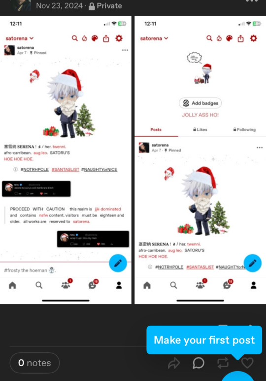
(i keep my themes on my side blog just in case)
this time, instead of following the frosty winter vibe i decided i wanted to base it off my latest obsession, sza’s deluxe album. from that point on, it was pretty simple. i typed “sza deluxe lana album” and pinterest gave me options (pinterest will be your best friend!).
step #2: editing/working on pinned
so technically i could’ve kept it as it was but i’m a complicated ass bitch so nothing is just simple with me lol. i decided to open capcut and add the parental advisory logo in the corner and added some filters/effects for an earthy vibe, because if you know sza then that’s basically her aesthetic. i also trademarked it for safety measures.
and since capcut works on making videos and tumblr is the shittiest app when it comes to videos, i opened a website to convert it into a gif.
i place it on my pinned (i run test trials on my side blog before putting it on this one) and usually add that glittery gif just to accentuate the image.
step #3: texts
this step isn’t too hard since i copy paste my texts (alias, age, etc.) but i do modify the caution warning based off my theme. since this time it’s based off an album, i used key words you’d associate with albums (tracklist for masterlist, deluxe for rules, features for tags and moots).
i then open picsart and identify the main colours of my main theme image to paste it onto certain texts, to make it more colourful (the draw button will help). the colours will come out in rgb so you’ll need to convert them to hex mode.
thennn, i open this website called stuffbydavid.com and place the hex code in the correct text box (the HTML option). it automatically shows the link you’ll need to paste the coloured text into tumblr. you’ll have to log into browser mode for tumblr, open your pinned, click settings and scroll until you see “rich text”, click on that and switch it to HTML. there will be different coding on your pinned and you can paste the link where you think fits.
(vegas made a post regarding it, i’ll link it here).
stay with me now! so when i’m done with pasting my links and i’m satisfied with the colouring, my pinned post is about finished. i’ll add in some tags related to my theme, throw in some more sparkles gifs and a thin divider. for the divider, i save the old one i had, open picsart and go back to the “draw” section, place in the rgb colour from earlier and just colour the divider, before saving it and putting it into my pinned. i also link my rules, masterlist and tags.
step #4: tweets
this is something i recently started in november, but i have this saved twitter template that i downloaded from a tumblr account (you can find these templates on tumblr). since it’s already in my previous works, i just click on them and modify them to my taste. my tweets will have something in common with my aesthetic (this time it’s lyrics off the album) and i’ll find a profile pic from pinterest.
i save them, then open background eraser to erase the background. on canva, the background colour i choose is red or green, that way the erasing app can easily erase the background colour without interfering.
then i save it from the app and open picsart to shrink their sizes. to do so, i open a blank space, click add photos and insert the first tweet. i make the image smaller by pinching the screen and move it to either the left or right side, then crop the image so the image can be saved horizontally (if you don’t understand what i mean, click my tweets and you’ll get it). i repeat the same steps with the second tweet.
after i’m finished, i upload it onto my pinned post, and then i’m finally done.
step #5: extra touches
first i’ll change the colouring of my background and accents. i often choose the colours i deducted from my main image in step 3, or if not, then i choose between black or white. i’ll paste the hex codes i feel fits the vibe.
after that’s done, i’ll work on my header. usually, i fuck around on picsart and slap images of gojo nendoroids and insert a silly text or sometimes a black girl as myself. but this time, since i’m following a theme, i remembered seeing an image for the lana album i knew i wanted as a header. however, it was in yellow and threw off the balance of the colours scheme.
so, i opened picsart on a blank space, filled in a blank text box and initially typed “lana sos deluxe”. but then, i realized rena and lana are pretty similar in writing, so i flipped shit around and decided to do that instead (sza if you see this don’t sue me thx!). i chose my fonts, saved the image and uploaded it on tumblr.
i always disable the stretch header button. it looks cleaner that way in my opinion. if the image ever looks too tiny, i crop it on picsart to adjust the size.
almost done! then i open pinterest and choose whatever profile pic i’m in the mood for. if i need to edit, i’ll open picsart. if i want a nendoroid character, i’ll open background eraser and erase the background. this time, i stuck with sza. i’ll then upload it as a pfp and choose to hide it, so you can clearly see my header.
nexttt, i choose what i want my description to be. again, i always base it off my current aesthetic, so this time i chose a song title. i’ll put in the hex code of the main colour of the theme so it changes to that. i like to stay on brand.
finally, i’ll change my inbox title. again, always sticking to aesthetics, so i chose the word “interlude” bc interludes are commonly found in albums. it’s also a pretty word lmaoo. and there you have it— a regular degular serena theme!
and then i move onto satorena and repeat most of these steps all over again ://
#─── (𝟏) 𝐍𝐄𝐖 𝐌𝐄𝐒𝐒𝐀𝐆𝐄. › from anon .ᐟ#this doesn’t mean copy theme down to the last word!#lemme make that clear
17 notes
·
View notes
Text
Because of who I am as a person, I’m now writing fic in a Markdown editor.
Google Docs is great, but i twitch at the formatting issues that happen when I copy/paste from Google Docs into AO3’s rich text editor. Extra spaces between paragraphs, words, punctuation, etc. (It doesn’t bother me at all when reading other people’s fic. But it bothers me a lot when it’s my own.)
So I’ve been writing the HTML by hand, and geez that is tedious and error-prone.
But with Markdown, I can write text like normal, using simple text formatting tricks we learned in text-only forums, and then have it magically turned into proper HTML afterwards. Examples under the cut.
For example:
Italics
*asterisks for italics*
will turn into <em>asterisks for italics</em>
which will become asterisks for italics
Bold
**double asterisks for bold**
will turn into <strong>double asterisks for bold</strong>
which will become double asterisks for bold
Strikethrough
~~strikethrough like this~~
will turn into <strike>strikethrough like this</strike>
which will become strikethrough like this
Blockquote
> blockquote like this
will turn into <blockquote>blockquote like this </blockquote>
which will become
blockquote like this
Horizontal rule
Three dashes like so:
---
will turn into <hr/>
which will become a horizontal line
Hyperlinks
[Make links like this](https://www.markdownguide.org/cheat-sheet/)
will turn into <a href="https://www.markdownguide.org/cheat-sheet/">Make links like this </a>
which will turn into linked text, Make links like this
App
I’m currently using the app Pretext on iOS so I can write on my phone. There are various apps around — search for “markdown editor” on whatever app store your platform has.
I’m still on the hunt for a Markdown app that understands footnotes. (You can do footnotes with Markdown, but not every Markdown editor understands how to turn them into HTML.)
But even if I have to manually edit the HTML for footnotes, it’ll still be less work than manually editing the HTML for everything.
Google Docs compatibility
Bonus: Google Docs can understand Markdown (it’s an option you can turn on). So if you still want to use Google Docs to collaborate/beta-read, you can copy-paste your plain text Markdown into a Google Doc, turn on the “Automatically detect Markdown” option, and it will be magically turned into proper formatting. https://support.google.com/docs/answer/12014036?hl=en
14 notes
·
View notes
Text
The Emergence of Catholicism as a Popular Culture in Vietnam
The emergence of Catholicism in Vietnam in the 16th century created a diverse picture of religion and culture in the country. Unlike the Three Teachings - Confucianism, Taoism, and Buddhism - which were closely tied to the elite and ruling classes, Catholicism found a place among the common people, especially those from lower social classes. In this critical reflection, I will give my perspective on why Catholicism was considered popular culture instead of high culture when it was introduced to Vietnam.
Historically, the three main orthodox ideologies - Confucianism, Taoism, and Buddhism - known collectively as the Three Teachings, primarily targeted the ruling elite and intellectuals when they first emerged in Vietnam. Consequently, these ideologies dominated philosophical discourse and the structures of social governance. These ideologies were not merely belief systems; they became deeply entrenched in state mechanisms. For instance, Confucianism was employed in imperial examinations to assess individuals' social and political status. As a result, the Three Teachings were regarded as high culture - an elite cultural framework that was difficult for the average people to access, predominantly reserved for those in the ruling class.
In contrast, when Catholicism was introduced by missionaries, it did not focus on the elite or the educated classes; instead, it reached out to the marginalized and disadvantaged groups within society. Catholicism challenged the dominant Confucian ideology, attracting marginalized groups such as women, poor tenant farmers, and fishermen, thus reflecting the struggle between new elements of pop culture and traditional political power. Unlike high culture, which was typically disseminated vertically - from the elite to the masses - popular culture spread horizontally, through everyday relationships and informal networks.
Catholicism managed to bypass the "gatekeepers" of high culture in Vietnam, creating a belief system that was accessible to people from all social classes. This accessibility played a crucial role in its acceptance and integration into the lives of many Vietnamese, fostering a sense of community and belonging among its followers. Therefore, Catholicism is not regarded as high culture but rather as popular culture due to its widespread accessibility and the absence of barriers related to social class or status.
In conclusion, when Catholicism was introduced to Vietnam, it was distinct from the Three Teachings, which were confined to the ruling class. This characteristic explains why Catholicism aligns more closely with the realm of popular culture rather than high culture. Its ability to connect with the masses, challenge existing power structures, and promote inclusivity has allowed it to later thrive as a significant cultural force in Vietnam.
________
REFERENCES:
Lân, H. (2019, November 26). Lịch sử khoa cử Việt Nam với truyền thống giáo dục Nho học. https://hanoimoi.vn/lich-su-khoa-cu-viet-nam-voi-truyen-thong-giao-duc-nho-hoc-528411.html
TÌM HIỂU VỀ QUÁ TRÌNH DU NHẬP VÀ PHÁT TRIỂN ĐẠO CÔNG GIÁO Ở VIỆT NAM. (n.d.). http://bantongiao.snv.kontum.gov.vn/thuong-thuc-ton-giao/TIM-HIEU-VE-QUA-TRINH-DU-NHAP-VA-PHAT-TRIEN--DAO-CONG-GIAO-O-VIET-NAM-1382
Vượng, T. Q. (1992). Popular Culture and High Culture in Vietnamese History.
2 notes
·
View notes
Note
The timeline thing is a godsend!! Is there any chance or you creating one that is year based, instead of days? This is more intuitive than any other writing/plotting timeliness I've been able to find.
Hi, thank you and I'm glad this is (somewhat) helpful to you!
To be entirely honest, the timeline I am using for my own story purposes got even MORE insane with even more options, and I've been wanting to share that template as well. But unfortunately... Making it "I don't know how to code 😭" friendly is insanely hard (even more so because now I'm using a python script to automatically generate the main HTML file out of sub-files + a number of parameters that can adjust things such as which time period is shown, how wide/thin the time scale is, custom elements for the size of icons and such, etc, and ALSO by far the most important detail, my timeline now actually has a smooth transition between day X and day X+1 instead of having a blank that creates an offset every time the clock strikes midnight, I'm so sorry that the currently downloadable version has that issue in horizontal mode), and unfortunately I just don't have the free time to make that right now (<- PhD student with way too many side projects).
I could try sharing the current state of my timeline as it is now, but I don't want to do that because it's like. full of spoilers for my own fanfic for obvious reasons lmfao. So for the time being I guess I can just share a screenshot of what it looks like and just how insane I am:
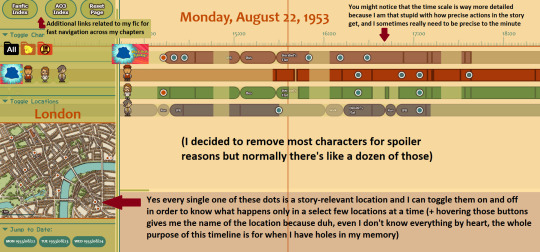
Regarding your question on the time scale: you could change that yourself by changing the contents of the svg file named "scale.svg" in the chr folder. It is actually a text file, not an image, and hopefully the logic behind it can be guessed easily enough! So if you know what exactly you want, and if you're willing to risk tinkering with it yourself, you can make a backup of that file, remove/change a few lines of code in the scale.svg file (don't rename it or move it around, change exclusively the file "scale.svg"), then reload your main timeline HTML page in order to see what that does.
The numbers in that file are X/Y coordinates for the most part, so by adding/moving/removing vertical bars, you could transform that 24-hour scale into a year scale. I guess it's convenient that a day has 24 hours and a year has 12 months! You could start first by deleting one in two hour bars and renaming the labels from "XX:XX" to month names. After that if you want to add the days... Well, it'll be trickier, but hopefully you'll have figured out a bit better how the logic of that file works so you'll be able to add these smaller day marks through a bit of trial and error.
......After looking at the state of my SVG file actually that might be a bit trickier. However, I have good news for you: you can copy-paste the code into the website SvgPathEditor in order to make your editing process much easier! All you have to do is copy-paste only the part of the code that looks like "M0 20 0 50M300 20 300 50M600 20 600 50M900 20 900" (the logic here is "M 0 20 0 50" = one vertical bar that starts at coordinates (0, 20) and ends at coordinates (0, 50), so it's just a list of the vertical bars one after the other. Sorry it's much less clear than I remembered it ^^')
(EDIT: I just hope you don't need to account for leap years, because due to the way the timeline is coded, I don't think it can afford to do that unless you make your scale so that it works by four years instead of only one. And let's not even get started on the "sometimes it's a new century so there's no leap year but some centuries do start with a leap year anyway" rule.)
All that being said, thank you again for your kind message, I'm sorry I can't do more than that for the time being (and you shouldn't hold your breath waiting for an update, I honestly don't know when / if it will ever have the time to happen :')), and good luck! I hope what I gave with the current zip file + this reply's advice will be good enough for you.
(EDIT²: For people who never heard of the original timeline post, here it is! It's a tool I made forever ago that lets you create a timeline in order to keep track of what each character does at what time in your own stories.)
14 notes
·
View notes
Text
Advertisement :)
pica - high quality and fast image resize in browser.
babelfish - developer friendly i18n with plurals support and easy syntax.
You will like those projects!
h1 Heading 8-)
h2 Heading
h3 Heading
h4 Heading
h5 Heading
h6 Heading
Horizontal Rules
Typographic replacements
Enable typographer option to see result.
(c) (C) (r) (R) (tm) (TM) (p) (P) +-
test.. test... test..... test?..... test!....
!!!!!! ???? ,, -- ---
"Smartypants, double quotes" and 'single quotes'
Emphasis
This is bold text
This is bold text
This is italic text
This is italic text
~~Strikethrough~~
Blockquotes
Blockquotes can also be nested...
...by using additional greater-than signs right next to each other...
...or with spaces between arrows.
Lists
Unordered
Create a list by starting a line with +, -, or *
Sub-lists are made by indenting 2 spaces:
Marker character change forces new list start:
Ac tristique libero volutpat at
Facilisis in pretium nisl aliquet
Nulla volutpat aliquam velit
Very easy!
Ordered
Lorem ipsum dolor sit amet
Consectetur adipiscing elit
Integer molestie lorem at massa
You can use sequential numbers...
...or keep all the numbers as 1.
Start numbering with offset:
foo
bar
Code
Inline code
Indented code
// Some comments line 1 of code line 2 of code line 3 of code
Block code "fences"
Sample text here...
Syntax highlighting
var foo = function (bar) { return bar++; }; console.log(foo(5));
Tables
Option Description data path to data files to supply the data that will be passed into templates. engine engine to be used for processing templates. Handlebars is the default. ext extension to be used for dest files.
Right aligned columns
Option Description data path to data files to supply the data that will be passed into templates. engine engine to be used for processing templates. Handlebars is the default. ext extension to be used for dest files.
Links
link text
link with title
Autoconverted link https://github.com/nodeca/pica (enable linkify to see)
Images
Like links, Images also have a footnote style syntax
With a reference later in the document defining the URL location:
Plugins
The killer feature of markdown-it is very effective support of syntax plugins.
Emojies
Classic markup: :wink: :cry: :laughing: :yum:
Shortcuts (emoticons): :-) :-( 8-) ;)
see how to change output with twemoji.
Subscript / Superscript
19^th^
H~2~O
[](https://github.com/markdown-it/markdown-it-ins)
++Inserted text++
[](https://github.com/markdown-it/markdown-it-mark)
==Marked text==
Footnotes
Footnote 1 link1.
Footnote 2 link2.
Inline footnote^[Text of inline footnote] definition.
Duplicated footnote reference2.
Definition lists
Term 1
Definition 1 with lazy continuation.
Term 2 with inline markup
Definition 2
{ some code, part of Definition 2 }
Third paragraph of definition 2.
Compact style:
Term 1 ~ Definition 1
Term 2 ~ Definition 2a ~ Definition 2b
Abbreviations
This is HTML abbreviation example.
It converts "HTML", but keep intact partial entries like "xxxHTMLyyy" and so on.
Custom containers
::: warning here be dragons :::
Footnote can have markup
and multiple paragraphs. ↩︎
Footnote text. ↩︎ ↩︎
0 notes
Text
Tailwind’s @apply Feature is Better Than it Sounds
New Post has been published on https://thedigitalinsider.com/tailwinds-apply-feature-is-better-than-it-sounds/
Tailwind’s @apply Feature is Better Than it Sounds

By this point, it’s not a secret to most people that I like Tailwind.
But, unknown to many people (who often jump to conclusions when you mention Tailwind), I don’t like vanilla Tailwind. In fact, I find most of it horrible and I shall refrain from saying further unkind words about it.
But I recognize and see that Tailwind’s methodology has merits — lots of them, in fact — and they go a long way to making your styles more maintainable and performant.
Today, I want to explore one of these merit-producing features that has been severely undersold — Tailwind’s @apply feature.
What @apply does
Tailwind’s @apply features lets you “apply” (or simply put, copy-and-paste) a Tailwind utility into your CSS.
Most of the time, people showcase Tailwind’s @apply feature with one of Tailwind’s single-property utilities (which changes a single CSS declaration). When showcased this way, @apply doesn’t sound promising at all. It sounds downright stupid. So obviously, nobody wants to use it.
/* Input */ .selector @apply p-4; /* Output */ .selector padding: 1rem;
To make it worse, Adam Wathan recommends against using @apply, so the uptake couldn’t be worse.
Confession: The `apply` feature in Tailwind basically only exists to trick people who are put off by long lists of classes into trying the framework.
You should almost never use it 😬
Reuse your utility-littered HTML instead.https://t.co/x6y4ksDwrt
— Adam Wathan (@adamwathan) February 9, 2020
Personally, I think Tailwind’s @apply feature is better than described.
Tailwind’s @apply is like Sass’s @includes
If you have been around during the time where Sass is the dominant CSS processing tool, you’ve probably heard of Sass mixins. They are blocks of code that you can make — in advance — to copy-paste into the rest of your code.
To create a mixin, you use @mixin
To use a mixin, you use @includes
// Defining the mixin @mixin some-mixin() color: red; background: blue; // Using the mixin .selector @include some-mixin(); /* Output */ .selector color: red; background: blue;
Tailwind’s @apply feature works the same way. You can define Tailwind utilities in advance and use them later in your code.
/* Defining the utility */ @utility some-utility color: red; background: blue; /* Applying the utility */ .selector @apply some-utility; /* Output */ .selector color: red; background: blue;
Tailwind utilities are much better than Sass mixins
Tailwind’s utilities can be used directly in the HTML, so you don’t have to write a CSS rule for it to work.
@utility some-utility color: red; background: blue;
<div class="some-utility">...</div>
On the contrary, for Sass mixins, you need to create an extra selector to house your @includes before using them in the HTML. That’s one extra step. Many of these extra steps add up to a lot.
@mixin some-mixin() color: red; background: blue; .selector @include some-mixin(); /* Output */ .selector color: red; background: blue;
<div class="selector">...</div>
Tailwind’s utilities can also be used with their responsive variants. This unlocks media queries straight in the HTML and can be a superpower for creating responsive layouts.
<div class="utility1 md:utility2">…</div>
A simple and practical example
One of my favorite — and most easily understood — examples of all time is a combination of two utilities that I’ve built for Splendid Layouts (a part of Splendid Labz):
vertical: makes a vertical layout
horizontal: makes a horizontal layout
Defining these two utilities is easy.
For vertical, we can use flexbox with flex-direction set to column.
For horizontal, we use flexbox with flex-direction set to row.
@utility horizontal display: flex; flex-direction: row; gap: 1rem; @utility vertical display: flex; flex-direction: column; gap: 1rem;
After defining these utilities, we can use them directly inside the HTML. So, if we want to create a vertical layout on mobile and a horizontal one on tablet or desktop, we can use the following classes:
<div class="vertical sm:horizontal">...</div>
For those who are new to Tailwind, sm: here is a breakpoint variant that tells Tailwind to activate a class when it goes beyond a certain breakpoint. By default, sm is set to 640px, so the above HTML produces a vertical layout on mobile, then switches to a horizontal layout at 640px.
If you prefer traditional CSS over composing classes like the example above, you can treat @apply like Sass @includes and use them directly in your CSS.
<div class="your-layout">...</div>
.your-layout @apply vertical; @media (width >= 640px) @apply horizontal;
The beautiful part about both of these approaches is you can immediately see what’s happening with your layout — in plain English — without parsing code through a CSS lens. This means faster recognition and more maintainable code in the long run.
Tailwind’s utilities are a little less powerful compared to Sass mixins
Sass mixins are more powerful than Tailwind utilities because:
They let you use multiple variables.
They let you use other Sass features like @if and @for loops.
@mixin avatar($size, $circle: false) width: $size; height: $size; @if $circle border-radius: math.div($size, 2);
On the other hand, Tailwind utilities don’t have these powers. At the very maximum, Tailwind can let you take in one variable through their functional utilities.
/* Tailwind Functional Utility */ @utility tab-* tab-size: --value(--tab-size-*);
Fortunately, we’re not affected by this “lack of power” much because we can take advantage of all modern CSS improvements — including CSS variables. This gives you a ton of room to create very useful utilities.
Let’s go through another example
A second example I often like to showcase is the grid-simple utility that lets you create grids with CSS Grid easily.
We can declare a simple example here:
@utility grid-simple display: grid; grid-template-columns: repeat(var(--cols), minmax(0, 1fr)); gap: var(--gap, 1rem);
By doing this, we have effectively created a reusable CSS grid (and we no longer have to manually declare minmax everywhere).
After we have defined this utility, we can use Tailwind’s arbitrary properties to adjust the number of columns on the fly.
<div class="grid-simple [--cols:3]"> <div class="item">...</div> <div class="item">...</div> <div class="item">...</div> </div>
To make the grid responsive, we can add Tailwind’s responsive variants with arbitrary properties so we only set --cols:3 on a larger breakpoint.
<div class="grid-simple sm:[--cols:3]"> <div class="item">...</div> <div class="item">...</div> <div class="item">...</div> </div>
This makes your layouts very declarative. You can immediately tell what’s going on when you read the HTML.
Now, on the other hand, if you’re uncomfortable with too much Tailwind magic, you can always use @apply to copy-paste the utility into your CSS. This way, you don’t have to bother writing repeat and minmax declarations every time you need a grid that grid-simple can create.
.your-layout @apply grid-simple; @media (width >= 640px) --cols: 3;
<div class="your-layout"> ... </div>
By the way, using @apply this way is surprisingly useful for creating complex layouts! But that seems out of scope for this article so I’ll be happy to show you an example another day.
Wrapping up
Tailwind’s utilities are very powerful by themselves, but they’re even more powerful if you allow yourself to use @apply (and allow yourself to detach from traditional Tailwind advice). By doing this, you gain access to Tailwind as a tool instead of it being a dogmatic approach.
To make Tailwind’s utilities even more powerful, you might want to consider building utilities that can help you create layouts and nice visual effects quickly and easily.
I’ve built a handful of these utilities for Splendid Labz and I’m happy to share them with you if you’re interested! Just check out Splendid Layouts to see a subset of the utilities I’ve prepared.
By the way, the utilities I showed you above are watered-down versions of the actual ones I’m using in Splendid Labz.
One more note: When writing this, Splendid Layouts work with Tailwind 3, not Tailwind 4. I’m working on a release soon, so sign up for updates if you’re interested!
#ADD#Advice#approach#Article#Articles#avatar#background#Blue#border#border-radius#Building#classes#code#Color#columns#CSS#CSS Grid#css preprocessors#desktop#direction#display#easy#effects#English#Features#framework#gap#grid#grid-template-columns#grids
0 notes
Text
Retro CS 1.6 UI Kit for Web - cs16.css
cs16.css is a tiny JavaScript library that recreates Counter-Strike 1.6’s iconic user interface through pure CSS components. The library supports essential UI components like buttons, form fields, horizontal rules, progress bars, range sliders, and more. Each component preserves Counter-Strike 1.6’s distinctive appearance while functioning as standard HTML elements. How to use it: 1. Download and…
1 note
·
View note
Text
styled dividers
i made another lil generator for jazzing up your fics on ao3
<hr/> playground ->
it's for making styled <hr/> elements — aka the "horizontal rule" or "thematic break" or "scene separator" or, as i'll call it from here on out, "divider"
like, you know, these guys:

not only can you style them, it's possible to add an ::after in CSS (a "pseudo-element") to add text characters to the divider, which makes all manner of fanciness possible:


the styles will work with both light and dark themes out of the box:

you can see some demos of how these look on AO3 here!
how do i use it for my ao3 works?
make a design you like, then paste the CSS into a workskin. now any <hr/> divider in your work text will use that style — including ones that you place using AO3's rich text editor, which means you don't even need to futz around in the HTML editor!
you can exclude the style from any given divider by adding the classname "default," like so:
<hr class="default"/>
okay. why?
i like fancy scene breaks & i wanted to show off some of the possibilities!
plus: i sometimes see authors use a string of characters to divide their scenes, and this technique lets you do that in a way that's more accessible. for example, if you use the text "oOo" as a divider, screen readers will read those characters out loud. this isn't a problem with text placed by an ::after selector!
it's also just a nice way to standardize your scene dividers without having to paste the same thing over and over again !
note: if you use a style with an ::after element, there's a chance it will look a little different on other browsers and systems due to variations in fonts — i tried to make the presets mostly compatible but, you know, buyer beware!
32 notes
·
View notes
Text
apologies for cut shenanigans; sometime while i was away, Tumblr changed how the fucking post applet works. is it rich text? is it html? who fucking knows. ohnoes, your post contains html i don't fucking understand, even though my dinosaurian cousin used to be able to mix HTML and BBS tags to let you use a cut correctly even when entering HTML!
ETA: wtf can't i use the horizontal rule tag wth is wrong with this hellsite that it can't let me have basic fucking HTML *ragesplosion*
1 note
·
View note
Text
hr tag in html | HTML Tutorial in Hindi | Website Design Tutorial | Beginners | Horizontal Rule in HTML
youtube
0 notes
Text
Going slightly off-topic, and I apologise to OP (also sorry if this has been mentioned already in the RB chain).
In AO3 you can use Horizontal Rules for scene breaks which, as a standard piece of HTML, can be read by screen readers or at least come with an aria attribute which can be understood by a screen reader.
Tumblr sadly doesn't have Horizontal Rules natively and they don't render if you write your post in HTML either. I've seen it recommended to use an image for your scene break and give it the alt text "[diving line]".
OPEN LETTER TO FANFICTION WRITERS ON ACCESSIBILITY; PLEASE READ.
first of all, thank you for spending your time, seldom acknowledged and definitely deserving of a compensation you are not receiving, to entertain us. i’m speaking on behalf of more than just blind readers, but everyone. you’re sick as hell.
i’ve summoned you to provide some information you may not already know. i know a lot of you like fonts. especially those who cross post their work on wattpad. i admire any and all acts of aestheticism to a degree, and can understand the desire to use them. (blind folk, sorry y’all. momma’s making a point.) 𝔰𝔱𝔲𝔣𝔣 𝔩𝔦𝔨𝔢 𝔱𝔥���𝔰, it’s cute. 𝐬𝐭𝐮𝐟𝐟 𝐥𝐢𝐤𝐞 𝐭𝐡𝐢𝐬 is a little cuter to me, if i had to choose. or maybe 𝓈𝑜𝓂𝑒𝓉𝒽𝒾𝓃𝑔 𝓁𝒾𝓀𝑒 𝓉𝒽𝒾𝓈?
now, sighted folk: if you’re on mobile, i implore you to participate in a little exercise for me. select this text and scroll through all the copy/paste/define/‘search the web’ options until you get to the speak portion. if you need to change a setting for your phone to do so, would you mind? i’d really appreciate it.
please make your phone read aloud part of my post, and be sure to include any bits with those super cute fonts. 𝕚’𝕝𝕝 𝕥𝕒𝕔𝕜 𝕠𝕟𝕖 𝕠𝕟 𝕥𝕙𝕖 𝕖𝕟𝕕 𝕠𝕗 𝕞𝕪 𝕡𝕝𝕖𝕒, 𝕣𝕚𝕘𝕙𝕥 𝕙𝕖𝕣𝕖. 𝕚 𝕙𝕠𝕡𝕖 𝕥𝕙𝕚𝕤 𝕚𝕤 𝕥𝕣𝕒𝕟𝕤𝕝𝕒𝕥𝕚𝕟𝕘 𝕔𝕠𝕣𝕣𝕖𝕔𝕥𝕝𝕪, 𝕚 𝕕𝕠𝕟’𝕥 𝕨𝕒𝕟𝕥 𝕥𝕙𝕖 ��𝕖𝕤𝕤𝕠𝕟 𝕥𝕠 𝕓𝕖 𝕤𝕢𝕦𝕒𝕟𝕕𝕖𝕣𝕖𝕕 𝕓𝕪 𝕥𝕪𝕡𝕠𝕤 𝕚 𝕔𝕒𝕟’𝕥 𝕤𝕖𝕖.
whether you participated and discovered it for yourself or you thought this was a crock of shit you’d rather not sniff, i’ll tell you! screen readers cannot dictate words using those fonts. at least, on a majority of devices. not mine, or any of my mutuals elsewhere.
you do not have to change your behavior on my behalf, but please be aware that fonts limit access to your work.
blind readers do exist, i exist, and i am bound by the same feelings of dogged longing that make other sad horny bitches read angsty, smutty, father-wounded nonsense.
thanks for making it this far. i really hope my sincerity is being conveyed, reading makes me so happy and i’m not the only person on this app who relies on accessibility settings more often than not. do with this information what you will, and have the day you deserve!
#accessibility#honestly some of those 'fonts' are hell to read for sighted people who have learning disabilities like dyslexia#(it's me. I'm the dyslexic who can't read those either)#(I end up copying them to a text editor which then they get thrown into a monospace font)#q
6K notes
·
View notes
Text
Creating Curved Elements with CSS: Elegant Design

Introduction
Welcome to the world of elegant web design where every curve tells a story! In this blog post, we'll delve into the art of creating curved elements using the power of CSS. From subtle rounded corners to sophisticated gradients, we'll explore how these techniques can add a touch of class and finesse to your website's visual appeal.Whether you're a seasoned developer looking to refine your design skills or a newcomer eager to learn the ropes, join us on this journey to discover the secrets of crafting aesthetically pleasing curved elements with CSS.
Understanding CSS Basics

Before we embark on our journey to create beautifully curved elements, let's ensure we have a solid grasp of the CSS fundamentals.CSS (Cascading Style Sheets) is the language used for styling web pages. It allows you to define how HTML elements should appear on the screen. Here are some key concepts to refresh your memory: - Selectors: CSS uses selectors to target HTML elements. It can be as simple as selecting a specific tag (e.g., p for paragraphs) or more complex with class and ID selectors. - Properties and Values: Each CSS rule consists of a property and a value. The property defines the aspect you want to style (e.g., color, font-size), and the value specifies how you want to style it. - Box Model: Understanding the box model is crucial. Every HTML element is considered a box with content, padding, border, and margin. Manipulating these components allows you to control the element's layout. - Flexbox and Grid: CSS offers powerful layout models like Flexbox and Grid. These tools simplify the arrangement of elements in a responsive and efficient manner. Now, let's relate these basics to our goal of creating curved elements. The border-radius property, which we'll explore in-depth later, is a fundamental CSS property for achieving curved edges. It defines the radius of the element's corners, allowing you to create circles, ellipses, or any curved shape you desire.As we proceed, keep in mind that a solid understanding of CSS basics forms the foundation for mastering advanced styling techniques. Whether you're adjusting colors, fonts, or layouts, these fundamentals remain essential to crafting a visually appealing and well-structured website.
Curved Borders in CSS
Now, let's dive into the exciting realm of curved borders using CSS. The border-radius property is your gateway to achieving elegant, rounded corners for HTML elements.The Basics of border-radius:At its core, border-radius enables you to control the curvature of an element's corners. You can apply it to various HTML elements, from simple divs to complex images. Here's a quick breakdown: Value Description length Defines the radius in pixels, em units, or other valid length units. For example, border-radius: 10px;. percentage Specifies the radius as a percentage of the element's width. For instance, border-radius: 50%; creates a perfect circle. multiple values You can provide up to four values to set the radius for each corner individually. For example, border-radius: 10px 20px 15px 5px;. Creating Different Shapes:By manipulating the border-radius property, you can fashion a variety of shapes. Want smooth, circular buttons? Use border-radius: 50%;. Interested in elliptical shapes? Specify different horizontal and vertical radii.Combining with Other Properties:For a truly polished look, consider combining border-radius with additional properties like box-shadow to add depth or background gradients for a sophisticated touch.Keep in mind that while curved borders bring a sense of style, it's essential to strike a balance. Overusing rounded corners might dilute their impact, so apply them thoughtfully to enhance your website's overall design.As we continue our exploration, get ready to elevate your design game by incorporating curved borders into your CSS toolkit.
Gradient Backgrounds for Elegance
Let's take our design journey to the next level by exploring the captivating world of gradient backgrounds in CSS. Gradients offer a seamless transition between two or more colors, adding depth and sophistication to your webpage.The Basics of CSS Gradients:Creating gradients is surprisingly straightforward in CSS. The linear-gradient and radial-gradient functions allow you to define the gradient's direction and shape. Here's a quick overview: Function Description linear-gradient() Produces a linear gradient, allowing you to specify the direction. For example, background: linear-gradient(to right, #ffcc00, #ff6699);. radial-gradient() Creates a radial gradient, radiating from the center. You can customize the shape and colors, like background: radial-gradient(circle, #3399ff, #3366cc);. Adding Gradients to Curved Elements:Now, let's combine gradients with our curved borders for a truly elegant design. Apply the background property with the gradient function to the element with a defined border-radius. The result is a harmonious blend of curves and colors that can elevate your website's visual appeal.Color Stops for Smooth Transitions:Enhance the subtlety of your gradients by using color stops. These allow you to control where and how colors transition within the gradient. Specify the position and color for each stop, ensuring a smooth and polished look.Responsive Considerations:As with any design element, it's crucial to consider responsiveness. Gradients can be responsive by using relative units like percentages. This ensures that your gradient backgrounds adapt gracefully to different screen sizes.Remember, the key to using gradient backgrounds lies in moderation and purpose. Thoughtfully chosen color schemes and well-crafted gradients can transform your curved elements into visually stunning focal points, enhancing the overall elegance of your website.
Shadows and Highlights
As we continue our exploration of crafting elegant designs with CSS, let's delve into the art of shadows and highlights. These subtle visual elements can add depth and dimension to your curved elements, creating a captivating user experience.Box Shadow Property:The box-shadow property in CSS is your go-to tool for creating shadows. It allows you to cast shadows from the frame of an element, simulating the way light interacts with objects in the real world. Here's a quick breakdown: Value Description offset-x Horizontal offset of the shadow. Positive values move the shadow right, while negative values move it left. offset-y Vertical offset of the shadow. Positive values move the shadow down, while negative values move it up. blur-radius Optional. Increases the size of the shadow, creating a blurred effect. A value of 0 produces a sharp shadow. color Specifies the color of the shadow. Use rgba for a transparent shadow. Highlights with CSS:While CSS doesn't have a specific property for highlights, you can simulate the effect using gradients and transparency. Create a gradient background that is lighter at the top or on one side, giving the illusion of a highlight. Adjust the opacity for a subtler touch.Combining Shadows and Highlights:For a truly polished and three-dimensional look, consider combining shadows and highlights. Experiment with different shadow offsets and highlight positions to find the perfect balance. This technique can make your curved elements pop off the screen, creating a visually engaging design.Performance Considerations:While shadows and highlights contribute significantly to aesthetics, be mindful of their impact on performance. Excessive use of shadows, especially with large blur radii, can affect page rendering speed. Strike a balance between visual appeal and performance optimization for an optimal user experience.With shadows and highlights in your design arsenal, you're equipped to infuse a sense of realism and sophistication into your curved elements, elevating the overall visual charm of your website.
Responsive Design Considerations
In the dynamic landscape of web design, ensuring that your curved elements look stunning across various devices and screen sizes is paramount. Let's explore the key considerations for achieving responsive design with curved elements in CSS.Fluid Measurements for Curves:When working with curved elements, it's essential to use relative units instead of fixed ones. Consider using percentages or em units for properties like border-radius to ensure that the curvature adjusts proportionally to the container's size. This approach guarantees a seamless transition between different screen dimensions.Media Queries for Breakpoints:Implementing media queries is a fundamental practice for responsive design. Define breakpoints where your curved elements may need adjustments to maintain visual harmony. Whether it's altering the curvature or modifying shadow effects, media queries allow you to tailor the design for specific screen widths.Flexible Grid Systems:Integrate flexible grid systems like Flexbox or CSS Grid to enhance the responsiveness of your overall layout. These tools enable you to create designs that adapt gracefully to diverse screen sizes while maintaining the integrity of your curved elements.Image and Gradient Optimization:Optimize images and gradients to strike a balance between visual appeal and loading performance. Use responsive image techniques, such as the max-width property, to ensure images scale appropriately on smaller screens. Similarly, adjust gradient color stops or switch to simpler gradients for improved performance on mobile devices.Testing Across Devices:Regularly test your website on various devices and browsers to identify potential issues with curved elements. Embrace a mobile-first approach during development, focusing on optimizing for smaller screens before progressively enhancing for larger displays.Accessibility:Consider the accessibility aspect of curved elements. Ensure that they remain user-friendly for individuals with disabilities, especially on touch devices. Aim for sufficient contrast, provide alternative text for images, and verify that interactive elements remain accessible through various input methods.User Experience Continuity:Strive for a consistent user experience across devices. Curved elements should not only adapt to different screen sizes but also maintain a cohesive design language. This ensures that users feel at home, regardless of the device they're using to access your website.By incorporating these responsive design considerations into your approach, you'll create a user-friendly and visually appealing experience, where curved elements seamlessly adapt to the diversity of the digital landscape.
Animation for a Touch of Sophistication
Bring your curved elements to life by incorporating subtle animations that add a touch of sophistication to your web design. CSS provides powerful tools for creating animations that engage users and elevate the overall user experience.The Power of CSS Animations:CSS animations allow you to apply gradual changes to CSS style properties over time. For curved elements, animations can introduce smooth transitions, create attention-grabbing effects, and enhance the overall visual appeal of your website.Transitions for Smooth Changes:Start with CSS transitions to achieve simple, smooth animations. The transition property lets you specify the property to be animated, the duration of the transition, and the timing function for acceleration or deceleration. Apply transitions to properties like border-radius to create elegant, gradual changes in the curvature of your elements.Keyframe Animations for Custom Effects:For more complex and custom animations, delve into keyframe animations. Define keyframes using the @keyframes rule, specifying the style changes at different points in the animation. This allows you to create dynamic effects, such as pulsating or bouncing curved elements, adding a layer of interactivity and charm.Considerate Timing and Delays:Adjust the timing of your animations for optimal user experience. Too fast or too slow animations can be jarring. Experiment with different durations and delays to find the sweet spot that enhances the elegance of your curved elements without distracting the user.Responsive Animation:Ensure that your animations are responsive by using relative units and percentages. This allows your animated curved elements to adapt gracefully to various screen sizes, providing a consistent and delightful experience across devices.Subtle Hover Effects:Implement subtle hover effects to make your curved elements interactive. A slight change in color, shadow, or curvature on hover can create an engaging and responsive feel, inviting users to interact with the design elements.Performance Considerations:While animations contribute to a visually appealing design, be mindful of their impact on performance. Optimize animations for smooth rendering and consider using hardware acceleration for improved performance, especially on mobile devices.With the judicious use of animations, you can infuse a touch of sophistication into your curved elements, making your website not only visually appealing but also memorable and engaging for your audience.
Optimization for Performance
As we strive for visually stunning curved elements on our website, it's crucial to balance aesthetics with performance. Optimization ensures that your web pages load quickly and provide a smooth user experience. Let's explore key strategies to optimize the performance of your curved designs.Minification and Compression:Start by minifying and compressing your CSS files. Minification removes unnecessary characters and spaces, reducing file sizes. Compression, achieved through tools like Gzip, further decreases the size of files during transmission. This results in faster loading times for your curved elements.Image Optimization:Curved elements often involve background images or decorative elements. Optimize these images by using the appropriate file formats (JPEG for photographs, PNG for images with transparency) and compressing them without compromising quality. Implement responsive image techniques to serve different sizes based on the user's device, reducing unnecessary data transfer.Lazy Loading for Non-Essential Elements:If your page contains curved elements that are not immediately visible, consider implementing lazy loading. This technique defers the loading of non-essential elements until they are about to come into view, reducing the initial page load time. This is particularly beneficial for websites with extensive content and numerous curved design elements.CSS and JavaScript Optimization:Optimize your CSS and JavaScript code by removing unused styles and scripts. Tools like PurifyCSS can help identify and eliminate unused CSS rules, while minification and bundling tools reduce the size of your JavaScript files. This streamlines the code execution process, improving overall page performance.Browser Caching:Leverage browser caching to store certain resources locally on the user's device. This reduces the need to repeatedly download assets, improving load times for returning visitors. Configure your server to set appropriate cache headers for assets like CSS, JavaScript, and images.Content Delivery Network (CDN):Implement a Content Delivery Network to distribute your website's assets across servers worldwide. This reduces latency by serving resources from a server geographically closer to the user, resulting in faster loading times for curved elements and other page content.Performance Monitoring:Regularly monitor your website's performance using tools like Google PageSpeed Insights or Lighthouse. These tools provide insights into potential bottlenecks and suggestions for improvement. Addressing performance issues promptly ensures that your curved elements maintain their elegance without sacrificing loading speed.Remember, optimization is an ongoing process. Regularly review and update your strategies to accommodate changes in content, user behavior, and web technologies. By prioritizing performance, you can provide users with a seamless and delightful experience while showcasing your beautifully curved design elements.Responsive login form with fun animation ✨ Using HTML, CSS and JS. CodePen link below 👇 pic.twitter.com/PweePGE6yH— Viki ✨ (@viki_code) November 7, 2023
FAQ
Explore the frequently asked questions to gain a deeper understanding of creating curved elements with CSS for an elegant design. - Q: Can I apply curved borders to any HTML element? A: Yes, the border-radius property can be applied to various HTML elements such as divs, buttons, and images, allowing you to create curved corners and edges. - Q: How can I create a circular element with CSS? A: To create a circular element, set the border-radius property to 50% for equal curvature on all sides. For example, border-radius: 50%;. - Q: What is the significance of using gradients with curved elements? A: Gradients add depth and sophistication to curved elements by smoothly transitioning between two or more colors. This technique enhances the visual appeal of your design, providing a polished and modern look. - Q: How can I optimize curved elements for performance? A: Optimize performance by minifying and compressing CSS files, optimizing images, implementing lazy loading for non-essential elements, and leveraging browser caching. Regularly monitor performance using tools like Google PageSpeed Insights. - Q: Are there responsive considerations for curved designs? Read the full article
0 notes
Text
Fundamentals of Web Application Architecture
In today's digital age, web applications have become an integral part of our daily lives. From social media platforms to online banking, these applications power our interactions and transactions on the internet. Behind the scenes, a well-designed web application architecture plays a crucial role in ensuring smooth functionality, scalability, and user satisfaction. In this blog post, we'll delve into the fundamentals of web application architecture and explore the key components that make these applications tick.
1. Client-Server Model:
At the heart of web application architecture lies the client-server model. This model involves two main components: the client (typically a web browser) and the server (where the application's data and logic are stored). When a user interacts with a web application by clicking buttons, submitting forms, or requesting information, the client sends requests to the server, which processes these requests and sends back the appropriate responses.
2. Front-End:
The front-end is the user interface that users directly interact with. It's what you see when you visit a website or use a web application. Front-end development involves technologies like HTML (for structuring content), CSS (for styling), and JavaScript (for interactivity). Modern web applications often utilize front-end frameworks like React, Angular, or Vue.js to create dynamic and responsive user interfaces.
3. Back-End:
The back-end, also known as the server-side, handles the behind-the-scenes operations of a web application. This is where the application's business logic, data processing, and database interactions occur. Back-end development involves choosing a programming language (such as Python, Ruby, Java, or Node.js) and a web framework (like Django, Ruby on Rails, Spring Boot, or Express.js) to build the server-side functionality.
4. Database:
Web applications need a place to store and manage data. Databases come in different types, such as relational databases (e.g., MySQL, PostgreSQL) and NoSQL databases (e.g., MongoDB, Cassandra). The choice of database depends on factors like the nature of the data, the scale of the application, and the need for flexibility.
5. API (Application Programming Interface):
APIs enable communication between different components of a web application, as well as with external services. They define the rules and protocols for how different software components should interact. REST (Representational State Transfer) APIs are a common architectural style for creating APIs, allowing data to be transferred between the client and server in a standardized way.
6. Scalability:
As web applications gain popularity and user traffic grows, scalability becomes crucial. Scalability refers to the application's ability to handle increasing loads without compromising performance. This can involve horizontal scaling (adding more servers) or vertical scaling (upgrading existing servers).
7. Security:
Web applications handle sensitive user data, making security a paramount concern. Implementing security measures like encryption (HTTPS), authentication (user login), authorization (controlling access to resources), and input validation are essential to protect user information and prevent unauthorized access.
8. Deployment and Hosting:
After development, a web application needs to be deployed to a server to be accessible to users. Cloud platforms like AWS, Azure, and Google Cloud offer hosting solutions that provide scalability, reliability, and easy deployment options.
In conclusion, web application architecture is a complex but essential aspect of modern software development. Understanding the client-server model, front-end and back-end development, databases, APIs, scalability, security, and deployment processes are crucial for creating robust, user-friendly, and reliable web applications. Whether you're a developer, a business owner, or simply a curious user, grasping these fundamentals will deepen your appreciation for the technology that powers the digital world we navigate every day.
0 notes