#nested frameset in html
Explore tagged Tumblr posts
Visit Tumblr Blog
Explore Tumblr blogs with no restrictions, modern design and the best experience.
Last Seen Tumblr Blogs


Fun Fact
Tumblr has 411 employees.
Link
HTML frames are used to divide your browser window into multiple sections where each section can load a separate HTML document. A collection of frames in the browser window is known as a frameset. The window is divided into frames in a similar way the tables are organized: into rows and columns.
In HTML, frames enable you present multiple HTML documents within the same window. For example, you can have a left frame for navigation and a right frame for the main content.

Frames are achieved by creating a frameset page, and defining each frame from within that page. This frameset page doesn’t actually contain any content – just a reference to each frame. The HTML <frame> tag is used to specify each frame within the frameset. All frame tags are nested with a <frameset> tag.
So, in other words, if you want to create a web page with 2 frames, you would need to create 3 files – 1 file for each frame, and 1 file to specify how they fit together.
HTML frames are no longer recommended by the HTML specification (as of HTML5) due to their poor usability. It is recommended that you use the <iframe> element to create iframes instead.
CREATING FRAMES
Two Column Frameset
HTML Code:
The frameset (frame_example_frameset_1.html):
<html>
<head>
<title>Frameset page<title>
</head>
<frameset cols = “25%, *”>
<frame src =”frame_example_left.html” />
<frame src =”frame_example_right.html” />
</frameset>
</html>
The left frame (frame_example_left.html):
<html>
<body style=”background-color:green”>
<p>This is the left frame (frame_example_left.html).</p>
</body>
</html>
The right frame (frame_example_right.html):
<html>
<body style=”background-color:yellow”>
<p>This is the right frame (frame_example_right.html).</p>
</body>
</html>
Add a Top Frame
You can do this by “nesting” a frame within another frame.
HTML Code:
The frameset (frame_example_frameset_2.html):
<html>
<head>
<title>Frameset page</title>
</head>
<b><frameset rows=”20%,*”>
<frame src=”/html/tutorial/frame_example_top.html”></b>
<frameset cols = “25%, *”>
<frame src =”/html/tutorial/frame_example_left.html” />
<frame src =”/html/tutorial/frame_example_right.html” />
</frameset>
<b></frameset></b>
</html>
The top frame (frame_example_top.html):
<html>
<body style=”background-color:maroon”>
<p>This is the Top frame (frame_example_top.html).</p>
</body>
</html>
(The left and right frames don’t change)
Remove the Borders
You can get rid of the borders if you like. Officially, you do this using frameborder="0". I say, officially because this is what the HTML specification specifies. Having said that, different browsers support different attributes, so for maximum browser support, use the frameborder, border, and framespacing attributes.
HTML Code:
The frameset (frame_example_frameset_3.html):
Example
<html>
<head>
<title>Frameset page</title>
</head>
<frameset <b>border=”0″ frameborder=”0″ framespacing=”0″</b> rows=”20%,*”>
<frame src=”/html/tutorial/frame_example_top.html”>
<frameset cols = “25%, *”>
<frame src =”/html/tutorial/frame_example_left.html” />
<frame src =”/html/tutorial/frame_example_right.html” />
</frameset>
</frameset>
</html>
Load Another Frame
Most websites using frames are configured so that clicking a link in one frame loads another frame. A common example of this is having a menu in one frame, and the main body in the other (like our example).
This is achieved using the name attribute. You assign a name to the target frame, then in your links, you specify the name of the target frame using the targetattribute.
Tip: You could use base target="content" at the top of your menu file (assuming all links share the same target frame). This would remove the need to specify a target frame in each individual link.
HTML Code:
The frameset (frame_example_frameset_4.html):
Example
<html>
<head>
<title>Frameset page</title>
</head>
<frameset border=”0″ frameborder=”0″ framespacing=”0″ cols = “25%, *”>
<frame src =”/html/tutorial/frame_example_left_2.html” />
<frame <b>name=”content”</b> src =”/html/tutorial/frame_example_yellow.html” />
</frameset>
</html>
The left frame (frame_example_left_2.html):
<html>
<body style=”background-color:green”>
<p>This is the left frame (frame_example_left_2.html).</p>
<p>
<a <b>target=”content”</b> href=”frame_example_yellow.html”>Yellow</a><br />
<a <b>target=”content”</b> href=”frame_example_lime.html”>Lime</a>
</p>
</body>
</html>
The yellow frame (frame_example_yellow.html):
<html>
<body style=”background-color:yellow”>
<p>This is the yellow frame (frame_example_yellow.html).</p>
</body>
</html>
The lime frame (frame_example_lime.html):
<html>
<body style=”background-color:Lime”>
<p>This is the lime frame (frame_example_lime.html).</p>
</body>
</html>
The frame Tag Attribute
The noframe Tag
Sr.NoAttribute & Description
1src This attribute is used to give the file name that should be loaded in the frame. Its value can be any URL. For example, src = “/html/top_frame.htm” will load an HTML file available in html directory.
2name This attribute allows you to give a name to a frame. It is used to indicate which frame a document should be loaded into. This is especially important when you want to create links in one frame that load pages into an another frame, in which case the second frame needs a name to identify itself as the target of the link.
3frameborder This attribute specifies whether or not the borders of that frame are shown; it overrides the value given in the frameborder attribute on the <frameset> tag if one is given, and this can take values either 1 (yes) or 0 (no).
4marginwidth This attribute allows you to specify the width of the space between the left and right of the frame’s borders and the frame’s content. The value is given in pixels. For example marginwidth = “10”.
5marginheight This attribute allows you to specify the height of the space between the top and bottom of the frame’s borders and its contents. The value is given in pixels. For example marginheight = “10”.
6noresize By default, you can resize any frame by clicking and dragging on the borders of a frame. The noresize attribute prevents a user from being able to resize the frame. For example noresize = “noresize”.
7scrolling This attribute controls the appearance of the scrollbars that appear on the frame. This takes values either “yes”, “no” or “auto”. For example scrolling = “no” means it should not have scroll bars.
8longdesc This attribute allows you to provide a link to another page containing a long description of the contents of the frame. For example longdesc = “framedescription.htm”
noframes tag is used if the user’s browser doesn’t support frames. Anything you type in between the noframes tags is displayed in their browser.
HTML Code:
<html>
<head>
<title>Frameset page<title>
</head>
<frameset cols = “25%, *”>
<b><noframes>
<body>Your browser doesn’t support frames.
Therefore, this is the noframe version of the site.</body>
</noframes></b>
<frame src =”frame_example_left.html” />
<frame src =”frame_example_right.html” />
</frameset>
</html>
The target attribute can also take one of the following values –
Sr.NoOption & Description
1_self Loads the page into the current frame.
2_blank Loads a page into a new browser window. Opening a new window.
3_parent Loads the page into the parent window, which in the case of a single frameset is the main browser window.
4_top Loads the page into the browser window, replacing any current frames.
5targetframe Loads the page into a named targetframe.
DISADVANTAGES OF FRAMES
There are few drawbacks with using frames, so it’s never recommended to use frames in your webpages −
Some smaller devices cannot cope with frames often because their screen is not big enough to be divided up.
Sometimes your page will be displayed differently on different computers due to different screen resolution.
The browser’s back button might not work as the user hopes.
There are still few browsers that do not support frame technology.
0 notes
Link

Websites are like a canvas. You have complete freedom to design them the way you want. But unlike a painting, not all people will view your site the way you want.
The internet is huge and old, and devices are getting smaller and more compact. Now you have to adapt your painting for a smaller canvas without losing its beauty.
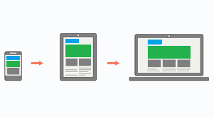
This is where Responsive Design comes in. Websites can now look just as good on a phone as they do on a big-screen TV. But it wasn't always this way. It took developers years of experimentation to reach this point. And we're still making improvements each day.
In this article, we're going to dive into the history of responsive web design, and see how websites have evolved over time.
The Early Days of the Internet
Remember the early days of internet, when any website seemed great? Just getting your own page live on the web was a grand achievement. Even if it was just a Geocities page or an Angelfire page. You'd show it off to your friends. And it was one of the best feelings in the world.
The good news for designers: they knew pretty much exactly how their websites would look. Everyone was accessing the web through desktop computers with only a handful of resolutions and aspect ratios. This meant that designers could place things anywhere on the screen they wanted without worrying too much about other screen sizes.

Yahoo's homepage in 2001
Back then, it was common to see websites that forced you to use a desktop browser. Re-designing an entire website to work on fringe screen sizes was a difficult task, and many companies didn't want to invest the effort.
Life Before CSS
For the past 20 years or so, most developers have gotten their start with web development. And that meant learning basic HTML, the basic building blocks websites.
In the most basic terms, HTML elements are rectangular boxes which stack over each other by default. There wasn't that much you could do with a few boxes containing text and images.
The most basic HTML tags were all we could use. They included h1 to h6 tags, image tags, lists, tables, paragraphs and many tags for even the most basic stuff (which are now done using CSS).
A basic HTML page would look like this:
<html> <head> <title>FreeCodeCamp</title> </head> <body> <h1>FreeCodeCamp</h1> <img src="logo.jpg" height="150" width="150" align="right"> <p>Text goes here</p> <p>Text goes here</p> </body> </html>

A basic HTML web page
There were no structured or uniform ways of styling HTML elements. But luckily, HTML gave you some customization through special tags.
All these tags even exist today, though some of them were deprecated in HTML5 because they were too basic. For example, there was a <marquee> tag, a tag for creating sliding text, images and other HTML elements.
You can achieve the same effect can now through CSS alone. But at that time, developers had to create separate tags for every single functionality. (Fun Fact: Google has an easter egg if you search "marquee tag." You get to see it in action.)
Thus, designers needed a structured way of styling elements. It needed to be flexible and completely customizable.
This led to the creation of Cascading Style Sheets (CSS), a standard way of styling HTML elements.
Cascading style sheets or CSS is a way of styling any HTML element. They have a set of pre-defined properties which can be applied to any HTML element. These style can be embedded in the same HTML page or used as an external .css file
It was a major milestone in web design. Now designers had an option to change each and every property of HTML elements and place them wherever they wanted.
When Screens Started Shrinking
Now that designers had complete control over the webpage, they had to make sure it looked good on all screen sizes.
Desktops are still popular today, but a majority of people also use hand-held mobile devices to surf the web. Now designers have less width but a more usable height, as scrolling is very convenient on touch-screen devices compared to desktops.
Websites now had to incorporate Responsive Web Design:
Responsive web design is an approach to web design that makes web pages render well on a variety of devices and window or screen sizes.
The most common way of dealing with smaller screens is a Sidebar. A sidebar is like a drawer where links and other not-so-important stuff is kept. Designers just transfer all secondary stuff to the sidebar so that the webpage looks clean.
This is an overused method, however, and sidebars weren't originally intended for this purpose.
Prior to this trend, the <frameset> and <frame> tags were very popular, as they allowed designers to embed external web pages.
But unlike the now popular <iframe> tags, these tags were highly unresponsive. This was because they didn't adapt to different screen sizes, and tried to maintain their layout even on smaller screens which looked terrible.
<frameset rows="100,*"> <frame src="header.html"/> <frameset cols="33%,33%,*">Nested frameset <frame src="subframe1.html"/> <frame src="subframe2.html"/> <frame src="subframe3.html"/> </frameset> </frameset>
The output would look completely fine on desktops but broke on mobile devices.
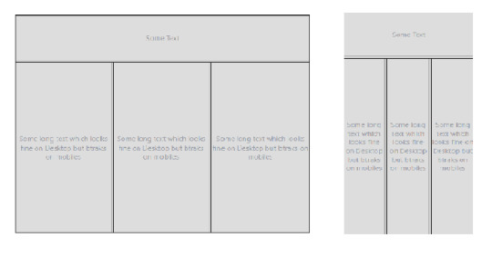
Framesets on Desktop and Mobile Devices
Transition to Responsive Design
The old, huge websites with thousands of pages were faced with a dilemma: to be responsive or not to be.
Any web designer knows that having to make a transition from a larger to a smaller screen is the worst. Your canvas is getting smaller, whereas the painting remains the same. Either you delete some parts of your painting or make it adapt.
Since there were no guidelines for being responsive back in the day, web designers often used naive ways of putting elements on various parts of the screen.
For example, using <table> tags.
Using a table tag for a layout was a bad practice for various reasons, such as:
Tables are not meant for layouts. They are for showing Tabular data in a compact form.
Table tags, just like frameset tags, are not responsive, and they don't adapt to smaller screen sizes.
The table can't be rendered until all its cells are loaded, whereas using div tags for a layout allows them to load independently.
Case Study of Some Large Websites
Let us see how some large websites dealt with this dilemma. We'll take YouTube, for example.
You have likely seen the desktop version of YouTube. It's full of stuff – a header on top, a sidebar on the left, videos stacked around each other, and a footer. Now, most of these things are quite unnecessary for mobile users as they can't utilize them properly.

YouTube on Desktop and Mobile
YouTube might have chosen responsive design, but that would mean hiding these extra elements somewhere.
Anyone who has designed a website knows how important website performance is. Each and every thing you put on a page slows it down. So, in YouTube's case, it would be a waste to fetch them from server only to hide them.
And YouTube is old, and so is its design. Modifying already written code has a high chance of breaking stuff that is already working. So instead, YouTube used what is known as Dynamic Serving.
Dynamic Serving is a method where the server checks whether the device requesting the webpage is a desktop or a mobile. Then it dynamically serves the webpage depending on the type of device.
This method is easy to implement, as designers don't have to deal with different screen sizes. But it's also often discouraged because if not properly configured it can devastate SEO because of duplicate content issues.
These mobile versions are often served through a different subdomain like m.<site-name>.com to distinguish them.
This method was used by Facebook, Wikipedia, and other huge websites, for similar reasons. Responsive Web Design is an ideal solution which is difficult to implement.
Some other sites decided to not be responsive but to build a mobile app instead. This was a reasonable approach considering that mobile apps were future proof. But installing a mobile app required some level of trust, as they had much greater access than web apps.
Also, the problem with native mobile apps was that they were expensive to make, as they had to be built for multiple platforms with the exact same design and functionality. The web is a pretty mature platform and thus has greater scope than mobile apps.
Responsive Web Design Strategy
These were the problems faced by sites which already existed. For new websites Responsive design became a must in order to compete with other websites.
Google also recently introduced mobile-first indexing which means that it prefers mobile-friendly websites in search on mobile devices, creating one more reason adapt.
Mobile-first approach
Suppose you have a suitcase with some stuff in it. would it be easier to transfer things from a smaller suitcase to a larger one, or from a larger to a smaller?
In the mobile-first approach, the website is made to be compatible with mobile first, and then see how things change when transitioning to a larger screen.
Mobile-first approach
One misconception around this approach is that people think that it's mobile-only. But that's not correct – mobile-first doesn't mean designing only for mobile. It is just a safe and easy approach to start with.
Since the available space on a mobile screen is much smaller compared to a desktop, it has to be used for central content.
Also, mobile users switch pages much more frequently, so it is important to grab their attention immediately. Since there are fewer elements on the page and focus is put more on content, this results in a cleaner web page.
The Future of Web Design
The web is growing at an incredible rate. People are shifting their businesses online, and competition is stiffer than before.
There is also a discussion as to whether businesses actually need a mobile app anymore. With growth of Progressive Web Apps (PWAs) and various web API's, the web is much more powerful than before. And most native features like notifications, location, caching, and offline compatibility are now possible with PWAs.
A progressive web application is a type of application software delivered through the web, built using common web technologies including HTML, CSS and JavaScript.
The process of making a PWA is very simple, but that is beyond the scope as well as the central idea of this article. Let us focus more on what we are getting with PWAs.
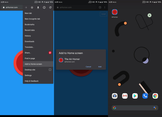
Installing a PWA
You might have noticed the "Add to Home Screen" button in the chrome browser above. For normal websites, it's nothing more than a shortcut icon on the home screen. But if the website is a PWA, you can do a lot of really cool stuff.
You don't need to install a web app for it to function as a PWA, but that makes it feel more like a native app. Also, a PWA can run as a standalone web app without the chrome address bar on top. This again gives it a more app-like feel.
PWAs work on Desktops too, which makes them a perfect candidate for any new app. They can run on any platform that has a web browser, they are safe, and they have all the basic native features.
Still, many features not already installed or available can pose a security threat, as opening a website is considered much safer than installing an app. Therefore, some highly native features still require a native app.
Just to be clear: PWAs are not a replacement for native apps. Native apps will continue to exist. PWAs are just a simpler way to achieve those features without actually building a mobile app.
Predicting the Future of the Web
As we've seen, technology continues to improve, and the internet continues to become more accessible as the number of users grows exponentially.
The shift of web design trends leans more towards performance and user experience. And will continue to do so.
We are also heading towards Web 3.0:
Web 3.0 is the next generation of Internet technology that heavily relies on the use of machine learning and artificial intelligence (AI). It aims to create more open, connected, and intelligent websites and web applications, which focus on using a machine-based understanding of data.
What this means is that everything will be connected and machines will use the internet too. It'll be similar to how web crawlers crawl websites and understand the context of the page.
A good, clean, minimal web design with more focus on content will help machines understand things better. The internet is an open place with lots of innovation. We might be heading towards a web controlled by the mind!
Conclusion

Responsive design
We started from the beginning of internet and we've seen how once popular technologies became obsolete. We are still in progress toward a better internet.
We are no longer in the era where developers don't worry about users. The user experience is a priority nowadays, whether it's performance or design, a user should feel satisfied with any application.
And unlike the old days, we are not limited to any one tool. We are free to use our own creativity, and it is up to us how we transform our creations into something valuable.
The web is a wonderful place and there are many great websites to get inspired by. Let's keep our fingers crossed and keep moving forward.
0 notes
Text
Why Do Some HTML Elements Become Deprecated?
The internet has been around for a long while, and over time we’ve changed the way we think about web design. Many old techniques and ways of doing things have gotten phased out as newer and better alternatives have been created, and we say that they have been deprecated.
Deprecated. It’s a word we use and see often. But have you stopped to think about what it means in practice? What are some examples of deprecated web elements, and why don’t we use them any more?
What is deprecation?
In everyday English, to “deprecate” something is to express disapproval of it. For example, you might be inclined to deprecate a news story you don’t like.
When we’re speaking in a technical sense, however, deprecation is the discouragement of use for an old feature. Often, the old feature remains functional in the interests of backward compatibility (so legacy projects don’t break). In essence, this means that you can technically still do things the legacy way. It’ll probably still work, but maybe it’s better to use the new way.
Another common scenario is when technical elements get deprecated as a prelude to their future removal (which we sometimes call “sunsetting” a feature). This provides everybody time to transition from the old way of working to the new system before the transition happens. If you follow WordPress at all, they recently did this with their radically new Gutenberg editor. They shipped it, but kept an option available to revert to the “classic” editor so users could take time to transition. Someday, the “classic” editor will likely be removed, leaving Gutenberg as the only option for editing posts. In other words, WordPress is sunsetting the “classic” editor.
That’s merely one example. We can also look at HTML features that were once essential staples but became deprecated at some point in time.
Why do HTML elements get deprecated?
Over the years, our way of thinking about HTML has evolved. Originally, it was an all-purpose markup language for displaying and styling content online.
Over time, as external stylesheets became more of a thing, it began to make more sense to think about web development differently — as a separation of concerns where HTML defines the content of a page, and CSS handles the presentation of it.
This separation of style and content brings numerous benefits:
Avoiding duplication: Repeating code for every instance of red-colored text on a page is unwieldy and inefficient when you can have a single CSS class to handle all of it at once.
Ease of management: With all of the presentation controlled from a central stylesheet, you can make site-wide changes with little effort.
Readability: When viewing a website’s source, it’s a lot easier to understand the code that has been neatly abstracted into separate files for content and style.
Caching: The vast majority of websites have consistent styling across all pages, so why make the browser download those style definitions again and again? Putting the presentation code in a dedicated stylesheet allows for caching and reuse to save bandwidth.
Developer specialization: Big website projects may have multiple designers and developers working on them, each with their individual areas of expertise. Allowing a CSS specialist to work on their part of the project in their own separate files can be a lot easier for everybody involved.
User options: Separating styling from content can allow the developer to easily offer display options to the end user (the increasingly popular ‘night mode’ is a good example of this) or different display modes for accessibility.
Responsiveness and device independence: separating the code for content and visual presentation makes it much easier to build websites that display in very different ways on different screen resolutions.
However, in the early days of HTML there was a fair amount of markup designed to control the look of the page right alongside the content. You might see code like this:
<center><font face="verdana" color="#2400D3">Hello world!</font></center>
…all of which is now deprecated due to the aforementioned separation of concerns.
Which HTML elements are now deprecated?
As of the release of HTML5, use of the following elements is discouraged:
<acronym> (use <abbr> instead)
<applet> (use <object>)
<basefont> (use CSS font properties, like font-size, font-family, etc.)
<big> (use CSS font-size)
<center> (use CSS text-align)
<dir> (use <ul>)
<font> (use CSS font properties)
<frame> (use <iframe>)
<frameset> (not needed any more)
<isindex> (not needed any more)
<noframes> (not needed any more)
<s> (use text-decoration: line-through in CSS)
<strike> (use text-decoration: line-through in CSS)
<tt> (use <code>)
There is also a long list of deprecated attributes, including many elements that continue to be otherwise valid (such as the align attribute used by many elements). The W3C has the full list of deprecated attributes.
Why don’t we use table for layouts any more?
Before CSS became widespread, it was common to see website layouts constructed with the <table> element. While the <table> element is not deprecated, using them for layout is strongly discouraged. In fact, pretty much all HTML table attributes that were used for layouts have been deprecated, such as cellpadding, bgcolor and width.
At one time, tables seemed to be a pretty good way to lay out a web page. We could make rows and columns any size we wanted, meaning we could put everything inside. Headers, navigation, footers… you name it!
That would create a lot of website code that looked like this:
<table border="0" cellpadding="0" cellspacing="0" width="720"> <tr> <td colspan="10"><img name="logobar" src="logobar.jpg" width="720" height="69" border="0" alt="Logo"></td> </tr> <tr> <td rowspan="2" colspan="5"><img name="something" src="something.jpg" width="495" height="19" border="0" alt="A picture of something"></td> <td>Blah blah blah!</td> <td colspan="3"> <tr> <!-- and so on --> </table>
There are numerous problems with this approach:
Complicated layouts often end up with tables nested inside other tables, which creates a headache-inducing mess of code. Just look at the source of any email newsletter.
Accessibility is problematic, as screen readers tend to get befuddled by the overuse of tables.
Tables are slow to render, as the browser waits for the entire table to download before showing it on the screen.
Responsible and mobile-friendly layouts are very difficult to create with a table-based layout. We still have not found a silver bullet for responsive tables (though many clever ideas exist).
Continuing the theme of separating content and presentation, CSS is a much more efficient way to create the visual layout without cluttering the code of the main HTML document.
So, when should we use<table>? Actual tabular data, of course! If you need to display a list of baseball scores, statistics or anything else in that vein, <table> is your friend.
Why do we still use <b> and <i> tags?
“Hang on just a moment,” you might say. “How come bold and italic HTML tags are still considered OK? Aren’t those forms of visual styling that ought to be handled with CSS?”
It’s a good question, and one that seems difficult to answer when we consider that other tags like <center> and <s> are deprecated. What’s going on here?
The short and simple answer is that <b> and <i> would probably have been deprecated if they weren’t so widespread and useful. CSS alternatives seem somewhat unwieldy by comparison:
<style> .emphasis { font-weight:bold } </style> This is a <span class="emphasis">bold</span> word! This is a <span style="font-weight:bold">bold</span> word! This is a <b>bold</b> word!
The long answer is that these tags have now been assigned some semantic meaning, giving them value beyond pure visual presentation and allowing designers to use them to confer additional information about the text they contain.
This is important because it helps screen readers and search crawlers better understand the purpose of the content wrapped in these tags. We might italicize a word for several reasons, like adding emphasis, invoking the title of a creative work, referring to a scientific name, and so on. How does a screen reader know whether to place spoken emphasis on the word or not?
<b> and <i>have companions, including <strong>, <em> and <cite>. Together, these tags make the meaning context of text clearer:
<b> is for drawing attention to text without giving it any additional importance. It’s used when we want to draw attention to something without changing the inflection of the text when it is read by a screen reader or without adding any additional weight or meaning to the content for search engines.
<strong> is a lot like <b> but signals the importance of something. It’s the same as changing the inflection of your voice when adding emphasis on a certain word.
<i> italicizes text without given it any additional meaning or emphasis. It’s perfect for writing out something that is normally italicized, like the scientific name of an animal.
<em> is like <i> in that it italicizes text, but it provides adds additional emphasis (hence the tag name) without adding more importance in context. (‘I’m sure I didn’t forget to feed the cat’).
<cite> is what we use to refer to the title of a creative work, say a movie like The Silence of the Lambs. This way, text is styled but doesn’t affect the way the sentence would be read aloud.
In general, the rule is that <b> and <i> are to be used only as a last resort if you can’t find anything more appropriate for your needs. This semantic meaning allows <b> and <i> to continue to have a place in our modern array of HTML elements and survive the deprecation that has befallen other, similar style tags.
On a related note, <u> — the underline tag — was at one time deprecated, but has since been restored in HTML5 because it has some semantic uses (such as annotating spelling errors).
There are many other HTML elements that might lend styling to content, but primarily serve to provide semantic meaning to content. Mandy Michael has an excellent write-up that covers those and how they can be used (and even combined!) to make the most semantic markup possible.
Undead HTML attributes
Some deprecated elements are still in widespread use around the web today. After all, they still work — they’re just discouraged.
This is sometimes because word hasn’t gotten around that that thing you’ve been using for ages isn’t actually the way it’s done any more. Other times, it’s due to folks who don’t see a compelling reason to change from doing something that works perfectly well. Hey, CSS-Tricks still uses the teletype element for certain reasons.
One such undead HTML relic is the align attribute in otherwise valid tags, especially images. You may see <img> tags with a border attribute, although that attribute has long been deprecated. CSS, of course, is the preferred and modern method for that kind of styling presentation.
Staying up to date with deprecation is key for any web developer. Making sure your code follows the current recommendations while avoiding legacy elements is an essential best practice. It not only ensures that your site will continue to work in the long run, but that it will play nicely with the web of the future.
Questions? Post a comment! You can also find me over at Angle Studios where I work.
The post Why Do Some HTML Elements Become Deprecated? appeared first on CSS-Tricks.
Why Do Some HTML Elements Become Deprecated? published first on https://deskbysnafu.tumblr.com/
0 notes
Text
300+ TOP XHTML Interview Questions and Answers
XHTML Interview Questions for freshers experienced :-
1. What is XHTML? XHTML stands for Extensible Hypertext Markup Language. It is a combination of XML and HTML. It is a more formal and stricter version of HTML. 2. Why to use XHTML? XHTML is more formal and stricter version of HTML. i.e. It has properly nested elements. All XHTML elements must always be closed. All XHTML elements must be written in lower case. Every XHTML document must have one root element. That is the reason behind its preferences over HTML because; most of the web pages contain bad HTML. 3. What is the difference between XHTML and HTML? There are some changes in XHTML as compared to HTML: All documents must have a DOCTYPE. The xmlns attribute in is mandatory and must specify the xml namespace for the document. , , , and are mandatory with their respective closing tags. All XHTML tags must be in lower case. All XHTML tags must be closed. All XHTML tags must be properly nested. The XHTML documents must have one root element. All XHTML attributes must be added properly. All XHTML attributes must be in lower case. The name attribute has changed. XHTML attributes cannot be shortened. XHTML attribute values must be quoted. 4. How is XHTML better than HTML? Following are the reasons specifying why XHTML is better than HTML: XHTML uses style sheets instead of font, color and alignment tags of HTML. XHTML allows to style sheets and scripts embedding in CDATA section. XML of XHTML makes easy the integration of new elements as subsets of SGML. 5. What is XHTML validation? XHTML validation is a process used to validate XHTML documents with W3C's validator. 6. Is it difficult to write codes in XHTML rather than HTML? XHTML is not very different from HTML 4.01, so you can easily adopt it. You should start to write your HTML code in lowercase letters. 7. Can elements be overlapped in XHTML or not? In XHTML elements cannot be overlapped. 8. Write an example that shows every attribute must have a value in XHTML? Let's take an example to show you in XHTML every attribute must have a value. Example in HTML: decline Same example in XHTML: decline 9. What is XHTML Modularization? The decomposition of XHTML into a group of modules that are abstract to provide modularity is known as XHTML Modularization. 10. What is the use of XHTML Modules? The XHTML modules are utilized in the XML document type definition language. 11. Why to use XHTML Modularization? XHTML modularization specifies a well defined set of XHTML elements which can be compiled and extended. It supports a specific devise by using standard building blocks and standard methods for building blocks usage. 12. How can you define DTD in XHTML? There are three types of DTD used in XHTML. Strict DTD Transitional DTD Frameset DTD You can use any of the DTD on the top of the XHTML document. 13. How to create a Hello World page in XHTML? The Hello World page of XHTML looks like this: Hello World My first Web page. 14. What is the need of modular DTDs? Modular DTD makes it easy to deploy new deployments. An application only supports subset of XHTML. For example a mobile phone, Internet TV etc. only require a subset of XHTML. 15. What is DOM? DOM is a platform independent, World Wide Web Consortium (W3C) standard form of representation of structured documents as an object-oriented model. It is an application programming interface for accessing HTML and XML documents. XHTML Questions and Answers Pdf Download Read the full article
0 notes
Text
Why SEO Is Important for your Businesses now a days?
SEO is Good for Business Visibility and Branding of your work and business.
When people search for your products and services, you obviously want to appear as high in the search engine rankings, social media ranking as possible, but the reasons for this are more than just because you want them to click through to your business website. In fact, there is a certain amount of business value in simply appearing in search results for terms directly related to your business. For instance, most website searchers don’t just simply search once, click on some websites, and be done with it. Instead, they(user/people) search, click on some websites, edit their search terms, search again, click on some websites, further hone their search terms, search again, and so on.
Top 17 way to Improve your Site's Ranking (SEO):
1. Publish Relevant Content 2. Update Your Content Regularly
3. Metadata
4. Have a link-worthy site
5. Use alt tags
6. Improve your page loading speed
7. Optimize your images
8. Break up your content with header tags
9. Start blogging
10. Use outbound links
11. Make sure your site is readable
12. Fix any broken links
13. Optimize your site for mobile devices
14. Properly format your page
15. Provide appropriate contact information
16. Encourage sharing on social media
17. Use keywords (Google ranking algorithm)
Top 10 types of businesses require SEO work. OR What kind of company or business require SEO?
· Medical professionals.
· Legal professionals.
· Maintenance professionals.
· Restaurants and bars.
· Software Security Company
· Education Institute
· Small businesses and startups.
· SaaS and online service companies.
· Niche companies.
· Locally exclusive companies.
What kind of error is important to resolve by Developer side?
Mostly Developer avoid given bellow error? Meta Title
Meta Description
Google Search
Results Preview
Most Common Keywords Test
Keywords Usage Test
Keywords Cloud
Related Keywords
Competitor Domains
Heading Tags Test
Robots.txt Test
Sitemap Test
Broken Links Test
SEO Friendly URL Test
Image Alt Test
Inline CSS Test
Deprecated HTML Tags
Google Analytics Test
Favicon Test
Backlinks Checker
JS Error Checker
Social Media Check
HTML Page Size Test
HTML Compression/GZIP Test
Site Loading Speed Test
Page Objects
Page Cache Test (Server-Side Caching)
Flash Test
CDN Usage Test
Image Caching Test
JavaScript Caching Test
CSS Caching Test
JavaScript Minification Test
CSS Minification Test
Nested Tables Test
Frameset Test
Doctype Test
URL Redirects Checker
URL Canonicalization Test
HTTPS Test
Safe Browsing Test
Server Signature Test
Directory Browsing Test
Plaintext Emails Test
Media Query Responsive Test
Mobile Snapshot
Microdata Schema Test
No index Checker
Canonical Tag Checker
No follow Checker
Disallow Directive Checker
SPF Records Checker More Information: URL: https://www.softsages.com/staffing-page.htmlURL: https://www.softsages.com/staffing-services.html#augURL: https://www.softsages.com/info-tech-page.htmlURL: https://www.softsages.com/security-page.htmlURL: https://www.softsages.com/security-services.html#risk
#staffing#Software Development company in Malvern software development company in Illinois software development company in us software development com#seo
0 notes
Quote
The internet has been around for a long while, and over time we’ve changed the way we think about web design. Many old techniques and ways of doing things have gotten phased out as newer and better alternatives have been created, and we say that they have been deprecated. Deprecated. It’s a word we use and see often. But have you stopped to think about what it means in practice? What are some examples of deprecated web elements, and why don’t we use them any more? What is deprecation? In everyday English, to “deprecate” something is to express disapproval of it. For example, you might be inclined to deprecate a news story you don’t like. When we’re speaking in a technical sense, however, deprecation is the discouragement of use for an old feature. Often, the old feature remains functional in the interests of backward compatibility (so legacy projects don’t break). In essence, this means that you can technically still do things the legacy way. It’ll probably still work, but maybe it’s better to use the new way. Another common scenario is when technical elements get deprecated as a prelude to their future removal (which we sometimes call “sunsetting” a feature). This provides everybody time to transition from the old way of working to the new system before the transition happens. If you follow WordPress at all, they recently did this with their radically new Gutenberg editor. They shipped it, but kept an option available to revert to the “classic” editor so users could take time to transition. Someday, the “classic” editor will likely be removed, leaving Gutenberg as the only option for editing posts. In other words, WordPress is sunsetting the “classic” editor. That’s merely one example. We can also look at HTML features that were once essential staples but became deprecated at some point in time. Why do HTML elements get deprecated? Over the years, our way of thinking about HTML has evolved. Originally, it was an all-purpose markup language for displaying and styling content online. Over time, as external stylesheets became more of a thing, it began to make more sense to think about web development differently — as a separation of concerns where HTML defines the content of a page, and CSS handles the presentation of it. This separation of style and content brings numerous benefits: Avoiding duplication: Repeating code for every instance of red-colored text on a page is unwieldy and inefficient when you can have a single CSS class to handle all of it at once. Ease of management: With all of the presentation controlled from a central stylesheet, you can make site-wide changes with little effort. Readability: When viewing a website’s source, it’s a lot easier to understand the code that has been neatly abstracted into separate files for content and style. Caching: The vast majority of websites have consistent styling across all pages, so why make the browser download those style definitions again and again? Putting the presentation code in a dedicated stylesheet allows for caching and reuse to save bandwidth. Developer specialization: Big website projects may have multiple designers and developers working on them, each with their individual areas of expertise. Allowing a CSS specialist to work on their part of the project in their own separate files can be a lot easier for everybody involved. User options: Separating styling from content can allow the developer to easily offer display options to the end user (the increasingly popular ‘night mode’ is a good example of this) or different display modes for accessibility. Responsiveness and device independence: separating the code for content and visual presentation makes it much easier to build websites that display in very different ways on different screen resolutions. However, in the early days of HTML there was a fair amount of markup designed to control the look of the page right alongside the content. You might see code like this: Hello world! …all of which is now deprecated due to the aforementioned separation of concerns. Which HTML elements are now deprecated? As of the release of HTML5, use of the following elements is discouraged: (use instead) (use ) (use CSS font properties, like font-size, font-family, etc.) (use CSS font-size) (use CSS text-align) (use ) (use CSS font properties) (use ) (not needed any more) (not needed any more) (not needed any more) (use text-decoration: line-through in CSS) (use text-decoration: line-through in CSS) (use ) There is also a long list of deprecated attributes, including many elements that continue to be otherwise valid (such as the align attribute used by many elements). The W3C has the full list of deprecated attributes. Why don’t we use table for layouts any more? Before CSS became widespread, it was common to see website layouts constructed with the element. While the element is not deprecated, using them for layout is strongly discouraged. In fact, pretty much all HTML table attributes that were used for layouts have been deprecated, such as cellpadding, bgcolor and width. At one time, tables seemed to be a pretty good way to lay out a web page. We could make rows and columns any size we wanted, meaning we could put everything inside. Headers, navigation, footers… you name it! That would create a lot of website code that looked like this: Blah blah blah! There are numerous problems with this approach: Complicated layouts often end up with tables nested inside other tables, which creates a headache-inducing mess of code. Just look at the source of any email newsletter. Accessibility is problematic, as screen readers tend to get befuddled by the overuse of tables. Tables are slow to render, as the browser waits for the entire table to download before showing it on the screen. Responsible and mobile-friendly layouts are very difficult to create with a table-based layout. We still have not found a silver bullet for responsive tables (though many clever ideas exist). Continuing the theme of separating content and presentation, CSS is a much more efficient way to create the visual layout without cluttering the code of the main HTML document. So, when should we use? Actual tabular data, of course! If you need to display a list of baseball scores, statistics or anything else in that vein, is your friend. Why do we still use and tags? “Hang on just a moment,” you might say. “How come bold and italic HTML tags are still considered OK? Aren’t those forms of visual styling that ought to be handled with CSS?” It’s a good question, and one that seems difficult to answer when we consider that other tags like and are deprecated. What’s going on here? The short and simple answer is that and would probably have been deprecated if they weren’t so widespread and useful. CSS alternatives seem somewhat unwieldy by comparison: .emphasis { font-weight:bold } This is a bold word! This is a bold word! This is a bold word! The long answer is that these tags have now been assigned some semantic meaning, giving them value beyond pure visual presentation and allowing designers to use them to confer additional information about the text they contain. This is important because it helps screen readers and search crawlers better understand the purpose of the content wrapped in these tags. We might italicize a word for several reasons, like adding emphasis, invoking the title of a creative work, referring to a scientific name, and so on. How does a screen reader know whether to place spoken emphasis on the word or not? and have companions, including , and . Together, these tags make the meaning context of text clearer: is for drawing attention to text without giving it any additional importance. It’s used when we want to draw attention to something without changing the inflection of the text when it is read by a screen reader or without adding any additional weight or meaning to the content for search engines. is a lot like but signals the importance of something. It’s the same as changing the inflection of your voice when adding emphasis on a certain word. italicizes text without given it any additional meaning or emphasis. It’s perfect for writing out something that is normally italicized, like the scientific name of an animal. is like in that it italicizes text, but it provides adds additional emphasis (hence the tag name) without adding more importance in context. (‘I’m sure I didn’t forget to feed the cat’). is what we use to refer to the title of a creative work, say a movie like The Silence of the Lambs. This way, text is styled but doesn’t affect the way the sentence would be read aloud. In general, the rule is that and are to be used only as a last resort if you can’t find anything more appropriate for your needs. This semantic meaning allows and to continue to have a place in our modern array of HTML elements and survive the deprecation that has befallen other, similar style tags. On a related note, — the underline tag — was at one time deprecated, but has since been restored in HTML5 because it has some semantic uses (such as annotating spelling errors). There are many other HTML elements that might lend styling to content, but primarily serve to provide semantic meaning to content. Mandy Michael has an excellent write-up that covers those and how they can be used (and even combined!) to make the most semantic markup possible. Undead HTML attributes Some deprecated elements are still in widespread use around the web today. After all, they still work — they’re just discouraged. This is sometimes because word hasn’t gotten around that that thing you’ve been using for ages isn’t actually the way it’s done any more. Other times, it’s due to folks who don’t see a compelling reason to change from doing something that works perfectly well. Hey, CSS-Tricks still uses the teletype element for certain reasons. One such undead HTML relic is the align attribute in otherwise valid tags, especially images. You may see tags with a border attribute, although that attribute has long been deprecated. CSS, of course, is the preferred and modern method for that kind of styling presentation. Staying up to date with deprecation is key for any web developer. Making sure your code follows the current recommendations while avoiding legacy elements is an essential best practice. It not only ensures that your site will continue to work in the long run, but that it will play nicely with the web of the future.
http://damianfallon.blogspot.com/2020/04/why-do-some-html-elements-become_4.html
0 notes
Quote
The internet has been around for a long while, and over time we’ve changed the way we think about web design. Many old techniques and ways of doing things have gotten phased out as newer and better alternatives have been created, and we say that they have been deprecated. Deprecated. It’s a word we use and see often. But have you stopped to think about what it means in practice? What are some examples of deprecated web elements, and why don’t we use them any more? What is deprecation? In everyday English, to “deprecate” something is to express disapproval of it. For example, you might be inclined to deprecate a news story you don’t like. When we’re speaking in a technical sense, however, deprecation is the discouragement of use for an old feature. Often, the old feature remains functional in the interests of backward compatibility (so legacy projects don’t break). In essence, this means that you can technically still do things the legacy way. It’ll probably still work, but maybe it’s better to use the new way. Another common scenario is when technical elements get deprecated as a prelude to their future removal (which we sometimes call “sunsetting” a feature). This provides everybody time to transition from the old way of working to the new system before the transition happens. If you follow WordPress at all, they recently did this with their radically new Gutenberg editor. They shipped it, but kept an option available to revert to the “classic” editor so users could take time to transition. Someday, the “classic” editor will likely be removed, leaving Gutenberg as the only option for editing posts. In other words, WordPress is sunsetting the “classic” editor. That’s merely one example. We can also look at HTML features that were once essential staples but became deprecated at some point in time. Why do HTML elements get deprecated? Over the years, our way of thinking about HTML has evolved. Originally, it was an all-purpose markup language for displaying and styling content online. Over time, as external stylesheets became more of a thing, it began to make more sense to think about web development differently — as a separation of concerns where HTML defines the content of a page, and CSS handles the presentation of it. This separation of style and content brings numerous benefits: Avoiding duplication: Repeating code for every instance of red-colored text on a page is unwieldy and inefficient when you can have a single CSS class to handle all of it at once. Ease of management: With all of the presentation controlled from a central stylesheet, you can make site-wide changes with little effort. Readability: When viewing a website’s source, it’s a lot easier to understand the code that has been neatly abstracted into separate files for content and style. Caching: The vast majority of websites have consistent styling across all pages, so why make the browser download those style definitions again and again? Putting the presentation code in a dedicated stylesheet allows for caching and reuse to save bandwidth. Developer specialization: Big website projects may have multiple designers and developers working on them, each with their individual areas of expertise. Allowing a CSS specialist to work on their part of the project in their own separate files can be a lot easier for everybody involved. User options: Separating styling from content can allow the developer to easily offer display options to the end user (the increasingly popular ‘night mode’ is a good example of this) or different display modes for accessibility. Responsiveness and device independence: separating the code for content and visual presentation makes it much easier to build websites that display in very different ways on different screen resolutions. However, in the early days of HTML there was a fair amount of markup designed to control the look of the page right alongside the content. You might see code like this: Hello world! …all of which is now deprecated due to the aforementioned separation of concerns. Which HTML elements are now deprecated? As of the release of HTML5, use of the following elements is discouraged: (use instead) (use ) (use CSS font properties, like font-size, font-family, etc.) (use CSS font-size) (use CSS text-align) (use ) (use CSS font properties) (use ) (not needed any more) (not needed any more) (not needed any more) (use text-decoration: line-through in CSS) (use text-decoration: line-through in CSS) (use ) There is also a long list of deprecated attributes, including many elements that continue to be otherwise valid (such as the align attribute used by many elements). The W3C has the full list of deprecated attributes. Why don’t we use table for layouts any more? Before CSS became widespread, it was common to see website layouts constructed with the element. While the element is not deprecated, using them for layout is strongly discouraged. In fact, pretty much all HTML table attributes that were used for layouts have been deprecated, such as cellpadding, bgcolor and width. At one time, tables seemed to be a pretty good way to lay out a web page. We could make rows and columns any size we wanted, meaning we could put everything inside. Headers, navigation, footers… you name it! That would create a lot of website code that looked like this: Blah blah blah! There are numerous problems with this approach: Complicated layouts often end up with tables nested inside other tables, which creates a headache-inducing mess of code. Just look at the source of any email newsletter. Accessibility is problematic, as screen readers tend to get befuddled by the overuse of tables. Tables are slow to render, as the browser waits for the entire table to download before showing it on the screen. Responsible and mobile-friendly layouts are very difficult to create with a table-based layout. We still have not found a silver bullet for responsive tables (though many clever ideas exist). Continuing the theme of separating content and presentation, CSS is a much more efficient way to create the visual layout without cluttering the code of the main HTML document. So, when should we use? Actual tabular data, of course! If you need to display a list of baseball scores, statistics or anything else in that vein, is your friend. Why do we still use and tags? “Hang on just a moment,” you might say. “How come bold and italic HTML tags are still considered OK? Aren’t those forms of visual styling that ought to be handled with CSS?” It’s a good question, and one that seems difficult to answer when we consider that other tags like and are deprecated. What’s going on here? The short and simple answer is that and would probably have been deprecated if they weren’t so widespread and useful. CSS alternatives seem somewhat unwieldy by comparison: .emphasis { font-weight:bold } This is a bold word! This is a bold word! This is a bold word! The long answer is that these tags have now been assigned some semantic meaning, giving them value beyond pure visual presentation and allowing designers to use them to confer additional information about the text they contain. This is important because it helps screen readers and search crawlers better understand the purpose of the content wrapped in these tags. We might italicize a word for several reasons, like adding emphasis, invoking the title of a creative work, referring to a scientific name, and so on. How does a screen reader know whether to place spoken emphasis on the word or not? and have companions, including , and . Together, these tags make the meaning context of text clearer: is for drawing attention to text without giving it any additional importance. It’s used when we want to draw attention to something without changing the inflection of the text when it is read by a screen reader or without adding any additional weight or meaning to the content for search engines. is a lot like but signals the importance of something. It’s the same as changing the inflection of your voice when adding emphasis on a certain word. italicizes text without given it any additional meaning or emphasis. It’s perfect for writing out something that is normally italicized, like the scientific name of an animal. is like in that it italicizes text, but it provides adds additional emphasis (hence the tag name) without adding more importance in context. (‘I’m sure I didn’t forget to feed the cat’). is what we use to refer to the title of a creative work, say a movie like The Silence of the Lambs. This way, text is styled but doesn’t affect the way the sentence would be read aloud. In general, the rule is that and are to be used only as a last resort if you can’t find anything more appropriate for your needs. This semantic meaning allows and to continue to have a place in our modern array of HTML elements and survive the deprecation that has befallen other, similar style tags. On a related note, — the underline tag — was at one time deprecated, but has since been restored in HTML5 because it has some semantic uses (such as annotating spelling errors). There are many other HTML elements that might lend styling to content, but primarily serve to provide semantic meaning to content. Mandy Michael has an excellent write-up that covers those and how they can be used (and even combined!) to make the most semantic markup possible. Undead HTML attributes Some deprecated elements are still in widespread use around the web today. After all, they still work — they’re just discouraged. This is sometimes because word hasn’t gotten around that that thing you’ve been using for ages isn’t actually the way it’s done any more. Other times, it’s due to folks who don’t see a compelling reason to change from doing something that works perfectly well. Hey, CSS-Tricks still uses the teletype element for certain reasons. One such undead HTML relic is the align attribute in otherwise valid tags, especially images. You may see tags with a border attribute, although that attribute has long been deprecated. CSS, of course, is the preferred and modern method for that kind of styling presentation. Staying up to date with deprecation is key for any web developer. Making sure your code follows the current recommendations while avoiding legacy elements is an essential best practice. It not only ensures that your site will continue to work in the long run, but that it will play nicely with the web of the future.
http://damianfallon.blogspot.com/2020/04/why-do-some-html-elements-become.html
0 notes