#tag font html5
Explore tagged Tumblr posts
Visit Tumblr Blog
Explore Tumblr blogs with no restrictions, modern design and the best experience.
Last Seen Tumblr Blogs


Fun Fact
In 2020, 27% of US Tumblr users had an annual household income of over $100,000.
Note
Hi, Mr Prokopetz, I'm a big fan. Apologies if you've answered this before, but I was wondering what software you use to create the pdf and epub layouts of your ttrpgs, and whether you'd recommend it to a hobbyist who wants to try putting together something more professional than a gdoc for their own ttrpg?
My workflow is unfortunately not terribly accessible unless you have a fair amount of technical know-how.
In brief, I write all of my games in Notepad++ as HTML documents, taking care to use only the subset of HTML5 tags which are supported by most popular EPUB readers. I then use Calibre (or, more, precisely, the command-line utility that comes with Calibre, though you can get mostly the same results via the GUI) to bundle the HTML document as an EPUB3 file. I typically distribute both the HTML and EPUB versions (the former in a zipfile with all of the fonts and images and such) because web browsers tend to have much better screen-reader support than EPUB apps do.
The PDF, meanwhile, is generated from the same master HTML document using CSS paged media extensions – the layout is all generated automatically based on rules specified in a big, gnarly CSS file, and is never touched by human hands. There are a number of software packages which can do this sort of CSS-driven HTML-to-PDF conversion, some of them free or open source; I use a commercial product called Prince because, to the best of my knowledge, it's the only such software which has out-of-the-box support for PDF/UA semantic tagging (i.e., the stuff you need to do in order to make your PDFs screen-reader friendly), but you have more options if you're willing to tag your PDFs manually. (I am not.)
As for whether I'd recommend doing it this way? Like I said, unless you're a proper gearhead, not really; it's super efficient once you get it all set up – the only version of the game I actually maintain is the master HTML document, and generating updated versions of all the other formats is a one-click affair – but it's really only feasible for me because I already knew how to all that workflow automation stuff for unrelated reasons. I can't imagine teaching yourself all that from scratch just to write elfgames!
349 notes
·
View notes
Text
🌐 What Is Web Designing?
Web Designing is the art and science of creating the visual layout and user experience of websites. It focuses on the look, feel, structure, and usability of a website — how it appears and how users interact with it.
It blends graphic design, UI/UX design, and front-end technologies to create responsive, accessible, and visually appealing websites.
🧩 Core Elements of Web Design
ElementDescriptionLayoutArrangement of visual elements on a page (header, content, footer)Color SchemeColors that match the brand and create emotional impactTypographyFont styles that enhance readability and personalityImageryIcons, illustrations, photos, and animations that support the contentNavigationMenus and links that help users move through the siteWhitespaceEmpty space that improves clarity and flowResponsivenessDesign that adapts to all screen sizes (mobile, tablet, desktop)
💻 Web Designer vs Web Developer
RoleFocusTools/Languages UsedWeb DesignerVisual layout, colors, fonts, UI/UXFigma, Adobe XD, Photoshop, Canva, WebflowWeb DeveloperCode-based implementation of the designHTML, CSS, JavaScript, frameworks (React, Vue)
💡 Many people today do both — especially freelancers.
🎨 Popular Web Design Tools
ToolUseFigmaInterface design, prototyping, team collaborationAdobe XDUI/UX design, wireframes, clickable mockupsCanvaSimple designs for web banners, graphicsWebflowVisual web design + code-free website buildingWix / SquarespaceDrag-and-drop website buildersPhotoshop / IllustratorAdvanced visual asset creation
🧠 Design Principles You Should Know
Visual hierarchy – Use size, contrast, and placement to guide the user
Consistency – Keep fonts, colors, and elements uniform across pages
Accessibility – Ensure usability for all users, including those with disabilities
Mobile-first design – Design for smaller screens first, then scale up
User-centric design – Prioritize ease of use and simplicity
📱 Responsive Web Design
Responsive design ensures your site looks great on all screen sizes.
Use media queries (CSS)
Use flexbox/grid layout systems
Test with browser tools and tools like Responsively App
🧭 Web Design Learning Roadmap (Beginner to Pro)
✅ Step 1: Design Fundamentals
Color theory, typography, layout
Learn tools like Figma, Canva, or Adobe XD
Understand UX/UI basics
✅ Step 2: HTML + CSS
Learn HTML5: structure, semantic tags
Learn CSS3: styling, Flexbox, Grid, animations
Practice with tools like CodePen
✅ Step 3: Responsive Design
Mobile-first layout
CSS media queries
Use frameworks: Bootstrap or Tailwind CSS
✅ Step 4: JavaScript (Optional, but powerful)
Add interactivity (menus, sliders, tabs)
DOM manipulation
Use lightweight libraries (like Alpine.js or jQuery)
✅ Step 5: Build Projects & Portfolio
Portfolio website
Business landing page
Blog layout
E-commerce front page
Redesign of an existing site
📚 Best Resources to Learn Web Design (2025)
PlatformCourse NameCostfreeCodeCampResponsive Web Design CertificationFreeScrimbaLearn Responsive Web Design (interactive)$12/moUdemyWeb Design for Beginners: Real World Coding₹400–₹800CourseraUI/UX Design by California Institute of the ArtsFree/PaidFrontend MentorPractice real-world UI challengesFree/Paid
💼 Careers in Web Design
RoleSkills NeededWeb DesignerVisual layout, design tools, basic HTML/CSSUI DesignerInterface-focused designUX DesignerResearch, wireframing, user flow planningFront-End DeveloperCode the design using HTML/CSS/JSFreelancerCombo of design + dev + client communication
🛠 Web Design Project Ideas
Personal portfolio
Photography website
Small business landing page
Responsive blog site
Redesign of a famous website (your version)
🔥 Final Tips
Start small: Redesign your own resume as a website
Get feedback: Share your work on Dribbble, Behance, or Reddit
Learn from others: Browse Awwwards, One Page Love, and Mobbin
Practice, practice, practice — design improves with experience
0 notes
Text
Choosing the Right Web Designer in Bangalore: Why Hello Errors Is the Smart Choice for Future-Ready Websites
In an age where a brand's first impression is often made online, having a professionally designed website is no longer a luxury—it’s a necessity. Whether you're a startup founder, a local business owner, or the head of an enterprise, finding a skilled Web Designer in Bangalore is crucial to establishing your digital footprint.
Among the many options, Hello Errors stands out not just for its creativity, but for its ability to blend design with strategy, speed, and scalability. In this blog, we’ll explore new and often-overlooked factors that matter when hiring a web design company—and why Hello Errors continues to earn the trust of Bangalore-based brands.
Why Bangalore Businesses Need Specialized Web Design
Bangalore's digital ecosystem is unique. With tech-savvy users, a high density of mobile-first audiences, and constant competition, your website has to be more than just pretty. It needs to work. Fast.
A high-performing website in Bangalore must:
Load within 2 seconds
Be mobile-optimized for Android and iOS users
Be built to rank on local search
Speak to multilingual and multicultural audiences
That’s where hiring the right Web Designer in Bangalore becomes essential—and Hello Errors is built to meet these exact challenges.
Hello Errors: Crafting Smart Web Design Solutions
At Hello Errors, we believe web design is not just about aesthetics—it’s about conversion, engagement, and scalability. Our work spans industries from real estate and education to wellness, logistics, and fintech. What sets us apart is how we focus on business goals, not just pixels.
Key Differentiators of Hello Errors:
1. Data-Driven Design
We don’t just build what looks good—we build what performs. Every page layout, color scheme, and font choice is backed by user behavior data and A/B testing principles.
2. Local SEO Optimization
Looking to rank for “best fitness center in Bangalore” or “organic grocery store near Indiranagar”? We integrate on-page SEO, schema markup, and local optimization directly into your website.
3. Website + Marketing Integration
We ensure your website connects seamlessly with:
CRM platforms (HubSpot, Zoho, etc.)
Google Analytics & Search Console
Facebook Pixel, Google Ads conversion tags
WhatsApp & chatbot integrations
That means your design isn’t just for show—it fuels your sales funnel too.
4. Accessibility and WCAG Compliance
An inclusive website is no longer optional. Hello Errors ensures that your website follows web accessibility guidelines, making it usable for all, including those with visual and cognitive impairments.
Responsive and Cross-Device Excellence
A modern website must look and perform consistently across:
Desktops
Mobile phones
Tablets
Smart TVs
As a seasoned Web Designer in Bangalore, Hello Errors delivers fluid, responsive layouts that adapt to every device and resolution. We test on multiple screen sizes and browsers to ensure a seamless experience.
Our Full Web Design Stack at a Glance
While many agencies offer basic design services, Hello Errors provides a full-stack web design package:
✅ Wireframing & UX Research
✅ Custom UI Design
✅ Front-end Development (HTML5, CSS3, JavaScript)
✅ CMS Integration (WordPress, Webflow, Shopify)
✅ Hosting Setup & Domain Mapping
✅ Performance & Security Optimization
✅ Maintenance & Update Plans
From concept to launch—and beyond—we’re with you every step of the way.
Real Benefits Our Clients Experience
Businesses that choose Hello Errors as their Web Designer in Bangalore experience:
🔹 Increased user engagement (up to 60% more time on site)
🔹 Lower bounce rates (by up to 35%)
🔹 Higher conversion rates for forms and CTAs
🔹 Boosted rankings for local and industry keywords
Our Specialty: Startups and Small Businesses in Bangalore
One of our proudest contributions is helping Bangalore startups go from idea to online in record time. We offer rapid design and launch packages that help small businesses:
Launch within 15 days
Get indexed on Google within a week
Start collecting leads and inquiries immediately
With affordable pricing, scalable options, and excellent post-launch support, Hello Errors is a top pick for emerging entrepreneurs in Bangalore.
Hello Errors’ Commitment to Quality
What makes Hello Errors a reliable Web Designer in Bangalore is our unwavering commitment to:
Timely delivery
Transparent pricing
Ongoing communication
Client training and support
We don’t just hand you a website—we empower you to run it efficiently, with training videos, dashboards, and even automation setups for contact forms and lead tracking.
Testimonials That Speak Volumes
“We were looking for a Web Designer in Bangalore who could understand our niche brand. Hello Errors nailed the brief and delivered beyond our expectations.” — Kritika Jain, Founder, PlantPottery
“The Hello Errors team helped us go from concept to live site in 3 weeks. Our online bookings went up by 70% in just two months!” — Vikas Rao, Fitness Studio Owner, Koramangala
Final Thoughts: Build the Future with Hello Errors
Your business deserves more than a basic website—it deserves a powerful online presence designed with intention and intelligence. If you're looking for a Web Designer in Bangalore who brings together design, strategy, SEO, and performance—Hello Errors is the partner you’ve been waiting for.
Let’s Build Something Great Together
📧 Email: [email protected] 🌐 Website: https://helloerrors.in
#WebDesignerInBangalore#HelloErrors#WebsiteDesignBangalore#UIUXExpertsBangalore#ResponsiveWebDesign#SEOFriendlyWebsites#BangaloreStartups#DigitalPresenceIndia#BangaloreTech#HelloErrorsWebDesign
0 notes
Text
CloudArcade Nulled Script 1.9.0

Discover the Power of CloudArcade Nulled Script: Build Your Own Game Portal Today Looking to launch your own online gaming website with zero coding knowledge? The CloudArcade Nulled Script is the perfect solution for anyone wanting to build a sleek, professional HTML5 web game portal CMS—completely for free. This powerful and lightweight gaming CMS offers the ultimate flexibility to create a fully functional arcade website in just minutes. With our nulled version, you gain full access to all premium features without spending a dime. What is CloudArcade Nulled Script? The CloudArcade Nulled Script is a feature-rich, customizable game CMS that allows users to create modern gaming websites with ease. Originally available through premium platforms, this script has been nulled and made available for free download on our platform—making it a budget-friendly choice for aspiring game publishers and developers alike. This CMS was designed specifically for webmasters who want to focus on game publishing without getting bogged down by complex configurations. Whether you’re planning to create a browser game portal or a casual gaming blog, CloudArcade adapts seamlessly to your vision. Technical Specifications Script Type: PHP-based CMS Database: MySQL Frontend: Responsive HTML5 design Supported Formats: HTML5, Flash (SWF), Unity WebGL Installation: One-click installer Top Features and Benefits Modern Design: Fully responsive UI with clean, modern aesthetics for desktop and mobile users. Easy Game Management: Upload, categorize, and manage games in a few simple steps. Custom Pages: Add static pages such as About Us, Contact, or Terms effortlessly. SEO Optimized: Built-in meta tags and clean URL structures help boost search engine visibility. Ad Support: Monetize easily with integrated ad spaces for banners or affiliate links. User Registration: Allow players to register and save scores or favorite games. Why Choose CloudArcade Nulled Script? With the CloudArcade Nulled Script, you don’t just get a stripped-down version—you get the full experience, unlocked and unrestricted. Unlike limited demos, this nulled version retains all functionalities, ensuring you can fully explore what the platform has to offer. Best of all, it's absolutely free. There’s no better way to break into the online arcade industry with zero startup cost. Use Cases for CloudArcade Nulled Script Game Portal Startups: Launch a full-featured game site in minutes. Educational Websites: Host brain games and puzzles for students. Mobile Gaming Sites: Deliver fast and responsive gameplay to mobile users. Ad Revenue Portals: Monetize traffic with ads while offering free games. Simple Installation Guide Download the CloudArcade Nulled Script from our site. Extract the zip file and upload contents to your web server. Run the installation wizard via your browser (e.g., yourdomain.com/install). Enter your MySQL credentials and complete setup. Login to your dashboard and start uploading games! Our nulled version comes with complete documentation to guide you through the setup process. You can also customize the site layout and theme with just a few clicks—no coding skills required. Frequently Asked Questions (FAQs) Is the CloudArcade Nulled Script safe to use? Yes, our nulled version is thoroughly checked to ensure it’s clean and malware-free. We recommend downloading only from trusted sources like our platform to avoid security risks. Can I monetize my CloudArcade website? Absolutely! The script comes with built-in ad support, allowing you to add banners, popups, and affiliate links for monetization. Is this script beginner-friendly? Yes. CloudArcade is designed with simplicity in mind. The admin panel is intuitive, and setup can be completed without technical knowledge. Can I customize the design? Yes, the script supports custom themes and layout changes. You can easily adjust fonts, colors, and navigation to match your branding. Get Started with CloudArcade Nulled Script Now
Don’t miss the chance to build your own gaming empire. The CloudArcade Nulled Script gives you the power, flexibility, and functionality of a premium CMS—without the price tag. Click the download button now and launch your free arcade site today. Looking for more tools to power your site? Explore our vast collection of nulled plugins to extend your website’s functionality. And if you're into design, be sure to check out the best nulled themes available for instant download.
0 notes
Text
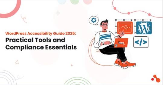
WordPress Accessibility Guide 2025: Practical Tools and Compliance Essentials
Let’s face it, WordPress accessibility guide 2025 isn’t just a checklist for developers anymore. It’s about real users having real trouble using your website if it’s not inclusive. You must plan to hire a remote WordPress developer to make sure your project defines all the benchmarks of today’s digital trends!
Millions of people browse the web with screen readers, keyboard navigation, or color-adjusted screens. If your WordPress site doesn’t support them, you’re losing traffic and trust, maybe even risking legal action.
This guide will walk you through the basics of making your WordPress site more accessible. From smart plugin picks to WordPress ADA compliance solutions, and tips on testing, we’ve packed it all in!
Starting First! Understanding WordPress Accessibility
What Is Website Accessibility?
For instance, a user relying on a screen reader must be able to navigate your blog post just as easily as someone scrolling with a mouse. In WordPress, it covers alt text for images, keyboard-friendly navigation, color contrast, readable fonts, form labels, and ARIA roles.
With over 1.3 billion people worldwide living with some form of disability (WHO), ensuring your site is inclusive is a strategic move. For e-commerce sites, blogs, or SaaS platforms built on WordPress, ignoring accessibility means excluding millions of potential users. A worthy WordPress website development company can help you achieve the mark of being highly accessible!
Key Accessibility Principles: The POUR Model
To make WordPress accessibility practical, the POUR framework serves as your foundation:
1. Perceivable
Users must be able to detect all UI elements, text, images, audio, and video. That means:
Use alt tags for every image.
Offer transcripts or captions for multimedia.
Avoid color-only indicators (e.g., don’t use red text to show errors alone).
2. Operable
Your site must work for users who:
Navigate via keyboard (tab, shift-tab, enter).
Use adaptive tools like screen readers or eye-tracking software.
Need sufficient time to complete actions like filling out forms.
3. Understandable
Structure your site with clear navigation and stick to common design conventions. Ensure error messages are easy to spot and correct. For example:
Use consistent layouts across all pages.
Label buttons with clear actions (“Submit,” not “Go”).
Avoid technical jargon or complex phrases.
4. Robust
Accessible content must remain valid as browsers and assistive technologies evolve. That means:
Valid HTML5 structure.
ARIA roles were necessary.
Regular plugin/theme updates to prevent breakages.
The Impact of Accessibility on UX, SEO, and Trust
User Experience
From font scaling to contrast adjustments, inclusive design equals a better experience for everyone. On mobile devices, these principles are even more vital.
SEO Rankings
Google’s Core Web Vitals intersect with many accessibility standards. Optimizing for accessibility often boosts SEO naturally.
Alt text = better image SEO.
Clean markup = faster indexing.
Descriptive links and headers = clearer site structure.
Brand Trust and Legal Safety
In the US alone, ADA lawsuits for inaccessible websites rose 12% in 2024. If your WordPress site isn’t accessible, you risk both revenue and legal penalties. If you’re offering WordPress development services, accessibility should be part of your pitch.
Important Accessibility Standards You Must Know (2025 Update)
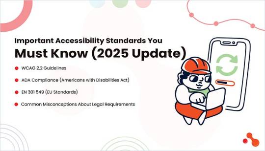
Whether you’re a developer, agency, or business owner, staying compliant with recognized accessibility standards is critical for any WordPress website. Let’s walk through the three major standards that directly impact your WordPress ADA compliance solutions and clear up the most common legal myths around them.
WCAG 2.2 Guidelines
The Web Content Accessibility Guidelines (WCAG) form the backbone of global web accessibility. The latest version, WCAG 2.2, builds on earlier guidelines and introduces refinements focused on mobile usability and cognitive impairments.
Key criteria in WCAG 2.2:
Focus appearance: Ensures users can see where they are navigating via keyboard.
Dragging movements: Replaces drag-and-drop with tap alternatives.
Consistent help: Guarantees help content is persistent on every page.
These standards categorize compliance into three levels:
A: Basic accessibility.
AA: Recommended for public-facing websites.
AAA: Advanced and often not fully achievable.
For anyone offering WordPress development services, achieving at least Level AA compliance should be non-negotiable. Most of the best WordPress accessibility plugins 2025 are designed specifically to meet these WCAG criteria.
ADA Compliance (Americans with Disabilities Act)
The ADA Title III requires that digital platforms be accessible to users with disabilities. Although the law does not explicitly name WCAG, most legal experts and courts reference WCAG 2.1 AA or 2.2 AA as the standard benchmark in litigation.
Lawsuits have surged over the last few years. Over 4,500 ADA lawsuits were filed in the U.S. in 2024 for digital inaccessibility. If you run a business website and serve U.S. customers, your site needs to meet ADA standards, especially if you offer services or sell products online.
EN 301 549 (EU Standards)
For European businesses or any site serving EU users, EN 301 549 is the standard enforced under the European Accessibility Act. It mandates accessibility for public sector websites, mobile applications, and increasingly for private entities in 2025. If you rely on WordPress ADA compliance solutions, make sure you understand the legal scope these tools claim to cover!
EN 301 549 directly references WCAG guidelines, but also includes:
Hardware and software interoperability
Assistive technology integration
Real-time text communication standards
Whether you choose to hire a WordPress plugin developer or agency, ensure they consider these regional requirements when customizing functionality:
Common Misconceptions About Legal Requirements
Many site owners and developers fall into traps due to misinformation. Let’s clear a few things up:
My site isn’t for government or healthcare, so I’m exempt.
Wrong. ADA applies to all public-facing websites in the U.S. with commercial offerings.
I installed a plugin, so I’m compliant.
Plugins help, but they don’t guarantee full compliance. Manual audits and developer input are essential.
No one will sue a small business.
Wrong again. Most lawsuits target small to mid-sized businesses because they often lack compliance knowledge or legal defense.
Accessibility is a one-time fix.
Accessibility is an ongoing process. Every theme update, plugin installation, or content change can affect it.
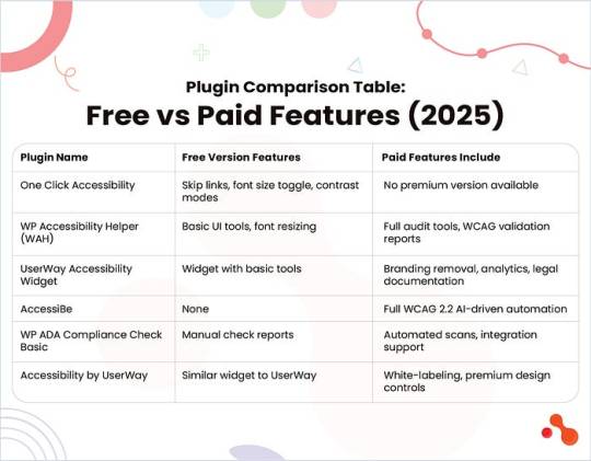
Top WordPress Accessibility Plugins to Use in 2025

While plugins can’t do everything, they serve as an essential layer in your WordPress ADA compliance solutions. Combining them with help from a WordPress website development company or hiring a WordPress plugin developer can help you build and maintain accessibility the right way!
Below is a curated list of the best WordPress accessibility plugins for 2025:
One Click Accessibility
Perfect for beginners, this plugin adds accessibility features like skip links, font resizing, and contrast toggles with a single install. Lightweight and fast.
Best for: Small business sites and blogs looking for quick WCAG wins.
WP Accessibility Helper (WAH)
A more advanced plugin that offers contrast adjustment, font controls, and ARIA landmarks. It includes WCAG checklists and paid options for detailed audits.
Best for: Developers and agencies managing multiple accessibility points.
UserWay Accessibility Widget
This cloud-based tool adds an accessibility widget that users can toggle. It covers contrast, font size, and screen reader adjustments.
Best for: Public-facing websites needing on-screen control options.
AccessiBe
One of the most widely used WordPress ADA compliance solutions, AccessiBe, uses AI to scan and apply accessibility fixes dynamically. It’s fully managed, but premium-only.
Best for: Businesses facing legal risk or needing full automation and audits.
WP ADA Compliance Check Basic
Audits your site and flags compliance issues. Ideal for spotting image alt text issues, missing labels, and structural HTML problems.
Best for: Developers needing fast compliance diagnostics.
Accessibility by UserWay
Similar to the UserWay Widget but with more configuration and branding controls. Integrates with screen readers and is WCAG 2.1-compliant.
Best for: Agencies and developers looking to white-label their accessibility efforts.
Let’s understand this more with this quick comparison table:
Plugin Comparison Table: Free vs Paid Features (2025)
Best Practices to Build an Accessible WordPress Site

These tips align with the latest guidelines from the WordPress accessibility guide 2025 and help you deliver real accessibility value to all users.
Use Correct HTML Semantic Markup
Always structure your site using <header>, <nav>, <main>, <section>, and <footer> tags properly. Use heading levels (<h1> to <h6>) in a logical order. Screen readers rely on this hierarchy to make sense of the page.
Ensure Color Contrast Ratios
Poor contrast affects readability for users with low vision. Follow WCAG 2.2 recommendations: 4.5:1 contrast ratio for normal text and 3:1 for large text. Use tools like WebAIM Contrast Checker to evaluate your color palette.
Add Alt Text to All Images
Descriptive alt text helps screen readers convey image context. Avoid using vague descriptions like “image” or “picture.” When using decorative images, add an empty alt=”” tag to skip unnecessary narration.
Enable Keyboard Navigation
Users with mobility impairments often rely on keyboards. Make sure all elements, menus, buttons, and forms are focusable using the Tab and Enter keys. Avoid JavaScript-only interactions that block keyboard access.
Support Screen Readers
Use ARIA roles and landmarks thoughtfully. Ensure live regions, modals, and dynamic content updates are properly announced. Test using tools like NVDA or VoiceOver to confirm your site works with real screen readers.
Avoid Auto-Playing Media
Videos or audio that play automatically can disorient users. If you must include auto-play content, provide clear pause and volume controls. This is critical for compliance under WordPress ADA compliance solutions.
Create Accessible Forms
Label every input clearly and consistently. Use <label> tags tied to their corresponding fields using the for attribute. Include helpful error messages and confirm button states that are easy to understand for users with screen readers or visual challenges.
How to Test Your WordPress Site for Accessibility?
Building an accessible site is just the beginning. You must test and audit it regularly to make sure it’s truly usable for everyone.
Here’s how you can test your WordPress site the right way!
Manual Testing Tips
Manual testing reveals issues that tools often miss. Try these steps:
Keyboard-Only Navigation: Can you navigate through all menus, forms, and links using only the Tab, Shift+Tab, and Enter keys? If not, users with mobility challenges may face barriers.
Screen Reader Simulation: Use screen readers like NVDA (Windows) or VoiceOver (macOS) to simulate how visually impaired users interact with your site. Listen for proper heading flow, button labeling, and announcements for dynamic content.
Form Accessibility Check: Test all form fields and validation states. Confirm if users receive clear error messages and can complete forms using assistive tech.
Automated Tools

Regular Audits and User Testing
Schedule monthly or quarterly audits using both tools and human testers, especially if your site updates frequently. You can involve users with disabilities in your testing cycle. Their feedback will help uncover edge cases and improve real-world usability beyond plugin coverage.
Common Accessibility Mistakes to Avoid
Even with the best plugins and tools, small mistakes can ruin the user experience. The WordPress accessibility guide 2025 points out that many site owners rely too heavily on automation or overlook mobile usability, two things that can break compliance.
Here’s what to avoid:
Relying Only on Plugins Without Manual Review
Plugins are helpful, but they aren’t perfect. They won’t catch incorrect heading structures, misleading link text, or poorly labeled form fields. For example, a plugin might not flag a CTA that says “Click Here” with no context. Always pair plugins with manual reviews and expert insight.
Ignoring Mobile Accessibility
Accessibility must extend beyond desktops. On mobile, buttons that are too small or layouts that shift can make navigation frustrating. Users who rely on screen magnifiers or touch navigation need a layout that adjusts with clarity and predictability.
Overusing Popups and Animations
Auto-triggered popups or moving elements can disorient users with cognitive disabilities. Flashing banners or background animations may also trigger seizures in sensitive users. Always offer ways to pause or disable motion.
Assuming Accessibility is a “One-Time” Project
Accessibility is a continuous process. New content, plugins, or theme updates can break previously compliant elements. Just because your site passed a test last year doesn’t mean it’s still accessible today.
Tip: Hire a WordPress plugin developer who ensures long-term compliance with each change or feature rollout!
Benefits of an Accessible WordPress Site
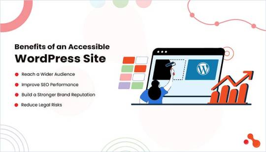
Following the WordPress accessibility guide, 2025 is a growth opportunity. An inclusive website doesn’t just help people with disabilities. It helps your brand grow faster, rank higher, and stay safer from legal trouble.
Reach a Wider Audience
More than 1.3 billion people globally live with some form of disability, which is over 15% of the population. By making your site accessible, you unlock a huge segment of users who are often excluded from digital experiences. Whether it’s visual impairments, motor limitations, or cognitive challenges, accessibility ensures every visitor can use your site.
Improve SEO Performance
Google’s algorithm rewards accessibility. Features like proper HTML structure, alt tags, ARIA roles, and keyboard navigation all improve crawlability and user experience, core factors in ranking. Many WordPress ADA compliance solutions align closely with technical SEO best practices, so improving one boosts the other naturally.
Build a Stronger Brand Reputation
In 2025, consumers value inclusivity. Accessibility sends a clear message: your brand cares about all users. It improves customer loyalty and adds weight to your ESG and DEI positioning. Startups and enterprises alike are now embedding accessibility into their development roadmap.
Reduce Legal Risks
In the U.S., the number of ADA lawsuits related to inaccessible websites has grown steadily. Internationally, laws like the European Accessibility Act are enforcing stricter standards. A non-compliant website can lead to fines, lawsuits, or even takedown orders. Staying compliant with the latest WordPress ADA compliance solutions reduces this risk and keeps your business legally safe.
Bottomline
As the WordPress accessibility guide 2025 has shown, relying solely on plugins won’t guarantee a fully accessible or legally compliant experience. Tools like WP ADA Compliance Check Basic or One Click Accessibility speed up your workflow, but the real value lies in aligning your site with WCAG 2.2, ADA guidelines, and global standards like EN 301 549.
0 notes
Text
Softhunters: Best PSD to HTML, XML, xHTML Conversion Experts
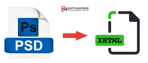
Why Choose PSD to HTML/XML/xHTML Conversion?
Photoshop (PSD) designs are ideal for creating static layouts. However, for these layouts to function on the web, they need to be converted into responsive and browser-compatible code. Converting PSD to HTML, XML, or xHTML ensures your website is not just visually attractive but also fast, mobile-friendly, and SEO-ready.
Whether you are a business owner with a stunning website design or an agency looking to deliver projects with pixel accuracy, our team of expert developers and web designers in Jaipur can transform your PSD files into dynamic, interactive web pages with clean, structured code.
Visit Now ;- https://softhunters.in/psd-to-html-xhtml-conversion-services/
Benefits of Our PSD to HTML & XML Conversion Services
1. Pixel-Perfect Conversion
We maintain 100% design integrity while converting your PSD to HTML or XML. Every visual element — colors, fonts, layout spacing, and responsiveness — is handled with precision, ensuring your web interface looks just like your original design.
2. W3C-Compliant Code
As a leading website designing company in Jaipur, Softhunters adheres strictly to W3C standards. Our clean, well-commented, and validated code helps improve SEO performance and cross-browser compatibility.
3. Responsive Design
With the increasing use of mobile devices, it’s vital for websites to be responsive. Our developers use the latest HTML5 and CSS3 techniques to make sure your site adjusts beautifully across screens and devices.
4. SEO-Friendly Markup
The conversion process incorporates SEO-friendly practices right from the start. We use semantic HTML tags and optimized images, which helps search engines index your site faster and better.
5. Fast Loading Speed
We optimize the code, compress images, and minimize the use of unnecessary scripts. This ensures quick load times — an essential factor for user experience and search engine ranking.
Why Softhunters Technologies?
With over a decade of experience in web development, Softhunters Technologies has established itself as a reputable website designing company in Jaipur. We combine technical skill with creative vision to bring your PSD designs to life. Our team of certified developers and creative web designers in Jaipur are known for their dedication to quality, innovation, and client satisfaction.
Our Core Strengths:
Dedicated Developers: Skilled in HTML5, CSS3, JavaScript, and frameworks like Bootstrap.
Cross-Browser Compatibility: Websites are tested on Chrome, Firefox, Safari, Edge, and others.
Quick Turnaround Time: We deliver projects on time without compromising on quality.
Affordable Pricing: High-quality conversion services at competitive rates.
Our PSD Conversion Process
We follow a structured, transparent approach that ensures you get the best results:
Requirement Analysis: We understand your PSD file and desired output (HTML, XML, or xHTML).
Slicing: The PSD is carefully sliced into multiple layers to manage each element efficiently.
HTML Markup: Clean, SEO-friendly HTML code is written using the latest standards.
Styling with CSS: CSS3 is used for styling, including animations, transitions, and layout formatting.
Integration and Testing: We integrate your HTML/XML code with CMS if needed and test it across all platforms and devices.
Delivery: The final product is delivered with full documentation and support.
Industries We Serve
Our PSD to HTML and XML services cater to a wide range of industries:
E-commerce
Healthcare
Real Estate
Education
Travel and Hospitality
Fashion & Lifestyle
Whether you’re a startup or an enterprise, we customize every project according to your specific needs.
Hire the Best Web Designers in Jaipur
If you’re searching for a reliable web designer in Jaipur, Softhunters is home to some of the most creative minds in the industry. Our design team doesn’t just convert files — they understand UI/UX principles, accessibility, and the latest design trends. This means your website won’t just look good, it will feel right for users.
We take pride in being among the top choices for PSD to HTML and XML conversion in Jaipur. Our client testimonials and successful project deliveries speak for our commitment and excellence.
Let’s Build Something Great
At Softhunters Technologies, we believe that your website should be a reflection of your brand. From PSD design to flawless HTML or XML implementation, we offer end-to-end solutions that help businesses grow online. Whether you need a static website, an eCommerce platform, or CMS integration, we’re here to make it happen.
0 notes
Text
Why Choose SKT Sandwich – Free Snacks WordPress Theme for Your Café or Food Blog?
Are you looking to launch a website for your café, sandwich shop, or street food venture without breaking the bank? The SKT Sandwich – Free Snacks WordPress Theme offers an excellent solution with its visually delicious design, easy customization, and mobile-ready layout. Whether you're running a local deli or building a food recipe blog, this theme helps present your brand in the most appetizing way possible.
Let’s explore what makes this free WordPress theme ideal for food businesses and culinary creators.
A Perfect Visual Treat for Food Lovers
First impressions matter, especially in the food business. With SKT Sandwich, your website gets a clean, colorful, and modern design that instantly appeals to foodies. The layout highlights images of dishes beautifully, encouraging site visitors to explore more.
With space for mouth-watering food photography, featured menus, and contact details, this free snacks WordPress theme ensures your visitors get all the information they need within seconds.
Responsive and Mobile-First Design
Over 60% of website traffic comes from mobile devices. That’s why the SKT Sandwich theme is designed with full mobile responsiveness in mind. Your website will look and function flawlessly across desktops, tablets, and smartphones.
Whether someone is browsing for lunch options on their phone or checking your latest recipe blog on their tablet, your site will always deliver a smooth and consistent experience.
Easy to Customize for Any Small Food Business
One of the major strengths of SKT Sandwich is its user-friendly customization options. Even if you’re not tech-savvy, you can change colors, fonts, headers, and layout sections using the WordPress Customizer.
You can also personalize your homepage by featuring best-selling snacks, adding customer reviews, or embedding your Instagram feed. These features help create a brand identity that reflects your unique style and offerings.
Want to start with this theme? Download SKT Sandwich – Free Snacks WordPress Theme and get online quickly.
Fast Loading for Better SEO and User Experience
Speed matters, especially for hungry visitors! The SKT Sandwich theme is optimized for performance, ensuring your pages load quickly. A fast-loading site not only improves user experience but also helps your rankings on Google and other search engines.
When combined with proper keyword usage and content strategy, the SKT Sandwich theme can boost your food blog’s SEO and help attract more organic traffic.
WooCommerce Compatibility for Selling Online
Planning to sell snacks, sauces, or meal kits directly from your site? SKT Sandwich is compatible with WooCommerce, the most popular eCommerce plugin for WordPress.
This means you can easily set up a shop, manage orders, accept online payments, and grow your food business without hiring a developer. From takeout orders to custom merchandise, WooCommerce support expands your revenue opportunities.
Ideal for Food Bloggers and Recipe Creators
If you’re a food blogger or aspiring chef, SKT Sandwich also serves as a fantastic platform to share recipes and cooking tips. The theme’s layout supports blog post formats, video embeds, and image galleries—giving your food content the attention it deserves.
Use categories, tags, and sidebar widgets to keep your content organized and engaging for your readers.
SEO-Friendly and Schema Ready
To help your site get found by search engines, this theme is SEO-friendly and follows modern HTML5 structure. It also supports schema markup, which enhances how your content appears on search engines, such as showing star ratings, recipe cards, or store hours in rich snippets.
By optimizing your content and site structure, you’ll improve your chances of showing up in Google’s featured results.
Looking for a free theme that’s SEO ready and food-focused? Try the SKT Sandwich WordPress Theme today.
Built-in Social Media Integration
Marketing your food brand is easier when your site and social media work together. SKT Sandwich supports social media links and sharing features so visitors can quickly connect with you on platforms like Instagram, Facebook, or Twitter.
Promote your food photos, new menu items, and blog updates directly from your website with easy social media integration.
Final Thoughts
The SKT Sandwich – Free Snacks WordPress Theme is more than just visually appealing—it's a functional, mobile-friendly, and customizable platform tailored for cafes, food trucks, snack bars, and culinary bloggers. With WooCommerce support, SEO readiness, and stunning image sections, it gives your food venture the online presence it deserves—without any cost.
#free snacks WordPress theme#snack shop WordPress template#fast food WordPress theme free#food delivery WordPress theme#gourmet snack website theme#free food business WordPress template#healthy snacks WordPress theme#junk food WordPress theme#free theme for food truck#café and snack WordPress theme#free eatery website template#quick bites WordPress theme#takeaway snacks WordPress theme#snack bar WordPress theme#crispy snacks WordPress theme#free snack product template#treats and snacks WordPress theme#street food WordPress theme#free munchies WordPress theme#snacks company WordPress theme
0 notes
Text
Trying to put together a "downloads" page.
What #$%^& decided to remove all the font related tags from HTML5? Why is my near 20 year old basic html knowledge obsolete? 😭 Those were useful dang it!
1 note
·
View note
Text
What's new about HTML6 and CSS5?
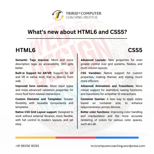
As technology continues to advance, so do the characteristics of how languages will shape a web in the future. HTML and CSS were also the constituent elements of web design. Although HTML5 and CSS3 have become standards in the industry, the web development community has anticipated HTML6 and CSS5 to come soon as they already breathe of new features and improvements that will revolutionize the way websites are constructed and experienced. Let's dive into what we can expect from these upcoming languages.
New Features of HTML6
Under development, HTML6 is expected to proffer any features exciting enough that it makes web development much more powerful and intuitive. Here is what is expected to come in:
Better Integration with JS Frameworks
HTML6 will come with a design that perfectly matches the working of modern JavaScript frameworks, for e.g., React, Angular, or Vue.js, enabling easy creation of dynamic and responsive web applications.
Reduced Complexity in Syntax
HTML6 should lessen complexity with new tags and attributes opening up ways to easier and simpler syntaxes. For example, semantic elements would be new to better content structuring, improving code readability.
Better Web Accessibility
Web accessibility is among the important developments of HTML6. New features would offer facilities to construct effective websites capable of usage by disabled people with improvements in screen reader usage and improved ARIA (Accessible Rich Internet Applications) integration.
Advanced Multimedia Support
HTML6 gives web developers greater control in the handling of multimedia elements, such as video and audio. Enhanced support of 3D content and interaction with more immersive user experience could be possible.
What Is Latest in CSS5?
Similar to the development of HTML6, CSS5 is being developed and is expected to give web designers an improved capability in designing. Here are some of the expected newer features of CSS5:
CSS Grid 2.0
CSS Grid has changed the face of layout design in CSS3, and CSS5 would go a step further by offering more positioning control of the elements to allow even more complex and fluid designs of grid layouts.
Advanced Typography Features
There will be improvements in typography with new properties that will allow for an even more impressive and lively text styling in CSS5. Better variable font support, animated text, and superior text alignment control can be expected.
Enhanced CSS Variables
CSS Variables are reusable styles incorporated in the development of a website that increase the ease with which developers could use styles. CSS5 will also reinvent custom properties, making them much easier to use in crafting flexible and scalable design systems.
New Pseudo-Classes and Pseudo-Elements
New pseudo-classes and pseudo-elements will be added to form CSS5. They will also provide new flexibility for selecting and styling elements on a page. Elements targeting dynamically, based on their state or position, will then be easier.
Flexible Improvements
Flexbox will be stable and strong as it is, and in addition to that, CSS5 is expected to give added powers. Here will come in new properties to enable better flexible-tenant layout construction, to make building responsive into it.
For What Purposes One Should Learn HTML6 and CSS5?
Well, whenever the new versions come into existence, it becomes important for web developers, designers, and students to keep pace with the changes. The TCCI Computer Coaching Institute makes up the best educational institutions for aspiring web developers to learn master HTML5, CSS3, and beyond.
Courses related to website designing and development will happen at TCCI, including practical learning sessions with HTML, CSS, JavaScript, and more. Whether a student is entering the doors of the web development world for the first time or wishes to learn new technologies to update their skill set, expert trainers are there for every step of the journey.
What HTML6 and CSS5 are going to do is a revolution in the way we build our websites. They are going to enhance the experience at the front end in terms of features, make the application more accessible, and increase compatibility with modern framework development. With these technologies, you are going to prepare yourself at the TCCI Computer Coaching Institute to be relevant in the changing tech world and develop the next generation of web experiences.
Call now on +91 9825618292
Get information from https://tccicomputercoaching.wordpress.com/
#Best Computer Training Institutes Bopal Ahmedabad#Computer Training Institutes near me in Ahmedabad India#TCCI - Tririd Computer Coaching Institute#Top Web Designing Institutes in Bopal Ahmedabad#web development courses in ahmedabad
0 notes
Text
Website Development Interview Questions.....
Website development interview questions:
In such a situation, it is critical to be ready for interviews, especially when entering the web development field. Irrespective of your plan of working with a leading organization such as SkyWeb Design Technologies, an organization that deals in web and mobile applications, or with any organization of your preference, it is important to learn the basics.
1. What is HTML, what is it used for?
Answer: HTML stands for Hyper Text Markup Language it’s most commonly used markup language in the creation of Web documents or anything related to the Web environment. It determines the layout of the material posted on the World Wide Web and includes such components as headings, paragraphs, hyperlinks, images, and others.
2. What makes HTML5 different from the prior version of HTML?
Answer: HTML5 is the version of HTML that is currently in use. It adds new elements and attributes and enhanced support for multimedia that are <article>, <section>, <header>, <footer>, <audio>, <video> and new APIs such as Canvas, Web Storage and Geolocation.
3. Here are some of the frequently used HTML tags and what they are used for:
Answer:
<p>: Defines a paragraph.
<h1> to <h6>:
<a>: Defines a hyperlink.
<img>: Embeds an image.
<ul> and <ol>: is unordered list, and ordered list.
<div>: division. So it defines a division or section.
<span>: Sets a block of text, mainly used for applying a style on.
4. What is CSS and why should one bother with it?
Answer: HTML is used to create a structure of a web page while CSS (Cascading Style Sheets) is used for appears of web pLAST EDITED: pages. It enables you to use aspects like colors font, space and position to your html elements which in turn creates aesthetically pleasing and more functional website to the users.
5. Please also provide me with a definition of what the box model in CSS .
Answer: The CSS box model describes the rectangular boxes generated for elements in the document tree and consists of:The CSS box model describes the rectangular boxes generated for elements in the document tree and consists of:
Content: The inner content area referred to as Knowledge Creation is:
Padding: Margin between the stuff and its visual frame.
Border: These are the line on the right and at the bottom of the padding and content.
Margin: (h) Space referring to the area beyond the border surrounding an element and other elements.
6. JavaScript is a programming language and web development tool, but how is it defined and what does it do?
Answer: JavaScript is also a language used in the designing of web sites to provide flexibility and impressive features on any web page. It lets you to work with HTML and CSS, manage events, verify data in forms, use animations, and work with servers.
7. What are variables in JavaScript and how can one declare them?
Answer: In JavaScript, variables refer to the means of storing data values. You can declare them using the var, let, or const keywords:You can declare them using the var, let, or const keywords:
javascript
var name = "ram";
let age = 25;
const isStudent = true;
8. What is the difference between let, const, and var?
Answer:
var: Any variable declared in a function block is either function-scoped or globally-scoped which even can be redeclared and again updated.
let: Local, write-only, specifically they allow updating the variable but not declaring it in the same block.
const: declared only in block can’t be updated, or redeclared after the declaration.
9. What is an array; Explain how you can define an array in JavaScript?
Answer: An array can be defined as a united variable for storing more than one value. We can create an array using square brackets []:
javascript
let fruits = [‘apple’, ‘banana’,’ cherries’];
10. What is a function and how does one describe or create one using JavaScript?
Answer: Function is a set of statements and instruction used to do a certain job or achieve a specific goal. we can define a function using the function keyword:
javascript
function greet(name) {
return ‘Hello, ‘ + name;
}
11. What is the event handling of JavaScript?
Answer: Javascript as the name suggests is an event driven language; this means that functions can be written that will take actions based on events such as a click, key press or even mouse movements. we can handle events by attaching event listeners to elements:
javascript
document. getElementById("myButton"). addEventListener("click", function() {
alert("Button clicked!");
});
12. What is the Document Object Model (DOM)?
Answer: DOM is a programming interface for the web documents. It depicts a document as a tree structure of nodes; this assist in managing the content and structures of the web pages by applying JavaScript.
13. How do you select an element by its ID in JavaScript?
Answer:
I can select an element by its ID using the getElementById method:
javascript
let element = document.getElementById("myElement");
14. What is responsive web design, and why is it important?
Answer:
Responsive web design ensures that web pages look good and function well on devices of various screen sizes and resolutions. It is important because it improves user experience and accessibility, and it is favored by search engines.
15. What are some basic steps to create a responsive web design?
Answer:
Use flexible grid layouts: Utilize relative units like percentages instead of fixed units like pixels.
Media queries: Apply different styles based on screen size, orientation, and other characteristics.
Flexible images: Ensure images scale appropriately within their containers.
Viewport meta tag: Set the viewport to control layout on mobile browsers.
html
<meta name="viewport" content="width=device-width, initial-scale=1.0">
These questions and answers demystify basic facts which a fresher that wants to join the web development team should know.
Thanks for visit us……
For more Information to visit our website: skyweb design Technologies.
Address: 15th floor, manjeera trinity corporation ,kukkatpally , HYDERABAD.
#app development#website development interview questions#website development services#best website designers#skyweb design technologies#best app developers in hyderabad
0 notes
Text
Zox News – Professional News & Magazine Theme v3.16.0
https://themesfores.com/product/zox-news-magazine-theme/ Zox News WordPress Theme: Professional WordPress News & Magazine Theme Building a news website with cutting-edge AI-enhanced content couldn’t be easier than with the help of the Zox News WordPress Theme. The theme’s cutting-edge tech foundation allows it to use AI and NLP to streamline the content creation process and set your site out from the rest. From its highly adaptable layout to its meticulously prepared AI-generated articles, the Zox News WordPress Theme has characteristics that are ideal for a news portal. Artificial intelligence makes it easy to make beautiful websites and publish engaging articles rapidly. The theme also allows for instantaneous automated updates, which is a major time-saver. The theme uses cutting-edge NLP technology to identify and produce more natural English phrases and conversations in its content. This makes sure that the conversation on your site sounds natural and interesting, rather than artificial. The material developed by AI is not only sensitive to its audience’s feelings, but also conceals the fact that it was made by a computer. Zox News WordPress Theme’s flexible framework makes it ideal for site owners who want to add a personal touch to their websites’ appearance. There is a wide variety of fonts, layouts, and color schemes to choose from, making it easy to tailor the theme to your specific needs. Create a news website with little effort using the cutting-edge artificial intelligence and natural language processing tools included into the Zox News WordPress Theme. Today is the day to put the powerful Zox News WordPress Theme to work for your news website. Zox News – Professional News & Magazine Theme v3.16.0 Zox News helps you go from blogger to boss by giving you a wide range of tools and options to give you the most professional-looking and functioning news site on the net. For full details and features, check out the sales page. Core Features of Zox News – Professional WordPress News & Magazine Theme Compatible with WordPress 5.5+ SEO Optimized RTL Ready Gutenberg Ready Google AMP ready HTML5 & CSS3 Translation ready (contains .po/.mo files) Child Theme included Comes with XML dummy data (posts, tags, categories, menus, dummy images) Easy implementation with Google Adsense ads WordPress Featured Image support WordPress Custom Background support WordPress Custom Menu support Unlimited Colors Youtube, Vimeo, and Soundcloud integration Schema.org Rich Snippets Custom Fly-Out Navigation WooCommerce compatible bbPress compatible Infinite Scroll Custom Theme Options panel Custom CSS section in Theme Options so users will not lose custom changes to CSS when you update to a new version Full-Width Posts Megamenus Facebook comments support Built-In Disqus comments support Free lifetime updates Easy logo customization 800+ Google Fonts Threaded comments Ability to turn Featured Image on posts on/off Ability to turn social buttons on posts on/off Optional Caption/Photo Credit below Featured Images in posts Custom copyright/footer text Custom favicon In-depth documentation Please note that any digital products presented on this website do not contain malicious code, viruses or advertising. https://themesfores.com/product/zox-news-magazine-theme/ #NewspaperThemes #WordpressTheme
0 notes
Text
A Comprehensive Guide for HTML CSS JavaScript Online Training
In today’s digital era, having a responsive website is not just a luxury; it’s a necessity. With the proliferation of devices with various screen sizes and resolutions, ensuring your website looks great and functions seamlessly across all platforms is paramount. If you’re ready to dive into the world of responsive web design while honing your skills in HTML, CSS, and JavaScript, you’re in the right place. Naresh IT’s HTML CSS JavaScript Online Training is here to guide you every step of the way.
Why Responsive Design Matters
Before we delve into the intricacies of creating a responsive website, let’s understand why it’s crucial for online success. In a world where users access the internet from smartphones, tablets, laptops, and desktops, a responsive website ensures a consistent user experience regardless of the device used. This not only enhances user satisfaction but also improves your site’s visibility and accessibility, ultimately boosting your online presence.
Getting Started with HTML, CSS, and JavaScript Online Training
Our comprehensive online training program covers everything you need to know to create stunning, responsive websites from scratch. Whether you’re a beginner or seasoned developer looking to enhance your skills, our expert instructors provide step-by-step guidance and hands-on exercises to ensure your success.
Key Topics Covered in Our Course:
HTML Fundamentals: Learn the building blocks of web development, including tags, attributes, and semantic markup. Dive into the latest HTML5 features and techniques to create well-structured and accessible web pages.
CSS Essentials: Master the art of styling your web pages with CSS. Explore selectors, properties, and values to customize the appearance of your site. Discover responsive design principles, such as media queries and flexible layouts, to adapt your content to different screen sizes.
JavaScript Basics: Elevate your web development skills with JavaScript. From manipulating the DOM to handling events and animations, our course covers everything you need to add interactivity and dynamism to your websites.
Building a Responsive Website: Step-by-Step Guide
Now that you have a solid understanding of HTML, CSS, and JavaScript, let’s embark on the journey of creating a responsive website. Follow these essential steps:
Planning Your Design: Start by defining your website’s goals, target audience, and key features. Sketch out wireframes and create a visual design mockup to guide your development process.
Mobile-First Approach: Embrace the mobile-first approach by designing your website for small screens first. This ensures a seamless experience for mobile users and simplifies the scaling process for larger devices.
Flexible Layouts with CSS Grid and Flexbox: Utilize CSS Grid and Flexbox to create flexible layouts that adapt to different screen sizes. These modern CSS techniques allow you to create complex grid structures and flexible containers with ease.
Media Queries for Responsive Styling: Implement media queries to apply different styles based on the device’s screen size and orientation. Adjust font sizes, margins, and padding to optimize readability and usability across devices.
Optimizing Images and Media: Ensure fast loading times and optimal performance by optimizing images and media assets for various devices. Use responsive images and video embeds to deliver the best viewing experience without compromising on quality.
Testing and Debugging: Thoroughly test your responsive website across different devices, browsers, and screen resolutions. Use browser developer tools and online testing platforms to identify and fix any layout or functionality issues.
Continuous Improvement: Responsive web design is an ongoing process. Monitor user feedback, analyze website analytics, and stay updated on the latest web development trends to continuously improve your site’s responsiveness and performance.
Take Your Skills to the Next Level with Naresh IT
Ready to embark on your journey to becoming a responsive web design expert? Enroll in Naresh IT’s HTML CSS JavaScript Online Training today and unlock your full potential. With our comprehensive curriculum, expert instructors, and hands-on projects, you’ll gain the skills and confidence to create stunning, responsive websites that stand out in today’s competitive online landscape.
youtube
Don’t miss out on this opportunity to elevate your career and make a lasting impact in the world of web development. Join Naresh IT’s growing community of learners and start your journey towards success today!
#javascript#programming#html#developer#webdevelopment#100daysofcode#html5#css3#javascriptdeveloper#codingisfun#javascripts#htmlcss#webdesign#codingpics#codingdays#Youtube
1 note
·
View note
Text
HTML and CSS Essentials: Building Blocks for Dynamic and Responsive Websites Design

In the dynamic world of web design, mastering HTML and CSS is essential for creating responsive websites that captivate audiences. Enroll in the HTML and CSS training program at SKILLIQ, the premier IT and non-IT training center. Our comprehensive Web Designing Course covers the essential skills of HTML and CSS. Let's delve into the core concepts and techniques that form the building blocks of modern web design.
HTML (Hypertext Markup Language) serves as the foundation of web pages, defining the structure and content. CSS (Cascading Style Sheets) complements HTML by controlling the presentation and layout, allowing for creative design customization.
Understanding HTML: HTML provides the structure for web content, consisting of elements like headings, paragraphs, images, and links. By mastering HTML tags and attributes, you can organize content effectively and optimize accessibility for users and search engines.
Harnessing the Power of CSS: CSS empowers designers to style HTML elements, control layout, and create visually appealing designs. With CSS selectors, properties, and values, you can customize colors, fonts, spacing, and more to achieve your desired aesthetic.
Creating Responsive Layouts: In today's mobile-first era, responsive design is crucial for ensuring optimal viewing experiences across various devices and screen sizes. Utilize CSS techniques like media queries, flexible grids, and fluid images to design layouts that adapt seamlessly to different devices.
Optimizing for Performance: Web performance plays a significant role in user experience and search engine rankings. Minimize file sizes, leverage CSS preprocessors like Sass or Less for efficiency, and prioritize loading critical content first to enhance site speed and performance.
Implementing Best Practices: Stay updated with HTML5 and CSS3 features and adhere to web standards and accessibility guidelines. Use semantic HTML for better SEO and usability, employ CSS resets or frameworks like Bootstrap for consistency, and ensure cross-browser compatibility for a seamless user experience.
Testing and Iterating: Regular testing across multiple browsers and devices is essential to identify and address compatibility issues and ensure consistency. Solicit feedback from users and conduct usability testing to refine and improve your designs continually.
Master the essentials of HTML and CSS at SKILLIQ, the leading IT and non-IT training center. Our professional Web Designing Course covers everything you need to create dynamic, responsive websites. With expert instructors, a comprehensive curriculum, and hands-on learning, you'll gain the skills and confidence to excel in web design. Enroll now and unleash your creativity in the world of web development.
#Web Designing Course#Ui Ux Course#Web Designing Training in Ahmedabad#Web Designing Course Fees#Best Web Designing Course#Web Design Training#Web Design Training Courses
0 notes
Text
Web Designing Course in Delhi.
https://picklesanimation.in/best-web-designing-institute-in-delhi/
Certainly! Here's a sample course outline for a web design course at Pickles Animation:
Course Title: Web Design Essentials
Week 1: Introduction to Web Design
Overview of web design principles
Evolution of the internet and web design
Understanding the role of a web designer
Introduction to HTML, CSS, and JavaScript
Overview of popular web design tools and software
Week 2: HTML Fundamentals
Introduction to HTML5
Understanding the structure of HTML documents
Working with tags, attributes, and elements
Creating links, images, and basic forms
Semantic HTML and best practices
Week 3: CSS Fundamentals
Introduction to CSS3
Basic CSS syntax and selectors
Working with color, typography, and backgrounds
Box model and layout techniques
Responsive design principles
Week 4: Advanced CSS
CSS positioning and layout techniques
Flexbox and CSS Grid
CSS transitions and animations
Introduction to CSS preprocessors (e.g., SASS)
Cross-browser compatibility and vendor prefixes
Week 5: Introduction to JavaScript
Basics of JavaScript programming
Working with variables, data types, and operators
Control flow and conditional statements
Functions and scope
Introduction to DOM manipulation
Week 6: Responsive Web Design
Principles of responsive design
Media queries and breakpoints
Creating fluid layouts
Adaptive vs. responsive design strategies
Testing and debugging for different devices
Week 7: Web Typography
Typography principles for the web
Choosing and pairing web fonts
Implementing custom fonts
Enhancing readability and accessibility
Typography trends in modern web design
Week 8: User Experience (UX) Design
Understanding user experience design principles
Conducting user research and analysis
Creating user personas and user journeys
Wireframing and prototyping tools and techniques
Usability testing and iteration
Week 9: Introduction to Web Design Frameworks and Libraries
Overview of popular CSS frameworks (e.g., Bootstrap, Foundation)
Introduction to front-end JavaScript frameworks (e.g., React, Vue.js)
Using pre-built components and templates
Pros and cons of using frameworks and libraries
Week 10: Web Design Portfolio Development
Crafting a web design portfolio
Showcasing projects and case studies
Building an online portfolio website
Resume and cover letter writing tips for web designers
Strategies for networking and finding job opportunities in web design
Final Project: Students will work on a final web design project that incorporates concepts learned throughout the course. This project will be presented to the class and will contribute to their portfolio.

Throughout the course, students will engage in hands-on projects, exercises, and critiques to reinforce their understanding of web design principles and techniques. Additionally, guest speakers from the industry may be invited to provide insights into real-world applications of web design.
0 notes
Text
Mobile-friendliness and website speed
Mobile-friendliness and website speed are crucial factors in on-page SEO.
Mobile-Friendliness:
Responsive Design:
Ensure your website design is responsive, adapting seamlessly to different screen sizes and devices.
Mobile-Optimized Content:
Format content to be easily readable on smaller screens, avoiding the need for users to zoom in or scroll excessively.
Mobile-Friendly Navigation:
Simplify navigation for mobile users with easy-to-tap buttons, clear menus, and a user-friendly interface.
Avoid Flash:
Flash content is not supported on many mobile devices. Use HTML5 or other mobile-friendly alternatives for multimedia elements.
Optimize Images:
Compress and optimize images for faster loading on mobile devices without compromising quality.
Readable Font Sizes:
Ensure text is legible on smaller screens by using appropriate font sizes. Avoid tiny fonts that may be difficult to read on mobile devices.
Touch-Friendly Buttons:
Make buttons and clickable elements touch-friendly, with enough space around them to prevent accidental clicks.
Accelerated Mobile Pages (AMP):
Consider implementing AMP to create stripped-down versions of your pages for faster loading on mobile devices.
Viewport Configuration:
Set the viewport meta tag to ensure your website scales properly on different devices, preventing horizontal scrolling.
Mobile-Friendly Testing:
Regularly test your website's mobile-friendliness using tools like Google's Mobile-Friendly Test.
Website Speed:
Page Loading Time:
Optimize your website to load quickly. Users are less likely to stay on a site that takes too long to load.
Minimize HTTP Requests:
Reduce the number of elements on a page that require separate server requests, such as images, scripts, and stylesheets.
Browser Caching:
Enable browser caching to store static files on a user's device, reducing the need to reload the entire page on subsequent visits.
Compress Images and Files:
Compress images and other files to reduce their size without compromising quality, improving load times.
Minify CSS, HTML, and JavaScript:
Remove unnecessary characters and spaces from code files to reduce their size and speed up loading times.
Use Content Delivery Networks (CDN):
Distribute your website's static content across multiple servers globally to reduce server response time and speed up content delivery.
Optimize Server Performance:
Ensure your web hosting server is optimized for speed, and consider using a reliable hosting provider.
Prioritize Above-the-Fold Content:
Load critical content first, ensuring users see important information without waiting for the entire page to load.
Eliminate Render-Blocking JavaScript and CSS:
Identify and minimize elements that block the rendering of a page until certain scripts or stylesheets are fully loaded.
Regular Performance Monitoring:
Use tools like Google PageSpeed Insights or GTmetrix to regularly monitor your website's performance and identify areas for improvement.
By addressing mobile-friendliness and website speed through on-page SEO, you can enhance the user experience and potentially improve your site's search engine rankings.
#digital marketing#canva#education#social media#canva design#seo#social media marketing#video editing
0 notes
Text
Decoding the Languages of Web Development

In the vast digital landscape where websites shape our online experiences, web development emerges as the unsung hero behind the scenes. To the uninitiated, the world of web development can seem like an intricate maze of languages, each with its purpose and syntax. In this comprehensive guide, we will embark on a journey of discovery and decoding web development languages. From the foundational trio of HTML, CSS, and JavaScript to the backend prowess of languages like Python and PHP, we will unravel the intricacies that bring the web to life.
HTML - The Backbone of Web Content
What is HTML?
HyperText Markup Language, or HTML, is the bedrock of web development. It provides the structure for web content, defining the elements that make up a webpage. From headings and paragraphs to images and links, HTML lays the foundation for a website's visual and interactive components.
Understanding HTML Syntax
HTML employs a straightforward syntax of tags, each representing a specific element on a webpage. Dive into the basics of HTML syntax, from opening and closing tags to attributes that enhance the functionality and appearance of elements.
HTML5 - Bringing Innovation to the Forefront
HTML continues to evolve, and HTML5 represents a significant leap forward. Explore the new features and elements introduced with HTML5, including native multimedia support, form enhancements, and the canvas element for dynamic graphics.
CSS - Styling the Web
The Role of CSS
While HTML structures the content, Cascading Style Sheets (CSS) takes center stage in styling and presentation. CSS enables developers to control a website's layout, colours, fonts, and overall aesthetics, ensuring a visually pleasing and consistent user experience.
CSS Syntax and Selectors
Delve into the syntax of CSS, which employs selectors to target specific HTML elements and apply styles. Understanding CSS is crucial for crafting visually appealing web pages, from essential property-value pairs to advanced techniques like flexbox and grid layouts.
Responsive Design with CSS
In the era of diverse devices, responsive design is paramount. Learn how CSS media queries enable developers to create websites that adapt seamlessly to different screen sizes, providing an optimal viewing experience across desktops, tablets, and smartphones.
JavaScript - Adding Interactivity and Dynamics
The Dynamic Power of JavaScript
JavaScript is the programming language that brings interactivity and dynamism to the web. From dynamic content updates to user interactions, JavaScript is the engine that transforms static web pages into immersive, responsive experiences.
JavaScript Syntax and Functions
Explore the fundamentals of JavaScript syntax, including variables, data types, and control structures. Gain insights into functions and the building blocks of reusable code and understand how they enable developers to organize and execute complex logic.
The Document Object Model (DOM)
The DOM is a critical concept in JavaScript, representing the structured representation of a document's elements. Learn how JavaScript interacts with the DOM, enabling developers to manipulate HTML and CSS dynamically, responding to user actions and events.
Backend Languages - Powering the Server
Introduction to Backend Development
While HTML, CSS, and JavaScript handle web development's front end (client-side), backend languages power the server side, handling tasks like data processing, storage, and user authentication. Explore the role of backend development in delivering dynamic and data-driven web applications.
Python - Versatility and Simplicity
Python has emerged as a versatile and beginner-friendly language for backend development. Discover how Python, with frameworks like Django and Flask, facilitates rapid development and clean, maintainable code for various web applications.
PHP - Pioneering Backend Development
PHP, a server-side scripting language, has long been a stalwart in web development. Uncover the role of PHP in dynamic web pages, server-side scripting, and its integration with databases like MySQL.
Node.js - JavaScript on the Server
Node.js brings JavaScript to the server, unifying the language across frontend and backend development. Explore how Node.js enables scalable and efficient server-side operations with its non-blocking, event-driven architecture.
Databases - Storing and Retrieving Data
The Importance of Databases
Databases are the backbone of data-driven web applications, storing and retrieving information dynamically. Understand the role of databases in web development and explore different types, including relational databases like MySQL and NoSQL databases like MongoDB.
SQL - Structured Query Language
Structured Query Language (SQL) is the language of relational databases, enabling developers to interact with and manipulate data. Learn SQL basics, from querying databases to performing updates and inserts, fostering efficient data management.
Version Control - Collaborative Development
The Need for Version Control
In collaborative web development, version control is paramount for tracking changes, collaborating seamlessly, and maintaining code integrity. Explore version control systems like Git and platforms like GitHub, understanding their role in collaborative coding.
Git - Tracking Changes and Collaboration
Git, a distributed version control system, revolutionized collaborative coding. Discover the basics of Git, from creating repositories to branching and merging, empowering developers to work together efficiently and maintain code quality.
Web Development Frameworks
The Role of Frameworks
Web development frameworks streamline the development process, providing pre-built components, structures, and patterns. Explore popular frontend frameworks like React and Angular and backend frameworks like Django, Flask, and Express.js.
Single Page Applications (SPAs)
Single Page Applications represent a paradigm shift in web development, providing a seamless and responsive user experience. Delve into the concepts of SPAs, their architecture, and the role of frameworks like React and Vue.js in building dynamic, client-side applications.
Deployment and Hosting
Taking Your Website Live
Bringing your web project to life requires deploying it to a server and making it accessible worldwide. Explore different hosting options, from traditional web hosting providers to cloud platforms like AWS, Azure, and Heroku.
Continuous Integration and Deployment (CI/CD)
Continuous Integration (CI) and Continuous Deployment (CD) automate the process of testing, building, and deploying code changes. Understand the principles of CI/CD pipelines and how they contribute to a robust and efficient development workflow.
To Sum Up
Web development languages form a rich tapestry, weaving together the front and backend components that create the digital experiences we encounter daily. By decoding HTML, CSS, JavaScript, and the myriad languages and concepts that power the web, you gain the keys to unlock the door to limitless possibilities. Whether crafting visually stunning interfaces, adding dynamic functionalities, or building robust server-side applications, understanding web development languages empowers you to shape the digital world. So, embark on this journey of discovery, armed with the knowledge to decode the languages of web development and contribute to the ever-evolving landscape of the internet.
“Delve into the vast realm of digital marketing and explore how it impacts our everyday lives with the informative resources provided by UE.
Whether you are a beginner or a seasoned professional in the industry, our carefully curated materials are designed to enhance your understanding and keep you up-to-date with the latest strategies and trends in digital marketing.
Bio: Unlimited Exposure Online is a Web Development company in Toronto”
0 notes