
Statistics
We looked inside some of the posts by theforceisstronginthisblog and here's what we found interesting.
Average Info
Notes Per Post
439
Likes Per Post
319
Reblog Per Post
120
Reply Per Post
0
Time Between Posts
2 days
Number of Posts By Type
Text
13
Photo
4
Last Seen Tumblr Blogs


Fun Fact
Tumblr.com rank in the US is 25.
Text
The past two months have been a very interesting and rewarding experience. Group work and collaboration can be challenging. I am pleased with how our exhibition looks, although putting it together was slightly frustrating and took a lot of time. We didn't really stick to any of the plans that were made to show how to work was displayed.
Over the past two months I have worked and collaborated with four illustrators and another graphic designer. This in itself proved to be challenging, as I am used to working with people just from my area of study. Though I learnt a lot about how the illustrators worked, I feel like I could have contributed more towards the drawings and postcards they were working on. It made me feel a bit left out when a couple of them were producing these amazing drawing, and there wasn't much I could contribute towards them myself (and what I did ended up being removed.)
I tried my best to make it to every meeting (even if I wasn't always on time. I also think we should have met up a lot more often, not just on days we were meant to be in the studio and the odd other meeting here and there), and contributed towards discussions on our facebook group. I feel that there was a bit of a communication problem in our group, with a couple of members never turning up to meetings for various reasons. I also feel that not everyone was completely engaged in what we were doing and the idea and concept behind the work. A few things had to be added last minute due to the lack off attendance and lack of commitment to the work.
Despite the negatives, I still think our show turned out well. It has a very original look to it, and stands out against the others.
0 notes
Photo
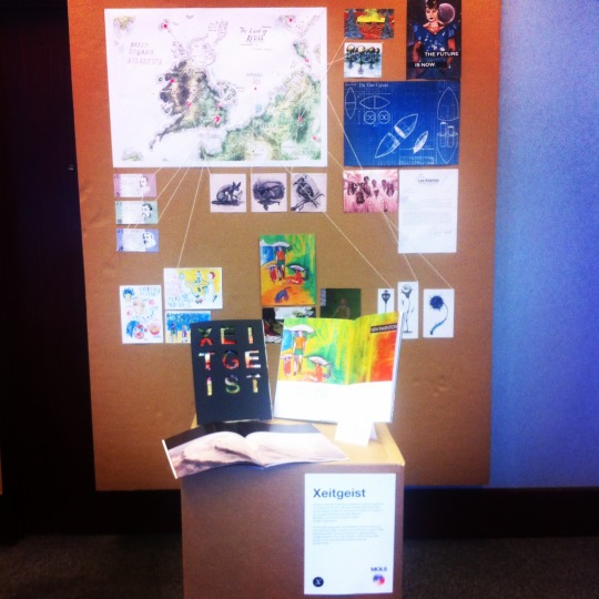
This is our final show. Displayed is the contents of our "time capsule" along with blueprints and a letter from the researches who found the capsule in the 50s, displayed in a forensic/police investigation way using pins and string.
0 notes
Text
End of week report
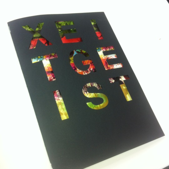
This week we finalised and printed/binded our magazine, and discussed ways we are going to display our work in the show. I am very pleased with how the magazine turned out, and the illustrations the others have made for the show look really good. I feel bad for not contributing much towards aspects outside the magazine, but this was mostly due to a collective lack of communication and organization.
We decided to go with the idea to create a forensic investigation style display for the rest of our work, so I have began drafting ideas of layouts of how it could be arranged in my sketchbook.
0 notes
Text
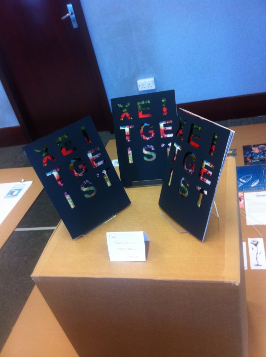
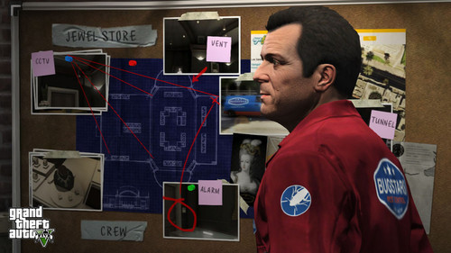
We have been discussing ways we can display our magazine and the other content of the time capsule. Me and Dom think it's a good idea to display it like an investigation, with string connecting each thing and with post-it notes explaining each thing. This is an idea I thought of while playing GTAV.
0 notes
Photo
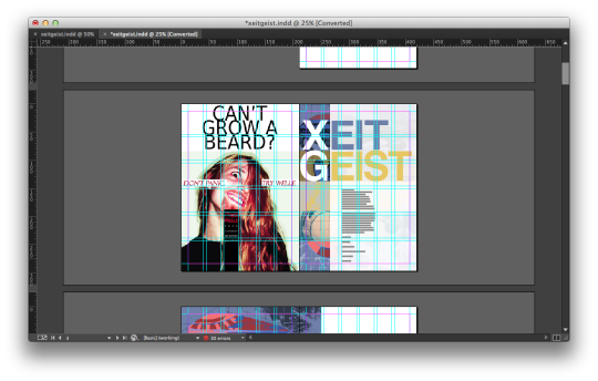
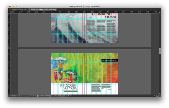
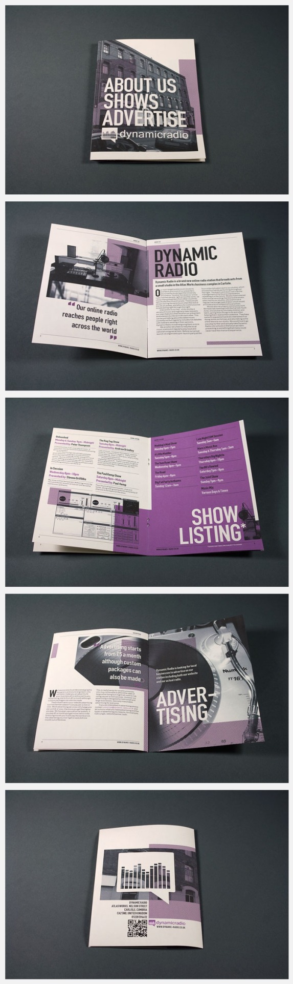
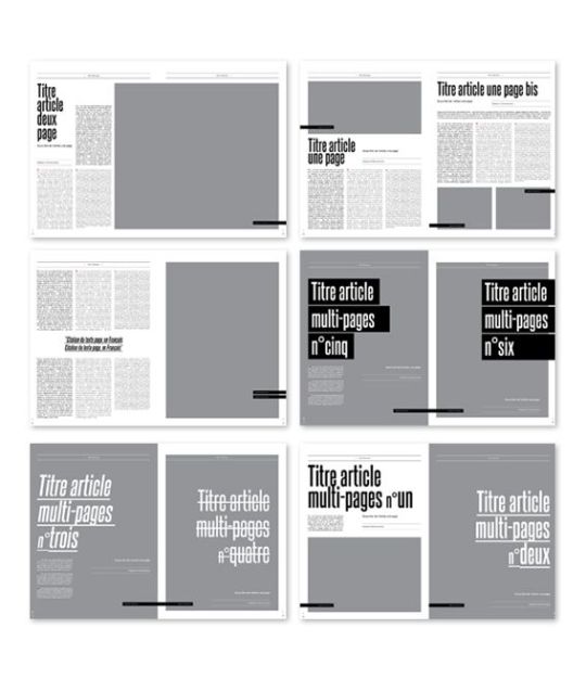
I ended up using a 6x6 grid for the layout of the magazine and adjusted each article to keep it consistent. Sticking to the grid is important because even though each article is so different, the magazine needs to have the same aesthetics throughout, and the grid allows us to do this.
0 notes
Text
Final edit of magazine
After receiving feedback from a tutor, I decided to re-edit the magazine using a different grid. I think that it looks a lot better now, and has much more constancy, despite each article being so diverse and different.
We printed and binded the magazine, and I am very pleased with how it looks.
0 notes
Text
Editing the magazine
We have began putting together all the articles and editing the magazine using a grid system on indesign. This is proving to be quite difficult, as we only have two graphic designers in our group, and as much as we like having input from the others, some of their ideas aren't exactly what we think is best for the magazine.
0 notes

Text
Logo for the second article
Images for the 2nd article
Logo for the video game:
0 notes
Text
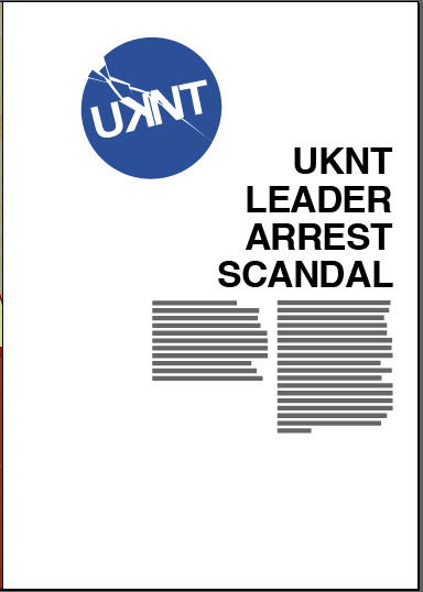
Creating a logo for UKNT
I have decided to create a logo to go along with my first article.


0 notes
Text
Marlboro ad revisited
I have made some slight changes to the marlboro advert, as I feel the model looked too masculine. I have also changed the name of the company, to fit it with the other changes to names of things in our parallel universe. This is the final outcome.
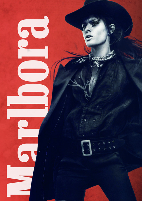
The colours obviously look different here to how it looks when it is printed.
0 notes
Text
My articles
I have written two articles for the magazine, one for the news section, and one for the entertainment section.
The first article is a parody/satirical take on the current issue of the May European elections. I have created my own political party, called UKNT. The article is about the arrest of the party leader.
"The leader of the United Kingdom Nationalism Tribe, Frage Nigella, was arrested yesterday evening. Sources say they were caught fraternizing with an alien species, the name of whom has been disclosed. The MP is yet to make a statement on the matter, but odds are not in their favor. Various videos were leaked to the video sharing site “ourtube”, and though were promptly removed, they have been shared over 1,000,000 times overnight. It is thought to be of no co-incidence that this scandal occurred just in time for the May elections, with many spectators believing the footage was leaked by a rival party. The UKNT party, who have been accused by many of being ‘alienist’, have always opposed the legalization of inter-species relations, which is why this news has come as such a shock to us. Nigella’s PA refuses to make note on the matter, however many are claiming that the video footage has been edited. Protests are being held throughout the country, many held by the activist party known as Ananymous, who claim the UKNT party should withdraw from the election due the to arrest of their leader."
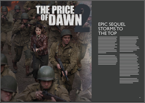
My second article is simply a video game review.
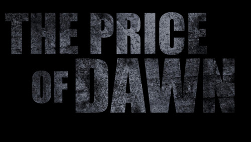
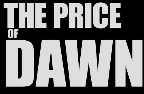
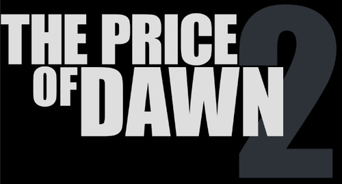
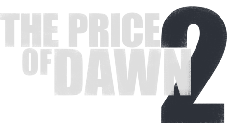
"The much-anticipated sequel to the best selling video game, the Price of Dawn, finally hit the shelves last night, and it has already sold over 5 million copies worldwide. The vast popularity, and the anticipation running up to the release of the game begs the question, is it worth the hype? Well our team, who received a copy the night before it was released, have be dying to tell you all about… The first thing we noticed about The Price of Dawn 2 was the ultra-real graphics. It’s almost like you’re controlling real people as you make your way though through the game, which picks up five years after the ending of the original. The global conflict centers on a full-scale war that whisks you through characters and exotic locales at a dizzying pace, and that’s the heart of the campaign’s only real stumbling block: It has so much story to tell that, at times, it feels far too frantically paced. What’s the hurry? Personally, I’d like more time to enjoy some of the jaw-dropping levels Infinity Ward has created. TPoD2 makes full use of the Oculus Raft 3’s new virtual-reality feature. Just a flick of the eye is all that’s needed to open up the amazingly designed new HUD. The Price of Dawn 2 is definitely worth playing, and we’re all excited to see what DLCs Actisight have in store for us in the future!
0 notes
Text
final adverts
these are my finished adverts for the magazine


0 notes

Text
End of week report
We had a group meeting earlier this week to brainstorm some more ideas. I have began working on thumbnails for the layout of the magazine/newspaper. I have also began creating a logo for the magazine, and been working on my adverts.
As a group, we have been discussing what else we are putting in the exhibition. So far we have ideas of a map of the parallel earth, some currency from a county in the parallel earth, and a few drawings and postcards, though I have only seen a couple of drawings. I hope we get everything done on time.
0 notes
Photo

Torrential.
Want to help me reform the Internets #1 fashion and street style platform from its divided gender ways? Elliott Alexzander has been rising to the top of the websites leader boards by showing off his gender variant style! Why is this important? The leader boards are closely watched by site moderators which means that Elliott must be coming into view for some of them. Why is this important? Because maybe if moderators begin to realize that one of their websites top fashion bloggers is gender variant, they will rethink the way they address gender with its users. The theory behind this? Well for starters, thousands of people flock to Lookbook.nu everyday seeking fashion advice and inspiration. How cool would it be to see gender variant individuals inspiring tomorrows fashions? Fashions that are not associated with gender roles, styles that are diverse in character and clothing that is body positive. That is the kind of world I dream of, what about you? Below is the email address to lookbook.nu. Email the website and speak up about gender inequality and make them aware of how they are keeping their users identities confined. Even if you don’t care about fashion, the moral of this goes further. The gender variant community needs to be represented and understood! Also, if you want to go the extra mile, join the website and keep Elliott floating on the leader boards by “hype” all of the outfits. The links bellow:
The Email for LookBook.nu - [email protected] Elliott Alexzander - Lookbook/elliott_alexzander
Thank you, The House of Alexzander Team!
439 notes
·
View notes