
Don't wanna be here? Send us removal request.
Statistics
We looked inside some of the posts by aimeerosebailey15-blog and here's what we found interesting.
Average Info
Notes Per Post
11
Likes Per Post
9
Reblog Per Post
0
Reply Per Post
2
Time Between Posts
3 days
Number of Posts By Type
Text
17
Last Seen Tumblr Blogs


Fun Fact
Tumblr has 411 employees.
Text
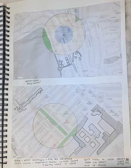
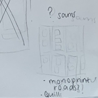
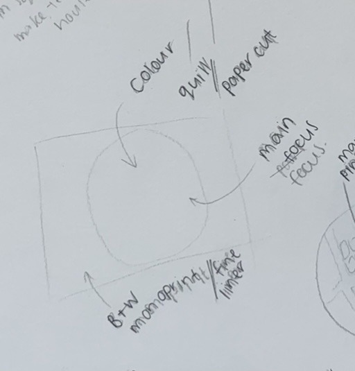
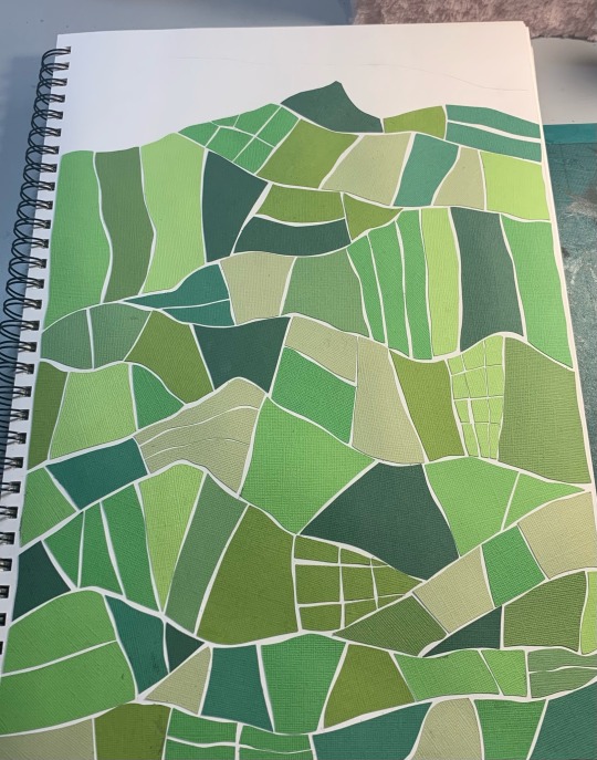
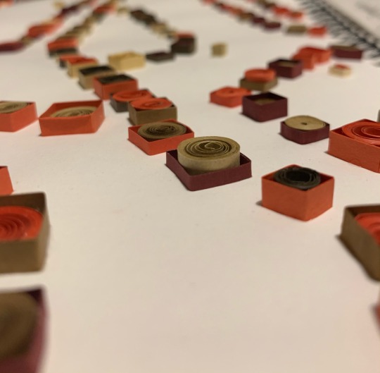
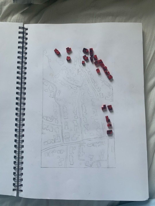
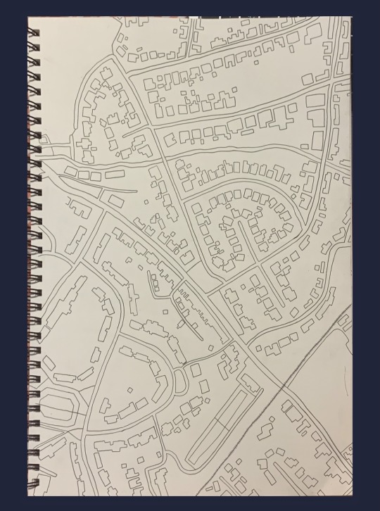
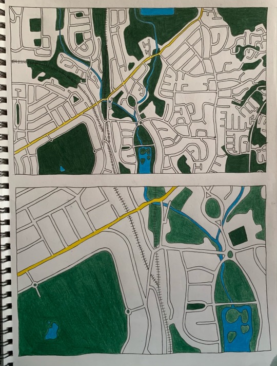
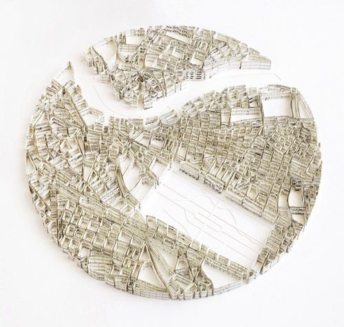
FINAL PIECE
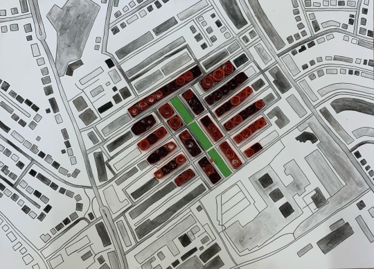
This how how my two final outcomes looked when I’d finished. The top one is my boyfriends house and the bottom is mine. I chose these places since they’re where I spent the most time during the COVID lockdowns in Wales.
To make these I used a fine liner for the majority to outline. I decided to use watercolour too to fill that in to add some contrast.
I quilled the immediate area around both of our houses to make that stand out.
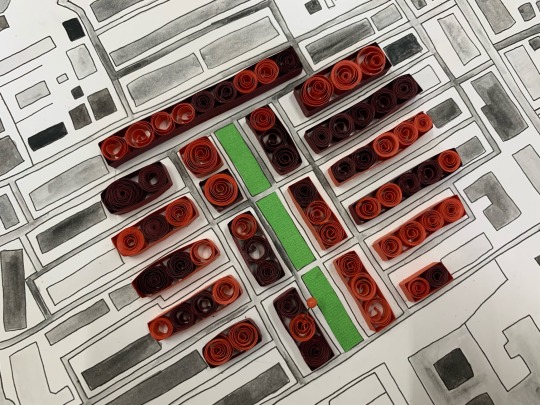

I think this circle design is really effective and I’m happy with the outcome. I love the contrast of not just the colours but the height of this piece too.
I wanted to make it really clear which house had the significance to me so I added some map pins to show.
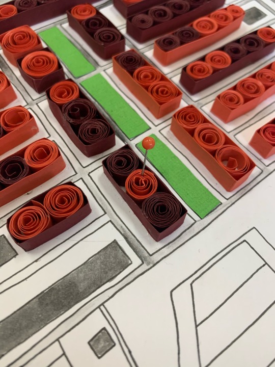
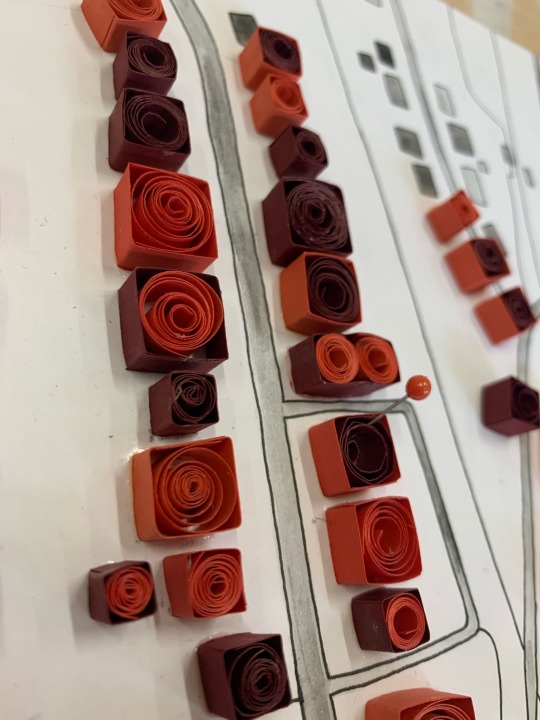
I’m glad I did this because it adds another little detail that’s quite small but makes a difference for sure.
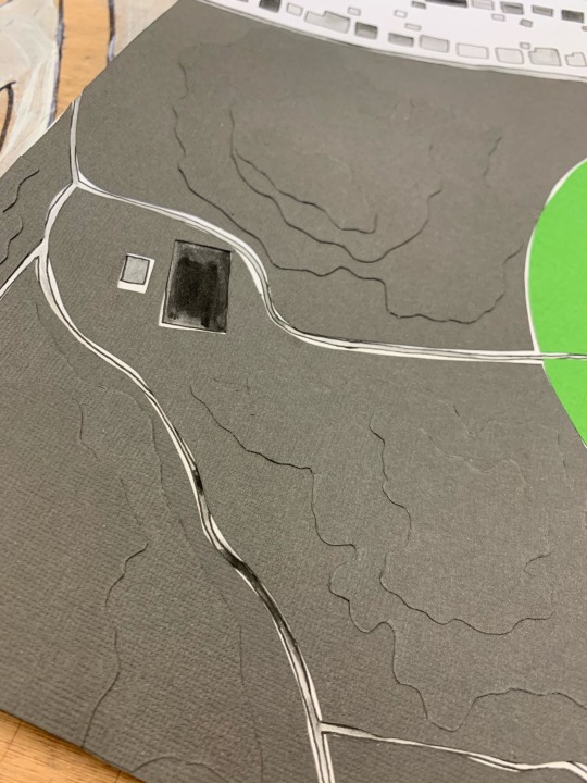
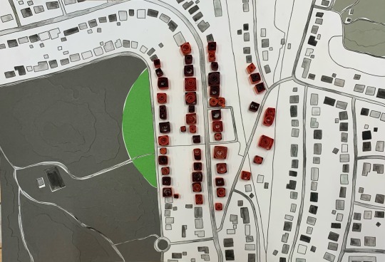
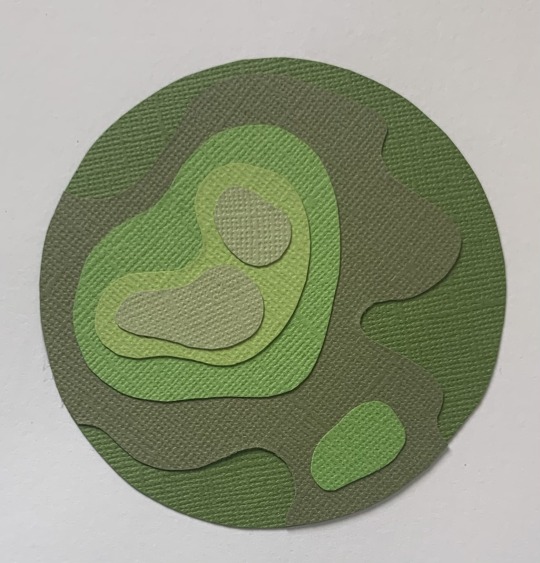
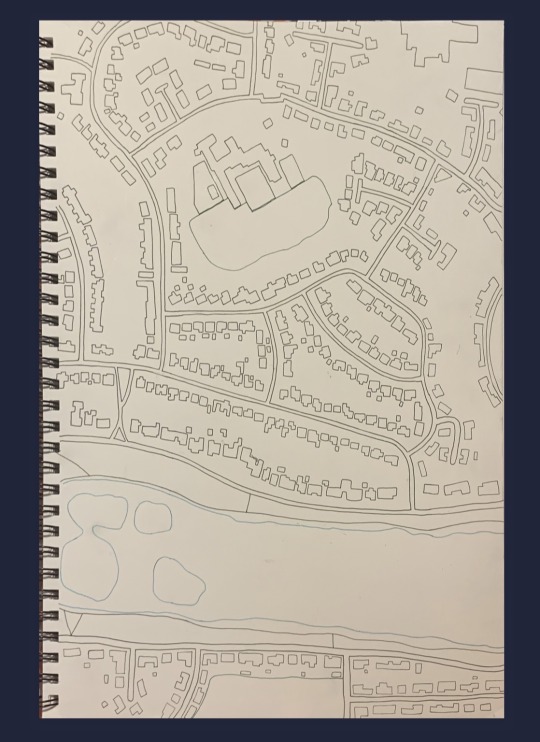
In the piece of my house I thought a lot about how to present the park. I considered watercolour but I didn’t want it to be flat. I decided to use topographic maps as my inspiration to layer the paper. I also thought about how many colours I wanted to use. In the end I went for a monotone look as to not take attention away from the quilling. I like how un obvious this is at first glance but without it I would definitely worry about the lack of dimension in that area.
0 notes
Text
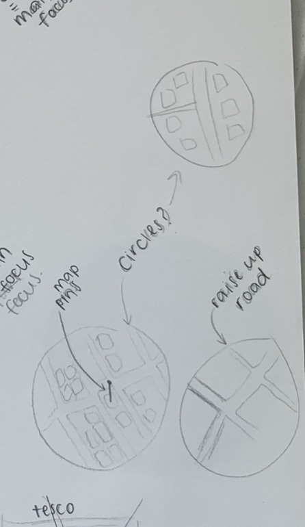
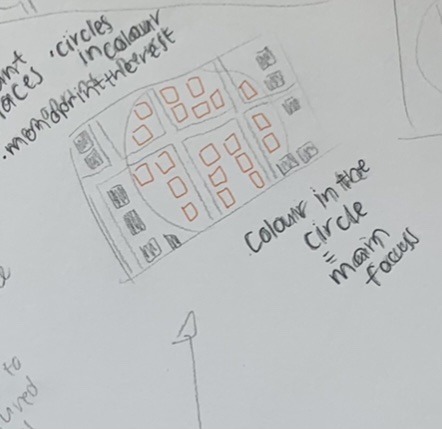
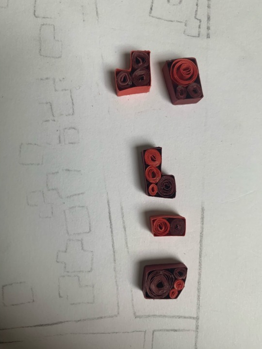
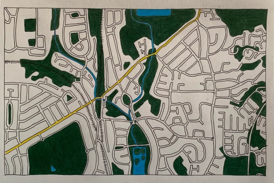
Final piece ideas
I wanted to see more accurately how my final piece could look.
To do this I printed out black and white images and coloured images of the places I spent most time at.
For the park where I walk my dog I used the black and white image for the streets surrounding the park. I then used the coloured one for just the park. I like the concept of this but I feel like it would just be very flat.
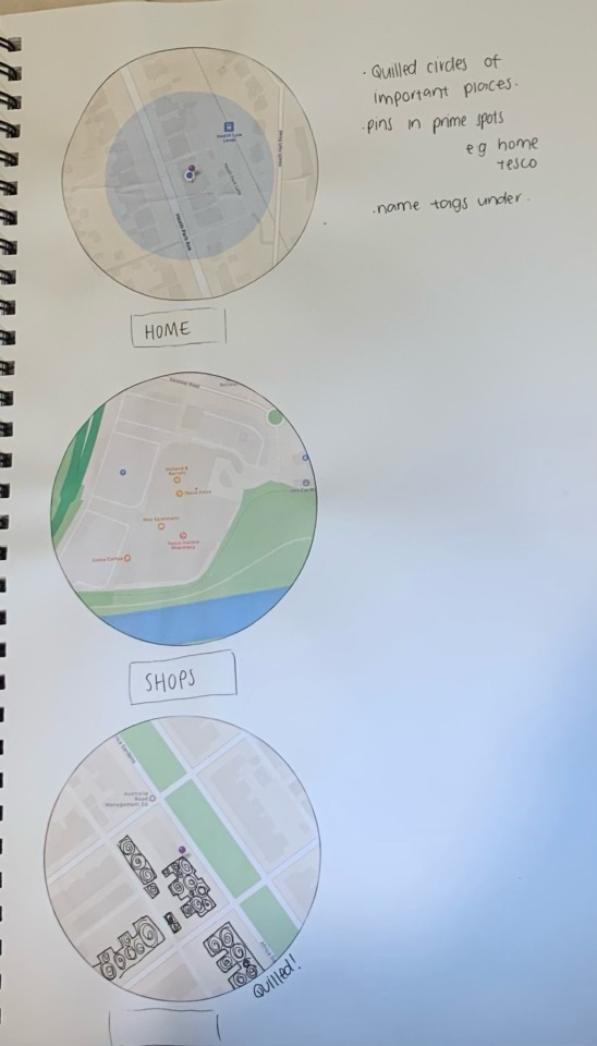

I tried the circle idea one more time to see if the colour changed my mind but I still didn’t like the idea. I just wanted something that would flow better.
I did the same idea I had for the park but with a lake I live by. This time I also included coloured parts around the map. I liked how this looked but I didn’t think it would compliment the other piece I wanted to do very well.
Eventually I settled on this idea using my boyfriends house and my house. I really love how these look and I was genuinely excited about making this which was a good sign. I wanted to use fineliner on the black and white parts and quill the houses on the inside of the circle. I bought map pins to show our houses.
2 notes
·
View notes
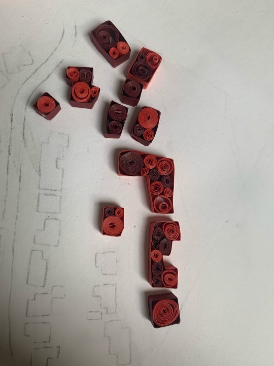
Text
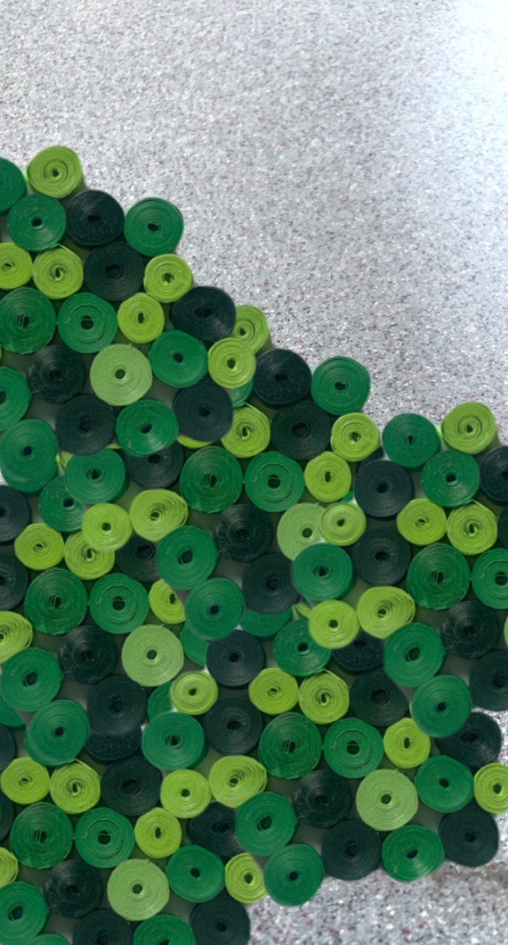
Since I knew there was going to be grass included in my final piece I did some testers to find out what I wanted it to look like.

I was inspired by topographic maps to layer paper and build up some height.
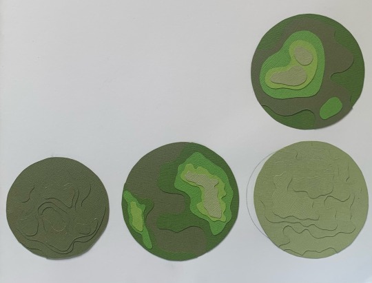
I did four quick circles to try. I really like how to mono-colour ones look since it’s not too over powering and I definitely don’t want it to be the main focus.
I didn’t like this one because it’s too rounded and soft. I like the more ridged edges, I think they look more natural.
0 notes
Text
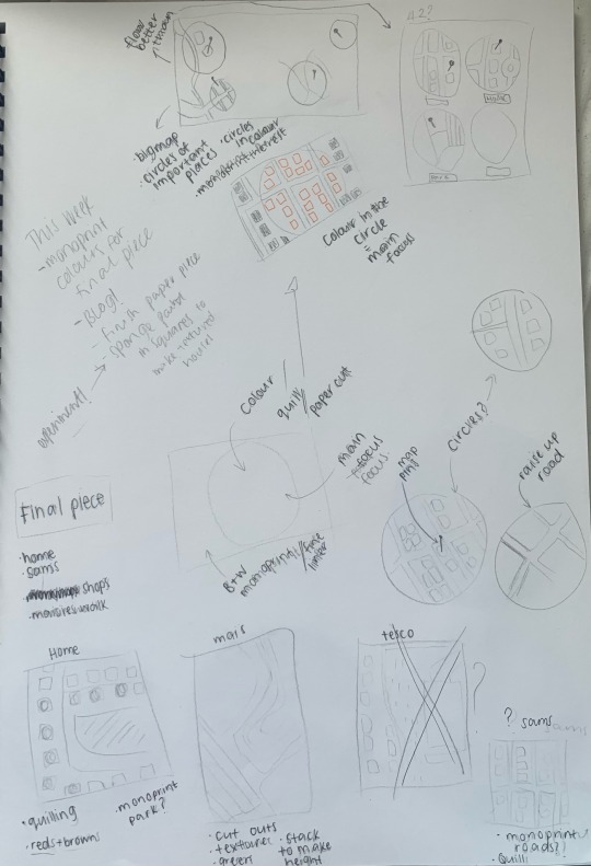
Final piece plan
I had quite a few ideas for a final piece so I did a few quick sketches to figure out what they might look like. I knew I wanted to do a couple of complimentary pieces, not just one. I just had to figure out what parts of Cardiff I wanted to use.
1.
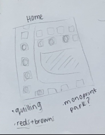
The first idea I had was to monoprint a map of my home in wales. I wanted to add the quilling I’d done previously over the top of the houses in reds and browns to match the brick colour. I live by a huge park so I considered mono-printing the park in green ink to add some more interest and texture. I wanted to use places I spent the most time at during lockdown so I knew my house needed to be one of them.
2.
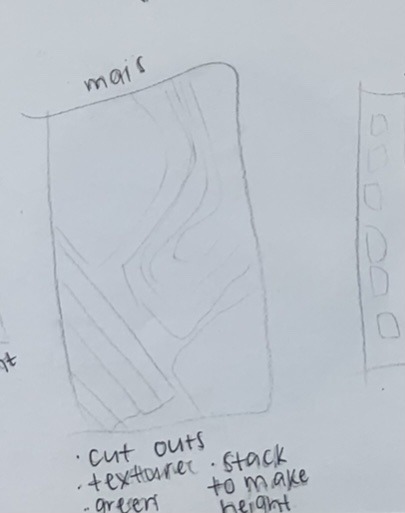
I spent a lot of time walking my dog Maisie during lockdowns. I took her to the local park so that’s the one I would include. I liked the idea of using the craft card and layering it to build height to mimic hills.
3.
I also spent a lot of time at my boyfriend Sam’s since we were able to form a bubble. The general idea I had for this was the same as what I thought of for my house. I thought this would compliment really well if they were next to each other though since they would be similar.
4.
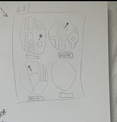
I thought about doing them in circles too if I needed to add a bit more interest. I wasn’t 100% sure on this composition though because I didn’t think it flowed very well.
Something I thought of to improve the flow was to do a big fine liner drawing of more of Cardiff and do a circle of colour around each important place. The one problem I found with this is that it might turn out massive since my important places aren’t close enough to fit on a reasonable size piece of paper.
5.
I really like the circle concept so I came up with this plan. I decided on a fine liner map with a quilled centre where the important place will be. I chose to do my house and my boyfriends house because that’s where I spent most of my time. I’m really excited to see how this turns out.
2 notes
·
View notes
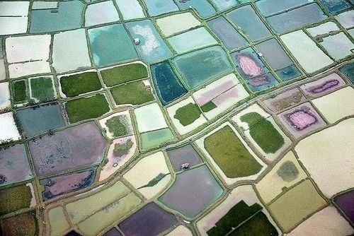
Text
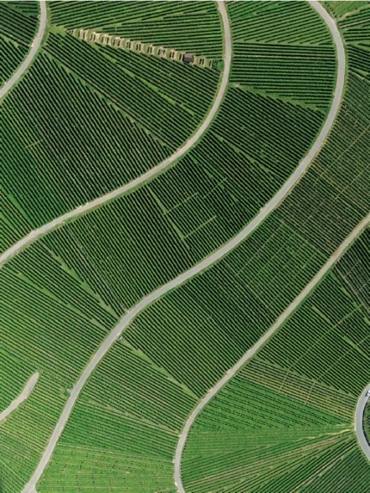
Something else that came to mind thinking of birds eye view was a hedge maze. I thought the patterns I could find in those would be interesting.
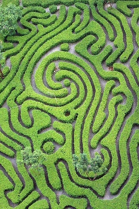
This is the photo I chose to recreate. I like the swirled pattern since it’s different from all the straight lines and strips I’ve been doing recently. It also naturally leads your eye across the piece.
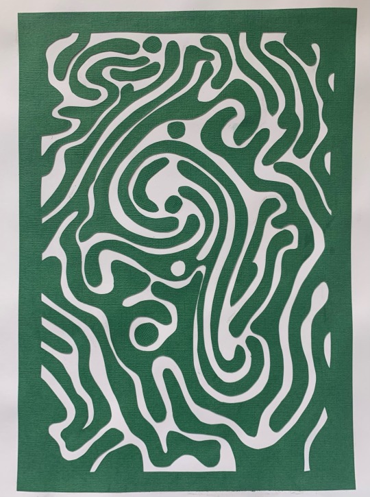
My recreation isn’t 100% accurate but you can for sure tell what it is when it’s next to the actual image. I do like the piece overall but there’s definitely parts I dislike.
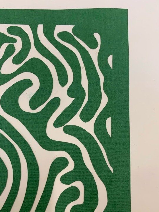
These squiggly sections are something I think turned out well. In my opinion they really look like part of a hedge maze. I also like the colour green I chose and how it stands out against the white background. But I think it might also be fun to put it on a light grey or brown background to mimic the ground in the original picture.
This middle section is a part that I’m not keen on which is a shame since it’s right in the centre and that’s where my eye seems to go to first.
I can’t pinpoint exactly what I don’t like about it, it just doesn’t look good to me.
0 notes
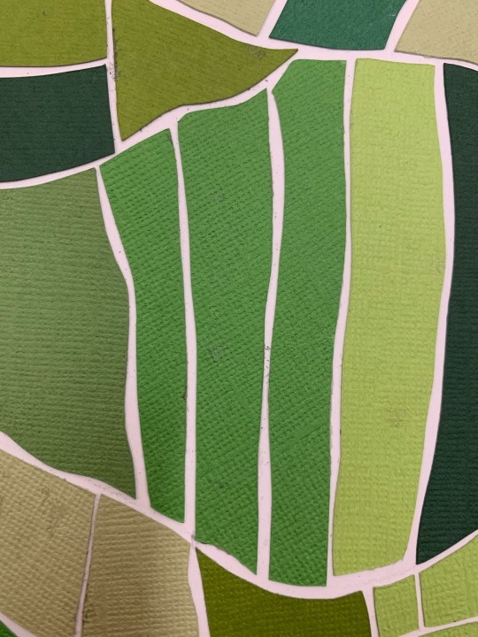
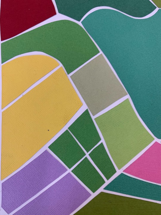
Text
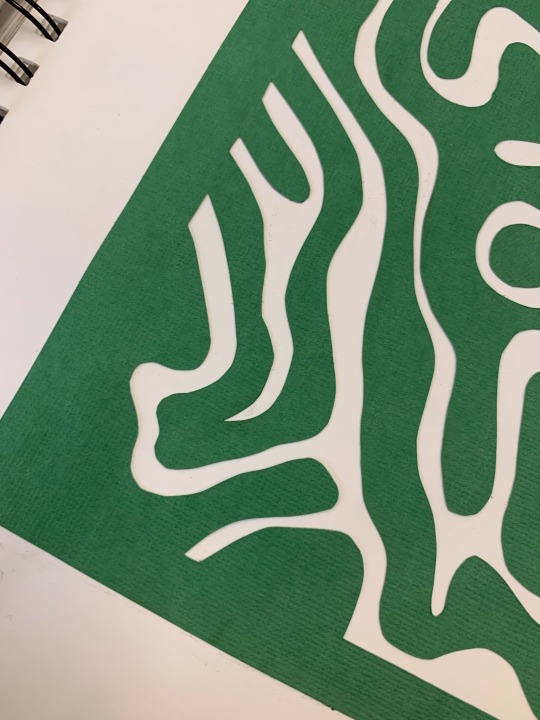
After wishing the last piece was a bit more detailed I decided to create something quite intricate.
This is the inspiration picture I chose since it stayed on theme but there’s so many lines and they’re quite skinny too so I knew it would come out looking how I wanted it to. I felt fine about not including other colours since I thought the detail would be enough to make it interesting.
I love how this turned out. I really like how it looks with the different shades of green, I’m happy I didn’t add extra colours into this one.
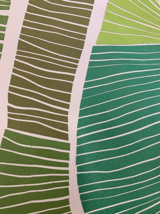
Just like the last two, I like how it’s abstract and it’s not obvious as to what it is at first glance.
One thing that wasn’t great about this was the amount of time it took. Cutting and glueing each individual strip was quite time consuming and I couldn’t of gone bigger than this A3 sheet even though I think it would look amazing.
1 note
·
View note
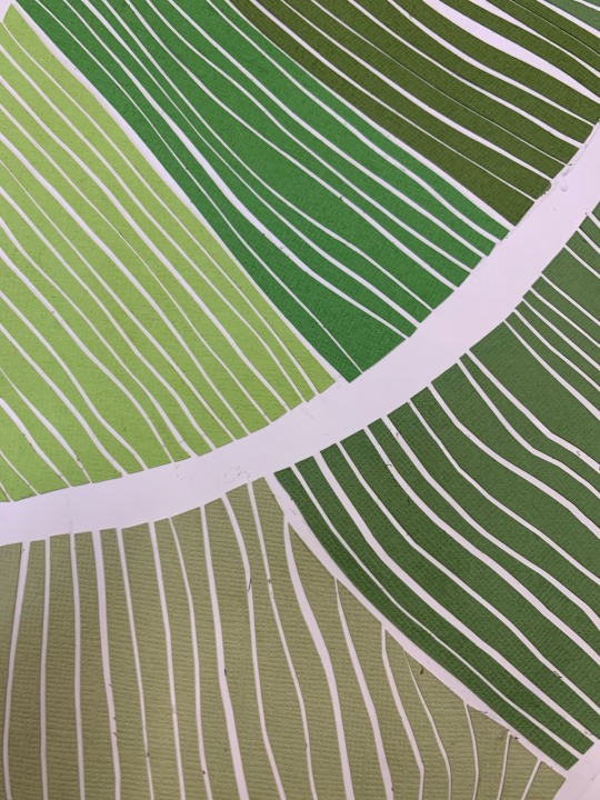
Text
I felt like adding a few different colours in this next one.
I love these inspiration pictures but I still wanted it to resemble a field a bit more than these do to me. To do this I planned on using more green with a few pops of colours that could be fields of flowers.
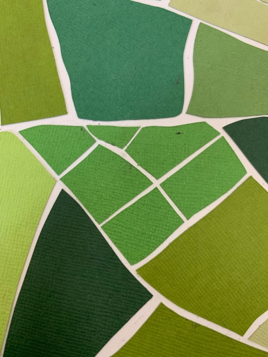
I chose some of the patterns I used before to carry on into this piece so it had some similarities that people could see. I chose the grid patterns and the strips. I also used the same greens.

I like how this one turned out too but I wish I’d make the shapes smaller and added more. There’s detail included but it’s not quite what I expected it to be. I definitely want the grids to have smaller squares and the strips to be skinnier so more could’ve fitted.
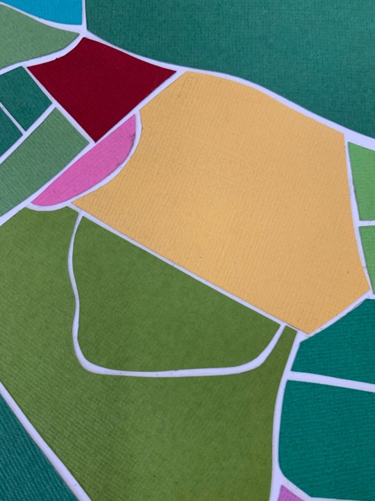
I feel really positive about the colours being included. I know I wouldn’t of liked this as much as i do if it was fully green. The new colours definitely add what I felt I was missing.
0 notes
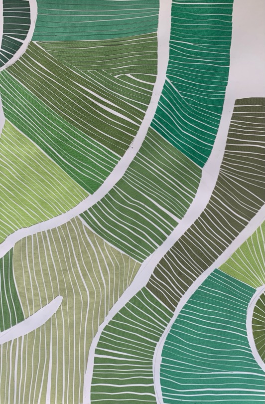
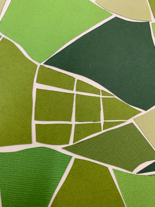
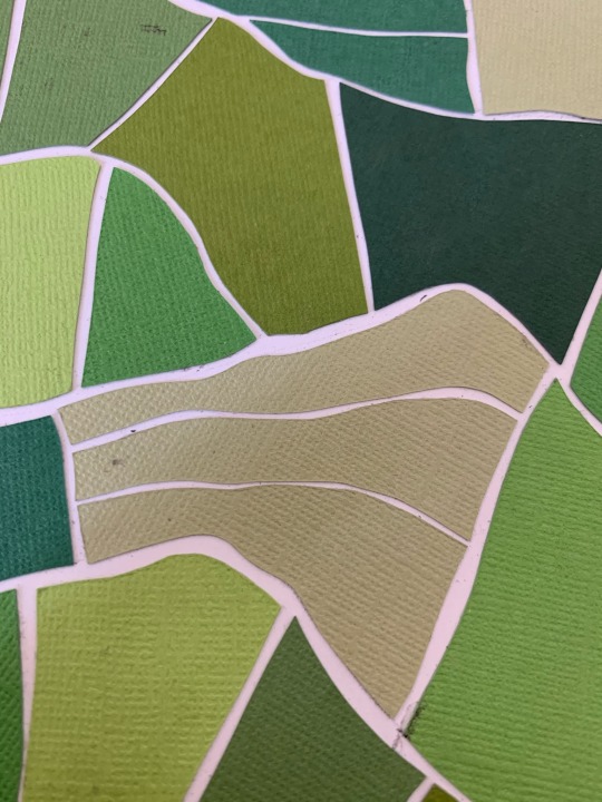
Text
Scrolling through Pinterest I found a lot of birds eye view pictures of fields. I liked how they were much more pattern based and some weren’t instantly obvious as to what it was.
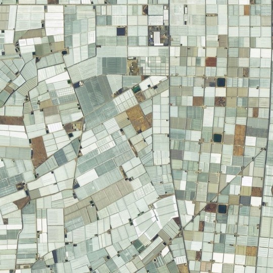
I felt pretty inspired by these and paper cutting came to mind to try.
I started by drawing some rough guidelines for where I wanted each field to be. I used quite a few different kinds of green because I wanted it to be bright and full. I left spaces in between each field like in the first inspiration picture since I liked how that looked the best.
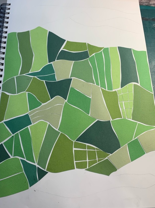
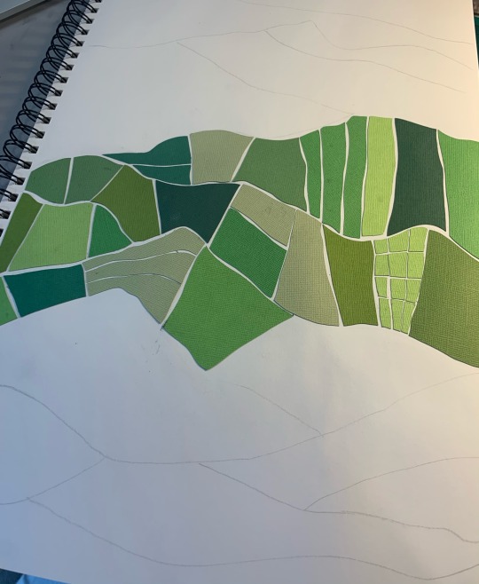
I decided to follow through and complete this since it was looking good. I enjoyed the process of this too, choosing what colour and pattern goes where and making it as aesthetically pleasing as possible.
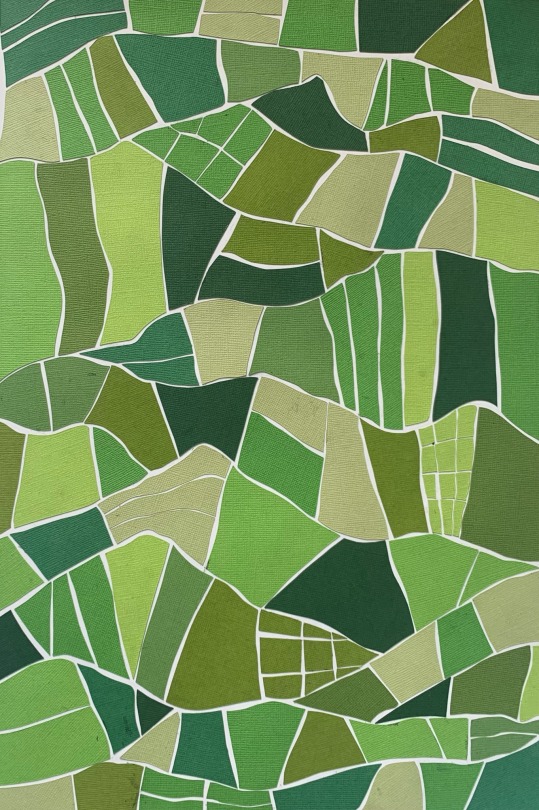
I found this really rewarding and I loved how this turned out. The fact that it’s super pattern based is exactly what I tend to lean towards and it’s what I think I’m best at. I like how it’s not obviously fields and it’s quite abstract. I knew instantly I wanted to continue with this type of work for a bit longer.
1 note
·
View note
Text
I really enjoyed the quilling process and the things I made so I wondered about carrying on with it. I knew I wanted to use some brighter colours this time.
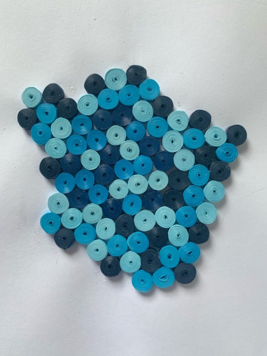
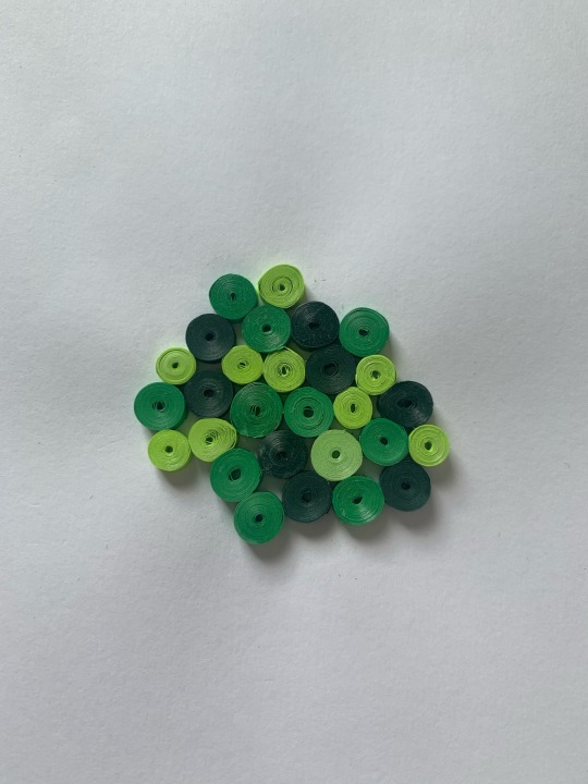
I chose green and blue since they were the obvious choice to me with the mapping theme. I wanted to use the different shades to add a bit more dimension too.
I really liked how the testers turned out but I wasn’t sure if it would be too overpowering on a larger scale. I used an editing app to roughly get an idea by copying and pasting a few next to each other to mimic it in a bigger size.
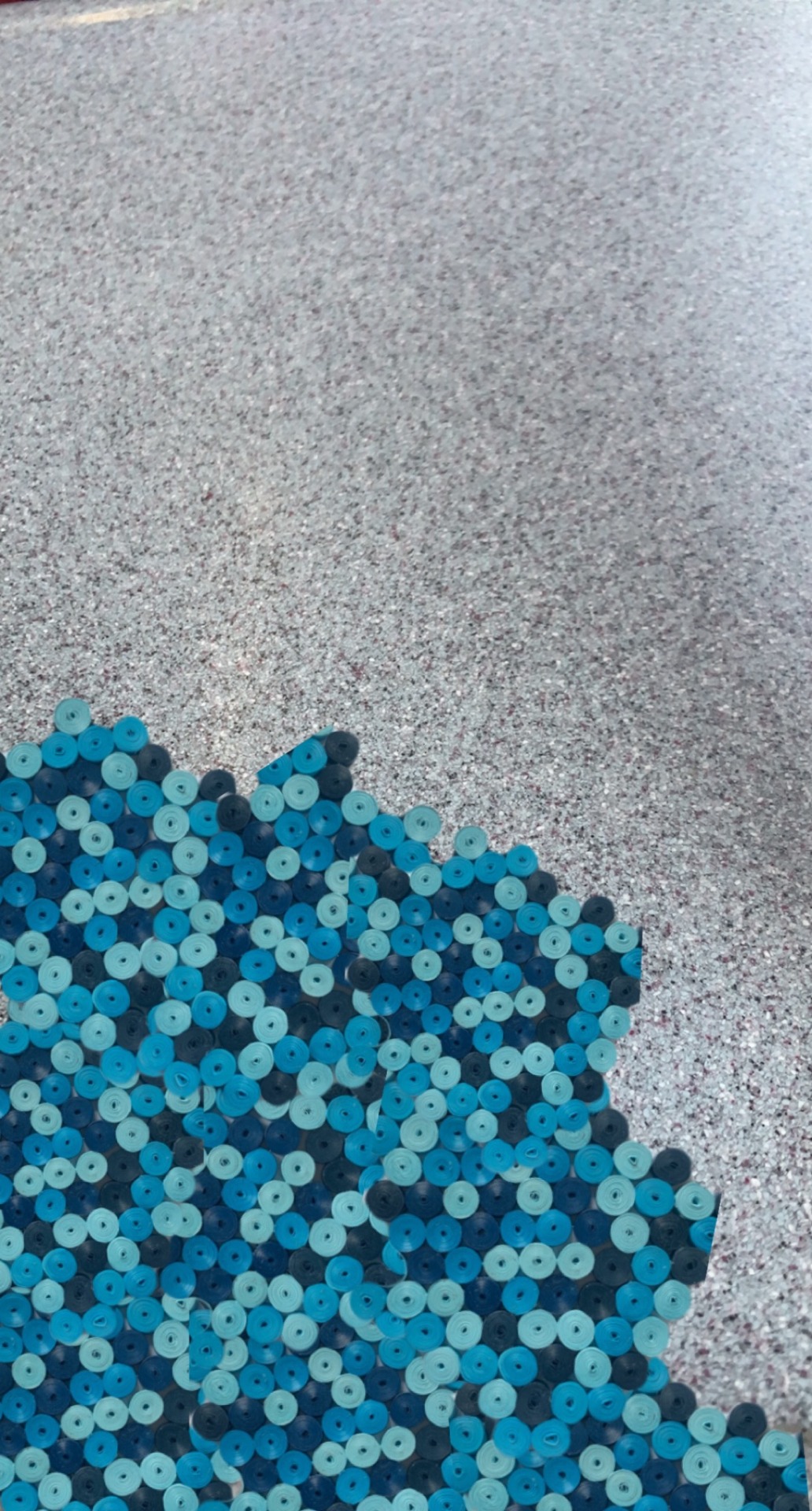
I really like how it looks on a larger scale but I think it is quite overwhelming to look at, especially if I wanted to include the quilled houses too.
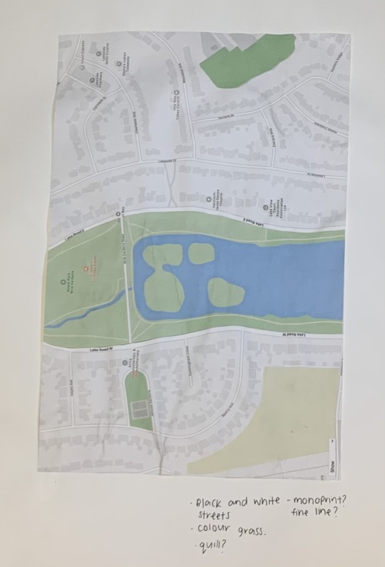
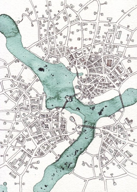
I thought about doing a line drawing of the lake screen shot and using this technique to fill in the lake and grass surrounding it.
I thought back to this picture where the lake is coloured and the streets surrounding are plain and I remembered how much I didn’t like this so I decided to leave the idea and move on.
1 note
·
View note
Text
Whilst I really like the simplistic look of the first quilling piece I made, my work is usually full of colour and pattern and quite intense.
To keep on theme I wanted to make something that was busier.
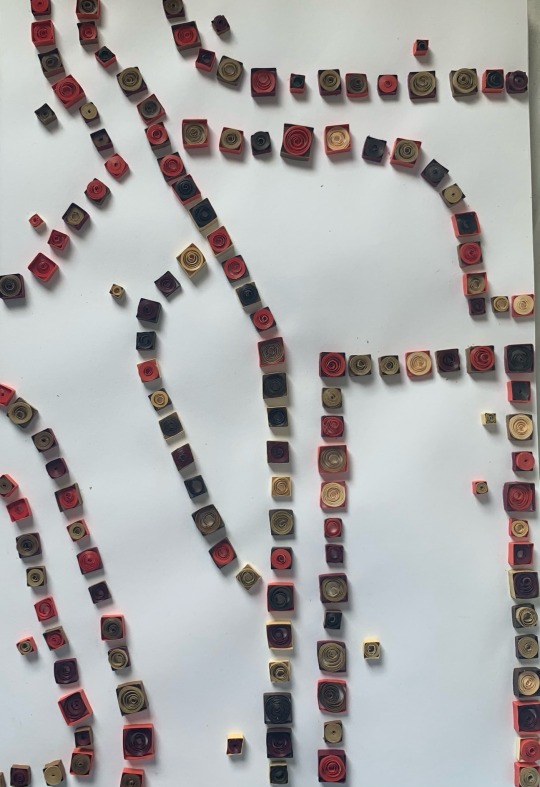
I went onto google maps to choose a section to follow. I used only squares this time as it was less time consuming and still looked effective.
I filled the shapes again with rolled up quilling paper. I wouldn’t of changed that since I loved the way it looked it the previous attempt.
Something I did change though which I’m happy about is the variety of heights. This time I used 3mm and 5mm paper. I like the way that turned out because it just adds another little pop.
1 note
·
View note
Text
After making some fine liner pieces I decided I needed to add some more interest and I knew texture would be a great way to achieve that.
Back in year 12 I made some quilling art after being inspired by Yulia Brodskaya. Quilling is an art form that involves the use of strips of paper that are rolled, shaped, and glued together to create decorative designs.
“Paper always held a special fascination for me. I've tried many deferent methods and techniques of working with it, until I found the way that has turned out to be 'the one' for me: now I draw with paper instead of on it". Not long after discovering her unique style, Brodskaya has earned an international reputation for her inspiring paper illustrations.
I obviously wanted to continue with my mapping theme so I quickly sketched a part of Cardiff. With my quilling paper I followed the outline of each shape to create a. 3D ‘house’. I wanted to make it really full and fun so I decided to roll the paper up to fill the shapes in, which I’m really happy about.
I also think it’s cool how only a few houses are coloured and the rest are flat and just an outline. This could be a cool thing to use in my final piece to show the most important places in Cardiff to me, or the ones I visited most frequently in lockdown.
1 note
·
View note
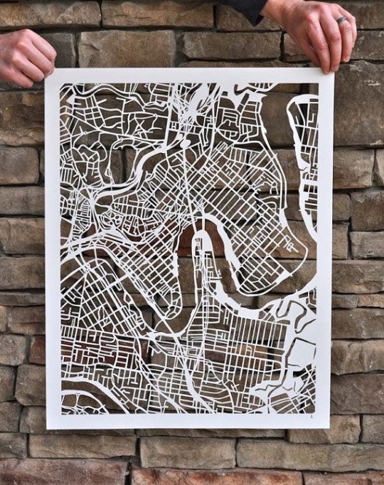
Text
I got the idea for a simple outline map because I liked how the houses looked on my last piece.
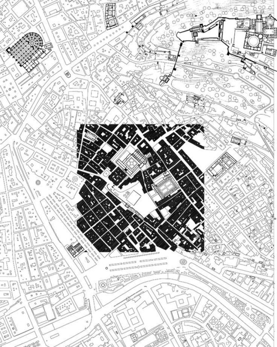
I would definitely like to do a really big scale one of these. I think one of a bigger area of Cardiff would be cool since it’s a busy city and there’s so many interesting buildings. I will for certain do a large scale piece like this during this project.
I also got inspired by Pinterest for this specific style.
These are so simple but I think they’re really effective. I really enjoy the black and white too, I feel like if there was colour it could be quite a lot to take in.
I wanted to test how it looked with colour to see if I was right. I added two tiny pops, a blue lake and a green patch of grass. I wish I used a lighter green. I can barely tell the difference between it and the black. I love how the blue looks though.
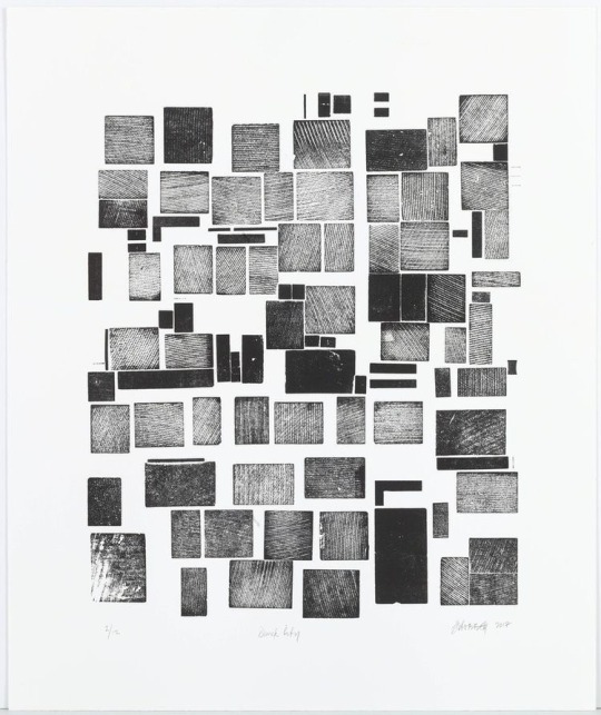
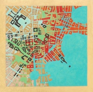
This piece of art is called Quick City made by Stephen Hobbs.
I like how he used texture to add interest. Without the lines running through it would just be a page of black squares and rectangles. I think adding this to the drawings I’ve been doing could add what I think I’ve been missing.
I want to mono print this. I know it’ll recreate it most accurately . I wouldn’t do it in this format like Hobbs has, I would just add it to the drawings I have that already exist.
1 note
·
View note
Text
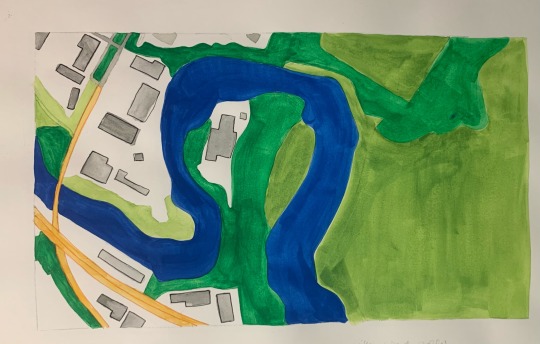
I wanted to try the water colour idea one more time.
I did the blue part too dark so I had to use black fine liner which I don’t really like. I think it looks a bit boring, nothing about it draws my eye to it. It might fix it if I wrote on the green too to add more interest but I wanted to start something else instead.
I tried felt tips again because I felt the water colour wasn’t giving the pop of brightness I was looking for. I like that I used the blue and the green for the text but I wish the line of the river was more prominent. I should’ve used a thicker line to define between the two colours more obviously.
I like this much better than the first version but it’s still not quite right so I’m going to move onto something different. I really like how the outlines of the houses look and I think it could be really interesting to do something with that.
0 notes
Text
I knew I wanted more colour but I didn’t like how the the felt tip pens were coming out every time so I wanted to try another medium.
I did some tests with water colour. The first one I tried came out far too dark. I really disliked the green colours I created and I knew if I wanted to add writing over the top of the river it wouldn’t be very visible.
I did some testers with the fine liners and water colours to see how light I’d have to make the paint so the pen would still be easily seen. I found out I’d have to use a lot of water especially with the darker colours so they didn’t get overly saturated.

On my second try I was way more successful. I preferred this green colour to the first but the blue was still too dark. I outlined the colours with the corresponding fine liner to test how visable they were. The greens turned out great but the blues and the greys were still just too dark. I’m still not the biggest fan of the lighter green I think it doesn’t suit the rest of the colours.
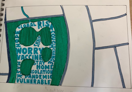
On the third and final try I went really carefully with the blue and made sure it was as light as I could make it. I decided to leave out the light green because I thought it was an eyesore. Instead I filled the space with the text I wanted to include. I really like how this turned out but I want more text in different colours if I do another piece.
0 notes
Text
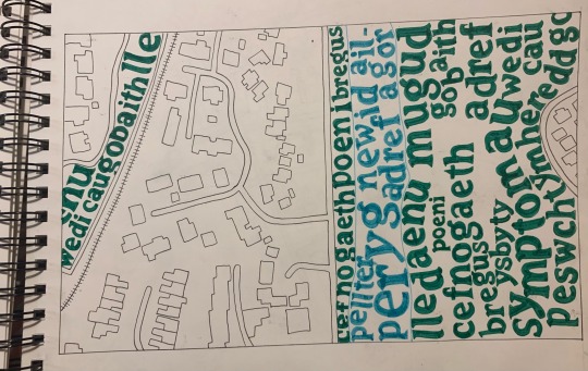
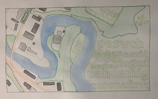
Whilst looking on Pinterest I saw this photo which I really liked and wanted to recreate but with a twist.
I decided to use words I would relate to the pandemic. I also wanted to use the Welsh translations since the maps I’m using are places in Wales.
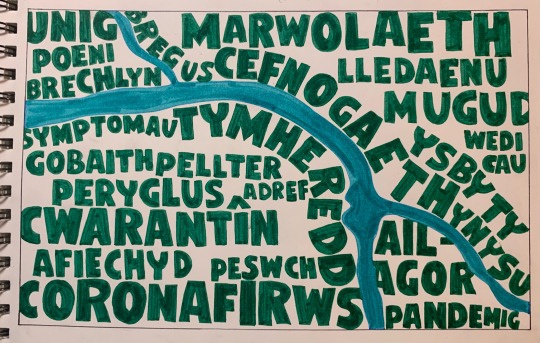
The first time I tried this I really enjoyed the outcome. I used the Afon Taf since it has a lot of interesting bends and turns.
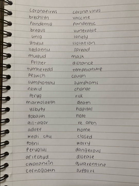
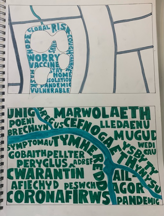
This is the list of words I came up with and the translations.
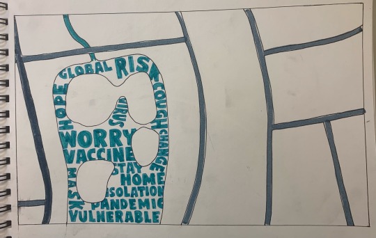
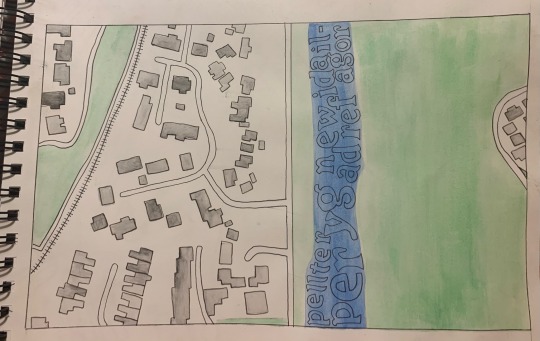
I wanted to try something else too and use the words where the water is. I used Roath Lake and a couple surrounding streets.
I didn’t feel like it was complete so I wanted to add some more.
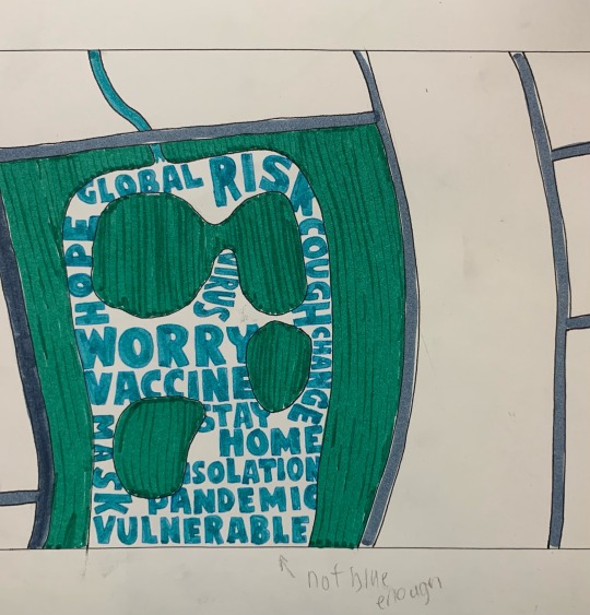
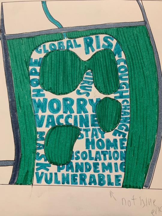
I added the green in around the lake but i think it’s way too over powering and it takes away from what I wanted to be the main focus, the lake. I initially was thinking of adding outlines of where the houses stand but after seeing the green I didn’t want to distract from the lake any more. I’m interested in doing something with the houses though for sure.
0 notes
Text
To start off creating I wanted to begin simple. I pulled up google maps on my laptop and I drew the map of my local area in Cardiff.
I didn’t want to take the map route too literally but to start off I thought it would be best until I knew what path I wanted to go down.
I used black fineliner to outline everything and coloured pencils to brighten it up.
I liked making these two pieces but I definitely think they’re far too literal. I usually like to create more abstract work.
0 notes
Text
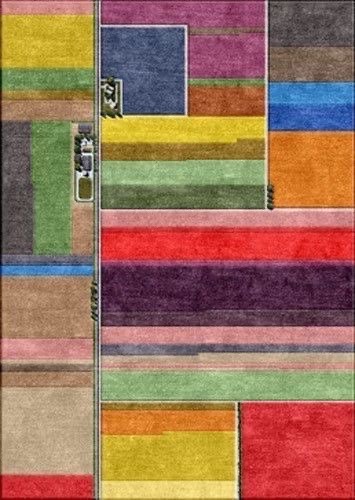
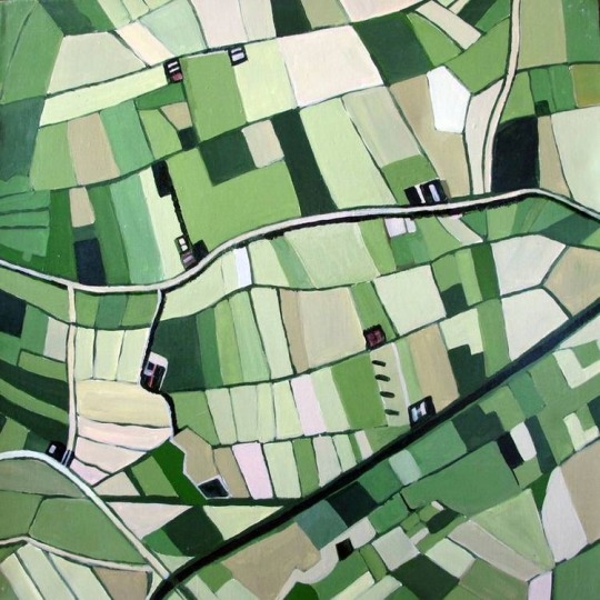
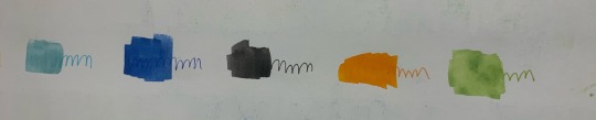
I went to Pinterest to find some inspiration to help me start my project.
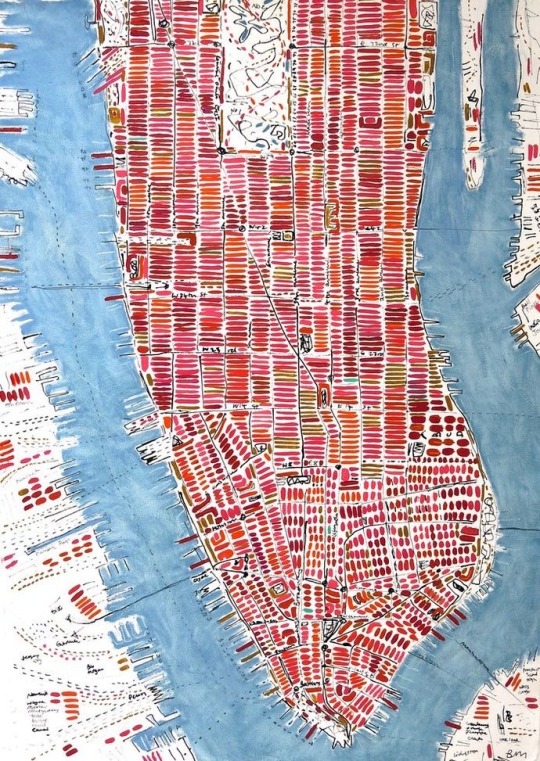
This image caught my eye straight away because I love using bright colour in my work. I also really enjoy that it’s semi abstract in the way that the houses are created with just a brush stroke.
I love working with paper so I saved these two images. I’ve done paper quilling in the past which is a technique that’ll help me if I want to do any 3D paper work. I also really enjoy detailed, intricate art and cutting paper is a relatively simple way to achieve this.
Where I live is full of rivers and lakes so I wanted some images that included water. I really enjoy how in the second picture the artist let the river be the main focus so they’ve left the rest of it in black and white.
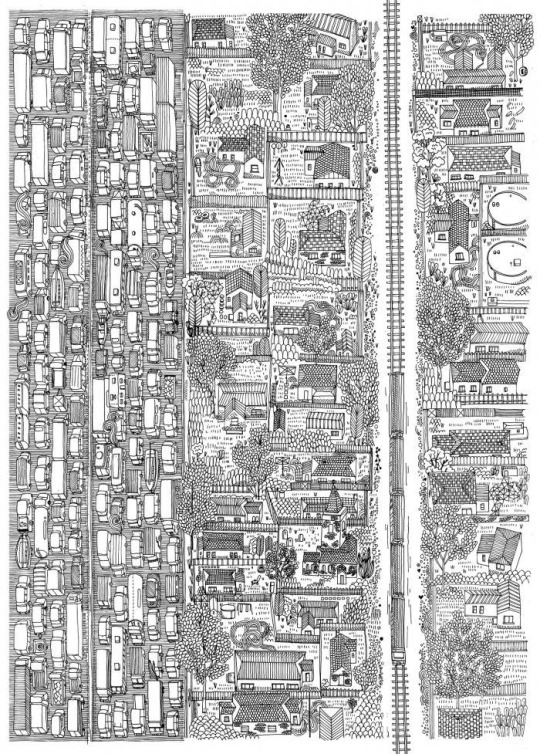
I picked this picture because I have a train track at the end of my garden and if I wanted to do a detailed pen drawing of where I live then I would definitely turn to this to help me.
1 note
·
View note