
Artist, nerd, gamer, aspiring author, professional graphic designer & illustrator, fan of D&D, Supernatural, House, Fairytail, all Law and Order, Studio Ghibli, TeamFourStar, bookaholic, Redwall series, Bioware, Fable, Elder Scrolls, Legend of Zelda
Don't wanna be here? Send us removal request.
Statistics
We looked inside some of the posts by capnkat88 and here's what we found interesting.
Average Info
Notes Per Post
1M
Likes Per Post
694K
Reblog Per Post
544K
Reply Per Post
829
Time Between Posts
3 months
Number of Posts By Type
Text
11
Photo
6
Last Seen Tumblr Blogs


Fun Fact
China blocked Tumblr because of pornography and censorship problems in 2013.
Text
HANAMUSA (JESSIExDELIA) MASTER POST
I probably should have started doing this forever ago but I wasn’t sure how long I was gonna stick with drawing these comics. But I guess we’re in it now! This will be continually updated~ EVERYTHING UNDER THE CUT
Keep reading
52K notes
·
View notes
Text
For anyone that loves FF14 and wants some art of their WoLs, check out my girl Lady Valiant! She does a great job and has reasonable prices too!

6 notes
·
View notes
Text
2021 lasted 5 seconds and those 5 seconds lasted 20 years that felt like only a few months i hope that clears things up
106K notes
·
View notes
Text

I think about this Twitter poll every day of my goddamn life
52K notes
·
View notes
Text
Okay so I keep seeing people unironically posting this on my timeline all the time
I just wanna clear something up about it
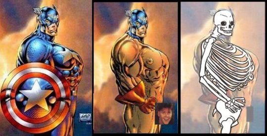
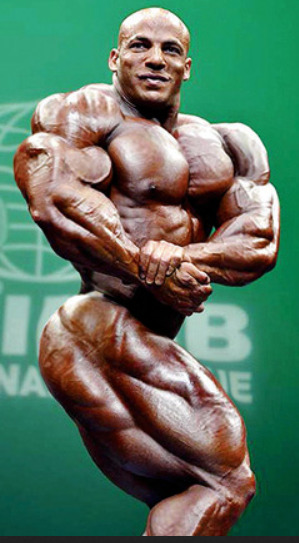
1)It is an undoubtedly bad drawing, yes, the rule of art is generally “it’s wrong if it looks wrong” and this clearly looks wrong 2) The person who did that draw-over doesn’t have a much better grasp of anatomy and, I’m going to assume, isn’t very familiar with what bodybuilders look like
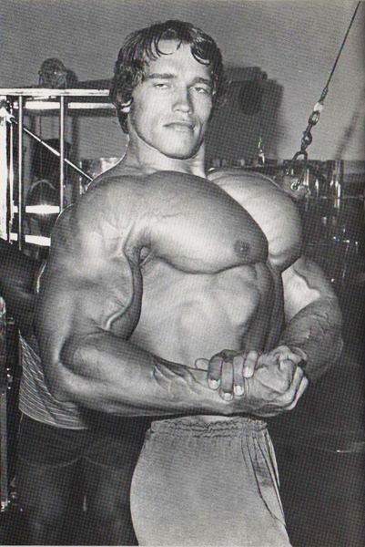
The Liefeld drawing was referenced from this photograph of Arnold Schwarzenegger;
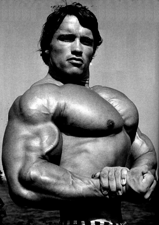
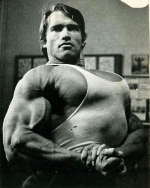
this is a pretty common bodybuilding pose and photography technique, to do these slight upshots to emphasize the size of the chest as much as possible. You can find a million photos of even just Arnie striking this exact pose in different situations;
The thing about competitive bodybuilders is that their dimensions are so outside the realm of what the average person is accustomed to that they can look “out of proportion” in real life. Parts of the body that can’t change size like the head and hands appear comparatively small, and the girth of limbs can make them appear shorter than they really are
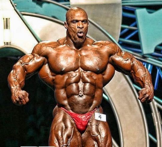
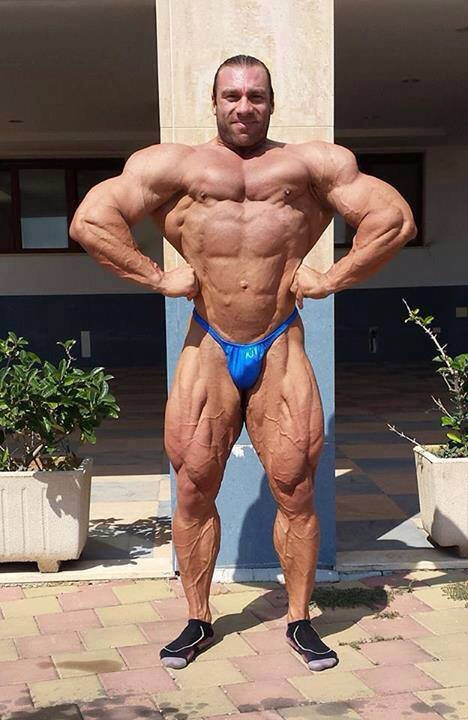
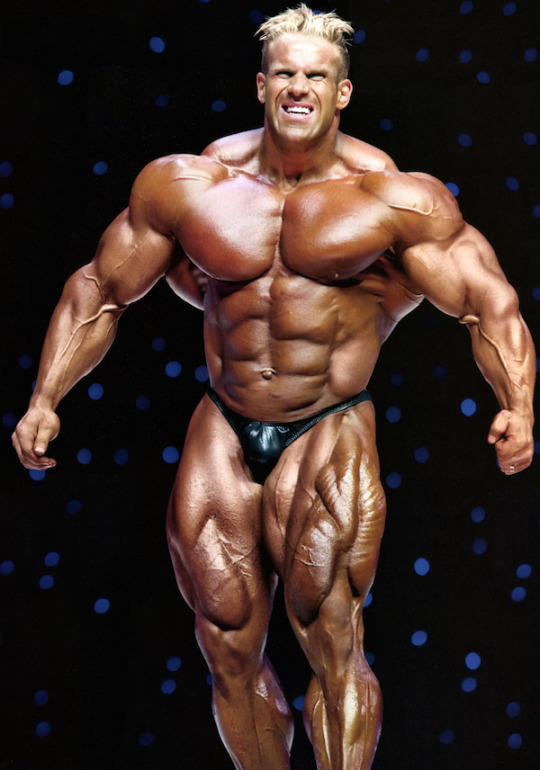
(In order these guys are Ronnie Coleman, Moustafa Ismail, Daniele Seccarecci, and Jay Cutler if you want a source) side note, comments about the body type being “unattractive” aren’t necessary in this conversation, bodybuilding on this scale is a form of body modification, akin to being heavily pierced or tattooed. In other words, they aren’t doing it for you.
The problem is, if you make art referencing a body type that appears out-of-proportion to the layman and don’t fudge the scale of individual elements to make it seem stylistically balanced, it will look wrong to the audience. You can show someone a tracing of a body like this and it will more than likely appear more “wrong” to them than a version taking artistic license to enlarge the hands and feet and enlongate the limbs to something the contextually feels correct.
Honestly, it is technically possibly to fit a fairly correctly proportioned human arm behind that shield;
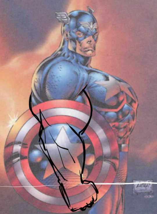
The wrist on a human body is about even with the groin when the arm is out straight, there’s room to fit a limb that long behind the shield. But the arm looks incorrect for a number of reasons; The chest wouldn’t appear at that angle if his far arm wasn’t wrapped around to hold his wrist like it was in the reference, the shield obscures line of his spine which causes his midriff to look massively thick, hiding the forearm behind the shield emphasizes how comparatively short the limb would feel even if the proportions were perfectly accurate, and the star on the shield causes viewers to assume at a glance that his arm is bent (if you look at the shield assuming the first point clockwise from the top is the actual top of the star it looks more in-proportion, but you have to stop and think about it so the drawing has already failed)
If you were to dump the shield and put the arms in a position that matches the way the chest is flexed, it makes a lot more sense what he was going for;
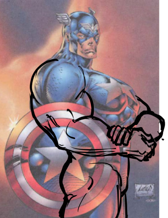
Which honestly isn’t even outside the realm of what actual human bodies can potentially look like;
I know this drawing is a long dead horse that everyone is sick of seeing beaten, but I wanted to throw this out there because hey, it’s a good example of what liberties to be mindful of taking when you work from references.
25K notes
·
View notes
Text
Realizing it’s not romance that I hate but overdone straight relationships with zero chemistry built on a slew of misogynistic tropes was like a huge revelation for me
182K notes
·
View notes

Photo
this gives me some much needed hope


Middle-aged accomplishments
29K notes
·
View notes
Text
“My greatest fear is that I am intelligent enough to know what I want but not intelligent enough to achieve it.”
— S.Z. (via versacepromises)
95K notes
·
View notes
Photo

#webtoon #webtoonshortstorycontest #webcomic #cat #artist https://www.instagram.com/p/B_p-BHEjAFOprNW4slIphMgwCoNi5mk-XzbcoU0/?igshid=mipduk7gzm0l
3 notes
·
View notes
Text
This reminded me so much of some people I know that act like this
Fenris to nobody after DAI: Everyone leaves me... what’s the point with friends if they just leave you when you’re no longer needed
Varric: I was captured, tortured and forced away
Hawke: I was forced to go into hiding and then save Varric’s ass
Isabela: I told you this would happen from the very beginning. Why are you surprised?
Anders: You hate me.
Merill: You hate me too
Sebastian: War is the only thing that matters now...
Aveline: I literally haven’t moved an inch for the last 10 years. You can come visit anytime
Fenris: I’m so alone :(
813 notes
·
View notes
Photo


Dungeon Master Appreciation Award / Journals and Stickers
Of Fate And Fortune on Etsy
4K notes
·
View notes
Photo
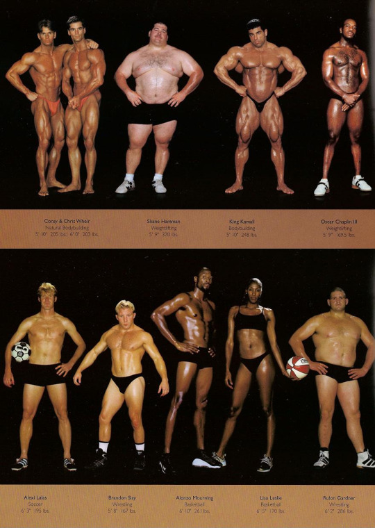
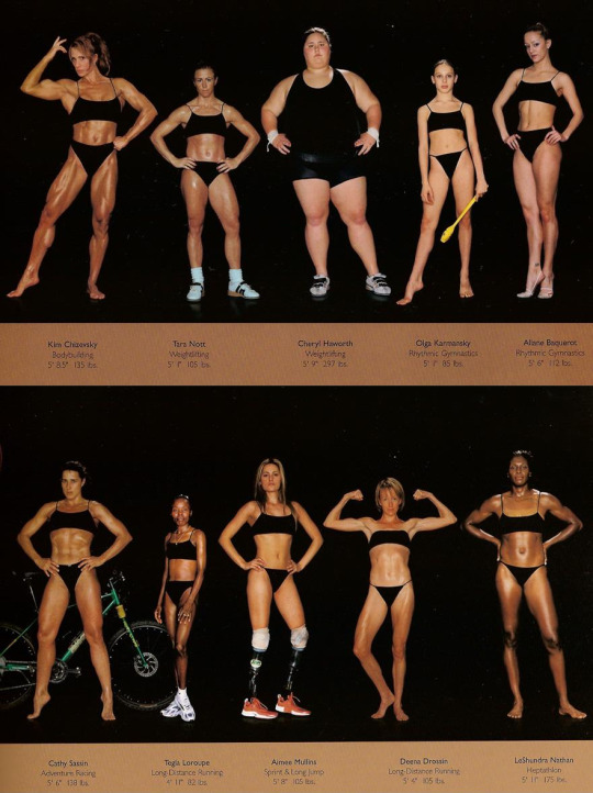
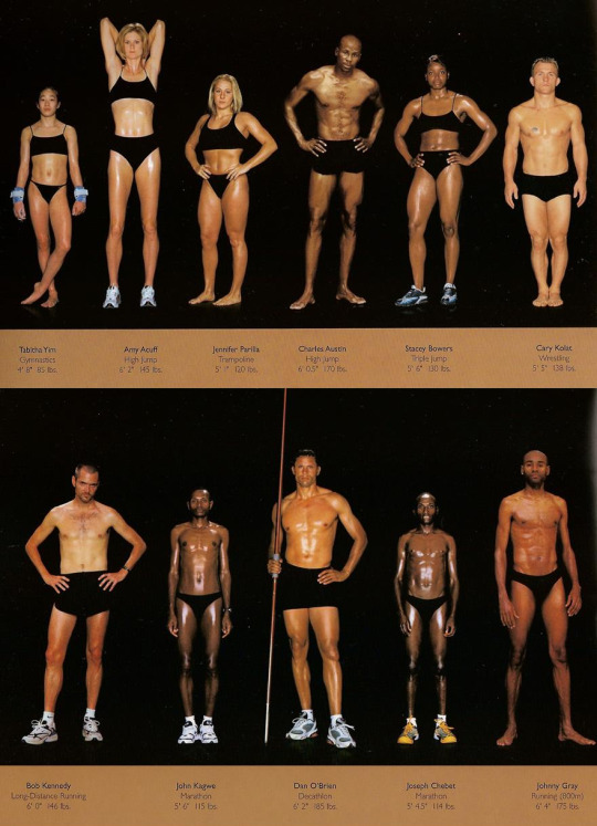
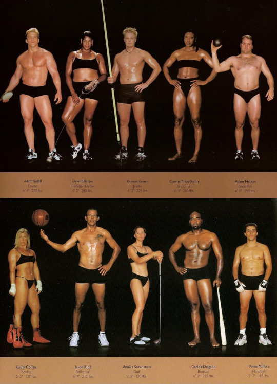


The Body Shapes of the World’s Best Athletes Compared Side By Side
329K notes
·
View notes
Text
Looking for Something? (Mobile)
Anatomy:
Arms
Breasts
Body Types
Feet
Female
Hands
Heads -Ears -Expressions -Eyes -Facial -Hair -Mouths and Lips -Noses -Tears
Humans
Legs
Male
Muscles
Pelvis
Proportions
Shoulders
Torso
Animals:
Anatomy
Antlers
Beaks
Behaviour
Ears
Facial
Feathers
Fur
Hooves
Horns
Insects
Legs
Paws
Talons
Teeth
Wings
Backgrounds:
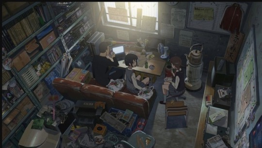
Cityscape
Indoors
Organic
Perspective
Quick BGs
Simplistic
Brushes:
Photoshop
Paint tool SAI
Design:
Buildings
Character Design
Clothing
Environments
Folds
Heights
Maps
Names
Sketching
Skin Tones
Drawing and Colouring:
Canvas Size
Colour Palettes
Colour Theory
Comics
Composition
Lighting
Lineart
Painting
Quick Tricks
Shading
Traditional
Fantasy:
Armor
Archery
Horns
Mythical Animals
Mythology
Power Ups
Weapons
Wings
For the Artist:
Copyright
File Types
Exercises
Portfolio
Reminders
Tablets
Tips and Advice
Tools
Languages:
ASL
Ancient
French
German
Grammar
Italian
Japanese
Korean
Morse
Spanish
Misc:
Animation
Commissions
Cosplay
Crafts
Life
Master Lists
Psychological
Resources
School
Writing
Nature:
Blood
Clouds
Fire
Flowers
Grass
Landscapes
Lightning
Metal
Plants
Rocks
Space
Trees
Water
Wood
Poses:
Angles
Animals
Draw Your X
Humans
Movement
Multiple Persons
Programs:
Clip Studio Paint
Krita
Paint Tool SAI
Photoshop
Etc
World Building:
Buildings
Culture
History
Historical Clothing
Video
Links
109K notes
·
View notes


Text
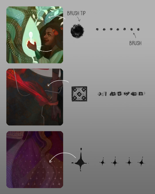
Some Photoshop Tips
I’ve been getting quite a few asks about the process for the patterns in my stylized artworks, so I decided to put together a couple of tips regarding them.
Firstly, what you need are
— CUSTOM BRUSHES —
Most of the patterns I use are custom brushes I made, such as those:
For the longest time I was convinced making brushes must be super extra complicated. I was super extra wrong. All you need to start is a transparent canvas (2500px x 2500px max):
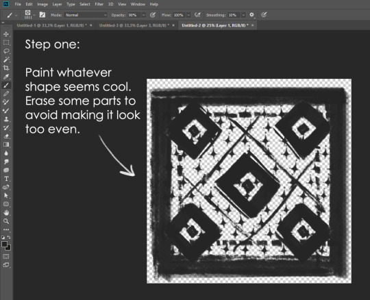
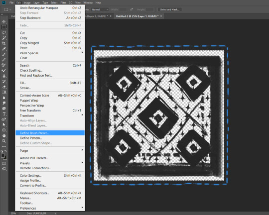
This will be your brush tip. When you’re satisfied how it looks, click Ctrl+A to select the whole canvas and go to ‘define brush preset’ under the edit menu
You will be asked to name your new glorious creation. Choose something that describes it well, so you can easily find it between all the ‘asfsfgdgd’ brushes you’ve created to be only used once

This is it. Look at it, you have just created a photoshop brush. First time i did I felt like I was cheated my whole life. IT’S SO EASY WHY HASN’T ANYONE TOLD ME
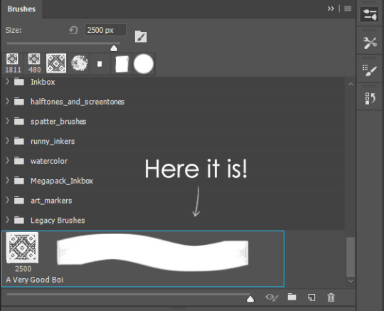
Time to edit the Good Boi to be more random, so it can be used as a Cool Fancy Pattern. Go into brush settings and change whatever you’d like. Here’s a list of what I do for patterns:
- under Shape Dynamics, I increase Size Jitter and Angle jitter by 5%-15%
- under Brush Tip Shape, I increase spacing by a shitload. Sometimes it’s like 150%, the point is to get the initial brush tip we painted to be visible.
- If I want it to look random and noisy, I enable the Dual Brush option, which acts like another brush was put on top of the one we’ve created. You can adjust all of the Dual Brush options (Size, Spacing, Scatter, Count) as you wish to get a very nice random brush to smear on your backgrounds

The result is as above. You can follow the same steps to create whatever brush you need: evenly spaced dots that look like you painted them by hand, geometric pattern to fill the background, a line of perfectly drawn XDs and so on.
BUT WAIT, THERE’S MORE
— PATHS —
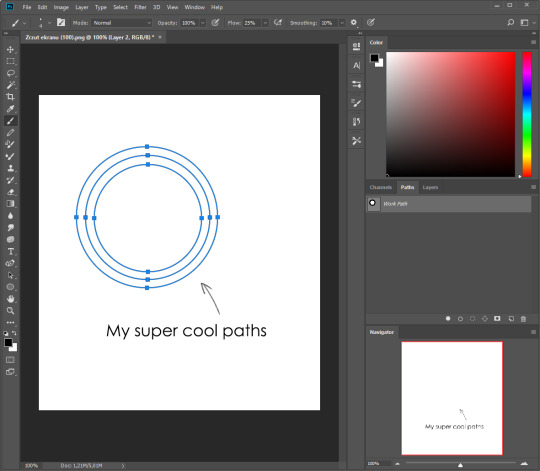
But what if you want to get lots of circles made of tiny dots? Or you need rows of triangles for your cool background? Photoshop can do all of that for you, thanks to the magic of paths.
Typically, paths window can be found right next to Layers:

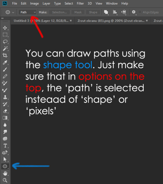
Draw whatever path you want, the Shape Tool has quite a bit of options. Remember, paths are completely different from brush strokes and they won’t show up in the navigator. To move a path around, click A to enable path selection tool. You can use Ctrl+T to transform it, and if you move a path while pressing Alt it will be duplicated.
Now, pick a brush you wish really was in place of that path you’ve drawn and go to layers, then choose the layer you want it to be drawn on. Then, click this tiny circle under the Paths window:

Then witness the magic of photoshop doing the drawing for you while you wonder how tf have you managed to forget about this option for the past 2 years
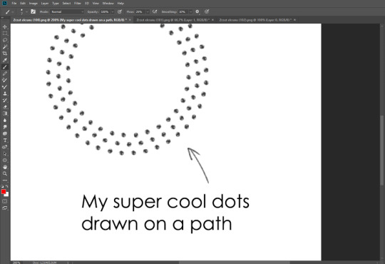
You can combine special brushes and paths for all sorts of cool effects. I mostly use them in backgrounds for my cards, but you can do whatever you want with them.
I hope that answers the questions for all of the people who were sending me inquires about the patterns. If you have any questions regarding this or any other Photoshop matter feel free to message me, I’m always up for complaining about how great and terrible Photoshop is C’:
93K notes
·
View notes
Text
Friendly reminder to all working artists or (especially) aspiring artists.
If a client says they can’t afford to pay you but you’ll get good exposure, one of two things is happening:
1. They are lying. They can afford to pay you, but they are choosing not to. They will pay the printer to print the books, they will pay the mail service to deliver them, and you’d better believe they’re going to pay themselves for sending you an email explaining that they can’t afford to pay you. They think you are a sucker, and if you take the job you’ll be telling them they are right.
2. They are not lying. They have zero budget, no audience and no real distribution system. They’ll still be paying the printer and mail service because people who work in those professions don’t work for free just because someone promises them a recommendation. But they aren’t paying themselves, they’re running on an incredibly small margin, and there’s a good chance they won’t exist as a corporate entity in a few years. Publishing your work with them will give you less exposure than putting it on tumblr or Instagram for free would. It will never lead to a paying job.
If a client starts ranting about the “short-sightedness” of artists, or otherwise complains about artists in general in their opening offer to you, run. Run as fast as you would run if a blind date spent the whole of dinner ranting about how horrible your entire gender is. Yes, there are doubtlessly clients who’ve been screwed over by artists in the past, but the ones who complain about artists in general will not respect you, they will not treat you well.
Working for free does not prove that you are passionate about something. It proves that you do not need to be paid for your work. How many doctors went into medicine because they are passionate about saving lives? Do you think any of them are asked to perform heart surgery for free?
No one will ever pay $50 for something if they can get something similar for $5. When you charge next to nothing for art that you’ve worked for hours on, art that required years of training to create, you are telling your client that it is worth next to nothing. They will remember that the next time they want to hire an artist.
People who are looking to exploit artists know that artists are hard on themselves. They know that most artists don’t think their work is good enough to charge top dollar. They know that artists have been told from the first day they started taking their art seriously as a career that they’ll never make any money off it, that it’s not a real job, that it has no value to society. They know how to push artists’ insecurities about their profession in order to convince them that that demanding fair compensation is unrealistic and uncooperative.
If you’re just desperate for a job in the arts, any job in the arts, give yourself a job. Start a webcomic, or give yourself illustration assignments that you post on social media regularly, create work for a gallery show even if you don’t have one yet, or make a book. Give yourself a job. If you’re going to work for free, you may as well be working for yourself, setting your own hours and following your own interests. Having original art with original characters and ideas in your portfolio, and making sure your art is visible online will get the attention of publishers who are actually looking to hire people for good jobs. Drawing a shitty comic for a defunct publisher based on someone else’s shitty ideas will not.
Protect yourself, because no one else will. Protect yourself, because no one else will. There are people lining up around the block to exploit you. Protect yourself because no one else will.
73K notes
·
View notes