
logging my art process for reference and record keeping :) feel free to follow along*not art advice or tips, just an art grad trying to self studybrushes i use are listed with download links on my carrd!
Don't wanna be here? Send us removal request.
Statistics
We looked inside some of the posts by cranjournals and here's what we found interesting.
Average Info
Notes Per Post
6
Likes Per Post
4
Reblog Per Post
2
Reply Per Post
0
Time Between Posts
1 month
Number of Posts By Type
Text
3
Last Seen Tumblr Blogs


Fun Fact
In Q3 of 2020, 31% of US users access the Tumblr app daily.
Text
#003: SnowBugs Sequence 040 Shot 0040
Date finalized: September 29, 2024
Program: Autodesk Maya
Rig: Kate McNeely Textures: Clarisse Chiang Lighting: Sarah Putka
This is one of the shots I animated on SnowBugs, an indie short film I was animation lead on! In my initial shot assignments, this was one I had to wait until later to work on as the rig was prepared, and I spent spent months mulling it over in my head on how to approach this from a technical standpoint.
Watch the full film here!
Notes:

The first choice was keeping the character and camera relatively stationary in space while moving the snow slope instead. It's supposed to be a very large distance she's covering, so this let me control the animation better. Setting the translation tool to "Object" mode makes this easy peasy!

Next, I needed a system that kept the rotations and translations separate for easy editing. This is the system I eventually came to.
rolyTrans_grp stores the translation keyframes of Rolypoly and everything that attaches to her body through the shot
rolyRot_grp stores the rotation keyframes, parented to that group node are the clumps of snow that pile onto her body (and their deformers), the rig itself, and the snowball model for the switch that happens once she's fully a snowball
ffd5Lattice and sculptor1 are both deformers, and needed to be parented to the translation group to move with the rig
There probably wouldn't have been an issue keeping the translations and rotations on the same control because animating in stepped rarely allows keyframes to be mismatched and she's only rotating on one axis, but keeping these separate was good for my sanity and would be good practice in spline to add another layer of control.

All snow accumulation on her body was accomplished using the basic snowball model and lattice deformers to morph into place around her body, and a sculpt deformer inside of her body to push her geometry out when needed to touch the snow. The snow scatter is that same snowball model scaled and translated around, with a parent constraint to the ground.
Most of the shot is animated on 2's, with two exceptions: the squashed contact pose which lasts for one frame then her hangtime in the air afterwards is extended by one frame. This adds texture to the animation timing. Having her be completely still for three frames would make her feel stuck, however, so her rotation/translation is offset by one frame so that she still has the feeling of moving on 2's.

It was important to pay attention to screen space so that her forward movement would read properly. In the beginning when she's rolling down, she's advanced forward in space slightly to show her picking up speed. Then when she hits the rock and bounces, I made sure she maintains a nice arc while appearing to hit the ground with some force.

To show how fast she was rolling without motion blur, she rotates basically 180 degrees with slight variations each keyframe, except when she hangs in the air. You can see it in the 32-40 area of the graph editor! Otherwise, the steps are all similarly sized.
Overall, I'm still pretty happy with this even if it's deceptively simple. It's basically a ball rolling down a hill, but I felt like I did well to keep the shot organized and want to maintain this level of thought going forward!
3 notes
·
View notes
Text
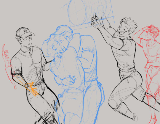
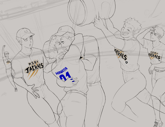
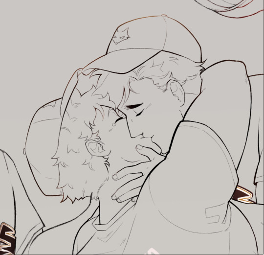
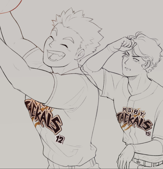
#002: AtsuHina Exchange - Baseball
Date of completion: March 16, 2024
Program: Clip Studio Paint (iPad)
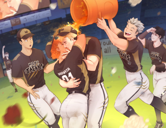
My piece for the 2025 AtsuHina Spring Exchange! I was feeling so warm and grateful for the community that I wanted to pour everything I had into this. Check it out on AO3 along with the rest of the amazing collection! Everyone here is so nice and talented, I can only hope this gives back a little bit!
Notes:
So... I know nothing about baseball! I started out trying to plan a whole thing in my head, like what positions they would all play, what scene I could draw that was more atshn than just MSBY/team dynamics but still more baseball than just slapping them in a different uniform (even if that is a little bit what ended up happening), etc., but I could tell I was going to think myself to death if I didn't just pick an idea and stick with it, so I went with a post-game celebration!
And when I say I know nothing, I really mean it qvq Pinterest ended up being my bestie for finding inspiration and references, and then I saw a pic of a gatorade shower and hubris said "I can paint that!!" and the rest is kind of history.
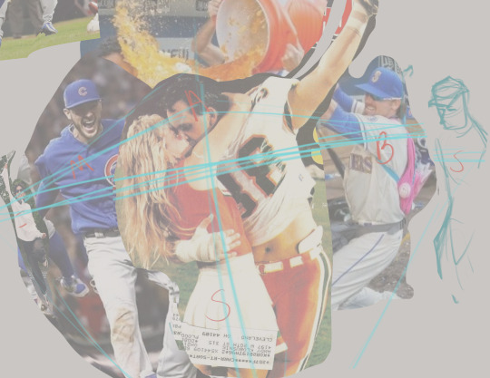
Composed everything using a collage of reference pics first, just going off of vibes until things felt right proportion- and perspective-wise
Loosely planned out background elements and adjusted poses to create implied or real lines that would point to atsuhina's faces as the focal point

A little layer management goes a long way, so almost every layer was named or sorted into a folder
Every character got a base fill, skin, hair, black, white, and gold layer. The brush I use blends color a lot, so I decided not to use separate shadow and light layers in this workflow
The group of uniform colors is marked with red so they'd be easy to see while scrolling through the panel, and lineart layers are marked in blue for the same reason
Once established, palette colors were added to my color mixer for easy access
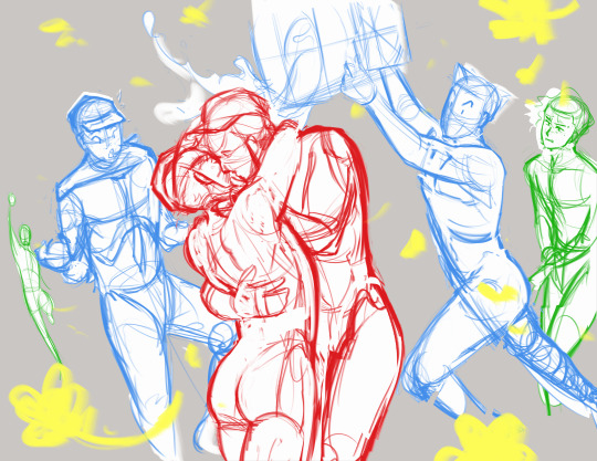
Usually am more of a sketcher/one sketch straight to lineart person, but this time I put a lot of attention into refining details over multiple sketches
Eliminated a lot of guesswork before going into lineart this way, and realized important details like the exact pose and angle of Meian's hand and atsuhina's lips were lost in the mess
Most anatomy is drawn from reference, but adjusted according to the character's body type or modified for a more appealing silhouette (Shoyo in particular had to be thickened up a lot. And caked up lol.)
Sakusa wasn't drawn from reference and maybe it shows... I also had to change his pose because I realized he was looking a little... homophobic.....
Meian also got changed because, for some reason, he just didn't feel like Meian?? I think I also didn't want him to look too surprised at the kiss, more like an "Oh! Finally!" reaction
Focused on lineart to strengthn one of my weaker skills. I have a difficult relationship with lineart because I love sketching and most of the time don't color what I make, but I also don't have a good workflow without it... Plus for something polished like this, I didn't want to leave my lines rough like I had been
Atsuhina are drawn with the default Real G-Pen brush so they're a bit more crisp while still having texture. Everyone else is drawn with the HB Pencil brush I use for refining sketches, so they look softer
I've heard that thicker lines = closer to camera, and thinning lines where two objects contact each other show that they are touching better, so tried to apply this in my lines
I have a naturally light hand, so tried playing to my strengths with very thin detailing
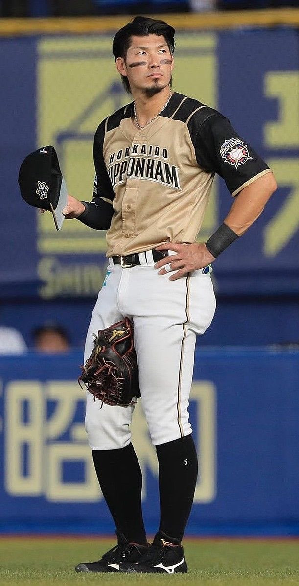
A lot of inspiration from this player and uniform when designing the Jackals baseball uniform!
It's impractical because black would get too hot to wear in the sun, but I wanted to keep the Jackal primary shirt color black, white pants, and gold accents
Only knew I wanted the end of their sleeves with gold trim, otherwise gold accents were added wherever it felt like I needed to break up the black. Putting gold into their socks was a little random, but I really liked it!
Inunaki's hat is colored differently because I originally thought the back should be gold with black in front... Then decided it looked better flipped, but Inunaki should stay black in front so it wouldn't be too distracting to have a lot of light colors there
Graphic design is not my passion :( But I try, for atsuhina
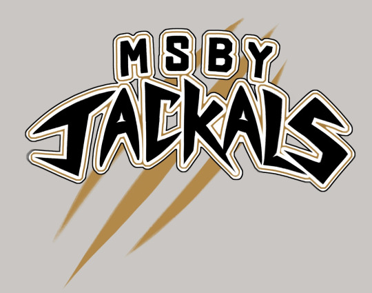
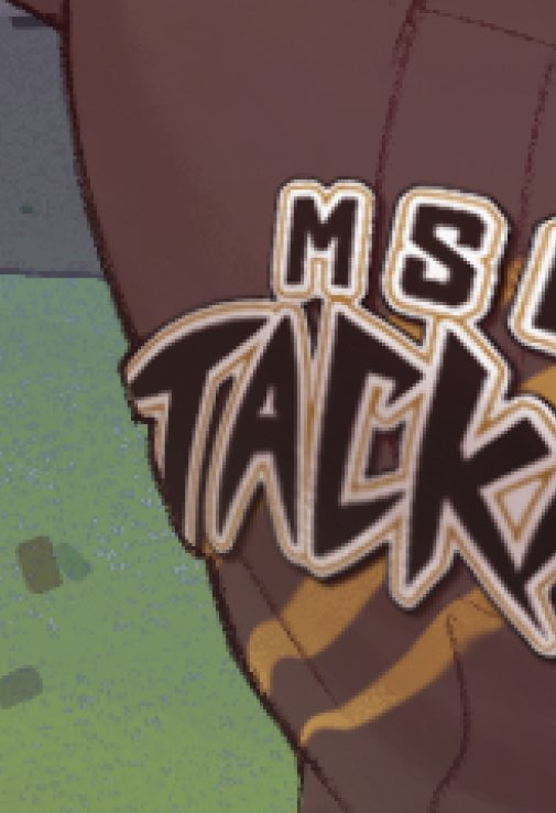
Entire Jackals lettering was based off of the two letters we see with the official logo
Tried to analyze where straight vs curved lines were used, the asymmetrical shapes, and the sharp points
Designed the logo on its own much bigger than I needed so that I could shrink and mesh it around without losing quality
Mesh transformation to get it to approximately the right shape, then finished using liquefy
Adjusted lineart where it curves around the body to make it look 3D like a sewn on patch
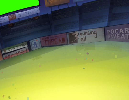
Decided on background details using reference pictures, designed the ads based on vibes/whatever I wanted at the moment! Even the "refined" sketch was loose and more for placing elements than anything
Fun facts: the sign under the screen originally had katakana for "rope bunny" because I didn't know what to put... then I got embarrassed realizing people can in fact read that and that it would be the only fully visible ad, so it got modified to "cope bunny" lol. If I had thought it out more, the "strongest dog"/"gleaming cat" signs would've been a fox and crow... Bouncing Ball and Pocari felt like they had to be included, but the easter egg I like most (and that ended up completely covered) was "Unmei Thread", just romaji for "destiny" + thread. That's Their Thing!!!
Starting furthest back in space to the front (in order: the sky and blocking in overall color transitions, the screen and ads in the back of the stadium, seating areas and crowd, grass, fence and ads, tufts of grass detail over the fence)
Struggle with freehanding architecture, so using the poly lasso tool until I have more practice. It gives it a unique sort of look, right? I think it's good for keeping things simple and "low poly"
Focus on shapes and selecting areas then adding color variation with the airbrush, or other brush as needed. Everything is done on basically one layer, so it's good to have brush variants like a Multiply/Highlight airbrush to make more interesting colors
This background technique is something I've been working on since I experimented with landscapes for a printmaking class. I was surprised to find people were actually drawn to the geometric style?? Been getting surprises lately that people are drawn to things in my art that I don't think are noteworthy at all

Tried out a different workflow! Where I usually focus on one character at a time, this time I tried painting everyone's skin first, then hair, then uniforms. I catch myself wondering how I got a certain look before when I work on a piece over a long time, so with so much going on it just made sense. I think I'll stick with this going forward!
After everyone was colored, used adjustment layers and a very light warm overlay to harmonize them more
Color saturation and luminosity: Areas of high saturation and contrast naturally draw the eye more, so I reserved these for atsuhina's faces and kept lighting/shading relatively subtle elsewhere
Sakusa and Inunaki in particularly were desaturated and painted over with blue from the background more to push them further back in space

In my sketches I favor hatching/contour lines a lot, and the delicate nature seemed appealing, so I tried bringing that in for rendering
Areas where its harder to blend colors smoothly or where things needed to be sharper, I used a very small size of my rendering brush to add hatching for texture. It's also good for darkening shadows or brightening highlights without being overbearing
If anyone wants to be an art nerd about it, that technique is probably classified as "optical mixing" where the viewer's eyes blend colors instead of blending them explicitly

Looked alright in the sketch then when it came time to render it turned out to be very hard...
Eventually approached with the idea of following "flowing lines" and staying mostly loose with it, just defining a couple spots where water would be splashing up
Followed this idea of "momentum" to block in shapes and large droplets with the Oil Brush
For the impression of a spray of tiny droplets behind Atsumu's head, I used the Dry Gouache brush, lightly brushed in the area with a large size, then erased out chunks or went back in with a smaller size of the brush to define the shape further
Oil Brush for more little details, especially highlights, until it looked alright
Airbrush set to "soft light" mode to give the effect of water "catching" in the droplets, then Droplet airbrush for larger drops into the Spray airbrush for very small but sharply defined particles
For the few rendered drops and happy tears, they were blocked in with white using the Oil Brush, erased in the middle, soft airbrush for the shadow of the highlight, highlight drawn in, then the "soft light" airbrush again in white lightly over the highlight
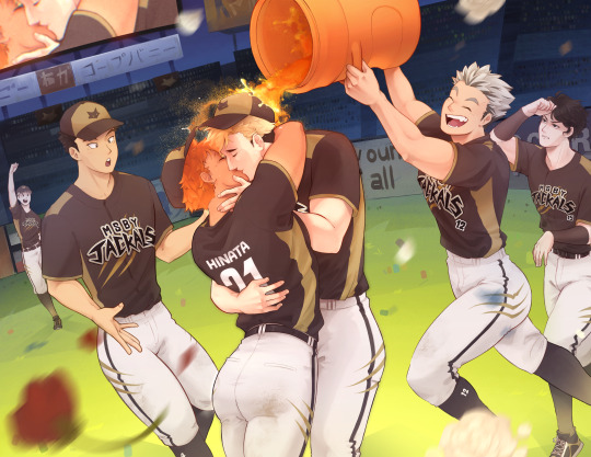

Raw image on the left, final on the right (Not blurry Sakusa exists!)
Spent much more time and effort than usual in compositing for this piece
Bounce lighting airbrushed over the characters from the grass, skin, orange keg, and pants. Light/bright colors will reflect more light while darker colors absorb more light. The airbrush can be large and loose too since bounce light scatters a lot.
Atmospheric perspective added to the background to push it further back
Nondestructive process: Creating flattened/merged copies of the background and characters to blur/use for other effects, and using masks to decide where effects would be applied without permanently erasing anything
Blurring areas aside from the focal point makes the focus very clear, and very light motion blur was added on Meian and Bokuto's legs
Blurred copies of the characters set to "soft light" mode at a low opacity gives a dreamy/soft look
Additionally, I had done a confidence building piece a little before I started this, just to remind myself that I'm most capable when I just go for things without fear, and to test drive some techniques before employing them for the first time on a work I considered much more important. I practiced some rendering techniques, giving the impression of lights, the dreamy glow effect, and reminded myself of things I often forget while making backgrounds, like working back to front and how messy my freehand gets haha.
Honestly, the process here looks long but it was a lot of fun! A lot of my weaknesses came from me just not having stamina to keep focused for a long time and lacking experience in certain things. if it takes a long time, it's because I haven't practiced enough. I want to study anatomy again and practice painting muscles more since my knowledge on the subject is fading and I'm scared of settling into what's comfortable instead of what's good.
In the end I'm not sure how to feel about this piece? I think it's good, definitely one of my better works, but after sitting with it for a while I can't help but think about what I wanted to do better. I think it shows some of my general weaknesses as an artist where I get absorbed in details and forget the bigger picture. I failed to plan properly and didn't take time researching different compositions, so I think in that respect it looks flat. I have resources for studying composition but feel intimidated by it, but it's one of the largest foundations of art so I have to try...!
I don't criticize my work to trash on it, but I do need to acknowledge where I could do better to set goals for the future!
2 notes
·
View notes
Text
#001: Hana and Xe (OCs)
Date of completion: September 01, 2024
Program: Clip Studio Paint (iPad)

Xe (right) belongs to Roman!
This piece I remember trying out after watching a video about painting faster and making a piece look finished with less time investment, but in the end I still spent a long time on it orz But speed is something you only gain from practice!
Notes:

The lineart was kept pretty rough, with this being an early screenshot I took in the rendering process. The brush makes things softer, but the lines did end up muddying my colors and making things harder during rendering
Adding soft gradients to key areas of my flat colors like the cheeks, fingers, and joints provided a solid foundation for my colors
I painted over a majority of everything by the end, which was fun but I did a lot of it on the fly, so I struggled with defining the hair. It had to look natural and flowy, and detailed, but maintain a good rhythm so the strokes wouldn't look repetitive. I'm not yet experienced enough to have an intuition for this, so all I could do was render a bit then go "no that's not right".


Something the video mentioned was controlling the areas where you concentrate detail, since detailed areas will look more finished and draw attention.
I put a lot of focus on detailing the hair and used hatching marks to intensify colors/shadow in the face while leaving the bodies very rough with broad brush strokes.
I remember the process for each hair piece being something like defining the shape of the strand/chunk in the darkest color, coloring just inside that shape with the midtone, then adding the highlights by splotching on the darkest color, the transitional red, and finally the highlight color and using a small brush to line along the edge of the chunk and make it pop. Not too efficient at all, but pretty relaxing!!!
In the end, months later, I'm still not mad about how this piece turned out, but I do think it could be better. I'm not satisfied with the anatomy now and should've found a good reference, and I think Xe's expression could be stronger, and that I should've spent more time softening up his face. There wasn't a plan for the background at all, and it's pretty lazy and messy. I feel like I stumbled into the result, and I should plan better with some more proper thought put in than "I want to try painting like this" because I always knew it was going to be a full piece!
That said, I did get some good experience out of this, and I learned a lot! In my cleaning closet piece I used what I learned here to stay loose and finish out the piece while keeping it rough, and actually planned out the background (a little bit)
1 note
·
View note