
Statistics
We looked inside some of the posts by deliciousdesign2-0 and here's what we found interesting.
Average Info
Notes Per Post
0
Likes Per Post
0
Reblog Per Post
0
Reply Per Post
0
Time Between Posts
4 days
Number of Posts By Type
Photo
12
Video
1
Last Seen Tumblr Blogs


Fun Fact
28.6 is the average number of monthly visits per US mobile user.
Photo
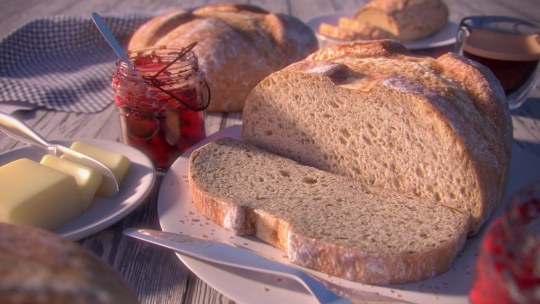
Scale is an important aesthetic in design. Scale is about the relationship of size between objects. Through relativity, such as the relative size of the knife compared to the loaf of bread in the image above, appropriate measures of scale can be assessed by the viewer. By taking every day objects, like the utensils depicted in the image, and placing them beside objects with a less defined size (or size that can often vary, such as the bread and the jar), the viewer can also use a ratio to compare proportions and understand the size relationship better. For example, the sliced piece of bread is as long as the utensil resting on the plate in front of it. This ratio between the bread and the utensil are crucial to understanding the scale of the objects in this image. We can also see a hierarchy in size in this composition. The main focal point, being the sliced loaf, is by far the largest object in this work, therefore, it draws the most attention and has the most dominating presence. If this were an add for a bread brand, the placement and scale of the bread would undoubtably be a major key in effectively selling the product. Scale has a big influence in design and in the future I will properly asses scale to help emphasize the importance and message I portray within my work.
Scale Glossary:
scale is the size of one object in relation to other objects in a design.
— a certain relative or proportionate size or extent (A human is 7.5 heads tall.)
— a standard of measurement or estimation (The UFO was as big as a football field.)
— point of reference by which to gauge or rate (My puppy is twice as big as your chihuahua.)
Aspect Ratio refers to the proportions of the height and width of an image. It defines its overall shape, and it is usually shown as W:H (W is the width and H is the height).Geometry- spheres, cubes, cylinders can be used to build more complex objects
Hierarchy is arranged according to importance or power. What’s bigger or taller is often more important or harder to kill.
Human scale sets the stage for the story happening to human-sized characters
Proportion is the size of the parts compared to the whole. Relativity.
A ratio tells us what proportions mean to each other. Measuring one thing in terms of another. That monster is twice the size of the human. Their ratio is 2 to 1.
Relativity is how objects appear in context with each other
0 notes
Photo
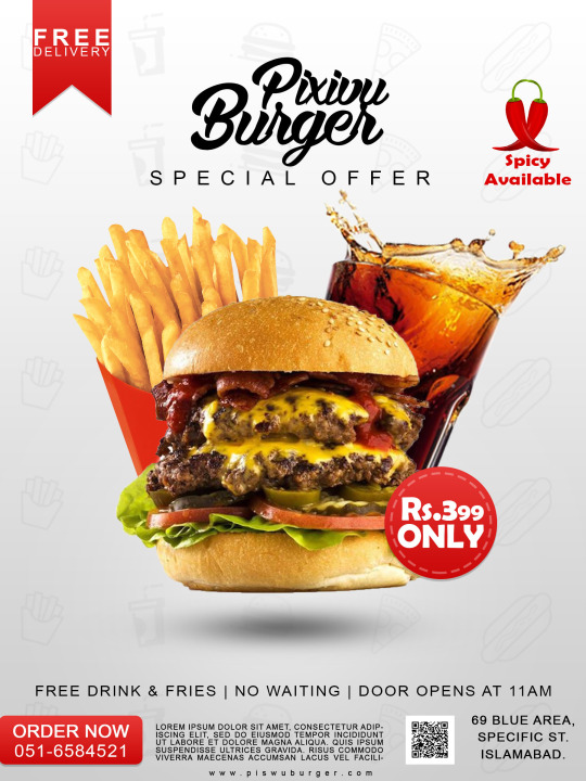
Emphasis is a major principle of design that helps designers express important information to an audience. The advertisement above is an example of emphasis on a focal point. The focal point, the image of food placed in the center of the composition, draws attention, and is the most prominent component of the scene. The other elements in the piece are considered subordinate to the main focal point. While these other elements are informative, the designer for this composition prioritized the desires of the customers by relying on the food itself to bring in more business. While all of these elements work together to build an effective composition, the food imagery is the main component of the piece and has the greatest emphasis.
Emphasis Glossary
Emphasis - Pow! Something in a scene dominates. In other words, the designer gives visual priority to part of a scene in order to draw the eye there first.
Contrast in size, color, texture can make one thing stand out from the many things around it.
Focal Point - The focal point demands attention, it is accentuated, contrasted – the star or the most prominent component of a scene.
Isolation - Feature a single element alone, away from other elements to create emphasis.
One Element - Eliminate everything else in the composition and the thing that’s left will grab the attention such as a bold title or symbol.
Placement - Position your most important design component in a place to grab attention, such as the center of a poster.
Subordination -The focal point has the visual power while other elements of the scene are subordinate.
Whole over Parts - Sometimes we don’t want the eye to go somewhere specifically such as in an establishing shot at the beginning of a story. We want to show an overview of the environment before we jump into the story. We might look at a map with lots of details. The whole map is the important thing. When we select a place on the map to visit, then that spot becomes the focal point and the Emphasis shifts from the whole to the specific. Another example is that the whole game is more important than its levels.
0 notes
Photo
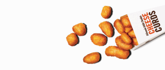
Often times when people think of contrast, they think about the opposition of lightness and darkness in a composition. As we can see in the image above, there’s high contrast with the darkness of letters and the dark shadows around the nuggets, making them pop against the stark white backdrop. However, contrast can also be used to describe the size relationship between objects. This is appropriately referred to as size contrast. For example, compared to the vastness of the white space in the composition, the other objects are much smaller, giving this piece an asymmetrical balance that creates a more dynamic image. Overall, theres a great many of ways to achieve contrast, whether it be through value contrast, size contrast, or even ideological contrasts, such as good and bad. The effective use of contrast can greatly impact the visual interest of a composition, hence, why it’s important for designers and artists alike.
Contrast Glossary:
Contrast refers to the arrangement of opposite elements (light vs. dark colors, rough vs. smooth textures, large vs. small shapes, etc.) in a composition so as to create visual interest, excitement and drama. Contrast creates variety within a unit, draws the eye to a focal point, creates a sense of adventure or mystery. Contrast is a unifier.
Value contrast is when a character or object has strong darks and lights compared to the scene around it.
Size contrast is a gigantic space cruiser compared to much smaller fighters.
High Contrast is strong dissimilarity such as black letters on a white background. The high contrast setting is an accessibility feature built into interfaces to assist people with vision impairment.
In visual perception of the real world, contrast is determined by the difference in the color and brightness of the object and other objects within the same field of view. Because the human visual system is more sensitive to contrast than absolute luminance, we can perceive the world similarly regardless of the huge changes in illumination over the day or from place to place.
Low Contrast means a minimum of contrast between light and dark, so that the image is either predominantly dark or predominantly light. The sun sets, dusk sets in and in the gloom there is low contrast in the landscape.
Asymmetrical balance is a dynamic compositional strategy in which each side of the axis are distinctly different yet belong to the same story.
Symmetrical is a form of balance in which both sides of the axis are the same, a mirror image of each other, creating stability and formality.
In visual storytelling the symmetrical formal balance is often contrasted with the dynamic action of asymmetrical configurations. For example, the formal balance and discipline on the Death Star in Star Wars is contrasted with the diversity of the different rebel cells and militias from across the galaxy. The dynamic contrasting rhythms and visuals of the dark side contrasted with the Jedi and rebel alliance has kept the franchise going for decades.
Contrasting camera angles - Part of your story is how you show as well as how you tell. The camera is your audience’s view of your story and should be well planned to reveal the story in the most effective way possible.
0 notes
Photo

The term, rhythm, instinctively makes one think of music and sounds, but it’s also a term that can be applied to visuals. The gif above has it’s own rhythm as well. It uses a repeating pattern of movements that controls the pace of the actions and creates a calm atmosphere about the piece. The minimalism in this composition also makes the eye jump around the piece slowly, much like a grasshopper, to each of the small objects scattered around the plate, while also following the motion of the hand. It’s very interesting how conceptual rhythm can be created, even when the sound itself is not provided. However, the viewer can provide that sound based not the rhythm they feel from a given composition. What do you hear as you watch the video above?
Rhythm Glossary:
Rhythm is caused by patterns in movement. What are those footsteps in the dark room? Are they slow or fast? Running or sneaking up on you? Rhythm controls the pace of action in your story. Rhythm can be repeated character types, weapons, or color strategies. We see and hear rhythm throughout nature as well as in our digital environment. Rhythm organizes units into patterns. Rhythm is created through repetition, alternation, and progression.
Alternating rhythm is a form of repetition and is predictable. We switch back and forth from one thing to another like a tennis match. Alternating rhythm can create tension, such as switching close up head shots of one character arguing with another.
Audio Rhythm - sounds that create patterns such breathing or shooting rounds of ammo.
Conceptual Rhythm - Intensifies, moves along, or calms the story. Conceptual rhythm coordinates visual and audio rhythm with the pace of your story.
Contrasting Rhythms are two or more sounds or motions at obviously different tempos.
Legato means music in a smooth flowing manner, without breaks between notes or a smooth flowing motion.
Polyrhythmic patterns - use of simultaneous contrasting rhythms. A battle scene has many(poly) rhythms such as big guns, small guns, shouts, rumbles, footsteps, and explosions.
Progressive rhythm is a pattern that changes over time to more or less intensity. Progressive rhythm makes us feel that. something is in an evolving state of change. We can tell when the battle is heating up by the rhythm of the sounds and the actions of the characters running toward or away from the fighting
Repeating - The same thing again and again gives us a feeling of predictability
Rhythm and motion - When a motion repeats, speeds up, slows down it creates a rhythm. The rhythm of tai chi is slow. The rhythm of Kung Fu is fast.
Staccato derives from the Italian verb staccare, meaning “to detach,” and can now describe anything - not just sounds - made, done, or happening in an abrupt or disjointed way.
Visual Rhythm - When motifs such as lines or shapes repeat visual rhythm forms.
0 notes
Photo

Design wise, this ice cream parlor has created a unified brand. Some of the unifying strategies this brand uses to create harmony and recognition of its delicacies, includes the pattern and color of the ice cream cones. Not only that, but the ice cream parlor itself uses the same green color on its building to create a conceptual unity that pushes the branding even further. The repetition of the ice cream’s shape, the continuous green color found throughout this composition, and the continuous pattern on the ice cream cones, illustrates a cohesion of elements that create a unity in this composition.
Unity Glossary:
Unity is an entity that is a systematic whole. A fusion or union of parts in harmony to create a oneness. A game is a unity based on a fusion of levels.
Alignment is a common axis that creates relationship, the line up creates meaning. Alignment in games can help you find your way on the map or aim true with your weapon. Alignment of troops or vessels indicates organizational strength. Maps are visually aligned with the edge of the frame. Your stats are aligned in a table.
Beat Boards are used to illustrate major story points before the rest of the storyboard is completed. Beat boards are a series of single drawings that depict key focal points in a scene. Beat Boards can be compared to a children’s book illustration because an individual picture shows a complex story. Beat boards can serve in art direction to indicate how the shot is staged and show color strategies, using shapes and colors, but are not detailed sketches. Making sure the beat boards relate to each other creates unity.
Composition is the arrangement of visual elements within a shot. The three basic shot compositions in filmmaking are long-shot, medium-shot, and close-up.
Conceptual unity a palm tree, an ocean beach, and a beer unify around the concept of ‘vacation’.
Contrast creates variety within a unit, draws the eye to a focal point, creates drama. Contrast is a unifier. Contrast is when a character or object has a strong darks and lights compared to the scene around it. Size contrast is a gigantic space cruiser compared to much smaller fighters.
Proximity is when closer distances connect elements and far apart elements create separation and sometimes magnetism
Repetition states that things that look alike relate to each other. Shapes or colors that recur in the image create rhythm and recognizable situations.
Unifying Strategies manipulate contrast, repetition, alignment and proximity to create visual unity and to pull a story along.
Visual unity is a group of repeating or similar elements that create balance or form a structure
0 notes
Photo

At first glance, this image may not be an obvious demonstration of point. However, I think it portrays a strong meaning, or point, in terms of the message it’s illustrating. The point of this visual is to demonstrate a sense of community and giving. Not only does this image have a strong point that it’s conveying, but it also has a strong focal point. The viewers eye in instinctively directed by the arms to the salad bowl being held in the foreground. This focal point is also more prominent because of the blur effect in the background, making the salad more distinctive against the less detailed food behind it. Considering this image is being displayed on a screen, it’s also composed of many little points called pixels. So, although this composition may not initially make one think of points, it’s clear that it’s actually quite full of them.
Point Glossary:
You have an idea sparking in your brain. You open a sketchbook or create a new file. You ponder a blank page or layer. You move your pencil or stylus. You land on a point. Your point moves and leaves a trail that evolves into a visible something. Groupings of points can stimulate human imagination to form familiar shapes. Ancient storytellers grouped stars into constellations of mythological beings. We group pixels into characters, animations, and game levels.
Point is the smallest visual component.
Pixel is a recently invented word. The word “pixel” was first published in 1965 by Frederic C. Billingsley ofJet Propulsion Laboratory to describe the picture elements of video images from space probes to the Moon and Mars. A pixel is the basic unit of programmable color on a computer display. Think of it as a logical - rather than a physical - unit. The physical size of a pixel depends on how you’ve set the resolution for the display screen. Each visual composition on your screen is made of thousands of illuminated points of hue and value.
Focal point is the feature of a design or work of art that is the most interesting or important or the most strongly emphasized.
The Point is what a player will tell a friend about the game if they like it.
The point is the mission or a moving target.
The point of no return (PNR or PONR) is the point beyond which one must continue on one’s current course of action because turning back is dangerous, physically impossible or difficult, or prohibitively expensive. The point of no return can be a calculated point during a continuous action (such as in aviation). A particular irreversible action (such as setting off an explosion or signing a contract) can be a point of no return.
0 notes
Photo
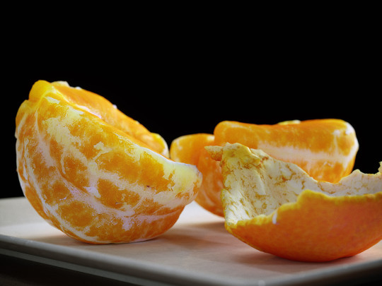
The use of Pattern’s and textures are a great way to add artistry to a composition. While patterns are a good design tool, textures mimic lifelike attributes. This 3D model of an orange for example, gives the illusion of having a tactile texture that would feel the exact same as an orange in real life. However, this illusion is created through texture mapping, making this computer graphic appear realistic, or verisimilitude. There can also be seen some organic patterns that occur throughout the surface of the orange, such as the white veins that repeat over and over again on each slice of the orange. All of these attributes help create an interesting visual that looks and feels authentic to the viewer.
Pattern and Texture Glossary:
Pattern is an arrangement, configuration, array, formation, guide, matrix of repeated forms. Patterns create rhythm and can be used to predict and organize design elements such as using a grid. In Software development patterns are conventions for describing and documenting recurring design decisions within a given context.
Alternating pattern means to occur in succession, such as day alternating with night. To pass back and forth from one state, action, or place to another such as alternate between happiness
Chiaroscuro is a technique of painting or drawing using a predictable sequence of light and shade to achieve a three-dimensional quality. From the wayback machine: [1680–90; < Italian, =chiaro bright (< Latin clārus) + oscuro dark (< Latin obscūrus)]. Chiaroscuro has been digitized to give depth and dimension in every 3-D video game or animation object.
Collage is a technique of an art production, primarily used in the visual arts, where the artwork is made from an assemblage of different forms, thus creating a new whole. Collage is a prototyping process used to assemble colors, textures, silhouettes and other assets to test ideas, colors, size relationships.
Gradient is continuous change, darkening, lightening, increasing or decreasing color saturation. A gradient is created when two or more different colors are layered to paint one element while gradually fading between the hues or values.
Grid means a rectangular system of coordinates used in locating the principal elements of a plan. and depression.
Progressive patterns create active change, momentum by shifting in a direction, increasing, escalating, or accelerating.
Radial balanced patterns are based on a circle with its design extending from its center. A few examples of radial balance are; a star, the iris in one’s eyes, and a wheel with spokes.
Texture of something is the way that it feels when you touch it, how smooth or rough it is. The texture of an object depends on the unique structure of its molecules. Fur may feel soft or coarse, metal may be oiled and shiny or rusted and rough.
Tactile textures are physical, touchable textures that you can actually feel on your skin in the real world, like when you pet a cat or dog.
Texture mapping is a process in which a two-dimensional surface, a texture map, is wrapped around a three-dimensional object. When wrapped, the 3-D object acquires a visual surface texture. Texture maps create high frequency detail, surface texture, or color information on a computer-generated graphic or 3D model.
Visual texture is an illusion of texture. Pixels or traditional drawing and painting media can be manipulated to give the impression of texture, while the surface actually remains smooth and flat. The texture on an ancient wall, a vehicle, or a creature’s scaly or slimy skin increases the immersiveness of a game. Texture artist is a career path. Texture artists are close observers as they collect, organize, and use textures to create believable surfaces.
Verisimilitude is the appearance of being real.
Trompe l’oeil is the representation of an object with such verisimilitude that it deceives the viewer.
0 notes
Video
youtube
Motion is an integral part of design that helps create life and energy to a composition. Here, in Anton’s iconic scene from Ratatouille, we see many different effects that bring about the motion and feelings of the character. For example, once Anton takes his first bite of the main dish, we see anticipation and stillness as his character freezes back in time. This helps create an exaggerated, overwhelming feeling of emotion coming from Anton. Also, as Anton is taken back to his childhood and out of restaurant scene, there’s motion blur around the main subject to help create a smooth transition and create a sense of traveling, much like one would see outside the windows of a moving train. Motion greatly effects the atmosphere and life of a composition, making it an integral art form for many different media’s.
Motion Glossary:
Motion is action, reaction, energy, what’s happening, gestures, dynamics, mobility, exertion, labor, and progress through space. Motion varies with your story. Motion indicators in storyboards are arrows, blurred lines, smears, zooms in and out. Your character is dramatized and embodied as a personality through gestural actions.
The 180-degree rule in filmmaking is a basic guideline regarding the on-screen spatial relationship between a character and another character or object within a scene. By keeping the camera on one side of an imaginary axis between two characters, the first character is always framed right of the second character. Moving the camera over the axis is called jumping the line or crossing the line; breaking the 180-degree rule by shooting on all sides is known as shooting in the round.
Anticipated Action is a dramatic action frozen in time, the tension mounts, we feel anticipation. We expect the sword to swing or the finger to pull the trigger or the couple to kiss.
Camera Motion- arrows are standard cues, a simple and recognizable way to show motion or progression in a storyboard.
Kinesthetic Empathy is a player’s actual movement when responding to action in a game. Leaning into a curve in a driving game is kinesthetic empathy.
Line of action is an artistic concept, an invisible line that captures the thrust and vitality of the movement. The line of action can be drawn by artists as the first element to capture or exaggerate the pose. Tip: Create the line of action as layer 1 so that you don’t downplay the pose. When you have the full energy of the drawing delete the action line layer.
Motion Blur- when your eyes or objects are in motion, the image will suffer from motion blur, resulting in an inability to resolve details. To cope with this, humans generally alternate between saccades (quick eye movements) and fixation (focusing on a single point).How is this biological situation useful in storyboard drawing? How do storyboard artists use motion blur? How does a smear function in animated motion?
Optical movement is an optical illusion. Although the image is not moving, it appears to move. To see examples search “Op Art”.
Stillness is calm, quiet, inaction, and peace. Stillness is the opposite of motion. It can be used to contrast with motion.
Before there were moving pictures, artists developed ways toindicate motion. These techniques are used today to quickly indicate motion. Blurred outlines is one technique, and repeating parts of a figure is another way. A figure may seem to be moving if their figure is cropped by the frame of the composition.
0 notes
Photo
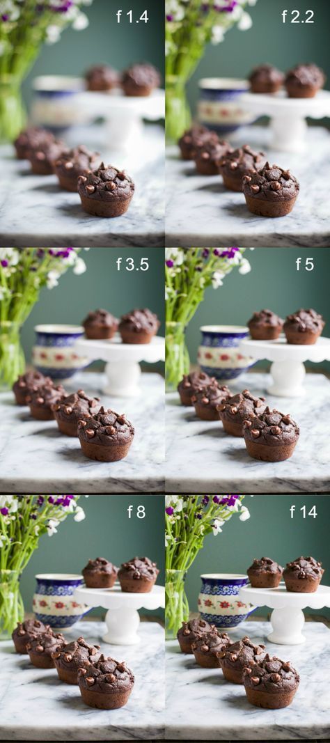
Space and depth is extremely advantageous in creating an interesting composition. The image above does a fantastic job of not only demonstrating certain principles of space and depth, but also how to increase the illusion of it. The initial principles of space and depth I notice is the elliptical perspective occurring with the desert stand and the cup. This warping from a circle to an ellipse makes it obvious that these objects are further in space than the muffins in the front which are still relatively circular compares to the other two objects. The use of diagonal shape is also quite effective in creating depth because the line of muffins gets smaller as the distance between the viewer gets further away, leading the eye further into the composition to explore the other objects in the Middleground. This also illustrates size relationship and vertical position because the muffins are getting smaller and higher in the composition as they get further away. If you compare the very top two images to the very bottom two images, you may notice that in the top two images, the muffin in the front appears much closer to the viewer than it does in the bottom two images. This is because the depth of field is increasing in the image from bottom to top. In the top images, the foreground is accentuated by the diminishing detail and increasing blur as the distance between the viewer and the objects increase. There’s many ways to create space and depth and the use of these principles will help a composition gain complexity and interest.
Space and Depth Glossary
Space is an area, expanse, territory, distance or range. Variable spaces expand or contract as our stories unfold. A closeup has a short range. A wide shot covers a lot of territory.
Atmospheric Perspective- value contrast and color saturation decrease with distance. Brightness increases as objects fade further into the background. In addition, objects such as mountains may appear more blue.
Diagonal Shapes pull the eye in a direction to create the illusion of depth. If the diagonal is going back like a railroad track or fence-line the eye will follow it into the perceived distance.
Elliptical Perspective- an ellipse is an oval shape. Elliptical perspective provides visual clues to the location of curved surfaces in space. Look straight down on a glass of water. The rim of the glass is a circle. Move the glass to the side, the rim now appears as an ellipse. Line up the rim at your exact eye level, the ellipse now appears as a straight line.
Foreground, Middleground, & Background- the 3 treatments of objects in space support design to achieve depth. This template for placing and sizing objects in the picture plane shows variations on the foreground, middleground, background configurations.
Foreshortening is when an object’s dimensions appear shorter when angled toward the viewer. At the same time the part coming toward the viewer is enlarged.
Linear Perspective is a system used by artists in which the relative size, shape, and position of objects are determined by drawn or imagined lines converging at a point on the horizon.
Overlapping is when part of one object is obscured by another object. The obscuring object appears to be in front.
S-Curve or Winding Path- in an image of a landscape, S-curve or winding path will draw the eye of the viewer into a perceived distance.
Size relationships is when objects appear smaller as their distance from the observer increases.
Transparency or Opacity is when we feel like we can see objects through a glassy, gauzy, smoky, or dusty layer. The transparent/opacity adjustment affects the saturation and color of objects to give a feel of depth.
Vertical Position places objects higher up in the composition to appear further away.
Volume is the amount, expanse, extent, magnitude, size, aggregate, bulk, dimensions, or mass of an object. The volume variable indicates the amount of territory needed for each object in a scene.
0 notes
Photo

Value is essential for creating dimension, mood, and effecting the entirety of a composition. The appeal of the picture above stems from the chiaroscuro it effectively utilizes. The composition has a high contrast in value between the darkness of the skillet, table, and plating, and the light softness of the pastries and the dipping sauce. The high contrast of values helps draw emphasis to the pastries because they pop against the darkness. This is a great way to design with a consumer in mind because the composition highlights the appeal of the pastries, making them more desirable.
Value Glossary:
Value in design is lightness or darkness on a scale of white to black (with white being the highest value and black being the lowest value). Value is widely considered to be one of the most important variables to the success of a design.
Chiaroscuro (English: kee-AR-ə-SKOOR-oh, -SKEWR-, Italian:; Italian for “light-dark”), is the use of strong contrasts between light and dark with bold contrasts affecting a whole composition. Chiaroscuro is a technical term for the use of contrasts of light to achieve a sense of volume in modelling three-dimensional objects and figures.
Light and dark - Every element in your design has a value from 1% black (almost white) to 100% black. Value is relative to everything in the composition. Every color has an underlying value somewhere between white and black.
Value as emphasis happens when a strong contrast in value draws attention to itself such as on this ancient Greek vase illustrating value contrast in the service of visual storytelling.
Value and space - Designers use dark and light values to create the illusion of light as it falls on objects. Value is used to create the illusion of highlights and shadows. Highlights and shadows combine to create the illusion of a light source. The pattern of light and dark can create dimension, volume, and mass.
Value patterns appear regularly in the world, in human-made design, and even in abstract ideas such as stories. The elements of a pattern repeat in a predictable manner. Night and day is a value pattern common in stories
0 notes
Photo

Color plays a dramatic role in design. Color can be the source of emotions, behavior, and feelings that one receives when looking at a particular piece of art or design work. This image above is demonstrating strong saturation of both the warm and cool colors. These strong contrasting colors make the piece appear very vibrant and lively.
Color Glossary:
Visible light spectrum is the segment of the electromagnetic spectrum that the humaneye can view. This range of wavelengths is called visible light. Typically, the human eye can detect wavelengths from 380 to 700 nanometers.
Color Psychology: Color psychology is the study of the effect that colors have on emotions, behavior and feelings of people.
Color Systems: Color systems classify color and analyze their effects.
●The additive color system is used for colors of light such as light emitted fromcomputers, phone screens, and projectors. Red, green, and blue are the primary colors
●The subtractive color system is used for pigments such as ink, dye, and paint. Cyan, magenta, and yellow are the primary colors. Color to Show Depth: Change in Color is to use color to separate the foreground, midground, and background planes to create the illusion of depth and is commonly used in animation.
Color Wheel: The color wheel, or color circle, arranges a pattern of hues around a circle. There areseveral versions of the color wheel or color circle. The circle connects relationships between hues to illustrate color strategies. (see 12 Chromatic Strategies) Color wheel history goes way back.
Local Color: Local color is the natural color of an object unmodified by adding unrealistic light and shadow or any other distortion. The color that the eye observes is altered by lighting conditions such as time of day or the surrounding environment. The local color of a lemon is yellow.
Palettes: The definition of a palette is the range of colors used in a particular composition or by any person who uses color such as an artist, house painter or interior decorator. An example of a palette is Vincent Van Gogh’s limited palette of hues in his Starry Night painting. Starry Night’s palette is a variety of blues, greens and yellows. Close up video of Starry Night lets you come closer than you could at the Museum of Modern Art.
Properties of Color: Properties of color are hue, saturation, and brightness.The H, S, and B in thePhotoshop Color Panel stand for hue, saturation, and brightness.
●Hue is the named color around the color circle such as red, orange, green, yellow, violet, and blue.
●Saturation is the intensity or purity of a hue. Fire engine red is more highly saturated than brick red or the color of red wine.
●Brightness is the perceived intensity of light coming from a source such as ascreen. On a color screen, brightness is the average of the red, green and bluepixels on the screen. Brightness is important to both color perception and batterylife on mobile devices. Brightness of a screen can be adjusted.
Symbolism of Color: Symbolism of color in art and anthropology refers to the use of color as a symbol in various cultures. There is great diversity in the use of colors and their associations. Diversity in color symbolism occurs because color meanings and symbolism occur onan individual, cultural and universal basis. Color symbolism is also context-dependent and changes over time.
12 Color Strategies:
1.Monochromatic means variations of a single hue such as a light blue and a dark blue or a greenish aqua blue and a lavender blue.
2.Achromatic color strategy integrates variations of black, white, gray, and a full range of neutrals.
3.Full Spectrum Strategy represents the full circle of spectral colors by incorporating at least five of the base hues.
4.In the Achromatic/Chromatic Mix strategy Achromatic colors dominate the composition with a chromatic hue accent.
5.Warm/Cool: Contrasting ‘temperatures’ of warm & cool. Cool colors appear onthe green/blue/violet side of the color wheel. The colors on the red/orange/yellowside of the color wheel are called warm. Emphasis is on the contrast between warm and cool achromatics: brown - gold (warm), grays - silver (cool)
6.Saturation Similarities/Saturation Contrast
●Saturation Similarities: Hues may vary in this strategy, but all colors must have the same or very similar saturations.
●Saturation Contrast: Hues may vary but all colors must have significant contrast of saturation.
7.Value Similarities/Value Contrast
●Value Similarities: Hues may vary in this strategy, but all colors have the same or very close values.
●Value Contrast: Black (or dark desaturated hues) contrast with white (orvery desaturated tints of hues). The Value Contrast strategy demonstrates strong distinction of value with the strongest example being between black and white.
8.Complementary Dyad creates a strong hue contrast. Complementary hues are located directly opposite each other on the color circle
9.Split Complementary strategies are based on two complements. To create a split complementary color strategy select one hue and contrast it with the hues on either side of its complement, such as Red & YellowGreen/BlueGreen.
10.A Tetrad strategy uses four equilateral hues from the color circle, such as Red,Orange, Green, Blue.
11. A Triad strategy uses three equilaterally balanced hues from the color circle, such as primary, secondary, or tertiary.
12.Analogous strategies collect 2 or 3 neighboring hues on the color circle.
0 notes
Photo
Shapes are a fundamental part of design and are useful in creating identifiable forms. In the case of the right hand image above, the silhouette of these food items serve as the shapes profile, and are easy to recognize. Shapes come in many different variations, serving many different purposes. The images on the left are representational of their real world selves. A yellow circle with a curvilinear white shape surrounding it, is recognizable as an egg because these are the essential shapes that make up an egg in real life. In summary, shapes are the building blocks that make forms recognizable and easily identifiable at even the most rudimental level of understanding.
Shape Glossary:
Shape is the external form or appearance characteristic of someone or something; the outline of an area or figure. As a verb, to shape is to give a particular form. As artists, we shape our characters outward appearance by using shapes.
Abstract Shapes and Abstraction (see Non-objective Shapes): Abstract means no recognizable objects. Abstraction is a sliding scale from realism tocompletely non representational. Abstract shapes can be used in backgrounds andtextures. The background pattern in this Minecraft image is abstract. The character is still recognizable as a human, but the doctor’s human form is abstracted in the game of Minecraft to conform to the blocks of the game world.
Biomorphic: Biomorphic is a free-form pattern or design with a shape suggestive of a living organism, especially an amoeba or protozoan.
Curvilinear Shapes: Curvilinear shapes are s-curves. Curvilinear shapes inform Jessica Rabbit’s character design and can represent a winding river vanishing into the distance.
Distortion: Distortion is exaggeration, contortion, reform, slant, twist, or warp in ways that departfrom reality. Look at the Minecraft Human body example. The figure of the Minecraftdoctor is distorted by the shape of the blocks.
Idealism: Idealism asserts that the physical world is less important than the mind or the spiritwhich shapes and animates it. Idealists choose the soul, the mind, or the psyche overthe body, the material, and the historical. When ideals (of appearance, or proportion forexample) regulate the way an artist represents the world, her work can be described asIdealistic. The leading artists of the High Renaissance - Leonardo, Raphael andMichelangelo - are all associated with varying forms of Idealism, as were ancient Greeksculptors. How do you think idealism affects avatar customization?
Non-objective Shapes (see Abstract Shapes): Non-objective shapes have no object as a reference and no recognizable subject matter. Non-objective shapes are often used to simplify design shapes. Geometric shapes such as a triangle, square, and circle are abstract until you put them together to represent a house or a smiley face. One Minecraft block, away from the game, is anon-objective shape. Inside the game that same block, depending on it’s color andtexture could represent a part of a landscape, sheep, or sword. The block as part of a character or environment inside the game would no longer be abstract.
Positive and Negative Shapes: Positive space is the subject, focal point, or areas of high interest in any composition.Negative space is the area around the areas of interest. All compositions balancepositive and negative space. Yes, stuff in the negative space can point to the focal pointto make it most obvious. Positive and negative create a whole. Every composition is acombination of positive and negative space. Wield the positive and negative spaces with control and story-telling magic to become a design master.
Realism or Naturalism: Realism, or naturalism, attempts to represent subject matter truthfully, without artificiality or exotic or supernatural elements. In the visual arts, illusionistic realism strives for the accurate depiction of lifeforms, perspective, and the details of light and colour. Rectilinear Shapes: Rectilinear is a boxy shape made with straight lines. For example, the screen you arelooking at is a rectilinear shape filled with little square pixels, and pixels are alsorectilinear. A storyboard is a series of drawings in a linear set of rectilinear frames.
Representational: Representational means objects that players can name. The object representssomething from the real world, or something that has the verisimilitude of realism. Acartoon bunny can represent a rabbit without being realistic. Representational is asliding scale from realism to almost abstract. 2 dots and a curve can be arranged intoan abstract pattern or they can be arranged into an emoji that represents a smiley face.
Silhouette: Silhouette is a profile or shape that is easy to identify.
Squash and Stretch: Squash and stretch are shapes profiles that emphasize motion. The stretched positionshows the form in an extended condition. When you do a sit up your belly squashes andyour back stretches.
0 notes
Photo
Lines play a dramatic role in the world of design. In the case of this lovely drawing, they help add dimension to an otherwise flat image. You may notice the heavier contour lines beneath all the objects that provides a change in line value, making the objects feel weighed down. There’s also explicit lines outlining each piece of food. These lines make the shape of the objects more obvious and are very effective in this relatively monotone image. Without the help of these explicit lines, the image could have become one big, green, blob. Overall, the lines in the drawing create dimension, making the food appear tangible, and separation that defines each piece of food.
Line Glossary
Lines have both a direction and a length. Line means a mark, streak, stroke, slash,path, stripe, border, contour, striation, course, route, and track. Curved, bent, thick,wide, broken, vertical, horizontal, burred, or freehand, lines delineate shapes, forms,and spaces, volumes, edges, movement and patterns. Not only that -- lines create both2D and 3D objects and figures. Lines are awesome and powerful.
Contour Lines: Contour lines indicate the edge around an object or the changes in volume within an object. Contour lines dramatize changes of plane within the form. The curve of a belt around the waist is a contour line.
Diagonal Lines: Diagonal Lines are useful to draw the eye into a composition such as toward the vanishing points. Three common types of diagonals are 1) actual diagonal lines 2)objects placed diagonally in a scene 3) a diagonal line created by the viewpoint such as the Dutch tilt.
Dutch Tilt: Dutch Tilt (known as a dutch angle, canted angle, or oblique angle) is a type of camera shot that has a noticeable tilt on the camera’s “x-axis.” The Dutch tilt camera technique was introduced by German Expressionists in the 1920s — so it's not actually Dutch.Directors often use a Dutch angle to signal to the viewer that something is wrong, disorienting, or unsettling.
Explicit Lines: Explicit means clear, direct, and obvious. If a drawing is easy to read it may be that thelines are explicit, clean, with efficient use of variety. There are explicit lines around the frame of the Dutch Tilt illustration.
Gesture Lines: Gesture Lines capture motion, such as in an action pose when gesture drawings are used in storyboards. The figures at the head of the Rembrandt Elephant drawing show the quickly sketched human gestures responding to the elephant.
Implied Lines: Implied lines in 3-D scenes a line in a scene that is not physically there but is suggested by points in the art.Implied lines suggest the edges of an object or planes within an object. The line may be broken such as a dotted line, it may be defined by value, color,or texture, or it may not be visible at all. With implied lines, our brain interprets that aline exists.
Line as Value: Line As Value has a long history. Artists have used line drawings to create value, orshading, and to achieve the impression of volume. In this quick sketch of a live elephant Rembrandt used outline contour lines around the edges of the elephant and curved contour lines around the big legs and belly. Most of the lines are at the lower part of the elephant to show that the light source was from above.
Line of Action (Also see motion): Line of action is an imaginary line that extends through the main action of the figure.When you draw an action figure you can capture the line of action on one layer then draw the figure drawing on another
Line Quality: Line quality is the expressive essence of lines. Varying the line quality makes objectsappear more 3-dimensional and exciting. Range in line quality heightens descriptive and3suggestive potential. A single line can change in darkness and width, can vanish all together to mentally reconnect later on an edge.
Line Weight: Line weight refers to the thickness or thinness of a line.
Lost and Found Lines: We don’t really need a strong contour line around every part of an object because our brain will fill in the blank where the edge disappears. When a line fades out and thenrestarts further along the edge it is called a lost and found line. There is a lost and foundline at the top of Rembrandt’s elephant behind the head. There is a strong contour line of the skull of the elephant and a strong bulge of the back, but between the 2 curved shapes the line fades out, yet we still know that the elephant shape continues.
Psychic Lines: Psychic lines are invisible. Psychic lines form between characters or between a gun anda target, or a hand pointing in a direction. There is no real line yet we feel a line. Eyes looking in a direction, especially characters looking at each other create a psychic line.
0 notes