georgiamayesd
Georgia May Experimental Surface Design
19 posts
Don't wanna be here? Send us removal request.
Last Seen Blogs

vnpt-hanoi
Sans titre

meruchan
Meru

bearclws
*✲゚*。✧٩(・ิᴗ・ิ๑)۶*✲゚*。✧

prying-pandora666
Don't Flatter Yourself: You were never even a PLAYA
prying-pandora666
Don't Flatter Yourself: You were never even a PLAYA
Text
Singular Pattern

Building on this pattern, I have taken the single design and scaled it up rather than duplicating it and mirroring it, and place the whole design on a close up image of my jeans. I then used the multiply blend mode to join the two. I also recoloured the original pattern to a teal so the colours matched.

Result ^
Steps:

The original single pattern scaled up ^

Same image but colour changed to teal ^

Blend mode.
Using that same pattern, I repeated the steps however changed the background texture to a close up photo of my couch fabric, changed the blend mode to overlay and removed the modified colour from the design.

My reason behind making this textile was because in my prior post, i mentioned one of my patterns resembling a couch from at a thrift store and wanted the develop that further. I think this particular pattern from the original design works really well in this concept and what I enjoy most is that the original design was created from leaves and flowers to looks like leaves and flowers, and when sectioned and blown up like this, it now just looks like a floral pattern.
The following is the same technique but with a diffeerent pattern and some changes to the colouring but other than that it is still the same techniques throughout.


0 notes
Text
Making more patterns
For this experiment, rather than outlining and selecting all the leaves from each disc, I’ve gone through using the magic wand on photoshop and pulled out small patterns found within the design themselves and then laid them out on an A3 page as a final pattern design.


For this one being my first attempt, I just blindly clicked the image and thats how I ended up with this pattern. I think converted it to an PNG with no background and brought it into my designer software (Affinity Designer)

The first thing that came to mind when I saw this pattern was that it reminds me a lot of creeping vines that you find on the side of buildings which was an interesting find considering the pattern itself was inside a design that was already nature based.

I wasn’t sure where I wanted to go from here with this image so I just started playing around and flipped and mirrored the pattern against itself until some symmetry formed. The white background is just a place holder as I wasn’t sure where to take this designer from this point.

This is now the second part of the same photo that I have selected.,

What I enjoyed most about this pattern that I found was that it looks a lot like a t-rex skull as well as a rat on a broomstick lol

Not the cleanest outcome, as I’m still trying to figure out where I can take this from here. It’s not the easiest taking something that was made my hand to look a certain way and then pull it apart to make something else.


A bit more momentum started to build with this pattern. I really like the pattern on it’s own as it is. It also reminds me of a creeping vine but this time with red colour throughout. The overall patterning of the design works great with itself when mirrored and flipped. For the second image i chose a black background to make the colour in the pattern pop. It also reminds me a lot of a dress I used to own with the similar colouring and style and it was that thought that brought me to changing the pattern colour to black and then putting it on a pale navy/grey background which I think now looks like it could be a velvet kind of fabric or even one of those royal wallpapers.

A different design to pull apart.


While putting these together, I initially thought of making the pattern green but then after mirroring the design it looked a bit like lightening so I played around with the colouring and set the blend mode to divide as well as adding a dark navy background to try and achieve that idea.
0 notes
Text
Procreate Manipulations
For this experiment, I am using the first pattern outcome that I made.

Before starting, I used the selection tool to isolate the image to get rid of things like my hands and the disc outlines etc, making it its own final image.

Here I played around with the noise and found the outcome very interesting due to being distorted but still clear enough to see what it is but up close it’s just squiggles!

Another noise manipulation, but this one is including the colour.

Halftone effect. If we had access to the screen printing room, I would have been really interested to see how this would turn out if I had to opportunity to screen print the layers of this image.

Playing around with HSB


Here I had a go with distorting the image. This was was done using the push option and I twisted the image myself.

Twirl option

Crystals option. I tried keeping this one directly in the center to try and make the image move outwards from the middle.

And here I used crystals throughout the whole image. This one reminds me a bit of a dandelion :)
0 notes
Text
Different variations.
The following images are different versions and reconstructions of some final outcomes. I have mixed and matched all 15 discs I have created so far.


I was very pleasantly surprised to see how well all of these prints worked with one another seeing as only two official overall designs were made to work with each other. I noticed a pattern immerge as I was putting these together and that was that in order for the design to be successful, a long centered printed needed to to be in the middle and back of each design to work as a foundation to build upon, similar to a trunk of a tree or a stem of a flower. Once that foundation was laid, I could essentially create multiple different variations and combinations as long as that centered “stick” was at the back.
The fourth and third from last don’t have that foundation print in the background but those specific designs worked without due to the delicateness of the print and the shaping of the stamp that without that center piece, they still work well at creating a kind or wreath.
And the final image is more of an example of what all prints looked like together. Its basically a bit mess BUT that center piece it still visible from the back so I were to reach for an outcome, I’d say it looks a bit like a shrub :)
0 notes
Text
Leaf stamping two
Exactly same processes as the last time, however this time I used a different variation of leaves as well as colours. I had to be a bit scarce when my paint because I was running low so a lot of the colours had to be watered down.


I used the same stamp for this one as I did the last time. The paint I used for this one was red but because the last one was a blue, some of that came off with it when I removed it from the disc resulting this this red/purple outcome.


I didn’t notice the wet paint on the left when making this so this discs came out a little bit sloppy however I have decided to leave it in hopes of those marks being beneficial when putting the image together.

Final four


The outcome!
When putting it together I noticed that it follows a very similar build up as the last one, and this was done instinctually because I think with the framing patterns on the front, the image might end up looking like just a bunch of things layered on top of each other. So even though I was freely stamping the leaves and choosing the colours, there was a still a design system that I was following when making it.
I chose these colours (yellow, red/purple, brown and turquoise) because I wanted to try and achieve a more of a spring feeling rather than autumn. The last experiment was inspired by dry leaves whereas this one I was hoping for some sort of colouring bouquet. Unfortunately the photos still don’t do the final outcome as much justice as it does seeing it in person. In person the colours pop a lot more and is much brighter.
0 notes
Text
Creating patterns
After having created a variation of different prints on my acrylic discs, I tried bringing it in digitally. I wasn’t entirely sure where I was going to take it when I started but I found ideas a long the way.

To do this I used the wand selection tool on photoshop to select parts of the prints to remove the original print from the disc. An issue I came across instantly was that it wasn’t easy removing the majority of the print due to it being thin as as well see-through in parts and I wanted to get only the paint and not the background poking through.

I wasn’t able to successfully select the right leaf print so I just duplicated the one I did have and flipped it and resized it along side the other.

I repeated the process with several more prints. This one you can see that on the paint on the right, the background has still come through a bit but due the the colouring of the background compared to the paint, it’s easy to miss.

It was at this point when I decided where I wanted to take this specific experiment. I thought it would be interesting to try and recreate a bed of leaves like what you would find outside during autumn and turn it into its own solid pattern.

You can see with this image, I had to sacrifice half of the right leaf in order to get a successful selection on the image. However, I think I preferred this outcome because when comparing it to real dried up leaves, they aren’t fully intact so if anything, its more realistic.

Building the image.


This pattern was a dud. The paint itself was either too thin or too translucent to be picked up as a single element in photoshop. Even on its own on the disc, it was more a smudge of paint than anything else but worked well when put together with the other discs

Again, you can see the background peeking through this selection, but I still decided to keep it in as this specific print itself is the what brings colour to the overall image/pattern.


This is what most of the patterns looked like when I attempted selecting them on photoshop. It’s not as clean and tight to the design itself however it worked well enough to get the idea across.

This was the final collection of leaves for this experiment. I placed them on a black background just so I could get a clearer look at all the individual designs and see where they popped the most.

I was initially going to place them all individually till I filled up an A4 page but then decided to just copy and paste the original selection and share them out amongst the page. I flipped and mirrored them so it wasn’t too symmetrical or repetitive in direction.

This is the same image except this time I played around with the brightness and contrast to bring out the colours a bit more. I also included a green background to have a more of an earthy feel, but for my next few experiments, I plan on taking a photo of grass and placing it as the background image to place the designs in a more natural setting.

Not this biggest fan of this image, but I wanted to include it anyway. All I did was take the previous image and invert it. I do think the leaves have changed from leaves and more into feather and cotton in this image, but it also reminds me of a curtain pattern or a horrible couch you would find at a thrift store.

And this one I played with the hues to see how and what it would look like with a different colour pattern. The original pallet was obviously autumn, and this one kind of fits that too but it now more like potpourri.
EDIT

A grass background. Not as effective as I was hoping because you cant really see the grass nor does it look good. I think next I’ll try do something a bit more minimal in regards to pattern.
0 notes
Text
Acrylic Leaf Stamping One

These are the discs I have. The are 4 inches in diameter and 1/8 thickness.

This was my first attempt at painting and stamping some leaves. I would have much preferred to do this with flowers however due to lock down I am unable to purchase any as there are none in stock and winter hasn’t aided in the growth of flowers around my house either. The colours I chose for this trial were autumn colours just so you can differentiate between each other to avoid them merging into one big blob of colours when layered.

Stem of leaves ^


I found stamping these leaves a lot more troublesome that I had anticipated. They did turn out well nonetheless but stamping a stem of leaves rather than a singular one was very finicky


Although the colours compliment each other really well, as a whole image it’s not really working. Each layer’s stamp is as big as the other and I have centered them all meaning when overlapping, the one in front is just hiding the image behind. However after seeing this I am able to plan my next step.

I figured out that in order for the image to work together, I would be best if I worked with longer pieces all going in the same direction but branching out from one another. Some of these leaves and flowers are real however the top right two and the bottom left and bottom middle leaves are fake ones that I found around my home.

This layout is my ideal outcome for what I want the discs to display when put together.

Allocating leaves to their discs.

I tried keeping the colours as similar to the stamps as possible to have a variety. and again, stop the prints from merging into one mess


Each individual disc ^


I think this type of project is one of those ‘trust the process’ type things. I was feeling a little deflated when making my individual prints as they were coking out as clear as I wanted however, when putting them together, the whole image really comes together. It may not be as clear as I was wanting but it still looks like flowers but also like a wild flower bouquet which is great considering it was made with wild leaves and flowers.
A problem I did come across that I wasn’t anticipating was how the images right at the back get faded out with the more discs added so the first image is eventually hidden. However, i was pleasantly surprised when photographing my work when I saw how much it pops with a light behind it.


The photographs don’t do it much justice but when seeing it in person, each layer is lit up individually and you can really see the image come through


This is what they would look like if displayed with slight gaps in between each disc. I don't have a plan for them once they’ve been stamped... I am considering turning them into coasters but if I do, I’d like to add feet to each disc with hot glue so when stacked on top of one another the disc doesn’t get damaged, but all they images would have depth to it and look similar to these photos ^
0 notes
Text
Inspiration Board + Statement


For this project, my inspiration came from the images above. I want to have a go at creating a print that also has depth and 3D elements. Essentially, I want to try and recreate those flower submerged in resin but by using a stamping technique with paint and leaves/flowers. I’m really intrigued by the effect of things which are either painted (like the first or landscapes) or submerged (flowers in resin) that look like a time frozen in place due the the layers and depths to the images. I’m not exactly sure where this idea will go but I’d like to try and recreate nature WITH nature and have that level of depth that brings it to life.
In regard to colour scheme, I don’t have any exact ideas other than keeping to close to nature colours i.e, greens, browns, oranges, reds, blues etc. Anything you might find in the garden to get an outcame that is as realistic as possible.
Statement
My interpretation of theme regarding this project is nature made with nature. I wanted to create a floral print using floral elements. I didn’t plan on making ‘bouquets’ as such until I discovered how the prints on each individual disc overlaid and contrast with the other. You can see in my very first attempts all stamps were placed in the middles of the discs and due to this, all prints blended into one and ended up a bit of a mess. From there is where I started deliberately planning out the placements of each one as well as the colours to see what worked best with what stamp and what colours. After figuring out a system I then started mixing and matching discs to see what stamps worked elsewhere other than their designated groups and essentially ended up with a selection of prints to create an array of different outcomes/’bouquets’.
0 notes
Text
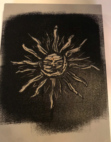
Lino Cutting & Relief Printing- Lockdown addition
Seeing as I was planning on doing my last workshop which was relief printing during our catch up lesson last Thursday, I’ve had to take a bit of a detour. Lucky for me however, I purchased some lino and lino cutters from Gordon Harris before lockdown happened.
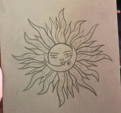
Prepping the Lino

Printed design on regular paper. ^

Cutting away the excess to I can match up the design to my lino ^
Graphite pencil over the back of the page which will then be transferred onto the lino ^
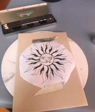
Design taped to lino to secure in place ^
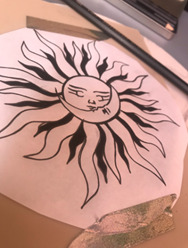
Not easy to see, but this was after I traced over the image with pencil ^

Image now transferred onto lino after tracing over image and transferring pencil to lino.
Because I don’t have the right kind of printer or paper at home that I could have used to transfer my image onto lino, I had to use a manual method to do so.
After sizing up my image to my lino, I cut away the excess paper and then using a 4B pencil, I scribbled all over the page of the paper, covering it completely in to create a transferable ‘ink’ which can be transferred onto the lino with some pressure.
Once my image was tape in place to stop it from sliding around, I went in again with a pencil and this time traced the outlines of my image which results in the graphite on the back of the paper to be pushes and transferred onto the lino. This was very effective, as you can see the whole design came out clear and prominent on the lino.
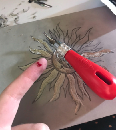
Cutting Lino
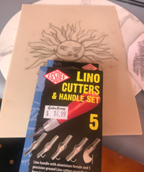
Lino cutters purchased from Gordon Harris ^
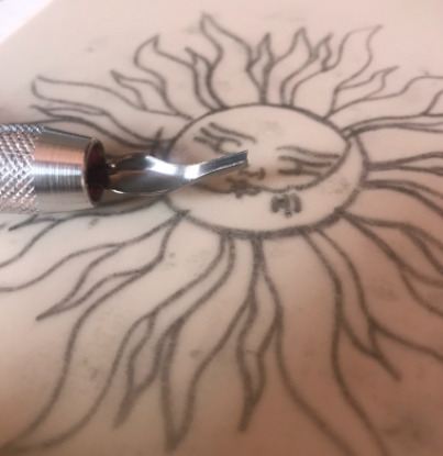
Smallest lino cutter used because of the finer lines and details and the condensed image makes it harder to get into the smaller, detailed parts. ^


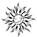
Because this was my very first time ever using or cutting lino, I did come across a few issues which I then realized how to fix only after the damage was done. For example, for a few of flames of the sun on the bottom, I went from outside in which ended in me going a bit to far into the image at times and also left some of my flame arms rounded at the ends when I wanted them sharper. But after realising this I starting going from the inside out.
I knew from the beginning that unless I carved out chunks of this image, it will just be an inverted outline and I was okay with that as this was my first try. Other than being careful of speed and pressure, the whole process was pretty straight forward.
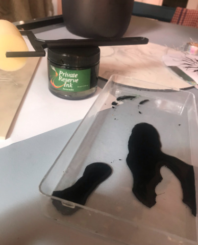
I don’t have any Indian ink on hand and the only ink I do have is this green fountain pen ink. I also didn’t have the correct, solid roller but instead had a sponge roller. I understand the issue here as the sponge does soak up all the ink and doesn’t give the lino a fresh and solid coat but I didn’t have any other tools on hand.
For some reason, I didn’t think about the lino rejecting the ink due to it being a solid object incapable of soaking up ink. But I still tried to print with it anyway.

Yeah..nah. Didn’t work as I was hoping. Because the lino rejected the ink, that resulting in the ink pooling in spots on the lino and when the paper was applied, it soak up ALL the ink, resulting in bed ink patches throughout.
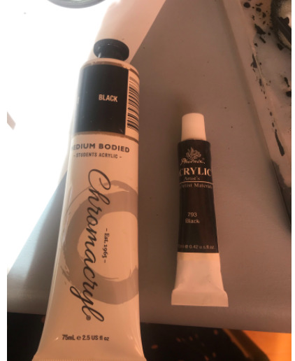
My next and only other option was to use black acrylic paint.

When prepping my roller, I noticed that the paint had a very similar texture and consistency to the ink used at uni and also made that same sticking, raspy sounds when rolled over.
I rolled the paint throughout the container to completely coat the sponge as well has get out any clumps of paint that could cover or over “ink” my image. If too much paint is placed over the cut out lines, theres a chance that they’re covered when printing.
The paint took really really well to the lino, it wasn’t as solid as ink would be and the sponge wasn’t as clean as a solid roller would be which resulted in that sponge print on the lino, but after applying a few coats fast enough, it shouldn’t be too much of a problem.
More coats ^

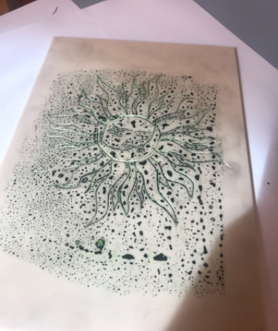
For my first attempt, I used standard photocopy paper to make my first print. I rubbed the paper over the lino for a bit, making sure to get all parts on the design and the ink onto the page.

Did I mention that the photocopy paper was very cheap?
Thankfully, the paint and paper washes off instantly.
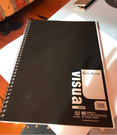
I bought this visual diary for this minor before I decided to just make a tumblr account instead so i was able to use this 110gsm paper instead.

A fresh coat of paint was rolled over the lino before transferring.

I did the same again when printing the image. I pressed and rubbed the page down firmly with my hand as I didn’t have a cap that Struan suggested on the YouTube tutorial, but I made sure to me as efficient as possible when doing this.
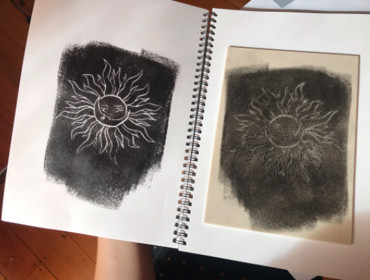
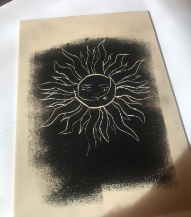
It worked! I was so pleased to see that even though I didn’t have the correct ink to do this, the paint took perfectly to the page. You can still see the sponge print throughout it and the cut out itself is rough as but minor issues aside, I think I can call this one a success.
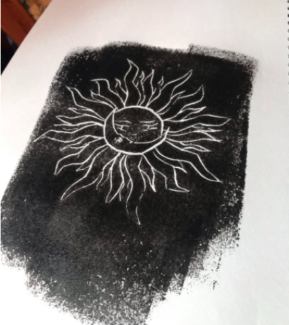
Another photo ^
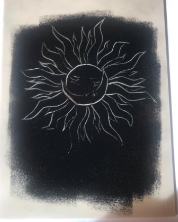
After doing this print, I wanted to have a go and now blocking out areas to give the design some dimension. I had purchased a blocked bit on lino as well, which is a lot harder than the lino i used for the first print.

After repeating the same image transfer method again, I traced over the lines for a clearer outline.
I also marked the areas that I wanted to carve out. As you can see theres a lot and this was a challenge and a half.
Mistakes were made.
My first lino cutout is a work of art compared to this one. It was very hard to carve around the details in the face and after doing it on a march harder piece of lino, I would definitely have preferred to do this version on the softer lino as it would have probably been a lot cleaner and easier.
I cut out the larger flames so when it came to printing, they were not covered in the paint and the smaller flames around the edges were just outlines so they came out fully black. Its a similar process to a negative and positive image. The parts you want “nothing” on are the parts that take more detail.
Rolled on paint once again (same process)
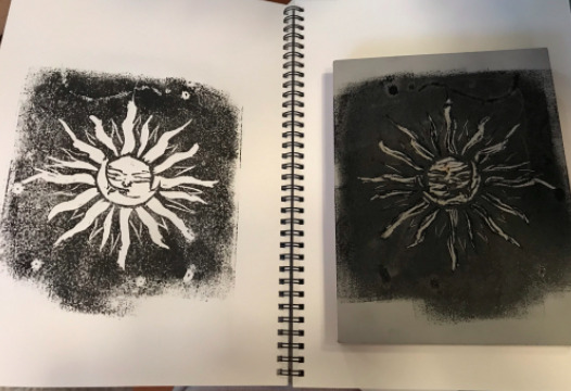
Not brilliant but not the worst! I definitely prefer the first attempt. If I had more lino I would have swapped the design with the linos. I think they harder lino works best with simple line work designs.
0 notes
Text
Product Research


Marie, L. (2020). Somewhere Over Our Rainbow. Home Talk. https://www.hometalk.com/diy/bedroom/furniture/somewhere-over-our-rainbow-36004109?id=4754810&id=4754810
I love love love this furniture piece by Lisa Marie. Something like this is right up my ally and now that I have seen this I really hope I can somehow do something like this for me second half of this minor. I’m not sure if there are any limitations but will definitely look into it. This link attached to this image is also a step by step tutorial on how to do this.


Mothershead, J. (2021). [Glass Painting]. https://jennymothersheadart.com/pages/portfolio
This is another art form I am very interested in. I have my own personal mug collection at home and the thought of creating my own mugs and glasses sounds very exciting. This is something that would potentially be very itneresting to explore. Along with glasses and mugs, Jenny also paints onto glass discs and I thought if I were to go down this path, I could look into screen printing onto glass!


Andrea Moebes Mandala Artist.[delicatedotsandrea]. (2021). [Dot Painting]. https://www.instagram.com/delicatedotsandrea/
As I'm finding research for future inspiration, I am seeing a pattern occur. This is another design technique with paint onto stone. I would love to have a go at something like this as well. The individual dots and separation of each add a whole extra element to this design. There is also so many places you can take this type of design from minimal to extra extravegant. It can also be done on more than tiles and stone. Could include it with clothes, pots, wood, paper, sea shells!


David [artstudio.r]. (2021). [String Art]. TikTok.
I’m not sure if this would classify as textile design but regardless of that, I have always been mesmerized by string art but have never thought I’d be able to do it myself as it looks like it takes a lot of skill and a clear vision but what I thought I could maybe do is incorporate string with another thing, like screen printing an image onto wood and then add dimension to the image with string and nails on top.
2 notes
·
View notes
Text
Architecture Research
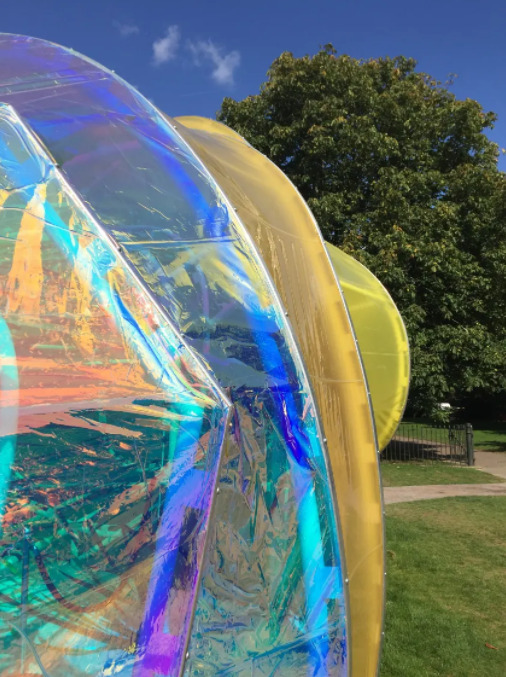
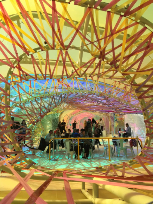

I didn’t know what I was expecting when I started researching architecture design but now that I see this image I’m excited. I experimented with cellophane first semester for my core com design paper and it was so affective and seeing something similar used for something large scale so super exciting. Holographic colour is such an interesting pattern that I would love to explore more.
Busing, E. (2015). Amazing Architecture: London's 2015 Serpentine Pavilion. Apartment Therapy https://www.apartmenttherapy.com/amazing-architecture-londons-2015-serpentine-pavillion-223543
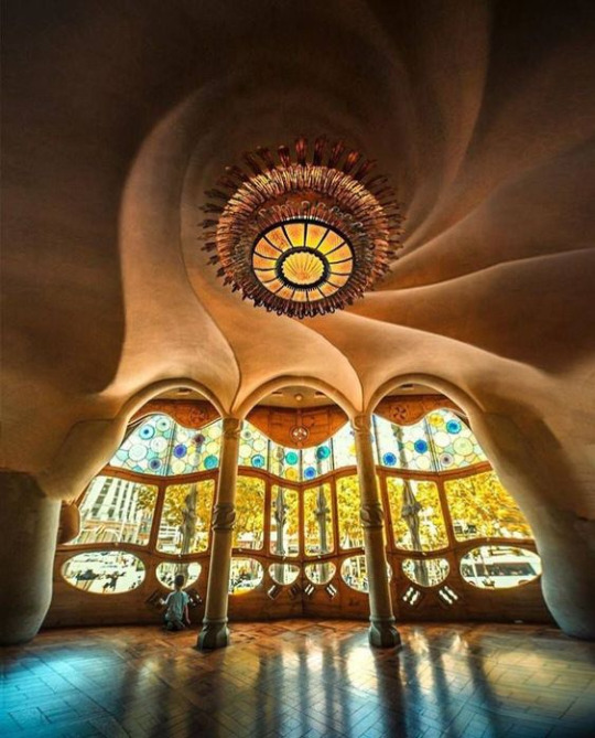

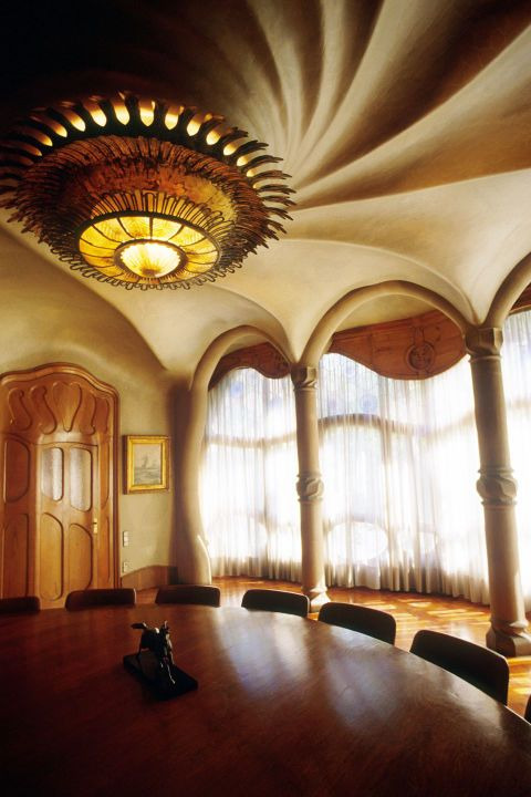
I chose this image as part of my research because what drew attention was the contrast between the hard, shiny flooring and the glass windows compared to the ceiling which almost looks velvet. The carving of the stone also twisting inwards with the light fixture. I’m not sure how this can inspire any future work however the contrast was hard to ignore.
Blaauw, K. D. (2020). Barcelona: 11x hotspots die je als interieurliefhebber wil onthouden. https://www.elle.com/nl/interieur/g25156367/barcelona-hotspots-interieurliefhebber-niet-missen/
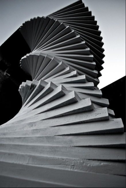
Vanniex. (2009). Stairway to Heaven. https://www.flickr.com/photos/vanniex/4018520576/in/photostream/
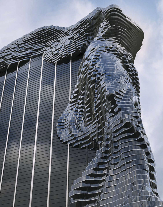
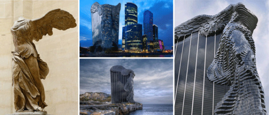
Georgitsis, G. (2015). Nike of Samothrace Tower. Greek Reporter. https://greekreporter.com/2015/01/04/nike-of-samothrace-tower/
This building is a digital rendering of a building build with inspiration from a greek statue. However, to me it looks like hot tar is being poured over the building, or like the building is being swallowed by tar. As a building, I personally dont think its very nice to look at but from a design perspective, it is intriguing. I can’t say it was a successful design as I don’t immediately see the statue but instead see tar. But each to their own.
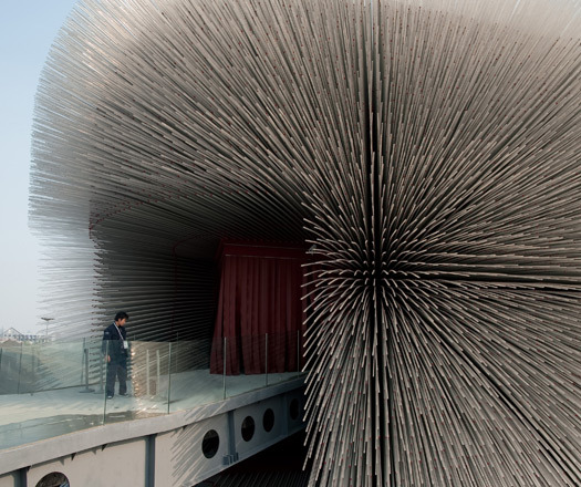

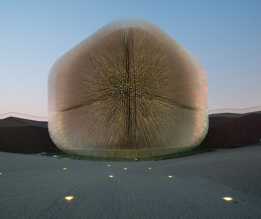
Mattioli, D. (2010). UK Pavilion [Photography]. Indesign Live https://www.indesignlive.com/shanghai-expo-2010/uk-pavilion
I am not sure if this is a real building but it definitely is amazing. The last image looks to be like the building itself is merely just a fluffy ball seconds away from being blown of or disappearing do the the fading towards the edges. The first images also looks soft but insanely shard at the same time. On the right it looks a bit like fireworks, however every other part of it looks a bit like a toilet brush.
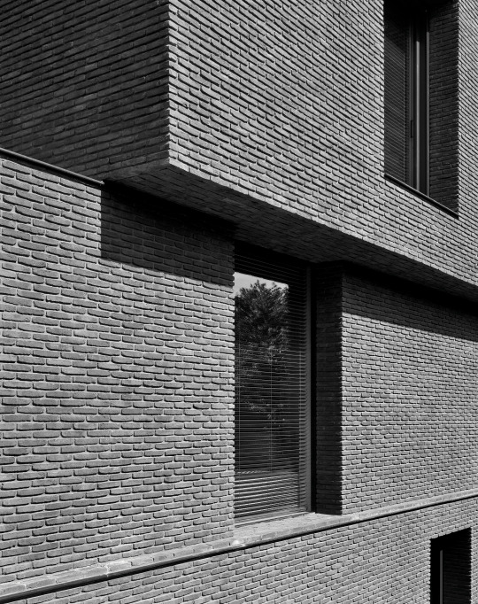

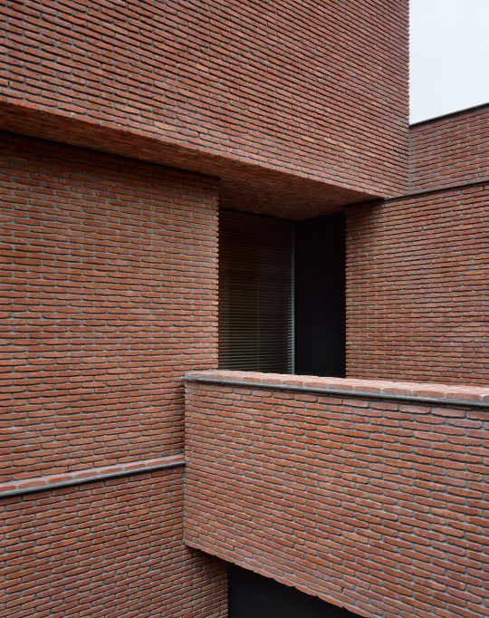
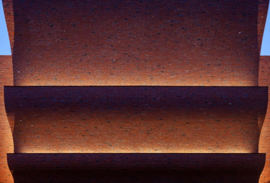
Binet, H., Halard, F., & Damme, K. V. (2014). BA Residence [Photography]. Belgium. https://vincentvanduysen.com/projects/ba
What stood out to me about these images is the precise layout/pattern of the bricks and the symmetry. The first image holds a lot of resemblance to that of scales


Michavila, X. (2013). Rafael Moneo. National Museum of Roman Art [Photography]. Spain. https://www.flickr.com/photos/ximo_michavila/8960879589/in/photostream/
Compared to the previous images, this building looks like it makes out of matches and popsicle sticks and the different shading of each brick gives it a very fragile look.

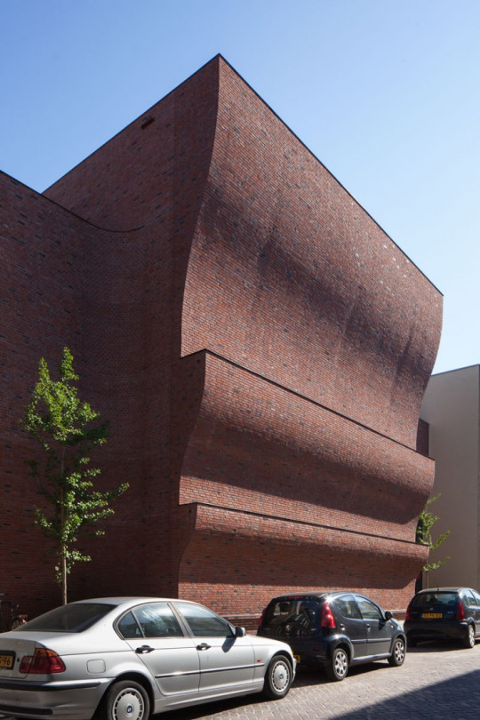
SPORTS BLOCK GRONINGEN. (2015). MARLIES ROHMER ARCHITECTS & URBANISTS. https://www.metalocus.es/en/news/sports-block-groningen-marlies-rohmer-architects-urbanists
The reason I chose this architecture was because the design of it has made it look like a wave, and that is so impressive considering the architects have managed to make something that is completely solid look like it has a liquid form but from a direct front on view, it looks like a basic three story building which is a great example of perspective.
0 notes
Text
Textile Research
Mary Worwood
Mary Worwood is a textile artist who specializes in recreating nature and natural landscapes out of threads and manipulated fabrics. These following images are her interpretation of what she sees.


Bark
When I first saw these images, I didn’t see bark. However, I did see nature. The first two images reminded me or fire or flowing lava, but that’s just because of the colour choices. The second one reminded me of swamp land or a bog. I find it very interesting how something made from thread and fabrics can evoke a thought of an entire landscape and that only shows that Worwood has executed her work brilliantly.

Bryony Berries
This design almost look sharp to the touch which just means the thorns and thickets surrounding the berries are very realistic. I’ve never been that interested in textile design but I didn’t know how detailed it can actually be.

Delphinium Border

Golden Onion

Gossamer
This is my one of my favorite designs out of Worwood’s entire portfolio. I can’t put my finger on what it is but this design looks like what a breath of fresh air feels like. It’s a combination of the cool background colouring and fogginess/blur and looks like if it were real, it would be cold. The layering of the fabrics as well add a depth to the image which makes it looks like you can reach right it and pluck some weeds.

Seashells

Seashore

Shoreline

Banded Agate

Hedgerow

Garden

Fernery

Flowerbed

And this last image is my second favourite. Unfortunately it didn’t have a title but I can still tell that its based off the idea of water. It look slike an ocean wave but it also look slike an oil spill due to the weaving and alignment of the design.
Warwood, M. (n.a). Contemporary Mix. Contemporary Mix Artists. http://www.contemporarymix.co.uk/mary-worwood.html


These silk sculptures by Peggy Osterkamp have perfectly captured the essence of smoke. When I first came across these images I briefly thought they were digitized trails of smoke but on closer inspection I was pleasantly surprised. I personally have always been mesmerized by the flow of smoke and its patterns so seeing it recreated in textiles has definitely opened my eyes to possibilites.
Osterkamp, P. (2010). Peggy Osterkamp Gallery. Peggy Osterkamp's Weaving Blog. https://peggyosterkamp.com/gallery/

Forbes, C. (2009). Little Gem Quilts. https://littlegemquilts.wordpress.com/category/carol-forbes/


The first four images are very intriguing and slightly unnerving designs. First thing I want to do when I see them is pluck them off like raspberries but then immediately after I want to run away. They have a bit of suggestive design to them but very interesting nonetheless.
The last image reminds me of rough bricks and hay.
James, S. Y. (2013). Silk Organza Sculpture [Sculpture]. Flickr. https://www.flickr.com/photos/modernfiberlab/12311007305/in/photostream/


I have deliberately saved the best for last with these two images. I had a bit of trouble tracking down the exact location of these images but everything kept sending my to the referenced link. I am unsure if there are more of these coral sculptures but I think it is SO clever and fun. If I had a chance to recreate something like this I'd jump of the opportunity
Catk. (2019). Coral. https://blog.catk.de/post/141540723851/coral
0 notes
Text
Nature Research
When I think of using nature as inspiration for design, I think of physical aspects of nature elements. Like leaves, gravel, bark, clay, cracks, stones (the colourful kind), shells, wood grain, bugs (markings, wings, shape etc), rain splatter/drops, roots, weeds, petals, foot prints, scales, moss, algae - I can list on forever.
The following images are what I’ve found exploring online.

Eaton, C. R. (2011). Carol R. Eaton Designs [Stamp]. http://carolreatondesigns.blogspot.com/2011/07/how-to-leaf-stamp.html
This is a sweet and simple technique if I decided to incorporate leaves in with any future work that I do. I have always wanted to make a full piece using just leaves as stamps and I might do just that, for this minor or not :)

Johansen-Ellis, M. (2010). Autumn Leave 1 [Monoprint]. https://www.flickr.com/photos/mariannjohansen-ellis/4933699052/in/photostream

McMahon, J. (2013, August 18). Fruit and Veggie Prints. https://www.chicagobotanic.org/blog/how_to/fruit_and_veggie_prints

Shelly. (2020). Welcome to Nana's. https://welcometonanas.com/paint-with-broccoli/
Using food as stamps is a great way to achieve some really interesting patterns and textures. Similar to the leaf stamps, I’d be interested to see what it would look like to combine different fruits and vegetables with different coloured inks and paints and make some kind of fruit collage.


Bee, T. S. (2013, August 21). Ceramic Bowl w Nature Impressions. http://theskillfulbee.blogspot.com/2013/08/ceramic-bowl-w-nature-impressions.html

Egan, M. (2015, January 23). Impressive Things to Make with Air-Dry Clay. Craft Foxes. https://www.craftfoxes.com/blog/things-to-make-with-air-dry-clay
So far I have really enjoyed working in the wet lab so would love to persue doing something along the lines of leaf impressions and a lot like this last image, a whole clay leaf.


Dunne, S. (2016). Sue Dunne. http://www.suedunneceramics.com/suedunneceramicswallhungwork.html

Love, L. B. (2012, March 13). Going With The Grain: Plywood Artwork. Dishfuntional Designers. http://dishfunctionaldesigns.blogspot.com/2012/03/going-with-grain-plywood-artwork.html

n.a. (n.a). Pinterest. https://www.pinterest.nz/pin/40110252923116480/
Personally I find working with wood in this context a bit trickier than other techniques as working with wood requires some serious craftsmen ship and also is a bit of a lucky dip when depending on wood grain. This last image however is very intriguing and looks like something I could potentially have a go at.


Thaden, K. (n.a). Thaden Mosaics. https://www.thadenmosaics.com/stone.html

Heery, C. (2009). The Rockpool [Mosaic]. Flickr. https://www.flickr.com/photos/intrinsic_mosaics/3918889962/in/faves-dragonfly-iris/
Mosaic work is such a rewarding process. I dabbled a very little bit with mosaics when I was little (we covered our mailbox in little square tiles and glass pebbles) and it was so much fun. I particularly like the last image in the set. It looks like a real pond/pool and that water reflection detail/texture has really stood out to me.

Schäfer, A. (2015). Tree Bark Painting. Saatchiart, Germany. https://www.saatchiart.com/art/Painting-Tree-Bark-Painting-1/693786/2705393/view?epik=dj0yJnU9Z1U1R0k4aDdZTGlIOEpXVTlUUEZuSlk3ZGVnaXFVOWomcD0wJm49TmE2alB3YWFvRUw4UGNCTGVGR1VfZyZ0PUFBQUFBR0ViSHhz


My work colleague recommended this artist to me. How she does her work is she layers hundreds of layers of paint onto some sort of canvas and waits for the layers to dry before engraving. Each layer of paint in a different colour so if she wants part of her image a certain colour, she carves right down until she reaches that specific colour she needs. By Hannah Jensen, H. (2017). Portholes into Nature. https://hannahjensen.co.nz/collections/portholes-into-nature-2015/


Macro lens images are always amazing when looking for designs and textures in things like plants, animals and insects. The reason I chose these images is because I am interested in the patterns found on an individual leaf and being able to see the patterns and textures on it. A great way to get inspiration for designs.
Tanakawho. (2009). [Photography]. Flickr.com. https://www.flickr.com/photos/28481088@N00/3566734666/


These photographs by Chris Perani have absolutely blown me away. I never knew how detailed and beautiful a butterfly’s/moths wings were up close. I was aware of moths having hair on their wings but never butterflies! It reminds me of sequined and beaded fabrics as well as embroidery.
Perani, C. (n.a). Butterfly Wings. https://www.chrisperani.com/Butterfly-Wings/i-Sk5cnPq

This is a close up image of a piece of coral! Amazing to see that it looks almost furry and like velvet. The image itself reminds me or a bacteria or some kind of microscopic organism.

Harlequin bug!
I was so excited when I came across this image of a Harlequin bug. I was hoping to find something insect related but this was way beyond what I was expecting. Its outter body looks like chromatic leather.
Stoupin, D. (2018). Microworlds Photography BioQuest Studios. https://www.microworldsphotography.com/Prints/Vertical-Abstract-Prints/

Organicvision. (2018). Gills in the Linden [Photography]. Deviant Art. https://www.deviantart.com/organicvision/art/Gills-in-the-Linden-725790134
This was a very interesting photo of mushrooms that I font on Pinterest. But what I like the msot about it is the illusion it gives off with the grooves in the mushrooms all going in the same direction.

I’m not too sure what this image is, I have a feeling its colourful canyon walls like the image below, but that's what makes it so intriguing - not being able to tell what it is. It looks a bit like molten lava and dusty paint.


Martin, A. (2011). Geology [Photography]. Flickr. https://www.flickr.com/photos/allibaba/5451118875/in/photostream/
0 notes
Text
Cyanotype
Prepping the cyanotype

There are two types of chemicals used for this type of design. Cyanotype and Van Dyke. For this particular one, I only worked with Cyanotype. The measurements for preparing the chemical are as written on the tub as well as __mls of water.
Applying cyanotype to stock

Paper
With a weakly charged brush, spread the cyanotype over paper. Recommended to do this fast to avoid any pooling or excess liquid setting into the paper. Unless you have an image you want to develop over the entire page, it isn’t necessary to coat the whole page as the image will only take to where the cyanotype is. So if it is just a small image, you only need to apply it to wherever you want the design to develop.

Calico
Applying the cyanotype to fabric is slightly different to paper as calico tends to reject the cyanotype so with a fuller brush, you need to force the chemical through the fabric, fully coating it to ensure a decent amount of coverage.

The cyanotype also can leak through the fabric onto the surface underneath so this is something to be aware of but also an opportunity ti get an interesting pattern on more stock. Once you’re done with the calico, you can place a piece of paper face down onto the droplets resulting in an interesting cyanotype pattern.

I made four copies. On the left is paper that I stamped over the top of the cyanotype droplets left behind from the calico on the left. I also used a slightly wet brush over the top for a more rougher pattern. The third is a completely covered piece of paper and on the far right was same technique just less refined.
Once happy with the application of the cyanotype, they need to be placed on these screens and put into the dark room to dry. This should only take around 10 minutes. Calico will take longer than paper
Prepping the image.


I prepared two sets of images. One of my mums dog, Delores and another of my partner James. I chose the photo of Delores because it was a clear photo and I chose the one of my partner because it had an old school grainy film texture to it that I wanted to experiment with and see how it would turn out.
These images have all been printed onto _____. This is a see through type of plastic film that the negative and positive image is printed onto.
This works similar to how emulsion works on screens in regard to the UV exposure, however when exposing a negative image (right) it develops as the original image/the positive (left). So when exposing the image on the right to cyanotype, the final result will look like the image on the left and vise versa. However an upside with cyanotype is that it is a lot more versatile compared to emulsion. Images can be printed in grayscale and this with show up when developed. Similar to developing a film photograph minus the film reel.
This can be done using the exposure machine or by simply leaving the image sitting on top of the cyanotype out in the sun. Depending on the strength of the sun when doing this, it can me done within minutes. Also there is no limit to size when creating you images as they are developed in water. The only difference between exposing in the exposure machine and in the sun is that the outcome is a lot more softer and gradual with the sun and cleaner and sharper with the exposure machine.
Exposing

Once your stock is dried its time to expose. Only once you have your images placed onto the exposure machine face up should you take your cyanotype out of the dark room as they are very light sensitive. The longer they are out in the light, there more chance you have of them exposing.
Side note: If you image has writing or has to be facing a particular way, make sure to print your images flipped or else they will print backwards.

Exposure settings set to 180- LtU.

Same as when exposing the screen, lock the cover in place. However this time the rubber chords don’t need to be on top of your image as there isn’t any objects we are trying to vacuum seal. The paper stock has a chance of slightly curling inwards due to the wetness of the cyanotype so its best to hold it down in place as you shut the cover. This is important as your stock can shift under the cover and the image can expose in the wrong place. Once the vacuum starts, the cover will slightly lift so its important to push that down in the early stages to avoid any unwanted kinks and wrinkles in the stock.
This will take around 2 minutes.
Developing

Once your image is done, all you need to do is soak it in a tub of cold water. The aim of this is to wash away any of the lime/green colouring. Make sure the image is completely submerged in the water. It helps to move water the water around and get it lapping over the images. This just helps to wash away any excess. For the calico, you can even read right in and scrunch it up and wring it out like you would a sponge.

Once you are confident the image is completely developed, take it out of the water and place it on the lowest rack you can find in the drying racks. The reason we put it right at the bottom is because the stock is wet and you don’t want it dripping onto other peoples work.
Once the image as fully dried, it should be darker. The calico will be wrinkled but you can simply iron it flat!
Finished Results

This is the dried product of my positive image onto paper stock. It’s come out very detailed and shows the image perfectly, however there is the odd line down the middle but other than that I can call this attempt a success. This image also reminds me of those classic crime shows introducing a character - “James was an ordinary man... until he wasn’t” *fading boom noise followed by negative image*

. Before ironing

After ironing.
I was very excited for my negative image used on the calico fabric, however it was not as successful as the paper stock. I’m not sure what has caused the spots scattered over the image BUT I still like the roughness to it. The brush marks around the edges are a nice touch too - if only it had done it at the top to. This result reminds me of an old western wanted poster.
Lockdown
I was planning on doing the image of my mums dog too but lockdown happened the day before I was planning on going in to do so.
0 notes
Text
Screen printing on Clay Tile
Prepping the clay

Clump of clay ready to be kneaded ^

Kneading area dedicated to kneading clay ^

First step to getting you clay prepared is to knead out all the air bubbles and making the clay more pliable. There are a couple ways you can knead your clay to help removing air bubbles. The first is using the palms of your hands and the weight of you body and rolling it in your hands against the bench. This technique circulates the clay and pushes out the air bubbles. Another technique is to pick it up and slap it back down onto the bench in a circular rhythm. Be sure not to change the direction of your kneading as you are pushing air bubbles from the center out. If you change direction, there is a possibility you will push the air bubbles back into the clay. The reason it is so important to knead out the air bubbles is because bubbles can cause explosions when in the kiln. The heat in the kiln causes the air bubble to expand and squeeze its way through the clay resulting in cracks or worse.

Wire cutter used for cutting clay


Noticeable air bubble pockets
Cutting your clay when kneaded helps snuff out any lingering bubbles and is a good way to get a proper look at what is going in in the middle. I did this a couple times before being happy with the clay.
Shaping your clay

Tools used for designing your tile. (+ a tub of water)


Using the (name) sticks, these create a guide for you to follow with the rolling pin. To begin rolling and flattening your clay, it helps to flatten it down as much as you can by hand before lining up the sticks which determine the height of the tile.

When rolling out your clay, this is the third opportunity to scope out any air bubbles that could still be lingering in the clay. When finding out, all you need is to stick it with a wooden skewer to pop the bubble and then take a small clump of clay, wet it, and push it into the pocket to fill the hole.

Filling the air pocket ^

When rolling out your clay, it is important to keep it rotating and flipping. This is to keep the clay molecules crosshatched within the clay, to prevent the water draining from the clay in one direction. If you flatten and roll you clay by going in one direction, when the water is drain from it, it can cause your clay to curl when drying and distorting the shape. So keep flipping and rotating.

Here you can see that the clay is now level with the sticks on the sides meaning we are not ready to start shaping our tile. If i were too keep rolling, essentially nothing would happen due to the sticks preventing the rolling pin getting any close to the bench.
Imprinting the tile

Here is where I separated the clay in two. The top half is what I plan on using to screen print on meaning I just need a flat slab which is what that is so I don’t need to work on that any further. The bottom half is what I intend on using to make my imprint for the clay. For this I’m using my laser cut out of my design.

Lining up the design and making a slight impression ^

Due to the shallow engrave of the detail on my laser cut out, it didn’t come out at prominent as I’d hoped but it still looks really interesting with the bold outlines and the faint detail in the middle.

I decided to take it a step further and cut out the shape using a knife. It is very rough and I’m not sure how its going to come out once fired but I am really interested to see how it holds. I also used a wooden skewer to enhance the details on the faces.
While reflecting on this now, I realize I could have made this process a lot easier for myself. After making the impression with the laser cut out, I then went in with a not so steady hand and cut it out. But what would have worked a lot better is if I left the cut out on the clay and just cut around it. My shapes would have definitely come out a lot cleaner. However, it may have a more organic, hand made look to it when its done.

For the final touch I went around with a wet sponge and softened some of the edges. For the fragile points, using wet fingers, i rounded in the edges a bit and smoothed out as many bumps as I could.


I had a bit of left over clay after finishing my initial design so tried the lace imprinting as well. Initially was going to just have it on the rectangular slab but I wanted to have a go with the circular cookie cutters and have various sizes so I did just that. I’m more excited to see how these turn out than the other just because they look adorable and I can’t wait to glaze them!
I am prepared for them to shrink when in the kiln as shown there

This example shows the 4 stages a piece of clay goes through. Starting out as a larger piece when wet and it hardens, shrinks and becomes sharp when glazed. This is something I am prepared for in regard to my sun. I did round in the points as much as possible and wet the edges to ensure a smoother result but it is still a possibility.

My pieces ready to be fired!
Screen Printing on Clay

Screen printing on clay is essentially the same process as regular screen printing. However the only difference with this is that the screen needs to be stacked in order to accommodate the thickness of the tile.


I used three for the top half and five pieces for the bottom half. This is so when using the squeegee, the screen isn’t too close to the tile and allows the screen to snap back. This is to stop your tile from sticking to the screen.

Ink (?) used for the tile. Looks blue and a bit watery compared to standard screen printing ink but dries black.

Pulling the ink is exactly the same.
With a firm grip, push the squeegee onto the screen and pull towards yourself. The squeegee should be slightly angled to pull the ink through. Once that is done, before looking at your image, lift your screen slightly and with one hand, using the squeegee, push the ink away from your self back to the starting point. This is to insure that you ink doesn’t dry up and you are lifting it so you don’t print onto your stock twice.
Because this ink (?) is a lot thinner than standard permaset ink, I pulled the ink through twice.

The result!
I’m so happy with how this image took to the clay. It’s so bold, so detailed and positioned in just the right place. Because I pulled the ink through twice, it is ever so slightly overlapping but it just adds to it.

There was some minor leaking and dripping around the edge of the tile which wasn’t ideal but it does kind of make it look like the the image is snaking over the edge.

There is also some slight texture to this print as well, I am not sure if that will just soak into the clay or if it will be textured once fired but either way, the outcome was great.
Lockdown
I went to the Wet Lab on Tuesday 17th however unfortunately there was a note posted to the door saying the Wet Lab was closed for the day so I wasn’t able to follow up on my tiles. My plan was to return on Wednesday but that was put to an immediate halt.
All that remained for me to do was to glaze my tiles
0 notes
Text
Laser Cutting.
Laser Setup

These are a few examples for the different laser strengths. It can either cut right through, outline or completely fill in a space.
Image Prep

I used the same design again - this time however i did run into a few hiccups. When I initially drew this design, it wasn’t as a vector so when I did transfer it to illustrator and traced the image, there were a few problems on my end with some ends not connecting, so I did my best to fill them in but I completely forgot about the amount of layers I was making in the process which is what resulted in the thicker lines in some spaces of the image. Also, due the the design itself, I wasn’t able to make a stamp from this image due to vital parts of it connecting to other parts and if I were to cut right through, the design itself would end up like some kind of puzzle that’s been taken apart in weird areas.
Machine

Cutting


For this design I ended up having to have just an engraving of my image, which either way I am really happy with. Matt also helped a lot by tweaking the design a bit, but fixing the outline of the design which then allowed the laser to go around a second time, but this time only around the edges which originally were connected to parts of the face and other details in the middle. But fixing the file, the laser stayed to the edges of the images which then resulted in the sun being cut out a a whole.


As you can see here, the design has popped in on itself, meaning the shape has been cut out.
Final Outcome


0 notes
Text
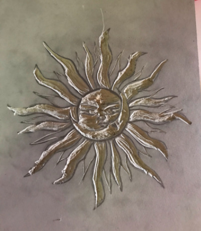
Screen Printing on Metal
Prepping the metal sheet.

Sanding the edges down ^

Sugar soap and pumice powder ^

First step to prepare my metal for screen printing is to sand down all the sharp edges using a scourer so the corners are smooth but also sands down the flat parts of the metal before washing it down in the sink with some sugar soap and pumice powder . This degreases the metal which helps the ink and vinyl stick better. Once that was done I dried the sheet with a hair dryer.
Prepping the image

Sizing up my design on the computer after measuring the length of the roll. Have to make sure it isn’t too small that the design isn’t clear but also not too big so it fits onto the metal sheet.

Cutting ^

Using the printer, I used the same design I used for my original screen however for this particular one, I removed all detail so it was just the outlines of the image that needed to be traced.

Like so ^
However due to the fine lines of the drawing, the printer had some trouble making a clean print. When it came to removing the parts of the design I wanted, I had to sacrifice some parts of the drawing in order for it to be as even as possible

It lost a few arms and an eyelid but I’m still happy with the result.
Applying to Metal


Once I was happy with the design, I stuck the face of it onto some adhesive paper which when peeled back, removes the remainder of the image from the backing and is then placed onto the metal sheet. I had to be careful with this process due to the fragility of my design, it did lift in spots a few times but it came out great. Once this is done, I then covered the back of the image with vinyl. It had a few air bubbles, I didn’t think of this when applying it but I hope it’s not a problem.
Printing on Metal

Prepping my gel ink with a blob of gel and green dye ^

Lining up the ink ^


For the green ink I used the gel with a green dye and then basic yellow permaset ink to create a blended “rainbow” effect. Because this is the first time I used the gel, I wasn’t sure of any exact measurements and it did come out a bit clumpy on the metal. I also would have preferred that I mixed the two colours a bit more so they blended nicely through the middle. However other than those minor issues, I am pleased with how it came out. I used my original screen as well for this so hopefully when the sticker is removed from the middle, I’ll get an interesting result.
Prepping the acid

Ingredient station ^

1 part Copper Sulphate (100 g)

1 part table salt (100g)

1 part water (1 ltr)
To make the acid for the metal etching, you need to mix together 1 part copper sulphate, 1 part table salt and 1 part water. These minerals will dissolve faster in hot water but will still dissolve in cold water. Once the all partsd have mixed together equally, this is when you place in your metal sheet.

Put a bit of tape on the back to use as a a handle to remove the sheet from the acid. Also ensure to place the sheet into the acid face up and away from you to avoid being hit by any splash back. You will notice immediately the acid reacting to the ink on the sheet and this is to be left for 40 minutes.
40 minutes later...


After 40 minutes, you’ll return to this lovely sight. The acid has reacted to the ink on the metal and has eaten away at it, removing it from the the metal surface. Now I just simply washing it away with the hose.

It was a lot trickier than I was expecting this part. Some of ink was really stubborn and required some picking at and scratching to get it off.


This is the final result. As you can see, the permaset didn’t hold as well as the gel did, and also the area that the permaset half of the image was, the texture has come out very rough. The gel ink on the other hand feels a lot smoother.
The acid reacts differently to gel ink compared to permaset. The reason the gel ink has come out a lot more visible is because it can withstand the the acid more than the permaset can. The permaset is “thinner” than the gel, resulting the the acid seeping through more.
However, I have a feeling I may have done something wrong in the process of making this print. There’s a few dark spots poking through which was unexpected.
The sticker however looks really vibrant and bold against the rough background. I’m most surprised with how clean the detail around the faces has come through. Will be really intersting to see how this looks when I relief it.
0 notes