
Don't wanna be here? Send us removal request.
Statistics
We looked inside some of the posts by imogenwilliamsproject3 and here's what we found interesting.
Average Info
Notes Per Post
2
Likes Per Post
2
Reblog Per Post
0
Reply Per Post
0
Time Between Posts
21 hours
Number of Posts By Type
Text
16
Photo
1
Last Seen Tumblr Blogs


Fun Fact
1,644 Tumblr posts in 1 second.
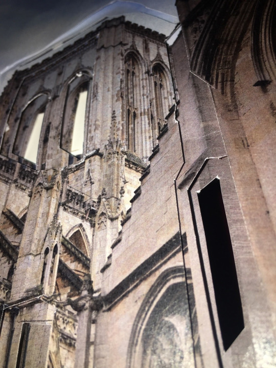
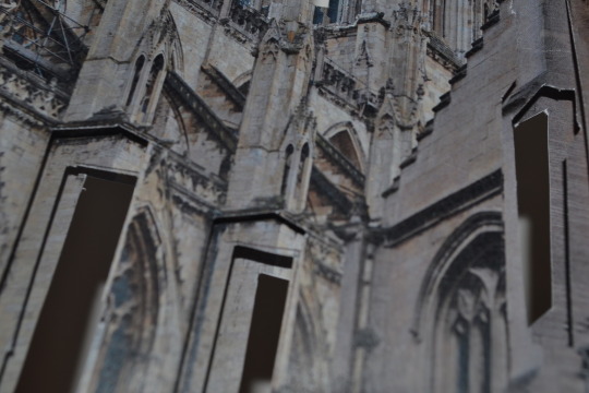
Text
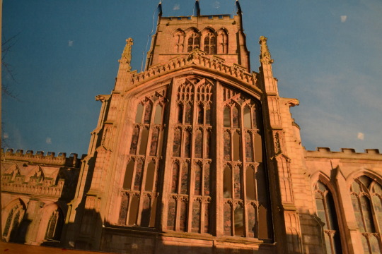
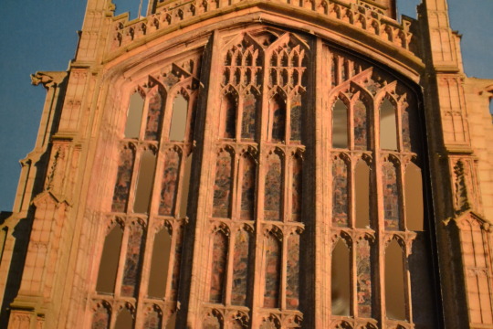
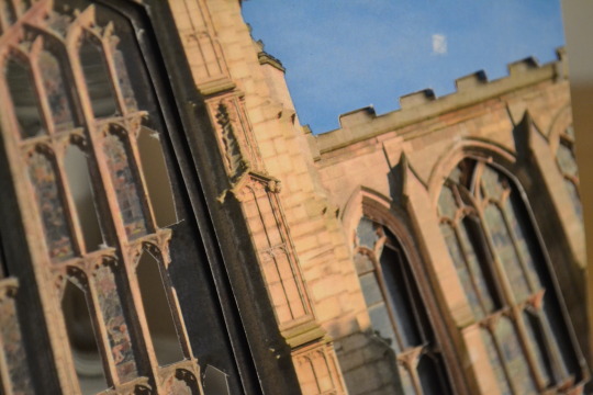
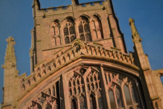
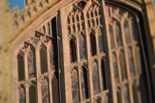
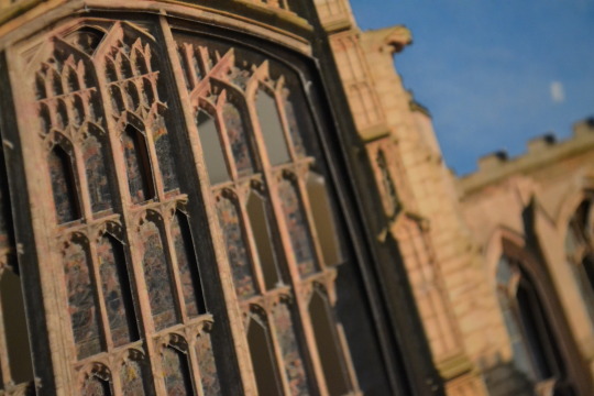
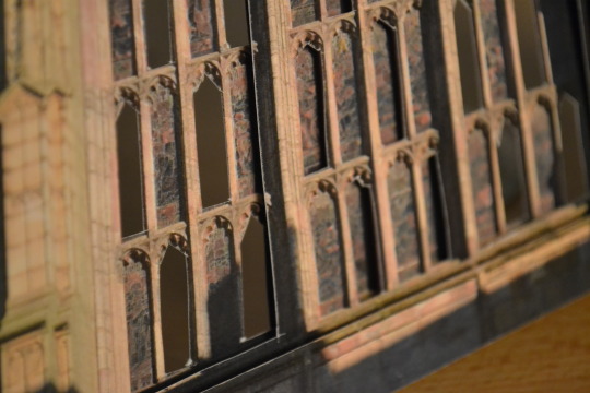
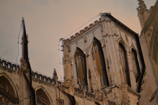
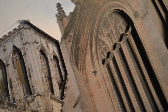
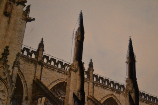
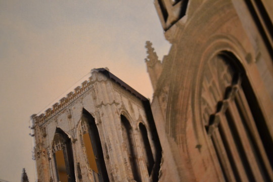
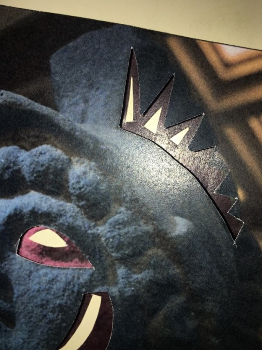
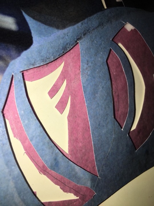
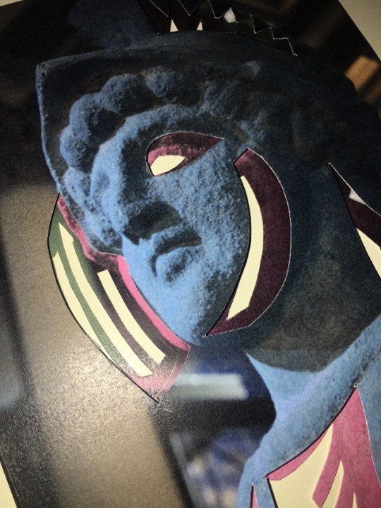
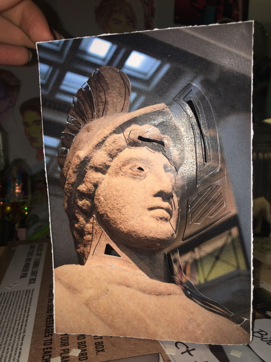
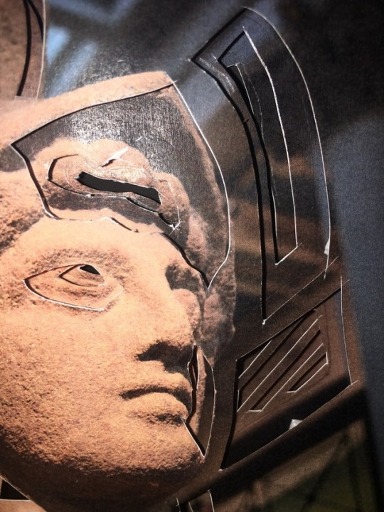
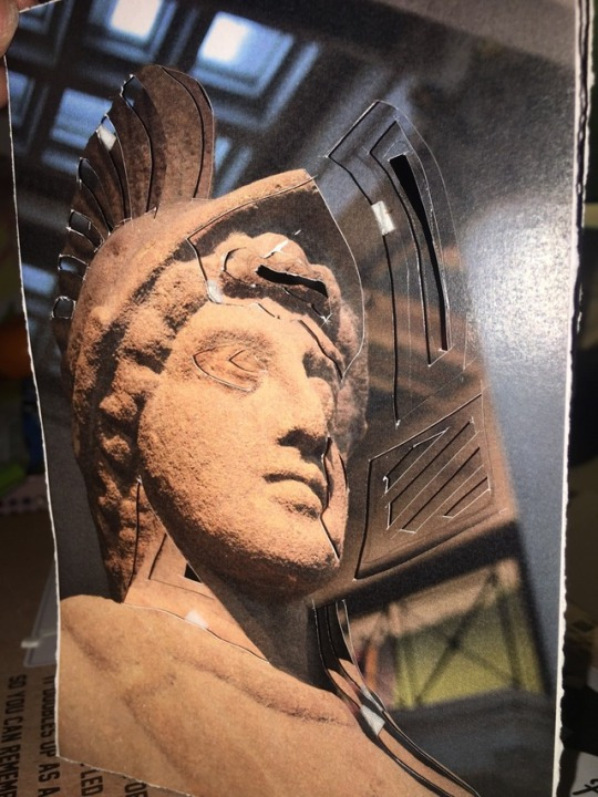
Close Up’s Of My Final Sculpture
St Marys church
Aperture:f/5.6 shutter speed:1/50 ISO: 3200 focal length: 32mm
Aperture:f/5.6 shutter speed:1/50 ISO: 3200 focal length: 55mm
Aperture:f/5.6 shutter speed:1/50 ISO: 3200 focal length: 52mm
Aperture:f/5.6 shutter speed:1/50 ISO: 3200 focal length: 55mm
Aperture:f/5.6 shutter speed:1/50 ISO: 3200 focal length: 55mm
Aperture:f/5.6 shutter speed:1/50 ISO: 3200 focal length: 55mm
Aperture:f/5.6 shutter speed:1/50 ISO: 3200 focal length: 55mm
Aperture:f/5.6 shutter speed:1/50 ISO: 3200 focal length: 55mm
Aperture: shutter speed: ISO: focal length:55mm
Aperture: shutter speed: ISO: focal length:55mm
Aperture: shutter speed: ISO: focal length:55mm
Aperture: shutter speed: ISO: focal length:55mm
Aperture: shutter speed: ISO: focal length:55mm
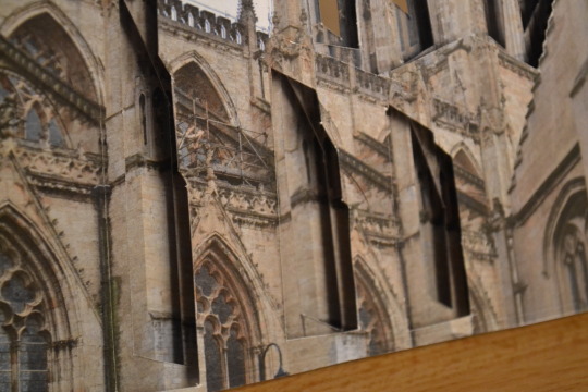
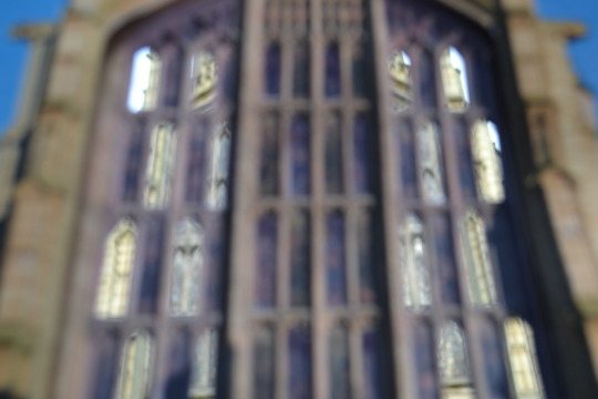
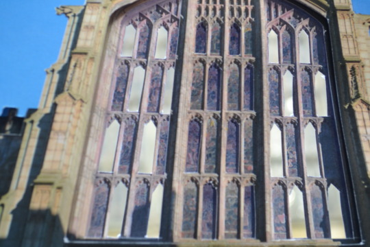
I wanted to include some more in depth pictures of my final sculptures to show the detailing and layering clearer. The sculpture of the St Marys church is neater than the cathedral in York, i think this was because the shapes were easier to do and I spent more time on it that the cathedral. I’m still happy with how they both look and they turned out really well.
1 note
·
View note
Text
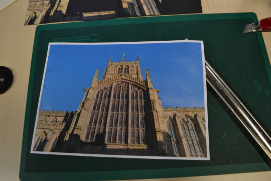
Photographing my final piece
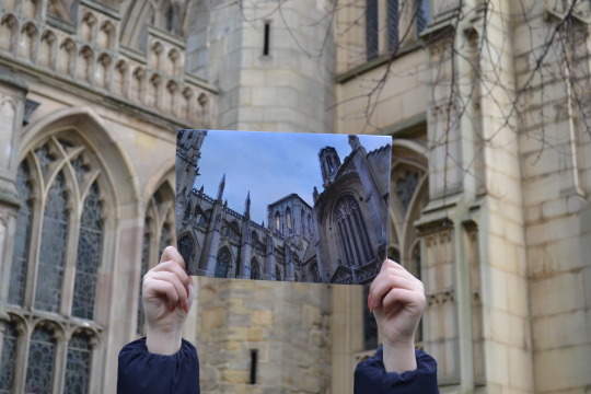
Originally I wanted to photograph my final sculpture in the location I took the photo but for my second sculpture I can’t as it’s in York and I’m not going back there so I’m going to photograph them both in the place I took the first sculpture, at St Mary’s church as holding up the sculpture in from of the stain glass window will be a good comparison to show the detailing of what I’ve cut out of the image and to see the actual building through my sculpture will look really effective. I also chose not to photograph the pieces stuck together as they both worked individually and photographing them together just wasn’t necessary.
These photos are for my final sculpture, I photographed these inside of the church to get more of a full background ans the church at this angle had some similarities with church in the sculpture.
Aperture: f/5.6 ISO: 200 shutter speed: 1/125 focal length: 40mm
Aperture: f/5.6 ISO: 200 shutter speed: 1/125 focal length: 40mm
Aperture: f/5.6 ISO: 100 shutter speed: 1/125 focal length: 24mm
You can see in this image that the church has a similar tower in the background to the one on the sculpture along with the same kind of roofing along the side.
Aperture: f/5.6 ISO: 200 shutter speed: 1/125 focal length: 40mm
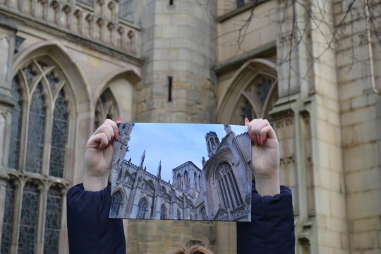
Here you can see the difference in size, I think in the end it was better to use A4 paper than A3 as it would of been harder to hold in the weather conditions and the A4 you ca still see the image clearly and it lets you see more of the background of the church so its a good comparison and lets you see detail in both.
Aperture: f/5.6 ISO: 250 shutter speed: 1/125 focal length: 34mm
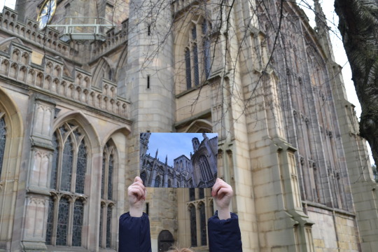
It was hard to find a good area to photograph as the sculpture and actual church didn't line up because the sizes were so different.So I took this image through the bars to try and get them to a similar size as there was a gate that was in the way so you could only go so far back.
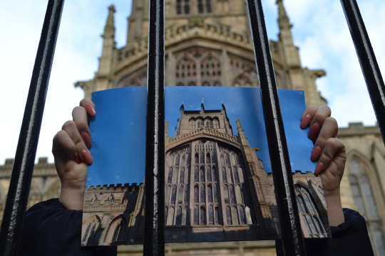
I Aperture: f/5.6 ISO: 100 shutter speed: 1/125 focal length: 28mm
think this image works even with the bars, it shows the sizing of the actual church along with the sculpture which I think is a nice comparison. I did have to get someone to hold both sculptures as there wasn’t an area to leave them to rest near the church and be able to photograph them well. Also it was very windy so the card was getting blown around. You can see it in this picture as there is creasing on the card from where the winds blowing it back, this was an issue but it’s not to noticeable.
Aperture: f/6.3 ISO: 100 shutter speed: 1/160 focal length: 18mm
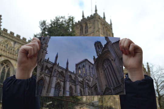
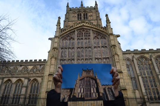
I tried to shoot this photo as close to the original as possible, I stood in the same place and photograph my sculpture in the middle of it. You can see the difference in day time and weather which I really like it makes the two images look different but also shows there similarity. You can see where I’ve cut out on the back page and through the windows. I then tried to shoot the real glass windows of the church through my sculpture but this was tricky with such a size difference.
Aperture: ISO: shutter speed: focal length: This image is very clear but I think you get the idea of what I was trying to do, I had to put the camera on manual focus for it to focus on the windows in the back.
Aperture: ISO: shutter speed: focal length:
Then for a close up of the windows on the sculpture I focused it on the foreground.
0 notes
Text
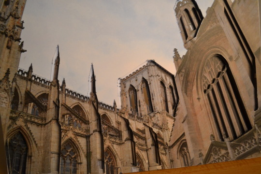
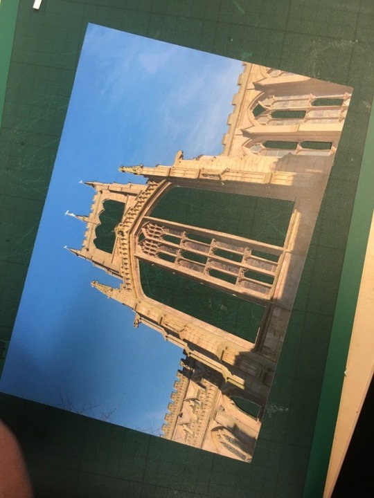
Final Piece P.2
For my second piece of A4 card I chose to use this image:
Apeture: f/5.6 shutter speed: 1/125 ISO: 100 focal length: 18mm
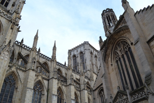
This photograph is of York cathedral I chose to use this image as I’d practiced the method on this image:

Apeture: f/5.6 shutter speed: 1/125 ISO: 100 focal length: 24mm
But this image is portrait and I wanted a landscape image to match with the other final piece I made which is also landscape. But both images have beautiful detailing that I could cut out in a number of ways so both images are very versatile and have a lot of options of where to cut out and layer.
To start of with I printed 3 of the images out on card.
Then I started doing the same process I did in the last and cut out the most pieces on the first layer, these pieces had to be the biggest as well so that the next layer I could cut out the shape smaller but just as easy.
Then I did the next layer.
This is the second layer but with the first layer also on top, this was after I’d stuck them together. As using 4 layered cubes on my practice piece which and seeing that it didn’t work I decided to keep it safe and use half the amount. Then I had to carefully place the second layer on top of the first.
This is the final layer I only cut a few pieces out as I didnt think loads needed to be cut out as it didn’t need to be overly complicated and keeping it simple was safe.
0 notes
Text
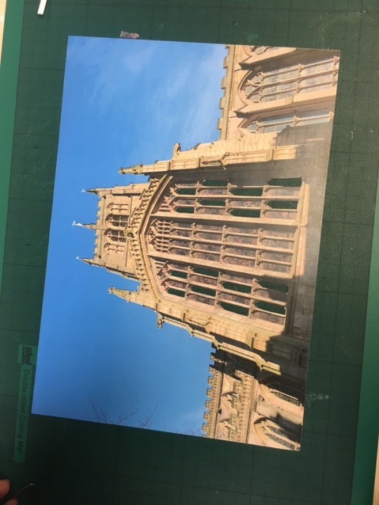
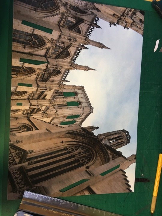
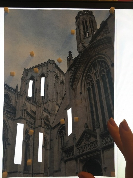
Making my final piece P.1
This is the final image I chose:
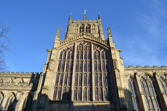
Aperture: f/6.3 shutter speed: 1/160 ISO: 100 focal length: 18mm
I chose to use this image because of the stain glass windows which are a staple in traditional English churches and cathedrals which are a big part of English architecture. This image was taken at Nottingham St Mary church. I wanted to use this image in my final piece because there was a lot of areas just from looking at it in person, that there were a lot of areas to cut out.For example the windows and arches. I made sure to take this photo on a sunny day but I do think the shadows are a bit distracting but once I’ve cut everything out it might work.
After printing on card the colours on the image stood out a lot more compared to the original. The blue was a lot more intense and the building was more golden, I’m happily surprised with this though as I think it looks better than the original. But there was a slight outline around everything on the image when it printed but it wasn’t an issue.
To start of with I then cut as such out as possible keeping in mind not to cut to much though as I didn’t want the card to be to flimsy. I think my cutting was neat and tidy I wasn’t sure if cutting on card was going to be more difficult than cutting paper as I hadn’t tried it yet but it was actually easier to cut the card. To cut everything I used a scalpel and ruler then did some free hand cutting when I needed to do curves.
0 notes
Text
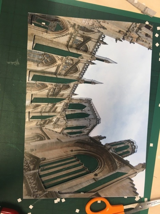
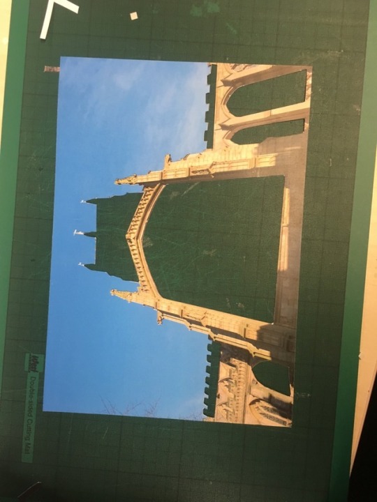
Protracting with A3 paper
This is the image I’m using to practice my final piece in A3. To start of with I printed 3 images out in A3 in preparation to stick everything together when it’s all done.
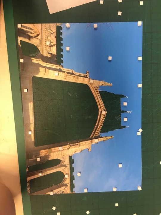
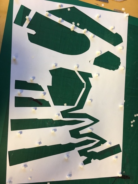
This is how the first layer looked when it was all cut out, I tried to cut as much out as possible so that the next layer will have a lot of choice as to where I can cut out, I made sure the pieces cut out were big enough so that when cutting out the next layer I wouldn't have to do it too small and there would be less chance of ripping. When I was happy with this layer I moved onto the next.
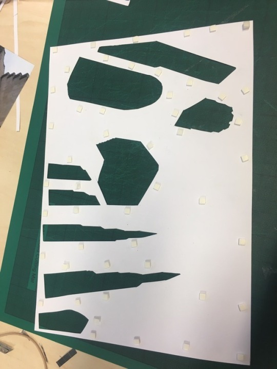
This was the next finished layer. Around the sky line there is pencil marks when I drew around the fist layer onto this page so that I could see where I could cut. I did try to rub these marks out but it rubbed the image off the page. So I decided to leave it as the top page should cover that pencil line.
This was then the final layer, the cut outs are minimal but neat so im happy with them and as the layering goes down it becomes harder to be precises as it gets smaller and smaller.
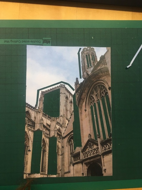
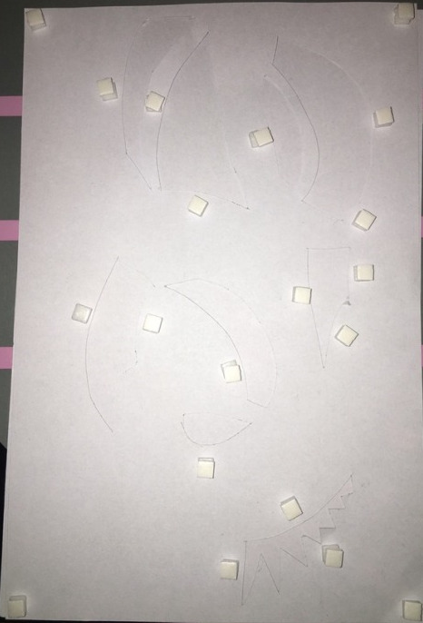
Then on the first layer I layered 4 sticky squares down on areas that needed to be kept up with extra support otherwise they would droop down, and also on the corners to keep everything in place.
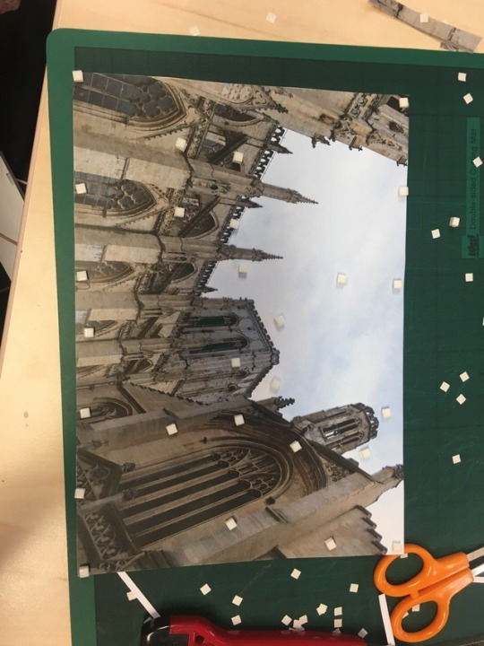
After attempting to stick this page on top of the next layer I realized the paper was to heavy and not thick enough to lye flat so it collapsed in on its self. The paper bunched up and didn’t stick down well. This wasn’t something I was anticipating because all the other times I’ve tried this it had worked.
I was going to use A3 for my final piece but as this didn’t work I’m doing to instead make 2 separate A4 and print the images on card as using paper isn’t strong enough. Then stick them together at the back. Or just stand them next to each other when I go to photograph them.
0 notes
Text
Evaluation
2.1 Demonstrate the ability to plan, organise and prepare solutions to a three-dimensional problem in art and design.
3.1 Analyse the effectiveness of solutions to three-dimensional problems in art and design.
Briefly explain what your final piece is and how you came up with the idea.
I came up with my final piece by researching “photography sculptures” on Pintrest to be short when I found the photographer Lucas Simões. But I then developed and further researched and experimented with different ways of making my work as best as possible and by experimenting with colour taking inspiration from Damien Blottiere. Then from there I just practiced my cutting out and layering technique so that I’d tried as many ways as possible of coming up with the best way to layer including how many pieces of paper to layer, how many squares to stack on top of each other, what the best size of paper was to use, how big the pieces of paper I cut out should be and to be more delicate and precise. So therefore I came up with my final piece by using Pintrest and then building of the research I had with my own ideas. I did like the work we did in the workshops but when then going off and doing my own research and finding something I thought I could be good at I decided to go with it and I wanted to do something different from everyone else. I decided to use this method because when I made my first piece I was inspired and exited to do more with it and build of this idea. The method overall wasn’t very hard either just time consuming but when I put the time into something and saw the outcome it meant much more because the thing I was putting my time into was paying off because when it was finished it looked really effective. There wasn’t much of a method I followed the same throughout each piece that I made I just free handed it most of the time because it didn’t need to be planned as I knew when looking at the image where I was going to cut it out because I was just going for large shapes and the images I used always had these. To start with I made the sculptures out of paper and foam squares to give it more height and definition. The paper worked well for the smaller sculptures but not anything bigger than A3 or A4. So to solve this problem I printed on card instead. I had to experiment with how many foam squares I stacked on top of each other as well as sometimes 2 didn’t see like enough but then 4 was to many so I just used a method of the bigger the paper the less squares you need stacked but the more you need around the paper as it’s bigger you need to make sure you cover enough of the paper so that none of it flattens of dips inward. I used these foam squares because they were cheap, I got 75 individual squares (that are about 1cm wide) for 75p and for my final pieces combined I used less than 75 squares so they were good value for money, They were sticky on both sides which is what I needed to combine both pages together and they were really easy to use but I had to be precise sticking them on top of each other not to have a square over hang as it could unbalance the paper and make it unstable which would ruin the finished look. My materials don’t relate much to where I took the photographs but I could of use some sort of stained glass or plastic in the windows to make it relate more to the church but this would of been to heavy for the card.
The photographs of my finished sculpture relate to the area I took them as both the sculpture and area I took the photograph are of traditional English churches. Also one of my sculptures is made from images taken of that church so this relates more than the other one but they still connect in appearance.
Ideally the best materials to use was card, I did try to make paper work but in the end it just wasn’t strong enough to use. Card was easy to cut with a scalpel and it kept everything more sturdy. I didn’t try any other materials but card worked more than fine so I didn't find it necessary to try anything else. But if i was to do this project again I would have experimented with coloured plastic for the windows to try and replicate stained glass just to push this idea further and expand it more, but I’m satisfied and happy with what I’ve made and done.
My finished sculptures are meant to be placed at a church or cathedral as this is the theme my work is based on, but they could be placed near more modern architecture to show the progression and change in architecture and religion as less modern churches are being build and old ones are treasured.
I feel I did well in this assignment I showed references to who my idea was inspired by and experimented with lots of different techniques and styles trying too make my sculpture as good as it can be,making sure it’s sturdy and well made. I do think my ideas changed a bit though which made it harder when writing up and having to change previous tumblr posts to fit what I was saying in the most recent ones about what I’m doing and how. But overall I think I have a strong and unique idea to everyone else.
If I had time I’d change the outcome by photographing my sculpture on a less windy day and maybe trying to get the A3 practice to work, the technique I used can be done it lot’s of different ways so I would of liked to experiment and push it more using different materials and different locations.
· What materials did you decide to use and why? What materials did you try? Discuss thickness, how you assembled it, what method of sticking/fastening and why? Do the materials relate to the space the sculpture is placed in?
·
· Ideally what materials would have been best to use?
· What location is your sculpture meant to be placed in?
· Why did you choose that location and how does your piece effectively fit within it?
· How well do you feel you did in this assignment?
· How do you feel about your work and the process you went through?
· How would you change the outcome if you had more time?
0 notes
Text
PHOTO SCULPTURE: THINK ABOUT IT
Intro:
A Sculpture needs to be thought about, what materials will you use and why? Where will it be placed and why? What problems could occur /or could it cause?
Task:1 (25 minutes)
In Groups of 3 -
Imagine you have to design and build a children’s nursery.
· What rooms do you need included? You need a room for the children to take naps in, a room for them to play indoors in. Toilet facility's for both the children and staff, as well as a staff room where they can put there belongings. A kitchen for food to be made . A collection point/reception as well as a dining area for them to eat. There should be a storage room for toys, also a medical room for any emergency's. A car park for staff and parents.
Where should they be? The toilets for both boys and girls should be next door to each other.There should be a play area for inside when its raining and there should also be a play area outside with fencing. The reception should be close to the door.
What should they be near? The children's nursery should be near to a car park for easy access for parents with cars and staff as well as visitors. Each room should be close together but with wide corridors for push chairs and for fire emergency’s.
What should they be made of? The building should be made of brick or stone as it lasts long is is durable and creative architecture isn't a necessary for a nursery so the building doesn’t need to be made of anything fancy.
How should they be laid-out? It should be laid out simply so children won’t get lost or confused and so staff can know where each room is and how to access it quickly in case of emergency. It should have clearly laid out fire exits and disabled access. So maybe 1 story floor would be best otherwise install a lift.
· What else do you need to think about? Think externally and internally, what materials should be used? Why? There should be an outdoor staircase if there is an upstairs,for emergency exits. There should be safety for the children so goof security, locked gates so no strangers can get in.
Task:2 (25 minutes)
In Groups of 3 -
Imagine you have to design and build a memorial to WW1
· Where would be an appropriate place to place it? Why? An appropriate place to build could be in a public town center to show respect to the memorial and the people on it as a lot of people would see it and remember the war and the people who fought in it. This could also be seen to more tourist as they would be likely passing though a popular part of town and stubble across this making it be seen by more and this would keep the remembrance of the war going.
· Where would be inappropriate and why? An inappropriate to place it could be by the side of a busy road as it would be in danger of being damaged by cars. And no one would really be able to appreciate or visit is peacefully if there is constant car noise, people going past in cars can’t stop and look at it either if its a busy road so it would be pointless if no one can stop and look at it.
· What materials should be used? Why? Think about the environmental factors of the location. Stone would be good and nostalgic to use as it last’s long and is very durable and lots of stone was used to build things around the time of the war onward.
· What should it look like? It should look simple and represent the war in some way, this could be in a statue of a soldier or a poppy. It should be easy to read and not overly complicated.
0 notes
Text
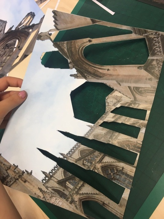
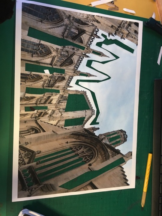
Final piece practice
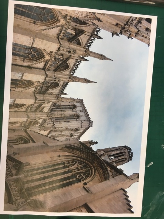
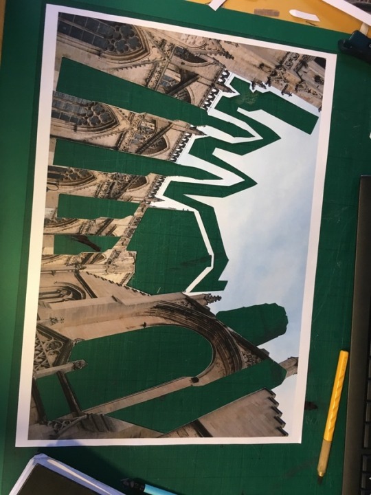
For my final piece I’m going to be using this method and potentially this image but on a larger scale of A3 paper.
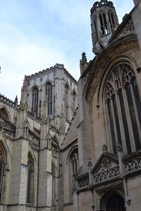
I want to show the detailing in English architecture in a 3 dimensional way. This is a cathedral in York and I wanted to use it as my practice as it’s got lot’s of area’s to cut out and therefore it will look really good with lot’s of layering.
This was the first layer with all it’s cut out’s. I added the area’s cut out in the sky as it looked to plain around there and wanted there to be a fair amount of places to cut out in the next two layers.
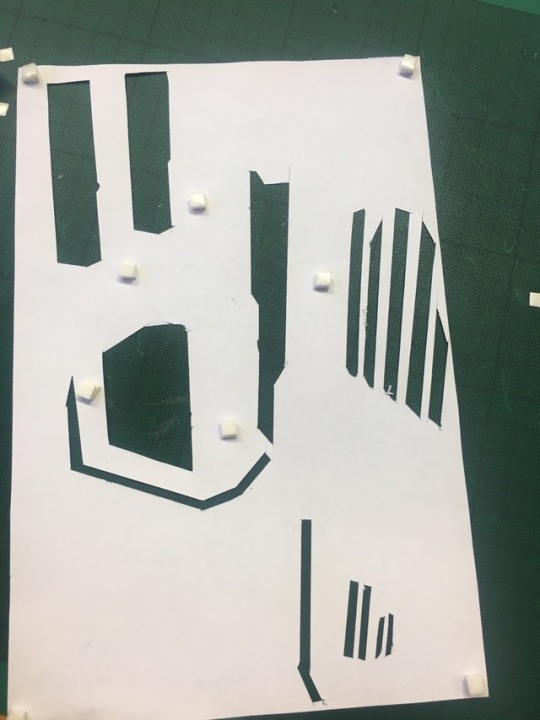
I then stuck this piece onto the next layer after it had all been cut out.( I forgot to photograph this)Then I moved onto cutting the final layer and after I was done with that I stuck 3 layered sticky squares around it.
Then I was finally ready to stick it all together. This was the finished outcome:
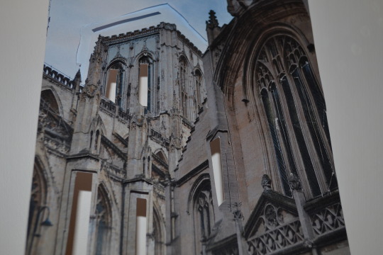
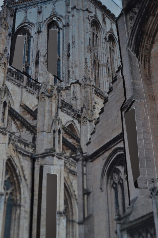
I’m overly pleased with how this came out. I’m looking forward to when I go to photograph my final piece in a location I think this has photographed really well and the close ups show the detail and structure. But again I think I need to take more time and precision when cutting the shapes out as any mistake show’s up very obviously in the photographs.I don’t think to many shapes have to be cut out as it’s still effective with the amount that has been up out of this sample and therfore I don’t think to much will need to be cut out the final piece and I can take my time making sure the shapes I do cut out are neat.
0 notes
Text
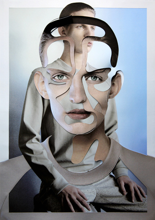
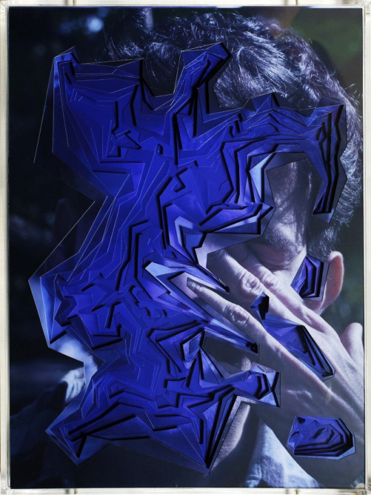
Work inspired by Damien Blottiere
I took inspiration from Damien Blottiere’s work and decided to use a different coloured image of a portrait in each layer. As before I stuck to the same image for each layer I wanted to experiment and expand on that and use different colour’s instead.
I wanted to use bright and neon colours to resemble this piece of work:
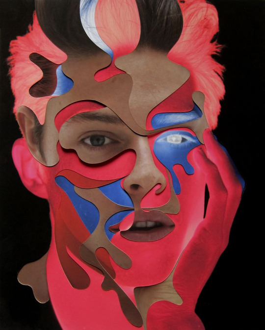
So I went onto photoshop and used the hue/saturation tool to change my photograph’s.Then I printed 2 of the images out one in blue and one in pink.
This was the original image before I photoshoped it:
aperure: f/4.8 ISO: 640 shutter speed: 1/60 focal length: 32mm
I started to then cut out larger area’s of the photograph which I didn’t do much of before but Damien Blottiere’s work had larger pieces cut out in his work.
This was the first cut out photo that was going to be the first layer of the two.
Then I moved onto the pink photo and did smaller cut outs of the one above to show a gradient.
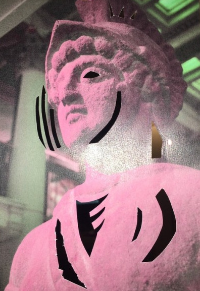
Then once both pieces were finished separately I layered 2 of the sticky foam square’s on top of each other in the corners and around the area’s that were cut out to give it volume. Then stuck the bottom layer on top.
This is how it looked all finished. I think the concept it good but the outcome wasn’t. It’s not as neatly cut as some of the other practices I’ve done so it doesn’t compare well to Damien Blottiere’s work already as his work is cut perfectly. I think to improve this would of looked better with more layers as it fall’s flat and underwhelming with just two. I only used two this time as that’s how many it looks like Damien Blottiere uses.I do like the use of different coloure’s but I think I’m just going to stick with using the same colour’s in each image for my final piece.
1 note
·
View note
Text
Damien Blottiere

This French born photographer, Damien Blottière uses a special method of combining photographic-images with hand-made collage set. This makes his work always individual, eye-catching and memorable.
In an interview Blottiere said “It’s about collages even if the final result is a photograph. It’s also about bodies. Unique, I don’t know but personal probably. I’ve always been fascinated by bodies. I love the human body, every types, and I try to go underneath. I’m not the one who is looking at subjects, I would prefer to go in them, pushing their limits through the collage process. I try to turn a reality into my own fantasy, making it mine.” from http://supertacular.com/2011/04/a-supertacular-interview-with-damien-blottiere/
0 notes
Text
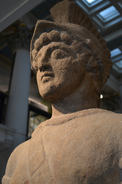
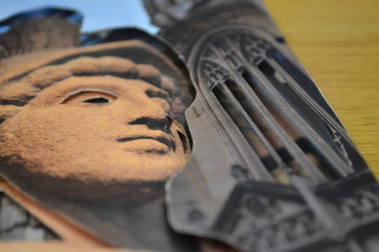
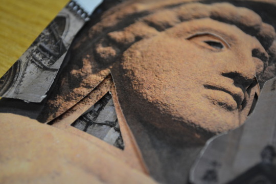
Experimenting with different cut outs.
I wanted to experiment with merging a portrait and a landscape image together. To do this I printed 2 images of this :
Apeture: f/ 5.6 ISO: 100 shutter speed: 1/125 focal length: 24mm
then printed 2 of these images :
aperure: f/4.8 ISO: 800 shutter speed: 1/60 focal length: 32mm
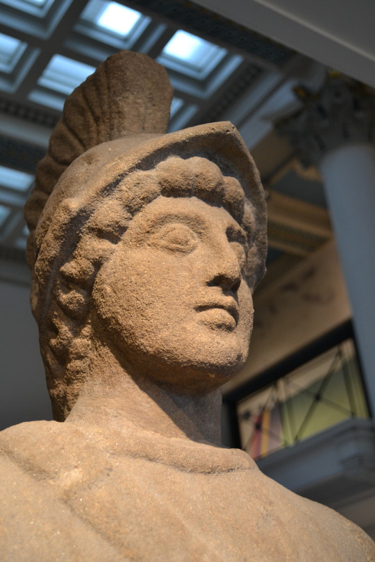
Then i drew around this image once i cut it out around the statue onto the image of the buildings.
Then i cut around the whole shape. Then on the next layer I cut different parts of the roman out in areas that i could easily drew out again smaller on the next layer. Then i stuck this layer on the back of the first using a couple of foam sticky squares. Then the next layer was the roman again. This layer was just copying the previous cut outs bit smaller. Then the last layer was the buildings again.
I am happy with how this looks at first i didn't think it would work very well but when it all came together and finished it actually looked really nice and neater than i expected with how fiddly it is.
0 notes
Text
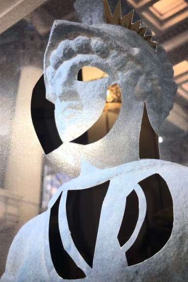
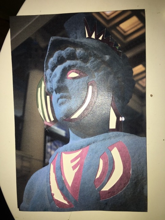
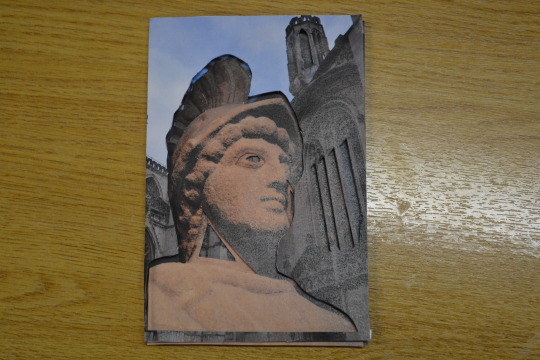
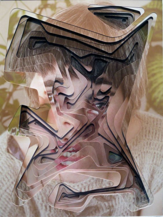
Practicing/Ideas
My work is inspired by Lucas Simões and Damien Blottière along with some of my own ideas. To start of with I printed the same image 3 times, although Lucas Simões used the same image 10 times I wanted to start with a smaller number as this was just my practice and if it went wrong I didn't want to waste 10 images. So went with a reasonable 3. I used this image:

I chose this as i wanted to practace on a face. I chose this image as I thought it seemed the closest to a piece of architecture in a facial form. It’s made from similar materials and it has lots of area’s that if cut out would look effective. There’s not much open/plane space so there’s lots of area’s to cut into.
I started with the first layer. I had to cut the most out of this piece as the next two layers had to have the same area’s cut out from but gradually getting smaller. So this layer was the easiest and least fiddly.
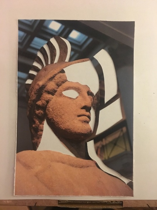
Then I moved onto the next layer often comparing the first one as a refernce as to where to cut the paper.
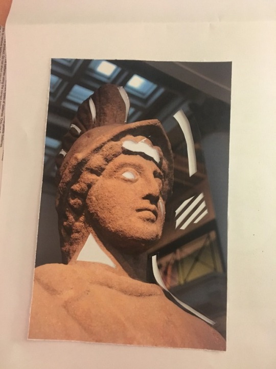
As you can see there is some mistakes in the paper but the size of the paper and size of the shapes i was cutting made it harder to cut neatly.
Then on the final layer I only cut the triangle in the left corner and the eye as the rest was to small and delicate to cut.On each layer I stacked 3 sticky foam squares on top of each other, on the corners and around anywhere i cut out. I stacked 3 on top of each other to give each page a lot of volume and space the pages equally. Also this allows you to see the cut outs of each page better and more individually.
This is the finished look. As the paper was shiny it was harder to photograph.
I’m really happy with the outcome though and know that for my final piece i want to use this technique. I know that I need to print the images out in A3 so that the cut outs will be a lot less fiddly as the photo will be bigger.And that for my final piece ill be a lot more careful when cutting out. And it would be easier to outline where I’m going to cut before i start doing it.
0 notes
Text
FINAL SUBMITTION PROPOSAL:
What are your photographs going to be of? And why?
My photographs are going to be of old architecture. Because for what I’m doing with the cutting put of my images old architecture specially of churches or cathedrals, they have lots of detail and structure to them. This will give me lots of things to cut out and i think the layered detailing will look really effective and interesting.
My final piece is going to be based of Lucas Simõesf work, he cuts out and layers his images and i experiment with doing his work but in a different way.
I’ve done a couple pieces one of a cathedral and one of roman statue as I thought i would be interesting to see how this technique looked using a portrait.
I’m going to be using layered doubled sided sticky squares to layer the paper on top of each other and so that the overall finish is more 3D and so you cans see which parts have been cut out easier.
Both of these pictures were taken in York, the statue of the roman was taken in a museum. As im not going to York anytime soon I can’t photograph my final piece there if i choose to use one of the pictures I took there. As I want to photograph the cut outs in the location of the original picture I’m either going to have to take brand new pictures in Nottingham so that once I’ve made the model I can go back and photograph it in the same place as the original photo’s. Or compromise and photograph the pictures from York in a location in Nottingham.
As im layering multiple images on top of each other I’m going to use paper. As card could;d be stronger its going to be harder to cut out easily and in detail. And i have better access to paper than card.The final piece will be A3 as well so that you can pick up on the detail easier and it will be easier to cut out in detail as its not as small. I want it to be able to stand on it’s own which will work as ive experiment making smaller versions of this idea and it’s stood up on its own each time.
The problems with making a 3D photography sculpture is that I've had to consider and come up with different and practical ways of making something look 3D. I added the foam squares between each cut out layer because i wanted to give it more dimension as i didn’t think the pages laying fat would look as good because you wouldn't of grasped the effect of the cut outs as the spaces in between lets you see how which parts of each page have been cut out.
Who or what have you been inspired by?
· Identify which artists, processes, techniques you will or have researched that are relevant to your photo sculpture.
My work has been inspired by Lucas Simões I came across his work on pintrest when I searched on the website “photography sculptures” and his work caught my eye. I then went on to research more into his work and then developed it more on my own.
0 notes
Text
Lucas Simões
Artist Lucas Simões makes his work by layering the same photo up to 10 times on top of each other and cutting out shapes on each layer. The first layer has the biggest cut out and then the cut outs gradually get smaller as they go down.
“n this series of works I invited intimate friends over to tell me a secret as I took their portrait. However, my intention was not to hear their secret, but to capture the expressions of each one at the moment they revealed their secret. I also asked each one to choose a song for me to listen to in my ear phones while I photographed them. And, after the photo session, I asked each one if the secret had a color, and these are the colors the portraits carry. From this photo shooting session I chose 10 different portraits to cut and overlap.” - extract from his website https://lucassimoes.com.br/desretratos
I like his work because its not trying to be pretty or beautiful to look at it’s more interesting and abstract and you always discover something new when you look at it.I did my own version of his work taking inspiration of how he layers and cuts out his pictures. My work will be different to his in that I’m not going to change and of the colours on my images on and of the layers and i’m going to be using fewer layers to his.
0 notes
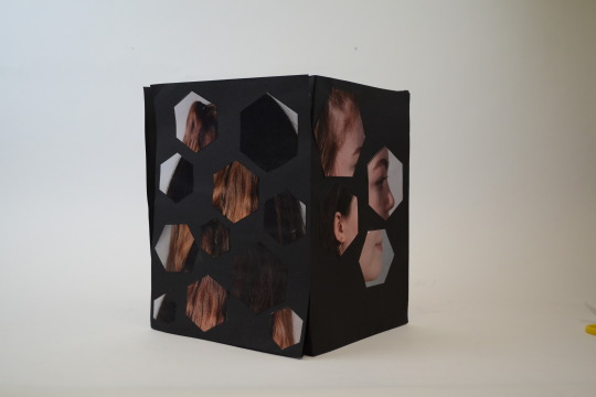
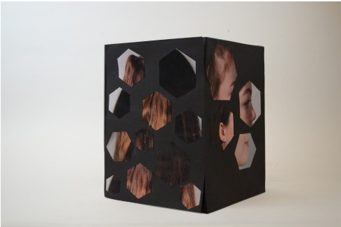
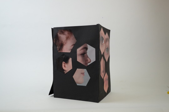
Photo
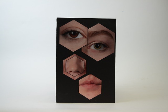
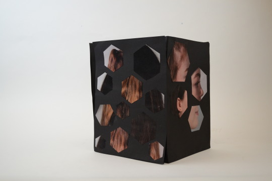
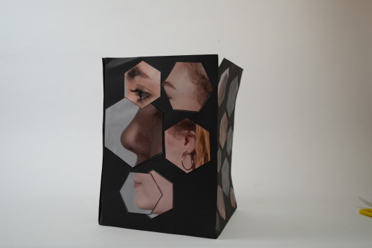
This is the finished box of the done in John’s lesson. Next we are going to apply the hexagons to a eachother’s faces taking insperation from Osang. The work is inspired by Osang Gwon and the box is inspired by Richard Artschwanger.
Overall the box was hard to stick together, we used black card and double sided sticky tape but as we were ticking the last two the sides together it got tricky to not squish the box together.
Overall though i am happily surprised with how this came out and the idea i had in my head was produced into something literal. If I was too improve this the photo’s would of all been taken at the same distance and it looks a bit misshapen with the different sized facial features.But i think whoever looks at this would see what we were going for and understand the concept of it looking like where was a head in a box.
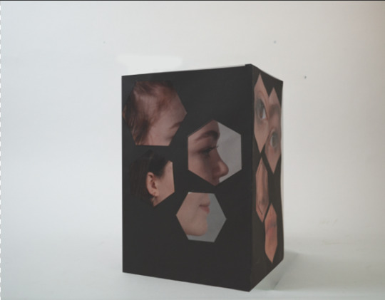
When photographing the box we looked back at the photographs and saw some areas that could be improved, the edges and the lighting specifically. So in 5mins i edited the bottom image so that the lines were straight. To do this in photoshop i copied the layer and pressed the eye to on the left of the layer to hide it. After that I drew around the box using the pen tool but i didn't draw round it perfectly i drew round it in straight lines, i then pressed make selection and then went to selection on one of the top tabs and pressed inverse. Then i make the copied layer visible again by pressing where the eye was . Then i enlarged the original layer pressing ctrl+t and holding shift to not distort is and enlarged it over the old layer covering the box on that layer.
This is the finished box of the done in John’s lesson. Next we are going to apply the hexagons to a eachother’s faces taking insperation from Osang. The work is inspired by Osang Gwon and the box is inspired by Richard Artschwanger.
0 notes
Text
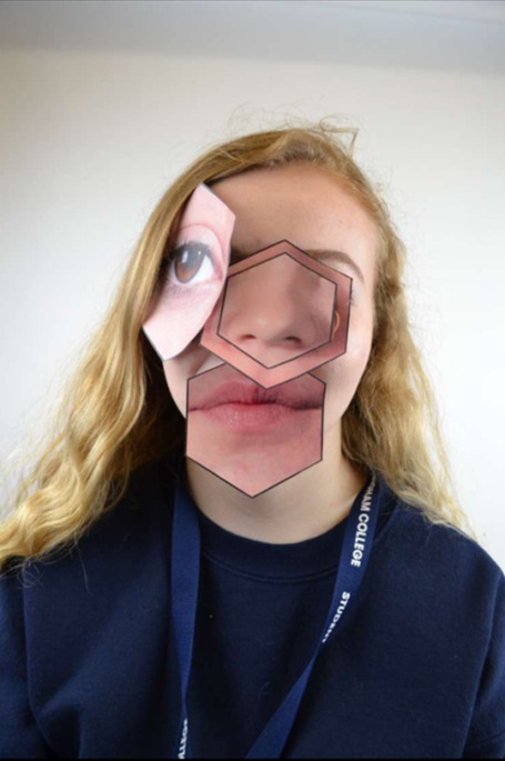
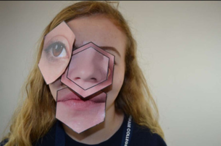
Re-creating art
In Kayne’s lesson we re-created art/photography. We worked in pairs to make a piece of artwork. Me and my partner got this image:
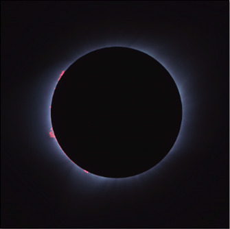
To recreate it we got black card and then blue tacked a clear round lid in the middle so that the chalk would be in the shape of a circle. Then we got a cutting knife to then cut along the length of the blue chalk to make dust. We then got a paintbrush to dusk the chalk around the circle to make it more faded.
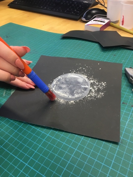
But the chalk wouldn’t stick to the card so then we put some glue down to make it stick. This didn’t work and made the chalk patchy and brighter in the places the glue was. So we started again turning over the paper.
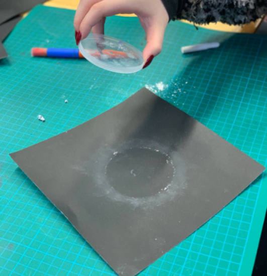
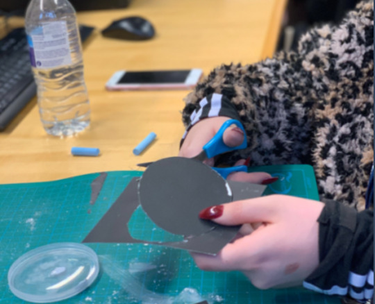
Then we cut a circle out of the same black card then used some folded paper to stick underneath the circle to the paper to make it more 3D then we stuck another smaller piece and did the same with the paper then stuck it over the top. Then we put some pink blobs of paint around the circle. Then we went to photograph the finished piece.
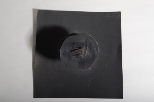
This is my photoshoped image that i did to improve our original photo. We got feedback on our pictures and getting rid of the shadow was the main issue. So on photoshop I copied the original layer then used the pen tool to draw straight down and around the circle and then I went to the other layer and flipped it horizontally so that the shadow was gone and replaced by the same lighting on the other side. Then I wanted to cover the badly painted circle on the top so i used the elliptical marquee tool to draw a circle on the background card. Then I covered the top circle with that one and re-sized it. Then i copied this layer to make a smaller circle as that’s what we did in the original photograph to make it more 3D then I made it lighter in the adjustments.
How did you research help your approach to this task? Research helped with this task because it showed us how flexible the capability of making something out of paper are. The research gave us idea’s about to construct and use the paper effectively.
What problems did you encounter when applying these techniques, and how did you overcome them? We had some problems less with the paper but more with the making of the faint blue cloud round the circle in the middle. We used blue chalk originally and dusted it on and blended it out but it blended into nothing and the colour was more white than blue. So we put glue down and then used a scallpol to cut the chalk and put the dust down onto the glue to keep the pigment.
How did you ensure that you worked effectively as a team? We both came up with idea’s and worked together well. We let each other get on with a task but were still working as a team to make something in the end together.
Analyse your final work. What are the strengths? What could be improved? How could you develop these techniques further in the future?
There’s strength in our work in that we took the original image and made it more 3D by adding more layers of paper on top of each other. Also in that we tried lots of techniques to make our picture look like the original and didn’t give up when something didn’t work.
There could be improvement in the colour’s used as there still isn’t much of a blue fade on the paper but I think if we’d had the resources and time we could of made it look more like the original. Maybe if we’d used some better chalk or maybe pencil crayon’s shaded around the circle. As well as the patchiness on the top circle could of been left without painting over the top and it would of been less textured and one shade all over. Originally it was painted over with black paint to get rid of some white marks on it. So in the future id have to be more careful with the chalk and make sure it doesn't go anywhere.
0 notes
Text
Artist Research
David Samuel Stern
My first idea is inspired by David Samuel Stern but photographing a location instead.His portrait work is done by taking still photographs, and waving them together so that they appear to be in motion.
He begins by taking two portraits of the same person, and then he carefully cuts them apart before physically weaving them back into one another.
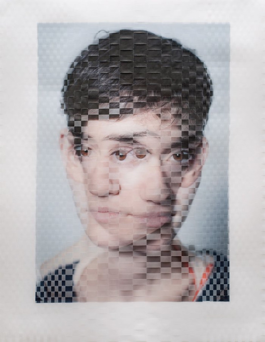
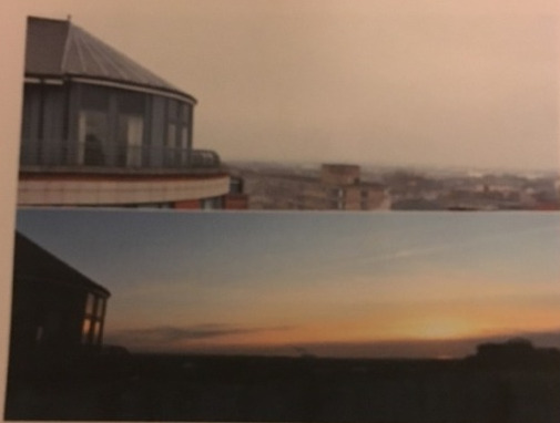
But in my work i want to do something similar but the thing that will be different in each image is the time of day. I want to take his use of weaving images together, but when i photograph I want to take the same picture in the same location but at different times of day/weather.
So i went to the top of a car park and photographed at sunset then went again a couple days later and photographed mid-day.Then i came home printed them out and cut them and weaved them together.
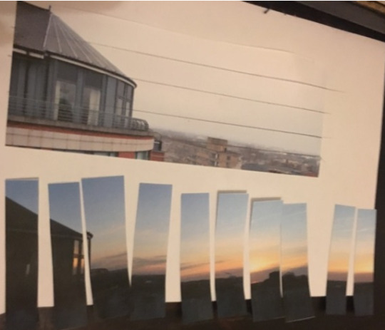
I cut one picture length ways and one down sides so that they weave into each other easily.
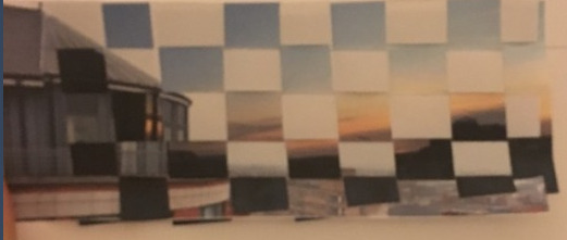
This was the finished outcome I think it looks goo but the image i took in the daytime the weather was foggy and overcast so there’s a lot of grey sky which doesn't look as good as it could on a clear day. This is something to keep in mind if i plan on taking this idea furthers. As well as this idea isn’t very 3D so the thing I’m going to do next is make a photo-net and stick the weaved images to the side and top.
Upon further research and experimenting with other work I don’t want to continue with this idea as for the amount of time we have to finish this project I think this idea is to ambitious. And I’m really happy with how my layering work is coming along.
0 notes