
Statistics
We looked inside some of the posts by jessharrisonadad and here's what we found interesting.
Average Info
Notes Per Post
13
Likes Per Post
3
Reblog Per Post
10
Reply Per Post
0
Time Between Posts
21 hours
Number of Posts By Type
Photo
10
Link
2
Text
2
Video
3
Last Seen Tumblr Blogs


Fun Fact
Hackers stole 65M passwords from Tumblr in 2013.
Photo


Assessment 3- Progress
Draft posters for pin the tail on the donkey --> pin the HECS debt on the art student
0 notes
Photo
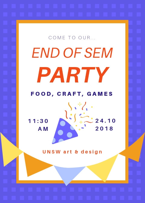
Assessment 3- Progress
First draft of party invitation. Want to print off one big one and then a few smaller ones to put onto the tables in the classroom before we present.
0 notes
Link
Assessment 3- Research
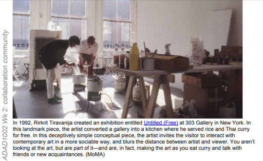
Artist Example 1- Rirkrit Tiravanija
Things we liked- people had a nice time in the work, something a bit more casual and everyday, a chance to build new relationships as well as challenge the purpose of the gallery space
0 notes
Text
Research
Assessment Task 3: Group event
The bulk of our group researching and brainstorming for this assessment task can be found in the following Google doc:
https://docs.google.com/document/d/1-FRUbqPmP1S3YeBzAnEOySFepnDCj9wPAzvAnEg-Pi8/edit?usp=sharing
The class topic that we decided to focus on for this task is collaboration, so the use of a Google doc that all of us can work on at once further reflects this concept.
Group members: Bridie Oliver, Bryony Lai, Jess Harrison
1 note
·
View note
Video
tumblr
Week 11- Desire pt 3
Artspace- The Public Body 03
5. [I forgot to write down the artists name of this work but will add it when I find it]
Desire to know. I didn’t watch this whole video but the parts I saw showed how our relationship to knowledge, nature and the world around us is wound up in computer code and the internet. Whilst I don’t fully understand it, the video felt like if a science lecture was made into a vapour wave meme. I learnt knew things, the aesthetics were familiar but interesting.
0 notes
Photo
Week 11- Desire pt 2
Artspace- The Public Body 03
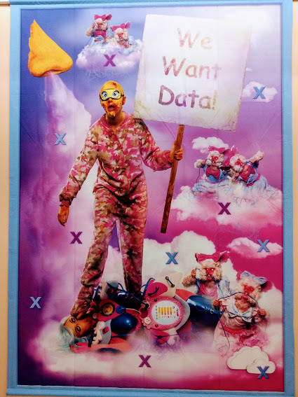
4. Rachel Maclean, ‘We Want Data!’ and ‘It’s What’s Inside That Counts’
Desire becomes a necessity. I felt that these works eroticised our dependency on and integration with the internet in a really confronting but almost kitchy way. The wall text says that the works ‘explore technology-induced anxiety and the perilous extravagance of consumer culture’. I appreciated how her critique of vanity and post-capitalism wasn’t as ‘womxn shaming’ as allot of other works I’ve seen.
0 notes
Photo
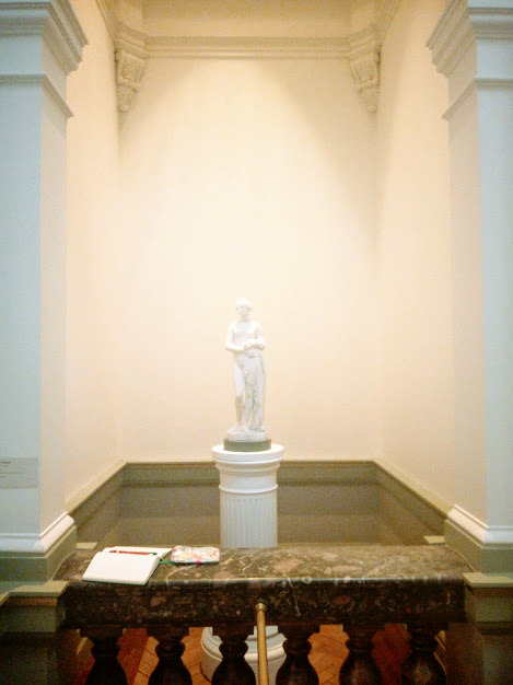
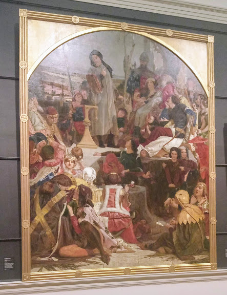
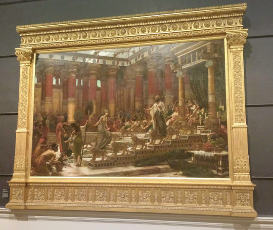
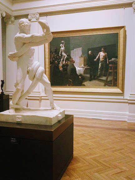
Week 11- Desire
AGNSW, identify three different types of desire
1. [Top] John Gibson, a miniature replica of the original Venus sculpture.
Desire (of the gallery) for status. The gallery can’t have the original sculpture so at least want a replica. Sacred staging but it’s off the side of an end room by a staircase- maybe this desire for status is less important now as it once was when the work was acquired.
2. [Middle] Ford Madox Brown ‘Chaucer at the court of Edward III’ and Edward John Poynter ‘The visit of the Queen of Sheba to King Solomon’
Surpressed desire. One side of the room shows the medieval scene celebrating the English lanugage and one side shows the ostentatious mythical court of King Solomon. The room works to directly oppose these two types of power. Poynter’s work is there to represent a power/society which is erotic, sensual, over-the-top, irrational, sexual, barbaic and backward. Brown’s work represents the Christian, white, British, colonial, family, moral and modest. In the room I feel a strange sense of sexual repression where white men project and construct an Oriental sexuality which would be improper for man in the Occident.
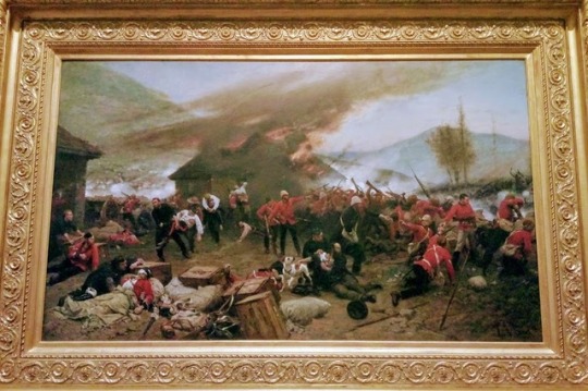
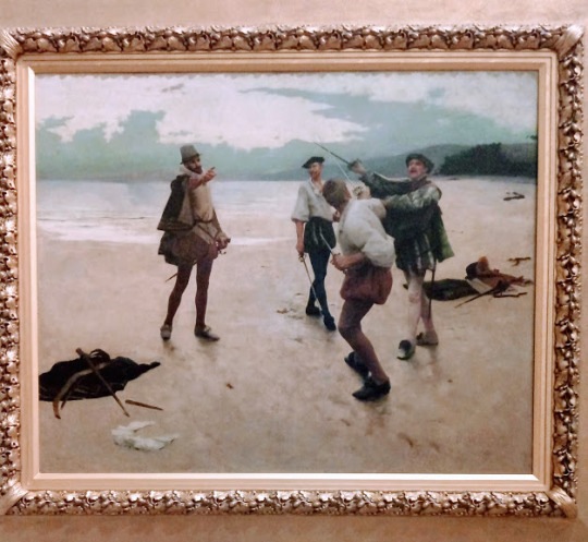
3. [Bottom] Just boy things
Desire for manliness. I felt that this room was a testament to toxic masculinity- the wrestler sculpture, anatomy class painting, beach sword play and actual war. The rooms send a message of ‘this is what men used to be’ but we all know too well that this implicit violence in masculinity is far from a thing of the past.
0 notes
Text
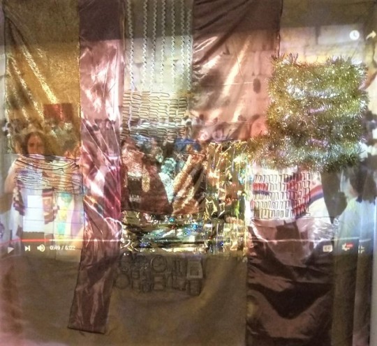
Concept Statement- Assessment 2 ‘Gold and Iron’
Critical geographer Bronwyn Fredericks says that places are social texts. Places have been struggled for, shape and are shaped by people’s identities, convey messages of belonging and exclusion and they can produce and reproduce power relations. All places are places of memory, both individual and collective. The contested meanings of spaces, the messages they convey and the people they either welcome or exclude is constantly responding to social and political change. My work ‘Gold and Iron’ explores how relationships to place are complicated, full of conflict and confusion.
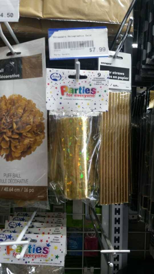
‘Gold and Iron’ is a video installation which discusses my complex relationship to Jerusalem. The work consists of two elements- a golden tapestry backdrop and a video projection. The backdrop is a soft collage with different materials arranged in ‘bricks’ as a reference to the sandstone bricks of the Kotel (the Western Wall). With a mixture of spray-painted pasta, belt buckles, faux velvet and party streamers, the collage/tapestry/sculpture comes together as a glinting, almost camp, Kotel. The video is projected onto the backdrop and is a montage of various civil protests around the city. The footage shows excerpts from the Slut Walk, Gay Pride, Haredi (Ultra Orthodox) protest against a carpark being opened on Shabbat, a Netanyahu anti-corruption protest, Rikkud Dgalim (Dance of the Flags)** and a women-lead prayer service at the Kotel with counter-protesters around them. The video shows a diverse cross-section of Jerusalem’s society with people of different backgrounds and outlooks advocating for different causes which, often, directly oppose each other.
The golden backdrop and the protest video represents two Jerusalems- one of Gold and one of Iron. The Golden Jerusalem, the backdrop, is named after the classic Israeli song Yerushalyim Shel Zahav (Jerusalem of Gold) by Naomi Shemer. This song represents the romantic Jerusalem, a city which is ancient, timeless, holy, golden (the entire old city is built out of sandstone so it appears to glow gold in the sun). The chorus of her poem reads-
Jerusalem of Gold, of bronze and light. I am the violin for all your songs.
The Iron Jerusalem, the video, is named after Meir Ariel’s protest poem Yerushalyim Shel Barzel (Jerusalem of Iron). Using Naomi Shemer’s song structure and melody to present a bleaker Jerusalem, one scarred by war, trauma and hopelessness. The chorus of his poem reads-
Jerusalem of iron, of lead, of darkness. Haven’t we set your wall free?
Viewing the work, it’s easier for your eye to focus on one layer- the Gold or the Iron. Focusing on one of these layers is at the expense of seeing the other. This represents the way that Jerusalem is a polarising place, a place where people can only really connect to one side/version of the city at a time. Viewing the work, it’s a lot harder to try and hold both layers together, to try and live with these competing images and opposing ideas.
My work does not seek to discredit either ‘Jerusalem’. Rather, I have tried to clash these worlds to illustrate my experiences as a young Jewish person in Australia where I am constantly being pulled in either direction in my relationship to Jerusalem, Israel and even my Judaism. I am always told I need to ‘make a choice’. However, I choose to live with complexity, I choose to struggle to see both layers, Gold and Iron, at the same time.
To return to Frederik’s theory of place, my relationship to Jerusalem is not unique. Audiences of all ages, backgrounds and outlooks have both individual and collective connections to important places in their lives. I would also bet that most people have equally complicated relationships to places (and what those places represent for them) as I do. I feel that this work is especially indicative of the attitude many young people have towards Australia at the moment- torn between being grateful for the ‘lucky country’ but ashamed of and disillusioned by our country’s politics. I hope that ‘Gold and Iron’ will allow viewers to further interrogate their relationships to place and work to feel confident living in complexity.
0 notes
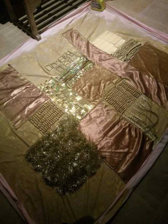
Photo
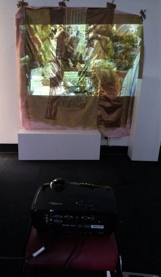
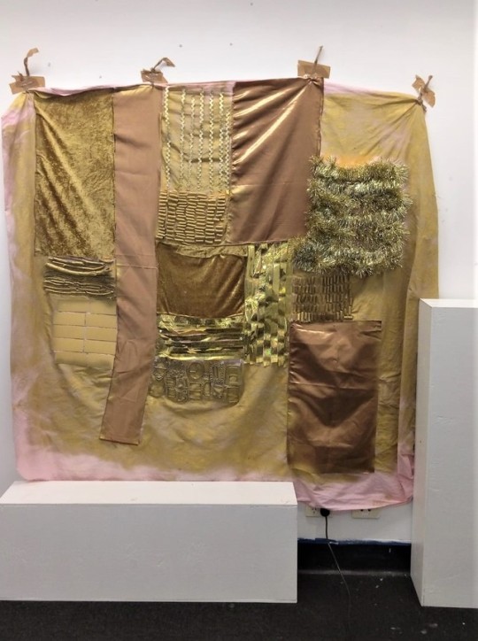
Final Presentation
The layout of the final presentation in one of the satellite rooms on campus. People responded well to the collage style of the backdrop and although we didn’t have much of a class discussion about it, people seemed to connect to the concept of relationships to place. If I were to expand on this piece or revisit it in some way, I’d increase the scale and even the intricacy of the backdrop. We discussed possibly even having multiple screens playing videos simultaneously.
1 note
·
View note
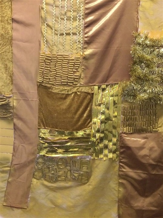
Photo
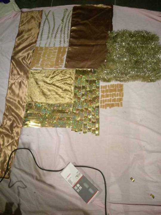
Progress Shots- building the backdrop
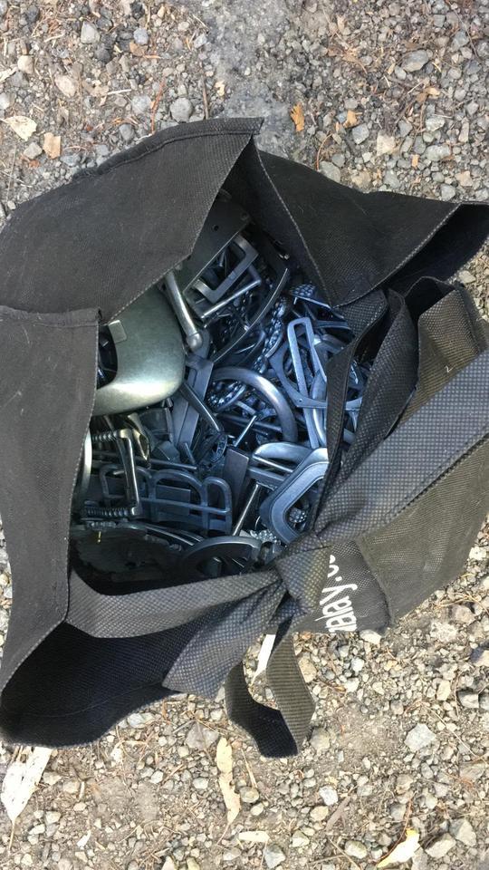
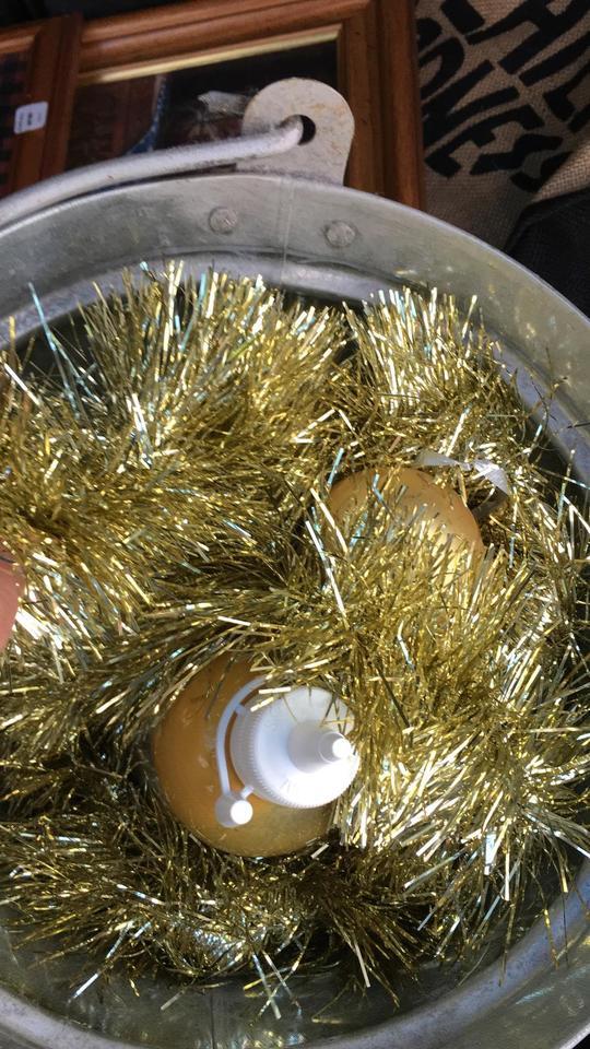
I’ve collected a whole mixture of different found materials. The background is an old sheet. The fabric and trimming are leftover from my poster assignment, the pasta is pasta, the sticks are from my backyard and the tinsel and belt buckles were from a friend’s mum’s preschool craft cupboard.
After collaging the different materials into ‘bricks’ I’ve spray painted the surface gold but kept the original colours of the fabric, tinsel, streamers and trimmings.
0 notes
Photo
Progress Shots- Video editing
Working to isolate the ‘group shots’ of the videos. Interesting to see how, even though the class won’t be able to understand the hebrew, allot of the imagery of protests is universal and people will be able to connect to it.
0 notes
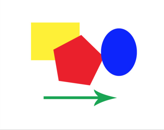
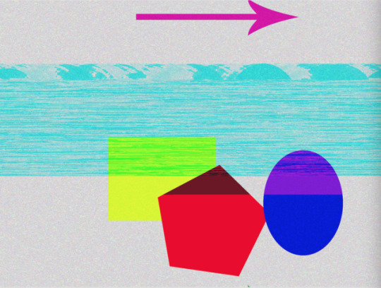
Photo
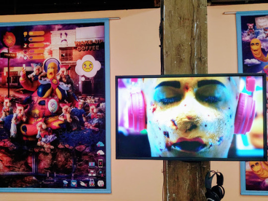
Group class activity, using Photoshop and audacity to glitch images

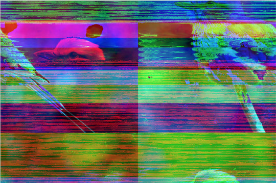
Week 10 - GLiTch
3 notes
·
View notes
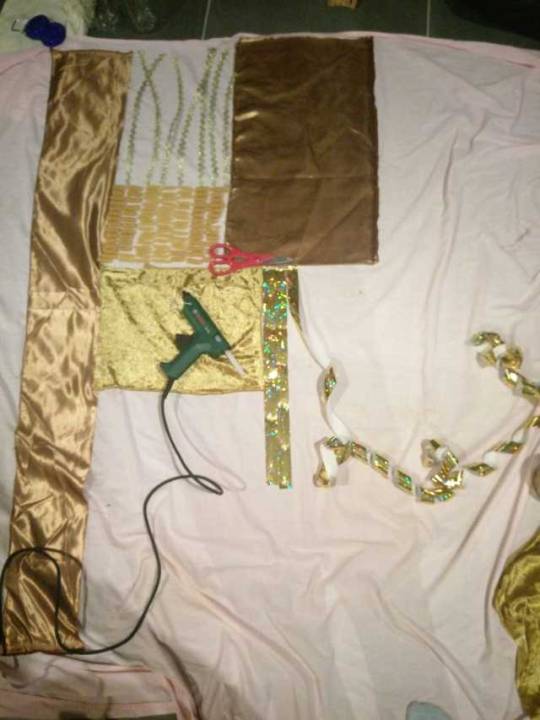
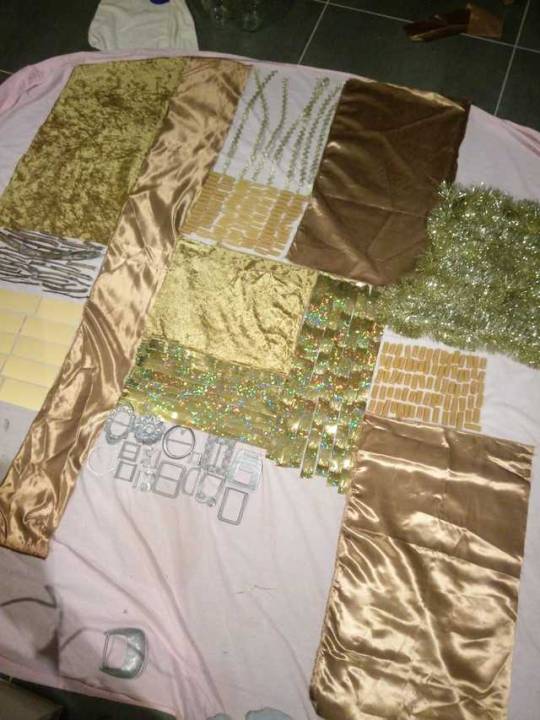
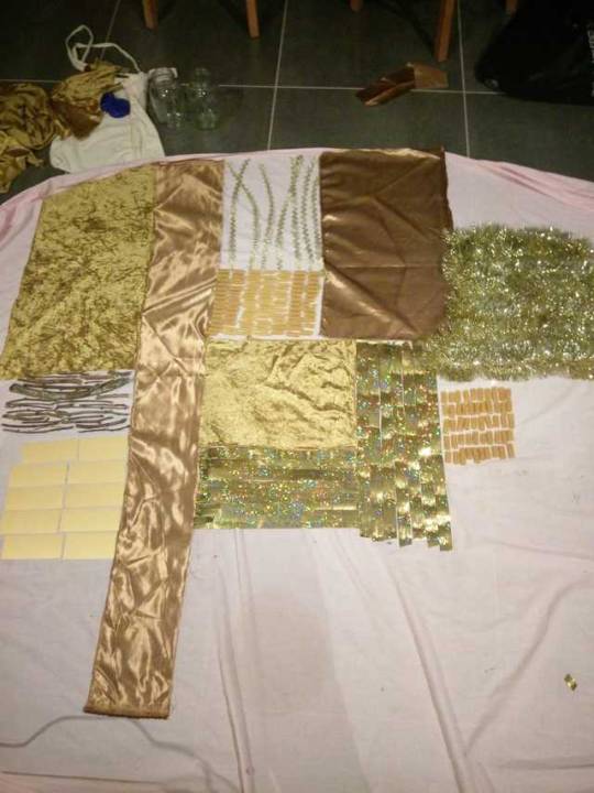
Photo
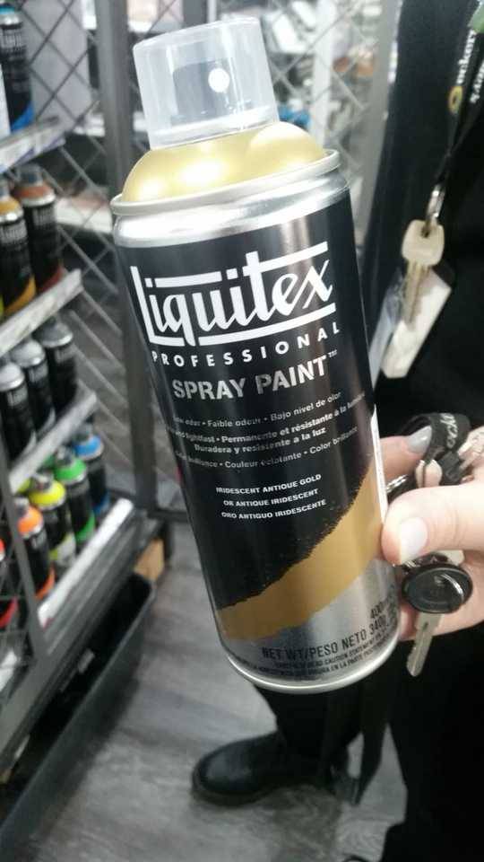
Collecting Materials
I decided to move away from making just a normal looking wall to project on. Allot of the feedback I got from my past assessment was talking about how I made a really nice object. I'm collecting a lot of different materials to make more of a golden collage to project the film onto; sticks, belt buckles, pasta, tinsel, Christmas baubles, spray paint, acrylic paint. That way, I think it will stand out more and be more interesting aesthetically.
0 notes