
Statistics
We looked inside some of the posts by jjuin-lang and here's what we found interesting.
Average Info
Notes Per Post
193K
Likes Per Post
120K
Reblog Per Post
73K
Reply Per Post
438
Time Between Posts
1 day
Number of Posts By Type
Text
10
Photo
1
Last Seen Tumblr Blogs


Fun Fact
Premium Tumblr themes are available from anywhere between $9 to $49.


Photo

Sundanese is traditionally written in Aksara Sunda, which has been almost completely replaced by the Roman alphabet.
Each of the large characters represents a syllable. The small ones modify them. The syllables that are only vowels are never modified. The others begin with a consonant and end with “A” by default. The modifiers show what vowel to replace the “A” with. The character that looks like a “3” with a tail reduces the syllable to its beginning consonant. Many Brahmic scripts use a similar system.
29 notes
·
View notes
Text
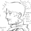
here are my first quick drafts, just to see possible shapes I could use
i want to make it look more natural, and register as more.... "beach-y"
i wonder if anyone has done something like this before? I'd love to see it
its like those who make artlangs out of vines and plants, but those are usually very clearly leafy and plant-y and botanically inspired
this kinda looks like arabic but worse lol
I don't know about this.......
id like to make an artlang.... I don't really know where to start
having a lot of fricatives and affricates, keep vowels limited to a few whispery ones
i was thinking making it cursive, that looks like waves on a beach
adding shells on the shore or bubbles as a kind of abugida
thatd be really cute, i think
ill let you know how it turns out
19 notes
·
View notes
Text
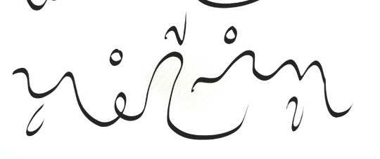
my third rehash.... truthfully, I don't think I like it. I may take a break and focus on the grammar and do some minor aesthetic drafts later before going at it again.
3 notes
·
View notes
Text
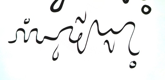
I've decided to rehash the glyphs i have, in order to make them more like what I envisioned, and easier to add new glyphs to
my plan as of right now is the add the ending consonant to the bottom, but I have 5 separate ones, and I am not sure if I can come up with five effective symbols for each that would fit underneath, and be easily distinguishable
as for why I changed it, as I was working on the older version, I realized the font would be difficult to see at small sizes, and it was giving me a headache. they looked too small compared to latin letters.
i took inspiration from Hebrew, Arabic, and Mongolian script
designing the letters is not my strength, but as of right now, I think they look alright.
i have to work more on my ending letters now.... the worst part is finding the space for them.
3 notes
·
View notes
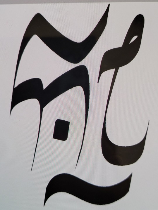
Text
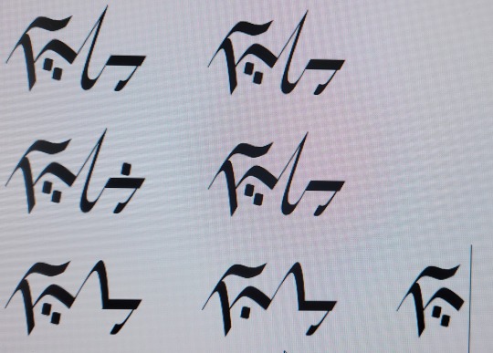
here's a test for a ligature-based logogram! the first is "my" and the second is "ttat"
for convenience, I am using the same syllables as Jjuin, but jjuin doesn't have a logography
im happy that my plan worked
it was more of a test to see whether or not abusing ligatures like that could work, and how to use the built-in drawing functions of fontforge
the design of the glyphs themselves is..... fine. TTAT is a little slanted (but im okay with the shape), and MY looks a little too much like そ (and MY also doesn't represent a "person" very well either)
i quite like the style of blocky, thick lines like that. I may use it for my next latin typeface
now I have to fix the latin non-combined letters because they look. bad (I didn't put any effort on them) (they are not the focus of the project)
im using fontforge for these
im having an issue with fontforge that when I have multiple separate shapes that overlap, sometimes they combine smoothly, and sometimes they invert each other (I hope that makes sense) (as in, the parts of the two shapes that are overlapping are blank, while the rest is shaded in properly)
if anyone has advice on how to fix this or any criticism/ advice / etc on my glyphs, I'd love to hear it, as I'm new to this lol
7 notes
·
View notes
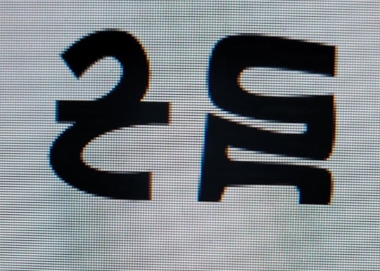
Text
a few Js with various vowels
can you tell I only have the one consonant designed? lol
im not sure about jw (pronounced yə) (that's the one on the bottom of the first column / bottom left corner)
im working in turning this into a working typeface!
2 notes
·
View notes
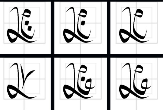
Text

the character for já ( /yæ/ )
each character is made up of three parts
the biggest part - the consonant on the left
the smaller part - the vowel on the right
and an addition to the bottom (not shown) - the ending consonant of the syllable
this is my first proper neography project, but not my first conlang
3 notes
·
View notes