
Don't wanna be here? Send us removal request.
Statistics
We looked inside some of the posts by jkemmlingcom130-blog and here's what we found interesting.
Average Info
Notes Per Post
0
Likes Per Post
0
Reblog Per Post
0
Reply Per Post
0
Time Between Posts
2 minutes
Number of Posts By Type
Photo
11
Last Seen Tumblr Blogs


Fun Fact
After the announcement of the deal with Yahoo!, there were 170K signatures of unhappy Tumblr users petitioning to prevent the sale in 2013.
Photo

This poster created in InDesign was our first introduction to the program. I experimented with making equal color blocks, different fonts and banners.
0 notes
Photo
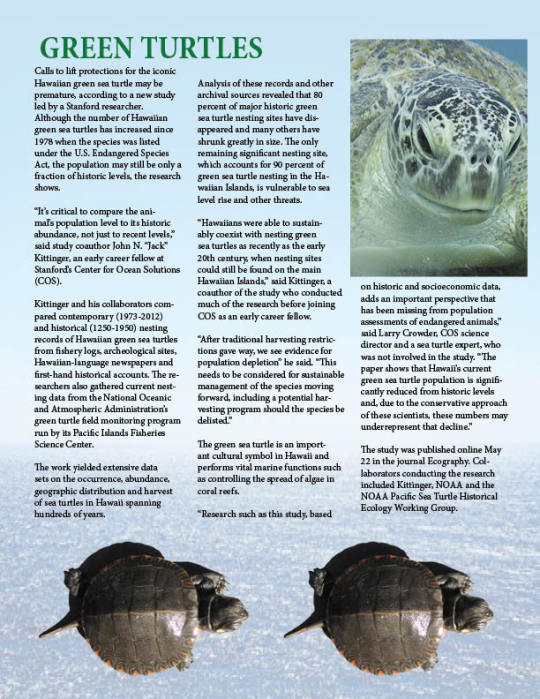
This green turtles infographic was made in InDesign. I made columns of text in different fonts and added in photos of turtles to make it look like a cohesive article.
0 notes
Photo

I created a pencil combining multiple shapes. I changed the edges of squares for the eraser and metal part and put a mesh overlay and gradients for variety in color. I made the pencil tip and its edges jagged so it looked more realistic and put a gradient on the tan part as if it were wood.
0 notes
Photo
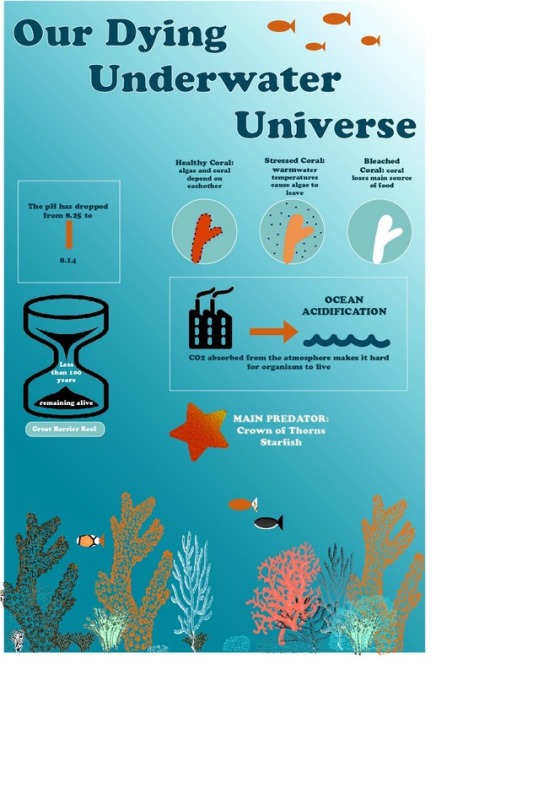
I used many tools to achieve my final poster. I chose a bright color scheme to showcase the underwater theme. I mainly used the rectangle and circle tools and added and removed anchor points to get my shapes and added text captions to my graphics to explain the main issues that coral reefs are having.
0 notes
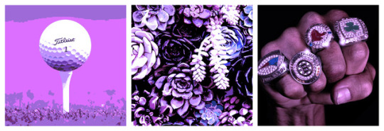
Photo

I chose a black and white simple color scheme since there was a lot going on with shapes and lines. I used the text to type Julia and deleted the J and drew in my own J with a font that I liked better with my overall design. I used the elipse tool to create the top of the golf ball and the dimples and the straight line tool to make the tee. I grouped everything together at the end to create a cohesive piece.
0 notes
Photo
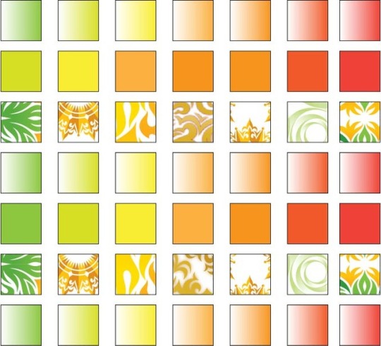
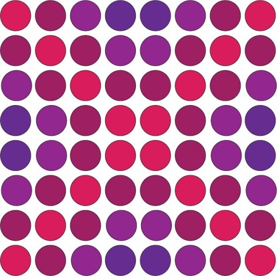

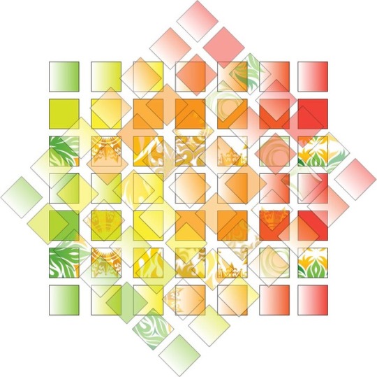
For grid1, I used a citrus color theme based on patterns found in color swatches on 1x1 squares. For grid2, I used an X pattern of berry toned circles. For grid3 I made a zig zag pattern of colored stars. For grid4, I chose my favorite grid pattern and rotated it and made it opaque layered on top of the original pattern.
0 notes
Photo

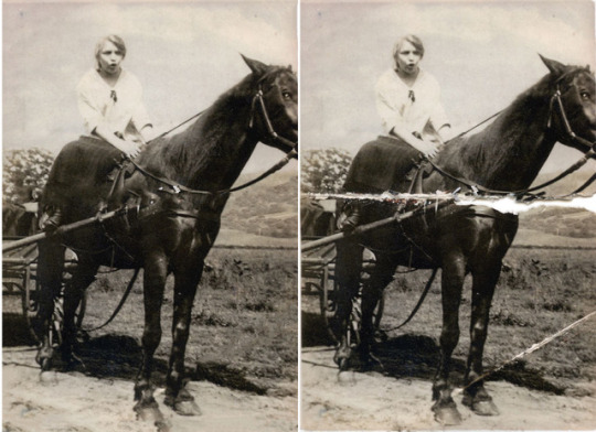
The first image was an example of changing colors. The shirt was originally bright purple and I changed it to a dark raspberry color. The second photo was an example of rotating a picture. The third photo was an example of fixing unwanted marks and tears within a picture.
0 notes
Photo
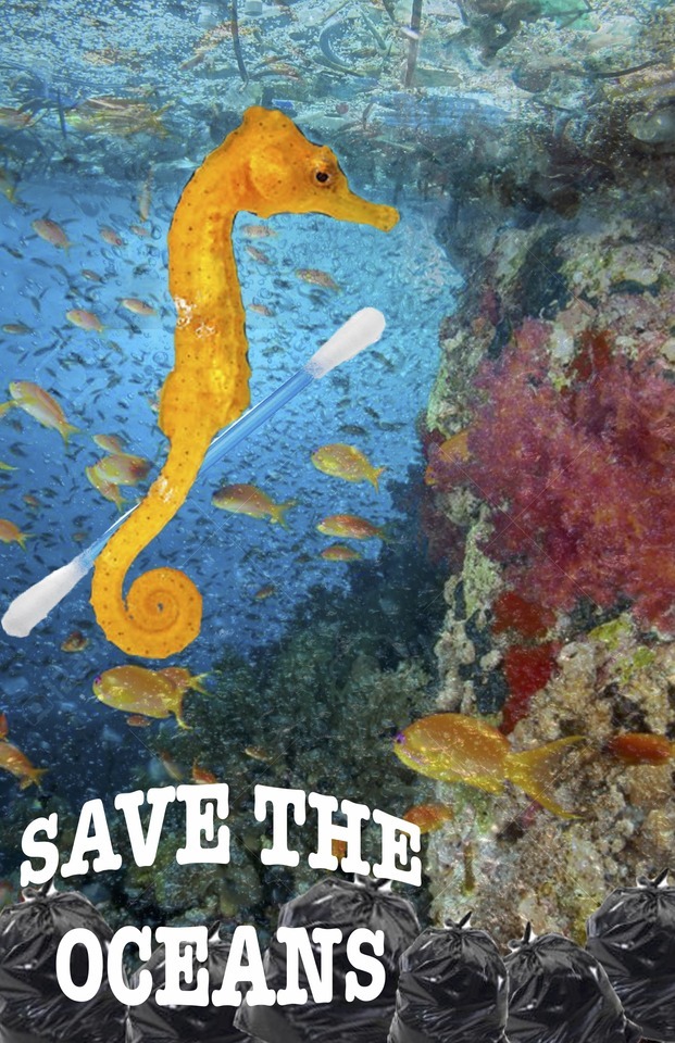
For this project I chose a "Save the Ocean" theme. I chose a seahorse holding a cotton swab as the main focus, using the lasso crop tool and layering them together. I chose a bold but bubble text at the bottom to get my message across and had a coral reef background. I layered in some trash floating at the top of the water and made it opaque so it wasn't the main focus but still visible. I also cropped in garbage bags of different sizes at the bottom for emphasis of my point.
0 notes
Photo

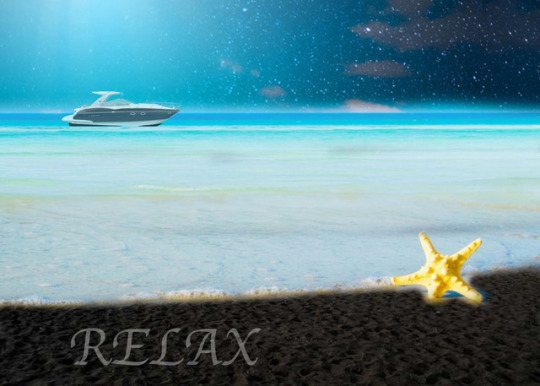
For the Project Layer 1 file, I chose a golf theme. I used 4 different layers and cropped items using the magnetic lasso tool. I made certain items prominent and certain items more opaque. For Project Layer 2 I chose a beach theme where I used 3 different layers to make a starry sky and the sand a different color. I added a boat faded into the horizon and the word "relax" at the bottom to give a peaceful vibe.
0 notes
Photo
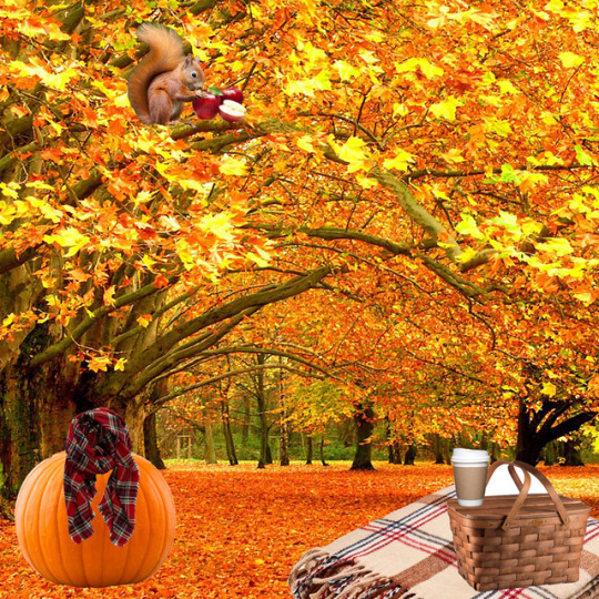
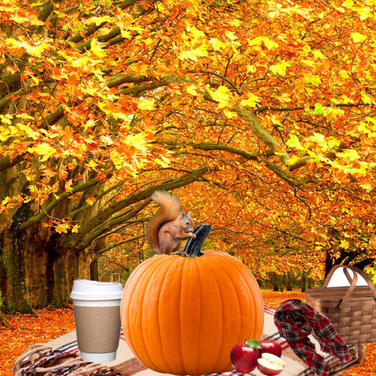
For this Photoshop selection project, I selected multiple images using the selection tool as well as the lasso tool and pasted them onto a background picture. The magnetic lassoo was most helpful for the strangely shaped objects. I chose a fall theme, using images that reminded me of fall, like hot coffee and blankets. I used a warm color scheme as well, sticking to mostly oranges, yellows and reds. I layered the images within the pictures so certain ones were prominent and larger than others.
0 notes
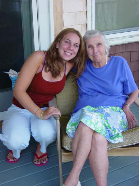
Photo
This was the first assignment that we did in Com130. It was the altered self project. I took 3 photos that I felt represented myself and altered them using different filters and settings within Photoshop, then cropped them to be the same size with the same amount of space in between.
0 notes