jojosasassignment
Best Places For Commercialising Cancer Diagnostics
91 posts
Don't wanna be here? Send us removal request.
Last Seen Blogs


dejadoodles-101
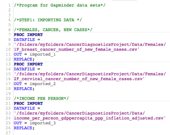
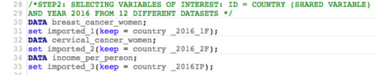
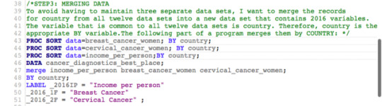
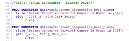
Belos Is My Hubby 🥰💍

carbonateddelusion
take it easy, but take it

uzumakiinaruto7
Dattebayo🦊

serpentine-rogue
ℱ𝒶𝓃𝑔𝓈 𝒶𝓃𝒹 𝒱𝑒𝓃𝑜𝓂
Text
REGRESSION MODELING IN PRACTICE - WEEK 1 | Introduction to Regression Analysis
STEP 1: I describe my sample. I provide enough detail so that the reader can clearly understand the population that the study sample came from. I use meaningful labels and do not use abbreviations (“PPM100”) or variable names.
a) Description of the study population (who or what was studied).
I study the incidence of different types of cancer by sex (colon & rectum, liver, lung, stomach, and prostate in men; colon & rectum, liver, lung, stomach, cervical, and breast cancer in women) in 2016 in 187 populations from the following countries:
Afghanistan, Albania, Algeria, Andorra, Angola, Antigua and Barbuda, Argentina, Armenia, Australia, Austria, Azerbaijan, Bahamas, Bahrain, Bangladesh, Barbados, Belarus, Belgium, Belize, Benin, Bhutan, Bolivia, Bosnia and Herzegovina, Botswana, Brazil, Brunei, Bulgaria, Burkina Faso, Burundi, Cambodia, Cameroon, Canada, Cape Verde, Central African Republic, Chad, Chile, China, Colombia, Comoros, Congo, Dem. Rep. Congo, Rep. Costa Rica, Cote d'Ivoire, Croatia, Cuba, Cyprus, Czech Republic, Denmark, Djibouti, Dominica, Dominican Republic, Ecuador, Egypt, El Salvador, Equatorial Guinea, Eritrea, Estonia, Ethiopia, Fiji, Finland, France, Gabon, Gambia, Georgia, Germany, Ghana, Greece, Grenada, Guatemala, Guinea, Guinea-Bissau, Guyana, Haiti, Honduras, Hungary, Iceland, India, Indonesia, Iran, Iraq, Ireland, Israel, Italy, Jamaica, Japan, Jordan, Kazakhstan, Kenya, Kiribati, Kuwait, Kyrgyz Republic, Lao, Latvia, Lebanon, Lesotho, Liberia, Libya, Lithuania, Luxembourg, Macedonia FYR, Madagascar, Malawi, Malaysia, Maldives, Mali, Malta, Marshall Islands, Mauritania,, Mauritius, Mexico, Micronesia Fed. Sts., Moldova, Mongolia, Montenegro, Morocco, Mozambique, Myanmar, Namibia, Nepal, Netherlands, New Zealand, Nicaragua, Niger, Nigeria, North Korea, Norway, Oman, Pakistan, Palestine, Panama, Papua New Guinea, Paraguay, Peru, Philippines, Poland, Portugal, Qatar, Romania, Russia, Rwanda, Samoa, Sao Tome and Principe, Saudi Arabia, Senegal, Serbia, Seychelles, Sierra Leone, Singapore, Slovak Republic, Slovenia, Solomon Islands, Somalia, South Africa, South Korea, South Sudan, Spain, Sri Lanka, St. Lucia, St. Vincent and the Grenadines, Sudan, Suriname, Swaziland, Sweden, Switzerland, Syria, Tajikistan, Tanzania, Thailand, Timor-Leste, Togo, Tonga, Trinidad and Tobago, Tunisia, Turkey, Turkmenistan, Uganda, Ukraine, United Arab Emirates, United Kingdom, United States, Uruguay, Uzbekistan, Vanuatu, Venezuela, Vietnam, Yemen, Zambia, Zimbabwe
b) I report the level of analysis studied (individual, group, or aggregate).
The analysis is run on the national level.
c) I report the number of observations in the data set.
There are 187 observations in the dataset for each type of cancer for each sex.
d) I describe my data analytic sample (the sample I am using for my analyses).
My sample includes 13 variables:
the number of the new cases of different cancer types per sex per year (6 cancer types for women and 5 cancer types for men), income per person, and human development index.
The cancer types are: colon & rectum, liver, lung, and prostate cancer in men in 2016 for each of the 187 countries (human populations on the national level) and colon & rectum, liver, lung, stomach, cervical, and breast cancer in women in 2016 for each of the 187 countries (human populations on the national level).
All 187 populations have been divided into groups based on the income level and/or human development index. Cancer incidence is “the number of new cancer cases arising in a specified population over a given period of time (typically 1 year). It can be expressed as an absolute number of cases within the entire population per year or as a rate per 100 000 persons per year. The cancer incidence rate provides an approximation of the average risk of developing a cancer” (source: http://gco.iarc.fr/resources.php).
Here, I use the first aforementioned measure called ‘absolute number of cases within the entire population per year’, as I am focused purely on commercialising molecular cancer diagnostics tests and finding potential customers for such products.
STEP 2: I describe the procedures that were used to collect the data.
a) I report the study design that generated that data (for example: data reporting, surveys, observation, experiment).
Data I used is routinely collected through data reporting by national or subnational population-based cancer registries. Detailed procedures (including disease classification) are very complex and described elsewhere: http://gco.iarc.fr/resources.php.
b) I describe the original purpose of the data collection.
The sample is from the Global Cancer Observatory (GCO), which is an online platform (http://gco.iarc.fr) providing global cancer statistics for cancer control and cancer research. The platform uses data from several key projects of IARC’s Section of Cancer Surveillance (CSU), including GLOBOCAN; Cancer Incidence in Five Continents (CI5); International Incidence of Childhood Cancer (IICC); and Cancer Survival in Africa, Asia, the Caribbean and Central America (SurvCan). The data presented in the Global Cancer Observatory aims to be the best available for each country worldwide.
c) I describe how the data were collected.
Data is routinely collected by national or subnational population-based cancer registries. Detailed procedures (including disease classification) are very complex and described elsewhere: http://gco.iarc.fr/resources.php.
d) I report when the data were collected.
Data sample I use for this specific project was collected in 2016.
e) I report where the data were collected.
The information was captured in 187 countries listed in the step 1a above.
STEP 3: I describe my variables.
a) I describe what my explanatory and response variables measured.
My explanatory variables are income per person (not inflation adjusted in US dollars) and human development index. My response variables are the incidences of various cancer types (colon & rectum, liver, lung, stomach, prostate, cervical, and breast cancer). More specifically these are the number of new cancer cases recorded in 2016 by cancer type by sex.
0 notes
Photo
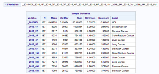
b) Describe the response scales for your explanatory and response variables.
Minimum and maximum values in the table above give the scales of the explanatory and response variables.
0 notes
Photo
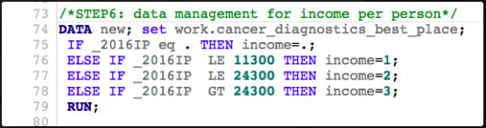
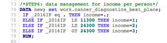
c) Describe how I managed my explanatory and response variables.
I grouped all 187 populations by income level (group 1 – low income countries; group 2 – middle income countries, group 3 – high income countries) according to the schema/code provided above (’ _2016IP’ is income per person in US dollars in the year 2016; if the data is missing no income group is assigned).
0 notes
Text
STATISTICAL TOOLS - WEEK 4 | Testing a Potential Moderator
Complete Code_Testing_Moderator
Complete Results_Testing_Moderator
INTRODUCTION
In the following section, I test for moderation within the context of inferential test - the Pearson correlation coefficient.
You might remember the scatter plot (Fig.2) from the last week in correlation based on the Gapminder data between breast cancer rate and cervical cancer rate. I found that this was a significant association with the correlation of 0.78 (p<0.0001). But might this relationship, this correlation between breast cancer rate and cervical cancer rate differ based on countries with different income levels? To explore this question, I have created a third variable called ‘income’ which is categorical. For this new variable, the income per person variable, which is quantitative, was categorized as a high income country given a value of 3, a moderate income country given a value of 2, and a low income country given a value of 1.
The adjustments I make with the correlation coefficient are very similar to the adjustments I made to ANOVA syntax and chi square syntax when testing moderation throughout ‘Statistical Tools’ module. I begin by creating the third variable, a new categorical variable, called ‘income’. I sort the data by this new categorical third variable. Next, I run the correlation between breast cancer rate and cervical cancer rate and then I include a ‘by’ statement, telling SAS to calculate the correlation coefficient for each ‘income’. When I examine the correlation coefficients between breast cancer rate and cervical cancer rate for each of the income groups, I find the following:
For the low income group, the correlation between breast cancer rate and cervical cancer rate is 0.96 and the p-value is significant (p<0.0001). For the moderate income countries, the association between breast cancer rate and cervical cancer rate is 0.99 with a significant p-value at <0.0001. And finally, among high income countries, the correlation coefficient is 0.96, again with a small p-value (<0.0001), suggesting that the association between breast cancer rate and cervical cancer rate is significant for high income countries as well. When I map these findings onto the associated scatter plots for each income group, I am able to better visualise these significant relationships. Estimating the line of best fit within each scatter plot shows the positive association between breast cancer rate and cervical cancer rate among all countries, however, the sloppiness of the regression fit (straight lines) varies depending on the income level.
Asking questions about statistical interactions seem to be an interesting way to explore data and my associations of interest. Although more advanced tests exist such as multivariate techniques that can be very powerful, the bivariate inferential tools of correlation can describe my sample well, allow to make inferences about the larger population, and to understand what relationships these associations hold, under what conditions, or at what levels of my third variable (‘income’).
Now that I have found associations, can I assume that association applies causation?
Well, not all associations can be explained by cause and effect, but some can. With enough evidence from enough different sources and the help of statistics, one can be confident in conclusions.
0 notes
Photo
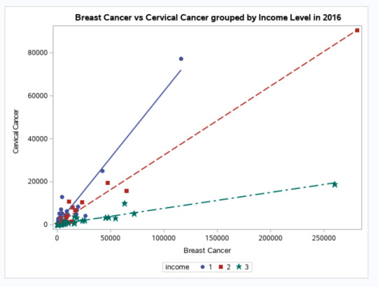
FIGURE1 | Breast Cancer vs Cervical Cancer in Women in 2016 (new clinical cases) - SCATTERPLOT.
Legend (’Income’ variable is a Potential Moderator here):
1 - low-income countries; 2 - middle-income countries; 3 - high-income countries
ASSIGNMENT FOR THE WEEK 4 (STATISTICAL TOOLS) - OUTPUT
0 notes
Photo

Table 1 | Generating Descriptive Statistics & Correlation Coefficients for the analysed variables along with a scatterplot (Figure 1) to confirm the strong correlation between variables of interest (’Breast Cancer vs Cervical Cancer in Women in 2016 (new clinical cases)) in the low-income countries (income level is a moderator here).
ASSIGNMENT FOR THE WEEK 4 (STATISTICAL TOOLS) - OUTPUT
0 notes
Photo
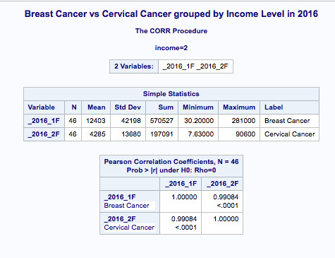
Table 2 | Generating Descriptive Statistics & Correlation Coefficients for the analysed variables along with a scatterplot (Figure 1) to confirm the strong correlation between variables of interest (’Breast Cancer vs Cervical Cancer in Women in 2016 (new clinical cases)) in the middle-income countries (income level is a moderator here).
ASSIGNMENT FOR THE WEEK 4 (STATISTICAL TOOLS) - OUTPUT
0 notes
Photo
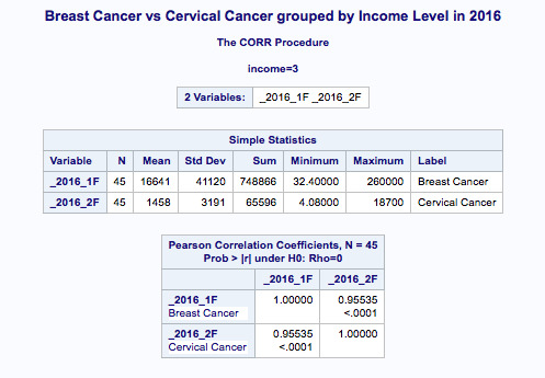
Table 3 | Generating Descriptive Statistics & Correlation Coefficients for the analysed variables along with a scatterplot (Figure 1) to confirm the strong correlation between variables of interest (’Breast Cancer vs Cervical Cancer in Women in 2016 (new clinical cases)) in the high-income countries (income level is a moderator here).
ASSIGNMENT FOR THE WEEK 4 (STATISTICAL TOOLS) - OUTPUT
0 notes
Photo
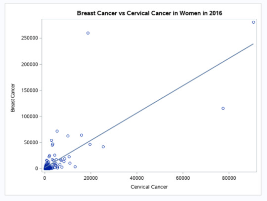
FIGURE 2 | Breast Cancer vs Cervical Cancer in Women in 2016 (new clinical cases) - SCATTERPLOT
You might remember the scatter plot from the last week in correlation based on the Gapminder data between breast cancer rate and cervical cancer rate. I found that this was a significant association with the correlation of 0.78 (p<0.0001). But might this relationship, this correlation between breast cancer rate and cervical cancer rate differ based on countries with different income levels? The answer is yes, based on the analysis described in the introduction section of Week 4 (Statistical Tools).
ASSIGNMENT FOR THE WEEK 4 (STATISTICAL TOOLS) - OUTPUT
0 notes
Photo
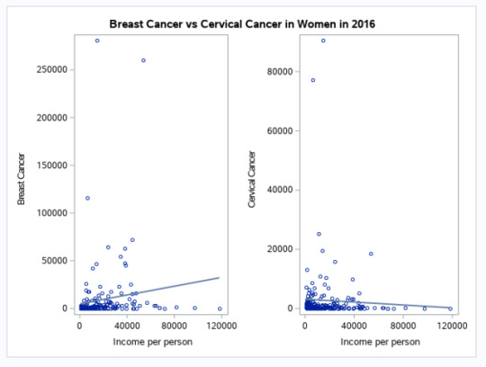
FIGURE 3 | Income per person vs. Brest Cancer and Cervical Cancer in Women in 2016 (new clinical cases) - SCATTERPLOT panel
I attached the Figure 3 panel here as it is an interesting observation: globally, breast cancer rate seems to increase with the ‘income per person’ whilst cervical cancer rate seems to decrease with the ‘income per person’.
ASSIGNMENT FOR THE WEEK 4 (STATISTICAL TOOLS) - OUTPUT
0 notes