
Don't wanna be here? Send us removal request.
Statistics
We looked inside some of the posts by josephroskillyinterfacedesign and here's what we found interesting.
Average Info
Notes Per Post
0
Likes Per Post
0
Reblog Per Post
0
Reply Per Post
0
Time Between Posts
1 day
Number of Posts By Type
Text
12
Last Seen Tumblr Blogs


Fun Fact
In 2020, 44% of users from Denmark used Tumblr daily.
Text
Evaluation of our app
After completing our project, we have been asked for an evaluation of our project and what we have learned when making our apps.
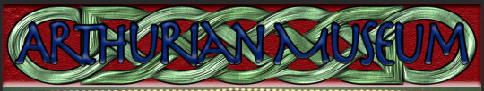
When making my app I have learned a lot of different design basics and techniques and how I have used my ideas and concepts with them to create what I have. From our lessons and lectures, we learned about some of the basics of designs and of the visual hierarchy. When I started my research, I started to look at materials relating to the time of King Arthur and of the legend but also material from the medieval times to get how I could put a medieval twist on modern design and not a modern twist on medieval design. I started to look at how I could use the medieval art and design and see how I could use that in my app, I saw a lot of text and how medieval nobility wrote in Anglo-Saxon ruins and symbols. I thought of having a font that could reflect this so I found a font online that gave the feeling that the text was medieval to reflect the theme. I also thought about having the actual runes in the app but users of the app might not fully understand or recognize its meaning. I also used designs and art from and about the Arthurian Legend like Excalibur, King Arthurs coat of arms and art from the medieval ages.
When creating my app, I had quite a few academic challenges to overcome to try and get my app to its best design. One of the main challenges was the colours. I was trying to find the right colours that could fit the theme of my app, a medieval but royal and mystical theme. I used a complex colour wheel to try to find the right colours that worked together and complimented each other to make it just right. I wanted to use 2 colours that associated with the royals of Britain, red and blue. I used these 2 but I needed a third colour to compliment them, I also made the red and blue darker because in the medieval era they didn’t have very bright colours. I chose green because it showed on the colour wheel to be the most complimentary. The other major challenge would have to be choosing an appropriate background, I couldn’t use modern techniques as my theme was medieval but when I was looking at medieval art they all had the same sort of texture in the background. I used this texture as my background to give the app the same look and texture of medieval art.
From my final results and design, I managed to get the medieval twist on a modern design I wanted. I managed to use the colours well with the fonts in the app so not only did the colours complement each other but the text would also stand out to really show the design and the shape of the text. I think to have the modern edge on the medieval materials make the app easy for users to understand like any other app but allows the user to be immersed with this medieval look. I think the app is very straightforward to operate and easy to read on where to go. With the choice of where to go in the app it allows users to explore it freely without being forced to do something they don’t have to like having to follow a certain path, that was my first original idea but I discarded that because having the freedom to explore the whole app makes a better user experience.
If I were to take some concepts forward I would put more interactivity into the app. For example, I would put the map in more detail and maybe in 3D so the user can know where they are exactly by dragging and looking at the map. I would also incorporate a QR scanner so people in the museum when walking around, could scan a QR code near an exhibit and find more information about that exhibit or more about a certain fact. I could have added more interactivity by possibly having a listening tour from the app so the user could put in their headphones or earphones and go step by step around the museum listening to the tours. This could go hand in hand with the QR code reader so users could use the QR codes to listen to new facts. If I could change anything with the design then I would maybe use some created art just for the museum like using the museum's own symbols and own banners. I would also think adding a few functions like a side menu so the user doesn’t always have to return to the main menu and maybe also a search bar to search for specific exhibits/items in the museum.
0 notes
Text
Interface Design Fundamental - Visual Hierarchy
When an app has so much content in it you will have to choose which content has to stand out to the user to appeal to them. This is called Visual Hierarchy. Visual Hierarchy controls how the user perceives the order of information from the app, there are 7 different segments in Visual Hierarchy.
Consistency and Repetition are key for any app, website or magazine. When a new user sees an app or a website they learn about how the page works and where everything is. Keeping a consistent style means the user won’t have to constantly learn about how the page works every time they explore the app or website.

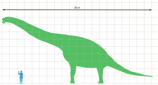
Size (and scale) should always be realistic or to scale to give a representation to the user how big an object is compared to another object. The most common example is when a human is compared to the size of a dinosaur.
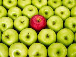
Contrast is a key function for highlighting a certain object amongst many of the same objects. For example, a red apple amongst a load of green apples.
Symmetry is not always needed in many apps and websites but when there are a few objects or a logo/symbol on a page then having symmetry to make it visually pleasing.
Relationships in visual hierarchy are not what a normal relationship is between 2 people. Relationship means how you prioritise objects on the screen for the user, for example, if you had a group of objects just put on the screen it would mean nothing to the user unless you put the objects in layers with the most important object being the forefront object and the least important towards the back or behind the forefront object.
Movement in visual hierarchy is usually implemented when a pattern without direction gets direction so for example, if you had a polka dot pattern then a better pattern would be a directional pattern.
0 notes
Text
Design Fundamental - Shape
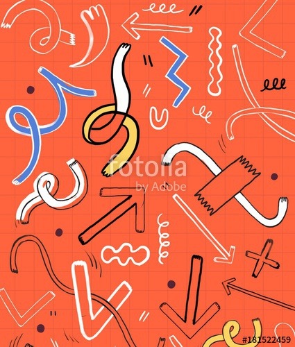
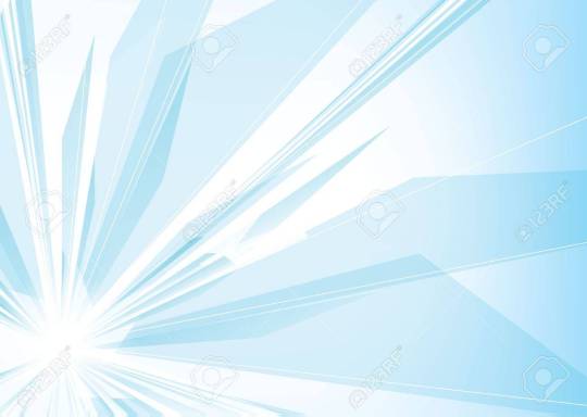
Shape is a design fundamental for communicating idea visually in interface design. Like typography, shapes can determine mood and a message through its form, its colour, the size of the shape and other properties of the shapes. For example, having shapes that are rounded and have softer colours would be suited more for personal blogs and playful subjects while having shapes that are sharp and angled would be more suited for sports blogs and businesses (e.g. Nike and Addias) all because of the mood that the shape would give off. You can see this from the 2 images below. The orange one looks very arts and crafty and that’s through the use of flowing shapes and it looking very homemade. The light blue one is very sharp and very modern and it shows with the sharp lines and overlapping shapes.
In my museum app, I don’t use many shapes for the background or for any images but I use them as indicators for my timeline. Each shape is a circle like a recognizable button but with different symbol so users can recognize the symbol within each button and just know from “everyday design” (recognizable symbols most people with technology would know e.g. the save button being a floppy disk).
0 notes
Text
Interface Design Fundamental -Grids
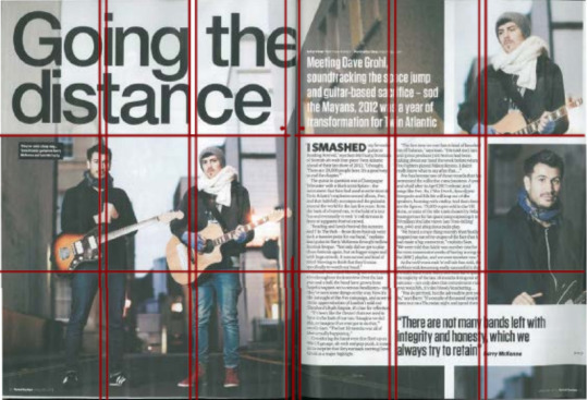
In Interface Design a good guide to keep a good interface is using Grids. Grids are a good use in designing anything with text or images as Grids set the boundaries for where things should be placed on a webpage, magazine or an app. For example, with the magazine entry below it shows the grid system is the same for each page making it parallel across the 2 pages.
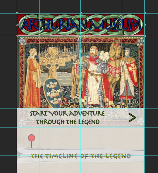
Establishing this kind of grid system and keeping the consistency of this grid is good for things like articles and magazines because they need to make the overlay of the text consistent and clear to read for the user. This does not always apply to apps but having a clear grid structure for the apps content makes the content itself clearer and more approachable for users. For example, in my museum app I have multiple guides and grids to help me align and place content in the app design. Without the guides most of my content would be out of place, not the right size or not visually pleasing as some of the small details could put off the most eagle-eyed user.
0 notes
Text
My Fantasy Museum App - Will be constantly updated
This post will be updated weekly with the research and design concepts of my fantasy museum of the Arthurian Legend.
Week 2 - Choose an idea for the fantasy museum app
In the second week, we had to create a presentation on what we wanted to do for our fantasy museum app. I pondered on what I wanted to do for my project and came up with 3 ideas (we had to come up with 3 to present and then choose 1 at the end from the feedback from Mike, the course lecturer, and some of my fellow students). I had Doctor Who, The Legend of Zelda and The Legend of King Arthur. These 3 things were what I enjoyed as a kid so revisiting either of these 3 things would have made my fantasy app full of content and style. I made a list of points for each subject and some basic ideas to point out while showing mike and my other students. The reason I chose the Arthurian Legend idea was that not only was there no physical museum of the legend but I had a few good ideas which stood out; plus the realisation we couldn't do actual fantasy like TV shows or games.
Week 3 - Designing the logo
In the third week, after learning about Interface Design grids and Visual Hierarchy we started to look at Logo design and the different designs used by museums.
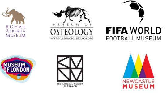
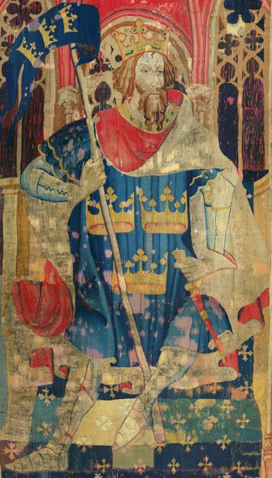
I saw that some museums used symbols like the museum of Finland and the Newcastle Museum. I felt that this wouldn't work for the legend of King Arthur so I thought of keeping it simple like the logos of the Museum of Osteology and the Royal Alberta Museum. I did some basic research online and also from my own knowledge that there were 2 symbols of King Arthur. Excalibur and King Arthurs Coat of Arms/crest.
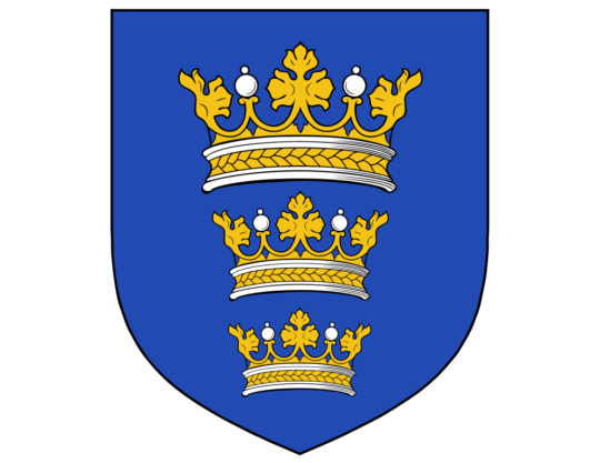
King Arthurs crest is the 3 crowns set on a blue background:
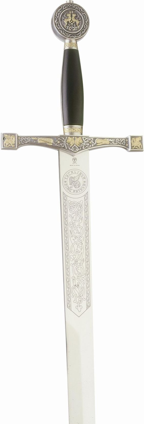
While Excalibur is King Arthurs legendary sword (this is a depiction of what the sword may have looked like):
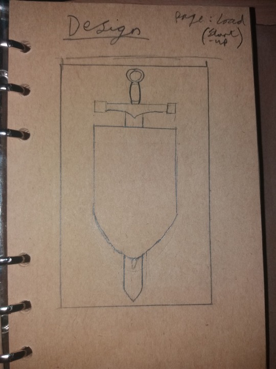
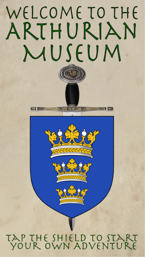
I thought of combining them together so I did a basic sketch-up of what it could look like:
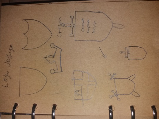
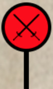
I experimented with the shield mainly to try to get a branded look to the museum while also portraying it was actually part of the Arthurian Legend and lore. Once I had set what the shield kind of looked like I think though of how to display Excalibur. I thought of having the very medieval styled ‘2 swords crossing each other’ look but I then dismissed that because Arthur didn't have 2 Excaliburs so a single sword in the centre but behind the shield to show off Excalibur and to also give the reference of the famous ‘sword in the stone’ in which Arthur pulled Excalibur out of a stone and became King.
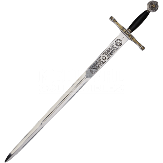
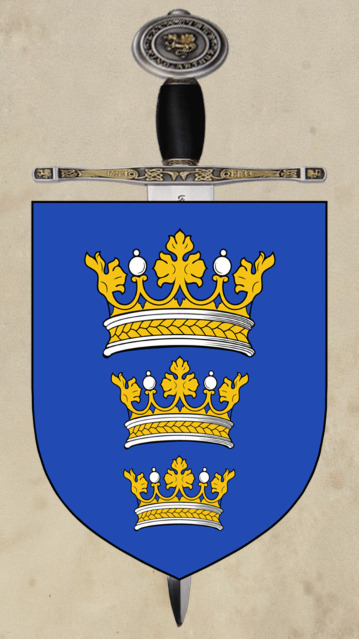
I then found some good images of both Excalibur and King Arthurs crest:
Once I had these 2 I simply put them together to get the final result:
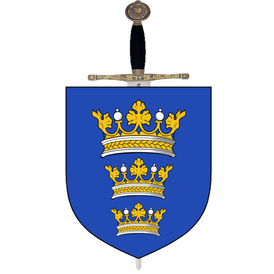
This is what my design was and it really stands out as a finished product. Not only has it got symmetry but the colours are bold to recognise and it has its meaning linked with the legend for my project.
Week 4 - Looking for a style
After week 3 we had a week with no lectures so I decided it was the perfect time to travel down to Tintagel, Cornwall, where there is a lot of strong connections to the Arthurian Legend. Not only was I there to get historical and legend context (Look at the Museum visit post to see this) but also to get the style of the Arthurian time and how the legend is depicted through art to help me give my app a design that reflects the legend and lore of King Arthur.
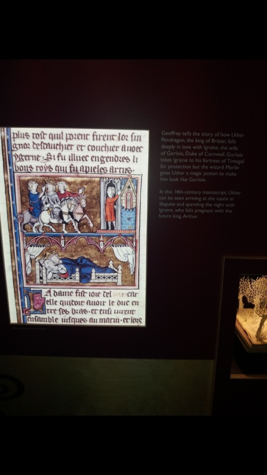
As you can see here from the actual museum is some medieval art depicting the story of how Arthur came about from Uther Pendragon (Arthurs father). The style of the old style text and the rough old medieval drawn pictures of people are the sorts of style I wanted.
When I wasn't going to the museum I was looking on sites like Pinterest (You can access my pinboard by clicking here) by looking at various different authentic and some replica medieval artwork. From this style, I had to choose either a purely medieval style or to mix the style of medieval with some modern aspects. I chose to mix them because if people were going to look at the museum app they would want it to be modern in usability but looks medieval in style so people can understand the app but also appreciate the medieval styling of it.
Week 5 - Creating the map
In week 5 we had started learning about maps and understanding about museum maps and how they were made and styled. I had a good idea of having the map kind of shaped like my logo with the shield being the main building and the sword being additional parts of the building.
My early drawings show this:
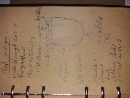
I kept this idea for a while but when I started to work on it in detail it didn't seem very realistic so I changed the layout so the shield was the main building and the sword didn't play a part in the building/map structure. I also went into a lot of detail about where walls would be and designated the different areas of the museum for my final design. Heres the final draft of the paper:
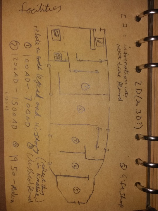
I followed this plan when making it in Photoshop but then I changed the layout again to make it a lot more simple for the user of the app and the map to follow a clear path. Here is the final design:
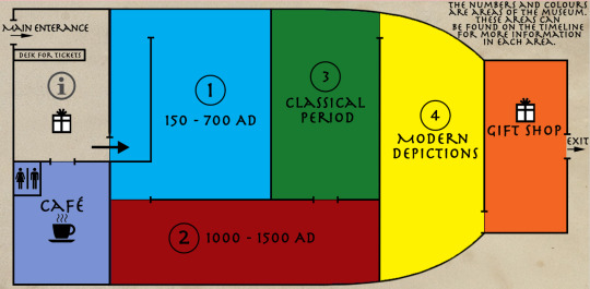
I kept the map very minimal and very simple but it shows enough detail for the user to understand where they would be in relation to the map. I think the map is simple to understand because instead of going into lots of details which can confuse someone if they looked at their map and then looked around then they would understand where they are compared on the map.
Week 6 - Putting the style and context into work
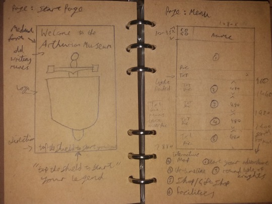
In week 6 we started learning about the layout and how to present all the content, the art and the different styles I collected and how to put it into an app styled page. I started to put stuff into a format that resembled an app by drawing a rough sketch of what I wanted in the app and what it should resemble. I started with the loading page and it's simply the Logo when loading up the app.
I then moved on to the start page (the page on the left) and the menu page (the page on the right). The start page is very simple and basically has the logo in the centre of the screen to show its the official logo in the centre of the screen, it also welcomes the user at the top of the screen and gives clear instructions at the bottom of the screen on what to do next. The Menu page is where the user can go to access most of the other content and acts as a jump page. The first thing they see when looking at the menu is the start of the tour into the museum so it clear where the user can immediately go if they don't want to explore the menu.
Week 7 and onwards - Design updates up to the deadline
0 notes
Text
Design Fundamental - Typography
Typography is a design basic as the design of a piece of text can set the mood on a document, a website or an app. The combination of colour, texture, the shape of the text and the overall font will show to the user or the reader what the item you are reading. For example you would want serious text for an online news site, a playful font for things like a personal blog and a vintage font for talking about old antiques.
I used typography in my museum app to give off that the text has the same shape, font, style and feel as what people would have used at the time of King Arthur and the time that the Arthurian legend was around or based on and changed it to make it more modern for the app. I used the font Herculanum as the font of the text and from there I used the colour from the 3 colours I had used from the colour wheel (see the colour wheel post to understand why) to make the text stand out along with a bit of texturing to make it the forefront of the page.

0 notes
Text
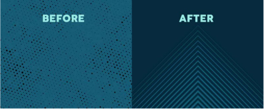
Design Fundamental - Line
Line is a design fundamental and can be used effectively for dividing space or trying to draw the user’s eyes to a certain part of the design. Line or lines can work well with or without colour but can be utilized effectively if the lines create their own effects like depth using lines by themselves.
The main basis of line is to show direction of one point to another point like in a flow chart or in a timeline. For example, in my Museum app I use line to show the direction of a highlight to my timeline and to divide the page into segments.
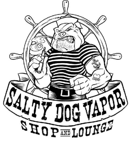
Lines can also be used in images. Line can cover all the detail in an image and give it depth without colour. Line is shown well in the Salty Dog Vapor logo below because, with the lack of colour, it shows all the necessary details but it also gives it depth because of the use of the density, opacity and texture of the lines to make it an effective but simple image without flooding it with colour.
0 notes
Text
Design Fundamental - Colour
Colour in graphics design is a big thing and getting the right colours to work with each other means that the design can look visually pleasing.
Colour is a big design basic and how to choose those colours can be tricky to get the right match. Most designer would use a colour wheel to find the right colours. A colour wheel is a wheel displaying all the colours in a circle and the use of the colour wheel is to choose opposing colours. Opposing colours work well as a basic but many designers, when needing multiple colours, use many different ways to find good colours as example in the photo below.
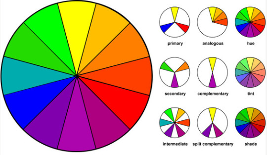
A good use of contrasting colours could be checked with a colour wheel to get good colour to stand out with each other for example with a light orange and purple would work well or a red and green. Each colour compliments itself. I have used the colour wheel a lot with my fantasy museum app to make sure each colour could compliment itself without it being too much colour. When using the colour wheel I used the split complementary technic to get 3 colours that work well with each other. The split complementary has 1 bold colour (red) and then splits into 2 colours (blue and green) that are similar on the colour wheel.
0 notes
Text
1st Lesson - Image Formats and Design Basics
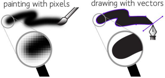
For our first lesson we learned about Image Formats and which format was crucial for different designs. There are 2 main image formats used for interface design and each one has its own purpose depending on what the user is working on. The formats are Bitmap and Vector graphics. Bitmap graphics are used for pictures and uses a grid system that identifies an image using pixels. When expanding a bitmap it pixelates to try to replicate the original bitmap but it always stretches. Vector graphics are used for logos and uses commands or mathematical statements to create a shape. If you expand a vector graphic it perfectly expands without any loss of quality.
After learning some design basics like line, shape and colour (which will be in other blog posts) we had to make our own interface that represents us based on some questions.

From the image above shows my first attempt at making an interface. I haven't looked at many good interfaces so my first attempt was very comical and very rough. It shows I had the skills to use Photoshop but I had to start my research on good interface designs and how to implement that into my work.
0 notes
Text
Classroom tasks
The first couple of weeks of the module we had some tasks set to us in class to improve our design skills and to help us to start our fantasy museum app.
The First Interface Design
The first week we start by learning about key design basics and then we attempted at making an interface. I had no idea on what to create as an interface so my first attempt was very comical and very rough. It showed I had to start my research on good interface designs and how to implement that into my work to know how not to create a bad interface.
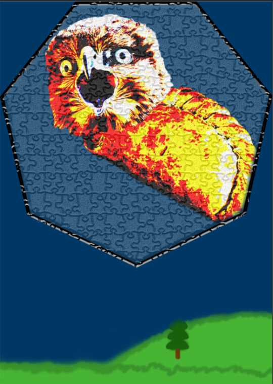
In this interface, there are several techniques (poorly) used in this interface. The most notable one would be colour and the use of analogous (colours near each other on the colour wheel, see the design basics - colours for more research) colours to represent the few colours that represented me for this task. I also used the scale to represent the things that matter to me the most like the hawks head and the Cornish pasty. On a push, you could say that I used line for the septagon to highlight and separate parts of the interface. For my first interface, I had no idea what I was doing so I had a lot to learn through the weeks.
Logo Design
Week 3 we looked into logo design and how other companies and how other museums have designed their logos. A lot of logos use at least one or 2 of the visual hierarchies and design fundamentals to make their logos meaningful but also stand out and be recognisable in a world full of brands and logos.
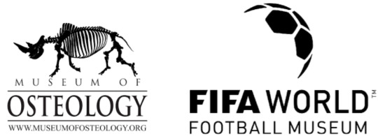
For example, the Museum of Osteology and the FIFA World Football Museum both show what their main attractions are. A collection of hexagons which represent a football for the FIFA World Football Museum uses contrast and negative space to make people think it looks like half a football with the collection of the hexagons (which you could also say uses the design fundamental of shapes). For the Museum of Osteology, it shows a skeleton of a rhino which, meaningfully, is the main exhibit of the museum but the museum also used negative space to show off the skeleton like the football from the FIFA World logo.
For my logo, I wanted to show off the 2 main things people recognise in the Arthurian legend, Arthurs crest (the shield with his coat of arms) and one of the most famous swords in the world; Excalibur.

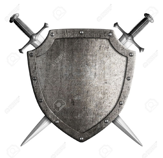
I combined both the sword and shield to show that the museum shows everything from the Arthurian Legend. In a design aspect, I used the secondary colours blue and yellow to stand out on the shield which makes it noticeable if you saw it from a distance. I also used Symmetry with the shield and the sword to make it look neater instead of having 2 swords crossed behind the shield or having the sword on an angle like this example. Having the sword in the shield as well is also a hidden meaning to the sword and the stone as the sword is inside of the shield.
Creating a map
In week 5 we looked into museum maps and the use of them for the museum and for a museums app. In class we had to go out in groups and create a map of the Commons building (the main building of the university). After we documented and surveyed the building, we had to then recreate the building as a map like you would pick up in a museum or you would see on an information board. We used photoshop to create the build and label all the different areas with different colours.
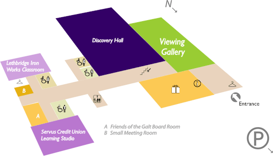
In the time I had, I managed to make the outline of the building, colour the different areas of the building and also draw the doors onto the building. For this I used a few of the design basics. Colour is one of the key design basics here as each key area is a different by colour. I chose each colour using the analogous colour wheel so each area would stand out but not stand out too much like if I had used a complementary colour like a red to contract the green. I also used shape to make the map of the building very simple to understand instead of going into lots of details which can confuse someone if they cant grasp or understand the details. I think keeping the map minimalist works better than going into extreme detail like this map from Galt Museum.
I also used this minimalist style for my map design for my museum app (look at my continuous fantasy museum app update blog post for reference)
0 notes
Text
Good and bad interface/app designs
In an age of technology design is one of the key elements of getting people to use your app. The majority of people would rather have a beautiful app with not many features than an ugly app with lots of features. Many apps developed nowadays have to have a high standard if they want to succeed in the app store and to keep customers and users interested in the app. App designers have the design and interface fundamentals but even some ugly apps can implement these fundamentals and it would not improve the overall look and usability.
Many professional apps, websites and magazines have good and sometimes even recognisable designs that make it so popular with users and designers. For example, some really good designs come from Windows and Apple:
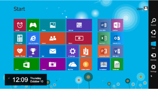
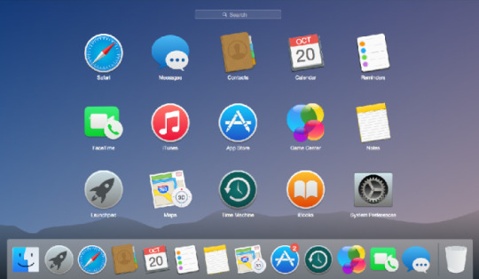
You can see Apple and Windows have used a good use of colour, shape, contrast and spacing. For the Windows design, they use simple but bright bold colours to show off each of the tabs in Windows 8, they also use contrast effectively by putting recognisable symbols against the bold colours to show to the uses what each tab is for. This is the same for Apple and their use of simple bright colours. These bright colours and recognisable symbols make the user interface easy to navigate and to understand.
Some user interfaces, on the other hand, can be horrible and sometimes even cringe-worthy when viewing them. They can be outdated, the colours can be too conflicting or there could be too many colours on the screen at once, a lack of a good grid system/the content isn't properly aligned and/or the text and content are just plain to look at. For example here are a few bad designs of apps and websites:
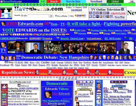
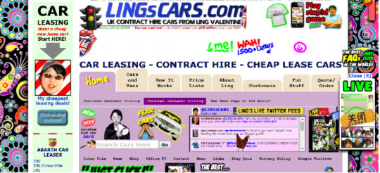
You can just see both of these websites just have too many colours, everything is clustered together and its an overload for the user. It also has no grid system and no visual hierarchy, there is no contrast or relationship because everything is just mashed together and I, as a user, don't know where to start with this website and I would just shut down my browser.
The HavenWork.com has too many images cluttered together and is not giving any videos, text or content any space. Its text is plain and uses so many different fonts and not being consistent across the site.
For LingsCars.com its not as bad as HavenWorks.com but still lacks things like space as everything is cluttered. For example, the tabs aren’t the same size, width or height, the banner doesn't fill the top of the screen and the main content doesn't fit the whole screen. There are even some things that are not necessary for the website like for example the Chicken on the live twitter feed, there is a pop-up on the right side of the screen and on the edges of the screen are some 1970s hippy circles and spirals. All of this is unnecessary and overloads the page. For a user, this would be too much as they would not know where to start on the website and so would just close the website down.
I downloaded some Museum apps myself to see how well these museum apps compared to the good and bad interfaces I explained earlier.
I downloaded 2 museum apps from the app store and tested them all. The 2 I tested were:
- The British museum app
- Natural History Museum app
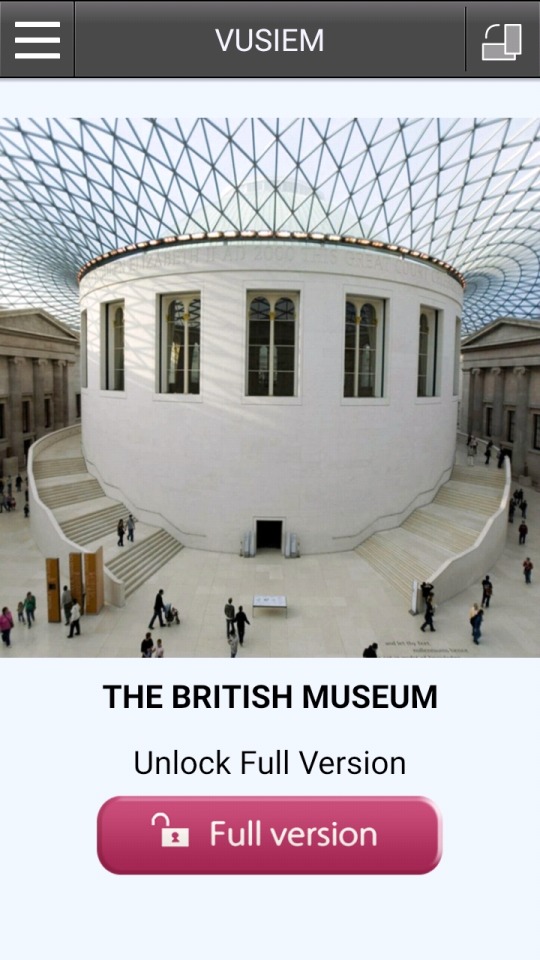
I started with British Museum app by Museum Tour Guides Ltd which has 3.5/5 stars. I started up the app to the loading page where the image doesn't even fit the whole screen and only the centre of it.
When you load into the app (despite the unlock the full version button) there is no indication where to go and you have to guess what to do next. I pressed the screen and I managed to get to the menu but the overall look is not appealing. The grey header bar isn’t the right colour and the front screen doesn't give any indication that you are on the British Museum app, it's just an image of people in a museum.
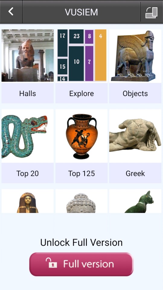
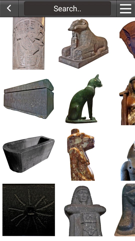
Now going into the actual menu it gives a general show of whats in the museum. The colours aren’t pleasing as well as they don't match or contrast but is just a pale purple with a load of pictures (the categories) with just plain text, it's so boring because its plain, it does its job of showing you the categories but it's not visually pleasing. If you click on one of the categories it just shows you all the images of that category and no detail unless you clicked on one of the images, it's just plain and drives no excitement from the app. Its user experience is very boring and basic, especially the map because you try to navigate the map and it doesn't respond to the commands you try to give it.
With the Natural History Museum app by the museum themselves which has 3.4/5 stars, this may be less than British Museum app but I disagree with the score (when reading the reviews most of the low scoring reviews were because of individual users and not because of the design of the app itself). When starting up the app you get a nice loading screen with the logo of the Museum and the name of the museum on a full sized picture. This app is comparatively better than the British Museums app.
Now going into the app itself with the menu its heaps better than the British Museums app. It has a clear, well structured and visually pleasing modern design that is easy to understand for any user. It has a nice colour theme with a burgundy red contrasting with the white making the white text and logo stand out. It uses a lot of the design basics like colour, space, contrast and consistency across its whole app.
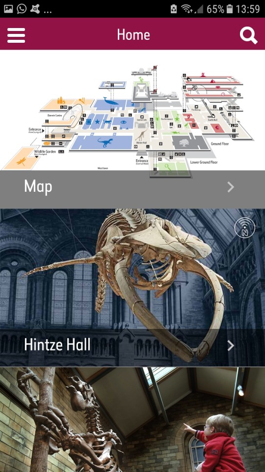
When you click on the side menu its responsive design is good as it doesn't go to a different page like the British Museums app, it slides out of the side like an attachment and not a whole new page. With the side menu, it's clear to read and it's easy to access.
When you go into one of the sections in the main menu it takes you to a well structured and clear page with the relevant photos.
From those 2 apps, it shows which app is the more well designed and well thought out app for user experience and design functionality.
0 notes
Text
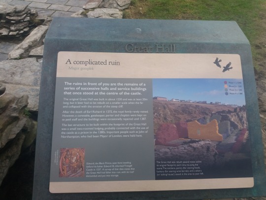
Museum Research - Tintagel Castle
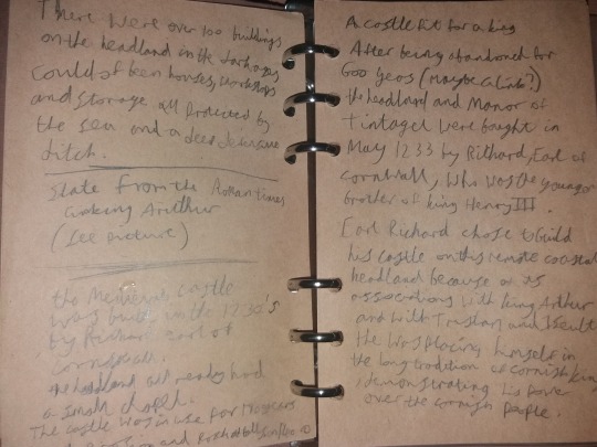
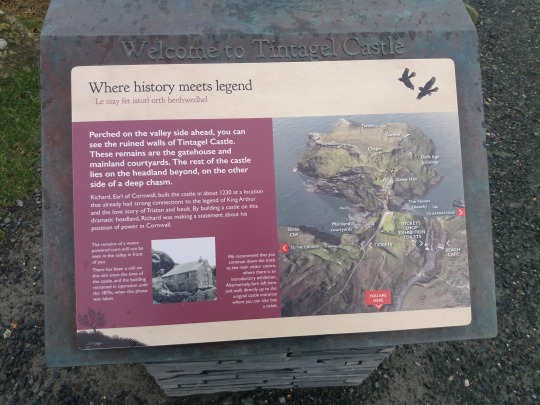
For my museum research I decided to kill 2 birds with one stone and go get some valuable research into my chosen topic; The Arthurian Legend. I travelled 150 miles to Tintagel, Cornwall, to go to the supposed birthplace of King Arthur. Tintagel is an English Heritage site meaning that they are a trusted national company so I know not only would I get some good resources for my interface design but I would also manage to get some good content for the app itself. I chose to do Arthurian Legend because I have always had a fascination with the subject since I was a child. Actually having the time and the objective to research this meant I was really passionate to find all the facts and visit all of the sites relating to the legend to get as much content and context as possible. When getting my tickets to get into the site I spoke to the guy at the desk and I said about my research project about the legend. He then told me a little bit about the legend and the actual history of the castle. I had my leather journal with me to document every detail in Tintagel so I was writing down every fact and every part of the legend so I could to try to get as much content as possible.
Along with this fact I learnt from the guide, I also bought some branded material that is of use as well for not only about the legend but it also shows how English Heritage uses Interface Design on their booklet and their material.
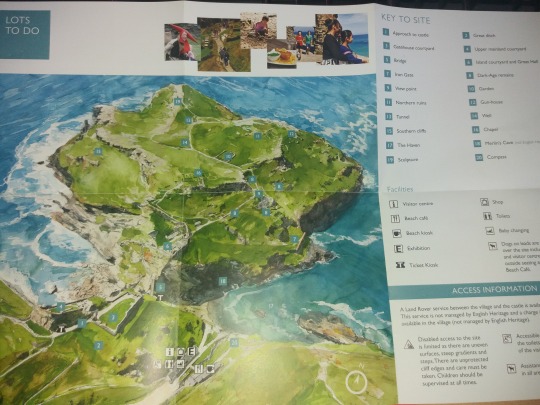
English Heritage display their content well with clear grids in their booklet, you can see that there are 2 main sections for text and then a side section for the smaller details about the pictures. This grid system makes it easy to read and follow. Along with the booklet I also got a map which is very simple but effective as it keeps it key out of the way of the map but it makes sure there is enough detail so no-one can get easily lost.
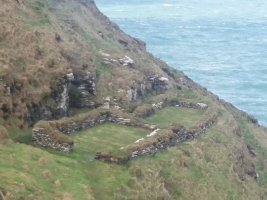
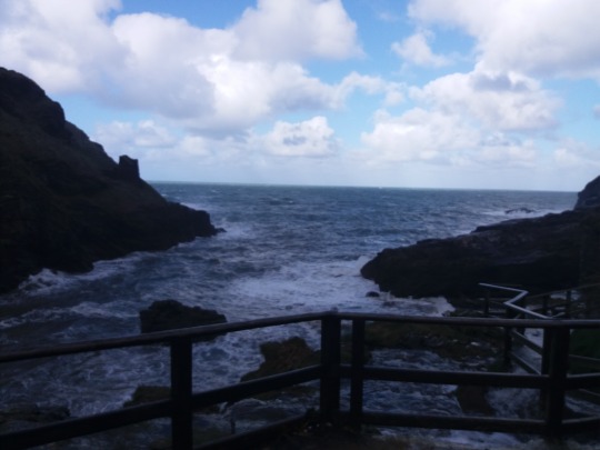
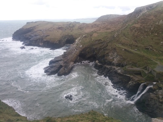
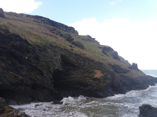
Now for all about the trip and what I found out during the trip (with a lot of photos)
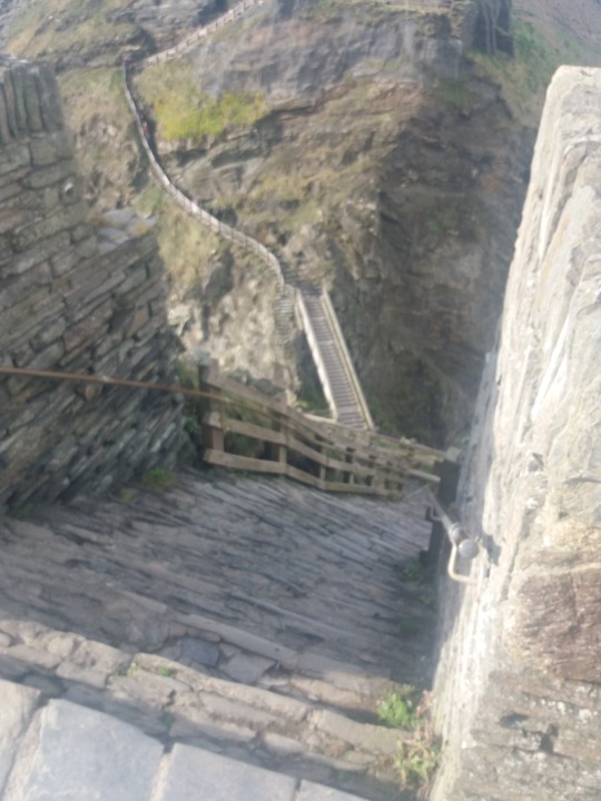
I started here at this first marker of many and this gives me some facts about the connections with King Arthur within Tintagel. I then began my long trek, and I mean lean as you can see from this photo of the stepping going down and then back up to the ruins
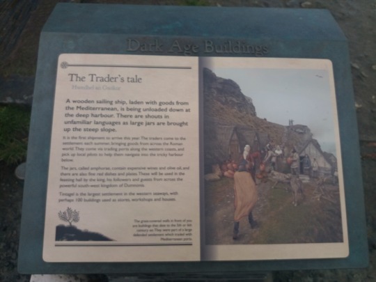
After going on this long trek I got to the museum, it was only a small museum but for me, it was enough to get the base facts about the legend and how it was connected to Tintagel. The museum allowed me to take pictures as I got permission after telling why I was taking them. I managed to get the picture and style of how Arthur was born into the world with the magic of Merlin and Uther Pendragon.
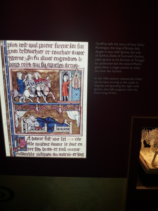
Despite it being a 14th-century painting it still tells the story of Arthur from the Dark ages (400 - 700 AD) in which the Arthurian legend is based around. At Tintagel, there was also ‘Merlins Cave’ in which it is said where Merlin used his magic to help Arthur come into this world, unfortunately, due to the weather I couldn’t access the cave. (There is a video at the end basically explaining why)
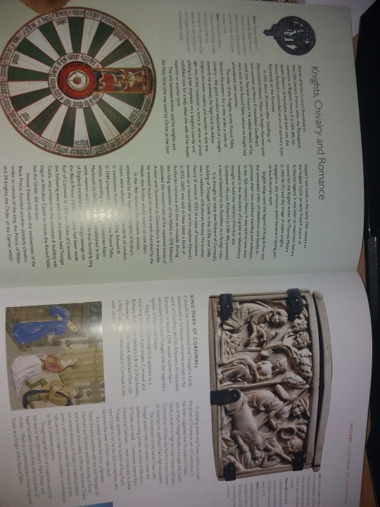
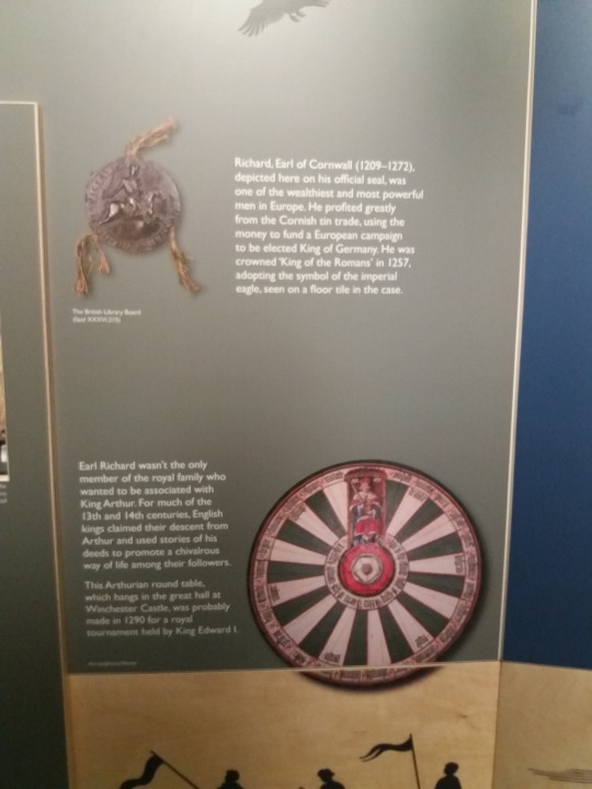
I also managed to get some good information about the dramatisation of the legend of King Arthur through the tells of Knights and Kings of England as they all wanted to be part of the legend or follow in its footsteps. Some things that many people believe that are true in the legend is the roundtable, that is false as King Edward I made the first roundtable in 1290 for a tournament as shown in the picture.
The Legend of King Arthur came about 500 - 600 years after King Arthur was around. Peasants didn't know how to read and write so monks and scholars were the only people who read and write so they wrote down the history of the land. The Legend of Arthur was only lore around in Cornwall and Devon until one scholar, Geoffrey of Monmouth, wrote down the previous accounts of King Arthur in his book Historia Regum Britanniae which means History of the Kings of Britain. This meant the stories of Arthur spread around Britain about his courage and chivalry. From this it was heavily dramatised and was twisted by word of mouth meaning Geoffrey of Monmouth's account is the only credible account so far along with the local lore in Cornwall. From these accounts King Arthur could be a few different roles, some say he was a victorious war leader against the Anglo-Saxons, some say he was King of Cornwall (some people think that King Mark of Cornwall could have been Arthur or vice versa) and some say Arthur could have been a magical man supported by the wizard Merlin. No-one knows exactly but there are many theories.
Here are a few more picture plus the reason why I couldn't go into Merlins Cave:
youtube


0 notes