call me kakudo/angle // 20 / oc art and yakuza/jopok stuff / KR/EN
Don't wanna be here? Send us removal request.
Statistics
We looked inside some of the posts by kakudo45 and here's what we found interesting.
Average Info
Notes Per Post
13K
Likes Per Post
9K
Reblog Per Post
4K
Reply Per Post
3
Time Between Posts
1 month
Number of Posts By Type
Text
16
Note
1
Last Seen Tumblr Blogs


Fun Fact
Tumblr has been providing a Korean-language service since 2013.
Text

love is natural // ocs
51 notes
·
View notes
Text
nana my beloved
#illustration#nana osaki#digital painting#i never draw a lot of women lol so it was esp fun to do#nana manga
1K notes
·
View notes
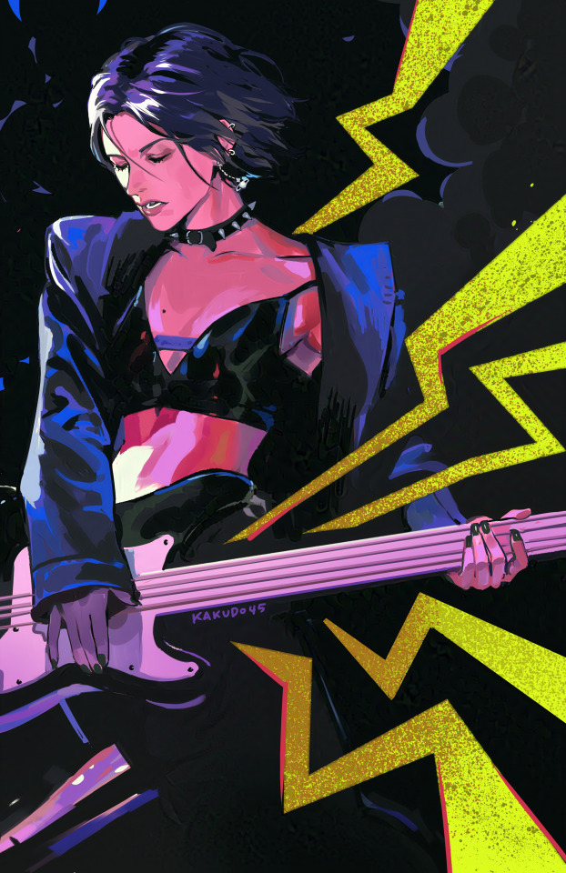
Text

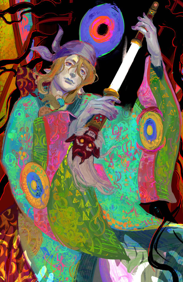
Consumption // OC art
26 notes
·
View notes
Text


some pieces I made for the office hours zine!
213 notes
·
View notes
Text
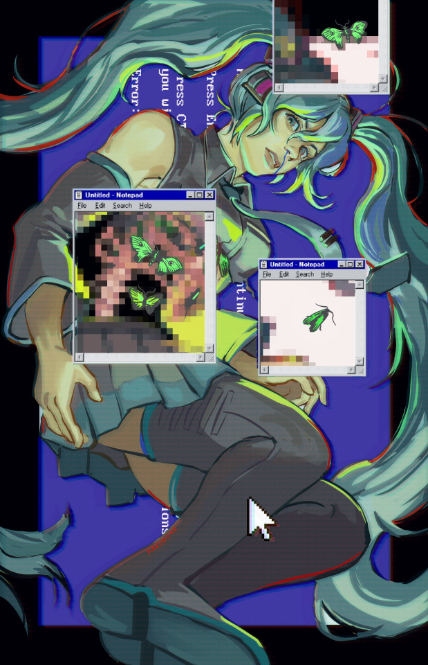
Miku System Error // Art for a zine
#hatsune miku#vocaloid miku#miku fanart#miku#illustration#kakudo art#Miku after I uninstalled McAfee from my computer
204 notes
·
View notes
Text

madoka!
613 notes
·
View notes
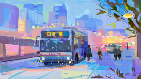
Text
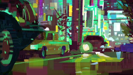
I live in the Inland Empire. // Disco Elysium
5K notes
·
View notes
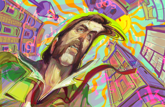
Text

head sketch of griffith
1K notes
·
View notes
Note
do you have any tips on how you color? your coloring style is similar to what i’m trying to achieve but i have no idea how you actually pull it off
Hi!
I'm gonna separate this question into rendering vs. coloring. I'm not sure which you mean so hopefully tackling both covers your question, although I'm not really the best at explaining things.
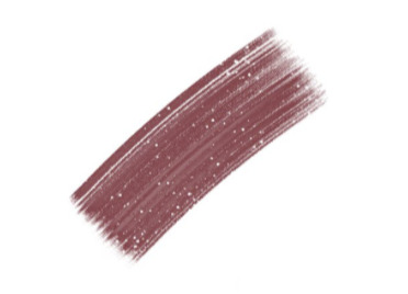
For rendering, I usually paint using some square/textured brush (kind of like the one pictured below and a low opacity circle brush (the standard in photoshop, and most painting software). Lately I like using brushsets from the digitalbrushes account here on tumblr.
I sketch, and then paint underneath the sketch. after i paint for long enough I either delete the sketch layer or I merge the two. I like to add texture where the midtones are. I think a lot of my "rendering style" is probably owed to that.
I like adding texture around midtones. I also like adding limited random variation of color and value to large areas. Like below, you can see that I added a slightly different shade of red to the lit part of the apple in step 3. If you add variation or slight gradation to the large light shapes or shadow shapes you can create the impression of depth. At the very least it looks more fun.
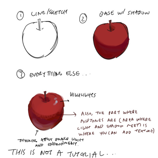
Also a disclaimer, but for the last two drawings I did I've kind of went off kilter. The process is the same but I used some oil paint brushes I downloaded and I pretty much added as much variation to every shape possible, which I would not recommend unless you're sure of what you're doing. But you can see here that even though I added variation (in color, brush stroke, etc) that the shapes are pretty readable and the light is very clearly separated from the shadow.


In terms of choosing color, I had a long stretch of time where nothing would look right to me. Things were colored really literally, with no regard for lighting or ambient color (background/environment surrounding characters). I would often fix things up using a gradient map and using color burn or multiply on 14%. Honestly, this is still a great way to make things look coherent, I really like these gradient maps on the CSP asset store if you want to look into them.
My colors improved a lot after I developed an eye for color/figured out what colors I like to put next to each other. I did this by saving and making a folder of any piece I saw that I liked specifically for color. By doing this I got a clearer sense of what kind of color schemes I tend to like. I suggest doing this as well so that you can figure out what kinds of color schemes and pairings you tend to enjoy most.
Hopefully this answers your question <: ] Apologies if this doesn't make sense, it's a bit of a long post.
#ask#I wish I could help out more anon ... I often feel like I have no style consistency so seeing this ask surprised me#i think unfortunately i do work partially intuitively so its a little hard putting this into words
109 notes
·
View notes
Text
Truth-seeker
#mononoke kusuriuri#mononoke#illustration#digital painting#digital art#this show changed my brain chemistry as a small child
3K notes
·
View notes
Text

wip of chang'e for a zine
#illustration#concept art#chang'e#digital painting#i love the pattern texture but im gonna have to elaborate on them . shoutout to my friend for telling me i gotta experiment more#she was right and its fun doing “new” stuff
342 notes
·
View notes
Text
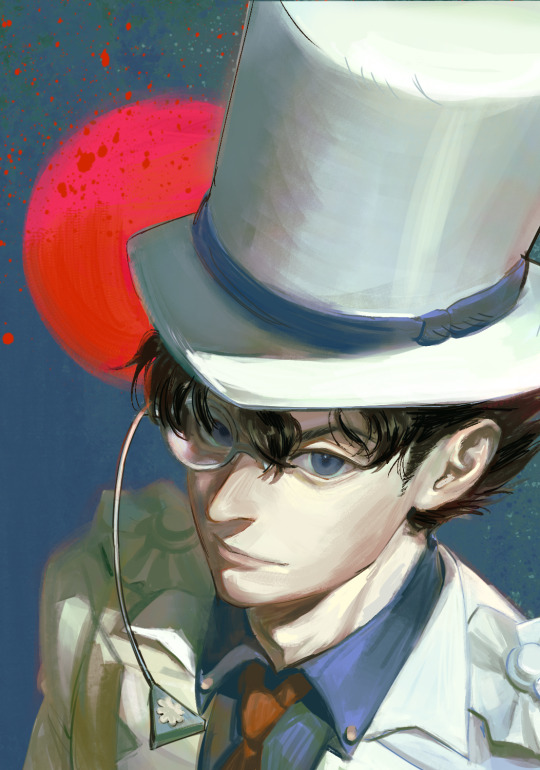
kaito kid (for a friend's bday :])
#kaito kid#detective conan#illustration#kakudo art#kaito kid looks very goofy i respect his unbeatable monopoly man outfit
171 notes
·
View notes
Text


edo period room aesthetic lmao, pushing myself to do complex bgs with perspective
26 notes
·
View notes
Text
no future or past
291 notes
·
View notes
Text

Snow
242 notes
·
View notes
Text
ZERO
175 notes
·
View notes