lisaspow
I was created to create
All images on this page are my own personal drawings/paintings, unless stated as inspiration
please do not take and claim as your own.
345 posts
Don't wanna be here? Send us removal request.
Last Seen Blogs
moonpeachmoth
Quantumplated
reptile-garden
Reptile-Garden

pacifistcowboy
silver the hedgehog’s papà
loprogeny
LO PROGENY
ohisthistakenaswell
Thad T.
Photo

I feel that the church street designs fit best on home ware products as the architecture is something in which would be featured in a home especially with a design of your home town onto it. I placed on a phone case i thought the image is fitting onto it and allows you to see the full image and always have a part of your town to show around.
2 notes
·
View notes
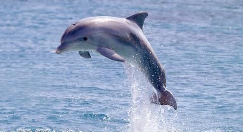
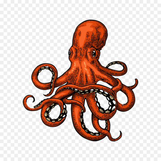
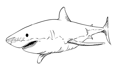
Photo
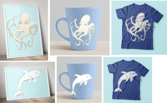


Lumiere
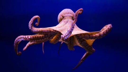
After looking at images of different sea creatures i decided to focus on the dolphin and octopus as i thought those are the creatures in which are affect the most by the ocean. It doesn’t have the shock factor of the plastics within the designs but if i was to further develop these ideas i would add to tug on heartstings of people who would be viewing my work by adding in plastic bags, bottles, plastic can holders and other products which people don’t recycle and end up throwing away. As i asked people around they said my sketches would work well on a variety of different things as they are basic images but do have a lot of detail within them which don’t need to be coloured. I applied them to a range of products in which i would be able to sell if i were to open up my own pop up store or stand.
0 notes
Photo


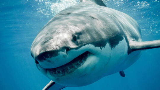
Research
with this project we worked with the choice of creating an art piece to go into the Lumiere light festival in Durham. We had the choice to create an art installation or design some images in which could be used on tshirts, prints, cards, collectors gifts. The theme for the idea was working on around the ocean. all the plastic pollution what is in the ocean affecting all the animals in there. It would make people aware and bring light into the situation.
0 notes
Text
Reflections
Creative Skills
The main creative skills in which i have learnt throughout my FDA course were creating illustrations with a more perspective on how everything lines up, getting size and proportion correct. Shading was something in which i wasn’t really good at but sitting down and working on a shape gave me skill to know which way you needed to follow to create the right amount of shading and what kind of pencils to use and how hard to press down, this has came in useful for a lot of the illustrations in which i have been doing through out projects. Typography was one of the main issues which i had as i didn’t realise that different style of fonts were needed to match with what other font face you were using, i learnt how to match them to give a professional finish and to not be able to see so easily how drastic the font had changed. I also developed this further by creating my own font styles to give a personal and unique feel but also kept it basic so i could also digitalise this if needed. As i experimented with different techniques and materials i realised that i should keep every experiment in which i create even if i didn’t like them as they could later be further developed or changed into something completely new, everything can be used even if it goes wrong. Throughout the experiments i grew more confident in using a wider range of materials in which i wouldn’t normally use to work with (non traditional) such as random things i found lying around, make up, plastic cutlery and other materials such as fabric to draw onto. I done a lot of work with using Cellulose Thinner, this was a technique in which i learnt on level three but was something in which i didn’t really use since, but as i found the project which this type of technique would fit into, i went back and used the skills in which i already knew to develop a little further and work more with the material i had, but using it on different fabrics, papers and incorporating charcoal into the image which gives the corroded effect.
Academic
Use of books helped me a lot through my projects, finding out the information about artists/designers physically instead of just looking around on the internet, seeing the images in a more bigger perspective and all the information is gather into one section rather than having to click finding variety of web pages. By doing this it helped with my essay writing, finding out about different artists work, what year it was created, letting me write down the research links within the essay to directly link to where i found the inspiration for what i was talking about, it then allows you to add in a bibliography so you can go back and look at the books in which you already read if missed anything out instead of having to search all over again. I improved on researching a variety of different artists in the contemporary and historical field. This allowed me to compare/contrast how much it had changed over the years and how similar things still were in the process of designing. As i was doing this i found new artists/designers in which i didn’t know before, letting me see the work of their designs through looking at someone who created a similar style to them, gathering a range to use as inspiration.
Technical
Photoshop was the main aspect of the technical techniques, using this for digital drawings/ underpainting, using a graphic tablet to be able to colour professionally and create finer detail within the image itself. Using the burn tool and dodge tool to create shading within the colouring to create depth on the image to make it more realistic and using the clone tool to apply fabric material onto the image to make it look textured. Putting your final designs on a mock up let you view what your design would look like on different products to allow you to see which you would like to create realistically.
Communication
My presentation skills have improved as i could talk more clearly of my work and the process in what i took to create it, showing the design process throughout to show where i found inspiration. After presenting it i got the feedback from the group which allowed me to go off and make changes to see if their ideas worked. Events were held with other artists/businesses in the industry which abled me to go and speak to them to find out what work they did themselves and how they got to be in the business, it gave me opportunity to speak to others and think what i want for the next step. For the project Defiance i posted out on social media wanting to get the public involved with something which was part of their home town and communicated to find out what they liked about the town itself. There was many responses which gave me a lot of ideas to work around with.
Project Management
I work part time and balance with university, i have to leave early some days but i resolved this by coming in on the days where i wasn’t timetabled to attend to catch up on the hours and even fit in extra time to be able to finish the projects by the deadlines we were given. I learnt throughout to make a plan and stick to it and not get distracted for it to work to be able to plan out your time and hit the deadline.
Personal
As i started the course i wasn’t very confident within myself and not confident i could do the work in which i would be set, but as i progressed through the years i found my confidence building and felt myself becoming more involved and getting out places more than i used to. I found myself sharing skills which i knew with others in the class and helping other classes when i could. My confidence in my work progressed as i started to experiment with a wider range of things and not scared to go out of the box and to try briefs that i wanted to have a go at and not just what i’m comfortable with. The support of the tutors helped my push through and push me out of those work boundaries i was holding myself back with.
Projects Enjoyed
From FDA year 1 the projects i liked were Through the Gift shop and Light as i liked that they were very open briefs and i could test my skill sets within each one.
From FDA year 2 the projects i enjoyed were Brand yourself as i could create my own logo to what i would like to see featured on all my products if i was to sell and gave a little insight into the business world. Sequential Narrative i really enjoyed character illustrating and changing an already existing book into my own character style. Design Contexts is where i pushed the boundaries with fashion as i created a sculpture with non traditional materials which is something i hadn’t ever done in any of my previous years. Although this was very time consuming i really enjoyed the physical outcome of the product instead of placing it onto mock ups to see the final product. Defiance was a really open brief which i linked to my home town and found that the products i designed would be fit to be able to sell if i was to create actual products of these things.
What would you like to do?
Fashion illustration is something i looked into and loved the design work behind the making of the garments in fashion without having to physically make them, just using the illustration aspect of it.
Character illustration was another thing i enjoyed but i found some parts of this difficult as you would have to get the proportions for them correct and i would have to put more practice into getting this right before i would take it professionally.
Graphic design is the main one i was looking into as i progressed through my work i saw that it all did tend to fall into the graphics department as i tend to tidy it up using photoshop and digitalising my final images.
I am looking into progression onto the third year of University at Sunderland studying Graphic Design.
0 notes
Photo

Homeware - Picnic Set, Deck chairs, look like something you would use in the summer for the outdoors as the beach huts are linked with the beach in vibrant colours.
Fashion - Socks, Suit linen, Silk handkerchief
0 notes
Photo

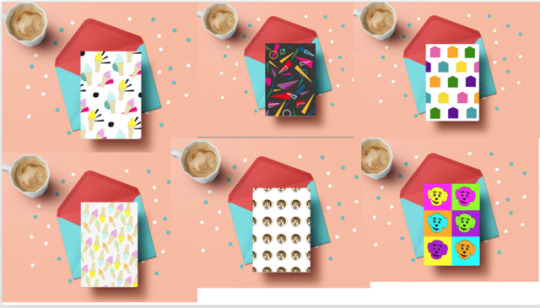
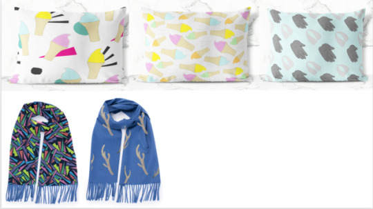
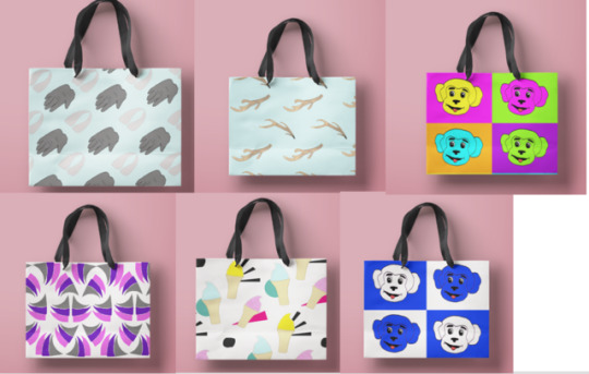
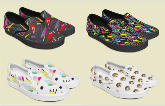

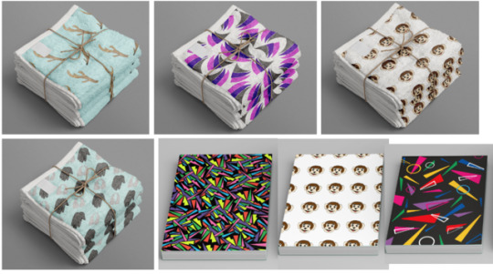

Mockups
Stationary - Greetings cards, notebooks, wrapping paper
Fashion - Shoes, shopping bags/gift bags, dresses, scarf, baby clothes
Homeware - Cups, Towels, cushions
0 notes
Photo


Layout of repeat patterns
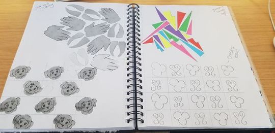
I started to mess around with layout of patterns seeing which the patterns worked best with the structure. I found that a lot of the images worked best if they were just randomly placed together so you could piece them like a puzzle rather than having them as a grid. But i found that some would be best to change to the grid style layout as the pattern looked too heavy and clumped together.
0 notes
Photo


Patterns
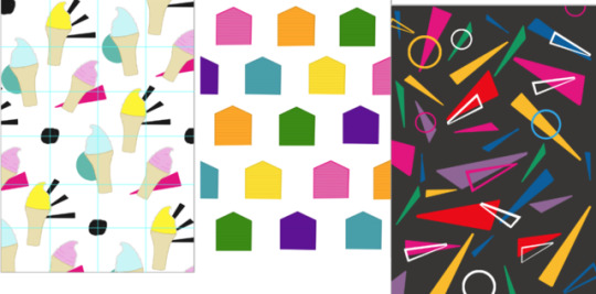
The use of geometric shapes were the main focus i wanted to play around with, using the college logo as inspiration. As i started to place them together i found that the pattern looked similar to the memphis designs which had the same style and colours as i was creating. I took inspiration and cut out the shapes leaving only the outline and changing the colour to incorporate into the design itself.
Using the same logo i took certain shapes from it, the triangles and squares and placed them behind the ice creams to form some kind of background to fill in the spaces so they didn’t look too much spaced out and too much white showing.
I used the shapes again to create a completely different pattern, but this one was more complicated as i had to cut each shape out one by one to be able to fit them together easily and make sure the colours repeated together more easier, this was very time consuming and took longer as you had to focus on each image fitting together without any spaces between. The pattern as it was finished reminded me of something from the 80s in the retro style. Working best on a black background as the colours stood out a lot more.
Taking the ice creams which i had previously sketched out and coloured, i digitally coloured them to make them more professional but as i used the grid method to create the pattern i found there was too much space between the images. So i used the same method as before of cutting out the shapes outline and only using that really faint so you can’t see it from distance but as you look closer you see the outlines of the ice creams, this makes the pattern not look as clustered together even if there isn’t much space there at all. It plays with your eyes.
0 notes
Photo

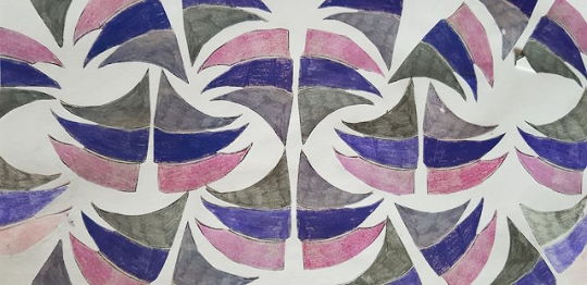
Middleton Grange logo pattern
Digitally underpainting the logo for middleton grange gave a professional and neat finish, coloured pencils which i previously used showed the lines in where i had been colouring and the colours werent as vibrant as they should of been. I decided i wanted to stick to the colours in which the logo was originally. To design this i rotated and flipped the image around so they would slot in together and become a mirrored imaged pattern which could then be repeated into bigger chunks of the pattern itself. The white background worked the best as it made the colours stand out and appear more eye catching, this is the colour they had used on the logo itself on the side of the buildings to be able to see from distance. The colours on the background dont make it as appealing as you seem to lose some of the colours vibrancy
0 notes
Photo

Stag and Monkey Print
Combining the two main aspects in which people relate to Hartlepool i didn’t want to use something in which was really obvious, i wanted to go for something in which would be unique and more on the creative side. I played around with the footprints of the two animals and placed them together side by side as if they were forming into one thing. These make you think to what they are because as you look closer the shape and detail come more into view. The backgrounds were too pale for the stag footprints to stand out against, you would have to look really close to be able to see, but i thought the blue colours looked nice, similar to the way it looked with the antler pattern wanting to keep the colour scheme going through out each of my designs.
0 notes
Photo
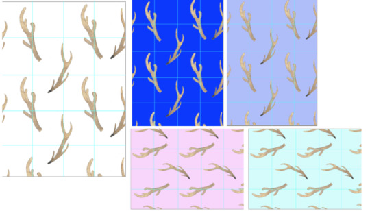
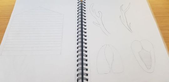
Stag Patterns
I didn’t want to do the typical stag head as i thought there would be a lot of things with that design on and i didn’t want to make it look too similar to the monkey, so i decided to take a certain part of the stag, the antlers, which i thought were the more obvious link to them and would work for a pattern within itself. Using the grid method i figured out the right places i needed to put the image so it was able to fit together and be repeated down, leaving the same amount of space between each one. I didn’t want a flat basic colour for the antlers as i thought it would look too plain when there is quite a bit of detail within them. So i took a texture of an image of bones, which antlers are made and placed it on top of the illustration in which i designed, shaping and erasing the parts in which i dont need to create a textured image, turning the opacity down so the image was able to blend without seeing any of the lines. I stuck with the colour pallette of having the colours previously used and thought the pastel colours worked best on these designs as the antlers themselves are quite dark so seem to blend in with the darker colours. I decided to go with the pale blue colour as i thought it is a link to Hartlepool colouring still and links together with the monkey head pattern being on white, giving that Hartlepool team colours when seen together.
0 notes
Photo

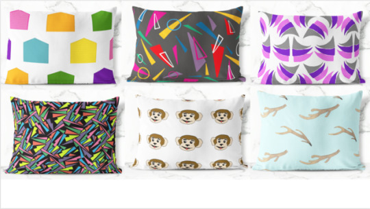
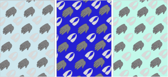
Monkey head pattern
Taking the monkey head which i had previously i wanted to create more of a sophisticated pattern rather than something which is child like and wanted to appeal to the adult audience. I stripped the colours from the background and just placed on a plain white background and made the monkey head smaller so you could fit more onto the pattern to be able to repeat the way it had went. I lined them up to make sure they were all even and in the same structure so where ever you move it too it would always be the same and repeat itself. I tried with two different colour blue backgrounds and thought the pastel colours worked best as you could see the image stand out whereas the darker blue was too dark and you began to lose the image completely. I then tried incorporating the Hartlepool football colours with the stripes in which i changed from the squares and thought this worked a little bit better but the background took all focus from what the pattern was supposed to be and started to look like a pattern within itself. I think the white plain background works best to be able to put onto products as it looks neat and professional and doesn’t distract you from the pattern itself.
0 notes
Photo
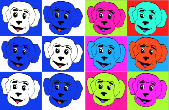


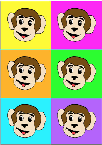
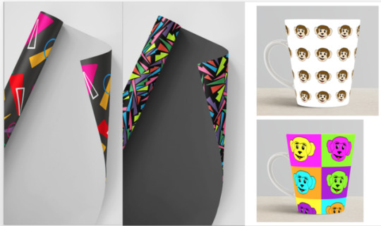
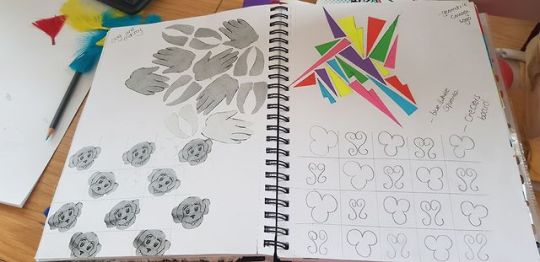
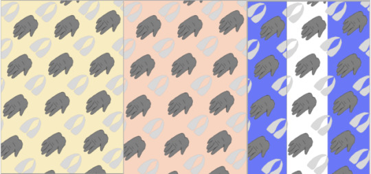
Pop Art monkey patterns
As i took the monkey head and coloured it on photoshop i saw that it was more cartoon effect rather than a real life looking monkey, which i thought would be more suitable towards younger audience such as children, but also would attract adults as it is one of the biggest symbols of Hartlepool. First i tried colouring the monkey in the Hartlepool football club colours, white and blue to symbolise the mascot, but i thought it didn’t work too well as it was too obvious what it was and wasn’t what i was going for, it didn’t look professional and feel it would work best on a stripe background rather than in squares. After i realised that didn’t work i started to colour them in different colours, keeping the same colour palette through out of the colours of Hartlepool. As i started to colour these it reminded me of the Pop art movement which Andy Warhol created putting characters/people on coloured squares with contrasting colours as the main focus. As i played around with the colours, i thought these were more appealing to the younger audience as they were vibrant and vivid colours which would attract the eye of the products to them. Going from that i thought maybe there was too much colour on them and too much to look at so i wanted to try colouring the monkey with a normal colour of what the orginal should be and found it worked better as the coloured squared backgrounds made the image stand out completely and nothing got lost within the background or the colours didn’t blend together too much.
0 notes
Photo
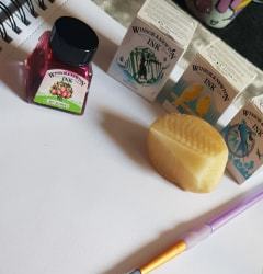

Printing
i wanted to try a different technique in which i wouldn’t normally try. I cut the shape from a potato of a triangle from the HCFE logo wanting to create a geometric shape pattern. I kept the colours of the logo of the college so it kept with the correct colour palette so you can easily identify where the inspiration came from. I used ink and Paint but i found that the ink didn’t show the colour as much as i liked too and the paper seemed to absorb into it, whereas the acrylic paint was thicker and didn’t soak into the paper so the colours seemed to work more vibrant. The worn out effect linked to the industrial style to old hartlepool in which people liked about the town to show that link as it wasn’t just a new/modern place and that it had a lot of history.
0 notes
Photo

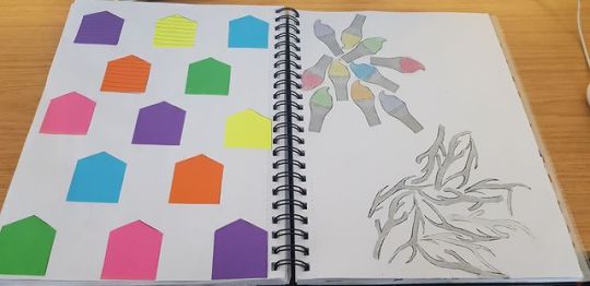
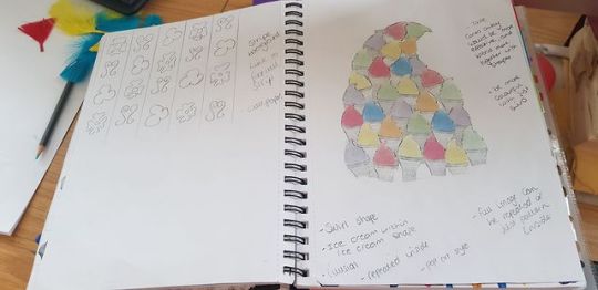
Pattern ideas
I took the shapes in which i illustrated and combined them together to make random repeat patterns to figure out the structure for each one. I experimented with a different technique to colour for each one. Ice cream i tried with chalk as you could easily blend them together, which gave the fluffy soft effect as ice cream does, choosing different colours keeping with the colour palette which i chose for most colours in which are featured around the town of Hartlepool. The house cabins are the same colours which represented to them at Seaton, being in bright neon colours so they are eye catching and stand out. The Middleton grange logo fit together, and was able to be rotated, if i was to further develop this i would of combined it together with the ship i drew early because the pattern itself looks like waves of the sea and would make a clear link to the beaches which people had mentioned in my research.
The layout of the patterns i chose were random or checkered board structured as i thought these were the easiest two to be able to create a complete repeat pattern. being able to flip/rotate the images around to piece together.
0 notes
Photo

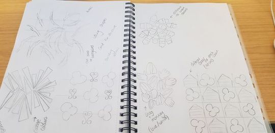
Shape Illustrations
As i took photographs around Hartlepool, i picked the main parts of each photo on what i liked and drew them in illustration style with just basic detail wanting to keep them simple so they would be easy to make a pattern with. I figured just creating the outline of the images allowed me to change the colours and would stand out instead of getting too lost in the details. Having just the illustration wasn’t very effective as it was just one colour and the outline was too thin so it wouldn’t really stand out on anything.
0 notes
Photo
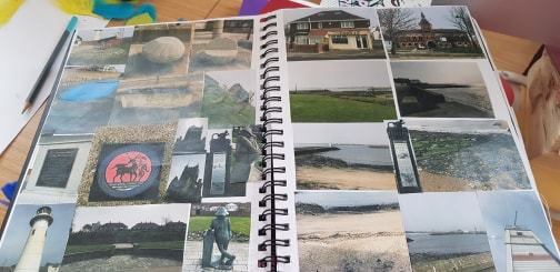
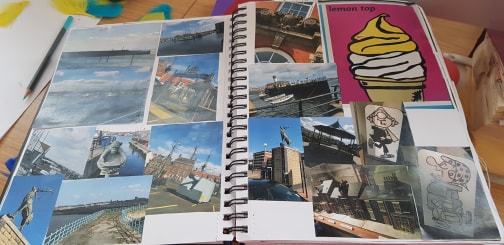

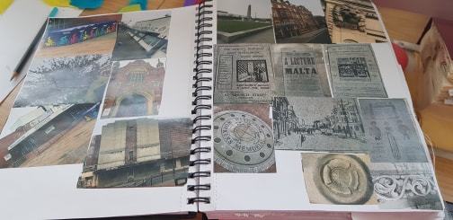
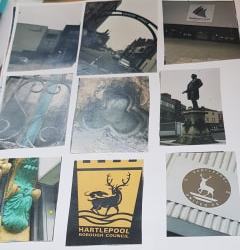
Hartlepool
Going from the Facebook comments from the public of Hartlepool, i went around different places of Hartlepool after making a list of what the people had commented. I took this into consideration as i tried to take a photo of each object. Headland, Seaton, Church Street, Town Centre were the main areas in which people had the fondest memories of. I got a variety of photographs, and close ups of the details in various architecture.
0 notes