
Statistics
We looked inside some of the posts by lyssasmit and here's what we found interesting.
Average Info
Notes Per Post
0
Likes Per Post
0
Reblog Per Post
0
Reply Per Post
0
Time Between Posts
2 days
Number of Posts By Type
Text
17
Last Seen Tumblr Blogs


Fun Fact
In Q3 of 2020, 31% of US users access the Tumblr app daily.
Text
Closing Statement
I don't know how to put the feelings I have about the end of this class into words. I enjoy it so much that I feel sad its over. I loved the routine of this class and how it was structured. There were hardly any miscommunications about projects and that was because Professor Kaplan would walk around the room each class and make sure that everyone's questions were answered which was so helpful. Sometimes it can be intimidating to ask what may seem like a simple question so having the professor intentionally walk around really helped. I like how there was always something to work on and that we could switch between projects to mix it up during class. The environment of our class was calm and I always appreciated the interest we took in each other's projects during critiques. I want to thank Professor Kaplan for being so patient and kind to us during class and for always encouraging our ideas and work. Overall, I will miss this class and am incredible thankful for the experience.
0 notes
Text
Fun pics I took while working on the Collage Article Header… obviously my preferred way to work is with a snack and a fun drink… while working on my beverage project. Cheers!


0 notes
Text
Collage Article Header / Color Analysis
This final project is my favorite one yet (and that's not because I prefer to work in a digital medium). I did two versions because I wanted to experiment with different styles. I'm very happy with how they both turned out. The second version could have been pushed further but I also feel like I could've worked on this forever and would have loved every tiny little change so the decision making side of me had to say that it was done for the sake of time and sanity. I particularly like the color palette and branding that the original image brought that made my collages visually intriguing. I think it's funny how apparent it is when someone is passionate about their project and their strengths come through. That's what I felt this project was for me and I think that was shown in class feedback I received during critique and made me feel very validated in my skillset and that I'm on the right path. Overall, Im very happy to be ending on a high note.

Original Article

Color Analysis


Version 1 & 2


Mockup Versions

0 notes
Text
Outside Influences... (Cont.)
The work of Gustav Klimt as absolutely gorgeous to me and reminds me so much of my grandma. She must've had a sort of replica or similar artwork in her home when I was a child. Im inspired by the color palette and use of shape and composition.

0 notes
Text
Outside Influences... (Cont.)
As we work on our collage projects, I have been inspired by the work of Eileen Agar. Her artworks are very... "out there" and contain beautiful colors. Each piece contains intricate patterns and dominant shapes. I'm going to try and implement some of her style into my project even though it would be difficult to do her justice.


0 notes
Text
Outside Influences... (Cont.)
In my art history class we are discussing the Fauve art movement and I find myself to be even more influenced by Matisse and André Derain. I've already talked about Matisse based on the podcast we listened to but learning about him in an art history setting has given me more knowledge into his works. I additionally find Derain's color palettes to be extremely visually intriguing. I particularly like the portraits they did of each other. I would eventually like to do a project inspired by the color choices of Matisse and Derain.


0 notes
Text
"Outside of class influences. Anything you found interesting that is influencing your personal work and/or career goals."
Throughout this class we have been shown and discussed many artists which has been super helpful to become familiar with different sorts of artistic styles and color preferences. Two that will stick with me and inspire me the most are Henri Matisse and Helen Frankenthaler.
After listening to the podcast about Matisse's, Red Studio, I have been inspired to ask question about my work and the work of others and feel that is it ok to be curious about a piece. I believe that discussing art with fellow classmates and artists can spark inspiration where we didn't even know inspiration lied.
My research presentation on Helen Frankenthaler was one of my favorite assignments at SCAD so far. I really loved the process of getting familiar with an artist from scratch. I had never heard of her before but learning about her career from start to finish was so beautiful. I also found that putting together the presentation of her artwork was very therapeutic and allowed me to study her work within my own space.
I will continue to look for outside influences because I didn't realize this was part of the journal rubric until recently but want to continue to add to the list.
0 notes
Text


Exercise #5: Emotions in Color!
The emotions I chose were serenity and excitement. I wanted to embody both these emotions by using fluid shapes and color palettes inspired by graphics I included. Loved this assignment… probably one of my most successful painting projects yet!
0 notes
Text
Albers Reading
My takeaway from this reading is that Albers is kind of sassy. The interview style writing was interesting to read and I enjoyed it more than I anticipated I would. I think it's interesting that Albers says "I would like to realize myself." I have never thought about art as a way to self realization, but it completely makes sense. I've always thought of it more as self expression than self realization but I guess it would be hard to express without realizing what to express. That's a mouthful. Albers seems to be a slightly mysterious man and answers in short responses that could be very iconic quotes, even though the meaning is hard to piece together. Here are a few of the quotes I wrote down in my notes that I found complex and thought provoking:
"Abstraction is nearer to my heart. I prefer to see with eyes closed."
"One plus one is two, but in art it can be three."
"Every color goes with every other color if the quantities are right."
As usual, I enjoyed this reading and love to expand my artist recognition.
0 notes
Text


Final Book Covers! I'm happy with how they turned out and my favorite it the triad color scheme. Bear Flag forever <3
0 notes
Text


Book Cover Process…
The color aid portion was the most frustrating part for me… Not have enough of the same color was the more difficult part but I was very happy with the painted portion. I did not finish the monochrome version because of my self sabotaging time management but once I do I’ll upload the final product.
0 notes
Text
Research Presentation:
I LOVED working on my research project. I felt so thankful that I chose Helen Frankenthaler as my subject. Her artwork is incredible and I felt so lucky to learn about it and create a presentation that focused on her art over everything else. I wish that I could commission her to create a piece for my bedroom even though it probably would’ve been the size of my wall. Her use of color is incredible and provokes so many emotions each time the paintings are viewed. One day I’ll be able to say that Helen taught me how to break all the rules.
0 notes
Text


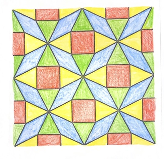
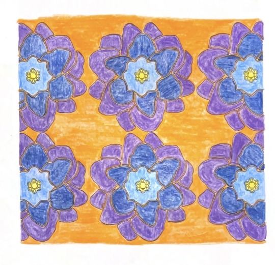
Exercise 4: Non-proportional Color
The process of the assignment was very satisfying to me. The only frustrating element was that I could not photograph the flower to get the colors I was seeing in real life. I felt like I wasn’t doing the flower justice… it was so beautiful and the colors ranged through a variety of pinks. I also wish that my painting was a bit smoother but I really love the design I created. Overall experience 8/10. Love it!
0 notes
Text


I enjoyed the bezold exercise so much. I thought it was extremely therapeutic and used the time to listen to an audio book while completing the assignment. I felt accomplished by the end of it.
0 notes
Text


Here is a much needed Tumblr update!
I turned in the Pixels project and was overall not happy with the outcome but was proud of myself for challenging the mediums I’m used to working with. The yarn did not cooperate the way I thought it was and my methods for glueing down the string were unsuccessful. I also didn’t like how there was no ability to mix colors so it was more of a color block than a recreation. I decided that this became more of a study on color and form in space than any work of art I had hoped for. I decided to change my color wheel because my initial idea also did not work out how I had hoped it would which was frustrating because I was very excited about it. Overall, Im not proud of the execution but I’m glad I completed the project and challenged myself.
0 notes
Text
The Elements of Color - Johannes Itten
The math in art regarding color combinations can get complicated fast. I would be lying if I said that I understood the reading after reading it just one time. I was able to relate what I read and understood to my research of Helen Frankenthaler which I really enjoyed. I feel as if I could learn something new every time I read it. What I found interesting initially was the breakdown of the types of contrast.
Types of Contrast:
Contrast of hue
Light - dark contrast
Cold - warm contrast
Complementary contrast
Simultaneous contrast
Contrast of saturation
Contrast of extension
This automatically showed me the many different types of combinations that can be made to create dynamic work. I found it to be overwhelming initially but I believe the figures and examples help a lot. Another thing that caught my attention was the discussion about how to work with gray especially since we spent a class creating different grays with various colors in our kit. "Any color will instantly transform gray from its neutral achromatic state to a complimentary color effect corresponding mathematically to the activating color. Gray depends on its neighbors to give it life." This is good to know considering that the use of gray can sometimes feels too forced or completely unintentional. Another thing to note is that the distance between colors highlight what type of contrast is being aimed towards. It's fascinating to me to think about all the ways that color interact with one another without the viewer consciously realizing. I look forward to continuing my exploration of color throughout my career.
0 notes
Text
David Zwirner Podcast - Mattisse
This podcast was very interesting to me because it can sometimes be hard to listen to artists speak. I think a lot of time there is a sense of trying to grasp these huge concepts using bog words and putting more meaning into something that is necessary. Although I understand the concept, I can't say I resonate with everything that is being said. I didn't know that there was so much discussion about The Red Studio. I found the question about knowing when a piece is done to be very interesting. As a student, it can be hard to determine how much work/time to put into a project without devoting every waking moment to it. I like what the first speaker said about how if the artwork is still in his vicinity, it is in art limbo until the deadline hits or it is put into the world in one way or another. I've never heard anyone speak about this and found it very comforting. I really enjoy the concept of this podcast where we hear the phone call and have this sort of over the phone interview. It's interesting to think about how whether Matisse decided to paint the painting red on a whim or if it was premeditated. It blows my mind how detailed and analyzed we can get into our work and the work of others. I wonder if artists have started to put more description and intentionality into their artist statements because of these types of situation. I personally love this painting because it reminds me of something that my very artistic and creative grandmother would have had in her house.
0 notes