
Don't wanna be here? Send us removal request.
Statistics
We looked inside some of the posts by makeahillterm1 and here's what we found interesting.
Average Info
Notes Per Post
25
Likes Per Post
8
Reblog Per Post
17
Reply Per Post
0
Time Between Posts
2 days
Number of Posts By Type
Text
17
Last Seen Tumblr Blogs


Fun Fact
Tumblr has 16.74 million mobile monthly users in the US.
Text
This term was a real eye opener for me. I learned how to use so many new media's, I've picked up many new skills that I can apply into my future work.
I've managed to figure out how to use new compute software such as: Photoshop, Premiere Pro and After Effects. Being able to navigate such programmes will prove very helpful during future projects.
Not only have I improved digitally bit I've also improved in using traditional media's especially in the area of creating concept sheets. I feel like my presentation on the page as well as my overall planning skills have massively improved.
Most importantly I discovered my favourite media; sculpey. Being able to navigate my strong points might be the greatest lesson I've learned from this term. I've managed to create a sculpture that I'm massively proud of, not only this but I have discovered a new media which I'm naturally comfortable working with. This skill is fundamental for me as id love to develop in skill and dabble in the world of sculpting.
I've practised with wood works but I feel like this is definitely my weakness. It's also good to pin point weaknesses and im glad I have discovered so. I can either work on my wood work skills or stay clear of it all together. I'm sure one day I'll give it another try.
I've also improved on artist analysis but even more importantly I've improved critiquing my own work.
This term has provided me with many new skills and alot more knolage that I can work on now in order to push myself and improve even further.
Final Evaluation
2 notes
·
View notes
Text
This is my final trailer.
I'm very happy with the outcome now that I've made some minor tweaks. I colour graded some cuts in an attempt to create an orderly and consistent flow between shots for example I darkened the daytime shots to avoid extreme contrast with the remaining shots.
I've now also added a title which im not the most satisfied with, I like the movment and design of the title card I just don't see the creativity in its actual name.
All in all id say it's pretty good.
Trailer link: https://youtu.be/DzvaRX-WOPk
1 note
·
View note
Text
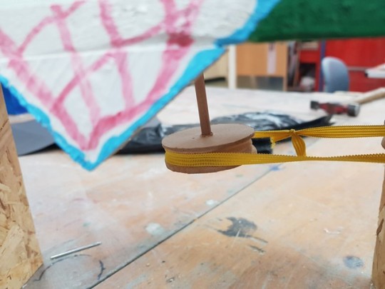
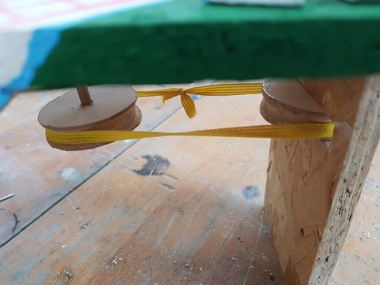
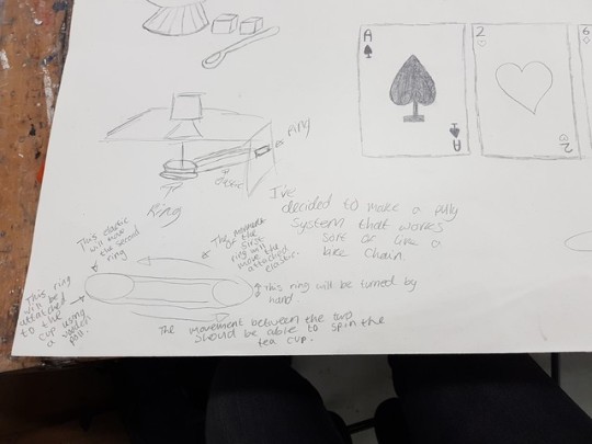
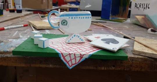
Once all my components were put together I started to work on the mechanism and I had a very difficult time trying to figure this out.
I started off by using the cog method that I ended up using in the end. I cut a ring out of wood out I hollowed it out around its perimeter and I did this to another one also. I then cut a slot in the side of the box. I attached a wooden stick to the teacup without using a washer and then untited the two cogs using a rubber band. This didn't work as the rubber band was way too grippy and I think that the friction of the teacup on the surface it was sitting on stop it from being able to spin so I had to change my method. I thought about just using two disks on two different pieces wooden dowel to use one friction to be able to rotate one another but this also didn't work.
I went back to my cog method and I added a washer in between the teacup and the surface in which it had contact with before hhand to stop the friction but doing this made my teacup sit wonky causing it to kept hitting the side of the playing cards so I had to reposition them.
Then instead of using an elastic band I took a mask used to cover your mouth and nose while dealing with plaster or resin and I cut off a part of that as it's made of fabric so it's less stretchy but still has enough grip to be able to pull the two cogs around, it's hard to explain but this did end up working.
However, the elastic I used kept slipping out of the grooves in both disks so I had to make the grooves deeper yet the elastic still kept slipping out and I think that's because my two disks aren't perfectly aligned but I am unable to align them perfectly because the stick which is coming through the top of the box is at an angle rather than being straight so the cog is always slightly wonky.
The mechanism does work you just got to be very slow with it otherwise the elastic will slip out of the cogs.

2 notes
·
View notes
Text
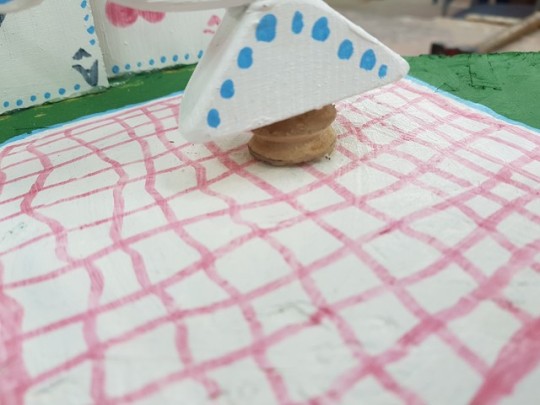
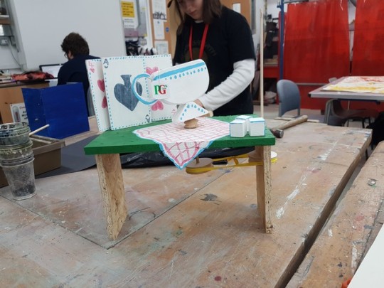
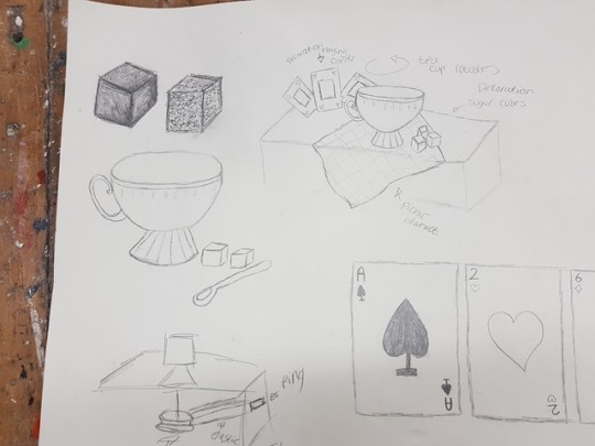
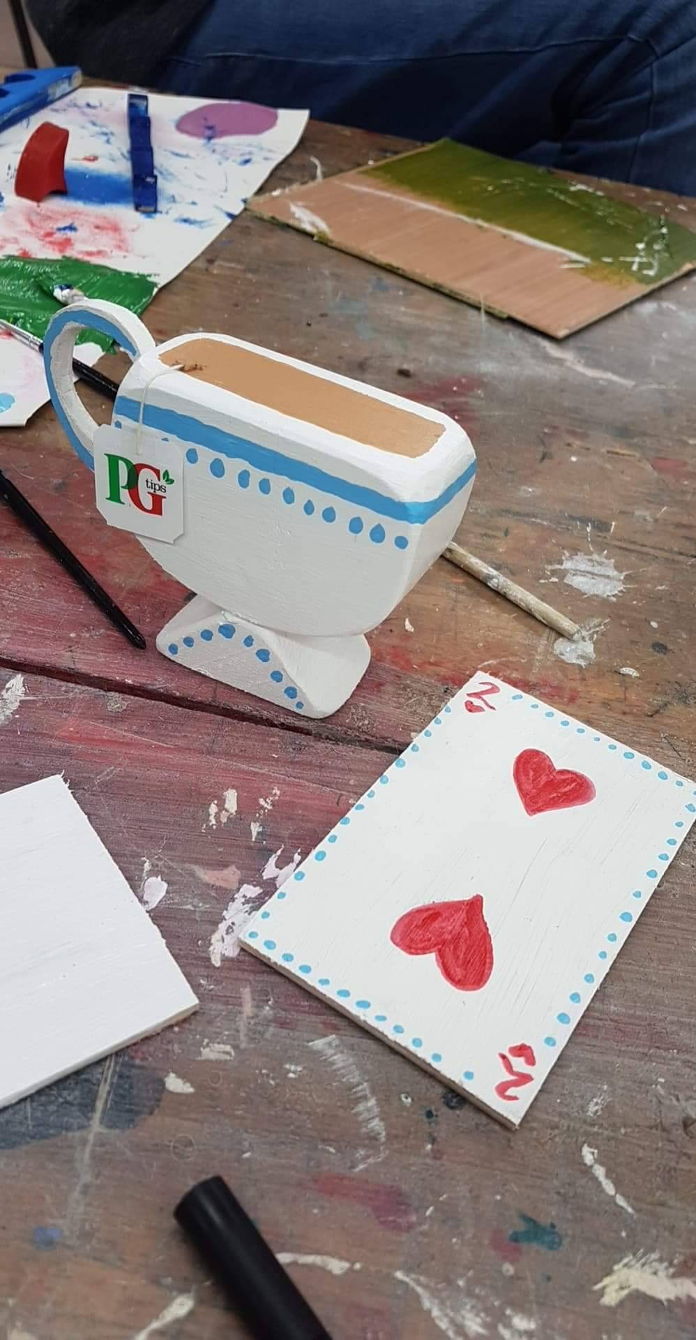
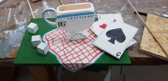
Once all of my wooden pieces were sanded, shaped and ready to be put together I painted everything.
I decided to use a very limited colour palette of white, baby blue,red and green. I chose to do this so that everything look very cohesive.
I wanted to keep everything very simple including the pain job because the woodblock shapes are very simple and I thought that the colours should compliment the simplistic aesthetic of this piece.
I decided to change the types of playing cards that i had originally planned to do. Before, I had a hearts, a diamonds and an ace but I decided to do 2 heart cards and 1 Ace card instead.
I got a PG Tips tea bag string and added it to my teacup because it was red and green so it would go with my colour schemes. I think that that little detail completely tops everything off.
I really like the fact that I managed to make the tablecloth look like it's drapping over the side of the box rather than just being flat and stopping, looking very unnatural. I like how I use the light blue on the sugar cubes to bring out some of the edges; I don't think it looks realistic in the slightest but I feel like it does give it that cartoony edge which fits with the aesthetic of all the other elements within this toy.
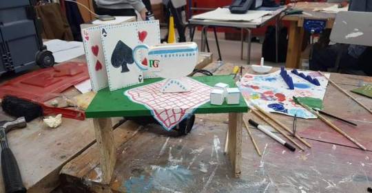
After painting it I put it together and I kept the bottom half un-painted and kept just the top section painted which displays the moving teacup. I also decided to change the way that the legs of the box sit, instead of being sideways I put them up right and I think it does resemble a dining table.
I put the sugar cubes to one side and I placed the cards in the background then i tried to place the cup in the centre of where the cloth is placed.
All in all I do like the outcome of the decoration, displacement, paint job and the shaping of the wood.
2 notes
·
View notes
Text
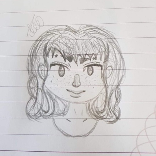
This is just a sketch displaying my experimental art style. I still haven't found my signature style but I can feel it's slowly developing.
2 notes
·
View notes
Text
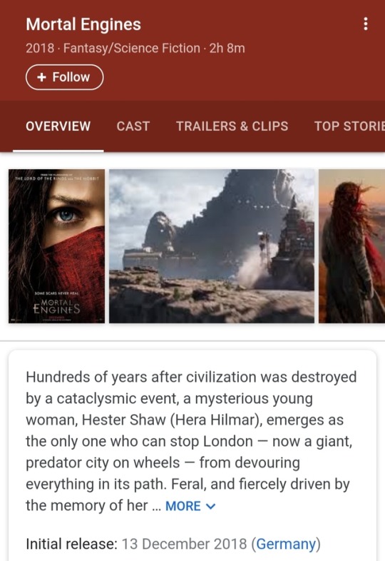
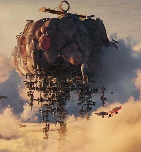
Yesterday I went to see Mortal Engines in the cinema and I was slightly let down.
I think that the aesthetic and the visuals for this movie were incredible. I feel like it really resembled the theme and look that I envisioned for this term and it's title before even watching the film; very mechanical and surreal, quite steampunk and as if all of the buildings, machines and so on were kind of piece together using old scraps that were found in wreckages.
I liked how they used parts of famous landmarks that are well known and use those pieces in a completely different way one thousand years into the future. Such as this transport wheel seen in the movie which takes people from the top of London to the bottom, it's actually the frame of the London Eye.
I liked how they displayed current culture, the Minions were seen as treasures almost and I appreciate the fact that they used current models of cell phones as Museum displays. Tom Natsworthy finds a toaster and believes it to be a rare ancient artefact.
I also liked the use of the repetitive shots of Hester Shaw's face it's the advertisement poster for this movie, that shot was effective when used multiple times in the beginning before her character is and face were revealed.
However I did not like how rushed this movie seemed. Most of the scenes were just fight scenes. There were a lot of skipped parts that simply just left you confused. I feel like the result of events in this movie just raise more questions. It didn't flow nicely, there were missing gaps in story and it was just fight scene after fight scene after fight seen.
A lot of reasoning was missed out and I feel like if this movie was a trilogy and was allowed more time to be able to build up the storyline and build up the characters so we could build a connection with them and there was more scenes that just fight scenes I think that this movie could have been a lot better.
1 note
·
View note
Text
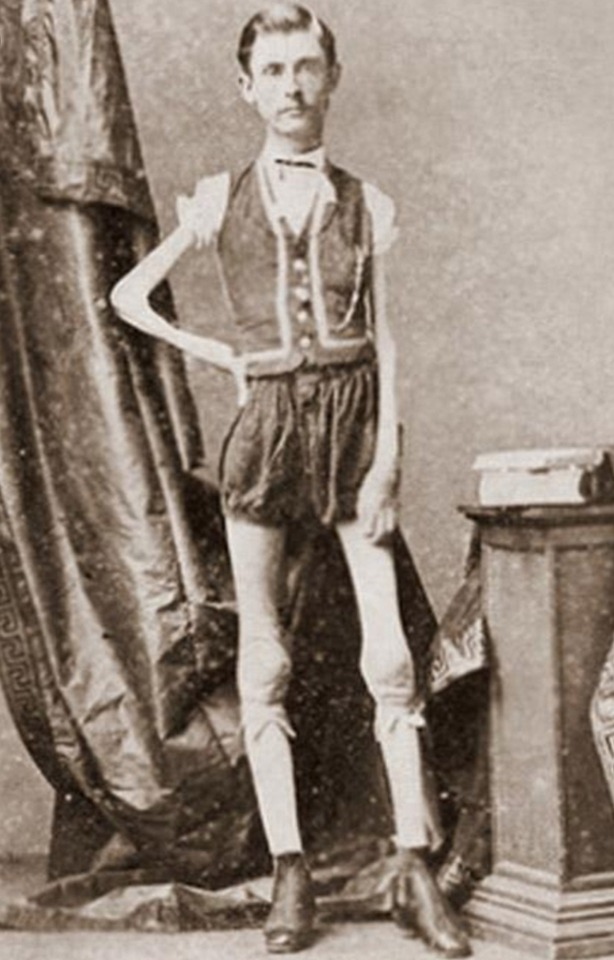
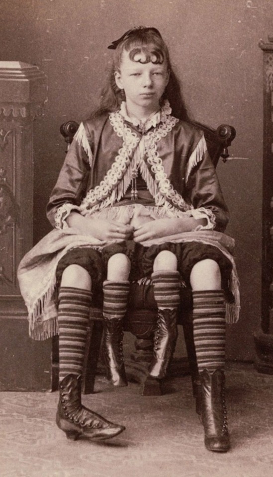
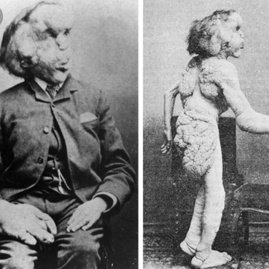
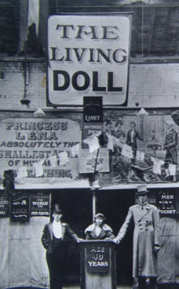
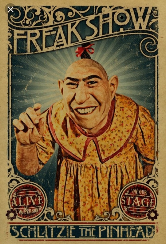
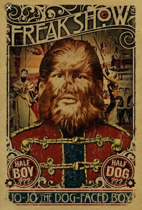
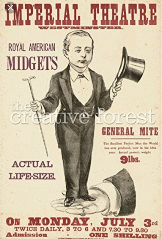
I did some research on the infamous Freak Shows from the 19th century.
They were massive thing back in the 19th century since there wasn't any television, Wi-Fi or anything else to really entertain so people would go out of their ways to find things out of the ordinary in order to fulfill their boredom and receive the entertainment that they crave so dearly.
They would look at deformed figures and was get joyman out of the viewing.
There are now many TV shows and characters inspired by some of the famous performers from the Freak Shows of the 19th century.
Sometime, founders of these Freak Shows would also provide shelters and food, they would care for the performers and also provide them a career by letting them be part of the act so, although these people were being exploited for having either mental or most commonly a physical disability, the performers were still gaining from being exploited and nany prefered the show life to regular living.
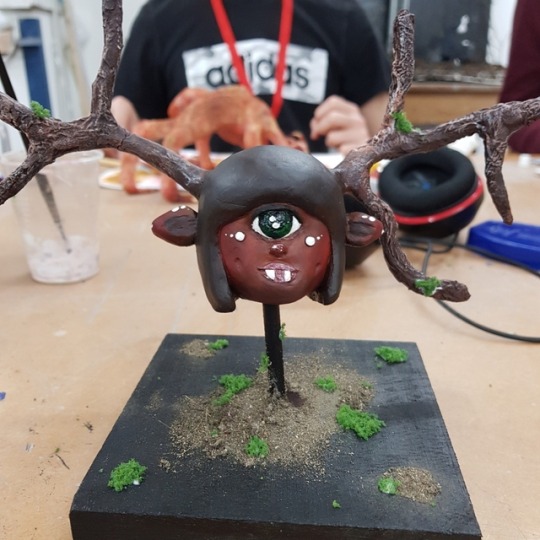
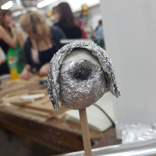
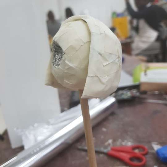
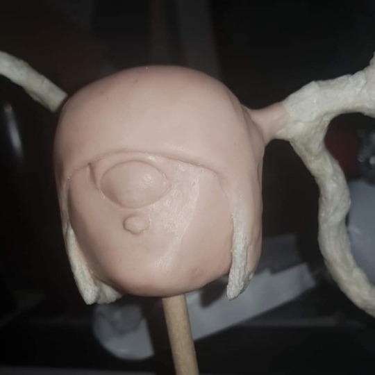
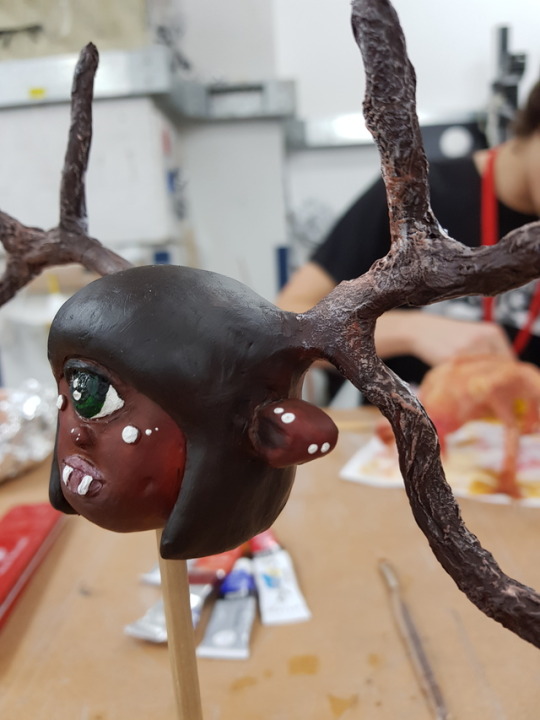
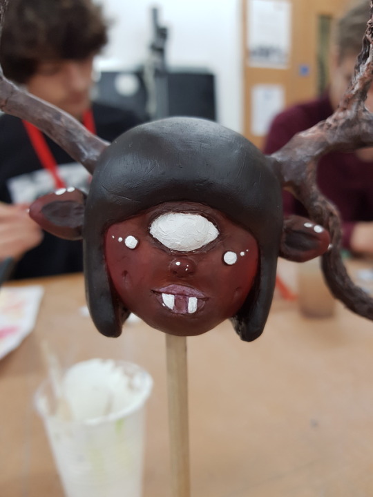
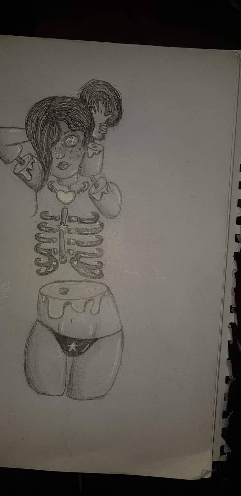
I took inspiration from the Freak Show as that was our title. That is how I came up with the concept for my model, my creation of cyclops cross dear cross human hybrid.
1 note
·
View note


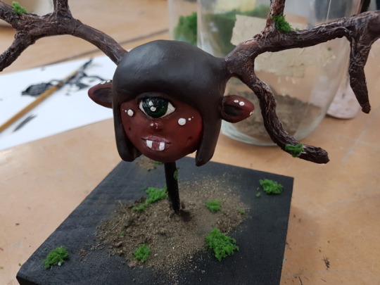
Text
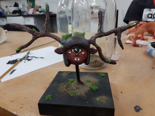
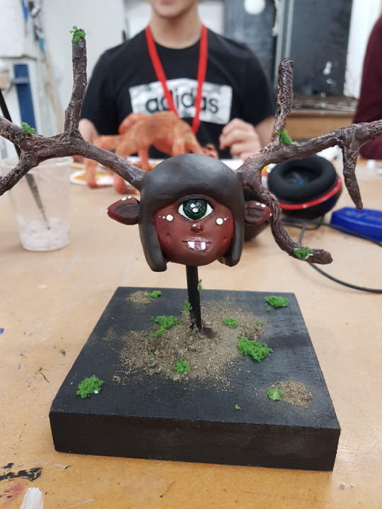
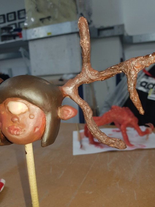
I chose to make the base all black so that it would contrast with the whole of the model.
I wanted to add the green moss and brown dirt on to the base for the obvious reason that I've been giving throughout all of my model progression posts, to go with the browns and the greens of nature and so that the stand and the model have the same colour palette.
I then bought the moss up the pole slightly and put some of the moss onto the antlers to tie everything together.
Not only that, but the placement of the dirt and the moss on the base is in a pattern.
I really do like the outcome of this model. I didn't think that I would be too good at using sculpey but for my first try I think that this was a pretty good attempt.

2 notes
·
View notes
Text
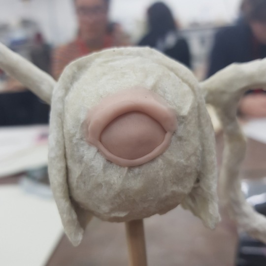
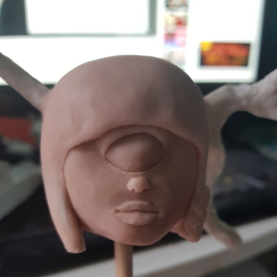
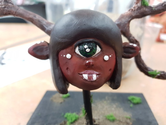
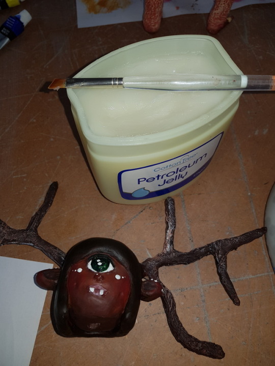
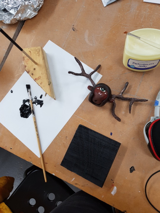
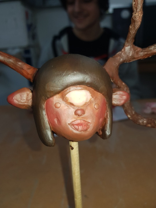
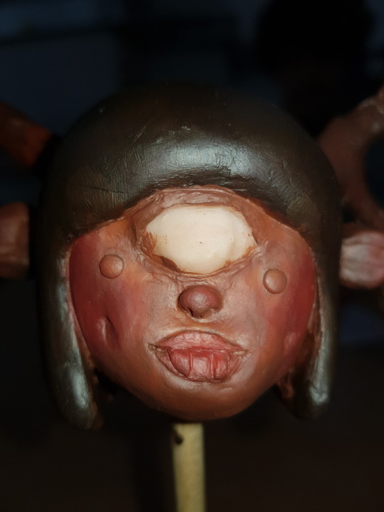
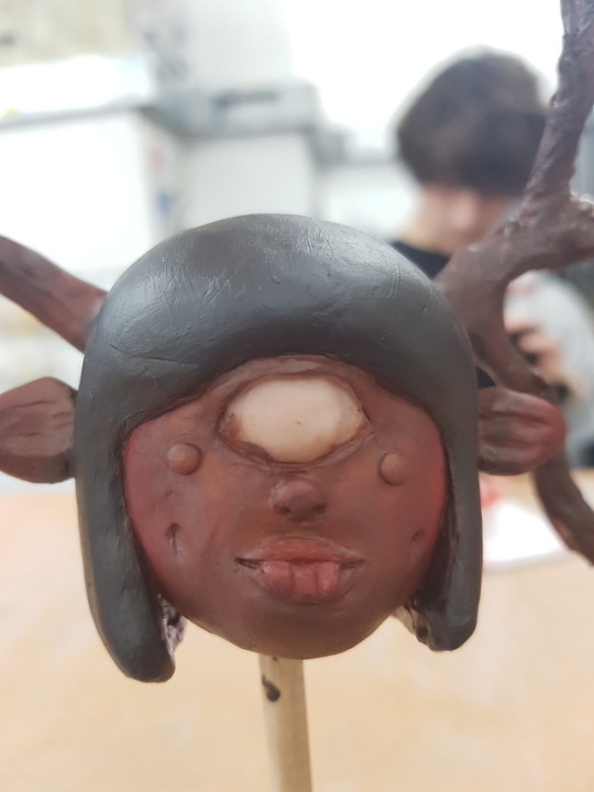
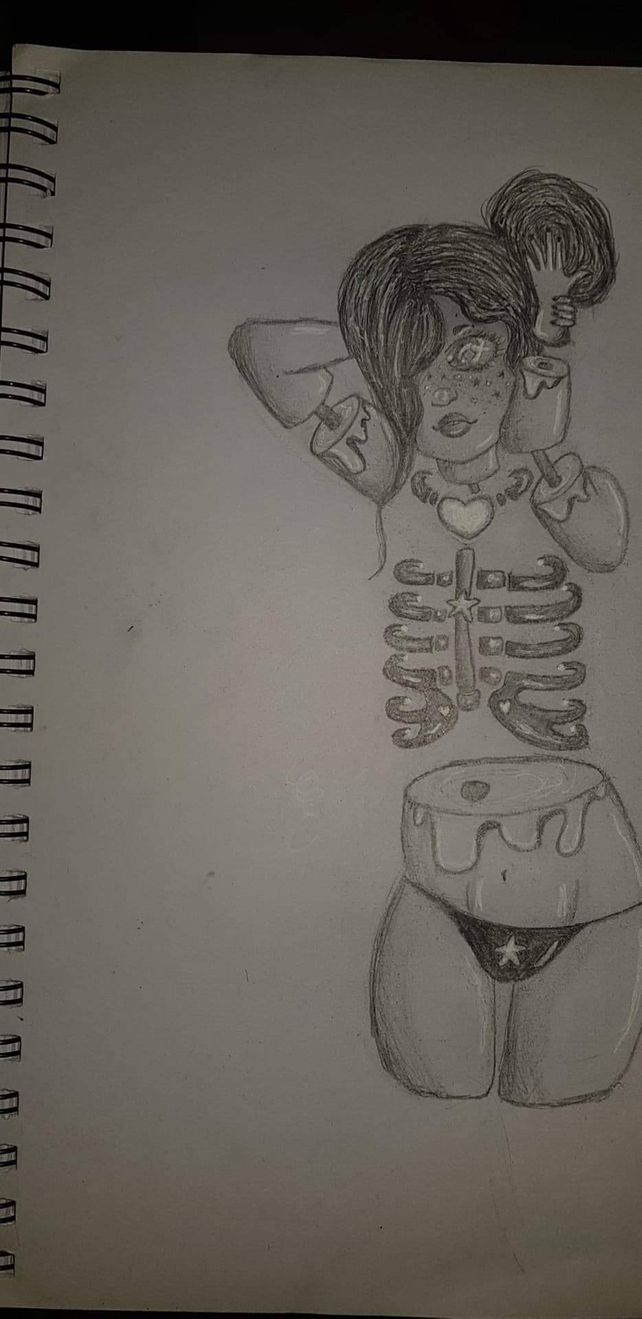
I then added the final details such as glossing the eye and lips using some petroleum jelly and making the stand that she will be presented on.
1 note
·
View note
Text
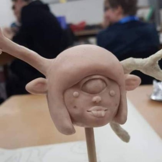
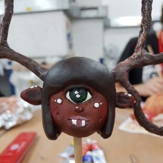
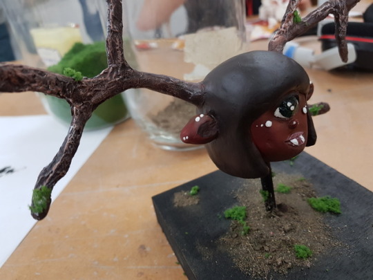
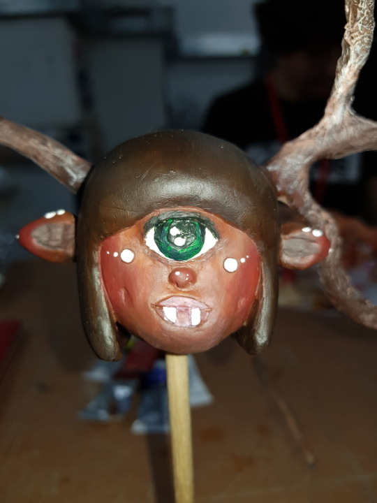
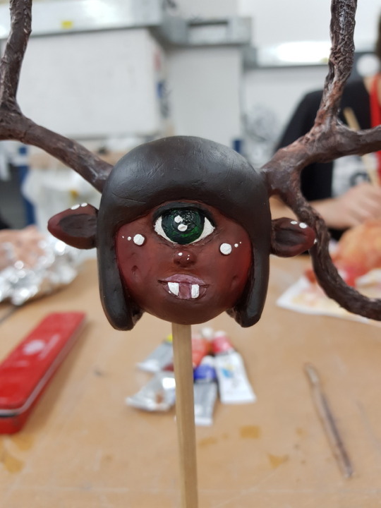
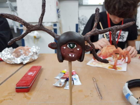
Once I had almost everything painted I started painting the last and most vital detail which was the eye.
I wanted it to be green to contrast with the deep brown skin tone and dark brown hair yet still resemble nature; her antlers look like branches, her face is brown almost like the bark of a tree and her eyes green like leafs. The same brown of a deer can be used for human skin tone.
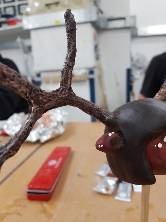
I use no black in the eye, just dark green for the pupil, light green for the iris and then the dark green again to add details to the iris. I then added the white shine to tie it in the white marks on her face as well as also dry brushing the antlers with a touch of white paint over the top of the brown so that it would bring the whole piece together to look more cohesive.
1 note
·
View note
Text
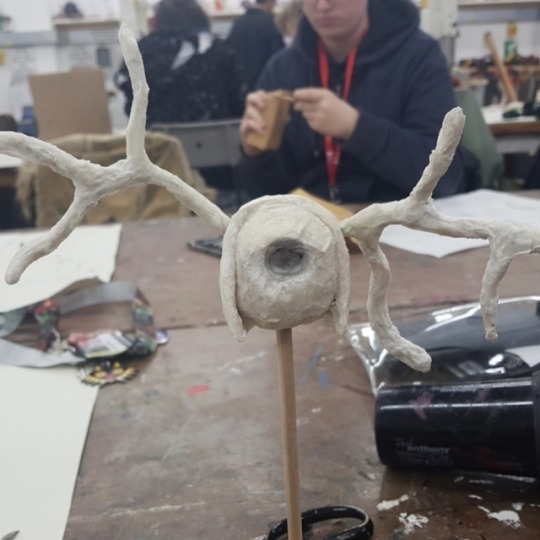
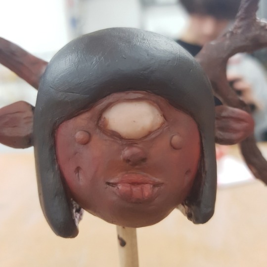
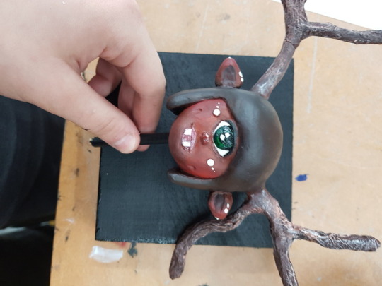
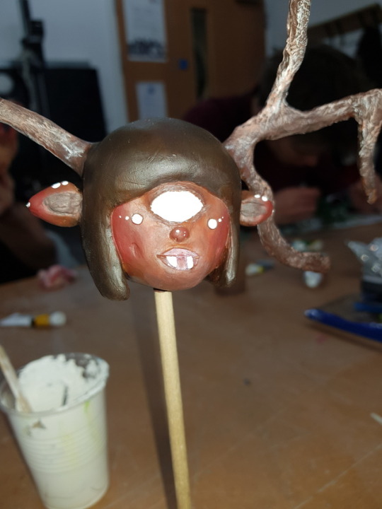
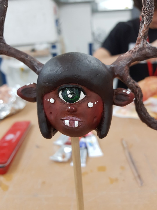
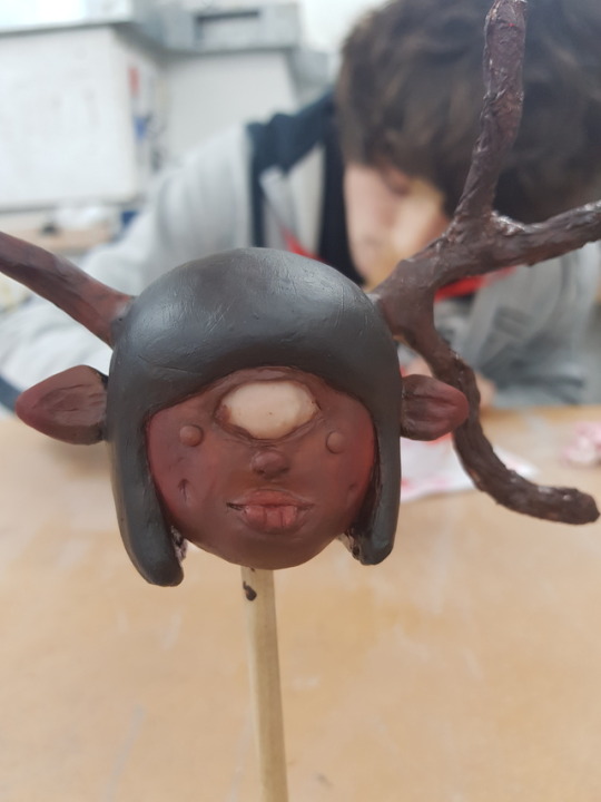
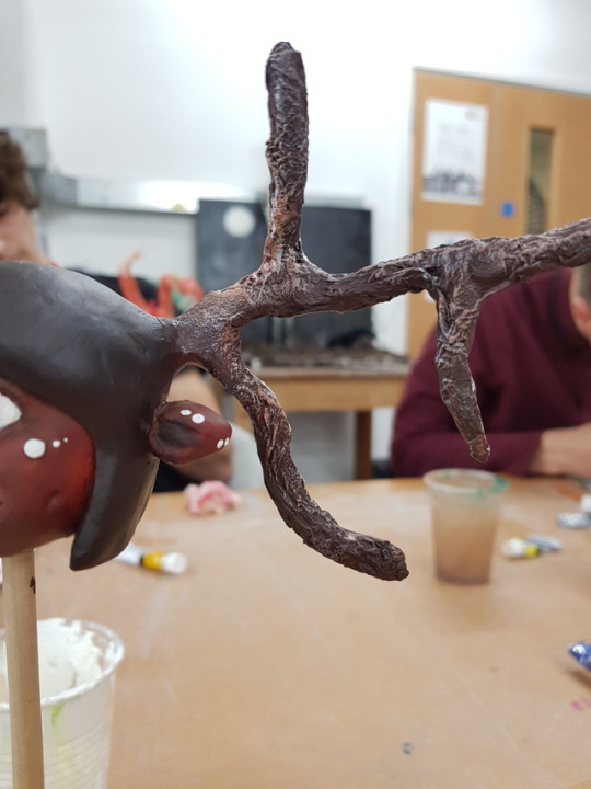
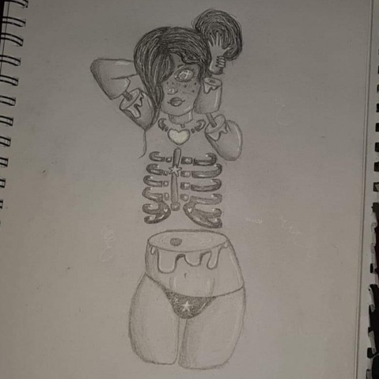
After I got my sculpture looking how I wanted it with the facial structure that I desired and the smoothness that I wanted I decided to bake it to save my progress.
Once it was baked and the sculpey was set in place I begin to paint as displayed in the photos.
I decided to go with very neutral brown tones as I felt that this colour palette would go with the natural theme of the deer and I wanted to keep to a colour palette which could fit both a human and a deer to unite the two composing mammals seamlessly into one creature without it looking to unnatural in an odd kind of way.
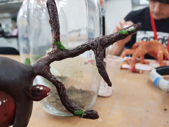
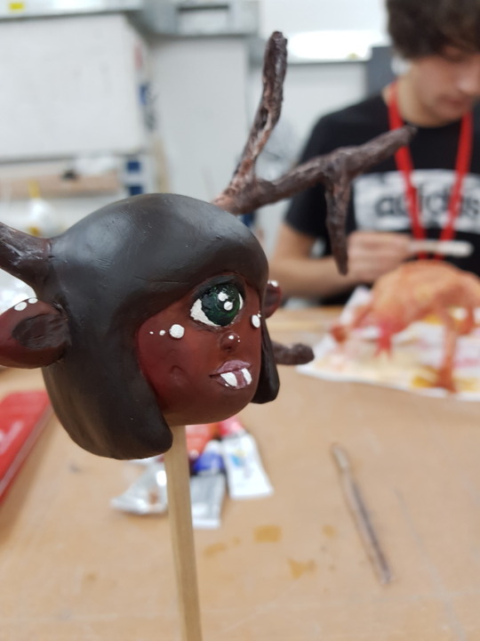
When it came to the antlers I did not want to cover them in sculpey as I thought that using a dry brushing technique with the acrylic paint over a hardened paper mache would look much more organic than me having to carve out the antlers with sculpey I can just use what I already had in a more sufficient way.
I did not want use a single bit of black on my actual sculpture as I wanted to keep it all neutral browns and other earthy kind of colours. I thought that using black anywhere on the face or antlers would overpower the piece and I wanted to keep it earthy, whenever I wanted a black I would just use a very dark brown instead to keep it natural.
Once I was happy with the skin tone, hair colour and the antlers I started painting on the white details to add contrast and to act as the markings that deers would have. I also started to paint the eye bright white as well.

1 note
·
View note
Text
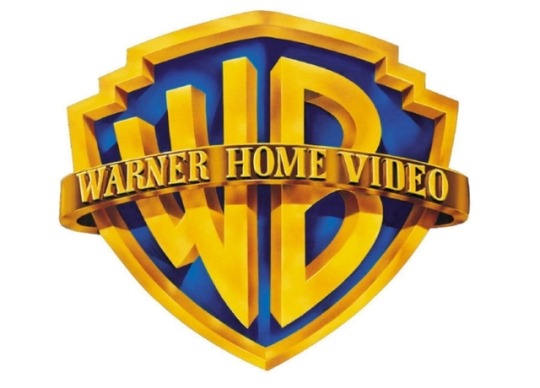
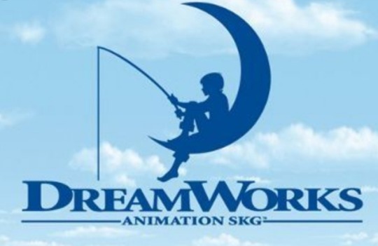
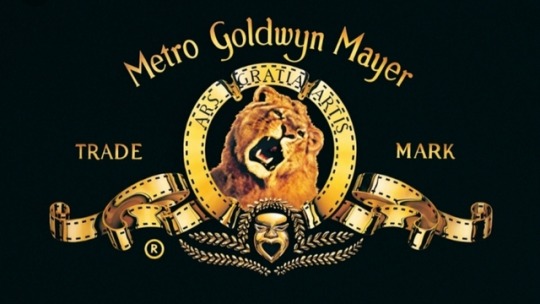
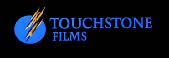
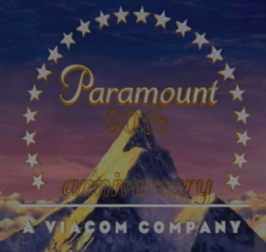
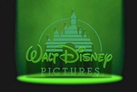
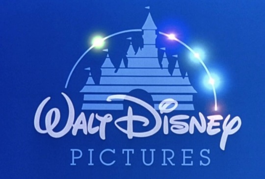
These are some examples of famous movie studio logos.
I wanted to display these specific logos and speak about them as they vary between very simplistic and very complex yet they are all extremely recognisable.
Take Disney for example, the Iconic logo is ofcourse the Castle but they are able to change the appearance of the Castle whether that be colour or adding and element from the movie into the logo so that is fits that specific movie. Even more famous for this is Warner Bros who can change their logo entirely to fit the movie in which it is featured in to set a certain kind of scene and atmosphere for the following movie.
I chose to include TouchStone Films as I believe the logo is more rememberable than the name of the company itself, it always seems familiar but I can never place a name unlike Walt Disney, Paramount and DreamWorks which are unforgettable names to me.
To me DreamWorks is so iconic that when I see a crescent moon it reminds me of the DreamWorks logo every time.
I've taken inspiration from the more simplistic logos as I feel like having something less complex during my trailer will complement the flashing imagery and gore scenes in which my trailer includes.


1 note
·
View note
Text
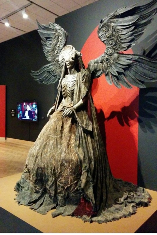
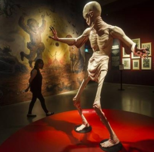
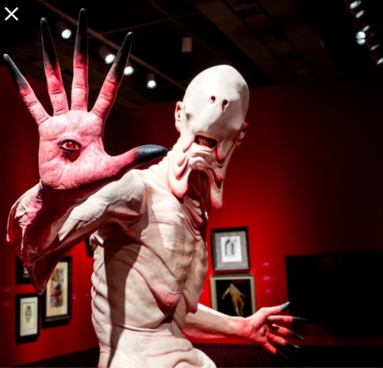
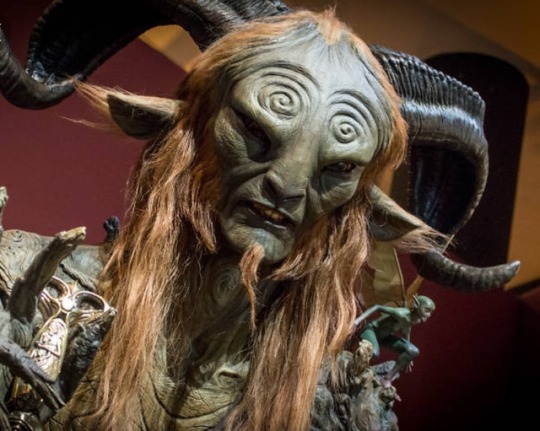
Guilemero Del Toro is an artist known for his rolls in development, concepts and character designs for famous movies.
He doesn't create any of his pieces in reality but rather designs them as concept pieces, most of them being rather gruesome and horrific.
He has also worked on many movies and TV series such as: Pan's Labyrinth, The Shape of Water, Trollhunters, Pacific Rim and many others.
Many of his pieces have been transformed into real objects through the art of sculpture (usually characters to have feature in certain movies). Alot of them are very recognisable such as the guy with his eyes embedded into his hands from Pan's Labyrinth.
2 notes
·
View notes
Text
Finished grime/gore piece.
Follow up to a previous progression post.
1 note
·
View note
Text
Frame 1-
I decided to talk about this frame as it displays a very unique camera technique.
You basically pan out on whatever it is that you are focused on while then walking forwards or pan in on something while walking backwards.
In my shot I was panning out while walking forwards.
Using this technique conveys to the audience that something isn't quite right, it gives you that unsettling feeling as this is not usually a motion you see in everyday life it's out of the ordinary.
This tricks the brain into knowing there something wrong.
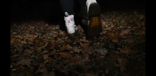
Frame 2-
I chose to talk about this frame because I feel like it's a very creepy part of my trailer.
Courtney is dragging her feet across the floor, you can see she's exhausted from the activity she had done previously.
Ive dones this to show the audience how much she's been willing to go through to commit this murder that she has, shows her dedication which overall makes the footage even more eerie.
I like how the camera is focused on the boots and the leafs in the foreground at first but as Courtney walks and the boots get further away they become more blurry and the focus stays on the leafs in the foreground. I feel like this is a really nice effect.
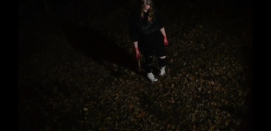
Frame 3-
I want to talk about this frame as I climbed up a tree to get the perfect shot.
I wanted to make sure that the shadow could be seen as it kind of elongates the further she walks away from the back of the trees.
I wanted this shadow to symbolise the growth of the monster within my character. She's killed a person and this monster inside of her has emerged. I wanted the increase of the shadows size to symbolise this in a very subtle way.
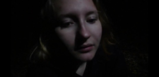
Frame 4-
I chose to talk about this frame as it makes my character seem tired and exhausted just like when the feet was being dragged across the floor.
This frame is out of focus purposely because I felt like the audience not being able to fully see something would bring more fear to them.
I also feel like the lack of focus would look more creepy and add a kinda static look in a weird kind of way.
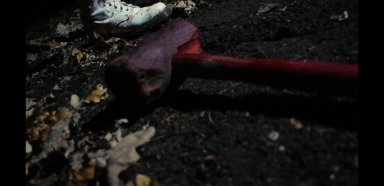
Frame 5-
This is the last frame in my trailer.
It's the hammer, the weapon of choice. You do see it before this particular frame during the trailer but after the music stops you're greeted with this frame of the blood-soaked hammer laying on the floor.
I feel like this creates a minor cliffhanger as to what happens next.
1 note
·
View note