
Don't wanna be here? Send us removal request.
Statistics
We looked inside some of the posts by manarebrahim20195279 and here's what we found interesting.
Average Info
Notes Per Post
104
Likes Per Post
72
Reblog Per Post
9
Reply Per Post
23
Time Between Posts
1 month
Number of Posts By Type
Text
17
Last Seen Tumblr Blogs


Fun Fact
Tumblr posted its first advertisements in May 2012 and subsequently earned $13M in revenue.


Text
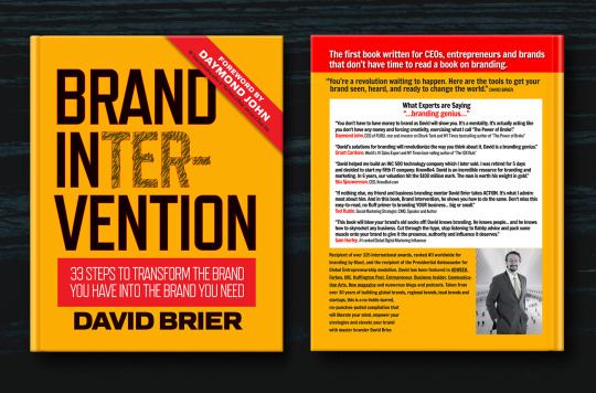


تحليل الكتاب : Brand Intervention
اسم الكتاب: : Brand Intervention
اسم الكاتب :David Brier
عدد الصفحات: 290 Nov 29 2017 :سنة النشر
:الناشر: Dbd International ltd
تلخيص: منار إبراهيم اللوتي
هل رسالة هويتك جذبت العميل في خلال ٨ ثواني؟
سؤال ابتدأه الكاتب في كتابه لمقياس مدى نجاح الهوية من عدمها فلو كان للوقت انسانا لكان أشد ما يغيظه أن يتم استنزافه في الفراغ. فمن هذا المنطلق أتى الكاتب بهذا الكتاب وأراد أن يختزل أفكاره ويختصرها مرهونة بعامل الوقت. لهذا كل مقدمة من فصول الكتاب تحتوي على حكمة من شخص ناجح أو من الكاتب نفسه مرتبطة بمحتوى الفصل.. والذي يتكون من ٣٣ فصل وهم عبارة عن ٣٣ خطوة تقتصر الوقت على القارئ في معرفة الكاملة عن كيفية تحويل الهوية الخاصة به لهوية يحتاجها، أي يعني أن المستهلك يحتاج إليك.
أراد الكاتب أن يجتث المفاهيم التقليدية من جذورها والتي لم تعد تجدي نفعا لهذا الوقت، ليبني مكانها عصرا من الاساليب الجديدة من وجهة نظره والتي تتماشى مع تغير والتطور المستمر في المجال الحالي بناء على خبرته وتجاربه مع العملاء الذي كان له الفضل في نجاحهم. بسبب تميزه في طرقه الخاصة والتي كانت واضحة من الكتاب الذي تفرد بأسلوبه المختلف والذي كان وكأنه يتحدث مع القارئ ويناقشه أي أنه أقرب اليه من علاقة كاتب وقارئ
فبدأها بثلاث خطوات عن كيفية خلق هوية سيئة ومن خلالها يعي القارئ على اجتنابها وهذه رسالة الكتاب وهي أن هناك أساليب عليك إتباعها بالمقابل هناك أساليب أخرى لاجتنابها.
و أصر على أهمية الاختلاف وهي أن تكون مختلفا وكيف أن تصبح مختلف ، كي لا تُحتكر في دائرة الابتذال لأن هو أول قاتل للهوية و باستخدامه كأنك تقوم بالترويج للفئة التي تندرج منها هويتك وليس هويتك في حد ذاتها وهذه تعتبر في نظره من أهم القواعد التي يجب كسرها فهو يحث القارئ على كسر القيود من خلال الإيمان بعدم وجود حدود للأفكار فعلى سبيل المثال قد استذكر عبارة التفكير خار�� الصندوق وكيف ليس انها بالضرورة ان تكون صحيحة فباعتقاده ان يمكنك أن تحول الصندوق لمسرح تقدم فيه أداء يصفق عليه الجمهور بمعنى أن التميز يأتي بكل الطرق
ولكن الأهم هو انجذاب العميل فكلما عاشوا العملاء على التميز كلما زاد صيتك في المجال فالملل هو نهاية قاتلة إلى هويتك وقل بريقها بين المتنافسين.
وفيما جاء عن "القيمة" وكيف لها أن تكون ذات صيت في هذا المجال وذو ثقل بين المنافسين فذكر الكاتب أمثلة تضيف قيمة للهوية وأمثلة تضاد لها تقلل من قيمتها
ومن أهم النصائح التي جاءت في الكتاب أن يجب عليك أن تعكس ثقتك بنفسك في الهوية فمن خلالها تجلب ثقة العميل إليك.
يختتم الكاتب ببعض من تجاربه مع العملاء واستأصل من خلالها المشكلة الكامنة في الهوية بحيث استعرض كل هوية وكيف كان أساس نجاحها واستدل بذلك بشروحات خاصة وكيف انه قام بتطبيق جميع الأساليب التي ذكرها في الكتاب وهذا يوضح مدى أهمية المضمون من خلال النجاح الملموس في ختامه
@uob-funoon
1 note
·
View note

Text
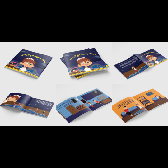
قصة ( رحلة رشود مع الزمن )
جيلُ التطور الإلكتروني والأجهزة الذكية، خلّف تباعد الناسِ عن بعضِهم البعض، و قلّلَ بينهم التواصُل الفعّال.
أثر هذا بشكلٍ ملحوظٍ على الأطفال. صارَ إدمانُ الأجهزةِ أمرًا طبيعيًا، وسيطرة الأبناء و تنفيذ أوامِرهم أمرًا لا مفر مِنه، بل أصبح الأطفال هم المتحكمين في والديهم؛ بدلًا من أن تطاعَ أوامر الآباء صارت أوامر الأبناء هي التي تُنفذ. إضافةً إلى الكلام البذيء غير المسموح التلفظ به حتى مِن فم الكبار، صارَ متداولًا مسموعًا بشكل يومي، وكأنه أمر معتاد، بجانب التنمر، والعنف، والحركات غير اللائقة.
في جانب آخر، حيث العالم الوردي، والحياة المليئة بالحُب، هُناك طفل يسافر عبر الزمن "إلى زمننا الحالي"، ويقرر إنقاذ الأطفال؛ ليخلق جيلًا طيبًا متماسكًا مراعيًا، يُقدّر العائلة والحُب والسلام، ويعرفُ الآداب، وطريقة حياة المجتمع الصحيحة.
مع إشراف الأستاذة: د.سماء الهاشمي
@uob-funoon
9 notes
·
View notes
Text
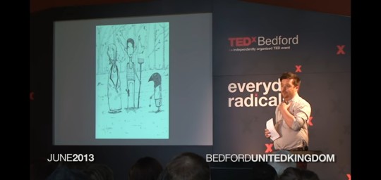
FA222
PROJECT 1 : lecture
David Litchfield is an illustrator who changed his life by the 1 year journey of drawing each day a one drawing. In this lecture he told us about his success story in every step he made.
so he started putting one drawing a day on tumblr and other social media so then he waited for their feedbacks.
After a few weeks he saw there were people started following him and asking him to share other drawings. He was shocked because they weren't his family so that meant people were starting to know him.and there were some people who offered him a job to work with them.
he said there were people always ask him how did he find the time to do this so his answer always will be if you are passions for what you like to do you will even create time for it.
after he finished from this challenge ( 1 year journey of drawing one drawing each day) he ended up with an exhibition for all the drawings he did in that year.
https://youtu.be/nclSb-MlAxo
6 notes
·
View notes
Text

FA222
PROJECT 1 : lecture
Ralph Ammer is a professor at the Munich University of Applied Sciences and teaches biophilic design.
In this lecture, Ralph Ammer began by asking questions that anyone who sends them can think of, and he has allocated the bad ones, for example, is this drawing good or do I have the talent and the worst is this considered art?
"Drawing is not about art "
this is his answer, as he explained that drawing is basically bigger than art, and it is a way of thinking in pictures. and he gave us some examples to be more clear.
In this part, he starts to explain about five ways that will help your virtual thinking.
(The first one was "intuition" )
He explains it and all you have to do is to connect your hands with your eyes by some exercises he has shown in this lecture. which was drawing big circles and then going with the smaller ones until you fill the page. then we just start to do this type of exercise to make space for more intuition visual mindset.
(beauty)
We pay more attention to details. This connects us to our present because the problem is that we draw what we know but we don't draw what we see.
( reflections )
the meaning here is to draw what we can't see like emotions or emotions.
(imagination)
in this way you have to combine two things or more to come up with something and you can combine anything from your life.
(communication)
this is the last way he talked about.here he said words could vanish from your mind but your drawings help them to stick.
and there was something he did and I really like it. He asked the audience to close their eyes and imagine a tree. Then he showed them some examples of what they saw but the trick here he explained to them that everyone differently imagine a kind of tree not similar to others so he showed them that one word could give you a lot of things.
so in the end, (drawing helps you think).
https://youtu.be/ZqlTSCvP-Z0
6 notes
·
View notes
Text

FA222
PROJECT 1 : Detailed critical coverage of exhibitions or events
(Virtual Art Exhibition "The Art of Solitude")
It is the first virtual art exhibition in the Kingdom of Saudi Arabia.
This exhibition enables you to move between the galleries of this exhibition and see the works clearly, but through your device, and this step is wonderful in my opinion.
The exhibition included many galleries, including a gallery called "Portrait of Solitude", a room called "Digital Solitude", and also "Artist Loneliness" and other halls. There was also a hall dedicated to children called "Talents of solitude."
the idea of this gallery is to show you what the Artists created during the protective isolation period.
This exhibition took place on May 8, 2020, in the Kingdom of Saudi Arabia.
https://www.aleqt.com/2020/05/08/article_1823261.html
9 notes
·
View notes
Text
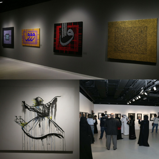
FA222
PROJECT 1 : Detailed critical coverage of exhibitions or events
(Three galleries in Katara)
This event took place in Qatar on March 18, 2018
This event consisted of three art exhibitions, the first exhibition was named "Art and Calligraphy" by the Turkish artist, Murad Karat, the second exhibition was "Tarabot" by the artist Shahida Ahmed, and finally, the last exhibition was "Creative Steps" for a group of students.
The Turkish artist Karat presented nearly 20 paintings, which included Qur’an verses and poems, written with Kufic script in distinctive ways. As for the artist Shahida, the theme of her exhibition was inspired by the “Dervish” or “Mevlevi” dance, and the black and white colors dominated most of the paintings that exceeded There are 25 paintings, and finally, the group of students presented more than 50 artworks.
https://www.alaraby.co.uk/%D8%AB%D9%84%D8%A7%D8%AB%D8%A9-%D9%85%D8%B9%D8%A7%D8%B1%D8%B6-%D9%81%D9%86%D9%8A%D8%A9-%D9%81%D9%8A-%22%D9%83%D8%AA%D8%A7%D8%B1%D8%A7%22
4 notes
·
View notes
Text

FA222
PROJECT 1 : detailed coverage of interview
(Interview 2 with John Baldessari)
john baldessari is an american conceptual artist.
his feild: painting, printmaking, sculpture, installation, photography.
in this interview was talked about the beginning of John Baldessari, about his influences and his career as conceptual artist who also called as the grandmaster of the Los Angeles art scene. moreover the discussed on why he stoped painting and go with conceptual art and he said his reasons.
and also what is his situation with how important the cultural and social of art which was he defence about that.
and as I know before there was a lot of artists got influenced by him such as Cindy Sherman, Catherine Opie and more.and at the same time he got influenced by mantegna.and last thing was, what keeps him still working in this job even though he is in his 80s.
in general i loved the way he thinks and for sure his work. also I got learned from his life and career.
https://youtu.be/unqdRH8trBg
7 notes
·
View notes
Text
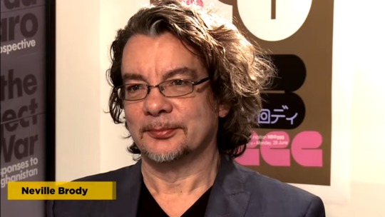
FA222
Project 1: coverage of interview with graphic designer
(Interview 1 with Neville Brody )
The interview was with the English graphic designer Neville Brody. They talked overall about his beginnings & inspirations....his challenges & opportunities..and finally how the graphic designer leaves his mark and how he wants to leave his mark.
""There was never a question for me"" this is his answer to how he decided to become a graphic designer. And his first steps to begin with, is when he joined a small record design agency called "Rocking Russian" in 1979 and that's the same year he came with his first cover design.
He talk about when he when to the lcp and how it caught his attention because it's was saying "anything is possible" and that match his interest in Dadaism & constructivism.
He said that William Burroughs & Brion Gysin were very competitive creative thinkers but that was the kind of work he was trying to get. And also how he always trying to get ideas outside the box.
They also discuss with him on how the graphic designer has more opportunity than before and he said that because of digital media nowadays and how everything being available anytime and anywhere. And to leave your mark you have to create ideas could inspire others and more things he mentioned.
What I like about him is how he treat his job as it's not a job for him so then he can do all he want and not a necessary thing that people should like his work as he said they should be forced to question it.
7 notes
·
View notes
Text
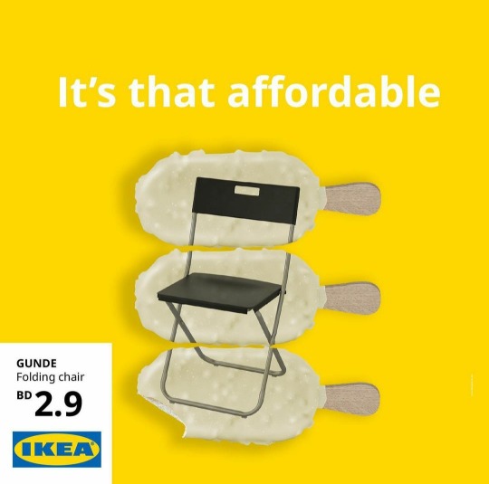
FA222
Project 1 : Ad analysis
Ad 2: IKEA Ad
As you can see in this creative ad for IKEA and it's a very famous brand and I am pretty sure you all know it very well.
in this ad, you can clearly see that it's very attractive and catchy for the eyes because they used the color yellow as we all know all the color yellow is a catchy color so here they used it to gain attention besides its one of their logo's colors.
they used an excellent contrast with the color of the font and the background (yellow and white) to make it more clear and easy to read. and they also used it with the color of ice creams to have similarity in this ad. moreover they also went with the principle repetition with the three ice creams to let the customer know that this chair cost three of these ice creams but if you focus you will see that the last ice cream there's missing a small part of it to fit in with the price and in my opinion its a smart and creative idea right?
8 notes
·
View notes
Text

FA222
Project 1 : Ad analysis
Ad 1 : coca-cola ad
In this smart ad, you could see there's a little trick and they went with closure as the principle who will help them to represent their idea and support the sentence they wrote ""think invisible"" which means you have to think with your brain and your eyes because they are like talking to them to see what is invisible in this ad so your brain will see it. They are giving you an uncompleted figure and you have to complete this easy puzzle with your brain. So here they gave you irregular white shapes but your brain will see them as three white circles and in the foreground, they left a silhouette you will also figure that it's a bottle of Coca-Cola. And finally, they left a gap between the letters C and A so your brain will know what is the rest of the letters to come with the word "Coca-Cola". So here they manage to use the closure with it's conditions correctly.
11 notes
·
View notes
Text

FA222
Project 1 : logo analyzing
Logo 2 : NBC
Is considered as one of the first permanent radio network. And it has many meanings behind this logo. We will talk about the principle they used which is: proximity.
The principle proximity is obviously in the peacock shape that consist of six shapes close to each other.
Moreover, they used the peacock after they took a common phrase say "proud as a peacock" to show they are proud of themselves that they are developing their channel. And the reason why the peacock has colorful shapes besides they are proud of themselves, they are also proud of their new color system and more than that, the colors represent the six divisions of NBC.
6 notes
·
View notes
Text
FA222
Project 1 : logo analyzing
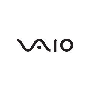
Logo 1 : Sony Vaio
Its a short for visual audio intelligent organizer, Its a famous brand to us for its technology, we all know this brand but not all of us knows the hidden meaning of their logo. The word vaio represents the combination of both analog and digital technologies in their products. As you can see the letters (V..A) made to look like the analog wave, while the (i..o) look like the numbers ( 1 and 0 ) representing a digital signal.
They went with the black color obviously because of the meanings of the color black which are: power, elegance, and sophistication. And it's a common thing to use this color because it's easy to read the text.
Moreover, there was an interview I saw for Teiyu goto, the supervisor of product design, said the logo has many meanings, like the way you read the word (vaio) it's same to the word (bio) that's which means the life and improvement of their products.
5 notes
·
View notes
Text

FA222
Assignment 6
In this assignment, we were asked to make a group of two students and we have to choose two principles of design, and each one of us design that demonstrates the principle we chose.
So I chose ""proximity"" and tried to find a good idea that reflects the principle clearly. And I did some sketches so here what I chose.
I decided to go with a Ramadan theme and start putting all the words related to Ramadan to build a vimto bottle that considered the most important thing we should have in Ramadan and add red background to reflect the color of vimto.
@uob-funoon
20 notes
·
View notes