
This is an art blog for my foundation year at Uni. The current themes are S,M,L,XL, Context and Rework.
Don't wanna be here? Send us removal request.
Statistics
We looked inside some of the posts by meganpratchett and here's what we found interesting.
Average Info
Notes Per Post
1
Likes Per Post
1
Reblog Per Post
0
Reply Per Post
0
Time Between Posts
3 days
Number of Posts By Type
Text
15
Photo
2
Last Seen Tumblr Blogs


Fun Fact
Tumblr’s reach among the 26-to-35-year-olds in the US is 11%.
Text


Zine summary
Zine summary
I made the zine starting with two of the cubes from my Extra Large final exhibit as my front and back covers, I made some white cubes for the pages. I decided I didn’t want a traditional zine fold but instead, I wanted the whole thing to fold out and I did this so the back of the zine would look like a doodle going from one cube to another like my work. I wasn't sure how to join the pages without disrupting the lines too much so I used pieces of card to connect them like joins. I have left the covers blank because I just wanted the simplicity of the cube to be prominent and not distracted by the text.
The first page is about my small exhibit, I have drawn three shoes and each is one from my favourite pairs, the main pair is the one I used for my small exhibit which I positioned at the top of the page. I wanted something to fill the page and was originally going to fill the whole page with tiny shoe drawings but to save time I did stripes with tiny shoe drawings to signify small. At the time my rework project was not very developed and so I didn’t have anything that would work for small and that is why I made one of my shoes. To incorporate my starting inspiration for this project which was rolls of fabric I dew lines around the shoes similar to the style of my developing work.
The second Page is about my Medium exhibit, which I made a collage and repeated it six times to create different mirrored perspectives. To reflect this I have used the small cubes to create a mirrored illusion also repeating it six times. To add another dimension I have used lines to suggest that a bigger cube is also on the page, this reflects my used of cubes within my work and tied in well with the previous page.
The third page is my large exhibit, I created an animation to make my Collage look like it was growing. I wanted to show movement in my zine without using words or arrows so I created fold out roots to suggest movement and growth, this also makes it much more interactive for the user because it allows them to move the pieces.
The last page was for my extra large piece and for that I made a large scale version of my Collage on a wall. The hardest part of that piece was having the patience and time to ink all the doodles, out of everything that was the biggest job and so I decided to cover the page in the lines to suggest the scale. I included a cube so that it would be more coherent but I think it suggests that the doodles have taken over just like this piece has done with my life the past few weeks.
Context
Small - My small piece was mostly personal but also a play on size. The boot is from my favourite pair of shoes and was my 18th birthday present from my parents so they are very special. They were also my first pair of goth boots that I owned, they hold a lot of meaning for my fashion journey. Whenever I wear these boots I get looks and mostly compliments about how impressive and interesting they are. They are a really big bulky pair of shoes that you just can’t miss and so making them small to me is ironic in the sense that they just really aren't small. What is funny to me is how they made so much of an impact being as small as it was, they still caught people's eye despite their size.
Medium - Medium was about playing with perspective and was very abstract compared to the usual art that I make. The art piece itself doesn’t really have a meaning I mainly just wanted to explore something different with my work. As I had repeated the Collage it did make me think how the piece could be turned into a fabric or wallpaper and used commercially, I think it would look really interesting on a coat or shirt and having the doodles creep down the arms of the jacket.
Large- Large was about movement and trying something completely out of my comfort zone that I had never tried before. Not only moving forward personally but my work as well. Doing so I realised that animation is not as scary as I thought it was and is something I would consider learning in the future. Large was also making my work digital which is not new to me but something I don’t do often, it being an animation means this piece would need to interact with the internet making it possibly worldwide if I were to post it online.
Extra Large- Extra Large was purely visual, I wanted to make a big impact on my work and again try something I hadn’t done before. I am used to working to about A2 size but this pushed me way out of that zone. I wanted viewers to feel slightly intimidated by the size but intrigued by the contrasting elements of the piece. I loved making this piece and I am so proud that I pushed myself to complete it because it came out better than expected.
Overall my work doesn’t have a context or meaning and I don’t want it to have one. If you want to add one you can but for me, this project has just been experimenting and exploring something new. At the end of college, my confidence in my art and drive to make art was very low, I was way too obsessed with making it look good and I still am. After college I took a gap year and mostly focused on working and earning money, I barely did any art because I felt that if it didn’t look like a masterpiece then what was the point. So going into this course I just wanted to let go, explore and experiment as much as I could, trying to take the stress away from making everything perfect and just make art because I can.
0 notes
Text
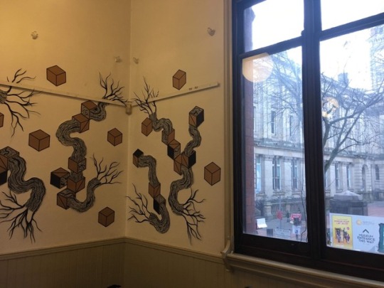
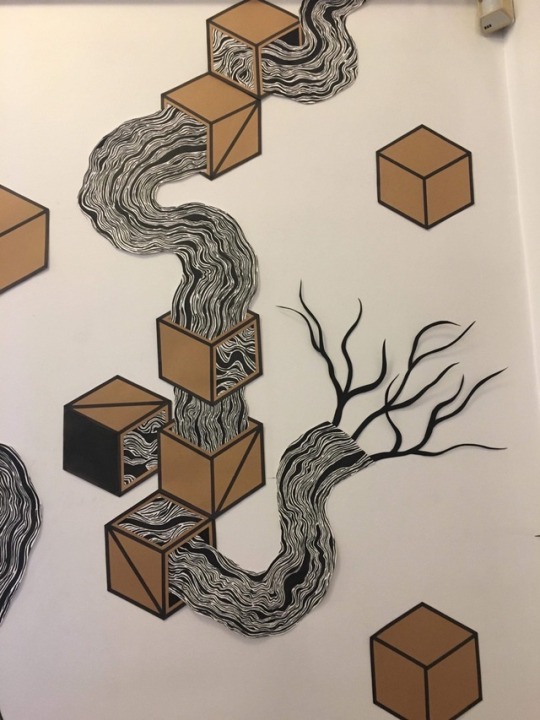

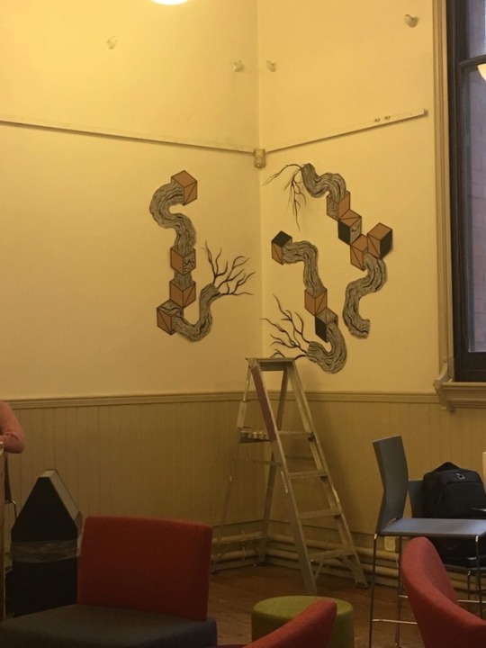
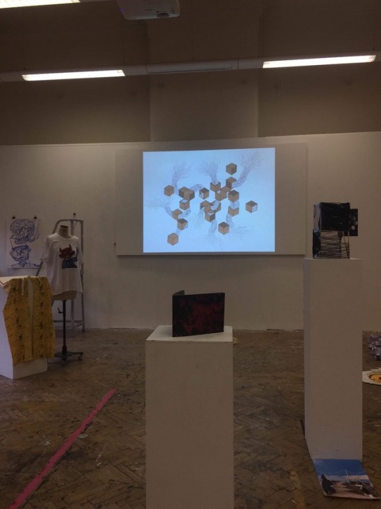
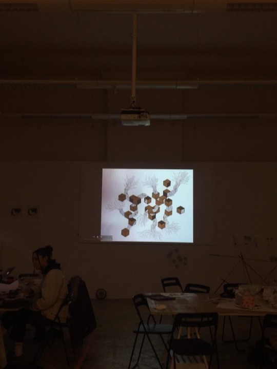
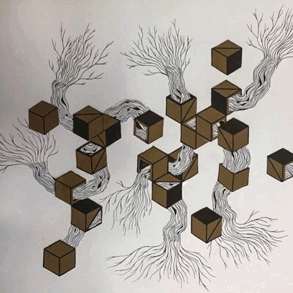
XL final exhibit
This was my Extra Large Piece, it was our final exhibit for this project. This was my biggest piece and one of the biggest pieces I have done as of yet so it was a rather big challenge for me to complete. This piece is my favourite out of all of the exhibits, because of how impactful it looks on a larger scale and the way it works with the surrounding space.
There were a lot of different elements to this piece that were all made by hand but a big thank you to my boyfriend Jack as he helped me to complete some parts of this piece and I wouldn’t have finished it without him.
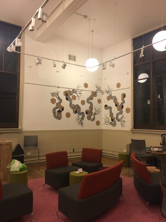
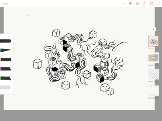
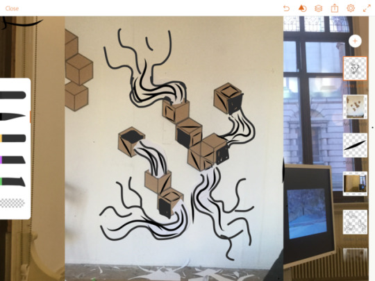
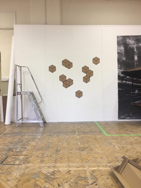
The cubes are made from kraft card, I was really struggling to make the cubes with the perfect angles because I am terrible at Maths. Jack helped me by drawing me up a cube template so I could trace it and make as many cubes as I needed for the exhibit, I made 38 in total. I decided I wanted to replicate the cubes used in my Medium exhibit so that the theme would be the same throughout my project. For the cubes I used a marker to outline them all, I realised I could have printed them but I had already done most of them by hand at that point but I would definitely print them if I was doing it again. To give variety I gave some of the cubes diagonal lines and blacked out some sides to replicate the pattern paper I was using previously
Compared to my small Collage, the doodles had to be much more planned out and flow well with the exhibit space and cubes they were attached to. Before I could start making them I had to plan the layout because it had to be tailored to the exhibit space. The doodles are what took the longest to make because they are very organic they needed to be hand inked. Each one I inked using drawing ink and a paintbrush, I wanted a variety of lines and sizes so there are no lines that are the same. I am very happy with how the doodles turned out but they do not match my original design. I feel that because I used more lines this piece came out darker feeling because of the amount of black.
For the roots I used a black card and cut thin root like shapes using a craft knife to get a smooth edge, I glued pieces together to make it look like they were growing outwards like roots. I used a black card that had been inked to match the doodles although I did not ink the paper myself. I originally wanted to paint the roots in order to get finer and more spread roots but due to the building being listed I could not paint on the walls. When I put the roots on the wall I did not blue tac them down completely, these left parts sticking out of the wall giving the piece a slightly three-dimensional feel, it also allowed my work to interact with the exhibit space as I used a painting rail to allow my work to sort of grow around it. Having the roots slightly lose also created shadows on the wall creating the effect of more roots and again giving more dimension to the piece.
After playing around with different corners of the room I decided on a space next to the windows as it reflected my work well because of the tree and geometric buildings outside. To incorporate the window I was going to use 3 spaces along the same corner but with had to scrap one of the spaces due to the amount of time I had to complete the piece, I still feel that the window reflects my work nicely even though my work is not running through it.
This idea was something I have been thinking about for a while, taking over a room or space with my Collage. I really wanted to make my work bigger or three-dimensional to make the viewer feel more uncomfortable when looking at it, viewing it on a sheet of paper is ok because it is contained but putting it on a wall to me gives it the feeling that it has started taking over the real world and if I had made it bigger I would have wanted it to flow on the floor and further around the room. The hight that the piece reaches I also feel somewhat looms over you and because it's bigger than use makes it feel like it is something we can’t control.
I think this works really well with the space I had chosen, not only does the window reflect my themes but I feel it also works well with the students coffee shop because of the brown and black, the black reflecting the coffee and the brown reflecting handmade and the paper cups covers often used around a cup. To me, it is an eye-catching piece and hopefully having it behind their stall will bring more people to buy coffee from them.
The main thing I would change about it is the size, I would make it bigger next time and give myself more time to plan it out, maybe covering a whole room. I would make the doodles less detailed as they are very dark to me and took a lot of time to paint, I would also make the roots much finer to match the lines on the doodles so they really look like they are growing from the lines. My favourite thing about this is the scale and that's why I would go bigger if I did this again. I would maybe also make it interact with the surrounding space more to create a more immersive experience rather than just a piece on the wall. My overall favourite thing about geometric and organic design is the contrasts. I love the harshness of the black and white with the soft organic forms, it creates this weird somewhat evil entity that I kind of just want to put my arm into to see what happens. It is very intriguing and I want to look at it more, it makes me ask questions without a huge meaning, I feel it kind of has a mind of its own and doesn’t care what others think.
There is still no context for this work as it is almost purely visual. I did not want to add a meaning because I didn’t feel it needed one, it already is it’s own entity. I do enjoy hearing what it makes people think of as well as the emotions that they get when looking at it. During my crit, the lady stated that it looks like it is taking over this tells me that it is possibly making people a little uncomfortable when they view it because of the size and height of the piece but even on a small scale my art had the same reaction.
0 notes
Text


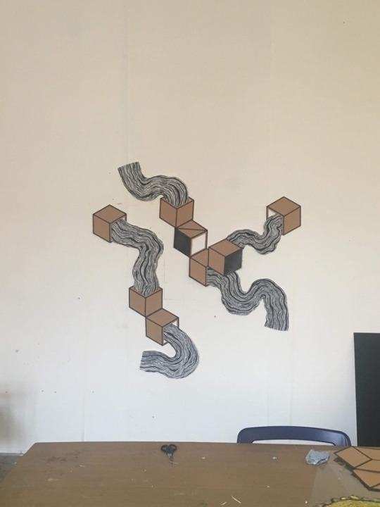
XL exhibit development
I was at first going to use a flat wall for my exhibit but Jo gave me the idea use multiple levels and walls to create different perspectives as my work already plays with the perspective I thought this would create an extra dimension. I did like it on a flat wall because when standing and looking at it, it looked like you could just walk into it but it was a lot less interesting compared to using a corner and making it feel like it was taking over around the room. I tried my work in a corner and liked it more than the flat just because it could be seen from multiple angles as well as it looks like it was shifting and growing from one wall to another. I also tried it on multiple corners and walls with the idea of making the doodles warp around the edges but I felt that the size I was working at was a little too big for space as well as a little too broken up to flow and look coherent.
0 notes
Text

Our Large exhibit
It was interesting to see what people had created for large although I did get the vibe that some were rushed and I myself also felt rushed for this project.
Ashely's work stood out the most to me with the lines and shapes she has used is similar to mine but with a different context. We both started from the same subject for our inspiration and that was the rolls of fabric from the markets. Whilst we are both using geometric and organic shapes in our work it is still very different, Ashleys is much more abstract and 3D where as mine is an image.
0 notes
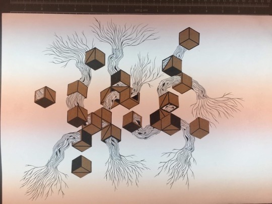
Text
My large piece is a moving image of my medium collage, I made this piece by using an app called plotaverse on my ipad. For this project I was exploring animation and making the roots grow to make it feel more invasive for the viewer. My final animation was projected onto a large screen with music played along side it to make it more emersive for the veiwer. I wanted to give the feeling that it was or could take over the area.
The process for making it was fairly straight forward as the app consists of two tools, and anchor and animate tool to which I only had to upload and place on the photo. Although it was an east process It was time consuming was having to place them all and map the photo to get a smooth animation.
I had a few problems with the app, mostly with how slow it ran. Because it is an animation I had to check how it was running throughtout the process which was made difficult because the app couldn’t handle the amount of points I had running at a time so had to export it eveytime I wanted to veiw my progress or check for faults, this mostly made my work progress slow and so it took longer to finish and perfect it.
In the animation itself there are a few points that don’t flow as they should. Something that I couldn’t get to work were some points where I have anchors would still move and so the corners of cubes would warp, I believe this was an issue with the app and how many points I had going on in one image because I could not get it to stop moving. A main issue I had was getting the roots to warp smoothly and looking like they were growing outwards, in some parts they skip or don’t move at all but I think this problem is my fault for not experiemnting with the app a little more and understand what effects long and short arrows give to the image. One awkward spot was right at the edge on the bottom, because the root touched the edge of the screen it doesn’t move which is annoying a breaks up the animation.
Originally I wanted to make my animation traditionally and make it grow by drawing each frame but after experimenting I realised how complex and how long it would take me to make an animation with the amount of movement I wanted to include. Since I still wanted to animate it, I used this app to create a sort of movment and give the same effect. Although it technically is not animated I think the effect of the warping works well the the black and white doodles because it looks rather trippy becuase of the way ir blurs when it warps, it also looks like a worm thats slithering through the boxes but then spreading out at the end and spilling into the paper instead of growing bit by bit.
Overall I think this outcome worked well but I am disappointed in myself and if I did it again I would defiently try and learn a software or produce it traditionally to really make it grow.
0 notes
Text

For my final Large exhibit I wanted to make the quality of the image better and so I had to take a new picture of my collage. After speaking with the photography/ animation lady we arranged for me to use a special light system that is for getting even and clear lighting. we were originally going to use one of the proper cameras but because of the app, I was using I had to use my phone due to the difference in pixels that the professional camera uses compared to what the iPad app might have used.
When taking the photos using my phone we noticed that it was creating these lines pictured in the images above. This is because my phones shutter speed is slower than the light and so it picks up these weird lines along the photo making the lighting system useless with my phone. Finally, to take a clear and mostly even photo we held light as close as we could get it and I took my photo that way.
0 notes
Text
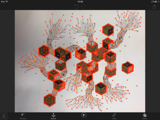
Large development- Test animation.
I did this test to make sure my animation was running smoothly as well as a test to see what it would look like projected on the screen. I had a few things to change about the animation itself like the image quality as it was very dark and shadowy. I also needed to reanimate it as some parts needed tweaking to make it run much smoother. The middle photo is of the mapping of the animation from the app, the arrows are the parts that make it move and the squares are the anchors to hold the photo in place. I used a lot of points to ensure I would get a smooth and flowing animation.
0 notes
Text
Some of my favourite pieces from the trip to the Tate Modern
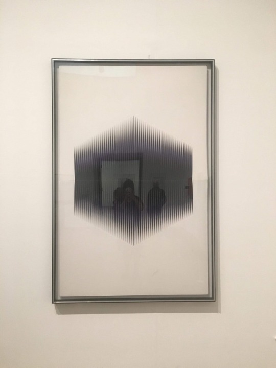
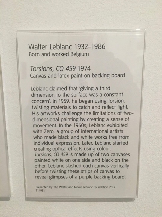
Walter Leblanc - Torsions: This piece is one of my favourites because I love the way it has been made, as it is positioned in the gallery that when you walk in the room it is the first thing you see and from a distance it looks like a drawing or painting of a 3D cube but as you get closer it is revealed that the cube is made from twisted pieces of canvas to create light, shadow and depth, which gives such an impressive 3D effect. I think aside from the illusion that it plays on the eyes, the way that it is made is so simple but so effective which is my favourite thing about it, it surprised me completely. In short, to me, it looks like a void has opened up and I want to put my hand into it because of how dark it feels.
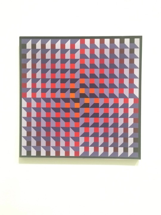
Jean-Pierre Yvaral - Ambiguous Structure: I like this piece because of the play on the depth that the artist has used, as described in the notes the forms in the painting appear to recede and project from the flat surface creating a very weird illusion for the eyes. To me, it also looks like it is swirling in a circle with the way the artist has flipped the image on itself creating an even weirder illusion. Lastly, I love the colour pallet used in this piece, it reminds me of a sunset very bright and eye-catching to the viewer.
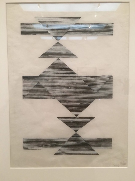
Lygia Pape - Weaving: I was drawn and I relate to this piece because of the use of white and black lines mixed with geometric shapes, I like how the lines are slightly off creating the different shapes throughout each other. The triangles used in this piece look like they are creating a vanishing point creating depth in a mostly flat piece. Although the context is very different upon reading the notes I realised it is similar to my work in the sense that they have combined geometric and organic themes.
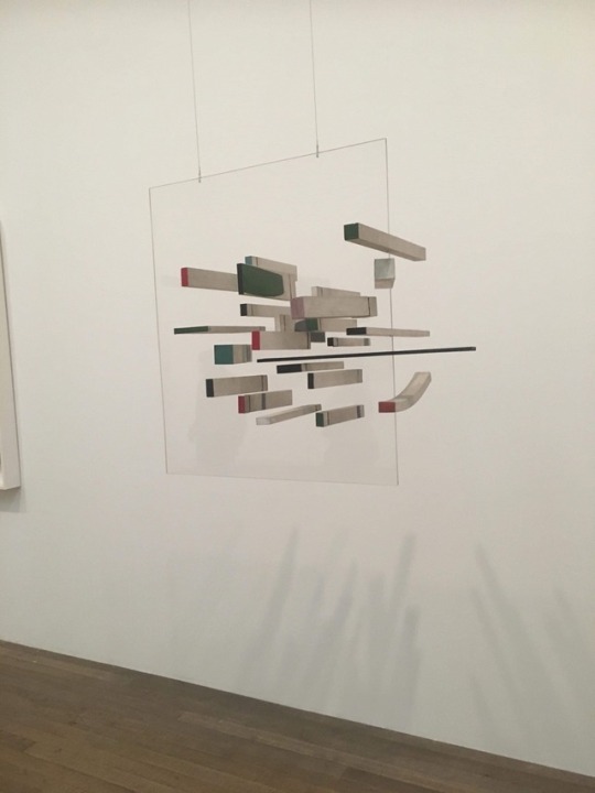
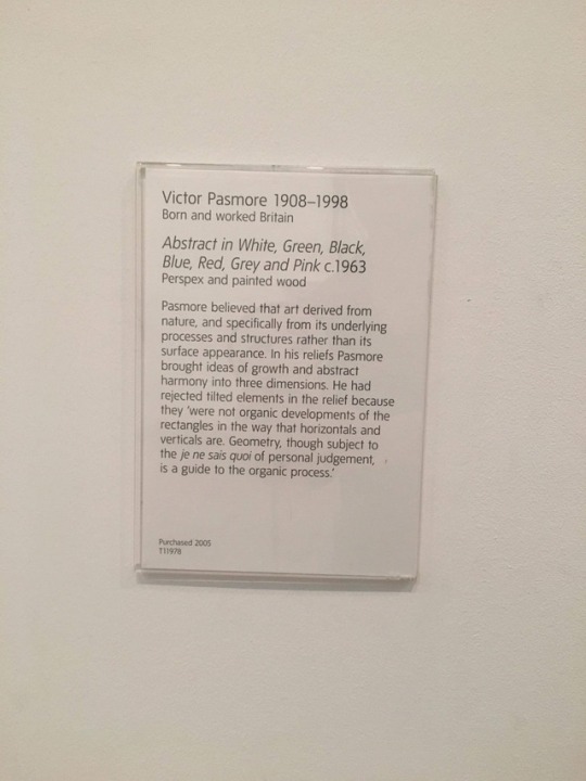
Victor Pasmore - Abstract in White, Green, Black, Blue, Red and Pink: At face value this piece is not aesthetically pleasing to me as I don’t like the colours and how it is very minimal and abstract but I do like the visual effect that it is creating having blocks suspended in the perspex. To me it is almost like fantasy how they are suspended and are floating in the air, what adds to this is the way some are slightly curved even though they are geometric blocks like it is bending reality and what we know.
1 note
·
View note
Text
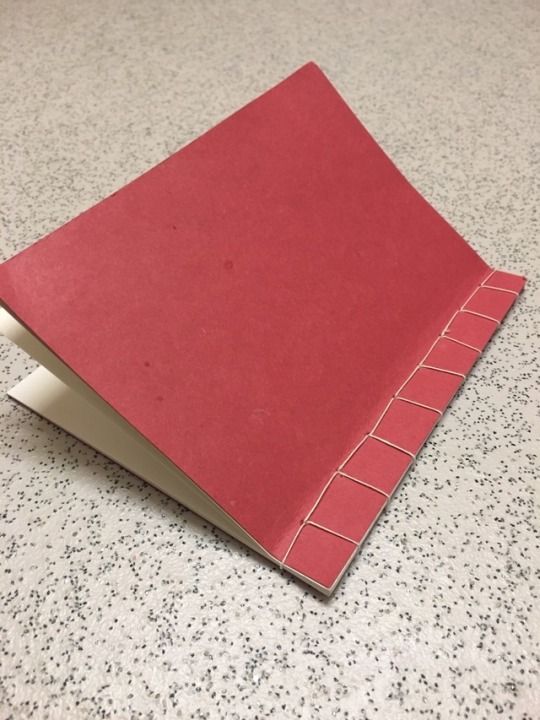
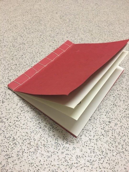
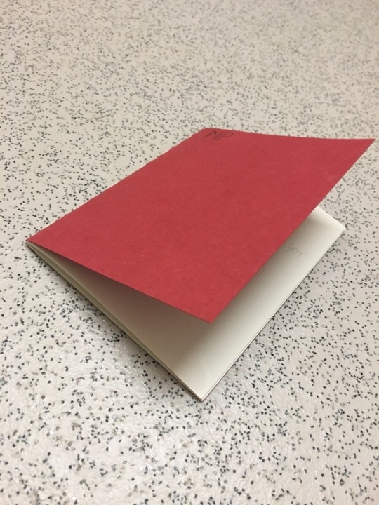
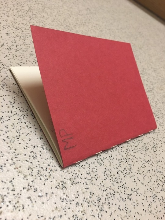


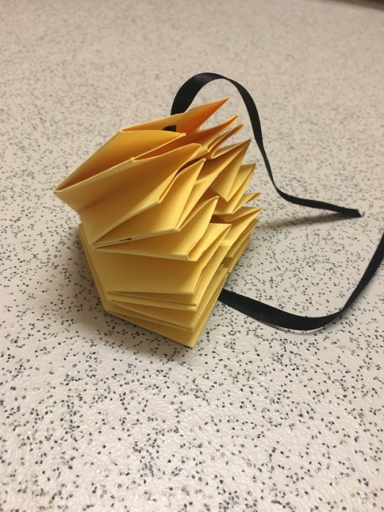
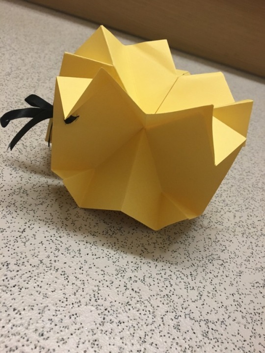
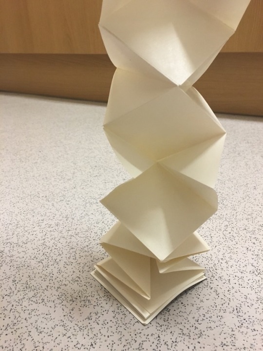
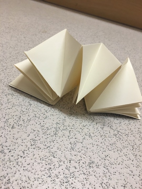
These were all the book/zines I made in my bookbinding workshop presented by Naomi Kent. The bookbinding techniques we did were: The Japanese stab bind, Saddle stitch, hardback, square fold and a star fold.
Saddle stitch technique: This was a simple technique to follow as we started out by folding a cover and inner pages in half using a bone folder. Using a pencil we marked out where we would be putting the stitches along the cover, making sure they were 1 cm apart. Using clamps to hold all the pages together and an Awl we made the holes for the stitches. The stitch we used was a simple running stitch starting from the inside of the book to ensure a 1cm space from the edge of the book, having space creates a more professional finish. As a final touch, it was put in a book press and guillotined to ensure all the pages were the same length.
I really enjoyed this workshop as it was quite relaxing and fun to do, I am excited to use the techniques to create my own sketchbooks with the paper I like and even use the ones I created for small doodles or ideas.
0 notes
Text
This was my traditional animation experiment, it consists of 11 frames and is only 3 seconds long. The process was straight forward but repetitive, I created this animation by drawing each frame and to save time I used a light box so I could trace the previous frame but added to each one to give the gradual effect that it was growing. Once I was doing with the drawing I took a picture of each frame and put it into an app called GIPHY CAM and created the animation there by loading each image in order.
There are many things wrong with this animation which I should have changed from my experiement with stop motion. Firstly I need to take my pictures in good clear lighting with no shadows and make sure the paper is clean with no marks so that it looks like an all white background, secondly I would need to mount my camera so the picture is taken is in the same place everytime and not jumping around as this breaks the animation, I felt that I didn’t make this change a second time because I got impatient with the process and just wanted to animate it. If I were to do this again I would add more frames to add to the length and quality of the video because I feel that my animation is rather jumpy in the rate the roots grow as well as it being a very short video so it goes by very fast.
Dispite the issues with the visual quality, the animation works as it should and it does look like the roots are growing from the cube. I think having multiple of these would make interesting animation if the roots were going in different directions and maybe intertwining with eachother.
0 notes
Text
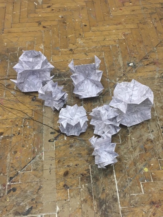
This was my stop motion experiment of a doodle growing from a cube. The props I used are just scrap pieces left over from my collage. I used a free stop motion app on my ipad to take the photos which would then play them all back to create a stop motion animation. Everytime I took a picture I added to the doodle so it looked like it was growing out of the cube, for the roots I did them seperatly with a pen so that they would have a more organic feel and so I could get the fine lines.
I did this as a starting point to get me familair with some animation after the talk with Kevin Wong, he suggested that stop motion with cubes and wire could work well to get a growing effect for the roots. Although Kevin mentioned that the way I did this was cheating, I quite like it because it keeps the crafty feel the collage gives off but adds another element to it.
There are many things wrong with this animation that I would need to refine and understand if I were to take this forward. To start with the camera moves around in every shot, taking away the illusion that it is a moving image and on top of that there are many different shadows which also break the animation. Having these issues means it is not a smooth watch and just looks more of a slide show of images instead of an animation. With the actual subject itself, I would need to make the chopped pieces smaller so I have more frames and make them closer together to ensure that it looks like a smooth and solid subject, this would also solve the problem of the growing being very jumpy and would make it flow more. With the roots at the end I mistakenly did them one by one instead of gradually, this took away from the illusion that it was growing and if I did this again I would draw them bit by bit.
Overall I really enjoyed making this but I think doing a digital or more traditional animation would serve it better as I would have the ability to draw it and make it more organic and flow in a more life like way.
0 notes
Text
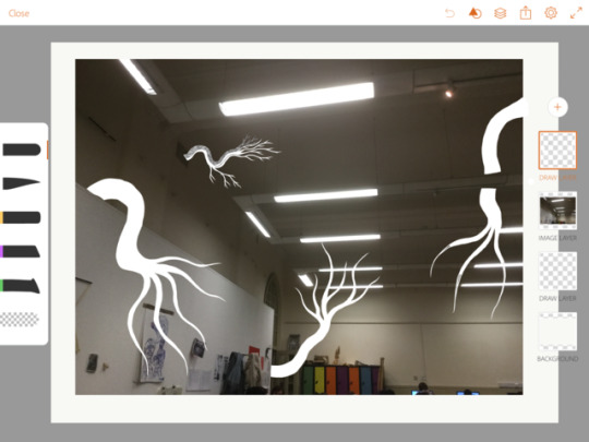
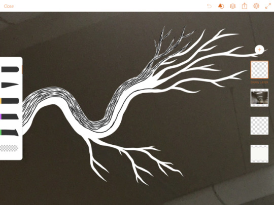
I did this piece on my iPad when I was feeling bogged down and had some art block. I wanted to restart my creativity so I took and a picture of the studio and started drawing on it, the idea is similar to the collages I made of the statue and BT tower. I wanted the doodle creatures to look like they were coming out of holes and crevices and start taking over the room. I made the doodles stand out against the dark photo of the studio by using white and then layered black lines on top, I used black and white because I wanted to somewhat replicate my doodles in my Collage, this also creates a clear divide between the subject and the background.
Not only is it a contrast in colour by also in style. The doodles are very cartoony and illustrative but the background is obviously real life, I feel this makes it somewhat more unnerving because it’s like the unreal has invaded the real.
Although I did not finish it, there are a few things would change if I were to continue this piece. The first thing I would change is the thickness and amount of black lines on the doodles, after doing some of the first ones I could tell that it is difficult to see the detail unless zoomed in. As you can’t really see the black lines I feel this takes away from the sort of optical trick that the black and white contrast gives. I would make the doodles interact more with the environment it is invading, having them wrap around some of the lights because I think that it is rather flat and giving them more “character” would make it more unnerving for the viewer. The last thing I would change is the quality of the picture used for the background, as I only used my iPad the quality and detail in the picture is not great and I feel for me to make it more invasive this would need to change.
0 notes
Text
Something that I have been inspired by for a while now is the silhouettes of the branches against the sky. I love the contrast because you can see every little branch and even though they are all the same tone you can still see the different layers of the tree. I think it’s the dark lines and stark contrast that catches my eye. I think my work has been subconsciously influenced by this in some way as I have been wanting to draw it for a while.
0 notes
Photo
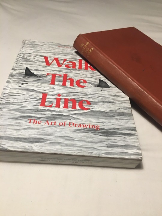
Books I have taken out from the library, Walk the line- The art of drawing and The world of M.C Escher.
Walk the line was an interesting book and had some interesting theory’s on a drawing but I felt that none of it really related to what I am currently exploring with my work.
0 notes
Text
0 notes
Photo
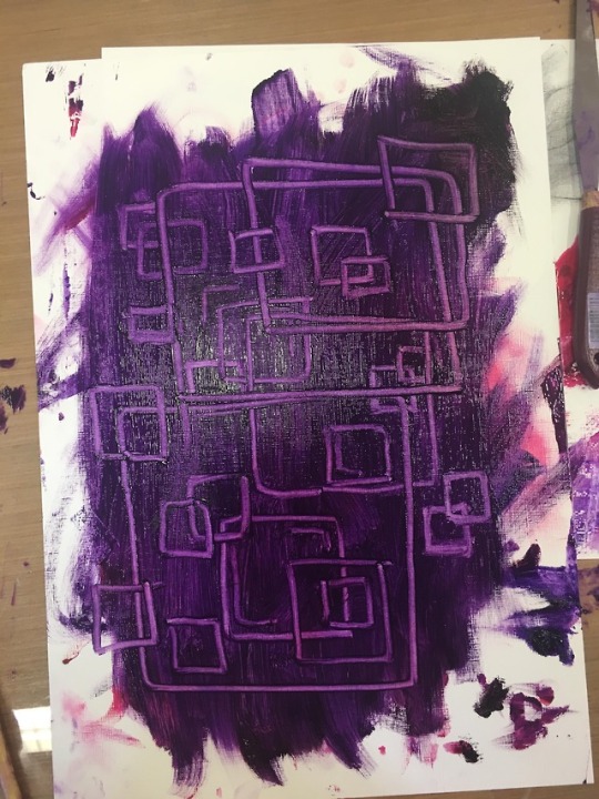
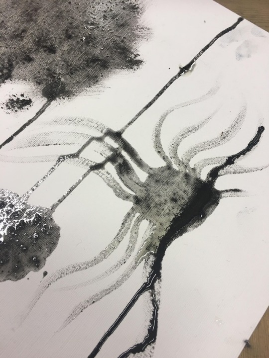
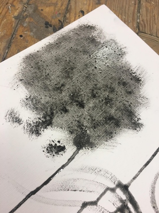
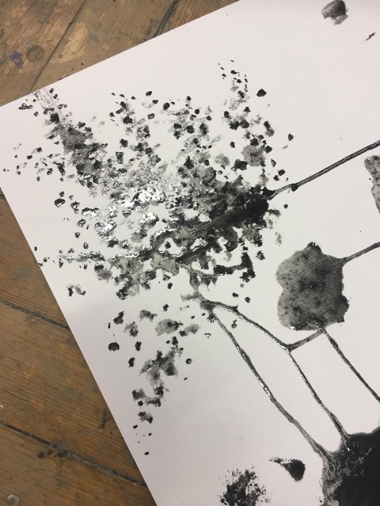
This was work from the oil painting workshop. I was really excited about this workshop as I enjoy messing around with paint but I found myself getting frustrated with the paint instead of gelling with it and the process.
One thing that I found really interesting was that you can make your own paint by taking a pigment and oil and grounding it and mixing it together. The black/grey Paint was a piece of charcoal ground up and mixed with oil to make the paint.
I created the purple piece by using a cotton wool bud to remove the oil and essentially draw with it. The purple was just me getting mad at the paint so I just painted the whole paper. One thing I enjoyed was that if I made a mistake I could blend the paint back out and erase what I had done.
Overall I enjoyed the workshop but I’m not sure painting is for me but I would give it another chance:)
0 notes