
Statistics
We looked inside some of the posts by milliebowerdgp1-blog and here's what we found interesting.
Average Info
Notes Per Post
0
Likes Per Post
0
Reblog Per Post
0
Reply Per Post
0
Time Between Posts
3 days
Number of Posts By Type
Text
17
Last Seen Tumblr Blogs


Fun Fact
Tumblr has a low social media market share in South America.
Text
Synopsis:
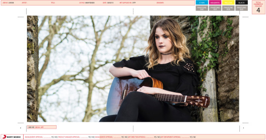
A ritual of a lifetime. Rachel May is a gothic rock artist, releasing her debut album, enter into a paranormal modern world and escape through her gothic tales.
0 notes
Text
Evaluation:
When I first got this brief I was dreading it - filming is not one of my strengths so I was worried that the final outcome was not going to be to my normal standard. For the first briefing for this project I was actually in Scotland shooting for my FMP so I was emailing Geraint about what we needed to do and how I could prepare for this project whilst also shooting FMP. Once I sat down with my laptop and looked at the brief, I picked it apart and started to brainstorm. I immediately knew that I wanted to do something edgy and exciting. I started thinking of models/artists I could use and was looking at unusual locations where I could shoot.
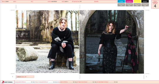
I got in contact with an artist I knew called Rachel May and I told her about my idea to do a ‘gothic’ photo shoot. This was not the usual image that she would portray as herself, however she was excited about the theme and told me I had complete artistic control. My next step was to find a location. I wanted to find somewhere that was different and unique in its own way. I wanted the location to tell the story as I wanted it to be featured heavily in my promo video. I managed to find an old ruin of an abandoned church in Buckfastleigh (near my home town of Brixham). This was the perfect location - better than I could’ve thought, in my head I could picture the image that I wanted to portray.
Next I got in touch with a local costume designer, he specialises in handmade corsets and I thought that these would be perfect, especially with a flowing blouse and leather jacket. He sent me a few images of ones he had already made, however he had recently bought some more material that I thought would be more suitable. This was a great source of collaboration for this project, I love working with a team of people to create something amazing. I also collaborated with a make up artist - this was important as the make ip played a heavy role in setting the theme and tone of my images.
Once I had my team of creatives, I started to look at dates to shoot - that’s the only downside to working with such a big group of people, trying to find time when everyones available. However we managed to cross this hurdle and I decided that I wanted to shoot it over 2 weekends - this is because I wanted to shoot my promo video alongside and I knew that there would be things I wanted to improve. I settled on the weekend of the 3rd and 4th March and the weekend of the 31st March and 1st April. I wanted to give myself plenty of time to reshoot in case something went horribly wrong. One of my key strengths this year has definitely been organisation, it’s something that I have strived on and something that has helped me control my anxiety throughout this year.
My shoots went so well, however I am glad that I decided to organise two weekends, because as I suspected, there were different outfits and different make up looks that I wanted to try out. However this enabled me to plan exactly what I wanted to shoot the second time round which made it super easy and quick. For both of my shoots I booked out two Ranger lights from CLR, as well as lighting stands, a tripod and a Canon 5D mark III and some lenses.
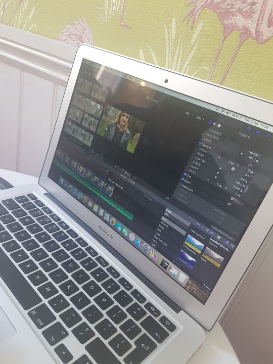
Post production has never been something that has particularly excited me - I have normally just done the bare minimum, however for this project I wanted to really push myself and learn more about retouching. I’m so glad I did because now it is something that I look forward to and learn in my spare time.
Printing! Where do I even start. What a nightmare. Me and Chloe went to the print space to try and test print and found out they didn’t print double sided. A lot of companies that I contacted wouldn't print a leaflet or CD at such a low production. I decided to buy a printer (because I needed one anyway I just bought it sooner). This way I could print everything I needed and ensure that the quality was to my standard.
Overall I am really pleased with the outcome of this project. I definitely pushed myself out of my comfort zone and really learnt a lot throughout. I think if I was to do something differently, I would have liked to experiment with shooting in the dark surrounded by candles. However it was so windy and cold I think the candles would have blown out. I definitely produced what I had set out to from the beginning so I am really happy.
0 notes
Text
Evaluation:
The aim of this project is to create a photobook in order to portray the bells and the locations in which they sit, as well as the local community surrounding the bells. I wanted to take my audience on a journey, using little wording, with only the images to tell the story. One thing that I needed to ensure was the continuity and the high standard of quality throughout. As I was shooting in different locations, at different times of the year, I needed to ensure that I kept the lighting consistent. One of the ways I did this was by shooting at a similar time of day at each location, as well as booking out ranger lights in order to enhance the light where necessary.
From the beginning of this project, when I was considering how it would fit with the brief, I was certain I didn’t want it to be just about the landscapes in which the bells are sited. The exciting element for me was the human story and the passion of the individuals within each community who fought to secure one of these unique sculptures for their town. I planned three major trips between December 2017 and February 2018 which would take me from London to North Devon, Wales and The Outer Hebrides. My goal was to document the project, taking images of the bells and the landscapes in each location along with portraits of the local characters who had worked together to install the sculptures. Each trip required meticulous planning and preparation. I needed to work out driving routes, flights, and train and ferry journeys. Book accommodation and reserve and book out equipment including lights, tripods, camera and lenses. It was by far the biggest project I have ever attempted, which was the most exciting part! This project gave me a focus and a passion, and I was constantly thinking about it and ways I could improve or add in further elements that would compliment it.
I am extremely pleased and proud to have completed this project. I feel that I challenged myself as prior to starting University and throughout the first two years I focussed mainly on fashion shoots. Fashion still inspires me, however over the past eight months I have discovered a new found passion for location photography. Lighting was always something I felt confident with but it’s much easier to control in a studio setting. Shooting outside is exhilarating. I feel connected to the environment and the natural light is constantly changing, so compensating for that is a challenge and I feel much more of a sense of pride and achievement with the finished images.
I have learnt so much throughout the past 8 months and have developed my own style as a photographer, which was one of the goals I set myself at the beginning of this project. This has helped me to learn more about the industry.
Overall, this project was the best decision I could have made for this past year! I have felt so motivated and proud of the outcome that I have achieved. Throughout this project I made sure that I gave myself plenty of time to carry out my shoots, kept in contact with my tutor, planned out every step and organised the shots that I wanted, and I believe that all of these elements together are the reason why I managed to achieve what I had set out to do. There was a lot of collaboration involved with this project and I had to make contact with all of the communities that were involved with the bells. This is something that I thrived on as I enjoy talking to people and learning their story. Shooting on location was something that was far out of my comfort zone, however after the first shoot in Aberdyfi, it was one of the things that I enjoyed the most about this project. If I was to do something differently throughout this project, it probably would have been to give myself extra time each shoot, this would help make me more relaxed and have more of a variety of images to choose from. However I treated it as a live brief where I would have had a deadline to adhere to.
0 notes
Text
Creating my artists Instagram page:
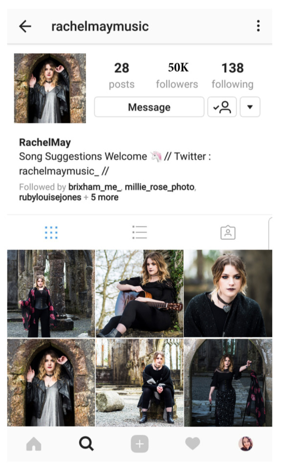
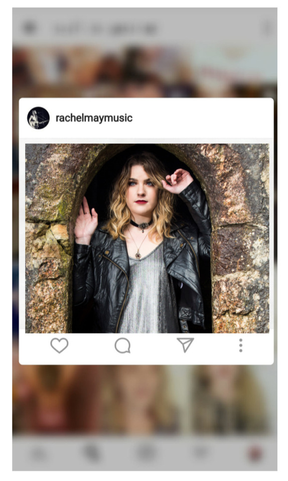
Using my hero image as the main photo featured on her Instagram.
My artist already had an Instagram but the overall look was different to the images I took - so I made this Instagram to show what my images would look like. As a whole I am really pleased, I think the lighting and aesthetic is consistent and the images work really well as a series.
0 notes
Text
My Budget:
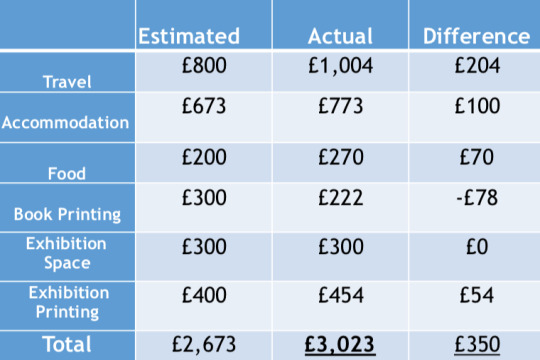
Above is the table of my expenditure: my estimations, what the project actually cost, and the calculated difference. When I first started third year I had no idea that my final major project would cost this much. However, once I got immersed into the project and started to estimate the costs it became clear that it would be slightly more expensive than first anticipated. After I spoke to my parents, we decided that this project would be far more valuable than what it would cost, for that I am grateful.
As you can see from the table, there is a slight difference from my estimated costs to what I actually spent, the main reason for this is because I hadn't factored in as much fuel as we used. Another reason why there is £100 difference with accommodation is because in Wales we got stuck in the snow and had to spend a night in a pub B&B while the snow ploughs cleared the road - this is something I could never have estimated!
0 notes
Text
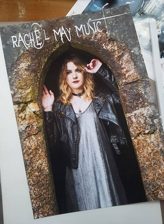
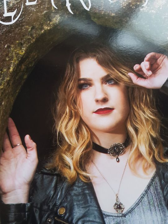
MY BOOK!
MY BOOK IS FINALLY HERE! This has been the most exciting 8 months and I am so grateful that I was able to take on this project. I have learnt more in the past few months than I have in the past 2 years. I am so happy with my book although the printers made a slight error when doing the wrap around! However I have shown my tutor and he said it’s fine, it’s hardly noticeable!
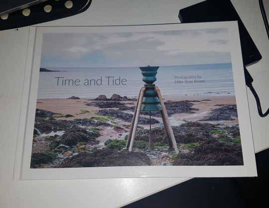
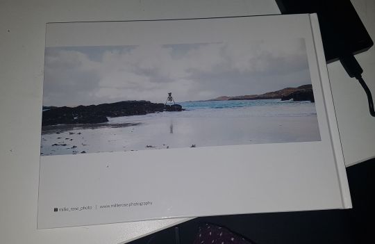
The quality of this book is so good and I am so glad that I persevered so I could find somewhere where I could choose the materials I wanted to use. Choosing a hard back cover was 100% the right decision as it feels a lot more substantial and better quality.
Below is the mistake that the printers made.
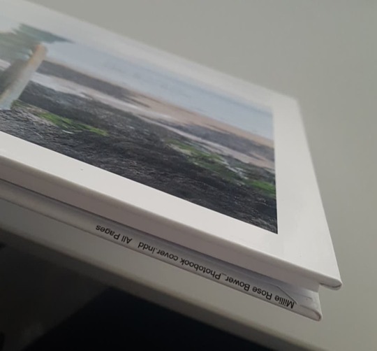
At first, I was really upset, because apart from this mistake it would have been perfect. But unfortunately once I sent it to the printers it was out of my hands and I had to trust other people to do the job correctly. Once I spoke to my tutor he said that I won't get marked down because it wasn't my mistake, and to get them to reprint it for the end of term exhibitions.
I have subsequently shown people my final book, and none of them noticed the mistake! This made me feel better as the error is on the inside of the bottom of the book and not on the front cover!
0 notes
Text
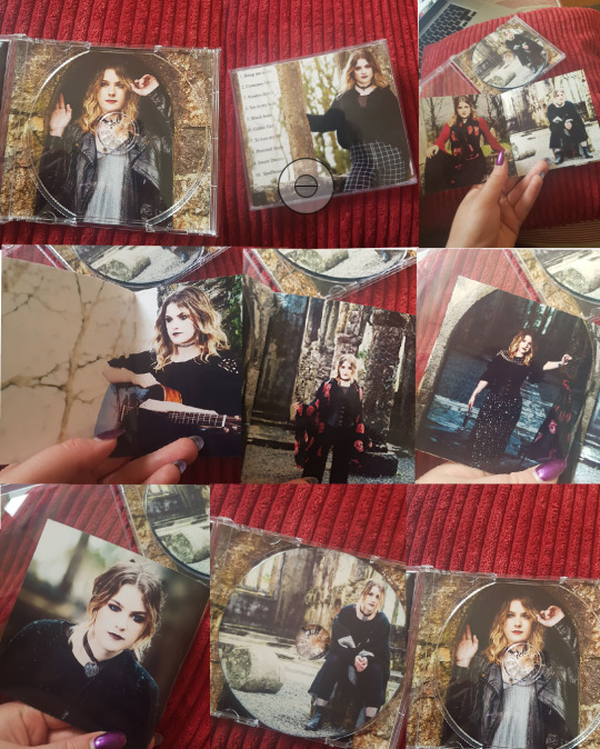
CD test prints:
I wasn’t sure which image I wanted for my CD - so I decided to test a couple! This was another plus for me to print it myself!
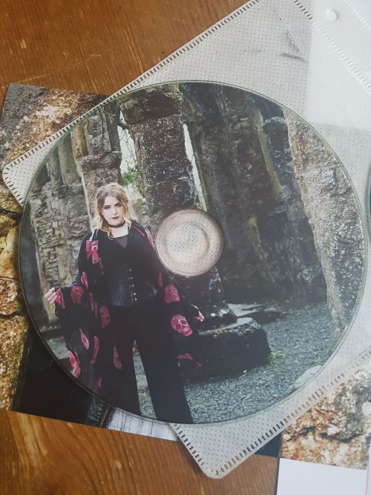
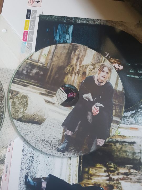
At first when I heard we had to put an image onto a CD I kind of freaked out a little bit. I thought that her face would be right in the middle where the hole is, however once I started playing around with the templates I was pleasantly surprised. I think that I prefer the second image, this is because I hadn’t used that image throughout the leaflet. It also matches the close up portrait image that is on the back page of the leaflet, so I think that it’ll look best as an overall package.
0 notes
Text
Test printing my poster!
I recently just bought a printer so I wanted to print the poster, leaflet and CD myself. I wanted to print it on glossy paper as I wanted the colours to pop and stand out.
A closer look..
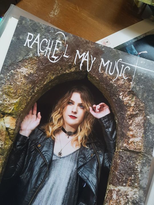
I really like the way the font has printed on top of the image. After I did some research into some music posters and I really liked the more minimalist look.
0 notes
Text
Poster Inspiration:
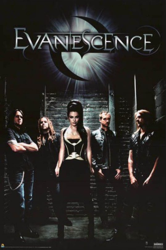
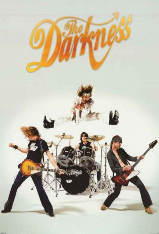
I decided to do some research into my music poster. I have decided that I wanted the more minimalist look with just my artists name on the front.
0 notes
Text
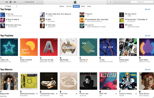
iTunes - WE MADE NUMBER 1!
Of course we did!
0 notes
Text
Creating my Facebook page:
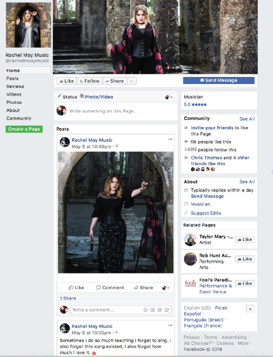
As part of the submission requirements I created a Facebook page for my artist Rachel May Music! This was all new to me as I never made one before but I am really pleased with how it turned out.
0 notes
Text
What is ‘gothic rock’
Doing some research into the origin of gothic rock. Wanted to do this to best understand how to design my poster and leaflet.
0 notes
Text
My poster so far:
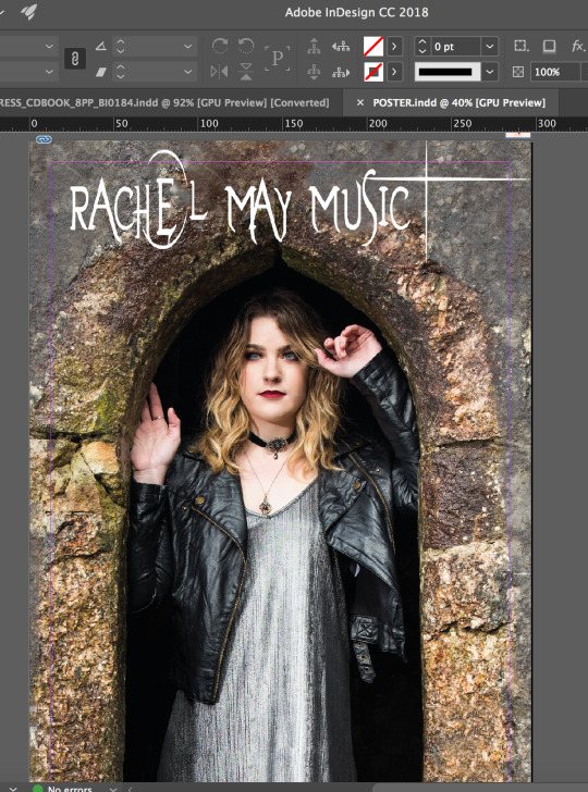
This is my poster so far, I have used the font that I have (see previous posts). I’m not sure if this is too plain for a poster or if it works well. I think that the image is strong enough on it’s own with just the artists name. I’m going to ask some opinions and see what people think.
0 notes