
Hello! I'm Phoenix and this is my Tumblr all about my journey through my Masters in Instructional Design & Learning Technology. With more than a decade in this field, I'm excited to see how I can take what I know, and combine it with what I'm about to learn.
Don't wanna be here? Send us removal request.
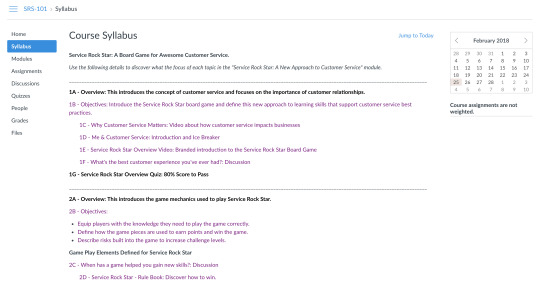
Statistics
We looked inside some of the posts by mrprcat and here's what we found interesting.
Average Info
Notes Per Post
40K
Likes Per Post
28K
Reblog Per Post
13K
Reply Per Post
13
Time Between Posts
22 days
Number of Posts By Type
Text
5
Audio
1
Photo
9
Link
1
Quote
1
Last Seen Tumblr Blogs


Fun Fact
Tumblr was named as a finalist in Lead411’s New York City Hot 125 in Aug 2010.
Text
Year in Review
A look back at the work I’ve done to attain my Instructional Design & Technology Masters shows just how much can be achieved through sustained effort. While I did take time off to move, travel to Italy, and travel for work, the cumulative total is 12 months, plus three for life events outside of school.
Month 1: Mastery - Personal Development and Leadership 1. This course was a great way to start thinking about the pursuit of mastery as a skill, and it was an excellent way to set the tone for the year ahead. The books we worked with and the supporting content led to a video, which I still appreciate. In the video we are asked to explain what we hope to achieve. This has helped me in my role as a Sr. Instructional Designer when I think about the work I create, and what I want to be known for in my industry. 2. I didn’t leverage this course in the work I’ve done on my final project in a direct way, however it was certainly part of the fabric of my overall results. 3. The personal triumph of this class was rooted in taking time to recognize, and celebrate, the fact that I’d committed to myself to seek out and attain a Masters degree in the field I’ve worked in for more than 16 years, and one that I love being part of.
Month 2: Strategies for Learner Engagement 1. This course helped me build a strong foundation of understanding as it relates to the history of Instructional Design and the many different modalities that can and do affect learning outcomes. 2. The work in this class shows up in how I formulate questions, design outcomes, and address the needs of varying learning audiences. It’s a course that makes so many strong connections between theory and practice, that it easily informs much of my creative process. I also look to my infographics for ideas I can use to make layouts interesting and informative. 3. My favorite piece of work was the visual design (shown below), that I created to show how there are many satellites orbiting the central concept of ‘learning technology’, which is a topic about which I’m very passionate.

Month 3: Visual and Verbal Communication in Instructional Design 1. This course wasn’t something I loved, but I appreciated it. While the goal was to understand the impact of layout and visual design, the project started with a brochure that was essentially marketing collateral for the Grand Canyon. The skills do apply to learning however the topic wasn’t directly linked to adult learning theory or practice. The additional projects used software proprietary to Apple, which tends to limit production realities in most corporate environments. 2. This didn’t inform my design or project efforts later, as the concepts shared weren’t new to me, because of the work I’ve done in branding and marketing. 3. This course didn’t have a stand out item for me, however I appreciated taking time to create customized icons for the environmental eLearn project.
Month 4: Corporate Training and Motivational Development 1. I loved the focus on conscious competence, and the project we did was fun and offered a good level of challenge and opportunities for peer review and self-reflection. This was a breakthrough moment for me as I worked to create a fun, casual, and easy-going video for the main project. The results still feel fresh, and useful. 2. This informs conversations I have about video production not needing to be overall formal, polished, or stylized. In fact, this project has also presented solutions for how I can use images in the lower-third of video footage in other case. 3. My favorite outcome was creating the visuals to tell the story of conscious competence theory in a fun, three-color way, in a video that was short, sincere, and informative, which you can see below.
vimeo
Month 5: Instructional Design and Evaluation 1. This course is one of my favorites because I was able to take the time to do extensive research and analysis. Working in learning and development, we often don’t have the time or luxury of doing a lengthy analysis. It’s a great piece of work that validates my own methods and processes for analyzing and designing learning interventions. 2. This work played a part in the way I designed learning outcomes, set strategy, and planned the technical and assessment requirements of my final project. 3. The most memorable personal triumph was creating a multi-page Training Needs Analysis that I know I could share within my corporate environment right now, and it would stand up to scrutiny.
Month 6: Digital Media and Learning Applications 1. This course was tough! It was also rewarding and aligned with my belief that the future of instructional design is a technical one. While I don’t want to become a developer, I can and do believe I’ll have to learn more about the development landscape as how people learn becomes more and more technical, and digital. 2. This didn’t inform my final project overall, but it did show up in the types of quiz questions I created because I wanted to be sure the distractors weren’t overly broad, or obvious. I also sough to ensure feedback would support passive learning, which is something we studied during this course. 3. My triumph was being able to customize and create a working, responsive quiz, that showed just how important coding and development are to the future of learning and development. My work is encapsulated in the time-line image below.
Month 7: Music and Audio for Instructional Design 1. I love storytelling, which is one reason I attained my BS in Digital Cinematography from Full Sail in 2013. This course was an excellent look at how to use music and audio to tell an educational story. 2. This course didn’t have a strong impact on my final project, except as I considered the audio, and music selections for a small video project. 3. I’m most proud of my audio production and narration for the story, “The Elves and the Shoemaker” by the Brothers Grimm. It was a lot of fun, and many of my friends shared it with their little kids. The link below will take you to this story.
https://soundcloud.com/phoenix-cavalier/the-elves-the-shoemaker-the-brothers-grimm
Month 8: Filmmaking Principles for Instructional Design 1. This project was generally interesting, however it wasn’t facilitated in a way that aligned well with actual corporate training and learning design as I know it. With it’s heavy focus on a didactic model of teaching, it lacked opportunities for innovation, and leaned too heavily on learning outcomes linked to film production, rather than education design. 2. I didn’t return to this topic for my final project, and although there was more video expected in the final project, this particular assignment wasn’t part of my design thinking. 3. My personal triumph was the creation of Art Made Metal, a fun and irreverent look at water color pencils, education, and the importance of creativity.
vimeo
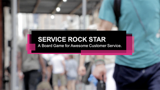
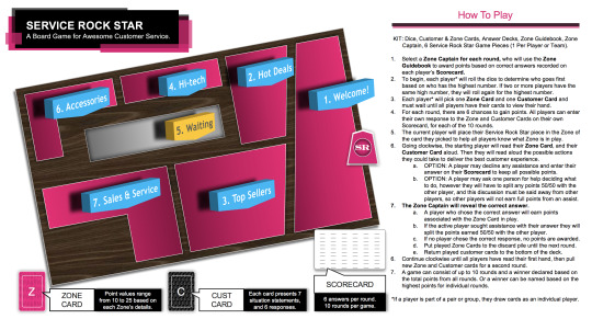
Month 9: Game Strategies and Motivation 1. This course was a great use of time and energy. It was such a clear look at what makes games work, and it helped reveal why so many instructional design games don’t work as intended. 2. This informed my final project as I sought to ensure the game mechanics would support flow, challenge, and risk levels that would drive engagement. 3. My favorite part of this class was creating a new way to talk about customer service, through my game called “Service Rock Star”. It was a high point for sure and I even shared the concept with my Sr. Manager and peers at work, who loved the idea as well.
Month 10: Learning Management Systems and Organization 1. While we do use Cornerstone at work, the ability to compare LMS options, think critically about them, and make clear recommendations for one versus another, was excellent. I’ve taken a more direct interest in the LMS we have at work, and am seeking to become more informed in LMS decisions. 2. This played a direct role in my final project as I mapped the course to the Canvas LMS online. It was great to feel competent and confident in the use of one LMS over others, and it made planning and design easier and more logical. 3. My favorite win during this course was the creation of attractive layouts within Canvas that would visually engage the learner. While I’m not an LMS Admin, I gained new insights and added respect for their work. Below is the visually interesting tile that learners would see to begin their work in Canvas.
Month 11: Media Asset Creation 1. This was an interesting course because we didn’t implement the course assets, we simply built them. This wasn’t my favorite course because it lacked a clear and cohesive outcome, and while we did a Training Needs Analysis, we didn’t go the distance to build out the course and show it all published in a working state. 2. This project was a good summary of many other projects and did allow me to leverage my knowledge of training analysis, game design, video production, and LMS design as well. 3. The personal triumph was producing several high-quality assets in a very short amount of time, that were backed up with empirical data and research along with data and citations to validate recommended positions.
Month 12: Final Instructional Design and Technology Project 1. This has been a powerful and fast-paced month. It’s been truly inspiring to look back and reflect on the work I’ve done and I’m thrilled to know that I’m able to demonstrate my knowledge and skills within the work I do in my career. 2. The many hours spent reading and researching certainly had a role in how I was able to quickly assemble different assets, and create customized online results each week for my portfolio. It was also great to determine which items warranted ‘top billing’ in what I am sharing online, and why. 3. My personal highlight for this course has been to see all my work in one place, with customized fonts, colors, margins, graphics, and much more. I’ve also taken the time to visualize my resume, and even updated my profile picture across several online platforms to create a consistent and unified online presence. It’s really been fun to curate my message as a Sr. Instructional Designer, who has earned a Masters in Instructional Design and Technology.
https://mrcavalier.myportfolio.com/
All the best,
Phoenix Rose Cavalier
0 notes
Text
The LMS Is Here To Stay
The LMS or Learning Management System is a central fixture in the world of learning and development, yet that doesn’t mean it isn’t changing. With advances in mobile computing, data speeds, and demands from modern learners of all ages, how courses are organized is just as important as how they’re deployed, which is what make the LMS such an interesting part of my career as a Sr. Instructional Designer.
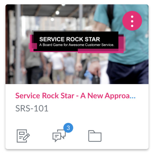
Exploring different LMS options was a real eye-opener! There are so many, and while there are leaders in corporate space such as Cornerstone and SkillSoft, many more options exist. One area with a lot of LMS diversity is education, both middle school and high school, along with higher education. My review led me to create a hypothetical course that taught retail employees with less than two years customer service experience how to play the game, Service Rock Star, which is a board game I created to make learning customer service skills more interesting. I chose to use the Canvas LMS to do something I think is often overlooked when we ask employees to use a game to learn new skills: we often do a terrible job of teaching employees *about* the game, before we ask them to play it. My belief is, a short course about a game that educates players on WHAT it is, and WHY it is importnat, could go a long way to helping them get the most out of actually playing the game with their peers.
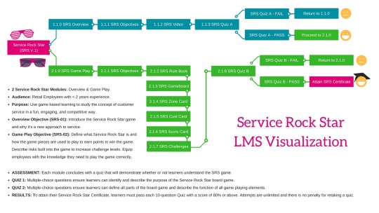
REFLECT: The image above is my road map for creating the education elements needed to help new retail employees use Canvas to learn all about playing Service Rock Start. It was really great to be able to put the game Service Rock Star into an educational framework that would prepare learners to play the actual game if it were published.
Learners were able to use three modules to get an overview of the game, learn the rules of game play, and gain an opportunity to reflect on their game playing experience with the closing discussion. Not only does the approach of the LMS reduce the apprehension, anxiety, or pressure to succeed at the game, it creates a level starting point for all players.
INQUIRE: The feedback shared in the surveys was positive overall, and comments also pointed out some great ways to improve the LMS experience.
Landing Page: This was confusing for some because it didn't start with the syllabus, so that's an important change to make to better onboard learners who access the courses in the LMS.
Visuals: Some learners expressed that they'd like more visuals to enhance how they perceive the game and its game play elements.
Media: There was a strong positive response to the videos in the LMS. The first video (included below) targets synthetic learning with a high-level discussion about customer service, to ground the learner in how service impact the customer experience, and presents stats on how service impacts the results a business achieves. The second video (included below) introduces the game in a commercial manner, with an explanation of game, its rules, and how points are won or lost. Both were well received, and comments indicated more videos would be beneficial.
youtube
vimeo
NPS Score: The volume of surveys weren't very high, however the NPS scores present a mixed response to "likely to recommend this course to a friend or colleague" and "likely to recommend the Service Rock Star game to a friend or colleague". The course gained a -33 NPS score, while the game received more detractors with a -67 score. This indicates a couple things when the comments are evaluated in relation to these scores. One, the course elements worked well, however better introduction and on-boarding could improve the course scores. Two, the game, which can't actually be played at this time, didn't win promoters, however comments indicate a desire to play the actual game, which bodes well for production goals.
SUGGEST:
What People Said... • "The components were well established, but I would suggest adding more of an introduction to the home page, as the main page can be overwhelming when first opening it due to the amount of modules that are listed. The message itself was effective and I would like to actually play the game to see how I would do!" • "If developed further, I would recommend this course to industry professionals." • "I think it should have more videos, and maybe some more images or custom layouts."
ELEVATE: I'm optimistic that this rough draft of a game idea was broadly appreciated and think with more detailed instructions and a revision to the order of events, the LMS could effectively prepare learners to play the game. I'm also glad to note that 2/3 of the respondents to the survey expressed a desire to play the game.
I also believe the feedback provides a good basis for improving both the game and the LMS organization.
All the best,
Phoenix R. Cavalier
_______________________________________________________________________
Full Feedback:
Hello Phoenix, If they fail the assessment, will going back straight to the beginning change the results? Maybe you can provide more resources before they return?
Keep working on it. Dr. Dan
Alana Sawchuk Thu Feb 1 @ 7:55 pm PST
• Reflect: Hi Phoenix, I think your choice to integrate ‘Service Rock Star’ into an LMS is very smart-- this game seems very interactive and the pieces will work well within an LMS environment, and your choice of incorporating mobile use works well for both your audience and your subject matter. While I did not see your final video from our previous class, I was able to decipher many key details about what your game and learning plan would entail. I can also tell from your research that you are carefully examining who your learner is and what will keep them engaged.
• Inquire: When viewing your mind map, section 2.1.2-2.1.7 really stuck out to me because I am assuming these are all components of how to play the game. Is this where each piece is introduced? Will these be used simultaneously, or will each piece be introduced as it is needed within the gaming environment? Does the learner play the game before 2.1.8 (Quiz B), or is that where the game occurs?
• Suggest: You might consider providing a brief description of what the quiz in each module will be covering. The information you provided in the bottom right corner provides a good framework for the scoring, but does not elaborate on subject matter. Are the questions in 2.1.8 situational or more conceptual? You may want to provide a sample question or a bulleted list to show what topics are covered within that part of the module.
• Elevate: Using Canvas for this project will be a good fit for your needs. Have you considered which of the integrations you might intertwine to this topic? Perhaps you can add a segment to your mind map about how the integrations would assist in achieving the objectives. Your layout is very aesthetically pleasing, but perhaps you can elaborate on which elements are already in existence, and which will need to be created for use in the LMS. I am excited to watch your project come to life and learn more about being a Service Rock Star!
Week 2 & 3: Create an LMS Learning Environment Outcome: Choose an LMS to create a learning module based on the graphic organizer. Outcome: Create a video presentation of your LMS to show the learning topic, purpose, objectives, functionality of the LMS, and how the module supports learner’s construction of knowledge. Grade: 100
• Link to the “Service Rock Star” video. https://vimeo.com/253295083
Daniel Siegel
Fri Feb 23 @ 7:37 pm PST
Hello Phoenix, Good job on this so far.
Try to vary your imagery and show what you are talking about. You had the same image on for 1:16. It was boring. Try to have imagery reflect content.
How are you going to make your LMS something people want to engage in instead of being forced? How can you make it informative and thoughtful?
What if learners post videos of trying to be a service rock star and others can evaluate it? I'm looking forward to seeing how you take this to the next level.
Dr. Dan
Mark Boulier Sun Feb 11 @ 11:35 am PST
Reflect: Your video is well edited and looks very professional. The LMS you've selected is appropriate for both your target audience and the content. Your video is longer than the suggested time and may need to be cut down. You have included all the learning objects the assignment has required. Inquire: How will your interactive game be used as an assessment tool? Is there information shared in the video that is not needed to cut down on time? How are you ensuring learning outcomes are met? Suggest: I would suggest cutting down the introduction and finding a way to concisely explain learning objectives and their purpose. You may also consider elaborating more on how exactly the learners will be assessed, and how this will ensure learning outcomes are met. Doing so will clarify your decision making in your design. Elevate: Your design looks good up to this point, and your video looks and sounds professional. Besides my comments on cutting down the length of your video, I think you just need to better explain the learning objects. So far, your modules look well organized and are easy for the learners to follow, but your video doesn't give the best explanation of how they will be utilized.
Joshua Vicznesky Fri Feb 16 @ 5:48 pm PST
Reflect Hello Phoenix, you have demonstrated that you know how to design a very aesthetically pleasing video using instructional design principles. The video is informative as you define the purpose of the LMS. I look forward to seeing it as it evolves and being able to test your LMS platform.
Inquire Dempsey and Lichfield state, "procedural understanding requires that learners perform tasks rather than merely understand how to perform them (2011)." What aspects about costumer service will the game teach? What concepts will learners be able to apply to customer services after playing the game? What are some of the customer support best practices? In other words, what will the learner expect to gain that is relevant to their lives?
Suggest The overview of the video is clear, as you defined, the audience, objectives, and purpose of the rock star game. Since the pinnacle of every learning object is the rock star game, I would like to see a sneak peek to what the game looks like. In the video, the graphics, background, animations, and on-screen text are well designed. However, the audio narration feels out of place. The unnatural pauses and slowed pace reminded me of text-to-speech or a robot. The tone of the narration does not match the overall “rock star” theme and the mechanical feel is uninviting. I suggest re-recording the narration to sharpen its fluidity and express emotion to further engage the audience.
Elevate Is the rock star game designed to be a multi-player game? If so, then the game will set the stage as a large scale social learning environment. If it is not, then I would suggest implementing a social object into your LMS design. And as engaging as game-based learning is, is there any plans for practical applications or real-world exercises? It is more likely to achieve the learning objectives by balancing synthetic and elemental environments.
Joshua Vicznesky
Fri Feb 23 @ 5:44 pm PST
Hello phoenix, I would like to start by saying that your course was functionally sound. I was able to complete it from start to finish. It demonstrated that you conducted planning and tests to ensure functionality. The use of a test student for post replies support your tests.
In the design, I found the technics to be vibrant and engaging (images and videos). The instructional video that you created was professional, using good principles of design techniques that we have learned thus far. The social learning environments (discussion boards) were relevant to the learning outcomes and allowed for incidental learning. I particularly like that the quizzes are set to be completed with multiple attempts to allow for improvement. Other favorable features that were noticed were the short time limits on quizzes so that outside source isn’t exploited requiring actual thought to complete and a required grade prerequisite to continue to the next section. At first, I failed the quiz and attempted to access the next section, but it did not allow for it. This is important to ensure that the material was understood before moving on. Overall the course flow made sense and the content was detailed.
Moving on into the future, I would like to point out some of the LMS design weaknesses and suggest possible solutions to improve your LMS. After enrolling in the course, the first thing I was greeted with was the modules page. It was a little confusing as I had no directions on where I should go or what to do. I didn’t even know why I was taking the course. I would suggest changing the homepage to the syllabus page. That way the learner would be greeted with the purpose of the course and get an idea of what they are about to do. Which leads me into the next issue. I strongly suggest adding or moving the overviews and objectives from the two modules to the top of the syllabus page for learner clarification.
One of the biggest detours of the course outline was the daunting amount of assignments. It may suit the learner if the course was simplified by condensing some of the material. There are many ways that you can accomplish this. First is the use of content pages. Content pages are merely pages that display information without attaching a grade to it. Many of your assets could be displayed in this way like the overview, objectives, and game rules. Consider combining the overview with the objectives on the same page. I do however like that the second module breaks up individual rules to be absorbed in smaller parts.
I believe that the learning outcomes need strengthened. It seems that there is a major focus on the rules and how to play the board game and no focus on what the game will teach. What is the reason for playing the game? What do you want the learner to take away that can be applied to customer service? I want to know the specifics. The course emphasizes the game and I would like to see the game as a learning object to accomplish improving customer service.
I see the potential for an engaging way to teach customer satisfaction. I wish you luck as you continue to improve it.
Weaknesses
Simplify /condense course assignments
Remove grades on the overviews, objectives, instructional videos, and game rules.
Make the homepage the syllabus, consider attaching the overview and objectives, provide the purpose of the course
Course assignments are not weighted
Strengthen your learning objective / add more outcomes
The reason for Service Rock Star (SRS-01) is to equip you with a new way to look at customer service, as a game that make every customer interaction meaningful. (grammar)
For the first quiz, quiz questions could be geared to be more relevant to customer service instead of technical questions about how the game functions
No grading rubrics
Add a game play project
Attach a link to the feedback survey
Remove unneeded and distracting navigation bar options
Remove repeated modules (the entire course is repeated twice)
Strengths
engaging visuals
“Why customer service matters” video is engaging
Me and customer service questions were relevant to the learning outcomes and incite incidental learning
Professional video-service rock star overview mp4- utilized good instructional design principles
Multiple attempts at quiz allows learning and improvement
Time limit on quiz is good so that outside source isn’t exploited
Good flow
Use of test student for post replies to ensure functionality
Alana Sawchuk
Fri Feb 23 @ 7:08 pm PST
Hi Phoenix, you did a great job of bringing your game to life through the use of LMS. I thought your introduction to customer service through video and through the social interaction of sharing service experiences was a smart way to put the learners in the right mindset. The statistics shared in the customer service video were also very intriguing and helped validate why the course topic was so important. Your objectives were also met successfully throughout the course.
When accessing the home page, I was a bit overwhelmed and unsure where to go due to the number of components that were shown—I almost felt like I was viewing a “behind the scenes” version of the content. My suggestion would be to incorporate elements that would be more of an introduction and help the learner identify that they are at the beginning of the course. The layout throughout the LMS worked well, and Canvas’s clean design allowed me to focus on the information instead of being distracted. The only issue I had navigating was that hitting the “Next” button at the end of the module started everything over again, and for a moment I didn’t realize it was repeating.
Your social interaction pieces allowed students to think about concepts in a real-world setting and I enjoyed the opportunity to respond to posts from my peers. I did notice, however, that the introduction assignment disappeared when it was submitted, so I would not have been able to see what others had posted for that particular section. Your LMS asked for feedback at the end of the course—would you incorporate that even when the course was more established, or was that incorporated to ensure the needs of the learner are being met?
The gaming components were very successful—the intro video was informative and the humor incorporated set the scene for the type of environment the game would take place in. It was also very helpful how the LMS walked the learner through each game piece after watching the video to reinforce their roles within the game. I wish I could play the game in real life because it seems like it would be challenging and unpredictable!
Your LMS was successful in delivering the content, and I enjoyed getting to see how you took your game-based learning and expanded it. I hope this feedback will be useful to you, and please let me know if I can clarify any details.
0 notes
Text
The Value of Education in Instructional Design
Should instructional designers be required to be industry certified to practice in the profession? The question to ask is, “What is instructional design?” It’s long been defined as the “physical means via which instruction is presented to learners” (Reiser & Gagne, 1983). Think about the words, ‘presented to learners’ and you’ll begin to see precisely where the biggest changes have occurred. From a classroom full of learners to online learning and remote instruction, modern communication tools are redefining how material is presented, and it continues to change at a rapid pace.
I do not think strict certification in the skill of instructional design should be a requirement of those seeking to join this field. Because there are many ways in which to educate people, from traditional teaching methods to advanced degrees in user interface (UI) and user experience (UX) design that apply to this field, a strict certification could actually undermine the overall flexibility of instructional design and limit its value. The field of instructional design must continue to evolve and change as it has over decades. If the field were to narrow its focus to just skills squarely defined as ‘instructional design’, we’d miss opportunities to broaden the definition of the work, thereby reducing the reach and impact of instructional design efforts.
Explain why continuing education in instructional design and technology is important, and how you plan to continue to develop your technical skills to remain competitive in the field. ADDIE, SAM, Rapid Prototyping and Gradual Release models of instructional design show there are many ways to design learning. I believe continuing education has distinct value in the field of instructional design as a way to leverage what we know, and use it to create a foundation for learning and development norms. While I do not think a degree in instructional design should be required of everyone in the field, I do think certificates are important when paired with other domains of higher education. Certificates can reinforce foundational standards to ensure instructional design team members understand core concepts to aid them in making sound instructional design choices and recommendations. I also believe understanding visual communication related to the fields of UI/UX are importnat to creating effective learning interventions. According to David McCandless (2010), “(��) visualizing information (…) is a form of knowledge compression. It's a way of squeezing an enormous amount of information and understanding into a small space”. From adult learning theory to the demands of an LMS, continuing education is an important way to ensure knowledge transfer is more likely to take place than not. Personally I’m interested in getting more involved in how the LMS can benefit learners. Using Canvas to help learners explore the Service Rock Star board game before playing was insightful because it wasn’t immediately obvious to the learner where to begin. I hadn’t made the landing page the syllabus you see below. I’d overlooked the impact of having the learner start with the actual course items and the feedback showed that learners found it overwhelming.
At the same time, learners responded well to visuals and also liked the videos that were part of the content. The impact of visual communication is likely to become an even larger part of the work instructional designers do. Combined with online learning and digital environments, knowing my way around an LMS will help distinguish my abilities in a field full of talented professionals.
Considering how quickly eLearning theories and practices have evolved, and in anticipating more changes in the future, how will you ensure that you as an instructional design professional will keep abreast of future changes? My approach to the field of instructional design is to view it as a unique space that sits between the fields of visual communication and software development. This is why I intend to focus on gaining skills in the fields of augmented and virtual reality. I believe that within the next five years it will be important for instructional design professionals to have a clear understanding of adult learning theory, combined with a solid grasp of the technical requirements needed to present information to learners in ways that are relevant to them. I do not think this will be easy, but I do believe it is necessary to avoid creating ‘new’ content that is obsolete by the time it reaches a learner.
To get started I’ve created a free account with Unity, a 3D game design platform. There are several tutorials online to learn how to create a virtual game. Many companies are currently experimenting with VR to educate employees on tasks that are too dangerous for real-world practice, yet are crucial to certain roles. For example, UPS is using VR to train delivery drivers how to navigate narrow neighborhood streets safely, without the risks of real-world accidents during training. Psotka (2013) noted that VR’s novelty in educational use is eclipsed by “the main effects of challenge, social interaction, peer feedback, and the instantiation of local goals that are intrinsically motivating.” What makes this so exciting is what we know about the relationship between learning and play. It seems VR may be the place that makes myriad topics more engaging and meaningful, and it’s what I plan to explore next.
References
McCandless, D. (2010) David McCandless: The beauty of data visualization. Video File. Retrieved from https://www.ted.com/talks/david_mccandless_the_beauty_of_data_visualization/transcript?language=en
Psotka, J. (2013). Educational Games and Virtual Reality as Disruptive Technologies. Journal Of Educational Technology & Society, 16(2), 69-80.
Reiser, Robert A. and Dempsey, John V. (2012). Trends and Issues in Instructional Design and Technology pp.1-44., pp. 208-217
0 notes
Text
Art Made Metal
vimeo
Art is something I love and have been immersed in my whole life. Both my parents are musicians and I’ve drawn, painted, or spent time singing for much of my life. This project was focused on the use of water color pencils, which I chose because I’d never used water color pencils, and they seemed intriguing.
My approach had two phases, the first video followed a pretty traditional style, a-la Bob Ross. While it was fun, it wasn’t really me, so I went back to the drawing board (pun intended), and created Art Made Metal.
I’ve come to enjoy metal music a lot, and it was a blast to listen to a bunch while I was writing the script and thinking about the project’s design. As the writer, actor, and director I wanted to be show that learning isn’t a one-size-fits-all effort. Having worked in learning and development for more than 17 years, I have seen many learners fall asleep from boring instructional videos, and I decided not to make one of those. The result is what you see at the top, and the first version, Art Made Simple, you can see below. Maybe you like one more than the other, or maybe neither one is for you, which is okay.
vimeo
The biggest take away I have from this project is that I love video, am passionate about learning and development, and I’m happy with what I’ve created because it lets people think of water coloring in a new way.
All the best,
Phoenix R. Cavalier - Artist
0 notes
Audio
Music & Audio for Instructional Design: Reflection on Month 7
Reflect: The work I did in Month 7 for my masters was focused on the power of sound as an educational tool. Not only was I asked to created a complete soundscape for a Grimms fairytale, I also created a world of sound for video footage that was completely silent. I really love the fairytale project because it related to when I used to read stories for kids as part of daycare enrichment programs. I also read stories as a birthday party leader for a small company, which was a lot of fun. Some of my friends even asked to get a copy to share with their kids, and our professor asked for permission to share my work as an example. The other project was tough because we were asked to keep the footage intact, making it very inflexible. I chose to lean into the challenge with a lot of soundscape creation using foley, different music, and a specific style of narration for the voice over. In both cases I managed the scripting as well. For the fairytale, I chose “The Elves and Shoemaker”, and to make it short enough I had to do a lot of edits. I also updated the language so it would be easier to relate to for my audience of reading-age kiddos.
Inquire: I think there’s room to consider how to use sound in more commercial ways. The results I created were fun and interesting to me, but they didn’t address common challenges I face as an instructional designer, because often the work is much more corporate, and less theatrical. The work on the video did lend itself to the kinds of informational narrative I could expect from public broadcasting, but it’s overall pace was much slower than anything I’ve worked with in my career. I’d like to see how this could be reviewed so the work would tackled some of the limits there are in corporate settings.
Suggest: There are many tools for creating digital media, and the use of Garageband isn’t one I’ve found in any of my work. This seems a missed opportunity because it’s a proprietary software that is only in a Mac. Most of corporate America uses PCs, which can easily run Adobe products. I don’t ever use Garageband at work, and believe it’s very useful, and works well, but doesn’t align with industry standards for audio editing.
Elevate: What could take this course to the next level would be to view the month as one request from an internal stakeholder who wants a certain multi-pronged learning outcome. This could be that they want a video, a podcast, and the scripted content to be created as well. Setting this up would include limits on brand messaging, colors, and other factors Instructional Designers are faced with each day. While the work is currently full of good technical skill building, and application of proven methods and procedures, it’s missing a stronger link to the limited, and specific challenges of most corporate environments of which I’m aware. For perspective, this includes Microsoft, T-Mobile, Citigroup, and Sears to name a few.
vimeo
0 notes
Photo
This doesn't affect me personally, but it does affect me as a fellow human being. Violence against minorities of any kind isn't to be ignored or tolerated. It should be understood at the root in order to end it, for good.


Here’s a little something I did for Trans Day of Remembrance. There won’t be any update tomorrow. <3
25K notes
·
View notes
Photo
39 years ago, this was our ambition. What happened America?
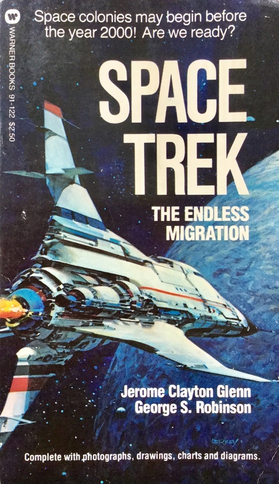
Interesting 1978 non-fiction book about the possibilities of space migration and the technical, social, economic ins and outs of how it would work. I’m willing to bet Elon Musk has read this one. Cover by John Berkey.
186 notes
·
View notes
Photo
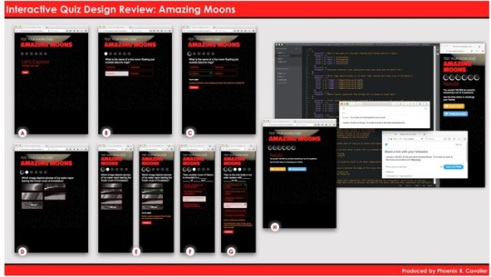
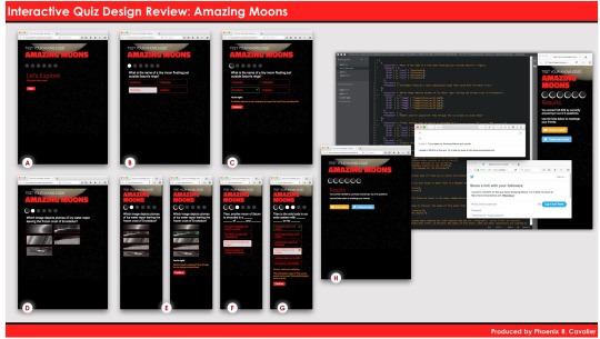
Here's a recap of the final version of my Amazing Moons interactive quiz.
A. We start with a new opening that says, "Let's Explore!" and "Click begin when ready". These subtle tweaks make the opening more casual and focus the learner on the idea that they are explorers, and they're in charge of getting started. You'll also see the revised color scheme, with a crimson red leading font color, and white for sub-headers or minor text.
B. Here you see that I've added a hover state to all the answers, which is a light grey. This color confirms the action for the learner, before they make a selection, and it allow them to consider their options more closely. I've revised the progress icons to change from transparent to white, before we see a 'Correct' icon added.
C. Here you see the 'Correct' icon as a cool crescent moon, in line with this moon theme of the quiz. I also revised the check mark used for correct answers, to be square, rather than the marker style originally used. You'll also see that the confirmation text says, "You're right!" all in bold white text, to be sure it stands out. This revised tone is a in line with the revised intro, and helps the learner in a relatable way, ditching the formality of "Correct" or "Incorrect".
D. The image question took a bit of work to get the images to fill the space as I intended. The choices are all in black and white, to challenge the learner a little more. This was also a case where the feedback was revised to better work with the formatting of the quiz.
E. This area focuses on two panels, we're now in the mobile device view, which you see as a narrow layout. The image questions change both height and width in this view. The hover action still takes place, and provides the learner an indication of their active choice with a slight border on the left and right of each image.
F. This shows the hover action again, and leads us to the next panel, where we see some revisions to the way incorrect answers are addressed for a learner.
G. What happens when an answer is incorrect? The messaging is revised, instead of saying "Oops", which seems rather pedantic, the message simply says, "Hmmm, check your selection". The goal is to turn the learner's attention to their choice, and give them an opportunity to reflect on their selection, even if momentarily.
H. This shows a completed quiz, with all answers being correct. Note that there's a revision to the way the message about the amount correct is presented. It no longer reads, "6 out of the 6 total questions", as this was too wordy. It now simply reads, "6 out of 6 questions". The larger section of item 'H' shows the live results of sharing on Twitter, or sending an email to challenge a friend.
R.I.S.E.
REFLECT: I'm really happy with the results and think this was a good use of technology to address some key areas of modern learning; coding and mobile device applications. While the work of instructional design may not be code-heavy today, I can imagine it will be more code-centric over the next three to five years. Having a sense of what it takes to make something like a quiz, what many might think of as 'easy', is good perspective to have when collaborating with different groups in the learning and development space.
INQUIRE: I’d like to see how this kind of a project could be used in a more corporate setting, with a more corporate topics, such as workplace safety.
SUGGEST: I’d also recommend more time be spent on effective test question creation, to make it possible for people to grasp the difference between asking, and actually educating.
ELEVATE: This project could be elevated with less time spent copying code, and more time spent editing completed code. Understanding how to have an impact on existing code is a real-world scenarios tied to managing and updating coded content.
All the best,
Phoenix R. Cavalier
0 notes
Text
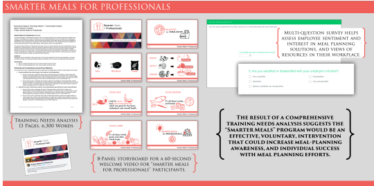
Smarter Meals for Professionals
REFLECT
Created a strategy for an educational program called “Smarter Meals for Professionals”, which included an online survey, a video and related quiz, and numerous citations that validated the recommendations I’d make for a company seeking to help their employees make healthier choices when planning meals.
INQUIRE
This project was interesting because it focused our attention on the many challenges faced by any professional seeking to recommend a specific type of intervention. What was fun to do was research the ways questions are used, how certain analysis and evaluation methods influence the design, and how packaging the information plays a large part in how digestible it is, or isn’t.
SUGGEST
I’m familiar with many parts of this process because of my career, however in corporate settings I rarely have the time we had in class to do in-depth research and analysis. Because of this, it was clear that there were many formal steps I’ve not had to take in my career, that are valuable, and I would suggest adding as best practices I can use on the job.
Creating the video was interesting because I wanted to neutralize the risk caused by on-camera talent. Illustrations allow a topic to be presented in a neutral manner, and tend to avoid alienating one audience or another. Throughout the project, I remained very sensitive to both HIPAA laws and risks some approaches could cause, and the emotional sensitivity with which I wanted to approach the topic of diet, eating, meal planning, and the general topic of health. It was very important to me that my video was just an relaxed, and neutral in tone, as the language I used in my design and analysis.
ELEVATE
A primary take away I have from this project is the value of submitting a recommendation paired with sound research, citations, and other data, along with working prototypes for analysis and evaluation, and examples of tools that can engage the audience through sharing information connected with quizzes or other tools for reflection and assessment.
All the best,
Phoenix R. Cavalier
vimeo
0 notes
Photo
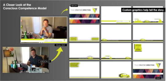
Video is something I’m passionate about, and is what I received my undergrad in from Full Sail in 2013. Because I understand video production the assignment was fun to complete. That said, knowing video also means having a lot of information that can slow you down at times. To keep things moving, and with limited time and technical resources, I worked to keep the message simple, and sought to stick to the design brief as much as possible.
The generational factors along with the tone of the company had a large influence on the look and feel of my video. I wanted a professional message to come through, but not a stiff one. I wanted to be relaxed and at ease, without looking lazy or poorly lit. The feedback I received along the way helped me go from a rather stiff video with someone telling a story, to someone who was really inviting a person into a company, and helping them learn about the culture. The difference was in my tone, my levels of eye contact, and my wardrobe to be sure who the viewer saw on camera was aligned with the design brief.
As I look back at the details and finer points, there are things I’d revise, like checking the set for things in the frame that are distracting. I’d also consider adding more lights, and look for different audio tracks to give more variety to the background music. I might also do something in front of the desk, standing or leaning casually, so the viewer could see more from my body language.
The theory of conscious competence is well known to me because I’ve been in the field of learning and development for about 15 years. I love the science and psychology that goes into my work, and the fact there are always new discoveries in fields such as neuroscience and emotional intelligence, changing the way I write and design. I’m proud of the video I made, and enjoyed seeing it come into focus. Even without possible changes, it was well received and effectively delivered a message using an analogy to which almost anyone can relate - the process of learning to drive a car - from novice, to expert.
All the best,
Phoenix R. Cavalier _______________________________________________________________________
Feedback I received included...
Heather Marron (Professor) Tue Aug 8 @ 5:19 pm PDT
Overall, good job with your video this week. The content for the video is great and you to a good job both building credibility with the audience and using an example that they can relate too.
As we move forward, there are a couple of things with the video that you may want to address. It is well framed, but the U-Haul boxes in the background are a little distracting. (I moved too many times.) Even just throwing a solid color sheet over them might help. Additionally, there is a little bit of fuzz on the audio track, so you may want to add some music to the final video.
We will add graphics to your final video for the class, but for this one, it should just be you and the camera. I look forward to seeing your next video.
Jamie West Thu Aug 10 @ 5:39 am PDT
Hello Phoenix. Here is my feedback for your second video.
REFLECT: Your message was clear and your analogy appropriate to the lesson. The setting did not distract from the video and implies the work space of a professional. Your tone was clear and easy to follow, however your hand gestures and body movements seemed to happen unconsciously and did not serve to punctuate your delivery.
INQUIRE: Why did you choose to delay your introduction to the topic until you were almost a third of the way through your video? Would you consider re-framing your opening story to focus on the listener? Perhaps you could try asking them to think about an experience they’ve had driving which is similar to yours. What is motivating your audience? Can you give them a reason to listen to your driving story at the beginning of your video?
SUGGEST: For your next attempt, I would suggest incorporating more engaging phrases and actions into your presentation. Try to draw the audience in by relating the analogy to them as quickly as possible. You may also want to consider incorporating some presentation choreography. Not dancing, of course, but intentionally use your hand gestures to emphasize key points and occasionally lean into the camera to communicate enthusiasm or excitement. Also, it may helpful to maintain eye contact with the camera/audience as much as possible so they feel spoken to instead of spoken at.
ELEVATE: Think about adding a sense of playful energy to your delivery. Don’t be afraid to smile or even interject some of your own emotional reactions to realizing you were driving on autopilot for three hours. Because your position on camera is fixed, you will want to use body language, eye contact, and energetic tones to make your presentation more engaging.
Mark Boulier Thu Aug 24 @ 10:33 pm PDT
REFLECT: I like that you created images that support the analogy you used with the car. I also agree with the use of the car moving towards to the right as you explain each stage. The timing of when you use your images lines up well with your video.
INQUIRE: What was your thought process when placing the slides that go over your credentials? Have you considered keeping them in the same area as opposed to separate sides of the screen? When you use "Un-" and "In-" throughout your graphics am I to understand that there is importance in this distinction when trying to understand the learning model?
SUGGEST: I would suggest adjusting the audio levels for the music you've added to your video as it can take away from your presentation by making it difficult to hear you. You might want to consider using the space in the upper right or left corners for the placement of your slides that go over your credentials and summarize the learning model. Placing them away from your desk in an area with fewer items may make it easier for the audience to process and remember. Your video may also benefit from giving the title slide just a few more seconds on screen.
ELEVATE: Your video has a lot of aspects that make it feel professional. Perhaps in future iterations, you can expand on this by adding more animation to the car moving from left to right. It would also be interesting to carry the car theme into more of your slides. You did a really a good job and I look forward to seeing your final draft.
Heather Marron (Professor) Tue Aug 29 @ 10:42 am PDT
Good job with your video. It does a good job delivering the information and highlighting the skills learned and reinforced in the class. The final project does a good job using the car analogy to discuss the conscious competency theory in a way that is both understandable and relatable. Excellent job with this both in your video and in your final self-reflection. They both show a strong understanding of the theories discussed in the course. As a whole, the final video presentation is very well done. The integration of the message and the visuals are well connected and did a good job delivering the content. The comments you gave Carson were well done and show a high level of understanding as well. There are a couple of minor things that you may want to adjust if you were to use this as a final portfolio piece. (1) Adjust the balance between your voiceover and the music. Sometimes the music is a little loud. (2) Take the broken scissors out of the pencil cup on your desk. With the graphics at the bottom of the screen, this becomes more apparent than in previous takes.
0 notes
Photo
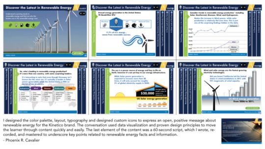
Below are the three rounds of feedback I received for the work I did on this project. It was a cool topic to discuss and one that I am passionate about - renewable energy. Having experience in layout and design made the task easier, but it didn’t mean there wasn’t room for improvement. For example, my icons had to get a second or third look to be sure they made sense. I also needed to address some color and typography choices, and make personal choices in relation to what was, and was not shown, on the solar power slide. I like the results, and it was good to explore how to use Keynote in a way that can meet basic standards for a WBT. All in all, it was a good project. Sincerely, MRPRCAT DRAFT 01 FEEDBACK Your Intro Slide: Grabs the viewer's attention! However, still wondering about the icons for coal and natural gas. I know what they are because of the assignment, but you may want to revisit recreating them again or finding something that looks more like coal and natural gas.
Your "first slide": Good contrast, but the white background is somewhat un-engaging. Can you find some pictures to spruce it up? Also, what is the green border? You will not want to "have a box within a box" Also, the white font colors for the tabs is somewhat problematic - kind of hard to see. What can you do about improving the contrast on the tabs?
Your second slide: Can you move the lower graphic up from the border of the box? You also have more green borders - you will want to remove those from the slides. The light blue type against the light background does not provide good contrast. Love the color blue, but can you make it darker, thus increasing the contrast?
Your third slide: Wow! The boxes are vibrant and jump right out at you! :-) However, the "Solar" with the white type font needs to be addressed. That part kind of burns the eyes. Can you darken up the blue type font for "It's interesting...." (Maybe you can turn that paragraph into a series of bullet points - you don't want to read it word for word in your narration.)
Your fourth slide: Same issue with the blue type font and the white font type against the green background. Also, "*Production Measured..." needs to be larger - right now too small.
Your fifth slide: Same issues as your fourth slide. You also have all that green space. What could you do to make it a bit more engaging, yet meaningful?
Your credits slide: Your "Image Source Details" is a bit small, but the whole slide has great contrast.
Cheers,
Dr. Reo DRAFT 02 FEEDBACK Be sure your introduction slide's narration is long enough to capture the viewer's attention. You also need to make sure that the Intro slide transitions by itself without having the user click on the slide. From there on out, the user should control.
On your slide 3 (with slide 1 being your intro) you need to not use the colored names of the categories as shadows. This takes away from the presentation.
Slide 4: Is there a reason why "solar" is higher than the others? Just wondering. :-)
Slides 5 & 6: Look good, no problems.
Overall: You have sound bites for each slide, but they are so short. I am not "feeling" a story being told, tying in one slide to the other. Also, this is not an infographic, but a presentation. You say the word "infographic" on the credits slide.
Remember, you want to engage your audience, not just inform them.
Cheers,
Dr. Reo
DRAFT 03 - FINAL FEEDBACK
Hi Phoenix, Wonderful feedback to Stephanie, and what a wonderful response back to Brandon and me! Your explanations shed greater light on the design choices you made. The feedback to Stephanie was write on point, helping her raise her project to a higher level. Your own reflections about what you created were helpful in understanding why they choices you made.
Your typography was fantastic - simple yet strong! I had to laugh when I saw the icon you made for natural gas - very creative and easy to tell what it was - way cool. The "lump of coal" was easy to make out as well. On the Wind Energy slide, I question why you included the topic of solar energy, yet did say anything about it in that slide. I understand the desire for brevity, but it seems as though more narration was needed on each slide to engage the learner just a bit more. Although you asterisked the BTU, I missed that entirely as I was listening and looking over the presentation. Some discussion of what BTUs are would have helped make it more engaging. All that said, good job on the presentation. Cheers, Dr. Reo,
Grade achieved: 91%.
1 note
·
View note
Photo
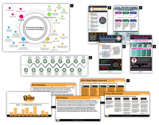
A look back at my design work from my Master’s program. The focus of instructional design is to transfer knowledge in a way that learners will appreciate. Often this becomes valuable through layout and visual balance between objects within a frame. My philosophy as an Instructional Designer (ID) is, “We look before we see”. This is at the heart of how I build any page for the learner. - Phoenix R. Cavalier
In this image you see seven elements, which are described below.
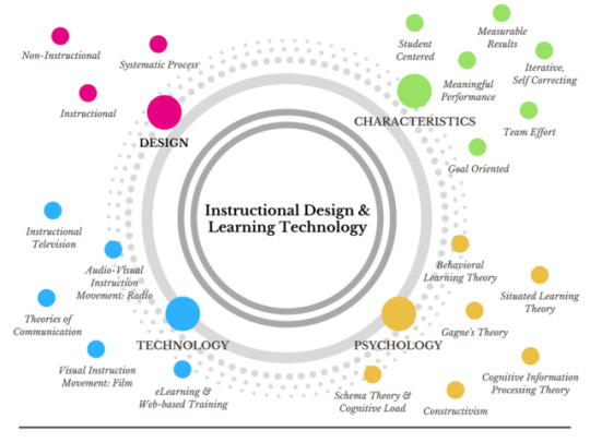
1. Instructional Design & Learning Technology diagram. I made this as part of a research paper that discusses the history of instructional design. This layout was inspired by the idea that how people learn includes a range of modalities, and methods. These methods are like satellites that orbit a central planet of Instructional Design, surrounded by the four moons of Design, Characteristics, Psychology, and Technology. Each of these moons has in its own orbit the many ways an instructional designer can create compelling content that will resonate with different learners, in different ways.
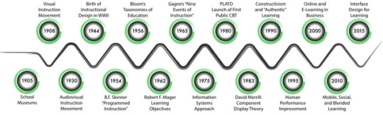
2. History of Instructional Design Time Line. This image was simply based on the many events in history that have defined instructional design, all the way back to 1905. The goal of this image was to create a fluid line quality that didn’t suggest any hard stops, since many event overlap. The other goal was to capture the feeling that this is a river of time, and it’s still flowing.
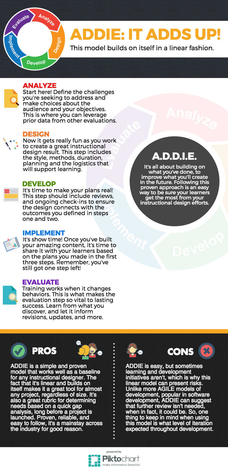
3. A.D.D.I.E. Infographic. My goal in writing with the intent of transferring knowledge is to use humor to keep the message relatable. Even if the topic is scientific, the writing style and tone may not be. The objective is to ensure the reader has a good time, and is able to relate to the ideas, and begin to see themselves applying the concepts in an easy way. Using a watermark style to show the ‘wheel’ of A.D.D.I.E. was a great way to give the page meaning, without making it seem heavy. Using weight of the darker colors in the lower third was on purpose, and helped leverage the layouts vertical design.
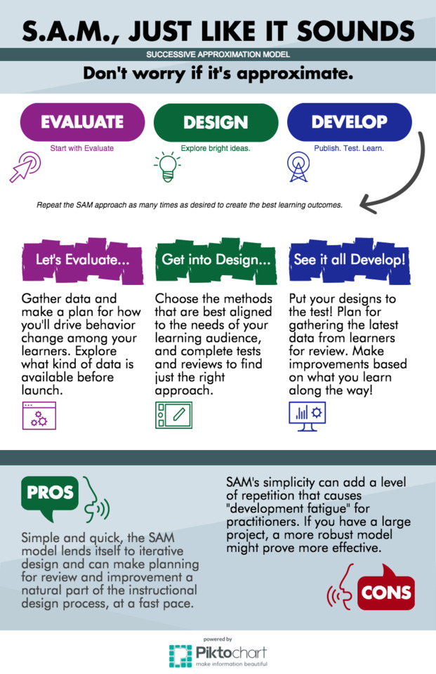
4. S.A.M. Infographic. SAM stands for Success Approximation Model, which is a very interesting approach to ID work. It leverages information a way that looks for ways to test what might work, and plan to make adjustments quickly, and often. Because this model is all about adapting, I used a paintbrush style to show rough edges, rather than clean, hard lines. The PROS and CONS were expressed with a relaxed conversational icon that aligned with the free-form nature of this model. I really enjoyed choosing colors and textured that invited the reader to feel okay with things that weren’t finalized. Since this model is all about trial and error, it’s important to let go, and see what happens.
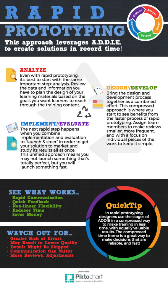
5. Rapid Prototyping Infographic. While A.D.D.I.E. is a great model, for many projects, the time available to complete a project may not be as much as one might want. Rapid Prototyping is a bit like S.A.M. because it stresses the importance of making choices quickly, and making adjustments quickly as well. It was fun to use colors to tell the story of A.D.D.I.E. in a new way, and I loved finding icons to signal when to analyze, when to design & develop, and when to implement and evaluate using this model.
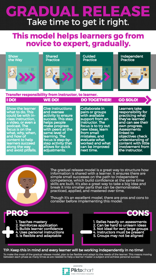
6. Gradual Release Infographic. The idea behind this design was all about showing something coming into focus, gradually. You can see this model in many classrooms; for example when a math teacher helps students build on a formula, they are ‘gradually releasing’ information, with the goal of steering the learner as they gain knowledge. I used image in the top of the layout to go from partial, to complete, through four phases. I loved the idea that educational pursuits, like film in a dark room, develop over time. The whole picture isn’t visible at first, but it does come into focus.
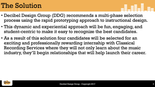
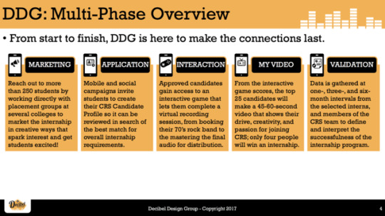
7. Instructional Design Consulting Video - Storyboard. As part of a group project to create a ‘pitch’ video, I was the writer. I felt great about my role, and was touched the my peers chose me to be the writer because they liked how I wrote with humor in my infographics. The storyboard I created leveraged the logo made by my teammate, Stephanie. Her color choice, and excellent use of positive and negative space really set us on a good path. Based on many noted, team calls, and a longer script draft, I created a storyboard for the three-minute video. This storyboard included five icons that I made which spoke to, Marketing, Application, Interaction, Video, and Validation - all steps that the client would want their candidates to complete. Our video was well received, and did a great job of pitching our teams idea for a training solution. Because my undergrad is in Digital Cinematography, I’m comfortable with script writing and have experience directing film projects. It was a lot of fun to lend my expertise to the team as the writer, and I loved watching our shared ideas come to life in our final project. It was an exciting month, and I’m looking forward to what’s next!
#MRPRCAT
0 notes
Link
Inspired. Prolific. Clear.
Angular Geometry (@angulargeometry) is so great!
After we told him Tumblr’s data confirms he’s the longest-running everyday GIF artist, he said, “I have no idea how to word what I am feeling to be honest. I am really moved.
Awww. And as if his GIFs themselves weren’t inspiring enough…
His advice to artists on their own everyday creative journey is, "Don’t worry so much. So much greatness is ruined by anxiety. Some days will turn out like garbage, some days you will be magically inspired and you will make something you are extremely happy with. The great thing is that the days just keep coming.”
It’s been a beautiful four years, Tyler. Here’s to four more.

5K notes
·
View notes

Photo
Awesome!


.
Light spills in a flood like a hundred golden urns pouring out of the sun.
3K notes
·
View notes
Quote
A bodhisattva doesn’t have to be perfect. Anyone who is aware of what is happening and who tries to wake up other people is a bodhisattva. We are all bodhisattvas, doing our best.
Thich Nhat Hanh (via aspiritualwarrior)
Be part of the solution.
573 notes
·
View notes