
Don't wanna be here? Send us removal request.
Statistics
We looked inside some of the posts by nina5319371 and here's what we found interesting.
Average Info
Notes Per Post
147
Likes Per Post
75
Reblog Per Post
1
Reply Per Post
71
Time Between Posts
10 days
Number of Posts By Type
Text
11
Photo
1
Last Seen Tumblr Blogs


Fun Fact
Tumblr.com is the 103rd most visited website in the world.
Text
Sci-Fi and Fantasy Movie Approach
I would discuss three typical movies in the 20th century: Art Deco(1927), 2001 Space Odessy(1965), and Blade Runner(1982). part from that,
The art style of Metropolis is greatly influenced by the Art Deco movement.

It was the largest film production of the year, shooting two million feet of film and employing 25,000 actors, 11,000 actresses, and 750 children. Therefore, as the earliest sci-fi movie, loads of human resources and models were used, in some way, the film relied on manual artifacts, such as the look of the city, the factory, and the robot.
2001 Space Odessy
To be honest, I did not have strong favor for this film. In some way, I sped up once. The main scene attracting me was the end in the bedroom. It was cutting-edge when the time audiences had no idea about the space, as well as the curiosity towards any technology.

Blade runner

As the latest version among all, results to be my favorite, neither from the plot or special effects.
Our world was imagined to have acid rains, high skyscrapers, and rubbish everywhere. In general, people lived in multi-cultures and hustle and bustle.
Chronicles of Narnia
It was my favorite movie/lion ever in my childhood. At that time, I always dreamed to be the one to be selected for Narnia's Kingdom.

The connections between reality and the wonderland were spontaneous, to give hints to audiences because things happen in daily life. For example, animals are not normal, as well as the closet. Special effects are used continually in the film, especially on a large scale to depict the whole scenario or the environment.
0 notes
Photo


Week 10 My Final And Our finals
Comprehensively, this post will start from the insight first, because I have lots of thoughts to share. IDES1262 can be concluded in one famous sentence, “Some of the most devastating things that happen to me have taught me the most”. Study with the flow by the course, I have experienced and well understand the sketch and modeling system in some way, from basic modeling techniques, tools, and computer-aided design. Apart from tangible improvements on hands-on skills, within the most essential part, the communication of design has been enhanced - design thinking. There are loads of ways that I can present and express my idea, which generates more radical thinkings and a creative approach towards design thinking.
😫As I mentioned at the beginning, every time starting from new was a thorny issue, and for me, I could be anxious and nervous. I always met difficulties at the preliminary stage, such as how to draw orthographic and engineering drawings, because apparently, they were precise and professional. Hence, my biggest problem among all was hard to start from zero.
Luckily, I would appreciate this course: IDES1262 offers the entrance ticket for me. Although I was still a freshman for modeling, still with tons of doubts when looking at online masterpieces by designers, this entrance ticket provided a series of exercises, including 3d max, cura, technical drawings, and foam modeling, which symbols I have started my journey. Now, the surface or the process of each system was familiar for me, where the anxiety vanished. Indeed, excitement and passion happen. I am looking forward to industrial design more and more, day by day!

From this point of view, pre-activity was always been my favorite. Occasionally, if there is material, I would print them out, and so far, there was a book on my desk for regular review. However, things would not be perfect. I dislike and was tired of the resolution of online classes. It did waste time for me to figure out every step, especially for the latter course in July and August.
Besides, other activities looked fundamental but were fun and communicative. Firstly, the community online, I always browse different output and sent messages to others; we have connections, not only from asking questions and appreciation, but also an influence for each other. There was a desire that I hope to meet everyone offline! Secondly, to document and record works online was a new attempt for me. If I did again, I would definitely prepare the bbcollab at first, there were many difficulties when using it. Indeed, the resolution and the stability of this software still is an issue. Therefore, by comparison, I love Tumblr! Tumblr is great, especially searching the tag in previous years, past works would pop out❤.

At last, thank you again to Rob, Gonz, and Tom: the content was rich and it gives me a precious entrance ticket! Thus, during the vacation, I could explore as many as I want into the further page. Hope to see everyone again next term.
10 notes
·
View notes
Text
Week 9 Prototyping
Pre-Class Activity: Andrew Simpson Cup Case Study
I found this video useful, as Simpson introduced a way how mature studios to do a case study. I have also looked up his website ’Vert Design’ for a comprehensive understanding. It was said that ‘the studio operates as a testing ground for new concepts and self-initiated experimentation, as well as offering design concepts, modeling, prototyping, and manufacturing to clients from niche boutique brands to multinational organizations'.Hence, with both videos and website resources, I concluded the comparison into two points.
Firstly, the testing process is similar to my experience. We all use tools nearby, even sometimes did not plan to use, always to check changes regularly. Besides, objects are likely to start up with rough to smooth transition and end up in something organic by typical tools. In other words, in the digital application, the modifiers can be seen as the instrument for edit details. Secondly, there exists the crucial difference of ‘feeling’. Andrew Simpson has always held the cup in the process and introduced the parts by hand for pointing out. Therefore, digital software cannot achieve such an experience, or I named it the ‘perceived value’. Particularly, the weight and design could influence the gesture we hold cups and how we grab the handles. In his studio, the feel of glass, ceramic, and even the holes are tested. During such a process, a myriad of changes and risky ideas have been tested for interaction purposes. In comparison, I did not have investigate deep about materials and other attempts.
Week 9 Studio Tutorial – Mesh modelling your own concept
This time, I preserved files carefully to avoid computer crashes during the rendering. Works in week 9 look similar to week 8, which consists more detailed design towards our bottle. Hence, a mixed practice to utilize the skills we need.
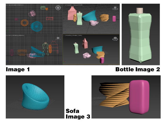
😄I enjoyed the lecture the most when tutors analyzing the cost per piece and the quantity(image 1). This is a powerful reason that most designers now promote digital drafts. In the tutorial, I have conquered several following issues: reference maps, the use of light&materials, and how to render or output in a professional way to depict my products.

I did not know the purpose of the map at first, which I lost my way here to confirm the size and specific lines for the bottle(image 2). Luckily, I fixed this by watching recordings. If I have the chance to do it again, I’d better ask tutors or jump over to do other steps. It is not valuable to stick in one procedure for a long time .

Coming to the playful stage: Materials can be easily achieved by the physical standard, which turned out to be my favorite. Glossy paint, transparency, aluminum have been displayed(image3&4). By adjusting the numbers in roughness and basis, the rendered products would perform in different smoothness(image5).

In the end, I was keen and dying to create a whole scene or atmosphere to express my product, aiming to express a natural feeling and joyful lifestyle, with light color. I failed in the 3d max process, then luckily, I put every single one into photoshop and successfully composed them together in unity(image 6).

All in all, standing from a designer perspective, I am used to displaying bitmaps, choose proper light and materials, and how to exhibit my products. Things I need to keep going: the matching function of every modifier (I always forget); how to position target light; and how to build a background in 3d max instead of in Photoshop.
19 notes
·
View notes
Text
Week 8 Studio Tutorial – Digital Iteration
My understanding of Andrew’s own explanation of ‘low-fidelity’-’hi-fidelity’
He gives examples from the handle, which from the aluminum handle, brass handle to plastics handles versus 3-d print. In my interpretation, it was a process from hi-fidelity to low, from the accurate and high-quality material towards the fast production. Hi-fidelity refers to be featured by minimal changes in sound reproduction; whereas, low-fidelity produces less accuracy and with less perceived value compared to the hi-fidelity. Hence, the difference between these two concepts results not only in the material but also in the perceived value, such as the feeling when users grip the weight of different handles.
From low to high, this process is a traditional and clean process to output the highest; however, from high to low, this is a way to test various aspects simultaneously and research different elements to add to the design.
Part1 introduces the basis and provides preparation for part2
CAD(Computer aided deisgn) has become mainstream, alomost every modern manufacturing company has access to at least one form of CAD or another. It helps me to achieve the design in a cheap and less cost mode in a most realistic way. Also, I suppose, 3d modeling would be a mundane performance for laymen, such as customers and factories. Compared to paper or sketching, a 3d file can be easily sent to everywhere by Internet.
By watching the recordings of the class several times, I have achieved the objectives overall, from conceptual understanding for 3ds max and quick generations. Before the class, I was extremely worried about computer-aided design, because I suffered a lot from the time of Rhino😫. However, everything was beyond my expectation positively😁. I get well on 3d max, especially the high-tech design of the interface, which was much more friendly.
My favorite: I enjoyed playing the modifiers and changed the numbers from different components(image1). I felt like this was magic, especially displaying the twist, mesh smooth, and the FFD, which can be seen from my bottle(image2); Organic shapes of the sofa were performed by squeeze(image3); lastly, I made myriad changes in edit poly to apply multiple layers inside the box, so that the container could be functional(image5). Actually, this was hard to define the numbers to the mesh smooth and squeeze; for me, I solved it by several failures from experiences.

My biggest regret ever: If I had time next time, I’d definitely save the file every 15 minutes, because when the rendering started, the application is going to easily break down. This is the reason I did twice this week. This point I assume that the fatal disadvantages are software complexity, aaintenance and Upkeep. Everything starts from digital devices, but also ended in its machinery shortcommings. The success or failure of the affair is all due to the very same point.
Online exercises and tutorials offered a series of episodes to lead me into the 3ds max: currently, it would be likely to create the object type first, then with various modifiers.
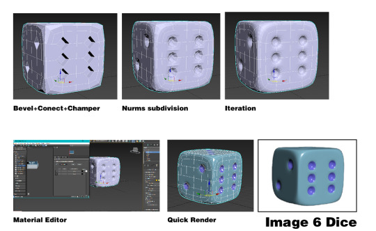
At last, I wanted to add material on the surface and did the quick rendering where the dice was designed by the aid from the tutorial(image6), which resulted in a glassy effect through several stages, bevels, connect, chamfer, and NURM subdivision. I like the way how bevel turned out to reveal the depth and details.

In a nutshell, digital works always benefit from techniques but are also limited by familiarity at first. Specifically, it was a process like clay making: firstly, the rough and overall structure; then with details and alterations. Next time, I would go further about the modifier list.
18 notes
·
View notes
Text
Week 7 Studio Tutorial – Physical Model Making (foam)
I have developed many experiences from previous to this week. Before class, materials are selected carefully by myself, and limited in few types.
For this week, we are learning how to make physical models with our hands. At first, I was surprised that how videos explain the purpose of hands-on experience. One tutor said, “although this is an age of the 3-d printer, the pieces we print out are only used for testing the mechanical properties, instead of the product itself ”. Honestly, I cannot agree with this point of view. When we started to make it, I am going to examine the function and connection physically.

Firstly, setting up a ‘home-making’ place was hard(image1). Due to the limited area of my room, I transferred the place from inside to the outside balcony, which provided the outdoor region and was easy to clean up the dust. I enjoyed and was satisfied in the preliminary stage for drawing on the piece of paper(image2), and chose the foam.
Unfortunately, it was miserable to have one brick that seemed like the material of yoga brick. As a result, the structure of this foam was so intense that could not be cut. In addition, with the wrong side of the rasp, the rasp was broken(image3). I reckon my problem with uneven forces. From here, I wish I could buy matched sizes and materials next time, in order to save resources and time.

Also, thanks to the previous experience, I tried the concept of abanded foams(image 4). Lastly, new tools have been fulfilled in my box, such as rasp, file, sandpapers. The output has been polished carefully(image5&6).

To encapsulate, there is a vital understanding of two things: the construction of profiles from a multi-perspective; the rough and the order of tools【blade > rasp > file > rough sandpaper > smooth sand paper】.
9 notes
·
View notes
Text
Week 6 Digital Rendering
It was not my first to commence rendering, 😲but I have never expected to use photoshop to visualize things before. In terms of the course, related to digital, a sense of worry comes up, because there are like to have several technical issues, especially online. Thus, in some way, rendering is my favorite part but also turns out to be my fear, a complex feeling towards it.
Initially, as everyone did, I looked up Behance for inspiration. Meanwhile, according to one sentence, ‘on the shoulders of a giant may see farther than a giant, therefore it is straightforward to have a basic understanding by finished works‘. The reason why I choose these two, perhaps, the sketching and the digital rendering, they are lively and vivid, rather than depending completely on software. There are sketching skills combined together. Hence, a combination of hand drawing and digital effects would be my style.


Image 1-3: In fact, things went well by following the short videos at the beginning, where I used my touchpad and pencil. Setting up the basics was easy to keep track of, however, I stuck at the outlining part for a while. Due to my version of photoshop, it was not able to stroke successfully at first. Not only me, but some other classmates also met this issue. For me, it was lucky, by following others’ instructions, I found a new way to achieve it. There was an auto button to select areas if you choose them in the system. If I have a chance, I will like to ask what was the problem with my photoshop, because it was not able to set rectangular at one layer.
My favourite part must be the shading and coloring for highlighting, by learning from previous failuers in the past classes. How to add the dark and the volume have been familiar for me.

A new concept I learned was digital one could indicate a rough sketch, merely depicting outline with shacky linework, which I did not notice before(image 4).

At last, I painted one bottle on my iPad with Autodesk, in which green try to convey a natural sense. So far, despite the work that was accomplished, I was not satisfied with the final. I know there is still a long way to go with digital rendering(image5-7). Currently, a kind of fear has transformed into passion and curiosity.


8 notes
·
View notes
Text
Week 5 Studio Tutorial – Sketching
This week contains numerous technical skills for me to commence on, from developing a rough comprehension towards sketching. There are two stages, the warm-up, and the olay bottle design.
Sessions 1 Exercise
The guideline from both tutor and documents stated things clearly and easily, whilst the work that I did follow was amateur compared to what the tutor drew. I felt like there was a big gap to say that was the difference😤.
Although I lost my way at the begining, I enjoyed this part, because the exercise applied a sense of ‘pure art’ growth, hence I was able to feel the direction of lines(image 3), and the lines followed my wrist.

Choosing the ‘proper’ tools to draw was a issue. What is proper, for me, initially I used thin pen and always failed to produce an ideal shape, which made me extremely devasted. Luckily, thanks to the discussion in the class, I finally realized the pen ought to be a bit thick as being an outline, and sometimes, thick pencils could also perform well(image 1).

I wish to choose selectively from the beginning so that it would save me a lot of time from the correction.
Contour lines aid to depict the form for circles, ellipses(image 2), and everyday objects (image 4), which was my favorite part, a sense of achievement of being like an architect for the mini world(fruit).
Sessions 2 Sketching
Part 1 Olay Moisturiser bottle
I have not expected there was a way to redesign the product in such a way, which was innovative and clever within 12 thumbnails. Before, I thought the entrance to industrial design was difficult to get access to; now, 12 rectangular decreased my fright to the product. Lego was my inspiration thus bottles were always in geometric constructions, which were closely attached to corners(image 5).

Adding contour lines, and tones, the final work looked closely to the mt ideal ‘sample’. During this stage, due to art experience, I handled well with the color, markers, and paper; it was a familiar procedure when I painting.
If I have time, I would prepare a color card for my greyish markers, therefore to pick the specific one quickly(image 6).
Part 2 Perspective Drawing
We accumulate every single skill together. Currently, such a part looked like a combination of every skill, perspective drawings to express our own goods. This time, again, we were in the semi way to design things imperceptibly(image 7). I would like to maintain some additional markers in the way to the vanishing point, but I think corners could be clean in some way.

Thanks to the Youtube tutorials, it helped a lot. Hence, next time, I should go through all resources in advance rather than viewing them in the process.
All in all, this week developed my confidence for industrial design; psychologically, it lowered down my worry about being a designer; also, seeing the final product from tutors, let me see my capability🤣, and we know we have a long way to go.
11 notes
·
View notes
Text
Week 4 Studio Tutorial – Perspective Drawing
🤣🤣Every time I thought it was the thorniest exercise ever, the new coming-up tasks always break up my memory in last week. No pain/failures, no gain, perhaps. In general, during this week, I am indulged in drawing different perspectives, distinguishing the numerous details between terminologies, and making comparisons with orthographic drawings. It was awesome and I have a lot of hilarious tales to share this week.
Part 1: Construct a 2 point perspective view of your chamfered box
Before the class, we prepared to make the chamfered model(image 1)and commenced reading the interactive website, to have a general understanding of what is a perspective drawing. However, to utilize methods down to the ground need patience and carefulness.

For me, it was a sad and funny story. I failed three times😭 and always happened at the end after tracing.
Initially, at the last moment in the tutorial, by showing to Robert, the lines from the station point were not parallel(image 2). A mistake was buried from the beginning.
Secondly, although I realized the problem, after taking a snap😑, I forgot the rules of carefulness totally, where LVP did not locate to the right position(image3). Having a snap just like a phone restored factory settings.
Thirdly, the vanishing point really ‘vanished’, luckily, the new page could be added together. Fortunately, things come to the end(image4). What I learned is a well-known sentence ‘No Success Chance, No Failure to Be Destined!’.
If I have the chance to do it again, I will double-check over the line weight and the page layout, and take notes down about things to change before relaxation, so that problems will not be made twice again.

Part 2. Extending a box in perspective /Part 3. Drawing circles in perspective
Certainly, by developing such deep insights from part 1, I went through the second(image5) and the third exercise(image6-7) quite smoothly, without any trouble. Overall, a radical system of perspective drawings was constructed, not only depicting things we see, but also it was possible to extend, subdivide, and adding circles inside. Always, a sense of achievement and gratification grows up.


19 notes
·
View notes
Text
Week 3 Studio Tutorial – Section and Auxiliary Views
This week encapsulates all aspects of engineering drawings that we learned before, including the third angle orthographic drawing, section view, and partial auxiliary view, complied with a thorny model by using the simplistic tools(image 2), which I felt like this task or this tapered block was meant to test us.

It was enjoyable to read the book, within the material so that I could able to get through everything in advance and turned concepts out to be practical, which gonna certainly always be my favorite part. However, as I said, tapered block owns a myriad of pitfalls, where the level is not parallel and it accompanies with various sections in different views. I have spent a lot of time to figure the differences, thus I assume I was loath to distinguish the model from plain paper. If I do next time, it would be better for me to take some steps, such as to observe the whole first, and to compare figures next(length, height, and width), lastly to imagine it in my mind.
Since childhood, I have been fascinated by spatial imagination. As for this exercise, I got radical methodology to visualize every single side by engineering drawing(image 3&4), rather than depending on the ability of a kind of nature(spatial imagination) in the past.

Lastly, my experience so far since the first class: it is absolutely an advantage and win-win situation when communicating to others in the class[perhaps, that’s what is called a class]. For example, thanks to suggestions from my classmate and tutor, I did improve my line weight so that different parts were more clear and precise than before. I’ve noticed the size problem from my classmate, and we worked out together, some applied reduction scale and I drew on A2(image 1). Many ways to Rome.
In general, this work was the most professional one that I did so far(image 5). I wish every time new drawings come up and ‘defeat’ my last.

12 notes
·
View notes
Text
Week 2 Studio Tutorial – Orthogonal Projection
The second session for ‘Sketch Mode’ put the engineering jargons down to the ground, which means we picked up one product then apply with AS 1100 standard by using the familiar instruments(image 1).

First of all, reading is essential. I felt like it was the right choice for me before class to print out the reading material for engineering drawing(image 4) because multiple pages were shown together that was easier to locate my doubts, such as how to illustrate the radius, what is the exact criteria, which turned out to be my favorite part, because these papers seemed the lighthouse in my way to go for ‘engineering drawing’.
At the start of the exercise, thanks to the guidance or steps, making a 5-sided box(image 2), as well as drawing the rough model, they all offered a comprehension about the object. Every procedure is made to enhance the understanding(image 3), including the dimensioning symbols, dimension, and projection lines. Besides, the use of a pen to indicate the discrepancy between lines could also be a task. During the class, it was worth asking questions, such as how to illustrate the curves, the suggestion of ‘french curve’ has been given(image 5), which gave a new option instead of being vexed.


l I thought that drawing for cream cub was tough, whilst I was wrong. Dimension worked fine(image 6). Things went difficult when the revision table needed to be added in. The standard length ‘33’ was not able to display on the page, due to the size of the cream tube. After all, I tried new for experiencing the size(image 7), but I should learn the size of the table in advance next time and ask tutors or planing layout again.


There are still many to go for a try. Practices toward the master for engineering drawing.
14 notes
·
View notes
Text
Week 1 Studio Tutorial – Drawing Instrument Exercises
The first session for ‘Sketch Mode’ introduced various instruments to help us in order to produce high-standard drafting ability from the beginning to the end. At first, I was perplexed about the tools in the lists and had no idea about the term ‘tee square’, ‘set square’, and the extension arm for quick-bow compass(image 6). However, thanks to the introductory video series and the reading material, such sources reduced my anxiety greatly.

Part 1 – Dimensionally accurate drawing
Honestly, I enjoyed the first work pretty much, which reminded me about the mathematical problem about geometry in high school, because this topic was my favorite, such as the equidistant. There are my steps to approach the figure(image1 and image2). Particularly, moving the compass point around the circle with the radius seems much cleaner than using the protractor. Meanwhile, I found it interesting when constructing with a pen, where some lines need not be painted. I regarded those lines as traps hah, because once you were trapped, everything should start again. Thus, being patient and precise has been the essence, the precious way to ‘Rome’.
In terms of the second, perhaps, the steering wheel, it was a tough task when I met the joint. The rounded corner brought about two problems: hard to ensure the accuracy between each other as well as how to connect by using the tool. During the process, not only with instruments(including coins), I have tested my wrist and rotated the paper to create the smooth line. Thus, I assume this issue was my pet peeve.
Fortunately, everything works well at last(image 3 and image 4). If I have a chance next time, I would display the circle template in advance. More beautiful curves could be produced.


Part 2 – Tessellating Pattern
Everything works smoothly after the first exercise. Apparently, by looking at the simple pattern, one word has already come up with ‘accuracy’. More simple the figure is, the fewer clues and fewer aids will be. Hence, whether things are precise or not would be fatal.
Apart from that, beyond my expectation, pattern owned the pinpoint accuracy, but the main problem I encountered was the cut and the knife. I was learning to execute with meticulous attention to detail.
Lastly, I displayed vivid colors in each tilling pattern(image 5), to apply with the design taste(Mediterranean-style tile). In general, instead of repeating sentences from the first paragraph, the current task truly tested our sense and the intuition towards the ‘accuracy’, and the sensitivity to the strength of how to use the knife along with the steel.
Tips: Robert’s guide about how to adjust the lightness and color balance of the photos is helpful.

15 notes
·
View notes
Text
About-Me
Hobbies: I'm interested in oil painting, sketching, and others, including debate, literature, learning German, and taekwondo. Belief: I believe in that 'let art not only be art', but it can also be useful and for practical purposes, especially associating with my favorite subject 'physics'. Something designed lasts forever or as long as it could be, which is likely to be meaningful to deal with consumerism and environmental problems. Therefore, a product designed for multiple purposes would be my ideal goal.
Glad to meet new friends.
12 notes
·
View notes