
Don't wanna be here? Send us removal request.
Statistics
We looked inside some of the posts by nwterm1project and here's what we found interesting.
Average Info
Notes Per Post
0
Likes Per Post
0
Reblog Per Post
0
Reply Per Post
0
Time Between Posts
2 days
Number of Posts By Type
Text
17
Last Seen Tumblr Blogs


Fun Fact
70% of Tumblr users say the Dashboard is their favorite place to spend time online.
Text
Term 1 Project Evaluation
This Don’t Panic project was quite an eye opener for me because it made me realise what i’m good and not good at and the workshops in which we did building up to this project helped me know what techniques I should use within my work and what to possibly avoid. The new skills in which I have learnt in this project is my drawing skills both digitally and non-digitally because I personally am not the best at the drawing and because of that I don’t feel confident in my work if I have hand drawn it from scratch without a photograph as reference to trace over in one way or another, but since starting the course I have learnt new ways to overcome that issue such as tracing over photographs using a graphic tablet on Photoshop or Illustrator or if I have drawn something physically then scanning it in and then using Illustrator to make, expand, ungroup, live paint make, and fill my drawings with colour and this is the method in which I used for the majority of my Don’t Panic project. Another skill in which has helped me in this project is the scanned typography work using the Canon scanners because it was a helpful method to use in terms of moving the paper around on the scanner to create a wave effect in which helped to showcase my fear as it almost imitates the movement of a snake , also I found ways in which to achieve this on Photoshop as well but I found this method much more experimental as you can get good mistakes out of some of the attempts as well and I would really like to use this method again as I found it quite enjoyable to experiment with.
One of the artist who I was inspired by throughout this project was Tyler Spangler because of his use of imposing bright colours along with monochrome and how some of his work is quite bold in terms of there just being colour and very little monochrome and I liked his overall style with his work, another artist who inspired me for one of my postcards was Eliza Southwood because of one of her illustrations and how it has a chequerboard appearance and I liked this look so I decided to recreate it with a grid instead of there just being different coloured squares next to each other without something to separate them. Lastly I was majorly inspired by just looking at zines and other artwork on Pinterest and previous Don’t Panic pack posters and postcards because I wanted to see how I could make my work stand out in terms of technique and appearance and how I can make my work different without repeating the same thing throughout my work.
I think one of my designs in which worked particularly well was my postcard of the snake shedding its skin because of how detailed it is yet quite simplistic in a way as the background is very detailed with the snake print and it also having different shades of blue in order to create a pattern, then you have the snake itself which is detailed when it comes to the actual snake but for the snake shedding I decided not to have any scales on that because I felt as though there would be too much on the postcard and it would become too overcrowded with the same pattern recurring on the same piece and I think it is my favourite piece of work from this Don’t Panic project. Another design in which I really like is the snake in the centre of the postcard with the Japanese sunset in the background because of how simple the background is but the snake in the foreground is really detailed and was done just using the graphic tablet, also the time in which it took to perfect the detailing on that snake made me appreciate its appearance even more and the style of these two postcards are the type of style in which I like to produce, simple yet detailed.
If I was given more time with this project, I would experiment with different colour palettes along with my finished poster and postcards as I chose my colour palette before I started to put together everything and personally I don’t think it really helps to showcase a fear as it kind of contradicts the meaning because the colours pink and blue aren’t really a fearful colour combination but it can be viewed as juxtaposing the purpose of showcasing a fear, I would also like to go back and add a bit more to the back of my Don’t Panic envelope and add a bit more detail in terms of some information about ophidiophobia and why people fear snakes. One pro of this project was being able to have the freedom in the fear in which we chose to showcase throughout our Don’t Panic pack and be able to use whatever techniques we wanted to without having to follow a workshop and have a specific outcome but a con to this project was being able to come up with ways to try and not repeat the same thing throughout my work such as on each postcard there being a snake, which I tried to avoid but I ended up using sections of snakes to try and make each postcard appear different.
Overall I found this project really successful because it helped me realise where my strong and weak points are when it comes to this course and it’s helped me know where I need to practice in order to improve on, I think my favourite part of this project was the Don’t Panic part because of how much freedom we had on what we could do even though it took me a while to think of what fear to showcase as i’m known as being quite indecisive when it comes to doing something like this. I also really liked the Zine photobook production because of the freedom in which we had when producing that but the difficult thing for me was being able to use the same photo for the whole book as I wanted to give myself a challenge instead of using multiple pieces of my work and in the end I really liked the outcome and the overall process in making it.
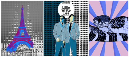
These are some of my favourite workshops in which we have done so far. Firstly I really enjoyed the glitch workshop because of how I got to edit some of my favourite photographs in which I took when I went on holiday to Paris and I got to enhance them like the one shown above of the Eiffel Tower which I personally think is my favourite outcome I have done so far, the reason I think this is because of how the colours of the glitched Eiffel Tower go really well with the monochrome background. I also liked the Little White Lies workshop because this is where I first used the graphic tablet for this type of drawing along with using carbon paper for the first time and I really liked the technique of repeating the title in the background and I used this method in my Don’t Panic poster. Then lastly the Don’t Panic project was definitely a favourite as I got to use whichever methods I felt as though I was strong in and didn’t have to worry about not being proud of my work.
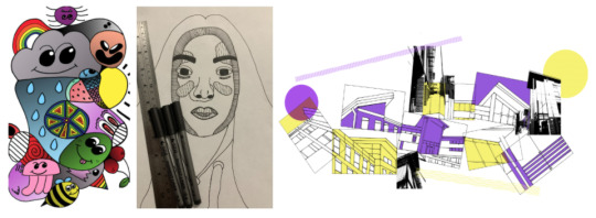
However, there were workshops in which I didn’t like because of the final outcomes or just the process and the work itself. Firstly the doodle art workshop wasn’t a personal favourite because of how all over the place it was in terms of it being random which I didn’t like and I felt as though its quite childish in terms of appearance and I feel as though if I was given a specific theme for it it might have been more successful, then the workshop I really didn’t like was the Luke Dixon one because I really have a passionate hate for drawing people, specifically facial features, because despite practice I have never been able to master major detail like this and when it came to the actual work I didn’t like a single part of it and I really wasn’t proud of the outcome. Then surprisingly I didn’t like the architectural workshop because I found that my work was a bit too random and I think if I could do it again I would put more thought into it and plan ahead on what i’m going to do.
0 notes
Text
Zine Photobook - Final Product

These are the options in which I chose for my Zine photobook on https://www.doxdirect.com/ and I chose to go with the saddle stitched A4 book because I felt as though because there’s are only 20 pages there is not really a need to have a proper book and I chose the 160gsm paper because it’s thicker and will be better quality in terms stability, I also chose to have card as my front and back cover so then my work would actually feel like a book in terms of the front and back page being thicker than the rest of the pages inside.
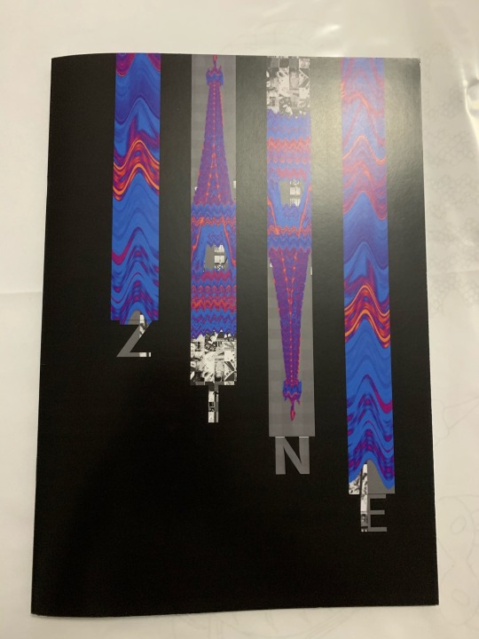
This is the final product of my Zine photo book and I’m really happy with the outcome because of the quality in which the pages turned out.
0 notes
Text
Don’t Panic Mockups

These are my poster and postcards for my Don’t Panic Pack showcased in a picture frame and someone holding a postcard mockup. I did this my selecting the mockup template in which I wanted to use and then went to the layer in which has the photograph in and then double clicked it and then opened my file of either my poster or postcards in it and then saved it and closed the tab, then when I went back onto the mockup file the image would have changed to mine. Overall they all have a really cool appearance but I think the one poster i’m not too keen on seeing them all together is the chequered snake and skull one because I think the white grid makes it appear somewhat out of place.
0 notes
Text
Don’t Panic Sticker Pack - Process & Outcome

The process in how I achieved the sticker appearance is by adding a white boarder with a slight shadow so once I had positioned my sticker I went to fx which is located at the bottom of where the layers are showcased then I went to stroke and made sure that the colour was white and the destination was set to outside and then I chose the size to be 30, once done it has a mix between a thin and thick outline which was just right for the appearance in which I was going for.

These are my final stickers and I really like how the pack turned out because it has a mix of both text and pictures. For some of the stickers I used sections from my poster and postcards as I was really happy with some of the drawings I did, in addition to them I also drew a few more drawings in order to use as stickers along with some type I did using the liquify tool and overall I am really pleased with how everything turned out.
0 notes
Text
Sticker Pack Inspiration

Here are some sticker packs from Pinterest in which I thought were inspirational in one way or another, this may be because of the colour choices, appearance or theme and a elements from a few packs will be featured within my own sticker pack. I like the sticker pack with the butterflies because of how the same butterfly design has been used but they all have been finished in a different colour which is an option in which I am looking at with my stickers but the only issue is that I need to stick to my colour theme so I might do different shades of one of the colours in my colour palette similar to the sticker pack on the left of the butterfly one, I also like the sticker pack with the majority of the stickers being writing and it has inspired me to have some written stickers in my pack because I don’t have much writing in my poster or postcard apart from repeated words so I might so breeds of snakes or words in which are associated with them. I have also thought of doing just monochrome stickers with maybe one colour like the packs on the bottom left and right hand side because the one of the left looks quite scary which is good as the aim of our Don’t Panic packs is to showcase a fear but I also like how the one on the right has an aesthetic appearance to it and is really detailed, I also like the boldness of the sticker pack on the top right hand side because of how thick the outline of the stickers are and how the colour choices are quite vibrant and not dull in any way which will help to draw interest in them. Overall I plan to use certain aspects from these sticker packs such as using text within my stickers and making sure to stick within my theme of snakes (ophidiophobia) and my colour palette, along with possibly using a thick outline around my stickers and keeping my stickers quite simple as my postcards and poster are very detailed.
0 notes
Text
InDesign Zine Book Pt3

These are my 12th and 13th pages of my Zine and in order to produce the 12th page I used the rectangular frame tool to produce one thin rectangle from the top to the bottom of the page and then I placed my glitched photograph inside, then I duplicated it and lines them up evenly across the page (cmd c and cmd v) from the left to the right hand side of the page. For the 13th page I used the rectangular frame tool to draw a square and then I placed my glitch inside then arranging it so then the monochrome section is captured, after that I duplicated it so then it went from the top to the bottom of the page in the centre of the page and then I used the rectangular frame tool again to cover both pages and then fill it with the colour black and then right click the background and go to fit, fit to back in order to have it as a background and everything else in front of it.

These are my 14th and 15th pages and for both of these I used the rectangular frame tool and made a rectangle and placed the glitch inside and for the page on the left I arranged the rectangles so the photograph was slip from top to bottom and then for the page on the right the photograph was split from left to right which has an interesting appearance yet I find it a bit boring in terms of them being really similar to each other but I might experiment with the blending options on one of the sections of the one on the right hand side and do some glitches in order to make them less similar.

I like my 16th and 17th pages because of how the rainbow-like drawing continues across both pages despite the photograph not being in the background on the page on the right but I think that it gives an overall interesting appearance, I also like how the colours of the drawn ‘rainbow’ are colours in which I selected from the Eiffel Tower as I wanted the colours to go with the colour theme of my zine. Firstly I opened Photoshop and inserted the file of my glitch and then I added a new layer and used the eyedropper tool to select certain colours from the glitch and then using the paintbrush tool I randomly drew a waved line across the page covering roughly just over a half and then using the same brush size I continued the ‘rainbow’ of colours, then I duplicated it onto a black page on another file to be on the other side of the page. Then on InDesign I used the rectangular frame tool and placed both photographs inside and then using the frame tool again I drew a box around both pages and filling it black just to be safe in terms of there being no gaps in the placing of both photographs.

These are my 18th and 19th pages and I think the page on the left is my favourite page of the whole zine because of how simplistic it is, I also really like how the Eiffel Tower has faded into the background and I feel like the black background helps to enhance the colours on the Eiffel Tower making them become more vibrant and eye-catching. To produce this page I used Photoshop and opened a new file and used the paint bucket tool to fill the background layer with the colour black, then I opened my Eiffel Tower glitch file and copied only the Eiffel Tower onto the new file (cmd c and cmd v) and then after positioning it to the centre of the left hand side of the page I duplicated it 4 times and then using the opacity scale on the top right hand side of where the layers are shown, I decreased the opacity on each Eiffel Tower apart from the first one and then once complete I saved it and then opened my InDesign zine and used the rectangular frame tool and placed the faded edit onto a new page.
Then for my 19th page I opened my glitch on Photoshop and then inserted a grid photograph (white) and then using the magic wand tool I selected the grid and transferred it onto the file with the glitch and then I used the free transform tool (cmd t) and covered the page with it so then there are even squares over the top of the image, then I used the paint bucket tool to fill in the squares in which didn’t have any of the coloured Eiffel Tower glitch inside with the colour black. Finally I saved it then went onto my InDesign zine file and used the rectangular frame tool and placed the edit inside and then using the frame tool again I drew a box around both pages and filled it with the colour black to ensure no gaps in between.

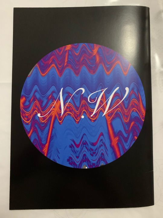
This is my 20th page of my zine which will also be my back cover and I like the appearance of this because of how simplistic it is, in addition to a personal touch which were my initials inside the circle in a somewhat classy/ fancy font instead of bold lettering as I think that it’s quite subtle in comparison to the vibrant colours of the book. To do this page I used the ellipse frame tool and placed my glitch edit inside and arranged it so then it was more in depth in terms of focusing on the patterns showcased, then using the type tool I selected a font in which was simple yet sophisticated and chose the colour white because I found that the text in black didn’t stand out as much as it slightly clashed with the background and then using the rectangular frame tool I covered the page and filled the box with the colour black and then right clicked the mouse then selected fit then fit to back to have it as the background and every other element of the page in front of it.
0 notes
Text
Don’t Panic Poster and Postcards-Processes & Final Outcomes Pt2

These are my hand-drawn drawings for my final poster design and postcards which I have scanned into my mac using the Canon scanners and my favourite drawing has to be the snake shedding its skin because it demonstrates the transformation, rebirth and healing of a snake and I personally feel as though it’s one of my most successful and favourite drawings in which I have done so far in this project because I think that it has a really interesting appearance. I plan for the drawing on the left to be used as the main feature for my new poster design because I feel as though my other poster designs were too chaotic and I personally wasn’t too fond of any of them as none of them jumped out to me in terms of being work i’m really proud of, then the drawing of the snake and skull is going to be used for another postcard as it’s a simple drawing with no texture as there are no scales on the snake or major detailing on the skull because quite a few of my posters are very packed full of detail.

This is a step by step for another one of my postcards in which I feel as though is my personal favourite. Firstly, I opened my shedding snake drawing in Photoshop and adjusted the levels of brightness and contrast making sure that use legacy is selected, then I transferred the enhanced drawing onto Illustrator and then selected the drawing and made and expanded it before ungrouping each element of the drawing so then I can make the drawing into a live paint one and then using the live paint bucket tool I selected different shades of grey so then it’s easier to add a coloured overlay to match my colour palette and theme. Once filled with colour I grouped everything back together and transferred the drawing back onto Photoshop where I used the magic wand tool to start selecting the white background and deleting it so then there is no background. Then on Illustrator again I added the scaled background from one of my other postcards and then I made it into a live paint drawing and using the eyedropper tool and live paint bucket tool I selected the blue from my colour palette and then started to fill in the scales, then I used a darker shade of the blue from my colour palette I added detailing into the scales in terms of patterns and then once done I grouped everything back together and transferred it back onto my Photoshop file where I arranged the layers so the scales become the background layer. Then I added a colour overlay to the snake and selecting the lighter shade of blue from the background and then experimenting with the blending options which are above the layers in Photoshop to the top left and I felt as though this option had the best appearance.

I really like how this postcard turned out because of how the snake shedding is very light in colour just real snake shedding which is a transparent/ white colour but I couldn’t really achieve this in my work as I wanted to follow my specific colour theme, also I like how the snake scale background helps make the postcard appear less flat and overall looks really detailed.

I quite like the appearance of this postcard because of how there is a chequerboard pattern in terms of the background and I also like how the snakes are alternating in colours so for a pink squares the snake are blue and for the blue squares the snakes are pink, the one thing I would possibly change about this postcard is maybe adding a bit more detail in terms of the skull because my other postcards in which feature snakes are very detailed and I think having one that’s a bit more simplistic is nice to see. To achieve this outcome I used Photoshop to adjust the levels of brightness and contrast (image, adjustments, brightness/ contrast) then I opened the drawing in Illustratorand made a copy so I had two and I made and expanded, ungrouped and then made the drawings into a live paint drawing, then using the live paint bucket tool and eyedropper tool I selected colours from my colour palette along with the addition of monochromes for the skulls to fill in both drawings and then once complete I grouped them back together. Then back on Photoshop I used the paint bucket tool to make the background layer of an A5 page black so then it is easier to view my grid in which I found on google and then used the magic wand to to select the grid and bring it onto the page, after positioning it using the free transform tool (cmd t) I used the eyedropper tool and the paint bucket tool to select the blue and pink colour from my colour palette and filling the background in alternating colours to give a chequerboard appearance. Once complete I opened both of my drawings and used the magic wand tool to delete the white background and then copying and pasting them onto the A5 page (cmd c and cmd v) and then using the free transform tool to scale them down to fit inside the boxes (cmd t), for skulls with the blue snakes went inside the pink boxes and then the skulls with the pink snakes went inside the blue boxes and then I made sure that all the skulls were exactly in the same position in each box so then they all look somewhat the same.

This is my final poster design for my Don’t Panic pack and I really feel as though it is more successful in comparison to my previous poster outcomes because of how simple it is yet have subtle detailing. In order to produce this outcome I adjusted the brightness and contrast of my drawing on Photoshop by going image, adjustments, brightness and contrast and then opening up my drawing in Illustrator and making and expanding it, then ungrouping the drawing and making it into a live paint drawing and then using the live paint bucket tool I selecting different shades of grey to fill in my drawing and then once complete I grouped the drawing back together. After that I opened the coloured drawing in Photoshop and positioned it in the centre of the A3 page using the free transform tool (cmd t) and then using the horizontal type tool I typed out the word ‘ophidiophobia’ which is the fear of snakes in which I am showcasing throughout my Don’t Panic work, then I selected a font in which I thought would suit my poster and then to make the type have a wave effect I selected the type then went to filter, distort, wave and then selected the colour red for the type as I felt as though it relates to snakes as snake venom can cause major blood clots and make the blood become a solid within moments and I didn’t want my poster to match with my colour theme like my postcards. Then to make the type repeat across the page I used the rectangular marquee tool and created a box around the type and went to edit and define pattern then layer, new fill layer and pattern to fill the whole page with writing and then after some adjustments in terms of positioning and size of the writing I selected the snake skull and then duplicated it and decreased the opacity then offset it to the right hand side of the original just to give the poster a bit of dimension.
0 notes
Text
Don’t Panic Envelope - Final Outcome

Here is the process in how I printed my Don’t Panic envelopes on the printer, firstly I opened my Illustrator file and turned it into a PDF and saved it onto my memory stick and then once at the printer I scanned my ID to log in and then went to device functions and plugged in my memory stick and selected print from memory stick, then I found my Don’t Panic envelope file and selected it and then made sure that the bypass try was selected at the top of the screen and then made the bypass tray paper size A3 and then I went to detailed settings which is on the right hand side of the screen and made sure that ‘fit to paper size’ was selected along with the colour mode being set to colour. Then I got my two pieces of A3 brown paper I placed one of them on the bypass tray slightly edged into the printed and then pressed print on the screen, the printer then took in the paper and printed off the front page and then I did the same with the second piece of brown paper in order to print off the back page.

To assemble the envelope I used a pair of scissors to precisely cut along the guidelines on the paper and then I folded the tabs in which are going to be glued to the back cover in order to make it easier to position, then putting the front cover face down I glued along the tabs with the writing on and once the back cover was cut I placed it on the glued tabs making sure that the top was left open so then I have an actual envelope which can be used if needed to produce an actual Don’t Panic pack. Overall I really like how the envelope turned out because of how the snake stands out in the foreground of the background and how the scales also stand out in terms of patterns, but I think the one thing I would change about my envelope is the back because I personally think it’s a bit too simple and maybe if I was able to do it again I would add a bit of information about the fear ophidiophobia.
0 notes
Text
InDesign Zine Book-Outcomes Pt2

Here is my sixth and seventh page of my Zine book and I really like them both because I enjoy the overall freedom I have to present my photographs in the book using various ranges of methods and techniques and I like coming up with ways to showcase the same photograph but in ways to not make every page look the same. I think the reasoning behind me liking this book is because I really like the photograph in which I am using because I think that the outcome of the glitch was my best glitch outcome.
For the first page I used Photoshop to add in a grid to my photograph and using the crop tool to crop the image of the grid so there was one line and then duplicating it and then arranging it so it would have a step effect as shown above. I then went back onto InDesign and used the ellipse frame tool (holding shift) and then placing the image (file then place) and adjusting the positioning to capture the area in which I wanted to showcase, in this case I wanted to showcase the centre of the photograph because of how it has a bit of everything including colour and the monochrome glitched background along with the grid. For the second page I used the rectangle frame tool and placed my photograph inside the rectangles across the page and also fit them so they weren’t fit proportionally to the frame as I wanted the frame on the right to be zoomed in more in comparison to the rectangles extended from the left hand side of it. I like how the frames on the left hand side go from small to large and then small again because it has a really interesting appearance and I also like how they aren’t all lined up because of how the rectangles are all different lengths so I think that it would be best presented this way.

These are my eight and ninth pages of my Zine book and I really like the page on the left because of how the circle in the middle has had its blending option altered with so then certain colours have switched and gives off a really interesting appearance. Firstly I used the rectangle frame tool and placed my photograph inside then fit it and then I duplicated it multiple times to cover the page, after that I used the ellipse frame tool and did the same thing apart from instead of leaving the blending options as normal I changed them to give a different effect. Then for the ninth page I used the rectangle frame tool and placed my photograph in and then after fitting it so then the pattern was only shown I duplicated it multiple times to form sections across the page, finally I used the rectangle frame tool again and filled it with the colour black and then right clicked the mouse then selected arrange and send to back to make it the background.

These are my tenth and eleventh pages of my Zine book and I really like the appearance of these joined pages because of how the hexagons line up in terms of patterns and I also like how there is a gap in between both the hexagons. To do this I used the polygon frame tool and placed my photograph inside and then did the same thing again but filled it black and placed it on top in order to give the one with the photograph the appearance of being an outline instead of being filled, then I used the polygon frame tool again and placed the same photograph inside and placed it in the centre of the pages so then the hexagons line up in terms of patterns.
0 notes
Text
Don’t Panic Postcards-Process & Final Outcomes

This is the process in how I produces the poster shown below with the snake suffocating a mouse. Firstly I opened up my adjusted drawings from Photoshop onto Illustrator and cropped the image so the section that I wanted was there, then I selected the drawing and then made and expanded the image (object, image trace, make and expand) and ungrouped (object, ungroup) them. After that I selected the white background of the image and deleted it so I was only left with the drawing and then I made it into a live paint drawing (object, live paint, make) and then using the eyedropper tool and live paint bucket tool and my selected colour palette from https://coolors.co/ to help generate a unique colour palette for my posters inspired by one of the posters shown on my Pinterest inspiration post before this one. Once the image was filled with colour I then grouped everything back together and positioned the snake in the middle of the page and then using the pen tool draw around the drawing leaving a slight gap in between and then using the type on a path tool select the path drawn with the pen tool and type the word ‘suffocation’ without any gaps around the snake and repeat this process until the page has been filled.Once complete change the font and size of the writing and then adjusting the kernings which is shown above the last screenshot in order to close up the gaps in between the words. Finally I brought the drawing into Photoshop and used the paint bucket tool to fill in the background in order to bring this poster together because it looked a bit plain being white.

This is the final outcome of the process shown above and I quite like how it turned out because of how the word ‘suffocation’ is surrounding and almost suffocating in on the drawing of the snake suffocating the mouse, the reason why I chose the word ‘suffocation’ is because of how people fear being suffocated to death by a snake as sometimes when you hold one they like to wrap themselves around your arm or around your neck and it tends to make people quite anxious due to knowing that’s how they kill their prey.

This poster is definitely my favourite because of how the background is the pattern of snake skin but my favourite element is how the writing has a wave effect to it and that the halftone has been offset to the right which gives off a really interesting appearance. To produce this postcard I used illustrator to make, expand and ungroup the drawing of the snake scales and then made it into a live paint drawing and used the live paint bucket tool to colour in the scales and then grouped everything back together and transported it onto Photoshop. Once in Photoshop I used the free transform tool to make the scales cover the background (cmd t) and then I selected my image of the scanned type of the word ‘ophidiophobia’ and used the magic wand tool to delete the background and then transfer the layer onto the one with the snake print, I then used the paint bucket tool to fill the writing with the letter white and then I used the magic wand tool again and selected the writing and made a new layer. With the new layer selected and the writing being selected I used the paintbrush tool and selected the brush ‘Kyle’s Screentones 35′, once selected I pained over the writing and then once done I deselected the type and then offset the layer to the right.

I like this poster because of how simplistic it is and how the blue fades nicely into the pink background but my favourite element of this postcard is the writing from the type scan in which I did in a previous post in which has been used for the word ‘snakes’. In order to produce this postcard I used Photoshop to insert a new A5 page and then inserted the scan of the type in which I moved on the scanner to give the text a wave effect to replicate the movement in which snakes do, then I used the magic wand tool to select the letters and then transfer it to the A5 page where I then grouped each letter together so then it would be easier to move them in one rather than individually. Once done I adjusted the brightness and contrast of the type in order to sharpen the edges of the letters (making sure use legacy was ticked) and then I used the eyedropper tool to select the blue colour off of my colour palette and then using the paint bucket tool I changed the colour of the letters to blue, I then duplicated the text multiple times so then it covers the whole page and using the opacity scale to the top right hand side of where the layers are shown I changed the scale so the opacity was getting smaller as the words reached the bottom of the page so they fade away just like snakes do in the wild due to their speed. Finally I used the paint bucket tool with the eyedropper tool to select the pink colour off of my colour palette and then fill the background with it as the colours pink and blue both complement each other.

I really like this poster because of how the background has the appearance of a Japanese sun and that there is a darker tone of blue on the side of the sun streaks as it gives a 3D appearance and a bit of body, but my favourite element of this poster is the snake because of the detail in which has gone into it which has made it look really realistic. To produce this I used my Illustrator drawing from my poster experimentation with the type backgrounds from the penguin books and I opened the snake drawing in Photoshop and placed it in the centre of the page, then I used the paint bucket tool and the eyedropper tool to select the pink colour from my colour palette and then place onto the background layer. Finally I used the polygonal lasso tool to create triangles around the snake and then using the paint bucket tool to fill them with the blue from my palette, after that I selecting all the layers with the triangles on and merged them together and then duplicated that layer and moved them to the left so it acts as shadowing and then added a colour overlay (blue) to the snake to match the colour theme of my postcards.
0 notes
Text
Postcard Colour Palette Inspiration

These are some images from Pinterest in which were inspiring to me but some for different reasons than others but my main focus for these images were the colour choices in which were used. I really like the colour choice of the second image on the first row because of how vibrant the pink is on top of the black but even though I really like it I wouldn’t be able to use it in my work as neon pink doesn’t really help to showcase a fear as such. I also like the fourth image on the bottom row because of how the pink, blue and red all go well with the monochrome and how the shapes used in the artwork are either black or white.
Overall I really like the colour combination of pink and blue because of how they both go well with each other as they are complementary and they aren’t really a typical colour choice to showcase a fear but I feel as though it could work if I don’t use vibrant shades of them colours.

To produce my own colour palette I used https://coolors.co/ and went to generate and then create palette from photo and selected the colours from the photo in which I liked the colours of and in some cases I adjusted the shades to either make them lighter or darker.
0 notes
Text
Mind Map

Here is my mind map which I did in order to come up with words in which associate with snakes as that’s the fear in which I have chosen to portray throughout my Don’t Panic pack. I put the word ‘snakes’ in the centre of the page and then I put the first 10 words which come into my head when I think of snakes and then I made it more detailed by linking the 10 words to other things to do with snakes associating to that one word, for example, snakes have fangs in which are used to bite and pierce the skin with poison which could sometimes lead to paralysis and be very painful. These words are going to help me with my postcards because it will give me ideas with what to draw in order to showcase why snakes are feared by people and I can also showcase these words in my work as a background or something on the side of a postcard.
0 notes
Text
Scanned Typography

For this method of producing a type scan I went onto Photoshop and typed out snakes and ophidiophobia onto an A4 layout, then printed them out and from there I used a canon scanner and attached it to my mac and used image capture to scan the pieces of paper. However, I didn’t leave the paper stationary as it was scanning as I experimented with moving the pieces of paper from side to side and also dragging the paper along with the scanner to extend the length of the letters. I liked this technique because it was so much easier than going to scan the paper in on the printers as by using the scanners it would go directly to your desktop on the mac so there was no having to save it onto a USB and wasting time, also I liked experimented with the speed in which to move the paper and seeing what difference it makes to the appearance of the letters.

Shown above are the outcomes in which were produced using the methods stated above. The top row of scans are the outcomes in which I think are the most successful because of how they all have a wave effect in which I was hoping to produce because it replicates the movement of a snake and how they move from side to side, but I think my favourite outcome has to be the third one because of how the writing is bold so it captured the movement better in the scanner and overall has the best appearance. The bottom row of scans aren’t necessarily unsuccessful but personally I don’t think that they are scans in which are the best in terms for what I am using them for. I am going to be using some of these scans for my postcards which will be included in my ophidiophobia inspired Don’t Panic pack in order to demonstrate different techniques within my work.
0 notes
Text
Don’t Panic Pack-Envelope Process & Final Outcome

Shown above are the drawings in which I drew for my postcards and my Don’t Panic envelope showcasing the fear ophidiophobia, to showcase this fear I drew a range of snakes from different perspectives and angles in addition to drawing some snake skin/scales as people tend to be scared of the texture of a snake. I think my favourite drawing has to be the snake suffocating a mouse because of how it is quite detailed in terms of the snake wrapping itself around the mouse and being able to see the ears of the mouse through the other side. I am going to use the drawings on the top and bottom left hand side and layering the snake on top of the skin/scales for my envelope because I think that it will have a really interesting yet fearful appearance due to the facial features of the snake.

Here is the process in which I produced my envelope from, firstly I increased the brightness and contrast on Photoshop of the drawings I produced. I then opened the template of the Don’t Panic envelopes on Illustrator and then I opened the drawings it on Illustrator on a different layer and cropped the page down so there was only the one of the scales and then used the mouse to select it and went to object then ungroup the lines and then went to object, live paint and make in order to live paint the drawing. Using the live paint tool I selected different shade of grey in order to replicate the patterns in which are seen on some snakes and then once filled with the colour I went to object then group to connect everything back together. I then did the same process for the snake head in which will sit on top of the scales using the ungroup, live paint and group method.

For the finishing touches of my envelope I got a photograph of the Don’t Panic logo, going to object, image trace and make and expand and then ungrouping it in order to remove the white background behind it and grouping it back together, once done I used the rectangle tool to make a rectangle with the dimensions 75mm in length and 15mm in width and scaled the Don’t Panic Logo so it was the same size as the rectangle (get rid of rectangle once same size) and then by using the wave filter by going to filter, distort and wave and then adjusting the settings. I adjusted the bar so then the wave of the logo fit perfectly in between the markings of the snake and making sure that the white lines don’t overlap too much as they will be transparent through to the envelope material when printed. Once done I needed to make the free stamp in which is showcased on each Don’t Panic pack so to do that I used the star tool and entered in the settings for 50 points and radius 1 being 12 and radius 2 being 10 in order to replicate the free stamp on the real Don’t Panic packs and placed it on the bottom right hand side of the envelope, then using the signpainter font I typed out ‘free’ and placed it inside the stamp. Finally for the back of the envelope I used the signpanter font and the wave distortion filter I typed out the fear ophidiophobia and placed it diagonally across the template.

I really like the overall appearance of the Don’t Panic envelope because of how the snake stands out on top of the snake print which I think is my favourite element due to the the shaping of the print as it is quite accurate in terms of shading and how the print is accurate in comparison to a real snake print, I also like the simplicity of the back of the envelope as the front is quite packed full of detail and I feel that the front of items are more payed attention to as when products are showcased they’re placed facing the front and not back as the front is what draws the most attention to someone. For these envelopes the areas in which are white will be transparent so it will the the colour of the material in which the envelopes will be printed onto and the ink used will be black and tones of black just like the Don’t Panic packs which is the reason behind why I used monochrome and grey colours.
0 notes
Text
Zine Book Process & Complete Pages

Here is the process of developing a page of my Zine book on InDesign which showcases how to develop the base of a page and this specific process is for my fourth and fifth page of my book.
Firstly I went onto InDesign and created a new page in which is set to A4 and then went onto pages at the top of the screen and added a few more in order to have a rough few pages to go to without adding one page at a time. Then using the rectangle frame tool I created a rectangle on top of the pink line so then there is a border around the outside and then going to file then place (cmd d) and selecting a given photograph in order to fill the interior of shape placed, after that I right clicked my mouse and then went to fitting and then fill frame proportionally to fit the photograph into the corresponding area and then using the rectangle frame tool again I created a frame from the centre of the page to the right so then it split the photograph in two and then filled it with the colour black. Finally I used the rectangle frame tool to create a frame around the whole page slightly beyond the page to make sure that the whole page is covered and then selected the colour black again and then right clicked the mouse and selected arrange then send to back in order to set the black as my background colour and have the photograph in front of it.

Here is the front page of my Zine book and I really like the appearance because of how the black background really brings out the colours of the glitch photograph I produced in the glitch workshop a few weeks ago and I also like how the rectangles are different sizes in terms of length almost acting as a stair effect but descending instead of ascending. The element I like the most is the Zine title because of how the photograph has been incorporated into each letter instead of a solid fill or gradient. In order to produce this front cover I used the rectangle frame tool and filled them with my photograph using the place method, after that I fit the middle two rectangles so then the Eiffel Tower was captured fully in both of them but the one on the right hand side was rotated by 180 º by right clicking the mouse and selecting transform and rotate 180 º. Whereas the two filled rectangles on the far left and right hand side were filled so that the Eiffel Tower was more zoomed in so you could see the pattern in which it has been made to appear like which I find really interesting. Finally after completing the cover after doing the title (step shown below) I used the rectangle frame tool to outline the whole page and fill with black and then sent to the back as the background.

This is one of the screenshots I took when doing the title on my front cover because I wanted to remember this specific part as it’s what accomplished the outcome. Firstly I used the type tool to individually type out each letter in the colour white then made them into a bigger size and placed them underneath each rectangle, after that I used got the rectangle frame tool and drew a frame over each letter and filled it with the same photograph as the rectangles and fill it so the photograph is zoomed in and then select certain areas to be the letters fill. Then I went onto effects and where the bar says normal I changed it so then it said multiply in order to fill the letter and I think it gives off a great appearance as it goes with the rest of the theme.

These are my second and third pages in my Zine book and I like how different shaped circles have been used and how the same pattern has been flipped in different directions so they are all not identical in overall appearance and I personally think that it gives off a space vibe as the pattern look like a really colourful planet. In order to create this appearance I used the ellipse frame tool and using shift in order to create a symmetrical circle and then placing a photograph in there but not using the fill proportionally option because I wanted the main focus to be on the pattern in which is showcased instead of the Eiffel Tower itself, then finally I used the rectangle frame tool and filled it using the colour black and made it the background by sending it to the back.

This is the outcome to my fourth and fifth page of my Zine book and I like this because of how the photograph has been split in hand and the other half is glitching away onto the other page and I also like how they are different sizes in terms of length and width. In order to achieve this outcome (following from the process at the beginning) I used the rectangle frame tool and placed the photograph inside and then positioned them so they were ascending towards the top of the page, then finally I used the same tool again and outlined the pages and filled it black and moved it to the back to be the background.
I look forward to completing this book because I really like the theme in which I am going with as I want the background to remain as being black throughout as I find that it helps to bring out the best in colours as it makes them stand out more, I also really like the developing process of doing these books as we have the freedom to be as creative as we want and express it what form we like and normally I get stuck with having the freedom artistic ways because I get too many ideas but the style of this book is a style in which I really like doing as it’s simplistic as I’m using the same photograph but using different sections of it and I’m looking forward as to what the finished product will be.
0 notes
Text
Tyler Spangler Analysis

Tyler Spangler is a digital artist based in California where he plays with colour and animations, he often imposes bright colours with monochrome photographs merging both together and he features his work through social media as it helps him gain exposure and showcase his work. Through his work he wants to be able to support his family and make people smile and create curiosity, he also states his work to be “chaotic, organic and curious” where his main themes feature anxiety, vibrancy, harmony and contemplation.
0 notes
Text
Fears Poster Process & Final Outcomes

For my fear I chose ophidiophobia which is the fear of snakes because of how they are deemed to be very dangerous and being poisoned by one could kill you within seconds as it clots your blood and makes it become solid, personally I’m not scared of snakes themselves it’s what they can do if you get injected with their venom. In order to draw the snake I found a photograph off the internet and then opened it on Illustrator and using the graphic tablet, I used the pen tool to trace the snake and adjusting the size of the pen by pressing ‘[ or ]’ on the keyboard depending on whether I want the pen to decrease or increase then once I traced everything I created another artboard which is under layers and then duplicated the snake onto the other page. Then making sure that the snake on the right hand side is selected I went to object then expand appearance and then object, live paint and then make and then using the live paint bucket and the eyedropper tool to select colours from the photograph and then place it onto the snake. Then finally I transferred the snake onto Photoshop by copying and pasting it.

Before pasting the snake I opened a new page making sure it was A3 and then pasted the snake onto the page, after that I selected two pages in which I drew on from my Penguin Classics book based on fears and then moved them onto the page with the snake on and adjusting them to the size of the page by using cmd t to transform them (scale) and then layering them up and selecting the top layer of the page I selected the tab where it says normal and changed it to difference to reveal the second page. I also selected the snake layer and went to the same tab but selected hard light in order to expose some of the page through the snake and then using the horizontal type tool I typed the fear ophidiophobia and selected a font in which didn’t look as standard as Arial but not too complicated and then rotated it 90 º to the left using the transform tool and placed it to the left of the page.

This is the result of the process showcased above and I quite like it because of how the colour of the writing matches the yellow on the snake but a bit darker, I also like how you can see the pages through all the sections of the snake which isn’t the colour black, however I’m not sure I like the background with because I personally think that it’s a bit too much and doesn’t go that well with the background and I just think the overall appearance isn’t scary which in theory it should be because it’s showcasing a fear and isn’t supposed to be cute looking which I think it is.

I like this poster because of how the yellow parts of the snake are transparent and have gone straight to the background because of the adjustment setting I put it on within the normal tab of the layer, I also like the way the text has been showcased because of how I used a setting in which gives the writing a wave effect to kind of replicate the movement of a snake and how they travel from side to side. I used the colour red as the background because of how it links to blood and snake venom is known to clot blood and turn it into a solid matter within seconds and the colour red also is a contrasting colour to yellow so makes a good background for the title.

For this poster I inserted my drawing of my snake from Illustrator then duplicated it and went to image, adjustments and then black and white in order to turn one of the snakes into monochrome as it will increase the choices in blending options. Then I selected a scan of a book page from my Penguin Book and added a colour overlay and experimented with the blending options until I was happy with the appearance and then I did the same thing with the snake duplicate in which is in colour and offset it to the left to have a glitch-like effect and then I also changed the blending option with the monochrome one so then you can see the text of the background in certain areas of the snake. Finally I used the text tool to type the fear ophidiophobia and changed the font and size and then duplicated it multiple times and changed decreased the opacity from top to bottom and having the first type being the colour yellow as they are a complimentary pair. I like this poster because of how the snake duplicate has been offset to the left of the monochrome snake and how the opacity decreases through the order of the text as it could demonstrate how snakes can disappear within moments as they can be fast paced.

For this poster I kept things quite simple just to keep the focus on what the fear ophidiophobia actually is and I like the appearance of how it came out but i’m not sure whether it’s too simple, but I like how the black areas of the snake have become transparent through to the background which gives it an interesting appearance. To achieve this outcome I inserted my snake drawing from Illustrator and then using the paint bucket tool I filled the background layer with the colour grey and then using the blending options of the snake layer, I experimented with the different options to see which gives the best appearance in terms of working with the background and then I typed the fear ophidiophobia using the text tool and changing the font, size and colour in order to go well with the background.
0 notes