
studiosem2projectaandb
We be designing and shiet
Naina Kumar
69 posts
Don't wanna be here? Send us removal request.
Last Seen Blogs

draco-after-dark
Its Goblin time

keepers-quaffles-and-old-clocks
Untitled

dr-ground-zero
Paging Dr Dynamite! You've made it to ground zero

jovialphantomwitch
Untitled

venditera
Venditera Telugu Movie News And Reviews


Photo


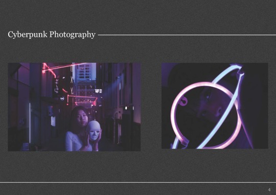
Wanted to keep it simple. the background is inspired by tv screens - which links with my love for gaming.
0 notes


Photo


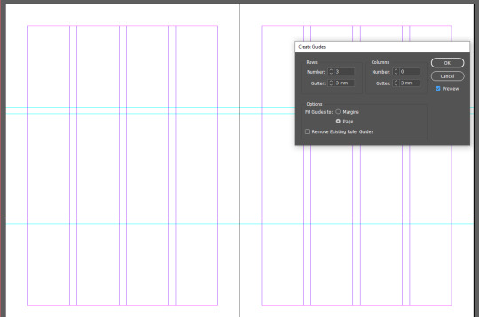
I wanted to stick to the original grid system since it was simple and easy to work with. I also tried to apply the work that inspired mine
0 notes
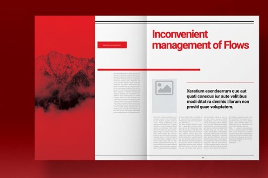
Photo


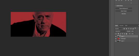
Image treatment. I wanted to stick to black and white with a think of red. It was to keep things simple
0 notes
Text
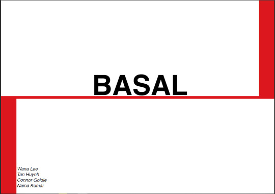
Logo

The logo made by the group was good and I didnt wanna change it tbh
0 notes
Text
https://www.grapheine.com/en/history-of-graphic-design/graphic-designer-muller-brockmann-swiss-style
0 notes

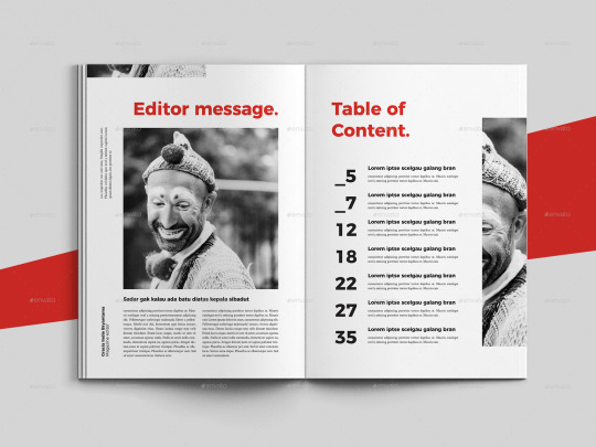


Photo

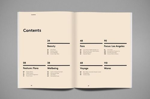


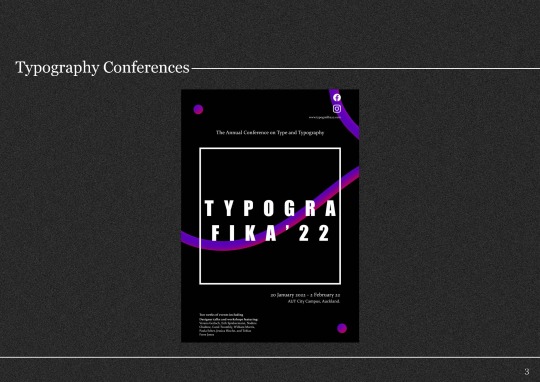
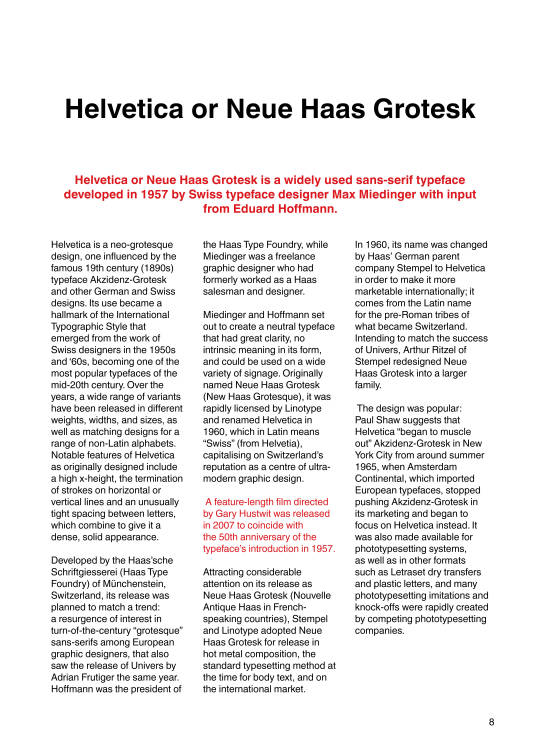
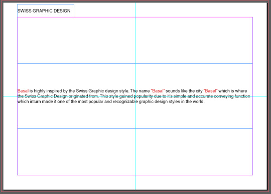
Inspiration for table of contents inspired by swiss graphic design.
0 notes

Text
1
https://www.grapheine.com/en/history-of-graphic-design/graphic-designer-muller-brockmann-swiss-style
0 notes
Text
design hero
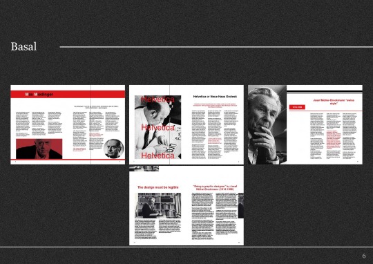
Josef Müller-Brockmann, another student of Keller’s, heavily focused his work around the grid system and Akzidenz-Grotesk typeface. After taking over Keller’s teaching position at the Kunstgewerbeschule and later opening his own design firm, Müller-Brockmann helped spread the Swiss aesthetic far beyond the borders of Europe by establishing the Neue Grafik (New Graphic Design) journal—a trilingual magazine he co-edited with Franco Vivarelli, Hans Neuberg and Richard Paul Lohse.
0 notes
Photo


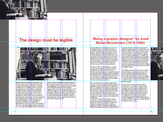
after feedback we re-edited the work again. this time done by wana with all of our files
0 notes
Text
They then send me their work and i combined the PDFs to make into one. We all decided to make our own slides because it was easier but we also made they they looked similar by sharing the sizing and weight - we also made sure we used the right colours for it which was Maximum red dc171d <-
0 notes
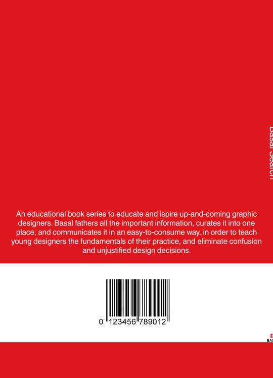
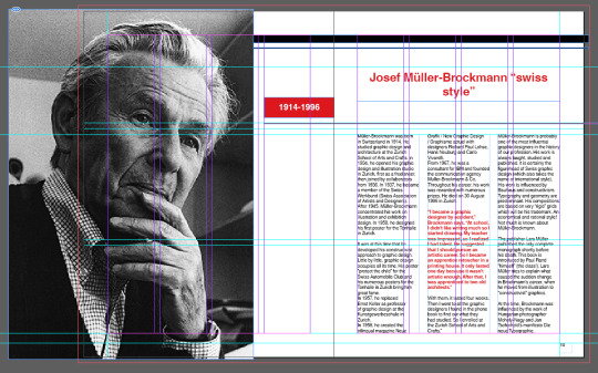
Photo

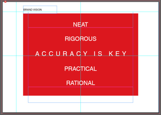

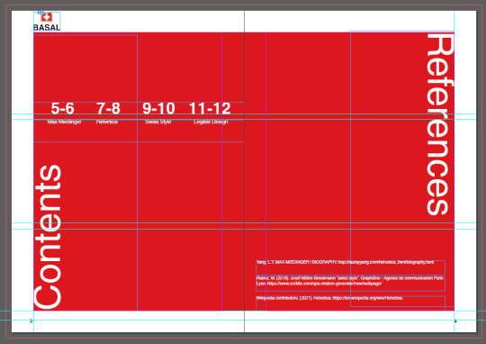
This was what we came up with after. I wanted to keep it minimalistic and in the middle. For the 3rd slide i wanted to create the swiss flag which is why it is laid out the way it is - during feedback i was told it looked like the flag
0 notes
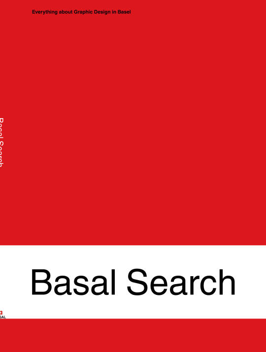
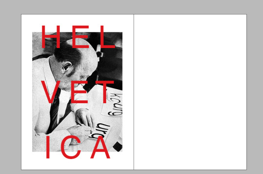
Photo
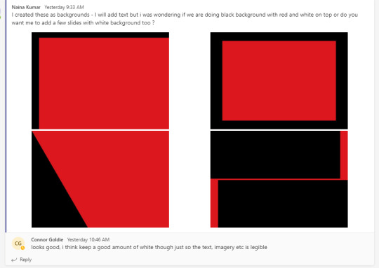
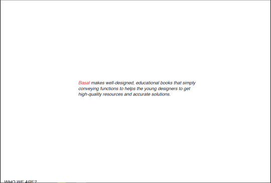
This was the first draft and I was told by group feedback on fb to change the background to white. I think that was a better choice since the black was a lot more serious and in some ways gave off the feeling of being closed off.
0 notes