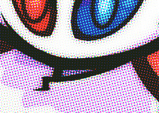
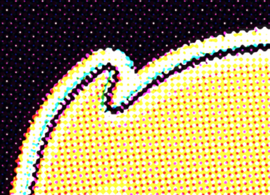
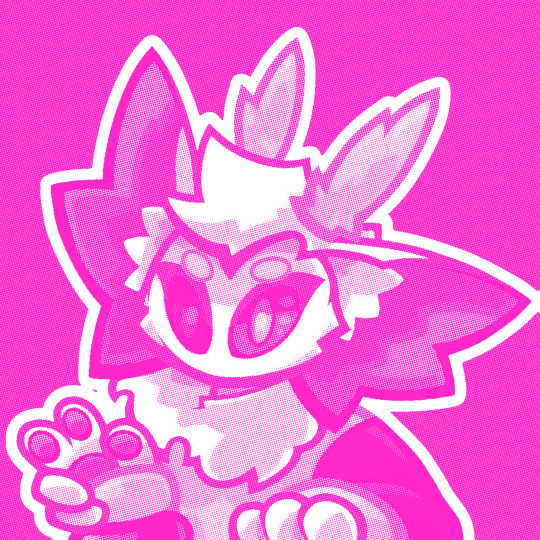
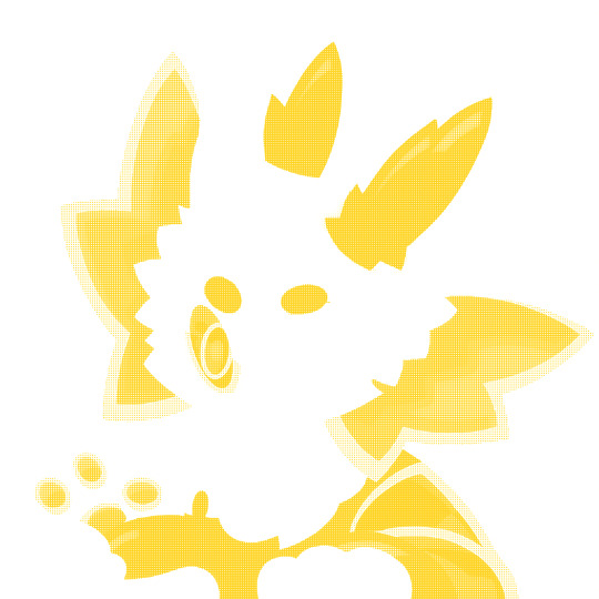
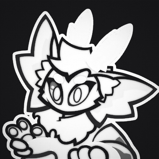
#Also there is other ways to do the halftone thing
Note
hello mr smoth first off i am a huge big fan. second off have you ever drawn rosebot. thrid off how do get that glitchy comic book effect over all your art, its literally so cool and i cant replicate it for the life of me. also i love your art. ok that is all
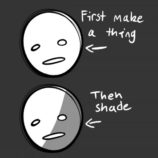
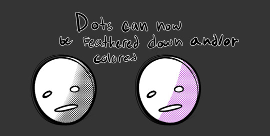
I'm not showing the 3D effect because I'm lazy and how I do that is via an auto action.
Clicking the image should take you to that.
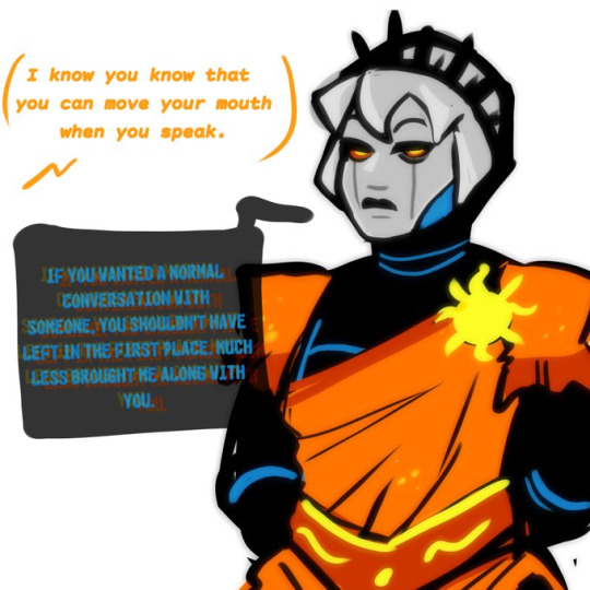
Hope this helps.
#Smoths? Do people pronounce /S.MOTHS as that?#homestuck#davebot#rosebot#also well#art ref#Also there is other ways to do the halftone thing#If it doesnt work well or if theres a better way then go with that
247 notes
·
View notes
Text
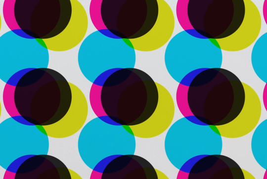
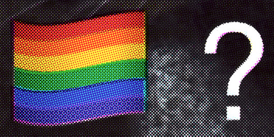
Was experimenting with halftone effects after watching this video and it almost has spiderverse vibes honestly. I actually learned some neat things about why printers use CMYK instead of just CMY so I thought I'd share !!
So in our optimal little computer space, Cyan (0,255,255), Magenta (255,0,255) and Yellow (255,255,0) all multiplied together gives us a perfect black (0,0,0) Awesome! The issue is that ink colors irl arent exactly perfect like this, and color is a bit more complicated irl compared to how computers represent it, so they aren't the greatest at combining into black if they aren't those perfect CMY values:
Left: CMY
Right: CMYK

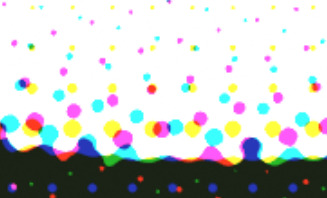
(thats not even black, its a dark blue in the original image but dark colors just look so much richer)
An important step to make sure you arent doubling up on the black values though is to divide the image by it's own "value" (the max of all 3 color channels) that way the value is equal to 1 everywhere, and you're letting the black ink take care of the value on its own.
Left: CMY (normalized value)
Middle: K (black)
Right: Combined


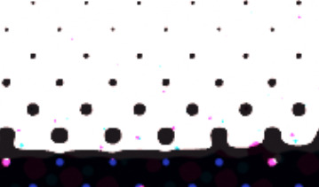
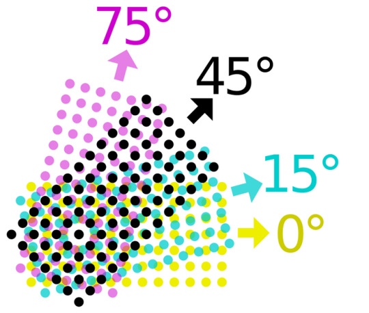
Now obviously the grids of dots cant be aligned perfectly with each other because you'd just get a bunch of black dots in unwanted areas, but if the grids are misaligned, then some dots become more prominent than others which tints the whole image. This was an issue because older printing methods didn't have great accuracy and these grids were often misaligned.
The solution was to rotate these grids such that they can move around freely while getting rid of that tint effect if they aren't perfectly aligned :D
(I have no idea how they came up with these angles but that might be something to look into in the future who knows)
SPEAKING OF MISALIGNMENT
I wanted to implement that in my own filter to get some cool effects, and I discovered another reason CMYK is better than CMY for lots of stuff !!
With CMY, you're relying on the combination of 3 color channels to make the color black. This means if you have thin lines or just details in general, misalignment can make those details very fuzzy. Since CMYK uses a single color of ink to handle value, it reduces color fringing and improves clarity a lot even if you have the exact same misalignment as CMY!
Left: CMY
Right: You guessed it! CMYK
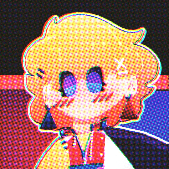
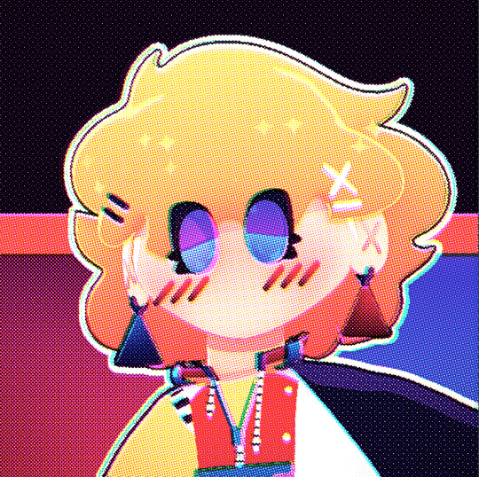


(yes these comparisons have the exact same color misalignment, the only difference is using a fourth ink color for black)
ANYWAY I just thought there was a lot of cool information in this tiny little day project, I also just think it looks really neat and wanted to share what I learned :3c


EDITING BECAUSE THERE'S ONE MORE THING I WANTED TO ADD
So, I talked about how to get K in addition to CMY instead of just CMY, but how exactly do you separate CMY from an image in the first place?
Well, CMY is a subtractive color space, meaning the "absence of color" is white, compared to RGB where it's black. This makes sense because ofc ink is printed on white paper. You can use dot product to get the "similarity" between two vectors, and this can be used to separate RGB actually! Using the dot product of a color and red (255,0,0) will give you just the red values of the image. This is cool though because if we get the dot product of our image and the color cyan (0,255,255), we can get the cyan values from our image too! If we first divide our colors by their value to separate the value from them, then separate CMY using those dot product values, and using K for our final black color value, our individual color passes end up looking like this:
While it's called a "subtractive" color space, I find it more intuitive to treat white as the absence of color here, and then multiply all these passes together. It makes it much easier to understand how the colors are combined imo.
Notice how cyan is the opposite of red: (255,0,0) vs (0,255,255) and magenta and yellow are the opposites of green and blue respectively! This means you can actually kinda get away with separating the RGB values and just inverting some stuff to optimize this, but this example is much more intuitive and readable so I won't go too deep into that.
THANKS FOR READING
I know it's a very long post but I hope people find it interesting! I try my best to explain things in a clear and concise way :3

oh thank you I realized I should probably add an eyestrain tag
1K notes
·
View notes
Note
How DO you think universe signatures work? I don't think I've seen many theories or discussions on it but I also haven't been looking for them either
HOHOOO UNIVERSE SIGNATURES. ok. as i was rewatching scenes so i could write this, my theories fucking blinked out of existence :) there is as much consistency to universe signatures as there is to the atsv timeline.
alright lets see how incoherent this gets
btw i’m not using the word ‘dimension.’ incorrect scientific terminology in an animated spider man comic movie franchise about the multiverse? couldn’t be me. i already let them keep their holograms*
itsv came out in 2018 and is reported to have taken four years to make. in 2014, we couldn’t have made atsv; the technology hadn’t been developed, because there wasn’t yet a movie to demand it. (usually when the question comes up during production, the team has to invent an answer. like animating violet’s hair in the incredibles in 2004, or water in finding nemo in 2003, or fur for sully in the monsters inc movies, or the entire animation process of 2019’s klaus, or reflections on the cars in cars—) this, combined with itsv being set entirely in miles’s own universe, means that the b team’s (noir, peni, ham) universe signatures changing between universes can be attributed to 1. less worldbuilding than atsv and 2. lack of technological ability in 2014-2018 (no diss to the og animators obviously, itsv is fucking gorgeous)
but that’s a boring doylist analysis. i wonder if we can get watsonian. atsv, which was likely produced from 2017 or so to 2023, explores four more universes, rather than sticking to miles’s. surely it’ll have more answers!
i went through the entire movie to see what changes. not gonna bore y’all with a scene to scene analysis, so i’ll summarize: the only person who substantially differs between dimensions is gwen (abstract in E-65, solid but still pastel in E-1610, slightly more painted in E-50101, abstract again in E-928 during emotional scenes). hobie’s collage changes to match the tone or color palette of the universe around him, but doesn’t take on its signature. other than that, the only effect any universe has on every character is with its light, and the only effect to overpower a universe signature is a portal.
let’s pretend that in an infinite multiverse, such a thing as a standard can be set, and that standard is Comic Style. comparing it to itsv, where peni and ham gained depth from previously 2d-esque universes, it seems as though some things don’t change—general color palette and extreme stylistic divergences from the aforementioned standard, eg when atsv peni is styled in 2d—and some change universally—like universe-specific volumetric light, eg in itsv when E-1610’s halftone-style light gives peni depth and in atsv when E-928’s holographic-style light does the same in a different way.
then portals. they distort the space around them in their style of origin: organic portals always have miles’s universe’s signature because that’s where they were born; any portal opened with an E-928 watch has miguel’s orange holographic hexagon, no matter who uses them or where they open to; portals opened with hobie’s homemade watch are always collage, though they take on the color palette of the universe they’re opened in. that means portals have to be watch-specific, prolly based on the materials’ universe of origin, but in that case, hobie’s would look a lot like miguel’s since he harvested most if not all of the parts from E-928. so it has to be specific to either the person who made it or the universe it was made in.
but neither of those make sense! the degree of separation from universe/person that apparently applies to the watches doesn’t apply to items left in other universes. E-1610’s rubik’s cube retains its color and volume in noir’s universe, but the sweater gwen leaves on miles’s bed isn’t abstract, and the shoes she nicked from E-138 aren’t scrappy. even hobie’s watch is rendered in strangely crisp 3d, brightly colored and noticeably not collage.
and of course, both universe-specific light theory and portals-overpower-all theory aren’t totally consistent. hobie’s only properly illuminated when he’s in his base colors. but maybe that’s a quirk of atsv? he doesn’t glitch like paper in the radius of a portal—renaissance vulture didn’t glitch like paper either, maybe that’s just how glitching works! maybe it’s always that tv-signal-bright blocky mess! maybe there is one concrete rule in all this!!!!!
noir’s universe (during his intro scene, at least) comprises of three solid colors: black, light gray, and white, and volume/shadow is communicated through the intensity of halftone used. in itsv and in atsv he’s always in black and white, no matter the color of the light around him. he’s also the ONLY CHARACTER who glitches differently. noir breaks down in black and white!! when the team is lit up by gwen’s portal in atsv’s final scene he’s the only one not distorting in color!!!!! what the fuck man!!!!!!!!!
there isn’t one cohesive multiversal rule for how universe signatures act and interact with different universes, much as i’d love to have one. it raises too many questions and doesn’t give quite enough evidence to study. the closest i can theorize is color/style generally sticks and lighting/spatial physics generally doesn’t, and since that’s relatively simple, i’ll use it. gwen gets her photo-booth-app watercolors and peni/pav/ham/noir get just a little more rendered.
theories i have seen floating around that i also enjoy
gwen’s universe requires people to be in tune with it, to reflect their emotions—implying that the floaty abstract art during her scene with her father is diagetic. so when she’s not in her universe, she’s not like her universe.
hobie’s universe signature necessitates that he doesn’t conform to any other style
on that note, so would ham’s, because cartoon logic defeats reality logic
hope you enjoyed!! or at least were amused by my suffering <3
*do not get me started on holograms
#spider man: into the spiderverse#spider man: across the spider verse#fan theory#but not really#i just compiled my observations and shouted angrily at them for a while#this got way longer than i wanted it to be#considering how little evidence there actually is for any be-all end-all rule#also strangely i noticed that noir’s intro scene and last itsv scene don’t match#like E-90214 are DIFFERENT in different scenes#the first one is solid but the last one is RENDERED?????#wh?????????#why isnt his own goddamn universe consistent#rude as hell of him#love he tho <3#thanks for asking anon!!#finally fucking changed the 298 to 928 idk how i did that smh
47 notes
·
View notes
Text
My “HOW TO MAKE YOUR DRAWINGS LOOK SHINY AND POLISHED WITHOUT A LOT OF EFFORT GUIDE”


These steps are by no means necessary! And your drawing will look amazing and completely finished without them. But I’ll occasionally get people asking how I get the effects I get on my final renders and this is the method I use almost every time.
1) Have a fininished drawing
2) I like to throw a colored OVERLAY or SOFT LIGHT layer at a low opacity over the entire drawing. I feel like it can help unify the colors a bit. Here I used a blue soft light layer at 39% opacity.
3) with a big soft brush, add a soft light from the direction of your light source. This really brightens up the drawing and further emphasizes your directional lighting. I usually use ADD or COLOR DODGE at a low opacity. Here I have useda warm orangy-yellow color at 44% opacity.
4) Slap some RIM LIGHTING on that bay-beeee. I usually use a textured brush and on a layer ABOVE the lineart layer go over the edges or “rim” of the forms of your drawing where the most light would catch. This usually works best with drawings that are not lit directly from the front, but dont let that limit you if you really wanna use it. Have fun with it! Here I have used the ELDER 2.0 brush from THIS brush set and Ive used an orange color for the hair, skin, and clothes, and a yellow for the crown.
5) If you are working in multiple layers, now is the time to merge them all. Make sure all your effects layers are cleaned up and don’t extend past the borders of your drawing or they’ll be visible when you flatten it. So go in and erase or otherwise remove any overhang. Then, put all your visible layers in a single folder and DUPLICATE it. Then MERGE or FLATTEN your duplicated folder so your drawing now exists on a single layer. Your original folder should still have all of your layers preserved so you can go back and edit them as needed.
6) ALPHA LOCK your flattened layer. This function has different names across different programs. In PHOTOSHOP it is indicated by a small lock symbol next to the layer. Once your layer is locked, duplicate it again. On your new duplicate layer add a GAUSSIAN BLUR. I usually add a 4 to 5% blur. The reason we have alpha locked the layers in this step are to keep the edges or the drawing sharp.
If you want to soften the edges, or find the process of alpha locking tedious or confusing, skip it and duplicate and gaussian blur your layers without alpha locking them.
Alpha locking is also unnecessary if your drawing encompasses the entire canvas.
This is all up to personal preference.
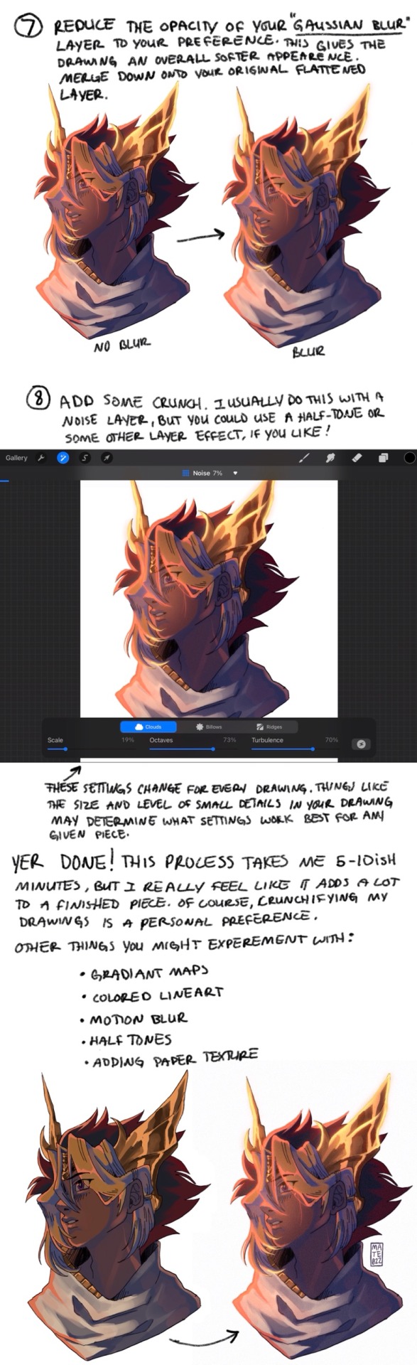
7) Reduce the opacity of your gaussian blur layer to your preference. This gives the drawing an overall softer appearance. MERGE DOWN onto your original flattened layer.
8) Add some CRUNCH. I usually do this with a NOISE layer but you could use a HALFTONE or other layer effect if you like! The specific settings I use change for every drawing, and different drawing programs might have different settings. Things like size and level of small details in your drawing may determine what settings work best for any given piece.
AND YER DONE! This process takes me between 5-10 minutes, sometimes a bit longer depending on how fussy I’m being. But overall it’s super quick and I feel like it adds a lot to my finished pieces. Crunchifying my drawings is a personal preference, which you may not like for your particular style. Thats okay! Here are some other things you might experiment with:
Halftone
Colored lineart
Motion blur
Gradient maps
Adding paper texture
Chromatic aberration
Hope yall find this in any way helpful!! sorry if this one isnt as straightforward as the GOLD GUIDE. Hopefully some of yall still get some use out of it. The sample drawing in this tutorial was a donation thank-you commission for @sigridhawke if youd like to find out how to snag a discounted (only 10$ !! Woah!!) commission of your own, check out THIS POST for details!!
176 notes
·
View notes
Note
how do you do the “cut out of a piece of cardstock or paper or something” effect
i'm gonna do an image guide, if that's okay!
i use these texture overlays - i've been planning to make a post that credits all these sorts of assets i use that i can link in my pinned post, but i keep forgetting...
so, well, i'll credit them now! and you can get them yourself, too! they're quite handy. it's a name your price thing, so you can download it for free, or be kind and donate to the creator!
-> Natural Materials Vol. 1 by TOMB of NULL
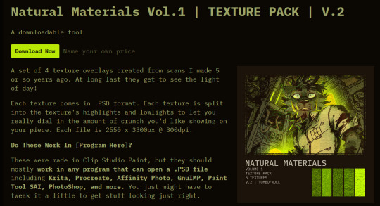
guzma art guide underneath all this, it does get a little long, but it should cover my whole process for getting this effect!
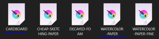
you download the thing above and unzip it, and get some handy files to open in basically any art program that can handle PSD files. there's other material packs, but i only use this one! and out of these, i really only ever use the ones i lined with blue. (CARDBOARD and WATERCOLOR-PAPER)
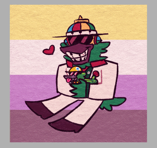
the idea is, that you draw a drawing and paste it within these folders. however, i don't do it this way, as you can see! it's a very different result. as an example, i'm gonna use the non-textured version of my old icon .
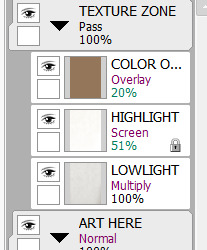
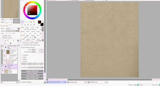
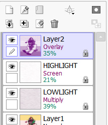
you can do this and get a nice effect, especially if you use more fitting colors for this sort of style, but again, this isn't what i do! i actually copy specific layers and paste THOSE into my actual pieces. (specifically "LOWLIGHT" and "HIGHLIGHT" from "WATERCOLOR-PAPER")
i paste LOWLIGHT first, and set it to MULTIPLY. then, i paste HIGHLIGHT on top of it, and i set it to SCREEN.
then, i lock the layers for both and either paint over or bucket-tool fill them with a different color that fits my piece more. i adjust the opacity of each layer. i don't get the color first try always, i spend some time to play around with it - but for demonstration i stuck with what i picked at the moment.
but that isn't all! i sometimes use "LOWLIGHT" from "CARDBOARD" as well, set on top of both of these layers, but instead set to OVERLAY. due to some scratches in the texture i don't like, i may move the position slightly. unless you draw really big, the texture will cover up your whole pieces and allow for some movement. if not, re-sizing is okay!
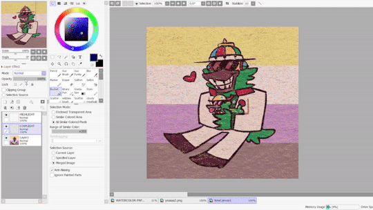
but i don't use that one always - what i use MOST of the time, and what i've done before i began using any paper overlays - were dot/halftone overlays! i either use these ones below, that are a specific, same size. (i resize for canvases all the time, that doesn't matter.)

...or i also use another method! it requires krita.
you open up krita, and paste your whole piece into it. (what i do, is flatten my current piece, copy it, then undo to get all my layers back. then i paste the image into krita)
once i'm there, i go to FILTERS -> ARTISTIC -> HALFTONE. i adjust as i think it looks good, and then copy that.

then, i paste that back into sai. however! it may be off by a few pixels! zoom in and move it slightly left or right - turn the opacity down slightly to help you figure it out. once you do that, set that layer to OVERLAY. you can play with the opacity - or even do fun things! it makes it look better, so hang on a minute!
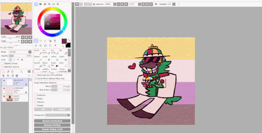
the "fun things" i mentioned is going over to LAYER and selecting "CONVERT LUMINACE TO TRANSPARENCY". in this case, it makes the white transparent and removes it, while it keeps the halftone! then i can change it's colors to be more fitting to my piece. (like we did with the texture layers!)
i used a purple overlay - so it makes the picture feel more purple and it ties the colors together a little bit more, without the use of an layer on top that's just one color set to OVERLAY or MULTIPLY to give it a different color hint. i usually do that, but set to super low opacity. but not always!
a lot of these are just done by "feeling it" and trial-and-error! just messing around and seeing what looks nice, after all, these are usually my final details i add to a piece once it's done to give it a more finished, uniform look. plus, the texture looks nice, and it's great to make more flat colored pieces just POP OUT !!
and of course, i use either the image half-tone overlay or the krita method depending on just what i think looks good. i don't really have a specific method!
and sometimes, i add different overlays on top and mix and match - sometimes from actual scanned paper textures! i've downloaded some from this google drive i'm going to link below. i use them rarely, but it's worth the credit, too.
-> PAPER TEXTURES GOOGLE DRIVE (not mines!) (unfortunately, i lost the tumblr post i got these from.)
------------------------------------------------------------------------
few other things i tend to do, also: i tend to add extra saturation once a piece is done. i like bright colors.
i also tend to copy the original drawing underneath all these effect layers, and paste it over all these other layers. i set it to OVERLAY and set it to low opacity. (or rarely, without the layer effect!) it helps gets a bit of the "original" feel out, while brightening/saturating the colors out a bit... i always play with the opacity here a bit.
and so, here's the layers again + the final piece!

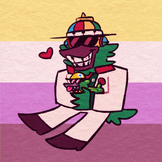
admittedly, this was supposed to be a softer looking piece from the get-go, so saturating it may make it look a bit goofy when the flag in the background has been made brighter previously... but it makes the characters stand out! still looks nice! i'd definitely tweak this a bit, but it's definitely the kind of result you may be looking for!
i did use sai as an example, but if you use krita, medibang paint, fire alpaca, csp or photoshop... this all should work there as well! i've done this in ibis paint as well - using textures from the app itself! using what you learned here could help you figure that out for your own.
------------------------------------------------------------------------
well, i hope this was helpful and somewhat comprehensive! if anything's a bit messy here, i can admit i made this while in a call, so that may be why. feel free to ask follow-up questions! thanks for reading!!!
7 notes
·
View notes
Text
okay so heres like all the things im going insane about in atsv its so disorganized im so sorry
spoilers for atsv
okay first off the mass amounts of color symbolism is insane
the fight with gwen and her dad where the color backgrounds kept switching to more and more contrasting colors to show that they were getting further and further apart emotionally
the one part where gwen talks about her identity and how she has to hide it while acting fine WITH THE TRANS COLOR??? shes trans theyre all trans
during the fight when the color backgrounds get closer and closer in shade to each other and then as everything falls apart again the background starts melting like watercolors its insane im going insane
and the clear color difference between earth42 and earth1610 is so amazing
earth42 is clearly more focused on purple and greens and theyre also even shaded differently too, earth1610 is shaded with halftone dots and colorful tones while earth42 focuses primarily on single colors with single directional hatching and comic book style shading (shading with straight up black rather than darker hues)
the fact that 42miles probably knows more spanish than 1610miles because he got closer with his mom after his dad died is heartbreaking
seeing the growth that miles has made in his 1 year, outsmarting literally the entire spidersociety with his plans and even beating some of them in combat its INSANE he's grown so much and while he's still a child he's also clearly grown and he knows his potential and worth
everyone has realistic motives that i can understand the reasoning behind and i also dont get the hate behind gwen
she's just 15-16 and her only parental figure has just rejected her–of course she's going to follow miguel and jessica at first and then struggle with rejecting their ideals to support miles OF COURSE she is SHE'S A CHILD
i understand miguel's goals of the greater good but at the same time his need for control after losing all of it with the second universe clouds his judgement so intensely that he blames miles for all of it (also i noticed peter b parker was in miguel's second universe while it was collapsing???)
they both (miguel and miles) want to save people but they're going about it with different philosophies and i think it's because miguel has lost his way with what being spiderman really means
being spiderman means knowing ur not gonna be able to save everyone but still trying to save everyone anyways, and that's what miles embodies
he knows he might not be able to save his dad but he wants to try anyways because if he just stood back and let it happen then there was everything he could've done and nothing he did do
miguel has forgotten in his grief that being spiderman means breaking conventional rules, never giving up nobody who tells you to and it's incredibly sad (and also kind of funny to see this like 50yo man send a manhunt for a 15yo teenager for not wanting his dad to die)
i think spiderman personally as the most human superhero purely because he's meant to a person anybody can imagine themselves as and people really can with the amount of different people, genders, ethnicities, etc you see in atsv!! the point of spiderman is to never give up and to always save people and although miguel intends to do those, he has given up on saving people in favor of what he would call "the greater good"
also the spot? i may be interpreting this wrong but i feel he's almost a parallel to miles
get your powers accidentally and not according to "canon events"
lose everything (miles, uncle aaron and the spot, like legitimately everything)
get new powers that you have no idea how to control and need to try and adapt to your life style
become incredibly powerful by learning to recognize your own potential and strength (as seen with miles' plan during the spidersociety chase and spot with the whole,, jesus fucking christ)
the difference between them is that miles recognized his potential and gained confidence through the support that he got from his dad saying that he will support him no matter what because he knows that miles can do it
meanwhile the spot got it specifically because the spiderpeople underestimated him, all making fun of him at first and even calling him "villain of the week" (or weak? i thought it was weak at first) and so he gets more powerful through spite, through the need to prove that he can be something despite having lost everything
and it's interesting to see how that also relates to miguel in a way
both losing quite literally everything and developing an intense and visceral need to control and dominate (men.) its amazing to see it
i might have more later but this is it rn
#atsv spoilers#spiderverse#atsv#spider man: across the spider verse#miguel o'hara#miles morales#gwen stacy#the spot
23 notes
·
View notes
Text
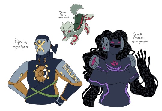
@standswap-september
Three in One just like with JoJos Parts 1-2-3! But with some Morioh Kids!
///⁉️🔭🎙///
[ Cherry Moon ] - named after the song by Prince is the Stand of Eiichi Haseki after he got shot by the Stand arrow by bunch of wasps, it first didn’t take form until put against the lying Stand [ The Who ]. It’s main ability is to be able to turn drawn objects and sounds into stickers that can either be brought to reality or be stickable and affect it’s targets however is limited to things that are inanimate, if it tries bringing drawn people then they just turn into paper dolls.
It has a very curious personality and is surprisingly skittish in comparison to it’s more upfront user and has surprisingly stricken a close friendship with [ Smooth Operator ] despite the users of both despising each other.
[ Ophelia ] - named after the song by The Band is the Stand of Hachiro Santos is one of seeing, it has immense physical strength that rivals that of When Doves Cry however also has a general telescope ability that allows for one to zoom in on things like microscopes but can work like a regular one mainly via the floating mini scope in it’s chest that can be summoned independently from it.
While it would normally be a very useful Stand, Hachiro seems to prefer using it as a force as opposed to something more than that.
[ Smooth Operator ] - named after the song by Sade is the Stand of Sada Aiteru is an audio based Stand. Able to mimic voices and sounds or be able to play or record sounds, it’s recorder tape body is prehensile and can be used for battle as a sort of restraint weapon
///⁉️🔭🎙///
Design Notes:
[ Cherry Moon ] - Koichi short therefore Cherry Moon is too, i wanted to do a sort of animal-ish Stand for him. Think like a dog-rabbit hybrid. He has both ⁉️ and the two kanji often seen in JoJo because of it’s ability while red is mixed to sort of balance the colour palette and provide emphasis on said things i mentioned before (and cause it looked pleasing).
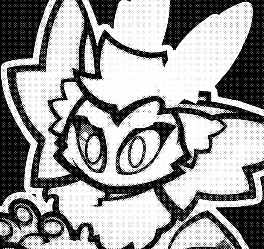
You can only see it if you zoom in but there are the dot halftone thing as a sort of reference to Pop Art because that’s widely seen in comic books. As of now i am unsure whether to make it an Act Stand or not.
[ Ophelia ] - I had a bit of a hard time designing him surprisingly! I don’t know why but he was, but i persisted cause i needed to do him so that’s how this exists! The telescope theming is meant to be a sort of counter to The Hand’s “look only one way” sort of direction it had with it’s design, fundamentally it’s still the same motif just spun a little bit.
He originally had a mouth but then i erased it cause i didn’t like it. The X was also supposed to stick out like Tessarus’ visor from MTMTE but it didn’t look good either so it was Marilyn Manson looking face for him!
[ Smooth Operator ] - My favourite of the bunch! Junie gave me the idea of wires but i sort of turned it into like cassette string like you see in casettes, her little headphone thingies are based on reel-to-reel tape recorders. Her hair was so tedious yet so fun to do and it kinda reminded me of that one SCP.
I TRIED to deviate from the school uniform but it ended up not being too possible as i wanted to have a bit of colour separation in a way that i’d personally like but then it still looked like a school uniform and i said “fuck it, Sada is a school PA runner and also a newsgirl” because of this.
#core’s art#jjba#jojo’s bizarre adventure#standswap#standswap september#okuyasu nijimura#koichi hirose#yukako yamagishi#god casette string was so fun to fuck up like pulling that shit from the casette was surprisingly fun#jjba mothswap
71 notes
·
View notes
Note
2. 5 favourites of your own work?
i say everything is a hard question… BUT IT’S TRUE! THESE ARE HARD! i like different pieces for different reasons, and favorite doesn’t exactly equate to “best” (which doesn’t matter of course!) BUT. i’d probably wage these guys… and i’ll tell you why below!
this is unequivocally my favorite thing i’ve ever drawn to date for a myriad of reasons! the short of it is: it’s my favorite cartoon of all time, with my favorite cartoon characters of all time, i got to flex my muscles in different mediums, i took my time with it, i’m happy with the little details, it feels believably human, and it’s my love letter to all of my favorite influences. i love it so much that it’s my background on my phone!
i don’t think words will ever be able to accurately describe how much cartoons mean to me. how much being a cartoonist means to me. i especially will never be able to accurately express just how much the work of influences such as Bob Clampett, in this case, have touched me to my core. i do think though that this piece, more so than others, is a particularly effective way at getting those points across. it was definitely made with love, sincerity, and passion, more so than others. it’s a very comforting piece and i think is a very solid representation of me! not that my art is all about me, and i didn’t make this with the intention of appeasing myself in mind, but it is a very “Me” piece, and unapologetically so. i could stand to be much more self indulgent, so it’s nice to have.
this was a redraw of a picture i’d made in my sketchbook in high school! i’d work on it in my AP Literature class over a matter of days, and my friend and i’d talk about setting up our own Krusty Krab restaurant someday HAHA. who knew i’d be doing what i do now!! i love it for that nostalgic connotation alone, but i’m also very happy i got to transform it into what it is. fun perspective! bold lines! my only regret is mistakenly coloring the floor brown instead of green… but i honestly thing it sort of adds to the authenticity? comic halftones took a lot of shortcuts (especially in golden age comics), so i just try to see it through that lens HAHA.
3. i’m a big fan of this for its versatility! i’m happy to have tried something a bit differently than i normally do. it’s stylized and warm, but still true to both the original Rocky and Bullwinkle and to my sensibilities! i’ve gotten a lot of print requests on this one too, which makes me happy
4. i’m very pleased with how bold this is (and for stepping out of my usual menagerie of characters!) i really like how crisp and sharp it feels, but also maintains that sort of warmth and familiarity i’m always striving for. very happy with the poses as well. i know for a fact i was thinking of Frank Tashlin when drawing Max especially!
5. another one i love for nostalgia, as well as loving for representing yet another cartoon very important to me! i’m very fortunate to have drawn many more seasoned Daffys and Porkys since this, but am particularly fond of it seeing as i had drawn this alternative only a YEAR before! it was my first time drawing Daffy! i think it really represents my growth as an artist in such a short amount of time, and i’m eternally grateful that i’ve made even more progress since then. it being a redraw of one of my favorite images of all time helps greatly!
25 notes
·
View notes
Note
How did you get the old style printer effects on the BitB flyers? Did you use Photoshop? ❤️
Yes I did use Photoshop! The printed effects are a combination of a few things: (original post here)
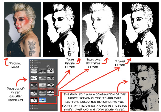
The easiest thing to do is to use Photoshop's default Filter Gallery, I usually use this as a starting point when editing. The filters I like also tend to flatten the image, which I don't usually mind unless the image starts getting unrecognisable/unreadable or loses depth in places where it needs it. For example, in the pic of Mason above, the shadow where the jaw meets the neck gets lost with the Halftone Pattern filter (it becomes hard to read)— to solve this, I used the Conté Crayon filter on a different layer underneath the halftone so that the shadow is still visible while maintaining the graphic qualities I like.
The other easiest thing to do is to avoid using pure whites and blacks anywhere. For this I recommend looking at what kind of printing you're trying to replicate digitally because it differs based on printing material. I also think it's worth seeing if you can actually, physically print and scan it back as a digital file to further edit because nothing beats the real effect.

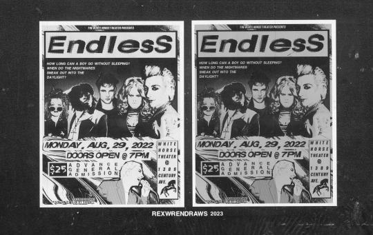
The left image is the digital files, and the right image is the same files printed (literally an office printer) and scanned back. The file with the white background scanned back in slightly grey/toned, which is what I tried to replicate in my original toned background digital file. Both printed/scanned versions interact with color overlays differently. It's a lot of trail and error, general experimentation lol.
On top of this, I like adding texture overlays! They're my best friend! Indieground has some fantastic freebies which I use a lot (especially the Photocopy Noise and Abstract ones), and Resourceboy's textures (especially his White Paper Textures, they've saved my life many times) are also excellent. For the BitB flyer, I added photocopy scanner textures before I printed it. I've used the white paper textures on this Daniel Hall artwork and the Horse Girl AU Poster.
Picking and adding color also depends on what kind of print style you're trying to replicate. The BitB flyer is trying emulate xerox flyers across both grunge and punk eras, so I wanted it to look like it was printed on colored paper of some kind.
These colors were added as adjustment layers above everything else. I think each color was at a different layer type though, I was purposefully avoiding anything that flattened the 'ink' and textures or made anything too pure black. I try to limit color when imitating xerox printing to one ink color and one paper color, but it's up to your personal tastes tbh.
Honestly, there's no one way to do it! It's always a lot of experimentation and feeling it out. This is just my general though process but hope it helps in whichever way you needed!
#rex replies#rex process#there's truly no right way to do it. if youre gonna go for a punk printing look dont try to replicate anything exactly ofc ofc#i explained other thoughts in the original post as well
4 notes
·
View notes
Photo
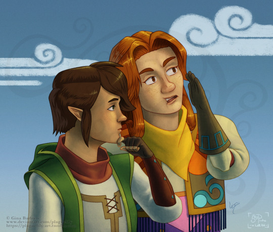
I needed a break from my other WIPs, and I had recently (finally) come up with a design for Malon as she appears in my Sky Pirates story, so I figured a nice little concept art would offer me a good break. This is also how Link will appear in Sky Pirates, although I've had his design for quite a while now. Still not sure about some of the color palettes, so those might change as I continue to refine things, but overall I'm really happy with how my project is coming along, even if the progress is a bit all over the place. I also tried out something new for the hair shading, although I'm not...sure how keen I am about it yet, although it is easier than what I have been doing. I'm also not sure if I'll stick with adding stylistic halftones to the shadows yet or not, but they are fun to add in.
My weird semi-hiatus will continue, as this continues to be the busiest part of the year for me.
—————————————————————————
2022, Summer-Fall
Digital (Adobe Photoshop)
Redesigns, AU iterations, and the Sky Pirates story belong to me. Link and Malon are characters from the Legend of Zelda series, and belong to Nintendo.
Artwork belongs to me.
This image (published by the artist to deviantart.com/plaguelily, plaguelily-art.tumblr.com) may not be reproduced, copied, edited, republished, or reuploaded in any way. Thank you.
14 notes
·
View notes
Note
could u tell me how u remove screentones? do u just paint right over it or is there some other way? and also could u share the textures u use (in that screen/subtract layer on top of the original) thank u very much for ur colorings theyre beautiful!!!
hi!! i use topaz labs to smooth things up, i also play with curves to lighten the grey screentones. but certain screentones you can't remove (like dots..etc) so yeah I manually remove them either erasing or painting over it.
I don't use any extra textures besides the ones already in photoshop, the main one I use is noise and halftone!
And thank you so much<3
3 notes
·
View notes
Note
HIIII i love your art style so so much and i love the way you draw law! i was wondering what your process is like and if you use reference pictures and stuff like that :D
HIII WOAHHH THANK UUUUU SORRY I DIDN'T SEE THIS💌💌 omg a process........ i think it's s pretty basic: sketch, base colors, fix colors, lineart, shade and details, fix colors, add noise layers and ta daaa🫰. if you want the long version of it then it's below :3c
mm i think of an idea and spend some time searching for references yk the usual. i may not if i don't have any problem with it or if it's just a small sketch without mind
after im finished with the sketch i take a day off from drawing so i come back fresh to it the next day and start the lineart (or not if i like the sketch enough)
i regularly use gradient maps and play around with the layer combination modes until i find a color palette that i like after im done with the base colors. ALSO correction level to fix dusty, bright, or dark palettes. i make sure to take screenshots and see them on my phone so i take note of what colors i have to fix
any other detail i add is a default soot brush on strong black shades of the lineart; colored halftones for texture, highlights or just play around with it, sometimes i don't use it. i also like to add some high density noise-like/pixelated brushes when shading or when trying to blend the colors
andddd when im done i show two layers of noise: the default csp one and a colored one, both on screen mode i think (i use a spanish version so I'm not sure about the name ..) the default is for da crispness and the colored one is to blend brush strokes. they're usually <20%, i change the opacity depending on the size of the drawing and i ~~usually~~ keep the default one at a higher opacity than the colored
before posting (if i do so) i post the drawing on a priv account on twitter to check for cropping, colors and whatever other things i have to fix THAT'S ALL🥳🔥
if u want any of my brushes i have some of them in my carrd (not updated tho..) https://fruti-lupis.carrd.co/
#asks#long text#if u want a brush i use or any other specific thing u can always ask or dm me here or on twitter
4 notes
·
View notes
Text


After a while I finally decided to do a slight design/pronoun update to my Obey Me OC Asagi Shimamura. While I liked the casual design and a few other things, it didn’t really fit with my personal HCs of him after a while. So a did a few things like make his hair fluffier/fix the gradient, made her skin-tone darker to the type I like it as, and even added a few scars (though mostly hidden by clothes) from her delinquent lifestyle. +plus an extra pic after she got done fighting a group of demons who still don’t like her hanging around the devildom from the first season. I really prefer this art of him now 😳
Though one funny thing is that aside from the eyes, Asagi kinda looks like Goetia from FGO now- I swear that was unintentional lol, I was testing out giving depth with halftones and it turned out like that 😅
I also ended up updating her pronouns from just she/her to she/her/he/him. I always imagined Asagi using both male and female pronouns and personally think it fits way better then just using one, so there’s a likely chance I’ll be switching between both when talking about him.
The template from the character questionnaire is by @reydelcastill0
Also a quick bio:
Name: Asagi Shimamura
Nicknames: Asa-nyan (reluctantly) Fighty Mc Fightface
Age: Around 20-ish at start of Season 1
Height: Since there’s no canon heights, about the same height as Lucifer and Satan, but taller than Mammon
Race: Human
Birthday: October 25
Likes: Mobile Games, collecting, fighting, comfortable clothes, weight training
Dislikes: Being commanded by others, sadists, spiders
Personality: Although a relatively nice person when you get to know her, Asagi mostly comes off as a bit of a jerk and rude, especially to people who act standoffish and rude. Like they say, if you want respect, you damn well better respect others in return. Along with his habit of getting into fights no matter where he is, Asagi is rather abrasive. Despite this, she isn’t the type to abandon others and genuinely takes care of those close to her, attesting to her role as a older sibling. Once getting close as friends, he’s the type to joke around and act as the tsukkomi from time to time- having to act as the one to drag others out of trouble- an ironic fact considering how much trouble he gets into.
4 notes
·
View notes
Text
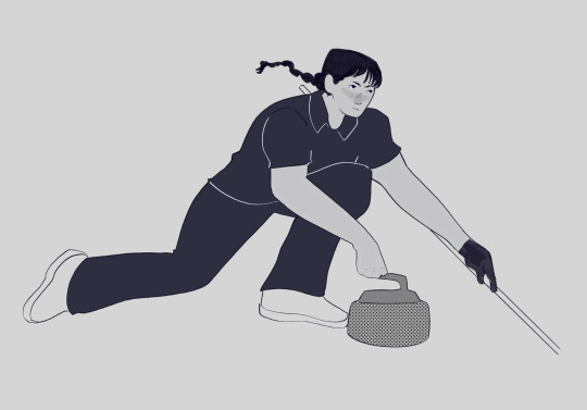
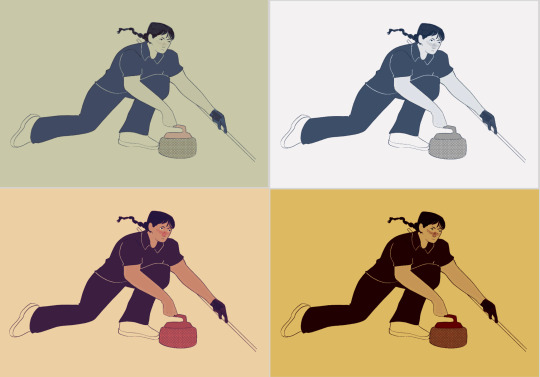
Animation Practice - Week 3
Today, the main focus was to work on a 150-300 word synopsis for our story, as well as doing 4 action/reaction poses. I started on the poses first, and I feel as though they went quite well, and embodied my character design and personality quite well. I also used these drawings as a way to experiment with colour palette and ways of shading, such as using halftones to create shading. I quite liked the warmer colour palettes which surprised me, but I feel conflicted as to wether I will end up using the, as it contradicts the cool nature of the sport and environment my character is surrounded by. However my lecturer gave the insight that I could find other ways of incorporating warmer tones, such as in the crowds or background elements of my graphic novel.
Before writing the synopsis, I first created small mind maps for each of the key things that should be included in the synopsis, which are: primary goal, major conflicts, stakes, key turning points and conclusion. This helped give me a clearer idea on what side of the story I wanted to focus on, and made it much easier to structure my synopsis in a clear and concise way.
Outside of the lesson, I worked on some further research pages for my story, such as extra character designs, and some layouts of potential environments that would be featured, such as a stadium, a training hall, locker rooms, and an apartment layout. I also looked at the specific curling items and layouts, such as the dimensions of the ice sheets they play on. In addition to this, I created a more finalized story, then turned this story into a script so that I could clearly see what actions and dialogue were needed.


0 notes
Text
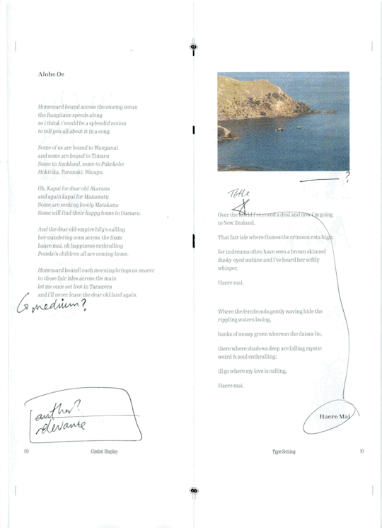
Feedback review and refinement since formative hand-in
I was unable to get all the changes i wanted, done before formative hand-in, which was disappointing as i really wanted to get the most out of the feedback we will get from it. This was mainly because i got confused with the deadline (mix-up with my other class) and submitted at 5pm instead of midnight 🤦🏼♀️. But i have been working on completing my booklet since and making further refinements beyond the feedback i received last week in class.
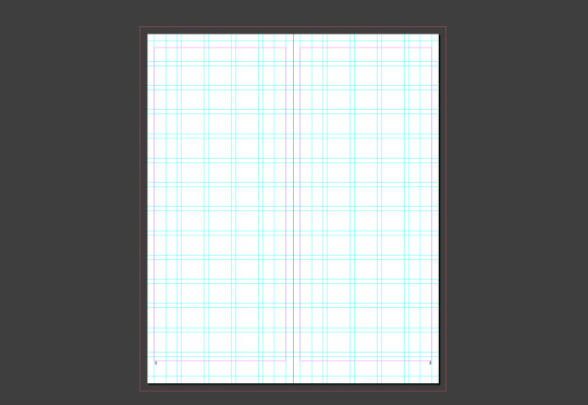
Just to mention it, I have tweeked my grid quite a bit since i started my earlier drafts. With streamlining elements on each page i added/removed parts of my grid and also changed my margins accordingly. Below is my current working grid.
I worked quite stricly to the grid i made, making sure that all the elements in my type specimen were consistant with the execeptions being intentional to "break the mold" so to speak.
The following are changes and refinements i've made to all my spreads - i also reordered the whole booklet. All of the change i made will be checked once i print it to see whether the changes look okay on paper and once the booklet has been folded. I'll do this this week so that i can finish it up for my presentation.
I removed the halftone effect on the images - will try this during printing to see which i like the look of better.
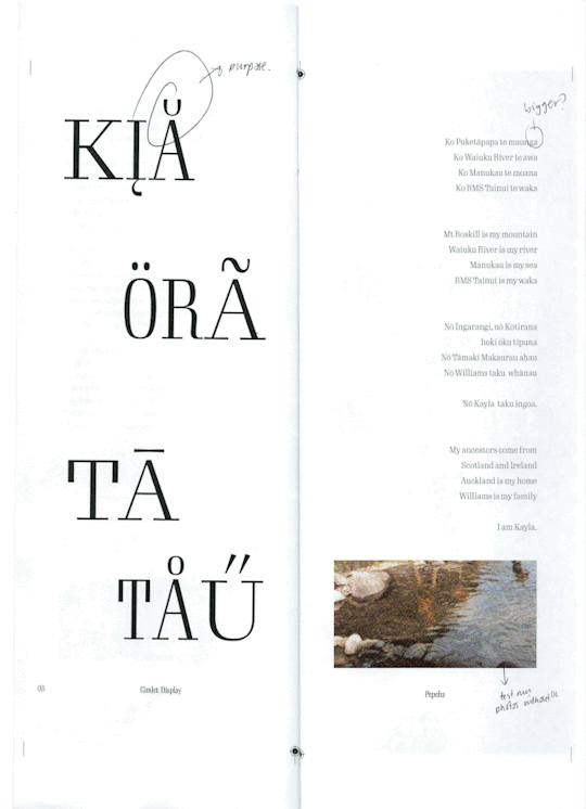
I amde my pepeha bigger - grouping the Māori version and english version rather than skipping between paragraphs.
After deciding on the header/footer elements and their placement i ended up removing the diacritic on the 'a' in 'kia' as it got in the way. I tried other diacritics to see if they would work but they were all on the top of the character and thus interferred with the header.
I also increased the width of the left spread and narrow the 't' on 'tā'.

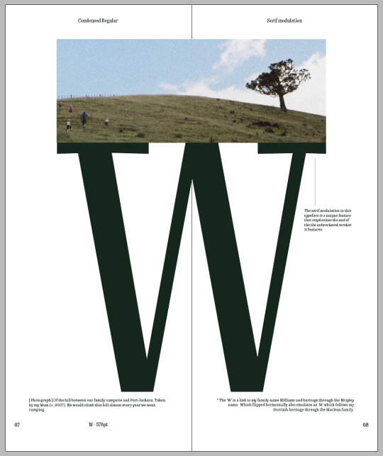
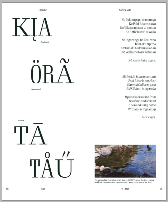
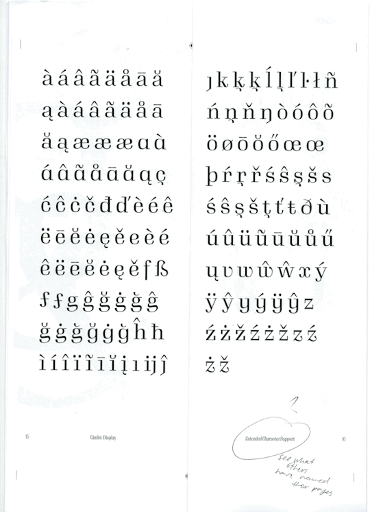
This spread got quite a dramatic change. I wasn't happy with any variations of the vowels and considering i have varying weights throughout my pages I though a page dedicated to showcasing the unique serif feature this typeface has would be a better use of space.
I am yet to see whether this spread will work or if its proportions work okay but so far i'm happy with it.

This double page spread underwent some minor changes in comparison to the rest but i made the text larger. Mostly because i had a lot of smaller text on other pages and this felt too much - it also shows the typeface at a scale i haven't got anywhere else in the booklet.
I did try just increasing the width to medium but at the smaller scale the text just didn't seem right.
I also removed the titles and to distinguish between the two piece of text i made one in italics and the other remained regular. Instead i put the titles and an explanation at the bottom of the page. I tried many variations of putting the titles in differen sizes etc. but none seemed to work.

I made a few more pages in my booklet fully coloured to add more contrast.
I also changed the page title to diacritics and ligatures which i think is more concise and reflects the contents of the page better.
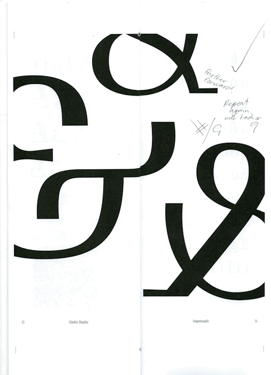

This spread had only minor changes, Emil said he really likes the layout so the only thing i added were the names of the different ampersands (as named by the DJR).
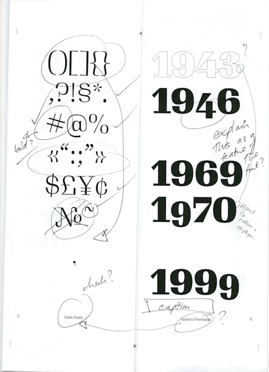
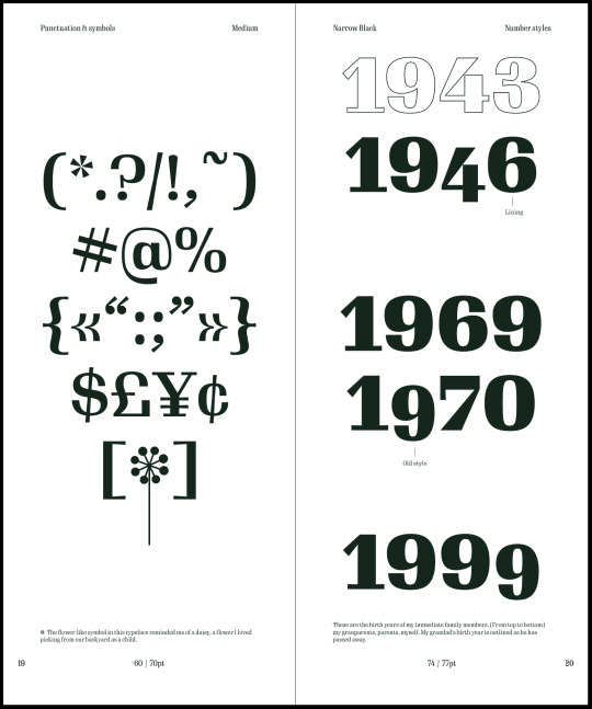
I decided to keep the outlined year on the right spread and added a caption to explain why i left it that way (as there is a reason). I also added labels to signify that the old style numbers were in fact a feature of the typeface and i didn't do it manually myself.
I made the symbols and puntuation page more balanced by playing with the idea of the symmetry i made in the third line. Also making use of the brackets rather than having them on a separate line.
I made a feature of the flower symbol that this typeface has - initially i had no purpose in adding it (originally on my cover design), however, being a unique symbol in the typeface i decided to make it into a flower (simply by adding a line) which made something that reminded me of a daisy (the significance of which is mentioned in the caption on that page).


I have kept the info page to the back as they will be points already covered in the booklet (history or rationale page) but just repeated for easy access.
The original idea i had for this spread just seemed like a bit of a waste of space and had too much white space for the booklet. The new design also brings in the block colour as well.
The biggest thing was Emil mentioned that he really liked the octathorpe in my typeface, it was quite unique and thought it would be a great idea to make a feature of it like i did the ampersands. I will have to see how it's placement is like once i print the spread but i like how it came out.
0 notes
Text
adobe photoshop cc 2019 32 bit filehippo
Adobe will undoubtedly be the best name in photo editing. They have the most effective software things that allow the photographer function digital photos so they will look sensational looking.
Spot Healing Brush - The Spot Healing Brush Tool will clean unwanted markings from an image. This brush can create its own sample area, from the pixels across marked section, and just be sure to match your past texture. This brush works wonders on gradients, steady patterns, and also predictable subjects. Unfortunately, of adobe photoshop cc License Key near another textured area, noticing definitely start picking up unwanted models.
You also adobe photoshop cc choose to discover some sites in their forums and discussion decks. You can ask members for advice and one way link them are prepared enough their aide. This serves as a peer-to-peer discussion where specific questions could be answered straight. Try exploring too the web page of producer. They often provide help to their clients to help you like the program you bought.
You can join essential Training online tutorial program by subscribing monthly, annually, or semi-annually. The wonderful thing about Total Training is the videos are delivered you r "on demand". In other words, obtain log in at whenever you want of 24 hours a day and be aware of the tutorial on which you decide. Of course, when you purchase to, you can purchase a DVD of a specific software subject.
When re-sampling images occurrences use either Bicubic Smoother or Bicubic Sharper. Achievable use Bicubic smoother for up sampling and Bicubic sharper for down selecting. You can actually specify which interpolation method usually be by simply going to general preferences and setting a extension.
This most likely newer sites but naturally lack in Photoshop systems. Pick out which free tutorial such as best, go through the link and learn how the specialists do the program. Learn smart objects, layer comps, halftone, aging, using brushes and many other.
I would recommend grabbing this book, or the newer version, or even the older version, and maintain it to remain close by if an individual constantly modifying photos. adobe photoshop cc Activation Code Free will guarantee you that however grab it and find the info somebody fast and apply it before you even be able to find value of getting chapter among all how-to books on Photoshop.
1 note
·
View note
Last Seen Blogs
aliann317
Life; love it or laugh about it.

zbmoiid-blog
Yara

gchouji
CLOUDS20

quiescentgale
❝A Broken Key❞
sosclancy
.OVERCOMPENSATE