#Black is my favourite colou- BLACK IS NOT A CREATIVE COLOUR
Text
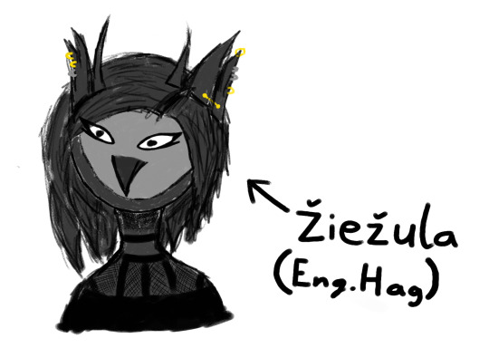
In a lot of art pieces my sona looks very tidy and pretty and all that, here's a biblically accurate Ieva who looks more like a goth hag than a goth queen with more piercings than was last drawn because fuck you I like them and also shiny stuff I grab that on first sight
I just decided to go brain off with this piece to relax but will use it to grab your attention (it's mine now) and tell you to watch me play the Baltic Trackmania League ELITE DIVISION group stage, essentially, that owl you see there got among the top 16 best players of the Baltic Region (wow!!!!! and wtf how???)
Match happens at 12:00 Eastern European Summer Time on the 3rd of Pride month and will be livestreamed @ https://www.twitch.tv/fastpointgg (I think)
Be there or else.
#digital art#furry#furry art#art#barn owl#trackmania#IM PLAYING A TOURNAMENT ON SATURDAY AND I AM NOT READY AAA#žiežulos titulas yra labai underrated nors duoda stipresnę aurą negu bet kas kitas#go on translate that last hashtag#To all the people I owe art to (there are 3 of you) I am sorry I'm working on I swear aaa#goth#really fuckin edgy#Black is my favourite colou- BLACK IS NOT A CREATIVE COLOUR
11 notes
·
View notes
Note
☕️ transformation items in precure!
Overall I’m more tolerant for dumb designs with transformation items than in weapons so most of them get a positive or at least neutral reaction from me. However some still scream “we would never have used a design like this if it wasn’t for the toys”.
Let’s go through them all!
Futari wa Precure
Simple flip-phone like designs for the modern girl in 2004. I think these are alright enough but don’t raise a lot of emotions in me. Not a fan of the mascots transforming into items, like does the phone become a part of their body, that’s just creepy. I’d prefer if it was made clear that the phone is a separate item and the mascots just shrink to be able to fit in it. I prefer the original designs, the upgraded ones look busier.
Uhh... I got nothing on this. I guess it’s nice that the new girl gets an item that’s a bit different but also similar to the ones we already have.
Splash Star

Still got nothing, it’s the same thing again. Good that they started using different ideas from the fourth season onwards. I guess I prefer the Futari Wa ones since these somehow feel too small. Nice light? But let’s just say that while it’s just fine to use phone as a base for the transformation item, there’s quite many of them on this list and in general they are a bit boring when you can’t do anything else with them than press a few buttons in the beginning.
Yes! Precure 5

Simple design but it works, usually black is a good idea. Though it could do with some buttons because now it doesn’t look you can do much anything with this. It’s a nice detail how the henshin starts with the lid of the clock opening and ends with it closing.
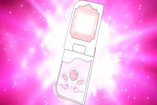
Now we’re truly in the 00′s with the flip phones. I like how the henshin starts with the lid opening, and the rose button is cute. But there’s not a lot to say about this one and it’s pretty boring.
My second least favourite Precure transformation item. What is this even supposed to be? Some kind of makeup case? In that case I’d rather have the colous be actual makeup and not buttons. The handle also feels stupid.
Fresh Precure!
This doesn’t even try to pretend it’s not a phone, it even has the number buttons. Actually were the transformation items originally the Cures’ phones? Can they make regular phone calls with this? I’d like to see that. But this is cute enough, I can imagine that a real phone like this could have been popular with little girls. But maybe it could do with some extra detail to look more weird, now it feels a bit too mundane to be a magical girl item.
Heartcatch Precure!
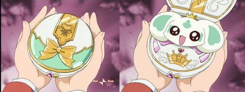
I’m not a huge fan of beauty products in little girls’ shows, but they do make a lot of sense in a transformation sequence where you get to see the characters “apply” the magic themselves, and the fragrance bottles make for some great henshin animation and also fit a flower-themed season. I also like the white-and-gold palette, makes it look more regal than the usual shock pink.
I forgot this one even existed. I really can’t muster any emotion towards it, KiraKira did the compact mirror thing a lot better.
Suite Precure

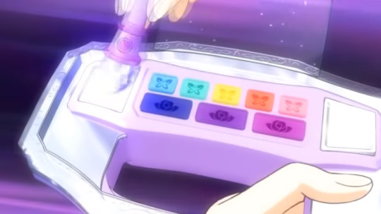
Why are the colours pink-white-blue-purple and not yellow? I don’t have particularly strong feelings for this one in any direction, I guess on its own it’s a bit boring when it doesn’t resemble any real item I can recognise and you can’t do much else with it than press the button at the bottom, but I also think it’s fine to have an item like that every once a while. However I think the little mascot creatures that are needed to use this thing are uncute and that lowers the overall points.
Smile Precure!
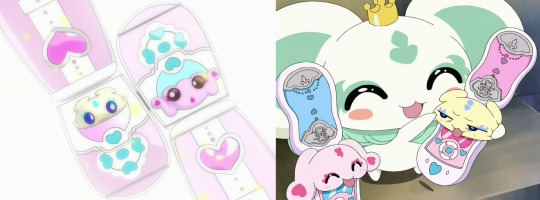
Another makeup item, another chance for the characters to do the transformation themselves. I love the little tup tup! sound effect that comes from this. Otherwise great, but it’s just unacceptable that the canon Cures cover 5 of the coloured bead thingys but we don’t get a red or purple Cure. False marketing I say.
Doki doki! Precure
The mascot-items are back and I’m still not a fan of this living-creature-turns-into-hard-plastic-device thing. It’s a phone, but it’s also too bulky to comfortably feel like one. But I really like how they spell L-O-V-E with the heart, I thought that was creative.

They tried to make Ace all cool and mature and then her transformation item is the most kiddy-looking TOY makeup box ever. Even if the merch is plastic can’d she at least have actual makeup in the henshin? And what’s with the button colours, sure they’re the team colours this time, but the other Cures don’t even use this item.
Happiness Charge Precure!

The idea that the Cures can choose different cards to insert is a super fun one, and it’s also nice that they can use it for more mundane outfit changes outside battle scenes too. The writing around the cards is atrocious though but that’s another story. As for the design of the device itself, I think it’s pretty weak, it’s somehow bulky and not very memorable.

Probably my least favourite item from this bunch. The Piano is yet another unrelated thing that is shoved into HapiCha’s confused world, there is nothing about making music in the themes of the season, or Iona as a character. I hate that this thing is the culmination of Hime and Iona’s character arcs. Also the design looks really cheap and the animation where Iona presses a couple keys to get sounds that don’t even try to hide that this is just a toy for three-year-olds wastes time.
Go! Princess Precure

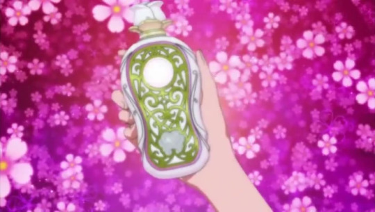
Another makeup item. At least perfumes fit the princess theme... But Go!Pri has the best henshin scenes in Precure, and the Cures applying the tranformation themselves plays a part in that. I also love how they start the transformation by filling the bottle with their theme colour, and the little twist they do with the key is a nice change from the usual button presses. And like with Heartcatch white and gold makes for a good regal colour palette. I think you could get an actual pretty fragrance bottle for grownups with this design if you did it with glass rather than plastic.
Also there are the keys which I love because of course I’m going to love collectible frilly dress items. They give each transformation and attack something unique and I like the bit where all the keys show up in a chain at the end of the henshin (and thankfully otherwise hidden under frills so you don’t need to draw them every time), and it’s nice to get the lock-and-key theme to the henshin as well. So once again Go!Pri is the best Precure at something and now gets the award for Best Precure Transformation item.
(god flora is so cute in this frame)
Mahou Tsukai Precure!

My bias that ever since I was a kid I’ve never really liked teddy bears comes to play here. The idea that the Cures don’t have a distinct transformation item at all is fun and the jewel theme is nice too, but I’m just filled with negative emotions whenever I see Mofurun... I haven’t seen MahouTsukai outside the henshin scenes so who knows if she’ll turn out to be my favourite character (and not just by process of elimination from me disliking everyone else more)

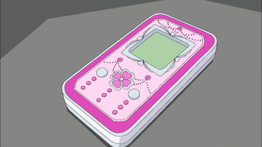
Not a big fan of this one, is it supposed to be a smartphone, or do they have some kind of smart notebooks in Japan? Either way it doesn’t really fit witches or flower fairies. All the little engravings are pretty and the flowers are cute, but overall this feels just random.
Kira Kira Precure a la Mode
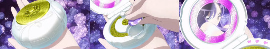
Mixing the attributes the character represents with a magic whisk and then transforming by covering yourself with the whipped cream is a super fun idea, and also one of the few Precure transformations where the girls apply the transformation themselves that is not based on beauty products. Or I guess this is a pocket mirror too but whatever. The item itself is fun and cute enough.
However as those who saw my Ichika fanart a few days ago I really really really don’t like that they have to fiddle with the pathetic tiny q-tip of a whisk, give them one the size of a microphone so they can put some strength into it!
Hugtto! Precure
I love how you can twist the end to make a heart, if I had one of these I’d click it back and forth while sitting at the computer and the hinges would be busted in no time. The grey things at the edge of the screen could be some other colour, now they look a bit like they’re made of rocks. I don’t think this one does anything special but it’s just so cute that I have to love it.
Star Twinkle Precure

These are fun but a bit wasted on a season that has nothing to do with art. But otherwise A+ idea, very active participation from the girls when they draw almost everything in their new look, and it’s not makeup-based. Quill and ink bottle are the most magical writing apparatus so that’s very fitting, and thanks to the space theme we get some stars too so it’s not just the usual hearts. The pink tone is a bit gaudy.
Healin’ Good Precure
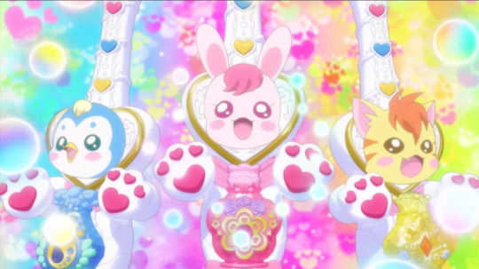
And we end on a weaker note with mascot items again. And these are my least favourites since to me they come across as if they have the dead-eyed animals’ decapitated heads sticking out of them. The paws also feel somehow unbalanced, and should not be pink for the blue and yellow items. The bottles feel tacked on too.
I feel that the mascots have been treated a bit better than average in Healin’ Good so I suppose it’s not bad that they get to be involved with the fights too (It’s nice that the item is also used as a weapon) but I would really rethink the design since now I don’t think the different elements go too well together and the result feels unbalanced.
41 notes
·
View notes
Last Seen Blogs

filmesbrasileiros
Filmes Brasileiros

mature-wives-lover
Naamloos

janjanligad
Untitled

faisal543
Faisal
sistersofhouseblack
Sisters of House Black