#DataStorytelling
Text
Hey students, if you have a choice of presenting your information in tables or graphs, choose the graph. Want to know why: 🔽

Graphs showcase trends, relationships, and key takeaways in a format the mind grasps faster than rows and columns. When you need to drive home critical data or demonstrate complex connections, graphs speak volumes.
Focus the spotlight on what matters most. Eliminate distractions with clean axes, labels, and legends tailored to the story you want to tell. Guide the viewer's eyes towards revelations, not footnotes.
But don't abandon tables altogether. Sometimes specifics and precise figures need the clarity tables allow. Use graphs to pull out patterns and messages, then turn to tables when the raw numbers themselves hold meaning.
With intentional design, graphs grab attention and spark "Aha!" moments. Tables serve as vital references to ground insights in accuracy. Together, they become a powerful communication duo.
The right balance drives home your data-driven point quickly, clearly and credibly. Let purpose guide your mix of visuals. Whether tables or graphs, let the numbers speak.
👉Do you agree with me? Let me know in the comments.
#scicomm#science communication#science#Infographic#DataViz#GraphicRecording#Sketchnotes#VisualCommunication#VisualThinking#DrawingExplanation#InformationDesign#DataStorytelling#VisualLiteracy#VisualNotes#GraphsRock#VisualizeThis
12 notes
·
View notes
Text

Unlocking Insights: Where data meets visualization magic ✨ Dive into the art of storytelling through data with Looker Studio. 📊💡 #DataVisualization #Analytics #LookerStudio #DataDrivenDecisions
#DataVisualization#Analytics#LookerStudio#DataDrivenDecisions#DataScience#DataStorytelling#DataAnalytics#BusinessIntelligence#VisualizeData
0 notes
Text
Strategies for Presenting Data and Solutions
1.What are the challenges of pitch deck?
Crafting a compelling pitch deck is a critical element in the process of obtaining funding for a new business venture. However, this task is not without its challenges. One of the primary difficulties lies in the need to distil complex concepts and information into a concise and engaging format.
Striking the right balance between providing sufficient detail to convey the business's value proposition and maintaining clarity and simplicity in the presentation can be a daunting task.
Furthermore, capturing the attention of potential investors and keeping them engaged throughout the pitch is no easy feat, as they are often inundated with a multitude of pitches and presentations. Therefore, developing a pitch deck that effectively communicates the business idea, demonstrates its potential for success, and leaves a lasting impression on investors demands meticulous planning, creativity, and strategic thinking.
Successful pitch decks require a delicate blend of storytelling, data visualization, and persuasive communication. Each slide must not only convey crucial information about the business. From outlining the problem, the business aims to solve to showcasing the innovative solution, market opportunity, competitive landscape, and financial projections, but every aspect of the pitch deck must also be meticulously crafted to resonate with investors.
2.What are the disadvantages of pitch deck?
Pitch decks play a critical role in the fundraising process for entrepreneurs, serving as a visual aid to communicate key information about their business to potential investors. However, it is important to recognize that there are certain drawbacks associated with relying solely on pitch decks. One significant challenge is the time and effort required to create a compelling and effective pitch deck. From conducting market research to designing visually appealing slides and refining the messaging, the process can be labour-intensive and time-consuming.
Furthermore, while pitch decks are a valuable tool for delivering a concise and structured presentation, they may sometimes fall short in fostering meaningful dialogue and interaction with investors.
3.What is pitch deck strategy?
Crafting a meticulously planned pitch deck strategy is essential for any business presentation seeking to make a lasting impact. This strategic blueprint serves as a roadmap for effectively conveying the business idea, product, or concept to potential investors, partners, or stakeholders.
Pitch deck strategy encompasses key elements such as a compelling introduction to the team, a precise elucidation of the problem at hand, a comprehensive overview of the solution or product offerings, market analysis, revenue model, competitive landscape, and financial projections. The primary objective of a pitch deck strategy is to engage the audience, pique their interest, and ultimately secure the necessary funding or support for the business. It demands meticulous planning, in-depth research, and a touch of creativity to ensure that the message is conveyed persuasively and with utmost clarity.
Developing a successful pitch deck strategy necessitates a deliberate and methodical approach to distilling complex information into a coherent and impactful presentation. By employing a blend of storytelling, data visualization, and strategic messaging, a well-crafted pitch deck can effectively convey the value proposition and potential of a business venture.
It is crucial to tailor the content of the pitch deck to resonate with the intended audience and address their specific needs and concerns. A compelling pitch deck strategy not only showcases the viability of the business but also demonstrates the competence and vision of the team behind it.
Ultimately, a thoughtfully constructed pitch deck serves as a powerful tool for driving interest, fostering trust, and securing the necessary resources to propel the business forward.
4.What is the main goal of a pitch deck?
Crafting a compelling pitch deck is a crucial element in the fundraising process for any business or project. The primary objective of a pitch deck is to succinctly and persuasively convey the essential aspects of a venture to potential investors or stakeholders.
This requires a strategic approach in outlining the problem statement, proposed solution, market analysis, competitive landscape, team composition, and financial projections. By effectively presenting these key components, a pitch deck aims to capture the interest of the audience, demonstrate the value proposition, and secure the necessary funding or support for the endeavour.
A well-designed pitch deck should not only be concise and visually appealing but also engaging and informative. It serves as a powerful tool to communicate the vision, viability, and potential return on investment of a business to potential backers.
Through a carefully curated presentation, a successful pitch deck can effectively highlight the unique selling points of the venture, establish credibility, and create a compelling case for why investors should consider supporting the project. Ultimately, a meticulously crafted pitch deck plays a pivotal role in shaping the success and growth trajectory of a business by attracting the right partners and resources needed for sustainable development.
5.What is pitch deck design?
Creating a compelling pitch deck design is a critical element in the success of an investor presentation. This visual representation of a company's business plan and value proposition must be meticulously crafted to effectively communicate key information to potential investors.
A well-designed pitch deck should be concise yet comprehensive, capturing the essence of the business model, market opportunity, competitive landscape, financial projections, and the expertise of the team behind the venture.
Utilizing engaging visuals, consistent branding elements, and a logical flow of information are essential components of an effective pitch deck design. By focusing on these aspects, entrepreneurs can enhance their ability to attract investor interest and secure the funding needed to propel their ventures forward.
The art of pitch deck design lies in striking a balance between aesthetic appeal and informational clarity. Each slide should be thoughtfully curated to convey the company's mission and vision succinctly while providing a comprehensive overview of the business opportunity.
By integrating compelling graphics, charts, and images alongside well-crafted content, entrepreneurs can create a visually engaging narrative that resonates with investors. A professionally designed pitch deck not only showcases the potential of the business but also reflects the credibility and preparedness of the founders.

0 notes
Text
Certificado en Visualización de Datos
Certificado en Visualización de Datos en la Plataforma de Platzi y en colaboración con Latinometrics. #Visualizaciondedatos #datavisualization #datastorytelling
Estoy muy contento de compartir con todos que he finalizado con éxito el curso de certificación en Visualización de datos ofrecido por Platzi y en colaboración con Latinometrics. Quiero agradecer a ambos por la excelente estructura y contenido del curso, que me ha permitido adquirir y mejorar mis habilidades en esta área tan importante. Aquí os muestro el certificado que he obtenido…
Certificado…

View On WordPress
0 notes
Text
Data Visualization
The process of representing data using popular images, like charts, plots, infographics, and even animations, is known as data visualization. These informational visual displays make difficult data linkages and data-driven insights understandable. YrEdge Consulting can provide you with optimum data visualization solutions, contact us today.

#DataVisualization#VisualizeData#DataViz#DataInsights#VisualData#Analytics#DataDriven#Infographics#ChartsAndGraphs#DataStorytelling#DataArt#DataAnalysis#DataPresentation#InformationDesign#GraphicalData#DataIllustration
0 notes
Text

Data Visualisation and Storytelling can be used together to Boost Sales in Banking
Combine Data Visualization with Storytelling to skyrocket banking sales! By presenting complex financial information visually and weaving it into compelling narratives, banks can captivate customers, enhance understanding, and drive sales.
0 notes
Text
Power bi online training with 100 % Placement Assistance

Secure your future with the Best #PowerBI Course in SR Nagar, Hyderabad at Learn giants!
Attend a Free Demo
Power BI empowers organizations to turn raw data into meaningful insights through interactive and visually compelling reports and dashboards. With its user-friendly interface, robust data connectivity, and advanced analytics capabilities, Power BI is a game-changer for businesses seeking data-driven decision-making.
Key Features:
Data Visualization: Transform data into visually appealing charts, graphs, and tables for easy interpretation.
Real-Time Analytics: Access and analyze data in real-time, enabling timely decision-making.
Interactive Dashboards: Create dynamic and interactive dashboards that provide a comprehensive overview of business performance.
Data Connectivity: Connect to a variety of data sources, both on-premises and in the cloud, ensuring comprehensive data integration.
Natural Language Queries: Use natural language queries to interact with data and gain insights without the need for complex queries.
Collaboration: Share reports and dashboards with stakeholders, fostering collaboration and informed discussions.
Security: Implement robust security measures to ensure that data is accessed and shared securely.
Hashtags:
#PowerBI
#DataVisualization
#BusinessIntelligence
#Analytics
#DataDriven
#BusinessAnalytics
#DashboardDesign
#MicrosoftBI
#LearnGiantsAcademy
#learngiants
#rajeshyepuri
Address: 🌐visit our website: www.learngiants.com for more information.
facebook :.https://www.facebook.com/
instagram:https://www.instagram.com/learn_giants/
CONTACT US:9032444875
📍 Location:#8-3-214/22/S, South India bank Building, 3rd Floor, Near Harsha mess, SR Nagar, Hyderabad-500038
#PowerBI#DataVisualization#BusinessIntelligence#DataAnalytics#DataInsights#Dashboard#BIReporting#MicrosoftPowerBI#DataDrivenDecisions#PowerBIDesktop#PowerBIService#PowerBICommunity#DataModeling#Analytics#DataStorytelling
1 note
·
View note
Text
How to master data visualization: 8 intriguing best practices
Data visualization plays a crucial role in the analysis and interpretation of data by transforming raw information into meaningful insights. By visually representing complex data sets, charts, graphs, and interactive visualizations make it easier for individuals and organizations to understand information, identify patterns, and make informed decisions.
Importance of Data Visualization
Data visualization is important because it allows us to comprehend and communicate data in a more intuitive and impactful way. It takes advantage of the human brain's visual processing power, enabling us to absorb and process information more efficiently than through text or numbers alone. Visualizing data helps identify trends, outliers, and relationships, leading to a deeper understanding of the underlying patterns within the data.
https://rahularaj.com/10-essential-python-libraries-every-data-scientist-must-know/
Benefits of Effective Visualization for Decision-Making and Insights
- Clarity and Simplification: Visualizations simplify complex data by presenting it in a visually appealing and digestible format. They enable users to quickly grasp the main findings and draw insights from the information at hand.
- Identification of Patterns and Trends: By representing data visually, patterns, trends, and correlations become more apparent. This allows decision-makers to identify opportunities, risks, and potential issues that may have been difficult to detect in raw data.
- Enhanced Communication and Persuasion: Visualizations are an effective means of communicating data-driven insights to various stakeholders. They can help break down complex concepts and findings, making it easier for non-technical audiences to understand and appreciate the significance of the data.
- Interactive Exploration: Interactive visualizations permit users to manipulate and explore data, enabling them to dive deeper into specific data subsets or variables. This interactivity facilitates a more interactive and dynamic analysis experience, encouraging users to ask questions and discover new insights.
- Data-Driven Decision-Making: Effective data visualizations empower decision-makers to base their judgments on sound evidence and insights derived from data. By ensuring data-driven decision-making, organizations can minimize risks, optimize resource allocation, and make informed strategic choices.
In conclusion, data visualization is a powerful tool that enables us to unlock the true potential of data. By transforming complex information into visual representations, data visualization simplifies understanding, enhances decision-making, and uncovers valuable insights that drive innovation and progress.
Choosing the Right Visualization Technique
When presenting data effectively, choosing the right visualization technique is crucial. Different types of visualizations are suitable for specific purposes, allowing you to convey information clearly and facilitate better data understanding. Here are five common visualization techniques and their respective applications:
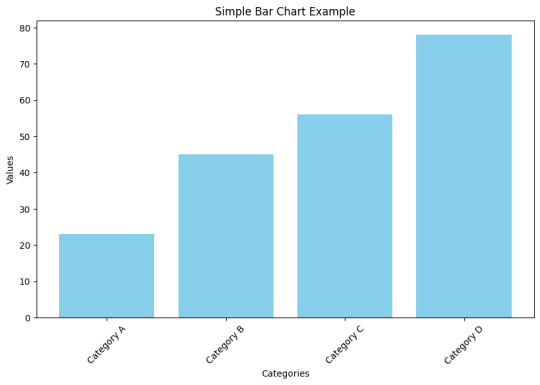
- Bar charts and column charts: These charts are ideal for displaying comparisons and trends. They use rectangular bars or columns to represent data values, making it easy to compare different categories or variables. Bar charts are preferable when the categories are distinct, whereas column charts are more suitable when the data points have varying heights.
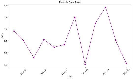
- Line charts and area charts: These visualizations are effective for showing changes over time. Line charts display data as a series of data points connected by lines, revealing trends and patterns. Area charts, on the other hand, fill the space between the lines and the x-axis, making it easier to see the magnitude and distribution of values over time.
- Scatter plots and bubble charts: These types of visualizations are useful for exploring relationships and correlations in data. Scatter plots represent individual data points using dots, plotting them along two axes to showcase correlations between variables. Bubble charts take it a step further by incorporating additional information through varying sizes or colors of bubbles, allowing for visual representation of three dimensions.
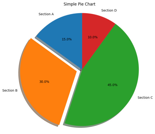
- Pie charts and donut charts: These circular visualizations are effective for illustrating proportions and percentages. Pie charts divide a circle into slices, with each slice representing a different category or value. The size of each slice corresponds to the proportion it represents. Donut charts are similar but include a hole in the center, providing space for additional information or emphasizing the central theme.
- Heatmaps and treemaps: Heatmaps are ideal for visualizing complex data patterns. They use color gradients to represent data values and provide a visual summary of a large dataset. Treemaps, on the other hand, use rectangles nested within larger rectangles to display hierarchical data. The size and color of each rectangle represent different variables, making it easy to identify patterns and relationships within the data.
By carefully selecting the appropriate visualization technique based on the nature of your data and the insights you want to convey, you can effectively communicate your data findings to your audience. Remember that clarity, simplicity, and relevance are key when choosing visualizations.
Designing Effective Visuals
When creating visuals, it is crucial to ensure that they effectively convey the intended message and engage the audience. Here are some key strategies to design visuals that are impactful and visually appealing:
- Simplify and Declutter: To emphasize the key message and minimize distractions, simplify the visual elements. Remove any unnecessary clutter and focus on highlighting the essential information. Use concise text, clean lines, and minimalistic design to create a clear and uncluttered visual.
- Choose Appropriate Colors: Colors play a significant role in visuals as they enhance readability and convey meaning. Select colors that align with the message and the overall tone of the content. Use a limited color palette to maintain consistency and avoid overwhelming the viewer. Consider the psychological impact of different colors and their associations when choosing appropriate colors for your visuals.
- Use Proper Scaling: Proper scaling is crucial for accurately representing data values and proportions. Ensure that the size of each visual element, such as bars in a bar chart or icons in an infographic, accurately reflects their respective values. Avoid distorting proportions as it can mislead the audience and impact the understanding of the information presented.
- Incorporate Meaningful Labels: Labels provide context and explanations for the visual elements. Include clear and concise labels that help the audience understand the information being presented. Use labels to identify data points, add captions, or provide additional context. Ensure that the labels are easily readable and positioned appropriately within the visual.
- Utilize White Space: White space refers to the empty or blank areas in a visual. It is essential for creating visual balance and aiding comprehension. Incorporate sufficient white space between different elements to prevent visual clutter and enhance readability. White space also helps guide the viewer's attention to the most important parts of the visual.
By following these strategies, you can design visuals that effectively communicate your message, engage the audience, and improve overall comprehension. Remember to maintain a cohesive visual style throughout your content for a polished and professional look.
Making Data Interactive
To make data more engaging and enhance exploration, adding interactivity is key. By incorporating interactive elements, users can have a more immersive and effective experience while analyzing and interpreting data.
1. Enhancing User Engagement: Adding interactivity to data visualizations, such as charts and graphs, encourages users to actively engage with the information presented. This can be achieved through various methods, including:
- Tooltips: Tooltips provide additional contextual information when users hover over data points or elements. They can be used to display specific values, explanations, or relevant details, allowing users to gain a deeper understanding of the data.
- Filters: Interactive filters enable users to refine the displayed data based on specific criteria. Users can selectively include or exclude certain categories, time periods, or other variables, allowing for a more focused analysis.
- Drill-Down: Implementing drill-down features allows users to explore data at different levels of granularity. By clicking on specific elements, users can dive deeper into the data, revealing more detailed information and uncovering insights that may not be apparent at a high-level view.
2. Improving Data Exploration: Interactive data visualization techniques facilitate effective exploration and analysis. Some strategies to consider include:
- Hover Effects: Incorporating hover effects, such as highlighting or enlarging data points, gives users immediate visual feedback and enables them to quickly identify patterns or outliers.
- Interactive Maps: Maps that allow users to interact with geographical data through zooming, panning, and clicking on specific regions can be highly effective in presenting location-based information.
- Animated Transitions: Smooth animations when transitioning between different data views or visual representations can help users better perceive changes and detect trends.
3. Promoting Data Understanding: Interactive features can contribute to users' comprehension of complex datasets. Examples of how this can be achieved include:
- Comparative Analysis: Interactive elements that facilitate side-by-side comparisons enable users to contrast different datasets or subsets of data. This can be done through interactive sliders, checkboxes, or other controls.
- Linked Visualizations: Creating connections between multiple visualizations allows users to explore relationships and correlations between variables. For example, selecting a data point in one visualization could highlight related data points in other linked visualizations.
- Storytelling: Combining interactive elements with narrative storytelling techniques can guide users through a data-driven story, making the information more understandable, engaging, and memorable.
In conclusion, by adding interactivity to data, such as tooltips, filters, and drill-down features, users can have a more immersive and exploratory experience. Furthermore, engaging users with interactive data visualizations helps improve data understanding, promotes valuable insights, and enhances the overall data analysis process.
Telling a Compelling Story with Data
To effectively communicate information through data visualizations, it is crucial to construct a compelling narrative that engages viewers and conveys a clear message. Here are three key steps to follow:
1. Establishing a Clear Narrative
Begin by defining the problem or topic that your visualization aims to address. Clearly articulate the purpose of the visualization, whether it is to inform, persuade, or entertain. This narrative framework will serve as the foundation for your data story.
For example, if your visualization focuses on the impact of climate change on global temperatures, start by explaining the significance of this issue and why it is important to understand its implications. This context will help viewers grasp the relevance of the data presented.
2. Guiding the Viewer's Attention
Once you have established your narrative, guide the viewer's attention towards the key insights and findings within the data. Use visual cues such as color, size, or position to emphasize the most important elements. By directing attention to these key points, you can ensure that viewers understand the main takeaways of your visualization.
Additionally, provide contextual information to help viewers interpret the data correctly. This could include labeling axes, providing units of measurement, or offering comparisons to familiar benchmarks. These annotations will enhance the viewer's understanding and facilitate meaningful insights.
For instance, if your visualization compares the energy consumption of different countries over time, highlight the countries with the highest and lowest energy usage. Provide explanations or annotations to clarify any fluctuations or patterns observed in the data, allowing viewers to fully comprehend the implications.
3. Incorporating Annotations and Explanations
To further augment the narrative, consider adding textual cues and explanations throughout the visualization. Annotations can provide additional context or clarify complex concepts. Use headlines, subheadings, labels, and captions strategically to provide clear and concise information.
For example, if your visualization illustrates the impact of a marketing campaign on sales, include annotations that describe the campaign objectives, targeted audience, and any external factors that influenced the results. These annotations will help viewers understand the story behind the data and connect it to real-world scenarios.
Remember to keep the text concise and focused, avoiding excessive clutter that may distract from the main narrative. Use a combination of heading levels, paragraphs, and bullet points to structure the content and create visual hierarchy.
By following these steps and incorporating effective annotations, you can transform raw data into a compelling story that engages and informs viewers, allowing them to derive meaningful insights from the visualization.
Ensuring Accessibility and Responsiveness
In order to create an inclusive and user-friendly experience, it is important to prioritize accessibility and responsiveness when designing visualizations. This ensures that all users, including those with disabilities, can effectively engage with the content. Furthermore, optimizing for different devices and screen sizes allows for seamless interaction across various platforms.
Designing Accessible Visualizations:
- Color Contrast: Ensure that there is sufficient contrast between the text and background colors in the visualization to make it easy to read for individuals with visual impairments.
- Alternative Text: Provide descriptive alternative text for images and graphics within the visualization. This allows users with visual impairments to understand the content through screen readers.
- Keyboard Accessibility: Design the visualization in a way that users can navigate and interact with it solely using a keyboard, without requiring a mouse or touch input. This accommodates individuals with motor disabilities who may have difficulty using a traditional pointing device.
- Assistive Technologies: Test the visualization with assistive technologies, such as screen readers and voice recognition software, to ensure compatibility and proper interpretation of the information.
Optimizing for Different Devices and Screen Sizes:
- Responsive Design: Employ responsive design techniques to ensure that the visualization adapts and scales appropriately across different screen sizes, from mobile devices to desktops. This allows users to easily view and interact with the content regardless of the device they are using.
- Flexible Layouts: Use flexible layouts and grids that automatically adjust and reflow based on the available screen space. This ensures that the visualization remains visually appealing and user-friendly on different devices.
- Mobile Optimization: Consider the limitations of mobile devices, such as smaller screens and slower internet connections. Optimize the visualization by minimizing unnecessary elements, optimizing image sizes, and prioritizing essential content for a smoother mobile experience.
- Touch-Friendly Interactions: Implement touch-friendly interactions, such as swipe gestures and pinch-to-zoom, to accommodate users accessing the visualization on touchscreen devices.
By prioritizing accessibility and responsiveness in visualization design, you can ensure that your content is widely accessible and provides an enhanced user experience for all users, regardless of their abilities or the devices they are using. This commitment to inclusivity and usability fosters a positive and inclusive digital environment.
Utilizing Advanced Visualization Techniques
Advanced visualization techniques play a crucial role in effectively presenting complex data and insights. By leveraging these techniques, you can enhance comprehension and make data-driven decisions. Let's delve into some of the prominent methods:
- Network Diagrams and Sankey Diagrams: These visualizations are ideal for presenting connected data and flows. Network diagrams display relationships between entities, such as social networks or organizational structures. On the other hand, Sankey diagrams demonstrate the flow of quantities or values through a system. Both diagrams enable users to identify patterns, bottlenecks, and interactions within complex systems.
- Geographic Maps and Choropleth Maps: When spatial patterns and distributions need to be visualized, geographic maps and choropleth maps are valuable tools. Geographic maps display data on a geographical layout, providing insights into regional variations. Choropleth maps, on the other hand, use color-coding to represent data at a specific geographic level, such as countries or regions. These visualizations help understand spatial relationships, identify trends, and make location-based decisions.
- Tree Diagrams and Sunburst Charts: Visualizing hierarchical relationships is made easier with tree diagrams and sunburst charts. Tree diagrams display hierarchical structures, with parent nodes branching out into child nodes. They are widely used to represent organizational hierarchies or categorize data. Sunburst charts, on the other hand, show hierarchical data in a circular layout. They illustrate the proportion of each category within the hierarchy, helping users understand the distribution of data.
By incorporating these advanced visualization techniques into your data analysis and communication, you can effectively convey complex information, identify patterns, and make data-driven decisions. These visualizations enhance understanding and simplify the interpretation of complex data structures, resulting in more impactful insights.
Testing and Iterating
Testing visuals is crucial for ensuring the usability and effectiveness of designs.
Read the full article
0 notes
Text
A Step-by-Step Guide to Create Dynamic Animated Graphs in Tableau
1.Connect to the Sample Superstore data in Tableau to load the dataset
2.Choose the "Sub-Category" field and place it into the Columns card.
3. Drag the "Sales" field and drop it into the Rows card.
4.Take the "Order Date" field and place it into the Filter card.
5. Drag the "Sub-Category" field and drop it into the Color option in the Marks card.
6. Select "Show History" to enable historical data.
Follow us for more insider tips and if you're ready to dive into the world of Tableau, enroll in our upcoming batches. 🚀 Contact us at +91 8288040281 or visit the link in bio for further details. 📈
#CACMSInstitute#TableauTutorial#DataVisualization#AnalyticsTips#TableauMastery#TechSkills#DataScience#DashboardDesign#VisualizeData#TechInnovation#TableauMagic#DataAnalytics#LearnTableau#GraphDesign#TableauTricks#DataStorytelling#BIExcellence#TableauExperts#DataVizCommunity#AnalyticsPro#TableauForBeginners
0 notes
Text
Data Unleashed: How Anervea Data Labs Transforms Raw Information into Actionable Insights
In the information age, data has become the lifeblood of businesses across industries. Organizations are inundated with vast volumes of raw data, but the true power lies not in the data itself but in its insights. This is where Anervea Data Labs is a beacon of transformation that turns raw information into actionable insights, unlocking the potential for smarter decisions and strategic growth.
Write to us at [email protected] to learn more about how Anervea Data Labs is a beacon of transformation that turns raw information into actionable insights, unlocking the potential for smarter decisions and strategic growth.
The Data Conundrum: From Raw to Refined
Raw data is like a puzzle with countless pieces waiting to be assembled into a coherent picture. However, handling raw data is a formidable task, requiring expert analysis to derive meaningful patterns and trends. This is where Anervea Data Labs is armed with a team of skilled data scientists, analysts, and cutting-edge tools.
Setting Us Apart: Unlocking Distinct Advantages
Deep expertise in the pharmaceutical industry, addressing unique challenges and regulatory requirements.
A collaborative approach to understand your goals and deliver tailored solutions.
We leverage advanced analytics and cutting-edge technologies for accurate predictions and competitive advantage.
Focus on data visualization to enhance understanding and facilitate decision-making.
Empowering Data-Driven Excellence
In a world driven by data, Anervea Data Labs stands as a beacon of transformation. By harnessing the power of advanced analytics, machine learning, and AI, raw data is turned into actionable insights that fuel revenue growth, innovation, and success.
As businesses strive for excellence, Anervea Data Labs is the trusted partner that navigates the data labyrinth, illuminating the path to data-driven decision-making. With a commitment to accuracy, innovation, and value creation, Anervea Data Labs is revolutionizing industries, one insight at a time. Because in a world awash with data, actionable insights are the true currency of progress.
The Path to Action: From Insights to Strategy
Unveiling insights is only half the battle; the real magic happens when these insights fuel strategic decision-making.
Informed Business Strategy: Actionable insights guide business strategies, from product development and marketing campaigns to supply chain optimization and customer experience enhancement.
Personalized Customer Engagement: Insights into customer behavior and preferences enable personalized engagements, resulting in higher customer satisfaction and loyalty.
Efficiency and Cost Savings: Insights guide resource allocation, reducing wastage and optimizing processes for cost-effective operations.
Anticipating Trends: Predictive insights empower businesses to anticipate market trends, gaining a competitive edge in rapidly evolving industries.
Visit our website now: https://www.anervea.com/
#DataUnleashed#ActionableInsights#DataDriven#AnalyticsMagic#InsightsInnovation#DigitalTransformation#BusinessIntelligence#DataScience#AIandAnalytics#DecisionMaking#SmartStrategies#DataVisualization#PredictiveAnalytics#InformedDecisions#DataToStrategy#UnlockingInsights#DataEmpowerment#StrategicGrowth#DataInnovation#DataStorytelling
0 notes
Text
Leverage the power of data storytelling - the most efficient approach to communicating business information and cultivate a data-driven culture that leads to more informed decision-making. we are passionate about turning complex data into engaging narratives that inspire action and drive business success.
0 notes
Text
Best Graph Making Tools

Follow @everythingaboutbiotech for informative and useful stuff ✨
#DataViz#DataVisualization#Graphs#Charts#DataGraphs#GraphDesign#Infographics#DataAnalytics#ChartTypes#BarChart#PieChart#LineGraph#GraphSoftware#ExcelCharts#TableauViz#DataStorytelling#FlowChart#OrgChart#Data#Analytics#Numbers#Statistics#DataScience#BigData#Dashboard
8 notes
·
View notes
Text
Best Corporate Keynote Speakers
Who is the best corporate or business keynote speaker?
The term “keynote” can be compared to a musician’s perfect note to compose the perfect tune. Similarly, the keynote speaker establishes the fundamental tone and tenor of the gathering that resonates through the event and is result oriented.
Key moments benefiting any event or occasion are captured and inseminated in the audience by a keynote speaker.

Why does the organization invite the keynote speaker?
The keynote speaker customizes and designs effective ways to engage and integrate the employees of an organization into the organization’s strategy process and motivation.
Keynote speeches inspire transformative change in the event by adding themes and making the content of the event or conference a knowledgeable and harmonious experience.
What are the benefits of the corporate guest speaker?
• To encapsulate the event’s theme.
• To assist the participants to connect themselves to the organization’s overall vision, mission, and goals.
• To inspire the participants to increase their productivity with the feeling of connectivity and being liable for their output.
Various aspects of Keynote Speaker Storytelling:
Compliment the Event’s Theme
The company and HR organize events with formal and knowledgeable themes like, Future of work, Financial Planning, Corporate culture, Leadership Transition, Work-Life balance etc. Many informal events with interesting themes like Gandhi Jayanti, Woman’s Day, Reading day, Green Day, Environment day etc. are also enjoyed and appreciated by the employees.
The Keynote Speaker supplies insight relevant to the themes of the conference.
E.g.1.: After the session on Financial Planning, the participants got the clear guidelines and foresight to manage their finance for a secured future.
E.g.2: After attending the session of Environmental Day, the employees became aware of the hazardous impacts of global warming. They also understood the measures to reduce the impact and maintain environmental sustainability for the future generations.
Promote Inter-Department Connection
In most companies, various departments work toward a singular goal. These departments are typically in silos; hence there is little or no interaction outside e-mail or chat systems. The speaker creates synergy between the teams and departments to connect and perform in sync.
(For E.g.: After the storytelling workshop on Team Bonding, the employees at all levels and designations, understood the magnitude of connectivity and binding for collaborated efforts towards achievement of goal and productivity and also a sense of belonging.)
Strategy facilitation and foresight
Corporate keynote speakers have expertise in facilitating practical strategic thinking amongst the participants. They advocate utilizing the latest techniques to help generate powerful insights and high-value action plans to assist organizations in succeeding in a rapidly-changing world.
For instance, new strategies were made during the Pandemic of COVID. In a virtual event, the keynote speaker projected a story about an organization that, through its remote working strategies, could maintain the productivity and profitability of the business.
The Uniqueness of Keynote speaker with Storytelling:
Keynote Speakers conduct the event with topics like leadership, team orientation, motivation etc., with long speeches. Best Keynote Speakers are unique and incorporate Storytelling on various topics. The gist is to create an effective and long-lasting impact on the audience.
A compelling and interesting story captivates the audience’s attention and interest, keeps them connected and engaged and shares valuable insight that influences their lives. It is this unique style of Storytelling which brings life to a keynote speech.
Conclusion
Give your event an innovative edge by inviting us as keynote speakers with a unique perspective of Storytelling to enhance the theme of the event. Through our expertise in Storytelling, the participants achieve not only a sense of ownership but also solid and valuable insights, which dramatically increase their work potential.
Contact us on [email protected] or call +919970838025 and we can customize the precise stories that befits your requirements.
#communication#storytelling#coaching#communicationskill#interview#corporate#workplace#Organizations#health#business#businessstories#datastorytelling#businessstorytelling
0 notes
Text
Tienes que probar Power BI
¡Amantes del análisis de datos y del Data StoryTelling, estoy emocionado de compartir con todos mi más reciente contacto con PowerBI, herramienta líder en visualización de datos! 📊 después de completar un nuevo curso en Platzi.!
🚀 ¡Descubre el poder de PowerBI !🚀
¡Amantes del análisis de datos y del Data StoryTelling, estoy emocionado de compartir con todos mi más reciente contacto con PowerBI, herramienta líder en visualización de datos! 📊 después de completar un nuevo curso en Platzi.!
Certificado curso de Análisis de Datos con Power BI
¡Permíteme mostrarte algunas de las increíbles características que he aprendido!…
View On WordPress
0 notes
Text
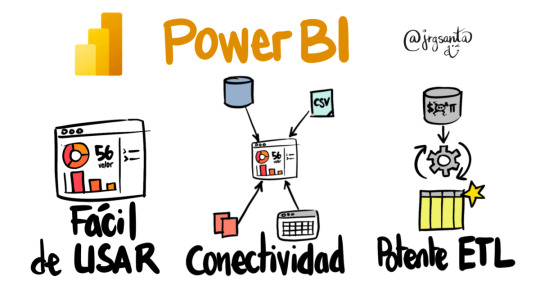
🚀 Master Power BI with Ease! 🚀
Are you ready to take your data analysis skills to the next level? I’ve covered everything you need to know about Power BI in my latest blog post! 📊✨
🔍 What you’ll learn:
1. Introduction to Power BI – What it is and its features 💡
2. How to connect and import data from multiple sources 🌐
3. Transforming and cleaning data like a pro with Power Query 🛠️
4. Creating stunning visuals and interactive dashboards 📈
5. Mastering DAX calculations and data analysis 🧠
6. Publishing and sharing your reports with ease 🌟
7. Advanced topics like Time Intelligence and custom visuals 🚀
💡 Plus, real-world project examples and case studies!
Don’t miss out on the ultimate guide to Power BI success. Check it out now and elevate your skills: https://analysiswithsadiul.blogspot.com
#PowerBI #DataVisualization #DataAnalytics #DashboardDesign #DAX #BusinessIntelligence #LearnPowerBI #DataScience
#PowerBI #DataVisualization #BusinessIntelligence #DataAnalytics #DataScience #BI #MicrosoftPowerBI #DAX #DataModeling #DataAnalysis #DataInsights #DashboardDesign #PowerQuery #Reporting #DataStorytelling #Visualization #Analytics #PowerPlatform #SelfServiceBI #PowerBIDesktop #PowerBIDashboard #BIReports #BigData #DataTransformation #BusinessAnalysis #AI #MachineLearning #Automation #SQL #ETL
#analytics#business intelligence#data analytics#power bi#data#data analysis#data science#youtube#data visualization#sql
0 notes
Text
When numbers meet narrative - that's where...
When numbers meet narrative - that's where magic happens. Discover how traditional storytelling merges with data analysis to boost team performance. https://krnfy.bz/470XpgA #datastorytelling #leadership #storytelling
When numbers meet narrative - that's where...
When numbers meet narrative - that's where magic happens. Discover how traditional storytelling merges with data analysis to boost team performance. https://krnfy.bz/470XpgA {hashtag|\#|datastorytelling} {hashtag|\#|leadership} {hashtag|\#|storytelling}
Korn Ferry Connect
0 notes
Last Seen Blogs

suriludeshi
Untitled

stonybrookiv
Stony Brook InterVarsity Christian Fellowship

goronpaladin
Goron Paladin

seema123456
Untitled

zarahjoyce
my place in this world