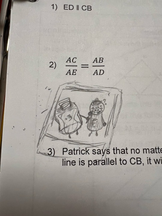
#Excel for beginners
Text
Master the Art of Excel: A Comprehensive Guide
Excel Like a Pro with These Tips!
Excel is more than just a spreadsheet tool; it’s a robust platform that allows you to manage data, perform complex calculations, and even develop custom applications. Whether you’re a finance expert, a data analyst, or someone who loves to organize and analyze data, Excel can be your best friend—if you know how to use it effectively. Let’s dive into a short…

View On WordPress
#Advanced Excel#data analysis#Excel charts#Excel for beginners#Excel formulas#Excel guide#Excel macros#Spreadsheet tips
0 notes
Text

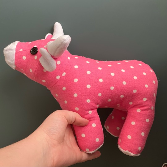
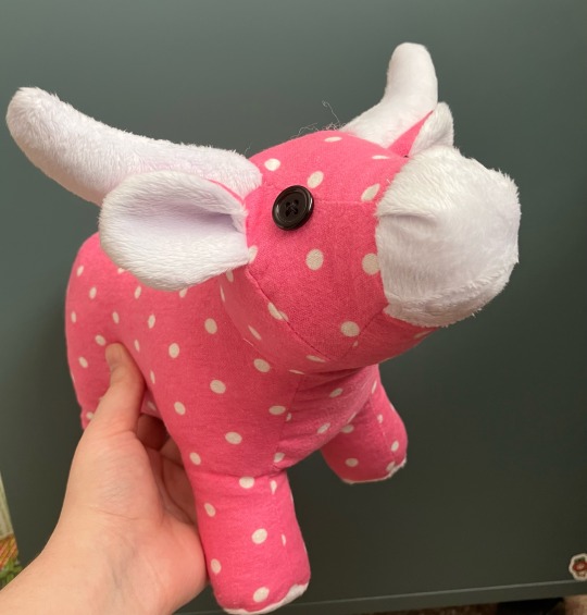
A little flannel cow!
I think her name has to be Dottie
#sewing#handmade#plushie#cow plushie#some interesting construction in this cow pattern#like. not unique but just enough different that it’s got me thinking of how I could do something like that#all in all 10/10 excellent pattern would make again#not super beginner friendly but also not difficult to make if you’ve made a plushie before
659 notes
·
View notes
Text
Mastering Excel: A Beginner's Guide to Organizing, Analyzing and Visualizing Data
Mastering Excel: A Beginner’s Guide to Organizing, Analyzing and Visualizing Data
Familiarize yourself with the layout of the Excel window, including the ribbon and the various tabs and buttons.
Learn how to navigate and select cells, rows, and columns.
Learn the basic mathematical functions and how to use them, such as SUM, AVERAGE, and COUNT.
Understand how to format cells, including font size and color, cell alignment, and borders.
Learn how to sort and filter data, and…

View On WordPress
#budgeting spreadsheet#dashboard excel#data analysis excel#excel courses#excel filter#excel for beginners#excel for dummies#excel for mac#excel spreadsheet microsoft excel excel online google excel excel spreadsheet converting pdf to excel sumif pdf excel excelle exel sumif exc#google docs excel#google excel sheet#if and excel#learn excel#leila gharani#microsoft excel online#miss excel#ms excel#openpyxl#power query excel#powerpivot#word excel
0 notes
Text
My mom sent me a watercolor she just did and I’m going a little crazy over it, tbh.
#it’s such a simple subject#flowers in a field at sunset#and it’s the sunflower + tulips + lupin combination that you see whenever you ask somebody to draw different flowers#but she has this red abstract squiggly border that looks just like the illuminations in manuscripts#and the sunset wash bleeds all together#and there’s this gradient in the muddy yellow of the sunflower#and you look at it. and you can tell. whoever made this had fun.#they enjoyed putting the colors down#the green layers of grass#the delicate squiggles of red#the tiny little flowers and the giant swath of sky#I’ve ranted and raved about how technical excellence /needs/ to be pursued#but - perhaps because I believe in excellence and not despite of it -#Every step along the way#every ‘beginner’s mistake’#every naive piece every foray into something new every attempt to make something beautiful#just inspires so much love and joy in me.#It’s beautiful. because it’s an attempt to express the inexpressible.
91 notes
·
View notes
Text

I decided like last night that ima change how I draw the humanized objects cause I’ve grown really fond of these character designs :).
(This was try one, I’m very open to criticism lmao)
#object shows#osc#object show community#osc art#fanart#beginner artist#humanized#humanized objects#EEE#extraordinaryexcellententities#extraordinarily excellent entities#diary x moonstone#eee diary#eee moonstone
36 notes
·
View notes
Text
(A silly idea and some art)
I was listening to a bunch of Trixie Mattel and Katia clips recently (because I love these too and think they’re amazing drag queens!) and while listening a really dumb idea came to me. So I have to ask, do you guys think that Diary (EEE) and Trophy (II) would be friends or enemies? I’m not sure why, but I just imagine them having a friendship like Katia and Trixie for some reason lol.
Tw: Reference to some Trixie & Katia scenes that include things that might make people uncomfortable
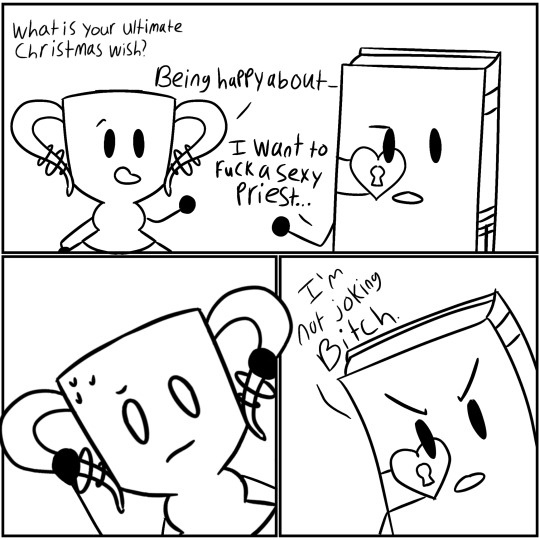

This was my first time drawing Trophy and I think he came out really good ^^
(The second one took a really long time and also was made a few days after the first one so they look really different lol. I also just gave kinda gave up on what they were sitting on tbh.)
#trophy ii#diary eee#inanimate insanity#osc#extraordinarily excellent entities#beginner artist#just a silly thing
29 notes
·
View notes
Text
im SOOOOO grateful my dnd party isn’t bigger actually wtf .
#the struggle when 1 of you works office hours and the other 3 work SO irregularly#planning was getting so messy we had to make an excel sheet for who’s available when 😭#by we I mean I. I made an excel sheet. It was fun though. I willingly did it.#see also our planning session. i was thinking character creation would be quick. no. we spent 6 hours.#i was like. it’s only 3 ppl it’s FINE#but turns out when you have to be looking up rules for spells and shit as you go + the players don’t know how to roll for their stats it uh.#Gets a lot messier and more complicated.#Rolling for stats is SO bad to explain. Have you ever tried to explain that to a complete beginner? Don’t. Use the stat block.#Also i did the thing where if their modifiers totaled to less than +2 they get to re roll#nd that meant A LOT of math and A LOT OF REROLLING#also I made them reroll if they were TOO op (one player rolled like 3 15s and a 14…) which also happened unbelievably many times#one of them kept rolling so badly and I was like ok let me roll. and her first stat i rolled fucking 5…#(total modifier sum was like. negative so we scratched that lmfao)#I might change the way I work w stats next character creation session bc it felt like a veeeery flawed way to go about things#But hey at least they got the hang of rolling for stats :D#z talks#not horse game
5 notes
·
View notes
Text
Homemaking, gardening, and self-sufficiency resources that won't radicalize you into a hate group

It seems like self-sufficiency and homemaking skills are blowing up right now. With the COVID-19 pandemic and the current economic crisis, a lot of folks, especially young people, are looking to develop skills that will help them be a little bit less dependent on our consumerist economy. And I think that's generally a good thing. I think more of us should know how to cook a meal from scratch, grow our own vegetables, and mend our own clothes. Those are good skills to have.
Unfortunately, these "self-sufficiency" skills are often used as a recruiting tactic by white supremacists, TERFs, and other hate groups. They become a way to reconnect to or relive the "good old days," a romanticized (false) past before modern society and civil rights. And for a lot of people, these skills are inseparably connected to their politics and may even be used as a tool to indoctrinate new people.
In the spirit of building safe communities, here's a complete list of the safe resources I've found for learning homemaking, gardening, and related skills. Safe for me means queer- and trans-friendly, inclusive of different races and cultures, does not contain Christian preaching, and does not contain white supremacist or TERF dog whistles.
Homemaking/Housekeeping/Caring for your home:
Making It by Kelly Coyne and Erik Knutzen [book] (The big crunchy household DIY book; includes every level of self-sufficiency from making your own toothpaste and laundry soap to setting up raised beds to butchering a chicken. Authors are explicitly left-leaning.)
Safe and Sound: A Renter-Friendly Guide to Home Repair by Mercury Stardust [book] (A guide to simple home repair tasks, written with rentals in mind; very compassionate and accessible language.)
How To Keep House While Drowning by KC Davis [book] (The book about cleaning and housework for people who get overwhelmed by cleaning and housework, based on the premise that messiness is not a moral failing; disability and neurodivergence friendly; genuinely changed how I approach cleaning tasks.)
Gardening
Rebel Gardening by Alessandro Vitale [book] (Really great introduction to urban gardening; explicitly discusses renter-friendly garden designs in small spaces; lots of DIY solutions using recycled materials; note that the author lives in England, so check if plants are invasive in your area before putting them in the ground.)
Country/Rural Living:
Woodsqueer by Gretchen Legler [book] (Memoir of a lesbian who lives and works on a rural farm in Maine with her wife; does a good job of showing what it's like to be queer in a rural space; CW for mentions of domestic violence, infidelity/cheating, and internalized homophobia)
"Debunking the Off-Grid Fantasy" by Maggie Mae Fish [video essay] (Deconstructs the off-grid lifestyle and the myth of self-reliance)
Sewing/Mending:
Annika Victoria [YouTube channel] (No longer active, but their videos are still a great resource for anyone learning to sew; check out the beginner project playlist to start. This is where I learned a lot of what I know about sewing.)
Make, Sew, and Mend by Bernadette Banner [book] (A very thorough written introduction to hand-sewing, written by a clothing historian; lots of fun garment history facts; explicitly inclusive of BIPOC, queer, and trans sewists.)
Sustainability/Land Stewardship
Braiding Sweetgrass by Robin Wall Kimmerer [book] (Most of you have probably already read this one or had it recommended to you, but it really is that good; excellent example of how traditional animist beliefs -- in this case, indigenous American beliefs -- can exist in healthy symbiosis with science; more philosophy than how-to, but a great foundational resource.)
Wild Witchcraft by Rebecca Beyer [book] (This one is for my fellow witches; one of my favorite witchcraft books, and an excellent example of a place-based practice deeply rooted in the land.)
Avoiding the "Crunchy to Alt Right Pipeline"
Note: the "crunchy to alt-right pipeline" is a term used to describe how white supremacists and other far right groups use "crunchy" spaces (i.e., spaces dedicated to farming, homemaking, alternative medicine, simple living/slow living, etc.) to recruit and indoctrinate people into their movements. Knowing how this recruitment works can help you recognize it when you do encounter it and avoid being influenced by it.
"The Crunchy-to-Alt-Right Pipeline" by Kathleen Belew [magazine article] (Good, short introduction to this issue and its history.)
Sisters in Hate by Seyward Darby (I feel like I need to give a content warning: this book contains explicit descriptions of racism, white supremacy, and Neo Nazis, and it's a very difficult read, but it really is a great, in-depth breakdown of the role women play in the alt-right; also explicitly addresses the crunchy to alt-right pipeline.)
These are just the resources I've personally found helpful, so if anyone else has any they want to add, please, please do!
#homemaking#homemaking resources#gardening#urban gardening#self sufficiency#self sufficient living#sustainability#sustainable living#homesteading#nontrad homemaker#nontrad housewife#urban homesteading#solarpunk#cottagecore#kitchen witch#kitchen witchcraft#crunchy to alt right pipeline#book rec#book recommendations#resource#long post#mine#racism tw#racism mention#transphobia tw#transphobia mention
24K notes
·
View notes
Text
Excel Mastery in Perth: How These Courses Can Take You from Beginner to Pro
In today’s competitive job market, proficiency in Microsoft Excel is more than just an asset—it’s necessary. Whether you’re crunching numbers, analyzing data, or managing projects, Excel is a tool that can streamline your work and boost your efficiency. But where do you start if you’re new to Excel or want to take your skills to the next level? Perth offers a variety of Excel courses tailored to meet the needs of beginners and professionals alike. Today, we’ll explore how you can transform your career by progressing from a beginner to a pro through top-notch Excel courses in Perth.

Why Excel Skills Are Essential
Excel is widely used across industries for tasks such as data analysis, financial modeling, and project management. Being proficient in Excel can significantly enhance your productivity and make you a valuable asset to any team. Employers are increasingly looking for candidates with advanced Excel skills, as they enable efficient data management, better decision-making, and accurate reporting. Whether you’re in finance, marketing, human resources, or any other field, having Excel training in Perth, can open doors to new opportunities and career advancement.
Beginner Courses: Laying the Foundation
If you’re starting with Excel, there are several beginner courses in Perth designed to help you build a strong foundation. These courses typically cover the basics, including navigating the interface, creating simple spreadsheets, and using basic formulas and functions. You’ll also learn how to format cells, sort and filter data, and create basic charts.
One popular option is the Excel Basics for Beginners course, which offers hands-on training in a small class setting. This course is perfect for those who have little to no experience with Excel and want to learn how to use it effectively in their daily tasks.
Intermediate Courses: Building on Your Skills
Once you’ve mastered the basics, it’s time to take your skills to the next level with intermediate courses. These courses delve deeper into Excel’s capabilities, teaching you to work with advanced formulas, pivot tables, and data validation. You’ll also learn to automate tasks using macros and manage large datasets efficiently.
The Excel Intermediate Course offered in Perth is an excellent choice for those looking to enhance their data analysis skills. This course is ideal for professionals who use Excel regularly and want to improve their efficiency and accuracy in handling data.
Advanced Courses: Becoming an Excel Pro
For those who want to achieve mastery in Excel, advanced courses are available to help you become a pro. These courses cover complex topics such as advanced data analysis, VBA programming, and dynamic dashboards. You’ll learn how to create sophisticated financial models, automate repetitive tasks, and visualize data in ways that make it easier to interpret and present.
The Advanced Excel for Professionals course in Perth is designed for those who want to leverage Excel to its fullest potential. By the end of this course, you’ll be equipped with the skills needed to tackle even the most challenging Excel tasks, making you an invaluable resource in your workplace.
Whether you’re a beginner looking to learn the basics or a seasoned professional aiming to refine your skills, Excel courses in Perth at Fast Track Computer Solutions offer something for everyone. Call them at 08 9275 9188 to enroll.
#Excel Courses Perth#Excel Training Perth#excel course#perth software#software devlopment#project training perth#project courses perth#education#excel courses for beginner#Famous Excel Training Courses Perth
0 notes
Text
A Beginner’s Guide to Stacked Waterfall Charts
Summary: A Stacked Waterfall Chart enhances data visualization by stacking multiple data series, providing a comprehensive view of how components contribute to overall changes. It's ideal for detailed financial, project, and marketing analysis.

Introduction
Data visualization is crucial for simplifying complex data and making it easily understandable. One popular type is the waterfall chart, which shows how sequential positive and negative values impact an overall total.
A Stacked Waterfall Chart extends this concept by displaying multiple series stacked on top of each other, providing a deeper insight into the components contributing to the change. In this guide, we'll explore the essentials of Stacked Waterfall Charts, how to create them, and their key features, helping you to effectively communicate data-driven insights.
What is a Stacked Waterfall Chart?
A stacked waterfall chart is a visual representation that helps in understanding the cumulative effect of sequentially introduced positive or negative values. Unlike a standard waterfall chart, which shows the starting point, increases, decreases, and the ending point, a stacked waterfall chart provides a more detailed breakdown by grouping related data points.
It stacks segments on top of each other within each category, allowing for a comprehensive view of multiple data series. This chart type is particularly useful when analyzing various components contributing to the total effect, offering a clear visual of the impact of each element.
Differences Between a Standard Waterfall Chart and a Stacked Waterfall Chart
The primary difference between a standard waterfall chart and a stacked waterfall chart lies in their data presentation. In a standard waterfall chart, individual data points are represented as columns, with the changes between them indicated by positive or negative bars. This provides a simple view of the net change from one data point to the next.
In contrast, a stacked waterfall chart layers multiple data series within each category, stacking them vertically. This method allows for the visualization of the cumulative impact of different components or categories within each step of the sequence. For instance, in financial analysis, a stacked waterfall chart can show the contribution of different revenue streams or expense categories, highlighting the positive and negative contributions in a single view.
Common Use Cases and Applications
Stacked waterfall charts are versatile tools used across various industries and applications. In financial analysis, they are invaluable for breaking down profit and loss statements, providing insights into the contributions of different revenue streams and expense categories. By stacking different financial elements, analysts can easily identify which components are driving growth or losses.
In project management and tracking, stacked waterfall charts help in visualizing the progress and contributions of different project phases or departments. They can show how individual tasks or groups contribute to the overall project timeline, helping managers identify bottlenecks or areas for improvement.
Another common use case is in marketing analytics, where stacked waterfall charts can demonstrate the effectiveness of various campaigns or channels. By stacking the contributions of different marketing strategies, businesses can evaluate which efforts yield the most significant returns, aiding in strategic decision-making.
Key Features of a Stacked Waterfall Chart

Stacked waterfall charts are powerful tools for visualizing complex data and understanding the underlying factors that drive changes over time. They offer several unique features that enhance data analysis and interpretation.
Visual Breakdown of Categories or Components: Stacked waterfall charts provide a clear, visual representation of how different categories or components contribute to the overall result. By stacking bars, they show the incremental effect of each category, making it easy to see how individual elements interact and impact the total.
Easy Identification of Positive and Negative Contributions: These charts effectively distinguish between positive and negative contributions to the final value. The stacked format allows for immediate visual differentiation, helping analysts quickly grasp how various factors influence the overall outcome.
Enhanced Understanding of Cumulative Effects Over a Series: With stacked bars, the cumulative impact of each series becomes evident. This feature helps in tracking the progression of values, making it easier to understand how changes accumulate over time or through different stages.
Flexibility in Displaying Multiple Data Series: Stacked waterfall charts are versatile, allowing the display of multiple data series within the same chart. This capability provides a comprehensive view of how various series contribute to the overall change, facilitating more nuanced analysis and comparison.
How to Create a Stacked Waterfall Chart?
Creating a stacked waterfall chart involves several key steps, from data preparation to chart customization. This guide will walk you through selecting the right data set, structuring it correctly, and using popular tools like Excel, Tableau, and Power BI to create an effective visual representation.
Additionally, we’ll cover best practices to ensure clarity and accuracy in your chart.
Selecting the Right Data Set
Choosing the appropriate data set is crucial for creating a meaningful stacked waterfall chart. This type of chart is ideal for showing the cumulative effect of sequentially introduced positive or negative values.
It's commonly used in financial analysis to illustrate profit and loss statements, sales data, or budget allocations. The data set should have distinct categories or segments that contribute to a total, with each segment broken down into sub-categories or components.
Structuring Data for the Chart
Proper data structuring is essential for a clear and accurate stacked waterfall chart. Begin by organizing your data into categories (e.g., months, departments, or products) and series (e.g., revenue, costs, profits).
Each series should have data points that represent the contribution of each category. The first column in your data set typically represents the categories, while subsequent columns represent the series. For instance, in a financial analysis, categories might be months, and series could be different types of income and expenses.
Step-by-Step Guide
Creating a stacked waterfall chart can be done using several popular data visualization tools. Here’s a basic guide for three commonly used tools:
1. Excel:
Step 1: Prepare your data in a table format, with categories in the first column and series in the subsequent columns.
Step 2: Select the data range and go to the 'Insert' tab.
Step 3: Choose 'Waterfall Chart' from the chart options. Excel may not directly support stacked waterfall charts, so you might need to customize a standard waterfall chart.
Step 4: Adjust the colors and labels to differentiate between the series.
Further Read:
Stacked waterfall chart in Excel – Step by Step Tutorial.
Creating Waterfall Chart in Excel: Step-by-Step Tutorial.
2. Tableau:
Step 1: Import your data set into Tableau.
Step 2: Drag the categories to the Columns shelf and the values to the Rows shelf.
Step 3: Use the ‘Measure Names’ and ‘Measure Values’ to stack the series.
Step 4: Customize the chart by adding color, adjusting the axis, and labeling the data points.
3. Power BI:
Step 1: Load your data into Power BI.
Step 2: Add a 'Waterfall Chart' visual to your report.
Step 3: Drag categories to the 'Category' field and series to the 'Y-Axis' field.
Step 4: Customize the visual by modifying the colors, data labels, and legends.
Customizing the Chart
Customizing your stacked waterfall chart is critical for clarity and engagement. Start by assigning different colors to each series to distinguish between them easily. Use a color scheme that is easy on the eyes and provides sufficient contrast.
Adding data labels helps viewers quickly understand the values represented by each segment. Legends are essential for explaining what each color or pattern represents. Make sure to place the legend in a location that doesn't obstruct the data or clutter the chart.
Best Practices
Accuracy is paramount in data visualization. Double-check your data inputs and calculations to ensure they are correct. Avoid overloading the chart with too much information, as this can make it difficult to read. Keep the design simple and clean, using consistent formatting and spacing.
A stacked waterfall chart is an excellent tool for highlighting key changes and trends. Use annotations or callouts to draw attention to significant data points or transitions, such as a sudden increase in sales or a notable reduction in costs. These highlights can help viewers quickly grasp the most critical insights from the data.
Frequently Asked Questions
What is a Stacked Waterfall Chart?
A Stacked Waterfall Chart visualizes cumulative effects of sequential positive or negative values, stacking multiple data series within each category. It provides a detailed breakdown of the components contributing to the overall total.
How do I create a Stacked Waterfall Chart in Excel?
In Excel, prepare your data in a table, select the range, and insert a Waterfall Chart. Customize it by adjusting colors and labels to stack series, as Excel may require manual adjustments for stacked effects.
What are the main applications of a Stacked Waterfall Chart?
Stacked Waterfall Charts are used in financial analysis, project management, and marketing analytics. They break down profit and loss statements, project contributions, and marketing campaign effectiveness, offering a clear view of individual components' impact.
Conclusion
A Stacked Waterfall Chart is a powerful tool for visualizing the cumulative impact of sequential values. By stacking multiple series within each category, it offers a detailed view of how individual components contribute to overall changes.
Use this chart to enhance your data analysis, making it easier to understand complex data sets and identify key insights.
#A Beginner’s Guide to Stacked Waterfall Charts#stacked waterfall chart#excel#power bi#tableau#data visualization
0 notes
Text

We warmly welcome you to the beneficial Excel online course for beginner. In this course, you will learn the basics of Excel and become an effective user.
View details - https://techford.info/category/basics-of-excel/
0 notes
Text
Introduction to MS Excel: Essential Tips for Beginners

Are you a student or a professional looking to enhance your spreadsheet skills? Look no further than Microsoft Excel, a powerful tool that can simplify your data management and analysis tasks. In this Beginner's Excel Tutorial, we'll explore some basic Excel techniques that will set you on the path to becoming a proficient user.
Understanding the Excel Interface
Let's start with the basics. When you open Excel, you'll be greeted with a grid of cells arranged in rows and columns. Each intersection of a row and a column is called a cell, and it is where you can enter and manipulate your data. The ribbon at the top of the screen contains various tabs, each dedicated to a specific set of tools.
Entering Data
To input data into Excel, simply click on the desired cell and start typing. You can enter numbers, text, or a combination of both. Press Enter to move to the next cell below or use the arrow keys to navigate. If you make a mistake, don't worry! You can edit the content of a cell by double-clicking on it.
Basic Formulas
Excel's real power lies in its ability to perform calculations. Formulas are expressions that perform operations on the data in your spreadsheet. The most basic formula involves using arithmetic operators such as addition (+), subtraction (-), multiplication (*), and division (/). For instance, to add the contents of two cells, use the formula =A1+B1, assuming A1 and B1 are the cells you want to add.
Auto fill Feature
Save time and effort by utilizing Excel's Autofill feature. If you have a series of numbers or a pattern, enter the first few and then drag the small square at the bottom right corner of the selected cell to fill the rest automatically. This feature is handy for creating numbered lists, dates, or any sequential pattern.
Cell Formatting
Make your spreadsheet visually appealing and easy to read by formatting cells. You can change the font, font size, color, and even apply borders to cells. Excel also allows you to format numbers, dates, and currency to suit your preferences or the requirements of your data.
Sorting and Filtering
Efficiently organize your data by sorting and filtering. Highlight the range of cells you want to organize, go to the "Data" tab, and choose the desired sorting or filtering option. This is particularly useful when working with large datasets, allowing you to focus on specific information.
Charts and Graphs
Excel makes it simple to represent your data visually through charts and graphs. Highlight the data you want to visualize, go to the "Insert" tab, and choose the type of chart that best suits your data. Whether it's a pie chart, bar graph, or line chart, Excel has you covered.
Saving and Sharing
Once you've created your masterpiece, don't forget to save your work. Click on the floppy disk icon (or use the shortcut Ctrl + S) to save your spreadsheet. You can also share your Excel file with others by clicking on the "Share" option, allowing multiple users to collaborate on the same document.
Conclusion
This brief Beginner's Excel Tutorial covers the fundamental skills you need to get started with Microsoft Excel. As you become more comfortable with these basic techniques, you'll be ready to explore more advanced features and functionalities. Excel is a versatile tool that can be an asset in various fields, so embrace the learning process and watch your spreadsheet skills grow
0 notes
Text
Excel IF Function - A Guide for Teachers and Beginners
Learn how to use the IF function in Excel to automate score calculations in a scorecard. Boost your productivity today! #Excel #IFFunction #Productivity
Today, I will show you how to make a scorecard in Excel and use the IF Function to calculate the scores automatically. We have a list of students who have all completed our test. If the student has scored more than 80 points, we should fill the results column with “Pass”; if they score less than 80 points, we should fill it in with “Fail”.
What is the IF Function
The IF function checks if a…

View On WordPress
0 notes
Text


Sketch dump lmao, most are on my math papers 💀
#object shows#osc#object show community#osc art#fanart#beginner artist#sketch#sketch dump#extraordinarily excellent entities#inanimate insanity
24 notes
·
View notes
Text
Just a little stupid thing I made lol :)

#extraordinarily excellent entities#excellent entities#osc#object shows#Diary/Moonstone#beginner artist
25 notes
·
View notes
Last Seen Blogs


sustainablityandstudy
Sustainable Studies

requiem-evil
We all get a second chance Regina

ingeniousfoils
A Social Experiment

ijustwantedtosaveyou
Love Is Love.