#I LOVE GRADIENT MAP!!! You’ve saved me so so many times
Note
I was wondering if you could do a tutorial on this gifset that you did i really like ittt
Thank you for sending this in, anon! I’m glad you liked it and wondered how it was made :) Fun fact: the day before you sent this, I had just started working on my next set in that “Select Filmography” series. I hope you like that one too when it’s ready!
I think I should start by saying I’m pretty new to giffing myself and there might be more efficient ways of getting to the same result. However, the point here is to show you the process I went through to make this gifset and hopefully help you understand how to make a similar one.
To follow this tutorial, you will need some version of Photoshop and some giffing knowledge. I know there are multiple ways of making gifs so I’m just letting you know I’m using the timeline and the “Convert for Smart Filters” option (I don’t really know how else to call it).
Now let’s get started!
STEP 1 - CHOOSE THE SCENES
It might sound obvious but, in my opinion, this is the most crucial step. It’s also the one that takes the longest (along with step 7, aka the coloring).
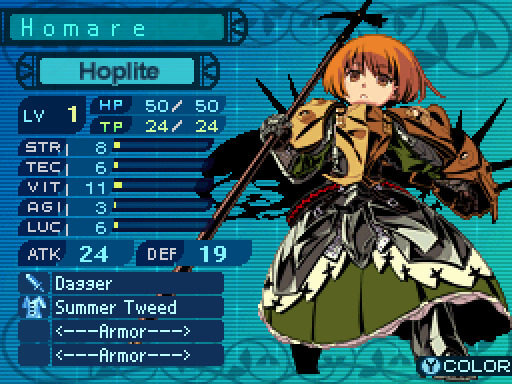
At this stage, you need to have a general idea on how you want your set to look like so you can choose the scenes accordingly. In my case, I knew I needed two types of shots for each movie: one close-up for the main gif and one mid shot for the shape. I also needed to take two other criteria into consideration: the movement (because of the shape) and the lighting (because darker scenes are such a pain to color). Last but not least, I didn’t want the characters to be talking (but that’s just a personal preference).
With all of that in mind, you can start saving a few screenshots of scenes that meet your criteria (or at least some of them). In the end, there won’t be that many to choose from so be prepared to make compromises.
STEP 2 - MAKE A DRAFT
Now that you’ve preselected a few scenes, you can make a first draft. This will help you turn your general idea into something more concrete.
Basically, this is your opportunity to organize your thoughts. What size do you want your gifs to be? What shape are you going to use? On which side do you want the close-ups to be? Do you want all of them to be on the same side or do you want to alternate from one gif to the other? Do the scenes you chose work together (gif-wise but also set-wise)? Are you happy with the way it looks, overall?
By answering all of the questions you might have now, you’ll save yourself a lot of time, trust me. Of course, you can totally skip this step if you already know exactly which scenes you’re going to use and how you’re going to present them together.
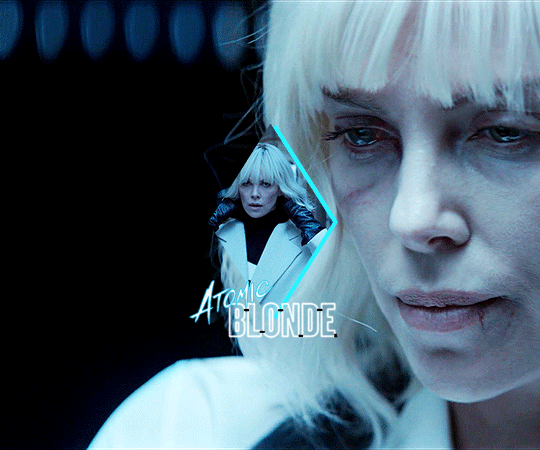
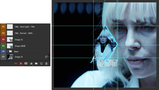
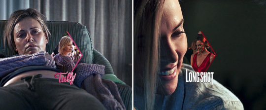
To give you an idea, this is what my draft looked like for Atomic Blonde.
STEP 3 - PREPARE YOUR GIFS
Once you have a clearer view on how you want your set to look like, you can finally start giffing like you usually would (i.e. importing, cropping, resizing, etc.).
It should then look something like this.
The important thing to mention here is that you want both of your gifs to be the same number of frames (32, in my case).
Ideally, you should also aim for the ~same~ coloring (especially for the skin tone, since both gifs will be so close to each other). This bit is particularly difficult when you chose scenes which have opposite lighting (see my two uncolored gifs below). Remember how I insisted on steps 1 and 2? It was to help you avoid this. So my advice would be not to choose these types of contrasted scenes, unless you can’t do otherwise and you’re ready to suffer!
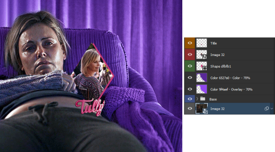
STEP 4 - MAKE YOUR SHAPE
To make your shape, you can click right on the Shape Tool (U) and select the last one, Custom Shape Tool. From the Shape menu appearing on top, you will be able to choose the shape you want from the drop down list and start drawing on your gif.
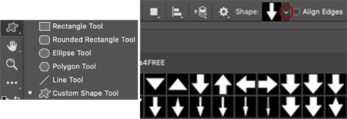
To be more precise with the dimensions, you can manually adapt the length and height from the Shape menu itself. I decided to go with the same ones as my gif.
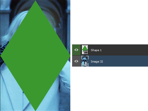
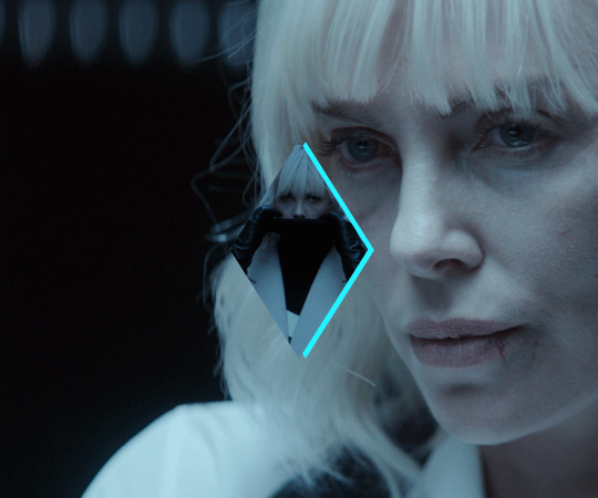
Once your shape is positioned like you want it to be, you can drag and drop the shape layer under your gif. Next, you will have to click right on the gif layer/smart filter and select Create Clipping Mask. The result is as below. Note that if the size of your shape was smaller than your gif, you would still be able to reposition your gif with the Move Tool (V).
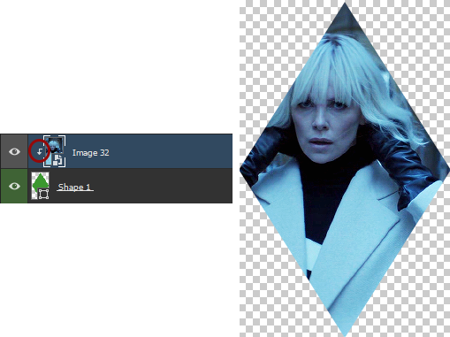
You can now export your shape gif, reopen it in Photoshop and convert it again to the video timeline and to a smart filter. This is where I’m not sure it’s the most efficient way of doing things but it’s the only way I found to keep the coloring of each gif separate. I also find it easier to work with a smart filter.
STEP 5 - COMBINE YOUR GIFS
To add your shape gif to your main gif, you can simply click right on the shape gif you just reopened and select Duplicate Layer. You can then choose the project which contains your main gif to duplicate it in there. Now go to your main gif and reposition your shape gif where you want it to be (how many times did I say gif here?). Finally, you can draw a new shape, using the same dimensions as in step 4, reposition it and choose any color you want from the Shape menu.
Since you will be repeating this process with your following gifs, I suggest you add a few guides so you know exactly where you should place everything to make all of your final gifs look the same.
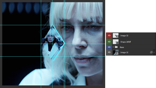
(In case you’re wondering, the “Base” folder contains my adjustment layers/basic coloring for the main gif.)
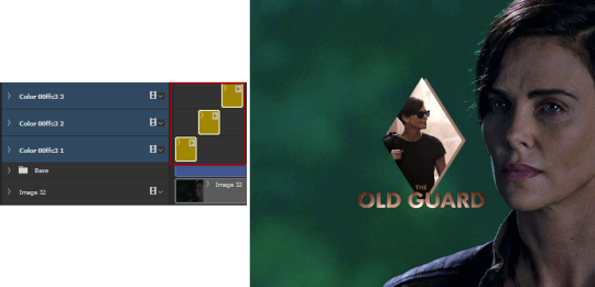
STEP 6 - ADD THE TITLE
This step is pretty simple: go on the web and type “[name of the movie] title”. Download the png you like most, open it in Photoshop and resize it to a length of about 150-200 pixels. Next, duplicate the layer to your main gif and reposition it. In case you need to resize it again, select the title layer and go to Edit > Free Transform (Ctrl+T).
This is optional but in case you want to change the way it looks, know you can always duplicate the title layer and play with the blending options (see below). The good thing with a png is that you can also add some effects by clicking on the “fx” button.
STEP 7 - ADD COLORING (OPTIONAL)
To be honest, I had not planned on coloring my gifs. But I had already spent so much time on them and I was still unhappy with the way they looked. I mean, see how grey-ish they are? Not great...
So the only thing left for me to do was to add some colors. Now, since coloring is worth a tutorial on its own and it already exists, I suggest you read through becca’s mega coloring tutorial (and especially steps 3 & 5). Seriously, shoutout to her for making this incredibly useful tutorial. She is so talented and I love everything she makes!
My Atomic Blonde gif barely even needed coloring so I’ll show you what I did for my Tully and The Old Guard gifs.
For the first one, once I had found which colors to use with which blending option and opacity level, I only had to remove the colors from the left side of the gif because there was barely any movement in that scene (phew!). For the second one, on the other hand, I decided to color frame by frame because there was way more movement, in comparison. This is quite a tedious process, which is why you want to limit yourself to a certain amount of frames.
I’ll conclude by saying there are so many things you can do with coloring and what works with one scene might not work with another. So experiment with it: try different colors, play with the blending options and opacity levels, add some gradients and/or gradient maps, etc. Just know it will take some time to get to a somewhat satisfying result!
And that’s it... I hope this tutorial made sense and was somehow helpful. Of course, don’t hesitate if you have any questions! Also, if you do end up making a similar edit, pleeease send me the link or tag me in the replies or something ‘cause I would definitely love to see it!!
#asks#anonymous#tutorials#resources#completeresources#allresources#itsphotoshop#putting all of this process into words took so long i really hope it makes sense#also i can't help but wonder if it was my before/after post which prompted this ask...#gifs#gifs: tutorials
371 notes
·
View notes
Photo

Hey guys! I got an ask wondering how I make my gifs and some people have asked me how I color my gifs, so here you go!
We’re going to be making this:

You’ll need:
VLC Media Player
Photoshop with working Import Video Frames to Layers function and timeline. I use Photoshop 2020, but any older versions with these functions will work!
A high-quality video (preferably 1080p)
Tutorial under the cut!
PART ONE: MAKING YOUR GIFS
You’re going to want to open up your video in VLC Media Player and open it to around a few seconds before your scene appears. If you’re giffing from a small YouTube video you can ignore this step, but for movies and TV, you’ll want to use VLC to extract the tiny part of it you want.
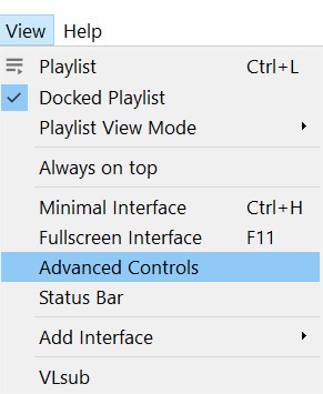
Pause it before your scene and click View >> Advanced Controls.
Above the play button, you should see a bunch of new controls. Focus on the red button I circled below:

Click this button and press play. VLC records are a little bit off, so this is why you want to be a few seconds before your scene actually starts so you catch it all! When your scene has played, press the button again. You’ve now recorded your scene and you can record as many scenes as you like for a full gifset.
You can find your recorded videos in the Videos folder. It’ll be named something like vlc-record-a bunch of letters and numbers.
Now that you have your scenes, it’s time to open Photoshop! When Photoshop has loaded, go to File >> Import >> Video Frames to Layers, which is a bit down to the bottom. It’ll prompt you to select a video; click on the video you just recorded, and a screen like this will pop up:
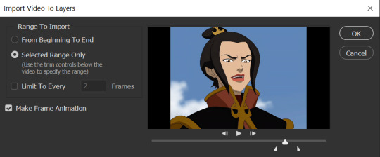
Use the white sliders to select the parameters of your scene. I would recommend going a little bit more on both sides so you catch your whole scene.
TIP: Make sure you do NOT select the button that says “Limit to Every 2 Frames,” because that will make your gifs look choppy and ugly. Love yourself!
Once your frames have loaded, you might not see them on Photoshop the way mine looks. If that’s the case, make sure you go to Window >> Timeline so you can see the frames!
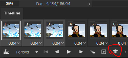
Delete the extra frames in your gif that you don’t need by selecting the frames you want to delete and pressing the trash can button, circled below:
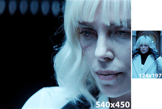
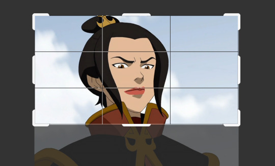
Now that you’ve done that, it’s time to crop. For this particular gif, I’m going for a full-width one, so the width I chose is 540px and I chose a height of 290px. Click on the crop tool and make sure your crop settings are at W x H x Resolution, or you won’t be able to input specific dimensions the way I’ve done here:

Position the crop tool where you want your gif to be:
And now that your gif is all cropped and sized, it’s time to sharpen! I have a pretty specific sharpening process that I’ll outline in detail here, but I have an action for this purpose so as to save time. I’m just making this part of the tutorial so you know what you’re meant to do in Photoshop.
First, go ahead and click the three little bars at the right edge of the Timeline/Frames tab and hit Convert to Video Timeline.
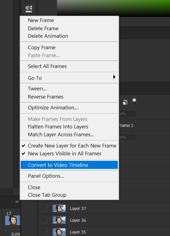
Now, your timeline should look like this:
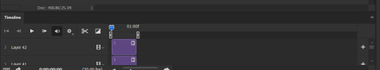
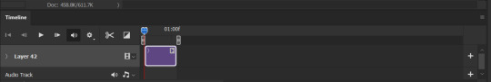
Go to Select >> All Layers, and right-click on one of the layers in the Layers tab once they’ve all been selected. Select Convert to Smart Object. This allows us to sharpen the entire gif at once as opposed to by frame! Your timeline should now look like this, with all the little purple parts condensed into one:
It’s time to sharpen! Go to Filter >> Sharpen >> Smart Sharpen. I do two passes with the Sharpening tool; here are my settings for both:

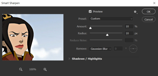
It’s not too apparent in the pictures, but it does make a difference. Don’t worry about your gifs looking too sharp; I use this action on every single one of my gifs and it always works like a charm.
Now that our gifs are nice and sharp, it’s time to take them back to frames. This is because of a glitch in Photoshop that makes gifs saved in Smart Object form much faster than they would be in frames. Click on the small bars on the right of the timeline again and select Convert Frames >> Flatten Frames into Clips.
Your gif should have all those little clips that we had before we converted it into a Smart Object.
Then, go to Convert Frames >> Convert to Frame Animation.

Your gif should be back in frames again, but it’s all one frame. Don’t worry; we’re going to fix that by clicking Make Frames from Layers from the menu with the three little bars again.

Now all your frames should be back! We’re going to set the speed of the gif now. Hit those three little bars again and click Select All Frames. Now click on the little triangle under any frame and click Other, and a little popup will appear. I always set my gifs to a speed of 0.05.

At this point, I save my gifs as a .PSD file. You can delete these PSDS after you’ve posted your gifset (I usually do to save space!), but it helps to have them so you can edit your gifs later if you want. Hit Ctrl+S, and now the screen to save it should pop up. Make sure you save it as a PSD file and not something else.

Now you have a gif that you can color! Which brings us to…
PART TWO: COLORING, ADDING SUBTITLES, AND SAVING YOUR GIFS
I do run a pale blog so this is going to be a pale coloring tutorial. You can check some popular resource blogs to see if they have any tutorials for colorful gifs!
I start out by making a group with the little folder below the layers tab; I title it “coloring.” (Not pictured: I added a layer mask and painted one black dot over it so I could reference the original!)

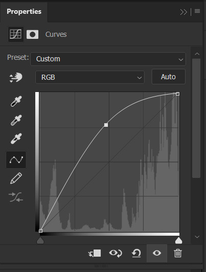
I always start out with a Curves layer; here are my settings:
The gif at this point:

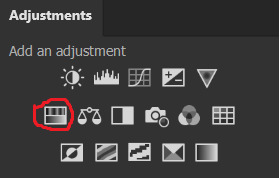
Next, I decrease saturation using the Hue/Saturation adjustment:

After this, I add a black and white Gradient Map layer and set it to blend mode Exclusion at 10% Opacity.


Then, (not pictured), I add a Selective Color layer and reduce blacks in Whites and Neutrals while increasing them in Blacks.
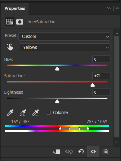
To make the background pale, I added a Hue/Sat layer, applying 100% Lightness to the Cyan and Blue channels and adding color to Azula’s skin by saturating the Yellows.

Here’s the gif after those adjustments:

Now I’m going to restore color to Azula’s skin following my own tutorial, so I’m not going to go into those details here. However, here’s the gif after all this. It’s not totally the same as Azula’s skin, but going any pinker makes the gif look awkward and oversaturated, which isn’t a good look:

After some minor adjustments and removal of the layer mask:

Now for subtitles!
Use the Text tool and make a rectangle at the bottom of your gif where subtitles go. I use Arial Rounded MT Bold, with Regular style, at 3.36pt and Sharp anti-aliasing.


Create a rectangle at the bottom of the gif where subtitles go and type in your text; then right-click on the text layer and select Blending Options and check Stroke, and these are my settings:

Now your subtitles are all ready! I’d recommend duplicating one frame of the gif and then duplicating the text layer onto a new canvas and saving it as a PSD so your settings and placement are always consistent across your gifsets!
Time to save your gif. Here are my settings, circled ones important:
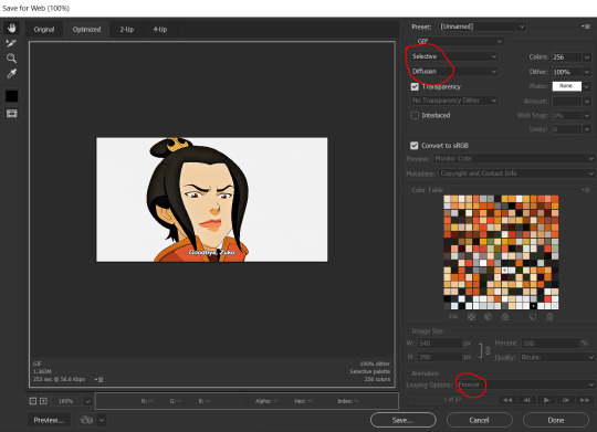
I’ve seen gifmakers use Adaptive+Pattern but I personally think that looks grainier and the pattern is really obvious; in my opinion Selective+Diffusion looks smoother, but it’s all up to you! Experiment with what you think looks best.
Make sure your gifs are set to loop Forever or they’ll only loop a limited amount.
Here’s your finished gif!
I hope this tutorial was helpful! Please reblog this if you learned something, and I hope you have a wonderful day. Happy gifmaking ❤
#allresources#chaoticresources#yeahps#biresources#resourcemarket#useradeela#usermaira#userdanisaur#userchelsea#tuserivy#*mine#resources#tutorial
409 notes
·
View notes
Text
Editing tips, I guess?
Hey uhhhhh, so I've gotten lots of new followers over the past few weeks and wanted to do some kind of thank you?? Also, I have seen a fair share of "omg HOW" in the tags on my edits (which??? always make my day?? my week??? my life????)
Anyway, I thought I'd share some of my ~techniques with y'all? So here goes:
(lmao this got really fuckin long so cuuuuuut)
1. Make EVERYTHING a Smart Object
Okay, maybe not EVERYTHING, but seriously. Do it. It will save ur editing life. You ever shrink something down and then an hour later change your mind and decide you want it bigger? If you're not using a smart object, it’ll get blurry when you scale it back up and you’ll be fuCKED!
To make a layer/group a smart object, just right click on it in the layers panel and select "convert to smart object". This makes Photoshop store the layer's original data in a separate space for safe keeping (an embedded .psb file, to be exact) -- so you can shrink it and enlarge it as many times as you want without any lossiness.
As soon as I paste/place a screencap, texture, or whatever into my document, the first thing I always, ALWAYS do is convert it to a smart object!!
Why, you might ask?? Continue to item No.2 :)))
2. Harness the POWER of Smart Objects!!
The reason I am obsessed with Smart Objects is because I am obsessed with making any edits as non-destructive as possible. If you use “Image > Adjustments > Levels/Selective Color/etc” on a regular layer, that’s a destructive edit. Same goes for any Filters (such as blur/sharpen) and transforms (Warp, distort, perspective). You lose the original data that was there and the only way it can be undone is with ctrl+z. Might not seem like a huge deal at first, but if you keep chugging along for an hour and decide, “hmm, maybe i went too hard on that levels adjustment after all...” your only options are deleting the layer and starting over, or uh... hoping it’s still in your history panel.
However, it's really easy to avoid destructive edits when you use smart objects!! Because all those adjustments, filters, and transforms become “Smart Filters”. Smart Filters have all the non-destructive advantages of performing these adjustments via adjustment layers, but have the added bonus of ONLY effecting the layer they’ve been applied to, instead of cascading down and effecting all the layers beneath. (Which can be a good thing sometimes, but that’s a whole other topic)
Smart filters are attached to their ‘parent layers’, and can be hidden, deleted, or modified (by double-clicking their names) at any time:

Can I hear a wahoo???
Other cool things about Smart Objects:
You can copy a Smart Filter with all its settings to another layer by alt+click+dragging it over
You can change the order in which Smart Filters are applied by clicking and dragging them around
You can edit a smart object independently/in a sort of 'isolated' mode by double-clicking on its thumbnail!! I like to use this for edits that are specific to a given screencap-- like cutting out the background and any initial adjustments, like levels and selective coloring. Once you’re done editing the contents of the smart object, hit ctrl+s and it will automatically update in the main document!
But really, the biggest thing for me here is psychological. I know I’m much more willing to try things and experiment when I know that I can easily go back and tweaks things at any time. Otherwise, I’d stick with adjustments I don’t really like all that much simply because it would take too much time/effort to redo them.
3. Don't even THINK ABOUT using the eraser tool or I will STOMP YOU to death with my hooves!!
Use a layer mask instead. Please I am begging you. It all comes back to making your edits as non-destructive as possible. If you erase something, it's gone forever. When you mask something, you can make changes to which parts are visible/not visible as often as you want.
For the newbies or the otherwise unacquainted, a mask is a greyscale ‘map’ attached to a layer (or layer group) that controls its opacity. Black areas give the layer 0% opacity, white areas will give it 100% opacity, and you can use shades of grey to achieve partial transparency. You ‘draw’ on these layers with the your trusty brush and paint bucket tools.
You can create a mask by selecting a layer and then clicking the little mask icon at the bottom of the layers panel (it’s the one with the little circle inside the box). Draw black on the parts you want to hide, and if you erase too much on accident? Just paint back over it with white!
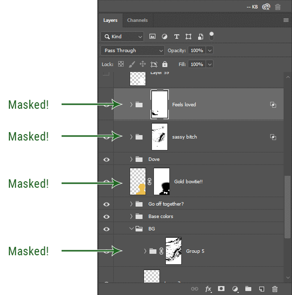
I love masks, and sometimes i will throw an already masked layer inside a layer group and apply a second mask to said group. This way I have two masks that can be edited independently from each other. Like layer mask-ception.
So anyway, yes. Eraser tool? Don’t know her.
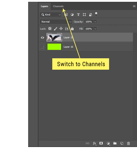
4. Try using channels to create masks!
This is a technique that works REALLY well for cutting out complex shapes, such as wispy hair (or feathers!) -- provided there's strong contrast between the subject and the background, and the background isn't too busy.
This is also a fantastic method for capturing alpha transparency. For example: If you have a neato paint stroke/splatter/watercolor texture you want to use as a mask, but has a solid background that’s getting in the way of things. This method will capture all the semi-opaque areas flawlessly!!
While editing your image (which you had better have made into a Smart Object!!!) do the following:
Switch from the "layers" panel to the "Channels" panel.
Toggle through the R, G, and B channels, and decide which one has the most contrast for the areas you are trying to mask.
Ctrl+Click that channel's thumbnail. This will create a selection marquee.
Switch back to the layers panel
Click on the target layer/group (the one you are trying to mask)
Click the mask icon at the bottom of the panel (the one with the circle inside a box)
Release the selection and invert the mask if necessary
If you're using this method to cut out a subject from its background, you probably won't want alpha transparency. In this case, select the mask thumbnail and use a levels adjustment on the mask itself to bump the contrast until you have more of a cutout effect!
It sounds like a lot of steps, but it’s really simple! So I made this handy GIF: (click to view from beginning)
Sometimes you won’t want to use this method for the entire image, but just a specific part. For example, if you’ve cut out a character with some other method (magic wand, manual brushwork), but are having a hard time with their hair in particular. Use this method to create the selection, but instead of converting the whole selection into a mask, use the brush tool to apply the mask only where you need it! You can invert the selection itself with shift+ctrl+i.
5. Outlining text
The font I used here is Salomé, which is actually a solid typeface with no outlined version. But you can make virtually any font into an outlined version if you so desire!
There's two possible methods here, actually:
The Easy Way:
Add a stroke layer effect to the text layer (by selecting the layer, clicking the little “fx” button at the bottom of the layers panel, and choosing “Stroke...”)
As far as settings go, aligning the stroke to the inside usually yields the best result/maintains the integrity of the letterforms.
Make the color of the text itself match the background.
If necessary, use the lighten/darken blend modes to create the illusion of transparency.
If you need true transparency (which I didn't until I decided I wanted to apply a gradient over the text), you'll have to try something else-- The Also Easy But Less Than Ideal Way:
Right click the text layer in the layers panel and select "convert to shape".
Now you can edit the fill/stroke the same way you would any other vector shape.
Again, you’ll want to set the stroke alignment to ‘inside’. For vector shapes, those settings are a little hidden. You’ll wanna open up that little dropdown in the toolbar with the line in it, and click “More Options”.
This is semi-destructive, so if you're working with a lot of text you might have to edit later, consider duplicating and hiding those text layers first so you'll have a 'backup' of it.
And while I’m on the topic of text...
6. Try breaking up your text layers!
I know a lot of people like to draw a neat little text box to put their text in, and then they center it all nice and neat and probably use a small font size to make it subtle and stuff... and that’s cool. Everyone’s got their different styles and things they like to emphasize in their edits and there’s absolutely merit to that sort of thing (case and point: the bulk of my dear @herzdieb’s work), but. Listen.
I love typography. I love a good typeface. The stroke widths, the letterforms, the ligatures, the serifs... I get like, horny on main for a good typeface. I like to make the text on my edits BIG, so that those details can shine. I also like doing interesting things with the text. Jumbling words/letters around, distorting them, deconstructing them and just... letting the text really ~interact with the rest of the composition instead of just kinda politely floating on top of it.
I’m not saying you have to do that kinda stuff. Or that I think neat little floaty text boxes are boring, or lazy, or whatever. It’s just... personally, I get really inspired by type. Fun type treatments are one of those things I LIVE FOR, something of a ~signature of mine, and I encourage everyone to just... try it? To use text as more of an integral Design Element and less of a... idk. A caption?
So if you have a quote, or even just a word... put each word (or letter) on its own text layer. And then: make ‘em different sizes. Make the words so big they don’t fit on the canvas. Rotate each one at a fun angle. Scatter them around. Go nuts. Use masks to chop parts of the letterforms off. Make ‘em overlap. Just have at it. Or, as the kids these days are saying: go absolutely fuckin feral.
If that really just isn’t your style, or doesn’t work/make sense for the edit you’re doing, fine. Delete all the layers and just do a text box or whatever. But. I’m tellin u.
Give it a try.
At least once.
Just... a lil taste.
7. Understand the difference between lighten/darken vs screen/multiply
For a while in my photoshoppin' youth, my understanding of these blend modes basically amounted to "darken makes things darker, and multiply makes things really darker", and vice versa for lighten/screen. But there's an important difference between how these blend modes work, and if you understand them, you can use them more... strategically? I guess?
Darken and Lighten are kinda misnomers tbh, because they technically don't really darken or lighten anything. What they actually do is make it so that only the areas of the layer that are darker or lighter than the content of the layers beneath them are visible. This produces some pretty nifty layering effects that you can't achieve with screen and multiply.
Here’s an example: (if you’re reading this on a phone with the brightness dimmed down you probably won’t be able to see the differences)
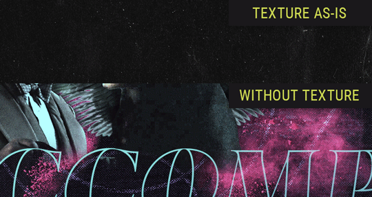
Without any the texture applied, you can really see the noise/graininess of Crowley’s jacket in the screencap. You can also see the ‘seam’ where Crowley fades into the background-- the jacket is a green-ish black, while the background it’s fading into is more of a purple-black.
With the texture set to ‘Screen’, the whole image becomes lighter across the board. Crowley’s jacket gets lighter, and so does Aziraphale’s jacket and the pink cloud thing. This does little to nothing to obscure the poor image quality and disguise that ‘seam’.
But with the ‘Lighten’ blend mode, ONLY the dark parts of the image appear lightened, and not only do they appear lightened, but they get kinda equalized. Notice how the patchy jpeg artifacts on Crowley’s jacket disappear, how that color seam smooths out, and how the brightness of Aziraphale’s jacket and the pink cloud doesn’t change at all.
This isn’t to say that lighten/darken are better and that you shouldn’t use screen/multiply. They each have their uses. But most often, I find myself using lighten/darken because the way they work is honestly really helpful? And just cool af?
8. Masking individual frames on gifs
If you ever feel like torturing yourself by making a gif that has frame-by-frame masking, my advice is don't try to mask each frame from scratch. You'll get patchy/wobbly results from the masks being slightly different on each frame.
Instead, mask the first frame, then alt+click and drag that mask onto the next frame. Make any minor adjustments to the new mask as needed, and repeat for each frame. This saves time and more importantly, keeps the masking consistent on areas with little to no movement, which makes a HUGE difference in how smooth the final product will be.

If you look at the edges of the animation, they’re nice and steady and consistent. It’s only the parts that have a lot of movement (like the back of his neck) where you can see any ‘ghosting’/wobbly-ness happening.
Sometimes the mask will move when I copy it to the next frame. Like, for the whole document. It gets nudged 20 pixels down or to the left or s/t every time. I have yet to figure out why, but I’m betting it has something to do with shooting myself in the foot with the frame 1 propagation settings at some point during editing?? ANYWAY, when this happens, just unlock the mask from its layer (click the little chain icon between their thumbnails) and move it back into place.
In these cases, I also like to pick a spot with a hard edge (such as the shoulder in the above gif) as a reference point of where it needs to be moved to. It kinda sucks having to do this for every frame, but you already signed up for some suckage when u decided to mask every frame of a gif, so I mean... 👀
9. Don't be afraid/too intimidated to do manips as needed!
Manips can be tricky if you're really striving for realism. There's light sources and color grading and perspectives to reconcile!! But when you're doing an artsy Edit with a capital E, odds are those kinds of discrepancies will be thoroughly camouflaged by all the levels, black and white, etc adjustments you're doing!
Something I run into often is, "I like this screencap, but the top of their head/hair is chopped off :(" But if I go back through all the screencaps from the scene, there's usually another frame where the camera is planned/zoomed out enough that I can steal the rest of their head/limb from it! And since it's from the same scene/shot, the lighting and color grading should already be a perfect match!
A super simple example:
So I wanted to use this picture of David and Michael for this edit, but 1) They’re standing on the wrong sides for their characters, and 2) part of David’s arm is covered up by Michael’s.
Of course, the easiest course of action would be to just mirror the photo so they’re on the correct sides, but 1) mirroring faces tends to yield wonky results, and 2) that still wouldn’t give me a perfect, free-standing cutout of Crowley to place wherever I want in my composition (as opposed to being forced to awkwardly position him off the edge of the canvas to hide the fact that the other arm is missing)
Fortunately, it only took all of like, two (2) minutes to draw a crude selection around his good arm, copy and paste it into a new layer, flip it around, and add any necessary masking to get the shape right.
My point here isn’t to teach y’all how to do manips, or to pass this off as an impressive example of one. Because it’s really, REALLY not. My point here is to demonstrate that even something as tiny and simple as this can really open up your options for what you can actually do with an edit/composition.
So next time you’re feeling limited/inconvenienced by the crop of a screencap, just... you know. Consider whether or not it’s worth attempting a quick and dirty manip to fix it.
Another Example:

Sometimes you’re torn between two screencaps. You like one element from Screencap A but also want some other element from Screencap B. What to do? Just frankenstein ‘em together. Layer one on top of the other, get them lined up, and mask out the necessary parts.
It’s easy to get hung up on stuff like “Uh... should Crowley’s shoulder be doing that?” but let me assure you that like... the people looking at the final product are none the wiser to your butcherwork and will not notice. Especially if you’re going to add a bunch of contrast and color adjustments later on. (in fact, sometimes I’ll apply those adjustments first so I’m not distracted by any discrepancies that are going to come out in the wash anyway)
“I dunno... 🤔🤔 doesn’t seem anatomically correct... 🤔🤔🤔🤔” thought no one.
Point is... point is... dolphins you can get away with a LOT more than you think you can. Don’t let the desire to make these kinds of manips perfect get in the way of just... making them good enough. The bar isn’t that high, I promise.
10. Know what inspires you
What types of edits get you EXCITED? What kind of work do you see on your dash and go, "oh, I'm reblobbin' THAT!!1!"
I know for herzdieb, she's all about emotional pieces. She likes matching words/lyrics/poetry to on-screen moments and punching you in the feels with both. She hears a song, or reads a poem, and the lightbulbs go off for her, and she does her thing.
As for myself, I just live for the aesthetics of an edit. The colors, the fonts, the composition. I almost never know what text/screencaps I'm going to use when I start an edit. I just see a font I like, or a color palette, or a texture, and think, "I wanna use that!"
And once you know what inspires you, collect that inspo! I hoard textures and fonts. I have them organized into neat lil folders. When I wanna make an edit, that’s where I start. I just browse through them all until one or two start calling my name. Herzdieb collects songs and quotes and poems. Maybe your thing is color palettes, or aesthetic-y photos. Or whatever.
The point here is make the kinda stuff you like/want to see. Not the kinda stuff everyone else is making or the kinda stuff you notice gets the most notes.
11. Be able to let go of things that aren't working
I often begin an edit with a rough idea of the style, colors, or layout I'm going for. And I almost always end up doing... something totally different.
So don't get too fixated on what your initial ideas are. Be open to experimenting and just let the edit be what it wants to be. If something looks nice, do it. If it doesn't, don't try to force it just because, "well, I was inspired by this piece that did xyz and I wanna try it too".
When you see a certain effect that inspires you, just keep it in mind as a possible solution for the next time you make something-- don't make it into a benchmark, or some imaginary 'goal' you have to meet for This Edit You Are Working On Right This Moment. In fact, sometimes the elements I end up ditching are the very ones I started with, that initially sparked my inspiration. And that's okay. Inspiration can be a moving target, and if your vision for something changes, let it.
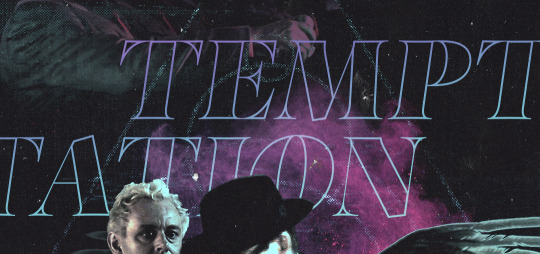
You wanna know what inspo reference I was looking at when I started that “Temptation Accomplished” edit?
Fucking this: https://search.muz.li/YTdiNjkwN2Rh
You might be thinking, “how the fUCK was that the inspiration??!! Your edit looks nothing like that at all!” ...and you would be 100% correct, and that is 100% my point. I spent a good hour or two trying to incorporate that cutout text layering effect before finally accepting the fact that it just wasn’t working for the edit I was making. And it wasn’t until then that it actually started to come together.
12. Be patient, and take the time to explore all your options!
I’m not gonna lie, y’all. I spend hours on my edits. I usually complete them over the course of 2-3 days/sittings. I rarely have a plan. 99% of the time I'm just throwing things at the wall and seeing what sticks. When I get stuck (when, not if), it helps to step away from it and come back later with a fresh perspective/set of eyes.
Every single edit I've posted, I have at some point felt like giving up on because I thought it looked like garbage (and not just because I was being self-deprecating/doubting myself, but because at those points, they simply weren't finished/something about the composition just wasn't working for me)
Work through those moments, and if necessary, take a break/sleep on it. It's always after I've exhausted my early ideas that the really good ones start to come to mind!
Here’s how the character poster edits I did progressed:

In Classic Me™ Fashion, I literally started off with just... textures I liked, and a font that I liked. Now, there were obviously a lot more ‘steps’ involved in both designs, but hopefully at the very least this gives a sense of how things get from point A to point B.
So uh... thanks 4 comin 2 my TED talk. I hope u learned at least one (1) cool new thing or maybe just feel vaguely inspired by this rambling mess?
158 notes
·
View notes
Note
Hello Yuseirra! I am a fan of yours and think you’re great; I know you’ve probably answered this before but what program do you use for art? Do you use a different one for the art you make for your rpg game? I can’t wait to see future updates
Hello anon!// A fan..??/// wow..! 0///0) that’s an honor to hear, thank you so much for watching over me and my works!! Maybe I have in the past, but I don’t feel like I’ve answered a question like this for some time, so it’s totally fine! I’ll be glad to help you out!
To jump straight to the answer, I don’t use a different program to use specifically for my game project.. I’m currently using three different programs to draw in particular though, and they’re all great programs so I would like to mention about them all..!
The main program I use to draw is SAI2! You can download and use it from this website, and use it permanently after you purchase SAI 1 and apply the software user license you get after the purchase. (It’s in the explanations, but it’s explained more in detail in this post if you need it!) the price of this program is 5400JPY which is about.. 50 dollars. The program looks like this when you open it. SAI2 has some advantages over SAI1, which would be stuff like rulers, outlining, blur, autosaving, text input and so on. I think there are more new features but those are what I make use of the most :)

I highly recommend this program because it’s lightweight, it has lovely pen pressure (I personally can’t move to other programs because its pen tools feel REALLY GOOD.. it’s the only program I have that allows me to draw in that sketchy and slightly messy style I have! ;v;) it’s really easy to use and it doesn’t force you to move your hands around all the time to press all the different icons like some other programs do. It’s all collected into a small part of the screen and it saves you a lot of time. Plus things look clean and it has almost everything you need if you want to make art!// I’ve made arts for videos and movies, and yes, this is also the program I used to make my game’s art. I edited pixels with this too!

Like this!
The second program I mainly use is clip studio paint. This is a very promising program that’s been growing big since the past few years, and I say it has its strong points. I feel it’s going to get even better too because the program has been updating quite a bit, and the staff seems to be working vigorously! Here’s what my program looks like, and this isn’t what this program looks like initially: you can adjust its windows to help it suit you by clicking and dragging the interface. I remember struggling a lot to push and pull things in a way that makes me feel more comfortable (I haven’t used photoshop but I think the initial interface may look pretty similar to how things are arranged there)

I use clip studio paint to edit my drawings. This program has a nice community that brings many free assets you could import and use (without any copyright issues too) and it also offers really cool features like the recently added auto-color (colorize) feature, gradient map (a blessing), special pens, auto-action.. and so on! I prefer SAI’s pen over clip studio’s so I mainly use this program to make adjustments and finalize my drawings, but it really depends on your own taste. My friend likes clip studio’s ones more than SAI’s and she ended up completely switching to this.
this program also costs about 50 dollars but it goes on sale every now and then, so keep an eye up for it if you’re interested! I bought mine when it was on half-price! and if I really do end up making a lot of money through art someday..(I can dream, right? ;v;) I might be able to afford the EX version which costs a lot more, but is suitable for making books, or creating animations.
The third program I’m using (and the most recent one I bought!) is aseprite! You can buy this program off steam or the official website. This seems to be a tool made solely for pixel art.. and I got it after seeing someone making really cool pixel animations with it. Here’s how it looks like when you open it.
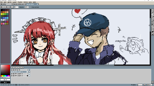
(Junpei’s one lucky boy.. Chidori is so cute ;v;.. they deserve each other)
I’ve been making some pixel arts using this lately and it’s pretty nice!! I like how it allows you to make pixel animations/gifs nice and fast (although I wish its zoom feature feels less stiff.. things feel too big or too small at times) and the program is very straightforward and it does its thing. This costs about 15 dollars, and I bought it when it was on 25% sale on steam last winter sale. It was in my wishlist for over half a year but now that I got it, I feel like I’ll try pixel-arting a lot more!// Please read over the steam reviews before you get it because it’ll help you a lot on understanding what this program may offer..!
These are the programs that I’ve been using and loving!// I would wholeheartedly recommend them all, but there are also free programs out there as well and I’m sure there are many other options available! Thank you for looking out for my works, I will keep practicing, and I wish to bring works that you may enjoy! Hope this helps you! :)
#kind anon#doodle#it makes me so glad that you await my future updates..!///#that's so lovely and uplifting to hear!!#Anonymous#asknreply
22 notes
·
View notes
Note
1, 13 and 32 :D
Putting this under a read more because I simply cannot shut up 💕
What are your top 3 favorite sets you’ve made?
(In no particular order)
I’m cheating and using one for these 2 Viktor sets because they’re the same theme - this post season 3 set, this pre season 3 set. I’ve just always really loved the theme of “Viktor is the bomb” and I’ve saved that post-s3 set quote for so many years and I held off using it until after season 3 and was excited that it was still relevant. The colors in that set just make me happy and I’ve tried so many times to use it again and it never works the same. And for that pre season 3 set, I think that’s when I was really starting to teach myself blending? So I had so much fun making it. I just love giffing Viktor in general, I think there are so many themes to play with while editing that always really inspires me when I make something for him.
This "favorite TV show" gifset of TWD: World Beyond is one of my favorites because I think it's probably the first time I ever did a layout set? And it took me sooooo long to do it and I had to make so many decisions because I love every episode and every character so trying to make everything, everyone, every theme all fit together was so hard, but I was really happy and it makes me happy to look at it because the show is my comfort show. I also really tried to focus on the panel being about family, science/fighting, love, and growing up, which are very much the main themes of the shows so I was happy with it!!
My Luther set + a quote from The Chosen Ones. This is probably my favorite Luther set ever, because I read this book and I wrote down so many notes on it screaming “Luther, Luther, Luther,” so I always wanted to make a set with him ft. this book. I was very strategic on the scenes I used based on what I think about him in my own head but in particularly, the last 2 gifs are very important to me (’desire something’ over a shot of his smile fading after the kids that were looking up to him then started laughing at him after he made a fool of himself + the shot of him thinking he’s in a better place now that he’s away from his father yet he’s still just in the same cycle of being exploited. And “wasn’t sure he was capable of it” with shots of him thinking he’s finally free / alive but the next day he’s just full of shame and still sad... I hold these two gifs so close to my heart). Also, this is definitely the set that began my love story with the gradient map. I’m not too fond of the typography anymore but this quote will forever be my Luther quote. Also, I know Luther always wears blue and that’s probably what people associate him with, but for some reason I’ve never wanted to use blue for him... but I am so pleased with this particular blue/purple shade for him, so he’s allowed some blue now <3
Klaus + You Look Like Death. When I opened photoshop, it was supposed to be a Five gifset.... and then when I decided it was Klaus, it started off as dark green and purple, so I literally don’t know how I got here? But Klaus + vibrancy is something so personal and he deserved it, and I loved Robert’s foreword so much and it was so fitting after season 3, so I’m very very happy with how this turned out. He’s one of those characters that just has so many fun shots/scenes to work with and I definitely want to gif him more.
My recent Five set. This time when I opened photoshop I actually let it be about Five. He has sooo many aesthetically pleasing and tragic shots that it really is so fun to gif him and I’m glad I finally did. I’ve always appreciated Five as a character but ofc following you has made me love him even more, I love your love for Five 😌
This is my “I thought this was a top 5 not a top 3″ disclaimer because I’ve once again cheated when you asked me top anything, but <3 anyway this was so TUA heavy so honorable mentions for my father’s day set for my favorite TV dad ever, this Tracy set, this Luther set, this Alden set
Where or from whom did you learn how to gif?
I’m a professional graphic designer, so technically, I learned in college... but obviously my day job is very different than any kind of giffing I do on tumblr. My work giffing is pretty bland in comparison and I often work with static images rather than videos, so it’s such a change of pace to gif here. I started giffing on tumblr though basically out of spite because so many of my favorite characters are either hated for no reason or just minor characters who don’t get much love, and I was tired of not finding anything in their tags, so I started giffing. Most of the things I’ve learned have come from different tutorials on tumblr (and bless them all because I absolutely don’t ever know how to explain anything I do, so all my love to the people who can articulate it so well that other people can learn from them).
Also my friend @felixcarlucci and I kind of started learning how to gif alongside each other so we exchange a lot of helpful tips and I’ve learned a lot from him too!
What is your favorite tool/adjustment layer in Photoshop?
Selective color my beloved!!! I also really, really love gradient map and I’ve been relying on it so much lately... I cannot help myself (currently working on a Sloane set with gradient maps and the coloring scheme for her is just making me vibrate, I’m excited to finish it).
#answered#me getting home from work to nap vs. ranting to lizzie my beloved#ty for sending!!!!#jameszmaguire#number5theboy
1 note
·
View note
Text
Carp Fishing – Ask The Experts – Summer Spots?
Carp Fishing – Ask The Experts – Summer Spots?
During the summer months I tend to try and fish the shallow spots in the lake I am fishing, and 9 times out of 10, I am looking for the cleanest spots I can find. Areas amongst weed that are getting attention from the carp…
I normally go in with the use of a bare lead to start with. This simple set up, can illustrate how clean a spot is, by the type of drop I get. After a cast or two, if it goes down with a ‘crack’, to me that is a very clean area and these are the spots I am always trying to find, and fish during the summer months.
Shallower areas in a lake can be found in various different areas. For instance if I decide to fish the shallower water surrounding a gravel bar. I would make sure I’m fishing the peak of the bar. Sometimes, I opt to use a marker float, casting past the bar, pulling it up until the lead locks up on top of the bar, that tells me I’m bang on top.
If I’m fishing cleaner spots, I tend to use a lead clip set up with a 4” of 30lb invisi-link with a size 4 rigga chod hook and a 14mm bottom bait and a big lead . I would alway have one on top of the bar and one on the bottom , so which ever the route the fish take, hopefully they will come across one of my hook baits. Baiting – I tend to fish boilies and particle over the rod on to of the bar and a single on the bottom of the bar. The thought being that it is likely, and often the case that the odd bait will roll down the gradients of a lakebed, and gather in the deeper gullies. Fishing a single on it’s own on this type of spot, I feel, mirrors the type of loose feed the carp will come across on their journies around the lake. It’s just something I have always done, it’s inconspicuous and without a doubt helped me land those wary ones over the years.
The lakes margins also get my attention during the warmer months. I will always be looking out for those cleaned, and polished areas that the fish have clearly fed off. With a good pair of polaroids, a trickle of bait here and there, walking and observing every inch of the bankside margins often can quickly give the game away of the carps whereabouts and where they like to spend their time.
As with all the seasons, I will continually analayse my appraoch and results throughout that season, and when I feel it’s the time to tweak or change my appraoch I will do so straight away. Come the colder months, I look too, and tend to fish the lakes deeper areas, where natural food may be stored or still in supply for the carp. It’s worth noting, that these areas might not be as clean as those I have targeted in the summer months, so my set-up will be adjusted accordingly. Often the order of the day is Heli’s and Pop-Ups, ensuring im presented and fishing as effectively as I can.
Carl Udry
With summer in full flow, and water temperatures now at their optimum in the summer. All waters will now be totally in bloom if any weed present. All my current venues have a variation of weed present. One thick and dense with it and the others with more general sparse coverings. One thing they all have in common, the water clarity is as clear as tap water.
In the summer, I start by considering the weather conditions to indicate where the carp are most likely to be. Hot, bright and higher air pressure daytime conditions, will tend to mean they will be laying up and taking shelter under canopy’s and snags. Overcast, moody and lower air pressure, will tend to mean potentially in open water and on the feed. Depending on these conditions and what time I have available to me, will help me decide if I fancy being somewhere more intimate and near the snags or out in open water.
For my venues with weed present, I am always looking for how the weed has formed through the spring and changed in to the summer. I will be looking for the clear or clearer areas and if any channel like patrol routes are visible. Carp obviously do swim directly through weed, but will often take clearer channels to move to and from different parts of the lake. I safely spend time up trees to give me those vantage points to visibly observe these areas. I then also use a small lead combined with my Gardner GTA application rod and a reel loaded with braid to feel and mark these or other areas on a simple map.
I am a big fan of angling with a helicopter set up and predominantly use stiff link rigs of around 5-6 inches. The only thing I do chop and change is the hook arrangement depending on certain conditions. I will tend to pivot between a stiff D rig, a Ronnie or a simple combi link. What tends to dictate this is the lakebed substrate I am presenting over. In the summer, my mindset and approach remains the same as the spring, but my rig placement is based on what I have observed from those vantage points or felt with my marker rod and braid. In the summer I always want my hook bait to be visible, but not blatant. By the time summer arrives, most carp will have seen everything and you are also competing with an abundance of the lakes natural food.
With line concealment in my weedy venues, I become less paranoid as I feel more weed can provide more natural camouflage for the mono to weave amongst. What I find is really important though, is allowing the mono to find its natural resting place on the weed or lake bed from the rig end back to the rod tip after casting. I will always look to avoid tight lines where possible especially at the rig end.
Be lucky, Carl.
Dan Chart
Summer months can often be tricky to get a bite, the carp have generally spawned and you’ve either hit it right and had a couple after they have done the ritual or missed out completely and your fishery is inconveniently going through a slow period because It’s that tough bit that’s in between the hard feeding spring and autumn period, when the fish tend to be feeding properly, and instead take to basking on the surface, without a care in the world! However, it’s lovely being out there without a ton of clothing on, despite the mosquitos!
So how do I normally go about catching carp in the warmer months?
Ideally, my water has an abundance of weed, I love the stuff, but then I make sure I’m geared up to landing the fish should I come into contact with one, both safely and sensibly. Weed is my friend and certainly not my enemy. It provides the much craved sanctuary carp require, as well as natural food larders from the many insects that thrive within its mass. Finding small holes in the weed is what I’m looking for, be it silt or gravel, or failing that, low level weed where I can fish a Chod Rig suitable for this application is also something I’m not adverse to. You just need to make sure the weed is of the right type and not something like Canadian pond weed if you want to present on top of it.
Other areas to consider would be snags, which I apply the same logic as with weed, in that all careful measures need to be recognised for the fishes safety. Snags easily give the whereabouts of the carp away, as the fish can be often found here, usually in the upper layers basking, whilst they comfortably reside in the warmer levels of the water. The margins are also a firm favourite with the warmer shallower water and, yet again, observational skills are key here with a good pair of polarised glasses required to help spot your quarry.
In the warmer months, the fish are far more active than they are in the colder ones, so be prepared to be up at first light as this is usually the most popular time for the carp to be throwing themselves out of the water. This can save you a lot of time and energy trying to find their whereabouts.
Personally, I try to stay away from the deeper water, contrary to the winter months, there are exceptions to this rule but as an approach, I’m far happier fishing the warmer, shallower areas if I’m presenting my baits on the bottom. On weedy waters, where I predominantly fish, zigs and surface fishing can be devastating but, applying this method in the weedy areas is dangerous to the fish’s welfare as the terminal tackle required to get the bite is not strong enough to land the fish, in my opinion.
That leads me on to line and rigs. I’m a recent convert to the Gardner Hydro Sink braided main line, which I find invaluable for weedy lakes, especially ones where a boat isn’t necessarily on hand when it comes to helping you land a weeded-up fish. The abrasive material of the braid helps cut through the weed, helping to enable a constant contact with the fish. I have also witnessed the carp behaving far better when they brush against braid in comparison to mono as I suppose it feels more natural to weed. If I wasn’t using braid, it would be a minimum of 0.40 diameter mono in the form of the GTHD, or the ridiculously strong tow rope, known as Hydro Tuff, only if your water is very weedy.
I don’t necessarily change my rigs, other than upping the hook size to say a 4 over a 6 which is something a few friends have advised me who have greater experience when it comes to braid fishing.
Finally, keep an eye on weather conditions, like new wind directions and drop in air pressures that can switch the carp on and, if you are into your moon phases, time your sessions around the new moon, but I’m not going there, that’s for another time!!
Enjoy and tight lines!
inline fishing leads
0 notes
Text
Helpful Sites
Here are some cool things I’ve collected over time from other posts and stuff, I hope someone else finds these useful! (I love them when I need a distraction c: )
***You can bookmark this page, it has everything on it, and I update it when I find something new!***
Interactive Sites/ Games:
Little Alchemy - combine elements to make new ones, and so on!
Tamagotchi - The classic simple and cute game!
Geo Guesser - Guess where you are, using Google Maps!
Cute Orisinal Games - Many mini games with cute themes!
Spent - An online game about surviving poverty
Thisissand - Make art using sand
Anime Avatar Creator - Self explanatory (!!! Loud music!!!)
Pokemon Fusion - Fuse Pokemon
Synaptop - Computer interface with it’s own little network?
PlanetMaker - Make a planet!
PointerPointer - Let your mouse sit there and it’ll match a picture to it
Virtual Piano - Play the piano!
Cookie Clicker - Get as many cookies as you can!
Color- Method of action - Match the color as close as you can
Seaquence - Cute little “sea” theme music maker
Today I die - Simple pixel game (Actually really inspirational)
Deer Cam - no longer live, hacked version of GTA SA, a deer through the city
Essay Typer - input any subject and press any keys for it to write for you (internet based)
Deep Space Map - you need the Google earth plugin but it’s pretty cool!
Art:
Color Blender - Blend any color into another (Great for gradients!)
Color Wheel - Find complimentary or opposite colors using this wheel!
Make a Galaxy - Make a galaxy using cool brushes
Weave Silk - Cool brushes that look like silk/space
Pose Maker - Stick figure like model
Art Models - 3D models, most are rotatable
Line of Action - pictures of models (nude and clothed, you can even add a time limit)
Color Palette Generator - Input image using url to get a color palette using the colors in the image
ColorHexa - Color Hex codes! + learn about colors
Color Hex - Hex codes, similar to color hexa but more user based
Make 8 Bit Art - very simple interface for making pixel art
Pixel Art - you can make your pixels explode to clear
Pixilart - pixel art with history
Piskelapp - pixel art with layers
Sketchpad - online sketchpad, simple layout but can do a lot
Zalgo Text - Make messy/scary looking text
Speech Bubble - great for edits, transparent or GIF
Make Banners - cool, but a little limited
Relaxing/Anxiety Relief:
The quiet place - A quiet place to relax (not working for me now, but there is an app somewhere!)
The Thoughts Room - Thinking things through
Do Nothing for 2 Minutes - Turn off all devices and just reflect
Jonah (interpersonal conflicts) - Choose and click responses to solve problems
Rainy Mood - Listen to the rain, you can even add music to it
Emergency Compliments - a simple and colorful website that gives you compliments using text
Nature Sounds - Sound mixer, choose from different themes, effects, and volumes
Automatic Flatterer - Using popups it flatters you, usually ends after 5 popups
Coffitivity - Background sounds of a library/coffee place
Rain - Use your mouse to make it go from sunny to stormy (hover/scroll over)
Break something - Smash the screen (loud!!!)
Planetarium - look at the sky
Make Everything Ok - Press a button,everything is ok (kinda silly but nice)
Disgruntle Me - stop being disgruntled and look at these cute stuff!
100,000 Stars - star map, very cool, soothing music
Study Help:
Japanese Vocab - Most used Japanese vocab in a Google docs/spreadsheet
Learn Japanese Masterpost - a tumblr tag from a super helpful tumblr user
Kana Invaders - game with space theme to help you with Japanese Hiragana/Katakana
Manga/Anime - learn with Japanese used in manga and anime
Learn using Anime - chat with anime characters to learn Japanese
Erin’s Challenge - Learn Japanese with skits
Jisho - Japanese Dictionary
Japanese Keyboard - Type in Japanese
Learn to Code - Super cool! Learn CSS, HTML, and more!
CodinGames - let’s you improve your coding with games
Wolframalpha - input any math problem and it will work it out and give many answers!
Long Division - Self explanatory
GeoGebra - calculator, cool interface, helpful with algebra, geometry, probability, and more
Desmos - really good graphing calculator
Tiger Algebra - Really useful and has great examples and sources
Balance - For balancing chemical equations
3D Biology - a 3D model of the human body
3D Solar System - interactive, and a robot voice reading out info
Written? Kitten! - after a set amount of words it will show a cute kitten picture! (or dog/bunny!)
Other stuff?:
WTF should I do today - have a random generator dictate- suggest things to do
Supercook - recipes by what you have around
Seasonal Foods - find fresh produce that is in season in your area
Hackertype - type random stuff and it’ll look like you’re hacking
Book Suggestions - based on books you’ve read before (input books you like and it’ll suggest similar books)
Dialect Test - Answer some questions and this will guess where you’re from based on your dialect
Cute Sound Effects - Simple ones that come in mp3 format
My Body Gallery - input your body type to find other people like you
Anime Sound Effects - also simple sfx
Emoji Tracker - Live tracking of most used emojis + live tweets that use them (epilepsy warning)
Meitu Online Photoshop - it’s all in Chinese, but simple to navigate after awhile
SCM Music Player Custom Skins - a lot of choices to customize a music player
Sanger - pug licking screen
Audiosauna - online music making studio, saves as .song file
#helpful stuff#games#distractions#links#self help#art reference#ref#reference#cool stuff#aye#thanks for the support#i do this every year#except last year bc i didnt find enough to post#help#helpful#lol#ok bye ily
8 notes
·
View notes
Text
etrian odyssey III part 1: prologue


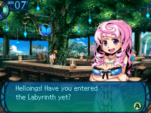
holy shit, it's eo3


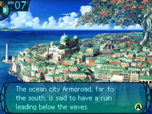
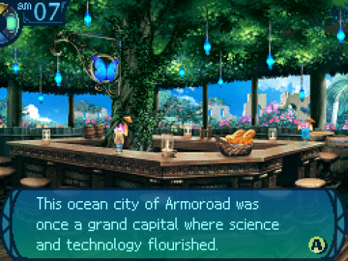
As if tacitly admitting it, the Senatus ruling over Armoroad have invited explorers to their city.
The invitation drew throngs of eager explorers who gathered to traverse the undersea maze.
But none of the throngs who came to challenge that maze were strong enough to master it.
The impenetrable ruins came to be known as the Yggdrasil Labyrinth, and its legend spread further...
You yourself are an explorer who has heard its legend and now sail to Armoroad to investigate.
Your only objective: to challenge the Labyrinth and win fame and fortune. Your hour is at hand!
i love that the whole plot of eo games is "explore this, get rich and famous"

so the first place we can go is the explorers guild and-- ok that looks a little glitchy
nds emulation is hard


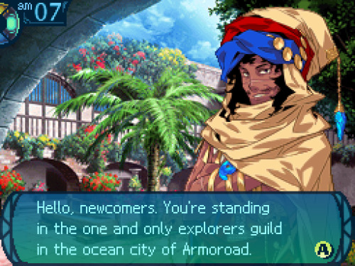
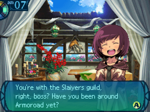
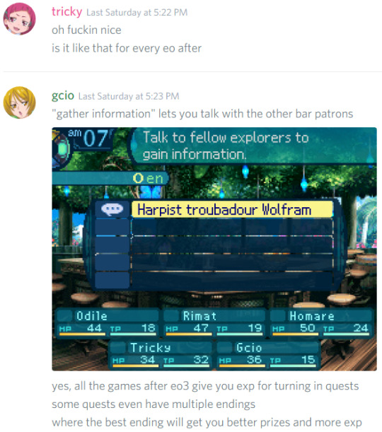
"I'm here to supervise all the explorers who find themselves in our fair burg.
Here's a little something I give every new guild for signing up."
the gradient text box looks cool
(he also gives us a cross script, a resolve script, and an offense script. i'll get into what those are for later)


"Think hard, because that name may be known someday across the seven seas. It all depends on you."
HELL YEAH
[i held a vote on our guild name and the channel chose “The Troll Slaiyers”, but that’s too long so i went with just “Slaiyers”]
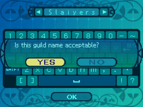
absolutely not but the people have spoken

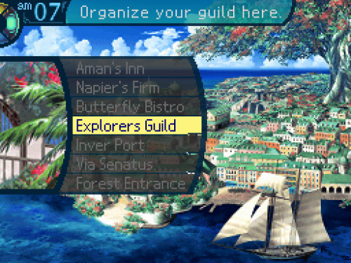
"Well then, step two is registering explorers in your guild.
You'll need to hire a few folks, but it's up to you whether or not you want to become a member too."
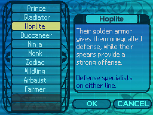
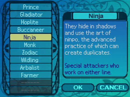
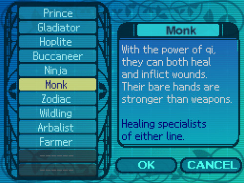
At the Explorers Guild, you can register explorers and organize your party.
Choose your favored classes from the list and form a party of up to five explorers.


you can talk to npcs in town too

"Even experienced warriors get swallowed up by that Labyrinth every day...
If you've come here as weekend warriors, I'll be straight with you: hit the beach instead."

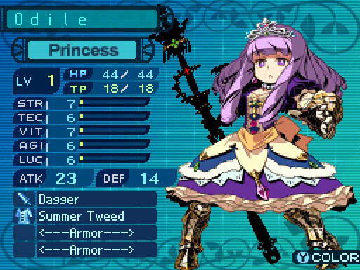
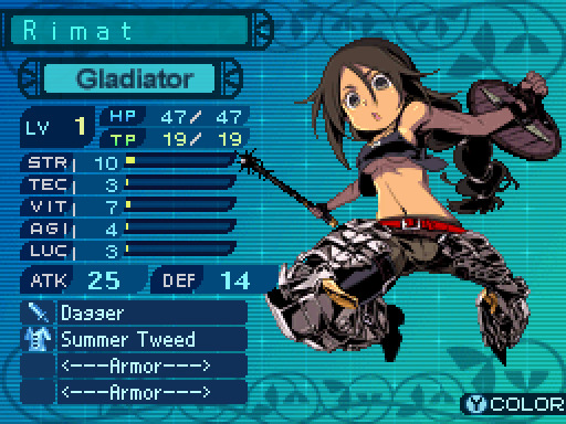
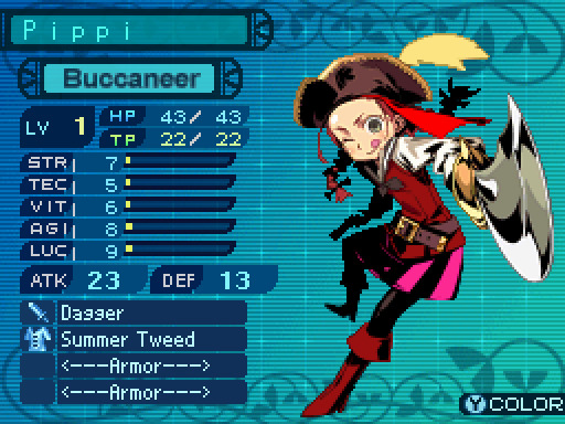
we can choose up to five characters to bring along at a time
i should add: characters in the front row take more damage from phys attacks and are more likely to be targeted,
so it's better to put characters with high defense/vitality there
[and this is the party the channel voted on]
"Oh, but before you go, let me explain one more thing.
It’s about the documents I just gave you along with the guild certificate...
Smart explorers actually read them carefully. If you don’t feel like it, just throw them away...
But if you hope to go all the way in the Labyrinth, you’d be well-served giving them a look."
In this game, powerful abilities called Limit Skills can be used by up to five party members.
Limit Skills can be learned by obtaining documents with the skill details written in them.
Gather various Limit Skills and use them well to make your time in the Labyrinth easier.
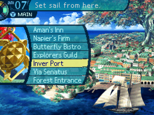
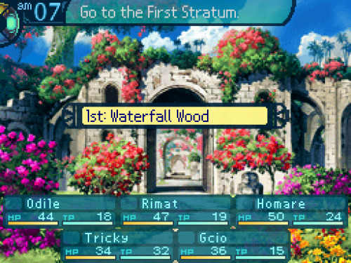
and then we're sent back to the main town screen, only now all the facilities are available to us. we could go to the senatus first like the guildmaster suggested, or we could check out the other places in town...
ONWARD


FIFTH STRATUM


...and then youre immediately kicked back to the town screen.
>:(

FINE

"Then you’d best remember this: You stand in an assembly hall of the Senatus, Armoroad’s government.
And I am she who wields the Senatus’ authority to manage explorers such as yourselves.
This is where so-called explorers’ skills are tested to sort the true warriors from the cowards.
If you want to be recognized as true Armoroad explorers, accept the mission I issue you now."
Carry out these missions to gain various rewards and advance the game’s storyline.
Select ”Accept mission” from the menu to see the details.
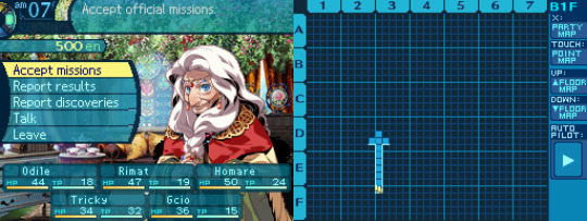
so there are a few things we can do here.
"accept mission", like the game said, lets us accept missions from the senatus.
"report results" is how we report completed missions
"report discoveries" lets us log monsters we've encountered and item drops we've won from battles.
materials we get from gathering points are logged in the item compendium too.
"talk" is self-explanatory:

"Just don’t get lost in the assembly hall on your way here!"
anyway, you have to accept the senatus' mission before you can go into the labyrinth, so let's do that


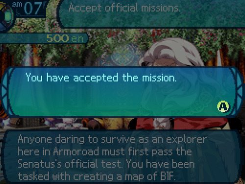

"The guard there will have more details for you. Look to him before you proceed.
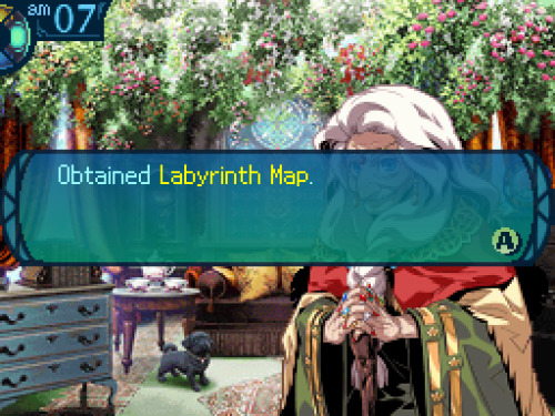
Ah, but you must have parchment first, eh? Here is the blank map given to explorers. Use it well."
when she said we have to draw our own map, she wasnt kidding--a big part of the game is drawing a map of each floor on the bottom screen
(...uh, i guess it's the "right screen" here)
floor tiles are filled out automatically, but you have to draw in the walls and other details yourself
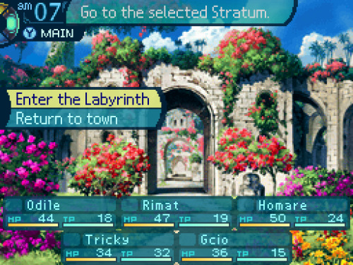
NOW we're free to go into the labyrinth
...but we're not going to yet. actually, doing so now would be a really bad idea
......because we still need to buy equipment


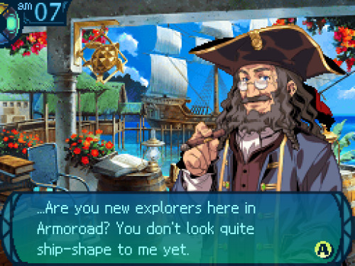
"In that case, welcome to Napier’s Firm. We carry all the weapons, armor, and tools you’ll require.
Here at our Firm, the customer is God. We’ll spare no expense for those who line our coffers.
Though that is conditional on you participating in a transaction. No window shoppers, please."

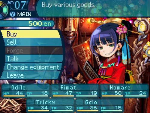

you start out with 500en (short for "ental"), which is just barely enough to get your party equipped

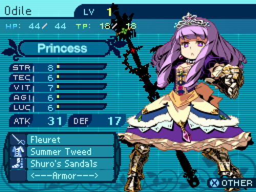
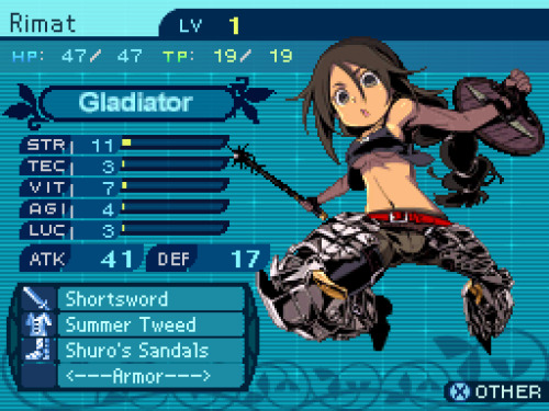
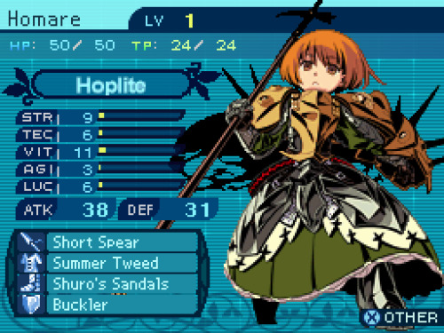
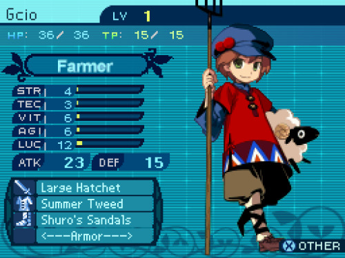
(i start by buying shuro's sandals for everyone)
...it says theyre made of shuro tree leaf, so i have a feeling the name shouldve just been "shuro sandals",
as opposed to implying there's a dude named Shuro or whatever
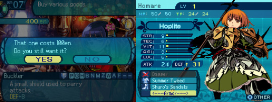
i also buy an absurdly expensive shield for homare,
because she needs a shield to use her tanky skills, and this is the only one available
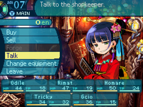
aaand we're broke

"Skilled explorers have few qualms at parting with their money. Stinginess never saved a life.
All things depend upon money. Your finances dictate whether you master Yggdrasil or die penniless.
Remember that. So then, what can I get for you?"
alright, everyone's all equipped. we could go into the labyrinth now, but im gonna check out the rest of town first
just to get it out of the way


"Not only can you spend the night here, we have doctors to treat your wounds, too!
So, is this your first time in Armoroad? Isn’t it awesome? Those clear seas! Those blue skies!"

we're gonna be seeing a lot of this place
"stay" lets us, obviously, stay at the inn. this fully heals the hp/tp of all (alive) party members. it also passes the time a bit, allowing you to stay at the inn until either the next morning or until nightfall
"treatment" lets us revive dead or petrified party members
(later games had dead/petrified party members heal automatically when staying at the inn)
"store" lets us put excess items in storage.
this can be pretty useful because we have limited inventory space
(and multiples of the same kind of item dont stack)
and "save" is, of course, the most important option of all:


anyway, we're not actually gonna stay here, because there's no need to. also we're totally fucking broke, in case anyone forgot
i mean, we WILL stay here, eventually. but not right now.
ah, so youve heard about us...
"They call this the ocean city, ’cuz so many people from across the seas wind up here.
I bet you’d enjoy taking a walk around town before you go down into the Labyrinth."
good idea! let's do that

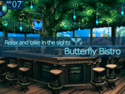
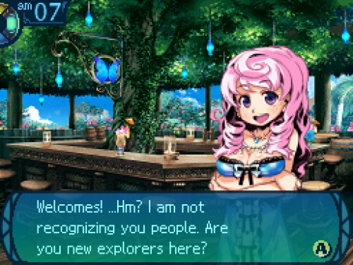

"Well, welcomes to you! This is the Butterfly Bistro, and I am the owner here!
Once you finish the mission that the old lady gives all the newbies, I can give you work.
...Until the then time, have some drinkings and chattings with the other explorers here!"

this is where you can accept quests, which are sort of like... mini-missions.
tbh there wasnt much reason to do these in eo1 and eo2, cuz the rewards werent too great, but in eo3 they give you exp too,
so it's worth it to do as many quests as you can
anyway, let's talk to this dude

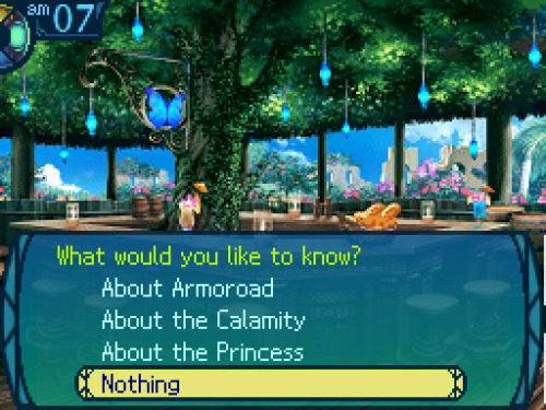
(bar patrons dont have character portraits, unfortunately)
"I’m Wolfram, a troubadour. I’ve wended my way from the far north all the way to this ocean city.
I’ve been here a long time... I may have a few words of advice about challenging that place."
(troubadours were a class in eo1/eo2. theyre bards, basically)
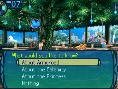
what should we ask him about first?


"Her sobriquet of the Porcelain Princess comes from her pure, white shining skin...
Her voice is like music from the harps of the goddesses; radiant enough to tame monsters!
But even the goddesses wouldn’t linger in her presence for having to compete with her face...
She is Princess Gutrune, a lovely goddess of Armoroad in her own right!
Her visage is the stuff dreams are made of... Though, mind you, I’ve never seen her in person.
Each successive princess in Armoroad is named Gutrune. I’ll tell you the reason... later."
what should we ask next?


"A free city of clear skies and white clouds, an endless sea, and a vibrant, eclectic culture!
"...But freedom can’t exist without order. This country does have a royal family.
Sadly, the modern royal family has been reduced to mere figureheads...
Ah, but who then governs Armoroad? The aristocrats of the Senatus, led by a fearsome old crone!
Consider her to be the true power behind Armoroad. You’ll most certainly meet her yourselves.
There’s more to Armoroad’s royal family than that, but... Let’s leave that for another time, hm?"

the calamity, AKA the backstory
"But around 100 years ago, the center of Armoroad was suddenly swallowed by the ocean!
Afterwards, the rippling waters became tidal waves... The gentle breeze gave way to earthquakes.
Armoroad’s advanced technology was sunk, which ended diplomatic relations with nearby countries.
It’s been a long road to recovery for Armoroad, but even today, it’s nowhere near what it once was...
Not since the Calamity. If you ask anyone here, you’ll get nothing but a stony silence.
Then again, that’s just because no one knows exactly what went on 100 years ago!
It wasn’t all bad, mind you. After the Calamity, a Labyrinth was revealed, drawing explorers here.
Though the Senatus had other reasons for gathering explorers... But that tale can wait for now."
I've Had Enough Of This Guy
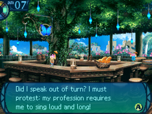
"...Ah, but I jest, I jest. Come again, explorers, if you wish to hear my stories."
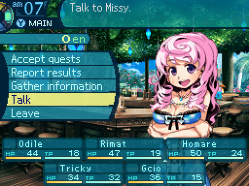
we have better things to do..... such as talking to the barkeep instead
uh... we're... working on it...
"...Ah, you are just heading out? You may want to gather info before you go in there.
Oh, by the by the way, what’s the name of your guild?
...Slaiyers? That’s cool! I will make sure to be remembering it.
I am hoping to do a lot of business with you, Slaiyers!"
u///u
alright, there's just one last place i want to check out before the FIFTH STRATUM


"You’ll need permission from the Senatus to go on voyages, so you should seek that out first."

...well, that was pointless
time to FINALLY get this show on the road
0 notes
Photo

Week 11: Progression Session and De-Brief
Feedback Broken down into sections:
Visual Design:
We really like the colour combination, the app looks so realistic. Every icon and colours are matched well and they catched our eyes well.
Nice colour scheme!
The colour scheme is awesome, the use of gradients on buttons are nice.
Nice colour scheme, very aesthetic - feels like a real app.
I love the colors!!
Really nice and clean visual design
The app overall is very consistent and feels professional.
Some icons don’t match the overall style of the app such as the bell, but that is us nitpicking
Colour and font choices compliment each other nicely and allow for a clean and refined overall flow to the app.
Flow:
This app is really working well in terms of the flow and simplicity!
I REALLY LIKE IT and it’s EASY to use for me!!
The app seems feature rich and well thought out
allowed for a clean and refined overall flow to the app.
Information on screens:
There are enough useful information in the app. Well done guys!!
You guys have included all important info needed for your app.
The feature of nearby prices for parking on the map is very nice. Keeping track of time remaining is nice. We like how it included lots of additional features which were easy to navigate
Really like the depth you’ve gone into with the FAQ and Need Help pages
content is organised within pages well.
User Issues:
Just curious about the card number in confirm payment, when you press pay it goes back to ‘pay with’ on a loop, but it works for paypal.
The only problem we found was the ASB pay button loops back to the saved cards part, we couldn’t get out of that, but the paypal and new card option worked.
In the payment option, once you’ve paid with the ASB card and confirm, it brings you back to the payment page, although both other options worked fine and the transition when you click the menu button looks unnatural.
You seem to have a navigational loop when you try to pay with the saved card?
Possibilities:
Under the ‘having trouble?’ Page it might be better to have the ‘phone’ (right hand side of the buttons) clickable to go to the phone filed instead of vice versa.
Different prices could have different colour schemes on the map, lower prices can be green and higher prices can be red.
Add a more obvious option to log out
I think maybe the circles design is too much? Like maybe less circles? Idk I like simple things.
De-Brief:
Based on this weeks progression session feedback, we noted that a lot of people really liked our visual design in terms of colour scheme and font choices. We didn’t have any negative points on the sizes of our font and icons. However there was a group who thought the style of the notification bell wasn’t as cohesive with the rest of the design. Overall, the majority of people thought it was very consistent and feels quite professional like a realistic app.
In terms of flow, many people thought that our app was easy to use and navigate. It was very simple and refined and someone noted it was feature rich. Since there wasn’t many comments about the flow, we assumed there wasn’t much of an issue in this field.
Regarding the screen information, a lot of people noted that we had covered all the useful and important information beneficial for the target users and what they expect to get out of our parking app. People commented on how the additional features made the navigation easy to understand for first time users, such as the extensive ‘FAQ’ and ‘Need Help’ sections. In summary, we feel like people had a good impression of the way that our content was organised within our screens.
One main issue that was re-occurring in our critique, was how we had an incorrect feedback loop. Once users tapped on the ASB card button, instead of taking them to a successful payment screen, it took them back to the confirm payment page again. This would have caused the users confusion which we are trying to eliminate in our parking app. Some users brought our attention to the side menu bar looking ‘unnatural’ as we had the home screen on a lower opacity behind it, but when they opened the sidebar from a different page it was the wrong background. Therefore, we will fix this issue for a more seamless experience.
One person had an issue with the visual design of a button in the ‘Forgot password page’. They couldn’t comprehend the other visual queues of the clickable button. Taking this one feedback into account, we will not be making any changes to this button as it would disrupt the overall visual language and cause further confusion on navigation.
A very helpful point the users said was that they thought we could use colour to represent different information such as the prices of the parking spaces located on the map i.e. red, yellow and green. One person mentioned we needed to make our logout button more visible, however we didn’t even have a logout button so we now know we need to add this in. Another person also mentioned that they didn’t like how many circles or rounded shapes we had used, but since this was only a personal preference, we’ll consider this opinion lightly. On the other hand, this also raised a point where some of our typing fields had rounded corners but others were more squared. If we go back to our prototype, we can re-edit this so that the typing fields are all rectangular to make it more distinguishable.
Overall, this session was very beneficial to our group’s progression as we could understand how users felt about it, what they liked and what we can do to improve.
0 notes
Text
How I Grew My Email List with MailerLite
New Post has been published on http://www.itsallblogsense.com/how-i-grew-my-email-list-with-mailerlite/
How I Grew My Email List with MailerLite
If you’ve been blogging for any amount of time, you’ve probably heard so many bloggers sing the praises of ConvertKit. A couple weeks after starting It’s All BlogSense, I followed the trend. As a new blogger at the time, however, I kept looking for other options as the $29/month just seemed like a steep investment. That’s when I bought my first blogging eBook where Taylor Stanford sang the praises of a different email subscription service—MailerLite. She said it was free, so I just had to check it out.
MailerLite vs. Convertkit: At First Glance
When I first signed up for MailerLite, I wanted to check things out before I canceled ConvertKit. As I dug in, I realized MailerLite had more features than ConvertKit, was simpler to use, and the only thing they didn’t have that ConvertKit did was phone support.
MailerLite
ConvertKit
Email Templates
Subscriber Notifications
Subscriber Management
Segmentation
Webforms
Popups
Landing Pages
Tracking
Campaign Reports
Automation
Drag & Drop Editor
Mobile Preview
iPhone & iPad App
Video
Split A/B Testing
Unsubscribe Page Builder
Click Map
Find out how MailerLite dominates in email marketing! #emailmarketing #blogtips Click To Tweet
MailerLite Wins with Features
As you can see, MailerLite has every feature ConvertKit has and then some! With so many people using their phones to check email while on the go, I love the mobile preview. I also like the unsubscribe page builder because you can use it to find out why the unsubscriber chose to unsubscribe, which can be helpful in maintaining your ideal subscriber. The split A/B testing is also useful to see what works well with your subscribers. With the additional features of MailerLite, they win across the board!
Now that we’ve compared the features of each platform, let’s check out the plans of both email subscription platforms.
Plans
MailerLite
ConvertKit
Up to 1,000 subscribers
FREE
$29/MONTH
Up to 5,000 subscribers
$20/MONTH
$79/MONTH
Up to 10,000 subscribers
$35/MONTH
$119/MONTH
Up to 25,000 subscribers
$80/MONTH
$199/MONTH
MailerLite Will Save You Money
As soon as I saw that MailerLite was free to start, had all the same features as ConvertKit, had additional features, and was exceptionally less expensive than ConvertKit I was sold! There was just one more area I had to see how MailerLite stacked up and that was customer service. So, let’s take a look at what I found in the way of customer service.
*insert Geico voice* Save money by switching to MailerLite! #emailmarketing #blogtips #savemoney Click To Tweet
Customer Support
MailerLite
ConvertKit
Method of Support
24/7 email & chat support
24/7 email support + can schedule a call
MailerLite Wins Across the Board
MailerLite won my vote with their long list of features, affordable pricing, and available support. I’m not one who jumps on the phone first. I prefer connecting via chat or email. I have had to contact MailerLite for assistance and they’ve been very nice and helpful. So, ConvertKit was canceled.
I have to say, this was just the beginning of my love for MailerLite. After switching to MailerLite, my email list grew like it never grew before.
Before we get to how MailerLite helped me grow my email list, I think it’s interesting how all bloggers and digital marketers are different. As bloggers, we are digital marketers. Would you mind checking out what kind of digital marketer you are? I’d love to know! Be sure to comment your results!
MailerLite Helped Me Grow My Email List
Growing your email list comes down to having the right opt-in. If you pay attention to your analytics and market research, you’ll be able to develop your perfect opt-in. MailerLite makes it easy to supercharge your opt-ins with all of their features.
A/B Testing: I started to use the A/B testing with my email list. I didn’t do it so much with my regular weekly emails, but with my affiliate and product launch emails, I did. I could test out different subject lines and email content. I’d test the different subject lines and email client with a small portion of my list. Whichever version tested best would be sent to the rest of my list. When the rest of my list got the ‘better’ version, it was a better user experience for them and that helped me to retain my subscribers.
Landing Pages: I loved having the ability to create my own landing pages without needing to pay for a premium service like LeadPages. The landing pages are free of distraction and there are great templates to choose from that are customizable. Using their landing pages were really helpful to getting new subscribers and improving my conversion rate.
Automation: Being able to automate is where I get a TON of my subscribers. I offer free eCourses that I write up to out over a 3-10 day period depending on the eCourse. People are thirsty for knowledge. My eCourses are an extension of my blog where in exchange for an email address, my subscribers get specific knowledge delivered to their inbox. They are also subscribed to my newsletter. It’s an all around win for everyone.
Ultimately, I’m a firm believer that you need an email subscription service you like. Transferring from one service to another is a pain. Trust me! I tried three email service subscriptions before deciding I loved MailerLite. If you want a feature-packed email subscription service that is easy to use and affordable, MailerLite has you covered!
Do you have growing your email list on the brain now? I’m looking for motivated bloggers just like you who want to get serious and grow their email list. Join my FREE 5-day challenge, Load Your List! *Mailerlite not required* See you there!
@import url('https://fonts.googleapis.com/css?family=Lato:400,400i,700,700i&subset=cyrillic,cyrillic-ext,latin-ext');
#mlb2-5627635,
#mlb2-5627635 *,
#mlb2-5627635 a:hover,
#mlb2-5627635 a:visited,
#mlb2-5627635 a:focus,
#mlb2-5627635 a:active
overflow: visible;
position: static;
background: none;
border: none;
bottom: auto;
clear: none;
cursor: default;
float: none;
letter-spacing: normal;
line-height: normal;
text-align: left;
text-indent: 0;
text-transform: none;
visibility: visible;
white-space: normal;
max-height: none;
max-width: none;
left: auto;
min-height: 0;
min-width: 0;
right: auto;
top: auto;
width: auto;
z-index: auto;
text-shadow: none;
box-shadow: none;
outline: medium none;
#mlb2-5627635 a:hover
cursor: pointer !important;
#mlb2-5627635 h4
font-weight: normal;
#mlb2-5627635 .subscribe-form
padding: 20px;
width: 725px !important;
border: 0px solid #F6F6F6 !important;
background: #2dcfbd none !important;
border-radius: 0px !important;
box-sizing: border-box !important;
#mlb2-5627635 .ml-block-form
margin-bottom: 0px;
#mlb2-5627635 .subscribe-form .form-section
margin-bottom: 20px;
width: 100%;
#mlb2-5627635 .subscribe-form .form-section.mb10
margin-bottom: 10px;
float: left;
#mlb2-5627635 .subscribe-form .form-section.mb0
margin-bottom: 0px;
#mlb2-5627635 .subscribe-form .form-section h4
margin: 0px 0px 10px 0px !important;
padding: 0px !important;
color: #000000 !important;
font-family: 'Lato', sans-serif !important;
font-size: 28px !important;
line-height: 100%;
text-align: left !important;
#mlb2-5627635 .subscribe-form .form-section p,
#mlb2-5627635 .subscribe-form .form-section li
line-height: 150%;
padding: 0px !important;
margin: 0px 0px 10px 0px;
color: #000000 !important;
font-family: 'Lato', sans-serif !important;
font-size: 16px !important;
#mlb2-5627635 .subscribe-form .form-section a
font-size: 16px !important;
#mlb2-5627635 .subscribe-form .form-section .confirmation_checkbox
line-height: 150%;
padding: 0px !important;
margin: 0px 0px 15px 0px !important;
color: #000000 !important;
font-family: 'Lato', sans-serif !important;
font-size: 13px !important;
font-weight: normal !important;
#mlb2-5627635 .subscribe-form .form-section .confirmation_checkbox input[type="checkbox"]
margin-right: 5px !important;
#mlb2-5627635 .subscribe-form .form-section .form-group
margin-bottom: 15px;
#mlb2-5627635 .subscribe-form .form-section .form-group label
float: left;
margin-bottom: 10px;
width: 100%;
line-height: 100%;
color: #000000 !important;
font-family: 'Lato', sans-serif !important;
font-size: 16px !important;
#mlb2-5627635 .subscribe-form .form-section .checkbox
width: 100%;
margin: 0px 0px 10px 0px;
#mlb2-5627635 .subscribe-form .form-section .checkbox label
color: #000000 !important;
font-family: 'Lato', sans-serif !important;
font-size: 16px !important;
#mlb2-5627635 .subscribe-form .form-section .checkbox input
margin: 0px 5px 0px 0px;
#mlb2-5627635 .subscribe-form .form-section .checkbox input[type=checkbox]
-webkit-appearance: checkbox;
#mlb2-5627635.ml-subscribe-form .form-group .form-control
width: 100%;
font-size: 13px;
padding: 10px 10px;
height: auto;
font-family: Arial;
border-radius: 0px;
border: 1px solid #cccccc !important;
color: #000000 !important;
background-color: #FFFFFF !important;
-webkit-box-sizing: border-box;
-moz-box-sizing: border-box;
box-sizing: border-box;
clear: left;
#mlb2-5627635.ml-subscribe-form button
border: none !important;
cursor: pointer !important;
width: 100% !important;
border-radius: 0px !important;
height: 40px !important;
background-color: #ef1f87 !important;
color: #ffffff !important;
font-family: 'Abril Fatface', sans-serif !important;
font-size: 16px !important;
text-align: center !important;
padding: 0 !important;
margin: 0 !important;
position: relative!important;
#mlb2-5627635.ml-subscribe-form button.gradient-on
background: -webkit-linear-gradient(top, rgba(0, 0, 0, 0) 0%, rgba(0, 0, 0, 0.2) 100%);
background: -o-linear-gradient(top, rgba(0, 0, 0, 0) 0%, rgba(0, 0, 0, 0.2) 100%);
background: -moz-linear-gradient(top, rgba(0, 0, 0, 0) 0%, rgba(0, 0, 0, 0.2) 100%);
background: linear-gradient(top, rgba(0, 0, 0, 0) 0%, rgba(0, 0, 0, 0.2) 100%);
#mlb2-5627635.ml-subscribe-form button.gradient-on:hover
background: -webkit-linear-gradient(top, rgba(0, 0, 0, 0) 0%, rgba(0, 0, 0, 0.3) 100%);
background: -o-linear-gradient(top, rgba(0, 0, 0, 0) 0%, rgba(0, 0, 0, 0.3) 100%);
background: -moz-linear-gradient(top, rgba(0, 0, 0, 0) 0%, rgba(0, 0, 0, 0.3) 100%);
background: linear-gradient(top, rgba(0, 0, 0, 0) 0%, rgba(0, 0, 0, 0.3) 100%);
#mlb2-5627635.ml-subscribe-form button[disabled]
cursor: not-allowed!important;
#mlb2-5627635.ml-subscribe-form .form-section.ml-error label
color: red!important;
#mlb2-5627635.ml-subscribe-form .form-group.ml-error label
color: red!important;
#mlb2-5627635.ml-subscribe-form .form-group.ml-error .form-control
border-color: red!important;
#mlb2-5627635 .ml-vertical-align-center
text-align: center;
#mlb2-5627635 .ml-block-success,
#mlb2-5627635 form.ml-block-form
display: inline-block;
width: 725px;
@media (max-width: 768px)
#mlb2-5627635
width: 100% !important;
#mlb2-5627635 form.ml-block-form,
#mlb2-5627635 .subscribe-form
width: 100% !important;
#mlb2-5627635 .subscribe-form.horizontal
padding-bottom: 0px;
#mlb2-5627635 .subscribe-form .form-section.horizontal
float: left;
margin-bottom: 5px;
width: 70%;
#mlb2-5627635 .subscribe-form .form-section.horizontal .form-group
float: left;
width: 50%;
padding-right: 10px;
box-sizing: border-box;
#mlb2-5627635 .subscribe-form .form-section.horizontal .form-group .form-control
height: 40px;
#mlb2-5627635 .subscribe-form .form-section.horizontal.ml-button-position
width: 30%;
padding: 0;
#mlb2-5627635 .subscribe-form .form-section.horizontal.ml-button-position.top-padding
padding-top: 26px;
@media (max-width: 768px)
#mlb2-5627635 .subscribe-form .form-section.horizontal
float: none;
#mlb2-5627635 .subscribe-form .form-section.horizontal,
#mlb2-5627635 .subscribe-form .form-section.horizontal.ml-button-position,
#mlb2-5627635 .subscribe-form .form-section.horizontal .form-group
width: 100%;
padding: 0;
#mlb2-5627635 .subscribe-form .form-section.horizontal.ml-button-position
margin-bottom: 20px;
Thank you! You have successfully subscribed to our newsletter and Load Your List!
LET’S GROW
Get serious & grow your email list! Be sure to join the #FREE 5-day challenge! #bloggers… Click To Tweet
0 notes
Last Seen Blogs

musings-a-la-megan-blog
The Nog Logs

fluffyemolover
The Place You Call Home

elysayings
Ely Sayings

world-war-z-experience-tr2p
H2D; world war z experience trainer download

appthehill
The Budget Dieter