#I think using the gradient tool to give you cues on how to do your lighting is really helpful
Text
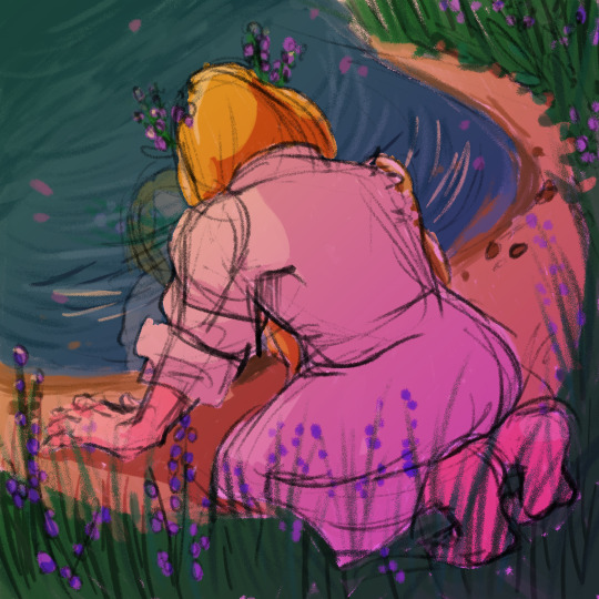
15 days of FatT: Divine Intervention
" [...] one that has begun to speak to her with the voice of what claims to be a Divine—I think the first law I’m gonna write is [...] “There is a reason why I am alive.”"
#15daysoffatt#fatt#friends at the table#clementine kesh#the witch in glass#fan art#digital art#God this one came to me like a bat out of hell#At first I thought I was gonna draw Fealty and Veronique#but i felt like i couldn't justify what I wanted to draw with this prompt#and then I though “well has anyone else had a deep life changing relationship with a divine that I can remember?”#*BAM* clem#I really like how this one worked out#I think using the gradient tool to give you cues on how to do your lighting is really helpful#even if I feel like its cheating#I wish I could do this traditionally lol
60 notes
·
View notes
Note
8, 11, 21 and 26!
hey! thank you!
8. your favourite graphic/gif created by yourselfuwuwu i guess there’s no way i can escape this (but thank you for the interest on my fav creation i am feeling v warm and mushy rn T_T) ok so i always go back to this (my twt babies that i will take a bullet for) and i think another one of my fav (just let me have this ok) is probably this spring day one i made recently bc for once in my life the colour adjustments actually worked out in my favour and look at them just pop and go wow i was so proud
11. what graphic/gif trends do you like the most?ok i sort of answered this q over here but now that i am faced w this a second time i just remembered: i am legit trash for colours. like see: graphics w vibrant/pop colours, gifs that not only brightened up the scene but also the colours that are enhanced by 100% w sharpening and adjustments. i just. wow. am always floored by it. i just scream colouuuursssss! in the tag then i have a meltdown over it bc those are gorgeous
21. how much time do you spend on a single graphic/gif? it usually ranges from a few hours up to a month or two. it really depends on what i’m working with. like the recent one w spring day (linked above) took me about a month to nail down the final ‘look’ of the entire set. the one im currently working on has been going on for 1 month+ and is still not even nearly done ;__; other times like this ariana grande one took me about 6-ish hours bc i already had a ‘feel’ of the vibe (cues the ari tweet in the caption) that kind of set the tone for me which made things a lot easier to work with
26. give a graphic/gif maker a quick tip!i can’t speak for gifs bc im still learning, but gradients and selective colours are very useful tools for when you want to set a tone/vibe in your graphics!
ask a gif/graphic maker
1 note
·
View note
Photo
Assignment 2
Jamie Wiedmann
Lighting is everything in an image, it establishes location, are you outside or inside, it establishes time of day, is it midday or nighttime, is the sun rising or setting, it can establish time of year, the weather. Lighting transforms the mood and tone of an image and the emotional response it evokes, just as the lighting of an establishment can transform it, for example, from a brunch place to a dim, candlelight dinner. Outdoors, dim lighting can turn a beautiful nature scene into one full of darkness and shadows. Lighting determines the entire mood of the image as the colors we see themselves can also change. Lower light situations do not illuminate every detail of an image, and it can contort colors into appearing darker than they are, while bright lights and colors are loud and busy. Light can also tell your eyes where to look in an image, much like a spotlight on a stage follows the person the audience should be looking at.
Because of this, light is tricky to work with, especially when you, the photographer, do not have control over it. Light can conceal details of an image by shining, or being focused elsewhere. Often times lights cue where the viewer should be looking, tricking them into not paying attention to the rest of an image, or the viewer simply may not be able to make out any details that are in the dark. Sometimes this can come in handy for a photographer who wants to manipulate lighting and exposure, if there is noise or insignificant details that draw away from the main focus, darkness can be used to hide the imperfections and draw the viewer to the focus of the image. I believe the analogy that light can reveal the truth does apply to photography, but I don’t think, in the case of photography, that it has to have a negative connotation, light is the most powerful tool a photographer can use, but that doesn’t always mean more is better, too much light can make everything appear washed out, also concealing details.
Natural lighting has always been my favorite, simply because it is natural. I feel like natural lighting grounds the image, preserves an element of truth. Even if the lighting is not perfect, it reflects the current situation. Natural lighting is also ever changing, it is hard to find the same exact effect twice, it is very organic. I would prefer editing the brightness, highlights, and exposure using software than adding a flash and unnatural light to an image.
For me, side light was the most difficult because it was hard to find the balance of light coming from the side and causing enough of a shadow, but then knowing the difference between an image with shadows and an image with side lighting because they are often the same thing.
I agree with the concept that there is a position of power when taking photographs. If the photographs have a sort of consciousness themselves, in turn they can each have their own view on the world, just as all people see things differently. Photographs can be manipulated in size, shape, color, and focus. Objects in the photo can be retouched or altogether removed; the photographer can manipulate objects in the field as well, changing a person’s position or an objects location. The photographer has the ability to make the viewer see something the way he or she sees it, so I do think Sontag’s statement is true.
My interpretation of Sontag’s proposal that photographs democratize experiences is that through photography we can catalogue the world. Every thing, place, person can exist as a photo, as a physical copy or an image online. Capturing the light and transposing it into a 2D, flat image, making it easily accessible, compact, and visible. However just because photographing objects or people ‘catalogues’ them in a similar way does not mean that all experiences themselves are equal, only the images of them are equal.
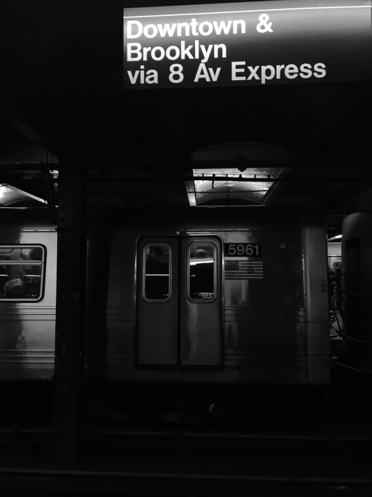
Artificial- I was in New York a couple days this week and I figured what better place to find artificial lighting! I originally simply picked the subway station because it’s underground and is entirely artificial light and because I had seen some creative photos of underground subway stations. I tried a number of different angles and object for this picture but when the train pulled in I thought that would be an interesting background since it spanned the entire width of the frame, changing the landscape entirely. It also gives a sense of motion without being blurry, and the metal causes the light to be reflected in so many different ways.It was hard to avoid getting a streak of white light at the top of the sign but in the end it added a soft glow to the letters. I put the image in black and white because it provided a starker contrast between light and dark, made the light parts look much brighter and unified them, instead of having slightly different colored light areas. It also made the dark part darker and reduced a lot of background noise.
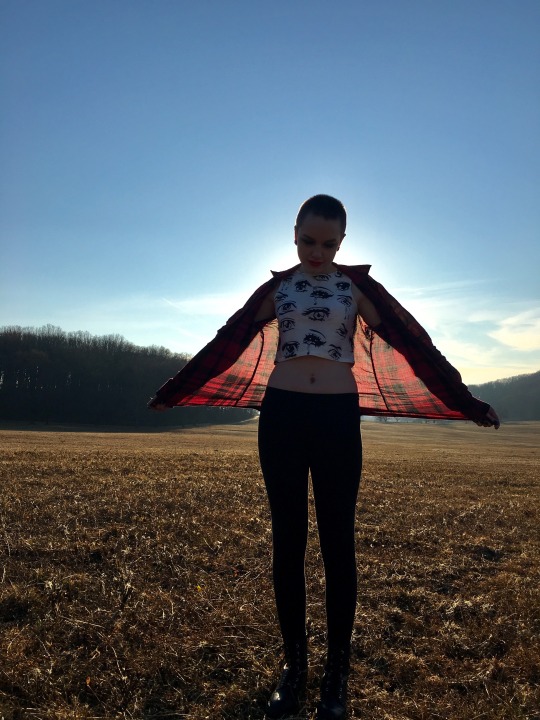
Back light- My inspiration for this picture actually came from the mother of one of my high school classmates who is a really talented photographer, she would take pictures of people during sunset and the light would turn their figures into a silhouette and they were always so beautiful. I got my sister to model for me and tried to create my own version of her photographs. As it turned out, perhaps because of the time of day, it was still a little early, there was enough light in the sky from the other direction that you can still see her features such as the color of her clothes and her facial features, I like that her figure is darkened but you can still make some of these things out. I told her to hold her shirt out, I had no idea how it would turn out, but I like that the light shines through the fabric of her shirt, and gives the outline of her body a glow, it’s like two different effects of light in one. I left it in color because of the pretty background colors and the bright contrast between them and her red shirt.
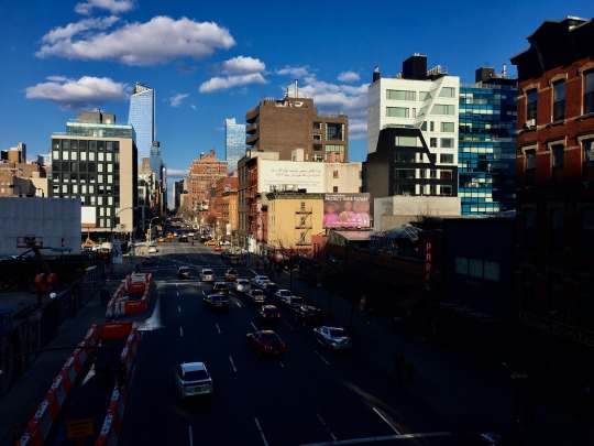
Shadow- I took this photo because the sun was at the perfect height in the sky where it made it look like the shadow was splitting the scene in half. The busy, colorful skyline is still lit while the quieter, darker road is in the shadow. I definitely wanted to keep this image in color because there are so many different, bright colors on the buildings and in this cause I think that enhances the lighting even more than if the image were in black and white, whereas it is often the other way around.
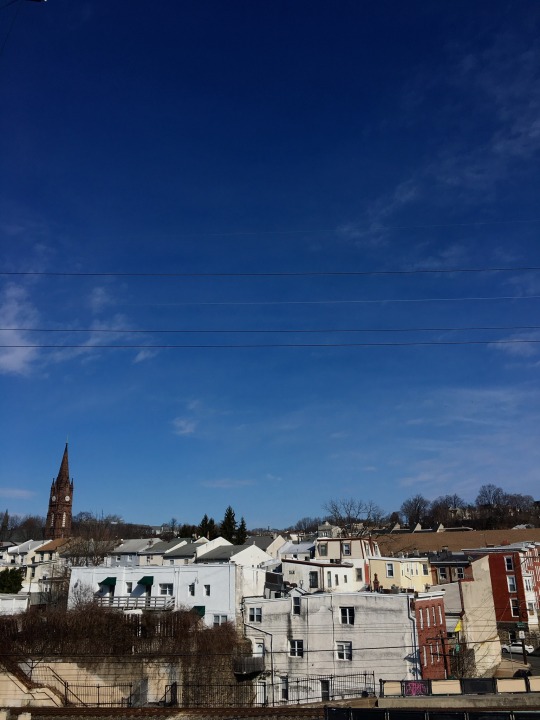
Natural- I always loved the skyline of Manayunk so I went to the trail Monday morning when the light was still soft and tried to get some good natural light images. I like the solid colors of the building walls and how the early morning light makes them appear brighter and cleaner in a way. I chose to have the buildings at the bottom of the image so they would frame the rest of it while simultaneously displaying the sky as as clear and expansive, also to show the gradient of color, from darker blue to lighter blue. I kept this image in color because of the beautiful blue color of the sky and the glow, white color of the buildings was exactly what I was looking for when going for natural light.
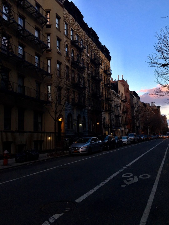
Side- I took this picture because from where I was standing the light was shining from the side, and there was a noticeable shift from day to night all in one scene. Again here I used the light to divide the image in half, the left and lower parts looks like nighttime while the right and upper parts still have daylight present. The streetlights of houses are on and the headlight on the cars, but the tops of the buildings have a soft glow that fades as it goes own, casting small shadows, and the sky is still a bright blue. The sun is coming from such an angle that you can’t see the physical area where it is setting, but you see both day and night in one image, without the area in between. I left this one in color as well because of just how light the sky was and the soft, warm, glow of the streetlights, the darkness of the buildings provided a sharp enough contrast to see the light coming from the side.
2 notes
·
View notes