#and change the color of objects!
Text
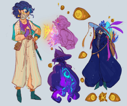
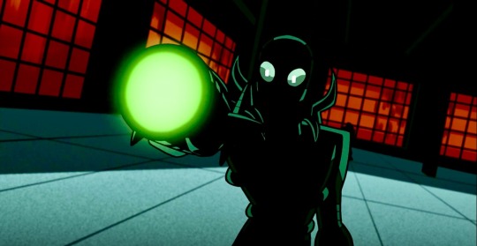
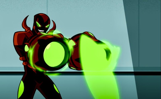
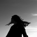
everyone say hello to arion, chromia’s color witch and my new empiressona! she/he pronouns :^D
#luna’s constellations#empires#empires sona#empires smp#arion has a fur coat that is a pocket dimension and can eat people sometimes#nd also he can create illusions for each of the senses at a time#and change the color of objects!#so like he can make someone see a butterfly but not touch it#or he can make someone feel a tap on their shoulder but not see or smell it#etc#i love her already this design brings me much joy
92 notes
·
View notes
Text

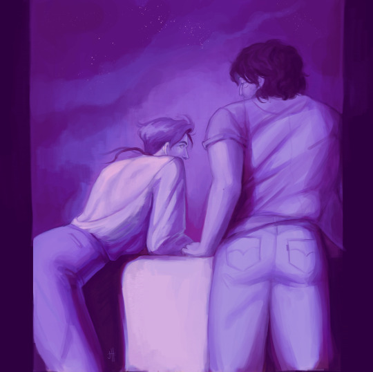
one sided // mutual
still obsessed with the intimacy of body language when the faces are obscured. inspired in part by Mead Schaefer's limitted palette paintings
#illustration#oc art#art#wolfgang#bastien#wolfien#happy wolfgang wednesday !! i wasnt sure i was gonna finish this but then i got possessed and wanted to do some fun value stuff#very happy with this though i did find out my new screen shows different colors than my phone :X hope it looks decent lol#still and forever in love with people looking at each other sorry. fav topic really#and! love changing people and how they are around each other even if they wont talk about it??#forever weak for how Bastien fell in love first but if Wolf never realized he would have died with that secret inside him i guess#and Wolfgang letting themself be more of a pathetic in love person than an Object of desire because they want to get closer to him#and Bastien barely keeping himself from touching them wahoo#anyway. i did Not work on the comic im gonna go whip myself goodnight
199 notes
·
View notes
Text
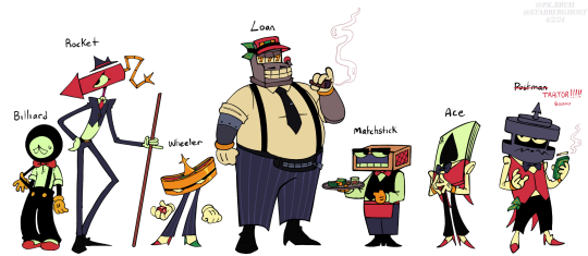

say hi to the company ! or. companies.. or the mailing company and the.. gambling ring.... yea. um. say hi
#might change colors for some of them#especially the mailing company#would also like some asks about them perhaps bats my eyelashes#stabberart#stabberghost ocs#oc#original character#object head#object heads
210 notes
·
View notes
Text
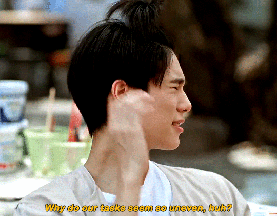
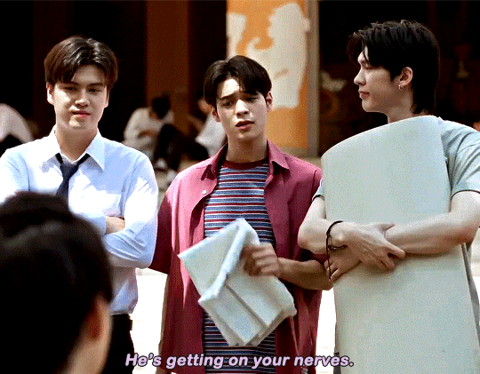
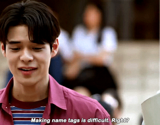
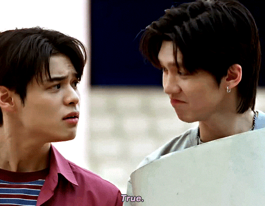
Since you’re studying Fine Arts, you’ll paint on this canvas. I’ve drafted some wording here.
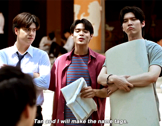
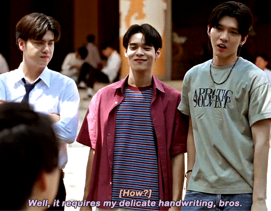
WE ARE | EP8
#we are the series#weareedit#phuwin tangsakyuen#poon mitpakdee#aou thanaboon#winny thanawin#marc natarit#peem#pun#chain#tan#Q#my edits#THEY ARE SO STUPID <3#me: almost always makes my colorings from scratch#my gifs: look like 8765678 different people made them <3#i hate not being able to find the coloring™ for any show lol#i always find things i would like to improve or change 😩#i would love to have a style™ like some fellow gifmakers who i am able to IMMEDIATELY RECOGNIZE BY THEIR COLORING AND SHARPENING ALONE 🥺#also this is not me fishing for compliments jdjdskdkd#i just have a certain gifstyle in mind that i’m barely ever able to achieve#and i’m very hard on my self because of it 😅🙈#like i know my gifs aren’t objectively bad#they just don’t look they way i want them to look and i’m being a little bitch about it lol
121 notes
·
View notes
Text
ok i've been thinking about how to answer The Color Asks for so long now. Once I start talking about colors I never stop, it seems. This is just me attempting to explain my personal thought process and not any universal rules or anything like that.
None of this is going to look very realistic at all. You need to exaggerate a little. That being said, having fundamental knowledge on how shadows and ligh tsources work is very useful. Know the rules before breaking them and all that.
Boiled down to its basics, what I think of is: if a lightsource is cold toned, make the highlight bright blue. if a light source is warm, make the highlight bright orange. Then contrast the light with a complementary shadow color that does not compete for dominance with the light. Or alternatively make the light source more neutral with a complimentary tone for the shaded areas and then add a highly saturated color in the deepest shadows.
Having both a highly saturated light source and a shadow color will compete with each other, instead choose one to be the dominant and one to be the um. submissive i suppose.
Just using a random doodle from my sketchbook for the purpose of throwing some color on:
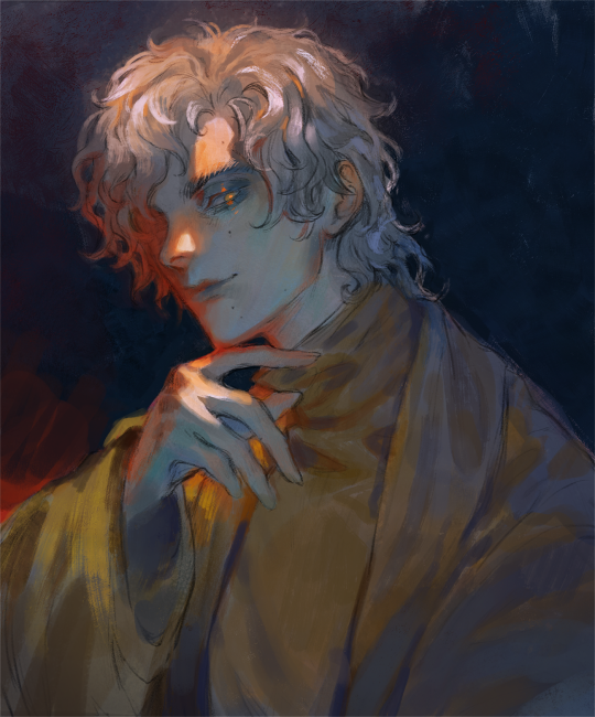
^^^ Here the midtones and the areas in the shade are predominantly of a low saturated cool blueish tone, while the highlight is stark and warm with orange and red light bouncing off. The orange and red hues you often see in skin that is lit by a strong light is called subsurface scattering (sss), one of the most important concepts in art IMO. It livens things up so much.

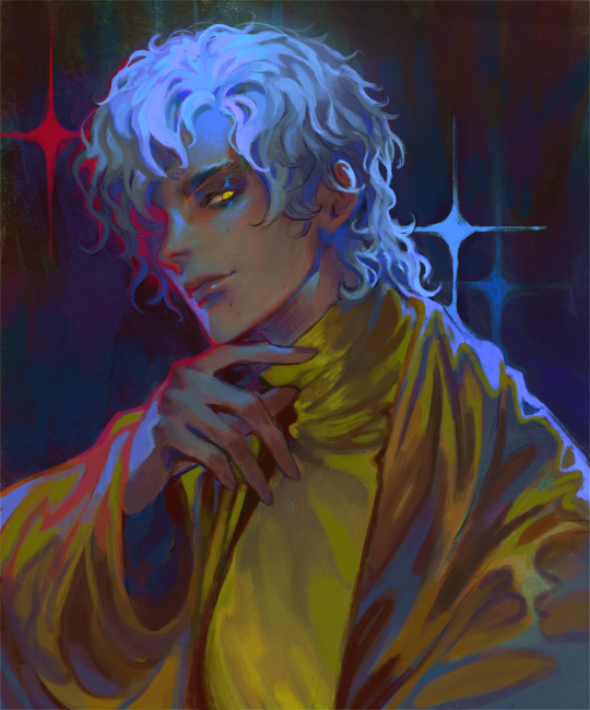
^^^Opposite from image 1, here the shaded area is a saturated golden color while the light source is a dull blue with hints of more vivid blue throughout. the blue balances the strong yellows and browns. Since the shaded area is bigger than the highlighted area, the subject matter could look quite monochromatic without the blue hints.
^^^Get wild with it. Lets say your highlight is blue toned: instead of just using a blue, introduce purple, teal, turquoise, ultramarine, cyan, etc around where the light is hitting. Add several light sources in different colors, make it not make sense, get crazy.
Though what is important above all else is that the image reads clearly. Unless you're doing abstract art then you'd probably want the audience to understand what they're looking at. That's where values come in, probably the number one cause of confusing pieces of art. If you can turn the painting black and white and still see the subject matter clearly then the values are good.
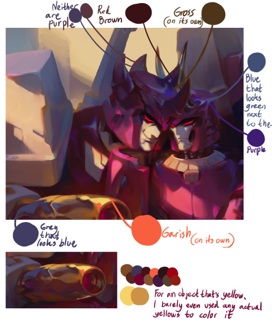
I find that i love using colors that most people find garish, especially when they're on their own, for small highlights and points of interest. When paired with other more neutral colors, a bright orange or a chartreuse etc can really brighten up a painting.
And colors are never what they seem, the human eye will interpret colors differently depending on what color they are next to. Make full use of this.
Hope this long ass post helps anyone who is struggling with color, I know I used to struggle severely myself xoxo
#my art#long post#recovering from playing dark souls 2 for like 20 hours the past few days#i hate bitches who are like 'colorpick from my fursona ref if u want to draw her! do not get her colors wrong!'#maybe that would work if the fursona is always going to be standing in a white void but environments are going to change the colors#i also hate bitches who want to say that there is an objective worst color#there isnt. green gold/chartreuse/raw umber/pyrrol orange etc has done more for society than colorhaters ever will
340 notes
·
View notes
Text
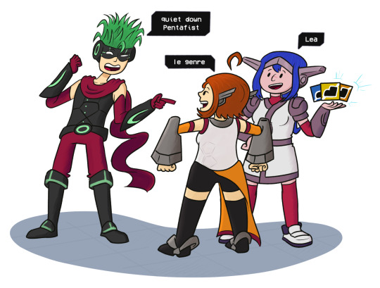
Average conversation between these three dweebs.
I don't actually know their canon heights (I think Lea is supposed to be the shortest) but Emilie being small fits the meme format better and is funnier so french gremlin she is. Also my heart tells me that Apollo is built like an actual blade of grass.
The og meme btw:
#gender c:#unstoppable force (my desire to keep making shitposts for this game)#vs immovable object (my lack of motivation to actually put pen to tablet)#honestly frustrated with myself rn#hope i get a second wind art-wise soon#(hopefully while this game is still living rent-free in my brain)#i did attempt to play around with some different brushes/markers on this one#so kindly disregard any inconsistent and terribly half-assed coloring/shading you may notice ;)#myartwork#artwork#sketches#crosscode#lea crosscode#emilie crosscode#apollo crosscode#memes#p.s. I feel like you could replace lea's shoes with crocs and literally nothing about her would change
64 notes
·
View notes
Text
ppl on twitter are finally finding out that the creators of smiling friends are racist assholes who believe the great white replacement theory and were roommates and great friends with JONTRON
and im like yeah. he's a fucking newgrounds animator. are you all stupid and braindead?
but noooo keep drawing your fucking yaoi of those ugly fucking characters and keep making a literal fucking nazi a millionaire by getting his show renewed a million times i guess !!!
#like do none of you think for five seconds im so fucking serious#im seeing people be like oh nooo but theyre my comfort characters!! 😭😭#and other people be like well that was 7 years ago im sure theyve changed and turned everything around!!#like you people are literally nothing but selfish useful idiots who would rather keep platforming the views + giving money to#this OBJECTIVELY AWFUL PERSON!! instead of like idk. getting into something new. or looking into the shit youre promoting#but you guys dont care abt that bc u dont ACTUALLY care abt how shit like this affects anyone who isnt white#the show is funny and the characters are bright and colorful and vaguely gay in your stupid little head so you just turn your brain off#its incredibly selfish and stupid and literally. sorry. i think you're all OBJECTIVELY bad people.#and literally every artist i liked that ive seen get into this shit i have immidiately lost respect for#you are all so stupid
33 notes
·
View notes
Text

hey girl. transmasc computer. do you agree
#the daily object show#tdos#the daily object show fanart#tdos fanart#tdos computer#tdos skull#tdos blood bag#tdos skullputer#skull tdos#computer tdos#blood bag tdos#transgender#his scars can change color the way his LED's can. amazing#osc#object show community#osc fanart#max does art
73 notes
·
View notes
Text
My favorite grainy instagram filter got axed and trying to find new ones that have the same crunchy look without adding makeup or changing my facial features is a struggle. :'(
#i liked it because it didn't change my face!!!! and it took some of the yellow out of colors so my hair actually looked white in photos#annoyed that every grain/color filter is like wOULD YOU LIKE LIP FILLERS AND WING EYELINER? NO? HOW ABOUT IF WE SHRINK YOUR NOSE??#objectively attractive#sry that's been my selfie tag since 2010#me#my face
14 notes
·
View notes
Text
Time for my yearly (ish, kinda, sorta, maybe) time to ANNOUNCE THAT I FUCKING LOVE SCARLET SCARAB!! I MISS HIM SO MUCH.


Look at my son. His iconic palette swapped fit. His funky little scarab buddy. His cool ass name. He's my little fella, my good time boy, the best mf that has ever existed on the planet and that time-span was like one episode. IF SCARLET SCARAB HAS NO FANS THEN I AM FUCKING DEAD.
That is all ( ´ ∀ `)ノ~ ♡
#never be normal about a character#<- my moto and i will live by it#i love himmmmmmmmm#HES SO NEAT#ofc i love blue beetle the icon the legend the moment the kind hearted mf whom i think is so neat#but scarlet scarab is also fascinating as fuck#i like to think the Reach still enslave people and colonize planets but its under the guise of improvement#dehumanize and inflantilize entire planets assuming they know better and step in until they take over#and do DO objective rule but also like... tyranny#so jaime got a hero-ish scarab that learned to vibe with his funky super villain host/buddy#anyways scarlet/blue is the best design for blue beetle in existence and the color change goes HARD#blue beetle#scarlet scarab#batman the brave and the bold#yapping hours#yap yap yap
16 notes
·
View notes
Text
Impromptu Tenna Redesign (Im not changing their design for DR!NN but if I ever take the chance to redo it all in like a game or something this is what you're getting

#deltarune#deltarune: nostalgia nightmare#deltarune au#tenna deltarune#Its tough to change the face. but I would ideally want stylistic consistency#other parts like the color shoes and gloves are just objectively good changes because they add visibilty to a character who was mostly#black on black backgrounds.
26 notes
·
View notes
Text
CHEER FACTORY!!!

#Ignore the fact I keep changing the bg color lmao#osc#inanimate insanity#my art#ii bot#ii goo#osc art#osc community#object show community#object show art#osc fanart#ii fanart#inanimate insanity fanart#bot ii#goo ii
32 notes
·
View notes
Text


No way, Blendy in TPOT 9!!!!!!!!!!!!!!!!!!!!!!!!!!!!!
#pink posts#<-- since it's not. really a drawing.#pinks ocs#object oc#oc blendy#this is an edit. a very minor one since i didn't change her color but it's still an edit nonetheless#tpot 9 spoilers#tpot spoilers
24 notes
·
View notes
Text


I was reorganizing my fails when I randomly decided to retouch an oc. I drew the 2nd one around 2022 and it looked realistic to me then, didn't even know there parts I could improve on until I put my hands on it again. Wow. I just felt a lil proud of myself to see all the better changes as result of applying stuff I newly learned.
It looks so normal on my pc and straight up too saturated on my phone though 💀
#digital painting#digital art#digital illustration#digital drawing#digital artwork#what a difference a year can make#and hearing about even simple information like how to draw 3D objects and very basic color theory changes so much#I retouched it for a tutorial a follower requested
20 notes
·
View notes
Text

GO TO HELL
#one layer thang!!!!!!!! i love using alot of colors#i love coloring the ink and his arms ok#i dont draw this version very often. that needs to change#splatoon#octo expansion#commander tartar#gijinka#object head#digital art#doodle#eye strain
386 notes
·
View notes
Text
omg just realized what i should do

#i think i’m gonna rewrite parts of black is the color before i get Properly started on premonition of love#maybe that’s something i should do now so then there won’t be inconsistencies later#YEAH GOOD IDEA @ ME#only gonna do this after i finish my rb’s so i have a set goal#YAHOOOOOO hope it’ll be easier to do this/get me into the writing groove again#bc i’m ABSOLUTELY changing the ending on that fic it’s so stupid and ugly#(respectfully ofc . i can Say that bc i’m the author and objective)#and then GONNA MAKE TOJI A REAL PERSON RAHHHHHHHHHH#i’m wondering though…………#hmmmmmm. do i keep suguru’s dad as an oc or make him kenjaku 😭 idkidk#you know what. i’ll keep him as an oc#and then i can use kenjaku for another fic 🤭🤭🤭 (dilfjaku who’s a therapist MHMMMM)#personal
6 notes
·
View notes
Last Seen Blogs

athenov
era without miracles
stefanasgarcea-blog
Street & Travel Photography

jasonmomoadaily
JASON MOMOA DAILY

777-ruby
My Eyes Have Seen Terrible Things

mokhtarshreif55
Untitled