#anyways idk if my horse anatomy is better in this or not. I can never tell
Text

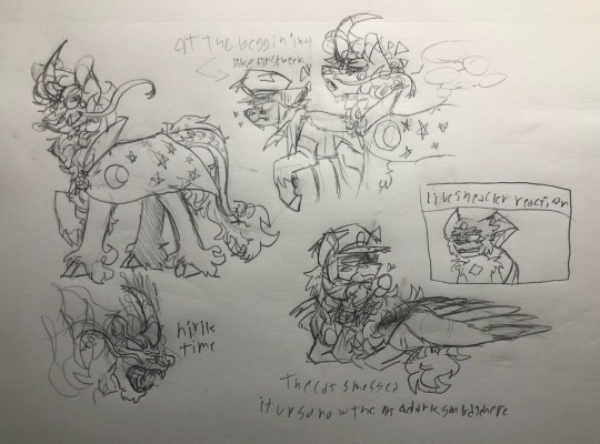
I keep forgetting to post this but. Kirin melli ft some highlandshipping bc they live in my head rent free
#warden melli#subway boss ingo#highlandsshipping#i based Nellis design off of Japanese kirins!! and I made them look a bit more draconic#*melli. god I hate autocorrect but I don’t wanna turn it off#Theres also a bit of a Moon motif goin on in their design bc I think it would be funny if in this au they were somehow trixies ancestor#anyways ingo is just a very scruffy modern day Pegasus when they get sent to hisui#i think ab this au a lot honestly#anyways idk if my horse anatomy is better in this or not. I can never tell
65 notes
·
View notes
Note
First off, I love your Butch Hartman video I can never stop using it as background noise when I'm in the middle of drawing anything and it's why I followed your tumblr. Second, I wanted to ask about detailed character designs cause I want to to do more mechanical/robotic kinds of characters but it seems to clash hard with basic character design philosophy. How do I figure out what to and what not to include when it comes to designing robotic characters somewhere between cartoony and detailed?
omg for real? that's actually pretty weird to think about LOL someone putting my video on in the background. Not weird in a bad way at all, just not something I’ve ever thought about! I'm flattered gjgjhgjh and glad you like it
as for the question, I'm honestly not SUPER sure? I honestly don't think I'm that great of a character designer lol, like I'm much better at catching what does and doesn't work in other pre-existing designs, but my own character designs are pretty boring and milquetoast imo lol
I'm especially bad with detailed character designs, but I do think a couple things can be helpful here:
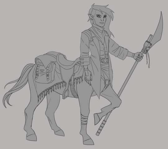
1) look at other mech/robot designs and see what they do! When I'm designing characters I almost ALWAYS look up references for inspiration (especially bc I'm unimaginative and bad at designing characters lmao, so the jumpstart is needed); a couple months ago I was playing around with designing a centaur girl, and I know I want to use her for a world that's post-apocalyptic, semi-fantastical/magical in nature (she's, y'know, a centaur, and characters can use magic channeled through staves, so her weapon has to double as one), and takes place in the desert. I also had like..... sad goth cowboy brainrot because I'd been listening to a lot of Lord Huron's Long Lost album lmao
So I googled a shitload of those words, alone and in combination, to see what other folks had done for similar ideas! I also had to look up images of horses bc I'd never drawn horse anatomy before, and also had to look up how saddles worked, bc my centaur girl is saddled up for her non-centaur girlfriend to hitch a ride lol. And then I stole borrowed all those ideas, and this is what popped out:

Is she, yknow, the BEST?????? Idk probably not. But I like how she turned out, and she wouldn't have turned out nearly as okay-looking if I hadn't looked up shitloads of references for what other people did and used that as inspiration!
Anyway. uh. not to just like shove my art and personal anecdotes in your face, but I'm not very coherent right now lol, I apologize. I hope I'm at least illustrating my point okay
BASICALLY UH, look at a shitload of other folks' art and see what they did. There is no shame as an artist in stealing like, aspects and little pieces of other designs and ideas, so long as you're not like, plagiarizing an entire fuckin character and/or idea and passing it off as your own. Take inspiration and details and ideas, and then put your own imagination to work
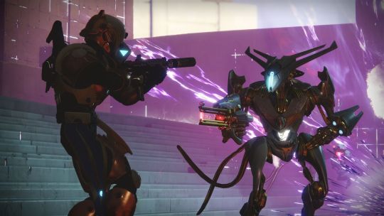
2) I think even in detailed character designs, more fundamental elements of character design can still apply! Even if a character is heavily detailed, you can still use value, color, and other elements to pull attention to areas of a character you want the eye to focus on (usually things like face and hands). I think a really neat example of this is the Vex from Destiny

The Vex (on the right lol) are mechanical enemies, so, a little confusing to parse at first glance even though they're humanoid. Their weakpoint is also NOT their head, as you might expect from a humanoid enemy, but rather (usually) their stomach. Thus, they're designed so that their stomach glows a very eye-catching and easy-to-aim-at warm white color, while the rest of their glowy bits are more subdued (usually moreso than in this picture) and cooler in color. The rest of their design, while very detailed and VERY neat, is pretty monochrome and dark so as not to distract from the Big Glowy Weakpoint
ofc, not every character design is going to want to emphasize a weakpoint lmao, but I think the idea is still sound and easily transferable. If your entire character is detailed, and especially if you're going with more of an alien/nonhumanoid shape, value and color are really useful ways of pulling attention to areas that you want to bring attention to
Not to pick on Butch Hartman again lmao, but since it was my BH video that brought you here, and it's SO easy to use him as an example..........

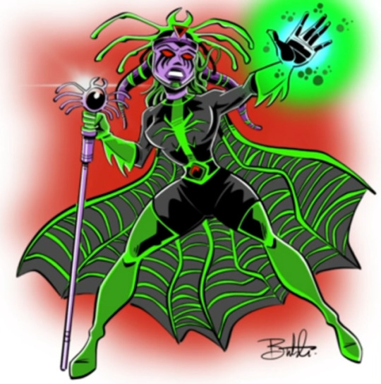
Look at her again........ Misery Vex (I just realized we have a theme going with this word) really isn't a detailed character design. She has...... a lot going on? But she's not.... SUPER detailed. Even simple character designs can be dumpster fires when the person designing them doesn't know what the fuck they're doing lol
The problem with Misery Vex isn't that she's highly detailed, it's that Butch doesn't understand how to lead the eye. Everything is the same value, some of the details that she DOES have don't add anything to the design (functionally, artistically, or to tell us anything about her as a character), the other details are extremely on-the-nose (like, we get it, she's a spider). Hyper-limited color pallets CAN work, but it doesn't work here at all because of all the other problems
And again, like I said in my video, the only place he DIDN'T add any sort of detail of any kind, in an otherwise highly-detailed piece, is her crotch, so the eye kind of automatically defaults to resting there. It’s a problem of not understanding how to use design principles to lead the eye
And the problem is that this isn't easily fixable lol. like, the ENTIRE design has to be reimagined to make it work. Trying to fix one aspect, like the overly obvious spider imagery, just makes the bad color pallet stand out more. Trying to fix the values just makes the extraneous details look weird and makes the colors muddy
So it’s not that the problem is Misery Vex being highly detailed, it's that her design is flawed in a VERY fundamental way. In many, many fundamental ways
To uhhhhhhhhhh... get back on point lol......... I think, again, looking at what other artists/shows/games/etc have done for mechs/robotic characters and asking whether you think they're effective designs, and whether you think they're aesthetically pleasant, and why or why not. What is your eye drawn to when you look at it? Do they do anything neat or interesting to draw your eye? Are they easy to parse despite their detail, or are they just a jumbled mess that your eye jumps all over, and if the latter, what would you have done differently to focus the design?
TL;DR I think that fundamental character design principles (shape, silhouette, color, value, probably others that I'm forgetting) can still be SUPER useful to keep in mind even when creating heavily detailed characters, you just might have to shift how you think about them, if that makes sense!
(Also again, thank u sm for the kind words and I'm glad you enjoyed the video)
(also also if anyone better at character design than me wants to chime in in the notes or reblogs, absolutely feel free to go buckwild)
#I hope this makes sense lol I'm so sorry#this is about the best ur gonna get out of me rn#skella answers#long post#anonymous#sorry everyone for making u look at misery vex again
16 notes
·
View notes