#art wip
Text
Who wants a sneak peek? 🫣
Edit: you can see it finished here!
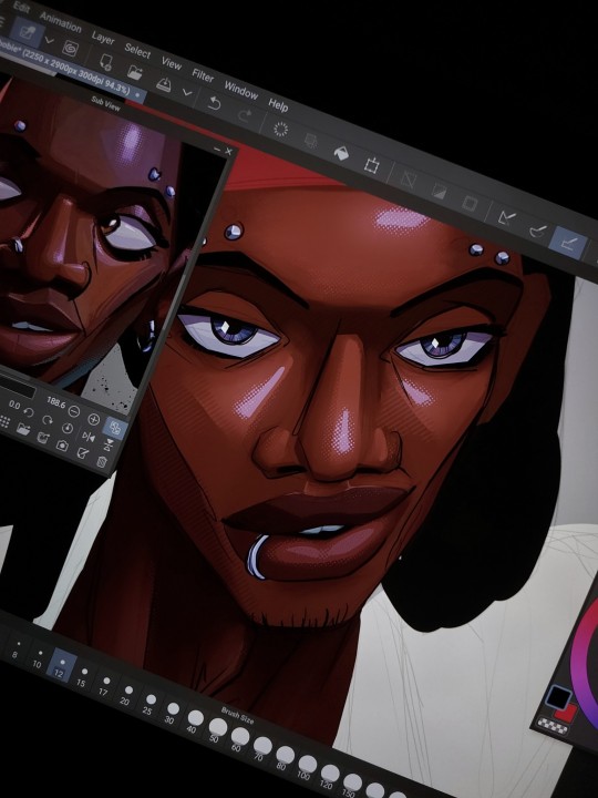
I've been having waaaay too much fun drawing him, hihihi. Sorry not sorry.
#hobie brown#spider punk#drawing#hobie spiderverse#spiderverse fanart#across the spiderverse#atsv#bdas fanart#bdas#work in progress#wip#art wip#between the devil and the sea#bleak posting#I LOVE ART OH MY GOD#spoiler i guess#i love him so much#loml
256 notes
·
View notes
Text

something bloody hot is going on here 👁👄👁
#uh oh#hades game#hades#hades 2#hades supergiant#ares x aphrodite#aphrodite x ares#mystuff#art wip#hades spoilers#ares#aphrodite#aphrodite areia#tw blood
247 notes
·
View notes
Text
Lovebirds
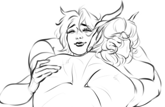

So... I made Dove (my newest Tav) to romance Rolan, because I totally forgot that he's not romanceable in game. BUT! I won't waste the potential.
Ship is called Rove and I rove them ♥
#sketch#art wip#rolan#bg3 rolan#rolan bg3#holy rolan empire#rolan x tav#tav x rolan#bg3#baldurs gate fanart#freckles
209 notes
·
View notes
Text
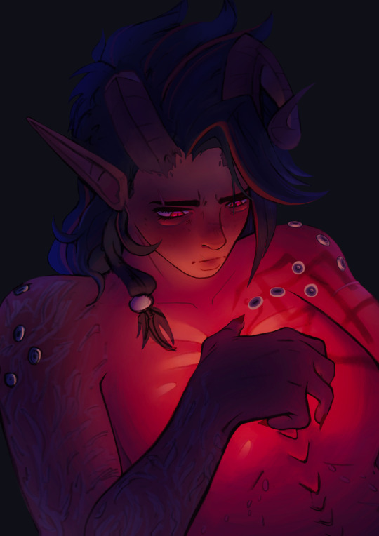
can i offer you a wip in these trying times 🤲
#bg3#baldur's gate 3#karlach#baldurs gate karlach#bg3 karlach#digital art#digital arwork#wip#art wip
171 notes
·
View notes
Text
In art, the hand can never execute anything higher than the heart can imagine.
#art#nail art#my art#my art <3#my art stuff#m art#digital art#art nude#art history#art tag#art wip#art commisions
147 notes
·
View notes
Text

hey guys look it's Tessa!!!! nothing strange about her for sure!!
140 notes
·
View notes
Text

Here, a doodle that will not be finished anytime soon
But this will also be me manifesting the whole
“It’s cold at night but the ghoul is warm bc radiation”
#my art#vaultghoul#lucy maclean#cooper howard#fallout tv series#art wip#I need to find some refs for coopers clothes sans jacket#also thanks to all the love on the previous pieces I’ve posted
146 notes
·
View notes
Text
I’m NOT a comic artist but, fuck, this is FUN… (sneak peek) 👀

#bg3#baldur's gate 3#bg3 fanart#fanart#astarion#karlach#astarion x karlach#karlach x astarion#hellspawn#starlach#wip#art wip#bg3 comic
113 notes
·
View notes
Text
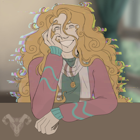
It’s Michael again! I wasn’t happy with the face so I’m leaving it as is for now :)
#tma micheal distortion#tma micheal shelly#tma distortion#tma podcast#tma fanart#michael shelley#the magnus archive fanart#the magnus archives#art wip#wip
111 notes
·
View notes
Text

The star of every Dragon Heist campaign
#art tag#personal art#dnd#dungeons and dragons#jarlaxle baenre#drow#forgotten realms#legend of drizzt#waterdeep dragon heist#art wip#drizzt do'urden#bregan d'aerthe
82 notes
·
View notes
Text
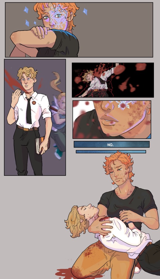
The cleric mortality rate in fantasy high is impressive
#dimension 20#d20#fantasy high#fhjy spoilers#fhjy#kristen applebees#my art#scribbles#I meant to draw a background#but this was 5 different drawings that I didn’t like#so like a masochist I combined them#buddy dawn#art wip
87 notes
·
View notes
Text

Astarion is just—-
#my art#my artwork#baldurs gate 3#bg3 fanart#bg3#bg3 art#baldurs gate fanart#art wip#baldurs gate 3 fanart#astarion ancunin#bg3 tav x astarion#durge x astarion#bg3 astarion#baldurs gate astarion#astarion#tav x astarion#bg3 tav
73 notes
·
View notes
Text
wip
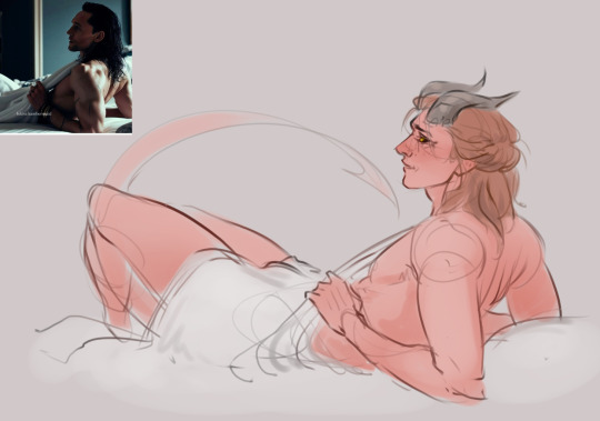
#sketch#baldurs gate fanart#art wip#bg3#bg3 rolan#rolan bg3#rolan#holy rolan empire#hot rolan#in progr#work in progress
165 notes
·
View notes
Note
Hi! I was looking at some of your painterly stuff, and I am in awe of the emotion, softness, and texture of the pieces. I wanted to ask what your general process of making painterly artwork is? Do you freehand without a sketch, how long it takes you to finish a piece like that, how you utilize layering, etc!
You are, of course, not obligated to share about your process or answer questions! If these questions are too invasive on your work, I completely understand. Thank you!
My process for those particular pieces is super loose! I try to use art fights as an excuse to try new color combos and try to get fast and comfy with painting bc I rarely do it it any more. But basically it looks like this!
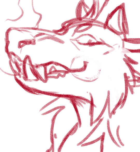
Loose sketch, I think this was the second or third sketch that I thought looked the best :)

2. I normally start with the complementary color to the character's main color (which was red here) unless I have a specific lighting goal or color palette in mind

3. I block in colors under the sketch layer! In this case I was just picking whatever colors but if I'm not feeling too confident I do color pick from photos or palettes I find on google images.

4. My emotional support overlay layer, of course <3. Not much thought process here, just trying to make it look good + more contrasty!
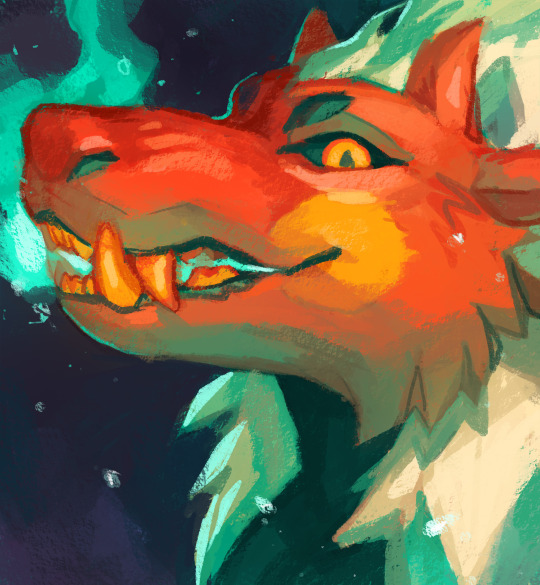
5. Then I make a layer on top of the sketch and just go ham! Try to separate the light and shadow, detail the teeth and stuff. I start with big blendy brushes and then scale down to smaller brushes towards the end.

All of my art fights take like 45 min-3 hrs (I definitely struggle on people faces so much). I think this one took a bit over an hour, which is where most of them fall! The one below was closer to 3, you can see I used a second sketch layer and did a lot of tweaks.
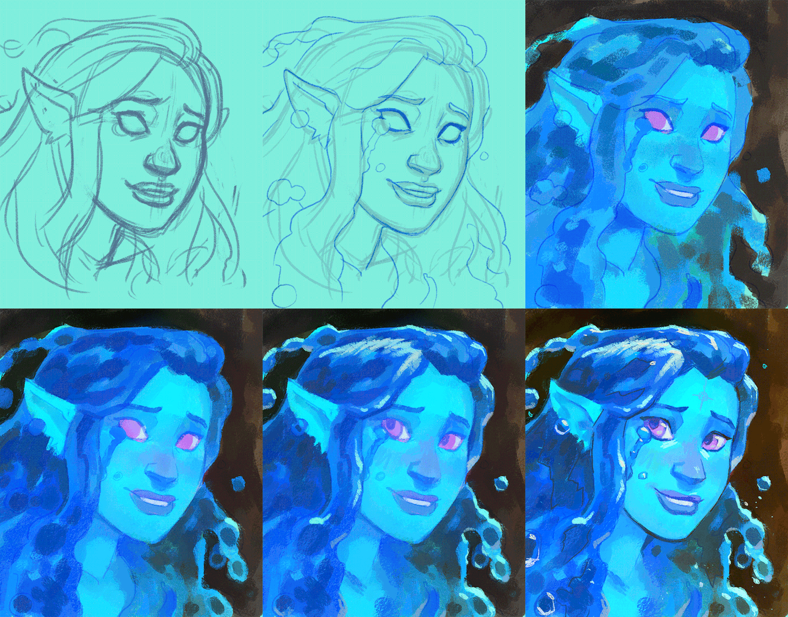
And finally, especially if you're focused on improving your skills, always collect inspiration pictures from artists who you want to emulate! My art fights draw LOADS of inspiration from @ikrutt + @polararts for example. I hope this gives you some insight to my process! As always, if you want to fuck with my brushes msg me, I can email you them :)
124 notes
·
View notes
Text

Our dear druid is looking lovingly as someone special :3, is it Tav? is it Astarion? Both? anyone else? who do you think it should be?
Leave a comment if you wanne help decide
i have sooooo many wips that never go beyond the sketch fase :/ i don't get to rave about self indulgent art with friends these days. I hope that others can enjoy a bit while i suffer under the stress of deadlines :p
#baldurs gate 3#bg3 fanart#halsin#art#fanart#halstarion#halsin x astarion#halsin x tav#bg3 art#art wip#artvote
66 notes
·
View notes
Text
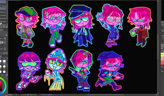
So I got 1 more slot for one more harold au design but I out of idea right now. I didn't change the top right one design, no harold is a waterbender what are you talking about? bloodbender? hell naw he only know basic healing and some cool waterbending moves...
#fanart#art#tdi fanart#total drama#tdi#td harold#harold mcgrady#art wip#I think I accidentally made that one harold into a twink
76 notes
·
View notes