#believe it or not there are green and blue overlays in here!
Text

Rumor has it, it was this lass's birthday yesterday!
Belarus | Belgium | Czechia | Hungary | Liechtenstein | Monaco | Seychelles | Taiwan | Ukraine | Vietnam
#her color palette is SO very pink..... so pink#everything here is tinted slightly pink it's like she was cast to be in the Barbie movie#believe it or not there are green and blue overlays in here!#if anyone's interested maybe i'll post the timelapse at some point#anyway! miss monaco! i hate drawing braided hair apparently!#i wanted her to still look a little youthful even if she's a step into her 20s so hence the baby face#hetalia#hws monaco#aph monaco#floralcrematorium art
100 notes
·
View notes
Note
drabble challenge - 39
“What color do you like better?” Satine knows that Christian is the absolute last person to ask this question to.
His dubious recollection of whether or not her eyes were green or blue leads her to believe that his grasp on color may not be the best.
She holds up a red slip dress, this one falls about midthigh and the middle is a light red mesh overlay, and the other is a dark navy one with a deep deep back. She likes the red against her complexion, it’s been a staple color in her wardrobe since she realized how good it looks on her. But she likes the feel of her long hair brushing against her bare back when she’s out in public, and the blue goes with her blue eyes.
“They both look good,” he says, proving her earlier thought of him being the last person to ask this to.
“But which one do you like better?” She asks, as that had been her question. She knew they both looked good and both looked good on her, that’s why she owned them.
“That one,” he points at the navy one. “You like your hair against your back.”
She grins at that, stupidly and without being able to help it. It always catches her off guard when he calls out specific details about her like that. No one else ever has. Unless you count them needling her weaknesses. “And?”
“And,” he reaches over, his hand pressed against the small of her back. “I like holding my hand here when you wear it.”
She rewards him with a kiss. She will love him forever, even if he’s hopeless about color.
7 notes
·
View notes
Note
Hiiiii! I love your art and I wondered how you did that aberration filter on your horrornatural zine artwork. It looks amazing!
Thank you so much! 🥰 I'm happy you like it!
Basically I cheated my way around having to do it manually by using the Procreate filter thingy, otherwise it's basically just a matter of separating the red, green and blue channels of your artwork and overlaying them on top of each other until you're satisfied with the result!
Here's a super quick tutorial for Photoshop, I believe:
I find this video explains how it works very well, if you need more detailed instructions (Clip Studio Paint has a few extra steps included to extract the channels):
youtube
10 notes
·
View notes
Photo

sucks to be an optimist
[ID: a large digital drawing of the artists courier six, and arcade gannon from fallout new vegas. to the left is courier six. courier six is a short, white person with long blond hair, dark brown roots, and a small mustache. he is wearing a pair of broken orange goggles on his head, a dark leather jacket with the transgender pride flag stitched onto her left arm, and a bright green brontosaurus to on the right sleeve. she is also wearing a white t shirt with a large, red bottle on it. he is talking to arcade and looks neutral. arcade is to the right of her, and also looks neutral. the background is of the empty mojave wasteland. the text reads, in order, “(courier) hey arcade?” “(arcade) yes?” “(courier) do you think things turn out alright? like in a parallel universe?”
the next 9 panels are much smaller than the previous one, and all show various different endings for arcade. the first one shows a hand holding a bloody scalpel, and is heavily tinted in red. the second displays an arm on a cross, and is tinted in orange. the third shows arcades face replaced with a bright yellow starburst sort of shape, and is heavily overlayed in yellow. the second row shows a wanted poster for arcade gannon. the words are cut off at various points, but it reads, “WANTED DEAD OR AL. PLEASE GO TO THE NEAREST. IF YOU BELIEVE TO HAVE IN. REWARD: 500 CAPS.” the image is heavily tinted in green. the second image in row 2 is of arcade speaking in front of a chalkboard. he has his hand held towards his heart and is looking forward. the final image in row 2 is of arcade wearing his fathers enclave armor. his helmet is removed, and he has a black eye and a bloody nose. the left side of his face is covered up by a light blue starburst with cracks in it. he looks like a mix of anger and fear, and is heavily tinted in a light blue. the first image in the third row is of a hand holding arcades plasma defender next to a pool of blood. the image is heavily tinted in a dark blue. the second image shows the strip in the background and arcade in front of it. he is looking back towards it and looks sad. the image is heavily tinted in purple. the final panel is of the old mormon fort, and is heavily tinted in a bright pink.
the final image is similar to the first one, with courier six and arcade walking in the mojave wasteland. arcade is looking towards courier six and saying “i’d like to think so. why do you ask?” he looks neutral. courier six responds, “just thinking.” and looks happy.]
WOO THAT WAS A LOT. heres some of the courier six i’m working on aka blair under the cut! truly the worlds weirdest girlboy


#RAHHHGHHHH I FINISHED THIS!!!#thought of this super late last night. woke up. drew for around 6 hours. and made this#anyways yeah i was thinking about the way arcade has easily the strongest moral compass and a really hopeful view on the future#and has easily some of the worst endings#and then i made this. so yeah.#also! there isn't much dialogue but if it feels weird at all thats because i barley write!#i wanted to convey the contrast of arcade vs his endings and i feel like i did that just. not with words#fnv#fallout new vegas#courier six#arcade gannon#fallout#joeys art#cw blood#blood#cw eyestrain#eyestrain#?just in case
35 notes
·
View notes
Text

Map of Skyrim to guide me in my Skyrim OC(Kahana)'s fanfic I'll be writing!
I downloaded the high quality paper map mod for Skyrim to use, but since it didn't have Skyrim's borders (it marked those mountains outside of it as in Skyrim, following the game's map), so i overlayed another map of skyrim and traced over it. I kept all the mountains and stuff from the mod because it looks awesome
With the online Skyrim interactive map i pinpointed all map markers i believed to be necessary (towns, forts and resources)

And here is the civil war map! For the story I'll be focusing on three main arcs: the Civil War, aftermath and resitance, and a future Thalmor invasion of Skyrim. And alongside all of it the Dragon plotline(but altered from the game)
In Blue is obviously the Stormcloaks (Falkreath included because from my understanding the old pro-stormcloak Jarl is kicked from power, itll happen at a later point instead)
In Red obviously the Imperials (Whiterun starts as Imperial instead of neutral)
In Green its the Orsimer strongholds (they're essentialy independent settlements from what i gathered)
In Brown its the Forsworn
In Yellow it's the Thalmor (the embassy and that fort you go to from the gray manes' quest)
And uncoloured it's the Grey Beards, who do not get involved in Skyrim's political affairs, and that vampire place from the Dawnguard dlc (thats not their actual location but it wasnt on the map so for simplicity i just put it above Dawnstar lol. ill be altering that plotline severely too, and that location fits more)
2 notes
·
View notes
Note
hey so like. I’ve been sorta… studying?? Other artists’ styles, like especially ones that have like… a good grasp on color expression and stuff and I’ve been looking at your comics and I was wondering if you have any tips on working with color and contrast? Because I really like how evocative (is that the right word) the colors were in some recent AFR pages
been sitting on this ask (and well, every ask I ever receive, i like to answer on desktop and i'm never on desktop on this account. oops.)
well, for the most recent pages idk if you meant the one where Asriel has a panic attack and the colors changed in every page (warning for eyestrain!) or the consequential fire afterwards.
panic attack scene:
Honestly I just used some pre-made gradient maps asldfsadl but usually just to enhance the colors I already put down? hm. so my logic is "i want one color to be bright and as i color pick more to the opposite side (complimentary) i'd make it less saturated. so, if i pick Cyan Blue as the brightest color, then orange would be closer to grey. Purple/Pink would be a halfway point. More likely leaning towards saturation than grey.
I spam overlays and a color layer of solid color sometimes to balance things. I like purple, orange or a mid sky-blue as these colors. But yeah, throwing a graident map and having it as an overlay or just plain normal at 30% is a great way to balance things quickly.
I also shade with one color (yellow, orange, on the lighter scale.) and shade with the complimentary color. (blue-ish purple). tho, if you're using artifical lights ofc the light source color would be different. but yeah:
shadows first: usually light source is from above but can be different depending on context. use your shadow color and (personally i use the default flat painting oil brush) to shade in and keep it at multiple 30-50% depending on how harsh the shadows need to be. (painted lightly typically)
light layers -> glow dodge + duplicate at additve at 10%-30% range. Nothing too overblown. I like to select the shadow layer and then use ctrl-i to inverse the selection and then color the lights. tho, i'll sometimes add a soft paint spray without using that selection. because colors aren't fully cut outs, things mix and bounce around u know
bedroom fire scene
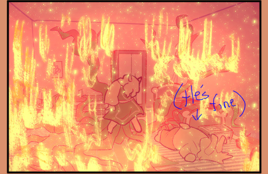
same logic but i actually forgot to add shadows kept the pallet simple. the lights are harsher and the fire is drawn above the lighting layers so they're not affected.
i believe i had a general multiply layer of a orange-red gradient and then used a gradient map with harsh contrasting colors to make the darker colors more "green." as for the actual colors, i kept the pallet extra simple!
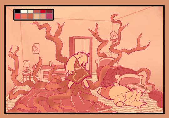
Literally just used 6 colors on repeat (maybe some lighter tones here and there) it kept the coloring process waaay more simple and keeps the whole pallet monochrome and pretty~
36 notes
·
View notes
Text
@teamfortresstwo (throws Salus and shimmer at you then runs away) umm. The 👍
General warning for medical stuff, slight mental health and violence discussion, and sort of alcohol technically but also worse
A clear thought through a haze of consciousness; the place is surprisingly neat.
Blue-green tiles softly line what feels like a kitchen. Maybe a kitchen, it’s quite open plan, so not exactly easy to tell. Probably a kitchen. The countertop is clearly wood or plastic, but the deceptive marble-style overlay paints an aura of sophistication. Whoever lives here has their shit together.
It’s perfectly neat, save for a toppled box, as if it was pulled from the cupboard in a hurry. Huh. A first aid kit. Well, can’t say that fits the interior decorating choices fully. Maybe it’s to make a statement?
What statement could it possibly be making?
Shimmer shakes off the question. Modern art can be fascinating. Learn some creativity.
The statement it’s making is that you raided the kitchen for the bottle in your hand right now.
Fuck. Right. That. Shimmer hadn’t quite factored that in, they admitted. They knew she wasn’t a drinker, so the medical alcohol had had to do. They weren’t going to find much better. It burnt their mouth. Badly. Felt like drinking poison. Wonder why. Shut up, they think, I’m trying to make it hurt less.
The bottle taps down on the table top unceremoniously as it’s dropped from shaky hands. They shift to pick it up, leaning to the side from their slumped perch on the counter. Muscles tense and the shaking worsens; the sting gets much worse as they move.
Why is the counter warm? It’s late, maybe mid afternoon, so despite the blurred light shuddering through the window, it can’t be the sun. Gold rays of sunlight on your face. It’s warm. You’re so happy. It feels free, more than anything, more than-
Stop. Shimmer’s hand is covered in blood. Why was that on the counter? Is she ok? What happened? Don’t be stupid, someone thinks. It’s not her blood. It’s yours. You’re bleeding to death and you can still only think about alcohol.
No. No. I’m helping. The thought comes off more as a plea than a fact. Let them keep doing this. Let them keep breaking things, searching for a solution. The answer is at the bottom of this next glass, they promise.
When did they even get here, actually? Why are they in Salus’ kitchen, barely conscious, half blind? Where is Salus? Are they alright? What happened to fae?
They’re fine. You aren’t. You stumbled here after the fight. You need stitches, and you’re not sober enough to even try. Plus, that bandage over your eye isn’t holding up well, and you almost certainly need antibiotics before you need to tear it out fully. Lyssa did her best but she’s certainly not a medical professional. Nor a therapist, so keep that in mind.
She wanted to help, shimmer snaps back - the thought clearly wasn’t wanted - and a glare settles over their face, I told her I didn’t need help.
You’d tell anyone that. She didn’t believe it anymore. Maybe soon no one will.
Shimmer doesn’t care anymore, and the environment fizzles out around them. The sensations shift, the gash across their left of their abdomen now producing a dull ache, not a sharp stab. Maybe the alcohol is finally kicking in, they think in passing, as they press the back of their head against the cold window. It’s grounding them. They wish it wouldn’t, they’d really rather not be aware they existed right now- but their neck begins to ache, and they don’t need more pain.
They don’t hear cars outside. They don’t hear the rustle of branches as the breeze tears through them. They don’t hear the door open, nor the footsteps, and not even the slight thud of a hand gripping a doorway in fear, shock, that thought of “Shit, why aren’t they moving?” crashing through someone’s nervous system.
They do hear the bag clatter to the floor, and slowly lift their head to face the familiar blurred figure, grabbing the bottle they’d dropped as they attempt to grin a reassuring mimic of “All good here!”
It categorically does not work.
They’re sure the blood must be seeping through the bandage over their eye by now, and as the torn side of their coat hangs off of the countertop, it’s clearly smudged with blood. Their grin is lopsided, and the whole right of their face burns.
Quick, Shimmer thinks, I need to make this seem more normal, before they panic.
A forced laugh, and it’s suddenly clear that it hurts Shimmer to speak, or even breathe properly, their voice shudders as they start to talk, but they hold the act of a joking tone surprisingly well,
“So doc, what’s wrong with me?”
“Shimmer were you fucking stabbed? What the fuck happened, please tell me you didn’t get into some stupid fight on purpose?”
Before Shimmer can even open their mouth to object, Salus is searching through the first aid kit, which is still scattered across the counter. Fae grabs what remains of the medical alcohol, and frowns at how much has spilled, then at Shimmer, who looks away guiltily.
Is this all feeling a little more blurry than before? Are the lines hazy now? Did it always look like that?
Disinfectant pours across their chest, and it feels like ice water; is that the chill of chemicals or is this it? A deep breath, that’s chemicals for sure, eroding their lungs. The pain is white hot, nerve endings must be exposed, or something like that. Who knows, Shimmer thinks, I’m not a doctor. No curtain call just yet, time for the intermission; it fades to black.
Salus sits on a thin carpet with her legs crossed, as she sews up the torn coat with surgical precision, one loop after another, cautious not to catch their hands with the needle.
They sit parallel to the unconscious form slumped across the kitchen floor, with a fresh bandage across their eye, and a t-shirt a few sizes too big for them. Their neck is supported by a cushion, but Salus had been worried that too much movement would break the stitches, so other than being dragged down from the countertop, they were in the same room as before.
Salus had no reason to doubt the stitches would hold up fine, a lot of practice went into making sure they would, but a person can seem so fragile like that, and it’s not easy to think they’ll be alright.
They allow themself to sink back into the repetitive process of the neat stitches. They should be fine now. Both of them should be, for now.
Quite mutterings float from parallel to her, but Salus does not look up, a disruption wouldn’t help them recover, and sleep talking would be their own business, their own memories. That’s not for Salus to listen to. Yet the mutterings escalate slowly, till they’re a panicked yet disoriented mumble of words,
“No, no, you can’t sew it- it’s a specific fabric, the stitches would burn and come apart, I don’t want you to waste hard work on-”
“Don’t worry about your precious coat, Shimmer. It’s fine. You think I’d forget how much you ramble on about it? I took it all into account. Go back to sleep.”
Salus’ tone is harsh, but fae smiles to herself, and Shimmer catches this, shifting to sit and watch quietly, only tilting their head curiously to see the material.
“It’s metal thread on the outside and a normal wool on the inside layers, and if that stitch is melting, them it’s hot enough that you would be too; so don’t worry about it. You can go back to standing in burning buildings like a moron, once that cut recovers,” while not indicating much before, her tone slips, leaning to worried, “It was a really nasty injury. So was your eye. I don’t think either will fully recover for a while.”
Shimmer is silent. They know what everyone thinks, stupid Shimmer Usotsuki, playing with knives again. Salus doesn’t think that yet, she believed them. Shimmer won’t let her think that.
Salus slowly places the needle and thread down in a small box, and hands the coat to Shimmer, who gestures their thanks with a half smile from the non-injured side of their face, as they wrap the coat around their shoulders, seeming to sink into it. Small rays of light flicker underneath blinds, and the warm light tints the cool decor. The world is not still, but full of life and sound, but the two are disconnected from it as they rest in the pause.
#I don’t know how to write them as comfortable or even happy maybe#so it might seem a bit weirdly paced#my posts dont forget this tag bro.#theproject.#god this took forever I think
3 notes
·
View notes
Text
About The Little Mermaid (2023) 3D
Okaaay.. I'll be honest with you.. I didn't plan to watch this movie on the cinema after I watched the trailer (coz it looks so dark and not really that colorful)
BUT!!
Since Ariel is one of my favorite Disney Princess during my childhood and somehow I saw that my nearby theater is playing this movie in 3D.. I was like...well let's try~
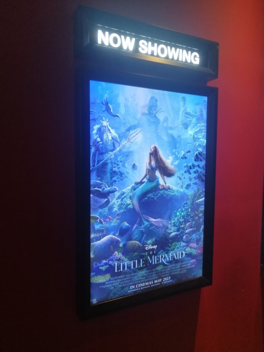
And so here I am, writing this thoughts after watched the movie just now..
Spoilery
.
.
.
.
.
Several things that I loves..
-The 3D pretty good
- Under the Sea songs!! 💕💕
- The glowing animations
- I love Halle Bailey as Ariel..she looks so pretty, her voice SUPER BEAUTIFUL!!! Aaand love her acting especially during the voiceless Ariel part..haha. She's so witty and her wordless banter with Eric so good!
- I cried when Eric tried to help Max the dog.. always difficult to not being emotional when cute animals on screen
- I love how they add more similarities story between Ariel and Eric.. how they both love adventuring, learn new things, exploring the world.... and COLLECTING TRINKETS!! ❤️
- Sebastian here still look like an RL crab but his eyes a bit bigger so it's more cartooney and his VA acting great makes it funny!
- I love how they add new songs here~ pretty catchy too~
- love when Ariel in the market place and curiously look at many things..but my favorite was when she got a flower and just ate it..😂
.
.
What I dislikes (long rants)...
- Lighting and colors blending.
I can't believe what I hate during the trailer still that apparent even inside the dark cinema room...
1. Lighting, WHERE'S the LIGHTING?!?! OMG WHY THIS MOVIE SOOOO DARK?? I want to see the details underwater...but I CAN'T it's so dark! What's going on? i cannot really see Ursula's lair.. or her expression and also Ariel expression and Eric expression or anyone because during the night and underwater scenes it's super...ULTRA DARK?? Why Disney? WHY didn't you add lighting and colors under the sea?? It's a fantasy movie.. why?????
It's actually reminded me on the Lion King live action..when Scar's sing and there's no changes in mood and colors... Well okay that part were an extreme example, Little Mermaid actually add more colors, but the lighting was not enough. It becoming dulls unfortunately.. especially because I wore the 3D glasses( which made it even darker)..so definitely not helping...
I was imagining if the underwater scenes using Moana colorschemes.. I think it will be more vivid and beautiful...
Oh actually the darkness also bothered me in both Eric's and Ariel's treasures rooms. I wish the illumination of candles make all the metals shining on Eric's room, while sunshines helps Ariel's cave glittering... Unfortunately both got dull lighting treatment, thus it kinda looks like abandoned place actually 🥲
2. Colors blending. Daylight on the land? Great! nothing to worry about.. but under the sea during daylight? Hmm...what can I say. it's colorful but somehow not blended naturally... it's really weird.. they want to make a colorful coral etc but somehow they seems lacking in researching the color of the underwater sea? Why all of the sea color must be that one blue tone? Why not greenish blue? Why not even pinkish during sunset or exaggerated yellowish when there's the fireworks?
why Disney live action so coward and didn't try to...play with the undertone? Why it needs to be so clear like that under the sea? Why not giving a bit of red overlay? Or green or orange or purple tint? Why not making all of the colors more evenly with soft light effect? Aaaa... I was so sad...yeah I know, that just my expectations.
However, those 2 things affected Ariel too.. she looks even more super pretty when there's slight reddish light from the fireworks above..
but why her hair must be on that color? Why not a bit darker red? But actually her current hair will still gonna be more beautiful IF LIGHTING and COLOR BLENDING WORK!! Oh why Disney....
About the story..
Still similar with the original with several difference that I noticed:
- Eric is not a prince by bloodline, but no further story on who he was before rescued from shipwreck and being adopted by the current queen.
- All Ariel's sisters are ruler from the 6 seas, Ariel and her Father in the 7th sea.. I wonder where tho? In the cartoon it's in Atlantica.. but in live action it should be near Caspian sea, considering Eric said(?) His kingdom near this sea..
- Ariel's mom died because of human.. I wonder if this based on One Piece story..lol (coz in cartoon I belive her mom dies from sickness?)
- The seagull is female..and it voiced by Awkwafina lol
- the Ursula contract not signed on paper but using blood and she add more difficulty as she made Ariel not only lose her voice but also cannot remember her mission to kiss the prince within 3 days.. (but thanks to her friend she almost made it lol)
- The real princess in this movie was Prince Eric...hahaha, he has animal sidekick, kind and caring to his people and have been saved by Ariel 3 times! (During the beginning scenes where he drowned, when he almost cursed forever by Vanessa and when he almost falling during the last battle scene with Ursula). Interestingly, Ariel was the one who stabbed Ursula using the ship, so... Eric here more like Tuxedo Mask from the Sailor Moon.. 😂 (he didn't really do anything)
TLDR. I Love the new songs in this movie, love Helle's Ariel voice... but not a fan for the lighting and color blending direction...
Around 7.5/10 for me..
(could be 9/10 if the lighting and coloring were good)
PS. I read that on IMAX or cinemas on other countries, the movie looks bright and colorful... So.. you know what? Congratulations for you who watched on a very good cinema.. I envy you... 🥲🥲
5 notes
·
View notes
Text
Week 3 SDL
x2 Composite Images
We were given the task to create 2 images using 3 or more images from our class stock library so here are the 2 that I made
Image 1

I have used this horizon by Clara and put 2 animals in the window (Penguin by Clara and Cow by Mikaela) and did some recolouring of the cow and penguin to make it look like we are looking at them through the window).

Image 2

I have used this horizon scene by Joel and replaces the sky with the same sky from Clara's horizon photograph and then also added a sign to the top of the main building in the foreground with a sign from Joel as well. (I of course did some recolouring of everything to make it cohesive).

Photographer Analysis - Propelthemoon (Ileah)
Photo 1
instagram
Composition - The colours in this photograph are very very purple (or warm-toned cool colours - like blue and green). The layout has the mermaid at the bottom of the photograph, lying on the pebbles, in the foreground. Then there is the beach and bank in the background to show off the scenery of the area. There seems to be a hazy overlay over the entire photograph to make it appear more dreamy. I believe the moon may have been digitally added, however it does appear the same in other photographs in the series so I am unsure.
Concept - a beached mermaid
Photo 2
instagram
Composition - This is a beautiful photograph consisting of lovely neutral colours (beige and hints of green. The model is standing in a shallow body of water reading some water. If you click to the next slide, it becomes clear that the model was digitally placed in the body of water as well as having her skirt extended in the water. There appears to be a hazy filter over the entire image to create a dreamy effect like the first example.
Concept - perhaps the fairy is reading and has been transported to the world in her story.
Photo 3
instagram
Composition - The two models in the foreground holding their wands out. The entire image is distinctly blue, which has been purposefully edited to look this way. If you click on the next image in the slides, it is clear that the entire building in the background has been photoshopped into the image and snow added to the air around the models. Plus the "magic" tips of the wands have been digitally added in post-production as well.
Concept - inspired by Beauxbatons Academy of Magic from Harry Potter there are 2 witches making magic from their wands.
Post-Photography, or are we past photography? By Andreia Alves De Oliveira
The article looks at "Post-Screen Culture" (which refers to the shift from traditional screens, like TVs and cinema, to interactive and immersive digital environments - like phones and computers. It refers to how screens now shape our experiences of art and communication) and impact our society.
The article argues that screens are now a central part of life, influencing how we see art, media, and reality. It suggests that the lines between different media and between the virtual and real worlds are becoming less clear. For example, billboards. They used to just be straight images that a company would have up for a certain period, but nowadays billboards can be electric so can change ads throughout the day and much more easily. Because of electric billboards, this has changed society's way of how we usually engage with our environment. Something that we would glance at on our commute has now become a source of entertainment while we drive. Watching to see what it'll change to next, like a game (and almost identical to how we interact with our social media screens). This shifts the role of the viewer from a passive observer to an active participant, altering how we perceive public spaces and interact with media in everyday life.
To expand on this, I think it’s interesting to discuss how electric billboards are part of a larger trend of screens becoming more interactive and dynamic in our lives. This trend goes beyond billboards to other areas of daily life, like digital signage in stores, interactive kiosks in public spaces, and even screens in our homes. This shift shows how we increasingly expect media to be engaging and constantly updating, which changes not just our environments but also our behaviour and how we consume information and entertainment. I also think this adds to our overconsumption culture, not only do we overconsume physical things, but art is also becoming fleeting. Creators feel like they need to create more than ever before just to stay relevant, making art feel rushed and easily forgotten. I think is where AI comes in, now AI is creating our art, because we (as people) just aren't fast enough to keep up with the demand.
What you see you don't see: Lisa Reihana's Digital Marae
This article offers a dual perspective on Lisa Reihana's art installation Digital Marae, blending a theoretical analysis with an affective response. The theoretical approach draws on Brian Massumi's political aesthetics, focusing on the processes of sensation and perception that occur when encountering art. This perspective suggests that Reihana's work, which combines Māori figures and European aesthetic elements, allows both Māori and non-Māori audiences to reimagine and deepen their connections to ancestry, family, and environment in the contemporary world.
Massumi's approach highlights that our perception of the world, including art, isn't fixed but shaped by our feelings. He explains how these perceptions are influenced by bigger social and political forces, giving them a deeper meaning.
Reihana's work is designed to trigger a range of emotional and physical responses. It blends the feel of sacred spaces with pop culture and the flashy visuals of capitalism. By using commercial photography techniques like digital manipulation and elaborate staging, Reihana taps into the look and feel of advertising and entertainment, making a point about the influence of capitalism on our lives. Reihana's semblance in her artwork creates a three-way relationship between the viewer, the space/environment, and a community of characters. This dynamic interaction invites the viewer to reflect on how semblance operates within these connections.
The article also goes through the concept of "semblance," which is about how we perceive things, involving both direct and indirect experiences that are influenced by feelings, time, and the broader social environment. Semblance affects our perception of time as it makes us aware of the past and the future in the present, allowing us to feel what it's like to see. There are two ways to witness the force of semblance:
Productive Resonance: This happens when we don't really see or feel the semblance itself but only notice what it creates alongside something else. It's like a one-sided relationship that drains the semblance of its full potential.
Resistance to Capture: The second way is when semblance resists being pinned down by outside influences, showing its independence and its ability to connect with all sorts of different things.
0 notes
Note
Hiya! Newbie artist here! Any tips on choosing the right colors for night and day like what you just posted? Like how do you choose the skin tones and such? I still use my character’s normal colors and it looks so wrong! Any advice is appreciated! XD
Okay!! Here's my tutorial-esque post!
(disclaimer: coloring is one of the skills I'm least confident in, lol)
There are two methods I think I'd recommend, so I'll drop them under the cut.
1. Using an art program's filters/color layers/color sliders!
This is probably the easiest way to match colors to backgrounds. Experiment with what looks best! I think purple overlay layers are quite good at harmonizing most colors, because purple is a good mix of both warm and cool colors. I don't like yellow or green overlay layers, because they tend to wash out cool or warm colors respectively.
2. Picking colors yourself!
I've gotten into this lately. I'm picky about colors, so it works well for me, but for this method to be helpful, you should probably know at least the basics of color theory. (There are lots of good resources to learn! It's not very scary at all if you just go for it.)
When you want your colors to match the background/time of day, you should think of which colors you want to stand out. Because my art is very stylized, the colors I pick are not always how things look in real life, they're just what I believe looks good.
For example, let's say the scene is a clear night under the full moon. All of the colors will be darker (unless something is glowing), but not as dark as they could be, thanks to the light of the moon. There is no stark contrast, because the light is natural. Blues, purples, and other cool colors can help sell the scene, so move all your colors toward cool on the color wheel. Yellows may become red-oranges, greens may become blue-cyans.
Another example! There is harsh yellow fluorescent lighting. So all the colors move toward yellow (blue to green, warm purple to red, and cool purple to blue). There is also more contrast (dark colors are darker, light colors are lighter). But, uh oh, I personally don't like yellow lighting! So I would move the colors closer to yellow-orange.
I tend to avoid shadows unless the scene demands it, and that could fill a whole 'nother post, so I won't cover it here. But you can ask if you'd like me to get into it!
#ask#anonymous#i'm talking tag!#I guess basically my advice is check out color theory lol. it's fun!#queue
0 notes
Text
trying to trace the way the sky in teyvat has transformed over the years.
example one. from: kokomi's character demo video.


"our ancestors once dwelled in the dark ocean depths. how must they have felt when they first gazed upon the starry sky?"
this is likely the sky the vishaps and seven sovereigns (the ancient dragons) saw when they first came to teyvat. this would then have to be the scenery before the arrival of the primordial one. it's likely that the stars in this scene are "real" stars (stars from like. outer space).
example two. from: book of esoteric revelations (fontaine quest)

I have a good feeling that this is what the sky looked like at least 500 years ago. before the cataclysm, before rhinedottir invited the rifthounds, etc. it might even be older than 500 years, since this location (or rather, the location where traveler spawns into when entering the book) connects to the inverted city, which dainsleif believes to be from a civilization older than khaenri'ah.
although the traveler saw a desolate place, canotila saw a beautiful world with gardens and sunflowers and golden butterflies. canotila was probably seeing the world as it was before. it's not certain if we're seeing the same sky as her, though.
so this could either be the abyssal sky, or a sky from before a past cataclysm (not necessarily the one from 500y ago; there could have been many cataclysms, especially considering how teyvat is its fourth samsara. cater also noted that great battles took place in the book). the timeline is a bit vague. I'll have to review the lore around the book of esoteric revelations (which is kinda a lot because they keep talking in metaphors). but I'm at least positive that this is from a time after the vishaps.
this also reminds me of the overlay we see in mona's ult. the stars in mona's ult are similar to those in kokomi's video as well.

example three. from: mona's mirage (minacious isle, golden apple archipelago. summertime oddysey event)

bringing this forward to the time of the archons.
minacious isle came from one of the mountains that venti razed and chucked into the sea. there is even a side quest in the first summer event where we lead a seelie from minacious isle to a court all the way back in mondstadt (somewhere around falcon coast; coincidentally, hexenzirkel's floating island in the sky is also found around falcon coast). the observatory from this island is also from mondstadt. mona's island allows the player to change the weather and the time.
so this was probably what the sky looked like approximately over 2600 years ago (around the time venti became archon and started terraforming mondstadt). there's still some hints of purple here, but it's starting to resemble the sky we usually see in the game. aside from the color, a slight difference can be seen in the size of the stars. some stars are noticeably bigger than others, whereas the size of the stars in the game are much more uniform. there's a parallax effect here that's not present in... the present. I wonder if this means "fate" hasn't been written into the stars yet.
bonus picture: the van gogh-esque starry sky from mona's domain.

example four: teyvat's current night sky. picture from mondstadt.


the color changes depending on the location, such as the very green sky that sometimes shows up in chenyu vale. but the "default" is usually a normal looking dark sky with some mixture of blue and teal (or whatever the anemo color is called). definitely not that purple anymore. as noted above, the size of the stars are a lot more uniform than in previous pictures.
one thing I find interesting is that the "milky way" (obviously it's not the milky way, but idk how to call it) in the sky always originates from north of the map. and by north, I mean our northeast, because teyvat is bonkers when it comes to cardinal directions and their true north is our northeast. but I digress. I just thought it's cool that you can still track the map's true north by looking up at the sky
usually when I'm outside mondstadt, I can track where the milky way comes from by looking for dragonspine lol. mondstadt is also known as the "crown of the north"
there are some other interesting variations, such as the pink sky from varanara, the spiral abyss, etc. but I mostly just wanted to track a "timeline" of how the sky changed. or I guess, how it was "fabricated" over time. fate is tied to the constellations/stars, so it's actually interesting to me how much the density and parallax (or lack thereof) of stars can vary depending on the scenery.

I also didn't make much of a distinction between what the sky of tevyat versus the abyss. it's possible that rather than "changing" the sky, the world was just flipped. and the progression we see here is us seeing the sky from the abyss and then falling down to see the sky from teyvat.
either way... really wish we could just get nahida, wanderer, mona, and albedo on a research team to get to the bottom of this.
0 notes
Text
Focused Research (Wider World Issues)
These are some of the most obvious issues that came to mind that I thought about some are big and some are small but here is what I thought about:
This isn't particularly an issue in the world but it could be conterversial or wrong in some countries- I am referring to the colour of luck as some countries believe the colour of luck is different for example in China they believe it is red and in India its orange and Thailand its yellow. So they might not understand why the character is green when leprechauns are supposed to be lucky as in their culture the leprechauns if they are supposed to be wearing a lucky colour should wear yellow, orange or red.
Source: Lucky Colours From Around The World | Mecca Bingo
Linking to this some countries won't know what a leprechaun is as they are less likely to know about Irish Mythology so they won't know what a leprechaun is and why it brings luck so if this game is played by people from the eastern world they might not understand what one is making it less accessible to them as they won't understand why the leprechaun wants to collect gold and why he dosen't like clovers. Although it would be recieved well with the western world as they understand what a leprechaun is and why it brings luck and the basis of the story behind them as events like St Patricks Day are big in mainly Ireland and USA and England and Scotland are less likely to celebrate St Patricks but they know what leprechauns are as we are the closest countries to Ireland and word of them has spread like with Scotland and the Loch Ness.
Another issue is that I am including alcahol in my game as a power up but I am choosing not to advertise the fact and call it Bitter Juice but people could still claim that it is alchaol so this can be quite contervesial with people as firstly it is banned in some religions like Islam, Jainisim, Sikhs and some Buddhists. Also I don't want to advertise it in a positive light to people who may suffer from drinking problems or to children as alcohol as being a good thing because it is addictive and can cause a lot of physical damage and dosen't help peoples mental health either and it is also a temptation which in religious groups you aren't allowed to give into as it is a sin. This is why I have decided to call it Bitter Juice so it is supposed to be alcohol but in disguise of a different name so it dosen't actually advertise the fact of alcohol so it should be okay for all these groups of people.
Another issue could be guns as I am thinking about using a gun power up in my game. Gun violence is obviously a big problem and we don't want to be showing children guns or violence so early on in their lives so they feel its a normality hence why there is PEGI restrictions but my game using a gun should be okay as it is fantasy violence as you are shooting clovers and the gun is not going to look like a real gun so it should be ok as a PEGI 12 and it shouldn't promote violence as it is all fantasy violence.
I suppose being colour blind could be an issue as my game uses a lot of colours especially green and their is a very common and specific strain of colourblindness which makes greens replaced with blues called tritanopia and I suppose people with complete colour blindness: monochromatisim would be affected but I cannot help that as they cannot see colour full stop so it dosen't really affect them whether it has colour or not as they cannot be helped to see colour at all. For the people have tritanopia I could give them an overlay but I will need to do further research to see what one they need.
0 notes
Text
Does nikon camera control pro 2 works with windows 8

#Does nikon camera control pro 2 works with windows 8 for mac
#Does nikon camera control pro 2 works with windows 8 update
#Does nikon camera control pro 2 works with windows 8 full
#Does nikon camera control pro 2 works with windows 8 pro
#Does nikon camera control pro 2 works with windows 8 mac
The following table shows the support for FoCal for Windows: Operating Systemĭownload FoCal 2.6 by logging in to the LMS at .uk. Not 100% Officially Supported (see above text) The following table shows the support for FoCal for Mac: Operating System
#Does nikon camera control pro 2 works with windows 8 full
We are working to make sure all Canon users find that FoCal is fully working with High Sierra, we don’t think we’re 100% there yet and adding full High Sierra support is our main development focus. If you’ve already upgraded to High Sierra and have access to try FoCal 2.6 do please let us know how you get on, either Raise a Support Request or by adding a blog comment below. We have work left to do in order to declare “ officially supported“. Huge thanks to Wolfgang and Tim and further users (too many to list by name!) there are still some rare cases where connecting Canon cameras with High Sierra may have issues. However, feedback from users leads us to believe there may be issues for some(!) To provide some background, we have 7 High Sierra development machines here and FoCal 2.5 and FoCal 2.6 work perfectly with Canon cameras. High Sierra with Canon Cameras (some work required on our part): This is a less clear cut situation(!) We believe most users will find that Canon cameras are working with High Sierra and FoCal 2.6. Some users may find that Nikon cameras are working with High Sierra and FoCal 2.4 and 2.5 as well.
#Does nikon camera control pro 2 works with windows 8 update
High Sierra with Nikon Cameras (Supported!): After extensive investigation and the update to the most recent Nikon communications libraries we are confident all Nikon cameras are fully working with FoCal 2.6 (this release!) and can say “officially supported”. Obviously “ may work” is a long way from where we need to be! macOS High Sierra (10.13) Support StatusĪ lot of work has been done on adding High Sierra Support to FoCal, good progress has been made but there are still some loose ends to tie up before full support across all cameras and all users is guaranteed(!)Ī quick overview, FoCal 2.4 added macOS Sierra (10.12) support and with a lot further testing internally and valuable user feedback we can say both FoCal 2.4 and FoCal 2.5 may work for some users with High Sierra (10.13). Previously updates were monthly now they are weekly (or better!). The comparison generation has been re-worked and we’ve added dedicated hardware at FoCal HQ in order to provide more regular updates. We’ve been working on ways to refine our approach, ensuring users get fresh and accurate comparison data during their calibrations and tests. Generating information for display that’s based on a large amount of raw data presents its own challenges. any points in this area neither poor or excellent), the red area is within the poorer end and the green area indicates it’s better than average.Įxample of comparison data shown on the graph within a FoCal Calibration: The blue area indicates the point is within the typical range of results from other users (i.e. FoCal users have been uploading calibration and test results for since 2012 (5 years!), the database contains tens of millions of data points across tens of thousands of camera and lens combinations.Īs with all FoCal Comparison Data, display of compared results from other users takes the form of a red/blue/green overlay.
#Does nikon camera control pro 2 works with windows 8 pro
One of the advantages to FoCal Pro is access to the FoCal camera/lens comparison database. The Nikon D850 runs in User Assisted Mode, most all the process is automated, users will be prompted a few times to change the AF Fine Tune during a calibration (see video showing Nikon D800 AF calibration to get an idea of what’s involved). This release brings full support for the hotly anticipated Nikon D850 to Reikan FoCal.
Improvement to comparison data generation and use within FoCal.
Update to metadata analyser for better camera/lens recognition.
Improvement for Canon with High Sierra in some cases (see section on High Sierra below).
#Does nikon camera control pro 2 works with windows 8 mac
Improvement during startup on Mac for Canon camera connections.
macOS High Sierra Support with Nikon – All Nikon cameras are supported with Reikan FoCal and High Sierra (10.13).
Full Nikon D850 Support Added – automated D850 focus calibration with Reikan FoCal.
We’ve been busy working on full High Sierra support, it’s not a completely done deal yet sadly (at least with Canon cameras) more details below. In addition we’ve made some handy improvements within FoCal, including to the lens comparison database generation.
#Does nikon camera control pro 2 works with windows 8 for mac
We’re delighted to announce FoCal 2.6 for Mac and Windows is ready for release! Nikon’s newest dSLR camera the D850 is now fully supported within FoCal.
0 notes
Text
Why does Silvio
have mountain-dew-colored hair?
(wip)


A continuation of this ☆
Why, myes, I've shamelessly made a new post instead of just tacking onto that one 😎
[nsfw commentary]
[angsty commentary??]
[i promise it's not what you think]
[but it definitely turns into chev simping hours by the end]
[it's crack. the following is just shameless, sweaty, crack]
[minors/ageless please dni 🙏🏽]
My coloring technique is far from fool-proof. Case in point: Silvio ended up with green hair after I applied a saturation layer in order to make his skin more shiny, more beach-sexy.
This in turn required an emergency gray saturation layer set to 69% opacity. I only realized after the fact that I'd set it to 69, but I believe I was guided there by the hands of the Sex Gods. Giggity.
The saturation layer only made his hair gray again, but not Silvio-pastel-summer-popsicle-silver. To accomplish that I created a new layer, filled it with wanton, coquettish, slutty dabs of pale blue and bruise-pink, to evoke Pure Silvio Energy (I'm kidding 😭). Then I set that to Overlay. The result is what you see on the right ^^
On a side note, the only reasons his lips look like that is because a) awesome reference pic, but also b) I always mentally reference Chev's super-pouty lips for that trademark Ikepri wolf wolf bark bark kissability. Now, I realize Silvio's lips look rather dull and lifeless here. I hope to fix that 😭😭😭😭😭😭😭😭😭😭😭😭😭
I cannot promise that I'll finish this in a timely manner. Technically I should be working on Vlad, or finishing the sunny Chev from yesterday, or putting Dr. Gil in his socks, or making chicken nuggets for lunch.
I'm gonna go make chicken nuggets for lunch 🍤
#ikemen prince#ikepri silvio#atelier draws ikeseries#99 files of wips on the wall take one down and pass it around#atelier basement
15 notes
·
View notes
Text
For the first time seen
Poe Dameron x ?
[no use of y/n. no pronouns used. Because of the AU ? has green eyes. This is the only descriptor given. Gif is a white person only because my options for green eyes were limited, sorry.]
Summary: Poe is looking for his soulmate.
My Masterlist
Words: 2100 [Read it on AO3]
Rating: General Audiences
Warnings: mentions of canon deaths [in the past]. soulmate AU.

You’d think it would be easy, having a soulmate.
Everyone knew how it worked, all you had to do was touch. The briefest touch of skin against skin and you would know. The world would light up, a color you had been unable to see your whole life suddenly bursting forth in perfect clarity.
The color of your soulmate’s eyes.
It was a relic of some common ancestor that the humanoid species shared in times long forgotten and passed into memory. A dominant genetic trait that had survived hundreds of millennia. It didn’t work on every species - but for most of those who lived in the Republic you knew that somewhere out there there was a person destined to be your everything.
It should be easy, having a soulmate.
Should.
The problem was the sheer number of people in the galaxy. Somewhere around one hundred quadrillion, as near as anyone could guess. There was no point in counting, the number changed constantly, and once you got to a number that high what was a few million here or there?
100,000,000,000,000,000.
It was… a lot of people. And yes, some of them did not have that common ancestor species and therefore no notice of a soulmate. The most conservative estimates were that about half the population of the galaxy had the gene.
So 50,000,000,000,000,000.
An overwhelming amount of people.
The thing about soulmates was that there was only one. One in fifty quadrillion. If you shook hands with one person every second, it would take you over a billion years to work through them all.
Most people didn’t bother. What was the point?
Yeah, there was one perfect person in the universe for you. But who worried about perfection? People lived and loved, had great passions and trials and affairs to end all ages without having found their soulmate. Inevitably, everyone knew, you would just miss them even if you were fated to meet. They would land somewhere just after you left. And that would be it.
The idea that you were fated to meet was a point of some contention as well. There were factions that believed that the universe would work to be sure you have the opportunity. Others believed that all the gene did was tell you who your soulmate was - there were no greater forces at work.
Even in that second faction there was some hope. People believed that your chances weren’t quite as bad as the quadrillion number. Because you and your soulmate would have to have some things in common - some framing of the universe that you shared. When you got right down to it, it was probably a few orders of magnitude less than a quadrillion.
One in a trillion maybe.
So only thirty thousand years or so of handshakes.
There was a reason Poe Dameron was so prone to touch. A reason he took every opportunity to press a hand to someone else or offer a hug when necessary. The contact had to be skin to skin.
Through process of elimination he had figured out early on that his color was green. It was a process everyone went through - even if only out of curiosity. The way he saw the world was odd, there were some blues that had the same shimmering overlay as green did for him, some yellows as well. Places where greens faded into those colors. They looked washed out to him, the lack of color overlaying the hues he could see.
It wasn’t like color blindness. Although, Maker help those that also had to deal with that. It was just, where the color should be it just… wasn’t. The palette filled in by shifting shades of gray. He knew of some people for whom gray was their color, but they said it looked different than normal colors anyway.
Everyone agreed on that. It just looked different.
He liked his X-Wing because it was one of the few spots where he wasn’t constantly seeing the sparkling grey. There were very few spots of green inside the cockpit of his ship. Very few reminders of what he was missing, the grays he could see blessedly still. He hated being on the ground. On D’Qar or later Ajan Kloss where everywhere he looked were the washed out remnants of what he didn’t have.
He thought, occasionally, that if he had been someone else he might have been able to forget the whole soulmate thing. Finn and Rose were perfectly happy together, and neither of them could see the brown of the other’s eyes. D’acy’s wife could not see the blue of the sky any more than she could see the blue of her wife’s eyes. Rumor was that Leia and Han had never been able to see the other’s colors either. None of them seemed to care. Virtually everyone moved on. Found someone to love and hold and be with and chose to ignore the thread that connected them to someone else.
If he had been someone else he might have been able to move on as well. To let the dream go and find someone he could love and settle down with and just be. To live a life unhaunted by the need to find his person.
If it hadn’t been for his parents.
He knew the story better than anyone. The rush of the crowd. The shock of the firefight. Kes’ hand reaching out and pulling Shara into a nearby doorway to shield her from the blast. The moment the world had come into tune for them - the rich brown’s of each other’s eyes staring into the other.
They had nearly died that day. So caught in the moment they had nearly missed the arrival of additional Imperial troops. But they hadn’t. Kes had grabbed Shara’s hand and never let go.
Poe had grown up on the story. Had seen every day the way that their love changed the very fabric of reality. Had seen how his father had wilted when his mother had passed. The slow fade of the brown in the universe back to grays.
He remembered the day it had faded completely. No one knew how or why, it seemed to vary person to person. The longer you touched the other the longer the color would stay. But eventually - if you were apart for too long - the color would fade back into the ether.
Poe was nine. It was a year after his mother’s death and he knew the colors were fading for his father. Could see the far away look in his eyes occasionally when Kes stared at a wooden bowl or paused in the doorway of their home on Yavin 4. He had come home from classes to see his father, hunched on the front steps of the house, cradling a handful of dark soil in his palms. To Poe’s eyes the rich earth tones were beautiful. To his father, they were nothing but flickering gray.
Kes would never see brown again.
It might have turned him off the concept entirely. Seeing how broken the loss left his father. But Kes was nothing if not steadfast. There was never a moment that Poe did not know, in his bones, that Kes loved Shara. Every time Kes spoke of her his eyes would soften and his throat would catch.
Poe grew up in a house that had known love. True, deep love that the universe celebrated. Even without his mother there the love remained. Even in the sorrow, the love shone brightly like a beacon - always guiding them back.
He wanted that for himself.
There were times when he tried not to. When he pulled someone into his arms and tried to hold onto them long enough that he might forget what was possible. Other people did it. But as time went on he could feel himself wanting. And inevitably they would feel it too. He had hurt people that way. Not intentionally, just by being unable to give all of himself. And it hurt him to see them hurt. To know he was the cause.
And so he stopped trying to pretend and focused on searching. He shook hands and he patted shoulders and gave comforting hugs and he sought for the moment that the universe would show him what he had been missing. The person that, literally, completed him.
It never came. He grew older and the world stayed relentlessly and mockingly gray. He threw himself into the Resistance. Needed something to focus his energy on that wasn’t that. It gave him purpose. Gave him meaning. Made him feel like maybe he could be complete even if he never found his color. The Resistance, the war, became his life. He devoted himself to it - took risks he might otherwise not have. Pushed himself further than he ever thought possible. Gave, every bit of himself, to the fight.
And if sometimes he found himself staring at a plant on the window of a small house. Or the scarf that Finn had picked up on a supply run - what of it? It was only curiosity anymore. A general curiousness of what 'green' might be. He tried to imagine it - tried to work his brain into the gap where blue and yellow met - but he always failed.
It didn’t matter anymore regardless. There were shipping runs and supply drops. Fight to be had and battles to plan. There was a war and the fate of everything he held dear rested on its success.
And then, suddenly, it was over.
His boots hit the ground and he found his way to Finn and then Rey, wrapping them in his arms and holding on tightly as they let themselves finally acknowledge that it was done. That the universe had come together at Exegol and they had defeated the Emperor. They had won.
Now what?
There were a million things still to be done. Leia had left them to him and he knew that he would need to look into them soon. But they weren’t… they didn’t feel right. The idea of the diplomacy and the rebuilding didn’t fill his heart and his mind the same way the fight had. But that was a thought for tomorrow. Tomorrow he would find something new to chase. Today was for celebration.
They had won.
The crowd jostled him and he smiled at Finn. "Think we could convince Chewie to hop over and get us some whiskey?"
"I think he already left," Rey responded with a raised eyebrow. Poe turned his head and sure enough, the Falcon was gone.
"Good man," he mumbled and felt Finn clap him on the shoulder. Someone bumped into his back and he turned his body slightly, moving closer to the other man. "I, for one, intend to drink so much I forget my name."
"That oughta be fun," Finn grinned.
Something brushed Poe’s hip, touching his hand briefly, and he moved away from it automatically, giving the other person room to pass by. He froze suddenly, blinking at the view over Finn’s shoulder.
Green. Lush, verdant green. The world was awash with it. The leaves of the trees shifting in the wind, the vines that hung down shining like … well like something beautiful and green he’d never been able to see before. It still shimmered in his vision, still shone with an inner light as the grays had - but it was there. He gaped, he hadn’t thought it would be so beautiful.
"Poe, you alright?"
Finn’s voice cut through his stupor and suddenly his brain caught up to his eyes. He could see it. He could see green, although it was quickly fading. He spun around so fast he nearly knocked someone over, reaching a hand to steady them as his eyes searched the crowd. Surely they must have noticed too. The world filling in the shades of brown that had been missing.
"Poe?" It was Rey’s voice this time, sounding worried.
"They’re here." The words tumbled from his lips as he searched the crowd with increasing desperation. Hadn’t they noticed? How could they not notice? It was overwhelming and he had to resist the urge to stare into the jungle around him, to hold on to the fading greenery and imprint it on himself. He needed to find them. He couldn’t lose this opportunity.
"Who?"
The last of the emerald tint faded and Poe was left with the same shimmery grays that had always filled his vision. He felt the loss acutely, blinking back tears as the familiar hues blanketed the world around him again. No one looked back at him. No one else searched the crowd with the same fervor that he did. Whoever they were, they hadn’t noticed.
"My soulmate."
#poe dameron#poe dameron x reader#poe dameron / reader#poe dameron / you#poe dameron / ofc#star wars sequels#star wars fanfiction#poe dameron imagine#soulmate AU
186 notes
·
View notes
Photo


SEAWINGS
[Rainwings] [Icewings] [Mudwings] [Nightwings] [Skywings] [Sandwings] [Silkwings] [Hivewings] [Leafwings]
Seawings are next for headcanon time!
BODY
Seawing bodies are extremely muscular and built for swimming. They are more horizontally built than the other tribes and they can press everything into their bodies (the frills, legs, and wings) to create a very hydrodynamic shape. They have very sensitive noses and senses of smell, but the other senses aren't that great, besides eyesight. The chin dangles are an adaption for "fishing" in lakes - a seawing will sit on land and leave their muzzle in water, the tiny pores on the nose will sense movement, and the chin dangles will look like a plant or worm for the fish to bite. They do regrow if bitten off, one of the only body parts that do.
Their legs are pretty short overall and not that muscular, so they really suck at running on land. They mostly use their wings and tail to steer and the legs just press against the body unless they are trying to grab a large prey item. The frill is very expressive and helps to control rolling in water, like the dorsal fins of sharks and dolphins.
The strongest part of a seawing's body is the tail. Much like a crocodile or shark, they swing their tails side to side to propel themselves extremely far out of water to catch flying prey or battling flying enemies.
WINGS
The wings of a seawing are very unimpressive. They are short with only one claw, but very thick and muscular, if only to help them swim. They are very bad fliers compared to the other tribes and they need to rest often when they fly.
COLORS
Probably the most complex tribe color system - overlaying genes. The base colors are green and blue, and they are modified by the overlaying genes. Light, dark, dull, and warm.
Blue, light: Turquoise
Blue, dark: Midnight
Blue, dull: Grey-blue
Blue, warm: Indigo
Green, light: Yellow-green
Green, dark: Kelp green
Green, dull: Sage green
Green, warm: Pink
There is also a very rare coral red color that shows up. Colors don't mean a lot as far as social status goes, and genes aren't really kept track of to figure out what color babies are going to be born. They just let it happen.
These colors can also be combined on one dragon - so they can have dark blue frills but a green body, or more famously on Anemone, a light blue body and pink frills.
GLOWING SCALES
There’s three main types based on size for the glowing scales - small, medium, and large. Small just appear as dots, large appears as thicker bands, and medium is somewhere in between. Not much to say here, they work as they do in the books and such.
MARKINGS
Seawings can have a variety of markings. Normally they appear as slightly darker than their body color, but they can be a drastically different color as well. Its extremely common to have a dark top color and light bottom color and seawings with the opposite soon find it is very hard to hunt for food.
RECESSIVE TRAITS
Seawings are very accepting of all types of traits, and not many are seen as bad or undesirable.
Spade Tail (and variants): The tail end has a sort of spade or arrowhead shape, they can also be shaped like a fish tail, shark tail, or be split in the middle.
Forked tongue: Everyone already knows the fact that seawings can have forked tongues and non-forked tongues. Here, the forked version is the recessive.
Otter paws: I just included this cause I thought it was cute. Large, soft scales grow on the underside of the claws, looking like paw pads.
Neck Frills: Thought of to be a trait inherited from a rainwing hybrid long ago. Kind of a rare trait but causes an extra frill to grow around the neck.
High spines: The spines are long and are very tough. Albatross was known for having this extra trait, so some believe it was introduced through the icewings.
YOUNG
Seawing young are very fat and squishy. They are pretty helpless but extremely curious. They are pretty quick to learn though, and most learn to fly quickly by jumping out of the water on their own - little to no help needed there, just help learning how to stay in the air and actually maneuver.
Eggs can be blue or green or somewhere in between. They are kind of soft and sort of shiny, and when they are about to hatch the baby can slightly be seen inside.
Water Spout: Extra thing I forgot to draw. Most say the seawings have no breath weapon, though they are able to forcefully shoot water that they hold in their mouths. This isn't actually meant for damage but it is sometimes used to disorient attackers and put out fires that fire breathers cause.
#wings of fire#seawing#wof seawing#wof fanart#wof headcanons#wof#wings of fire fanart#wings of fire headcanons#wings of fire seawing
331 notes
·
View notes
Last Seen Blogs

brandymaddoxmusic-blog
Singer, Actress

przyprawy
sugar, spice, & everything nice

sai-nt
egg
yuu-should-probably-not
🌙Can someone explain 💫

lifeeisfullofsurprises-blog
Surprise me?