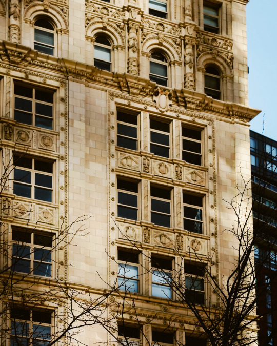
#boston architecture
Text
I thought it was supposed to be a whale. I was wrong.
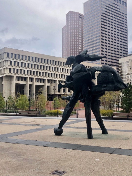
Government Center, Scollay Square Boston. A neighborhood destroyed in the service of urban renewal.
Oh the ah, the ahem, sculpture? Inspired by the illustrious military career of John F. Kennedy. That was my second guess.
7 notes
·
View notes
Text

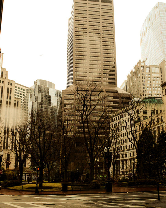
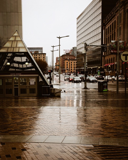
rainy, beautiful Boston
#boston#bostonliving#bostonlife#travelblogger#streetsofboston#streetphotocollective#city aesthetic#city life#mbta#rainyafternoon#rainy vibes#city architecture#boston architecture
21 notes
·
View notes
Text
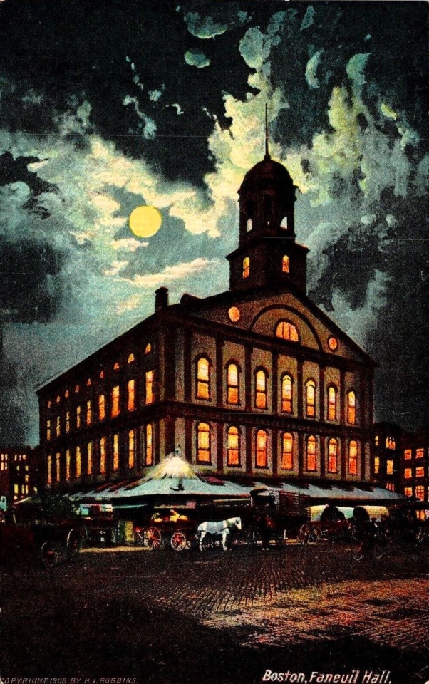
1909 Boston Faneuil Hall Postcard Nighttime.
@postcardtimemachine
21 notes
·
View notes
Text

The old church on beacon hill. 🍁🍂🦃(mixed media on canvas)⛪️
#old church#beacon hill#boston public library#boston architecture#boston apartments#boston artist#colonial history#colonial architecture#north end#boston common#boston strong#Red Sox#patriots#bruins#Celtics#wild turkeys#wild turkey#turkeys#brownstone#plein air painting#plein air#naive art#folk art painting#cityscape painting#charles street#copley square#fall foliage#autumn leaves#impressionism#claude monet
16 notes
·
View notes
Photo

Open - Family Room
Example of a mid-sized trendy open concept medium tone wood floor and beige floor family room design with white walls and a wall-mounted tv
#contemporary interior#best boston architects#residential architect#charles rose architects#contemporary architecture#family room#boston architecture
2 notes
·
View notes
Text
Strangled and Mangled: Classicism and Its Ersatz After Architecture’s Commodification
N.B.: All images, unless otherwise stated, are of my own making. Additionally, if you are having difficulty with parsing the images’ captions in this post, you may want to try viewing this same article on Medium.
If you have ever enjoyed and appreciated the special insights and emphases of my writings, I would encourage you to support me on Patreon! Most of the essays I write are so particular in their subject matter, and so committed to preserving the integrity of my authorial voice, that publication elsewhere is often out of the question, and so I opt for self-publication.
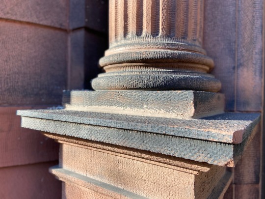
A local example of excellent classical modeling around the base of a column, found on Gainsborough Street in Boston, MA. Despite advancements in industrial production, many new buildings with classical pretensions will cut corners, or employ people bereft of the relevant formal knowledge.
The following can be considered complementary to my series on the Dark Souls series, Bloodborne, and Sekiro, entitled Putting Names to Built Things, the entries for which can be viewed by clicking here.
It is not difficult, when treading the relatively casual discursive spheres of architectural observation and criticism, to find many instances of designs for élite clientele being mocked for formal ugliness, stylistic ignorance, and architectonic ineptitude. Many of these designs have pretensions of classicism (that is, of the Greco-Roman variety), meaning that such criticism can draw from well-established stylistic rules or suggestions. What is rarer to find is an equivalent scrutiny regarding common architecture. This discursive rift is understandable yet problematic: on the one hand, it makes sense that people will find special delight in pointing out the ineptitude of wealthy persons’ taste (which, I would argue, has been a commonality only since the so-called Victorian period’s free-for-all destruction of a coherent classical tradition); on the other hand, the overt focus on “exceptional” sites reinforces a long-standing preoccupation with the 1% of things within architectural studies, to the general exclusion of what most of us encounter day-to-day.
Classicism today, or what remains of it, typically exists in a state far more dire than anything the Victorians could have imagined doing to it. Rather than see it twisted, turned, incised, and scooped out by designers under the delusion that, with enough arbitrary tweaks, a totally new style might emerge by chance, we rather see it paraphrased or mutilated in cheaply assembled new buildings or in a grim life-support state as the vestiges of prior designs. As someone who lives in Boston, a city with an abundance of buildings built during the late-19th and early-20th century, I see much of the latter; and so newer buildings do, on occasion, attempt to integrate into this environment by loosely conforming to some degraded vernacular. Correctives for either of these situations aren’t clear-cut. Usually, the more a building is made-over to keep it up to date, the further its appearance is jumbled about or demeaned by ugly materials (to say nothing of the expenses and labor involved); and a modicum of knowledge of classical detailing, and a team’s ability to competently execute it, is required for new building schemes with an integrative or “historical” objective.
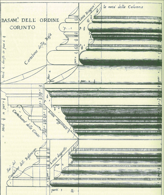
A drawing of a Corinthian order base, done by Vincenzo Scamozzi.
Exactly describing the classical style is not easy, but it must be stressed that none of its components come close to being a domain of esoteric or bewildering knowledge (like many things, the real complexities arise from arrangement). These are things schoolchildren could learn. A great deal of laypeople might associate classicism with, say, the usage of columns, or a certain profusion of sculptural ornamentation; and while these are, or can be, marks of classicism or its variants, among its further-reaching aspects are types and usages of moldings. Moldings are essentially horizontal bands with a dimensional characteristic — either rectilinear or curved, with varying depths and orientations. Each molding is an element of great simplicity which, through contextual application and iteration, acquires its status as a crucial characteristic of classicism, at its best and worst. Like other dimensions of classicism, too, once you are educated as to the types and historical uses of moldings, and once you work with them enough to internalize their properties, you can begin to adjust the implicit or explicit rule-sets for invention. To my mind, two of the greatest practitioners of this were the architects Edwin Lutyens and Richard Norman Shaw.
Martino Longhi the Younger, an Italian architect of the 17th century, went to the extent of claiming, “Whoever does not have, among other branches of knowledge, an understanding of the exceedingly important art of moulding cannot be called an architect.” Longhi’s claim, of course, has limited contemporary application, since he was practicing within a culture and a time when the classical paradigm was normative; but the fact such an assertion could have at one point been made — and that its sentiment was shared by other practitioners, before and after — demonstrates its assigned artistic importance, equal to matters such as intercolumniation or superimposition. Michael Hill and Peter Kohane’s paper, “The Signature of Architecture”: Compositional Ideas in the Theory of Profiles, explores how the once-popular idea of columnar proportions and divisions being an analogy for the human body had a parallel in the physiognomic idea that profiles were alike facial profiles of various affect. Jacques-François Blondel, for instance, argued that “the facial resemblance enabled the spectator to quickly apprehend what is pleasing or otherwise about the cornice. …the face was there for theatrical reasons, to be seen by the building’s audience.” Before him, Augustin-Charles d’Aviler wrote (anticipating the notion of architecture parlante) that “[just] as the combination of characters makes an infinite number of words in different languages, so by the mix of mouldings can one invent distinct profiles for each of the Orders.”
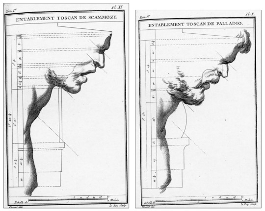
Two drawings by Jacques-François Blondel, comparing a couple of Tuscan order profiles, one by Scamozzi, the other by Palladio, and situating them within a physiognomic framework.
As with a number of other intellectual domains, these analogical elements were gradually phased out, alongside metaphysical concerns, as cultural relativism became the order of the day. Today, the physiognomic aspect might be considered especially suspect, given its proximity to anatomical, or racial, prejudice (although the term has enjoyed a very recent resurgence in popularity on platforms like TikTok, perhaps because it can complement sun sign astrology’s typologizing of personality). Hill and Kohane identify Charles Howard Walker’s 1926 text, The Theory of Moldings, as “the last book on the topic.” As they explain, “The book is practical, with no mention of earlier theorists, nor any discussion of the relationship of mouldings to the face or the body; other than prescriptions for cornice ‘facial angles’, which probably derives from Jacques-François Blondel.”
Just as significant as the deprivation of profiles’ symbolic value is the fact that the bulk of architecture students now are not taught anything about profiles, even from the perspective of “practicality” — nor are they taught the intrinsic value (and pleasure) of drawing, as distinct from angular-centric computer modeling. If one were to ask our average architect to draw a small arrangement involving the Doric order with competence, and without an external point of reference, they would be unable to do so. Such information, although readily available to anyone looking for it, has long been relocated to an area of superfluous considerations, alongside forms of ornamentation, deepening an artificial rift between “legitimate” and “classical” architecture. Profiles have rather become the domain of cabinetmakers, trim installers, or some form of interior designer, although this specialization has been by no means a guarantee of competence.

Classicism transformed, wielded with imagination and tact. Central Congregational Church, Newton MA, designed by Hartwell and Richardson. Here, the elements of an enriched entablature have been put into a rustic format, giving the effect of the layers phasing in and out of a sheath.
Classicism’s system of moldings is accompanied by a system of alignments and positions involving posts, lintels, and fenestration. As a classical structure grows and each component is put into place, it asks for a relevant response and optical relationship. Again, there is wiggle-room within the creative process once one has graduated to competence. But there are certain rules which ask for regular adherence: for example, the rule which requires that a column’s outline (given that the column’s entasis has not been deliberately exaggerated) aligns with the first fascia of the architrave; or the rule which requires the column to be positioned so that the capital is not under, but extends a certain distance beyond, the architrave.
It should be stated that there is quite enough modern-day classicism so committed to a kind of prim accuracy that the results are simply myopic expressions of core rules, such as the work of Quinlan Terry, or Michael Dwyer. This work is deficient not in competence but in imagination. It is correct, fine, and unremarkable. The trick to mastery would appear to be finding the unteachable midpoint between Lutyens’ apparently paradoxical statements that, “You cannot copy: you find if you do you are caught, a mess remains”, and that, “You cannot play originality with the Orders. They have to be so well digested that there is nothing but essence left.” Our focus here, however, is not unimaginativeness but incompetence, ignorance, and forms of degradation — makeshift, renovative, professional, industrial.
A portion of the exterior of the W. J. Sullivan House, Brookline MA. Despite a fairly ugly exterior, the house’s designer provided some amusing flourishes, such as this chair rail molding reappearing between a salient, recalling the various solutions to the problem of corners during the Italian renaissance.
A few more comments. Although cultural relativism has had a hand in freeing up assessments, theories, and practices from certain constraints, it has had the additional effect of making it very easy to believe that, after a point, classicism was holding on simply by way of convention (local, national, imperial) or according to socioeconomic pretensions to taste (I would reiterate that the new, house-proud middle-class, and the aimless architects, of the 1800s more or less obliterated any sense of what proper classicism is, with the effect that today’s élite really have no more of an idea of what an entablature should look like than the column- and gable-desiring lower classes). To be sure, these were, and are, sustaining factors; but they do not fully explain the incredible persistence of classicism. I believe that the relativist sentiment can only be upheld by people who have not spent significant time doing classical designs themselves. Get in deep enough and you might begin to sense that this system really does hold a sort of inherent aesthetic perfection, an almost inevitable rightness that, after a while, becomes as natural and sensual as the human body.
What I mean to do with this mini-essay — actually more of a brief tour with a preamble — is not provide a reason for why any of this matters. Readers will have to do (or not do) that for themselves. I am not going to indulge an imaginary debate over whether or not taking common facades to task for their aesthetic disasters is class warfare (in these instances, however, given the sites, it is probable that most of the private buildings depicted have fairly high monthly rents). Nor is my intent to make a hard correlation between a form of external propriety and residential, or public, happiness. It is rather to illustrate how the vast majority of what we directly, civilly perceive as deriving from Greco-Roman classicism has been degraded into the crudest, barely composed forms — and to ask if it might not be better to omit these details altogether from renovations or schema if they are going to be so tortured and blunted. It is my opinion that cheaply made and ineptly executed classicism is far less preferable than any adequate “modernist” design. Classicism, by nature of being distinctly composed of standardized modes of articulation and units of assembly, gives us an executional baseline. Anything below this baseline merely impresses a discrepancy. Modernist architecture has no such baseline, no such codification, even if there is a common canon of its practitioners.
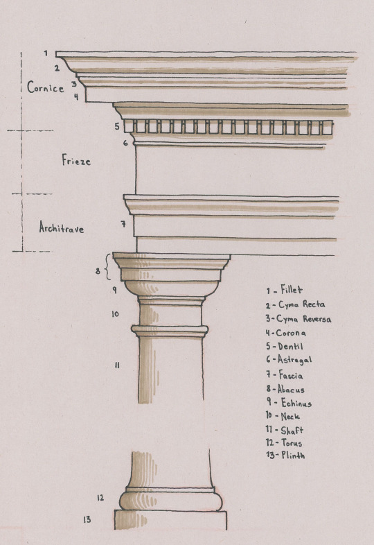
A visual point of reference for a standard classical profile. Note that, even within this example, there are certain alternatives present, such as the architrave having two, rather than three, fasciae; and that certain forms, and their terms, are not included (such as the ovolo, scotia, or cavetto).
With all that out of the way, let’s begin. You can use my drawing, above, as a point of reference for arrangement and terminology; but please also refer to other diagrams online which are sure to have more information. And be sure to enlarge the photographs if the captions are illegible.
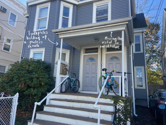
1
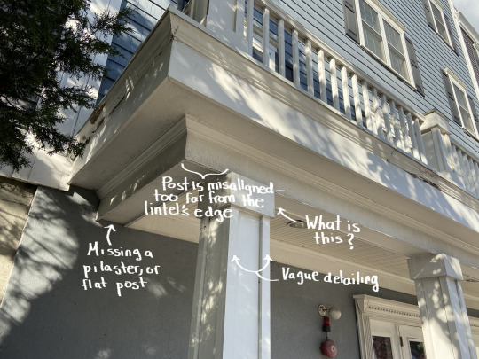
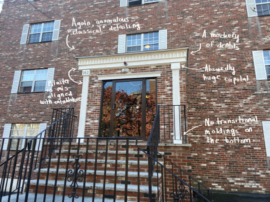
As with some of the other examples, it’s difficult to tell if this building had a prior appearance and if its current state crudely reuses, or “renovated”, some external structural details, or if it was entirely designed this way, so haphazard is its assembly, so slapdash its detailing. A vaguely classical surround frames the entrance with pseudo-pilasters missing their extremities. Consoles have been mashed into the middle and sides of the surround’s top, and the side consoles’ “hovering” bottom-tips highlight the pseudo-pilasters’ headless state. The entablature is nonsensical — a cornice with an overly large corona, and a slightly smaller duplicate of that below. The columns are unrelated, having no classical character, and being set too far in from the side of the lintel they are supporting.

A diagrammatic portion of a Doric order. Taken, and edited, from Pinterest.
Note the orange line I’ve drawn on the diagram above, showing how there is a continuous “line” conforming the column’s upper portion to the side of the architrave (at least that of its lowest fascia), and then to the frieze’s side. Note, too, that the column’s capital consequently protrudes past the architrave, rather than being all under the lintel. These are a couple of core attributes of classicism, the absence of which generally indicates that the designer has no idea what they are doing, or that an inconsiderate, abusive renovation has pushed the classical elements to do what they are not meant to do. We will see many instances of this mistake hereafter.

2
It is almost certain that the bay projection on this house once had a strong cornice above it. As the owner(s) proceeded to “update” it over the years, this cornice may have been in a deteriorating state and was removed, but not replaced, with the rest of the projection’s top covered over with shoddy laminated roof shingles. I’m tempted to venture the guess that most of the courses with dentils here are replacements, but it’s not clear. What is clear is that there is too much dead space above the bay and upper story dentils. Moreover, the dentils do not emerge from a molding but are each a thin block stuck to a board’s underside. They look flat, lifeless. They are a child’s project. One cannot even say that these upper jaws are “snarling.”

3
Designs such as this one are so ridiculous that it is frankly extremely difficult to not imagine it as having been conceived with a condescension verging on subconscious contempt (similar to Robert Venturi’s Guild House, originally capped by sculptural TV antennae, mocking the inhabitants for their “chief pastime”). What is more likely is that it is a cheap and inept attempt at bridging the “southern colonial” look with a modern housing block. Why have the classical details at all, though? The columns — pornographically stretched out to Fun Size, and bereft of entasis — are like a bad joke that’s worn out a tepid welcome, and the pediment is just dumb, with its raking cornice sliding clear past the lintel below, its body covered by clapboards. Of particular unfortunate note is the detail of the lintel above the columns “clipping” through the abacus of each.
4
Classicism here assumes a highly reduced appearance (as with so many houses, a curvaceous cyma is retained for the gutter cornice), yet still asks for certain responses to its calls. The rectangular posts have singular base moldings, but no capitals; and, again, they are out of sync with their lintel — especially where it protrudes to match the pediment’s projection. The reductions, or abstractions, of this design do make it a little less offensive to my eyes, and I might not have stopped to take this photo at all if the silly pediment, and the problems it brought along with it, weren’t included.
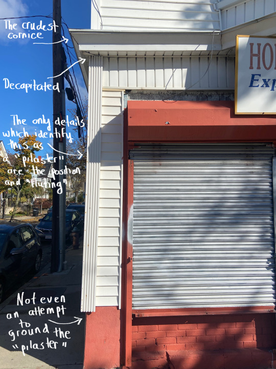
5
I’m not sure if this is or isn’t uglier than the third example, but its similarly anomalous (or nearly anomalous; the building’s sides are clasped by brick quoins) and inept classical details make one wonder why they were included at all, besides as a cheap, preemptive acquiescence to sentimental taste, as the out of place, non-functional window shutters additionally suggest. Despite having capitals and bases, the “pilasters” are barely an improvement over those in the first example, and are set too far away from the block’s edges. The entablature is brutal idiocy, with a row of pseudo-dentils maimed so badly that the section looks instead as if shallow rectangular impressions have made into the surface. I’ve seen gas station roofs styled as huge entablatures with more literacy than this.
6
Zombie classicism, so deprived that it has retreated into an unconscious form of camouflage, several levels removed from the referents, all of its cracks showing. This may be the most dire example of the bunch.
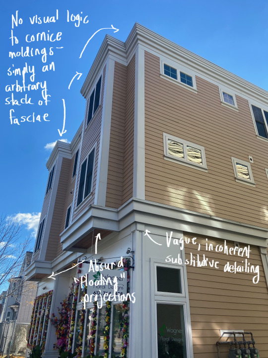
7
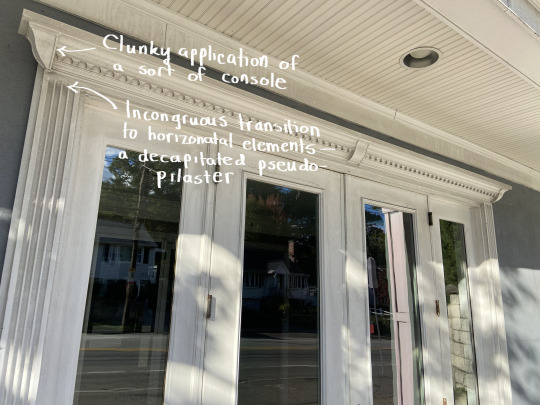
A newer, mixed-use building. Oriels are not a classical element, but they have traditionally been visually, if not also structurally, supported by an underside of diminishing moldings, corbels, or consoles. The lack of either here, combined with the string course below appearing to jut out just as far, if not further, than the cornice, gives their sudden thrusting-out an absurd effect: too bottom-heavy and yet floating. The cornice makes a big deal of itself, despite having nothing to say. Its only organizational, formal principle is the sections’ gradual thinning as they near the top. There is a feeble attempt at suggesting corner pilasters on the building’s first story, comparable to the shoulder-shrugging posts from the first example.
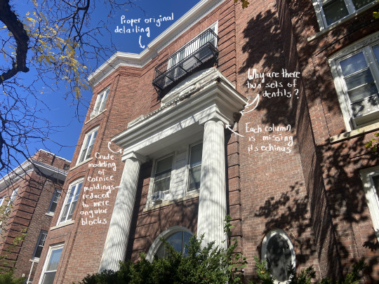
8
One can find ample examples of entablatures and molded bands from antiquity, and throughout various phases of neoclassicism, which reuse certain ornamentation (such as the bead and reel pattern, or egg and dart pattern) in quick, adjacent succession. Dentils, however, have always been excluded from this duplicative leeway. Note how, in a photograph of a detail of the Triumphal Arch of Septimius Severus, dentils are indeed reused, but always within a different zone on the structure: first, at the arch’s imposts; then, along the entablature; and finally below the cornice. Crude and arbitrary segmenting and modeling aside, the entablature here breaks this rule, looking even more ridiculous since its dentils are crimped as a pie’s crust is. The columns lack echini, and the oversized abaci look like cardboard boxes placed atop tubes.

9
A situation so grim that one resists the fact that it is a finished product and not a construction site. The entablature is a set of rickety chunks cobbled together, their sole pretensions to enrichment being the semblance of panels, echoing the dado’s pseudo-panels. It is curious that the columns utilize a different material and exhibit entasis, almost as if they are molds taken of prior columns. Again, this facade — the clapboarded rise beyond included — is such a hodgepodge that one has to wonder about the chronology of development. Was this once a Queen Anne-styled home, mutilated through renovation and now unrecognizable as such?
10
Classicism kept in a vegetative state when it has lost nearly everything that once made it whole. This portico would look so much better if all of the entablature’s vestiges were scrapped, replaced by a plain lintel, and if the posts weren’t poles. As it is, this is a surgically removed, rotting upper jaw, the overt mass of which goes against a minimalist supportive solution.
11
There is a bit of play here which identifies the design as more postmodern-classical than classical, at least within the realm of intentionality, yet the materials’ cheap appearance and the overall cartoonish, warbling tenor —��the way an entablature has been suggested by abstract quotations of a blown-up cornice — merely call to mind the reality that the built-in exaggerations of postmodernism have ultimately led to an uncontrolled flood of kitsch. One often sees this sort of kitsch around outlet malls/centers, where gables, faux-chimneys, and hollow Italic towers have been propped up as if to offer scraps of “humanizing” design, all the while implicating the tradition-deprived mundanity and regurgitated tedium of persons’ consumerist lives.
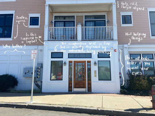
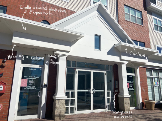
12
An acceptable design lurks beneath this newer building’s fussy exterior. As I’ve remarked, the projected entrance block looks better if you squint your eyes, omitting the jumble of panels and strips. Once again, like the seventh example, the designer has replaced pilasters with vague and vapid substitutes, the “capitals” of which have no geometric relationship to adjacent element, and which are out of sync with the capital-molded posts above. Amazingly, however, the latter’s outlines are aligned with their lintel’s sides. The main block’s first story windows on the right are echoed by blind windows on the left, but these are very obviously not genuine recessions — rather, frames stuck onto the surface — and only detract.

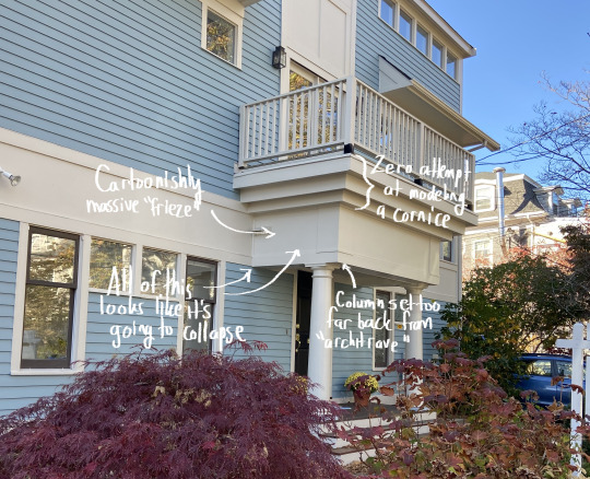
13
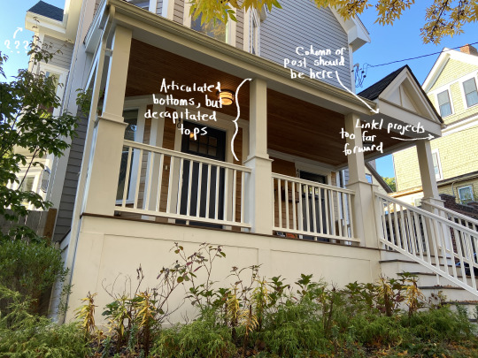
Another nonsensical hodgepodge. Everything about the portico is wrongheaded. The paired columns are not only set too far in from the lintel’s edges but have differing positions relative to one another — and they are too visually weak relative to the enormity they are upholding, similar to the tenth example. Such eaves asks for bold, rustic piers. Perhaps the owner(s) wanted as much shelter as possible, which may explain the eaves’ extent, but nothing about the solutions here are elegant or formally coherent, and the columns’ classicism appears desperate.

14
Not as bad as the sixth example. Still, pretty bad. The square columns’ capitals are meager to the extreme. They might work on a fence’s main posts — not as the caps for a building’s prominent structural device. And nothing about what they support is worthy of being seen.
15
This monstrosity of a gaffe provoked a double-take. Despite being a newer building, the portico is hardly any better than the last one shown. Correct modeling on the columns can’t hide their incorrect positions. The entablature, with its blundering triple-threat stack, is laughable — a protuberance with all the stylishness of a bellowing burp. What it brought to mind, actually, are photographs of a shockingly ugly mansion in Sandton, Johannesburg (see the second image). Anyone with an informed eye knows that this is the polar opposite of sophistication.

16
Not much new to say here, except that this example is particularly baffling, since there is a point of reference next door. Columns, yet again, aren’t where they should be, the architrave is missing at least one fascia, the dentils are badly spaced, the cornice is too flush and flat, and the entablature as a whole has been contorted into a boxy mold. I just don’t get how stuff like this happens when all you have to do is look to your right.

17
All pretension — no discrimination. This portion of a Newton residence was more recently executed. The rest of the house, which has been altered/renovated to different degrees, appears to have once been of a sort of late-19th or early-20th century “free classic” variety. Metal Corinthian columns (now showing signs of rust) have been used, but nothing else is recognizable as the Corinthian order — or, really, as any sort of order. The entablature is an omissive pseudo-entablature, and the pediment’s size asks for its vacuous tympanum to have some kind of infilling or relief work.
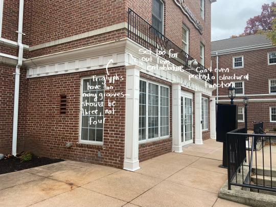
18
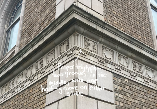
This is our last stop today. Many more examples could have been used, but after a while the faux pas are so consistent that commentary becomes redundant. Because they are barely underneath the entablature, it is unclear if the posts mean to be engaged square columns or pilasters with too much dimensionality. As either thing, they are four absurd interjections, symbolically and structurally unmoored. The frieze’s triglyphs have four grooves — one too many. Triglyphs are named such because they have, literally, three (tri) carvings, or grooves (glyphs). Expressed correctly, a triglyph has two “whole” grooves incised onto the main body, and then a half-groove on either side — coming out to three grooves total.
I hope that this tour has been educational and engaging. I also hope that it has not given you the impression that the wielding of a discriminating view is done to detriment of the viewer; rather, I believe that explorations like this have the ultimate effect of helping one grow into an appreciation of architecture well-done all the more. The eye is transformed for the better. It is likely that I’ll do another installment later on, if I can find enough novel missteps around the area. I’m pretty sure I can; and I’m pretty sure you can, too — unfortunately!
#architecture#boston architecture#architectural criticism#classical architecture#neoclassical architecture#vernacular architecture#architectural history
12 notes
·
View notes
Text
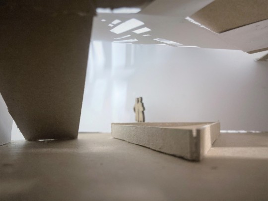
The Light Museum Project
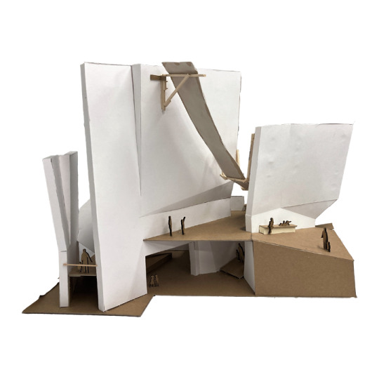
In my studio class I was tasked with designing a Museum of Light at 321 Newbury Street here in Boston.
By recreating light conditions found in extreme landscapes using materials that are ubiquitous in urban Boston, my intention was to challenge visitors to question what makes a space urban or natural.
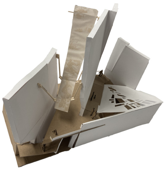

I really enjoyed researching site conditions and considering materiality in this project. This project also allowed me to focus on and improve my craft when it comes to modeling and drawing, and I think it is my favorite project of my first semester at the BAC!
Below: Longitudinal Section
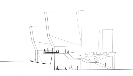

Above: Ground Floor Plan (Left), Roof Plan (Right)
#architecture#architecture school#architecture studyblr#boston architectural college#boston architecture#BAC
2 notes
·
View notes
Text
#boston#boston architecture#historic architecture#historic buildings#brick#brick buildings#streetscape
0 notes
Photo

Traditional Living Room
#With gray walls#a standard fireplace#a stone fireplace#and no television#this large traditional loft-style living room idea also features a medium-tone wood floor and brown floor. arts and crafts#chimney#curved ceiling#boston architecture#curved windows
0 notes
Text
Architecture- Philosophies of Anomalous Architects
Never underestimating the power of design is the main lesson that well known architects have sought to impart to us over the years
0 notes
Text

1K notes
·
View notes

Text
#boston#boston architecture#architecturephotography#bostonliving#travelphotography#travelblogger#citydetails#light acamedia#light acadamia aesthetic#streetphotography
4 notes
·
View notes
Text
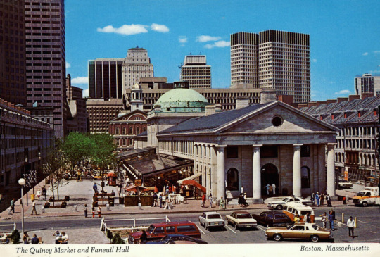
Boston Quincy market postcard from 1977. @postcardtimemachine
30 notes
·
View notes
Text
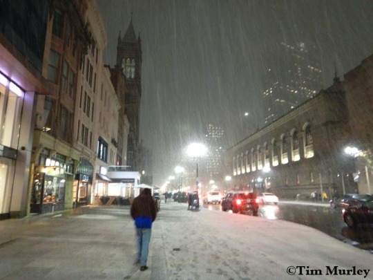
Snowfall at copley square. ❄️🌛🌧
#copley square#boylston street#boston public garden#boston public library#Boston#boston strong#boston architecture#boston apartments#boston artist#snowflakes#snow#snowy night#snowing#bomb cyclone#boston blizzard#blizzard#nieve#walking at night#thinking about life#snow photography#back bay mbta station#back bay#emerson college#north eastern#noreaster#night photo art#night photoshoot#night photo walk#night person#night photography
6 notes
·
View notes
Text


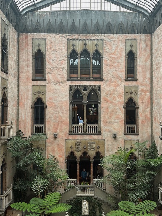
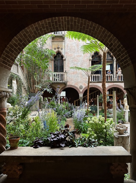

Isabella Stewart Gardner Museum, home of the biggest known art theft in history.
#art theft#art#green aesthetic#greenhouse#vsco#vscocam#iphonography#travelblr#Boston#massachusetts#architektura#architecture#sculpture
966 notes
·
View notes
Last Seen Blogs